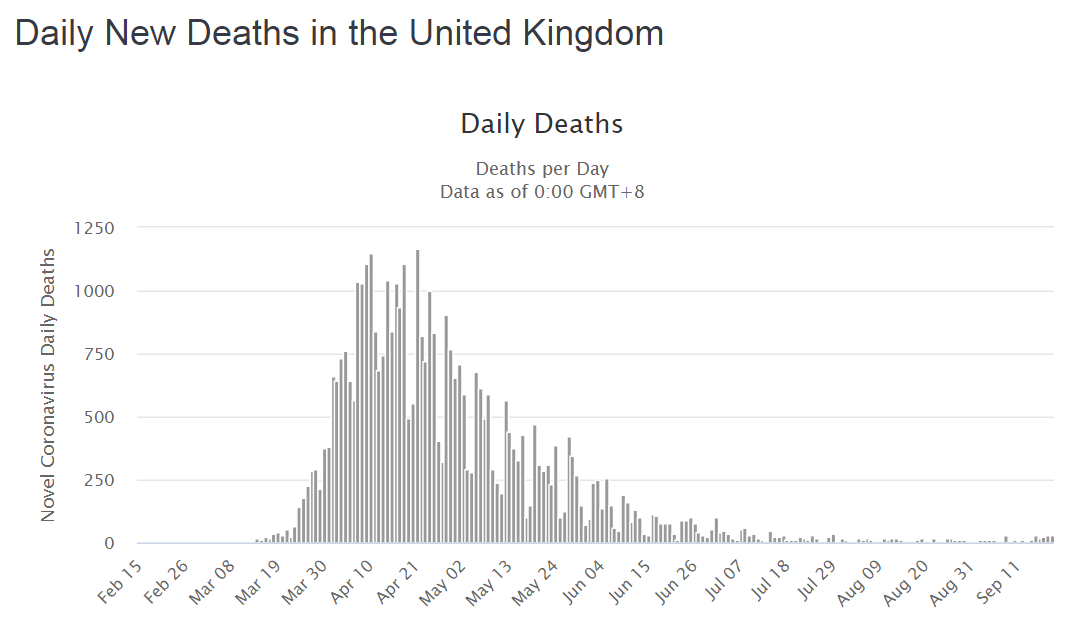
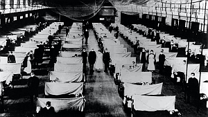
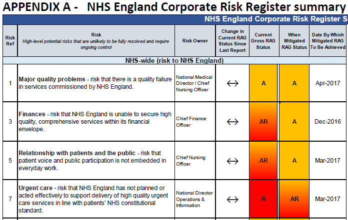
 On 5th July 2018, the NHS will be 70 years old, and like many of those it was created to serve, it has become elderly and frail.
We live much longer, on average, than we used to and the growing population of frail elderly are presenting an unprecedented health and social care challenge that the NHS was never designed to manage.
The creases and cracks are showing, and each year feels more pressured than the last.
This week a story that illustrates this challenge was shared with me along with permission to broadcast …
“My mother-in-law is 91, in general she is amazingly self-sufficient, able to arrange most of her life with reasonable care at home via a council tendered care provider.
She has had Parkinson’s for years, needing regular medication to enable her to walk and eat (it affects her jaw and swallowing capability). So the care provision is time critical, to get up, have lunch, have tea and get to bed.
She’s also going deaf, profoundly in one ear, pretty bad in the other. She wears a single ‘in-ear’ aid, which has a micro-switch on/off toggle, far too small for her to see or operate. Most of the carers can’t put it in, and fail to switch it off.
Her care package is well drafted, but rarely adhered to. It should be 45 minutes in the morning, 30, 15, 30 through the day. Each time administering the medications from the dossette box. Despite the register in/out process from the carers, many visits are far less time than designed (and paid for by the council), with some lasting 8 minutes instead of 30!
Most carers don’t ensure she takes her meds, which sometimes leads to dropped pills on the floor, with no hope of picking them up!
While the care is supposedly ‘time critical’ the provider don’t manage it via allocated time slots, they simply provide lists, that imply the order of work, but don’t make it clear. My mother-in-law (Mum) cannot be certain when the visit will occur, which makes going out very difficult.
The carers won’t cook food, but will micro-wave it, thus if a cooked meal is to happen, my Mum will start it, with the view of the carers serving it. If they arrive early, the food is under-cooked (“Just put vinegar on it, it will taste better”) and if they arrive late, either she’ll try to get it out herself, or it will be dried out / cremated.
Her medication pattern should be every 4 to 5 hours in the day, with a 11:40 lunch visit, and a 17:45 tea visit, followed by a 19:30 bed prep visit, she finishes up with too long between meds, followed by far too close together. Her GP has stated that this is making her health and Parkinson’s worse.
Mum also rarely drinks enough through the day, in the hot whether she tends to dehydrate, which we try to persuade her must be avoided. Part of the problem is Parkinson’s related, part the hassle of getting to the toilet more often. Parkinson’s affects swallowing, so she tends to sip, rather than gulp. By sipping often, she deludes herself that she is drinking enough.
She also is stubbornly not adjusting methods to align to issues. She drinks tea and water from her lovely bone china cups. Because her grip is not good and her hand shakes, we can’t fill those cups very high, so her ‘cup of tea’ is only a fraction of what it could be.
As she can walk around most days, there’s no way of telling whether she drinks enough, and she frequently has several different carers in a day.
When Mum gets dehydrated, it affects her memory and her reasoning, similar to the onset of dementia. It also seems to increase her probability of falling, perhaps due to forgetting to be defensive.
When she falls, she cannot get up, thus usually presses her alarm dongle, resulting in me going round to get her up, check for concussion, and check for other injuries, prior to settling her down again. These can be ten weeks apart, through to a few in a week.
When she starts to hallucinate, we do our very best to increase drinking, seeking to re-hydrate.
On Sunday, something exceptional happened, Mum fell out of bed and didn’t press her alarm. The carer found her and immediately called the paramedics and her GP, who later called us in. For the first time ever she was not sufficiently mentally alert to press her alarm switch.
After initial assessment, she was taken to A&E, luckily being early on Sunday morning it was initially quite quiet.
Hospital
The Hospital is on the boundary between two counties, within a large town, a mixture of new build elements, between aging structures. There has been considerable investment within A&E, X-ray etc. due partly to that growth industry and partly due to the closures of cottage hospitals and reducing GP services out of hours.
It took some persuasion to have Mum put on a drip, as she hadn’t had breakfast or any fluids, and dehydration was a probable primary cause of her visit. They took bloods, an X-ray of her chest (to check for fall related damage) and a CT scan of her head, to see if there were issues.
I called the carers to tell them to suspend visits, but the phone simply rang without be answered (not for the first time.)
After about six hours, during which time she was awake, but not very lucid, she was transferred to the day ward, where after assessment she was given some meds, a sandwich and another drip.
Later that evening we were informed she was to be kept on a drip for 24 hours.
The next day (Bank Holiday Monday) she was transferred to another ward. When we arrived she was not on a drip, so their decisions had been reversed.
I spoke at length with her assigned staff nurse, and was told the following: Mum could come out soon if she had a 24/7 care package, and that as well as the known issues mum now has COPD. When I asked her what COPD was, she clearly didn’t know, but flustered a ‘it is a form of heart failure that affects breathing’. (I looked it up on my phone a few minutes later.)
So, to get mum out, I had to arrange a 24/7 care package, and nowhere was open until the next day.
Trying to escalate care isn’t going to be easy, even in the short term. My emails to ‘usually very good’ social care people achieved nothing to start with on Tuesday, and their phone was on the ‘out of hours’ setting for evenings and weekends, despite being during the day of a normal working week.
Eventually I was told that there would be nothing to achieve until the hospital processed the correct exit papers to Social Care.
When we went in to the hospital (on Tuesday) a more senior nurse was on duty. She explained that mum was now medically fit to leave hospital if care can be re-established. I told her that I was trying to set up 24/7 care as advised. She looked through the notes and said 24/7 care was not needed, the normal 4 x a day was enough. (She was clearly angry).
I then explained that the newly diagnosed COPD may be part of the problem, she said that she’s worked with COPD patients for 16 years, and mum definitely doesn’t have COPD. While she was amending the notes, I noticed that mum’s allergy to aspirin wasn’t there, despite us advising that on entry. The nurse also explained that as the hospital is in one county, but almost half their patients are from another, they are always stymied on ‘joined up working’
While we were talking with mum, her meds came round and she was only given paracetamol for her pain, but NOT her meds for Parkinson’s. I asked that nurse why that was the case, and she said that was not on her meds sheet. So I went back to the more senior nurse, she checked the meds as ordered and Parkinson’s was required 4 x a day, but it was NOT transferred onto the administration sheet. The doctor next to us said she would do it straight away, and I was told, “Thank God you are here to get this right!”
Mum was given her food, it consisted of some soup, which she couldn’t spoon due to lack of meds and a dry tough lump of gammon and some mashed sweet potato, which she couldn’t chew.
When I asked why meds were given at five, after the delivery of food, they said ‘That’s our system!’, when I suggested that administering Parkinson’s meds an hour before food would increase the ability to eat the food they said “that’s a really good idea, we should do that!”
On Wednesday I spoke with Social Care to try to re-start care to enable mum to get out. At that time the social worker could neither get through to the hospital nor the carers. We spoke again after I had arrived in hospital, but before I could do anything.
On arrival at the hospital I was amazed to see the white-board declaring that mum would be discharged for noon on Monday (in five days-time!). I spoke with the assigned staff nurse who said, “That’s the earliest that her carers can re-start, and anyway its nearly the weekend”.
I said that “mum was medically OK for discharge on Tuesday, after only two days in the hospital, and you are complacent to block the bed for another six days, have you spoken with the discharge team?”
She replied, “No they’ll have gone home by now, and I’ve not seen them all day” I told her that they work shifts, and that they will be here, and made it quite clear if she didn’t contact SHEDs that I’d go walkabout to find them. A few minutes later she told me a SHED member would be with me in 20 minutes.
While the hospital had resolved her medical issues, she was stuck in a ward, with no help to walk, the only TV via a complex pay-for system she had no hope of understanding, with no day room, so no entertainment, no exercise, just boredom encouraged to lay in bed, wear a pad because she won’t be taken to the loo in time.
When the SHED worker arrived I explained the staff nurse attitude, she said she would try to improve those thinking processes. She took lots of details, then said that so long as mum can walk with assistance, she could be released after noon, to have NHS carer support, 4 times a day, from the afternoon. She walked around the ward for the first time since being admitted, and while shaky was fine.
Hopefully all will be better now?”
This story is not exceptional … I have heard it many times from many people in many different parts of the UK. It is the norm rather than the exception.
It is the story of a fragmented and fractured system of health and social care.
It is the story of frustration for everyone – patients, family, carers, NHS staff, commissioners, and tax-payers. A fractured care system is unsafe, chaotic, frustrating and expensive.
There are no winners here. It is not a trade off, compromise or best possible.
It is just poor system design.
What we want has a name … it is called a Frail Safe design … and this is not a new idea. It is achievable. It has been achieved.
http://www.frailsafe.org.uk
So why is this still happening?
The reason is simple – the NHS does not know any other way. It does not know how to design itself to be safe, calm, efficient, high quality and affordable.
It does not know how to do this because it has never learned that this is possible.
But it is possible to do, and it is possible to learn, and that learning does not take very long or cost very much.
And the return vastly outnumbers the investment.
The title of this blog is Righteous Indignation …
… if your frail elderly parents, relatives or friends were forced to endure a system that is far from frail safe; and you learned that this situation was avoidable and that a safer design would be less expensive; and all you hear is “can’t do” and “too busy” and “not enough money” and “not my job” … wouldn’t you feel a sense of righteous indignation?
I do.
For more posts like this please vote here.
For more information please subscribe here.


 Abstract


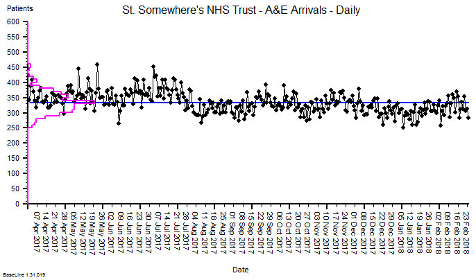
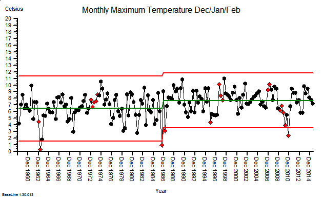
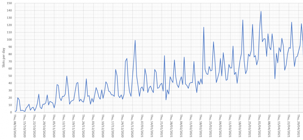
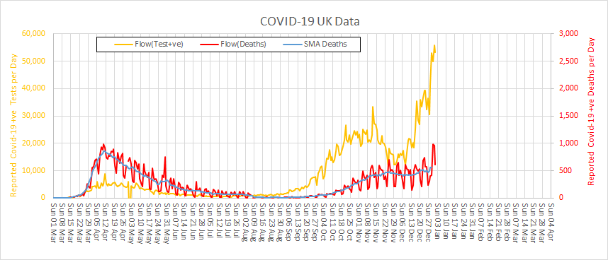
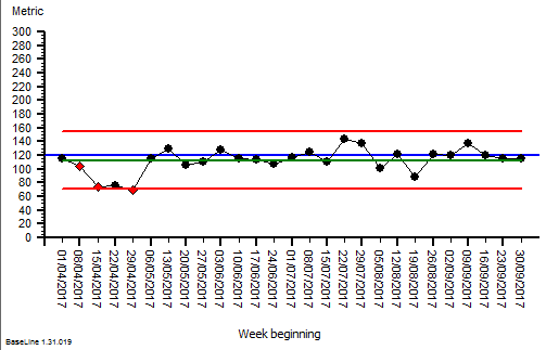
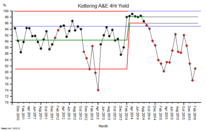
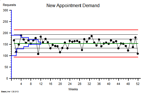
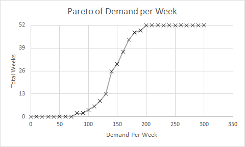
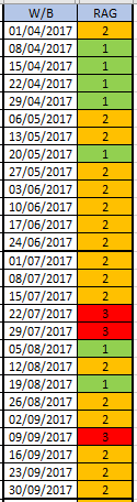 The quarterly target I need to stay below is 120 and my weekly RAG chart is set to show green when less than 108 (10% below target) and red when more than 132 (10% above target) because I know there is quite a lot of random week-to-week variation.
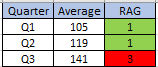
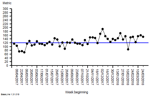


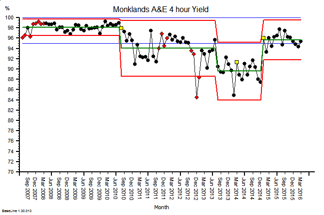


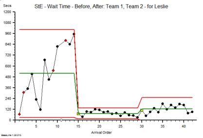


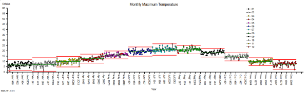
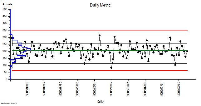
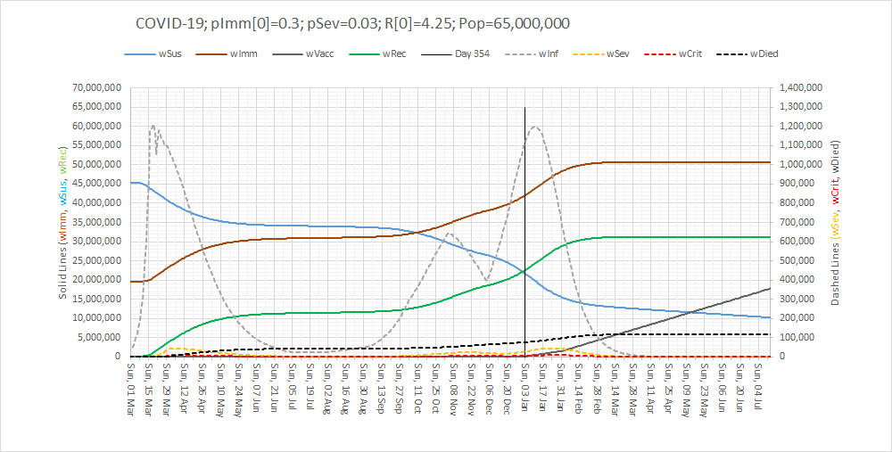
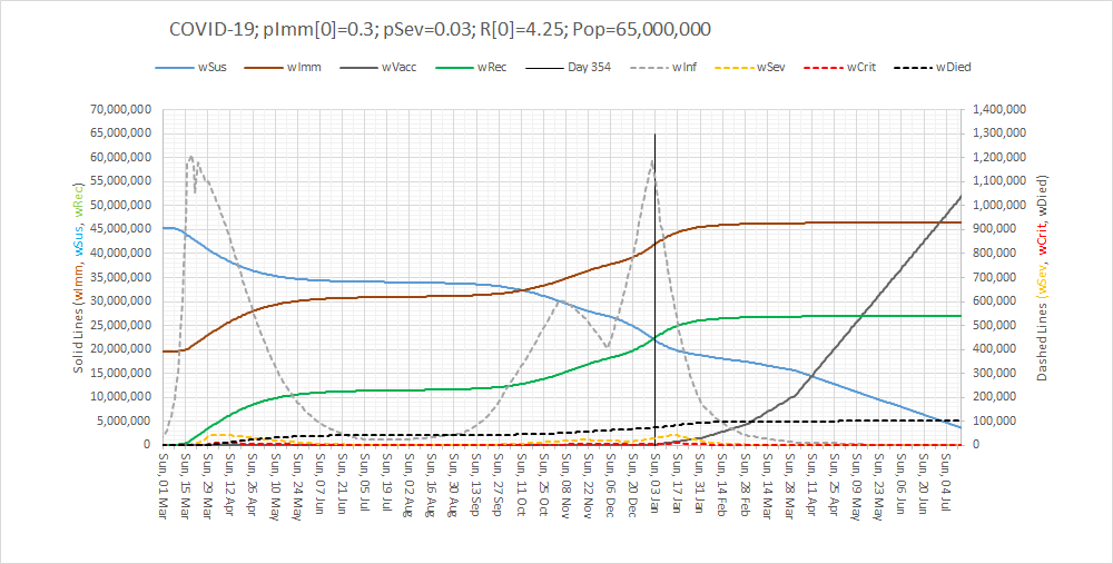
 These were indeed almost identical so I lumped them together as a ‘winter’ group and compared the earlier half with the later half using another BaseLine© feature called segmentation.