Dr Bill Hyde was already at the bar when Bob Jekyll arrived.
Bill and Bob had first met at university and had become firm friends, but their careers had diverged and it was only by pure chance that their paths had crossed again recently.
They had arranged to meet up for a beer and to catch up on what had happened in the 25 years since they had enjoyed the “good old times” in the university bar.
<Dr Bill> Hi Bob, what can I get you? If I remember correctly it was anything resembling real ale. Will this “Black Sheep” do?
<Bob> Hi Bill, Perfect! I’ll get the nibbles. Plain nuts OK for you?
<Dr Bill> My favourite! So what are you up to now? What doors did your engineering degree open?
<Bob> Lots! I’ve done all sorts – mechanical, electrical, software, hardware, process, all except civil engineering. And I love it. What I do now is a sort of synthesis of all of them. And you? Where did your medical degree lead?
<Dr Bill> To my hearts desire, the wonderful Mrs Hyde, and of course to primary care. I am a GP. I always wanted to be a GP since I was knee-high to a grasshopper.
<Bob> Yes, you always had that “I’m going to save the world one patient at a time!” passion. That must be so rewarding! Helping people who are scared witless by the health horror stories that the media pump out. I had a fright last year when I found a lump. My GP was great, she confidently diagnosed a “hernia” and I was all sorted in a matter of weeks with a bit of nifty day case surgery. I was convinced my time had come. It just shows how damaging the fear of the unknown can be!
<Dr Bill> Being a GP is amazingly rewarding. I love my job. But …
<Bob> But what? Are you alright Bill? You suddenly look really depressed.
<Dr Bill> Sorry Bob. I don’t want to be a damp squib. It is good to see you again, and chat about the old days when we were teased about our names. And it is great to hear that you are enjoying your work so much. I admit I am feeling low, and frankly I welcome the opportunity to talk to someone I know and trust who is not part of the health care system. If you know what I mean?
<Bob> I know exactly what you mean. Well, I can certainly offer an ear, “a problem shared is a problem halved” as they say. I can’t promise to do any more than that, but feel free to tell me the story, from the beginning. No blood-and-guts gory details though please!
<Dr Bill> Ha! “Tell me the story from the beginning” is what I say to my patients. OK, here goes. I feel increasingly overwhelmed and I feel like I am drowning under a deluge of patients who are banging on the practice door for appointments to see me. My intuition tells me that the problem is not the people, it is the process, but I can’t seem to see through the fog of frustration and chaos to a clear way forward.
<Bob> OK. I confess I know nothing about how your system works, so can you give me a bit more context.
<Dr Bill> Sorry. Yes, of course. I am what is called a single-handed GP and I have a list of about 1500 registered patients and I am contracted to provide primary care for them. I don’t have to do that 24 x 7, the urgent stuff that happens in the evenings and weekends is diverted to services that are designed for that. I work Monday to Friday from 9 AM to 5 PM, and I am contracted to provide what is needed for my patients, and that means face-to-face appointments.
<Bob> OK. When you say “contracted” what does that mean exactly?
<Dr Bill> Basically, the St. Elsewhere’s® Practice is like a small business. It’s annual income is a fixed amount per year for each patient on the registration list, and I have to provide the primary care service for them from that pot of cash. And that includes all the costs, including my income, our practice nurse, and the amazing Mrs H. She is the practice receptionist, manager, administrator and all-round fixer-of-anything.
<Bob> Wow! What a great design. No need to spend money on marketing, research, new product development, or advertising! Just 100% pure service delivery of tried-and-tested medical know-how to a captive audience for a guaranteed income. I have commercial customers who would cut off their right arms for an offer like that!
<Dr Bill> Really? It doesn’t feel like that to me. It feels like the more I offer, the more the patients expect. The demand is a bottomless well of wants, but the income is capped and my time is finite!
<Bob> H’mm. Tell me more about the details of how the process works.
<Dr Bill> Basically, I am a problem-solving engine. Patients phone for an appointment, Mrs H books one, the patient comes at the appointed time, I see them, and I diagnose and treat the problem, or I refer on to a specialist if it’s more complicated. That’s basically it.
<Bob> OK. Sounds a lot simpler than 99% of the processes that I’m usually involved with. So what’s the problem?
<Dr Bill> I don’t have enough capacity! After all the appointments for the day are booked Mrs H has to say “Sorry, please try again tomorrow” to every patient who phones in after that. The patients who can’t get an appointment are not very happy and some can get quite angry. They are anxious and frustrated and I fully understand how they feel. I feel the same.
<Bob> We will come back to what you mean by “capacity”. Can you outline for me exactly how a patient is expected to get an appointment?
<Dr Bill> We tell them to phone at 8 AM for an appointment, there is a fixed number of bookable appointments, and it is first-come-first-served. That is the only way I can protect myself from being swamped and is the fairest solution for patients. It wasn’t my idea; it is called Advanced Access. Each morning at 8 AM we switch on the phones and brace ourselves for the daily deluge.
<Bob> You must be pulling my leg! This design is a batch-and-queue phone-in appointment booking lottery! I guess that is one definition of “fair”. How many patients get an appointment on the first attempt?
<Dr Bill> Not many. The appointments are usually all gone by 9 AM and a lot are to people who have been trying to get one for several days. When they do eventually get to see me they are usually grumpy and then spring the trump card “And while I’m here doctor I have a few other things that I’ve been saving up to ask you about“. I help if I can but more often than not I have to say, “I’m sorry, you’ll have to book another appointment!“.
<Bob> I’m not surprised you patients are grumpy. I would be too. And my recollection of seeing my GP with my scary lump wasn’t like that at all. I phoned at lunch time and got an appointment the same day. Maybe I was just lucky, or maybe my GP was as worried as me. But it all felt very calm. When I arrived there was only one other patient waiting, and I was in and out in less than ten minutes – and mightily reassured I can tell you! It felt like a high quality service that I could trust if-and-when I needed it, which fortunately is very infrequently.
<Dr Bill> I dream of being able to offer a service like that! I am prepared to bet you are registered with a group practice and you see whoever is available rather than your own GP. Single-handed GPs like me who offer the old fashioned personal service are a rarity, and I can see why. We must be suckers!
<Bob> OK, so I’m starting to get a sense of this now. Has it been like this for a long time?
<Dr Bill> Yes, it has. When I was younger I was more resilient and I did not mind going the extra mile. But the pressure is relentless and maybe I’m just getting older and grumpier. My real fear is I end up sounding like the burned-out cynics that I’ve heard at the local GP meetings; the ones who crow about how they are counting down the days to when they can retire and gloat.
<Bob> You’re the same age as me Bill so I don’t think either of us can use retirement as an exit route, and anyway, that’s not your style. You were never a quitter at university. Your motto was always “when the going gets tough the tough get going“.
<Dr Bill> Yeah I know. That’s why it feels so frustrating. I think I lost my mojo a long time back. Maybe I should just cave in and join up with the big group practice down the road, and accept the inevitable loss of the personal service. They said they would welcome me, and my list of 1500 patients, with open arms.
<Bob> OK. That would appear to be an option, or maybe a compromise, but I’m not sure we’ve exhausted all the other options yet. Tell me, how do you decide how long a patient needs for you to solve their problem?
<Dr Bill> That’s easy. It is ten minutes. That is the time recommended in the Royal College Guidelines.
<Bob> Eh? All patients require exactly ten minutes?
<Dr Bill> No, of course not! That is the average time that patients need. The Royal College did a big survey and that was what most GPs said they needed.
<Bob> Please tell me if I have got this right. You work 9-to-5, and you carve up your day into 10-minute time-slots called “appointments” and, assuming you are allowed time to have lunch and a pee, that would be six per hour for seven hours which is 42 appointments per day that can be booked?
<Dr Bill> No. That wouldn’t work because I have other stuff to do as well as see patients. There are only 25 bookable 10-minute appointments per day.
<Bob> OK, that makes more sense. So where does 25 come from?
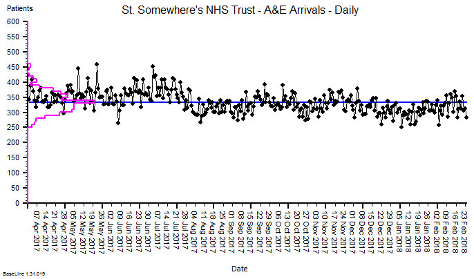
<Dr Bill> Ah! That comes from a big national audit. For an average GP with and average list of 1,500 patients, the average number of patients seeking an appointment per day was found to be 25, and our practice population is typical of the national average in terms of age and deprivation. So I set the upper limit at 25. The workload is manageable but it seems to generate a lot of unhappy patients and I dare not increase the slots because I’d be overwhelmed with the extra workload and I’m barely coping now. I feel stuck between a rock and a hard place!
<Bob> So you have set the maximum slot-capacity to the average demand?
<Dr Bill> Yes. That’s OK isn’t it? It will average out over time. That is what average means! But it doesn’t feel like that. The chaos and pressure never seems to go away.
There was a long pause while Bob mulls over what he had heard, sips his pint of Black Sheep and nibbles on the dwindling bowl of peanuts. Eventually he speaks.
<Bob> Bill, I have some good news and some not-so-good news and then some more good news.
<Dr Bill> Oh dear, you sound just like me when I have to share the results of tests with one of my patients at their follow up appointment. You had better give me the “bad news sandwich”!
<Bob> OK. The first bit of good news is that this is a very common, and easily treatable flow problem. The not-so-good news is that you will need to change some things. The second bit of good news is that the changes will not cost anything and will work very quickly.
<Dr Bill> What! You cannot be serious!! Until ten minutes ago you said that you knew nothing about how my practice works and now you are telling me that there is a quick, easy, zero cost solution. Forgive me for doubting your engineering know-how but I’ll need a bit more convincing than that!
<Bob> And I would too if I were in your position. The clues to the diagnosis are in the story. You said the process problem was long-standing; you said that you set the maximum slot-capacity to the average demand; and you said that you have a fixed appointment time that was decided by a subjective consensus. From an engineering perspective, this is a perfect recipe for generating chronic chaos, which is exactly the symptoms you are describing.
<Dr Bill> Is it? OMG. You said this is well understood and resolvable? So what do I do?
<Bob> Give me a minute. You said the average demand is 25 per day. What sort of service would you like your patients to experience? Would “90% can expect a same day appointment on the first call” be good enough as a starter?
<Dr Bill> That would be game changing! Mrs H would be over the moon to be able to say “Yes” that often. I would feel much less anxious too, because I know the current system is a potentially dangerous lottery. And my patients would be delighted and relieved to be able to see me that easily and quickly.
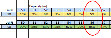
<Bob> OK. Let me work this out. Based on what you’ve said, some assumptions, and a bit of flow engineering know-how; you would need to offer up to 31 appointments per day.
<Dr Bill> What! That’s impossible!!! I told you it would be impossible! That would be another hour a day of face-to-face appointments. When would I do the other stuff? And how did you work that out anyway?
<Bob> I did not say they would have to all be 10-minute appointments, and I did not say you would expect to fill them all every day. I did however say you would have to change some things. And I did say this is a well understood flow engineering problem. It is called “resilience design“. That’s how I was able to work it out on the back of this Black Sheep beer mat.
<Dr Bill> H’mm. That is starting to sound a bit more reasonable. What things would I have to change? Specifically?
<Bob> I’m not sure what specifically yet. I think in your language we would say “I have taken a history, and I have a differential diagnosis, so next I’ll need to examine the patient, and then maybe do some tests to establish the actual diagnosis and to design and decide the treatment plan“.
<Dr Bill> You are learning the medical lingo fast! What do I need to do first? Brace myself for the forensic rubber-gloved digital examination?
<Bob> Alas, not yet and certainly not here. Shall we start with the vital signs? Height, weight, pulse, blood pressure, and temperature? That’s what my GP did when I went with my scary lump. The patient here is not you, it is your St. Elsewhere’s® Practice, and we will need to translate the medical-speak into engineering-speak. So one thing you’ll need to learn is a bit of the lingua-franca of systems engineering. By the way, that’s what I do now. I am a systems engineer, or maybe now a health care systems engineer?
<Dr Bill> Point me in the direction of the HCSE dictionary! The next round is on me. And the nuts!
<Bob> Excellent. I’ll have another Black Sheep and some of those chilli-coated ones. We have work to do. Let me start by explaining what “capacity” actually means to an engineer. Buckle up. This ride might get a bit bumpy.
This story is fictional, but the subject matter is factual.
Bob’s diagnosis and recommendations are realistic and reasonable.
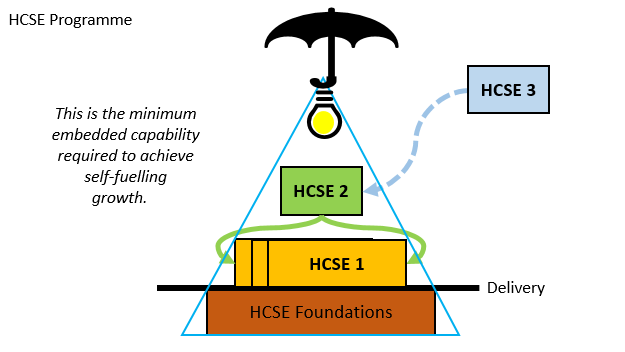
Chapter 1 of the HCSE dictionary can be found here.
And if you are a GP who recognises these “symptoms” then this may be of interest.


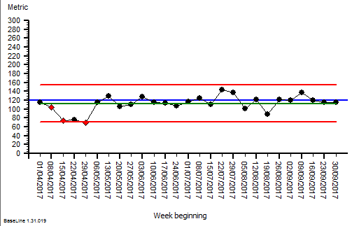
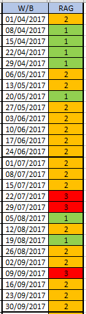 The quarterly target I need to stay below is 120 and my weekly RAG chart is set to show green when less than 108 (10% below target) and red when more than 132 (10% above target) because I know there is quite a lot of random week-to-week variation.
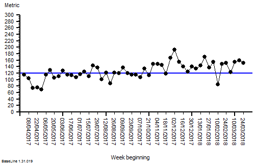