Survival of the Fittest

business_race__PA_150_wht_3222There is a widely held belief that competition is the only way to achieve improvement.

This is a limiting belief.

But our experience tells us that competition is an essential part of improvement!

So which is correct?


When two athletes compete they both have to train hard to improve their individual performance. The winner of the race is the one who improves the most.  So by competing with each other they are forced to improve.

The goal of improvement is excellence and the test-of-excellence is performed in the present and is done by competing with others. The most excellent is labelled the “best” or “winner”. Everyone else is branded “second best” or “loser”.

This is where we start to see the limiting belief of competition.

It has a crippling effect.  Many competitive people will not even attempt the race if they do not feel they can win.  Their limiting belief makes them too fearful. They fear loss of self-esteem. Their ego is too fragile. They value hubris more than humility. And by not taking part they abdicate any opportunity to improve. They remain arrogantly mediocre and blissfully ignorant of it. They are the real losers.


So how can we keep the positive effect of competition and at the same time escape the limiting belief?

There are two ways:

First we drop the assumption that the only valid test of excellence is a comparison of us with others in the present.  And instead we adopt the assumption that it is equally valid to compare us with ourselves in the past.

We can all improve compared with what we used to be. We can all be winners of that race.

And as improvement happens our perspective shifts.  What becomes normal in the present would have been assumed to be impossible in the past.


This week I sat at my desk in a state of wonder.

I held in my hand a small plastic widget about the size of the end of my thumb.  It was a new USB data stick that had just arrived, courtesy of Amazon, and on one side in small white letters it proudly announced that it could hold 64 Gigabytes of data (that is 64 x 1024 x 1024 x 1024). And it cost less than a take-away curry.

About 30 years ago, when I first started to learn how to design, build and program computer system, a memory chip that was about the same size and same cost could hold 4 kilobytes (4 x 1024).  

So in just 30 years we have seen a 16-million-fold increase in data storage capacity. That is astounding! Our collective knowledge of how to design and build memory chips has improved so much. And yet we take it for granted.


The second way to side-step the limiting belief is even more powerful.

It is to drop the belief that individual improvement is enough.

Collective improvement is much, much, much more effective.


Cell_StructureEvidence:

The human body is made up of about 50 trillion (50 x 1000 x 1000 x 1000 x 1000) cells – about the same as the number of bytes could store on 1000 of my wonderful new 64 Gigabyte data sticks!

And each cell is a microscopic living individual. A nano-engineered adaptive system of wondrous complexity and elegance.

Each cell breathes, eats, grows, moves, reproduces, senses, learns and remembers. These cells are really smart too! And they talk to each other, and they learn from each other.

And what makes the human possible is that its community of 50 trillion smart cells are a collaborative community … not a competitive community.

If all our cells started to compete with each other we would be very quickly reduced to soup (which is what the Earth was bathed in for about 2.7 billions years).

The first multi-celled organisms gained a massive survival advantage when they learned how to collaborate.

The rest is the Story of Evolution.  Even Charles Darwin missed the point – evolution is more about collaboration than competition – and we are only now beginning to learn that lesson. The hard way.  


come_join_the_team_150_wht_10876So survival is about learning and improving.

And survival of the fittest does not mean the fittest individual … it means the fittest group.

Collaborative improvement is the process through which we can all achieve win-win-win excellence.

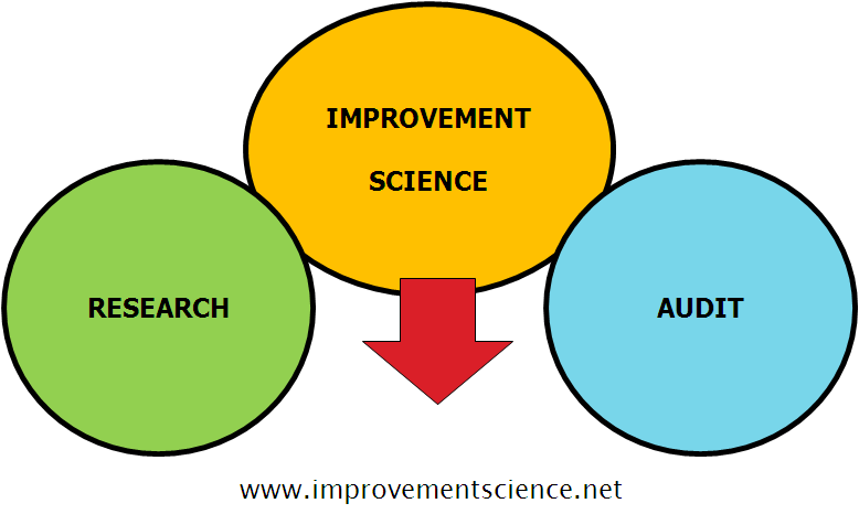
And the understanding of how to do this collaborative improvement has a name … it is called Improvement Science.

Whip or WIP?

smack_head_in_disappointment_150_wht_16653The NHS appears to be suffering from some form of obsessive-compulsive disorder.

OCD sufferers feel extreme anxiety in certain situations. Their feelings drive their behaviour which is to reduce the perceived cause of their feelings. It is a self-sustaining system because their perception is distorted and their actions are largely ineffective. So their anxiety is chronic.

Perfectionists demonstrate a degree of obsessive-compulsive behaviour too.


In the NHS the triggers are called ‘targets’ and usually take the form of failure metrics linked to arbitrary performance specifications.

The anxiety is the fear of failure and its unpleasant consequences: the name-shame-blame-game.


So a veritable industry has grown around ways to mitigate the fear. A very expensive and only partially effective industry.

Data is collected, cleaned, manipulated and uploaded to the Mothership (aka NHS England). There it is further manipulated, massaged and aggregated. Then the accumulated numbers are posted on-line, every month for anyone with a web-browser to scrutinise and anyone with an Excel spreadsheet to analyse.

An ocean of measurements is boiled and distilled into a few drops of highly concentrated and sanitized data and, in the process, most of the useful information is filtered out, deleted or distorted.


For example …

One of the failure metrics that sends a shiver of angst through a Chief Operating Officer (COO) is the failure to deliver the first definitive treatment for any patient within 18 weeks of referral from a generalist to a specialist.

The infamous and feared 18-week target.

Service providers, such as hospitals, are actually fined by their Clinical Commissioning Groups (CCGs) for failing to deliver-on-time. Yes, you heard that right … one NHS organisation financially penalises another NHS organisation for failing to deliver a result over which they have only partial control.

Service providers do not control how many patients are referred, or a myriad of other reasons that delay referred patients from attending appointments, tests and treatments. But the service providers are still accountable for the outcome of the whole process.

This ‘Perform-or-Pay-The-Price Policy‘ creates the perfect recipe for a lot of unhappiness for everyone … which is exactly what we hear and what we see.


So what distilled wisdom does the Mothership share? Here is a snapshot …

RTT_Data_Snapshot

Q1: How useful is this table of numbers in helping us to diagnose the root causes of long waits, and how does it help us to decide what to change in our design to deliver a shorter waiting time and more productive system?

A1: It is almost completely useless (in this format).


So what actually happens is that the focus of management attention is drawn to the part just before the speed camera takes the snapshot … the bit between 14 and 18 weeks.

Inside that narrow time-window we see a veritable frenzy of target-failure-avoiding behaviour.

Clinical priority is side-lined and management priority takes over.  This is a management emergency! After all, fines-for-failure are only going to make the already bad financial situation even worse!

The outcome of this fire-fighting is that the bigger picture is ignored. The focus is on the ‘whip’ … and avoiding it … because it hurts!


Message from the Mothership:    “Until morale improves the beatings will continue”.


The good news is that the undigestible data liquor does harbour some very useful insights.  All we need to do is to present it in a more palatable format … as pictures of system behaviour over time.

We need to use the data to calculate the work-in-progress (=WIP).

And then we need to plot the WIP in time-order so we can see how the whole system is behaving over time … how it is changing and evolving. It is a dynamic living thing, it has vitality.

So here is the WIP chart using the distilled wisdom from the Mothership.

RTT_WIP_RunChart

And this picture does not require a highly trained data analyst or statistician to interpret it for us … a Mark I eyeball linked to 1.3 kg of wetware running ChimpOS 1.0 is enough … and if you are reading this then you must already have that hardware and software.

Two patterns are obvious:

1) A cyclical pattern that appears to have an annual frequency, a seasonal pattern. The WIP is higher in the summer than in the winter. Eh? What is causing that?

2) After an initial rapid fall in 2008 the average level was steady for 4 years … and then after March 2012 it started to rise. Eh? What is causing is that?

The purpose of a WIP chart is to stimulate questions such as:

Q1: What happened in March 2012 that might have triggered this change in system behaviour?

Q2: What other effects could this trigger have caused and is there evidence for them?


A1: In March 2012 the Health and Social Care Act 2012 became Law. In the summer of 2012 the shiny new and untested Clinical Commissioning Groups (CCGs) were authorised to take over the reins from the exiting Primary care Trusts (PCTs) and Strategic Health Authorities (SHAs). The vast £80bn annual pot of tax-payer cash was now in the hands of well-intended GPs who believed that they could do a better commissioning job than non-clinicians. The accountability for outcomes had been deftly delegated to the doctors.  And many of the new CCG managers were the same ones who had collected their redundancy checks when the old system was shut down. Now that sounds like a plausible system-wide change! A massive political experiment was underway and the NHS was the guinea-pig.

A2: Another NHS failure metric is the A&E 4-hour wait target which, worringly, also shows a deterioration that appears to have started just after July 2010, i.e. just after the new Government was elected into power.  Maybe that had something to do with it? Maybe it would have happened whichever party won at the polls.

A&E_Breaches_2004-15

A plausible temporal association does not constitute proof – and we cannot conclude a political move to a CCG-led NHS has caused the observed behaviour. Retrospective analysis alone is not able to establish the cause.

It could just as easily be that something else caused these behaviours. And it is important to remember that there are usually many causal factors combining together to create the observed effect.

And unraveling that Gordian Knot is the work of analysts, statisticians, economists, historians, academics, politicians and anyone else with an opinion.


We have a more pressing problem. We have a deteriorating NHS that needs urgent resuscitation!


So what can we do?

One thing we can do immediately is to make better use of our data by presenting it in ways that are easier to interpret … such as a work in progress chart.

Doing that will trigger different conversions; ones spiced with more curiosity and laced with less cynicism.

We can add more context to our data to give it life and meaning. We can season it with patient and staff stories to give it emotional impact.

And we can deepen our understanding of what causes lead to what effects.

And with that deeper understanding we can begin to make wiser decisions that will lead to more effective actions and better outcomes.

This is all possible. It is called Improvement Science.


And as we speak there is an experiment running … a free offer to doctors-in-training to learn the foundations of improvement science in healthcare (FISH).

In just two weeks 186 have taken up that offer and 13 have completed the course!

And this vanguard of curious and courageous innovators have discovered a whole new world of opportunity that they were completely unaware of before. But not anymore!

So let us ease off applying the whip and ease in the application of WIP.


PostScript

Here is a short video describing how to create, animate and interpret a form of diagnostic Vitals Chart® using the raw data published by NHS England.  This is a training exercise from the Improvement Science Practitioner (level 2) course.

How to create an 18 weeks animated Bucket Brigade Chart (BBC)

The Bit In The Middle

RIA_graphicA question that is often asked by doctors in particular is “What is the difference between Research, Audit and Improvement Science?“.

It is a very good question and the diagram captures the essence of the answer.

Improvement science is like a bridge between research and audit.

To understand why that is we first need to ask a different question “What are the purposes of research, improvement science and audit? What do they do?

In a nutshell:

Research provides us with new knowledge and tells us what the right stuff is.
Improvement Science provides us with a way to design our system to do the right stuff.
Audit provides us with feedback and tells us if we are doing the right stuff right.


Research requires a suggestion and an experiment to test it.   A suggestion might be “Drug X is better than drug Y at treating disease Z”, and the experiment might be a randomised controlled trial (RCT).  The way this is done is that subjects with disease Z are randomly allocated to two groups, the control group and the study group.  A measure of ‘better’ is devised and used in both groups. Then the study group is given drug X and the control group is given drug Y and the outcomes are compared.  The randomisation is needed because there are always many sources of variation that we cannot control, and it also almost guarantees that there will be some difference between our two groups. So then we have to use sophisticated statistical data analysis to answer the question “Is there a statistically significant difference between the two groups? Is drug X actually better than drug Y?”

And research is often a complicated and expensive process because to do it well requires careful study design, a lot of discipline, and usually large study and control groups. It is an effective way to help us to know what the right stuff is but only in a generic sense.


Audit requires a standard to compare with and to know if what we are doing is acceptable, or not. There is no randomisation between groups but we still need a metric and we still need to measure what is happening in our local reality.  We then compare our local experience with the global standard and, because variation is inevitable, we have to use statistical tools to help us perform that comparison.

And very often audit focuses on avoiding failure; in other words the standard is a ‘minimum acceptable standard‘ and as long as we are not failing it then that is regarded as OK. If we are shown to be failing then we are in trouble!

And very often the most sophisticated statistical tool used for audit is called an average.  We measure our performance, we average it over a period of time (to remove the troublesome variation), and we compare our measured average with the minimum standard. And if it is below then we are in trouble and if it is above then we are not.  We have no idea how reliable that conclusion is though because we discounted any variation.


A perfect example of this target-driven audit approach is the A&E 95% 4-hour performance target.

The 4-hours defines the metric we are using; the time interval between a patient arriving in A&E and them leaving. It is called a lead time metric. And it is easy to measure.

The 95% defined the minimum  acceptable average number of people who are in A&E for less than 4-hours and it is usually aggregated over three months. And it is easy to measure.

So, if about 200 people arrive in a hospital A&E each day and we aggregate for 90 days that is about 18,000 people in total so the 95% 4-hour A&E target implies that we accept as OK for about 900 of them to be there for more than 4-hours.

Do the 900 agree? Do the other 17,100?  Has anyone actually asked the patients what they would like?


The problem with this “avoiding failure” mindset is that it can never lead to excellence. It can only deliver just above the minimum acceptable. That is called mediocrity.  It is perfectly possible for a hospital to deliver 100% on its A&E 4 hour target by designing its process to ensure every one of the 18,000 patients is there for exactly 3 hours and 59 minutes. It is called a time-trap design.

We can hit the target and miss the point.

And what is more the “4-hours” and the “95%” are completely arbitrary numbers … there is not a shred of research evidence to support them.

So just this one example illustrates the many problems created by having a gap between research and audit.


And that is why we need Improvement Science to help us to link them together.

We need improvement science to translate the global knowledge and apply it to deliver local improvement in whatever metrics we feel are most important. Safety metrics, flow metrics, quality metrics and productivity metrics. Simultaneously. To achieve system-wide excellence. For everyone, everywhere.

When we learn Improvement Science we learn to measure how well we are doing … we learn the power of measurement of success … and we learn to avoid averaging because we want to see the variation. And we still need a minimum acceptable standard because we want to exceed it 100% of the time. And we want continuous feedback on just how far above the minimum acceptable standard we are. We want to see how excellent we are, and we want to share that evidence and our confidence with our patients.

We want to agree a realistic expectation rather than paint a picture of the worst case scenario.

And when we learn Improvement Science we will see very clearly where to focus our improvement efforts.


Improvement Science is the bit in the middle.


Turning the Corner

Nerve_CurveThe emotional journey of change feels like a roller-coaster ride and if we draw as an emotion versus time chart it looks like the diagram above.

The toughest part is getting past the low point called the Well of Despair and doing that requires a combination of inner strength and external support.

The external support comes from an experienced practitioner who has been through it … and survived … and has the benefit of experience and hindsight.

The Improvement Science coach.


What happens as we  apply the IS principles, techniques and tools that we have diligently practiced and rehearsed? We discover that … they work!  And all the fence-sitters and the skeptics see it too.

We start to turn the corner and what we feel next is that the back pressure of resistance falls a bit. It does not go away, it just gets less.

And that means that the next test of change is a bit easier and we start to add more evidence that the science of improvement does indeed work and moreover it is a skill we can learn, demonstrate and teach.

We have now turned the corner of disbelief and have started the long, slow, tough climb through mediocrity to excellence.


This is also a time of risks and there are several to be aware of:

  1. The objective evidence that dramatic improvements in safety, flow, quality and productivity are indeed possible and that the skills can be learned will trigger those most threatened by the change to fight harder to defend their disproved rhetoric. And do not underestimate how angry and nasty they can get!
  2. We can too easily become complacent and believe that the rest will follow easily. It doesn’t.  We may have nailed some of the easier niggles to be sure … but there are much more challenging ones ahead.  The climb to excellence is a steep learning curve … all the way. But the rewards get bigger and bigger as we progress so it is worth it.
  3. We risk over-estimating our capability and then attempting to take on the tougher improvement assignments without the necessary training, practice, rehearsal and support. If we do that we will crash and burn.  It is like a game of snakes and ladders.  Our IS coach is there to help us up the ladders and to point out where the slippery snakes are lurking.

So before embarking on this journey be sure to find a competent IS coach.

They are easy to identify because they will have a portfolio of case studies that they have done themselves. They have the evidence of successful outcomes and that they can walk-the-talk.

And avoid anyone who talks-the-walk but does not have a portfolio of evidence of their own competence. Their Siren song will lure you towards the submerged Rocks of Disappointment and they will disappear like morning mist when you need them most – when it comes to the toughest part – turning the corner. You will be abandoned and fall into the Well of Despair.

So ask your IS coach for credentials, case studies and testimonials and check them out.