 An effective way to improve is to learn from others who have demonstrated the capability to achieve what we seek. To learn from success.
Another effective way to improve is to learn from those who are not succeeding … to learn from failures … and that means … to learn from our own failings.
But from an early age we are socially programmed with a fear of failure.
The training starts at school where failure is not tolerated, nor is challenging the given dogma. Paradoxically, the effect of our fear of failure is that our ability to inquire, experiment, learn, adapt, and to be resilient to change is severely impaired!
So further failure in the future becomes more likely, not less likely. Oops!
Fortunately, we can develop a healthier attitude to failure and we can learn how to harness the gap between intent and impact as a source of energy, creativity, innovation, experimentation, learning, improvement and growing success.
And health care provides us with ample opportunities to explore this unfamiliar terrain. The creative domain of the designer and engineer.
The scatter plot below is a snapshot of the A&E 4 hr target yield for all NHS Trusts in England for the month of July 2016. The required “constitutional” performance requirement is better than 95%. The delivered whole system average is 85%. The majority of Trusts are failing, and the Trust-to-Trust variation is rather wide. Oops!
This stark picture of the gap between intent (95%) and impact (85%) prompts some uncomfortable questions:
Q1: How can one Trust achieve 98% and yet another can do no better than 64%?
Q2: What can all Trusts learn from these high and low flying outliers?
[NB. I have not asked the question “Who should we blame for the failures?” because the name-shame-blame-game is also a predictable consequence of our fear-of-failure mindset.]
Let us dig a bit deeper into the information mine, and as we do that we need to be aware of a trap:
A snapshot-in-time tells us very little about how the system and the set of interconnected parts is behaving-over-time.
We need to examine the time-series charts of the outliers, just as we would ask for the temperature, blood pressure and heart rate charts of our patients.
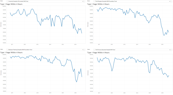
Here are the last six years by month A&E 4 hr charts for a sample of the high-fliers. They are all slightly different and we get the impression that the lower two are struggling more to stay aloft more than the upper two … especially in winter.
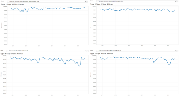
And here are the last six years by month A&E 4 hr charts for a sample of the low-fliers. The Mark I Eyeball Test results are clear … these swans are falling out of the sky!
So we need to generate some testable hypotheses to explain these visible differences, and then we need to examine the available evidence to test them.
One hypothesis is “rising demand”. It says that “the reason our A&E is failing is because demand on A&E is rising“.
Another hypothesis is “slow flow”. It says that “the reason our A&E is failing is because of the slow flow through the hospital because of delayed transfers of care (DTOCs)“.
So, if these hypotheses account for the behaviour we are observing then we would predict that the “high fliers” are (a) diverting A&E arrivals elsewhere, and (b) reducing admissions to free up beds to hold the DTOCs.
Let us look at the freely available data for the highest flyer … the green dot on the scatter gram … code-named “RC9”.
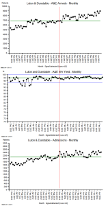 The top chart is the A&E arrivals per month.
The middle chart is the A&E 4 hr target yield per month.
The bottom chart is the emergency admissions per month.
Both arrivals and admissions are increasing, while the A&E 4 hr target yield is rock steady!
And arranging the charts this way allows us to see the temporal patterns more easily (and the images are deliberately arranged to show the overall pattern-over-time).
Patterns like the change-for-the-better that appears in the middle of the winter of 2013 (i.e. when many other trusts were complaining that their sagging A&E performance was caused by “winter pressures”).
The objective evidence seems to disprove the “rising demand”, “slow flow” and “winter pressure” hypotheses!
So what can we learn from our failure to adequately explain the reality we are seeing?
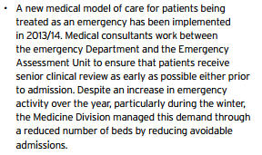
The trust code-named “RC9” is Luton and Dunstable, and it is an average district general hospital, on the surface. So to reveal some clues about what actually happened there, we need to read their Annual Report for 2013-14. It is a public document and it can be downloaded here.
This is just a snippet …
… and there are lots more knowledge nuggets like this in there …
… it is a treasure trove of well-known examples of good system flow design.
The results speak for themselves!
Q: How many black swans does it take to disprove the hypothesis that “all swans are white”.
A: Just one.
“RC9” is a black swan. An outlier. A positive deviant. “RC9” has disproved the “impossibility” hypothesis.
And there is another flock of black swans living in the North East … in the Newcastle area … so the “Big cities are different” hypothesis does not hold water either.
The challenge here is a human one. A human factor. Our learned fear of failure.
Learning-how-to-fail is the way to avoid failing-how-to-learn.
And to read more about that radical idea I strongly recommend reading the recently published book called Black Box Thinking by Matthew Syed.
It starts with a powerful story about the impact of human factors in health care … and here is a short video of Martin Bromiley describing what happened.
The “black box” that both Martin and Matthew refer to is the one that is used in air accident investigations to learn from what happened, and to use that learning to design safer aviation systems.
Martin Bromiley has founded a charity to support the promotion of human factors in clinical training, the Clinical Human Factors Group.
So if we can muster the courage and humility to learn how to do this in health care for patient safety, then we can also learn to how do it for flow, quality and productivity.
Our black swan called “RC9” has demonstrated that this goal is attainable.
And the body of knowledge needed to do this already exists … it is called Health and Social Care Systems Engineering (HSCSE).
For more posts like this please vote here.
For more information please subscribe here.
To email the author please click here.
Postscript: And I am pleased to share that Luton & Dunstable features in the House of Commons Health Committee report entitled Winter Pressures in A&E Departments that was published on 3rd Nov 2016.
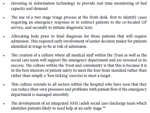
Here is part of what L&D shared to explain their deviant performance:
These points describe rather well the essential elements of a pull design, which is the antidote to the rather more prevalent pressure cooker design.


