Warts-and-All

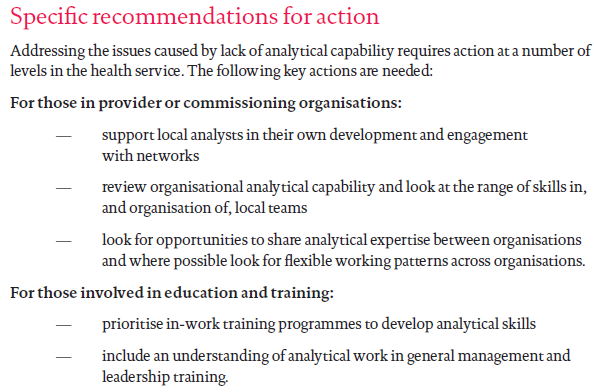
This week saw the publication of a landmark paper – one that will bring hope to many.  A paper that describes the first step of a path forward out of the mess that healthcare seems to be in.  A rational, sensible, practical, learnable and enjoyable path.


This week I also came across an idea that triggered an “ah ha” for me.  The idea is that the most rapid learning happens when we are making mistakes about half of the time.

And when I say ‘making a mistake’ I mean not achieving what we predicted we would achieve because that implies that our understanding of the world is incomplete.  In other words, when the world does not behave as we expect, we have an opportunity to learn and to improve our ability to make more reliable predictions.

And that ability is called wisdom.


When we get what we expect about half the time, and do not get what we expect about the other half of the time, then we have the maximum amount of information that we can use to compare and find the differences.

Was it what we did? Was it what we did not do? What are the acts and errors of commission and omission? What can we learn from those? What might we do differently next time? What would we expect to happen if we do?


And to explore this terrain we need to see the world as it is … warts and all … and that is the subject of the landmark paper that was published this week.


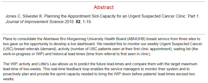
The context of the paper is improvement of cancer service delivery, and specifically of reducing waiting time from referral to first appointment.  This waiting is a time of extreme anxiety for patients who have suspected cancer.

It is important to remember that most people with suspected cancer do not have it, so most of the work of an urgent suspected cancer (USC) clinic is to reassure and to relieve the fear that the spectre of cancer creates.

So, the sooner that reassurance can happen the better, and for the unlucky minority who are diagnosed with cancer, the sooner they can move on to treatment the better.

The more important paragraph in the abstract is the second one … which states that seeing the system behaviour as it is, warts-and-all,  in near-real-time, allows us to learn to make better decisions of what to do to achieve our intended outcomes. Wiser decisions.

And the reason this is the more important paragraph is because if we can do that for an urgent suspected cancer pathway then we can do that for any pathway.


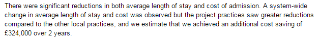
The paper re-tells the first chapter of an emerging story of hope.  A story of how an innovative and forward-thinking organisation is investing in building embedded capability in health care systems engineering (HCSE), and is now delivering a growing dividend.  Much bigger than the investment on every dimension … better safety, faster delivery, higher quality and more affordability. Win-win-win-win.

The only losers are the “warts” – the naysayers and the cynics who claim it is impossible, or too “wicked”, or too difficult, or too expensive.

Innovative reality trumps cynical rhetoric … and the full abstract and paper can be accessed here.

So, well done to Chris Jones and the whole team in ABMU.

And thank you for keeping the candle of hope alight in these dark, stormy and uncertain times for the NHS.

Filter-Pull versus Push-Carveout

It is November 2018, the clocks have changed back to GMT, the trick-and-treats are done, the fireworks light the night skies and spook the hounds, and the seasonal aisles in the dwindling number of high street stores are already stocked for Christmas.

I have been a bit quiet on the blog front this year but that is because there has been a lot happening behind the scenes and I have had to focus.

One output of is the recent publication of an article in Future Healthcare Journal on the topic of health care systems engineering (HCSE).  Click here to read the article and the rest of this excellent edition of FHJ that is dedicated to “systems”.

So, as we are back to the winter phase of the annual NHS performance cycle it is a good time to glance at the A&E Performance Radar and see who is doing well, and not-so-well.

Based on past experience, I was expecting Luton to be Top-of-the-Pops and so I was surprised (and delighted) to see that Barnsley have taken the lead.  And the chart shows that Barnsley has turned around a reasonable but sagging performance this year.

So I would be asking “What has happened at Barnsley that we can all learn from? What did you change and how did you know what and how to do that?

To be sure, Luton is still in the top three and it is interesting to explore who else is up there and what their A&E performance charts look like.

The data is all available for anyone with a web-browser to view – here.

For completeness, this is the chart for Luton, and we can see that, although the last point is lower than Barnsley, the performance-over-time is more consistent and less variable. So who is better?

NB. This is a meaningless question and illustrates the unhelpful tactic of two-point comparisons with others, and with oneself. The better question is “Is my design fit-for-purpose?”

The question I have for Luton is different. “How do you achieve this low variation and how do you maintain it? What can we all learn from you?”

And I have some ideas how they do that because in a recent HSJ interview they said “It is all about the filters“.


What do they mean by filters?

A filter is an essential component of any flow design if we want to deliver high safety, high efficiency, high effectiveness, and high productivity.  In other words, a high quality, fit-4-purpose design.

And the most important flow filters are the “upstream” ones.

The design of our upstream flow filters is critical to how the rest of the system works.  Get it wrong and we can get a spiralling decline in system performance because we can unintentionally trigger a positive feedback loop.

Queues cause delays and chaos that consume our limited resources.  So, when we are chasing cost improvement programme (CIP) targets using the “salami slicer” approach, and combine that with poor filter design … we can unintentionally trigger the perfect storm and push ourselves over the catastrophe cliff into perpetual, dangerous and expensive chaos.

If we look at the other end of the NHS A&E league table we can see typical examples that illustrate this pattern.  I have used this one only because it happens to be bottom this month.  It is not unique.

All other NHS trusts fall somewhere between these two extremes … stable, calm and acceptable and unstable, chaotic and unacceptable.

Most display the stable and chaotic combination – the “Zone of Perpetual Performance Pain”.

So what is the fundamental difference between the outliers that we can all learn from? The positive deviants like Barnsley and Luton, and the negative deviants like Blackpool.  I ask this because comparing the extremes is more useful than laboriously exploring the messy, mass-mediocrity in the middle.

An effective upstream flow filter design is a necessary component, but it is not sufficient. Triage (= French for sorting) is OK but it is not enough.  The other necessary component is called “downstream pull” and omitting that element of the design appears to be the primary cause of the chronic chaos that drags trusts and their staff down.

It is not just an error of omission though, the current design is an actually an error of commission. It is anti-pull; otherwise known as “push”.


This year I have been busy on two complicated HCSE projects … one in secondary care and the other in primary care.  In both cases the root cause of the chronic chaos is the same.  They are different systems but have the same diagnosis.  What we have revealed together is a “push-carveout” design which is the exact opposite of the “upstream-filter-plus-downstream-pull” design we need.

And if an engineer wanted to design a system to be chronically chaotic then it is very easy to do. Here is the recipe:

a) Set high average utilisation target of all resources as a proxy for efficiency to ensure everything is heavily loaded. Something between 80% and 100% usually does the trick.

b) Set a one-size-fits-all delivery performance target that is not currently being achieved and enforce it punitively.  Something like “>95% of patients seen and discharged or admitted in less than 4 hours, or else …”.

c) Divvy up the available resources (skills, time, space, cash, etc) into ring-fenced pots.

Chronic chaos is guaranteed.  The Laws of Physics decree it.


Unfortunately, the explanation of why this is the case is counter-intuitive, so it is actually better to experience it first, and then seek the explanation.  Reality first, reasoning second.

And, it is a bittersweet experience, so it needs to be done with care and compassion.

And that’s what I’ve been busy doing this year. Creating the experiences and then providing the explanations.  And if done gradually what then happens is remarkable and rewarding.

The FHJ article outlines one validated path to developing individual and organisational capability in health care systems engineering.

Diagnose-Design-Deliver

A story was shared this week.

A story of hope for the hard-pressed NHS, its patients, its staff and its managers and its leaders.

A story that says “We can learn how to fix the NHS ourselves“.

And the story comes with evidence; hard, objective, scientific, statistically significant evidence.


The story starts almost exactly three years ago when a Clinical Commissioning Group (CCG) in England made a bold strategic decision to invest in improvement, or as they termed it “Achieving Clinical Excellence” (ACE).

They invited proposals from their local practices with the “carrot” of enough funding to allow GPs to carve-out protected time to do the work.  And a handful of proposals were selected and financially supported.

This is the story of one of those proposals which came from three practices in Sutton who chose to work together on a common problem – the unplanned hospital admissions in their over 70’s.

Their objective was clear and measurable: “To reduce the cost of unplanned admissions in the 70+ age group by working with hospital to reduce length of stay.

Did they achieve their objective?

Yes, they did.  But there is more to this story than that.  Much more.


One innovative step they took was to invest in learning how to diagnose why the current ‘system’ was costing what it was; then learning how to design an improvement; and then learning how to deliver that improvement.

They invested in developing their own improvement science skills first.

They did not assume they already knew how to do this and they engaged an experienced health care systems engineer (HCSE) to show them how to do it (i.e. not to do it for them).

Another innovative step was to create a blog to make it easier to share what they were learning with their colleagues; and to invite feedback and suggestions; and to provide a journal that captured the story as it unfolded.

And they measured stuff before they made any changes and afterwards so they could measure the impact, and so that they could assess the evidence scientifically.

And that was actually quite easy because the CCG was already measuring what they needed to know: admissions, length of stay, cost, and outcomes.

All they needed to learn was how to present and interpret that data in a meaningful way.  And as part of their IS training,  they learned how to use system behaviour charts, or SBCs.


By Jan 2015 they had learned enough of the HCSE techniques and tools to establish the diagnosis and start to making changes to the parts of the system that they could influence.


Two years later they subjected their before-and-after data to robust statistical analysis and they had a surprise. A big one!

Reducing hospital mortality was not a stated objective of their ACE project, and they only checked the mortality data to be sure that it had not changed.

But it had, and the “p=0.014” part of the statement above means that the probability that this 20.0% reduction in hospital mortality was due to random chance … is less than 1.4%.  [This is well below the 5% threshold that we usually accept as “statistically significant” in a clinical trial.]

But …

This was not a randomised controlled trial.  This was an intervention in a complicated, ever-changing system; so they needed to check that the hospital mortality for comparable patients who were not their patients had not changed as well.

And the statistical analysis of the hospital mortality for the ‘other’ practices for the same patient group, and the same period of time confirmed that there had been no statistically significant change in their hospital mortality.

So, it appears that what the Sutton ACE Team did to reduce length of stay (and cost) had also, unintentionally, reduced hospital mortality. A lot!


And this unexpected outcome raises a whole raft of questions …


If you would like to read their full story then you can do so … here.

It is a story of hunger for improvement, of humility to learn, of hard work and of hope for the future.

The Lost Tribe

figures_lost_looking_at_map_anim_150_wht_15601

“Jingle Bells, Jingle Bells” announced Bob’s computer as he logged into the Webex meeting with Lesley.

<Bob> Hi Lesley, in case I forget later I’d like to wish you a Happy Christmas and hope that 2017 brings you new opportunity for learning and fun.

<Lesley> Thanks Bob, and I wish you the same. And I believe the blog last week pointed to some.

<Bob> Thank you and I agree;  every niggle is an opportunity for improvement and the “Houston we have a problem!” one is a biggie.

<Lesley> So how do we start on this one? It is massive!

<Bob> The same way we do on all niggles; we diagnose the root cause first. What do you feel they might be?

<Lesley> Well, following it backwards from your niggle, the board reports are created by the data analysts, and they will produce whatever they are asked to. It must be really irritating for them to have their work rubbished!

<Bob> Are you suggesting that they understand the flaws in what they are asked to do but keep quiet?

<Lesley> I am not sure they do, but there is clearly a gap between their intent and their impact. Where would they gain the insight? Do they have access to the sort of training I have am getting?

<Bob> That is a very good question, and until this week I would not have been able to answer, but an interesting report by the Health Foundation was recently published on that very topic. It is entitled “Understanding Analytical Capability In Health Care” and what it says is that there is a lost tribe of data analysts in the NHS.

<Lesley> How interesting! That certainly resonates with my experience.  All the data analysts I know seem to be hidden away behind their computers, caught in the cross-fire between between the boards and the wards, and very sensibly keeping their heads down and doing what they are asked to.

<Bob> That would certainly help to explain what we are seeing! And the good news is that Martin Bardsley, the author of the paper, has interviewed many people across the system, gathered their feedback, and offered some helpful recommendations.  Here is a snippet.

analysiscapability

<Lesley> I like these recommendations, especially the “in-work training programmes” and inclusion “in general management and leadership training“. But isn’t that one of the purposes of the CHIPs training?

<Bob> It is indeed, which is why it is good to see that Martin has specifically recommended it.

saasoftrecommended

<Lesley> Excellent! That means that my own investment in the CHIPs training has just gained in street value and that’s good for my CV. An unexpected early Xmas present. Thank you!

Defensive Reasoning

monkey_on_back_anim_150_wht_11200

About 25 years ago a paper was published in the Harvard Business Review with the interesting title of “Teaching Smart People How To Learn

The uncomfortable message was that many people who are top of the intellectual rankings are actually very poor learners.

This sounds like a paradox.  How can people be high-achievers and yet be unable to learn?


Health care systems are stuffed full of super-smart, high-achieving professionals. The cream of educational crop. The top 2%. They are called “doctors”.

And we have a problem with improvement in health care … a big problem … the safety, delivery, quality and affordability of the NHS is getting worse. Not better.

Improvement implies change and change implies learning, so if smart people struggle to learn then could that explain why health care systems find self-improvement so difficult?

This paragraph from the 1991 HBR paper feels uncomfortably familiar:

defensive_reasoning_2

The author, Chris Argyris, refers to something called “single-loop learning” and if we translate this management-speak into the language of medicine it would come out as “treating the symptom and ignoring the disease“.  That is poor medicine.

Chris also suggests an antidote to this problem and gave it the label “double-loop learning” which if translated into medical speak becomes “diagnosis“.  And that is something that doctors can relate to because without a diagnosis, a justifiable treatment is difficult to formulate.


We need to diagnose the root cause(s) of the NHS disease.


The 1991 HBR paper refers back to an earlier 1977 HBR paper called Double Loop Learning in Organisations where we find the theory that underpins it.

The proposed hypothesis is that we all have cognitive models that we use to decide our actions (and in-actions), what I have referred to before as ChimpWare.  In it is a reference to a table published in a 1974 book and the message is that Single-Loop learning is a manifestation of a Model 1 theory-in-action.

defensive_reasoning_models


And if we consider the task that doctors are expected to do then we can empathize with their dominant Model 1 approach.  Health care is a dangerous business.  Doctors can cause a lot of unintentional harm – both physical and psychological.  Doctors are dealing with a very, very complex system – a human body – that they only partially understand.  No two patients are exactly the same and illness is a dynamic process.  Everyone’s expectations are high. We have come a long way since the days of blood-letting and leeches!  Failure is not tolerated.

Doctors are intelligent and competitive … they had to be to win the education race.

Doctors must make tough decisions and have to have tough conversations … many, many times … and yet not be consumed in the process.  They often have to suppress emotions to be effective.

Doctors feel the need to protect patients from harm – both physical and emotional.

And collectively they do a very good job.  Doctors are respected and trusted professionals.


But …  to quote Chris Argyris …

“Model I blinds people to their weaknesses. For instance, the six corporate presidents were unable to realize how incapable they were of questioning their assumptions and breaking through to fresh understanding. They were under the illusion that they could learn, when in reality they just kept running around the same track.”

This blindness is self-reinforcing because …

“All parties withheld information that was potentially threatening to themselves or to others, and the act of cover-up itself was closed to discussion.”


How many times have we seen this in the NHS?

The Mid-Staffordshire Hospital debacle that led to the Francis Report is all the evidence we need.


So what is the way out of this double-bind?

Chris gives us some hints with his Model II theory-in-use.

  1. Valid information – Study.
  2. Free and informed choice – Plan.
  3. Constant monitoring of the implementation – Do.

The skill required is to question assumptions and break through to fresh understanding and we can do that with design-led approach because that is what designers do.

They bring their unconscious assumptions up to awareness and ask “Is that valid?” and “What if” questions.

It is called Improvement-by-Design.

And the good news is that this Model II approach works in health care, and we know that because the evidence is accumulating.


Undiscussables

Chimp_NoHear_NoSee_NoSpeakLast week I shared a link to Dr Don Berwick’s thought provoking presentation at the Healthcare Safety Congress in Sweden.

Near the end of the talk Don recommended six books, and I was reassured that I already had read three of them. Naturally, I was curious to read the other three.

One of the unfamiliar books was “Overcoming Organizational Defenses” by the late Chris Argyris, a professor at Harvard.  I confess that I have tried to read some of his books before, but found them rather difficult to understand.  So I was intrigued that Don was recommending it as an ‘easy read’.  Maybe I am more of a dimwit that I previously believed!  So fear of failure took over my inner-chimp and I prevaricated. I flipped into denial. Who would willingly want to discover the true depth of their dimwittedness!


Later in the week, I was forwarded a copy of a recently published paper that was on a topic closely related to a key thread in Dr Don’s presentation:

understanding variation.

The paper was by researchers who had looked at the Board reports of 30 randomly selected NHS Trusts to examine how information on safety and quality was being shared and used.  They were looking for evidence that the Trust Boards understood the importance of variation and the need to separate ‘signal’ from ‘noise’ before making decisions on actions to improve safety and quality performance.  This was a point Don had stressed too, so there was a link.

The randomly selected Trust Board reports contained 1488 charts, of which only 88 demonstrated the contribution of chance effects (i.e. noise). Of these, 72 showed the Shewhart-style control charts that Don demonstrated. And of these, only 8 stated how the control limits were constructed (which is an essential requirement for the chart to be meaningful and useful).

That is a validity yield of 8 out of 1488, or 0.54%, which is for all practical purposes zero. Oh dear!


This chance combination of apparently independent events got me thinking.

Q1: What is the reason that NHS Trust Boards do not use these signal-and-noise separation techniques when it has been demonstrated, for at least 12 years to my knowledge, that they are very effective for facilitating improvement in healthcare? (e.g. Improving Healthcare with Control Charts by Raymond G. Carey was published in 2003).

Q2: Is there some form of “organizational defense” system in place that prevents NHS Trust Boards from learning useful ‘new’ knowledge?


So I surfed the Web to learn more about Chris Argyris and to explore in greater depth his concept of Single Loop and Double Loop learning.  I was feeling like a dimwit again because to me it is not a very descriptive title!  I suspect it is not to many others too.

I sensed that I needed to translate the concept into the language of healthcare and this is what emerged.

Single Loop learning is like treating the symptoms and ignoring the disease.

Double Loop learning is diagnosing the underlying disease and treating that.


So what are the symptoms?
The pain of NHS Trust  failure on all dimensions – safety, delivery, quality and productivity (i.e. affordability for a not-for-profit enterprise).

And what are the signs?
The tell-tale sign is more subtle. It’s what is not present that is important. A serious omission. The missing bits are valid time-series charts in the Trust Board reports that show clearly what is signal and what is noise. This diagnosis is critical because the strategies for addressing them are quite different – as Julian Simcox eloquently describes in his latest essay.  If we get this wrong and we act on our unwise decision, then we stand a very high chance of making the problem worse, and demoralizing ourselves and our whole workforce in the process! Does that sound familiar?

And what is the disease?
Undiscussables.  Emotive subjects that are too taboo to table in the Board Room.  And the issue of what is discussable is one of the undiscussables so we have a self-sustaining system.  Anyone who attempts to discuss an undiscussable is breaking an unspoken social code.  Another undiscussable is behaviour, and our social code is that we must not upset anyone so we cannot discuss ‘difficult’ issues.  But by avoiding the issue (the undiscussable disease) we fail to address the root cause and end up upsetting everyone.  We achieve exactly what we are striving to avoid, which is the technical definition of incompetence.  And Chris Argyris labelled this as ‘skilled incompetence’.


Does an apparent lack of awareness of what is already possible fully explain why NHS Trust Boards do not use the tried-and-tested tool called a system behaviour chart to help them diagnose, design and deliver effective improvements in safety, flow, quality and productivity?

Or are there other forces at play as well?

Some deeper undiscussables perhaps?

FrailSafe Design

frailsafeSafe means avoiding harm, and safety is an emergent property of a well-designed system.

Frail means infirm, poorly, wobbly and at higher risk of harm.

So we want our health care system to be a FrailSafe Design.

But is it? How would we know? And what could we do to improve it?


About ten years ago I was involved in a project to improve the safety design of a specific clinical stream flowing through the hospital that I work in.

The ‘at risk’ group of patients were frail elderly patients admitted as an emergency after a fall and who had suffered a fractured thigh bone. The neck of the femur.

Historically, the outcome for these patients was poor.  Many do not survive, and many of the survivors never returned to independent living. They become even more frail.


The project was undertaken during an organisational transition, the hospital was being ‘taken over’ by a bigger one.  This created a window of opportunity for some disruptive innovation, and the project was labelled as a ‘Lean’ one because we had been inspired by similar work done at Bolton some years before and Lean was the flavour of the month.

The actual change was small: it was a flow design tweak that cost nothing to implement.

First we asked two flow questions:
Q1: How many of these high-risk frail patients do we admit a year?
A1: About one per day on average.
Q2: What is the safety critical time for these patients?
A2: The first four days.  The sooner they have hip surgery and are able to be actively mobilise the better their outcome.

Second we applied Little’s Law which showed the average number of patients in this critical phase is four. This was the ‘work in progress’ or WIP.

And we knew that variation is always present, and we knew that having all these patients in one place would make it much easier for the multi-disciplinary teams to provide timely care and to avoid potentially harmful delays.

So we suggested that one six-bedded bay on one of the trauma wards be designated the Fractured Neck Of Femur bay.

That was the flow diagnosis and design done.

The safety design was created by the multi-disciplinary teams who looked after these patients: the geriatricians, the anaesthetists, the perioperative emergency care team (PECT), the trauma and orthopaedic team, the physiotherapists, and so on.

They designed checklists to ensure that all #NOF patients got what they needed when they needed it and so that nothing important was left to chance.

And that was basically it.

And the impact was remarkable. The stream flowed. And one measured outcome was a dramatic and highly statistically significant reduction in mortality.

Injury_2011_Results
The full paper was published in Injury 2011; 42: 1234-1237.

We had created a FrailSafe Design … which implied that what was happening before was clearly not safe for these frail patients!


And there was an improved outcome for the patients who survived: A far larger proportion rehabilitated and returned to independent living, and a far smaller proportion required long-term institutional care.

By learning how to create and implement a FrailSafe Design we had added both years-to-life and life-to-years.

It cost nothing to achieve and the message was clear, as this quote is from the 2011 paper illustrates …

Injury_2011_Message

What was a bit disappointing was the gap of four years between delivering this dramatic and highly significant patient safety and quality improvement and the sharing of the story.


What is more exciting is that the concept of FrailSafe is growing, evolving and spreading.

The Cost of Chaos

british_pound_money_three_bundled_stack_400_wht_2425This week I conducted an experiment – on myself.

I set myself the challenge of measuring the cost of chaos, and it was tougher than I anticipated it would be.

It is easy enough to grasp the concept that fire-fighting to maintain patient safety amidst the chaos of healthcare would cost more in terms of tears and time …

… but it is tricky to translate that concept into hard numbers; i.e. cash.


Chaos is an emergent property of a system.  Safety, delivery, quality and cost are also emergent properties of a system. We can measure cost, our finance departments are very good at that. We can measure quality – we just ask “How did your experience match your expectation”.  We can measure delivery – we have created a whole industry of access target monitoring.  And we can measure safety by checking for things we do not want – near misses and never events.

But while we can feel the chaos we do not have an easy way to measure it. And it is hard to improve something that we cannot measure.


So the experiment was to see if I could create some chaos, then if I could calm it, and then if I could measure the cost of the two designs – the chaotic one and the calm one.  The difference, I reasoned, would be the cost of the chaos.

And to do that I needed a typical chunk of a healthcare system: like an A&E department where the relationship between safety, flow, quality and productivity is rather important (and has been a hot topic for a long time).

But I could not experiment on a real A&E department … so I experimented on a simplified but realistic model of one. A simulation.

What I discovered came as a BIG surprise, or more accurately a sequence of big surprises!

  1. First I discovered that it is rather easy to create a design that generates chaos and danger.  All I needed to do was to assume I understood how the system worked and then use some averaged historical data to configure my model.  I could do this on paper or I could use a spreadsheet to do the sums for me.
  2. Then I discovered that I could calm the chaos by reactively adding lots of extra capacity in terms of time (i.e. more staff) and space (i.e. more cubicles).  The downside of this approach was that my costs sky-rocketed; but at least I had restored safety and calm and I had eliminated the fire-fighting.  Everyone was happy … except the people expected to foot the bill. The finance director, the commissioners, the government and the tax-payer.
  3. Then I got a really big surprise!  My safe-but-expensive design was horribly inefficient.  All my expensive resources were now running at rather low utilisation.  Was that the cost of the chaos I was seeing? But when I trimmed the capacity and costs the chaos and danger reappeared.  So was I stuck between a rock and a hard place?
  4. Then I got a really, really big surprise!!  I hypothesised that the root cause might be the fact that the parts of my system were designed to work independently, and I was curious to see what happened when they worked interdependently. In synergy. And when I changed my design to work that way the chaos and danger did not reappear and the efficiency improved. A lot.
  5. And the biggest surprise of all was how difficult this was to do in my head; and how easy it was to do when I used the theory, techniques and tools of Improvement-by-Design.

So if you are curious to learn more … I have written up the full account of the experiment with rationale, methods, results, conclusions and references and I have published it here.

The Improvement Pyramid

IS_PyramidDeveloping productive improvement capability in an organisation is like building a pyramid in the desert.

It is not easy and it takes time before there is any visible evidence of success.

The height of the pyramid is a measure of the level of improvement complexity that we can take on.

An improvement of a single step in a system would only require a small pyramid.

Improving the whole system will require a much taller one.


But if we rush and attempt to build a sky-scraper on top of the sand then we will not be surprised when it topples over before we have made very much progress.  The Egyptians knew this!

First, we need to dig down and to lay some foundations.  Stable enough and strong enough to support the whole structure.  We will never see the foundations so it is easy to forget them in our rush but they need to be there and they need to be there first.

It is the same when developing improvement science capability  … the foundations are laid first and when enough of that foundation knowledge is in place we can start to build the next layer of the pyramid: the practitioner layer.


It is the the Improvement Science Practitioners (ISPs) who start to generate tangible evidence of progress.  The first success stories help to spur us all on to continue to invest effort, time and money in widening our foundations to be able to build even higher – more layers of capability -until we can realistically take on a system wide improvement challenge.

So sharing the first hard evidence of improvement is an important milestone … it is proof of fitness for purpose … and that news should be shared with those toiling in the hot desert sun and with those watching from the safety of the shade.

So here is a real story of a real improvement pyramid achieving this magical and motivating milestone.


The Journal of Improvement Science

Improvement Science encompasses research, improvement and audit and includes both subjective and objective dimensions.  An essential part of collective improvement is sharing our questions and learning with others.

From the perspective of the learner it is necessary to be able to trust that what is shared is valid and from the perspective of the questioner it is necessary to be able to challenge with respect.

Sharing new knowledge is not the only purpose of publication: for academic organisations it is also a measure of performance so there is a academic peer pressure to publish both quantity and quality – an academic’s career progression depends on it.

This pressure has created a whole industry of its own – the academic journal – and to ensure quality is maintained it has created the scholastic peer review process.  The  intention is to filter submitted papers and to only publish those that are deemed worthy – those that are believed by the experts to be of most value and of highest quality.

There are several criteria that editors instruct their volunteer “independent reviewers” to apply such as originality, relevance, study design, data presentation and balanced discussion.  This process was designed over a hundred years ago and it has stood the test of time – but – it was designed specifically for research and before the invention of the Internet, of social media and the emergence of Improvement Science.

So fast-forward to the present and to a world where improvement is now seen to  be complementary to research and audit; where time-series statistics is viewed as a valid and complementary data analysis method; and where we are all able to globally share information with each other and learn from each other in seconds through the medium of modern electronic communication.

Given these changes is the traditional academic peer review journal system still fit for purpose?

One way to approach this question is from the perspective of the customers of the system – the people who read the published papers and the people who write them.  What niggles do they have that might point to opportunities for improvement?

Well, as a reader:

My first niggle is to have to pay a large fee to download an electronic copy of a published paper before I can read it. All I can see is the abstract which does not tell me what I really want to know – I want to see the details of the method and the data not just the authors edited highlights and conclusions.

My second niggle is the long lead time between the work being done and the paper being published – often measured in years!  This implies that the published news is old news  useful for reference maybe but useless for stimulating conversation and innovation.

My third niggle is what is not published.  The well-designed and well-conducted studies that have negative outcomes; lessons that offer as much opportunity for learning as the positive ones.  This is not all – many studies are never done or never published because the outcome might be perceived to adversely affect a commercial or “political” interest.

My fourth niggle is the almost complete insistence on the use of empirical data and comparative statistics – data from simulation studies being treated as “low-grade” and the use of time-series statistics as “invalid”.  Sometimes simulations and uncontrolled experiments are the only feasible way to answer real-world questions and there is more to improvement than a RCT (randomised controlled trial).

From the perspective of an author of papers I have some additional niggles – the secrecy that surrounds the review process (you are not allowed to know who has reviewed the paper); the lack of constructive feedback that could help an inexperienced author to improve their studies and submissions; and the insistence on assignment of copyright to the publisher – as an author you have to give up ownership of your creative output.

That all said there are many more nuggets to the peer review process than niggles and to a very large extent what is published can be trusted – which cannot be said for the more popular media of news, newspapers, blogs, tweets, and the continuous cacophony of partially informed prejudice, opinion and gossip that goes for “information”.

So, how do we keep the peer-reviewed baby and lose the publication-process bath water? How do we keep the nuggets and dump the niggles?

What about a Journal of Improvement Science along the lines of:

1. Fully electronic, online and free to download – no printed material.
2. Community of sponsors – who publically volunteer to support and assist authors.
3. Continuously updated ranking system – where readers vote for the most useful papers.
4. Authors can revise previously published papers – using feedback from peers and readers.
5. Authors retain the copyright – they can copy and distribute their own papers as much as they like.
6. Expected use of both time-series and comparative statistics where appropriate.
7. Short publication lead times – typically days.
8. All outcomes are publishable – warts and all.
9. Published authors are eligible to be sponsors for future submissions.
10. No commercial sponsorship or advertising.

STOP PRESS: JOIS is now launched: Click here to enter.