
 Last week Bob and Leslie were exploring the data analysis trap called a two-points-in-time comparison: as illustrated by the headline “This winter has not been as bad as last … which proves that our winter action plan has worked.”
Actually it doesn’t.
But just saying that is not very helpful. We need to explain the reason why this conclusion is invalid and therefore potentially dangerous.
So here is the continuation of Bob and Leslie’s conversation.
<Bob> Hi Leslie, have you been reflecting on the two-points-in-time challenge?
<Leslie> Yes indeed, and you were correct, I did know the answer … I just didn’t know I knew if you get my drift.
<Bob> Yes, I do. So, are you willing to share your story?
<Leslie> OK, but before I do that I would like to share what happened when I described what we talked about to some colleagues. They sort of got the idea but got lost in the unfamiliar language of ‘variance’ and I realized that I needed an example to illustrate.
<Bob> Excellent … what example did you choose?
<Leslie> The UK weather – or more specifically the temperature. My reasons for choosing this were many: first it is something that everyone can relate to; secondly it has strong seasonal cycle; and thirdly because the data is readily available on the Internet.
<Bob> OK, so what specific question were you trying to answer and what data did you use?
<Leslie> The question was “Are our winters getting warmer?” and my interest in that is because many people assume that the colder the winter the more people suffer from respiratory illness and the more that go to hospital … contributing to the winter A&E and hospital pressures. The data that I used was the maximum monthly temperature from 1960 to the present recorded at our closest weather station.
<Bob> OK, and what did you do with that data?
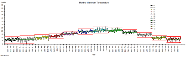
<Leslie> Well, what I did not do was to compare this winter with last winter and draw my conclusion from that! What I did first was just to plot-the-dots … I created a time-series chart … using the BaseLine© software.

And it shows what I expected to see, a strong, regular, 12-month cycle, with peaks in the summer and troughs in the winter.
<Bob> Can you explain what the green and red lines are and why some dots are red?
<Leslie> Sure. The green line is the average for all the data. The red lines are called the upper and lower process limits. They are calculated from the data and what they say is “if the variation in this data is random then we will expect more than 99% of the points to fall between these two red lines“.
<Bob> So, we have 55 years of monthly data which is nearly 700 points which means we would expect fewer than seven to fall outside these lines … and we clearly have many more than that. For example, the winter of 1962-63 and the summer of 1976 look exceptional – a run of three consecutive dots outside the red lines. So can we conclude the variation we are seeing is not random?
<Leslie> Yes, and there is more evidence to support that conclusion. First is the reality check … I do not remember either of those exceptionally cold or hot years personally, so I asked Dr Google.
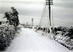 This picture from January 1963 shows copper telephone lines that are so weighed down with ice, and for so long, that they have stretched down to the ground. In this era of mobile phones we forget this was what telecommunication was like!
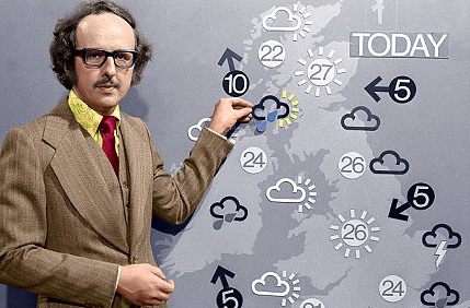
And just look at the young Michal Fish in the Summer of ’76! Did people really wear clothes like that?
And there is more evidence on the chart. The red dots that you mentioned are indicators that BaseLine© has detected other non-random patterns.
So the large number of red dots confirms our Mark I Eyeball conclusion … that there are signals mixed up with the noise.
<Bob> Actually, I do remember the Summer of ’76 – it was the year I did my O Levels! And your signals-in-the-noise phrase reminds me of SETI – the search for extra-terrestrial intelligence! I really enjoyed the 1997 film of Carl Sagan’s book Contact with Jodi Foster playing the role of the determined scientist who ends up taking a faster-than-light trip through space in a machine designed by ET and built by humans. And especially the line about 10 minutes from the end when those-in-high-places who had discounted her story as “unbelievable” realized they may have made an error … the line ‘Yes, that is interesting isn’t it’.
<Leslie> Ha ha! Yes. I enjoyed that film too. It had lots of great characters – her glory seeking boss; the hyper-suspicious head of national security who militarized the project; the charismatic anti-hero; the ranting radical who blew up the first alien machine; and John Hurt as her guardian angel. I must watch it again.
Anyway, back to the story. The problem we have here is that this type of time-series chart is not designed to extract the overwhelming cyclical, annual pattern so that we can search for any weaker signals … such as a smaller change in winter temperature over a longer period of time.
<Bob>Yes, that is indeed the problem with these statistical process control charts. SPC charts were designed over 60 years ago for process quality assurance in manufacturing not as a diagnostic tool in a complex adaptive system such a healthcare. So how did you solve the problem?
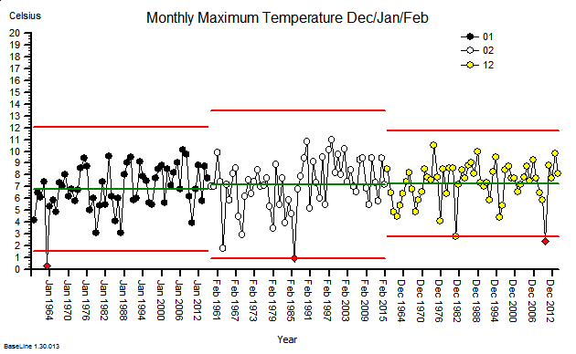
<Leslie> I realized that it was the regularity of the cyclical pattern that was the key. I realized that I could use that to separate out the annual cycle and to expose the weaker signals. I did that using the rational grouping feature of BaseLine© with the month-of-the-year as the group.
Now I realize why the designers of the software put this feature in! With just one mouse click the story jumped out of the screen!
<Bob> OK. So can you explain what we are looking at here?
<Leslie> Sure. This chart shows the same data as before except that I asked BaseLine© first to group the data by month and then to create a mini-chart for each month-group independently. Each group has its own average and process limits. So if we look at the pattern of the averages, the green lines, we can clearly see the annual cycle. What is very obvious now is that the process limits for each sub-group are much narrower, and that there are now very few red points … other than in the groups that are coloured red anyway … a niggle that the designers need to nail in my opinion!
<Bob> I will pass on your improvement suggestion! So are you saying that the regular annual cycle has accounted for the majority of the signal in the previous chart and that now we have extracted that signal we can look for weaker signals by looking for red flags in each monthly group?
<Leslie> Exactly so. And the groups I am most interested in are the November to March ones. So, next I filtered out the November data and plotted it as a separate chart; and I then used another cool feature of BaseLine© called limit locking.
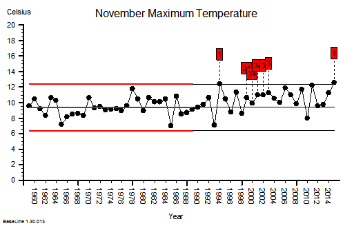
What that means is that I have used the November maximum temperature data for the first 30 years to get the baseline average and natural process limits … and we can see that there are no red flags in that section, no obvious signals. Then I locked these limits at 1990 and this tells BaseLine© to compare the subsequent 25 years of data against these projected limits. That exposed a lot of signal flags, and we can clearly see that most of the points in the later section are above the projected average from the earlier one. This confirms that there has been a significant increase in November maximum temperature over this 55 year period.
<Bob> Excellent! You have answered part of your question. So what about December onwards?
<Leslie> I was on a roll now! I also noticed from my second chart that the December, January and February groups looked rather similar so I filtered that data out and plotted them as a separate chart.
 These were indeed almost identical so I lumped them together as a ‘winter’ group and compared the earlier half with the later half using another BaseLine© feature called segmentation.
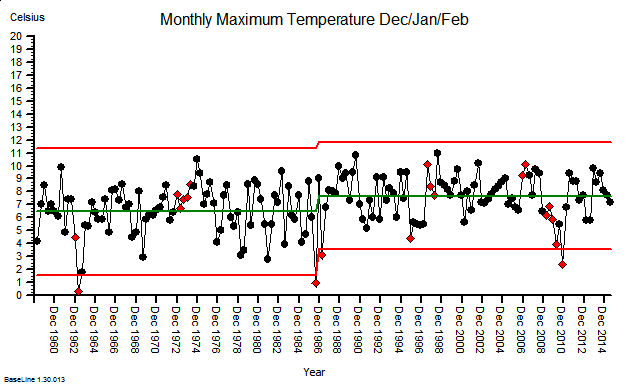 This showed that the more recent winter months have a higher maximum temperature … on average. The difference is just over one degree Celsius. But it also shows that that the month-to-month and year-to-year variation still dominates the picture.
<Bob> Which implies?
<Leslie> That, with data like this, a two-points-in-time comparison is meaningless. If we do that we are just sampling random noise and there is no useful information in noise. Nothing that we can learn from. Nothing that we can justify a decision with. This is the reason the ‘this year was better than last year’ statement is meaningless at best; and dangerous at worst. Dangerous because if we draw an invalid conclusion, then it can lead us to make an unwise decision, then decide a counter-productive action, and then deliver an unintended outcome.
By doing invalid two-point comparisons we can too easily make the problem worse … not better.
<Bob> Yes. This is what W. Edwards Deming, an early guru of improvement science, referred to as ‘tampering‘. He was a student of Walter A. Shewhart who recognized this problem in manufacturing and, in 1924, invented the first control chart to highlight it, and so prevent it. My grandmother used the term meddling to describe this same behavior … and I now use that term as one of the eight sources of variation. Well done Leslie!