
 The debate about how to sensibly report NHS metrics has been raging for decades.
So I am delighted to share the news that NHS Improvement have finally come out and openly challenged the dogma that two-point comparisons and red-amber-green (RAG) charts are valid methods for presenting NHS performance data.
Their rather good 147-page guide can be downloaded: HERE
The subject is something called a statistical process control (SPC) chart which sounds a bit scary! The principle is actually quite simple:
Plot data that emerges over time as a picture that tells a story – #plotthedots
The main trust of the guide is learning the ropes of how to interpret these pictures in a meaningful way and to avoid two traps (i.e. errors).
Trap #1 = Over-reacting to random variation.
Trap #2 = Under-reacting to non-random variation.
Both of these errors cause problems, but in different ways.
Over-reacting to random variation
Random variation is a fact of life. No two days in any part of the NHS are the same. Some days are busier/quieter than others.
Plotting the daily-arrivals-in-A&E dots for a trust somewhere in England gives us this picture. (The blue line is the average and the purple histogram shows the distribution of the points around this average.)
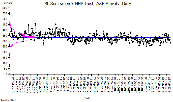
Suppose we were to pick any two days at random and compare the number of arrivals on those two days? We could get an answer anywhere between an increase of 80% (250 to 450) or a decrease of 44% (450 to 250).
But if we look at the while picture above we get the impression that, over time:
- There is an expected range of random-looking variation between about 270 and 380 that accounts for the vast majority of days.
- There are some occasional, exceptional days.
- There is the impression that average activity fell by about 10% in around August 2017.
So, our two-point comparison method seriously misleads us – and if we react to the distorted message that a two-point comparison generates then we run the risk of increasing the variation and making the problem worse.
Lesson: #plotthedots
One of the downsides of SPC is the arcane and unfamiliar language that is associated with it … terms like ‘common cause variation‘ and ‘special cause variation‘. Sadly, the authors at NHS Improvement have fallen into this ‘special language’ trap and therefore run the risk of creating a new clique.
The lesson here is that SPC is a specific, simplified application of a more generic method called a system behaviour chart (SBC).
The first SPC chart was designed by Walter Shewhart in 1924 for one purpose and one purpose only – for monitoring the output quality of a manufacturing process in terms of how well the product conformed to the required specification.
In other words: SPC is an output quality audit tool for a manufacturing process.
This has a number of important implications for the design of the SPC tool:
- The average is not expected to change over time.
- The distribution of the random variation is expected to be bell-shaped.
- We need to be alerted to sudden shifts.
Shewhart’s chart was designed to detect early signs of deviation of a well-performing manufacturing process. To detect possible causes that were worth investigating and minimise the adverse effects of over-reacting or under-reacting.
However, for many reasons, the tool we need for measuring the behaviour of healthcare processes needs to be more sophisticated than the venerable SPC chart. Here are three of them:
- The average is expected to change over time.
- The distribution of the random variation is not expected to be bell-shaped.
- We need to be alerted to slow drifts.
Under-Reacting to Non-Random Variation
Small shifts and slow drifts can have big cumulative effects.
Suppose I am a NHS service manager and I have a quarterly performance target to meet, so I have asked my data analyst to prepare a RAG chart to review my weekly data.
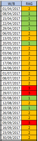 The quarterly target I need to stay below is 120 and my weekly RAG chart is set to show green when less than 108 (10% below target) and red when more than 132 (10% above target) because I know there is quite a lot of random week-to-week variation.
On the left is my weekly RAG chart for the first two quarters and I am in-the-green for both quarters (i.e. under target).
Q: Do I need to do anything?
A: The first quarter just showed “greens” and “ambers” so I relaxed and did nothing. There are a few “reds” in the second quarter, but about the same number as the “greens” and lots of “ambers” so it looks like I am about on target. I decide to do nothing again.
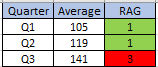 At the end of Q3 I’m in big trouble!
The quarterly RAG chart has flipped from Green to Red and I am way over target for the whole quarter. I missed the bus and I’m looking for a new job!
So, would a SPC chart have helped me here?
Here it is for Q1 and Q2. The blue line is the target and the green line is the average … so below target for both quarters, as the RAG chart said.
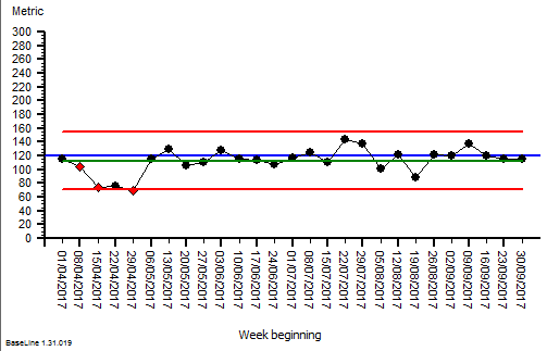
The was a dip in Q1 for a few weeks but it was not sustained and the rest of the chart looks stable (all the points inside the process limits). So, “do nothing” seemed like a perfectly reasonable strategy. Now I feel even more of a victim of fortune!
So, let us look at the full set of weekly date for the financial year and apply our retrospectoscope.
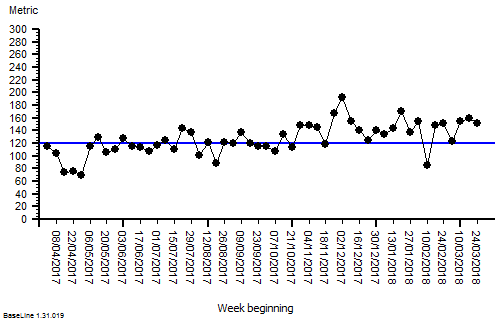 This is just a plain weekly performance run chart with the target limit plotted as the blue line.
It is clear from this that there is a slow upward drift and we can see why our retrospective quarterly RAG chart flipped from green to red, and why neither our weekly RAG chart nor our weekly SPC chart alerted us in time to avoid it!
This problem is often called ‘leading by looking in the rear view mirror‘.
The variation we needed to see was not random, it was a slowly rising average, but it was hidden in the random variation and we missed it. So we under-reacted and we paid the price.
This example illustrates another limitation of both RAG charts and SPC charts … they are both insensitive to small shifts and slow drifts when there is lots of random variation around, which there usually is.
So, is there a way to avoid this trap?
Yes. We need to learn to use the more powerful system behaviour charts and the systems engineering techniques and tools that accompany them.
But that aside, the rather good 147-page guide from NHS Improvement is a good first step for those still using two-point comparisons and RAG charts and it can be downloaded: HERE