Can We See a Story in the Data?

I often hear the comments “I cannot see the wood for the trees”, “I am drowning in an ocean of data” and “I cannot identify the cause of the problem”.  We have data, we know there is a problem and we sense there is a soluton; the gap seems to be using the data to find a solution to the problem.

Most quantitative data is presented as tables of columns and rows of numbers; and is indigestable by the majority of people.  Numbers are a recent invention on a biological timescale and we have not yet evolved to effortlessly process data presented in that format. We are visual animals and we have evolved to be very good at seeing patterns in pictures – because it was critical to survival.  Another recent invention is spoken language and, long before writing was invented, accumulated knowledge and wisdom was passed down by word of mouth as legends, myths and stories. Stories are general descriptions that suggest specific solutions. So why do we have such difficulty in extracting the story from the data? Perhaps it is because we use our ears to hear stories that are communicated in words and we use our eyes to see patterns in pictures.  Presenting quantitative data as streams of printed symbols just doesn’t work as well.  To see the story in the data we need to present it as a picture and then talk about what we perceive.

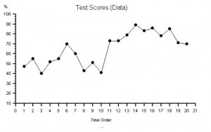
Here are some data – a series of numbers recorded over a period of time – what is the story?

47, 55, 40, 52, 55, 70, 60, 43, 51, 41, 73, 73, 79, 89, 83, 86, 78, 85, 71, 70

Here is the same data converted into a picture.  You can see the message in the data … something changed between measurement 10 and 11.  The chart does not tell us why it changed – it only tells us when it happened and sugegsts what to look for – anything that is capable of causing the effect we can see.  We now have a story and our curiosity is aroused. We want an explanation; we want to understand; we want to learn; and we want to improve.  (For source of data and image visit www.valuesystemdesign.com).

A picture can save a thousand words and ten thousand numbers!

What is the Quickest way to Paralyse a System?

Create confusion by introducing a new factor that the system has little experience of how to manage. And to get the message to spread make it really scary; life-threatening-for-innocent-bystanders-scary; because bad news travels faster than good news. What happens next is predictable; a safety alarm goes off, someone hits the brakes and everything stops. We need time to focus on the new factor, to observe it, investigate it, work out what it is, how it behaves and what to do. We have switched from doing to learning. There is a perfect example of this principle operating on a global scale as I write – a volcano in Iceland that has been dormant since 1821 suddenly spews a cloud of dust high into the sky. There are volcanic eruptions all the time so why is this different? Well, because of a combination of factors that when they combine creates a BIG system-wide impact. First the location of the volcano – on the north-west corner of Europe; then the weather – the prevailing winds are carrying the volcanic plume south and east over the whole of Europe; then the effect – to create a hazard for high altitude commercial jets. Europe is one of the most congested airspaces in the world with around 28,000 flights per day – mostly short haul – but the large European hubs serve as the end points of the trans-global long haul routes. If you want to paralyse global air travel for a completely reversible yet uncontrollable and unpredictable length of time then you probably couldn’t come up with a better plan! The trouble is that the longer the paralysis persists the greater and more irreversible the long term damage. Air travel is an essential component of many industries; so loss of flying capacity not only means loss of revenue and increased costs for airlines – the effects will be felt in every corner of commerce. What triggered this chaos was not just a volcano – it required something else – fear of the unknown. Limited, accidental experience of the interaction of high altitude volcanic plumes and commercial jets shows that all the engines of the jet can shut down – clogged by the volcanic ash. Not an attractive option for anyone. The problem is we simply do not know what the limits of safety are? We are on the horns of an uncomfortable dilemma. The experts and the press who normally feed off each other are uncharacteristically quiet at the moment … everyone is watching, waiting and hoping it will just blow away and we can get back to normal. It won’t and we can’t. Our worldview has just been changed and there is no going back – we have to evolve.

Update 25/04/2010 – I got stranded abroad for a week. It could have been much worse and what was interesting to observe was how the situation was managed. After the initial shock everyone just watched and waited. After a few days it was clear that the problem wasn’t just blowing away. The airlines were haemorrhaging money and were forced to act – by testing if the fear of engine failure was justified. It appeared not to be. A reduction in the volcanic ash being generated, and a shift of the wind, and increasing confidence led to flight activity begin resumed after 7 days. Long before the Authorities could gain any meaningful “scientific” data. The current tasks are to sort out the backlog of displaced passengers; find someone to blame and to sue for compensation. If past behaviour is anything to go by the Authorities will be blamed and the Taxpayers will pick up the bill.  Have we learned anything of lasting benefit from this experience? If not then the same lesson will be repeated; sometime, somewhere, somehow – until we do.

Are your Targets a Pain in the #*&!?

If your delivery time targets are giving you a pain in the #*&! then you may be sitting on a Horned Gaussian and do not realise it. What is a Horned Gaussian? How do you detect one? And what causes it?  To establish the diagnosis you need to gather the data from the most recent couple of hundred jobs and from it calculate the interval from receipt to delivery. Next create a tally chart with Delivery Time on the vertical axis and Counts on the horizontal axis; mark your Delivery Time Target as a horizontal line about two thirds of the way up the vertical axis; draw ten equally spaced lines between it and the X axis and five more above the Target. Finally, sort your delivery times into these “bins” and look at the profile of the histogram that results. If there is a clearly separate “hump” and “horn” and the horn is just under the target then you have confirmed the diagnosis of a Horned Gaussian. The cause is the Delivery Time Target, or more specifically its effect on your behaviour.  If the Target is externally imposed  and enforced using either a reward or a punishment then when the delivery time for a request approaches the Target, you will increase the priority of the request and the job leapfrogs to the front of the queue, pushing all the other jobs back. The order of the jobs is changing and in a severe case the large number of changing priorities generates a lot of extra work to check and reschedule the jobs.  This extra work exacerbates the delays and makes the problem worse, the horn gets taller and sharper, and the pain gets worse. Does that sound a familiar story? So what is the treatment? Well, to decide that you need to create a graph of delivery times in time order and look at the pattern (using charting tool such as BaseLine© www.valuesystemdesign.com makes this easier and quicker). What you do depends on what the chart says to you … it is the Voice of the Process.  Improvement Science is learning to understand the voice of the process.

Are We in Heated Agreement?

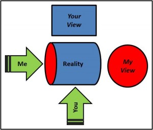
Do you ever feel that during a heated debate you are actually arguing the same point? You are in agreement, or rather “heated agreement”. Why does that happen and how can you distinguish this from an real disagreement? Some years ago I came across the concept of “worldviews” while looking for guidance on managing conflict. The idea is that two different people can look at the same thing and see something different; or rather perceive something different. The apparent difference leads to the debate or argument, which if carried to its conclusion demonstrates the zones of both agreement and difference.  When this is done both protagonists can learn from each other and expand their worldviews and their common ground.  If the debate never takes place then their views remain polarised, no exchange happens, no learning takes place and the common ground does not grow. So is heated debate a good thing? Well it depends on the outcome you want.  If you want to improve, learn, change and expand your perspective then “yes”; if you want to change someone else’s opinion to match yours then “no”.  Improvement implies change; change imples learning; and learning implies an altered perspective.  So engaging in heated debate and achieving heated agreement is a sensible improvement strategy!