Circles

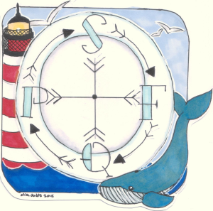
SFQP_enter_circle_middle_15576For a system to be both effective and efficient the parts need to work in synergy. This requires both alignment and collaboration.

Systems that involve people and processes can exhibit complex behaviour. The rules of engagement also change as individuals learn and evolve their beliefs and their behaviours.

The values and the vision should be more fixed. If the goalposts are obscure or oscillate then confusion and chaos is inevitable.


So why is collaborative alignment so difficult to achieve?

One factor has been mentioned. Lack of a common vision and a constant purpose.

Another factor is distrust of others. Our fear of exploitation, bullying, blame, and ridicule.

Distrust is a learned behaviour. Our natural inclination is trust. We have to learn distrust. We do this by copying trust-eroding behaviours that are displayed by our role models. So when leaders display these behaviours then we assume it is OK to behave that way too.  And we dutifully emulate.

The most common trust eroding behaviour is called discounting.  It is a passive-aggressive habit characterised by repeated acts of omission:  Such as not replying to emails, not sharing information, not offering constructive feedback, not asking for other perspectives, and not challenging disrespectful behaviour.


There are many causal factors that lead to distrust … so there is no one-size-fits-all solution to dissolving it.

One factor is ineptitude.

This is the unwillingness to learn and to use available knowledge for improvement.

It is one of the many manifestations of incompetence.  And it is an error of omission.


Whenever we are unable to solve a problem then we must always consider the possibility that we are inept.  We do not tend to do that.  Instead we prefer to jump to the conclusion that there is no solution or that the solution requires someone else doing something different. Not us.

The impossibility hypothesis is easy to disprove.  If anyone has solved the problem, or a very similar one, and if they can provide evidence of what and how then the problem cannot be impossible to solve.

The someone-else’s-fault hypothesis is trickier because proving it requires us to influence others effectively.  And that is not easy.  So we tend to resort to easier but less effective methods … manipulation, blame, bullying and so on.


A useful way to view this dynamic is as a set of four concentric circles – with us at the centre.

The outermost circle is called the ‘Circle of Ignorance‘. The collection of all the things that we do not know we do not know.

Just inside that is the ‘Circle of Concern‘.  These are things we know about but feel completely powerless to change. Such as the fact that the world turns and the sun rises and falls with predictable regularity.

Inside that is the ‘Circle of Influence‘ and it is a broad and continuous band – the further away the less influence we have; the nearer in the more we can do. This is the zone where most of the conflict and chaos arises.

The innermost is the ‘Circle of Control‘.  This is where we can make changes if we so choose to. And this is where change starts and from where it spreads.


SFQP_enter_circle_middle_15576So if we want system-level improvements in safety, flow, quality and productivity (or cost) then we need to align these four circles. Or rather the gaps in them.

We start with the gaps in our circle of control. The things that we believe we cannot do … but when we try … we discover that we can (and always could).

With this new foundation of conscious competence we can start to build new relationships, develop trust and to better influence others in a win-win-win conversation.

And then we can collaborate to address our common concerns – the ones that require coherent effort. We can agree and achieve our common purpose, vision and goals.

And from there we will be able to explore the unknown opportunities that lie beyond. The ones we cannot see yet.

Cumulative Sum

Dr_Bob_Thumbnail[Bing] Bob logged in for the weekly Webex coaching session. Leslie was not yet on line, but joined a few minutes later.

<Leslie> Hi Bob, sorry I am a bit late, I have been grappling with a data analysis problem and did not notice the time.

<Bob> Hi Leslie. Sounds interesting. Would you like to talk about that?

<Leslie> Yes please! It has been driving me nuts!

<Bob> OK. Some context first please.

<Leslie> Right, yes. The context is an improvement-by-design assignment with a primary care team who are looking at ways to reduce the unplanned admissions for elderly patients by 10%.

<Bob> OK. Why 10%?

<Leslie> Because they said that would be an operationally very significant reduction.  Most of their unplanned admissions, and therefore costs for admissions, are in that age group.  They feel that some admissions are avoidable with better primary care support and a 10% reduction would make their investment of time and effort worthwhile.

<Bob> OK. That makes complete sense. Setting a new design specification is OK.  I assume they have some baseline flow data.

<Leslie> Yes. We have historical weekly unplanned admissions data for two years. It looks stable, though rather variable on a week-by-week basis.

<Bob> So has the design change been made?

<Leslie> Yes, over three months ago – so I expected to be able to see something by now but there are no red flags on the XmR chart of weekly admissions. No change.  They are adamant that they are making a difference, particularly in reducing re-admissions.  I do not want to disappoint them by saying that all their hard work has made no difference!

<Bob> OK Leslie. Let us approach this rationally.  What are the possible causes that the weekly admissions chart is not signalling a change?

<Leslie> If there has not been a change in admissions. This could be because they have indeed reduced readmissions but new admissions have gone up and is masking the effect.

<Bob> Yes. That is possible. Any other ideas?

<Leslie> That their intervention has made no difference to re-admissions and their data is erroneous … or worse still … fabricated!

<Bob> Yes. That is possible too. Any other ideas?

<Leslie> Um. No. I cannot think of any.

<Bob> What about the idea that the XmR chart is not showing a change that is actually there?

<Leslie> You mean a false negative? That the sensitivity of the XmR chart is limited? How can that be? I thought these charts will always signal a significant shift.

<Bob> It depends on the degree of shift and the amount of variation. The more variation there is the harder it is to detect a small shift.  In a conventional statistical test we would just use bigger samples, but that does not work with an XmR chart because the run tests are all fixed length. Pre-defined sample sizes.

<Leslie> So that means we can miss small but significant changes and come to the wrong conclusion that our change has had no effect! Isn’t that called a Type 2 error?

<Bob> Yes, it is. And we need to be aware of the limitations of the analysis tool we are using. So, now you know that how might you get around the problem?

<Leslie> One way would be to aggregate the data over a longer time period before plotting on the chart … we know that will reduce the sample variation.

<Bob> Yes. That would work … but what is the downside?

<Leslie> That we have to wait a lot longer to show a change, or not. We do not want that.

<Bob> I agree. So what we do is we use a chart that is much more sensitive to small shifts of the mean.  And that is called a cusum chart. These were not invented until 30 years after Shewhart first described his time-series chart.  To give you an example, do you recall that the work-in-progress chart is much more sensitive to changes in flow than either demand or activity charts?

<Leslie> Yes, and the WIP chart also reacts immediately if either demand or activity change. It is the one I always look at first.

<Bob> That is because a WIP chart is actually a cusum chart. It is the cumulative sum of the difference between demand and activity.

<Leslie> OK! That makes sense. So how do I create and use a cusum chart?

<Bob> I have just emailed you some instructions and a few examples. You can try with your unplanned admissions data. It should only take a few minutes. I will get a cup of tea and a chocolate Hobnob while I wait.

[Five minutes later]

<Leslie> Wow! That is just brilliant!  I can see clearly on the cusum chart when the shifts happened and when I split the XmR chart at those points the underlying changes become clear and measurable. The team did indeed achieve a 10% reduction in admissions just as they claimed they had.  And I checked with a statistical test which confirmed that it is statistically significant.

<Bob> Good work.  Cusum charts take a bit of getting used to and we have be careful about the metric we are plotting and a few other things but it is a useful trick to have up our sleeves for situations like this.

<Leslie> Thanks Bob. I will bear that in mind.  Now I just need to work out how to explain cusum charts to others! I do not want to be accused of using statistical smoke-and-mirrors! I think a golf metaphor may work with the GPs.

Persistence and Patience

magnify_text_anim_16253(1)There is no doubt about it …

… change is not easy.

If it were we would all be doing it …

… all of the time.

So one skill that an effective agent of change demonstrates is persistence.

And also patience. And also reflective learning.


A recent change project demonstrated objective, measurable outcomes which showed that the original design goal was achieved. In budget. It took two years from first contact to final report.

Why two years? Could it have been done quicker?

In principle – ‘Emphatically, yes’.  In practice – ‘Evidently, no’.


With the benefit of hindsight it is always clearer what might have caused the delay.  Maybe the experience-based advice of those guiding the process was discounted.  Maybe the repeated recommendation that an initial investment in learning the basic science of improvement would deliver a quicker return was ignored.  Maybe.


So the reflective learning from the first wave was re-invested in the second wave.

And the second wave delivered a significant and objectively measurable improvement in one year.

And the reflective learning from the second wave was re-invested in the third wave.

And the third wave delivered a significant and objectively measurable improvement in six months.

And the three improvement projects were of comparable complexity.


So what is happening here?

The process of improvement is itself being improved.  Experience and learning are being re-invested.

And two repeating themes emerge ….

Patience is needed to await outcomes and to learn from them.

Persistence is needed to re-examine old paradigms with this new knowledge and new understanding.


Patience and Persistence. And these principles apply as much to the teacher as to the taught.

A School for Rebels

Troublemaker_vs_RebelSystem-wide, significant, and sustained improvement implies system-wide change.

And system-wide change implies more than 20% of the people commit to action. This is the cultural tipping point.

These critical 20% have a badge … they call themselves rebels … and they are perceived as troublemakers by those who profit most from the status quo.

But troublemakers and rebels are radically different … as shown in the summary by Lois Kelly.


Rebels share a common, future-focussed purpose.  A mission.  They are passionate, optimistic and creative.  They understand synergy and how to release and align the stored emotional energy of both themselves and others.  And most importantly they are value-led and that makes them attractive.  Values such as honesty, integrity and industry are what make leaders together-effective.

SHCR_logoAnd as we speak there is school for rebels in healthcare gaining momentum …  and their programme is current, open to all and free to access. And the change agent development materials are excellent!

Click here to download their study guide.


Converting possibilities into realities is the essence of design … so our merry band of rebels will also need to learn how to convert their positive rhetoric into practical reality. And that is more physics than psychology.

Streams flow because of physics not because of passion.SFQP_Compass

And this is why the science of improvement is important because it is the synthesis of the people dimension and the process dimension – into a system that delivers significant and sustained improvement.

On all dimensions. Safety, Flow, Quality and Productivity.

The lighthouse is our purpose; the whale represents the magnitude of our challenge; the blue sky is the creative thinking we need … to avoid trying to boil the ocean.

And the noisy, greedy, s****y seagulls are the troublemakers who always will plague us.

[Image by Malaika Art].