The Strangeness of LoS

It had been some time since Bob and Leslie had chatted so an email from the blue was a welcome distraction from a complex data analysis task.

<Bob> Hi Leslie, great to hear from you. I was beginning to think you had lost interest in health care improvement-by-design.

<Leslie> Hi Bob, not at all.  Rather the opposite.  I’ve been very busy using everything that I’ve learned so far.  It’s applications are endless, but I have hit a problem that I have been unable to solve, and it is driving me nuts!

<Bob> OK. That sounds encouraging and interesting.  Would you be able to outline this thorny problem and I will help if I can.

<Leslie> Thanks Bob.  It relates to a big issue that my organisation is stuck with – managing urgent admissions.  The problem is that very often there is no bed available, but there is no predictability to that.  It feels like a lottery; a quality and safety lottery.  The clinicians are clamoring for “more beds” but the commissioners are saying “there is no more money“.  So the focus has turned to reducing length of stay.

<Bob> OK.  A focus on length of stay sounds reasonable.  Reducing that can free up enough beds to provide the necessary space-capacity resilience to dramatically improve the service quality.  So long as you don’t then close all the “empty” beds to save money, or fall into the trap of believing that 85% average bed occupancy is the “optimum”.

<Leslie> Yes, I know.  We have explored all of these topics before.  That is not the problem.

<Bob> OK. What is the problem?

<Leslie> The problem is demonstrating objectively that the length-of-stay reduction experiments are having a beneficial impact.  The data seems to say they they are, and the senior managers are trumpeting the success, but the people on the ground say they are not. We have hit a stalemate.


<Bob> Ah ha!  That old chestnut.  So, can I first ask what happens to the patients who cannot get a bed urgently?

<Leslie> Good question.  We have mapped and measured that.  What happens is the most urgent admission failures spill over to commercial service providers, who charge a fee-per-case and we have no choice but to pay it.  The Director of Finance is going mental!  The less urgent admission failures just wait on queue-in-the-community until a bed becomes available.  They are the ones who are complaining the most, so the Director of Governance is also going mental.  The Director of Operations is caught in the cross-fire and the Chief Executive and Chair are doing their best to calm frayed tempers and to referee the increasingly toxic arguments.

<Bob> OK.  I can see why a “Reduce Length of Stay Initiative” would tick everyone’s Nice If box.  So, the data analysts are saying “the length of stay has come down since the Initiative was launched” but the teams on the ground are saying “it feels the same to us … the beds are still full and we still cannot admit patients“.

<Leslie> Yes, that is exactly it.  And everyone has come to the conclusion that demand must have increased so it is pointless to attempt to reduce length of stay because when we do that it just sucks in more work.  They are feeling increasingly helpless and hopeless.

<Bob> OK.  Well, the “chronic backlog of unmet need” issue is certainly possible, but your data will show if admissions have gone up.

<Leslie> I know, and as far as I can see they have not.

<Bob> OK.  So I’m guessing that the next explanation is that “the data is wonky“.

<Leslie> Yup.  Spot on.  So, to counter that the Information Department has embarked on a massive push on data collection and quality control and they are adamant that the data is complete and clean.

<Bob> OK.  So what is your diagnosis?

<Leslie> I don’t have one, that’s why I emailed you.  I’m stuck.


<Bob> OK.  We need a diagnosis, and that means we need to take a “history” and “examine” the process.  Can you tell me the outline of the RLoS Initiative.

<Leslie> We knew that we would need a baseline to measure from so we got the historical admission and discharge data and plotted a Diagnostic Vitals Chart®.  I have learned something from my HCSE training!  Then we planned the implementation of a visual feedback tool that would show ward staff which patients were delayed so that they could focus on “unblocking” the bottlenecks.  We then planned to measure the impact of the intervention for three months, and then we planned to compare the average length of stay before and after the RLoS Intervention with a big enough data set to give us an accurate estimate of the averages.  The data showed a very obvious improvement, a highly statistically significant one.

<Bob> OK.  It sounds like you have avoided the usual trap of just relying on subjective feedback, and now have a different problem because your objective and subjective feedback are in disagreement.

<Leslie> Yes.  And I have to say, getting stuck like this has rather dented my confidence.

<Bob> Fear not Leslie.  I said this is an “old chestnut” and I can say with 100% confidence that you already have what you need in your T4 kit bag?

<Leslie>Tee-Four?

<Bob> Sorry, a new abbreviation. It stands for “theory, techniques, tools and training“.

<Leslie> Phew!  That is very reassuring to hear, but it does not tell me what to do next.

<Bob> You are an engineer now Leslie, so you need to don the hard-hat of Improvement-by-Design.  Start with your Needs Analysis.


<Leslie> OK.  I need a trustworthy tool that will tell me if the planned intervention has has a significant impact on length of stay, for better or worse or not at all.  And I need it to tell me that quickly so I can decide what to do next.

<Bob> Good.  Now list all the things that you currently have that you feel you can trust.

<Leslie> I do actually trust that the Information team collect, store, verify and clean the raw data – they are really passionate about it.  And I do trust that the front line teams are giving accurate subjective feedback – I work with them and they are just as passionate.  And I do trust the systems engineering “T4” kit bag – it has proven itself again-and-again.

<Bob> Good, and I say that because you have everything you need to solve this, and it sounds like the data analysis part of the process is a good place to focus.

<Leslie> That was my conclusion too.  And I have looked at the process, and I can’t see a flaw. It is driving me nuts!

<Bob> OK.  Let us take a different tack.  Have you thought about designing the tool you need from scratch?

<Leslie> No. I’ve been using the ones I already have, and assume that I must be using them incorrectly, but I can’t see where I’m going wrong.

<Bob> Ah!  Then, I think it would be a good idea to run each of your tools through a verification test and check that they are fit-4-purpose in this specific context.

<Leslie> OK. That sounds like something I haven’t covered before.

<Bob> I know.  Designing verification test-rigs is part of the Level 2 training.  I think you have demonstrated that you are ready to take the next step up the HCSE learning curve.

<Leslie> Do you mean I can learn how to design and build my own tools?  Special tools for specific tasks?

<Bob> Yup.  All the techniques and tools that you are using now had to be specified, designed, built, verified, and validated. That is why you can trust them to be fit-4-purpose.

<Leslie> Wooohooo! I knew it was a good idea to give you a call.  Let’s get started.


[Postscript] And Leslie, together with the other stakeholders, went on to design the tool that they needed and to use the available data to dissolve the stalemate.  And once everyone was on the same page again they were able to work collaboratively to resolve the flow problems, and to improve the safety, flow, quality and affordability of their service.  Oh, and to know for sure that they had improved it.

The Turkeys Voting For Xmas Trap

One of the quickest and easiest ways to kill an improvement initiative stone dead is to label it as a “cost improvement program” or C.I.P.

Everyone knows that the biggest single contributor to cost is salaries.

So cost reduction means head count reduction which mean people lose their jobs and their livelihood.

Who is going to sign up to that?

It would be like turkeys voting for Xmas.

There must be a better approach?

Yes. There is.


Over the last few weeks, groups of curious skeptics have experienced the immediate impact of systems engineering theory, techniques and tools in a health care context.

They experienced queues, delays and chaos evaporate in front of their eyes … and it cost nothing to achieve. No extra resources. No extra capacity. No extra cash.

Their reaction was “surprise and delight”.

But … it also exposed a problem.  An undiscussable problem.


Queues and chaos require expensive resources to manage.

We call them triagers, progress-chasers, and fire-fighters.  And when the queues and chaos evaporate then their jobs do too.

The problem is that the very people who are needed to make the change happen are the ones who become surplus-to-requirement as a result of the change.

So change does not happen.

It would like turkeys voting for Xmas.


The way around this impasse is to anticipate the effect and to proactively plan to re-invest the resource that is released.  And to re-invest it doing a more interesting and more worthwhile jobs than queue-and-chaos management.

One opportunity for re-investment is called time-buffering which is an effective way to improve resilience to variation, especially in an unscheduled care context.

Another opportunity for re-investment is tail-gunning the chronic backlogs until they are down to a safe and sensible size.

And many complain that they do not have time to learn about improvement because they are too busy managing the current chaos.

So, another opportunity for re-investment is training – oneself first and then others.


R.I.P.    C.I.P.

The Disbelief to Belief Transition

The NHS appears to be descending in a frenzy of fear as the winter looms and everyone says it will be worse than last and the one before that.

And with that we-are-going-to-fail mindset, it almost certainly will.

Athletes do not start a race believing that they are doomed to fail … they hold a belief that they can win the race and that they will learn and improve even if they do not. It is a win-win mindset.

But to succeed in sport requires more than just a positive attitude.

It also requires skills, training, practice and experience.

The same is true in healthcare improvement.


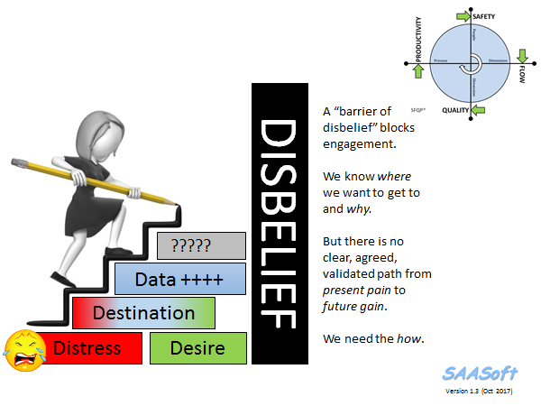
That is not the barrier though … the barrier is disbelief.

And that comes from not having experienced what it is like to take a system that is failing and transform it into one that is succeeding.

Logically, rationally, enjoyably and surprisingly quickly.

And, the widespread disbelief that it is possible is paradoxical because there are plenty of examples where others have done exactly that.

The disbelief seems to be “I do not believe that will work in my world and in my hands!

And the only way to dismantle that barrier-of-disbelief is … by doing it.

How do we do that?

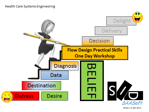
The emotionally safest way is in a context that is carefully designed to enable us to surface the unconscious assumptions that are the bricks in our individual Barriers of Disbelief.

And to discard the ones that do not pass a Reality Check, and keep the ones that are OK.

This Disbelief-Busting design has been proven to be effective, as evidenced by the growing number of individuals who are learning how to do it themselves, and how to inspire, teach and coach others to as well.


So, if you would like to flip disbelief-and-hopeless into belief-and-hope … then the door is here.

Diagnose-Design-Deliver

A story was shared this week.

A story of hope for the hard-pressed NHS, its patients, its staff and its managers and its leaders.

A story that says “We can learn how to fix the NHS ourselves“.

And the story comes with evidence; hard, objective, scientific, statistically significant evidence.


The story starts almost exactly three years ago when a Clinical Commissioning Group (CCG) in England made a bold strategic decision to invest in improvement, or as they termed it “Achieving Clinical Excellence” (ACE).

They invited proposals from their local practices with the “carrot” of enough funding to allow GPs to carve-out protected time to do the work.  And a handful of proposals were selected and financially supported.

This is the story of one of those proposals which came from three practices in Sutton who chose to work together on a common problem – the unplanned hospital admissions in their over 70’s.

Their objective was clear and measurable: “To reduce the cost of unplanned admissions in the 70+ age group by working with hospital to reduce length of stay.

Did they achieve their objective?

Yes, they did.  But there is more to this story than that.  Much more.


One innovative step they took was to invest in learning how to diagnose why the current ‘system’ was costing what it was; then learning how to design an improvement; and then learning how to deliver that improvement.

They invested in developing their own improvement science skills first.

They did not assume they already knew how to do this and they engaged an experienced health care systems engineer (HCSE) to show them how to do it (i.e. not to do it for them).

Another innovative step was to create a blog to make it easier to share what they were learning with their colleagues; and to invite feedback and suggestions; and to provide a journal that captured the story as it unfolded.

And they measured stuff before they made any changes and afterwards so they could measure the impact, and so that they could assess the evidence scientifically.

And that was actually quite easy because the CCG was already measuring what they needed to know: admissions, length of stay, cost, and outcomes.

All they needed to learn was how to present and interpret that data in a meaningful way.  And as part of their IS training,  they learned how to use system behaviour charts, or SBCs.


By Jan 2015 they had learned enough of the HCSE techniques and tools to establish the diagnosis and start to making changes to the parts of the system that they could influence.


Two years later they subjected their before-and-after data to robust statistical analysis and they had a surprise. A big one!

Reducing hospital mortality was not a stated objective of their ACE project, and they only checked the mortality data to be sure that it had not changed.

But it had, and the “p=0.014” part of the statement above means that the probability that this 20.0% reduction in hospital mortality was due to random chance … is less than 1.4%.  [This is well below the 5% threshold that we usually accept as “statistically significant” in a clinical trial.]

But …

This was not a randomised controlled trial.  This was an intervention in a complicated, ever-changing system; so they needed to check that the hospital mortality for comparable patients who were not their patients had not changed as well.

And the statistical analysis of the hospital mortality for the ‘other’ practices for the same patient group, and the same period of time confirmed that there had been no statistically significant change in their hospital mortality.

So, it appears that what the Sutton ACE Team did to reduce length of stay (and cost) had also, unintentionally, reduced hospital mortality. A lot!


And this unexpected outcome raises a whole raft of questions …


If you would like to read their full story then you can do so … here.

It is a story of hunger for improvement, of humility to learn, of hard work and of hope for the future.

Courage and Constancy of Purpose

bull_by_the_horns_anim_150_wht_9609This week I witnessed an act of courage by someone prepared to take the health care bull by the horns.

On 25th October 2016 a landmark review was published about the integrated health and social care system in Northern Ireland.

It is not a comfortable read.

And the act of courage was the simultaneous publication of the document “Health and Well-being 2026” by Michelle O’Neill, the new Minister of Health.

The full document can be downloaded here.


It is courageous because it says, bluntly, that there is a burning platform, the level of service is not acceptable, doing nothing is not an option, and nothing short of a system-wide redesign will be required.

It is courageous because it sets a clear vision, a burning ambition, and is very clear that this will not be a quick fix. It is a ten year plan.

That implies a constancy of purpose will need to be maintained for at least a decade.

science_of_improvement

And it is courageous because it says that:

we will have to learn how to do this

Here is one paragraph that says that:

Developing the science of improvement can be done at the same time as making improvements

and

We need an infrastructure that makes this possible.”


The good news is that this science of improvement in health care is already well advanced, and it will advance further: a whole health and social care system transformation-by-design is a challenge of some magnitude.

A health and social care system engineering (HSCSE) challenge.


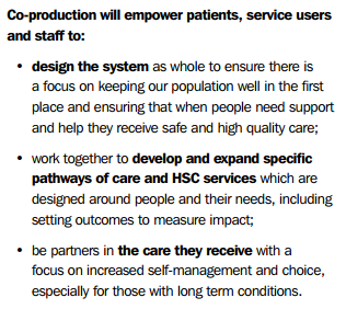
One component of the ten year plan is to develop this capability through a process called co-production.

co-productionNotice that the focus is on pro-actively preventing illness, not just re-actively managing it.
Notice that the design is centered on both the customer and the supplier, not just on the supplier.

And notice that the population served are also expected to be equal partners in the transformation-by-design process.


Courage, constancy of purpose and capability development  … a very welcome breath of fresh air!


For more posts like this please vote here.
For more information please subscribe here.

Fragmentation Cost

figure_falling_with_arrow_17621The late Russell Ackoff used to tell a great story. It goes like this:

“A team set themselves the stretch goal of building the World’s Best Car.  So the put their heads together and came up with a plan.

First they talked to drivers and drew up a list of all the things that the World’s Best Car would need to have. Safety, speed, low fuel consumption, comfort, good looks, low emissions and so on.

Then they drew up a list of all the components that go into building a car. The engine, the wheels, the bodywork, the seats, and so on.

Then they set out on a quest … to search the world for the best components … and to bring the best one of each back.

Then they could build the World’s Best Car.

Or could they?

No.  All they built was a pile of incompatible parts. The WBC did not work. It was a futile exercise.


Then the penny dropped. The features in their wish-list were not associated with any of the separate parts. Their desired performance emerged from the way the parts worked together. The working relationships between the parts were as necessary as the parts themselves.

And a pile of average parts that work together will deliver a better performance than a pile of best parts that do not.

So the relationships were more important than the parts!


From this they learned that the quickest, easiest and cheapest way to degrade performance is to make working-well-together a bit more difficult.  Irrespective of the quality of the parts.


Q: So how do we reverse this degradation of performance?

A: Add more failure-avoidance targets of course!

But we just discovered that the performance is the effect of how the parts work well together?  Will another failure-metric-fueled performance target help? How will each part know what it needs to do differently – if anything?  How will each part know if the changes they have made are having the intended impact?

Fragmentation has a cost.  Fear, frustration, futility and ultimately financial failure.

So if performance is fading … the quality of the working relationships is a good place to look for opportunities for improvement.

Precious Life Time

stick_figure_help_button_150_wht_9911Imagine this scenario:

You develop some non-specific symptoms.

You see your GP who refers you urgently to a 2 week clinic.

You are seen, assessed, investigated and informed that … you have cancer!


The shock, denial, anger, blame, bargaining, depression, acceptance sequence kicks off … it is sometimes called the Kübler-Ross grief reaction … and it is a normal part of the human psyche.

But there is better news. You also learn that your condition is probably treatable, but that it will require chemotherapy, and that there are no guarantees of success.

You know that time is of the essence … the cancer is growing.

And time has a new relevance for you … it is called life time … and you know that you may not have as much left as you had hoped.  Every hour is precious.


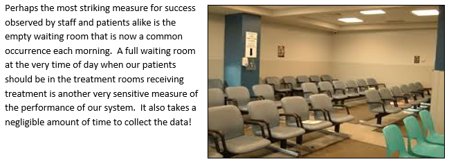
So now imagine your reaction when you attend your local chemotherapy day unit (CDU) for your first dose of chemotherapy and have to wait four hours for the toxic but potentially life-saving drugs.

They are very expensive and they have a short shelf-life so the NHS cannot afford to waste any.   The Aseptic Unit team wait until all the safety checks are OK before they proceed to prepare your chemotherapy.  That all takes time, about four hours.

Once the team get to know you it will go quicker. Hopefully.

It doesn’t.

The delays are not the result of unfamiliarity … they are the result of the design of the process.

All your fellow patients seem to suffer repeated waiting too, and you learn that they have been doing so for a long time.  That seems to be the way it is.  The waiting room is well used.

Everyone seems resigned to the belief that this is the best it can be.

They are not happy about it but they feel powerless to do anything.


Then one day someone demonstrates that it is not the best it can be.

It can be better.  A lot better!

And they demonstrate that this better way can be designed.

And they demonstrate that they can learn how to design this better way.

And they demonstrate what happens when they apply their new learning …

… by doing it and by sharing their story of “what-we-did-and-how-we-did-it“.

CDU_Waiting_Room

If life time is so precious, why waste it?

And perhaps the most surprising outcome was that their safer, quicker, calmer design was also 20% more productive.

The Capstan

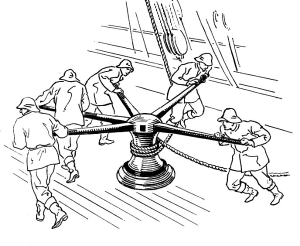
CapstanA capstan is a simple machine for combining the effort of many people and enabling them to achieve more than any of them could do alone.

The word appears to have come into English from the Portuguese and Spanish sailors at around the time of the Crusades.

Each sailor works independently of the others. There is no requirement them to be equally strong because the capstan will combine their efforts.  And the capstan also serves as a feedback loop because everyone can sense when someone else pushes harder or slackens off.  It is an example of simple, efficient, effective, elegant design.


In the world of improvement we also need simple, efficient, effective and elegant ways to combine the efforts of many in achieving a common purpose.  Such as raising the standards of excellence and weighing the anchors of resistance.

In health care improvement we have many simultaneous constraints and we have many stakeholders with specific perspectives and special expertise.

And if we are not careful they will tend to pull only in their preferred direction … like a multi-way tug-o-war.  The result?  No progress and exhausted protagonists.

There are those focused on improving productivity – Team Finance.

There are those focused on improving delivery – Team Operations.

There are those focused on improving safety – Team Governance.

And we are all tasked with improving quality – Team Everyone.

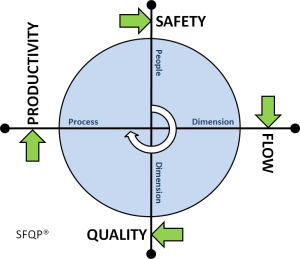
So we need a synergy machine that works like a capstan-of-old, and here is one design.

Engine_Of_ExcellenceIt has four poles and it always turns in a clockwise direction, so the direction of push is clear.

And when all the protagonists push in the same direction, they will get their own ‘win’ and also assist the others to make progress.

This is how the sails of success are hoisted to catch the wind of change; and how the anchors of anxiety are heaved free of the rocks of fear; and how the bureaucratic bilge is pumped overboard to lighten our load and improve our speed and agility.

And the more hands on the capstan the quicker we will achieve our common goal.

Collective excellence.

Notably Absent

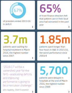
KingsFund_Quality_Report_May_2016This week the King’s Fund published their Quality Monitoring Report for the NHS, and it makes depressing reading.

These highlights are a snapshot.

The website has some excellent interactive time-series charts that transform the deluge of data the NHS pumps out into pictures that tell a shameful story.

On almost all reported dimensions, things are getting worse and getting worse faster.

Which I do not believe is the intention.

But it is clearly the impact of the last 20 years of health and social care policy.


What is more worrying is the data that is notably absent from the King’s Fund QMR.

The first omission is outcome: How well did the NHS deliver on its intended purpose?  It is stated at the top of the NHS England web site …

NHSE_Purpose

And lets us be very clear here: dying, waiting, complaining, and over-spending are not measures of what we want: health and quality success metrics.  They are a measures of what we do not want; they are failure metrics.

The fanatical focus on failure is part of the hyper-competitive, risk-averse medical mindset:

primum non nocere (first do no harm),

and as a patient I am reassured to hear that but is no harm all I can expect?

What about:

tunc mederi (then do some healing)


And where is the data on dying in the Kings Fund QMR?

It seems to be notably absent.

And I would say that is a quality issue because it is something that patients are anxious about.  And that may be because they are given so much ‘open information’ about what might go wrong, not what should go right.


And you might think that sharp, objective data on dying would be easy to collect and to share.  After all, it is not conveniently fuzzy and subjective like satisfaction.

It is indeed mandatory to collect hospital mortality data, but sharing it seems to be a bit more of a problem.

The fear-of-failure fanaticism extends there too.  In the wake of humiliating, historical, catastrophic failures like Mid Staffs, all hospitals are monitored, measured and compared. And the negative deviants are named, shamed and blamed … in the hope that improvement might follow.

And to do the bench-marking we need to compare apples with apples; not peaches with lemons.  So we need to process the raw data to make it fair to compare; to ensure that factors known to be associated with higher risk of death are taken into account. Factors like age, urgency, co-morbidity and primary diagnosis.  Factors that are outside the circle-of-control of the hospitals themselves.

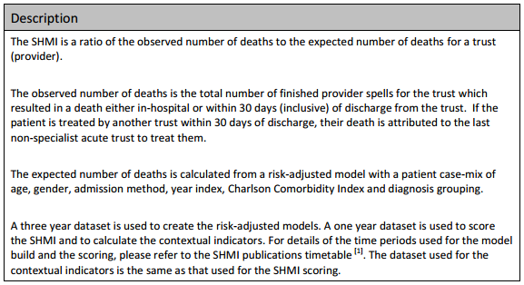
And there is an army of academics, statisticians, data processors, and analysts out there to help. The fruit of their hard work and dedication is called SHMI … the Summary Hospital Mortality Index.

SHMI_Specification

Now, the most interesting paragraph is the third one which outlines what raw data is fed in to building the risk-adjusted model.  The first four are objective, the last two are more subjective, especially the diagnosis grouping one.

The importance of this distinction comes down to human nature: if a hospital is failing on its SHMI then it has two options:
(a) to improve its policies and processes to improve outcomes, or
(b) to manipulate the diagnosis group data to reduce the SHMI score.

And the latter is much easier to do, it is called up-coding, and basically it involves camping at the pessimistic end of the diagnostic spectrum. And we are very comfortable with doing that in health care. We favour the Black Hat.

And when our patients do better than our pessimistically-biased prediction, then our SHMI score improves and we look better on the NHS funnel plot.

We do not have to do anything at all about actually improving the outcomes of the service we provide, which is handy because we cannot do that. We do not measure it!


And what might be notably absent from the data fed in to the SHMI risk-model?  Data that is objective and easy to measure.  Data such as length of stay (LOS) for example?

Is there a statistical reason that LOS is omitted? Not really. Any relevant metric is a contender for pumping into a risk-adjustment model.  And we all know that the sicker we are, the longer we stay in hospital, and the less likely we are to come out unharmed (or at all).  And avoidable errors create delays and complications that imply more risk, more work and longer length of stay. Irrespective of the illness we arrived with.

So why has LOS been omitted from SHMI?

The reason may be more political than statistical.

We know that the risk of death increases with infirmity and age.

We know that if we put frail elderly patients into a hospital bed for a few days then they will decondition and become more frail, require more time in hospital, are more likely to need a transfer of care to somewhere other than home, are more susceptible to harm, and more likely to die.

So why is LOS not in the risk-of-death SHMI model?

And it is not in the King’s Fund QR report either.

Nor is the amount of cash being pumped in to keep the HMS NHS afloat each month.

All notably absent!

Burning Ambition

flag_waving_mountain_150_clr_13781A wise person once said:

Improvement implies change, but change does not imply improvement.

To get improvement on any dimension we need to change something: our location, our perspective, our actions, our decisions, our assumptions, our beliefs even.

And we hate doing that because we know from life experience that change does not guarantee improvement.  Even with well-intended, carefully-considered, and collectively-agreed change … things can get worse.  And we fear that.  So the safest thing to do is … nothing!  We sit on the fence.


Until a ‘fire’ breaks out.  Then we are motivated to move by a stronger emotion … fear for our very survival.  That bigger fear gives us the necessary push and we move to somewhere cooler and safer.

But as the temperature drops, the fear goes away, the push goes away too and we lose momentum and return to torpor.  Until the next fire breaks out.

The other problem with a collective fear-based motivator is that we usually jump in different directions so any shred of cohesion we did have, is lost completely.  The system fragments.  Fear is always destructive.


The alternative to fear-driven change is a different type of motivator … a burning ambition.

Ambition may feel just as hot but it is different in that it continues to pull and to motivate us.  We do not slump back into torpor after the first success.  If anything the sense of achievement fuels our fire-of-ambition and that pulls us with greater force.

And when many others share the same burning ambition then we are pulled into alignment on a common purpose and that can become constructive and synergistic … if we work collaboratively.


So let us take health care improvement as the example.

We have a burning platform.  The newspapers are full of doom-and-gloom about escalating waits, failed targets, weekend mortality effects, spiraling costs and political conflict.

But do we have a collective burning ambition?  A common goal? A shared purpose?

A common goal like a health care system that is safe, delivers on time, meets and exceeds expectation and is affordable ?

If we do, then what is the barrier to change? We have push and we have pull … so where is the friction and resistance coming from?

From inside ourselves perhaps?  Maybe we harbour limiting beliefs that it is impossible or we can’t do it?  Beliefs that self-justify our ‘do nothing’ decision.

So only one example that disproves our limiting beliefs is enough to remove them. Just one.  And I shared a video of it last week – the Luton & Dunstable one.


And the animated video by Dr Peter Fuda captures the essence of this push-and-pull Kurt Lewin Force Field concept brilliantly!

Undiscussables

Chimp_NoHear_NoSee_NoSpeakLast week I shared a link to Dr Don Berwick’s thought provoking presentation at the Healthcare Safety Congress in Sweden.

Near the end of the talk Don recommended six books, and I was reassured that I already had read three of them. Naturally, I was curious to read the other three.

One of the unfamiliar books was “Overcoming Organizational Defenses” by the late Chris Argyris, a professor at Harvard.  I confess that I have tried to read some of his books before, but found them rather difficult to understand.  So I was intrigued that Don was recommending it as an ‘easy read’.  Maybe I am more of a dimwit that I previously believed!  So fear of failure took over my inner-chimp and I prevaricated. I flipped into denial. Who would willingly want to discover the true depth of their dimwittedness!


Later in the week, I was forwarded a copy of a recently published paper that was on a topic closely related to a key thread in Dr Don’s presentation:

understanding variation.

The paper was by researchers who had looked at the Board reports of 30 randomly selected NHS Trusts to examine how information on safety and quality was being shared and used.  They were looking for evidence that the Trust Boards understood the importance of variation and the need to separate ‘signal’ from ‘noise’ before making decisions on actions to improve safety and quality performance.  This was a point Don had stressed too, so there was a link.

The randomly selected Trust Board reports contained 1488 charts, of which only 88 demonstrated the contribution of chance effects (i.e. noise). Of these, 72 showed the Shewhart-style control charts that Don demonstrated. And of these, only 8 stated how the control limits were constructed (which is an essential requirement for the chart to be meaningful and useful).

That is a validity yield of 8 out of 1488, or 0.54%, which is for all practical purposes zero. Oh dear!


This chance combination of apparently independent events got me thinking.

Q1: What is the reason that NHS Trust Boards do not use these signal-and-noise separation techniques when it has been demonstrated, for at least 12 years to my knowledge, that they are very effective for facilitating improvement in healthcare? (e.g. Improving Healthcare with Control Charts by Raymond G. Carey was published in 2003).

Q2: Is there some form of “organizational defense” system in place that prevents NHS Trust Boards from learning useful ‘new’ knowledge?


So I surfed the Web to learn more about Chris Argyris and to explore in greater depth his concept of Single Loop and Double Loop learning.  I was feeling like a dimwit again because to me it is not a very descriptive title!  I suspect it is not to many others too.

I sensed that I needed to translate the concept into the language of healthcare and this is what emerged.

Single Loop learning is like treating the symptoms and ignoring the disease.

Double Loop learning is diagnosing the underlying disease and treating that.


So what are the symptoms?
The pain of NHS Trust  failure on all dimensions – safety, delivery, quality and productivity (i.e. affordability for a not-for-profit enterprise).

And what are the signs?
The tell-tale sign is more subtle. It’s what is not present that is important. A serious omission. The missing bits are valid time-series charts in the Trust Board reports that show clearly what is signal and what is noise. This diagnosis is critical because the strategies for addressing them are quite different – as Julian Simcox eloquently describes in his latest essay.  If we get this wrong and we act on our unwise decision, then we stand a very high chance of making the problem worse, and demoralizing ourselves and our whole workforce in the process! Does that sound familiar?

And what is the disease?
Undiscussables.  Emotive subjects that are too taboo to table in the Board Room.  And the issue of what is discussable is one of the undiscussables so we have a self-sustaining system.  Anyone who attempts to discuss an undiscussable is breaking an unspoken social code.  Another undiscussable is behaviour, and our social code is that we must not upset anyone so we cannot discuss ‘difficult’ issues.  But by avoiding the issue (the undiscussable disease) we fail to address the root cause and end up upsetting everyone.  We achieve exactly what we are striving to avoid, which is the technical definition of incompetence.  And Chris Argyris labelled this as ‘skilled incompetence’.


Does an apparent lack of awareness of what is already possible fully explain why NHS Trust Boards do not use the tried-and-tested tool called a system behaviour chart to help them diagnose, design and deliver effective improvements in safety, flow, quality and productivity?

Or are there other forces at play as well?

Some deeper undiscussables perhaps?

Grit in the Oyster

Pearl_and_OysterThe word pearl is a metaphor for something rare, beautiful, and valuable.

Pearls are formed inside the shell of certain mollusks as a defense mechanism against a potentially threatening irritant.

The mollusk creates a pearl sac to seal off the irritation.


And so it is with change and improvement.  The growth of precious pearls of improvement wisdom – the ones that develop slowly over time – are triggered by an irritant.

Someone asking an uncomfortable question perhaps, or presenting some information that implies that an uncomfortable question needs to be asked.


About seven years ago a question was asked “Would improving healthcare flow and quality result in lower costs?”

It is a good question because some believe that it would and some believe that it would not.  So an experiment to test the hypothesis was needed.

The Health Foundation stepped up to the challenge and funded a three year project to find the answer. The design of the experiment was simple. Take two oysters and introduce an irritant into them and see if pearls of wisdom appeared.

The two ‘oysters’ were Sheffield Hospital and Warwick Hospital and the irritant was Dr Kate Silvester who is a doctor and manufacturing system engineer and who has a bit-of-a-reputation for asking uncomfortable questions and backing them up with irrefutable information.


Two rare and precious pearls did indeed grow.

In Sheffield, it was proved that by improving the design of their elderly care process they improved the outcome for their frail, elderly patients.  More went back to their own homes and fewer left via the mortuary.  That was the quality and safety improvement. They also showed a shorter length of stay and a reduction in the number of beds needed to store the work in progress.  That was the flow and productivity improvement.

What was interesting to observe was how difficult it was to get these profoundly important findings published.  It appeared that a further irritant had been created for the academic peer review oyster!

The case study was eventually published in Age and Aging 2014; 43: 472-77.

The pearl that grew around this seed is the Sheffield Microsystems Academy.


In Warwick, it was proved that the A&E 4 hour performance could be improved by focussing on improving the design of the processes within the hospital, downstream of A&E.  For example, a redesign of the phlebotomy and laboratory process to ensure that clinical decisions on a ward round are based on todays blood results.

This specific case study was eventually published as well, but by a different path – one specifically designed for sharing improvement case studies – JOIS 2015; 22:1-30

And the pearls of wisdom that developed as a result of irritating many oysters in the Warwick bed are clearly described by Glen Burley, CEO of Warwick Hospital NHS Trust in this recent video.


Getting the results of all these oyster bed experiments published required irritating the Health Foundation oyster … but a pearl grew there too and emerged as the full Health Foundation report which can be downloaded here.


So if you want to grow a fistful of improvement and a bagful of pearls of wisdom … then you will need to introduce a bit of irritation … and Dr Kate Silvester is a proven source of grit for your oyster!

The Cost of Chaos

british_pound_money_three_bundled_stack_400_wht_2425This week I conducted an experiment – on myself.

I set myself the challenge of measuring the cost of chaos, and it was tougher than I anticipated it would be.

It is easy enough to grasp the concept that fire-fighting to maintain patient safety amidst the chaos of healthcare would cost more in terms of tears and time …

… but it is tricky to translate that concept into hard numbers; i.e. cash.


Chaos is an emergent property of a system.  Safety, delivery, quality and cost are also emergent properties of a system. We can measure cost, our finance departments are very good at that. We can measure quality – we just ask “How did your experience match your expectation”.  We can measure delivery – we have created a whole industry of access target monitoring.  And we can measure safety by checking for things we do not want – near misses and never events.

But while we can feel the chaos we do not have an easy way to measure it. And it is hard to improve something that we cannot measure.


So the experiment was to see if I could create some chaos, then if I could calm it, and then if I could measure the cost of the two designs – the chaotic one and the calm one.  The difference, I reasoned, would be the cost of the chaos.

And to do that I needed a typical chunk of a healthcare system: like an A&E department where the relationship between safety, flow, quality and productivity is rather important (and has been a hot topic for a long time).

But I could not experiment on a real A&E department … so I experimented on a simplified but realistic model of one. A simulation.

What I discovered came as a BIG surprise, or more accurately a sequence of big surprises!

  1. First I discovered that it is rather easy to create a design that generates chaos and danger.  All I needed to do was to assume I understood how the system worked and then use some averaged historical data to configure my model.  I could do this on paper or I could use a spreadsheet to do the sums for me.
  2. Then I discovered that I could calm the chaos by reactively adding lots of extra capacity in terms of time (i.e. more staff) and space (i.e. more cubicles).  The downside of this approach was that my costs sky-rocketed; but at least I had restored safety and calm and I had eliminated the fire-fighting.  Everyone was happy … except the people expected to foot the bill. The finance director, the commissioners, the government and the tax-payer.
  3. Then I got a really big surprise!  My safe-but-expensive design was horribly inefficient.  All my expensive resources were now running at rather low utilisation.  Was that the cost of the chaos I was seeing? But when I trimmed the capacity and costs the chaos and danger reappeared.  So was I stuck between a rock and a hard place?
  4. Then I got a really, really big surprise!!  I hypothesised that the root cause might be the fact that the parts of my system were designed to work independently, and I was curious to see what happened when they worked interdependently. In synergy. And when I changed my design to work that way the chaos and danger did not reappear and the efficiency improved. A lot.
  5. And the biggest surprise of all was how difficult this was to do in my head; and how easy it was to do when I used the theory, techniques and tools of Improvement-by-Design.

So if you are curious to learn more … I have written up the full account of the experiment with rationale, methods, results, conclusions and references and I have published it here.

Melting the Queue

custom_meter_15256[Drrrrrrring]

<Leslie> Hi Bob, I hope I am not interrupting you.  Do you have five minutes?

<Bob> Hi Leslie. I have just finished what I was working on and a chat would be a very welcome break.  Fire away.

<Leslie> I really just wanted to say how much I enjoyed the workshop this week, and so did all the delegates.  They have been emailing me to say how much they learned and thanking me for organising it.

<Bob> Thank you Leslie. I really enjoyed it too … and I learned lots … I always do.

<Leslie> As you know I have been doing the ISP programme for some time, and I have come to believe that you could not surprise me any more … but you did!  I never thought that we could make such a dramatic improvement in waiting times.  The queue just melted away and I still cannot really believe it.  Was it a trick?

<Bob> Ahhhh, the siren-call of the battle-hardened sceptic! It was no trick. What you all saw was real enough. There were no computers, statistics or smoke-and-mirrors used … just squared paper and a few coloured pens. You saw it with your own eyes; you drew the charts; you made the diagnosis; and you re-designed the policy.  All I did was provide the context and a few nudges.

<Leslie> I know, and that is why I think seeing the before and after data would help me. The process felt so much better, but I know I will need to show the hard evidence to convince others, and to convince myself as well, to be brutally honest.  I have the before data … do you have the after data?

<Bob> I do. And I was just plotting it as BaseLine charts to send to you.  So you have pre-empted me.  Here you are.

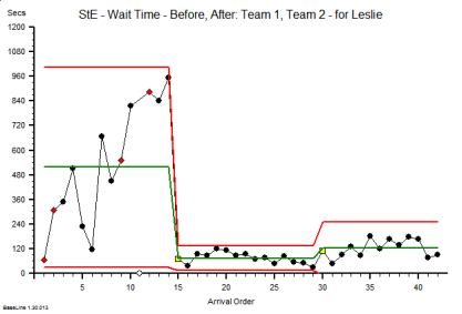
StE_OSC_Before_and_After
This is the waiting time run chart for the one stop clinic improvement exercise that you all did.  The leftmost segment is the before, and the rightmost are the after … your two ‘new’ designs.

As you say, the queue and the waiting has melted away despite doing exactly the same work with exactly the same resources.  Surprising and counter-intuitive but there is the evidence.

<Leslie> Wow! That fits exactly with how it felt.  Quick and calm! But I seem to remember that the waiting room was empty, particularly in the case of the design that Team 1 created. How come the waiting is not closer to zero on the chart?

<Bob> You are correct.  This is not just the time in the waiting room, it also includes the time needed to move between the rooms and the changeover time within the rooms.  It is what I call the ‘tween-time.

<Leslie> OK, that makes sense now.  And what also jumps out of the picture for me is the proof that we converted an unstable process into a stable one.  The chaos was calmed.  So what is the root cause of the difference between the two ‘after’ designs?

<Bob> The middle one, the slightly better of the two, is the one where all patients followed the newly designed process.  The rightmost one was where we deliberately threw a spanner in the works by assuming an unpredictable case mix.

<Leslie> Which made very little difference!  The new design was still much, much better than before.

<Bob> Yes. What you are seeing here is the footprint of resilient design. Do you believe it is possible now?

<Leslie> You bet I do!

New Meat for Old Bones

FreshMeatOldBonesEvolution is an amazing process.

Using the same building blocks that have been around for a lot time, it cooks up innovative permutations and combinations that reveal new and ever more useful properties.

Very often a breakthrough in understanding comes from a simplification, not from making it more complicated.

Knowledge evolves in just the same way.

Sometimes a well understood simplification in one branch of science is used to solve an ‘impossible’ problem in another.

Cross-fertilisation of learning is a healthy part of the evolution process.


Improvement implies evolution of knowledge and understanding, and then application of that insight in the process of designing innovative ways of doing things better.


And so it is in healthcare.  For many years the emphasis on healthcare improvement has been the Safety-and-Quality dimension, and for very good reasons.  We need to avoid harm and we want to achieve happiness; for everyone.

But many of the issues that plague healthcare systems are not primarily SQ issues … they are flow and productivity issues. FP. The safety and quality problems are secondary – so only focussing on them is treating the symptoms and not the cause.  We need to balance the wheel … we need flow science.


Fortunately the science of flow is well understood … outside healthcare … but apparently not so well understood inside healthcare … given the queues, delays and chaos that seem to have become the expected norm.  So there is a big opportunity for cross fertilisation here.  If we choose to make it happen.


For example, from computer science we can borrow the knowledge of how to schedule tasks to make best use of our finite resources and at the same time avoid excessive waiting.

It is a very well understood science. There is comprehensive theory, a host of techniques, and fit-for-purpose tools that we can pick of the shelf and use. Today if we choose to.

So what are the reasons we do not?

Is it because healthcare is quite introspective?

Is it because we believe that there is something ‘special’ about healthcare?

Is it because there is no evidence … no hard proof … no controlled trials?

Is it because we assume that queues are always caused by lack of resources?

Is it because we do not like change?

Is it because we do not like to admit that we do not know stuff?

Is it because we fear loss of face?


Whatever the reasons the evidence and experience shows that most (if not all) the queues, delays and chaos in healthcare systems are iatrogenic.

This means that they are self-generated. And that implies we can un-self-generate them … at little or no cost … if only we knew how.

The only cost is to our egos of having to accept that there is knowledge out there that we could use to move us in the direction of excellence.

New meat for our old bones?

Emergent Learning

CAS_DiagramThe theme this week has been emergent learning.

By that I mean the ‘ah ha’ moment that happens when lots of bits of a conceptual jigsaw go ‘click’ and fall into place.

When, what initially appears to be smoky confusion suddenly snaps into sharp clarity.  Eureka!  And now new learning can emerge.


This did not happen by accident.  It was engineered.


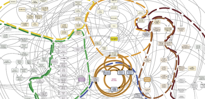
The picture above is part of a bigger schematic map of a system – in this case a system related to the global health challenge of escalating obesity.

It is a complicated arrangement of boxes and arrows. There are  dotted lines that outline parts of the system that have leaky boundaries like the borders on a political map.

But it is a static picture of the structure … it tells us almost nothing about the function, the system behaviour.

And our intuition tells us that, because it is a complicated structure, it will exhibit complex and difficult to understand behaviour.  So, guided by our inner voice, we toss it into the pile labelled Wicked Problems and look for something easier to work on.


Our natural assumption that a complicated structure always leads to complex behavior is an invalid simplification, and one that we can disprove in a matter of moments.


Exhibit 1. A system can be complicated and yet still exhibit simple, stable and predictable behavior.

Harrison_H1The picture is of a clock designed and built by John Harrison (1693-1776).  It is called H1 and it is a sea clock.

Masters of sailing ships required very accurate clocks to calculate their longitude, the East-West coordinate on the Earth’s surface. And in the 18th Century this was a BIG problem. Too many ships were getting lost at sea.

Harrison’s sea clock is complicated.  It has many moving parts, but it was the most stable and accurate clock of its time.  And his later ones were smaller, more accurate and even more complicated.


Exhibit 2.  A system can be simple yet still exhibit complex, unstable and unpredictable behavior.

Double-compound-pendulumThe image is of a pendulum made of only two rods joined by a hinge.  The structure is simple yet the behavior is complex, and this can only be appreciated with a dynamic visualisation.

The behaviour is clearly not random. It has an emergent structure. It is called chaotic.

So, with these two real examples we have disproved our assumption that a complicated structure always leads to complex behaviour; and we have also disproved its inverse … that complex behavior always comes from a complicated structure.

The cognitive trap we have exposed here is over-generalisation, the unconscious habit of slipping in the implied [always].


This deeper understanding gives us hope.

John Harrison was a rare, naturally-gifted, mechanical genius.  And to make it easier, he was working on a purely mechanical system comprised of non-living parts that only obeyed the Laws of Newtonian physics.  And even with those advantages it took him decades to learn how to design and to build his sea clocks.  He was the first to do so and he was self-educated so his learning was emergent.

If there were a way to design complicated systems to exhibit stable and predictable behaviour, how could more of us learn how to do that?


Our healthcare system is not made of passive, mechanical cogs and springs.  The parts are active, living people whose actions are limited by physical Laws but whose decisions are steered by other policies … learned ones … and ones that can change.  These learned rules of thumb are called heuristics and they vary from person-to-person and from minute-to-minute.  Heuristics can be learned, unlearned, updated, and evolved.

This is called emergent learning.

And to generate it we only need to create the context for it … the rest happens … as if by magic … but only if we design a fit-for-purpose context.


This week I personally observed over a dozen healthcare staff simultaneously re-invent a complicated process scheduling technique, at the same time as using it to eliminate the  queues, waiting and chaos in the system they wanted to improve.

Their queues just evaporated … without requiring any extra capacity or money. Eureka!


We did not show them how to do it so they could not have just copied what we did.

We designed and built the context for their learning to emerge … and it did.  On its own.

The One Day Practical Skills Workshop delivered emergent learning … just as it was designed to do.

A health care system is a complex adaptive system (CAS), and system improvement-by-design is what systems engineers (SE) are trained to do.

And this emerging style of complex adaptive systems engineering (CASE) is at the cutting edge of human knowledge, and when applied in the health care domain it is called health care systems engineering (HCSE).

Our experience of the emergent learning that flows from the practical skills workshops verifies that CASE is both possible, learnable, teachable, applicable and effective.

The Five-day versus Seven-day Bun-Fight

Dr_Bob_ThumbnailThere is a big bun-fight kicking off on the topic of 7-day working in the NHS.

The evidence is that there is a statistical association between mortality in hospital of emergency admissions and day of the week: and weekends are more dangerous.

There are fewer staff working at weekends in hospitals than during the week … and delays and avoidable errors increase … so risk of harm increases.

The evidence also shows that significantly fewer patients are discharged at weekends.


So the ‘obvious’ solution is to have more staff on duty at weekends … which will cost more money.


Simple, obvious, linear and wrong.  Our intuition has tricked us … again!


Let us unravel this Gordian Knot with a bit of flow science and a thought experiment.

1. The evidence shows that there are fewer discharges at weekends … and so demonstrates lack of discharge flow-capacity. A discharge process is not a single step, there are many things that must flow in sync for a discharge to happen … and if any one of them is missing or delayed then the discharge does not happen or is delayed.  The weakest link effect.

2. The evidence shows that the number of unplanned admissions varies rather less across the week; which makes sense because they are unplanned.

3. So add those two together and at weekends we see hospitals filling up with unplanned admissions – not because the sick ones are arriving faster – but because the well ones are leaving slower.

4. The effect of this is that at weekends the queue of people in beds gets bigger … and they need looking after … which requires people and time and money.

5. So the number of staffed beds in a hospital must be enough to hold the biggest queue – not the average or some fudged version of the average like a 95th percentile.

6. So a hospital running a 5-day model needs more beds because there will be more variation in bed use and we do not want to run out of beds and delay the admission of the newest and sickest patients. The ones at most risk.

7. People do not get sicker because there is better availability of healthcare services – but saying we need to add more unplanned care flow capacity at weekends implies that it does.  What is actually required is that the same amount of flow-resource that is currently available Mon-Fri is spread out Mon-Sun. The flow-capacity is designed to match the customer demand – not the convenience of the supplier.  And that means for all parts of the system required for unplanned patients to flow.  What, where and when. It costs the same.

8. Then what happens is that the variation in the maximum size of the queue of patients in the hospital will fall and empty beds will appear – as if by magic.  Empty beds that ensure there is always one for a new, sick, unplanned admission on any day of the week.

9. And empty beds that are never used … do not need to be staffed … so there is a quick way to reduce expensive agency staff costs.

So with a comprehensive 7-day flow-capacity model the system actually gets safer, less chaotic, higher quality and less expensive. All at the same time. Safety-Flow-Quality-Productivity.

What is Productivity?

It was the time for Bob and Leslie’s regular coaching session. Dr_Bob_ThumbnailBob was already on line when Leslie dialed in to the teleconference.

<Leslie> Hi Bob, sorry I am a bit late.

<Bob> No problem Leslie. What aspect of improvement science shall we explore today?

<Leslie> Well, I’ve been working through the Safety-Flow-Quality-Productivity cycle in my project and everything is going really well.  The team are really starting to put the bits of the jigsaw together and can see how the synergy works.

<Bob> Excellent. And I assume they can see the sources of antagonism too.

<Leslie> Yes, indeed! I am now up to the point of considering productivity and I know it was introduced at the end of the Foundation course but only very briefly.

<Bob> Yes,  productivity was described as a system metric. A ratio of a steam metric and a stage metric … what we get out of the streams divided by what we put into the stages.  That is a very generic definition.

<Leslie> Yes, and that I think is my problem. It is too generic and I get it confused with concepts like efficiency.  Are they the same thing?

<Bob> A very good question and the short answer is “No”, but we need to explore that in more depth.  Many people confuse efficiency and productivity and I believe that is because we learn the meaning of words from the context that we see them used in. If  others use the words imprecisely then it generates discussion, antagonism and confusion and we are left with the impression of that it is a ‘difficult’ subject.  The reality is that it is not difficult when we use the words in a valid way.

<Leslie> OK. That reassures me a bit … so what is the definition of efficiency?

<Bob> Efficiency is a stream metric – it is the ratio of the minimum cost of the resources required to complete one task divided by the actual cost of the resources used to complete one task.

<Leslie> Um.  OK … so how does time come into that?

<Bob> Cost is a generic concept … it can refer to time, money and lots of other things.  If we stick to time and money then we know that if we have to employ ‘people’ then time will cost money because people need money to buy essential stuff that the need for survival. Water, food, clothes, shelter and so on.

<Leslie> So we could use efficiency in terms of resource-time required to complete a task?

<Bob> Yes. That is a very useful way of looking at it.

<Leslie> So how is productivity different? Completed tasks out divided by cash in to pay for resource time would be a productivity metric. It looks the same.

<Bob> Does it?  The definition of efficiency is possible cost divided by actual cost. It is not the as our definition of system productivity.

<Leslie> Ah yes, I see. So do others define productivity the same way?

<Bob> Try looking it up on Wikipedia …

<Leslie> OK … here we go …

Productivity is an average measure of the efficiency of production. It can be expressed as the ratio of output to inputs used in the production process, i.e. output per unit of input”.

Now that is really confusing!  It looks like efficiency and productivity are the same. Let me see what the Wikipedia definition of efficiency is …

“Efficiency is the (often measurable) ability to avoid wasting materials, energy, efforts, money, and time in doing something or in producing a desired result”.

But that is closer to your definition of efficiency – the actual cost is the minimum cost plus the cost of waste.

<Bob> Yes.  I think you are starting to see where the confusion arises.  And this is because there is a critical piece of the jigsaw missing.

<Leslie> Oh …. and what is that?

<Bob> Worth.

<Leslie> Eh?

<Bob> Efficiency has nothing to do with whether the output of the stream has any worth.  I can produce a worthless product with low waste … in other words very efficiently.  And what if we have the situation where the output of my process is actually harmful.  The more efficiently I use my resources the more harm I will cause from a fixed amount of resource … and in that situation it is actually safer to have an inefficient process!

<Leslie> Wow!  That really hits the nail on the head … and the implications are … profound.  Efficiency is objective and relates only to flow … and between flow and productivity we have to cross the Safety-Quality line. Productivity also includes the subjective concept of worth or value. That all makes complete sense now. A productive system is a subjectively and objectively win-win-win design.

<Bob> Yup.  Get the safety, flow and quality perspectives of the design in synergy and productivity will sky-rocket. It is called a Fit-4-Purpose design.

Measure and Matter

stick_figure_balance_mind_heart_150_wht_9344Improvement implies learning.  And to learn we need feedback from reality because without it we will continue to believe our own rhetoric.

So reality feedback requires both sensation and consideration.

There are many things we might sense, measure and study … so we need to be selective … we need to choose those things that will help us to make the wise decisions.


Wise decisions lead to effective actions which lead to intended outcomes.


Many measures generate objective data that we can plot and share as time-series charts.  Pictures that tell an evolving story.

There are some measures that matter – our intended outcomes for example. Our safety, flow, quality and productivity charts.

There are some measures that do not matter – the measures of compliance for example – the back-covering blame-avoiding management-by-fear bureaucracy.


And there are some things that matter but are hard to measure … objectively at least.

We can sense them subjectively though.  We can feel them. If we choose to.

And to do that we only need to go to where the people are and the action happens and just watch, listen, feel and learn.  We do not need to do or say anything else.

And it is amazing what we learn in a very short period of time. If we choose to.


If we enter a place where a team is working well we will see smiles and hear laughs. It feels magical.  They will be busy and focused and they will show synergism. The team will be efficient, effective and productive.

If we enter place where is team is not working well we will see grimaces and hear gripes. It feels miserable. They will be busy and focused but they will display antagonism. The team will be inefficient, ineffective and unproductive.


So what makes the difference between magical and miserable?

The difference is the assumptions, attitudes, prejudices, beliefs and behaviours of those that they report to. Their leaders and managers.

If the culture is management-by-fear (a.k.a bullying) then the outcome is unproductive and miserable.

If the culture is management-by-fearlessness (a.k.a. inspiring) then the outcome is productive and magical.

It really is that simple.

Excellent or Mediocre?

smack_head_in_disappointment_150_wht_16653Many organisations proclaim that their mission is to achieve excellence but then proceed to deliver mediocre performance.

Why is this?

It is certainly not from lack of purpose, passion or people.

So the flaw must lie somewhere in the process.


The clue lies in how we measure performance … and to see the collective mindset behind the design of the performance measurement system we just need to examine the key performance indicators or KPIs.

Do they measure failure or success?


Let us look at some from the NHS …. hospital mortality, hospital acquired infections, never events, 4-hour A&E breaches, cancer wait breaches, 18 week breaches, and so on.

In every case the metric reported is a failure metric. Not a success metric.

And the focus of action is getting away from failure.

Damage mitigation, damage limitation and damage compensation.


So we have the answer to our question: we know we are doing a good job when we are not failing.

But are we?

When we are not failing we are not doing a bad job … is that the same as doing a good job?

Q: Does excellence  = not excrement?

A: No. There is something between these extremes.

The succeed-or-fail dichotomy is a distorting simplification created by applying an arbitrary threshold to a continuous measure of performance.


And how, specifically, have we designed our current system to avoid failure?

Usually by imposing an arbitrary target connected to a punitive reaction to failure. Management by fear.

This generates punishment-avoidance and back-covering behaviour which is manifest as a lot of repeated checking and correcting of the inevitable errors that we find.  A lot of extra work that requires extra time and that requires extra money.

So while an arbitrary-target-driven-check-and-correct design may avoid failing on safety, the additional cost may cause us to then fail on financial viability.

Out of the frying pan and into the fire.

No wonder Governance and Finance come into conflict!

And if we do manage to pull off a uneasy compromise … then what level of quality are we achieving?


Studies show that if take a random sample of 100 people from the pool of ‘disappointed by their experience’ and we ask if they are prepared to complain then only 5% will do so.

So if we use complaints as our improvement feedback loop and we react to that and make changes that eliminate these complaints then what do we get? Excellence?

Nope.

We get what we designed … just good enough to avoid the 5% of complaints but not the 95% of disappointment.

We get mediocrity.


And what do we do then?

We start measuring ‘customer satisfaction’ … which is actually asking the question ‘did your experience meet your expectation?’

And if we find that satisfaction scores are disappointingly low then how do we improve them?

We have two choices: improve the experience or reduce the expectation.

But as we are very busy doing the necessary checking-and-correcting then our path of least resistance to greater satisfaction is … to lower expectations.

And we do that by donning the black hat of the pessimist and we lay out the the risks and dangers.

And by doing that we generate anxiety and fear.  Which was not the intended outcome.


Our mission statement proclaims ‘trusted to achieve excellence’ not ‘designed to deliver mediocrity’.

But mediocrity is what the evidence says we are delivering. Just good enough to avoid a smack from the Regulators.

And if we are honest with ourselves then we are forced to conclude that:

A design that uses failure metrics as the primary feedback loop can achieve no better than mediocrity.


So if we choose  to achieve excellence then we need a better feedback design.

We need a design that uses success metrics as the primary feedback loop and we use failure metrics only in safety critical contexts.

And the ideal people to specify the success metrics are those who feel the benefit directly and immediately … the patients who receive care and the staff who give it.

Ask a patient what they want and they do not say “To be treated in less than 18 weeks”.  In fact I have yet to meet a patient who has even heard of the 18-week target!

A patient will say ‘I want to know what is wrong, what can be done, when it can be done, who will do it, what do I need to do, and what can I expect to be the outcome’.

Do we measure any of that?

Do we measure accuracy of diagnosis? Do we measure use of best evidenced practice? Do we know the possible delivery time (not the actual)? Do we inform patients of what they can expect to happen? Do we know what they can expect to happen? Do we measure outcome for every patient? Do we feed that back continuously and learn from it?

Nope.


So …. if we choose and commit to delivering excellence then we will need to start measuring-4-success and feeding what we see back to those who deliver the care.

Warts and all.

So that we know when we are doing a good job, and we know where to focus further improvement effort.

And if we abdicate that commitment and choose to deliver mediocrity-by-default then we are the engineers of our own chaos and despair.

We have the choice.

We just need to make it.

Excellence By Design

top_surgeon_400_wht_7589All healthcare organisations strive for excellence, which is good, and most achieve mediocrity, which is not so good.

Why is that?

One cause is the design of their model for improvement … the one that is driven by targets, complaints, near misses, serious untoward incidents (SUIs) and never events (which are not never).

A model for improvement that is driven by failure feedback loops can only ever achieve mediocrity, not excellence.

Whaaaaaat?!* That’s rubbish”  I hear you cry … so let us see.


Try this simple test …. just ask any employee in your organisation this question (and start with yourself):

How do you know you are doing a good job?

If the first answer heard is “When no one is complaining” then you have a Mediocrity Design.


When customers have a disappointing experience most do not pen a letter or write an email to complain.  Most just sigh and lower their expectations to avoid future disappointment; many will grumble to family and friends; and only a few (about 5%) will actually complain. They are the really angry extreme.  So they can easily be fobbed off with platitudes … just being earnestly listened to and unreservedly apologised to is usually enough to take the wind out of their sails.  It will escort them back to the silent but disappointed majority whose expectation is being gradually eroded by relentless disappointment. Nothing fundamental needs to change because eventually the complaints dry up, apathy is re-established and chronic mediocrity is assured.


To achieve excellence we need a better answer to the “How do you know you are doing a good job?” question.

We need to be able to say “I know I am doing a good job because this is what a good outcome looks like; this is my essential contribution to achieving that outcome; and here are the measures of the intended outcomes that we are achieving.

In short we need a clear purpose, a defined part in the process that delivers that purpose, and we need an objective feedback loop that tells us that the purpose has been achieved and that our work is worthwhile.

And if  any of those components are missing then we know we have some improvement work to do.

The first step is usually answering the question “What is our purpose?

The second step is using the purpose to design and install the how-are-we-doing feedback loop.

And the  third step is to learn to use the success feedback loop to ensure that we are always working to have a necessary-and-sufficient process that delivers the intended outcome and that we are playing a part in that.

And when we are reliably achieving our purpose, we set ourselves an even better outcome – an even safer, calmer, higher quality and more productive one … and doing that will generate more improvement work to do.  We will not be idle.


That is the essence of Excellence-by-Design.

Over-Egged Expectation

FISH_ISP_eggs_jumpingResistance-to-change is an oft quoted excuse for improvement torpor. The implied sub-message is more like “We would love to change but They are resisting“.

Notice the Us-and-Them language.  This is the observable evidence of an “We‘re OK and They’re Not OK” belief.  And in reality it is this unstated belief and the resulting self-justifying behaviour that is an effective barrier to systemic improvement.

This Us-and-Them language generates cultural friction, erodes trust and erects silos that are effective barriers to the flow of information, of innovation and of learning.  And the inevitable reactive solutions to this Us-versus-Them friction create self-amplifying positive feedback loops that ensure the counter-productive behaviour is sustained.

One tangible manifestation are DRATs: Delusional Ratios and Arbitrary Targets.


So when a plausible, rational and well-evidenced candidate for an alternative approach is discovered then it is a reasonable reaction to grab it and to desperately spray the ‘magic pixie dust’ at everything.

This a recipe for disappointment: because there is no such thing as ‘improvement magic pixie dust’.

The more uncomfortable reality is that the ‘magic’ is the result of a long period of investment in learning and the associated hard work in practising and polishing the techniques and tools.

It may look like magic but is isn’t. That is an illusion.

And some self-styled ‘magicians’ choose to keep their hard-won skills secret … because by sharing them know that they will lose their ‘magic powers’ in a flash of ‘blindingly obvious in hindsight’.

And so the chronic cycle of despair-hope-anger-and-disappointment continues.


System-wide improvement in safety, flow, quality and productivity requires that the benefits of synergism overcome the benefits of antagonism.  This requires two changes to the current hope-and-despair paradigm.  Both are necessary and neither are sufficient alone.

1) The ‘wizards’ (i.e. magic folk) share their secrets.
2) The ‘muggles’ (i.e. non-magic folk) invest the time and effort in learning ‘how-to-do-it’.


The transition to this awareness is uncomfortable so it needs to be managed pro-actively … by being open about the risk … and how to mitigate it.

That is what experienced Practitioners of Improvement Science (and ISP) will do. Be open about the challenged ahead.

And those who desperately want the significant and sustained SFQP improvements; and an end to the chronic chaos; and an end to the gaming; and an end to the hope-and-despair cycle …. just need to choose. Choose to invest and learn the ‘how to’ and be part of the future … or choose to be part of the past.


Improvement science is simple … but it is not intuitively obvious … and so it is not easy to learn.

If it were we would be all doing it.

And it is the behaviour of a wise leader of change to set realistic and mature expectations of the challenges that come with a transition to system-wide improvement.

That is demonstrating the OK-OK behaviour needed for synergy to grow.

Circles

SFQP_enter_circle_middle_15576For a system to be both effective and efficient the parts need to work in synergy. This requires both alignment and collaboration.

Systems that involve people and processes can exhibit complex behaviour. The rules of engagement also change as individuals learn and evolve their beliefs and their behaviours.

The values and the vision should be more fixed. If the goalposts are obscure or oscillate then confusion and chaos is inevitable.


So why is collaborative alignment so difficult to achieve?

One factor has been mentioned. Lack of a common vision and a constant purpose.

Another factor is distrust of others. Our fear of exploitation, bullying, blame, and ridicule.

Distrust is a learned behaviour. Our natural inclination is trust. We have to learn distrust. We do this by copying trust-eroding behaviours that are displayed by our role models. So when leaders display these behaviours then we assume it is OK to behave that way too.  And we dutifully emulate.

The most common trust eroding behaviour is called discounting.  It is a passive-aggressive habit characterised by repeated acts of omission:  Such as not replying to emails, not sharing information, not offering constructive feedback, not asking for other perspectives, and not challenging disrespectful behaviour.


There are many causal factors that lead to distrust … so there is no one-size-fits-all solution to dissolving it.

One factor is ineptitude.

This is the unwillingness to learn and to use available knowledge for improvement.

It is one of the many manifestations of incompetence.  And it is an error of omission.


Whenever we are unable to solve a problem then we must always consider the possibility that we are inept.  We do not tend to do that.  Instead we prefer to jump to the conclusion that there is no solution or that the solution requires someone else doing something different. Not us.

The impossibility hypothesis is easy to disprove.  If anyone has solved the problem, or a very similar one, and if they can provide evidence of what and how then the problem cannot be impossible to solve.

The someone-else’s-fault hypothesis is trickier because proving it requires us to influence others effectively.  And that is not easy.  So we tend to resort to easier but less effective methods … manipulation, blame, bullying and so on.


A useful way to view this dynamic is as a set of four concentric circles – with us at the centre.

The outermost circle is called the ‘Circle of Ignorance‘. The collection of all the things that we do not know we do not know.

Just inside that is the ‘Circle of Concern‘.  These are things we know about but feel completely powerless to change. Such as the fact that the world turns and the sun rises and falls with predictable regularity.

Inside that is the ‘Circle of Influence‘ and it is a broad and continuous band – the further away the less influence we have; the nearer in the more we can do. This is the zone where most of the conflict and chaos arises.

The innermost is the ‘Circle of Control‘.  This is where we can make changes if we so choose to. And this is where change starts and from where it spreads.


SFQP_enter_circle_middle_15576So if we want system-level improvements in safety, flow, quality and productivity (or cost) then we need to align these four circles. Or rather the gaps in them.

We start with the gaps in our circle of control. The things that we believe we cannot do … but when we try … we discover that we can (and always could).

With this new foundation of conscious competence we can start to build new relationships, develop trust and to better influence others in a win-win-win conversation.

And then we can collaborate to address our common concerns – the ones that require coherent effort. We can agree and achieve our common purpose, vision and goals.

And from there we will be able to explore the unknown opportunities that lie beyond. The ones we cannot see yet.

A School for Rebels

Troublemaker_vs_RebelSystem-wide, significant, and sustained improvement implies system-wide change.

And system-wide change implies more than 20% of the people commit to action. This is the cultural tipping point.

These critical 20% have a badge … they call themselves rebels … and they are perceived as troublemakers by those who profit most from the status quo.

But troublemakers and rebels are radically different … as shown in the summary by Lois Kelly.


Rebels share a common, future-focussed purpose.  A mission.  They are passionate, optimistic and creative.  They understand synergy and how to release and align the stored emotional energy of both themselves and others.  And most importantly they are value-led and that makes them attractive.  Values such as honesty, integrity and industry are what make leaders together-effective.

SHCR_logoAnd as we speak there is school for rebels in healthcare gaining momentum …  and their programme is current, open to all and free to access. And the change agent development materials are excellent!

Click here to download their study guide.


Converting possibilities into realities is the essence of design … so our merry band of rebels will also need to learn how to convert their positive rhetoric into practical reality. And that is more physics than psychology.

Streams flow because of physics not because of passion.SFQP_Compass

And this is why the science of improvement is important because it is the synthesis of the people dimension and the process dimension – into a system that delivers significant and sustained improvement.

On all dimensions. Safety, Flow, Quality and Productivity.

The lighthouse is our purpose; the whale represents the magnitude of our challenge; the blue sky is the creative thinking we need … to avoid trying to boil the ocean.

And the noisy, greedy, s****y seagulls are the troublemakers who always will plague us.

[Image by Malaika Art].


SFQP

SFQPThe flavour of the week has been “chaos”.  Again!

Chaos dissipates energy faster than calm so chaotic behaviour is a symptom of an inefficient design.

And we would like to improve our design to restore a state of ‘calm efficiency’.

Chaos is a flow phenomenon … but that is not where the improvement by design process starts.  There is a step before that … Safety.


Safety First
If a design is unsafe it generates harm.  So we do not want to improve the smooth efficiency of the harm generator … that will only produce more harm!  First we must consider if our system is safe enough.

Despite what many claim, our healthcare systems are actually very safe.  For sure there are embarrassing exceptions and we can always improve safety further, but we actually have quite a safe design.

It is not a very efficient design though.  There is a lot of checking and correcting which uses up time and resources … but it helps to ensure safety is good enough for now.

Having done the safety sanity check we can move on to Flow.


Flow Second
Flow comes before quality because it is impossible to deliver a high quality experience in a chaotic system.  First we need to calm any chaos.  Or rather we need to diagnose the root causes of the chaotic behaviour and do some flow re-design to restore the calm.

Chaos is funny stuff.  It does not behave intuitively.  Time is always a factor.  The butterflies wing effect is ever present.  Small causes can have big effects, both good and bad.  Big causes can have no effect.  Causes can be synergistic and they can be antagonistic.  The whole is not the sum of the parts.  This confusing and counter-intuitive behaviour is called “non linear” and we are all rubbish at getting a mental handle on it.  Our brains did not evolve that way.

The good news is that when chaos reigns it is usually possible to calm it with a small number of carefully placed, carefully timed, carefully designed, synergistic, design “tweaks”.

The problem is that when we do what intuitively feels “right” we can too easily make poor improvement decisions that lead to ineffective actions.  The chaos either does not go away or it gets worse.  So, we have learned from our ineptitude to just put up with the chaos and to accept the inefficiency, the high cost-of-chaos.

To calm the chaos we have to learn how to use the tools designed to do that.  And they do exist.


Quality
Safety and Flow represent the “absolute” half of the SFQP cycle.  Harm is an absolute metric. We can devise absolute definitions and count harmful events.  Mortality.  Mistakes.  Hospital  acquired infections.  That sort of stuff.

Flow is absolute too in the sense that the Laws of Physics determine what happens, and they are absolute too. And non-negotiable.

Quality is relative.  It is the ratio of experience and expectation and both of these are subjective but that is not the point.  The point is that it is a ratio and that makes it a relative metric.  My expectation influences my perception of quality, as does what I experience.  And this has important implications.  For example we can reduce disappointment by lowering expectation; or we can reduce disappointment by improving experience.  Lowering expectation is the easier option because to do that we only have to don the “black hat” and paint a grisly picture of a worst case scenario.  Some call it “informed consent”; I call it “abdication of empathy” and “fear-mongering”.

Variable quality can  come from variable experience, variable expectation or both.  So, to reduce quality variation we can focus on either input to the ratio; and the easiest is expectation.  Setting a realistic expectation just requires measuring experience retrospectively and sharing it prospectively.  Not satisfaction mind you – Experience. Satisfaction surveys are largely meaningless as an improvement tool because just setting a lower expectation will improve satisfaction!

And this is why quality follows flow … because if flow is chaotic then expectation becomes a lottery, and quality does too.  The chaotic behaviour of the St.Elsewhere’s® A&E Department that we saw last week implies that we cannot set any other expectation than “It might be OK or it might be Not OK … we cannot predict. So fingers crossed.”  It is a quality lottery!

But with calm and efficient flow we experience less variation and with that we can set a reasonable expectation.  Quality becomes predictable-within-limits.


Productivity
Productivity is also a relative concept.  It is the ratio of what we get out of the system divided by what we put in.  Revenue divided by expense for example.

And it does not actually emerge last.  As soon as safety, flow or quality improve then they will have an immediate impact on productivity.  Work gets easier.  The cost of harm, chaos and disappointment will fall (and they are surprisingly large costs!).

The reason that productivity-by-design comes last is because we are talking about focussed productivity improvement-by-design.  Better value for money.  And that requires a specific design focus.  And it comes last because we need some head-space and some life-time to learn and do good system design.

And SFQP is a cycle so after doing the Productivity improvement we go back to Safety and ask “How can we make our design even safer and even simpler?” And so on, round and round the SFQP loop.

Do no harm, restore the calm, delight for all, and costs will fall.

And if you would like a full-size copy of the SFQP cycle diagram to use and share just click here.

Counter-Productivity

coffee_table_talk_PA_150_wht_6082The Webex icon bounced up and down on Bob’s task bar signalling that Leslie had just joined the weekly ISP coaching session.

<Leslie> Hi Bob. I have been so busy this week that I have not had time to consider a topic to explore.

<Bob> No problem Leslie, I have shelf full of topics we have not touched yet.  So shall we talk about counter-productivity?

<Leslie> Don’t you mean productivity … the fourth dimension of system improvement.

<Bob>They are related of course but we will approach the issue of productivity from a different angle. Rather like we did with safety. To improve safety we considered at the causes of un-safety and focussed our efforts there.

<Leslie> Ah yes, I see.  So to improve productivity we look at the causes of un-productivity … in other words counter-productive beliefs and behaviours that are manifest as system design flaws.

<Bob> Exactly. So remind me what the definition of a productivity metric is from your FISH course.

<Leslie> Productivity is the ratio of a stream metric and a stage metric.  Value-for-Money for example.

<Bob> Good.  So counter-productivity is also a ratio of a stream and a stage metric.

<Leslie> Um, I’m not sure I quite get that. Can you explain a bit more.

<Bob> OK. To explore deeper we need to be clear about how each metric relates to our intended outcome.  Remember in safety-by-design we count the number and severity of risks and harm because  as harm is going up then safety is going down.  So harm is an un-safety stream metric.

<Leslie> Ah! Yes I see.  So if we look at cycle-time, which is a stage metric; as cycle-time increases, the activity falls and productivity falls. So cycle-time is actually a counter-productivity metric.

<Bob>Excellent. You are getting the hang of the concept of counter-productivity.

<Leslie> And we need to be careful because productivity is a ratio so the numerator and denominator metrics work in opposite ways: increasing the magnitude of the numerator is equivalent to decreasing the magnitude of the denominator – the ratio increases.

<Bob> Indeed, there are many hazards with ratios as we have explored before. So let is consider a real and rather useful example.  Let us look at Little’s Law from the perspective of counter-productivity. Remind me of the definition of Little’s Law for a single step system.

<Leslie> Little’s Law is a mathematically proven law of flow physics which states that the average lead-time is the product of the average work-in-progress and the average cycle-time.

LT = WIP * CT

<Bob> Good and I am pleased to see that you have used cycle-time. We are considering a single stream, single stage, single step system.

<Leslie> Yes, I avoided using the unqualified term ‘activity’. I have learned that lesson the hard way too!

<Bob> So how do the terms in Little’s Law relate to streams, stages and systems?

<Leslie> Lead-time is a stream metric, cycle-time is a stage metric and work-in-progress is a …. h’mm. What it is? A stream metric or a stage metric?

<Bob>Or?

<Leslie>A system metric?  WIP is a system metric!

<Bob> Good. So now re-arrange Little’s Law as a productivity formula.

<Leslie> Work-in-Progress equals lead-time divided by cycle-time

WIP = LT / CT

<Bob> So is WIP a productivity or a counter-productivity metric?

<Leslie> H’mmm …. I will need to work this through logically and step-by-step. I do not trust my intuition on this flow stuff.

Increasing cycle-time is counter-productive because it implies activity is falling while costs are not.

But cycle-time is on the bottom of the ratio so it’s effect reverses.

So if lead-time stays the same and cycle-time increases then because it is on the bottom of the ratio that implies a more productive design. And at the same time work in progress must be falling. Urrgh! This is hurting my head.

<Bob> Good, keep going … you are nearly there.

<Leslie> So a falling WIP is a sign of increasing productivity.

<Bob> Good … and that implies?

<Leslie> WIP is a counter-productivity system metric!

<Bob> Well done. Your logic is flawless.

<Leslie> So that  is why we focus on WIP so much!  Whatever causes WIP to increase is counter-productive!

Ahhhh …. that makes complete sense.

Lo-WIP  designs are more productive than Hi-WIP designs.

<Bob> Bravo!  And translating this into financial metrics … it is because a big queue of waiting work incurs costs. Storage cost, maintenance cost, processing cost and so on. So WIP is a liability. It is not an asset!

<Leslie> But doesn’t that imply treating work-in-progress as an asset on the financial balance sheet is counter-productive?

<Bob> It does indeed.

<Leslie> Oh dear! That revelation is going to upset a lot of people in the accounting department!

<Bob> The painful reality is that  the Laws of Flow Physics are completely indifferent to what any of us believe or do not believe.

<Leslie> Wow!  I like this concept of counter-productivity … it really helps to expose some of our invalid assumptions that invisibly block improvement!

<Bob> So here is a question to ponder.  Is zero WIP desirable or even possible?

<Leslie> H’mmm.  I will have to think about that.  I know you would not have asked the question for no reason.

Fit-4-Purpose

F4P_PillsWe all want a healthcare system that is fit for purpose.

One which can deliver diagnosis, treatment and prognosis where it is needed, when it is needed, with empathy and at an affordable cost.

One that achieves intended outcomes without unintended harm – either physical or psychological.

We want safety, delivery, quality and affordability … all at the same time.

And we know that there are always constraints we need to work within.

There are constraints set by the Laws of the Universe – physical constraints.

These are absolute,  eternal and are not negotiable.

Dr Who’s fantastical tardis is fictional. We cannot distort space, or travel in time, or go faster than light – well not with our current knowledge.

There are also constraints set by the Laws of the Land – legal constraints.

Legal constraints are rigid but they are also adjustable.  Laws evolve over time, and they are arbitrary. We design them. We choose them. And we change them when they are no longer fit for purpose.

The third limit is often seen as the financial constraint. We are required to live within our means. There is no eternal font of  limitless funds to draw from.  We all share a planet that has finite natural resources  – and ‘grow’ in one part implies ‘shrink’ in another.  The Laws of the Universe are not negotiable. Mass, momentum and energy are conserved.

The fourth constraint is perceived to be the most difficult yet, paradoxically, is the one that we have most influence over.

It is the cultural constraint.

The collective, continuously evolving, unwritten rules of socially acceptable behaviour.


Improvement requires challenging our unconscious assumptions, our beliefs and our habits – and selectively updating those that are no longer fit-4-purpose.

To learn we first need to expose the gaps in our knowledge and then to fill them.

We need to test our hot rhetoric against cold reality – and when the fog of disillusionment forms we must rip up and rewrite what we have exposed to be old rubbish.

We need to examine our habits with forensic detachment and we need to ‘unlearn’ the ones that are limiting our effectiveness, and replace them with new habits that better leverage our capabilities.

And all of that is tough to do. Life is tough. Living is tough. Learning is tough. Leading is tough. But it energising too.

Having a model-of-effective-leadership to aspire to and a peer-group for mutual respect and support is a critical piece of the jigsaw.

It is not possible to improve a system alone. No matter how smart we are, how committed we are, or how hard we work.  A system can only be improved by the system itself. It is a collective and a collaborative challenge.


So with all that in mind let us sketch a blueprint for a leader of systemic cultural improvement.

What values, beliefs, attitudes, knowledge, skills and behaviours would be on our ‘must have’ list?

What hard evidence of effectiveness would we ask for? What facts, figures and feedback?

And with our check-list in hand would we feel confident to spot an ‘effective leader of systemic cultural improvement’ if we came across one?


This is a tough design assignment because it requires the benefit of  hindsight to identify the critical-to-success factors: our ‘must have and must do’ and ‘must not have and must not do’ lists.

H’mmmm ….

So let us take a more pragmatic and empirical approach. Let us ask …

“Are there any real examples of significant and sustained healthcare system improvement that are relevant to our specific context?”

And if we can find even just one Black Swan then we can ask …

Q1. What specifically was the significant and sustained improvement?
Q2. How specifically was the improvement achieved?
Q3. When exactly did the process start?
Q4. Who specifically led the system improvement?

And if we do this exercise for the NHS we discover some interesting things.

First let us look for exemplars … and let us start using some official material – the Monitor website (http://www.monitor.gov.uk) for example … and let us pick out ‘Foundation Trusts’ because they are the ones who are entrusted to run their systems with a greater degree of capability and autonomy.

And what we discover is a league table where those FTs that are OK are called ‘green’ and those that are Not OK are coloured ‘red’.  And there are some that are ‘under review’ so we will call them ‘amber’.

The criteria for deciding this RAG rating are embedded in a large balanced scorecard of objective performance metrics linked to a robust legal contract that provides the framework for enforcement.  Safety metrics like standardised mortality ratios, flow metrics like 18-week and 4-hour target yields, quality metrics like the friends-and-family test, and productivity metrics like financial viability.

A quick tally revealed 106 FTs in the green, 10 in the amber and 27 in the red.

But this is not much help with our quest for exemplars because it is not designed to point us to who has improved the most, it only points to who is failing the most!  The league table is a name-and-shame motivation-destroying cultural-missile fuelled by DRATs (delusional ratios and arbitrary targets) and armed with legal teeth.  A projection of the current top-down, Theory-X, burn-the-toast-then-scrape-it management-of-mediocrity paradigm. Oh dear!

However,  despite these drawbacks we could make better use of this data.  We could look at the ‘reds’ and specifically at their styles of cultural leadership and compare with a random sample of all the ‘greens’ and their models for success. We could draw out the differences and correlate with outcomes: red, amber or green.

That could offer us some insight and could give us the head start with our blueprint and check-list.


It would be a time-consuming and expensive piece of work and we do not want to wait that long. So what other avenues are there we can explore now and at no cost?

Well there are unofficial sources of information … the ‘grapevine’ … the stuff that people actually talk about.

What examples of effective improvement leadership in the NHS are people talking about?

Well a little blue bird tweeted one in my ear this week …

And specifically they are talking about a leader who has learned to walk-the-improvement-walk and is now talking-the-improvement-walk: and that is Sir David Dalton, the CEO of Salford Royal.

Here is a copy of the slides from Sir David’s recent lecture at the Kings Fund … and it is interesting to compare and contrast it with the style of NHS Leadership that led up to the Mid Staffordshire Failure, and to the Francis Report, and to the Keogh Report and to the Berwick Report.

Chalk and cheese!


So if you are an NHS employee would you rather work as part of an NHS Trust where the leaders walk-DD’s-walk and talk-DD’s-talk?

And if you are an NHS customer would you prefer that the leaders of your local NHS Trust walked Sir David’s walk too?


We are the system … we get the leaders that we deserve … we make the  choice … so we need to choose wisely … and we need to make our collective voice heard.

Actions speak louder than words.  Walk works better than talk.  We must be the change we want to see.

A Little Law and Order

teamwork_puzzle_build_PA_150_wht_2341[Bing bong]. The sound heralded Lesley logging on to the weekly Webex coaching session with Bob, an experienced Improvement Science Practitioner.

<Bob> Good afternoon Lesley.  How has your week been and what topic shall we explore today?

<Lesley> Hi Bob. Well in a nutshell, the bit of the system that I have control over feels like a fragile oasis of calm in a perpetual desert of chaos.  It is hard work keeping the oasis clear of the toxic sand that blows in!

<Bob> A compelling metaphor. I can just picture it.  Maintaining order amidst chaos requires energy. So what would you like to talk about?

<Lesley> Well, I have a small shoal of FISHees who I am guiding  through the foundation shallows and they are getting stuck on Little’s Law.  I confess I am not very good at explaining it and that suggests to me that I do not really understand it well enough either.

<Bob> OK. So shall we link those two theme – chaos and Little’s Law?

<Lesley> That sounds like an excellent plan!

<Bob> OK. So let us refresh the foundation knowledge. What is Little’s Law?

<Lesley>It is a fundamental Law of process physics that relates flow, with lead time and work in progress.

<Bob> Good. And specifically?

<Lesley> Average lead time is equal to the average flow multiplied by the average work in progress.

<Bob>Yes. And what are the units of flow in your equation?

<Lesley> Ah yes! That is  a trap for the unwary. We need to be clear how we express flow. The usual way is to state it as number of tasks in a defined period of time, such as patients admitted per day.  In Little’s Law the convention is to use the inverse of that which is the average interval between consecutive flow events. This is an unfamiliar way to present flow to most people.

<Bob> Good. And what is the reason that we use the ‘interval between events’ form?

<Leslie> Because it is easier to compare it with two critically important  flow metrics … the takt time and the cycle time.

<Bob> And what is the takt time?

<Leslie> It is the average interval between new tasks arriving … the average demand interval.

<Bob> And the cycle time?

<Leslie> It is the shortest average interval between tasks departing …. and is determined by the design of the flow constraint step.

<Bob> Excellent. And what is the essence of a stable flow design?

<Lesley> That the cycle time is less than the takt time.

<Bob>Why less than? Why not equal to?

<Leslie> Because all realistic systems need some flow resilience to exhibit stable and predictable-within-limits behaviour.

<Bob> Excellent. Now describe the design requirements for creating chronically chaotic system behaviour?

<Leslie> This is a bit trickier to explain. The essence is that for chronically chaotic behaviour to happen then there must be two feedback loops – a destabilising loop and a stabilising loop.  The destabilising loop creates the chaos, the stabilising loop ensures it is chronic.

<Bob> Good … so can you give me an example of a destabilising feedback loop?

<Leslie> A common one that I see is when there is a long delay between detecting a safety risk and the diagnosis, decision and corrective action.  The risks are often transitory so if the corrective action arrives long after the root cause has gone away then it can actually destabilise the process and paradoxically increase the risk of harm.

<Bob> Can you give me an example?

<Leslie>Yes. Suppose a safety risk is exposed by a near miss.  A delay in communicating the niggle and a root cause analysis means that the specific combination of factors that led to the near miss has gone. The holes in the Swiss cheese are not static … they move about in the chaos.  So the action that follows the accumulation of many undiagnosed near misses is usually the non-specific mantra of adding yet another safety-check to the already burgeoning check-list. The longer check-list takes more time to do, and is often repeated many times, so the whole flow slows down, queues grow bigger, waiting times get longer and as pressure comes from the delivery targets corners start being cut, and new near misses start to occur; on top of the other ones. So more checks are added and so on.

<Bob> An excellent example! And what is the outcome?

<Leslie> Chronic chaos which is more dangerous, more disordered and more expensive. Lose lose lose.

<Bob> And how do the people feel who work in the system?

<Leslie> Chronically naffed off! Angry. Demotivated. Cynical.

<Bob>And those feelings are the key symptoms.  Niggles are not only symptoms of poor process design, they are also symptoms of a much deeper problem: a violation of values.

<Leslie> I get the first bit about poor design; but what is that second bit about values?

<Bob>  We all have a set of values that we learned when we were very young and that have bee shaped by life experience.  They are our source of emotional energy, and our guiding lights in an uncertain world. Our internal unconscious check-list.  So when one of our values is violated we know because we feel angry. How that anger is directed varies from person to person … some internalise it and some externalise it.

<Leslie> OK. That explains the commonest emotion that people report when they feel a niggle … frustration which is the same as anger.

<Bob>Yes.  And we reveal our values by uncovering the specific root causes of our niggles.  For example if I value ‘Hard Work’ then I will be niggled by laziness. If you value ‘Experimentation’ then you may be niggled by ‘Rigid Rules’.  If someone else values ‘Safety’ then they may value ‘Rigid Rules’ and be niggled by ‘Innovation’ which they interpret as risky.

<Leslie> Ahhhh! Yes, I see.  This explains why there is so much impassioned discussion when we do a 4N Chart! But if this behaviour is so innate then it must be impossible to resolve!

<Bob> Understanding  how our values motivate us actually helps a lot because we are naturally attracted to others who share the same values – because we have learned that it reduces conflict and stress and improves our chance of survival. We are tribal and tribes share the same values.

<Leslie> Is that why different  departments appear to have different cultures and behaviours and why they fight each other?

<Bob> It is one factor in the Silo Wars that are a characteristic of some large organisations.  But Silo Wars are not inevitable.

<Leslie> So how are they avoided?

<Bob> By everyone knowing what common purpose of the organisation is and by being clear about what values are aligned with that purpose.

<Leslie> So in the healthcare context one purpose is avoidance of harm … primum non nocere … so ‘safety’ is a core value.  Which implies anything that is felt to be unsafe generates niggles and well-intended but potentially self-destructive negative behaviour.

<Bob> Indeed so, as you described very well.

<Leslie> So how does all this link to Little’s Law?

<Bob>Let us go back to the foundation knowledge. What are the four interdependent dimensions of system improvement?

<Leslie> Safety, Flow, Quality and Productivity.

<Bob> And one measure of  productivity is profit.  So organisations that have only short term profit as their primary goal are at risk of making poor long term safety, flow and quality decisions.

<Leslie> And flow is the key dimension – because profit is just  the difference between two cash flows: income and expenses.

<Bob> Exactly. One way or another it all comes down to flow … and Little’s Law is a fundamental Law of flow physics. So if you want all the other outcomes … without the emotionally painful disorder and chaos … then you cannot avoid learning to use Little’s Law.

<Leslie> Wow!  That is a profound insight.  I will need to lie down in a darkened room and meditate on that!

<Bob> An oasis of calm is the perfect place to pause, rest and reflect.

Economy-of-Scale vs Economy-of-Flow

We_Need_Small_HospitalsThis was an interesting headline to see on the front page of a newspaper yesterday!

The Top Man of the NHS is openly challenging the current Centralisation-is-The-Only-Way-Forward Mantra;  and for good reason.

Mass centralisation is poor system design – very poor.

Q: So what is driving the centralisation agenda?

A: Money.

Or to be more precise – rather simplistic thinking about money.

The misguided money logic goes like this:

1. Resources (such as highly trained doctors, nurses and AHPs) cost a lot of money to provide.
[Yes].

2. So we want all these resources to be fully-utilised to get value-for-money.
[No, not all – just the most expensive].

3. So we will gather all the most expensive resources into one place to get the Economy-of-Scale.
[No, not all the most expensive – just the most specialised]

4. And we will suck /push all the work through these super-hubs to keep our expensive specialist resources busy all the time.
[No, what about the growing population of older folks who just need a bit of expert healthcare support, quickly, and close to home?]

This flawed logic confuses two complementary ways to achieve higher system productivity/economy/value-for-money without  sacrificing safety:

Economies of Scale (EoS) and Economies of Flow (EoF).

Of the two the EoF is the more important because by using EoF principles we can increase productivity in huge leaps at almost no cost; and without causing harm and disappointment. EoS are always destructive.

But that is impossible. You are talking rubbish … because if it were possible we would be doing it!

It is not impossible and we are doing it … but not at scale and pace in healthcare … and the reason for that is we are not trained in Economy-of-Flow methods.

And those who are trained and who have have experienced the effects of EoF would not do it any other way.

Example:

In a recent EoF exercise an ISP (Improvement Science Practitioner) helped a surgical team to increase their operating theatre productivity by 30% overnight at no cost.  The productivity improvement was measured and sustained for most of the last year. [it did dip a bit when the waiting list evaporated because of the higher throughput, and again after some meddlesome middle management madness was triggered by end-of-financial-year target chasing].  The team achieved the improvement using Economy of Flow principles and by re-designing some historical scheduling policies. The new policies  were less antagonistic. They were designed to line the ducks up and as a result the flow improved.


So the specific issue of  Super Hospitals vs Small Hospitals is actually an Economy of Flow design challenge.

But there is another critical factor to take into account.

Specialisation.

Medicine has become super-specialised for a simple reason: it is believed that to get ‘good enough’ at something you have to have a lot of practice. And to get the practice you have to have high volumes of the same stuff – so you need to specialise and then to sort undifferentiated work into separate ‘speciologist’ streams or sequence the work through separate speciologist stages.

Generalists are relegated to second-class-citizen status; mere tripe-skimmers and sign-posters.

Specialisation is certainly one way to get ‘good enough’ at doing something … but it is not the only way.

Another way to learn the key-essentials from someone who already knows (and can teach) and then to continuously improve using feedback on what works and what does not – feedback from everywhere.

This second approach is actually a much more effective and efficient way to develop expertise – but we have not been taught this way.  We have only learned the scrape-the-burned-toast-by-suck-and-see method.

We need to experience another way.

We need to experience rapid acquisition of expertise!

And being able to gain expertise quickly means that we can become expert generalists.

There is good evidence that the broader our skill-set the more resilient we are to change, and the more innovative we are when faced with novel challenges.

In the Navy of the 1800’s sailors were “Jacks of All Trades and Master of One” because if only one person knew how to navigate and they got shot or died of scurvy the whole ship was doomed.  Survival required resilience and that meant multi-skilled teams who were good enough at everything to keep the ship afloat – literally.


Specialisation has another big drawback – it is very expensive and on many dimensions. Not just Finance.

Example:

Suppose we have six-step process and we have specialised to the point where an individual can only do one step to the required level of performance (safety/flow/quality/productivity).  The minimum number of people we need is six and the process only flows when we have all six people. Our minimum costs are high and they do not scale with flow.

If any one of the six are not there then the whole process stops. There is no flow.  So queues build up and smooth flow is sacrificed.

Out system behaves in an unstable and chaotic feast-or-famine manner and rapidly shifting priorities create what is technically called ‘thrashing’.

And the special-six do not like the constant battering.

And the special-six have the power to individually hold the whole system to ransom – they do not even need to agree.

And then we aggravate the problem by paying them the high salary that it is independent of how much they collectively achieve.

We now have the perfect recipe for a bigger problem!  A bunch of grumpy, highly-paid specialists who blame each other for the chaos and who incessantly clamour for ‘more resources’ at every step.

This is not financially viable and so creates the drive for economy-of-scale thinking in which to get us ‘flow resilience’ we need more than one specialist at each of the six steps so that if one is on holiday or off sick then the process can still flow.  Let us call these tribes of ‘speciologists’ there own names and budgets, and now we need to put all these departments somewhere – so we will need a big hospital to fit them in – along with the queues of waiting work that they need.

Now we make an even bigger design blunder.  We assume the ‘efficiency’ of our system is the same as the average utilisation of all the departments – so we trim budgets until everyone’s utilisation is high; and we suck any-old work in to ensure there is always something to do to keep everyone busy.

And in so doing we sacrifice all our Economy of Flow opportunities and we then scratch our heads and wonder why our total costs and queues are escalating,  safety and quality are falling, the chaos continues, and our tribes of highly-paid specialists are as grumpy as ever they were!   It must be an impossible-to-solve problem!


Now contrast that with having a pool of generalists – all of whom are multi-skilled and can do any of the six steps to the required level of expertise.  A pool of generalists is a much more resilient-flow design.

And the key phrase here is ‘to the required level of expertise‘.

That is how to achieve Economy-of-Flow on a small scale without compromising either safety or quality.

Yes, there is still a need for a super-level of expertise to tackle the small number of complex problems – but that expertise is better delivered as a collective-expertise to an individual problem-focused process.  That is a completely different design.

Designing and delivering a system that that can achieve the synergy of the pool-of-generalists and team-of-specialists model requires addressing a key error of omission first: we are not trained how to do this.

We are not trained in Complex-Adaptive-System Improvement-by-Design.

So that is where we must start.


Jiggling

hurry_with_the_SFQP_kit[Dring] Bob’s laptop signaled the arrival of Leslie for their regular ISP remote coaching session.

<Bob> Hi Leslie. Thanks for emailing me with a long list of things to choose from. It looks like you have been having some challenging conversations.

<Leslie> Hi Bob. Yes indeed! The deepening gloom and the last few blog topics seem to be polarising opinion. Some are claiming it is all hopeless and others, perhaps out of desperation, are trying the FISH stuff for themselves and discovering that it works.  The ‘What Ifs’ are engaged in war of words with the ‘Yes Buts’.

<Bob> I like your metaphor! Where would you like to start on the long list of topics?

<Leslie> That is my problem. I do not know where to start. They all look equally important.

<Bob> So, first we need a way to prioritise the topics to get the horse-before-the-cart.

<Leslie> Sounds like a good plan to me!

<Bob> One of the problems with the traditional improvement approaches is that they seem to start at the most difficult point. They focus on ‘quality’ first – and to be fair that has been the mantra from the gurus like W.E.Deming. ‘Quality Improvement’ is the Holy Grail.

<Leslie>But quality IS important … are you saying they are wrong?

<Bob> Not at all. I am saying that it is not the place to start … it is actually the third step.

<Leslie>So what is the first step?

<Bob> Safety. Eliminating avoidable harm. Primum Non Nocere. The NoNos. The Never Events. The stuff that generates the most fear for everyone. The fear of failure.

<Leslie> You mean having a service that we can trust not to harm us unnecessarily?

<Bob> Yes. It is not a good idea to make an unsafe design more efficient – it will deliver even more cumulative harm!

<Leslie> OK. That makes perfect sense to me. So how do we do that?

<Bob> It does not actually matter.  Well-designed and thoroughly field-tested checklists have been proven to be very effective in the ‘ultra-safe’ industries like aerospace and nuclear.

<Leslie> OK. Something like the WHO Safe Surgery Checklist?

<Bob> Yes, that is a good example – and it is well worth reading Atul Gawande’s book about how that happened – “The Checklist Manifesto“.  Gawande is a surgeon who had published a lot on improvement and even so was quite skeptical that something as simple as a checklist could possibly work in the complex world of surgery. In his book he describes a number of personal ‘Ah Ha!’ moments that illustrate a phenomenon that I call Jiggling.

<Leslie> OK. I have made a note to read Checklist Manifesto and I am curious to learn more about Jiggling – but can we stick to the point? Does quality come after safety?

<Bob> Yes, but not immediately after. As I said, Quality is the third step.

<Leslie> So what is the second one?

<Bob> Flow.

There was a long pause – and just as Bob was about to check that the connection had not been lost – Leslie spoke.

<Leslie> But none of the Improvement Schools teach basic flow science.  They all focus on quality, waste and variation!

<Bob> I know. And attempting to improve quality before improving flow is like papering the walls before doing the plastering.  Quality cannot grow in a chaotic context. The flow must be smooth before that. And the fear of harm must be removed first.

<Leslie> So the ‘Improving Quality through Leadership‘ bandwagon that everyone is jumping on will not work?

<Bob> Well that depends on what the ‘Leaders’ are doing. If they are leading the way to learning how to design-for-safety and then design-for-flow then the bandwagon might be a wise choice. If they are only facilitating collaborative agreement and group-think then they may be making an unsafe and ineffective system more efficient which will steer it over the edge into faster decline.

<Leslie>So, if we can stabilize safety using checklists do we focus on flow next?

<Bob>Yup.

<Leslie> OK. That makes a lot of sense to me. So what is Jiggling?

<Bob> This is Jiggling. This conversation.

<Leslie> Ah, I see. I am jiggling my understanding through a series of ‘nudges’ from you.

<Bob>Yes. And when the learning cogs are a bit rusty, some Improvement Science Oil and a bit of Jiggling is more effective and much safer than whacking the caveman wetware with a big emotional hammer.

<Leslie>Well the conversation has certainly jiggled Safety-Flow-Quality-and-Productivity into a sensible order for me. That has helped a lot. I will sort my to-do list into that order and start at the beginning. Let me see. I have a plan for safety, now I can focus on flow. Here is my top flow niggle. How do I design the resource capacity I need to ensure the flow is smooth and the waiting times are short enough to avoid ‘persecution’ by the Target Time Police?

<Bob> An excellent question! I will send you the first ISP Brainteaser that will nudge us towards an answer to that question.

<Leslie> I am ready and waiting to have my brain-teased and my niggles-nudged!

Burn-and-Scrape


telephone_ringing_300_wht_14975[Ring Ring]

<Bob> Hi Leslie how are you to today?

<Leslie> I am good thanks Bob and looking forward to today’s session. What is the topic?

<Bob> We will use your Niggle-o-Gram® to choose something. What is top of the list?

<Leslie> Let me see.  We have done “Engagement” and “Productivity” so it looks like “Near-Misses” is next.

<Bob> OK. That is an excellent topic. What is the specific Niggle?

<Leslie> “We feel scared when we have a safety near-miss because we know that there is a catastrophe waiting to happen.”

<Bob> OK so the Purpose is to have a system that we can trust not to generate avoidable harm. Is that OK?

<Leslie> Yes – well put. When I ask myself the purpose question I got a “do” answer rather than a “have” one. The word trust is key too.

<Bob> OK – what is the current safety design used in your organisation?

<Leslie> We have a computer system for reporting near misses – but it does not deliver the purpose above. If the issue is ranked as low harm it is just counted, if medium harm then it may be mentioned in a report, and if serious harm then all hell breaks loose and there is a root cause investigation conducted by a committee that usually results in a new “you must do this extra check” policy.

<Bob> Ah! The Burn-and-Scrape model.

<Leslie>Pardon? What was that? Our Governance Department call it the Swiss Cheese model.

<Bob> Burn-and-Scrape is where we wait for something to go wrong – we burn the toast – and then we attempt to fix it – we scrape the burnt toast to make it look better. It still tastes burnt though and badly burnt toast is not salvageable.

<Leslie>Yes! That is exactly what happens all the time – most issues never get reported – we just “scrape the burnt toast” at all levels.

fire_blaze_s_150_clr_618 fire_blaze_h_150_clr_671 fire_blaze_n_150_clr_674<Bob> One flaw with the Burn-and-Scrape design is that harm has to happen for the design to work.

It is all reactive.

Another design flaw is that it focuses attention on the serious harm first – avoidable mortality for example.  Counting the extra body bags completely misses the purpose.  Avoidable death means avoidably shortened lifetime.  Avoidable non-fatal will also shorten lifetime – and it is even harder to measure.  Just consider the cumulative effect of all that non-fatal life-shortening avoidable-but-ignored harm?

Most of the reasons that we live longer today is because we have removed a lot of lifetime shortening hazards – like infectious disease and severe malnutrition.

Take health care as an example – accurately measuring avoidable mortality in an inherently high-risk system is rather difficult.  And to conclude “no action needed” from “no statistically significant difference in mortality between us and the global average” is invalid and it leads to a complacent delusion that what we have is good enough.  When it comes to harm it is never “good enough”.

<Leslie> But we do not have the resources to investigate the thousands of cases of minor harm – we have to concentrate on the biggies.

<Bob> And do the near misses keep happening?

<Leslie> Yes – that is why they are top rank  on the Niggle-o-Gram®.

<Bob> So the Burn-and-Scrape design is not fit-for-purpose.

<Leslie> So it seems. But what is the alternative? If there was one we would be using it – surely?

<Bob> Look back Leslie. How many of the Improvement Science methods that you have already learned are business-as-usual?

<Leslie> Good point. Almost none.

<Bob> And do they work?

<Leslie> You betcha!

<Bob> This is another example.  It is possible to design systems to be safe – so the frequent near misses become rare events.

<Leslie> Is it?  Wow! That know-how would be really useful to have. Can you teach me?

<Bob> Yes. First we need to explore what the benefits would be.

<Leslie> OK – well first there would be no avoidable serious harm and we could trust in the safety of our system – which is the purpose.

<Bob> Yes …. and?

<Leslie> And … all the effort, time and cost spent “scraping the burnt toast” would be released.

<Bob> Yes …. and?

<Leslie> The safer-by-design processes would be quicker and smoother, a more enjoyable experience for both customers and suppliers, and probably less expensive as well!

<Bob> Yes. So what does that all add up to?

<Leslie> A win-win-win-win outcome!

<Bob> Indeed. So a one-off investment of effort, time and money in learning Safety-by-Design methods would appear to be a wise business decision.

<Leslie> Yes indeed!  When do we start?

<Bob> We have already started.


For a real-world example of this approach delivering a significant and sustained improvement in safety click here.

Disappointers, Delighters and Satisfiers.

There are two broad approaches to improvement. One is to start with what we have got now and tinker with it in the hope it will get better.  When this is done well it is effective albeit slow. When it is done badly it amounts to dangerous meddling. The more interconnected the system we are trying to improve the more likely our well intentioned tinkering will create a bigger problem in the future than we have now.

Another approach is to start with what-we-want-to-have in the future and then design-to-deliver it. Our starting point is not an aspirational dream vision, also known as an hallucination, it is a clear performance specification with four dimensions: safety, delivery, quality and affordability. This is called a SFQP specification.

The first one to focus on is safety … and what we usually find is that risk of harm is usually a knock-on effect of delivery and quality design problems.

The easiest one is delivery – because it is the application of process physics. The next easiest one is affordability because that is the application of value system accounting.

The tricky one is quality because that implies subjectivity, people, psychology, behaviour and politics. When we add quality to our design challenge we rack up the wickedness score!

So, how do we create a clear and realistic output quality performance specification?

If we draw up a chart with Subjective Quality on the Y-axis and Objective Performance on the X-axis, we can plot all the characteristics of our current and future design on this chart.  And when we do that we discover some surprising things.

First – some factors go unnoticed until the performance drops. Said another way we do not notice when it is working – we only only notice when it is not.  These factors are called Disappointers.  We take for granted that things work 99% of the time – the sun comes up every morning; there is 21% of oxygen in the atmosphere; the air temperature is OK; the electricity is on; the milk, paper and post gets delivered; the car starts and so on. We take it all for granted and we complain when it unexpectedly does not.

So if we ask our customers what they want from an improved service they do not spontaneously volunteer what is currently working well and that they take for granted – because it is out of their awareness.  This is what Henry Ford implied when he said “If I asked the customer what they wanted I would have got a faster horse“. It is also the reason why a Three Wins design starts with The 4N Chart® – and specifically the Nuggets corner. We need to make conscious what works well because when we plan improvement we do not want to unintentionally discard the baby with the bath water!

Second – some factors go unnoticed until performance exceeds a minimum threshold. They are not expected so we do not mind if they are not provided – but if they are unexpectedly provided then we are surprised and Delighted.  The first time. Once we know what is possible we come to expect it again, and eventually every time.


A common design error is to try to use a Delighter to compensate for a Disappointer.

Suppose we walked into our hotel room and found a complimentary bottle of wine that we were not expecting and then we discovered that there was no toilet paper and the shower was cold. The bottle of wine would not compensate for our disappointment and it might even irritate us because we conclude that the management does not care about our basic needs. Our trust is eroded and our feedback reflects that.


Effective design for trusted quality starts by eliminating the possibility of disappointment. We design it so the expected essentials are “right first time and every time“.  Our measure of success is not praise – it is absence of complaints. A deafening silence. It is what does not happen that is important. Good expected essential design is invisible – because it never intrudes on our awareness.  And for this reason it is surprisingly difficult to do. It requires pro-action not re-action.


The third type of factor is the Satisfier – and these are the ones that our customers will volunteer because they are aware of them. Lower performance giving lower perceived quality scores and higher performance giving higher.  These are the “you get what you pay for” factors. A better designed car is expected to be more comfortable, quieter, easier to drive, safer, more reliable, more effort-saving gadgets and so on. Price is a satisfier. Cost is not. Cost is an output of the design process. So the better the design the greater the gap can be between cost and price.


This method is called Kano Analysis and an understanding of it is essential for effective quality improvement. And like so much of Improvement Science it appears counter-intuitive at first,  common-sense when explained, and blindingly obvious when experienced.


Design-for-Productivity

One tangible output of process or system design exercise is a blueprint.

This is the set of Policies that define how the design is built and how it is operated so that it delivers the specified performance.

These are just like the blueprints for an architectural design, the latter being the tangible structure, the former being the intangible function.

A computer system has the same two interdependent components that must be co-designed at the same time: the hardware and the software.


The functional design of a system is manifest as the Seven Flows and one of these is Cash Flow, because if the cash does not flow to the right place at the right time in the right amount then the whole system can fail to meet its design requirement. That is one reason why we need accountants – to manage the money flow – so a critical component of the system design is the Budget Policy.

We employ accountants to police the Cash Flow Policies because that is what they are trained to do and that is what they are good at doing – they are the Guardians of the Cash.

Providing flow-capacity requires providing resource-capacity, which requires providing resource-time; and because resource-time-costs-money then the flow-capacity design is intimately linked to the budget design.

This raises some important questions:
Q: Who designs the budget policy?
Q: Is the budget design done as part of the system design?
Q: Are our accountants trained in system design?

The challenge for all organisations is to find ways to improve productivity, to provide more for the same in a not-for-profit organisation, or to deliver a healthy return on investment in the for-profit arena (and remember our pensions are dependent on our future collective productivity).

To achieve the maximum cash flow (i.e. revenue) at the minimum cash cost (i.e. expense) then both the flow scheduling policy and the resource capacity policy must be co-designed to deliver the maximum productivity performance.


If we have a single-step process it is relatively easy to estimate both the costs and the budget to generate the required activity and revenue; but how do we scale this up to the more realistic situation when the flow of work crosses many departments – each of which does different work and has different skills, resources and budgets?

Q: Does it matter that these departments and budgets are managed independently?
Q: If we optimise the performance of each department separately will we get the optimum overall system performance?

Our intuition suggests that to maximise the productivity of the whole system we need to maximise the productivity of the parts.  Yes – that is clearly necessary – but is it sufficient?


To answer this question we will consider a process where the stream flows though several separate steps – separate in the sense that that they have separate budgets – but not separate in that they are linked by the same flow.

The separate budgets are allocated from the total revenue generated by the outflow of the process. For the purposes of this exercise we will assume the goal is zero profit and we just need to calculate the price that needs to be charged the “customer” for us to break even.

The internal reports produced for each of our departments for each time period are:
1. Activity – the amount of work completed in the period.
2. Expenses – the cost of the resources made available in the period – the budget.
3. Utilisation – the ratio of the time spent using resources to the total time the resources were available.

We know that the theoretical maximum utilisation of resources is 100% and this can only be achieved when there is zero-variation. This is impossible in the real world but we will assume it is achievable for the purpose of this example.

There are three questions we need answers to:
Q1: What is the lowest price we can achieve and meet the required demand?
Q2: Will optimising each step independently step give us this lowest price?
Q3: How do we design our budgets to deliver maximum productivity?


To explore these questions let us play with a real example.

Let us assume we have a single stream of work that crosses six separate departments labelled A-F in that sequence. The department budgets have been allocated based on historical activity and utilisation and our required activity of 50 jobs per time period. We have already worked hard to remove all the errors, variation and “waste” within each department and we have achieved 100% observed utilisation of all our resources. We are very proud of our high effectiveness and our high efficiency.

Our current not-for-profit price is £202,000/50 = £4,040 and because our observed utilisation of resources at each step is 100% we conclude this is the most efficient design and that this is the lowest possible price.

Unfortunately our celebration is short-lived because the market for our product is growing bigger and more competitive and our market research department reports that to retain our market share we need to deliver 20% more activity at 80% of the current price!

A quick calculation shows that our productivity must increase by 50% (New Activity/New Price = 120%/80% = 150%) but as we already have a utilisation of 100% then this challenge looks hopelessly impossible.  To increase activity by 20% will require increasing flow-capacity by 20% which will imply a 20% increase in costs so a 20% increase in budget – just to maintain the current price.  If we no longer have customers who want to pay our current price then we are in trouble.

Fortunately our conclusion is incorrect – and it is incorrect because we are not using the data available to co-design the system such that cash flow and work flow are aligned.  And we do not do that because we have not learned how to design-for-productivity.  We are not even aware that this is possible.  It is, and it is called Value Stream Accounting.

The blacked out boxes in the table above hid the data that we need to do this – an we do not know what they are. Yet.

But if we apply the theory, techniques and tools of system design, and we use the data that is already available then we get this result …

 We can see that the total budget is less, the budget allocations are different, the activity is 20% up and the zero-profit price is 34% less – which is a 83% increase in productivity!

More than enough to stay in business.

Yet the observed resource utilisation is still 100%  and that is counter-intuitive and is a very surprising discovery for many. It is however the reality.

And it is important to be reminded that the work itself has not changed – the ONLY change here is the budget policy design – in other words the resource capacity available at each stage.  A zero-cost policy change.

The example answers our first two questions:
A1. We now have a price that meets our customers needs, offers worthwhile work, and we stay in business.
A2. We have disproved our assumption that 100% utilisation at each step implies maximum productivity.

Our third question “How to do it?” requires learning the tools, techniques and theory of System Engineering and Design.  It is not difficult and it is not intuitively obvious – if it were we would all be doing it.

Want to satisfy your curiosity?
Want to see how this was done?
Want to learn how to do it yourself?

You can do that here.


For more posts like this please vote here.
For more information please subscribe here.

The Seven Flows

Improvement Science is the knowledge and experience required to improve … but to improve what?

Improve safety, delivery, quality, and productivity?

Yes – ultimately – but they are the outputs. What has to be improved to achieve these improved outputs? That is a much more interesting question.

The simple answer is “flow”. But flow of what? That is an even better question!

Let us consider a real example. Suppose we want to improve the safety, quality, delivery and productivity of our healthcare system – which we do – what “flows” do we need to consider?

The flow of patients is the obvious one – the observable, tangible flow of people with health issues who arrive and leave healthcare facilities such as GP practices, outpatient departments, wards, theatres, accident units, nursing homes, chemists, etc.

What other flows?

Healthcare is a service with an intangible product that is produced and consumed at the same time – and in for those reasons it is very different from manufacturing. The interaction between the patients and the carers is where the value is added and this implies that “flow of carers” is critical too. Carers are people – no one had yet invented a machine that cares.

As soon as we have two flows that interact we have a new consideration – how do we ensure that they are coordinated so that they are able to interact at the same place, same time, in the right way and is the right amount?

The flows are linked – they are interdependent – we have a system of flows and we cannot just focus on one flow or ignore the inter-dependencies. OK, so far so good. What other flows do we need to consider?

Healthcare is a problem-solving process and it is reliant on data – so the flow of data is essential – some of this is clinical data and related to the practice of care, and some of it is operational data and related to the process of care. Data flow supports the patient and carer flows.

What else?

Solving problems has two stages – making decisions and taking actions – in healthcare the decision is called diagnosis and the action is called treatment. Both may involve the use of materials (e.g. consumables, paper, sheets, drugs, dressings, food, etc) and equipment (e.g. beds, CT scanners, instruments, waste bins etc). The provision of materials and equipment are flows that require data and people to support and coordinate as well.

So far we have flows of patients, people, data, materials and equipment and all the flows are interconnected. This is getting complicated!

Anything else?

The work has to be done in a suitable environment so the buildings and estate need to be provided. This may not seem like a flow but it is – it just has a longer time scale and is more jerky than the other flows – planning-building-using a new hospital has a time span of decades.

Are we finished yet? Is anything needed to support the these flows?

Yes – the flow that links them all is money. Money flowing in is called revenue and investment and money flowing out is called costs and dividends and so long as revenue equals or exceeds costs over the long term the system can function. Money is like energy – work only happens when it is flowing – and if the money doesn’t flow to the right part at the right time and in the right amount then the performance of the whole system can suffer – because all the parts and flows are interdependent.

So, we have Seven Flows – Patients, People, Data, Materials, Equipment, Estate and Money – and when considering any process or system improvement we must remain mindful of all Seven because they are interdependent.

And that is a challenge for us because our caveman brains are not designed to solve seven-dimensional time-dependent problems! We are OK with one dimension, struggle with two, really struggle with three and that is about it. We have to face the reality that we cannot do this in our heads – we need assistance – we need tools to help us handle the Seven Flows simultaneously.

Fortunately these tools exist – so we just need to learn how to use them – and that is what Improvement Science is all about.