End In Sight

We are a month into Lock-down III.

Is there any light at the end of the tunnel?

Here is the reported UK data.  As feared the Third Wave was worse than the First and the Second, and the cumulative mortality has exceeded 100,000 souls.  But the precipitous fall in reported positive tests is encouraging and it looks like the mortality curve is also turning the corner.

The worst is over.

So, was this turnaround caused by Lock-down III?

It is not possible to say for sure from this data.  We would need a No Lock-down randomised control group to keep the statistical purists happy and we could not do that.

Is there another way?

Yes, there is.  It is called a digital twin.  The basic idea is we design, build, verify and calibrate a digital simulation model of the system that we are interested and use that to explore cause-and-effect hypotheses.  Here is an example: The solid orange line in the chart above (daily reported positive tests) is closely related to the dotted grey line in the chart below (predicted daily prevalence of infectious people).   Note the almost identical temporal pattern and be aware that in the first wave we only reported positive tests of patients admitted to hospital.

What does our digital twin say was the cause?

It says that the primary cause of the fall in daily prevalence of infectious people is because the number of susceptible people (the solid blue line) has fallen to a low enough level for the epidemic to fizzle out on its own.  Without any more help from us.

And it says that Lock-down III has contributed a bit by flattening and lowering the peak of infections, admissions and deaths.

And it says that the vaccination programme has not contributed to the measured fall in prevalence.

What are the implications if our digital twin is speaking the truth?

Firstly, that the epidemic is already self-terminating.
Secondly, that the restrictions will not be needed after the end of February.
Thirdly, that a mass vaccination programme is a belt-and-braces insurance policy.

I would say that is all good news.  The light the end would appear to be in sight.

No Queue Vaccination

Vaccinating millions of vulnerable people in the middle of winter requires a safe, efficient and effective process.

It is not safe to have queues of people waiting outside in the freezing cold.  It is not safe to have queues of people packed into an indoor waiting area.

It is not safe to have queues full stop.

And let us face it, the NHS is not brilliant at avoiding queues.

My experience is that the commonest cause of queues in health care processes something called the Flaw of Averages.

This is where patients are booked to arrive at an interval equal to the average rate they can be done.

For example, suppose I can complete 15 vaccinations in an hour … that is one every 4 minutes on average … so common sense tells me it that the optimum way to book patients for their jab is one every four minutes.  Yes?

Actually, No.  That is the perfect design for generating a queue – and the reason is because, in reality, patients don’t arrive exactly on time, and they don’t arrive at exactly one every three minutes, and  there will be variation in exactly how long it takes me to do each jab, and unexpected things will happen.  In short, there are lots of sources of variation.  Some random and some not.  And just that variation is enough to generate a predictably unpredictable queue.  A chaotic queue.

The Laws of Physics decree it.


So, to illustrate the principles of creating a No Queue design here are some videos of a simulated mass vaccination process.

The process is quite simple – there are three steps that every patient must complete in sequence:

1) Pre-Jab Safety Check – Covid Symptoms + Identity + Clinical Check.
2) The Jab.
3) Post-Jab Safety Check (15 minutes of observation … just-in-case).

And the simplest layout of a sequential process is a linear one with the three steps in sequence.

So, let’s see what happens.

Notice where the queue develops … this tells us that we have a flow design problem.  A queue is signpost that points to the cause.

The first step is to create a “balanced load, resilient flow” design.

Hurrah! The upstream queue has disappeared and we finish earlier.  The time from starting to finishing is called the makespan and the shorter this is, the more efficient the design.

OK. Let’s scale up and have multiple, parallel, balanced-load lanes running with an upstream FIFO (first-in-first-out) buffer and a round-robin stream allocation policy (the sorting hat in the video).  Oh, and can we see some process performance metrics too please.

Good, still no queues.  We are making progress.  Only problem is our average utilisation is less than 90% and The Accountants won’t be happy with that.  Also, the Staff are grumbling that they don’t get rest breaks.

Right, let’s add a Flow Coordinator to help move things along quicker and hit that optimum 100% utilisation target that The Accountants desire.

Oh dear!  Adding a Flow Coordinator seems to made queues worse rather than better; and we’ve increased costs so The Accountants will be even less happy.  And the Staff are still grumbling because they still don’t get any regular rest breaks.  The Flow Coordinator is also grumbling because they are running around like a blue a***d fly.  Everyone is complaining now.  That was not the intended effect.  I wonder what went wrong?

But, to restore peace let’s take out the Flow Coordinator and give the Staff regular rest breaks.

H’mm.  We still seem to have queues.  Maybe we just have to live with the fact that patients have to queue.  So long as The Accountants are happy and the Staff  get their breaks then that’s as good as we can expect. Yes?

But … what if … we flex the Flow Coordinator to fill staggered Staff rest breaks and keep the flow moving calmly and smoothly all day without queues?

At last! Everyone is happy. Patients don’t wait. Staff are comfortably busy and also get regular rest breaks. And we actually have the most productive (value for money) design.

This is health care systems engineering (HCSE) in action.

PS. The Flaw of Averages error is a consequence of two widely held and invalid assumptions:

  1. That time is money. It isn’t. Time costs money but they are not interchangeable.
  2. That utilisation and efficiency are interchangeable.  They aren’t.  It is actually often possible to increase efficiency and reduce utilisation at the same time!

The Final Push

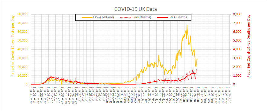
It is New Year 2021 and the spectre of COVID-4-Christmas came true.  We are now in the depths of winter and in the jaws of the Third Wave.  What happened?  Let us look back at the UK data for positive tests and deaths to see how this tragic story unfolded.

There was a Second Wave that started to build when Lock-down I was relaxed in July 2020.  And it looks like Lock-down II in November 2020 did indeed have a beneficial effect – but not as much as was needed.  So, when it too was relaxed at the start of December 2020 then … infections took off again … even faster than before!

That is the nature of epidemics and of exponential growth.  It seems we have not learned those painful lessons well enough.

And we all so desperately wanted a more normal Xmas that we conspired to let the COVID cat out of the bag again.  The steep rise in positive tests is real and we know that because a rise in deaths is following about three weeks behind.  And that means hospitals have filled up again.

Are we back to square one?

The emerging news of an even more contagious variant has only compounded our misery, but it is hard to separate the effect of that from all the other factors that are fuelling the Third Wave.

Is there no end to this recurring nightmare?

The short answer is – “It will end“.  It cannot continue forever.  All epidemics eventually burn themselves out when there are too few susceptible people left to infect and we enter the “endemic” phase.  When that happens the R number will gravitate to 1.0 again which some might find confusing.  The confusion is caused by mixing up Ro and Rt.

How close are we to that end game?

Well, we are certainly a lot closer than we were in July 2020 because millions more people have been exposed, infected and recovered and many of those were completely asymptomatic.  It is estimated that about a third of those who catch it do not have any symptoms – so they will not step forward to be tested and will not appear in the statistics.  But they can unwittingly and silently spread the virus while they are infectious.  And many who are symptomatic do not come get tested so they won’t appear in the statistics either.

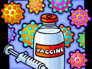
And there are now two new players in the COVID-19 Game … the Pfizer vaccine and the Oxford vaccine.  They are the White Knights and they are on our side.

Hurrah!

Now we must manufacture, distribute and administer these sickness-and-death-preventing vaccines to 65 million people as soon as possible.  That alone is a massive logistical challenge when we are already fighting battles on many fronts.  It seems impossible.

Or do we?

It feels obvious but is it the most effective strategy?  Should we divert our limited, hard-pressed, exhausted health care staff to jabbing the worried-well?  Should we eke out our limited supplies of precious vaccine to give more people a first dose by delaying the second dose for others?

Will the White Knights save us?

The short answer is – “Not on their own“.

The maths is simple enough.

Over the last three weeks we have, through Herculean effort, managed to administer 1 million first doses of the Pfizer vaccine.  That sounds like a big number but when put into the context of a UK population of 65 million it represents less than 2% and offers only delayed and partial protection.  The trial evidence confirmed that two doses of the Pfizer vaccine given at a three week interval would confer about 90% protection.  That is the basis of the licence and the patient consent.

So, even if we delay second doses and double the rate of first dose delivery we can only hope to partially protect about 2-3% of the population by the end of January 2021.  That is orders of magnitude too slow.

And the vaccines are not a treatment.  The vaccine cannot mitigate the fact that a large number of people are already infected and will have to run the course of their illness.  Most will recover, but many will not.

So, how do we get our heads around all these interacting influences?  How do we predict how the Coronavirus Game is likely to play out over the next few weeks? How do we decide what to do for the best?

I believe it is already clear that trying to answer these questions using the 1.3 kg of wetware between our ears is fraught with problems.

We need to seek the assistance of some hardware, software and some knowledge of how to configure them to illuminate the terrain ahead.


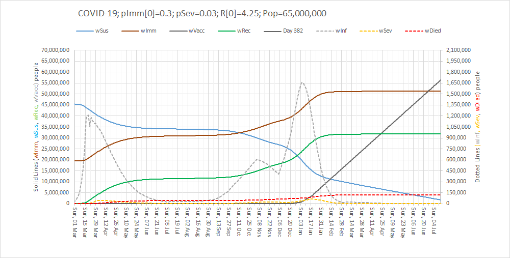
Here is what the updated SEIR-V model suggests will happen if we continue with the current restrictions and the current vaccination rate.  I’ve updated it with the latest data and added a Vaccination component.

The lines to focus on are the dotted ones: grey = number of infected cases, yellow = number ill enough to justify hospital treatment, red = critically ill and black = not survived.

The vertical black line is Now and the lines to the right of that is the most plausible prediction.

It says that a Third Wave is upon us and that it could be worse than the First Wave.  That is the bad news. The good news is that the reason that the infection rate drops is because the epidemic will finally burn itself out – irrespective of the vaccinations.

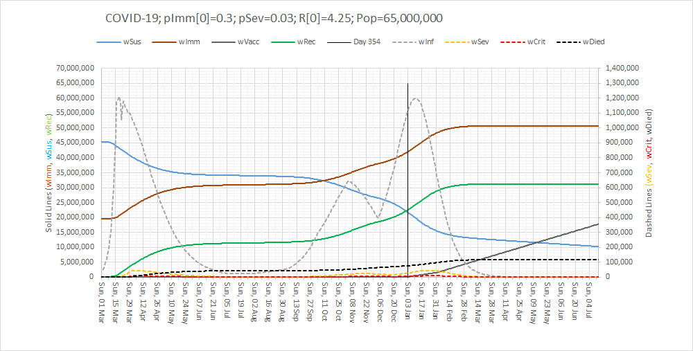
So, it would appear that the White Knights cannot rescue us on their own … but we can all help to accelerate the final phase and limit the damage – if we all step up and pull together, at the same time and in the same direction.

We need a three-pronged retaliation:

  1. Lock-down:  “Stay at home. Protect the NHS. Save Lives”.  It worked in the First Wave and it will work in the Third Wave.
  2. Care in the Community:  For those who will become unwell and who will need the support of family, friends, neighbours and the NHS.
  3. Volunteer to Vaccinate:  To protect everyone as soon as is practically feasible.

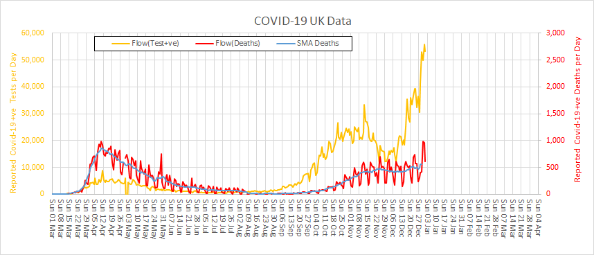
Here is what it could look like.  All over by Easter.

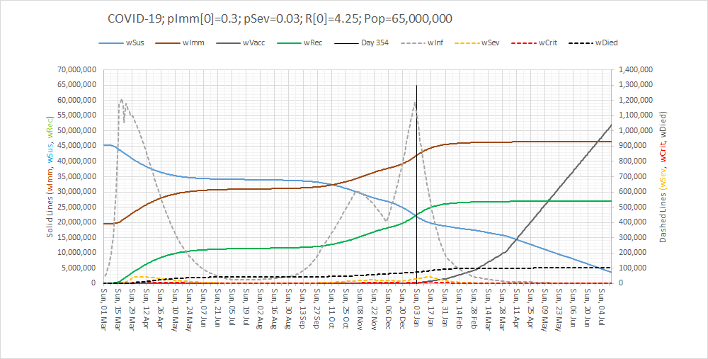
There is light at the end of the tunnel.  The end is in sight.  We just have to pull together in the final phase of the Game.


PS. For those interested in how an Excel-based SEIR-V model is designed, built and used here’s a short (7 minute) video of the highlights:

This is health care systems engineering (HCSE) in action.

And I believe that the UK will need a new generation of HCSEs to assist in the re-designing and re-building of our shattered care services.  So, if you are interested then click here to explore further.