Warts-and-All

This week saw the publication of a landmark paper – one that will bring hope to many.  A paper that describes the first step of a path forward out of the mess that healthcare seems to be in.  A rational, sensible, practical, learnable and enjoyable path.


This week I also came across an idea that triggered an “ah ha” for me.  The idea is that the most rapid learning happens when we are making mistakes about half of the time.

And when I say ‘making a mistake’ I mean not achieving what we predicted we would achieve because that implies that our understanding of the world is incomplete.  In other words, when the world does not behave as we expect, we have an opportunity to learn and to improve our ability to make more reliable predictions.

And that ability is called wisdom.


When we get what we expect about half the time, and do not get what we expect about the other half of the time, then we have the maximum amount of information that we can use to compare and find the differences.

Was it what we did? Was it what we did not do? What are the acts and errors of commission and omission? What can we learn from those? What might we do differently next time? What would we expect to happen if we do?


And to explore this terrain we need to see the world as it is … warts and all … and that is the subject of the landmark paper that was published this week.


The context of the paper is improvement of cancer service delivery, and specifically of reducing waiting time from referral to first appointment.  This waiting is a time of extreme anxiety for patients who have suspected cancer.

It is important to remember that most people with suspected cancer do not have it, so most of the work of an urgent suspected cancer (USC) clinic is to reassure and to relieve the fear that the spectre of cancer creates.

So, the sooner that reassurance can happen the better, and for the unlucky minority who are diagnosed with cancer, the sooner they can move on to treatment the better.

The more important paragraph in the abstract is the second one … which states that seeing the system behaviour as it is, warts-and-all,  in near-real-time, allows us to learn to make better decisions of what to do to achieve our intended outcomes. Wiser decisions.

And the reason this is the more important paragraph is because if we can do that for an urgent suspected cancer pathway then we can do that for any pathway.


The paper re-tells the first chapter of an emerging story of hope.  A story of how an innovative and forward-thinking organisation is investing in building embedded capability in health care systems engineering (HCSE), and is now delivering a growing dividend.  Much bigger than the investment on every dimension … better safety, faster delivery, higher quality and more affordability. Win-win-win-win.

The only losers are the “warts” – the naysayers and the cynics who claim it is impossible, or too “wicked”, or too difficult, or too expensive.

Innovative reality trumps cynical rhetoric … and the full abstract and paper can be accessed here.

So, well done to Chris Jones and the whole team in ABMU.

And thank you for keeping the candle of hope alight in these dark, stormy and uncertain times for the NHS.

The Strangeness of LoS

It had been some time since Bob and Leslie had chatted so an email from the blue was a welcome distraction from a complex data analysis task.

<Bob> Hi Leslie, great to hear from you. I was beginning to think you had lost interest in health care improvement-by-design.

<Leslie> Hi Bob, not at all.  Rather the opposite.  I’ve been very busy using everything that I’ve learned so far.  It’s applications are endless, but I have hit a problem that I have been unable to solve, and it is driving me nuts!

<Bob> OK. That sounds encouraging and interesting.  Would you be able to outline this thorny problem and I will help if I can.

<Leslie> Thanks Bob.  It relates to a big issue that my organisation is stuck with – managing urgent admissions.  The problem is that very often there is no bed available, but there is no predictability to that.  It feels like a lottery; a quality and safety lottery.  The clinicians are clamoring for “more beds” but the commissioners are saying “there is no more money“.  So the focus has turned to reducing length of stay.

<Bob> OK.  A focus on length of stay sounds reasonable.  Reducing that can free up enough beds to provide the necessary space-capacity resilience to dramatically improve the service quality.  So long as you don’t then close all the “empty” beds to save money, or fall into the trap of believing that 85% average bed occupancy is the “optimum”.

<Leslie> Yes, I know.  We have explored all of these topics before.  That is not the problem.

<Bob> OK. What is the problem?

<Leslie> The problem is demonstrating objectively that the length-of-stay reduction experiments are having a beneficial impact.  The data seems to say they they are, and the senior managers are trumpeting the success, but the people on the ground say they are not. We have hit a stalemate.


<Bob> Ah ha!  That old chestnut.  So, can I first ask what happens to the patients who cannot get a bed urgently?

<Leslie> Good question.  We have mapped and measured that.  What happens is the most urgent admission failures spill over to commercial service providers, who charge a fee-per-case and we have no choice but to pay it.  The Director of Finance is going mental!  The less urgent admission failures just wait on queue-in-the-community until a bed becomes available.  They are the ones who are complaining the most, so the Director of Governance is also going mental.  The Director of Operations is caught in the cross-fire and the Chief Executive and Chair are doing their best to calm frayed tempers and to referee the increasingly toxic arguments.

<Bob> OK.  I can see why a “Reduce Length of Stay Initiative” would tick everyone’s Nice If box.  So, the data analysts are saying “the length of stay has come down since the Initiative was launched” but the teams on the ground are saying “it feels the same to us … the beds are still full and we still cannot admit patients“.

<Leslie> Yes, that is exactly it.  And everyone has come to the conclusion that demand must have increased so it is pointless to attempt to reduce length of stay because when we do that it just sucks in more work.  They are feeling increasingly helpless and hopeless.

<Bob> OK.  Well, the “chronic backlog of unmet need” issue is certainly possible, but your data will show if admissions have gone up.

<Leslie> I know, and as far as I can see they have not.

<Bob> OK.  So I’m guessing that the next explanation is that “the data is wonky“.

<Leslie> Yup.  Spot on.  So, to counter that the Information Department has embarked on a massive push on data collection and quality control and they are adamant that the data is complete and clean.

<Bob> OK.  So what is your diagnosis?

<Leslie> I don’t have one, that’s why I emailed you.  I’m stuck.


<Bob> OK.  We need a diagnosis, and that means we need to take a “history” and “examine” the process.  Can you tell me the outline of the RLoS Initiative.

<Leslie> We knew that we would need a baseline to measure from so we got the historical admission and discharge data and plotted a Diagnostic Vitals Chart®.  I have learned something from my HCSE training!  Then we planned the implementation of a visual feedback tool that would show ward staff which patients were delayed so that they could focus on “unblocking” the bottlenecks.  We then planned to measure the impact of the intervention for three months, and then we planned to compare the average length of stay before and after the RLoS Intervention with a big enough data set to give us an accurate estimate of the averages.  The data showed a very obvious improvement, a highly statistically significant one.

<Bob> OK.  It sounds like you have avoided the usual trap of just relying on subjective feedback, and now have a different problem because your objective and subjective feedback are in disagreement.

<Leslie> Yes.  And I have to say, getting stuck like this has rather dented my confidence.

<Bob> Fear not Leslie.  I said this is an “old chestnut” and I can say with 100% confidence that you already have what you need in your T4 kit bag?

<Leslie>Tee-Four?

<Bob> Sorry, a new abbreviation. It stands for “theory, techniques, tools and training“.

<Leslie> Phew!  That is very reassuring to hear, but it does not tell me what to do next.

<Bob> You are an engineer now Leslie, so you need to don the hard-hat of Improvement-by-Design.  Start with your Needs Analysis.


<Leslie> OK.  I need a trustworthy tool that will tell me if the planned intervention has has a significant impact on length of stay, for better or worse or not at all.  And I need it to tell me that quickly so I can decide what to do next.

<Bob> Good.  Now list all the things that you currently have that you feel you can trust.

<Leslie> I do actually trust that the Information team collect, store, verify and clean the raw data – they are really passionate about it.  And I do trust that the front line teams are giving accurate subjective feedback – I work with them and they are just as passionate.  And I do trust the systems engineering “T4” kit bag – it has proven itself again-and-again.

<Bob> Good, and I say that because you have everything you need to solve this, and it sounds like the data analysis part of the process is a good place to focus.

<Leslie> That was my conclusion too.  And I have looked at the process, and I can’t see a flaw. It is driving me nuts!

<Bob> OK.  Let us take a different tack.  Have you thought about designing the tool you need from scratch?

<Leslie> No. I’ve been using the ones I already have, and assume that I must be using them incorrectly, but I can’t see where I’m going wrong.

<Bob> Ah!  Then, I think it would be a good idea to run each of your tools through a verification test and check that they are fit-4-purpose in this specific context.

<Leslie> OK. That sounds like something I haven’t covered before.

<Bob> I know.  Designing verification test-rigs is part of the Level 2 training.  I think you have demonstrated that you are ready to take the next step up the HCSE learning curve.

<Leslie> Do you mean I can learn how to design and build my own tools?  Special tools for specific tasks?

<Bob> Yup.  All the techniques and tools that you are using now had to be specified, designed, built, verified, and validated. That is why you can trust them to be fit-4-purpose.

<Leslie> Wooohooo! I knew it was a good idea to give you a call.  Let’s get started.


[Postscript] And Leslie, together with the other stakeholders, went on to design the tool that they needed and to use the available data to dissolve the stalemate.  And once everyone was on the same page again they were able to work collaboratively to resolve the flow problems, and to improve the safety, flow, quality and affordability of their service.  Oh, and to know for sure that they had improved it.

The Disbelief to Belief Transition

The NHS appears to be descending in a frenzy of fear as the winter looms and everyone says it will be worse than last and the one before that.

And with that we-are-going-to-fail mindset, it almost certainly will.

Athletes do not start a race believing that they are doomed to fail … they hold a belief that they can win the race and that they will learn and improve even if they do not. It is a win-win mindset.

But to succeed in sport requires more than just a positive attitude.

It also requires skills, training, practice and experience.

The same is true in healthcare improvement.


That is not the barrier though … the barrier is disbelief.

And that comes from not having experienced what it is like to take a system that is failing and transform it into one that is succeeding.

Logically, rationally, enjoyably and surprisingly quickly.

And, the widespread disbelief that it is possible is paradoxical because there are plenty of examples where others have done exactly that.

The disbelief seems to be “I do not believe that will work in my world and in my hands!

And the only way to dismantle that barrier-of-disbelief is … by doing it.


How do we do that?

The emotionally safest way is in a context that is carefully designed to enable us to surface the unconscious assumptions that are the bricks in our individual Barriers of Disbelief.

And to discard the ones that do not pass a Reality Check, and keep the ones that are OK.

This Disbelief-Busting design has been proven to be effective, as evidenced by the growing number of individuals who are learning how to do it themselves, and how to inspire, teach and coach others to as well.


So, if you would like to flip disbelief-and-hopeless into belief-and-hope … then the door is here.

One Step Back; Two Steps Forward.

This week a ground-breaking case study was published.

It describes how a team in South Wales discovered how to make the flows visible in a critical part of their cancer pathway.

Radiology.

And they did that by unintentionally falling into a trap!  A trap that many who set out to improve health care services fall into.  But they did not give up.  They sought guidance and learned some profound lessons.

Part 1 of their story is shared here.


One lesson they learned is that, as they take on more complex improvement challenges, they need to be equipped with the right tools, and they need to be trained to use them, and they need to have practiced using them.

Another lesson they learned is that making the flows in a system visible is necessary before the current behaviour of the system can be understood.

And they learned that they needed a clear diagnosis of how the current system is not performing; before they can attempt to design an intervention to deliver the intended improvement.

They learned how the Study-Plan-Do cycle works, and they learned the reason it starts with “Study”, and not with “Plan”.


They tried, failed, took one step back, asked, listened and learned.


Then with their new knowledge, more advanced tools, and deeper understanding they took two steps forward; diagnosed problem, designed an intervention, and delivered a significant improvement.

And visualised just how significant.

Then they shared Part 2 of their story … here.


Unknown-Knowns

This is the now-infamous statement that Donald Rumsfeld made at a Pentagon Press Conference which triggered some good-natured jesting from the assembled journalists.

But there is a problem with it.

There is a fourth combination that he does not mention: the Unknown-Knowns.

Which is a shame because they are actually the most important because they cause the most problems.  Avoidable problems.


Suppose there is a piece of knowledge that someone knows but that someone else does not; then we have an unknown-known.

None of us know everything and we do not need to, because knowledge that is of no value to us is irrelevant for us.

But what happens when the unknown-known is of value to us, and more than that; what happens when it would be reasonable for someone else to expect us to know it; because it is our job to know.


A surgeon would be not expected to know a lot about astronomy, but they would be expected to know a lot about anatomy.


So, what happens if we become aware that we are missing an important piece of knowledge that is actually already known?  What is our normal human reaction to that discovery?

Typically, our first reaction is fear-driven and we express defensive behaviour.  This is because we fear the potential loss-of-face from being exposed as inept.

From this sudden shock we then enter a characteristic emotional pattern which is called the Nerve Curve.

After the shock of discovery we quickly flip into denial and, if that does not work then to anger (i.e. blame).  We ignore the message and if that does not work we shoot the messenger.


And when in this emotionally charged state, our rationality tends to take a back seat.  So, if we want to benefit from the discovery of an unknown-known, then we have to learn to bite-our-lip, wait, let the red mist dissipate, and then re-examine the available evidence with a cool, curious, open mind.  A state of mind that is receptive and open to learning.


Recently, I was reminded of this.


The context is health care improvement, and I was using a systems engineering framework to conduct some diagnostic data analysis.

My first task was to run a data-completeness-verification-test … and the data I had been sent did not pass the test.  There was some missing.  It was an error of omission (EOO) and they are the hardest ones to spot.  Hence the need for the verification test.

The cause of the EOO was an unknown-known in the department that holds the keys to the data warehouse.  And I have come across this EOO before, so I was not surprised.

Hence the need for the verification test.

I was not annoyed either.  I just fed back the results of the test, explained what the issue was, explained the cause, and they listened and learned.


The implication of this specific EOO is quite profound though because it appears to be ubiquitous across the NHS.

To be specific it relates to the precise details of how raw data on demand, activity, length of stay and bed occupancy is extracted from the NHS data warehouses.

So it is rather relevant to just about everything the NHS does!

And the error-of-omission leads to confusion at best; and at worst … to the following sequence … incomplete data =>  invalid analysis => incorrect conclusion => poor decision => counter-productive action => unintended outcome.

Does that sound at all familiar?


So, if would you like to learn about this valuable unknown-known is then I recommend the narrative by Dr Kate Silvester, an internationally recognised expert in healthcare improvement.  In it, Kate re-tells the story of her emotional roller-coaster ride when she discovered she was making the same error.


Here is the link to the full abstract and where you can download and read the full text of Kate’s excellent essay, and help to make it a known-known.

That is what system-wide improvement requires – sharing the knowledge.

The Storyboard

This week about thirty managers and clinicians in South Wales conducted two experiments to test the design of the Flow Design Practical Skills One Day Workshop.

Their collective challenge was to diagnose and treat a “chronically sick” clinic and the majority had no prior exposure to health care systems engineering (HCSE) theory, techniques, tools or training.

Two of the group, Chris and Jat, had been delegates at a previous ODWS, and had then completed their Level-1 HCSE training and real-world projects.

They had seen it and done it, so this experiment was to test if they could now teach it.

Could they replicate the “OMG effect” that they had experienced and that fired up their passion for learning and using the science of improvement?

Continue reading “The Storyboard”

The Lost Tribe

figures_lost_looking_at_map_anim_150_wht_15601

“Jingle Bells, Jingle Bells” announced Bob’s computer as he logged into the Webex meeting with Lesley.

<Bob> Hi Lesley, in case I forget later I’d like to wish you a Happy Christmas and hope that 2017 brings you new opportunity for learning and fun.

<Lesley> Thanks Bob, and I wish you the same. And I believe the blog last week pointed to some.

<Bob> Thank you and I agree;  every niggle is an opportunity for improvement and the “Houston we have a problem!” one is a biggie.

<Lesley> So how do we start on this one? It is massive!

<Bob> The same way we do on all niggles; we diagnose the root cause first. What do you feel they might be?

<Lesley> Well, following it backwards from your niggle, the board reports are created by the data analysts, and they will produce whatever they are asked to. It must be really irritating for them to have their work rubbished!

<Bob> Are you suggesting that they understand the flaws in what they are asked to do but keep quiet?

<Lesley> I am not sure they do, but there is clearly a gap between their intent and their impact. Where would they gain the insight? Do they have access to the sort of training I have am getting?

<Bob> That is a very good question, and until this week I would not have been able to answer, but an interesting report by the Health Foundation was recently published on that very topic. It is entitled “Understanding Analytical Capability In Health Care” and what it says is that there is a lost tribe of data analysts in the NHS.

<Lesley> How interesting! That certainly resonates with my experience.  All the data analysts I know seem to be hidden away behind their computers, caught in the cross-fire between between the boards and the wards, and very sensibly keeping their heads down and doing what they are asked to.

<Bob> That would certainly help to explain what we are seeing! And the good news is that Martin Bardsley, the author of the paper, has interviewed many people across the system, gathered their feedback, and offered some helpful recommendations.  Here is a snippet.

analysiscapability

<Lesley> I like these recommendations, especially the “in-work training programmes” and inclusion “in general management and leadership training“. But isn’t that one of the purposes of the CHIPs training?

<Bob> It is indeed, which is why it is good to see that Martin has specifically recommended it.

saasoftrecommended

<Lesley> Excellent! That means that my own investment in the CHIPs training has just gained in street value and that’s good for my CV. An unexpected early Xmas present. Thank you!

Hungry, Hardworking, Humble

lencioni_ideal_team_playerThis week I read a new book by one of my favourite authors – Patrick Lencioni.

The book is The Ideal Team Player.

Patrick’s books are written as stories which makes them very accessible and easily memorable.  And each one captures a priceless pearl of wisdom.

Improving a complex adaptive system such as health care can only be done by the people in the system working together and sharing expectations, experiences, knowledge, understanding and wisdom.

So each person needs to understand what it is to be able to contribute effectively to a team – because teams are how complex systems are designed and how they are improved.


Patrick identifies three “virtues” – and he uses that term appropriately.

Hungry … which means a having a burning ambition.  Something needed and wanted. An unsatisfied longing. A vision. A mission. A goal. A pull. A purpose.

Hardworking … which means a willingness to do what is needed to satisfy the hunger. Going that extra mile. Reading that extra book. Solving that extra problem. Giving that extra bit of feedback. Doing that extra job that no one else wants to do. Investing in the future.

Humble … which means that Ego is not running the show.  Confidence is linked to competence. Impact and intent are aligned. The mind is open to learning. The eyes are open to seeing. The ears are open to listening. And the mouth is only open for asking questions and telling stories.


The three virtues are necessary and sufficient, they are effective and efficient.

So if any one is missing the outcome is not achievable.

Time to pick up the mirror and look deeply into it … and ask:

“Am I hungry enough?”
“Am I prepared to commit my lifetime?”
“Am I open to learning from reality and from others?”

Our tangible record of past behaviour provides us with our answers.

 It is the time to dig deep and ask the question: am  hungry, hardworking and humble?

Pride and Joy

stick_figure_superhero_anim_150_wht_1857Have you heard the phrase “Pride comes before a fall“?

What does this mean? That the feeling of pride is the reason for the subsequent fall?

So by following that causal logic, if we do not allow ourselves to feel proud then we can avoid the fall?

And none of us like the feeling of falling and failing. We are fearful of that negative feeling, so with this simple trick we can avoid feeling bad. Yes?

But we all know the positive feeling of achievement – we feel pride when we have done good work, when our impact matches our intent.  Pride in our work.

Is that bad too?

Should we accept under-achievement and unexceptional mediocrity as the inevitable cost of avoiding the pain of possible failure?  Is that what we are being told to do here?


The phrase comes from the Bible, from the Book of Proverbs 16:18 to be precise.

proverb

And the problem here is that the phrase “pride comes before a fall” is not the whole proverb.

It has been simplified. Some bits have been omitted. And those omissions lead to ambiguity and the opportunity for obfuscation and re-interpretation.

pride_goes_before_a_fall
In the fuller New International Version we see a missing bit … the “haughty spirit” bit.  That is another way of saying “over-confident” or “arrogant”.


But even this “authorised” version is still ambiguous and more questions spring to mind:

Q1. What sort of pride are we referring to? Just the confidence version? What about the pride that follows achievement?

Q2. How would we know if our feeling of confidence is actually justified?

Q3. Does a feeling of confidence always precede a fall? Is that how we diagnose over-confidence? Retrospectively? Are there instances when we feel confident but we do not fail? Are there instances when we do not feel confident and then fail?

Q4. Does confidence cause the fall or it is just a temporal association? Is there something more fundamental that causes both high-confidence and low-competence?


There is a well known model called the Conscious-Competence model of learning which generates a sequence of four stages to achieving a new skill. Such as one we need to achieve our intended outcomes.

We all start in the “blissful ignorance” zone of unconscious incompetence.  Our unknowns are unknown to us.  They are blind spots.  So we feel unjustifiably confident.

hierarchy_of_competence

In this model the first barrier to progress is “wrong intuition” which means that we actually have unconscious assumptions that are distorting our perception of reality.

What we perceive makes sense to us. It is clear and obvious. We feel confident. We believe our own rhetoric.

But our unconscious assumptions can trick us into interpreting information incorrectly.  And if we derive decisions from unverified assumptions and invalid analysis then we may do the wrong thing and not achieve our intended outcome.  We may unintentionally cause ourselves to fail and not be aware of it.  But we are proud and confident.

Then the gap between our intent and our impact becomes visible to all and painful to us. So we are tempted to avoid the social pain of public failure by retreating behind the “Yes, But” smokescreen of defensive reasoning. The “doom loop” as it is sometimes called. The Victim Vortex. “Don’t name, shame and blame me, I was doing my best. I did not intent that to happen. To err is human”.


The good news is that this learning model also signposts a possible way out; a door in the black curtain of ignorance.  It suggests that we can learn how to correct our analysis by using feedback from reality to verify our rhetorical assumptions.  Those assumptions which pass the “reality check” we keep, those which fail the “reality check” we redesign and retest until they pass.  Bit by bit our inner rhetoric comes to more closely match reality and the wisdom of our decisions will improve.

And what we then see is improvement.  Our impact moves closer towards our intent. And we can justifiably feel proud of that achievement. We do not need to be best-compared-with-the-rest; just being better-than-we-were-before is OK. That is learning.

the_learning_curve

And this is how it feels … this is the Learning Curve … or the Nerve Curve as we call it.

What it says is that to be able to assess confidence we must also measure competence. Outcomes. Impact.

And to achieve excellence we have to be prepared to actively look for any gap between intent and impact.  And we have to be prepared to see it as an opportunity rather than as a threat. And we will need to be able to seek feedback and other people’s perspectives. And we need to be to open to asking for examples and explanations from those who have demonstrated competence.

It says that confidence is not a trustworthy surrogate for competence.

It says that we want the confidence that flows from competence because that is the foundation of trust.

Improvement flows at the speed of trust and seeing competence, confidence and trust growing is a joyous thing.

Pride and Joy are OK.

Arrogance and incompetence comes before a fall would be a better proverb.

The Cost of Chaos

british_pound_money_three_bundled_stack_400_wht_2425This week I conducted an experiment – on myself.

I set myself the challenge of measuring the cost of chaos, and it was tougher than I anticipated it would be.

It is easy enough to grasp the concept that fire-fighting to maintain patient safety amidst the chaos of healthcare would cost more in terms of tears and time …

… but it is tricky to translate that concept into hard numbers; i.e. cash.


Chaos is an emergent property of a system.  Safety, delivery, quality and cost are also emergent properties of a system. We can measure cost, our finance departments are very good at that. We can measure quality – we just ask “How did your experience match your expectation”.  We can measure delivery – we have created a whole industry of access target monitoring.  And we can measure safety by checking for things we do not want – near misses and never events.

But while we can feel the chaos we do not have an easy way to measure it. And it is hard to improve something that we cannot measure.


So the experiment was to see if I could create some chaos, then if I could calm it, and then if I could measure the cost of the two designs – the chaotic one and the calm one.  The difference, I reasoned, would be the cost of the chaos.

And to do that I needed a typical chunk of a healthcare system: like an A&E department where the relationship between safety, flow, quality and productivity is rather important (and has been a hot topic for a long time).

But I could not experiment on a real A&E department … so I experimented on a simplified but realistic model of one. A simulation.

What I discovered came as a BIG surprise, or more accurately a sequence of big surprises!

  1. First I discovered that it is rather easy to create a design that generates chaos and danger.  All I needed to do was to assume I understood how the system worked and then use some averaged historical data to configure my model.  I could do this on paper or I could use a spreadsheet to do the sums for me.
  2. Then I discovered that I could calm the chaos by reactively adding lots of extra capacity in terms of time (i.e. more staff) and space (i.e. more cubicles).  The downside of this approach was that my costs sky-rocketed; but at least I had restored safety and calm and I had eliminated the fire-fighting.  Everyone was happy … except the people expected to foot the bill. The finance director, the commissioners, the government and the tax-payer.
  3. Then I got a really big surprise!  My safe-but-expensive design was horribly inefficient.  All my expensive resources were now running at rather low utilisation.  Was that the cost of the chaos I was seeing? But when I trimmed the capacity and costs the chaos and danger reappeared.  So was I stuck between a rock and a hard place?
  4. Then I got a really, really big surprise!!  I hypothesised that the root cause might be the fact that the parts of my system were designed to work independently, and I was curious to see what happened when they worked interdependently. In synergy. And when I changed my design to work that way the chaos and danger did not reappear and the efficiency improved. A lot.
  5. And the biggest surprise of all was how difficult this was to do in my head; and how easy it was to do when I used the theory, techniques and tools of Improvement-by-Design.

So if you are curious to learn more … I have written up the full account of the experiment with rationale, methods, results, conclusions and references and I have published it here.

The Magic Black Box

stick_figure_magic_carpet_150_wht_5040It was the appointed time for Bob and Leslie’s regular coaching session as part of the improvement science practitioner programme.

<Leslie> Hi Bob, I am feeling rather despondent today so please excuse me in advance if you hear a lot of “Yes, but …” language.

<Bob> I am sorry to hear that Leslie. Do you want to talk about it?

<Leslie> Yes, please.  The trigger for my gloom was being sent on a mandatory training workshop.

<Bob> OK. Training to do what?

<Leslie> Outpatient demand and capacity planning!

<Bob> But you know how to do that already, so what is the reason you were “sent”?

<Leslie> Well, I am no longer sure I know how to it.  That is why I am feeling so blue.  I went more out of curiosity and I came away utterly confused and with my confidence shattered.

<Bob> Oh dear! We had better start at the beginning.  What was the purpose of the workshop?

<Leslie> To train everyone in how to use an Outpatient Demand and Capacity planning model, an Excel one that we were told to download along with the User Guide.  I think it is part of a national push to improve waiting times for outpatients.

<Bob> OK. On the surface that sounds reasonable. You have designed and built your own Excel flow-models already; so where did the trouble start?

<Leslie> I will attempt to explain.  This was a paragraph in the instructions. I felt OK with this because my Improvement Science training has given me a very good understanding of basic demand and capacity theory.

IST_DandC_Model_01<Bob> OK.  I am guessing that other delegates may have felt less comfortable with this. Was that the case?

<Leslie> The training workshops are targeted at Operational Managers and the ones I spoke to actually felt that they had a good grasp of the basics.

<Bob> OK. That is encouraging, but a warning bell is ringing for me. So where did the trouble start?

<Leslie> Well, before going to the workshop I decided to read the User Guide so that I had some idea of how this magic tool worked.  This is where I started to wobble – this paragraph specifically …

IST_DandC_Model_02

<Bob> H’mm. What did you make of that?

<Leslie> It was complete gibberish to me and I felt like an idiot for not understanding it.  I went to the workshop in a bit of a panic and hoped that all would become clear. It didn’t.

<Bob> Did the User Guide explain what ‘percentile’ means in this context, ideally with some visual charts to assist?

<Leslie> No and the use of ‘th’ and ‘%’ was really confusing too.  After that I sort of went into a mental fog and none of the workshop made much sense.  It was all about practising using the tool without any understanding of how it worked. Like a black magic box.


<Bob> OK.  I can see why you were confused, and do not worry, you are not an idiot.  It looks like the author of the User Guide has unwittingly used some very confusing and ambiguous terminology here.  So can you talk me through what you have to do to use this magic box?

<Leslie> First we have to enter some of our historical data; the number of new referrals per week for a year; and the referral and appointment dates for all patients for the most recent three months.

<Bob> OK. That sounds very reasonable.  A run chart of historical demand and the raw event data for a Vitals Chart® is where I would start the measurement phase too – so long as the data creates a valid 3 month reporting window.

<Leslie> Yes, I though so too … but that is not how the black box model seems to work. The weekly demand is used to draw an SPC chart, but the event data seems to disappear into the innards of the black box, and recommendations pop out of it.

<Bob> Ah ha!  And let me guess the relationship between the term ‘percentile’ and the SPC chart of weekly new demand was not explained?

<Leslie> Spot on.  What does percentile mean?


<Bob> It is statistics jargon. Remember that we have talked about the distribution of the data around the average on a BaseLine chart; and how we use the histogram feature of BaseLine to show it visually.  Like this example.

IST_DandC_Model_03<Leslie> Yes. I recognise that. This chart shows a stable system of demand with an average of around 150 new referrals per week and the variation distributed above and below the average in a symmetrical pattern, falling off to zero around the upper and lower process limits.  I believe that you said that over 99% will fall within the limits.

<Bob> Good.  The blue histogram on this chart is called a probability distribution function, to use the terminology of a statistician.

<Leslie> OK.

<Bob> So, what would happen if we created a Pareto chart of demand using the number of patients per week as the categories and ignoring the time aspect? We are allowed to do that if the behaviour is stable, as this chart suggests.

<Leslie> Give me a minute, I will need to do a rough sketch. Does this look right?

IST_DandC_Model_04

<Bob> Perfect!  So if you now convert the Y-axis to a percentage scale so that 52 weeks is 100% then where does the average weekly demand of about 150 fall? Read up from the X-axis to the line then across to the Y-axis.

<Leslie> At about 26 weeks or 50% of 52 weeks.  Ah ha!  So that is what a percentile means!  The 50th percentile is the average, the zeroth percentile is around the lower process limit and the 100th percentile is around the upper process limit!

<Bob> In this case the 50th percentile is the average, it is not always the case though.  So where is the 85th percentile line?

<Leslie> Um, 52 times 0.85 is 44.2 which, reading across from the Y-axis then down to the X-axis gives a weekly demand of about 170 per week.  That is about the same as the average plus one sigma according to the run chart.

<Bob> Excellent. The Pareto chart that you have drawn is called a cumulative probability distribution function … and that is usually what percentiles refer to. Comparative Statisticians love these but often omit to explain their rationale to non-statisticians!


<Leslie> Phew!  So, now I can see that the 65th percentile is just above average demand, and 85th percentile is above that.  But in the confusing paragraph how does that relate to the phrase “65% and 85% of the time”?

<Bob> It doesn’t. That is the really, really confusing part of  that paragraph. I am not surprised that you looped out at that point!

<Leslie> OK. Let us leave that for another conversation.  If I ignore that bit then does the rest of it make sense?

<Bob> Not yet alas. We need to dig a bit deeper. What would you say are the implications of this message?


<Leslie> Well.  I know that if our flow-capacity is less than our average demand then we will guarantee to create an unstable queue and chaos. That is the Flaw of Averages trap.

<Bob> OK.  The creator of this tool seems to know that.

<Leslie> And my outpatient manager colleagues are always complaining that they do not have enough slots to book into, so I conclude that our current flow-capacity is just above the 50th percentile.

<Bob> A reasonable hypothesis.

<Leslie> So to calm the chaos the message is saying I will need to increase my flow capacity up to the 85th percentile of demand which is from about 150 slots per week to 170 slots per week. An increase of 7% which implies a 7% increase in costs.

<Bob> Good.  I am pleased that you did not fall into the intuitive trap that a increase from the 50th to the 85th percentile implies a 35/50 or 70% increase! Your estimate of 7% is a reasonable one.

<Leslie> Well it may be theoretically reasonable but it is not practically possible. We are exhorted to reduce costs by at least that amount.

<Bob> So we have a finance versus governance bun-fight with the operational managers caught in the middle: FOG. That is not the end of the litany of woes … is there anything about Did Not Attends in the model?


<Leslie> Yes indeed! We are required to enter the percentage of DNAs and what we do with them. Do we discharge them or re-book them.

<Bob> OK. Pragmatic reality is always much more interesting than academic rhetoric and this aspect of the real system rather complicates things, at least for a comparative statistician. This is where the smoke and mirrors will appear and they will be hidden inside the black magic box.  To solve this conundrum we need to understand the relationship between demand, capacity, variation and yield … and it is rather counter-intuitive.  So, how would you approach this problem?

<Leslie> I would use the 6M Design® framework and I would start with a map and not with a model; least of all a magic black box one that I did not design, build and verify myself.

<Bob> And how do you know that will work any better?

<Leslie> Because at the One Day ISP Workshop I saw it work with my own eyes. The queues, waits and chaos just evaporated.  And it cost nothing.  We already had more than enough “capacity”.

<Bob> Indeed you did.  So shall we do this one as an ISP-2 project?

<Leslie> An excellent suggestion.  I already feel my confidence flowing back and I am looking forward to this new challenge. Thank you again Bob.

Emergent Learning

CAS_DiagramThe theme this week has been emergent learning.

By that I mean the ‘ah ha’ moment that happens when lots of bits of a conceptual jigsaw go ‘click’ and fall into place.

When, what initially appears to be smoky confusion suddenly snaps into sharp clarity.  Eureka!  And now new learning can emerge.


This did not happen by accident.  It was engineered.


The picture above is part of a bigger schematic map of a system – in this case a system related to the global health challenge of escalating obesity.

It is a complicated arrangement of boxes and arrows. There are  dotted lines that outline parts of the system that have leaky boundaries like the borders on a political map.

But it is a static picture of the structure … it tells us almost nothing about the function, the system behaviour.

And our intuition tells us that, because it is a complicated structure, it will exhibit complex and difficult to understand behaviour.  So, guided by our inner voice, we toss it into the pile labelled Wicked Problems and look for something easier to work on.


Our natural assumption that a complicated structure always leads to complex behavior is an invalid simplification, and one that we can disprove in a matter of moments.


Exhibit 1. A system can be complicated and yet still exhibit simple, stable and predictable behavior.

Harrison_H1The picture is of a clock designed and built by John Harrison (1693-1776).  It is called H1 and it is a sea clock.

Masters of sailing ships required very accurate clocks to calculate their longitude, the East-West coordinate on the Earth’s surface. And in the 18th Century this was a BIG problem. Too many ships were getting lost at sea.

Harrison’s sea clock is complicated.  It has many moving parts, but it was the most stable and accurate clock of its time.  And his later ones were smaller, more accurate and even more complicated.


Exhibit 2.  A system can be simple yet still exhibit complex, unstable and unpredictable behavior.

Double-compound-pendulumThe image is of a pendulum made of only two rods joined by a hinge.  The structure is simple yet the behavior is complex, and this can only be appreciated with a dynamic visualisation.

The behaviour is clearly not random. It has an emergent structure. It is called chaotic.

So, with these two real examples we have disproved our assumption that a complicated structure always leads to complex behaviour; and we have also disproved its inverse … that complex behavior always comes from a complicated structure.

The cognitive trap we have exposed here is over-generalisation, the unconscious habit of slipping in the implied [always].


This deeper understanding gives us hope.

John Harrison was a rare, naturally-gifted, mechanical genius.  And to make it easier, he was working on a purely mechanical system comprised of non-living parts that only obeyed the Laws of Newtonian physics.  And even with those advantages it took him decades to learn how to design and to build his sea clocks.  He was the first to do so and he was self-educated so his learning was emergent.

If there were a way to design complicated systems to exhibit stable and predictable behaviour, how could more of us learn how to do that?


Our healthcare system is not made of passive, mechanical cogs and springs.  The parts are active, living people whose actions are limited by physical Laws but whose decisions are steered by other policies … learned ones … and ones that can change.  These learned rules of thumb are called heuristics and they vary from person-to-person and from minute-to-minute.  Heuristics can be learned, unlearned, updated, and evolved.

This is called emergent learning.

And to generate it we only need to create the context for it … the rest happens … as if by magic … but only if we design a fit-for-purpose context.


This week I personally observed over a dozen healthcare staff simultaneously re-invent a complicated process scheduling technique, at the same time as using it to eliminate the  queues, waiting and chaos in the system they wanted to improve.

Their queues just evaporated … without requiring any extra capacity or money. Eureka!


We did not show them how to do it so they could not have just copied what we did.

We designed and built the context for their learning to emerge … and it did.  On its own.

The One Day Practical Skills Workshop delivered emergent learning … just as it was designed to do.

A health care system is a complex adaptive system (CAS), and system improvement-by-design is what systems engineers (SE) are trained to do.

And this emerging style of complex adaptive systems engineering (CASE) is at the cutting edge of human knowledge, and when applied in the health care domain it is called health care systems engineering (HCSE).

Our experience of the emergent learning that flows from the practical skills workshops verifies that CASE is both possible, learnable, teachable, applicable and effective.

Hot and Cold

stick_figure_on_cloud_150_wht_9604Last week Bob and Leslie were exploring the data analysis trap called a two-points-in-time comparison: as illustrated by the headline “This winter has not been as bad as last … which proves that our winter action plan has worked.

Actually it doesn’t.

But just saying that is not very helpful. We need to explain the reason why this conclusion is invalid and therefore potentially dangerous.


So here is the continuation of Bob and Leslie’s conversation.

<Bob> Hi Leslie, have you been reflecting on the two-points-in-time challenge?

<Leslie> Yes indeed, and you were correct, I did know the answer … I just didn’t know I knew if you get my drift.

<Bob> Yes, I do. So, are you willing to share your story?

<Leslie> OK, but before I do that I would like to share what happened when I described what we talked about to some colleagues.  They sort of got the idea but got lost in the unfamiliar language of ‘variance’ and I realized that I needed an example to illustrate.

<Bob> Excellent … what example did you choose?

<Leslie> The UK weather – or more specifically the temperature.  My reasons for choosing this were many: first it is something that everyone can relate to; secondly it has strong seasonal cycle; and thirdly because the data is readily available on the Internet.

<Bob> OK, so what specific question were you trying to answer and what data did you use?

<Leslie> The question was “Are our winters getting warmer?” and my interest in that is because many people assume that the colder the winter the more people suffer from respiratory illness and the more that go to hospital … contributing to the winter A&E and hospital pressures.  The data that I used was the maximum monthly temperature from 1960 to the present recorded at our closest weather station.

<Bob> OK, and what did you do with that data?

<Leslie> Well, what I did not do was to compare this winter with last winter and draw my conclusion from that!  What I did first was just to plot-the-dots … I created a time-series chart … using the BaseLine© software.

MaxMonthTemp1960-2015

And it shows what I expected to see, a strong, regular, 12-month cycle, with peaks in the summer and troughs in the winter.

<Bob> Can you explain what the green and red lines are and why some dots are red?

<Leslie> Sure. The green line is the average for all the data. The red lines are called the upper and lower process limits.  They are calculated from the data and what they say is “if the variation in this data is random then we will expect more than 99% of the points to fall between these two red lines“.

<Bob> So, we have 55 years of monthly data which is nearly 700 points which means we would expect fewer than seven to fall outside these lines … and we clearly have many more than that.  For example, the winter of 1962-63 and the summer of 1976 look exceptional – a run of three consecutive dots outside the red lines. So can we conclude the variation we are seeing is not random?

<Leslie> Yes, and there is more evidence to support that conclusion. First is the reality check … I do not remember either of those exceptionally cold or hot years personally, so I asked Dr Google.

BigFreeze_1963This picture from January 1963 shows copper telephone lines that are so weighed down with ice, and for so long, that they have stretched down to the ground.  In this era of mobile phones we forget this was what telecommunication was like!


HeatWave_1976

And just look at the young Michal Fish in the Summer of ’76! Did people really wear clothes like that?

And there is more evidence on the chart. The red dots that you mentioned are indicators that BaseLine© has detected other non-random patterns.

So the large number of red dots confirms our Mark I Eyeball conclusion … that there are signals mixed up with the noise.

<Bob> Actually, I do remember the Summer of ’76 – it was the year I did my O Levels!  And your signals-in-the-noise phrase reminds me of SETI – the search for extra-terrestrial intelligence!  I really enjoyed the 1997 film of Carl Sagan’s book Contact with Jodi Foster playing the role of the determined scientist who ends up taking a faster-than-light trip through space in a machine designed by ET and built by humans. And especially the line about 10 minutes from the end when those-in-high-places who had discounted her story as “unbelievable” realized they may have made an error … the line ‘Yes, that is interesting isn’t it’.

<Leslie> Ha ha! Yes. I enjoyed that film too. It had lots of great characters – her glory seeking boss; the hyper-suspicious head of national security who militarized the project; the charismatic anti-hero; the ranting radical who blew up the first alien machine; and John Hurt as her guardian angel. I must watch it again.

Anyway, back to the story. The problem we have here is that this type of time-series chart is not designed to extract the overwhelming cyclical, annual pattern so that we can search for any weaker signals … such as a smaller change in winter temperature over a longer period of time.

<Bob>Yes, that is indeed the problem with these statistical process control charts.  SPC charts were designed over 60 years ago for process quality assurance in manufacturing not as a diagnostic tool in a complex adaptive system such a healthcare. So how did you solve the problem?

<Leslie> I realized that it was the regularity of  the cyclical pattern that was the key.  I realized that I could use that to separate out the annual cycle and to expose the weaker signals.  I did that using the rational grouping feature of BaseLine© with the month-of-the-year as the group.

MaxMonthTemp1960-2015_ByMonth

Now I realize why the designers of the software put this feature in! With just one mouse click the story jumped out of the screen!

<Bob> OK. So can you explain what we are looking at here?

<Leslie> Sure. This chart shows the same data as before except that I asked BaseLine© first to group the data by month and then to create a mini-chart for each month-group independently.  Each group has its own average and process limits.  So if we look at the pattern of the averages, the green lines, we can clearly see the annual cycle.  What is very obvious now is that the process limits for each sub-group are much narrower, and that there are now very few red points  … other than in the groups that are coloured red anyway … a niggle that the designers need to nail in my opinion!

<Bob> I will pass on your improvement suggestion! So are you saying that the regular annual cycle has accounted for the majority of the signal in the previous chart and that now we have extracted that signal we can look for weaker signals by looking for red flags in each monthly group?

<Leslie> Exactly so.  And the groups I am most interested in are the November to March ones.  So, next I filtered out the November data and plotted it as a separate chart; and I then used another cool feature of BaseLine© called limit locking.

MaxTempNov1960-2015_LockedLimits

What that means is that I have used the November maximum temperature data for the first 30 years to get the baseline average and natural process limits … and we can see that there are no red flags in that section, no obvious signals.  Then I locked these limits at 1990 and this tells BaseLine© to compare the subsequent 25 years of data against these projected limits.  That exposed a lot of signal flags, and we can clearly see that most of the points in the later section are above the projected average from the earlier one.  This confirms that there has been a significant increase in November maximum temperature over this 55 year period.

<Bob> Excellent! You have answered part of your question. So what about December onwards?

<Leslie> I was on a roll now! I also noticed from my second chart that the December, January and February groups looked rather similar so I filtered that data out and plotted them as a separate chart.

MaxTempDecJanFeb1960-2015_GroupedThese were indeed almost identical so I lumped them together as a ‘winter’ group and compared the earlier half with the later half using another BaseLine© feature called segmentation.

MaxTempDecJanFeb1960-2015-SplitThis showed that the more recent winter months have a higher maximum temperature … on average. The difference is just over one degree Celsius. But it also shows that that the month-to-month and year-to-year variation still dominates the picture.

<Bob> Which implies?

<Leslie> That, with data like this, a two-points-in-time comparison is meaningless.  If we do that we are just sampling random noise and there is no useful information in noise. Nothing that we can  learn from. Nothing that we can justify a decision with.  This is the reason the ‘this year was better than last year’ statement is meaningless at best; and dangerous at worst.  Dangerous because if we draw an invalid conclusion, then it can lead us to make an unwise decision, then decide a counter-productive action, and then deliver an unintended outcome.

By doing invalid two-point comparisons we can too easily make the problem worse … not better.

<Bob> Yes. This is what W. Edwards Deming, an early guru of improvement science, referred to as ‘tampering‘.  He was a student of Walter A. Shewhart who recognized this problem in manufacturing and, in 1924, invented the first control chart to highlight it, and so prevent it.  My grandmother used the term meddling to describe this same behavior … and I now use that term as one of the eight sources of variation. Well done Leslie!

The Two-Points-In-Time Comparison Trap

comparing_information_anim_5545[Bzzzzzz] Bob’s phone vibrated to remind him it was time for the regular ISP remote coaching session with Leslie. He flipped the lid of his laptop just as Leslie joined the virtual meeting.

<Leslie> Hi Bob, and Happy New Year!

<Bob> Hello Leslie and I wish you well in 2016 too.  So, what shall we talk about today?

<Leslie> Well, given the time of year I suppose it should be the Winter Crisis.  The regularly repeating annual winter crisis. The one that feels more like the perpetual winter crisis.

<Bob> OK. What specifically would you like to explore?

<Leslie> Specifically? The habit of comparing of this year with last year to answer the burning question “Are we doing better, the same or worse?”  Especially given the enormous effort and political attention that has been focused on the hot potato of A&E 4-hour performance.

<Bob> Aaaaah! That old chestnut! Two-Points-In-Time comparison.

<Leslie> Yes. I seem to recall you usually add the word ‘meaningless’ to that phrase.

<Bob> H’mm.  Yes.  It can certainly become that, but there is a perfectly good reason why we do this.

<Leslie> Indeed, it is because we see seasonal cycles in the data so we only want to compare the same parts of the seasonal cycle with each other. The apples and oranges thing.

<Bob> Yes, that is part of it. So what do you feel is the problem?

<Leslie> It feels like a lottery!  It feels like whether we appear to be better or worse is just the outcome of a random toss.

<Bob> Ah!  So we are back to the question “Is the variation I am looking at signal or noise?” 

<Leslie> Yes, exactly.

<Bob> And we need a scientifically robust way to answer it. One that we can all trust.

<Leslie> Yes.

<Bob> So how do you decide that now in your improvement work?  How do you do it when you have data that does not show a seasonal cycle?

<Leslie> I plot-the-dots and use an XmR chart to alert me to the presence of the signals I am interested in – especially a change of the mean.

<Bob> Good.  So why can we not use that approach here?

<Leslie> Because the seasonal cycle is usually a big signal and it can swamp the smaller change I am looking for.

<Bob> Exactly so. Which is why we have to abandon the XmR chart and fall back the two points in time comparison?

<Leslie> That is what I see. That is the argument I am presented with and I have no answer.

<Bob> OK. It is important to appreciate that the XmR chart was not designed for doing this.  It was designed for monitoring the output quality of a stable and capable process. It was designed to look for early warning signs; small but significant signals that suggest future problems. The purpose is to alert us so that we can identify the root causes, correct them and the avoid a future problem.

<Leslie> So we are using the wrong tool for the job. I sort of knew that. But surely there must be a better way than a two-points-in-time comparison!

<Bob> There is, but first we need to understand why a TPIT is a poor design.

<Leslie> Excellent. I’m all ears.

<Bob> A two point comparison is looking at the difference between two values, and that difference can be positive, zero or negative.  In fact, it is very unlikely to be zero because noise is always present.

<Leslie> OK.

<Bob> Now, both of the values we are comparing are single samples from two bigger pools of data.  It is the difference between the pools that we are interested in but we only have single samples of each one … so they are not measurements … they are estimates.

<Leslie> So, when we do a TPIT comparison we are looking at the difference between two samples that come from two pools that have inherent variation and may or may not actually be different.

<Bob> Well put.  We give that inherent variation a name … we call it variance … and we can quantify it.

<Leslie> So if we do many TPIT comparisons then they will show variation as well … for two reasons; first because the pools we are sampling have inherent variation; and second just from the process of sampling itself.  It was the first lesson in the ISP-1 course.

<Bob> Well done!  So the question is: “How does the variance of the TPIT sample compare with the variance of the pools that the samples are taken from?”

<Leslie> My intuition tells me that it will be less because we are subtracting.

<Bob> Your intuition is half-right.  The effect of the variation caused by the signal will be less … that is the rationale for the TPIT after all … but the same does not hold for the noise.

<Leslie> So the noise variation in the TPIT is the same?

<Bob> No. It is increased.

<Leslie> What! But that would imply that when we do this we are less likely to be able to detect a change because a small shift in signal will be swamped by the increase in the noise!

<Bob> Precisely.  And the degree that the variance increases by is mathematically predictable … it is increased by a factor of two.

<Leslie> So as we usually present variation as the square root of the variance, to get it into the same units as the metric, then that will be increased by the square root of two … 1.414

<Bob> Yes.

<Leslie> I need to put this counter-intuitive theory to the test!

<Bob> Excellent. Accept nothing on faith. Always test assumptions. And how will you do that?

<Leslie> I will use Excel to generate a big series of normally distributed random numbers; then I will calculate a series of TPIT differences using a fixed time interval; then I will calculate the means and variations of the two sets of data; and then I will compare them.

<Bob> Excellent.  Let us reconvene in ten minutes when you have done that.


10 minutes later …


<Leslie> Hi Bob, OK I am ready and I would like to present the results as charts. Is that OK?

<Bob> Perfect!

<Leslie> Here is the first one.  I used our A&E performance data to give me some context. We know that on Mondays we have an average of 210 arrivals with an approximately normal distribution and a standard deviation of 44; so I used these values to generate the random numbers. Here is the simulated Monday Arrivals chart for two years.

TPIT_SourceData

<Bob> OK. It looks stable as we would expect and I see that you have plotted the sigma levels which look to be just under 50 wide.

<Leslie> Yes, it shows that my simulation is working. So next is the chart of the comparison of arrivals for each Monday in Year 2 compared with the corresponding week in Year 1.

TPIT_DifferenceData <Bob> Oooookaaaaay. What have we here?  Another stable chart with a mean of about zero. That is what we would expect given that there has not been a change in the average from Year 1 to Year 2. And the variation has increased … sigma looks to be just over 60.

<Leslie> Yes!  Just as the theory predicted.  And this is not a spurious answer. I ran the simulation dozens of times and the effect is consistent!  So, I am forced by reality to accept the conclusion that when we do two-point-in-time comparisons to eliminate a cyclical signal we will reduce the sensitivity of our test and make it harder to detect other signals.

<Bob> Good work Leslie!  Now that you have demonstrated this to yourself using a carefully designed and conducted simulation experiment, you will be better able to explain it to others.

<Leslie> So how do we avoid this problem?

<Bob> An excellent question and one that I will ask you to ponder on until our next chat.  You know the answer to this … you just need to bring it to conscious awareness.


Storytelling

figure_turning_a_custom_page_15415

Telling a compelling story of improvement is an essential skill for a facilitator and leader of change.

A compelling story has two essential components: cultural and technical. Otherwise known as emotional and factual.

Many of the stories that we hear are one or the other; and consequently are much less effective.


Some prefer emotive language and use stories of dismay and distress to generate an angry reaction: “That is awful we must DO something about that!”

And while emotion is the necessary fuel for action,  an angry mob usually attacks the assumed cause rather than the actual cause and can become ‘mindless’ and destructive.

Those who have observed the dangers of the angry mob opt for a more reflective, evidence-based, scientific, rational, analytical, careful, risk-avoidance approach.

And while facts are the necessary informers of decision, the analytical mind often gets stuck in the ‘paralysis of analysis’ swamp as layer upon layer of increasing complexity is exposed … more questions than answers.


So in a compelling story we need a bit of both.

We need a story that fires our emotions … and … we need a story that engages our intellect.

A bit of something for everyone.

And the key to developing this compelling-story-telling skill this is to start with something small enough to be doable in a reasonable period of time.  A short story rather than a lengthy legend.

A story, tale or fable.

Aesop’s Fables and Chaucer’s Canterbury Tales are still remembered for their timeless stories.


And here is a taste of such a story … one that has been published recently for all to read and to enjoy.

A Story of Learning Improvement Science

It is an effective blend of cultural and technical, emotional and factual … and to read the full story just follow the ‘Continue’ link.

Yield

Dr_Bob_ThumbnailA recurring theme this week has been the concept of ‘quality’.

And it became quickly apparent that a clear definition of quality is often elusive.

Which seems to have led to a belief that quality is difficult to measure because it is subjective and has no precise definition.

The science of quality improvement is nearly 100 years old … and it was shown a long time ago, in 1924 in fact, that it is rather easy to measure quality – objectively and scientifically.

The objective measure of quality is called “yield”.

To measure yield we simply ask all our customers this question:

Did your experience meet your expectation?” 

If the answer is ‘Yes’ then we count this as OK; if it is ‘No’ then we count it as Not OK.

Yield is the ratio of the OKs divided by the number of customers who answered.


But this tried-and-tested way of measuring quality has a design flaw:

Where does a customer get their expectation from?

Because if a customer has an unrealistically high expectation then whatever we do will be perceived by them as Not OK.

So to consistently deliver a high quality service (i.e. high yield) we need to be able to influence both the customer experience and the customer expectation.


If we set our sights on a worthwhile and realistic expectation and we broadcast that to our customers, then we also need a way of avoiding their disappointment … that our objective quality outcome audit may reveal.

One way to defuse disappointment is to set a low enough expectation … which is, sadly, the approach adopted by naysayers,  complainers, cynics and doom-mongers. The inept.

That is not the path to either improvement or to excellence. It is the path to apathy.

A better approach is to set ourselves some internal standards of expectation and to check at each step if our work meets our own standard … and if it fails then we know we need have some more work to do.

This commonly used approach to maintaining quality is called a check-and-correct design.

So let us explore the ramifications of this check-and-correct approach to quality.


Suppose the quality of the product or service that we deliver is influenced by many apparently random factors. And when we actually measure our yield we discover that the chance of getting a right-first-time outcome is about 50%.  This amounts to little more than a quality lottery and we could simulate that ‘random’ process by tossing a coin.

So to set a realistic expectation for future customers there are two further questions we need to answer:
1. How long can an typical customer expect to wait for our product or service?
2. How much can an typical customer expect to pay for our product or service?

It is not immediately and intuitively obvious what the answers to these questions are … so we need to perform an experiment to find out.

Suppose we have five customers who require our product or service … we could represent them as Post It Notes; and suppose we have a clock … we could measure how long the process is taking; and suppose we have our coin … we can simulate the yield of the step; … and suppose we do not start the lead time clock until we start the work for each customer.

We now have the necessary and sufficient components to assemble a simple simulation model of our system … a model that will give us realistic answers to our questions.

So let us see what happens … just click the ‘Start Game’ button.

Http iframes are not shown in https pages in many major browsers. Please read this post for details.


It is worth running this exercise about a dozen times and recording the data for each run … then plotting the results on a time-series chart.

The data to plot is the make-time (which is the time displayed on the top left) and the cost (which is display top middle).

The make-time is the time from starting the first game to completing the last task.

The cost is the number of coin tosses we needed to do to deliver all work to the required standard.

And here are the charts from my dozen runs (yours will be different).

PostItNote_MakeTimeChart

PostItNote_CostChart

The variation from run to run is obvious; as is the correlation between a make-time and a high cost.

The charts also answer our two questions … a make time up to 90 would not be exceptional and an average cost of 10 implies that is the minimum price we need to charge in order to stay in business.

Our customers are waiting while we check-and-correct our own errors and we are expecting them to pay for the extra work!

In the NHS we have a name for this low-quality high-cost design: Payment By Results.


The charts also show us what is possible … a make time of 20 and a cost of 5.

That happened when, purely by chance, we tossed five heads in a row in the Quality Lottery.

So with this insight we could consider how we might increase the probability of ‘throwing a head’ i.e. doing the work right-first-time … because we can see from our charts what would happen.

The improved quality and cost of changing ourselves and our system to remove the root causes of our errors.

Quality Improvement-by-Design.

That something worth learning how to do.

And can we honestly justify not doing it?

Celebrate and Share

There comes a point in every improvement journey when it is time to celebrate and share. This is the most rewarding part of the Improvement Science Practitioner (ISP) coaching role so I am going to share a real celebration that happened this week.

The picture shows Chris Jones holding his well-earned ISP-1 Certificate of Competence.  The “Maintaining the Momentum of Medicines”  redesign project is shown on the poster on the left and it is the tangible Proof of Competence. The hard evidence that the science of improvement delivers.

Chris_Jones_Poster_and_Certificate

Behind us are the A3s for one of the Welsh Health Boards;  ABMU in fact.


An A3 is a way of summarising an improvement project very succinctly – the name comes from the size of paper used.  A3 is the biggest size that will go through an A4 fax machine (i.e. folded over) and the A3 discipline is to be concise and clear at the same time.

The three core questions that the A3 answers are:
Q1: What is the issue?
Q2: What would improvement need to look like?
Q3: How would we know that a change is an improvement?

This display board is one of many in the room, each sharing a succinct story of a different improvement journey and collectively a veritable treasure trove of creativity and discovery.

The A3s were of variable quality … and that is OK and is expected … because like all skills it takes practice. Lots of practice. Perfection is not the goal because it is unachievable. Best is not the goal because only one can be best. Progress is the goal because everyone can progress … and so progress is what we share and what we celebrate.


The event was the Fifth Sharing Event in the Welsh Flow Programme that has been running for just over a year and Chris is the first to earn an ISP-1 Certificate … so we all celebrated with him and shared the story.  It is a team achievement – everyone in the room played a part in some way – as did many more who were not in the room on the day.


stick_figure_look_point_on_cliff_anim_8156Improvement is like mountain walking.

After a tough uphill section we reach a level spot where we can rest; catch our breath; take in the view; reflect on our progress and the slips, trips and breakthroughs along the way; perhaps celebrate with drink and nibble of our chocolate ration; and then get up, look up, and square up for the next uphill bit.

New territory for us.  New challenges and new opportunities to learn and to progress and to celebrate and share our improvement stories.

The Improvement Pyramid

IS_PyramidDeveloping productive improvement capability in an organisation is like building a pyramid in the desert.

It is not easy and it takes time before there is any visible evidence of success.

The height of the pyramid is a measure of the level of improvement complexity that we can take on.

An improvement of a single step in a system would only require a small pyramid.

Improving the whole system will require a much taller one.


But if we rush and attempt to build a sky-scraper on top of the sand then we will not be surprised when it topples over before we have made very much progress.  The Egyptians knew this!

First, we need to dig down and to lay some foundations.  Stable enough and strong enough to support the whole structure.  We will never see the foundations so it is easy to forget them in our rush but they need to be there and they need to be there first.

It is the same when developing improvement science capability  … the foundations are laid first and when enough of that foundation knowledge is in place we can start to build the next layer of the pyramid: the practitioner layer.


It is the the Improvement Science Practitioners (ISPs) who start to generate tangible evidence of progress.  The first success stories help to spur us all on to continue to invest effort, time and money in widening our foundations to be able to build even higher – more layers of capability -until we can realistically take on a system wide improvement challenge.

So sharing the first hard evidence of improvement is an important milestone … it is proof of fitness for purpose … and that news should be shared with those toiling in the hot desert sun and with those watching from the safety of the shade.

So here is a real story of a real improvement pyramid achieving this magical and motivating milestone.


V.U.T.

figure_pointing_out_chart_data_150_wht_8005It was the appointed time for the ISP coaching session and both Bob and Leslie were logged on and chatting about their Easter breaks.

<Bob> OK Leslie, I suppose we had better do some actual work, which seems a shame on such a wonderful spring day.

<Leslie> Yes, I suppose so. There is actually something I would like to ask you about because I came across it by accident and it looked very pertinent to flow design … but you have never mentioned it.

<Bob> That sounds interesting. What is it?

<Leslie> V.U.T.

<Bob> Ah ha!  You have stumbled across the Queue Theorists and the Factory Physicists.  So, what was your take on it?

<Leslie> Well it all sounded very impressive. The context is I was having a chat with a colleague who is also getting into the improvement stuff and who had been to a course called “Factory Physics for Managers” – and he came away buzzing about the VUT equation … and claimed that it explained everything!

<Bob> OK. So what did you do next?

<Leslie> I looked it up of course and I have to say the more I read the more confused I got. Maybe I am just a bid dim and not up to understanding this stuff.

<Bob> Well you are certainly not dim so your confusion must be caused by something else. Did your colleague describe how the VUT equation is applied in practice?

<Leslie> Um. No, I do not remember him describing an example – just that it explained why we cannot expect to run resources at 100% utilisation.

<Bob> Well he is correct on that point … though there is a bit more to it than that.  A more accurate statement is “We cannot expect our system to be stable if there is variation and we run flow-resources at 100% utilisation”.

<Leslie> Well that sounds just like the sort of thing we have been talking about, what you call “resilient design”, so what is the problem with the VUT equation?

<Bob> The problem is that it gives an estimate of the average waiting time in a very simple system called a G/G/1 system.

<Leslie> Eh? What is a G/G/1 system?

<Bob> Arrgh … this is the can of queue theory worms that I was hoping to avoid … but as you brought it up let us grasp the nettle.  This is called Kendall’s Notation and it is a short cut notation for describing the system design. The first letter refers to the arrivals or demand and G means a general distribution of arrival times; the second G refers to the size of the jobs or the cycle time and again the distribution is general; and the last number refers to the number of parallel resources pulling from the queue.

<Leslie> OK, so that is a single queue feeding into a single resource … the simplest possible flow system.

<Bob> Yes. But that isn’t the problem.  The problem is that the VUT equation gives an approximation to the average waiting time. It tells us nothing about the variation in the waiting time.

<Leslie> Ah I see. So it tells us nothing about the variation in the size of the queue either … so does not help us plan the required space-capacity to hold the varying queue.

<Bob> Precisely.  There is another problem too.  The ‘U’ term in the VUT equation refers to utilisation of the resource … denoted by the symbol ? or rho.  The actual term is ? / (1-?) … so what happens when rho approaches one … or in practical terms the average utilisation of the resource approaches 100%?

<Leslie> Um … 1 divided by (1-1) is 1 divided by zero which is … infinity!  The average waiting time becomes infinitely long!

<Bob> Yes, but only if we wait forever – in reality we cannot and anyway – reality is always changing … we live in a dynamic, ever-changing, unstable system called Reality. The VUT equation may be academically appealing but in practice it is almost useless.

<Leslie> Ah ha! Now I see why you never mentioned it. So how do we design for resilience in practice? How do we get a handle on the behaviour of even the G/G/1 system over time?

<Bob> We use an Excel spreadsheet to simulate our G/G/1 system and we find a fit-for-purpose design using an empirical, experimental approach. It is actually quite straightforward and does not require any Queue Theory or VUT equations … just a bit of basic Excel know-how.

<Leslie> Phew!  That sounds more up my street. I would like to see an example.

<Bob> Welcome to the first exercise in ISP-2 (Flow).

Over-Egged Expectation

FISH_ISP_eggs_jumpingResistance-to-change is an oft quoted excuse for improvement torpor. The implied sub-message is more like “We would love to change but They are resisting“.

Notice the Us-and-Them language.  This is the observable evidence of an “We‘re OK and They’re Not OK” belief.  And in reality it is this unstated belief and the resulting self-justifying behaviour that is an effective barrier to systemic improvement.

This Us-and-Them language generates cultural friction, erodes trust and erects silos that are effective barriers to the flow of information, of innovation and of learning.  And the inevitable reactive solutions to this Us-versus-Them friction create self-amplifying positive feedback loops that ensure the counter-productive behaviour is sustained.

One tangible manifestation are DRATs: Delusional Ratios and Arbitrary Targets.


So when a plausible, rational and well-evidenced candidate for an alternative approach is discovered then it is a reasonable reaction to grab it and to desperately spray the ‘magic pixie dust’ at everything.

This a recipe for disappointment: because there is no such thing as ‘improvement magic pixie dust’.

The more uncomfortable reality is that the ‘magic’ is the result of a long period of investment in learning and the associated hard work in practising and polishing the techniques and tools.

It may look like magic but is isn’t. That is an illusion.

And some self-styled ‘magicians’ choose to keep their hard-won skills secret … because by sharing them know that they will lose their ‘magic powers’ in a flash of ‘blindingly obvious in hindsight’.

And so the chronic cycle of despair-hope-anger-and-disappointment continues.


System-wide improvement in safety, flow, quality and productivity requires that the benefits of synergism overcome the benefits of antagonism.  This requires two changes to the current hope-and-despair paradigm.  Both are necessary and neither are sufficient alone.

1) The ‘wizards’ (i.e. magic folk) share their secrets.
2) The ‘muggles’ (i.e. non-magic folk) invest the time and effort in learning ‘how-to-do-it’.


The transition to this awareness is uncomfortable so it needs to be managed pro-actively … by being open about the risk … and how to mitigate it.

That is what experienced Practitioners of Improvement Science (and ISP) will do. Be open about the challenged ahead.

And those who desperately want the significant and sustained SFQP improvements; and an end to the chronic chaos; and an end to the gaming; and an end to the hope-and-despair cycle …. just need to choose. Choose to invest and learn the ‘how to’ and be part of the future … or choose to be part of the past.


Improvement science is simple … but it is not intuitively obvious … and so it is not easy to learn.

If it were we would be all doing it.

And it is the behaviour of a wise leader of change to set realistic and mature expectations of the challenges that come with a transition to system-wide improvement.

That is demonstrating the OK-OK behaviour needed for synergy to grow.

Cumulative Sum

Dr_Bob_Thumbnail[Bing] Bob logged in for the weekly Webex coaching session. Leslie was not yet on line, but joined a few minutes later.

<Leslie> Hi Bob, sorry I am a bit late, I have been grappling with a data analysis problem and did not notice the time.

<Bob> Hi Leslie. Sounds interesting. Would you like to talk about that?

<Leslie> Yes please! It has been driving me nuts!

<Bob> OK. Some context first please.

<Leslie> Right, yes. The context is an improvement-by-design assignment with a primary care team who are looking at ways to reduce the unplanned admissions for elderly patients by 10%.

<Bob> OK. Why 10%?

<Leslie> Because they said that would be an operationally very significant reduction.  Most of their unplanned admissions, and therefore costs for admissions, are in that age group.  They feel that some admissions are avoidable with better primary care support and a 10% reduction would make their investment of time and effort worthwhile.

<Bob> OK. That makes complete sense. Setting a new design specification is OK.  I assume they have some baseline flow data.

<Leslie> Yes. We have historical weekly unplanned admissions data for two years. It looks stable, though rather variable on a week-by-week basis.

<Bob> So has the design change been made?

<Leslie> Yes, over three months ago – so I expected to be able to see something by now but there are no red flags on the XmR chart of weekly admissions. No change.  They are adamant that they are making a difference, particularly in reducing re-admissions.  I do not want to disappoint them by saying that all their hard work has made no difference!

<Bob> OK Leslie. Let us approach this rationally.  What are the possible causes that the weekly admissions chart is not signalling a change?

<Leslie> If there has not been a change in admissions. This could be because they have indeed reduced readmissions but new admissions have gone up and is masking the effect.

<Bob> Yes. That is possible. Any other ideas?

<Leslie> That their intervention has made no difference to re-admissions and their data is erroneous … or worse still … fabricated!

<Bob> Yes. That is possible too. Any other ideas?

<Leslie> Um. No. I cannot think of any.

<Bob> What about the idea that the XmR chart is not showing a change that is actually there?

<Leslie> You mean a false negative? That the sensitivity of the XmR chart is limited? How can that be? I thought these charts will always signal a significant shift.

<Bob> It depends on the degree of shift and the amount of variation. The more variation there is the harder it is to detect a small shift.  In a conventional statistical test we would just use bigger samples, but that does not work with an XmR chart because the run tests are all fixed length. Pre-defined sample sizes.

<Leslie> So that means we can miss small but significant changes and come to the wrong conclusion that our change has had no effect! Isn’t that called a Type 2 error?

<Bob> Yes, it is. And we need to be aware of the limitations of the analysis tool we are using. So, now you know that how might you get around the problem?

<Leslie> One way would be to aggregate the data over a longer time period before plotting on the chart … we know that will reduce the sample variation.

<Bob> Yes. That would work … but what is the downside?

<Leslie> That we have to wait a lot longer to show a change, or not. We do not want that.

<Bob> I agree. So what we do is we use a chart that is much more sensitive to small shifts of the mean.  And that is called a cusum chart. These were not invented until 30 years after Shewhart first described his time-series chart.  To give you an example, do you recall that the work-in-progress chart is much more sensitive to changes in flow than either demand or activity charts?

<Leslie> Yes, and the WIP chart also reacts immediately if either demand or activity change. It is the one I always look at first.

<Bob> That is because a WIP chart is actually a cusum chart. It is the cumulative sum of the difference between demand and activity.

<Leslie> OK! That makes sense. So how do I create and use a cusum chart?

<Bob> I have just emailed you some instructions and a few examples. You can try with your unplanned admissions data. It should only take a few minutes. I will get a cup of tea and a chocolate Hobnob while I wait.

[Five minutes later]

<Leslie> Wow! That is just brilliant!  I can see clearly on the cusum chart when the shifts happened and when I split the XmR chart at those points the underlying changes become clear and measurable. The team did indeed achieve a 10% reduction in admissions just as they claimed they had.  And I checked with a statistical test which confirmed that it is statistically significant.

<Bob> Good work.  Cusum charts take a bit of getting used to and we have be careful about the metric we are plotting and a few other things but it is a useful trick to have up our sleeves for situations like this.

<Leslie> Thanks Bob. I will bear that in mind.  Now I just need to work out how to explain cusum charts to others! I do not want to be accused of using statistical smoke-and-mirrors! I think a golf metaphor may work with the GPs.

Learning Loops

campfire_burning_150_wht_174[Beep Beep] Bob’s phone reminded him that it was time for the remote coaching session with Leslie, one of the CHIPs (community of healthcare improvement science practitioners). He flipped open his laptop and logged in. Leslie was already there.

<Leslie> Hi Bob.  I hope you had a good Xmas.

<Bob> Thank you Leslie. Yes, I did. I was about to ask the same question.

<Leslie> Not so good here I am afraid to say. The whole urgent care system is in meltdown. The hospital is gridlocked, the 4-hour target performance has crashed like the Stock Market on Black Wednesday, emergency admissions have spilled over into the Day Surgery Unit, hundreds of operations have been cancelled, waiting lists are spiralling upwards and the fragile 18-week performance ceiling has been smashed. It is chaos. Dangerous chaos.

<Bob> Oh dear. It sounds as if the butterfly has flapped its wings. Do you remember seeing this pattern of behaviour before?

<Leslie> Sadly yes. When I saw you demonstrate the Save the NHS Game.  This is exactly the chaos I created when I attempted to solve the 4-hour target problem, and the chaos I have seen every doctor, manager and executive create when they do too. We seem to be the root cause!

<Bob> Please do not be too hard on yourself Leslie. I am no different. I had to realise that I was contributing to the chaos I was complaining about, by complaining about it. Paradoxically not complaining about it made no difference. My error was one of omission. I was not learning. I was stuck in a self-justifying delusional blame-bubble of my own making. My humility and curiosity disabled by my disappointment, frustration and anxiety. My inner chimp was running the show!

<Leslie> Wow! That is just how everyone is feeling and behaving. Including me. So how did you escape from the blame-bubble?

<Bob> Well first of all I haven’t completely escaped. I just spend less time there. It is always possible to get sucked back in. The way out started to appear when I installed a “learning loop”.

<Leslie> A what? Is that  like a hearing loop for the partially deaf?

<Bob> Ha! Yes! A very apt metaphor.  Yes, just like that. Very good. I will borrow that if I may.

<Leslie> So what did your learning loop consist of?

<Bob> A journal.  I started a journal. I invested a few minutes each day reflecting and writing it down. The first entries were short and rather “ranty”. I cannot possibly share them in public. It is too embarrassing. But it was therapeutic and over time the anger subsided and a quieter, calmer inner voice could be heard. The voice of curiosity. It was asking one question over and over again. “How?” … not “Why?”.

<Leslie> Like “How did I get myself into this state?

<Bob> Exactly so.  And also “How come I cannot get myself out of this mess?

<Leslie> And what happened next?

<Bob> I started to take more notice of things that I had discounted before. Apparently insignificant things that I discovered had profound implications. Like the “butterflies wing” effect … I discovered that small changes can have big effects.  I also learned to tune in to specific feelings because they were my warning signals.

<Leslie> Niggles you mean?

<Bob> Yes. Niggles are flashes of negative emotion that signal a design flaw. They are usually followed by an untested assumption, an invalid conclusion, an unwise decision and a counter-productive action. It all happens unconsciously and very fast so we are only aware of the final action – the MR ANGRY reply to the email that we stupidly broadcast via the Reply All button!

<Leslie> So you learned to tune into the niggle to avoid the chain reaction that led to hitting the Red Button.

<Bob> Sort of. What actually happened is that the passion unleashed by the niggle got redirected into a more constructive channel – via my Curiosity Centre to power up the Improvement Engine. It was a bit rusty! It had not been used for a long while.

<Leslie> And once the “engine” was running it sucked in niggles that were now a source of fuel! You started harvesting them using the 4N Chart! So what was the output?

<Bob> Purposeful, focused, constructive, rational actions. Not random, destructive, emotional explosions.

<Leslie> Constructive actions such as?

<Bob> Well designing and building the FISH course is one, and this ISP programme is another.

<Leslie> More learning loops!

<Bob> Yup.

<Leslie> OK. So I can see that a private journal can help an individual to build their own learning loop. How does that work with groups? We do not all need to design and build a FISH-equivalent surely!

<Bob> No indeed. What we do is we share stories. We gather together in small groups around camp fires and we share what we are learning … as we are learning it. We contribute our perspective to the collective awareness … and we all gain from everyone’s learning. We learn and teach together.

<Leslie> So the stories are about what we are learning, not what we achieved with that learning.

<Bob> Well put! The “how” we achieved it is more valuable knowledge than “what” we achieved. The “how” is the process, the “what” is just the product. And the “how” we failed to achieve is even more valuable.

<Leslie> Wow! So are you saying that the chaos we are experiencing is the expected effect of not installing enough learning loops! A system-wide error of omission.

<Bob> I would say that is a reasonable diagnosis.

<Leslie> So a rational and reasonable course of treatment becomes clear.  I am on the case!

Catalyst

everyone_has_an_idea_300_wht_12709[Bing Bong] Bob was already logged into the weekly coaching Webex when Leslie arrived: a little late.

<Bob> Hi Leslie, how has your week been?

<Leslie> Hi Bob, sorry I am a bit late. It has been a very interesting week.

<Bob> My curiosity is pricked … are you willing to share?

<Leslie> Yes indeed! First an update on the improvement project was talked about a few weeks ago.

<Bob> The call centre one?

<Leslie> Yes.  The good news is that the improvement has been sustained. It was not a flash in the pan. The chaos is gone and the calm has continued.

<Bob> That is very good to hear. And how did the team react?

<Leslie> That is one of the interesting things. They went really quiet.  There was no celebration, no cheering, no sounds of champagne corks popping.  It was almost as if they did not believe what they were seeing and they feared that if they celebrated too early they would somehow trigger a failure … or wake up from a dream.

<Bob> That is a very common reaction.  It takes a while for reality to sink in – the reality that they have changed something, that the world did not end, and that their chronic chaos has evaporated.  It is like a grief reaction … they have to mourn the loss of their disbelief. That takes time. About six weeks usually.

<Leslie> Yes, that is exactly what has happened – and I know they have now got over the surprise because the message I got this week was simply “OK, that appears to have worked exactly as you predicted it would. Will you help us solve the next impossible problem?

<Bob> Well done Leslie!  You have helped them break through the “Impossibility Barrier”.  So what was your answer?

<Leslie> Well I was really tempted to say “Of course, let me at it!” but I did not. Instead I asked a question “What specifically do you need my help to do?

<Bob> OK.  And how was that reply received?

<Leslie> They were surprised, and they said “But we could not have done this on our own. You know what to do right at the start and even with your help it took us months to get to the point where we were ready to make the change. So you can do this stuff much more quickly than we can.

<Bob> Well they are factually correct.

<Leslie> Yes I know, so I pointed out that although the technical part of the design does not take very long … that was not the problem … what slowed us down was the cultural part of the change.  And that is done now so does not need to be repeated. The next study-plan-do cycle will be much quicker and they only need me for the technical bits they have not seen before.

<Bob> Excellent. So how would you now describe your role?

<Leslie> More of a facilitator and coach with a bit of only-when-needed training thrown in.

<Bob> Exactly … and I have a label for this role … I call it a Catalyst.

<Leslie> That is interesting, why so?

<Bob> Because the definition of a catalyst fits rather well. Using the usual scientific definition, a catalyst increases the yield and rate of a chemical reaction. With a catalyst, reactions occur faster and with less energy and catalysts are not consumed, they are recycled, so only tiny amounts are required.

<Leslie> Ah yes, that feels about right.  But I am not just catalysing the reaction that produced the desired result am I?

<Bob> No. What else are you doing?

<Leslie> I am also converting some of the substrate into potential future catalysts too.

<Bob> Yes, you are. And that is what is needed for the current paradigm to shift.

<Leslie> Wow! I see that. This is powerful stuff!

<Bob> It is indeed. And the reaction you are catalysing is the combination of wisdom with ineptitude.

<Leslie> Eh? Can you repeat that again. Wisdom and ineptitude? Those are not words that I hear very often. I hear words like dumb, stupid, ignorant, incompetent and incapable. What is the reason you use those words?

<Bob> Simply because the dictionary definitions fit. Ineptitude means not knowing what to do to get the result we want, which is not the same as just not knowing stuff or not having the necessary skills.  What we need are decisions which lead to effective actions and to intended outcomes. Wise decisions. If we demonstrate ineptitude we reveal that we lack the wisdom to make those effective decisions.  So we need to combine ineptitude with wisdom to get the capability to achieve our purpose.

<Leslie> But why use the word “wisdom”? Why not just “knowledge”?

<Bob> Because knowledge is not enough.  Knowledge just implies that I recognise what I am seeing. “I know this. I have seen it before“.  Appreciating the implication of what I recognise is something more … it is called “understanding”.

<Leslie> Ah! I know this. I have seen this before. I know what a time-series chart is and I know how to create one but it takes guidance, time and practice to understand the implications of what the chart is saying about the system.  But where does wisdom fit?

<Bob>Understanding is past-focussed. We understand how we got to where we are in the present. We cannot change the past so understanding has nothing to do with wise decisions or effective actions or intended outcomes. It is retrospection.

<Leslie> So wisdom is future-focussed. It is prospective. It is the ability to predict the outcome of an action and that ability is necessary to make wise decisions. That is why wisdom is the antidote to ineptitude!

<Bob> Well put! And that is what you did long before you made the change in the call centre … you learned how to make reliable predictions … and the results have confirmed yours was a wise decision.  They got their intended outcome. You are not inept.

<Leslie> Ah! Now I understand the difference. I am a catalyst for improvement because I am able to diagnose and treat ineptitude. That is what you did for me. You are a catalyst.

<Bob> Welcome to the world of the Improvement Science Practitioner.  You have earned your place.


Atul_GawandeThe word “ineptitude” is coined by Dr Atul Gawande in the first of the 2014 Reith Lectures entitled “Why Do Doctors Fail?“.

Click HERE to listen to his first lecture (30 minutes).

In his second lecture he describes how it is the design of the system that delivers apparently miraculous outcomes.  It is the way that the parts work together and the attention to context and to detail that counts.

Click HERE to hear his second lecture  “The Century of the System” (30 minutes).

And Atul has a proven track record in system improvement … he is the doctor-surgeon-instigator of the WHO Safer Surgery Check List – a simple idea borrowed from aviation that is now used worldwide and is preventing 1000’s of easily avoidable deaths during and after surgery.

Click HERE to hear his third lecture  “The Problem of Hubris” (30 minutes).

Click HERE to hear his fourth lecture  “The Idea of Wellbeing” (30 minutes).


Counter-Productivity

coffee_table_talk_PA_150_wht_6082The Webex icon bounced up and down on Bob’s task bar signalling that Leslie had just joined the weekly ISP coaching session.

<Leslie> Hi Bob. I have been so busy this week that I have not had time to consider a topic to explore.

<Bob> No problem Leslie, I have shelf full of topics we have not touched yet.  So shall we talk about counter-productivity?

<Leslie> Don’t you mean productivity … the fourth dimension of system improvement.

<Bob>They are related of course but we will approach the issue of productivity from a different angle. Rather like we did with safety. To improve safety we considered at the causes of un-safety and focussed our efforts there.

<Leslie> Ah yes, I see.  So to improve productivity we look at the causes of un-productivity … in other words counter-productive beliefs and behaviours that are manifest as system design flaws.

<Bob> Exactly. So remind me what the definition of a productivity metric is from your FISH course.

<Leslie> Productivity is the ratio of a stream metric and a stage metric.  Value-for-Money for example.

<Bob> Good.  So counter-productivity is also a ratio of a stream and a stage metric.

<Leslie> Um, I’m not sure I quite get that. Can you explain a bit more.

<Bob> OK. To explore deeper we need to be clear about how each metric relates to our intended outcome.  Remember in safety-by-design we count the number and severity of risks and harm because  as harm is going up then safety is going down.  So harm is an un-safety stream metric.

<Leslie> Ah! Yes I see.  So if we look at cycle-time, which is a stage metric; as cycle-time increases, the activity falls and productivity falls. So cycle-time is actually a counter-productivity metric.

<Bob>Excellent. You are getting the hang of the concept of counter-productivity.

<Leslie> And we need to be careful because productivity is a ratio so the numerator and denominator metrics work in opposite ways: increasing the magnitude of the numerator is equivalent to decreasing the magnitude of the denominator – the ratio increases.

<Bob> Indeed, there are many hazards with ratios as we have explored before. So let is consider a real and rather useful example.  Let us look at Little’s Law from the perspective of counter-productivity. Remind me of the definition of Little’s Law for a single step system.

<Leslie> Little’s Law is a mathematically proven law of flow physics which states that the average lead-time is the product of the average work-in-progress and the average cycle-time.

LT = WIP * CT

<Bob> Good and I am pleased to see that you have used cycle-time. We are considering a single stream, single stage, single step system.

<Leslie> Yes, I avoided using the unqualified term ‘activity’. I have learned that lesson the hard way too!

<Bob> So how do the terms in Little’s Law relate to streams, stages and systems?

<Leslie> Lead-time is a stream metric, cycle-time is a stage metric and work-in-progress is a …. h’mm. What it is? A stream metric or a stage metric?

<Bob>Or?

<Leslie>A system metric?  WIP is a system metric!

<Bob> Good. So now re-arrange Little’s Law as a productivity formula.

<Leslie> Work-in-Progress equals lead-time divided by cycle-time

WIP = LT / CT

<Bob> So is WIP a productivity or a counter-productivity metric?

<Leslie> H’mmm …. I will need to work this through logically and step-by-step. I do not trust my intuition on this flow stuff.

Increasing cycle-time is counter-productive because it implies activity is falling while costs are not.

But cycle-time is on the bottom of the ratio so it’s effect reverses.

So if lead-time stays the same and cycle-time increases then because it is on the bottom of the ratio that implies a more productive design. And at the same time work in progress must be falling. Urrgh! This is hurting my head.

<Bob> Good, keep going … you are nearly there.

<Leslie> So a falling WIP is a sign of increasing productivity.

<Bob> Good … and that implies?

<Leslie> WIP is a counter-productivity system metric!

<Bob> Well done. Your logic is flawless.

<Leslie> So that  is why we focus on WIP so much!  Whatever causes WIP to increase is counter-productive!

Ahhhh …. that makes complete sense.

Lo-WIP  designs are more productive than Hi-WIP designs.

<Bob> Bravo!  And translating this into financial metrics … it is because a big queue of waiting work incurs costs. Storage cost, maintenance cost, processing cost and so on. So WIP is a liability. It is not an asset!

<Leslie> But doesn’t that imply treating work-in-progress as an asset on the financial balance sheet is counter-productive?

<Bob> It does indeed.

<Leslie> Oh dear! That revelation is going to upset a lot of people in the accounting department!

<Bob> The painful reality is that  the Laws of Flow Physics are completely indifferent to what any of us believe or do not believe.

<Leslie> Wow!  I like this concept of counter-productivity … it really helps to expose some of our invalid assumptions that invisibly block improvement!

<Bob> So here is a question to ponder.  Is zero WIP desirable or even possible?

<Leslie> H’mmm.  I will have to think about that.  I know you would not have asked the question for no reason.

Seeing and Believing

Flow_Science_Works[Beep] It was time again for the weekly Webex coaching session. Bob dialled into the teleconference to find Leslie already there … and very excited.

<Leslie> Hi Bob, I am so excited. I cannot wait to tell you about what has happened this week.

<Bob> Hi Leslie. You really do sound excited. I cannot wait to hear.

<Leslie> Well, let us go back a bit in the story.  You remember that I was really struggling to convince the teams I am working with to actually make changes.  I kept getting the ‘Yes … but‘ reaction from the sceptics.  It was as if they were more comfortable with complaining.

<Bob> That is the normal situation. We are all very able to delude ourselves that what we have is all we can expect.

<Leslie> Well, I listened to what you said and I asked them to work through what they predicted could happen if they did nothing.  Their healthy scepticism then worked to build their conviction that doing nothing was a very dangerous choice.

<Bob> OK. And I am guessing that insight was not enough.

<Leslie> Correct.  So then I shared some examples of what others had achieved and how they had done it, and I started to see some curiosity building, but no engagement still.  So I kept going, sharing stories of ‘what’, and ‘how’.  And eventually I got an email saying “We have thought about what you said about a one day experiment and we are prepared to give that a try“.

<Bob> Excellent. How long ago was that?

<Leslie> Three months. And I confess that I was part of the delay.  I was so surprised that they said ‘OK‘ that I was not ready to follow on.

<Bob> OK. It sounds like you did not really believe it was possible either. So what did you do next?

<Leslie> Well I knew for sure that we would only get one chance.  If the experiment failed then it would be Game Over. So I needed to know before the change what the effect would be.  I needed to be able to predict it accurately. I also needed to feel reassured enough to take the leap of faith.

<Bob> Very good, so did you use some of your ISP-2 skills?

<Leslie> Yes! And it was a bit of a struggle because doing it in theory is one thing; doing it in reality is a lot messier.

<Bob> So what did you focus on?

<Leslie> The top niggle of course!  At St Elsewhere® we have a call-centre that provides out-of-office-hours telephone advice and guidance – and it is especially busy at weekends.  We are required to answer all calls quickly, which we do, and then we categorise them into ‘urgent’  and ‘non-urgent’ and pass them on to the specialists.  They call the clients back and provide expert advice and guidance for their specific problem.

<Bob>So you do not use standard scripts?

<Leslie> No, that does not work. The variety of the problems we have to solve is too wide. And the specialist has to come to a decision quite quickly … solve the problem over the phone, arrange a visit to an out of hours clinic, or to dispatch a mobile specialist to the client immediately.

<Bob> OK. So what was the top niggle?

<Leslie> We have contractual performance specifications we have to meet for the maximum waiting time for our specialists to call clients back; and we were not meeting them.  That implied that we were at risk of losing the contract and that meant loss of revenue and jobs.

<Bob> So doing nothing was not an option.

<Leslie> Correct. And asking for more resources was not either … the contract was a fixed price one. We got it because we offered the lowest price. If we employed more staff we would go out of business.  It was a rock-and-a-hard-place problem.

<Bob> OK.  So if this was ranked as your top niggle then you must have had a solution in mind.

<Leslie> I had a diagnosis.  The Vitals Chart© showed that we already had enough resources to do the work. The performance failure was caused by a scheduling policy – one that we created – our intuitively-obvious policy.

<Bob> Ah ha! So you suggested doing something that felt counter-intuitive.

<Leslie> Yes. And that generated all the ‘Yes .. but‘  discussion.

<Bob> OK. Do you have the Vitals Chart© to hand? Can you send me the Wait-Time run chart?

<Leslie> Yes, I expected you would ask for that … here it is.

StE_CallCentre_Before<Bob> OK. So I am looking at the run chart of waiting time for the call backs for one Saturday, and it is in call arrival order, and the blue line is the maximum allowed waiting time is that correct?

<Leslie>Yup. Can you see the diagnosis?

<Bob> Yes. This chart shows the classic pattern of ‘prioritycarveoutosis’.  The upper border is the ‘non-urgents’ and the lower group are the ‘urgents’ … the queue jumpers.

<Leslie> Spot on.  It is the rising tide of non-urgent calls that spill over the specification limit.  And when I shared this chart the immediate reaction was ‘Well that proves we need more capacity!

<Bob> And the WIP chart did not support that assertion.

<Leslie> Correct. It showed we had enough total flow-capacity already.

<Bob> So you suggested a change in the scheduling policy would solve the problem without costing any money.

<Leslie> Yes. And the reaction to that was ‘That is impossible. We are already working flat out. We need more capacity because to work quicker will mean cutting corners and it is unsafe to cut-corners‘.

<Bob> So how did you get around that invalid but widely held belief?

<Leslie> I used one of the FISH techniques. I got a few of them to play a table top game where we simulated a much simpler process and demonstrated the same waiting time pattern on a hand-drawn run chart.

<Bob> Excellent.  Did that get you to the ‘OK, we will give it a go for one day‘ decision.

<Leslie>Yes. But then I had to come up with a new design and I had test it so I know it would work.

<Bob> Because that was a step too far for them. And It sounds like you achieved that.

<Leslie> Yes.  It was tough though because I knew I had to prove to myself I could do it. If I had asked you I know what you would have said – ‘I know you can do this‘.  And last Saturday we ran the ‘experiment’. I was pacing up and down like an expectant parent!

<Bob> I expect rather like the ESA team who have just landed Rosetta’s little probe-child on an asteroid travelling at 38,000 miles per hour, billions of miles from Earth after a 10 year journey through deep space!  Totally inspiring stuff!

<Leslie> Yes. And that is why I am so excited because OUR DESIGN WORKED!  Exactly as predicted.

<Bob> Three cheers for you!  You have experienced that wonderful feeling when you see the effect of improvement-by-design with your own eyes. When that happens then you really believe what opportunities become possible.

<Leslie> So I want to show you the ‘after’ chart …

StE_CallCentre_After

<Bob> Wow!  That is a spectacular result! The activity looks very similar, and other than a ‘blip’ between 15:00 and 19:00 the prioritycarveoutosis has gone. The spikes have assignable causes I assume?

<Leslie> Spot on again!  The activity was actually well above average for a Saturday.  The subjective feedback was that the new design felt calm and under-control. The chaos had evaporated.  The performance was easily achieved and everyone was very positive about the whole experience.  The sceptics were generous enough to say it had gone better than they expected.  And yes, I am now working through the ‘spikes’ and excluding them … but only once I have a root cause that explains them.

<Bob> Well done Leslie! I sense that you now believe what is possible whereas before you just hoped it would be.

<Leslie> Yes! And the most important thing to me is that we did it ourselves. Which means improvement-by-design can be learned. It is not obvious, it feels counter-intuitive, so it is not easy … but it works.

<Bob> Yes. That is the most important message. And you have now earned your ISP Certificate of Competency.

World Class Improvement

figure_weight_lift_success_150_wht_12334Improvement Science is exactly like a sport: it requires training and practice to do well.

Elite athletes do not just turn up and try hard … they have invested thousands of hours of blood, sweat and tears to even be eligible to turn up.

And their preparation is not random or haphazard … it is structured and scientific.  Sport is a science.

So it is well worth using this sporting metaphor to outline some critical-to-success factors … because the statistics on improvement projects is not good.

It is said that over 70% of improvement projects fail to achieve their goals.

figure_weight_lift_fail_anim_150_wht_12338That is a shocking statistic. It is like saying 70% of runners who start a race do not finish!

And in sport if you try something that you are not ready for then you can seriously damage your health. So just turning up and trying hard is not enough. In can actually be counter-productive!

Common sense tells us that those fail to complete the course were not well enough prepared to undertake the challenge.  We know that only one person can win a race … but everyone else could finish it.  And to start and finish a tough race is a major achievement for each participant.

It is actually their primary goal.

Being good enough to when we need to is the actual objective;  being the best-on-the-day is a bonus. Not winning is not a failure. Not finishing is.


So how does an Improvement Scientist prepare for the improvement challenge?

First, we need enough intrinsic motivation to get out of bed and to invest the required time and effort.  We must have enough passion to get started and to keep going.  We must be disappointed enough with past failures to commit to preventing future ones.  We must be angry enough with the present problems to take action … not on the people … but on the problem. We must be fearful enough of the future consequences of inaction to force us to act. And we need to be excited enough by the prospect of success to reach out for it.

Second, we need some technical training.  How to improve the behaviour and performance of  a complex adaptive system is not obvious. If it were we would all know how to do it. Many of the most effective designs appear counter-intuitive at first sight.  Many of our present assumptions and beliefs are actually a barrier to change.  So we need help and guidance in identifying what assumptions we need to unlearn.

stick_woman_toe_touch_150_wht_12023Third, We need to practice what we have learned until it becomes second-nature, and almost effortless. Deceptively easy to the untrained eye.  And we develop our capability incrementally by taking on challenges of graded difficulty. Each new challenge is a bit of a stretch, and we build on what we have achieved already.  There are no short cuts or quick fixes if we want to be capable and confident at taking on BIG improvement challenges.


And we need a coach as well as a trainer.

The role of a trainer is to teach us technical skills and to develop our physical strength, stamina and resilience.

The role of the coach is to help us develop our emotional stamina and resilience.  We need to learn to manage our minds as much as our muscles. We all harbour self-defeating attitudes, beliefs and behaviours. Bad habits that trip us up and cause us to slip, fall and bruise our egos and confidence.

The psychological development is actually more important than the physical … because if is our self-defeating “can’t do” and “yes but” inner voices that sap our intrinsic motivation and prevent us crawling out of bed and getting started.

bicycle_racer_150_wht_5606The UK Cycling Team that won multiple goal medals in the 2012 Olympics did not just train hard and have the latest and best equipment. They also had the support of a very special type of coach. Dr Steve Peters … who showed them how to manage their inner Chimp … and how to develop their mental strength in synergy with their technical ability. The result was a multi-gold medal winning engine.

And we can all benefit from this wisdom just by reading The Chimp Paradox by Dr Steve Peters.


So when we take on a difficult improvement challenge, one that many have tried and failed to overcome, and if we want world class performance as the outcome … then we need to learn the hard-won lessons of the extreme athletes … and we need to model their behaviour.

Because that is what it takes to become an Improvement Science Practitioner.

Our goal is to finish each improvement race that we start … to deliver a significant and sustained improvement.  We do not need to be perfect or the best … we just need to start and finish the race.

A Little Law and Order

teamwork_puzzle_build_PA_150_wht_2341[Bing bong]. The sound heralded Lesley logging on to the weekly Webex coaching session with Bob, an experienced Improvement Science Practitioner.

<Bob> Good afternoon Lesley.  How has your week been and what topic shall we explore today?

<Lesley> Hi Bob. Well in a nutshell, the bit of the system that I have control over feels like a fragile oasis of calm in a perpetual desert of chaos.  It is hard work keeping the oasis clear of the toxic sand that blows in!

<Bob> A compelling metaphor. I can just picture it.  Maintaining order amidst chaos requires energy. So what would you like to talk about?

<Lesley> Well, I have a small shoal of FISHees who I am guiding  through the foundation shallows and they are getting stuck on Little’s Law.  I confess I am not very good at explaining it and that suggests to me that I do not really understand it well enough either.

<Bob> OK. So shall we link those two theme – chaos and Little’s Law?

<Lesley> That sounds like an excellent plan!

<Bob> OK. So let us refresh the foundation knowledge. What is Little’s Law?

<Lesley>It is a fundamental Law of process physics that relates flow, with lead time and work in progress.

<Bob> Good. And specifically?

<Lesley> Average lead time is equal to the average flow multiplied by the average work in progress.

<Bob>Yes. And what are the units of flow in your equation?

<Lesley> Ah yes! That is  a trap for the unwary. We need to be clear how we express flow. The usual way is to state it as number of tasks in a defined period of time, such as patients admitted per day.  In Little’s Law the convention is to use the inverse of that which is the average interval between consecutive flow events. This is an unfamiliar way to present flow to most people.

<Bob> Good. And what is the reason that we use the ‘interval between events’ form?

<Leslie> Because it is easier to compare it with two critically important  flow metrics … the takt time and the cycle time.

<Bob> And what is the takt time?

<Leslie> It is the average interval between new tasks arriving … the average demand interval.

<Bob> And the cycle time?

<Leslie> It is the shortest average interval between tasks departing …. and is determined by the design of the flow constraint step.

<Bob> Excellent. And what is the essence of a stable flow design?

<Lesley> That the cycle time is less than the takt time.

<Bob>Why less than? Why not equal to?

<Leslie> Because all realistic systems need some flow resilience to exhibit stable and predictable-within-limits behaviour.

<Bob> Excellent. Now describe the design requirements for creating chronically chaotic system behaviour?

<Leslie> This is a bit trickier to explain. The essence is that for chronically chaotic behaviour to happen then there must be two feedback loops – a destabilising loop and a stabilising loop.  The destabilising loop creates the chaos, the stabilising loop ensures it is chronic.

<Bob> Good … so can you give me an example of a destabilising feedback loop?

<Leslie> A common one that I see is when there is a long delay between detecting a safety risk and the diagnosis, decision and corrective action.  The risks are often transitory so if the corrective action arrives long after the root cause has gone away then it can actually destabilise the process and paradoxically increase the risk of harm.

<Bob> Can you give me an example?

<Leslie>Yes. Suppose a safety risk is exposed by a near miss.  A delay in communicating the niggle and a root cause analysis means that the specific combination of factors that led to the near miss has gone. The holes in the Swiss cheese are not static … they move about in the chaos.  So the action that follows the accumulation of many undiagnosed near misses is usually the non-specific mantra of adding yet another safety-check to the already burgeoning check-list. The longer check-list takes more time to do, and is often repeated many times, so the whole flow slows down, queues grow bigger, waiting times get longer and as pressure comes from the delivery targets corners start being cut, and new near misses start to occur; on top of the other ones. So more checks are added and so on.

<Bob> An excellent example! And what is the outcome?

<Leslie> Chronic chaos which is more dangerous, more disordered and more expensive. Lose lose lose.

<Bob> And how do the people feel who work in the system?

<Leslie> Chronically naffed off! Angry. Demotivated. Cynical.

<Bob>And those feelings are the key symptoms.  Niggles are not only symptoms of poor process design, they are also symptoms of a much deeper problem: a violation of values.

<Leslie> I get the first bit about poor design; but what is that second bit about values?

<Bob>  We all have a set of values that we learned when we were very young and that have bee shaped by life experience.  They are our source of emotional energy, and our guiding lights in an uncertain world. Our internal unconscious check-list.  So when one of our values is violated we know because we feel angry. How that anger is directed varies from person to person … some internalise it and some externalise it.

<Leslie> OK. That explains the commonest emotion that people report when they feel a niggle … frustration which is the same as anger.

<Bob>Yes.  And we reveal our values by uncovering the specific root causes of our niggles.  For example if I value ‘Hard Work’ then I will be niggled by laziness. If you value ‘Experimentation’ then you may be niggled by ‘Rigid Rules’.  If someone else values ‘Safety’ then they may value ‘Rigid Rules’ and be niggled by ‘Innovation’ which they interpret as risky.

<Leslie> Ahhhh! Yes, I see.  This explains why there is so much impassioned discussion when we do a 4N Chart! But if this behaviour is so innate then it must be impossible to resolve!

<Bob> Understanding  how our values motivate us actually helps a lot because we are naturally attracted to others who share the same values – because we have learned that it reduces conflict and stress and improves our chance of survival. We are tribal and tribes share the same values.

<Leslie> Is that why different  departments appear to have different cultures and behaviours and why they fight each other?

<Bob> It is one factor in the Silo Wars that are a characteristic of some large organisations.  But Silo Wars are not inevitable.

<Leslie> So how are they avoided?

<Bob> By everyone knowing what common purpose of the organisation is and by being clear about what values are aligned with that purpose.

<Leslie> So in the healthcare context one purpose is avoidance of harm … primum non nocere … so ‘safety’ is a core value.  Which implies anything that is felt to be unsafe generates niggles and well-intended but potentially self-destructive negative behaviour.

<Bob> Indeed so, as you described very well.

<Leslie> So how does all this link to Little’s Law?

<Bob>Let us go back to the foundation knowledge. What are the four interdependent dimensions of system improvement?

<Leslie> Safety, Flow, Quality and Productivity.

<Bob> And one measure of  productivity is profit.  So organisations that have only short term profit as their primary goal are at risk of making poor long term safety, flow and quality decisions.

<Leslie> And flow is the key dimension – because profit is just  the difference between two cash flows: income and expenses.

<Bob> Exactly. One way or another it all comes down to flow … and Little’s Law is a fundamental Law of flow physics. So if you want all the other outcomes … without the emotionally painful disorder and chaos … then you cannot avoid learning to use Little’s Law.

<Leslie> Wow!  That is a profound insight.  I will need to lie down in a darkened room and meditate on that!

<Bob> An oasis of calm is the perfect place to pause, rest and reflect.

Wacky Language

wacky_languageAll innovative ideas are inevitably associated with new language.

Familiar words used in an unfamiliar context so that the language sounds ‘wacky’ to those in the current paradigm.

Improvement science is no different.

A problem arises when familiar words are used in a new context and therefore with a different meaning. Confusion.

So we try to avoid this cognitive confusion by inventing new words, or by using foreign words that are ‘correct’ but unfamiliar.

This use of novel and foreign language exposes us to another danger: the evolution of a clique of self-appointed experts who speak the new and ‘wacky’ language.

This self-appointed expert clique can actually hinder change because it can result yet another us-and-them division.  Another tribe. More discussion. More confusion. Less improvement.


So it is important for an effective facilitator-of-improvement to define any new language using the language of the current paradigm.  This can be achieved by sharing examples of new concepts and their language in familiar contexts and with familiar words, because we learn what words mean from their use-in-context.

For example:

The word ‘capacity’ is familiar and we all know what we think it means.  So when we link it to another familiar word, ‘demand’, then we feel comfortable that we understand what the phrase ‘demand-and-capacity’ means.

But do we?

The act of recognising a word is a use of memory or knowledge. Understanding what a word means requires more … it requires knowing the context in which the word is used.  It means understanding the concept that the word is a label for.

To a practitioner of flow science the word ‘capacity’ is confusing – because it is too fuzzy.  There are many different forms of capacity: flow-capacity, space-capacity, time-capacity, and so on.  Each has a different unit and they are not interchangeable. So the unqualified term ‘capacity’ will trigger the question:

What sort of capacity are you referring to?

[And if that is not the reaction then you may be talking to someone who has little understanding of flow science].


Then there are the foreign words that are used as new labels for old concepts.

Lean zealots seem particularly fond of peppering their monologues with Japanese words that are meaningless to anyone else but other Lean zealots.  Words like muda and muri and mura which are labels for important and useful flow science concepts … but the foreign name gives no clue as to what that essential concept is!

[And for a bit of harmless sport ask a Lean zealot to explain what these three words actually mean but only using  language that you understand. If they cannot to your satisfaction then you have exposed the niggle. And if they can then it is worth asking ‘What is the added value of the foreign language?’]

And for those who are curious to know the essential concepts that these four-letter M words refer to:

muda means ‘waste’ and refers to the effects of poor process design in terms of the extra time (and cost) required for the process to achieve its intended purpose.  A linked concept is a ‘niggle’ which is the negative emotional effect of a poor process design.

muri means ‘overburdening’ and can be illustrated  with an example.  Suppose you work in a system where there is always a big backlog of work waiting to be done … a large queue of patients in the waiting room … a big heap of notes on the trolley. That ‘burden’ generates stress and leads to other risky behaviours such as rushing, corner-cutting, deflection and overspill. It is also an outcome of poor process design, so  is avoidable.

mura means variation or uncertainty. Again an example helps. Suppose we are running an emergency service then, by definition, a we have no idea what medical problem the next patient that comes through the door will present us with. It could be trivial or life-threatening. That is unplanned and expected variation and is part of the what we need our service to be designed to handle.  Suppose when we arrive for our shift that we have no idea how many staff will be available to do the work because people phone in sick at the last minute and there is no resilience on the staffing capacity.  Our day could be calm-and-capable (and rewarding) or chaotic-and-incapable (and unrewarding).  It is the stress of not knowing that creates the emotional and cultural damage, and is the expected outcome of incompetent process design. And is avoidable.


And finally we come to words that are not foreign but are not very familiar either.

Words like praxis.

This sounds like ‘practice’ but is not spelt the same. So is the the same?

And it sounds like a medical condition called dyspraxia which means:  poor coordination of movement.

And when we look up praxis in an English dictionary we discover that one definition is:

the practice and practical side of a profession or field of study, as opposed to theory.

Ah ah! So praxis is a label for the the concept of ‘how to’ … and someone who has this ‘know how’ is called a practitioner.  That makes sense.

On deeper reflection we might then describe our poor collective process design capability as dyspraxic or uncoordinated. That feels about right too.


An improvement science practitioner (ISP) is someone who knows the science of improvement; and can demonstrate their know-how in practice; and can explain the principles that underpin their praxis using the language of the learner. Without any wacky language.

So if we want to diagnose and treat our organisational dyspraxia;

… and if we want smooth and efficient services (i.e. elimination of chaos and reduction of cost);

… and if we want to learn this know-how,  practice or praxis;

… then we could study the Foundations of Improvement Science in Healthcare (FISH);

… and we could seek the wisdom of  the growing Community of Healthcare Improvement Practitioners (CHIPs).


FISH & CHIPs … a new use for a familiar phrase?

A Sisyphean Nightmare

cardiogram_heart_signal_150_wht_5748[Beep] It was time for the weekly e-mentoring session so Bob switched on his laptop, logged in to the virtual meeting site and found that Lesley was already there.

<Bob> Hi Lesley. What shall we talk about today?

<Lesley> Hello Bob. Another old chestnut I am afraid. Queues.  I keep hitting the same barrier where people who are fed up with the perpetual queue chaos have only one mantra “If you want to avoid long waiting times then we need more capacity.

<Bob> So what is the problem? You know that is not the cause of chronic queues.

<Lesley> Yes, I know that mantra is incorrect – but I do not yet understand how to respectfully challenge it and how to demonstrate why it is incorrect and what the alternative is.

<Bob> OK. I understand. So could you outline a real example that we can work with.

<Lesley> Yes. Another old chestnut: the Emergency Department 4-hour breaches.

<Bob> Do you remember the Myth of Sisyphus?

<Leslie> No, I do not remember that being mentioned in the FISH course.

<Bob> Ho ho! No indeed,  it is much older. In Greek mythology Sisyphus was a king of Ephyra who was punished by the Gods for chronic deceitfulness by being compelled to roll an immense boulder up a hill, only to watch it roll back down, and then to repeat this action forever.

Sisyphus_Cartoon

<Lesley> Ah! I see the link. Yes, that is exactly how people in the ED feel.  Everyday it feels like they are pushing a heavy boulder uphill – only to have to repeat the same labour the next day. And they do not believe it can ever be any better with the resources they have.

<Bob> A rather depressing conclusion! Perhaps a better metaphor is the story in the film  “Ground Hog Day” where Bill Murray plays the part of a rather arrogant newsreader who enters a recurring nightmare where the same day is repeated, over and over. He seems powerless to prevent it.  He does eventually escape when he learns the power of humility and learns how to behave differently.

<Lesley> So the message is that there is a way out of this daily torture – if we are humble enough to learn the ‘how’.

<Bob> Well put. So shall we start?

<Lesley> Yes please!

<Bob> OK. As you know very well it is important not to use the unqualified term ‘capacity’.  We must always state if we are referring to flow-capacity or space-capacity.

<Lesley> Because they have different units and because they are intimately related to lead time by Little’s Law.

<Bob> Yes.  Little’s Law is mathematically proven Law of flow physics – it is not negotiable.

<Lesley> OK. I know that but how does it solve problem we started with?

<Bob> Little’s Law is necessary but it is not sufficient. Little’s Law relates to averages – and is therefore just the foundation. We now need to build the next level of understanding.

<Lesley> So you mean we need to introduce variation?

<Bob> Yes. And the tool we need for this is a particular form of time-series chart called a Vitals Chart.

<Lesley> And I am assuming that will show the relationship between flow, lead time and work in progress … over time ?

<Bob> Exactly. It is the temporal patterns on the Vitals Chart that point to the root causes of the Sisyphean Chaos. The flow design flaws.

<Lesley> Which are not lack of flow-capacity or space-capacity.

<Bob> Correct. If the chaos is chronic then there must already be enough space-capacity and flow-capacity. Little’s Law shows that, because if there were not the system would have failed completely a long time ago. The usual design flaw in a chronically chaotic system is one or more misaligned policies.  It is as if the system hardware is OK but the operating software is not.

<Lesley> So to escape from the Sisyphean Recurring ED 4-Hour Breach Nightmare we just need enough humility and enough time to learn how to diagnose and redesign some of our ED system operating software? Some of our own policies? Some of our own mantras?

<Bob> Yup.  And not very much actually. Most of the software is OK. We need to focus on the flaws.

<Lesley> So where do I start?

<Bob> You need to do the ISP-1 challenge that is called Brainteaser 104.  That is where you learn how to create a Vitals Chart.

<Lesley> OK. Now I see what I need to do and the reason:  understanding how to do that will help me explain it to others. And you are not going to just give me the answer.

<Bob> Correct. I am not going to just give you the answer. You will not fully understand unless you are able to build your own Vitals Chart generator. You will not be able to explain the how to others unless you demonstrate it to yourself first.

<Lesley> And what else do I need to do that?

<Bob> A spreadsheet and your raw start and finish event data.

<Lesley> But we have tried that before and neither I nor the database experts in our Performance Department could work out how to get the real time work in progress from the events – so we assumed we would have to do a head count or a bed count every hour which is impractical.

<Bob> It is indeed possible as you are about to discover for yourself. The fact that we do not know how to do something does not prove that it is impossible … humility means accepting our inevitable ignorance and being open to learning. Those who lack humility will continue to live the Sisyphean Nightmare of ED Ground Hog Day. The choice to escape is ours.

<Lesley> I choose to learn. Please send me BT104.

<Bob> It is on its way …

The Jigsaw

6MDesignJigsawSystems are made of interdependent parts that link together – rather like a jigsaw.

If pieces are distorted, missing, or in the wrong place then the picture is distorted and the system does not work as well as it could.

And if pieces of one jigsaw are mixed up with those of another then it is even more difficult to see any clear picture.

A system of improvement is just the same.

There are many improvement jigsaws each of which have pieces that fit well together and form a synergistic whole. Lean, Six Sigma, and Theory of Constraints are three well known ones.

Each improvement jigsaw evolved in a different context so naturally the picture that emerges is from a particular perspective: such as manufacturing.

So when the improvement context changes then the familiar jigsaws may not work as well: such as when we shift context from products to services, and from commercial to public.

A public service such as healthcare requires a modified improvement jigsaw … so how do we go about getting that?


One way is to ‘evolve’ an old jigsaw into a new context. That is tricky because it means adding new pieces and changing old pieces and the ‘zealots’ do not like changing their familiar jigsaw so they resist.

Another way is to ‘combine’ several old jigsaws in the hope that together they will provide enough perspectives. That is even more tricky because now you have several tribes of zealots who resist having their familiar jigsaws modified.

What about starting with a blank canvas and painting a new picture from scratch? Well it is actually very difficult to create a blank canvas for learning because we cannot erase what we already know. Our current mental model is the context we need for learning new knowledge.


So what about using a combination of the above?

What about first learning a new creative approach called design? And within that framework we can then create a new improvement jigsaw that better suits our specific context using some of the pieces of the existing ones. We may need to modify the pieces a bit to allow them to fit better together, and we may need to fashion new pieces to fill the gaps that we expose. But that is part of the fun.


6MDesignJigsawThe improvement jigsaw shown here is a new hybrid.

It has been created from a combination of existing improvement knowledge and some innovative stuff.

Pareto analysis was described by Vilfredo Pareto over 100 years ago.  So that is tried and tested!

Time-series charts were invented by Walter Shewhart almost 100 years ago. So they are tried and tested too!

The combination of Pareto and Shewhart tools have been used very effectively for over 50 years. The combination is well proven.

The other two pieces are innovative. They have different parents and different pedigrees. And different purposes.

The Niggle-o-Gram® is related to 2-by-2, FMEA and EIQ and the 4N Chart®.  It is the synthesis of them that creates a powerful lens for focussing our improvement efforts on where the greatest return-on-investment will be.

The Right-2-Left Map® is a descendent of the Design family and has been crossed with Graph Theory and Causal Network exemplars to introduce their best features.  Its purpose is to expose errors of omission.

The emergent system is synergistic … much more effective than each part individually … and more even than their linear sum.


So when learning this new Science of Improvement we have to focus first on learning about the individual pieces and we do that by seeing examples of them used in practice.  That in itself is illuminating!

As we learn about more pieces a fog of confusion starts to form and we run the risk of mutating into a ‘tool-head’.  We know about the pieces in detail but we still do not see the bigger picture.

To avoid the tool-head trap we must balance our learning wheel and ensure that we invest enough time in learning-by-doing.

Then one day something apparently random will happen that triggers a ‘click’.  Familiar pieces start to fit together in a unfamiliar way and as we see the relationships, the sequences, and the synergy – then a bigger picture will start to emerge. Slowly at first and then more quickly as more pieces aggregate.

Suddenly we feel a big CLICK as the final pieces fall into place.  The fog of confusion evaporates in the bright sunlight of a paradigm shift in our thinking.

The way forward that was previously obscured becomes clearly visible.

Ah ha!

And we are off on the next stage  of our purposeful journey of improvement.

The 85% Optimum Occupancy Myth

egg_face_spooked_400_wht_13421There seems to be a belief among some people that the “optimum” average bed occupancy for a hospital is around 85%.

More than that risks running out of beds and admissions being blocked, 4 hour breaches appearing and patients being put at risk. Less than that is inefficient use of expensive resources. They claim there is a ‘magic sweet spot’ that we should aim for.

Unfortunately, this 85% optimum occupancy belief is a myth.

So, first we need to dispel it, then we need to understand where it came from, and then we are ready to learn how to actually prevent queues, delays, disappointment, avoidable harm and financial non-viability.


Disproving this myth is surprisingly easy.   A simple thought experiment is enough.

Suppose we have a policy where  we keep patients in hospital until someone needs their bed, then we discharge the patient with the longest length of stay and admit the new one into the still warm bed – like a baton pass.  There would be no patients turned away – 0% breaches.  And all our the beds would always be full – 100% occupancy. Perfection!

And it does not matter if the number of admissions arriving per day is varying – as it will.

And it does not matter if the length of stay is varying from patient to patient – as it will.

We have disproved the hypothesis that a maximum 85% average occupancy is required to achieve 0% breaches.


The source of this specific myth appears to be a paper published in the British Medical Journal in 1999 called “Dynamics of bed use in accommodating emergency admissions: stochastic simulation model

So it appears that this myth was cooked up by academic health economists using a computer model.

And then amateur queue theory zealots jump on the band-wagon to defend this meaningless mantra and create a smoke-screen by bamboozling the mathematical muggles with tales of Poisson processes and Erlang equations.

And they are sort-of correct … the theoretical behaviour of the “ideal” stochastic demand process was described by Poisson and the equations that describe the theoretical behaviour were described by Agner Krarup Erlang.  Over 100 years ago before we had computers.

BUT …

The academics and amateurs conveniently omit one minor, but annoying,  fact … that real world systems have people in them … and people are irrational … and people cook up policies that ride roughshod over the mathematics, the statistics and the simplistic, stochastic mathematical and computer models.

And when creative people start meddling then just about anything can happen!


So what went wrong here?

One problem is that the academic hefalumps unwittingly stumbled into a whole minefield of pragmatic process design traps.

Here are just some of them …

1. Occupancy is a ratio – it is a meaningless number without its context – the flow parameters.

2. Using linear, stochastic models is dangerous – they ignore the non-linear complex system behaviours (chaos to you and me).

3. Occupancy relates to space-capacity and says nothing about the flow-capacity or the space-capacity and flow-capacity scheduling.

4. Space-capacity utilisation (i.e. occupancy) and systemic operational efficiency are not equivalent.

5. Queue theory is a simplification of reality that is needed to make the mathematics manageable.

6. Ignoring the fact that our real systems are both complex and adaptive implies that blind application of basic queue theory rhetoric is dangerous.

And if we recognise and avoid these traps and we re-examine the problem a little more pragmatically then we discover something very  useful:

That the maximum space capacity requirement (the number of beds needed to avoid breaches) is actually easily predictable.

It does not need a black-magic-box full of scary queue theory equations or rather complicated stochastic simulation models to do this … all we need is our tried-and-trusted tool … a spreadsheet.

And we need something else … some flow science training and some simulation model design discipline.

When we do that we discover something else …. that the expected average occupancy is not 85%  … or 65%, or 99%, or 95%.

There is no one-size-fits-all optimum occupancy number.

And as we explore further we discover that:

The expected average occupancy is context dependent.

And when we remember that our real system is adaptive, and it is staffed with well-intended, well-educated, creative people (who may have become rather addicted to reactive fire-fighting),  then we begin to see why the behaviour of real systems seems to defy the predictions of the 85% optimum occupancy myth:

Our hospitals seem to work better-than-predicted at much higher occupancy rates.

And then we realise that we might actually be able to design proactive policies that are better able to manage unpredictable variation; better than the simplistic maximum 85% average occupancy mantra.

And finally another penny drops … average occupancy is an output of the system …. not an input. It is an effect.

And so is average length of stay.

Which implies that setting these output effects as causal inputs to our bed model creates a meaningless, self-fulfilling, self-justifying delusion.

Ooops!


Now our challenge is clear … we need to learn proactive and adaptive flow policy design … and using that understanding we have the potential to deliver zero delays and high productivity at the same time.

And doing that requires a bit more than a spreadsheet … but it is possible.

Perfect Storm

lightning_strike_150_wht_5809[Drrrrring Drrrrring]

<Bob> Hi Lesley! How are you today?

<Leslie> Hi Bob.  Really good.  I have just got back from a well earned holiday so I am feeling refreshed and re-energised.

<Bob> That is good to hear.  It has been a bit stormy here over the past few weeks.  Apparently lots of  hot air hitting cold reality and forming a fog of disillusionment and storms of protest.

<Leslie> Is that a metaphor?

<Bob> Yes!  A good one do you think? And it leads us into our topic for this week. Perfect storms.

<Leslie> I am looking forward to it.  Can you be a bit more specific?

<Bob> Sure.  Remember the ISP exercise where I asked you to build a ‘chaos generator’?

<Leslie> I sure do. That was an eye-opener!  I had no idea how easy it is to create chaotic performance in a system – just by making the Flaw of Averages error and adding a pinch of variation. Booom!

<Bob> Good. We are going to use that model to demonstrate another facet of system design.  How to steer out of chaos.

<Leslie> OK – what do I need to do.

<Bob> Start up that model and set the cycle time to 10 minutes with a sigma of 1.5 minutes.

<Leslie> OK.

<Bob> Now set the demand interval to 10 minutes and the sigma of that to 2.0 minutes.

<Leslie> OK. That is what I had before.

<Bob> Set the lead time upper specification limit to 30 minutes. Run that 12 times and record the failure rate.

<Leslie> OK.  That gives a chaotic picture!  All over the place.

<Bob> OK now change just the average of the demand interval.  Start with a value of 8 minutes, run 12 times, and then increase to 8.5 minutes and repeat that up to 12 minutes.

<Leslie> OK. That will repeat the run for 10 minutes. Is that OK.

<Bob> Yes.

<Leslie> OK … it will take me a few minutes to run all these.  Do you want to get a cup of tea while I do that?

<Bob> Good idea.

[5 minutes later]

<Leslie> OK I have done all that – 108 data points. Do I plot that as a run chart?

<Bob> You could.  I suggest plotting as a scattergram.

<Leslie> With the average demand interval on the X axis and the Failure % on the  Y axis?

<Bob> Yes. Exactly so. And just the dots, no lines.

<Leslie> OK. Wow! That is amazing!  Now I see why you get so worked up about the Flaw of Averages!

<Bob> What you are looking at is called a performance curve.  Notice how steep and fuzzy it is. That is called a chaotic transition. The perfect storm.  And when fall into the Flaw of Averages trap we design our systems to be smack in the middle of it.

<Leslie> Yes I see what you are getting at.  And that implies that to calm the chaos we do not need very much resilient flow capacity … and we could probably release that just from a few minor design tweaks.

<Bob> Yup.

<Leslie> That is so cool. I cannot wait to share this with the team. Thanks again Bob.

A Stab At The Vitals

pirate_flag_anim_150_wht_12881[Drrring Drrring] The phone heralded the start of the weekly ISP mentoring session.

<Bob> Hi Leslie, how are you today?

<Leslie> Hi Bob. To be honest I am not good. I am drowning. Drowning in data!

<Bob> Oh dear! I am sorry to hear that. Can I help? What led up to this?

<Leslie> Well, it was sort of triggered by our last chat and after you opened my eyes to the fact that we habitually throw most of our valuable information away by thresholding, aggregating and normalising.  Then we wonder why we make poor decisions … and then we get frustrated because nothing seems to improve.

<Bob> OK. What happened next?

<Leslie> I phoned our Performance Team and asked for some raw data. Three months worth.

<Bob> And what was their reaction?

<Leslie> They said “OK, here you go!” and sent me a twenty megabyte Excel spreadsheet that clogged my email inbox!  I did manage to unclog it eventually by deleting loads of old junk.  But I could swear that I heard the whole office laughing as they hung up the phone! Maybe I am paranoid?

<Bob> OK. And what happened next?

<Leslie> I started drowning!  The mega-file had a row of data for every patient that has attended A&E for the last three months as I had requested, but there were dozens of columns!  Trying to slice-and-dice it was a nightmare! My computer was smoking and each step took ages for it to complete.  In the end I gave up in frustration.  I now have a lot more respect for the Performance Team I can tell you! They do this for a living?

<Bob> OK.  It sounds like you are ready for a Stab At the Vitals.

<Leslie> What?  That sounds rather piratical!  Are you making fun of my slicing-and-dicing metaphor?

<Bob> No indeed.  I am deadly serious!  Before we leap into the data ocean we need to be able to swim; and we also need a raft that will keep us afloat;  and we need a sail to power our raft; and we need a way to navigate our raft to our desired destination.

<Leslie> OK. I like the nautical metaphor but how does it help?

<Bob> Let me translate. Learning to use system behaviour charts is equivalent to learning the skill of swimming. We have to do that first and practice until we are competent and confident.  Let us call our raft “ISP” – you are already aboard.  The sail you also have already – your Excel software.  The navigation aid is what I refer to as Vitals. So we need to have a “stab at the vitals”.

<Leslie> Do you mean we use a combination of time-series charts, ISP and Excel to create a navigation aid that helps avoid the Depths of Data and the Rocks of DRAT?

<Bob> Exactly.

<Leslie> Can you demonstrate with an example?

<Bob> Sure. Send me some of your data … just the arrival and departure events for one day – a typical one.

<Leslie> OK … give me a minute!  …  It is on its way.  How long will it take for you to analyse it?

<Bob> About 2 seconds. OK, here is your email … um … copy … paste … copy … reply

Vitals_Charts<Leslie> What the ****? That was quick! Let me see what this is … the top left chart is the demand, activity and work-in-progress for each hour; the top right chart is the lead time by patient plotted in discharge order; the table bottom left includes the 4 hour breach rate.  Those I do recognise. What is the chart on the bottom right?

<Bob> It is a histogram of the lead times … and it shows a problem.  Can you see the spike at 225 to 240 minutes?

<Leslie> Is that the fabled Horned Gaussian?

<Bob> Yes.  That is the sign that the 4-hour performance target is distorting the behaviour of the system.  And this is yet another reason why the  Breach Rate is a dangerous management metric. The adaptive reaction it triggers amplifies the variation and fuels the chaos.

<Leslie> Wow! And you did all that in Excel using my data in two seconds?  That must need a whole host of clever macros and code!

<Bob> “Yes” it was done in Excel and “No” it does not need any macros or code.  It is all done using simple formulae.

<Leslie> That is fantastic! Can you send me a copy of your Excel file?

<Bob> Nope.

<Leslie>Whaaaat? Why not? Is this some sort of evil piratical game?

<Bob> Nope. You are going to learn how to do this yourself – you are going to build your own Vitals Chart Generator – because that is the only way to really understand how it works.

<Leslie> Phew! You had me going for a second there! Bring it on! What do I do next?

<Bob> I will send you the step-by-step instructions of how to build, test and use a Vitals Chart Generator.

<Leslie> Thanks Bob. I cannot wait to get started! Weigh anchor and set the sails! Ha’ harrrr me hearties.

Economy-of-Scale vs Economy-of-Flow

We_Need_Small_HospitalsThis was an interesting headline to see on the front page of a newspaper yesterday!

The Top Man of the NHS is openly challenging the current Centralisation-is-The-Only-Way-Forward Mantra;  and for good reason.

Mass centralisation is poor system design – very poor.

Q: So what is driving the centralisation agenda?

A: Money.

Or to be more precise – rather simplistic thinking about money.

The misguided money logic goes like this:

1. Resources (such as highly trained doctors, nurses and AHPs) cost a lot of money to provide.
[Yes].

2. So we want all these resources to be fully-utilised to get value-for-money.
[No, not all – just the most expensive].

3. So we will gather all the most expensive resources into one place to get the Economy-of-Scale.
[No, not all the most expensive – just the most specialised]

4. And we will suck /push all the work through these super-hubs to keep our expensive specialist resources busy all the time.
[No, what about the growing population of older folks who just need a bit of expert healthcare support, quickly, and close to home?]

This flawed logic confuses two complementary ways to achieve higher system productivity/economy/value-for-money without  sacrificing safety:

Economies of Scale (EoS) and Economies of Flow (EoF).

Of the two the EoF is the more important because by using EoF principles we can increase productivity in huge leaps at almost no cost; and without causing harm and disappointment. EoS are always destructive.

But that is impossible. You are talking rubbish … because if it were possible we would be doing it!

It is not impossible and we are doing it … but not at scale and pace in healthcare … and the reason for that is we are not trained in Economy-of-Flow methods.

And those who are trained and who have have experienced the effects of EoF would not do it any other way.

Example:

In a recent EoF exercise an ISP (Improvement Science Practitioner) helped a surgical team to increase their operating theatre productivity by 30% overnight at no cost.  The productivity improvement was measured and sustained for most of the last year. [it did dip a bit when the waiting list evaporated because of the higher throughput, and again after some meddlesome middle management madness was triggered by end-of-financial-year target chasing].  The team achieved the improvement using Economy of Flow principles and by re-designing some historical scheduling policies. The new policies  were less antagonistic. They were designed to line the ducks up and as a result the flow improved.


So the specific issue of  Super Hospitals vs Small Hospitals is actually an Economy of Flow design challenge.

But there is another critical factor to take into account.

Specialisation.

Medicine has become super-specialised for a simple reason: it is believed that to get ‘good enough’ at something you have to have a lot of practice. And to get the practice you have to have high volumes of the same stuff – so you need to specialise and then to sort undifferentiated work into separate ‘speciologist’ streams or sequence the work through separate speciologist stages.

Generalists are relegated to second-class-citizen status; mere tripe-skimmers and sign-posters.

Specialisation is certainly one way to get ‘good enough’ at doing something … but it is not the only way.

Another way to learn the key-essentials from someone who already knows (and can teach) and then to continuously improve using feedback on what works and what does not – feedback from everywhere.

This second approach is actually a much more effective and efficient way to develop expertise – but we have not been taught this way.  We have only learned the scrape-the-burned-toast-by-suck-and-see method.

We need to experience another way.

We need to experience rapid acquisition of expertise!

And being able to gain expertise quickly means that we can become expert generalists.

There is good evidence that the broader our skill-set the more resilient we are to change, and the more innovative we are when faced with novel challenges.

In the Navy of the 1800’s sailors were “Jacks of All Trades and Master of One” because if only one person knew how to navigate and they got shot or died of scurvy the whole ship was doomed.  Survival required resilience and that meant multi-skilled teams who were good enough at everything to keep the ship afloat – literally.


Specialisation has another big drawback – it is very expensive and on many dimensions. Not just Finance.

Example:

Suppose we have six-step process and we have specialised to the point where an individual can only do one step to the required level of performance (safety/flow/quality/productivity).  The minimum number of people we need is six and the process only flows when we have all six people. Our minimum costs are high and they do not scale with flow.

If any one of the six are not there then the whole process stops. There is no flow.  So queues build up and smooth flow is sacrificed.

Out system behaves in an unstable and chaotic feast-or-famine manner and rapidly shifting priorities create what is technically called ‘thrashing’.

And the special-six do not like the constant battering.

And the special-six have the power to individually hold the whole system to ransom – they do not even need to agree.

And then we aggravate the problem by paying them the high salary that it is independent of how much they collectively achieve.

We now have the perfect recipe for a bigger problem!  A bunch of grumpy, highly-paid specialists who blame each other for the chaos and who incessantly clamour for ‘more resources’ at every step.

This is not financially viable and so creates the drive for economy-of-scale thinking in which to get us ‘flow resilience’ we need more than one specialist at each of the six steps so that if one is on holiday or off sick then the process can still flow.  Let us call these tribes of ‘speciologists’ there own names and budgets, and now we need to put all these departments somewhere – so we will need a big hospital to fit them in – along with the queues of waiting work that they need.

Now we make an even bigger design blunder.  We assume the ‘efficiency’ of our system is the same as the average utilisation of all the departments – so we trim budgets until everyone’s utilisation is high; and we suck any-old work in to ensure there is always something to do to keep everyone busy.

And in so doing we sacrifice all our Economy of Flow opportunities and we then scratch our heads and wonder why our total costs and queues are escalating,  safety and quality are falling, the chaos continues, and our tribes of highly-paid specialists are as grumpy as ever they were!   It must be an impossible-to-solve problem!


Now contrast that with having a pool of generalists – all of whom are multi-skilled and can do any of the six steps to the required level of expertise.  A pool of generalists is a much more resilient-flow design.

And the key phrase here is ‘to the required level of expertise‘.

That is how to achieve Economy-of-Flow on a small scale without compromising either safety or quality.

Yes, there is still a need for a super-level of expertise to tackle the small number of complex problems – but that expertise is better delivered as a collective-expertise to an individual problem-focused process.  That is a completely different design.

Designing and delivering a system that that can achieve the synergy of the pool-of-generalists and team-of-specialists model requires addressing a key error of omission first: we are not trained how to do this.

We are not trained in Complex-Adaptive-System Improvement-by-Design.

So that is where we must start.


The Writing On The Wall – Part I

writing_on_the_wallThe writing is on the wall for the NHS.

It is called the Francis Report and there is a lot of it. Just the 290 recommendations runs to 30 pages. It would need a very big wall and very small writing to put it all up there for all to see.

So predictably the speed-readers have latched onto specific words – such as “Inspectors“.
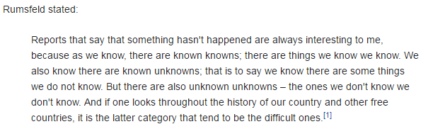
Recommendation 137Inspection should remain the central method for monitoring compliance with fundamental standards.”

And it goes further by recommending “A specialist cadre of hospital inspectors should be established …”

A predictable wail of anguish rose from the ranks “Not more inspectors! The last lot did not do much good!”

The word “cadre” is not one that is used in common parlance so I looked it up:

Cadre: 1. a core group of people at the center of an organization, especially military; 2. a small group of highly trained people, often part of a political movement.

So it has a military, centralist, specialist, political flavour. No wonder there was a wail of anguish! Perhaps this “cadre of inspectors” has been unconsciously labelled with another name? Persecutors.

Of more interest is the “highly trained” phrase. Trained to do what? Trained by whom? Clearly none of the existing schools of NHS management who have allowed the fiasco to happen in the first place. So who – exactly? Are these inspectors intended to be protectors, persecutors, or educators?

And what would they inspect?

And how would they use the output of such an inspection?

Would the fear of the inspection and its possible unpleasant consequences be the stick to motivate compliance?

Is the language of the Francis Report going to create another brick wall of resistance from the rubble of the ruins of the reputation of the NHS?  Many self-appointed experts are already saying that implementing 290 recommendations is impossible.

They are incorrect.

The number of recommendations is a measure of the breadth and depth of the rot. So the critical-to-success factor is to implement them in a well-designed order. Get the first few in place and working and the rest will follow naturally.  Get the order wrong and the radical cure will kill the patient.

So where do we start?

Let us look at the inspection question again.  Why would we fear an external inspection? What are we resisting? There are three facets to this: first we do not know what is expected of us;  second we do not know if we can satisfy the expectation; and third we fear being persecuted for failing to achieve the impossible.

W Edwards Deming used a very effective demonstration of the dangers of well-intended but badly-implemented quality improvement by inspection: it was called the Red Bead Game.  The purpose of the game was to illustrate how to design an inspection system that actually helps to achieve the intended goal. Sustained improvement.

This is applied Improvement Science and I will illustrate how it is done with a real and current example.


I am assisting a department in a large NHS hospital to improve the quality of their service. I have been sent in as an external inspector.  The specific quality metric they have been tasked to improve is the turnaround time of the specialist work that they do. This is a flow metric because a patient cannot leave hospital until this work is complete – and more importantly it is a flow and quality metric because when the hospital is full then another patient, one who urgently needs to be admitted, will be waiting for the bed to be vacated. One in one out.

The department have been set a standard to meet, a target, a specification, a goal. It is very clear and it is easily measurable. They have to turnaround each job of work in less than 2 hours.  This is called a lead time specification and it is arbitrary.  But it is not unreasonable from the perspective of the patient waiting to leave and for the patient waiting to be admitted. Neither want to wait.

The department has a sophisticated IT system that measures their performance. They use it to record when each job starts and when each job is finished and from those two events the software calculates the lead time for each job in real-time. At the end of each day the IT system counts how many jobs were completed in less than 2 hours and compares this with how many were done in total and calculates a ratio which it presents as a percentage in the range of 0 and 100. This is called the process yield.  The department are dedicated and they work hard and they do all the work that arrives each day the same day – no matter how long it takes. And at the end of each day they have their score for that day. And it is almost never 100%.  Not never. Almost never. But it is not good enough and they are being blamed for it. In turn they blame others for making their job more difficult. It is a blame-game and it has been going on for years.

So how does an experienced Improvement Science-trained Inspector approach this sort of “wicked” problem?

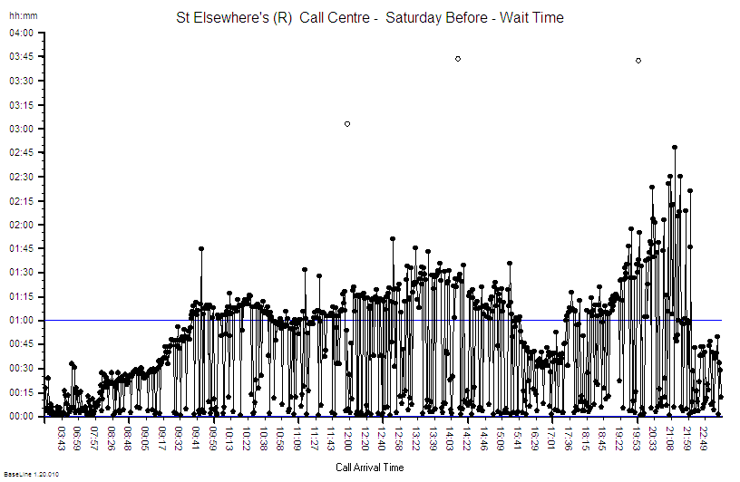
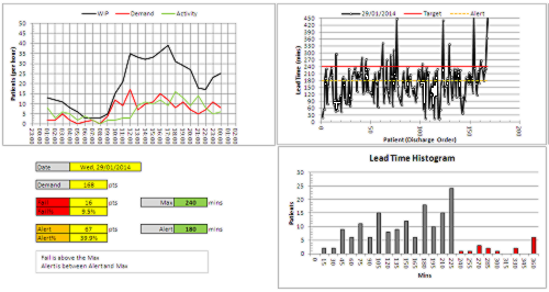
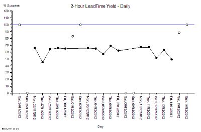
First we need to get the writing on the wall – we need to see the reality – we need to “plot the dots” – we need to see what the performance is doing over time – we need to see the voice of the process. And that requires only their data, a pencil, some paper and for the chart to be put on the on the wall where everyone can see it.

Chart_1
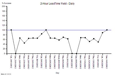
This is what their daily % yield data for three consecutive weeks looked like as a time-series chart. The thin blue line is the 100% yield target.

The 100% target was only achieved on three days – and they were all Sundays. On the other Sunday it was zero (which may mean that there was no data to calculate a ratio from).

There is wide variation from one day to the next and it is the variation as well as the average that is of interest to an improvement scientist. What is the source of the variation it? If 100% yield can be achieved some days then what is different about those days?

Chart_2

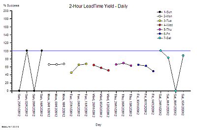
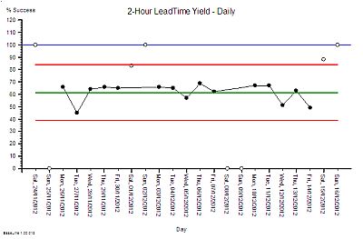
So our Improvement science-trained Inspector will now re-plot the data in a different way – as rational groups. This exposes the issue clearly. The variation on Weekends is very wide and the performance during the Weekdays is much less variable.  What this says is that the weekend system and the weekday system are different. This means that it is invalid to combine the data for both.

It also raises the question of why there is such high variation in yield only at weekends?  The chart cannot answer the question, so our IS-trained Inspector digs a bit deeper and discovers that the volume of work done at the weekend is low, the staffing of the department is different, and that the recording of the events is less reliable. In short – we cannot even trust the weekend data – so we have two reasons to justify excluding it from our chart and just focusing on what happens during the week.

Chart_3We re-plot our chart, marking the excluded weekend data as not for analysis.

We can now see that the weekday performance of our system is visible, less variable, and the average is a long way from 100%.

The team are working hard and still only achieving mediocre performance. That must mean that they need something that is missing. Motivating maybe. More people maybe. More technology maybe.  But there is no more money for more people or technology and traditional JFDI motivation does not seem to have helped.

This looks like an impossible task!

Chart_4

So what does our Inspector do now? Mark their paper with a FAIL and put them on the To Be Sacked for Failing to Meet an Externally Imposed Standard heap?

Nope.

Our IS-trained Inspector calculates the limits of expected performance from the data  and plots these limits on the chart – the red lines.  The computation is not difficult – it can be done with a calculator and the appropriate formula. It does not need a sophisticated IT system.

What this chart now says is “The current design of this process is capable of delivering between 40% and 85% yield. To expect it do do better is unrealistic”.  The implication for action is “If we want 100% yield then the process needs to be re-designed.” Persecution will not work. Blame will not work. Hoping-for-the-best will not work. The process must be redesigned.

Our improvement scientist then takes off the Inspector’s hat and dons the Designer’s overalls and gets to work. There is a method to this and it is called 6M Design®.

Chart_5

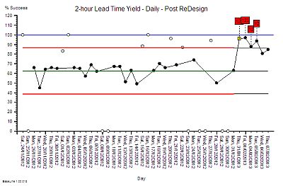
First we need to have a way of knowing if any future design changes have a statistically significant impact – for better or for worse. To do this the chart is extended into the future and the red lines are projected forwards in time as the black lines called locked-limits.  The new data is compared with this projected baseline as it comes in.  The weekends and bank holidays are excluded because we know that they are a different system. On one day (20/12/2012) the yield was surprisingly high. Not 100% but more than the expected upper limit of 85%.

Chart_6The alerts us to investigate and we found that it was a ‘hospital bed crisis’ and an ‘all hands to the pumps’ distress call went out.

Extra capacity was pulled to the process and less urgent work was delayed until later.  It is the habitual reaction-to-a-crisis behaviour called “expediting” or “firefighting”.  So after the crisis had waned and the excitement diminished the performance returned to the expected range. A week later the chart signals us again and we investigate but this time the cause was different. It was an unusually quiet day and there was more than enough hands on the pumps.

Both of these days are atypically good and we have an explanation for each of them. This is called an assignable cause. So we are justified in excluding these points from our measure of the typical baseline capability of our process – the performance the current design can be expected to deliver.

An inexperienced manager might conclude from these lessons that what is needed is more capacity. That sounds and feels intuitively obvious and it is correct that adding more capacity may improve the yield – but that does not prove that lack of capacity is the primary cause.  There are many other causes of long lead times  just as there are many causes of headaches other than brain tumours! So before we can decide the best treatment for our under-performing design we need to establish the design diagnosis. And that is done by inspecting the process in detail. And we need to know what we are looking for; the errors of design commission and the errors of design omission. The design flaws.

Only a trained and experienced process designer can spot the flaws in a process design. Intuition will trick the untrained and inexperienced.


Once the design diagnosis is established then the redesign stage can commence. Design always works to a specification and in this case it was clear – to significantly improve the yield to over 90% at no cost.  In other words without needing more people, more skills, more equipment, more space, more anything. The design assignment was made trickier by the fact that the department claimed that it was impossible to achieve significant improvement without adding extra capacity. That is why the Inspector had been sent in. To evaluate that claim.

The design inspection revealed a complex adaptive system – not a linear, deterministic, production-line that manufactures widgets.  The department had to cope with wide variation in demand, wide variation in quality of request, wide variation in job complexity, and wide variation in urgency – all at the same time.  But that is the nature of healthcare and acute hospital work. That is the expected context.

The analysis of the current design revealed that it was not well suited for this requirement – and the low yield was entirely predictable. The analysis also revealed that the root cause of the low yield was not lack of either flow-capacity or space-capacity.

This insight led to the suggestion that it would be possible to improve yield without increasing cost. The department were polite but they did not believe it was possible. They had never seen it, so why should they be expected to just accept this on faith?

Chart_7
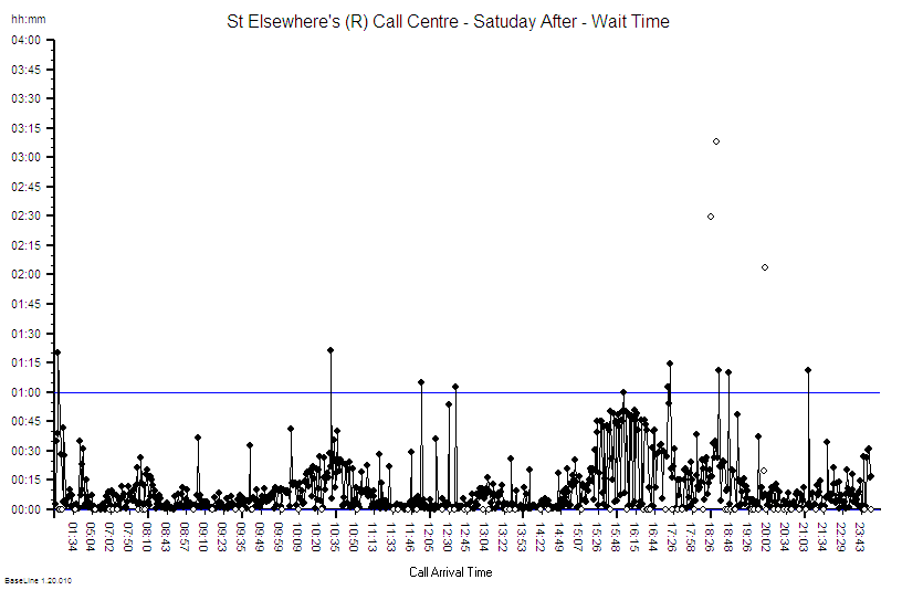
So, the next step was to develop, test and demonstrate a new design and that was done in three stages. The final stage was the Reality Test – the actual process design was changed for just one day – and the yield measured and compared with the predicted improvement.

This was the validity test – the proof of the design pudding. And to visualise the impact we used the same technique as before – extending the baseline of our time-series chart, locking the limits, and comparing the “after” with the “before”.

The yellow point marks the day of the design test. The measured yield was well above the upper limit which suggested that the design change had made a significant improvement. A statistically significant improvement.  There was no more capacity than usual and the day was not unusually quiet. At the end of the day we held a team huddle.

Our first question was “How did the new design feel?” The consensus was “Calmer, smoother, fewer interruptions” and best of all “We finished on time – there was no frantic catch up at the end of the day and no one had to stay late to complete the days work!”

The next question was “Do we want to continue tomorrow with this new design or revert back to the old one?” The answer was clear “Keep going with the new design. It feels better.”

The same chart was used to show what happened over the next few days – excluding the weekends as before. The improvement was sustained – it did not revert to the original because the process design had been changed. Same work, same capacity, different process – higher yield. The red flags on the charts mark the statistically significant evidence of change and the cluster of red flags is very strong statistical evidence that the improvement is not due to chance.

The next phase of the 6M Design® method is to continue to monitor the new process to establish the new baseline of expectation. That will require at least twelve data points and it is in progress. But we have enough evidence of a significant improvement. This means that we have no credible justification to return to the old design, and it also implies that it is no longer valid to compare the new data against the old projected limits. Our chart tells us that we need to split the data into before-and-after and to calculate new averages and limits for each segment separately. We have changed the voice of the process by changing the design.

Chart_8And when we split the data at the point-of-change then the red flags disappear – which means that our new design is stable. And it has a new capability – a better one. We have moved closer to our goal of 100% yield. It is still early days and we do not really have enough data to calculate the new capability.

What we can say is that we have improved average quality yield from 63% to about 90% at no cost using a sequence of process diagnose, design, deliver.  Study-Plan-Do.

And we have hard evidence that disproves the impossibility hypothesis.


And that was the goal of the first design change – it was not to achieve 100% yield in one jump. Our design simulation had predicted an improvement to about 90%.  And there are other design changes to follow that need this stable foundation to build on.  The order of implementation is critical – and each change needs time to bed in before the next change is made. That is the nature of the challenge of improving a complex adaptive system.

The cost to the department was zero but the benefit was huge.  The bigger benefit to the organisation was felt elsewhere – the ‘customers’ saw a higher quality, quicker process – and there will be a financial benefit for the whole system. It will be difficult to measure with our current financial monitoring systems but it will be real and it will be there – lurking in the data.

The improvement required a trained and experienced Inspector/Designer/Educator to start the wheel of change turning. There are not many of these in the NHS – but the good news is that the first level of this training is now available.

What this means for the post-Francis Report II NHS is that those who want to can choose to leap over the wall of resistance that is being erected by the massing legions of noisy cynics. It means we can all become our own inspectors. It means we can all become our own improvers. It means we can all learn to redesign our systems so that they deliver higher safety, better quality, more quickly and at no extra one-off or recurring cost.  We all can have nothing to fear from the Specialist Cadre of Hospital Inspectors.

The writing is on the wall.


15/02/2013 – Two weeks in and still going strong. The yield has improved from 63% to 92% and is stable. Improvement-by-design works.

10/03/2013 – Six weeks in and a good time to test if the improvement has been sustained.

TTO_Yield_Weekly
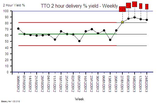
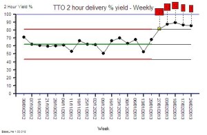
The chart is the weekly performance plotted for 17 weeks before the change and for 5 weeks after. The advantage of weekly aggregated data is that it removes the weekend/weekday 7-day cycle and reduces the effect of day-to-day variation.

The improvement is obvious, significant and has been sustained. This is the objective improvement. More important is the subjective improvement.

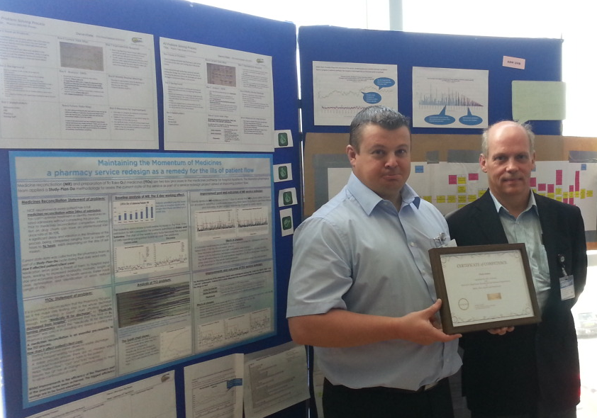
Here is what Chris M (departmental operational manager) wrote in an email this week (quoted with permission):

Hi Simon

It is I who need to thank you for explaining to me how to turn our pharmacy performance around and ultimately improve the day to day work for the pharmacy team (and the trust staff). This will increase job satisfaction and make pharmacy a worthwhile career again instead of working in constant pressure with a lack of achievement that had made the team feel rather disheartened and depressed. I feel we can now move onwards and upwards so thanks for the confidence boost.

Best wishes and many thanks

Chris

This is what Improvement Science is all about!
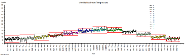
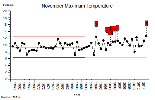
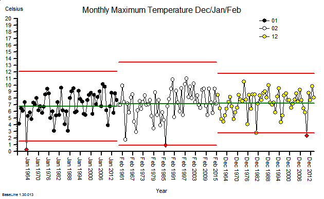