High Performing Design Teams

figures_colored_teamwork_pass_puzzle_piece_300_wht_9681It is possible but unusual for significant improvement-by-design to be delivered by an individual.

It is much more likely to require a group of people – a design team.


And that is where efforts to improve often come to a grinding halt because, despite our good intentions, we are not always very good at collaborative improvement.


This is not a new problem so the solution must be elusive, yes?

Well, actually that is not the case.  We all already know what to do, we all know the pieces of the productive team jigsaw … we just do not use all of them all of the time.

Fortunately, there is an easy way to get around this problem. A checklist.

Just like the ones that astronauts, pilots, and surgeons use.

And this week I discovered an excellent source of checklists for developing and sustaining high performance teams:

A Systematic Guide to High Performing Teams by Ken Thompson (ISBN 9-781522-871910) and here is a TEDx talk of Ken describing the ‘secrets’.

The ones that we all know.

Notably Absent

KingsFund_Quality_Report_May_2016This week the King’s Fund published their Quality Monitoring Report for the NHS, and it makes depressing reading.

These highlights are a snapshot.

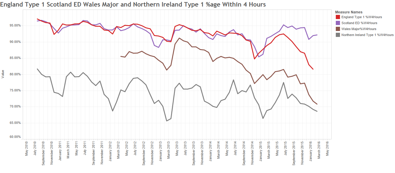
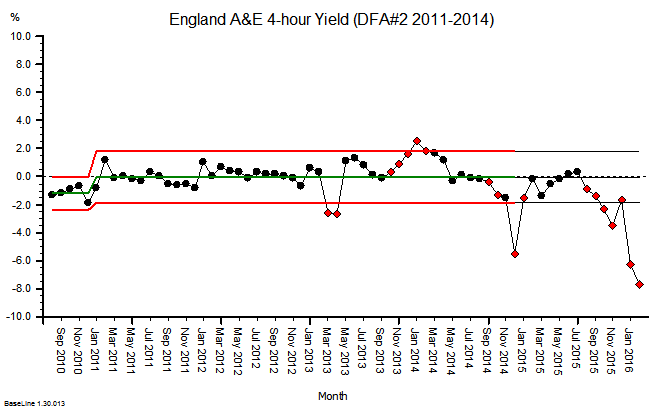
The website has some excellent interactive time-series charts that transform the deluge of data the NHS pumps out into pictures that tell a shameful story.

On almost all reported dimensions, things are getting worse and getting worse faster.

Which I do not believe is the intention.

But it is clearly the impact of the last 20 years of health and social care policy.


What is more worrying is the data that is notably absent from the King’s Fund QMR.

The first omission is outcome: How well did the NHS deliver on its intended purpose?  It is stated at the top of the NHS England web site …

NHSE_Purpose

And lets us be very clear here: dying, waiting, complaining, and over-spending are not measures of what we want: health and quality success metrics.  They are a measures of what we do not want; they are failure metrics.

The fanatical focus on failure is part of the hyper-competitive, risk-averse medical mindset:

primum non nocere (first do no harm),

and as a patient I am reassured to hear that but is no harm all I can expect?

What about:

tunc mederi (then do some healing)


And where is the data on dying in the Kings Fund QMR?

It seems to be notably absent.

And I would say that is a quality issue because it is something that patients are anxious about.  And that may be because they are given so much ‘open information’ about what might go wrong, not what should go right.


And you might think that sharp, objective data on dying would be easy to collect and to share.  After all, it is not conveniently fuzzy and subjective like satisfaction.

It is indeed mandatory to collect hospital mortality data, but sharing it seems to be a bit more of a problem.

The fear-of-failure fanaticism extends there too.  In the wake of humiliating, historical, catastrophic failures like Mid Staffs, all hospitals are monitored, measured and compared. And the negative deviants are named, shamed and blamed … in the hope that improvement might follow.

And to do the bench-marking we need to compare apples with apples; not peaches with lemons.  So we need to process the raw data to make it fair to compare; to ensure that factors known to be associated with higher risk of death are taken into account. Factors like age, urgency, co-morbidity and primary diagnosis.  Factors that are outside the circle-of-control of the hospitals themselves.

And there is an army of academics, statisticians, data processors, and analysts out there to help. The fruit of their hard work and dedication is called SHMI … the Summary Hospital Mortality Index.

SHMI_Specification

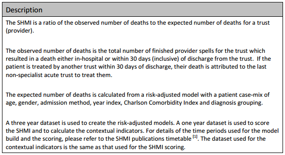
Now, the most interesting paragraph is the third one which outlines what raw data is fed in to building the risk-adjusted model.  The first four are objective, the last two are more subjective, especially the diagnosis grouping one.

The importance of this distinction comes down to human nature: if a hospital is failing on its SHMI then it has two options:
(a) to improve its policies and processes to improve outcomes, or
(b) to manipulate the diagnosis group data to reduce the SHMI score.

And the latter is much easier to do, it is called up-coding, and basically it involves camping at the pessimistic end of the diagnostic spectrum. And we are very comfortable with doing that in health care. We favour the Black Hat.

And when our patients do better than our pessimistically-biased prediction, then our SHMI score improves and we look better on the NHS funnel plot.

We do not have to do anything at all about actually improving the outcomes of the service we provide, which is handy because we cannot do that. We do not measure it!


And what might be notably absent from the data fed in to the SHMI risk-model?  Data that is objective and easy to measure.  Data such as length of stay (LOS) for example?

Is there a statistical reason that LOS is omitted? Not really. Any relevant metric is a contender for pumping into a risk-adjustment model.  And we all know that the sicker we are, the longer we stay in hospital, and the less likely we are to come out unharmed (or at all).  And avoidable errors create delays and complications that imply more risk, more work and longer length of stay. Irrespective of the illness we arrived with.

So why has LOS been omitted from SHMI?

The reason may be more political than statistical.

We know that the risk of death increases with infirmity and age.

We know that if we put frail elderly patients into a hospital bed for a few days then they will decondition and become more frail, require more time in hospital, are more likely to need a transfer of care to somewhere other than home, are more susceptible to harm, and more likely to die.

So why is LOS not in the risk-of-death SHMI model?

And it is not in the King’s Fund QR report either.

Nor is the amount of cash being pumped in to keep the HMS NHS afloat each month.

All notably absent!

Burning Ambition

flag_waving_mountain_150_clr_13781A wise person once said:

Improvement implies change, but change does not imply improvement.

To get improvement on any dimension we need to change something: our location, our perspective, our actions, our decisions, our assumptions, our beliefs even.

And we hate doing that because we know from life experience that change does not guarantee improvement.  Even with well-intended, carefully-considered, and collectively-agreed change … things can get worse.  And we fear that.  So the safest thing to do is … nothing!  We sit on the fence.


Until a ‘fire’ breaks out.  Then we are motivated to move by a stronger emotion … fear for our very survival.  That bigger fear gives us the necessary push and we move to somewhere cooler and safer.

But as the temperature drops, the fear goes away, the push goes away too and we lose momentum and return to torpor.  Until the next fire breaks out.

The other problem with a collective fear-based motivator is that we usually jump in different directions so any shred of cohesion we did have, is lost completely.  The system fragments.  Fear is always destructive.


The alternative to fear-driven change is a different type of motivator … a burning ambition.

Ambition may feel just as hot but it is different in that it continues to pull and to motivate us.  We do not slump back into torpor after the first success.  If anything the sense of achievement fuels our fire-of-ambition and that pulls us with greater force.

And when many others share the same burning ambition then we are pulled into alignment on a common purpose and that can become constructive and synergistic … if we work collaboratively.


So let us take health care improvement as the example.

We have a burning platform.  The newspapers are full of doom-and-gloom about escalating waits, failed targets, weekend mortality effects, spiraling costs and political conflict.

But do we have a collective burning ambition?  A common goal? A shared purpose?

A common goal like a health care system that is safe, delivers on time, meets and exceeds expectation and is affordable ?

If we do, then what is the barrier to change? We have push and we have pull … so where is the friction and resistance coming from?

From inside ourselves perhaps?  Maybe we harbour limiting beliefs that it is impossible or we can’t do it?  Beliefs that self-justify our ‘do nothing’ decision.

So only one example that disproves our limiting beliefs is enough to remove them. Just one.  And I shared a video of it last week – the Luton & Dunstable one.


And the animated video by Dr Peter Fuda captures the essence of this push-and-pull Kurt Lewin Force Field concept brilliantly!

The NHS Cockpit Dashboard

A few weeks ago I raised the undiscussable issue that the NHS feels like it is on a downward trajectory … and that what might be needed are some better engines … and to design, test, build and install them we will need some health care system engineers (HCSEs) … and that we do not have appear to have enough of those. None in fact.

The feedback shows that many people resonated with this sentiment.


This week I had the opportunity to peek inside the NHS Cockpit and look at the Dashboard … and this is what I saw on the A&E Performance panel.

UK_Type_1_ED_Monthly_4hr_Yield

This is the monthly aggregate A&E 4-hour performance for England (red), Scotland (purple), Wales (brown) and Northern Ireland (grey) for the last six years.

The trajectory looked alarmingly obvious to me – the NHS is on a predictable path to destruction – a controlled flight into terrain (CFIT).

The repeating up-and-down pattern is the annual cycle of seasons; better in the summer and worse in the winter.  This signal is driven by the celestial clock … the movement of the planets … which is beyond our power to influence.

The downward trajectory is the cumulative effect of our current design … which is the emergent effect of our collective beliefs, behaviours, policies and politics … which are completely within our gift to change.

If we chose to and if we knew how to – which we do not appear to.

Our collective ineptitude is not a topic for discussion. It is a taboo subject.


And I know that because if it were for discussion then this dashboard would be on public view on a website hosted by the NHS.

It isn’t.


George_DonaldIt was created by George Donald, a member of the public, a disappointed patient, and a retired IT consultant.  And it was shared, free for all to see and use via Twitter (@GMDonald).

The information source is open, public, shared NHS data, but it takes a lot of work to winkle it out and present it like this.  So well done George … keep up the great work!


Now have a closer look at the Dashboard Display … look at the most recent data for England and Scotland.  What do you see?

Does it look like Scotland is pulling out of the dive and England is heading down even faster?

Hard to say for sure; there are lots of signals and noise all mixed up.


So we need to use some Systems Engineering tools to help us separate the signals from the noise; and for this a statistical process control (SPC) chart is useless.  We need a system behaviour chart (SBC) and its handy helper the deviation from aim (DFA) chart.

I will not bore you with the technical details but, suffice it to say, it is a tried-and-tested technique called the Method of Residuals.

Scotland_A&E_DFA_02 Exhibit #1 is the DFA chart for Scotland.  The middle 4 years (2011-2014) are used to create a ‘predictive model’;  the model projection is then compared with measured performance; and the difference is plotted as the DFA chart.

What this “says” is that the 2015/16 performance in Scotland is significantly better than projected, and the change of direction seemed to start in the first half of 2015.

This evidence seems to support the results of our Mark I Eyeball test.

England_A&E_DFA_02

Exhibit #2 – the DFA for England suggests the 2015/16 performance is significantly worse than projected, and this deterioration appears to have started later in 2015.

Oh dear! I do not believe that was the intention, but it appears to be the impact.


So what are England and Scotland doing differently?
What can we all learn from this?
What can we all do differently in the future?

Isn’t that a question that more people like you, me and George could reasonably ask of those whom we entrust to design, build and fly our NHS?

Isn’t that a reasonable question that could be asked by the 65 million people in the UK who might, at any time, be unlucky enough to require a trip to their local A&E department.

So, let us all grasp the nettle and get the Elephant in the Room into plain view and say in unison “The Emperor Has No Clothes!”

We are suffering from mass ineptitude and hubris, to use Dr Atul Gawande’s language, and we need a better collective strategy.


And there is hope.

Some innovative hospitals have had the courage to grasp the nettle. They have seen what is coming; they have fully accepted the responsibility for their own fate; they have stepped up to the challenge; they have looked-listened-and-learned from others, and they are proving what is possible.

They have a name. They are called positive deviants.

Have a look at this short video … it is jaw-dropping … it is humbling … it is inspiring … and it is challenging … because it shows what has been achieved already.

It shows what is possible. Now, and here in the UK.

Luton and Dunstable