The Productive Meeting

networking_people_PA_300_wht_1844The engine of improvement is a productive meeting.

Complex adaptive systems (CAS) are those that  learn and change themselves.

The books of ‘rules’ are constantly revised and refreshed as the CAS co-evolves with its environment.

System improvement is the outcome of effective actions.

Effective actions are the outcomes of wise decisions.

Wise decisions are the output of productive meetings.

So the meeting process must be designed to be productive: which means both effective and efficient.


One of the commonest niggles that individuals report is ‘Death by Meeting’.

That alone is enough evidence that our current design for meetings is flawed.


One common error of omission is lack of clarity about the purpose of the meeting.

This cause has two effects:

1. The wrong sort of meeting design is used for the problem(s) under consideration.

A meeting designed for tactical  (how to) planning will not work well for strategic (why to) problems.

2. A mixed bag of problems is dumped into the all-purpose-less meeting.

Mixing up short term tactical and long term strategic problems on a single overburdened agenda is doomed to fail.


Even when the purpose of  a meeting  is clear and agreed it is common to observe an unproductive meeting process.

The process may be unproductive because it is ineffective … there are no wise decisions made and so no effective actions implemented.

Worse even than that … decisions are made that are unwise and the actions that follow lead to unintended negative consequences.

The process may also be unproductive because it is inefficient … it requires too much input to get any output.

Of course we want both an effective and an efficient meeting process … and we need to be aware that effectiveness  comes first.  Designing the meeting process to be a more efficient generator of unwise decisions is not a good idea! The result is an even bigger problem!


So our meeting design focus is ‘How could we make wise decisions as a group?’

But if we knew the answer to that we would probably already be doing it!

So we can ask the same question another way: ‘How do we make unwise decisions as a group?

The second question is easier to answer. We just reflect on our current experience.

Some ways we appear to unintentionally generate unwise decisions are:

a) Ensure we have no clarity of purpose – confusion is a good way to defuse effective feedback.
b) Be selective in who we invite to the meeting – group-think facilitates consensus.
c) Ignore the pragmatic, actual, reality and only use academic, theoretical, rhetoric.
d) Encourage the noisy – quiet people are non-contributors.
e) Engage in manipulative styles of behaviour – people cannot be trusted.
f) Encourage the  sceptics and cynics to critique and cull innovative suggestions.
g) Have a trump card – keep the critical ‘any other business’ to the end – just in case.

If we adopt all these tactics we can create meetings that are ‘lively’, frustrating, inefficient and completely unproductive. That of course protects us from making unwise decisions.


So one approach to designing meetings to be more productive is simply to recognise and challenge the unproductive behaviours – first as individuals and then as groups.

The place to start is within our own circle of influence – with those we trust – and to pledge to each other to consciously monitor for unproductive behaviours and to respectfully challenge them.

These behaviours are so habitual that we are often unaware that we are doing them.

And it feels strange at first but it get easier with practice and when you see the benefits.

Perfect Storm

lightning_strike_150_wht_5809[Drrrrring Drrrrring]

<Bob> Hi Lesley! How are you today?

<Leslie> Hi Bob.  Really good.  I have just got back from a well earned holiday so I am feeling refreshed and re-energised.

<Bob> That is good to hear.  It has been a bit stormy here over the past few weeks.  Apparently lots of  hot air hitting cold reality and forming a fog of disillusionment and storms of protest.

<Leslie> Is that a metaphor?

<Bob> Yes!  A good one do you think? And it leads us into our topic for this week. Perfect storms.

<Leslie> I am looking forward to it.  Can you be a bit more specific?

<Bob> Sure.  Remember the ISP exercise where I asked you to build a ‘chaos generator’?

<Leslie> I sure do. That was an eye-opener!  I had no idea how easy it is to create chaotic performance in a system – just by making the Flaw of Averages error and adding a pinch of variation. Booom!

<Bob> Good. We are going to use that model to demonstrate another facet of system design.  How to steer out of chaos.

<Leslie> OK – what do I need to do.

<Bob> Start up that model and set the cycle time to 10 minutes with a sigma of 1.5 minutes.

<Leslie> OK.

<Bob> Now set the demand interval to 10 minutes and the sigma of that to 2.0 minutes.

<Leslie> OK. That is what I had before.

<Bob> Set the lead time upper specification limit to 30 minutes. Run that 12 times and record the failure rate.

<Leslie> OK.  That gives a chaotic picture!  All over the place.

<Bob> OK now change just the average of the demand interval.  Start with a value of 8 minutes, run 12 times, and then increase to 8.5 minutes and repeat that up to 12 minutes.

<Leslie> OK. That will repeat the run for 10 minutes. Is that OK.

<Bob> Yes.

<Leslie> OK … it will take me a few minutes to run all these.  Do you want to get a cup of tea while I do that?

<Bob> Good idea.

[5 minutes later]

<Leslie> OK I have done all that – 108 data points. Do I plot that as a run chart?

<Bob> You could.  I suggest plotting as a scattergram.

<Leslie> With the average demand interval on the X axis and the Failure % on the  Y axis?

<Bob> Yes. Exactly so. And just the dots, no lines.

<Leslie> OK. Wow! That is amazing!  Now I see why you get so worked up about the Flaw of Averages!

<Bob> What you are looking at is called a performance curve.  Notice how steep and fuzzy it is. That is called a chaotic transition. The perfect storm.  And when fall into the Flaw of Averages trap we design our systems to be smack in the middle of it.

<Leslie> Yes I see what you are getting at.  And that implies that to calm the chaos we do not need very much resilient flow capacity … and we could probably release that just from a few minor design tweaks.

<Bob> Yup.

<Leslie> That is so cool. I cannot wait to share this with the team. Thanks again Bob.

Seeing-by-Doing

OneStopBeforeGanttFlow improvement-by-design requires being able to see the flows; and that is trickier than it first appears.

We can see movement very easily.

Seeing flows is not so easy – particularly when they are mixed-up and unsteady.

One of the most useful tools for visualising flow was invented over 100 years ago by Henry Laurence Gantt (1861-1919).

Henry Gantt was a mechanical engineer from Johns Hopkins University and an early associate of Frederick Taylor. Gantt parted ways with Taylor because he disagreed with the philosophy of Taylorism which was that workers should be instructed what to do by managers (=parent-child).  Gantt saw that workers and managers could work together for mutual benefit of themselves and their companies (=adult-adult).  At one point Gantt was invited to streamline the production of munitions for the war effort and his methods were so successful that the Ordinance Department was the most productive department of the armed forces.  Gantt favoured democracy over autocracy and is quoted to have said “Our most serious trouble is incompetence in high places. The manager who has not earned his position and who is immune from responsibility will fail time and again, at the cost of the business and the workman“.

Henry Gantt invented a number of different charts – not just the one used in project management which was actually invented 20 years earlier by Karol Adamieki and re-invented by Gantt. It become popularised when it was used in the Hoover Dam project management; but that was after Gantt’s death in 1919.

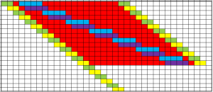
The form of Gantt chart above is called a process template chart and it is designed to show the flow of tasks through  a process. Each horizontal line is a task; each vertical column is an interval of time. The colour code in each cell indicates what the task is doing and which resource the task is using during that time interval. Red indicates that the task is waiting. White means that the task is outside the scope of the chart (e.g. not yet arrived or already departed).

The Gantt chart shows two “red wedges”.  A red wedge that is getting wider from top to bottom is the pattern created by a flow constraint.  A red wedge that is getting narrower from top to bottom is the pattern of a policy constraint.  Both are signs of poor scheduling design.

A Gantt chart like this has three primary uses:
1) Diagnosis – understanding how the current flow design is creating the queues and delays.
2) Design – inventing new design options.
3) Prognosis – testing the innovative designs so the ‘fittest’ can be chosen for implementation.

These three steps are encapsulated in the third “M” of 6M Design® – the Model step.

In this example the design flaw was the scheduling policy.  When that was redesigned the outcome was zero-wait performance. No red on the chart at all.  The same number of tasks were completed in the same with the same resources used. Just less waiting. Which means less space is needed to store the queue of waiting work (i.e. none in this case).

That this is even possible comes as a big surprise to most people. It feels counter-intuitive. It is however an easy to demonstrate fact. Our intuition tricks us.

And that reduction in the size of the queue implies a big cost reduction when the work-in-progress is perishable and needs constant attention [such as patients lying on A&E trolleys and in hospital beds].

So what was the cost of re-designing this schedule?

A pinch of humility. A few bits of squared paper and some coloured pens. A couple hours of time. And a one-off investment in learning how to do it.  Peanuts in comparison with the recurring benefit gained.