Carveoutosis Multiforme Fulminans

This is the name given to an endemic, chronic, systemic, design disease that afflicts the whole NHS that very few have heard of, and even fewer understand.

This week marked two milestones in the public exposure of this elusive but eminently treatable health care system design illness that causes queues, delays, overwork, chaos, stress and risk for staff and patients alike.

The first was breaking news from the team in Swansea led by Chris Jones.

They had been grappling with the wicked problem of chronic queues, delays, chaos, stress, high staff turnover, and escalating costs in their Chemotherapy Day Unit (CDU) at the Singleton Hospital.

The breakthrough came earlier in the year when we used the innovative eleGANTT® system to measure and visualise the CDU chaos in real-time.

This rich set of data enabled us, for the first time, to apply a powerful systems engineering  technique called counterfactual analysis which revealed the primary cause of the chaos – the elusive and counter-intuitive design disease carvoutosis multiforme fulminans.

And this diagnosis implied that the chaos could be calmed quickly and at no cost.

But that news fell on slightly deaf ears because, not surprisingly, the CDU team were highly sceptical that such a thing was possible.

So, to convince them we needed to demonstrate the adverse effect of carveoutosis in a way that was easy to see.  And to do that we used some advanced technology: dice and tiddly winks.

The reaction of the CDU nurses was amazing.  As soon as they ‘saw’ it they clicked and immediately grasped how to apply it in their world.  They designed the change they needed to make in a matter of minutes.


But the proof-of-the-pudding-is-in-the eating and we arranged a one-day-test-of-change of their anti-carveout design.

The appointed day arrived, Wednesday 19th June.  The CDU nurses implemented their new design (which cost nothing to do).  Within an hour of the day starting they reported that the CDU was strangely calm.   And at the end of the day they reported that it had remained strangely calm all day; and that they had time for lunch; and that they had time to do all their admin as they went; and that they finished on time; and that the patients did not wait for their chemotherapy; and that the patients noticed the chaos-to-calm transformation too.

They treated just the same number of patients as usual with the same staff, in the same space and with the same equipment.  It cost nothing to make the change.

To say they they were surprised is an understatement!  They were so surprised and so delighted that they did not want to go back to the old design – but they had to because it was only a one-day-test-of-change.

So, on Thursday and Friday they reverted back to the carveoutosis design.  And the chaos returned.  That nailed it!  There was a riot!!  The CDU nurses refused to wait until later in the year to implement their new design and they voted unanimously to implement it from the following Monday.  And they did.  And calm was restored.


The second milestone happened on Thursday 11th July when we ran a Health Care Systems Engineering (HCSE) Masterclass on the very same topic … chronic systemic carveoutosis multiforme fulminans.

This time we used the dice and tiddly winks to demonstrate the symptoms, signs and the impact of treatment.  Then we explored the known pathophysiology of this elusive and endemic design disease in much more depth.

This is health care systems engineering in action.

It seems to work.

System Dynamics

On Thursday we had a very enjoyable and educational day.  I say “we” because there were eleven of us learning together.

There was Declan, Chris, Lesley, Imran, Phil, Pete, Mike, Kate, Samar and Ellen and me (behind the camera).  Some are holding their long-overdue HCSE Level-1 Certificates and Badges that were awarded just before the photo was taken.

The theme for the day was System Dynamics which is a tried-and-tested approach for developing a deep understanding of how a complex adaptive system (CAS) actually works.  A health care system is a complex adaptive system.

The originator of system dynamics is Jay Wright Forrester who developed it around the end of WW2 (i.e. about 80 years ago) and who later moved to MIT.  Peter Senge, author of The Fifth Discipline was part of the same group as was Donella Meadows who wrote Limits to Growth.  Their dream was much bigger – global health – i.e. the whole planet not just the human passengers!  It is still a hot topic [pun intended].


The purpose of the day was to introduce the team of apprentice health care system engineers (HCSEs) to the principles of system dynamics and to some of its amazing visualisation and prediction techniques and tools.

The tangible output we wanted was an Excel-based simulation model that we could use to solve a notoriously persistent health care service management problem …

How to plan the number of new and review appointment slots needed to deliver a safe, efficient, effective and affordable chronic disease service?

So, with our purpose in mind, the problem clearly stated, and a blank design canvas we got stuck in; and we used the HCSE improvement-by-design framework that everyone was already familiar with.

We made lots of progress, learned lots of cool stuff, and had lots of fun.

We didn’t quite get to the final product but that was OK because it was a very tough design assignment.  We got 80% of the way there though which is pretty good in one day from a standing start.  The last 20% can now be done by the HCSEs themselves.

We were all exhausted at the end.  We had worked hard.  It was a good day.


And I am already looking forward to the next HCSE Masterclass that will be in about six weeks time.  This one will address another chronic, endemic, systemic health care system “disease” called carveoutosis multiforme fulminans.

Filter-Pull versus Push-Carveout

It is November 2018, the clocks have changed back to GMT, the trick-and-treats are done, the fireworks light the night skies and spook the hounds, and the seasonal aisles in the dwindling number of high street stores are already stocked for Christmas.

I have been a bit quiet on the blog front this year but that is because there has been a lot happening behind the scenes and I have had to focus.

One output of is the recent publication of an article in Future Healthcare Journal on the topic of health care systems engineering (HCSE).  Click here to read the article and the rest of this excellent edition of FHJ that is dedicated to “systems”.

So, as we are back to the winter phase of the annual NHS performance cycle it is a good time to glance at the A&E Performance Radar and see who is doing well, and not-so-well.

Based on past experience, I was expecting Luton to be Top-of-the-Pops and so I was surprised (and delighted) to see that Barnsley have taken the lead.  And the chart shows that Barnsley has turned around a reasonable but sagging performance this year.

So I would be asking “What has happened at Barnsley that we can all learn from? What did you change and how did you know what and how to do that?

To be sure, Luton is still in the top three and it is interesting to explore who else is up there and what their A&E performance charts look like.

The data is all available for anyone with a web-browser to view – here.

For completeness, this is the chart for Luton, and we can see that, although the last point is lower than Barnsley, the performance-over-time is more consistent and less variable. So who is better?

NB. This is a meaningless question and illustrates the unhelpful tactic of two-point comparisons with others, and with oneself. The better question is “Is my design fit-for-purpose?”

The question I have for Luton is different. “How do you achieve this low variation and how do you maintain it? What can we all learn from you?”

And I have some ideas how they do that because in a recent HSJ interview they said “It is all about the filters“.


What do they mean by filters?

A filter is an essential component of any flow design if we want to deliver high safety, high efficiency, high effectiveness, and high productivity.  In other words, a high quality, fit-4-purpose design.

And the most important flow filters are the “upstream” ones.

The design of our upstream flow filters is critical to how the rest of the system works.  Get it wrong and we can get a spiralling decline in system performance because we can unintentionally trigger a positive feedback loop.

Queues cause delays and chaos that consume our limited resources.  So, when we are chasing cost improvement programme (CIP) targets using the “salami slicer” approach, and combine that with poor filter design … we can unintentionally trigger the perfect storm and push ourselves over the catastrophe cliff into perpetual, dangerous and expensive chaos.

If we look at the other end of the NHS A&E league table we can see typical examples that illustrate this pattern.  I have used this one only because it happens to be bottom this month.  It is not unique.

All other NHS trusts fall somewhere between these two extremes … stable, calm and acceptable and unstable, chaotic and unacceptable.

Most display the stable and chaotic combination – the “Zone of Perpetual Performance Pain”.

So what is the fundamental difference between the outliers that we can all learn from? The positive deviants like Barnsley and Luton, and the negative deviants like Blackpool.  I ask this because comparing the extremes is more useful than laboriously exploring the messy, mass-mediocrity in the middle.

An effective upstream flow filter design is a necessary component, but it is not sufficient. Triage (= French for sorting) is OK but it is not enough.  The other necessary component is called “downstream pull” and omitting that element of the design appears to be the primary cause of the chronic chaos that drags trusts and their staff down.

It is not just an error of omission though, the current design is an actually an error of commission. It is anti-pull; otherwise known as “push”.


This year I have been busy on two complicated HCSE projects … one in secondary care and the other in primary care.  In both cases the root cause of the chronic chaos is the same.  They are different systems but have the same diagnosis.  What we have revealed together is a “push-carveout” design which is the exact opposite of the “upstream-filter-plus-downstream-pull” design we need.

And if an engineer wanted to design a system to be chronically chaotic then it is very easy to do. Here is the recipe:

a) Set high average utilisation target of all resources as a proxy for efficiency to ensure everything is heavily loaded. Something between 80% and 100% usually does the trick.

b) Set a one-size-fits-all delivery performance target that is not currently being achieved and enforce it punitively.  Something like “>95% of patients seen and discharged or admitted in less than 4 hours, or else …”.

c) Divvy up the available resources (skills, time, space, cash, etc) into ring-fenced pots.

Chronic chaos is guaranteed.  The Laws of Physics decree it.


Unfortunately, the explanation of why this is the case is counter-intuitive, so it is actually better to experience it first, and then seek the explanation.  Reality first, reasoning second.

And, it is a bittersweet experience, so it needs to be done with care and compassion.

And that’s what I’ve been busy doing this year. Creating the experiences and then providing the explanations.  And if done gradually what then happens is remarkable and rewarding.

The FHJ article outlines one validated path to developing individual and organisational capability in health care systems engineering.

The Pathology of Variation I

In medical training we have to learn about lots of things. That is one reason why it takes a long time to train a competent and confident clinician.

First, we learn the anatomy (structure) and the physiology (function) of the normal, healthy human.

Then we learn about how this amazingly complicated system can go wrong.  We learn about pathology.  And we do that so that we understand the relationship between the cause (disease) and the effect (symptoms and signs).

Then we learn about diagnostics – which is how to work backwards from the effects to the most likely cause(s).

And only then can we learn about therapeutics – the design and delivery of a treatment plan that we are confident will relieve the symptoms by curing the disease.

And we learn about prevention – how to avoid some illnesses (and delay others) by addressing the root causes earlier.  Much of the increase in life expectancy over the last 200 years has come from prevention, not from cure.


The NHS is an amazingly complicated system, and it too can go wrong.  It can exhibit a wide spectrum of symptoms and signs; medical errors, long delays, unhappy patients, burned-out staff, and overspent budgets.

But, there is no equivalent training in how to diagnose and treat a sick health care system.  And this is not acceptable, especially given that the knowledge of how to do this is already available.

It is called complex adaptive systems engineering (CASE).


Before the Renaissance, the understanding of how the body works was primitive and it was believed that illness was “God’s Will” so we had to just grin-and-bear (and pray).

The Scientific Revolution brought us new insights, profound theories, innovative techniques and capability-extending tools.  And the impact has been dramatic.  Those who do have access to this knowledge live better and longer than ever.  Those who do not … do not.

Our current understanding of how health care systems work is, to be blunt, medieval.  The current approaches amount to little more than rune reading, incantations and the prescription of purgatives and leeches.  And the impact is about as effective.

So we need to study the anatomy, physiology, pathology, diagnostics and therapeutics of complex adaptive systems like healthcare.  And most of all we need to understand how to prevent catastrophes happening in the first place.  We need the NHS to be immortal.


And this week a prototype complex adaptive pathology training system was tested … and it employed cutting-edge 21st Century technology: Pasta Twizzles.

The specific topic under scrutiny was variation.  A brain-bending concept that is usually relegated to the mystical smoke-and-mirrors world called “Sadistics”.

But no longer!

The Mists-of-Jargon and Fog-of-Formulae were blown away as we switched on the Fan-of-Facilitation and the Light-of-Simulation and went exploring.

Empirically. Pragmatically.


And what we discovered was jaw-dropping.

A disease called the “Flaw of Averages” and its malignant manifestation “Carveoutosis“.


And with our new knowledge we opened the door to a previously hidden world of opportunity and improvement.

Then we activated the Laser-of-Insight and evaporated the queues and chaos that, before our new understanding, we had accepted as inevitable and beyond our understanding or control.

They were neither. And never had been. We were deluding ourselves.

Welcome to the Resilient Design – Practical Skills – One Day Workshop.

Validation Test: Passed.

Miracle on Tavanagh Avenue

Sometimes change is dramatic. A big improvement appears very quickly. And when that happens we are caught by surprise (and delight).

Our emotional reaction is much faster than our logical response. “Wow! That’s a miracle!


Our logical Tortoise eventually catches up with our emotional Hare and says “Hare, we both know that there is no such thing as miracles and magic. There must be a rational explanation. What is it?

And Hare replies “I have no idea, Tortoise.  If I did then it would not have been such a delightful surprise. You are such a kill-joy! Can’t you just relish the relief without analyzing the life out of it?

Tortoise feels hurt. “But I just want to understand so that I can explain to others. So that they can do it and get the same improvement.  Not everyone has a ‘nothing-ventured-nothing-gained’ attitude like you! Most of us are too fearful of failing to risk trusting the wild claims of improvement evangelists. We have had our fingers burned too often.


The apparent miracle is real and recent … here is a snippet of the feedback:

Notice carefully the last sentence. It took a year of discussion to get an “OK” and a month of planning to prepare the “GO”.

That is not a miracle and some magic … that took a lot of hard work!

The evangelist is the customer. The supplier is an engineer.


The context is the chronic niggle of patients trying to get an appointment with their GP, and the chronic niggle of GPs feeling overwhelmed with work.

Here is the back story …

In the opening weeks of the 21st Century, the National Primary Care Development Team (NPDT) was formed.  Primary care was a high priority and the government had allocated £168m of investment in the NHS Plan, £48m of which was earmarked to improve GP access.

The approach the NPDT chose was:

harvest best practice +
use a panel of experts +
disseminate best practice.

Dr (later Sir) John Oldham was the innovator and figure-head.  The best practice was copied from Dr Mark Murray from Kaiser Permanente in the USA – the Advanced Access model.  The dissemination method was copied from from Dr Don Berwick’s Institute of Healthcare Improvement (IHI) in Boston – the Collaborative Model.

The principle of Advanced Access is “today’s-work-today” which means that all the requests for a GP appointment are handled the same day.  And the proponents of the model outlined the key elements to achieving this:

1. Measure daily demand.
2. Set capacity so that is sufficient to meet the daily demand.
3. Simple booking rule: “phone today for a decision today”.

But that is not what was rolled out. The design was modified somewhere between aspiration and implementation and in two important ways.

First, by adding a policy of “Phone at 08:00 for an appointment”, and second by adding a policy of “carving out” appointment slots into labelled pots such as ‘Dr X’ or ‘see in 2 weeks’ or ‘annual reviews’.

Subsequent studies suggest that the tweaking happened at the GP practice level and was driven by the fear that, by reducing the waiting time, they would attract more work.

In other words: an assumption that demand for health care is supply-led, and without some form of access barrier, the system would be overwhelmed and never be able to cope.


The result of this well-intended tampering with the Advanced Access design was to invalidate it. Oops!

To a systems engineer this is meddling was counter-productive.

The “today’s work today” specification is called a demand-led design and, if implemented competently, will lead to shorter waits for everyone, no need for urgent/routine prioritization and slot carve-out, and a simpler, safer, calmer, more efficient, higher quality, more productive system.

In this context it does not mean “see every patient today” it means “assess and decide a plan for every patient today”.

In reality, the actual demand for GP appointments is not known at the start; which is why the first step is to implement continuous measurement of the daily number and category of requests for appointments.

The second step is to feed back this daily demand information in a visual format called a time-series chart.

The third step is to use this visual tool for planning future flow-capacity, and for monitoring for ‘signals’, such as spikes, shifts, cycles and slopes.

That was not part of the modified design, so the reasonable fear expressed by GPs was (and still is) that by attempting to do today’s-work-today they would unleash a deluge of unmet need … and be swamped/drowned.

So a flood defense barrier was bolted on; the policy of “phone at 08:00 for an appointment today“, and then the policy of  channeling the over spill into pots of “embargoed slots“.

The combined effect of this error of omission (omitting the measured demand visual feedback loop) and these errors of commission (the 08:00 policy and appointment slot carve-out policy) effectively prevented the benefits of the Advanced Access design being achieved.  It was a predictable failure.

But no one seemed to realize that at the time.  Perhaps because of the political haste that was driving the process, and perhaps because there were no systems engineers on the panel-of-experts to point out the risks of diluting the design.

It is also interesting to note that the strategic aim of the NPCT was to develop a self-sustaining culture of quality improvement (QI) in primary care. That didn’t seem to have happened either.


The roll out of Advanced Access was not the success it was hoped. This is the conclusion from the 300+ page research report published in 2007.


The “Miracle on Tavanagh Avenue” that was experienced this week by both patients and staff was the expected effect of this tampering finally being corrected; and the true potential of the original demand-led design being released – for all to experience.

Remember the essential ingredients?

1. Measure daily demand and feed it back as a visual time-series chart.
2. Set capacity so that is sufficient to meet the daily demand.
3. Use a simple booking rule: “phone anytime for a decision today”.

But there is also an extra design ingredient that has been added in this case, one that was not part of the original Advanced Access specification, one that frees up GP time to provide the required “resilience” to sustain a same-day service.

And that “secret” ingredient is how the new design worked so quickly and feels like a miracle – safe, calm, enjoyable and productive.

This is health care systems engineering (HCSE) in action.


So congratulations to Harry Longman, the whole team at GP Access, and to Dr Philip Lusty and the team at Riverside Practice, Tavangh Avenue, Portadown, NI.

You have demonstrated what was always possible.

The fear of failure prevented it before, just as it prevented you doing this until you were so desperate you had no other choices.

To read the fuller story click here.

PS. Keep a close eye on the demand time-series chart and if it starts to rise then investigate the root cause … immediately.


Value, Verify and Validate

thinker_figure_unsolve_puzzle_150_wht_18309Many of the challenges that we face in delivering effective and affordable health care do not have well understood and generally accepted solutions.

If they did there would be no discussion or debate about what to do and the results would speak for themselves.

This lack of understanding is leading us to try to solve a complicated system design challenge in our heads.  Intuitively.

And trying to do it this way is fraught with frustration and risk because our intuition tricks us. It was this sort of challenge that led Professor Rubik to invent his famous 3D Magic Cube puzzle.

It is difficult enough to learn how to solve the Magic Cube puzzle by trial and error; it is even more difficult to attempt to do it inside our heads! Intuitively.


And we know the Rubik Cube puzzle is solvable, so all we need are some techniques, tools and training to improve our Rubik Cube solving capability.  We can all learn how to do it.


Returning to the challenge of safe and affordable health care, and to the specific problem of unscheduled care, A&E targets, delayed transfers of care (DTOC), finance, fragmentation and chronic frustration.

This is a systems engineering challenge so we need some systems engineering techniques, tools and training before attempting it.  Not after failing repeatedly.

se_vee_diagram

One technique that a systems engineer will use is called a Vee Diagram such as the one shown above.  It shows the sequence of steps in the generic problem solving process and it has the same sequence that we use in medicine for solving problems that patients present to us …

Diagnose, Design and Deliver

which is also known as …

Study, Plan, Do.


Notice that there are three words in the diagram that start with the letter V … value, verify and validate.  These are probably the three most important words in the vocabulary of a systems engineer.


One tool that a systems engineer always uses is a model of the system under consideration.

Models come in many forms from conceptual to physical and are used in two main ways:

  1. To assist the understanding of the past (diagnosis)
  2. To predict the behaviour in the future (prognosis)

And the process of creating a system model, the sequence of steps, is shown in the Vee Diagram.  The systems engineer’s objective is a validated model that can be trusted to make good-enough predictions; ones that support making wiser decisions of which design options to implement, and which not to.


So if a systems engineer presented us with a conceptual model that is intended to assist our understanding, then we will require some evidence that all stages of the Vee Diagram process have been completed.  Evidence that provides assurance that the model predictions can be trusted.  And the scope over which they can be trusted.


Last month a report was published by the Nuffield Trust that is entitled “Understanding patient flow in hospitals”  and it asserts that traffic flow on a motorway is a valid conceptual model of patient flow through a hospital.  Here is a direct quote from the second paragraph in the Executive Summary:

nuffield_report_01
Unfortunately, no evidence is provided in the report to support the validity of the statement and that omission should ring an alarm bell.

The observation that “the hospitals with the least free space struggle the most” is not a validation of the conceptual model.  Validation requires a concrete experiment.


To illustrate why observation is not validation let us consider a scenario where I have a headache and I take a paracetamol and my headache goes away.  I now have some evidence that shows a temporal association between what I did (take paracetamol) and what I got (a reduction in head pain).

But this is not a valid experiment because I have not considered the other seven possible combinations of headache before (Y/N), paracetamol (Y/N) and headache after (Y/N).

An association cannot be used to prove causation; not even a temporal association.

When I do not understand the cause, and I am without evidence from a well-designed experiment, then I might be tempted to intuitively jump to the (invalid) conclusion that “headaches are caused by lack of paracetamol!” and if untested this invalid judgement may persist and even become a belief.


Understanding causality requires an approach called counterfactual analysis; otherwise known as “What if?” And we can start that process with a thought experiment using our rhetorical model.  But we must remember that we must always validate the outcome with a real experiment. That is how good science works.

A famous thought experiment was conducted by Albert Einstein when he asked the question “If I were sitting on a light beam and moving at the speed of light what would I see?” This question led him to the Theory of Relativity which completely changed the way we now think about space and time.  Einstein’s model has been repeatedly validated by careful experiment, and has allowed engineers to design and deliver valuable tools such as the Global Positioning System which uses relativity theory to achieve high positional precision and accuracy.


So let us conduct a thought experiment to explore the ‘faster movement requires more space‘ statement in the case of patient flow in a hospital.

First, we need to define what we mean by the words we are using.

The phrase ‘faster movement’ is ambiguous.  Does it mean higher flow (more patients per day being admitted and discharged) or does it mean shorter length of stage (the interval between the admission and discharge events for individual patients)?

The phrase ‘more space’ is also ambiguous. In a hospital that implies physical space i.e. floor-space that may be occupied by corridors, chairs, cubicles, trolleys, and beds.  So are we actually referring to flow-space or storage-space?

What we have in this over-simplified statement is the conflation of two concepts: flow-capacity and space-capacity. They are different things. They have different units. And the result of conflating them is meaningless and confusing.


However, our stated goal is to improve understanding so let us consider one combination, and let us be careful to be more precise with our terminology, “higher flow always requires more beds“. Does it? Can we disprove this assertion with an example where higher flow required less beds (i.e. space-capacity)?

The relationship between flow and space-capacity is well understood.

The starting point is Little’s Law which was proven mathematically in 1961 by J.D.C. Little and it states:

Average work in progress = Average lead time  X  Average flow.

In the hospital context, work in progress is the number of occupied beds, lead time is the length of stay and flow is admissions or discharges per time interval (which must be the same on average over a long period of time).

(NB. Engineers are rather pedantic about units so let us check that this makes sense: the unit of WIP is ‘patients’, the unit of lead time is ‘days’, and the unit of flow is ‘patients per day’ so ‘patients’ = ‘days’ * ‘patients / day’. Correct. Verified. Tick.)

So, is there a situation where flow can increase and WIP can decrease? Yes. When lead time decreases. Little’s Law says that is possible. We have disproved the assertion.


Let us take the other interpretation of higher flow as shorter length of stay: i.e. shorter length of stay always requires more beds.  Is this correct? No. If flow remains the same then Little’s Law states that we will require fewer beds. This assertion is disproved as well.

And we need to remember that Little’s Law is proven to be valid for averages, does that shed any light on the source of our confusion? Could the assertion about flow and beds actually be about the variation in flow over time and not about the average flow?


And this is also well understood. The original work on it was done almost exactly 100 years ago by Agner Krarup Erlang and the problem he looked at was the quality of customer service of the early telephone exchanges. Specifically, how likely was the caller to get the “all lines are busy, please try later” response.

What Erlang showed was there there is a mathematical relationship between the number of calls being made (the demand), the probability of a call being connected first time (the service quality) and the number of telephone circuits and switchboard operators available (the service cost).


So it appears that we already have a validated mathematical model that links flow, quality and cost that we might use if we substitute ‘patients’ for ‘calls’, ‘beds’ for ‘telephone circuits’, and ‘being connected’ for ‘being admitted’.

And this topic of patient flow, A&E performance and Erlang queues has been explored already … here.

So a telephone exchange is a more valid model of a hospital than a motorway.

We are now making progress in deepening our understanding.


The use of an invalid, untested, conceptual model is sloppy systems engineering.

So if the engineering is sloppy we would be unwise to fully trust the conclusions.

And I share this feedback in the spirit of black box thinking because I believe that there are some valuable lessons to be learned here – by us all.


To vote for this topic please click here.
To subscribe to the blog newsletter please click here.
To email the author please click here.

Patient Traffic Engineering

motorway[Beep] Bob’s computer alerted him to Leslie signing on to the Webex session.

<Bob> Good afternoon Leslie, how are you? It seems a long time since we last chatted.

<Leslie> Hi Bob. I am well and it has been a long time. If you remember, I had to loop out of the Health Care Systems Engineering training because I changed job, and it has taken me a while to bring a lot of fresh skeptics around to the idea of improvement-by-design.

<Bob> Good to hear, and I assume you did that by demonstrating what was possible by doing it, delivering results, and describing the approach.

<Leslie> Yup. And as you know, even with objective evidence of improvement it can take a while because that exposes another gap, the one between intent and impact.  Many people get rather defensive at that point, so I have had to take it slowly. Some people get really fired up though.

 <Bob> Yes. Respect, challenge, patience and persistence are all needed. So, where shall we pick up?

<Leslie> The old chestnut of winter pressures and A&E targets.  Except that it is an all-year problem now and according to what I read in the news, everyone is predicting a ‘melt-down’.

<Bob> Did you see last week’s IS blog on that very topic?

<Leslie> Yes, I did!  And that is what prompted me to contact you and to re-start my CHIPs coaching.  It was a real eye opener.  I liked the black swan code-named “RC9” story, it makes it sound like a James Bond film!

<Bob> I wonder how many people dug deeper into how “RC9” achieved that rock-steady A&E performance despite a rising tide of arrivals and admissions?

<Leslie> I did, and I saw several examples of anti-carve-out design.  I have read though my notes and we have talked about carve out many times.

<Bob> Excellent. Being able to see the signs of competent design is just as important as the symptoms of inept design. So, what shall we talk about?

<Leslie> Well, by co-incidence I was sent a copy of of a report entitled “Understanding patient flow in hospitals” published by one of the leading Think Tanks and I confess it made no sense to me.  Can we talk about that?

<Bob> OK. Can you describe the essence of the report for me?

<Leslie> Well, in a nutshell it said that flow needs space so if we want hospitals to flow better we need more space, in other words more beds.

<Bob> And what evidence was presented to support that hypothesis?

<Leslie> The authors equated the flow of patients through a hospital to the flow of traffic on a motorway. They presented a table of numbers that made no sense to me, I think partly because there are no units stated for some of the numbers … I’ll email you a picture.

traffic_flow_dynamics

<Bob> I agree this is not a very informative table.  I am not sure what the definition of “capacity” is here and it may be that the authors may be equating “hospital bed” to “area of tarmac”.  Anyway, the assertion that hospital flow is equivalent to motorway flow is inaccurate.  There are some similarities and traffic engineering is an interesting subject, but they are not equivalent.  A hospital is more like a busy city with junctions, cross-roads, traffic lights, roundabouts, zebra crossings, pelican crossings and all manner of unpredictable factors such as cyclists and pedestrians. Motorways are intentionally designed without these “impediments”, for obvious reasons! A complex adaptive flow system like a hospital cannot be equated to a motorway. It is a dangerous over-simplification.

<Leslie> So, if the hospital-motorway analogy is invalid then the conclusions are also invalid?

<Bob> Sometimes, by accident, we get a valid conclusion from an invalid method. What were the conclusions?

<Leslie> That the solution to improving A&E performance is more space (i.e. hospital beds) but there is no more money to build them or people to staff them.  So the recommendations are to reduce volume, redesign rehabilitation and discharge processes, and improve IT systems.

<Bob> So just re-iterating the habitual exhortations and nothing about using well-understood systems engineering methods to accurately diagnose the actual root cause of the ‘symptoms’, which is likely to be the endemic carveoutosis multiforme, and then treat accordingly?

<Leslie> No. I could not find the term “carve out” anywhere in the document.

<Bob> Oh dear.  Based on that observation, I do not believe this latest Think Tank report is going to be any more effective than the previous ones.  Perhaps asking “RC9” to write an account of what they did and how they learned to do it would be more informative?  They did not reduce volume, and I doubt they opened more beds, and their annual report suggests they identified some space and flow carveoutosis and treated it. That is what a competent systems engineer would do.

<Leslie> Thanks Bob. Very helpful as always. What is my next step?

<Bob> Some ISP-2 brain-teasers, a juicy ISP-2 project, and some one day training workshops for your all-fired-up CHIPs.

<Leslie> Bring it on!


For more posts like this please vote here.
For more information please subscribe here.

A Case of Chronic A&E Pain: Part 6

Dr_Bob_ThumbnailDr Bob runs a Clinic for Sick Systems and is sharing the Case of St Elsewhere’s® Hospital which is suffering from chronic pain in their A&E department.

The story so far: The history and examination of St.Elsewhere’s® Emergency Flow System have revealed that the underlying disease includes carveoutosis multiforme.  StE has consented to a knowledge transplant but is suffering symptoms of disbelief – the emotional rejection of the new reality. Dr Bob prescribed some loosening up exercises using the Carveoutosis Game.  This is the appointment to review the progress.


<Dr Bob> Hello again. I hope you have done the exercises as we agreed.

<StE> Indeed we have.  Many times in fact because at first we could not believe what we were seeing. We even modified the game to explore the ramifications.  And we have an apology to make. We discounted what you said last week but you were absolutely correct.

<Dr Bob> I am delighted to hear that you have explored further and I applaud you for the curiosity and courage in doing that.  There is no need to apologize. If this flow science was intuitively obvious then we we would not be having this conversation. So, how have you used the new understanding?

<StE> Before we tell the story of what happened next we are curious to know where you learned about this?

<Dr Bob> The pathogenesis of carveoutosis spatialis has been known for about 100 years but in a different context.  The story goes back to the 1870s when Alexander Graham Bell invented the telephone.  He was not an engineer or mathematician by background; he was interested in phonetics and he was a pragmatist and experimented by making things. He invented the telephone and the Bell Telephone Co. was born.  This innovation spread like wildfire, as you can imagine, and by the early 1900’s there were many telephone companies all over the world.  At that time the connections were made manually by telephone operators using patch boards and the growing demand created a new problem.  How many lines and operators were needed to provide a high quality service to bill paying customers? In other words … to achieve an acceptably low chance of hearing the reply “I’m sorry but all lines are busy, please try again later“.  Adding new lines and more operators was a slow and expensive business so they needed a way to predict how many would be needed – and how to do that was not obvious!  In 1917, a Danish mathematician, statistician and engineer called Agner Krarup Erlang published a paper with the solution.  A complicated formula that described the relationship and his Erlang B equation allowed telephone exchanges to be designed, built and staffed and to provide a high quality service at an acceptably low cost.  Mass real-time voice communication by telephone became affordable and has transformed the world.

<StE> Fascinating! We sort of sense there is a link here and certainly the “high quality and low cost” message resonates for us. But how does designing telephone exchanges relate to hospital beds?

<Dr Bob> If we equate an emergency admission needing a bed to a customer making a phone call, and we equate the number of telephone lines to the number of beds, then the two systems are very similar from the flow physics perspective. Erlang’s scary-looking equation can be used to estimate the minimum number of beds needed to achieve any specified level of admission service quality if you know the average rate of demand and average the length of stay.  That is how I made the estimate last week. It is this predictable-within-limits behaviour that you demonstrated to yourself with the Carveoutosis Game.

<StE> And this has been known for nearly 100 years but we have only just learned about it!

<Dr Bob> Yes. That is a bit annoying isn’t it?

<StE> And that explains why when we ‘ring-fence’ our fixed stock of beds the 4-hour performance falls!

<Dr Bob> Yes, that is a valid assertion. By doing that you are reducing your space-capacity resilience and the resulting danger, chaos, disappointment and escalating cost is completely predictable.

<StE> So our pain is iatrogenic as you said! We have unwittingly caused this. That is uncomfortable news to hear.

<Dr Bob> The root cause is actually not what you have done wrong, it is what you have not done right. It is an error of omission. You have not learned to listen to what your system is telling you. You have not learned how that can help you to deepen your understanding of how your system works. It is that information, knowledge, understanding and wisdom that you need to design a safer, calmer, higher quality and more affordable healthcare system.

<StE> And now we can see our omission … before it was like a blind spot … and now we can see the fallacy of our previously deeply held belief: that it was impossible to solve this without more beds, more staff and more money.  The gap is now obvious where before it was invisible. It is like a light has been turned on.  Now we know what to do and we are on the road to recovery. We need to learn how to do this ourselves … but not by guessing and meddling … we need to learn to diagnose and then to design and then to deliver safety, flow, quality and productivity.  All at the same time.

<Dr Bob> Welcome to the world of Improvement Science. And here I must sound a note of caution … there is a lot more to it than just blindly applying Erlang’s B equation. That will get us into the ball-park, which is a big leap forward, but real systems are not just simple, passive games of chance; they are complicated, active and adaptive.  Applying the principles of flow design in that context requires more than just mathematics, statistics and computer models.  But that know-how is available and accessible too … and waiting for when you are ready to take that leap of learning.

OK. I do not think you require any more help from me at this stage. You have what you need and I wish you well.  And please let me know the outcome.

<StE> Thank you and rest assured we will. We have already started writing our story … and we wanted to share the that with you today … but with this new insight we will need to write a few more chapters first.  This is really exciting … thank you so much.


St.Elsewhere’s® is a registered trademark of Kate Silvester Ltd,  and to read more real cases of 4-hour A&E pain download Kate’s: The Christmas Crisis


Part 1 is here. Part 2 is here. Part 3 is here. Part 4 is here. Part 5 is here.

A Case of Chronic A&E Pain: Part 5

Dr_Bob_ThumbnailDr Bob runs a Clinic for Sick Systems and is sharing the Case of St Elsewhere’s® Hospital which is suffering from chronic pain in their A&E department.

The story so far: The history and examination of St.Elsewhere’s® Emergency Flow System have revealed the footprint of a Horned Gaussian in their raw A&E data. This characteristic sign suggests that the underlying disease includes carveoutosis.  StE has signed up for treatment and has started by installing learning loops. This is the one week follow up appointment.


<Dr Bob> Hi there. How are things? What has changed this week?

<StE> Lots! We shared the eureka moment we had when you described the symptoms, signs and pathogenesis of carvoutosis temporalis using the Friday Afternoon Snail Mail story.  That resonated strongly with lots of people. And as a result that symptom has almost gone – as if by magic!  We are now keeping on top of our emails by doing a few each day and we are seeing decisions and actions happening much more quickly.

<Dr Bob> Excellent. Many find it surprising to see such a large beneficial impact from such an apparently small change. And how are you feeling overall? How is the other pain?

<StE> Still there unfortunately. Our A&E performance has not really improved but we do feel a new sense of purpose, determination and almost optimism.  It is hard to put a finger on it.

<Dr Bob> Does it feel like a paradoxical combination of “feels subjectively better but looks objectively the same”?

<StE> Yes, that’s exactly it. And it is really confusing. Are we just fire-fighting more quickly but still not putting out the fire?

<Dr Bob> Possibly. It depends on your decisions and actions … you may be unwittingly both fighting and fanning the fire at the same time.  It may be that you are suffering from carveoutosis multiforme.

<StE> Is that bad?

<Dr Bob> No. Just trickier to diagnose and treat. It implies that there is more than one type of carveoutosis active at the same time and they tend to amplify each other. The other common type is called carveoutosis spatialis. Shall we explore that hypothesis?

<StE> Um, OK. Does it require more painful poking?

<Dr Bob> A bit. Do you want to proceed? I cannot do so without your consent.

<StE> I suppose so.

<Dr Bob> OK. Can you describe for me what happens to emergency patients after they are admitted. Where do they go to?

<StE> That’s easy.  The medical emergencies go to the medical wards and the others go to the surgical wards. Or rather they should. Very often there is spillover from one to the other because the specialty wards are full. That generates a lot of grumbling from everyone … doctors, nurses and patients. We call them outliers.

<Dr Bob> And when a patient gets to a ward where do they go? Into any available empty bed?

<StE> No.  We have to keep males and females separate, to maintain privacy and dignity.  We get really badly beaten up if we mix them.  Our wards are split up into six-bedded bays and a few single side-rooms, and we are constantly juggling bays and swapping them from male to female and back. Often moving patients around in the process, and often late at night. The patients do not like it and it creates lots of extra work for the nurses.

<Dr Bob> And when did these specialty and gender segregation policies come into force?

<StE> The specialty split goes back decades, the gender split was introduced after StE was built. We were told that it wouldn’t make any difference because we are still admitting the same proportion of males and females so it would average out, but it causes us a lot of headaches!  Maybe we are now having to admit more patients than the hospital was designed to hold!

<Dr Bob> That is possible, but even if you were admitting the same number for the same length of time the symptoms of carveoutosis spatialis are quite predictable. When there is any form of variation in demand, casemix, or gender then if you split your space-capacity into ‘ring-fenced’ areas you will always need more total space-capacity to achieve the same waiting time performance. Always. It is mandated by the Laws of Physics. It is not negotiable. And it does not average out.

<StE> What! So we were mis-informed?  The chaos we are seeing was predictable?

<Dr Bob> The effect of carveoutosis spatialis is predictable. But knowing that does not prove it is the sole cause of the chaos you are experiencing. It may well be a contributory factor though.

<StE> So how big an effect are we talking about here? A few percent?

<Dr Bob> I can estimate it for you.  What are your average number of emergency admissions per day, the split between medical and surgical, the split between gender, and the average length of stay in each group?

<StE> We have an average of sixty emergency admissions per day, the split between medicine and surgery is 50:50 on average;  the gender split is 50:50 on average and the average LoS in each of those 4 groups is 8 days.  We worked out using these number that we should need 480 beds but even now we have about 540 and even that doesn’t seem to be enough!

<Dr Bob> OK, let me work this out … with those parameters and assuming that the LoS does not change then the Laws of Flow Physics predict that you would need about 25% more beds than 480 – nearer six hundred – to be confident that there will always be a free bed for the next emergency admission in all four categories of  patient.

<StE> What! Our Director of Finance has just fallen off his chair! That can’t be correct!

[pause]

But that is exactly what we are seeing.

[pause]

If we we were able to treated this carvoutosis spatialis … if, just for the sake of argument, we could put any patient into any available bed … what effect would that have?  Would we then only need 480 beds?

<Dr Bob> You would if there was absolutely zero variation of any sort … but that is impossible. If nothing else changed the Laws of Physics predict that you would need about 520 beds.

<StE> What! But we have 540 beds now. Are you saying our whole A&E headache would evaporate just by doing that … and we would still have beds to spare?

<Dr Bob> That would be my prognosis, assuming there are no other factors at play that we have not explored yet.

<StE> Now the Head of Governance has just exploded! This is getting messy! We cannot just abandon the privacy and dignity policy.  But there isn’t much privacy or dignity lying on a trolley in the A&E corridor for hours!  We’re really sorry Dr Bob but we cannot believe you. We need proof.

<Dr Bob> And so would I were I in your position. Would you like to prove it to yourselves?  I have a game you can play that will demonstrate this unavoidable consequence of the Laws of Physics. Would you like to play it?

<StE> We would indeed!

<Dr Bob> OK. Here are the instructions for the game. This is your homework for this week.  See you next week.


St.Elsewhere’s® is a registered trademark of Kate Silvester Ltd,  and to read more real cases of 4-hour A&E pain download Kate’s: The Christmas Crisis


Part 1 is here. Part 2 is here. Part 3 is here. Part 4 is here.

A Case of Chronic A&E Pain: Part 4

Dr_Bob_ThumbnailDr Bob runs a Clinic for Sick Systems and is sharing the Case of St Elsewhere’s ® Hospital which is suffering from chronic pain in the A&E department.

Dr Bob is presenting the case study in weekly bite-sized bits that are ample food for thought.

Part 1 is here. Part 2 is here. Part 3 is here.

The story so far:

The history and initial examination of St.Elsewhere’s® Emergency Flow System have revealed the footprint of a Horned Gaussian in their raw A&E data.  That characteristic sign suggests that the underlying disease complex includes one or more forms of carveoutosis.  So that is what Dr Bob and StE will need to explore together.


<Dr Bob> Hello again and how are you feeling since our last conversation?

<StE> Actually, although the A&E pain continues unabated, we feel better. More optimistic. We have followed your advice and have been plotting our daily A&E time-series charts and sharing those with the front-line staff.  And what is interesting to observe is the effect of just doing that.  There are fewer “What you should do!” statements and more “What we could do …” conversations starting to happen – right at the front line.

<Dr Bob> Excellent. That is what usually happens when we switch on the fast feedback loop. I detect that you are already feeling the emotional benefit.  So now we need to explore carveoutosis.  Are you up for that?

<StE> You betcha! 

<Dr Bob> OK. The common pathology in carveoutosis is that we have some form of resource that we, literally, carve up into a larger number of smaller pieces.  It does not matter what the resource is.  It can be time, space, knowledge, skill, cash.  Anything.

<StE> Um, that is a bit abstract.  Can you explain with a real example?

<Dr Bob> OK. I will use the example of temporal carveoutosis.  Do you use email?  And if so what are your frustrations with it … your Niggles?

<StE> Ouch! You poked a tender spot with that question!  Email is one of our biggest sources of frustration.  A relentless influx of dross that needs careful scanning to filter out the important stuff. We waste hours every week on this hamster wheel.  And if we do not clear our Inboxes by close of play on Friday then the following week is even worse!

<Dr Bob> And how many of you put time aside on Friday afternoon to ‘Clear-the-Inbox’?

<StE> We all do. It does at least give us some sense of control amidst the chaos. 

<Dr Bob> OK. This is a perfect example of temporal carveoutosis.  Suppose we consider the extreme case where we only process our emails on a Friday afternoon in a chunk of protected time carved out of our diary.  Now consider the effect of our carved-out-time-policy on the flow of emails. What happens?

<StE> Well, if we all do this then we will only send emails on a Friday afternoon and the person we are sending them to will only read them the following Friday afternoon and if we need a reply we will read that the Friday after.  So the time from sending an email to getting a reply will be two weeks. And it does not make any difference how many emails we send!

<Dr Bob> Yes. That is the effect on the lead-time … but I asked what the effect was on flow?

<StE> Oops! So our answer was correct but that was not the question you asked.  Um, the effect on flow is that it will be very jerky.  Emails will only flow on Friday afternoons … so all the emails for the week will try to flow around in a few hours or minutes.  Ah! That may explain why the email system seems to slow down on Friday afternoons and that only delays the work and adds to our frustration! We naturally assumed it was because the IT department have not invested enough in hardware! Faster computers and bigger mailboxes!

<Dr Bob> What you are seeing is the inevitable and predictable effect of one form of temporal carveoutosis.  The technical name for this is a QBQ time trap and it is an iatrogenic disease. Self-inflicted. (QBQ=queue-batch-queue).

<StE> So if the IT Department actually had the budget, and if they had actually treated the ear-ache we were giving them, and if they had actually invested in faster and bigger computers then the symptom of Friday Snail Mail would go away – but the time trap would remain.  And it might actually reinforce our emails-only-on-a-Friday-afternoon behaviour! Wow! That was not obvious until you forced us to think it through logically.

<Dr Bob> Well. I think that insight is enough to chew over for now. One eureka reaction at a time is enough in my experience. Food for thought requires time to digest.  This week your treatment plan is to share your new insight with the front-line teams.  You can use this example because email Niggles are very common.  And remember … Focus on the Flow.  Repeat that mantra to yourselves until it becomes a little voice in your head that reminds you what to do when you are pricked by the feelings of disappointment, frustration and fear.  Next week


St.Elsewhere’s® is a registered trademark of Kate Silvester Ltd. And to read more real cases of 4-hour A&E pain download Kate’s: The Christmas Crisis


A Case of Chronic A&E Pain: Part 3

Dr_Bob_ThumbnailDr Bob runs a Clinic for Sick Systems and is sharing the story of a recent case – a hospital that has presented with chronic pain in their A&E department.

It is a complicated story so Dr Bob is presenting it in bite-sized bits that only require a few minutes to read. Part 1 is here. Part 2 is here.

To summarise the case history so far:

The patient is St.Elsewhere’s® Hospital, a medium sized district general hospital situated in mid-England. StE has a type-1 A&E Department that receives about 200 A&E arrivals per day which is rather average. StE is suffering with chronic pain – specifically the emotional, operational, cultural and financial pain caused by failing their 4-hour A&E target. Their Paymasters and Inspectors have the thumbscrews on, and each quarter … when StE publish their performance report that shows they have failed their A&E target (again) … the thumbscrews are tightened a few more clicks. Arrrrrrrrrrrrgh.

Dr Bob has discovered that StE routinely collect data on when individual patients arrive in A&E and when they depart, and that they use this information for three purposes:
1) To calculate their daily and quarterly 4-hour target failure rate.
2) To create action plans that they believe will eliminate their pain-of-failure.
3) To expedite patients who are approaching the 4-hour target – because that eases the pain.

But the action plans do not appear to have worked and, despite their heroic expeditionary effort, the chronic pain is getting worse. StE is desperate and has finally accepted that it needs help. The Board are worried that they might not survive the coming winter storm and when they hear whispers of P45s being armed and aimed by the P&I then they are finally scared enough to seek professional advice. So they Choose&Book an urgent appointment at Dr Bob’s clinic … and they want a solution yesterday … but they fear the worst. They fear discovering that there is no solution!

The Board, the operational managers and the senior clinicians feel like they are between a rock and a hard place.  If Dr Bob’s diagnosis is ‘terminal’ then they cannot avert the launch of the P45’s and it is Game Over for the Board and probably for StE as well.  And if Dr Bob’s diagnosis is ‘treatable’ then they cannot avert accepting the painful exposure of their past and present ineptitude – particularly if the prescribed humble pie is swallowed and has the desired effect of curing the A&E pain.

So whatever the diagnosis they appear to have an uncomfortable choice: leave or learn?

Dr Bob has been looking at the A&E data for one typical week that StE have shared.

And Dr Bob knows what to look for … the footprint of a dangerous yet elusive disease. A characteristic sign that doctors have a name for … a pathognomic sign.

Dr Bob is looking for the Horned Gaussian … and has found it!

So now Dr Bob has to deliver the bittersweet news to the patient.


<Dr Bob> Hello again. Please sit down and make yourselves comfortable. As you know I have been doing some tests on the A&E data that you shared.  I have the results of those tests and I need to be completely candid with you. There is good news and there is not-so-good news.

[pause]

Would you like to hear this news and if so … in what order?

<StE> Oh dear. We were hoping there was only good news so perhaps we should start there.

<Dr Bob> OK.  The good news is that you appear to be suffering from a treatable disease. The data shows the unmistakable footprint of a Horned Gaussian.

<StE> Phew! Thank the Stars! That is what we had hoped and prayed for! Thank you so much. You cannot imagine how much better we feel already.  But what is the not-so-good news?

<Dr Bob> The not-so-good news is that the disease is iatrogenic which is medical jargon for self-inflicted.  And I appreciate that you did not do this knowingly so you should not feel guilt or blame for doing things that you did not know are self-defeating.

[pause]

And in order to treat this disease we have to treat the root cause and that implies you have a simple choice to make.

<StE> Actually, what you are saying does not come as a surprise. We have sensed for some time that there was something that we did not really understand but we have been so consumed by fighting-the-fire that we have prevaricated in grasping that nettle.  And we think we know what the choice is: to leave or to learn. Continuing as we are is no longer an option.

<Dr Bob> You are correct.  That is the choice.


StE confers and unanimously choose to take the more courageous path … they choose to learn.


<StE> We choose to learn. Can we start immediately? Can you teach us about the Horned Gaussian?

<Dr Bob> Of course, but before that we need to understand what a Gaussian is.

Suppose we have some very special sixty-sided dice with faces numbered 1 to 59, and suppose we toss six of them and wait until they come to rest. Then suppose we count up the total score on the topmost facet of each die … and then suppose we write that total down. And suppose we do this 1500 times and then calculate the average total score. What do you suppose the average would be … approximately?

<StE> Well … the score on each die can be between 1 and 59 and each number is equally likely to happen … so the average score for 1500 throws of one die will be about 30 … so the average score for six of these mega-dice will be about 180.

<Dr Bob> Excellent. And how will the total score vary from throw to throw?

<StE> H’mm … tricky.  We know that it will vary but our intuition does not tell us by how much.

<Dr Bob> I agree. It is not intuitively obvious at all. We sense that the further away from 180 we look the less likely we are to find that score in our set of 1500 totals but that is about as close as our intuition can take us.  So we need to do an empirical experiment and we can do that easily with a spreadsheet. I have run this experiment and this is what I found …

Sixty_Sided_Dice_GameNotice that there is rather a wide spread around our expected average of 180 and remember that this is just tossing a handful of sixty-sided dice … so this variation is random … it is inherent and expected and we have no influence over it. Notice too that on the left the distribution of the scores is plotted as a histogram … the blue line. Notice the symmetrical hump-like shape … this is the footprint of a Gaussian.

<StE> So what? This is a bit abstract and theoretical for us. How does it help us?

<Dr Bob> Please bear with me a little longer. I have also plotted the time that each of your patients were in A&E last week on the same sort of chart. What do you notice?

StE_A&E_Actual

<StE> H’mm. This is very odd. It looks like someone has taken a blunt razor to the data … they fluffed the first bit but sharpened up their act for the rest of it. And the histogram looks a bit like the one on your chart, well the lower half does, then there is a big spike. Is that the Horned thingamy?

<Dr Bob> Yes. This is the footprint of a Horned Gaussian. What this picture of your data says is that something is distorting the natural behaviour of your A&E system and that something is cutting in at 240 minutes. Four hours.

<StE> Wait a minute! That is exactly what we do. We admit patients who are getting close to the 4-hour target to stop the A&E clock and reduce the pain of 4-hour failure.  But we can only admit as many as we have space for … and sometimes we run out of space.  That happened last Monday evening. The whole of StE hospital was gridlocked and we had no option but to store the A&E patients in the corridors – some for more than 12 hours! Just as the chart shows.

<Dr Bob> And by distorting your natural system behaviour in this way you are also distorting the data.  Your 4-hour breach rate is actually a lot lower that it would otherwise be … until the system gridlocks then it goes through the roof.  This design is unstable and unsafe.

[pause]

Are Mondays always like this?

<StE> Usually, yes. Tuesday feels less painful and the agony eases up to Friday then it builds up again.  It is worse than Groundhog Day … it is more like Groundhog Week!  The chaos and firefighting is continuous though, particularly in the late afternoon and evenings.      

<Dr Bob> So now we are gaining some understanding.  The uncomfortable discovery when we look in the mirror is that: part of the cause is our own policies that create the symptoms and obscure the disease. We have looked in the mirror and “we have seen the enemy and the enemy is us“. This is an iatrogenic disease and in my experience a common root cause is something called carveoutosis.  Understanding the pathogenesis of carveoutosis is the path to understanding what is needed to treat it.  Are you up for that?

<StE> You bet we are!

<Dr Bob> OK. First we need to establish a new habit. You need to start plotting your A&E data just like this. Every day. Every week. Forever. This is your primary feedback loop. This chart will tell you when real improvement is happening. Your quarterly average 4-hour breach percentage will not. The Paymasters, Inspectors and Government will still ask for that quarterly aggregated target failure data but you will use these diagnostic and prognostic system behaviour charts for all your internal diagnosis, decisions and actions.  And next week we will explore carveoutosis … 


St.Elsewhere’s® is a registered trademark of Kate Silvester Ltd.
And to read more real cases of 4-hour pain download Kate’s:
 The Christmas Crisis


A Case of Chronic A&E Pain: Part 2

Dr_Bob_ThumbnailHello, Dr Bob here.

This week we will continue to explore the Case of Chronic Pain in the A&E Department of St.Elsewhere’s Hospital.

Last week we started by ‘taking a history’.  We asked about symptoms and we asked about the time patterns and associations of those symptoms. The subjective stuff.

And as we studied the pattern of symptoms a list of plausible diagnoses started to form … with chronic carveoutosis as a hot contender.

Carveoutosis is a group of related system diseases that have a common theme. So if we find objective evidence of carveoutosis then we will talk about it … but for now we need to keep an open mind.


The next step is to ‘examine the patient’ – which means that we use the pattern of symptoms to focus our attention on seeking objective signs that will help us to prune our differential diagnosis.

But first we need to be clear what the pain actually is. We need a more detailed description.

<Dr Bob> Can you explain to me what the ‘4-hour target’ is?

<StE> Of course. When a new patient arrives at our A&E Department we start a clock for that patient, and when the patient leaves we stop their clock.  Then we work out how long they were in the A&E Department and we count the number that were longer than 4-hours for each day.  Then we divide this number by the number of patients who arrived that day to give us a percentage: a 4-hour target failure rate. Then we average those daily rates over three months to give us our Quarterly 4-hour A&E Target Performance; one of the Key Performance Indicators (KPIs) that are written into our contract and which we are required to send to our Paymasters and Inspectors.  If that is more than 5% we are in breach of our contract and we get into big trouble, if it is less than 5% we get left alone. Or to be more precise the Board get into big trouble and they share the pain with us.

<Dr Bob> That is much clearer now.  Do you know how many new patients arrive in A&E each day, on average.

<StE> About two hundred, but it varies quite a lot from day-to-day.


Dr Bob does a quick calculation … about 200 patients for 3 months is about 18,000 pieces of data on how long the patients were in the A&E Department …  a treasure trove of information that could help to diagnose the root cause of the chronic 4-hour target pain.  And all this data is boiled down into a binary answer to the one question in their quarterly KPI report:

Q: Did you fail the 4-hour A&E target this quarter? [Yes] [No]       

That implies that more than 99.99% of the available information is not used.

Which is like driving on a mountain road at night with your lights on but your eyes closed! Dangerous and scary!

Dr Bob now has a further addition to his list of diagnoses: amaurosis agnosias which roughly translated means ‘turning a blind eye’.


<Dr Bob> Can I ask how you use this clock information in your minute-to-minute management of patients?

<StE> Well for the first three hours we do not use it … we just get on with managing the patients.  Some are higher priority and more complicated than others, we call them Majors and we put them in the Majors Area. Some are lower priority and easier so we call them Minors and we put them in the Minors Area. Our doctors and nurses then run around looking after the highest clinical priority patients first … for obvious reasons. However, as a patient’s clock starts to get closer to 4-hours then that takes priority and those patients start to leapfrog up the queue of who to see next.  We have found that this is an easy and effective way to improve our 4-hour performance. It can make the difference between passing or failing a quarter and reducing our referred pain! To assist us implement the Leapfrog Policy our Board have invested in some impressive digital technology … a huge computer monitor on the wall that shows exactly who is closest to the 4-hour target.  This makes it much easier for us to see which patients needs to be leapfrogged for decision and action.

<Dr Bob>  Do you, by any chance, keep any of the individual patient clock data?

<StE> Yes, we have to do that because we are required to complete a report each week for the causes of 4-hour failures and we also have to submit an Action Plan for how we will eliminate them.  So we keep the data and then spend hours going back through the thousands of A&E cards to identify what we think are the causes of the delays. There are lots of causes and many patients are affected by more than one; and there does not appear to be any clear pattern … other than ‘too busy’. So our action plan is the same each week … write yet another business case asking for more staff and for more space. 

<Dr Bob> Could you send me some of that raw clock data?  Anonymous of course. I just need the arrival date and time and the departure date and time for an average week.

<StE> Yes of course – we will send the data from last week – there were about 1500 patients.


Dr Bob now has all the information needed to explore the hunch that the A&E Department is being regularly mauled by a data mower … one that makes the A&E performance look better … on paper … and that obscures the actual problem.

Just like treating a patient’s symptoms and making their underlying disease harder to diagnose and therefore harder to cure.

To be continued … here

A Case of Chronic A&E Pain: Part 1


Dr_Bob_Thumbnail

The blog last week seems to have caused a bit of a stir … so this week we will continue on the same theme.

I’m Dr Bob and I am a hospital doctor: I help to improve the health of poorly hospitals.

And I do that using the Science of Improvement – which is the same as all sciences, there is a method to it.

Over the next few weeks I will outline, in broad terms, how this is done in practice.

And I will use the example of a hospital presenting with pain in their A&E department.  We will call it St.Elsewhere’s ® Hospital … a fictional name for a real patient.


It is a while since I learned science at school … so I thought a bit of a self-refresher would be in order … just to check that nothing fundamental has changed.

Science_Sequence

This is what I found on page 2 of a current GCSE chemistry textbook.

Note carefully that the process starts with observations; hypotheses come after that; then predictions and finally designing experiments to test them.

The scientific process starts with study.

Which is reassuring because when helping a poorly patient or a poorly hospital that is exactly where we start.

So, first we need to know the symptoms; only then can we start to suggest some hypotheses for what might be causing those symptoms – a differential diagnosis; and then we look for more specific and objective symptoms and signs of those hypothetical causes.


<Dr Bob> What is the presenting symptom?

<StE> “Pain in the A&E Department … or more specifically the pain is being felt by the Executive Department who attribute the source to the A&E Department.  Their pain is that of 4-hour target failure.

<Dr Bob> Are there any other associated symptoms?

<StE> “Yes, a whole constellation.  Complaints from patients and relatives; low staff morale, high staff turnover, high staff sickness, difficulty recruiting new staff, and escalating locum and agency costs. The list is endless.”

<Dr Bob> How long have these symptoms been present?

<StE> “As long as we can remember.”

<Dr Bob> Are the symptoms staying the same, getting worse or getting better?

<StE> “Getting worse. It is worse in the winter and each winter is worse than the last.”

<Dr Bob> And what have you tried to relieve the pain?

<StE> “We have tried everything and anything – business process re-engineering, balanced scorecards, Lean, Six Sigma, True North, Blue Oceans, Golden Hours, Perfect Weeks, Quality Champions, performance management, pleading, podcasts, huddles, cuddles, sticks, carrots, blogs  and even begging. You name it we’ve tried it! The current recommended treatment is to create a swarm of specialist short-stay assessment units – medical, surgical, trauma, elderly, frail elderly just to name a few.” 

<Dr Bob> And how effective have these been?

<StE> “Well some seemed to have limited and temporary success but nothing very spectacular or sustained … and the complexity and cost of our processes just seem to go up and up with each new initiative. It is no surprise that everyone is change weary and cynical.”


The pattern of symptoms is that of a chronic (longstanding) illness that has seasonal variation, which is getting worse over time and the usual remedies are not working.

And it is obvious that we do not have a clear diagnosis; or know if our unclear diagnosis is incorrect; or know if we are actually dealing with an incurable disease.

So first we need to focus on establishing the diagnosis.

And Dr Bob is already drawing up a list of likely candidates … with carveoutosis at the top.


<Dr Bob> Do you have any data on the 4-hour target pain?  Do you measure it?

<StE> “We are awash with data! I can send the quarterly breach performance data for the last ten years!”

<Dr Bob> Excellent, that will be useful as it should confirm that this is a chronic and worsening problem but it does not help establish a diagnosis.  What we need is more recent, daily data. Just the last six months should be enough. Do you have that?

<StE> “Yes, that is how we calculate the quarterly average that we are performance managed on. Here is the spreadsheet. We are ‘required’ to have fewer than 5% 4-hour breaches on average. Or else.”


This is where Dr Bob needs some diagnostic tools.  He needs to see the pain scores presented as  picture … so he can see the pattern over time … because it is a very effective way to generate plausible causal hypotheses.

Dr Bob can do this on paper, or with an Excel spreadsheet, or use a tool specifically designed for the job. He selects his trusted visualisation tool : BaseLine©.


StE_4hr_Pain_Chart

<Dr Bob> This is your A&E pain data plotted as a time-series chart.  At first glance it looks very chaotic … that is shown by the wide and flat histogram. Is that how it feels?

<StE> “That is exactly how it feels … earlier in the year it was unremitting pain and now we have a constant background ache with sharp, severe, unpredictable stabbing pains on top. I’m not sure what is worse!

<Dr Bob> We will need to dig a bit deeper to find the root cause of this chronic pain … we need to identify the diagnosis or diagnoses … and your daily pain data should offer us some clues.

StE_4hr_Pain_Chart_RG_DoWSo I have plotted your data in a different way … grouping by day of the week … and this shows there is a weekly pattern to your pain. It looks worse on Mondays and least bad on Fridays.  Is that your experience?

<StE> “Yes, the beginning of the week is definitely worse … because it is like a perfect storm … more people referred by their GPs on Mondays and the hospital is already full with the weekend backlog of delayed discharges so there are rarely beds to admit new patients into until late in the day. So they wait in A&E.  


Dr Bob’s differential diagnosis is firming up … he still suspects acute-on-chronic carveoutosis as the primary cause but he now has identified an additional complication … Forrester’s Syndrome.

And Dr Bob suspects an unmentioned problem … that the patient has been traumatised by a blunt datamower!

So that is the evidence we will look for next … here

Seeing and Believing

Flow_Science_Works[Beep] It was time again for the weekly Webex coaching session. Bob dialled into the teleconference to find Leslie already there … and very excited.

<Leslie> Hi Bob, I am so excited. I cannot wait to tell you about what has happened this week.

<Bob> Hi Leslie. You really do sound excited. I cannot wait to hear.

<Leslie> Well, let us go back a bit in the story.  You remember that I was really struggling to convince the teams I am working with to actually make changes.  I kept getting the ‘Yes … but‘ reaction from the sceptics.  It was as if they were more comfortable with complaining.

<Bob> That is the normal situation. We are all very able to delude ourselves that what we have is all we can expect.

<Leslie> Well, I listened to what you said and I asked them to work through what they predicted could happen if they did nothing.  Their healthy scepticism then worked to build their conviction that doing nothing was a very dangerous choice.

<Bob> OK. And I am guessing that insight was not enough.

<Leslie> Correct.  So then I shared some examples of what others had achieved and how they had done it, and I started to see some curiosity building, but no engagement still.  So I kept going, sharing stories of ‘what’, and ‘how’.  And eventually I got an email saying “We have thought about what you said about a one day experiment and we are prepared to give that a try“.

<Bob> Excellent. How long ago was that?

<Leslie> Three months. And I confess that I was part of the delay.  I was so surprised that they said ‘OK‘ that I was not ready to follow on.

<Bob> OK. It sounds like you did not really believe it was possible either. So what did you do next?

<Leslie> Well I knew for sure that we would only get one chance.  If the experiment failed then it would be Game Over. So I needed to know before the change what the effect would be.  I needed to be able to predict it accurately. I also needed to feel reassured enough to take the leap of faith.

<Bob> Very good, so did you use some of your ISP-2 skills?

<Leslie> Yes! And it was a bit of a struggle because doing it in theory is one thing; doing it in reality is a lot messier.

<Bob> So what did you focus on?

<Leslie> The top niggle of course!  At St Elsewhere® we have a call-centre that provides out-of-office-hours telephone advice and guidance – and it is especially busy at weekends.  We are required to answer all calls quickly, which we do, and then we categorise them into ‘urgent’  and ‘non-urgent’ and pass them on to the specialists.  They call the clients back and provide expert advice and guidance for their specific problem.

<Bob>So you do not use standard scripts?

<Leslie> No, that does not work. The variety of the problems we have to solve is too wide. And the specialist has to come to a decision quite quickly … solve the problem over the phone, arrange a visit to an out of hours clinic, or to dispatch a mobile specialist to the client immediately.

<Bob> OK. So what was the top niggle?

<Leslie> We have contractual performance specifications we have to meet for the maximum waiting time for our specialists to call clients back; and we were not meeting them.  That implied that we were at risk of losing the contract and that meant loss of revenue and jobs.

<Bob> So doing nothing was not an option.

<Leslie> Correct. And asking for more resources was not either … the contract was a fixed price one. We got it because we offered the lowest price. If we employed more staff we would go out of business.  It was a rock-and-a-hard-place problem.

<Bob> OK.  So if this was ranked as your top niggle then you must have had a solution in mind.

<Leslie> I had a diagnosis.  The Vitals Chart© showed that we already had enough resources to do the work. The performance failure was caused by a scheduling policy – one that we created – our intuitively-obvious policy.

<Bob> Ah ha! So you suggested doing something that felt counter-intuitive.

<Leslie> Yes. And that generated all the ‘Yes .. but‘  discussion.

<Bob> OK. Do you have the Vitals Chart© to hand? Can you send me the Wait-Time run chart?

<Leslie> Yes, I expected you would ask for that … here it is.

StE_CallCentre_Before<Bob> OK. So I am looking at the run chart of waiting time for the call backs for one Saturday, and it is in call arrival order, and the blue line is the maximum allowed waiting time is that correct?

<Leslie>Yup. Can you see the diagnosis?

<Bob> Yes. This chart shows the classic pattern of ‘prioritycarveoutosis’.  The upper border is the ‘non-urgents’ and the lower group are the ‘urgents’ … the queue jumpers.

<Leslie> Spot on.  It is the rising tide of non-urgent calls that spill over the specification limit.  And when I shared this chart the immediate reaction was ‘Well that proves we need more capacity!

<Bob> And the WIP chart did not support that assertion.

<Leslie> Correct. It showed we had enough total flow-capacity already.

<Bob> So you suggested a change in the scheduling policy would solve the problem without costing any money.

<Leslie> Yes. And the reaction to that was ‘That is impossible. We are already working flat out. We need more capacity because to work quicker will mean cutting corners and it is unsafe to cut-corners‘.

<Bob> So how did you get around that invalid but widely held belief?

<Leslie> I used one of the FISH techniques. I got a few of them to play a table top game where we simulated a much simpler process and demonstrated the same waiting time pattern on a hand-drawn run chart.

<Bob> Excellent.  Did that get you to the ‘OK, we will give it a go for one day‘ decision.

<Leslie>Yes. But then I had to come up with a new design and I had test it so I know it would work.

<Bob> Because that was a step too far for them. And It sounds like you achieved that.

<Leslie> Yes.  It was tough though because I knew I had to prove to myself I could do it. If I had asked you I know what you would have said – ‘I know you can do this‘.  And last Saturday we ran the ‘experiment’. I was pacing up and down like an expectant parent!

<Bob> I expect rather like the ESA team who have just landed Rosetta’s little probe-child on an asteroid travelling at 38,000 miles per hour, billions of miles from Earth after a 10 year journey through deep space!  Totally inspiring stuff!

<Leslie> Yes. And that is why I am so excited because OUR DESIGN WORKED!  Exactly as predicted.

<Bob> Three cheers for you!  You have experienced that wonderful feeling when you see the effect of improvement-by-design with your own eyes. When that happens then you really believe what opportunities become possible.

<Leslie> So I want to show you the ‘after’ chart …

StE_CallCentre_After

<Bob> Wow!  That is a spectacular result! The activity looks very similar, and other than a ‘blip’ between 15:00 and 19:00 the prioritycarveoutosis has gone. The spikes have assignable causes I assume?

<Leslie> Spot on again!  The activity was actually well above average for a Saturday.  The subjective feedback was that the new design felt calm and under-control. The chaos had evaporated.  The performance was easily achieved and everyone was very positive about the whole experience.  The sceptics were generous enough to say it had gone better than they expected.  And yes, I am now working through the ‘spikes’ and excluding them … but only once I have a root cause that explains them.

<Bob> Well done Leslie! I sense that you now believe what is possible whereas before you just hoped it would be.

<Leslie> Yes! And the most important thing to me is that we did it ourselves. Which means improvement-by-design can be learned. It is not obvious, it feels counter-intuitive, so it is not easy … but it works.

<Bob> Yes. That is the most important message. And you have now earned your ISP Certificate of Competency.

Software First

computer_power_display_glowing_150_wht_9646A healthcare system has two inter-dependent parts. Let us call them the ‘hardware’ and the ‘software’ – terms we are more familiar with when referring to computer systems.

In a computer the critical-to-success software is called the ‘operating system’ – and we know that by the brand labels such as Windows, Linux, MacOS, or Android. There are many.

It is the O/S that makes the hardware fit-for-purpose. Without the O/S the computer is just a box of hot chips. A rather expensive room heater.

All the programs and apps that we use to to deliver our particular information service require the O/S to manage the actual hardware. Without a coordinator there would be chaos.

In a healthcare system the ‘hardware’ is the buildings, the equipment, and the people.  They are all necessary – but they are not sufficient on their own.

The ‘operating system’ in a healthcare system are the management policies: the ‘instructions’ that guide the ‘hardware’ to do what is required, when it is required and sometimes how it is required.  These policies are created by managers – they are the healthcare operating system design engineers so-to-speak.

Change the O/S and you change the behaviour of the whole system – it may look exactly the same – but it will deliver a different performance. For better or for worse.


In 1953 the invention of the transistor led to the first commercially viable computers. They were faster, smaller, more reliable, cheaper to buy and cheaper to maintain than their predecessors. They were also programmable.  And with many separate customer programs demanding hardware resources – an effective and efficient operating system was needed. So the understanding of “good” O/S design developed quickly.

In the 1960’s the first integrated circuits appeared and the computer world became dominated by mainframe computers. They filled air-conditioned rooms with gleaming cabinets tended lovingly by white-coated technicians carrying clipboards. Mainframes were, and still are, very expensive to build and to run! The valuable resource that was purchased by the customers was ‘CPU time’.  So the operating systems of these machines were designed to squeeze every microsecond of value out of the expensive-to-maintain CPU: for very good commercial reasons. Delivering the “data processing jobs” right, on-time and every-time was paramount.

The design of the operating system software was critical to the performance and to the profit.  So a lot of brain power was invested in learning how to schedule jobs; how to orchestrate the parts of the hardware system so that they worked in harmony; how to manage data buffers to smooth out flow and priority variation; how to design efficient algorithms for number crunching, sorting and searching; and how to switch from one task to the next quickly and without wasting time or making errors.

Every modern digital computer has inherited this legacy of learning.

In the 1970’s the first commercial microprocessors appeared – which reduced the size and cost of computers by orders of magnitude again – and increased their speed and reliability even further. Silicon Valley blossomed and although the first micro-chips were rather feeble in comparison with their mainframe equivalents they ushered in the modern era of the desktop-sized personal computer.

In the 1980’s players such as Microsoft and Apple appeared to exploit this vast new market. The only difference was that Microsoft only offered just the operating system for the new IBM-PC hardware (called MS-DOS); while Apple created both the hardware and software as a tightly integrated system – the Apple I.

The ergonomic-seamless-design philosophy at Apple led to the Apple Mac which revolutionised personal computing. It made them usable by people who had no interest in the innards or in programming. The Apple Macs were the “designer”computers and were reassuringly more expensive. The innovations that Apple designed into the Mac are now expected in all personal computers as well as the latest generations of smartphones and tablets.

Today we carry more computing power in our top pocket than a mainframe of the 1970’s could deliver! The design of the operating system has hardly changed though.

It was the O/S  design that leveraged the maximum potential of the very expensive hardware.  And that is still the case – but we take it for completely for granted.


Exactly the same principle applies to our healthcare systems.

The only difference is that the flow is not 1’s and 0’s – it is patients and all the things needed to deliver patient care. The ‘hardware’ is the expensive part to assemble and run – and the largest cost is the people.  Healthcare is a service delivered by people to people. Highly-trained nurses, doctors and allied healthcare professionals are expensive.

So the key to healthcare system performance is high quality management policy design – the healthcare operating system (HOS).

And here we hit a snag.

Our healthcare management policies have not been designed using the same rigor as the operating systems for our computers. They have not been designed using the well-understood principles of flow physics. The various parts of our healthcare system do not work well together. The flows are fractured. The silos work independently. And the ubiquitous symptom of this dysfunction is confusion, chaos and conflict.  The managers and the doctors are at each others throats. And this is because the management policies have evolved through a largely ineffective and very inefficient strategy called “burn-and-scrape”. Firefighting.

The root cause of the poor design is that neither healthcare managers nor the healthcare workers are trained in operational policy design. Design for Safety. Design for Quality. Design for Delivery. Design for Productivity.

And we are all left with a lose-lose-lose legacy: a system that is no longer fit-for-purpose and a generation of managers and clinicians who have never learned how to design the operational and clinical policies that ensure the system actually delivers what the ‘hardware’ is capable of delivering.


For example:

Suppose we have a simple healthcare system with three stages called A, B and C.  All the patients flow through A, then to B and then to C.  Let us assume these three parts are managed separately as departments with separate budgets and that they are free to use whatever policies they choose so long as they achieve their performance targets -which are (a) to do all the work and (b) to stay in budget and (c) to deliver on time.  So far so good.

Now suppose that the work that arrives at Department B from Department  A is not all the same and different tasks require different pathways and different resources. A Radiology, Pathology or Pharmacy Department for example.

Sorting the work into separate streams and having expensive special-purpose resources sitting idle waiting for work to arrive is inefficient and expensive. It will push up the unit cost – the total cost divided by the total activity. This is called ‘carve-out’.

Switching resources from one pathway to another takes time and that change-over time implies some resources are not able to do the work for a while.  These inefficiencies will contribute to the total cost and therefore push up the “unit-cost”. The total cost for the department divided by the total activity for the department.

So Department B decides to improve its “unit cost” by deploying a policy called ‘batching’.  It starts to sort the incoming work into different types of task and when a big enough batch has accumulated it then initiates the change-over. The cost of the change-over is shared by the whole batch. The “unit cost” falls because Department B is now able to deliver the same activity with fewer resources because they spend less time doing the change-overs. That is good. Isn’t it?

But what is the impact on Departments A and C and what effect does it have on delivery times and work in progress and the cost of storing the queues?

Department A notices that it can no longer pass work to B when it wants because B will only start the work when it has a full batch of requests. The queue of waiting work sits inside Department A.  That queue takes up space and that space costs money but the queue cost is incurred by Department A – not Department B.

What Department C sees is the order of the work changed by Department B to create a bigger variation in lead times for consecutive tasks. So if the whole system is required to achieve a delivery time specification – then Department C has to expedite the longest waiters and delay the shortest waiters – and that takes work,  time, space and money. That cost is incurred by Department C not by Department B.

The unit costs for Department B go down – and those for A and C both go up. The system is less productive as a whole.  The queues and delays caused by the policy change means that work can not be completed reliably on time. The blame for the failure falls on Department C.  Conflict between the parts of the system is inevitable. Lose-Lose-Lose.

And conflict is always expensive – on all dimensions – emotional, temporal and financial.


The policy design flaw here looks like it is ‘batching’ – but that policy is just a reaction to a deeper design flaw. It is a symptom.  The deeper flaw is not even the use of ‘unit costing’. That is a useful enough tool. The deeper flaw is the incorrect assumption that by improving the unit costs of the stages independently will always get an improvement in whole system productivity.

This is incorrect. This error is the result of ‘linear thinking’.

The Laws of Flow Physics do not work like this. Real systems are non-linear.

To design the management policies for a non-linear system using linear-thinking is guaranteed to fail. Disappointment and conflict is inevitable. And that is what we have. As system designers we need to use ‘systems-thinking’.

This discovery comes as a bit of a shock to management accountants. They feel rather challenged by the assertion that some of their cherished “cost improvement policies” are actually making the system less productive. Precisely the opposite of what they are trying to achieve.

And it is the senior management that decide the system-wide financial policies so that is where the linear-thinking needs to be challenged and the ‘software patch’ applied first.

It is not a major management software re-write. Just a minor tweak is all that is required.

And the numbers speak for themselves. It is not a difficult experiment to do.


So that is where we need to start.

We need to learn Healthcare Operating System design and we need to learn it at all levels in healthcare organisations.

And that system-thinking skill has another name – it is called Improvement Science.

The good news is that it is a lot easier to learn than most people believe.

And that is a big shock too – because how to do this has been known for 50 years.

So if you would like to see a real and current example of how poor policy design leads to falling productivity and then how to re-design the policies to reverse this effect have a look at Journal Of Improvement Science 2013:8;1-20.

And if you would like to learn how to design healthcare operating policies that deliver higher productivity with the same resources then the first step is FISH.

DRAT!

[Bing Bong]  The sound bite heralded Leslie joining the regular Improvement Science mentoring session with Bob.  They were now using web-technology to run virtual meetings because it allows a richer conversation and saves a lot of time. It is a big improvement.

<Bob> Hi Lesley, how are you today?

<Leslie> OK thank you Bob.  I have a thorny issue to ask you about today. It has been niggling me even since we started to share the experience we are gaining from our current improvement-by-design project.

<Bob> OK. That sounds interesting. Can you paint the picture for me?

<Leslie> Better than that – I can show you the picture, I will share my screen with you.

DRAT_01 <Bob> OK. I can see that RAG table. Can you give me a bit more context?

<Leslie> Yes. This is how our performance management team have been asked to produce their 4-weekly reports for the monthly performance committee meetings.

<Bob> OK. I assume the “Period” means sequential four week periods … so what is Count, Fail and Fail%?

<Leslie> Count is the number of discharges in that 4 week period, Fail is the number whose length of stay is longer than the target, and Fail% is the ratio of Fail/Count for each 4 week period.

<Bob> It looks odd that the counts are all 28.  Is there some form of admission slot carve-out policy?

<Leslie> Yes. There is one admission slot per day for this particular stream – that has been worked out from the average historical activity.

<Bob> Ah! And the Red, Amber, Green indicates what?

<Leslie> That is depends where the Fail% falls in a set of predefined target ranges; less than 5% is green, 5-10% is Amber and more than 10% is red.

<Bob> OK. So what is the niggle?

<Leslie>Each month when we are in the green we get no feedback – a deafening silence. Each month we are in amber we get a warning email.  Each month we are in the red we have to “go and explain ourselves” and provide a “back-on-track” plan.

<Bob> Let me guess – this feedback design is not helping much.

<Leslie> It is worse than that – it creates a perpetual sense of fear. The risk of breaching the target is distorting people’s priorities and their behaviour.

<Bob> Do you have any evidence of that?

<Leslie> Yes – but it is anecdotal.  There is a daily operational meeting and the highest priority topic is “Which patients are closest to the target length of stay and therefore need to have their  discharge expedited?“.

<Bob> Ah yes.  The “target tail wagging the quality dog” problem. So what is your question?

<Leslie> How do we focus on the cause of the problem rather than the symptoms?  We want to be rid of the “fear of the stick”.

<Bob> OK. What you have hear is a very common system design flaw. It is called a DRAT.

<Leslie> DRAT?

<Bob> “Delusional Ratio and Arbitrary Target”.

<Leslie> Ha! That sounds spot on!  “DRAT” is what we say every time we miss the target!

<Bob> Indeed.  So first plot this yield data as a time series chart.

<Leslie> Here we go.

DRAT_02<Bob>Good. I see you have added the cut-off thresholds for the RAG chart. These 5% and 10% thresholds are arbitrary and the data shows your current system is unable to meet them. Your design looks incapable.

<Leslie>Yes – and it also shows that the % expressed to one decimal place is meaningless because there are limited possibilities for the value.

<Bob> Yes. These are two reasons that this is a Delusional Ratio; there are quite a few more.

DRAT_03<Leslie> OK  and if I plot this as an Individuals charts I can see that this variation is not exceptional.

<Bob> Careful Leslie. It can be dangerous to do this: an Individuals chart of aggregate yield becomes quite insensitive with aggregated counts of relatively rare events, a small number of levels that go down to zero, and a limited number of points.  The SPC zealots are compounding the problem and plotting this data as a C-chart or a P-chart makes no difference.

This is all the effect of the common practice of applying  an arbitrary performance target then counting the failures and using that as means of control.

It is poor feedback loop design – but a depressingly common one.

<Leslie> So what do we do? What is a better design?

<Bob> First ask what the purpose of the feedback is?

<Leslie> To reduce the number of beds and save money by forcing down the length of stay so that the bed-day load is reduced and so we can do the same activity with fewer beds and at the same time avoid cancellations.

<Bob> OK. That sounds reasonable from the perspective of a tax-payer and a patient. It would also be a more productive design.

<Leslie> I agree but it seems to be having the opposite effect.  We are focusing on avoiding breaches so much that other patients get delayed who could have gone home sooner and we end up with more patients to expedite. It is like a vicious circle.  And every time we fail we get whacked with the RAG stick again. It is very demoralizing and it generates a lot of resentment and conflict. That is not good for anyone – least of all the patients.

<Bob>Yes.  That is the usual effect of a DRAT design. Remember that senior managers have not been trained in process improvement-by-design either so blaming them is also counter-productive.  We need to go back to the raw data. Can you plot actual LOS by patient in order of discharge as a run chart.

DRAT_04

<Bob> OK – is the maximum LOS target 8 days?

<Leslie> Yes – and this shows  we are meeting it most of the time.  But it is only with a huge amount of effort.

<Bob> Do you know where 8 days came from?

<Leslie> I think it was the historical average divided by 85% – someone read in a book somewhere that 85%  average occupancy was optimum and put 2 and 2 together.

<Bob> Oh dear! The “85% Occupancy is Best” myth combined with the “Flaw of Averages” trap. Never mind – let me explain the reasons why it is invalid to do this.

<Leslie> Yes please!

<Bob> First plot the data as a run chart and  as a histogram – do not plot the natural process limits yet as you have done. We need to do some validity checks first.

DRAT_05

<Leslie> Here you go.

<Bob> What do you see?

<Leslie> The histogram  has more than one peak – and there is a big one sitting just under the target.

<Bob>Yes. This is called the “Horned Gaussian” and is the characteristic pattern of an arbitrary lead-time target that is distorting the behaviour of the system.  Just as you have described subjectively. There is a smaller peak with a mode of 4 days and are a few very long length of stay outliers.  This multi-modal pattern means that the mean and standard deviation of this data are meaningless numbers as are any numbers derived from them. It is like having a bag of mixed fruit and then setting a maximum allowable size for an unspecified piece of fruit. Meaningless.

<Leslie> And the cases causing the breaches are completely different and could never realistically achieve that target! So we are effectively being randomly beaten with a stick. That is certainly how it feels.

<Bob> They are certainly different but you cannot yet assume that their longer LOS is inevitable. This chart just says – “go and have a look at these specific cases for a possible cause for the difference“.

<Leslie> OK … so if they are from a different system and I exclude them from the analysis what happens?

<Bob> It will not change reality.  The current design of  this process may not be capable of delivering an 8 day upper limit for the LOS.  Imposing  a DRAT does not help – it actually makes the design worse! As you can see. Only removing the DRAT will remove the distortion and reveal the underlying process behaviour.

<Leslie> So what do we do? There is no way that will happen in the current chaos!

<Bob> Apply the 6M Design® method. Map, Measure and Model it. Understand how it is behaving as it is then design out all the causes of longer LOS and that way deliver with a shorter and less variable LOS. Your chart shows that your process is stable.  That means you have enough flow capacity – so look at the policies. Draw on all your FISH training. That way you achieve your common purpose, and the big nasty stick goes away, and everyone feels better. And in the process you will demonstrate that there is a better feedback design than DRATs and RAGs. A win-win-win design.

<Leslie> OK. That makes complete sense. Thanks Bob!  But what you have described is not part of the FISH course.

<Bob> You are right. It is part of the ISP training that comes after FISH. Improvement Science Practitioner.

<Leslie> I think we will need to get a few more people trained in the theory, techniques and tools of Improvement Science.

<Bob> That would appear to be the case. They will need a real example to see what is possible.

<Leslie> OK. I am on the case!

Six Weeks

team_puzzle_123456There seems to be a natural cycle to change and improvement.

A pace that feels right and that works well. Try to push faster and resistance increases. Relax and pull slower and interest wanders.

The pace that feels about right is a six week cycle.

So why six weeks? Is it 42 days that is important or it there something about a seven-day week and the number six?

The daily and the weekly cycles are dictated by the Celestial Clockwork.  The day is the Earth’s rotation and the week is one quarter if the 28 day Lunar cycle. These are not arbitrary policies – they are celestial physics. Not negotiable.

So where does the Six come from? That does seem to be something to do with people and psychology.

team_puzzle_SDABDRRemember the Nerve Curve?

The predictable sequence of emotional states that accompanies significant change? The sequence of Shock-Denial-Anger-Bargaining-Depression-Resolution?  It has six stages.  Is that just a co-incidence?

team_puzzle_MMMMMMRemember 6M Design®?

The required sequence of steps that structure any improvement-by-design challenge? It has six stages.

Is that just a co-incidence too?

And is seven days a convenient size? It was originally six-days-of-work and one-day-of-rest. The modern 5-and-2 design is a recent invention.

And if each stage requires at least one week to complete and we require six stages then we get a Six Week cycle.

It sounds lie a plausible hypothesis but is that what happens in reality?

There is a lot of empirical evidence to suggest that it does. It seems we feel comfortable working with six-week chunks of time.  We plan about six weeks ahead.  School terms are divided into about six week chunks. A financial “quarter” is about two chunks. We can fit four of those into a Year with a bit left over.  Action learning seems to work well in six week cycles. Courses are very often carved up into six week modules. It feels OK.

So what does this mean for the Improvement Scientist?

First it suggests that doing something every week makes sense. Leaving it all to the last minute does not.
Second it suggests that each week the step required and the emotional reaction is predictable.
Third it suggests that five weeks of facilitative investment are required.
Fourth it suggests that if something throws a spanner into the sequence the we need to add extra weeks.

And it suggests that in the Seventh Week we can rest, reflect, share and prepare for the next Six Week change cycle.

So maybe Douglas Adams was correct – the Answer to Life the Universe and Everything is Forty Two.

The Five Ages of Improvement

Improvement is not easy. If it were this blog would not attract any vistors.  The data says that the hit rate is increasing. So what questions are visitors asking?

What makes improvement so difficult?

In a word – disappointment.

Or rather the cumulative effect of repeated disappointments.

Over time we become emotionally damaged by disappointment. Our youthful mountain of optimism is slowly eroded and washed away by the stormy reality that life throws at us.

Is this emotional erosion inevitable? I believe not. Some seem to avoid it with innate ability – the rest of us have to learn how. To do that we need to understand how the emotional erosion happens and with that insight we can design an anti-disappointment defense for ourselves.

I see it as a time-dependent process with five phases. The divisions are somewhat artificial because it is a continuous process; the phases overlap and we do not all progress at the same rate. Each phase lasts about 10-15 years it seems.

The First Age – Tender Idealism

Tender_Idealist

The natural child-like behaviour that we are born with is curious, playful, happy, and optimistic.  We arrive with no knowledge of the real world.  Our starting expectation is high because all we have experienced is the safe, warm, fuzzy redness of the womb. Birth is our first big disappointment! Ouch! It is cold out here and suddenly we have to do lots more for ourselves such as breathing, keeping warm, eating, weeing, and pooing. Waaaaaah!

Some claim that we spend our whole lives trying in vain to regain that wonderful, warm womb-like feeling of security and comfort.

But after our birthday surprise we activate our innate curiosity and we learn quickly as we explore the real world. We do not forget though –  we dream about how the world could be more womb-like. We are natural idealists. We all want to recreate a reliable comfort-zone. And anything that gets in our way needs to be removed! The old ideas and the old farts who cling on to them need to go! The problems and solutions are obvious; crystal clear; black-or-white; day-or-night; all-or-nothing; either-or. We start as Tender Idealists.

And we learn quickly that reality resists us.

The Second Age  – Tearful Optimism

Tearful_Optimist

As our experience grows the perfectly sharp edges of our idealism become smoothed off: eroded by the emotional impacts of numerous small disappointments. We remain optimists but our expectations are lowered and our frustrations are elevated. We are told by the Older-and-Wiser that when we fall off our bikes or horses we should brush ourselves down, get back on and try again. “No Pain No Gain” they preach. But it really hurts when we fall off – we graze our knees and we bruise our egos. We cry tears of frustration, pain and fear. But we strive to retain our optimism. We try again, and again, and again. And we are young so we have energy and stamina. We are not too damaged – not yet. We are Tearful Optimists.

The Third Age – Tired Realism

Tired_RealistBut reality is relentless. The battering by the sunshine and storms of life continue – apparently unaffected by our strenuous efforts to create calm.  And we keep slipping as the complexity mud gets thicker, deeper and stickier. We become more, and more tired. We try less and we sit on the fence more. It is less difficult, less tiring, less self-disappointing. We develop a taste for spectator sports. We adopt a team. We cheer when they win and we chide when they lose. Reality has eroded our optimism to the point where it has become so fragile that we dare not pit it against new challenges. We fear the seemingly inevitable failure and the consequent disappointment. Just one more tumble could break us completely. We have become Tired Realists.

The Fourth Age – Turgid Skepticism

Turgid_SkepticNow the rules of the life-game change. We must now protect the last precious vestiges of our hope and we must defend our life-dream from despair. So we build barriers that block the new Idealists and the new Optimists from blindly generating more disappointments for themselves – and for us.  We do not want to lose all hope. We exercise our intellect and our experience and we become experts in the “Yes … but” game.  We dispell new ideas and we say that they are not new and they are not worth trying. We say “Yes, but we tried that and it did not work“. We create a red-taped morass of bureaucracy to slow them down and to tire them out. And we can do that because by now we have gravitated to Positions of Authority. We write the Rules. And our rules all start with the word “No”.

The Tired Realists sit on the fence to watch the New Optimists battle with us Old Skeptics. Just as they had done when they still had the energy. It becomes their favourite spectator sport. A few optimists navigate the bureaucracy swamp and have their innovations implemented. Some even succeed and shine for a while. All fade and fail eventually. The emotional erosion continues relentlessly.

The skeptics are well-intentioned though – they want to prevent avoidable disappointment – but their strategy is non-specific. It blocks all innovation – both the worthwhile and the worthless. And their preferred tool is the simple question “Where is the evidence?” No evidence means “game over” but having evidence is no guarantor of success. Evidence means rich opportunities for nit-picking. The more academic skeptics discard what cannot be proved statistically beyond all reasonable doubt and unintentionally create an unwinnable game of Catch-22.  And over time their examination of the evidence becomes less and less rigorous. They become increasingly Turgid Skeptics.

The Fifth Age – Toxic Cynicism

Toxic_CynicThe final age starts when the skeptic suffers dream failure and enters the Land of the Hopeless. Here any idealism, optimism and realism are discounted by default and without respect. Their Pavlovian reflex is now fully established – every one and every thing is discounted without conscious thought. This is the Creed of the Cynics. The continuous discounting acts as an oily emotional toxin. It is called cynicide – and it poisons the whole organisation. It greases the slippery slope from Realist through Skeptic to Cynic – who may be a minority but the damage they create is disproportionately large. The Toxic Cynics create the waves that trigger the storms that drive the whole disappointment process.

And Toxic Cynics are indiscriminate. A Tender Idealiss can have their fragile and nascent curiosity and optimism destroyed by just one poisonous barb fired accurately but unwittingly by a habitually cynical parent figure.

stick_figure_drawing_three_check_marks_150_wht_5283So what does an experienced Improvement Scientist do to avoid the decline to Cynicism? What strategies do they employ to deflect and dissipate the storms and to defend themselves from their emotionally erosive action?

First they learn of the weathering process and the damage it does and they actively remove themselves from the most toxic parts of their organisations. Why be exposed to cynicide for no good reason? They avoid the cynics,  their congregations and their conversations. They avoid the emotional hooks-and-lines that cynics cast and use to draw others into the Drama Triangle – the negative emotional maelstrom from which the unwitting victims may never escape.

Second they learn to channel their own disappointment into improvement. They learn that after they have failed to meet their own expectation they must step back, reflect, understand what happened, formulate a new design, and then try again. Not just to blindly repeat the same action in the hope that just determination and repetition is sufficient. It is not. They also learn to do the same after a success – they reflect and understand what delivered the delight and how to make that happen more often.

Third they learn to engage the skeptics in a constructive dialog. Skeptics are useful – their sharp questions can help to improve an innovation as much as to destroy one. And they learn how to disarm the cynics. They learn how to neutralise the cynicide poison – by exposing it to the antidote – Respectful Challenge of the Cynical Behaviour.

leaderEffective leaders are de facto improvement scientists. Effective leaders carve an alternative groove for the Idealists, Optimists and Realists – the path to Capability, Credibility, and Sagacity. Effective leaders nurture the Idealists because they are the  future Optimists. Effective leaders support the Optimists because they are the future leaders. Effective leaders coax the Realists out of passive observation and into active participation. Effective leaders respect the Skeptics for their skills and restrict their bureaucracy.  Effective leaders block cynicide production by offering the Cynics a simple binary choice: healthy skepticism or The Door.

The Five Ages represent learned roles not inherited attributes. We can all choose our behaviour. We can all choose to play any of the five roles at any time. We are not Saints or Sinners. We are all fallible; we are all on the same life path and we all have the same choices:

Do we choose the path of continual improvement or do we choose the path of constant disappointment?

A wise decision is required.

And for the Optimists, Realists and Skeptics out there – hard evidence that Improvement Science works in practice – even when the participants are highly skeptical – the six week update on the real example described in The Writing On The Wall – Part I

Curing Chronic Carveoutosis

pin_marker_lighting_up_150_wht_6683Last week the Ray Of Hope briefly illuminated a very common system design disease called carveoutosis.  This week the RoH will tarry a little longer to illuminate an example that reveals the value of diagnosing and treating this endemic process ailment.

Do you remember the days when we used to have to visit the Central Post Office in our lunch hour to access a quality-of-life-critical service that only a Central Post Office could provide – like getting a new road tax disc for our car?  On walking through the impressive Victorian entrances of these stalwart high street institutions our primary challenge was to decide which queue to join.

In front of each gleaming mahogony, brass and glass counter was a queue of waiting customers. Behind was the Post Office operative. We knew from experience that to be in-and-out before our lunch hour expired required deep understanding of the ways of people and processes – and a savvy selection.  Some queues were longer than others. Was that because there was a particularly slow operative behind that counter? Or was it because there was a particularly complex postal problem being processed? Or was it because the customers who had been waiting longer had identified that queue was fast flowing and had defected to it from their more torpid streams? We know that size is not a reliable indicator of speed or quality.figure_juggling_time_150_wht_4437

The social pressure is now mounting … we must choose … dithering is a sign of weakness … and swapping queues later is another abhorrent behaviour. So we employ our most trusted heuristic – we join the end of the shortest queue. Sometimes it is a good choice, sometimes not so good!  But intuitively it feels like the best option.

Of course  if we choose wisely and we succeed in leap-frogging our fellow customers then we can swagger (just a bit) on the way out. And if not we can scowl and mutter oaths at others who (by sheer luck) leap frog us. The Post Office Game is fertile soil for the Aint’ It Awful game which we play when we arrive back at work.

single_file_line_PA_150_wht_3113But those days are past and now we are more likely to encounter a single-queue when we are forced by necessity to embark on a midday shopping sortie. As we enter we see the path of the snake thoughtfully marked out with rope barriers or with shelves hopefully stacked with just-what-we-need bargains to stock up on as we drift past.  We are processed FIFO (first-in-first-out) which is fairer-for-all and avoids the challenge of the dreaded choice-of-queue. But the single-queue snake brings a new challenge: when we reach the head of the snake we must identify which operative has become available first – and quickly!

Because if we falter then we will incur the shame of the finger-wagging or the flashing red neon arrow that is easily visible to the whole snake; and a painful jab in the ribs from the impatient snaker behind us; and a chorus of tuts from the tail of the snake. So as we frantically scan left and right along the line of bullet-proof glass cells looking for clues of imminent availability we run the risk of developing acute vertigo or a painful repetitive-strain neck injury!

stick_figure_sitting_confused_150_wht_2587So is the single-queue design better?  Do we actually wait less time, the same time or more time? Do we pay a fair price for fair-for-all queue design? The answer is not intuitively obvious because when we are forced to join a lone and long queue it goes against our gut instinct. We feel the urge to push.

The short answer is “Yes”.  A single-queue feeding tasks to parallel-servers is actually a better design. And if we ask the Queue Theorists then they will dazzle us with complex equations that prove it is a better design – in theory.  But the scary-maths does not help us to understand how it is a better design. Most of us are not able to convert equations into experience; academic rhetoric into pragmatic reality. We need to see it with our own eyes to know it and understand it. Because we know that reality is messier than theory.    

And if it is a better design then just how much better is it?

To illustrate the potential advantage of a single-queue design we need to push the competing candiates to their performance limits and then measure the difference. We need a real example and some real data. We are Improvementologists! 

First we need to map our Post Office process – and that reveals that we have a single step process – just the counter. That is about as simple as a process gets. Our map also shows that we have a row of counters of which five are manned by fully trained Post Office service operatives.

stick_figure_run_clock_150_wht_7094Now we can measure our process and when we do that we find that we get an average of 30 customers per hour walking in the entrance and and average of 30 cusomers an hour walking out. Flow-out equals flow-in. Activity equals demand. And the average flow is one every 2 minutes. So far so good. We then observe our five operatives and we find that the average time from starting to serve one customer to starting to serve the next is 10 minutes. We know from our IS training that this is the cycle time. Good.

So we do a quick napkin calculation to check and that the numbers make sense: our system of five operatives working in parallel, each with an average cycle time of 10 minutes can collectively process a customer on average every 2 minutes – that is 30 per hour on average. So it appears we have just enough capacity to keep up with the flow of work  – we are at the limit of efficiency.  Good.

CarveOut_00We also notice that there is variation in the cycle time from customer to customer – so we plot our individual measurements asa time-series chart. There does not seem to be an obvious pattern – it looks random – and BaseLine says that it is statistically stable. Our chart tells us that a range of 5 to 15 minutes is a reasonable expectation to set.

We also observe that there is always a queue of waiting customers somewhere – and although the queues fluctuate in size and location they are always there.

 So there is always a wait for some customers. A variable wait; an unpredictable wait. And that is a concern for us because when the queues are too numerous and too long then we see customers get agitated, look at their watches, shrug their shoulders and leave – taking their custom and our income with them and no doubt telling all their friends of their poor experience. Long queues and long waits are bad for business.

And we do not want zero queues either because if there is no queue and our operatives run out of work then they become under-utilised and our system efficiency and productivity falls.  That means we are incurring a cost but not generating an income. No queues and idle resources are bad for business too.

And we do not want a mixture of quick queues and slow queues because that causes complaints and conflict.  A high-conflict customer complaint experience is bad for business too! 

What we want is a design that creates small and stable queues; ones that are just big enough to keep our operatives busy and our customers not waiting too long.

So which is the better design and how much better is it? Five-queues or a single-queue? Carve-out or no-carve-out?

To find the answer we decide to conduct a week-long series of experiments on our system and use real data to reveal the answer. We choose the time from a customer arriving to the same customer leaving as our measure of quality and performance – and we know that the best we can expect is somewhere between 5 and 15 minutes.  We know from our IS training that is called the Lead Time.

time_moving_fast_150_wht_10108On day #1 we arrange our Post Office with five queues – clearly roped out – one for each manned counter.  We know from our mapping and measuring that customers do not arrive in a steady stream and we fear that may confound our experiment so we arrange to admit only one of our loyal and willing customers every 2 minutes. We also advise our loyal and willing customers which queue they must join before they enter to avoid the customer choice challenges.  We decide which queue using a random number generator – we toss a dice until we get a number between 1 and 5.  We record the time the customer enters on a slip of paper and we ask the customer to give it to the operative and we instruct our service operatives to record the time they completed their work on the same slip and keep it for us to analyse later. We run the experiment for only 1 hour so that we have a sample of 30 slips and then we collect the slips,  calculate the difference between the arrival and departure times and plot them on a time-series chart in the order of arrival.

CarveOut_01This is what we found.  Given that the time at the counter is an average of 10 minutes then some of these lead times seem quite long. Some customers spend more time waiting than being served. And we sense that the performance is getting worse over time.

So for the next experiment we decide to open a sixth counter and to rope off a sixth queue. We expect that increasing capacity will reduce waiting time and we confidently expect the performance to improve.

On day #2 we run our experiment again, letting customers in one every 2 minutes as before and this time we use all the numbers on the dice to decide which queue to direct each customer to.  At the end of the hour we collect the slips, calculate the lead times and plot the data – on the same chart.

CarveOut_02This is what we see.

It does not look much better and that is big surprise!

The wide variation from customer to customer looks about the same but with the Eye of Optimism we get a sense that the overall performance looks a bit more stable.

So we conclude that adding capacity (and cost) may make a small difference.

But then we remember that we still only served 30 customers – which means that our income stayed the same while our cost increased by 20%. That is definitely NOT good for business: it is not goiug to look good in a business case “possible marginally better quality and 20% increase in cost and therefore price!”

So on day #3 we change the layout. This time we go back to five counters but we re-arrange the ropes to create a single-queue so the customer at the front can be ‘pulled’ to the first available counter. Everything else stays the same – one customer arriving every 2 minutes, the dice, the slips of paper, everything.  At the end of the hour we collect the slips, do our sums and plot our chart.

CarveOut_03And this is what we get! The improvement is dramatic. Both the average and the variation has fallen – especially the variation. But surely this cannot be right. The improvement is too good to be true. We check our data again. Yes, our customers arrived and departed on average one every 2 minutes as before; and all our operatives did the work in an average of 10 minutes just as before. And we had the exactly the same capacity as we had on day #1. And we finished on time. It is correct. We are gobsmaked. It is like a magic wand has been waved over our process. We never would have predicted  that just moving the ropes around to could have such a big impact.  The Queue Theorists were correct after all!

But wait a minute! We are delivering a much better customer experience in terms of waiting time and at the same cost. So could we do even better with six counters open? What will happen if we keep the single-queue design and open the sixth desk?  Before it made little difference but now we doubt our ability to guess what will happen. Our intuition seems to keep tricking us. We are losing our confidence in predicting what the impact will be. We are in counter-intuitive land! We need to run the experiment for real.

So on day #4 we keep the single-queue and we open six desks. We await the data eagerly.

CarveOut_04And this is what happened. Increasing the capacity by 20% has made virtually no difference – again. So we now have two pieces of evidence that say – adding extra capacity did not make a difference to waiting times. The variation looks a bit less though but it is marginal.

It was changing the Queue Design that made the difference! And that change cost nothing. Rien. Nada. Zippo!

That will look much better in our report but now we have to face the emotional discomfort of having to re-evaluate one of our deepest held assumptions.

Reality is telling us that we are delivering a better quality experience using exactly the same resources and it cost nothing to achieve. Higher quality did NOT cost more. In fact we can see that with a carve-out design when we added capacity we just increased the cost we did NOT improve quality. Wow!  That is a shock. Everything we have been led to believe seems to be flawed.

Our senior managers are not going to like this message at all! We will be challening their dogma directly. And they do not like that. Oh dear! 

Now we can see how much better a no-carveout single-queue pull-design can work; and now we can explain why single-queue designs  are used; and now we can show others our experiment and our data and if they do not believe us they can repeat the experiment themselves.  And we can see that it does not need a real Post Office – a pad of Post It® Notes, a few stopwatches and some willing helpers is all we need.

And even though we have seen it with our own eyes we still struggle to explain how the single-queue design works better. What actually happens? And we still have that niggling feeling that the performance on day #1 was unstable.  We need to do some more exploring.

So we run the day#1 experiment again – the five queues – but this time we run it for a whole day, not just an hour.

CarveOut_06

Ah ha!   Our hunch was right.  It is an unstable design. Over time the variation gets bigger and bigger.

But how can that happen?

Then we remember. We told the customers that they could not choose the shortest queue or change queue after they had joined it.  In effect we said “do not look at the other queues“.

And that happens all the time on our systems when we jealously hide performance data from each other! If we are seen to have a smaller queue we get given extra work by the management or told to slow down by the union rep!  

So what do we do now?  All we are doing is trying to improve the service and all we seem to be achieving is annoying more and more people.

What if we apply a maximum waiting time target, say of 1 hour, and allow customers to jump to the front of their queue if they are at risk if breaching the target? That will smooth out spikes and give everyone a fair chance. Customers will understand. It is intuitively obvious and common sense. But our intuition has tricked us before … 

So we run the experiment again and this time we tell our customers that if they wait 50 minutes then they can jump to the front of their queue. They appreciate this because they now have a upper limit on the time they will wait.  

CarveOut_07And this is what we observe. It looks better than before, at least initially, and then it goes pear-shaped.

All we have done with our ‘carve-out and-expedite-the-long-waiters’ design is to defer the inevitable – the crunch. We cannot keep our promise. By the end everyone is pushing to the frontof the queue. It is a riot!  

And there is more. Look at the lead time for the last few customers – two hours. Not only have they waited a long time, but we have had to stay open for two hours longer. That is a BIG cost pessure in overtime payments.

So, whatever way we look at it: a single-queue design is better.  And no one loses out! The customers have a short and predictable waiting time; the operatives are kept occupied and go home on time; and the executives bask in the reflected glory of the excellent customer feedback.  It is a Three Wins® design.

Seeing is believing – and we now know that it is worth diagnosing and treating carveoutosis.

And the only thing left to do is to explain is how a single-queue design works better. It is not obvious is it? 

puzzle_lightbulb_build_PA_150_wht_4587And the best way to do that is to play the Post Office Game and see what actually happens. 

A big light-bulb moment awaits!


Update: My little Sylvanian friends have tried the Post Office Game and kindly sent me this video of the before  Sylvanian Post Office Before and the after Sylvanian Post Office After. They say they now know how the single-queue design works better. 


A Ray Of Hope

stick_figure_shovel_snow_anim_150_wht_9579It does not seem to take much to bring a real system to an almost standstill.  Six inches of snow falling between 10 AM and 2 PM in a Friday in January seems to be enough!

It was not so much the amount of snow – it was the timing.  The decision to close many schools was not made until after the pupils had arrived – and it created a logistical nightmare for parents. 

Many people suddenly needed to get home before they expected which created an early rush hour and gridlocked the road system.

The same number of people travelled the same distance in the same way as they would normally – it just took them a lot longer.  And the queues created more problems as people tried to find work-arounds to bypass the traffic jams.

How many thousands of hours of life-time was wasted sitting in near-stationary queues of cars? How many millions of poundsworth of productivity was lost? How much will the catchup cost? 

And yet while we grumble we shrug our shoulders and say “It is just one of those things. We cannot control the weather. We just have to grin and bear it.”  

Actually we do not have to. And we do not need a weather machine to control the weather. Mother Nature is what it is.

Exactly the same behaviour happens in many systems – and our conclusion is the same.  We assume the chaos and queues are inevitable.

They are not.

They are symptoms of the system design – and specifically they are the inevitable outcomes of the time-design.

But it is tricky to visualise the time-design of a system.  We can see the manifestations of the poor time-design, the queues and chaos, but we do not so easily perceive the causes. So the poor time-design persists. We are not completely useless though; there are lots of obvious things we can do. We can devise ingenious ways to manage the queues; we can build warehouses to hold the queues; we can track the jobs in the queues using sophisticated and expensive information technology; we can identify the hot spots; we can recruit and deploy expediters, problem-solvers and fire-fighters to facilitate the flow through the hottest of them; and we can pump capacity and money into defences, drains and dramatics. And our efforts seem to work so we congratulate ourselves and conclude that these actions are the only ones that work.  And we keep clamouring for more and more resources. More capacity, MORE capacity, MORE CAPACITY.

Until we run out of money!

And then we have to stop asking for more. And then we start rationing. And then we start cost-cutting. And then the chaos and queues get worse. 

And all the time we are not aware that our initial assumptions were wrong.

The chaos and queues are not inevitable. They are a sign of the time-design of our system. So we do have other options.  We can improve the time-design of our system. We do not need to change the safety-design; nor the quality-design; nor the money-design.  Just improving the time-design will be enough. For now.

So the $64,000,000 question is “How?”

Before we explore that we need to demonstrate What is possible. How big is the prize?

The class of system design problem that cause particular angst are called mixed-priority mixed-complexity crossed-stream designs.  We encounter dozens of them in our daily life and we are not aware of it.  One of particular interest to many is called a hospital. The mixed-priority dimension is the need to manage some patients as emergencies, some as urgent and some as routine. The mixed-complexity dimension is that some patients are easy and some are complex. The crossed-stream dimension is the aggregation of specialised resources into departments. Expensive equipment and specific expertise.  We then attempt to push patients with different priorites long different paths through these different departments . And it is a management nightmare! 

BlueprintOur usual and “obvious” response to this challenge is called a carve-out design. And that means we chop up our available resource capacity into chunks.  And we do that in two ways: chunks of time and chunks of space.  We try to simplify the problem by dissecting it into bits that we can understand. We separate the emergency departments from the  planned-care facilities. We separate outpatients from inpatients. We separate medicine from surgery – and we then intellectually dissect our patients into organ systems: brains, lungs, hearts, guts, bones, skin, and so on – and we create separate departments for each one. Neurology, Respiratory, Cardiology, Gastroenterology, Orthopaedics, Dermatology to list just a few. And then we become locked into the carve-out design silos like prisoners in cages of our own making.

And so it is within the departments that are sub-systems of the bigger system. Simplification, dissection and separation. Ad absurdam.

The major drawback with our carve-up design strategy is that it actually makes the system more complicated.  The number of necessary links between the separate parts grows exponentially.  And each link can hold a small queue of waiting tasks – just as each side road can hold a queue of waiting cars. The collective complexity is incomprehensible. The cumulative queue is enormous. The opportunity for confusion and error grows exponentially. Safety and quality fall and cost rises. Carve-out is an inferior time-design.

But our goal is correct: we do need to simplify the system so that means simplifying the time-design.

To illustrate the potential of this ‘simplify the time-design’ approach we need a real example.

One way to do this is to create a real system with lots of carve-out time-design built into it and then we can observe how it behaves – in reality. A carefully designed Table Top Game is one way to do this – one where the players have defined Roles and by following the Rules they collectively create a real system that we can map, measure and modify. With our Table Top Team trained and ready to go we then pump realistic tasks into our realistic system and measure how long they take in reality to appear out of the other side. And we then use the real data to plot some real time-series charts. Not theoretical general ones – real specific ones. And then we use the actual charts to diagnose the actual causes of the actual queues and actual chaos.

TimeDesign_BeforeThis is the time-series chart of a real Time-Design Game that has been designed using an actual hospital department and real observation data.  Which department it was is not of importance because it could have been one of many. Carve-out is everywhere.

During one run of the Game the Team processed 186 tasks and the chart shows how long each task took from arriving to leaving (the game was designed to do the work in seconds when in the real department it took minutes – and this was done so that one working day could be condensed from 8 hours into 8 minutes!)

There was a mix of priority: some tasks were more urgent than others. There was a mix of complexity: some tasks required more steps that others. The paths crossed at separate steps where different people did defined work using different skills and special equipment.  There were handoffs between all of the steps on all of the streams. There were  lots of links. There were many queues. There were ample opportunities for confusion and errors.

But the design of the real process was such that the work was delivered to a high quality – there were very few output errors. The yield was very high. The design was effective. The resources required to achieve this quality were represented by the hours of people-time availability – the capacity. The cost. And the work was stressful, chaotic, pressured, and important – so it got done. Everyone was busy. Everyone pulled together. They helped each other out. They were not idle. They were a good team. The design was efficient.

The thin blue line on the time-series chart is the “time target” set by the Organisation.  But the effective and efficient system design only achieved it 77% of the time.  So the “obvious” solution was to clamour for more people and for more space and for more equipment so that the work can be done more quickly to deliver more jobs on-time.  Unfortunately the Rules of the Time-Design Game do not allow this more-money option. There is no more money.

To succeed at the Time-Design Game the team must find a way to improve their delivery time performance with the capacity they have and also to deliver the same quality.  But this is impossible! If it were possible then the solution would be obvious and they would be doing it already. No one can succeed on the Time-Design Game. 

Wrong. It is possible.  And the assumption that the solution is obvious is incorrect. The solution is not obvious – at least to the untrained eye.

To the trained eye the time-series chart shows the characteristic signals of a carve-out time-design. The high task-to-task variation is highly suggestive as is the pattern of some of the earlier arrivals having a longer lead time. An experienced system designer can diagnose a carve-out time-design from a set of time-series charts of a process just as a doctor can diagnose the disease from the vital signs chart for a patient.  And when the diagnosis is confirmed with a verification test then the time-Redesign phase can start. 

TimeDesign_AfterPhase1This chart shows what happened after the time-design of the system was changed – after some of the carve-out design was modified. The Y-axis scale is the same as before – and the delivery time improvement is dramatic. The Time-ReDesigned system is now delivering 98% achievement of the “on time target”.

The important thing to be aware of is that exactly the same work was done, using exactly the same steps, and exactly the same resources. No one had to be retrained, released or recruited.  The quality was not impaired. And the cost was actually less because less overtime was needed to mop up the spillover of work at the end of the day.

And the Time-ReDesigned system feels better to work in. It is not chaotic; flow is much smoother; and it is busy yet relaxed and even fun.  The same activity is achieved by the same people doing the same work in the same sequence. Only the Time-Design has changed. A change that delivered a win for the workers!

What was the impact of this cost-saving improvement on the customers of this service? They can now be 98% confident that they will get their task completed correctly in less than 120 minutes.  Before the Time-Redesign the 98% confidence limit was 470 minutes! So this is a win for the customers too!

And the Time-ReDesigned system is less expensive so it is a win for whoever is paying.

Same safety and quality, quicker with less variation, and at lower cost. Win-Win-Win.

And the usual reaction to playing the Time-ReDesign Game is incredulous disbelief.  Some describe it as a “light bulb” moment when they see how the diagnosis of the carve-out time-design is made and and how the Time-ReDesign is done. They say “If I had not seen it with my own eyes I would not have believed it.” And they say “The solutions are simple but not obvious!” And they say “I wish I had learned this years ago!”  And thay apologise for being so skeptical before.

And there are those who are too complacent, too careful or too cynical to play the Time-ReDesign Game (which is about 80% of people actually) – and who deny themselves the opportunity of a win-win-win outcome. And that is their choice. They can continue to grin and bear it – for a while longer.     

And for the 20% who want to learn how to do Time ReDesign for real in their actual systems there is now a Ray Of Hope.

And the Ray of Hope is illuminating a signpost on which is written “This Way to Improvementology“. 

Look Out For The Time Trap!

There is a common system ailment which every Improvement Scientist needs to know how to manage.

In fact, it is probably the commonest.

The Symptoms: Disappointingly long waiting times and all resources running flat out.

The Diagnosis?  90%+ of managers say “It is obvious – lack of capacity!”.

The Treatment? 90%+ of managers say “It is obvious – more capacity!!”

Intuitively obvious maybe – but unfortunately these are incorrect answers. Which implies that 90%+ of managers do not understand how their systems work. That is a bit of a worry.  Lament not though – misunderstanding is a treatable symptom of an endemic system disease called agnosia (=not knowing).

The correct answer is “I do not yet have enough information to make a diagnosis“.

This answer is more helpful than it looks because it prompts four other questions:

Q1. “What other possible system diagnoses are there that could cause this pattern of symptoms?”
Q2. “What do I need to know to distinguish these system diagnoses?”
Q3. “How would I treat the different ones?”
Q4. “What is the risk of making the wrong system diagnosis and applying the wrong treatment?”


Before we start on this list we need to set out a few ground rules that will protect us from more intuitive errors (see last week).

The first Rule is this:

Rule #1: Data without context is meaningless.

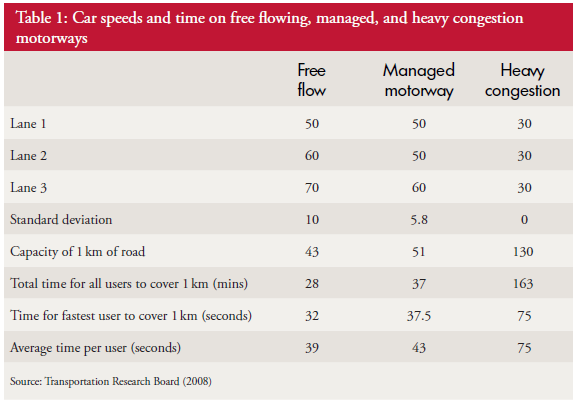
For example 130  is a number – it is data. 130 what? 130 mmHg. Ah ha! The “mmHg” is the units – it means millimetres of mercury and it tells us this data is a pressure. But what, where, when,who, how and why? We need more context.

“The systolic blood pressure measured in the left arm of Joe Bloggs, a 52 year old male, using an Omron M2 oscillometric manometer on Saturday 20th October 2012 at 09:00 is 130 mmHg”.

The extra context makes the data much more informative. The data has become information.

To understand what the information actually means requires some prior knowledge. We need to know what “systolic” means and what an “oscillometric manometer” is and the relevance of the “52 year old male”.  This ability to extract meaning from information has two parts – the ability to recognise the language – the syntax; and the ability to understand the concepts that the words are just labels for; the semantics.

To use this deeper understanding to make a wise decision to do something (or not) requires something else. Exploring that would  distract us from our current purpose. The point is made.

Rule #1: Data without context is meaningless.

In fact it is worse than meaningless – it is dangerous. And it is dangerous because when the context is missing we rarely stop and ask for it – we rush ahead and fill the context gaps with assumptions. We fill the context gaps with beliefs, prejudices, gossip, intuitive leaps, and sometimes even plain guesses.

This is dangerous – because the same data in a different context may have a completely different meaning.

To illustrate.  If we change one word in the context – if we change “systolic” to “diastolic” then the whole meaning changes from one of likely normality that probably needs no action; to one of serious abnormality that definitely does.  If we missed that critical word out then we are in danger of assuming that the data is systolic blood pressure – because that is the most likely given the number.  And we run the risk of missing a common, potentially fatal and completely treatable disease called Stage 2 hypertension.

There is a second rule that we must always apply when using data from systems. It is this:

Rule #2: Plot time-series data as a chart – a system behaviour chart (SBC).

The reason for the second rule is because the first question we always ask about any system must be “Is our system stable?”

Q: What do we mean by the word “stable”? What is the concept that this word is a label for?

A: Stable means predictable-within-limits.

Q: What limits?

A: The limits of natural variation over time.

Q: What does that mean?

A: Let me show you.

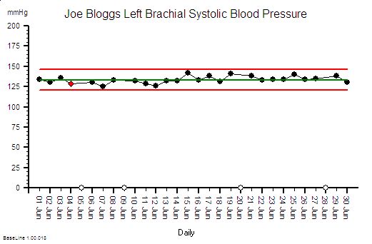
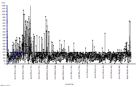
Joe Bloggs is disciplined. He measures his blood pressure almost every day and he plots the data on a chart together with some context .  The chart shows that his systolic blood pressure is stable. That does not mean that it is constant – it does vary from day to day. But over time a pattern emerges from which Joe Bloggs can see that, based on past behaviour, there is a range within which future behaviour is predicted to fall.  And Joe Bloggs has drawn these limits on his chart as two red lines and he has called them expectation lines. These are the limits of natural variation over time of his systolic blood pressure.

If one day he measured his blood pressure and it fell outside that expectation range  then he would say “I didn’t expect that!” and he could investigate further. Perhaps he made an error in the measurement? Perhaps something else has changed that could explain the unexpected result. Perhaps it is higher than expected because he is under a lot of emotional stress a work? Perhaps it is lower than expected because he is relaxing on holiday?

His chart does not tell him the cause – it just flags when to ask more “What might have caused that?” questions.

If you arrive at a hospital in an ambulance as an emergency then the first two questions the emergency care team will need to know the answer to are “How sick are you?” and “How stable are you?”. If you are sick and getting sicker then the first task is to stabilise you, and that process is called resuscitation.  There is no time to waste.


So how is all this relevant to the common pattern of symptoms from our sick system: disappointingly long waiting times and resources running flat out?

Using Rule#1 and Rule#2:  To start to establish the diagnosis we need to add the context to the data and then plot our waiting time information as a time series chart and ask the “Is our system stable?” question.

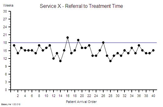
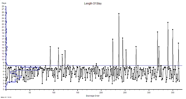
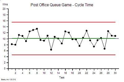
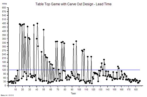
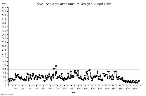
Suppose we do that and this is what we see. The context is that we are measuring the Referral-to-Treatment Time (RTT) for consecutive patients referred to a single service called X. We only know the actual RTT when the treatment happens and we want to be able to set the expectation for new patients when they are referred  – because we know that if patients know what to expect then they are less likely to be disappointed – so we plot our retrospective RTT information in the order of referral.  With the Mark I Eyeball Test (i.e. look at the chart) we form the subjective impression that our system is stable. It is delivering a predictable-within-limits RTT with an average of about 15 weeks and an expected range of about 10 to 20 weeks.

So far so good.

Unfortunately, the purchaser of our service has set a maximum limit for RTT of 18 weeks – a key performance indicator (KPI) target – and they have decided to “motivate” us by withholding payment for every patient that we do not deliver on time. We can now see from our chart that failures to meet the RTT target are expected, so to avoid the inevitable loss of income we have to come up with an improvement plan. Our jobs will depend on it!

Now we have a problem – because when we look at the resources that are delivering the service they are running flat out – 100% utilisation. They have no spare flow-capacity to do the extra work needed to reduce the waiting list. Efficiency drives and exhortation have got us this far but cannot take us any further. We conclude that our only option is “more capacity”. But we cannot afford it because we are operating very close to the edge. We are a not-for-profit organisation. The budgets are tight as a tick. Every penny is being spent. So spending more here will mean spending less somewhere else. And that will cause a big argument.

So the only obvious option left to us is to change the system – and the easiest thing to do is to monitor the waiting time closely on a patient-by-patient basis and if any patient starts to get close to the RTT Target then we bump them up the list so that they get priority. Obvious!

WARNING: We are now treating the symptoms before we have diagnosed the underlying disease!

In medicine that is a dangerous strategy.  Symptoms are often not-specific.  Different diseases can cause the same symptoms.  An early morning headache can be caused by a hangover after a long night on the town – it can also (much less commonly) be caused by a brain tumour. The risks are different and the treatment is different. Get that diagnosis wrong and disappointment will follow.  Do I need a hole in the head or will a paracetamol be enough?


Back to our list of questions.

What else can cause the same pattern of symptoms of a stable and disappointingly long waiting time and resources running at 100% utilisation?

There are several other process diseases that cause this symptom pattern and none of them are caused by lack of capacity.

Which is annoying because it challenges our assumption that this pattern is always caused by lack of capacity. Yes – that can sometimes be the cause – but not always.

But before we explore what these other system diseases are we need to understand why our current belief is so entrenched.

One reason is because we have learned, from experience, that if we throw flow-capacity at the problem then the waiting time will come down. When we do “waiting list initiatives” for example.  So if adding flow-capacity reduces the waiting time then the cause must be lack of capacity? Intuitively obvious.

Intuitively obvious it may be – but incorrect too.  We have been tricked again. This is flawed causal logic. It is called the illusion of causality.

To illustrate. If a patient complains of a headache and we give them paracetamol then the headache will usually get better.  That does not mean that the cause of headaches is a paracetamol deficiency.  The headache could be caused by lots of things and the response to treatment does not reliably tell us which possible cause is the actual cause. And by suppressing the symptoms we run the risk of missing the actual diagnosis while at the same time deluding ourselves that we are doing a good job.

If a system complains of  long waiting times and we add flow-capacity then the long waiting time will usually get better. That does not mean that the cause of long waiting time is lack of flow-capacity.  The long waiting time could be caused by lots of things. The response to treatment does not reliably tell us which possible cause is the actual cause – so by suppressing the symptoms we run the risk of missing the diagnosis while at the same time deluding ourselves that we are doing a good job.

The similarity is not a co-incidence. All systems behave in similar ways. Similar counter-intuitive ways.


So what other system diseases can cause a stable and disappointingly long waiting time and high resource utilisation?

The commonest system disease that is associated with these symptoms is a time trap – and they have nothing to do with capacity or flow.

They are part of the operational policy design of the system. And we actually design time traps into our systems deliberately! Oops!

We create a time trap when we deliberately delay doing something that we could do immediately – perhaps to give the impression that we are very busy or even overworked!  We create a time trap whenever we deferring until later something we could do today.

If the task does not seem important or urgent for us then it is a candidate for delaying with a time trap.

Unfortunately it may be very important and urgent for someone else – and a delay could be expensive for them.

Creating time traps gives us a sense of power – and it is for that reason they are much loved by bureaucrats.

To illustrate how time traps cause these symptoms consider the following scenario:

Suppose I have just enough resource-capacity to keep up with demand and flow is smooth and fault-free.  My resources are 100% utilised;  the flow-in equals the flow-out; and my waiting time is stable.  If I then add a time trap to my design then the waiting time will increase but over the long term nothing else will change: the flow-in,  the flow-out,  the resource-capacity, the cost and the utilisation of the resources will all remain stable.  I have increased waiting time without adding or removing capacity. So lack of resource-capacity is not always the cause of a longer waiting time.

This new insight creates a new problem; a BIG problem.

Suppose we are measuring flow-in (demand) and flow-out (activity) and time from-start-to-finish (lead time) and the resource usage (utilisation) and we are obeying Rule#1 and Rule#2 and plotting our data with its context as system behaviour charts.  If we have a time trap in our system then none of these charts will tell us that a time-trap is the cause of a longer-than-necessary lead time.

Aw Shucks!

And that is the primary reason why most systems are infested with time traps. The commonly reported performance metrics we use do not tell us that they are there.  We cannot improve what we cannot see.

Well actually the system behaviour charts do hold the clues we need – but we need to understand how systems work in order to know how to use the charts to make the time trap diagnosis.

Q: Why bother though?

A: Simple. It costs nothing to remove a time trap.  We just design it out of the process. Our flow-in will stay the same; our flow-out will stay the same; the capacity we need will stay the same; the cost will stay the same; the revenue will stay the same but the lead-time will fall.

Q: So how does that help me reduce my costs? That is what I’m being nailed to the floor with as well!

A: If a second process requires the output of the process that has a hidden time trap then the cost of the queue in the second process is the indirect cost of the time trap.  This is why time traps are such a fertile cause of excess cost – because they are hidden and because their impact is felt in a different part of the system – and usually in a different budget.

To illustrate. Suppose that 60 patients per day are discharged from our hospital and each one requires a prescription of to-take-out (TTO) medications to be completed before they can leave.  Suppose that there is a time trap in this drug dispensing and delivery process. The time trap is a policy where a porter is scheduled to collect and distribute all the prescriptions at 5 pm. The porter is busy for the whole day and this policy ensures that all the prescriptions for the day are ready before the porter arrives at 5 pm.  Suppose we get the event data from our electronic prescribing system (EPS) and we plot it as a system behaviour chart and it shows most of the sixty prescriptions are generated over a four hour period between 11 am and 3 pm. These prescriptions are delivered on paper (by our busy porter) and the pharmacy guarantees to complete each one within two hours of receipt although most take less than 30 minutes to complete. What is the cost of this one-delivery-per-day-porter-policy time trap? Suppose our hospital has 500 beds and the total annual expense is £182 million – that is £0.5 million per day.  So sixty patients are waiting for between 2 and 5 hours longer than necessary, because of the porter-policy-time-trap, and this adds up to about 5 bed-days per day – that is the cost of 5 beds – 1% of the total cost – about £1.8 million.  So the time trap is, indirectly, costing us the equivalent of £1.8 million per annum.  It would be much more cost-effective for the system to have a dedicated porter working from 12 am to 5 pm doing nothing else but delivering dispensed TTOs as soon as they are ready!  And assuming that there are no other time traps in the decision-to-discharge process;  such as the time trap created by batching all the TTO prescriptions to the end of the morning ward round; and the time trap created by the batch of delivered TTOs waiting for the nurses to distribute them to the queue of waiting patients!


Q: So how do we nail the diagnosis of a time trap and how do we differentiate it from a Batch or a Bottleneck or Carveout?

A: To learn how to do that will require a bit more explanation of the physics of processes.

And anyway if I just told you the answer you would know how but might not understand why it is the answer. Knowledge and understanding are not the same thing. Wise decisions do not follow from just knowledge – they require understanding. Especially when trying to make wise decisions in unfamiliar scenarios.

It is said that if we are shown we will understand 10%; if we can do we will understand 50%; and if we are able to teach then we will understand 90%.

So instead of showing how instead I will offer a hint. The first step of the path to knowing how and understanding why is in the following essay:

A Study of the Relative Value of Different Time-series Charts for Proactive Process Monitoring. JOIS 2012;3:1-18

Click here to visit JOIS

Design-for-Productivity

One tangible output of process or system design exercise is a blueprint.

This is the set of Policies that define how the design is built and how it is operated so that it delivers the specified performance.

These are just like the blueprints for an architectural design, the latter being the tangible structure, the former being the intangible function.

A computer system has the same two interdependent components that must be co-designed at the same time: the hardware and the software.


The functional design of a system is manifest as the Seven Flows and one of these is Cash Flow, because if the cash does not flow to the right place at the right time in the right amount then the whole system can fail to meet its design requirement. That is one reason why we need accountants – to manage the money flow – so a critical component of the system design is the Budget Policy.

We employ accountants to police the Cash Flow Policies because that is what they are trained to do and that is what they are good at doing – they are the Guardians of the Cash.

Providing flow-capacity requires providing resource-capacity, which requires providing resource-time; and because resource-time-costs-money then the flow-capacity design is intimately linked to the budget design.

This raises some important questions:
Q: Who designs the budget policy?
Q: Is the budget design done as part of the system design?
Q: Are our accountants trained in system design?

The challenge for all organisations is to find ways to improve productivity, to provide more for the same in a not-for-profit organisation, or to deliver a healthy return on investment in the for-profit arena (and remember our pensions are dependent on our future collective productivity).

To achieve the maximum cash flow (i.e. revenue) at the minimum cash cost (i.e. expense) then both the flow scheduling policy and the resource capacity policy must be co-designed to deliver the maximum productivity performance.


If we have a single-step process it is relatively easy to estimate both the costs and the budget to generate the required activity and revenue; but how do we scale this up to the more realistic situation when the flow of work crosses many departments – each of which does different work and has different skills, resources and budgets?

Q: Does it matter that these departments and budgets are managed independently?
Q: If we optimise the performance of each department separately will we get the optimum overall system performance?

Our intuition suggests that to maximise the productivity of the whole system we need to maximise the productivity of the parts.  Yes – that is clearly necessary – but is it sufficient?


To answer this question we will consider a process where the stream flows though several separate steps – separate in the sense that that they have separate budgets – but not separate in that they are linked by the same flow.

The separate budgets are allocated from the total revenue generated by the outflow of the process. For the purposes of this exercise we will assume the goal is zero profit and we just need to calculate the price that needs to be charged the “customer” for us to break even.

The internal reports produced for each of our departments for each time period are:
1. Activity – the amount of work completed in the period.
2. Expenses – the cost of the resources made available in the period – the budget.
3. Utilisation – the ratio of the time spent using resources to the total time the resources were available.

We know that the theoretical maximum utilisation of resources is 100% and this can only be achieved when there is zero-variation. This is impossible in the real world but we will assume it is achievable for the purpose of this example.

There are three questions we need answers to:
Q1: What is the lowest price we can achieve and meet the required demand?
Q2: Will optimising each step independently step give us this lowest price?
Q3: How do we design our budgets to deliver maximum productivity?


To explore these questions let us play with a real example.

Let us assume we have a single stream of work that crosses six separate departments labelled A-F in that sequence. The department budgets have been allocated based on historical activity and utilisation and our required activity of 50 jobs per time period. We have already worked hard to remove all the errors, variation and “waste” within each department and we have achieved 100% observed utilisation of all our resources. We are very proud of our high effectiveness and our high efficiency.

Our current not-for-profit price is £202,000/50 = £4,040 and because our observed utilisation of resources at each step is 100% we conclude this is the most efficient design and that this is the lowest possible price.

Unfortunately our celebration is short-lived because the market for our product is growing bigger and more competitive and our market research department reports that to retain our market share we need to deliver 20% more activity at 80% of the current price!

A quick calculation shows that our productivity must increase by 50% (New Activity/New Price = 120%/80% = 150%) but as we already have a utilisation of 100% then this challenge looks hopelessly impossible.  To increase activity by 20% will require increasing flow-capacity by 20% which will imply a 20% increase in costs so a 20% increase in budget – just to maintain the current price.  If we no longer have customers who want to pay our current price then we are in trouble.

Fortunately our conclusion is incorrect – and it is incorrect because we are not using the data available to co-design the system such that cash flow and work flow are aligned.  And we do not do that because we have not learned how to design-for-productivity.  We are not even aware that this is possible.  It is, and it is called Value Stream Accounting.

The blacked out boxes in the table above hid the data that we need to do this – an we do not know what they are. Yet.

But if we apply the theory, techniques and tools of system design, and we use the data that is already available then we get this result …

 We can see that the total budget is less, the budget allocations are different, the activity is 20% up and the zero-profit price is 34% less – which is a 83% increase in productivity!

More than enough to stay in business.

Yet the observed resource utilisation is still 100%  and that is counter-intuitive and is a very surprising discovery for many. It is however the reality.

And it is important to be reminded that the work itself has not changed – the ONLY change here is the budget policy design – in other words the resource capacity available at each stage.  A zero-cost policy change.

The example answers our first two questions:
A1. We now have a price that meets our customers needs, offers worthwhile work, and we stay in business.
A2. We have disproved our assumption that 100% utilisation at each step implies maximum productivity.

Our third question “How to do it?” requires learning the tools, techniques and theory of System Engineering and Design.  It is not difficult and it is not intuitively obvious – if it were we would all be doing it.

Want to satisfy your curiosity?
Want to see how this was done?
Want to learn how to do it yourself?

You can do that here.


For more posts like this please vote here.
For more information please subscribe here.