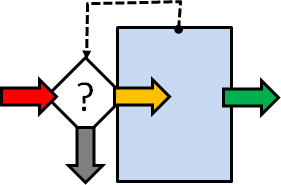
The phrase “A system is only as good as its feedback loops” is one that I commonly hear myself using, but what is feedback, why do we need it and how do we practice it?
Feedback determines our ability to sense, adapt, and improve. Without effective feedback we can become rigid, blind and prone to failure which in turn causes us to feel disappointment and frustration. Failure creates additional work for us and fuels anxiety about our future.
To benefit from feedback, we just need to make a choice – to invite feedback and to reflect on it. With the insights we learn, we will be better able to offer effective and constructive feedback when asked.
This is a win-win strategy.
So, what can we do to develop this valuable skill and what is the theory and history that underpins the practice?
That is a great question to give an AI Assistant who will search the Internet for us and collate the most relevant information for us to reflect on, build on and share.
The Importance and Art of Asking for Feedback
1.1 Why Asking for Feedback Matters
Asking for feedback is a proactive way to support personal and professional growth. It enables us to understand how our actions, work, or behaviour are perceived by others, and it helps us to identify areas for improvement. Actively seeking feedback demonstrates our self-awareness, openness, and a commitment to continuous improvement; unlike passive feedback, which is often unsolicited and may lack context.
1.2 Timing and Context
The effectiveness of feedback often depends on when and how we request it. The best times to ask for feedback are:
→ Soon after completing a task, presentation, or interaction.
→ During or after key milestones in a project.
→ Regularly, as part of a learning or performance review cycle.
Asking for feedback can be less effective during emotionally charged moments or in group settings, where others may feel inhibited. Private, calm, and reflective environments often yield more honest and constructive insights.
1.3 Framing the Request
We need to be specific when asking for feedback because it improves the quality of responses. Vague questions like “What did you think?” often lead to vague answers.
Instead, use clear prompts:
→ “What’s one thing I could improve in my communication?”
→ “Did I handle that challenge clearly and professionally?”
→ “Was my behaviour effective in that meeting?”
This signals to the other person that their feedback is valued and that you are looking for actionable insights, not just praise and/or criticism.
1.4 Choosing the Right People
The source of feedback matters. Ideally, feedback should be sought from people whose opinion you respect and who you can trust to offer a balanced opinion without bias or personal judgement:
→ People with relevant experience or perspective.
→ Individuals who are honest, constructive, and supportive.
→ A mix of peers, supervisors, and subordinates (depending on the context).
Asking people who are overly critical or not invested in our development can be unproductive and even damaging.
Giving Feedback Effectively and Respectfully
2.1 The Purpose of Giving Feedback
Feedback is most valuable when it is aimed at growth, learning, and improvement, not at judgement. Constructive feedback helps others:
→ Understand the impact of their actions or performance.
→ Reveal blind spots they might be unaware of.
→ Strengthen their skills, behaviours, and strategies.
The goal is to build up, not break down. Poorly delivered feedback can harm relationships, reduce motivation, and create resistance.
Principles of Constructive Feedback
Be Specific: General statements like “You need to improve” are not helpful.
Focus on clear observations: “Your report showed great insight. The conclusion was unclear.” Be careful about using the word “but” because it can signal a discount of what went before as in the commonly used response “Yes, but …”.
Be Balanced: Use a mix of positive reinforcement and areas for improvement. The “feedback sandwich” (positive–constructive–positive) can be effective when used genuinely, not mechanically.
Focus on Behaviour, Not Personality:
→ Say: “When you interrupted, it disrupted the flow of the meeting.”
→ Do not say: “You are always so rude.”
Use “I” Statements: Express your own perspective rather than making assumptions:
→ “I found it hard to follow your logic in that section,” rather than: “You didn’t make any sense.”
Make It Timely: Feedback loses value the longer it is delayed. Provide it soon after the behaviour or event, while it is still fresh and relevant.
Emotional Intelligence in Feedback
Feedback is a relational act. Being emotionally intelligent means:
→ Being aware of the recipient’s emotional state.
→ Reading nonverbal cues.
→ Adjusting tone and delivery style to reduce defensiveness.
It is essential to create a space where the receiver feels safe, respected, and heard.
Reflecting on Feedback – Turning Insight into Action
3.1 Why Reflection is Crucial
Receiving feedback is only half the process; reflecting on it is what turns the insight into real growth. Without reflection, feedback may be misunderstood, forgotten, or dismissed.
Reflection involves:
→ Analysing the feedback.
→ Assessing its validity.
→ Deciding what to do with it.
This helps differentiate between useful insight and noise or bias.
3.2 Managing Emotional Reactions
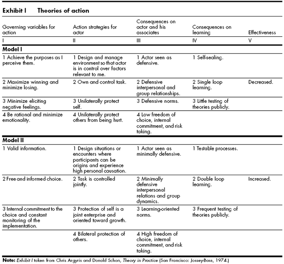
Even well-intentioned feedback can trigger emotional reactions such as defensiveness, embarrassment, or frustration. Common cognitive responses include:
→ Justifying one’s actions.
→ Blaming others.
→ Dismissing the feedback entirely.
To reflect effectively:
→ Pause before reacting to let emotions ebb.
→ Ask clarifying questions if needed.
→ Write down what was said to revisit later with a cooler head.
It is important to remember that feedback reflects the perspective of the giver. It is not a judgement or a verdict.
3.3 Tools and Techniques for Reflection
Journaling: Capture feedback and your reactions to it. Ask yourself:
→ What surprised me?
→ What do I agree and/or disagree with?
→ What patterns are emerging?
Feedback Logs: Maintain a running list of feedback received over time to track improvements and recurring themes.
Coaching Conversations: Discuss feedback with a mentor or coach who can act as a sounding board to help unpack and contextualise it.
Action Plans: Set goals based on feedback. For example:
→ Feedback: “You tend to dominate meetings.”
→ Plan: “I will consciously pause and ask others for input in the next three team meetings.”
Creating a Feedback Culture
4.1 Normalizing Feedback
When feedback is built into the fabric of an organization, classroom, or team, it becomes a normal, expected, and welcomed part of collaboration. This reduces stigma and anxiety around giving or receiving feedback. To support a healthy feedback culture:
→ Leaders and peers must model openness to feedback.
→ Mistakes should be treated as learning opportunities.
→ Recognition should be as frequent as constructive critique.
4.2 Encouraging Ongoing Feedback Cycles
Instead of viewing feedback as a one-time event, it should be seen as a continuous loop:
→ Action or behaviour occurs.
→ Feedback is requested and given (study).
→ Reflection and adjustment happen (plan).
→ New action follows (do).
This Study-Plan-Do loop supports agility, growth, and accountability.
4.3 Feedback in Remote or Digital Environments
In hybrid or remote settings, feedback requires extra attention:
→ Use video or voice where possible, to preserve tone and nuance.
→ Follow up in writing to clarify and confirm understanding.
→ Be intentional in requesting and giving feedback—do not let it become an afterthought.
We can use the same skills when requesting, giving, reflecting, acting on feedback within a group of people and between groups of people.
In Summary
Feedback is not a one-sided activity; it is a dialogue. Whether we are asking for feedback, giving it, or reflecting on it, the key is to remain curious, respectful, and growth oriented. When approached with the right mindset and skills, feedback becomes one of the most powerful tools for learning, connection, and transformation.
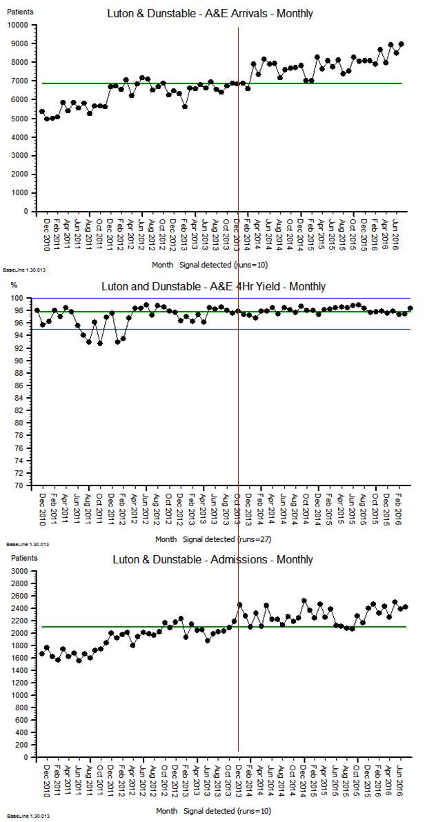
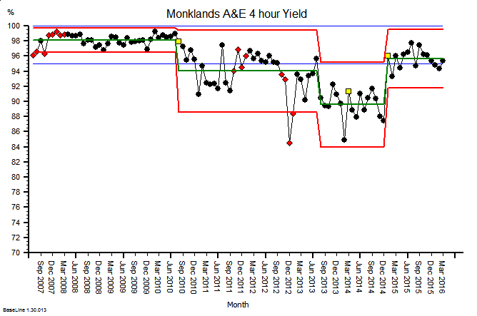
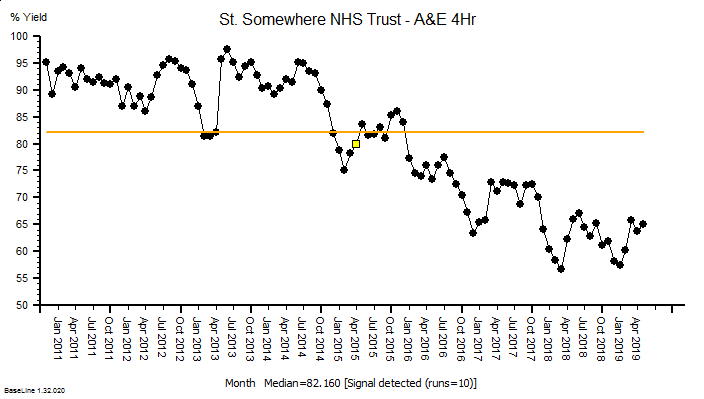
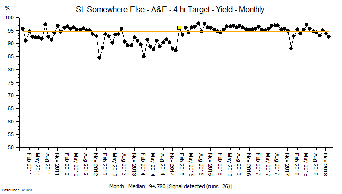
The same principles apply to all sources of information that provide feedback on the effects of our decisions and actions. Objective data is less value-loaded than subjective opinion, and we need to be just as mindful that objective data can be incomplete, biassed and distorted.
So, an essential action in any improvement programme is to design, build, test and embed the objective feedback loops that are both useful and can be trusted, and to use these as part of our feedback on the effects of our decisions and actions.
It is a win-win strategy.
Theory and History
Feedback loops determine a system’s ability to sense, adapt, and improve, so without good feedback, systems become rigid, blind, or prone to failure.
The phrase “A system is only as good as its feedback loops” is a commonly used expression in systems thinking and organizational theory, but it does not originate from a single definitive source. Instead, it’s a paraphrase or synthesis of ideas that have been central to several key thinkers and disciplines. It is a systems-thinking truism that is widely used in engineering, management, biology, and software development.
Here are some of the historical influencers:
Norbert Weiner – Cybernetics (1948)
Norbert Wiener, the father of cybernetics, emphasized the importance of feedback in both mechanical and biological systems in his 1948 book Cybernetics: Or Control and Communication in the Animal and the Machine he introduced the concept of feedback loops as critical for system regulation and control.
Gregory Bateson – Steps to an Ecology of Mind (1972)
“The fact that we are part of the systems we try to understand, means that feedback is not just a mechanism – it is the pattern that connects.”
“The major problems in the world result from the difference between how nature works and the way people think.”
Bateson was a key figure in developing the theoretical foundation of feedback in social, biological, and psychological systems. His work helped broaden the application of feedback loops beyond engineering and cybernetics into ecology, anthropology, and psychology. Bateson helped bridge cybernetics with the social sciences, showing how feedback mechanisms operate in families, cultures, and minds. In his work with the Macy Conferences on Cybernetics (1940s–50s), he was instrumental in defining second-order cybernetics—the study of systems that observe and include themselves in their models.
Peter Senge – The Fifth Discipline (1990)
“Learning is only possible in the presence of feedback. Without it, we are cut off from the consequences of our actions.”
Senge’s work on learning organizations also emphasizes the importance of feedback loops for adaptive, responsive, and resilient systems—especially in business or organizational contexts. His work focuses on how organisations (as systems) need feedback to learn, adapt, and grow—or else they stagnate or collapse.
Donella Meadows – Thinking in Systems (2008)
“Missing feedback is one of the most common causes of system malfunction.”
“A system with bad feedback is like a car without a speedometer, or a thermostat that responds a day late.”
“Information is power. When feedback is delayed, damped, or denied, the power to respond effectively is lost.”
“A system’s capacity to function well depends directly on the quality and timeliness of its feedback.”
Meadows, a major figure in systems thinking, wrote extensively about feedback loops in her influential book. She distinguished between balancing/stabilising/negative and reinforcing/destabilising/positive feedback loops as essential mechanisms for the dynamic tension between system stability and change.


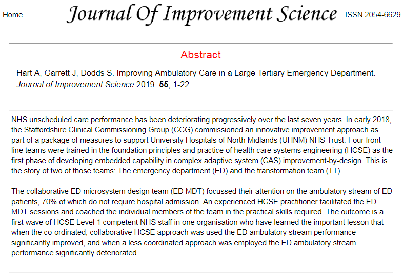

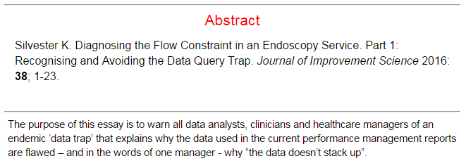
 Abstract