 [Bzzzzzz] Bob’s phone vibrated to remind him it was time for the regular ISP remote coaching session with Leslie. He flipped the lid of his laptop just as Leslie joined the virtual meeting.
<Leslie> Hi Bob, and Happy New Year!
<Bob> Hello Leslie and I wish you well in 2016 too. So, what shall we talk about today?
<Leslie> Well, given the time of year I suppose it should be the Winter Crisis. The regularly repeating annual winter crisis. The one that feels more like the perpetual winter crisis.
<Bob> OK. What specifically would you like to explore?
<Leslie> Specifically? The habit of comparing of this year with last year to answer the burning question “Are we doing better, the same or worse?” Especially given the enormous effort and political attention that has been focused on the hot potato of A&E 4-hour performance.
<Bob> Aaaaah! That old chestnut! Two-Points-In-Time comparison.
<Leslie> Yes. I seem to recall you usually add the word ‘meaningless’ to that phrase.
<Bob> H’mm. Yes. It can certainly become that, but there is a perfectly good reason why we do this.
<Leslie> Indeed, it is because we see seasonal cycles in the data so we only want to compare the same parts of the seasonal cycle with each other. The apples and oranges thing.
<Bob> Yes, that is part of it. So what do you feel is the problem?
<Leslie> It feels like a lottery! It feels like whether we appear to be better or worse is just the outcome of a random toss.
<Bob> Ah! So we are back to the question “Is the variation I am looking at signal or noise?”
<Leslie> Yes, exactly.
<Bob> And we need a scientifically robust way to answer it. One that we can all trust.
<Leslie> Yes.
<Bob> So how do you decide that now in your improvement work? How do you do it when you have data that does not show a seasonal cycle?
<Leslie> I plot-the-dots and use an XmR chart to alert me to the presence of the signals I am interested in – especially a change of the mean.
<Bob> Good. So why can we not use that approach here?
<Leslie> Because the seasonal cycle is usually a big signal and it can swamp the smaller change I am looking for.
<Bob> Exactly so. Which is why we have to abandon the XmR chart and fall back the two points in time comparison?
<Leslie> That is what I see. That is the argument I am presented with and I have no answer.
<Bob> OK. It is important to appreciate that the XmR chart was not designed for doing this. It was designed for monitoring the output quality of a stable and capable process. It was designed to look for early warning signs; small but significant signals that suggest future problems. The purpose is to alert us so that we can identify the root causes, correct them and the avoid a future problem.
<Leslie> So we are using the wrong tool for the job. I sort of knew that. But surely there must be a better way than a two-points-in-time comparison!
<Bob> There is, but first we need to understand why a TPIT is a poor design.
<Leslie> Excellent. I’m all ears.
<Bob> A two point comparison is looking at the difference between two values, and that difference can be positive, zero or negative. In fact, it is very unlikely to be zero because noise is always present.
<Leslie> OK.
<Bob> Now, both of the values we are comparing are single samples from two bigger pools of data. It is the difference between the pools that we are interested in but we only have single samples of each one … so they are not measurements … they are estimates.
<Leslie> So, when we do a TPIT comparison we are looking at the difference between two samples that come from two pools that have inherent variation and may or may not actually be different.
<Bob> Well put. We give that inherent variation a name … we call it variance … and we can quantify it.
<Leslie> So if we do many TPIT comparisons then they will show variation as well … for two reasons; first because the pools we are sampling have inherent variation; and second just from the process of sampling itself. It was the first lesson in the ISP-1 course.
<Bob> Well done! So the question is: “How does the variance of the TPIT sample compare with the variance of the pools that the samples are taken from?”
<Leslie> My intuition tells me that it will be less because we are subtracting.
<Bob> Your intuition is half-right. The effect of the variation caused by the signal will be less … that is the rationale for the TPIT after all … but the same does not hold for the noise.
<Leslie> So the noise variation in the TPIT is the same?
<Bob> No. It is increased.
<Leslie> What! But that would imply that when we do this we are less likely to be able to detect a change because a small shift in signal will be swamped by the increase in the noise!
<Bob> Precisely. And the degree that the variance increases by is mathematically predictable … it is increased by a factor of two.
<Leslie> So as we usually present variation as the square root of the variance, to get it into the same units as the metric, then that will be increased by the square root of two … 1.414
<Bob> Yes.
<Leslie> I need to put this counter-intuitive theory to the test!
<Bob> Excellent. Accept nothing on faith. Always test assumptions. And how will you do that?
<Leslie> I will use Excel to generate a big series of normally distributed random numbers; then I will calculate a series of TPIT differences using a fixed time interval; then I will calculate the means and variations of the two sets of data; and then I will compare them.
<Bob> Excellent. Let us reconvene in ten minutes when you have done that.
10 minutes later …
<Leslie> Hi Bob, OK I am ready and I would like to present the results as charts. Is that OK?
<Bob> Perfect!
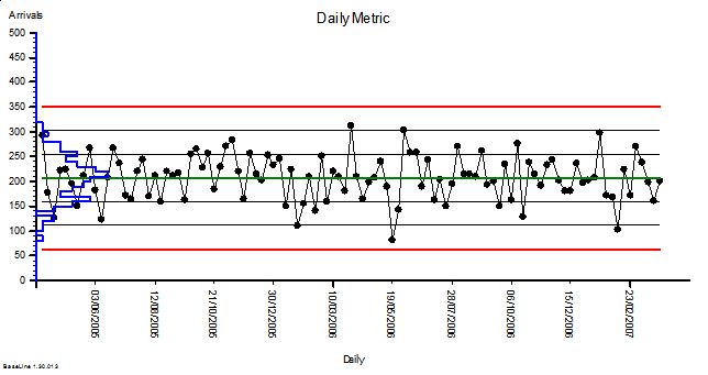
<Leslie> Here is the first one. I used our A&E performance data to give me some context. We know that on Mondays we have an average of 210 arrivals with an approximately normal distribution and a standard deviation of 44; so I used these values to generate the random numbers. Here is the simulated Monday Arrivals chart for two years.
<Bob> OK. It looks stable as we would expect and I see that you have plotted the sigma levels which look to be just under 50 wide.
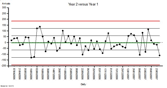
<Leslie> Yes, it shows that my simulation is working. So next is the chart of the comparison of arrivals for each Monday in Year 2 compared with the corresponding week in Year 1.
 <Bob> Oooookaaaaay. What have we here? Another stable chart with a mean of about zero. That is what we would expect given that there has not been a change in the average from Year 1 to Year 2. And the variation has increased … sigma looks to be just over 60.
<Leslie> Yes! Just as the theory predicted. And this is not a spurious answer. I ran the simulation dozens of times and the effect is consistent! So, I am forced by reality to accept the conclusion that when we do two-point-in-time comparisons to eliminate a cyclical signal we will reduce the sensitivity of our test and make it harder to detect other signals.
<Bob> Good work Leslie! Now that you have demonstrated this to yourself using a carefully designed and conducted simulation experiment, you will be better able to explain it to others.
<Leslie> So how do we avoid this problem?
<Bob> An excellent question and one that I will ask you to ponder on until our next chat. You know the answer to this … you just need to bring it to conscious awareness.

