
It is November 2018, the clocks have changed back to GMT, the trick-and-treats are done, the fireworks light the night skies and spook the hounds, and the seasonal aisles in the dwindling number of high street stores are already stocked for Christmas.
I have been a bit quiet on the blog front this year but that is because there has been a lot happening behind the scenes and I have had to focus.
One output of is the recent publication of an article in Future Healthcare Journal on the topic of health care systems engineering (HCSE). Click here to read the article and the rest of this excellent edition of FHJ that is dedicated to “systems”.
So, as we are back to the winter phase of the annual NHS performance cycle it is a good time to glance at the A&E Performance Radar and see who is doing well, and not-so-well.
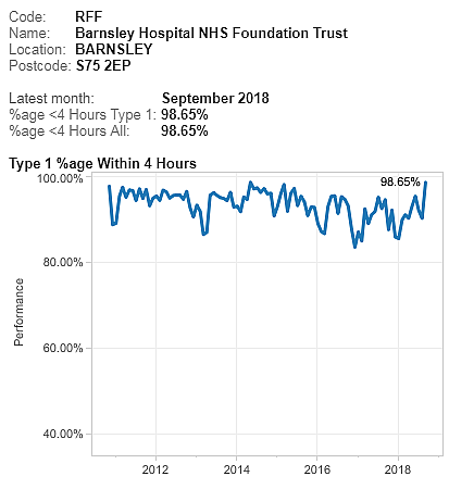 Based on past experience, I was expecting Luton to be Top-of-the-Pops and so I was surprised (and delighted) to see that Barnsley have taken the lead. And the chart shows that Barnsley has turned around a reasonable but sagging performance this year.
So I would be asking “What has happened at Barnsley that we can all learn from? What did you change and how did you know what and how to do that?“
To be sure, Luton is still in the top three and it is interesting to explore who else is up there and what their A&E performance charts look like.
The data is all available for anyone with a web-browser to view – here.
 For completeness, this is the chart for Luton, and we can see that, although the last point is lower than Barnsley, the performance-over-time is more consistent and less variable. So who is better?
NB. This is a meaningless question and illustrates the unhelpful tactic of two-point comparisons with others, and with oneself. The better question is “Is my design fit-for-purpose?”
The question I have for Luton is different. “How do you achieve this low variation and how do you maintain it? What can we all learn from you?”
And I have some ideas how they do that because in a recent HSJ interview they said “It is all about the filters“.
What do they mean by filters?
A filter is an essential component of any flow design if we want to deliver high safety, high efficiency, high effectiveness, and high productivity. In other words, a high quality, fit-4-purpose design.
And the most important flow filters are the “upstream” ones.
The design of our upstream flow filters is critical to how the rest of the system works. Get it wrong and we can get a spiralling decline in system performance because we can unintentionally trigger a positive feedback loop.
Queues cause delays and chaos that consume our limited resources. So, when we are chasing cost improvement programme (CIP) targets using the “salami slicer” approach, and combine that with poor filter design … we can unintentionally trigger the perfect storm and push ourselves over the catastrophe cliff into perpetual, dangerous and expensive chaos.
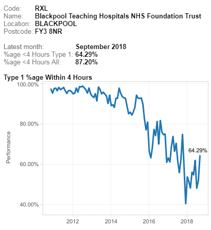 If we look at the other end of the NHS A&E league table we can see typical examples that illustrate this pattern. I have used this one only because it happens to be bottom this month. It is not unique.
All other NHS trusts fall somewhere between these two extremes … stable, calm and acceptable and unstable, chaotic and unacceptable.
Most display the stable and chaotic combination – the “Zone of Perpetual Performance Pain”.
So what is the fundamental difference between the outliers that we can all learn from? The positive deviants like Barnsley and Luton, and the negative deviants like Blackpool. I ask this because comparing the extremes is more useful than laboriously exploring the messy, mass-mediocrity in the middle.
An effective upstream flow filter design is a necessary component, but it is not sufficient. Triage (= French for sorting) is OK but it is not enough. The other necessary component is called “downstream pull” and omitting that element of the design appears to be the primary cause of the chronic chaos that drags trusts and their staff down.
It is not just an error of omission though, the current design is an actually an error of commission. It is anti-pull; otherwise known as “push”.
This year I have been busy on two complicated HCSE projects … one in secondary care and the other in primary care. In both cases the root cause of the chronic chaos is the same. They are different systems but have the same diagnosis. What we have revealed together is a “push-carveout” design which is the exact opposite of the “upstream-filter-plus-downstream-pull” design we need.
And if an engineer wanted to design a system to be chronically chaotic then it is very easy to do. Here is the recipe:
a) Set high average utilisation target of all resources as a proxy for efficiency to ensure everything is heavily loaded. Something between 80% and 100% usually does the trick.
b) Set a one-size-fits-all delivery performance target that is not currently being achieved and enforce it punitively. Something like “>95% of patients seen and discharged or admitted in less than 4 hours, or else …”.
c) Divvy up the available resources (skills, time, space, cash, etc) into ring-fenced pots.
Chronic chaos is guaranteed. The Laws of Physics decree it.
Unfortunately, the explanation of why this is the case is counter-intuitive, so it is actually better to experience it first, and then seek the explanation. Reality first, reasoning second.
And, it is a bittersweet experience, so it needs to be done with care and compassion.
And that’s what I’ve been busy doing this year. Creating the experiences and then providing the explanations. And if done gradually what then happens is remarkable and rewarding.
The FHJ article outlines one validated path to developing individual and organisational capability in health care systems engineering.