Courage and Constancy of Purpose

bull_by_the_horns_anim_150_wht_9609This week I witnessed an act of courage by someone prepared to take the health care bull by the horns.

On 25th October 2016 a landmark review was published about the integrated health and social care system in Northern Ireland.

It is not a comfortable read.

And the act of courage was the simultaneous publication of the document “Health and Well-being 2026” by Michelle O’Neill, the new Minister of Health.

The full document can be downloaded here.


It is courageous because it says, bluntly, that there is a burning platform, the level of service is not acceptable, doing nothing is not an option, and nothing short of a system-wide redesign will be required.

It is courageous because it sets a clear vision, a burning ambition, and is very clear that this will not be a quick fix. It is a ten year plan.

That implies a constancy of purpose will need to be maintained for at least a decade.

science_of_improvement

And it is courageous because it says that:

we will have to learn how to do this

Here is one paragraph that says that:

Developing the science of improvement can be done at the same time as making improvements

and

We need an infrastructure that makes this possible.”


The good news is that this science of improvement in health care is already well advanced, and it will advance further: a whole health and social care system transformation-by-design is a challenge of some magnitude.

A health and social care system engineering (HSCSE) challenge.


One component of the ten year plan is to develop this capability through a process called co-production.

co-productionNotice that the focus is on pro-actively preventing illness, not just re-actively managing it.

Notice that the design is centered on both the customer and the supplier, not just on the supplier.

And notice that the population served are also expected to be equal partners in the transformation-by-design process.


Courage, constancy of purpose and capability development  … a very welcome breath of fresh air!


For more posts like this please vote here.
For more information please subscribe here.

ChimpWare

chimpwareOne of the recurring themes in this narrative is the realisation that we are all subject to the emergent effects of millions of years of adaptive evolution.

We all know about genes, the chemical code called DNA, that holds the instructions for building a person.

We are less aware of memes, the cultural code that holds the instructions for building a society.

And we are even less aware of the complex interaction between genes and memes.


One of the emergent properties of this gene/meme interaction is our ability to use symbolic language and causal reasoning.

But this amazing ability only developed recently, in the last few million years, and that means evolution has not had time to finish the job.  So we are left with prototype hardware and software.


The prototype hardware is called ChimpWare and it is the 1.3 kg of wetware between our ears.  On the surface it looks a bit like the wetware of other animals, but appearances are deceptive.

Our ChimpWare is a multi-level-parallel-multi-processor! Amazing engineering.

And rather than evolving a completely new design (which is rather difficult for a reactive evolutionary process), we have evolved newer prototypes that sit on top of the older wetware.

This build-on-the-old-foundations approach has a downside … the newer parts and the older parts need to talk to each other and they use different languages.

Different software.


The newer part uses sequential, causal logic and communicates using symbolic language.  The older part uses parallel, associative logic and communicates using emotions.  Thinking and feeling.  Rational and irrational.

The software is ChimpOS 1.0 and we are not going to get an update … because it too is a work-in-progress.


When we are forced by circumstance to grapple with the challenge of improving a complex adaptive system such as health care, we have no choice but to use ChimpWare and ChimpOS both individually and collectively.  And it is not well designed for this job.

invisible_gorillaSo we make mistakes, and we are often not aware of the errors we are making.  All we become aware of is the gap between our intent and our impact.

Our intuition deceives us, which also implies that some concepts that are valid and useful feel counter-intuitive.  So we discount them.

The Invisible Gorilla” is well worth a read because it describes many of the illusions that our ChimpWare and ChimpOS generate.

Illusions such as the illusion of attention,  the illusion of memory,  the illusion of confidence,  the illusion of knowledge, and the illusion of cause.


But with a conscious insight into the limitations of the legacy of evolution, we can actually learn to avoid many of the pitfalls, and to develop our individual and collective capability for improving the complex adaptive systems that we live in.

For the benefit of everyone and everything.

In fact, our long term survival depends on it – both collectively and individually.

So doing nothing is not an option.


For more posts like this please vote here.
For more information please subscribe here.

Patient Traffic Engineering

motorway[Beep] Bob’s computer alerted him to Leslie signing on to the Webex session.

<Bob> Good afternoon Leslie, how are you? It seems a long time since we last chatted.

<Leslie> Hi Bob. I am well and it has been a long time. If you remember, I had to loop out of the Health Care Systems Engineering training because I changed job, and it has taken me a while to bring a lot of fresh skeptics around to the idea of improvement-by-design.

<Bob> Good to hear, and I assume you did that by demonstrating what was possible by doing it, delivering results, and describing the approach.

<Leslie> Yup. And as you know, even with objective evidence of improvement it can take a while because that exposes another gap, the one between intent and impact.  Many people get rather defensive at that point, so I have had to take it slowly. Some people get really fired up though.

 <Bob> Yes. Respect, challenge, patience and persistence are all needed. So, where shall we pick up?

<Leslie> The old chestnut of winter pressures and A&E targets.  Except that it is an all-year problem now and according to what I read in the news, everyone is predicting a ‘melt-down’.

<Bob> Did you see last week’s IS blog on that very topic?

<Leslie> Yes, I did!  And that is what prompted me to contact you and to re-start my CHIPs coaching.  It was a real eye opener.  I liked the black swan code-named “RC9” story, it makes it sound like a James Bond film!

<Bob> I wonder how many people dug deeper into how “RC9” achieved that rock-steady A&E performance despite a rising tide of arrivals and admissions?

<Leslie> I did, and I saw several examples of anti-carve-out design.  I have read though my notes and we have talked about carve out many times.

<Bob> Excellent. Being able to see the signs of competent design is just as important as the symptoms of inept design. So, what shall we talk about?

<Leslie> Well, by co-incidence I was sent a copy of of a report entitled “Understanding patient flow in hospitals” published by one of the leading Think Tanks and I confess it made no sense to me.  Can we talk about that?

<Bob> OK. Can you describe the essence of the report for me?

<Leslie> Well, in a nutshell it said that flow needs space so if we want hospitals to flow better we need more space, in other words more beds.

<Bob> And what evidence was presented to support that hypothesis?

<Leslie> The authors equated the flow of patients through a hospital to the flow of traffic on a motorway. They presented a table of numbers that made no sense to me, I think partly because there are no units stated for some of the numbers … I’ll email you a picture.

traffic_flow_dynamics

<Bob> I agree this is not a very informative table.  I am not sure what the definition of “capacity” is here and it may be that the authors may be equating “hospital bed” to “area of tarmac”.  Anyway, the assertion that hospital flow is equivalent to motorway flow is inaccurate.  There are some similarities and traffic engineering is an interesting subject, but they are not equivalent.  A hospital is more like a busy city with junctions, cross-roads, traffic lights, roundabouts, zebra crossings, pelican crossings and all manner of unpredictable factors such as cyclists and pedestrians. Motorways are intentionally designed without these “impediments”, for obvious reasons! A complex adaptive flow system like a hospital cannot be equated to a motorway. It is a dangerous over-simplification.

<Leslie> So, if the hospital-motorway analogy is invalid then the conclusions are also invalid?

<Bob> Sometimes, by accident, we get a valid conclusion from an invalid method. What were the conclusions?

<Leslie> That the solution to improving A&E performance is more space (i.e. hospital beds) but there is no more money to build them or people to staff them.  So the recommendations are to reduce volume, redesign rehabilitation and discharge processes, and improve IT systems.

<Bob> So just re-iterating the habitual exhortations and nothing about using well-understood systems engineering methods to accurately diagnose the actual root cause of the ‘symptoms’, which is likely to be the endemic carveoutosis multiforme, and then treat accordingly?

<Leslie> No. I could not find the term “carve out” anywhere in the document.

<Bob> Oh dear.  Based on that observation, I do not believe this latest Think Tank report is going to be any more effective than the previous ones.  Perhaps asking “RC9” to write an account of what they did and how they learned to do it would be more informative?  They did not reduce volume, and I doubt they opened more beds, and their annual report suggests they identified some space and flow carveoutosis and treated it. That is what a competent systems engineer would do.

<Leslie> Thanks Bob. Very helpful as always. What is my next step?

<Bob> Some ISP-2 brain-teasers, a juicy ISP-2 project, and some one day training workshops for your all-fired-up CHIPs.

<Leslie> Bring it on!


For more posts like this please vote here.
For more information please subscribe here.

Outliers

reading_a_book_pa_150_wht_3136An effective way to improve is to learn from others who have demonstrated the capability to achieve what we seek.  To learn from success.

Another effective way to improve is to learn from those who are not succeeding … to learn from failures … and that means … to learn from our own failings.

But from an early age we are socially programmed with a fear of failure.

The training starts at school where failure is not tolerated, nor is challenging the given dogma.  Paradoxically, the effect of our fear of failure is that our ability to inquire, experiment, learn, adapt, and to be resilient to change is severely impaired!

So further failure in the future becomes more likely, not less likely. Oops!


Fortunately, we can develop a healthier attitude to failure and we can learn how to harness the gap between intent and impact as a source of energy, creativity, innovation, experimentation, learning, improvement and growing success.

And health care provides us with ample opportunities to explore this unfamiliar terrain. The creative domain of the designer and engineer.


The scatter plot below is a snapshot of the A&E 4 hr target yield for all NHS Trusts in England for the month of July 2016.  The required “constitutional” performance requirement is better than 95%.  The delivered whole system average is 85%.  The majority of Trusts are failing, and the Trust-to-Trust variation is rather wide. Oops!

This stark picture of the gap between intent (95%) and impact (85%) prompts some uncomfortable questions:

Q1: How can one Trust achieve 98% and yet another can do no better than 64%?

Q2: What can all Trusts learn from these high and low flying outliers?

[NB. I have not asked the question “Who should we blame for the failures?” because the name-shame-blame-game is also a predictable consequence of our fear-of-failure mindset.]


Let us dig a bit deeper into the information mine, and as we do that we need to be aware of a trap:

A snapshot-in-time tells us very little about how the system and the set of interconnected parts is behaving-over-time.

We need to examine the time-series charts of the outliers, just as we would ask for the temperature, blood pressure and heart rate charts of our patients.

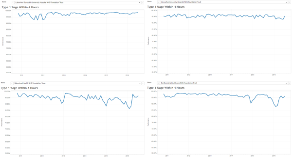
Here are the last six years by month A&E 4 hr charts for a sample of the high-fliers. They are all slightly different and we get the impression that the lower two are struggling more to stay aloft more than the upper two … especially in winter.


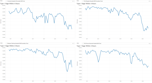
And here are the last six years by month A&E 4 hr charts for a sample of the low-fliers.  The Mark I Eyeball Test results are clear … these swans are falling out of the sky!


So we need to generate some testable hypotheses to explain these visible differences, and then we need to examine the available evidence to test them.

One hypothesis is “rising demand”.  It says that “the reason our A&E is failing is because demand on A&E is rising“.

Another hypothesis is “slow flow”.  It says that “the reason our A&E is failing is because of the slow flow through the hospital because of delayed transfers of care (DTOCs)“.

So, if these hypotheses account for the behaviour we are observing then we would predict that the “high fliers” are (a) diverting A&E arrivals elsewhere, and (b) reducing admissions to free up beds to hold the DTOCs.

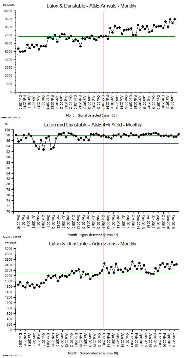
Let us look at the freely available data for the highest flyer … the green dot on the scatter gram … code-named “RC9”.

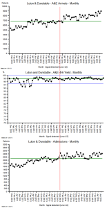
The top chart is the A&E arrivals per month.

The middle chart is the A&E 4 hr target yield per month.

The bottom chart is the emergency admissions per month.

Both arrivals and admissions are increasing, while the A&E 4 hr target yield is rock steady!

And arranging the charts this way allows us to see the temporal patterns more easily (and the images are deliberately arranged to show the overall pattern-over-time).

Patterns like the change-for-the-better that appears in the middle of the winter of 2013 (i.e. when many other trusts were complaining that their sagging A&E performance was caused by “winter pressures”).

The objective evidence seems to disprove the “rising demand”, “slow flow” and “winter pressure” hypotheses!

So what can we learn from our failure to adequately explain the reality we are seeing?


The trust code-named “RC9” is Luton and Dunstable, and it is an average district general hospital, on the surface.  So to reveal some clues about what actually happened there, we need to read their Annual Report for 2013-14.  It is a public document and it can be downloaded here.

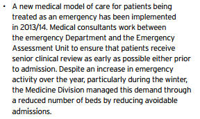
This is just a snippet …

… and there are lots more knowledge nuggets like this in there …

… it is a treasure trove of well-known examples of good system flow design.

The results speak for themselves!


Q: How many black swans does it take to disprove the hypothesis that “all swans are white”.

A: Just one.

“RC9” is a black swan. An outlier. A positive deviant. “RC9” has disproved the “impossibility” hypothesis.

And there is another flock of black swans living in the North East … in the Newcastle area … so the “Big cities are different” hypothesis does not hold water either.


The challenge here is a human one.  A human factor.  Our learned fear of failure.

Learning-how-to-fail is the way to avoid failing-how-to-learn.

And to read more about that radical idea I strongly recommend reading the recently published book called Black Box Thinking by Matthew Syed.

It starts with a powerful story about the impact of human factors in health care … and here is a short video of Martin Bromiley describing what happened.

The “black box” that both Martin and Matthew refer to is the one that is used in air accident investigations to learn from what happened, and to use that learning to design safer aviation systems.

Martin Bromiley has founded a charity to support the promotion of human factors in clinical training, the Clinical Human Factors Group.

So if we can muster the courage and humility to learn how to do this in health care for patient safety, then we can also learn to how do it for flow, quality and productivity.

Our black swan called “RC9” has demonstrated that this goal is attainable.

And the body of knowledge needed to do this already exists … it is called Health and Social Care Systems Engineering (HSCSE).


For more posts like this please vote here.
For more information please subscribe here.
To email the author please click here.


Postscript: And I am pleased to share that Luton & Dunstable features in the House of Commons Health Committee report entitled Winter Pressures in A&E Departments that was published on 3rd Nov 2016.

Here is part of what L&D shared to explain their deviant performance:

luton_nuggets

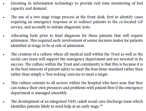
These points describe rather well the essential elements of a pull design, which is the antidote to the rather more prevalent pressure cooker design.

The Cream of the Crap Trap

database_transferring_data_150_wht_10400It has been a busy week.

And a common theme has cropped up which I have attempted to capture in the diagram below.

It relates to how the NHS measures itself and how it “drives” improvement.

The measures are called “failure metrics” – mortality, infections, pressure sores, waiting time breaches, falls, complaints, budget overspends.  The list is long.

The data for a specific trust are compared with an arbitrary minimum acceptable standard to decide where the organisation is on the Red-Amber-Green scale.

If we are in the red zone on the RAG chart … we get a kick.  If not we don’t.

The fear of being bullied and beaten raises the emotional temperature and the internal pressure … which drives movement to get away from the pain.  A nematode worm will behave this way. They are not stupid either.

As as we approach the target line our RAG indicator turns “amber” … this is the “not statistically significant zone” … and now the stick is being waggled, ready in case the light goes red again.

So we muster our reserves of emotional energy and we PUSH until our RAG chart light goes green … but then we have to hold it there … which is exhausting.  One pain is replaced by another.

The next step is for the population of NHS nematodes to be compared with each other … they must be “bench-marked”, and some are doing better than others … as we might expect. We have done our “sadistics” training courses.

The bottom 5% or 10% line is used to set the “arbitrary minimum standard target” … and the top 10% are feted at national award ceremonies … and feast on the envy of the other 90 or 95% of “losers”.

The Cream of the Crop now have a big tick in their mission statement objectives box “To be in the Top 10% of Trusts in the UK“.  Hip hip huzzah.

And what has this system design actually achieved? The Cream of the Crap.

Oops!


It is said that every system is perfectly designed to deliver what it delivers.

And a system that has been designed to only use failure and fear to push improvement can only ever achieve chronic mediocrity – either chaotic mediocrity or complacent mediocrity.

So, if we want to tap into the vast zone of unfulfilled potential, and if we want to escape the perpetual pain of the Cream of the Crap Trap … we need a better system design.

And maybe we might need a splash of humility and some system engineers to help us do that.

This week I met some at the Royal Academy of Engineering in London, and it felt like finding a candle of hope amidst the darkness of despair.

I said it had been a busy week!