Resilience

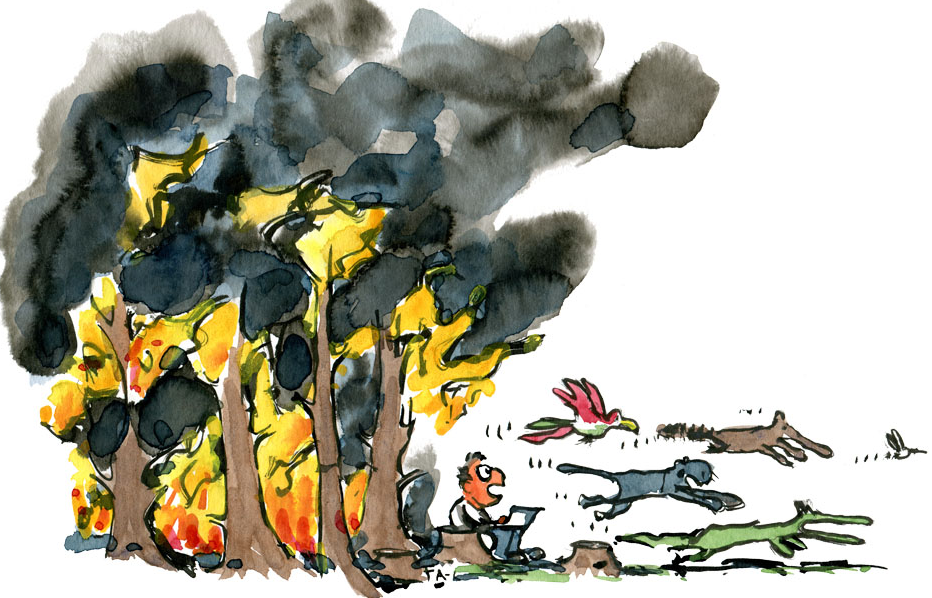
The rise in the use of the term “resilience” seems to mirror the sense of an accelerating pace of change. So, what does it mean? And is the meaning evolving over time?

One sense of the meaning implies a physical ability to handle stresses and shocks without breaking or failing. Flexible, robust and strong are synonyms; and opposites are rigid, fragile, and weak.

So, digging a bit deeper we know that strong implies an ability to withstand extreme stress while resilient implies the ability to withstanding variable stress. And the opposite of resilient is brittle because something can be both strong and brittle.

This is called passive resilience because it is an inherent property and cannot easily be changed. A ball is designed to be resilient – it will bounce back – and this inherent in the material and the structure. The implication of this is that to improve passive resilience we would need to remove and to replace with something better suited to the range of expected variation.

The concept of passive resilience applies to processes as well, and a common manifestation of a brittle process is one that has been designed using averages.

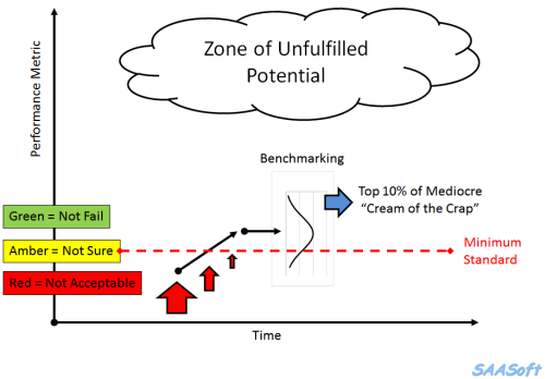
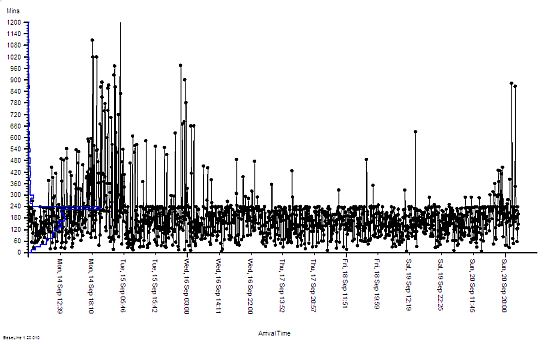
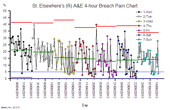
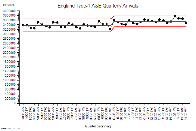
Processes imply flows. The flow into a process is called demand, while the flow out of the process is called activity. What goes in must come out, so if the demand exceeds the activity then a backlog will be growing inside the process. This growing queue creates a number of undesirable effects – first it takes up space, and second it increases the time for demand to be converted into activity. This conversion time is called the lead-time.

So, to avoid a growing queue and a growing wait, there must be sufficient flow-capacity at each and every step along the process. The obvious solution is to set the average flow-capacity equal to the average demand; and we do this because we know that more flow-capacity implies more cost – and to stay in business we must keep a lid on costs!

This sounds obvious and easy but does it actually work in practice?

The surprising answer is “No”. It doesn’t.

What happens in practice is that the measured average activity is always less than the funded flow-capacity, and so less than the demand. The backlogs will continue to grow; the lead-time will continue to grow; the waits will continue to grow; the internal congestion will continue to grow – until we run out of space. At that point everything can grind to a catastrophic halt. That is what we mean by a brittle process.

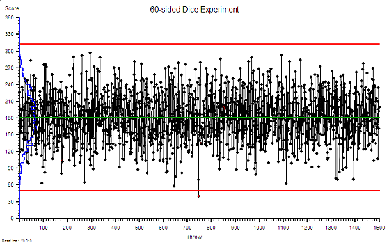
This fundamental and unexpected result can easily and quickly be demonstrated in a concrete way on a table top using ordinary dice and tokens. A credible game along these lines was described almost 40 years ago in The Goal by Eli Goldratt, originator of the school of improvement called Theory of Constraints. The emotional impact of gaining this insight can be profound and positive because it opens the door to a way forward which avoids the Flaw of Averages trap. There are countless success stories of using this understanding.


So, when we need to cope with variation and we choose a passive resilience approach then we have to plan to the extremes of the range of variation. Sometimes that is not possible and we are forced to accept the likelihood of failure. Or we can consider a different approach.

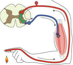
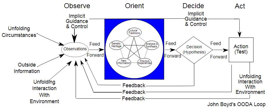
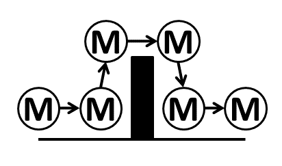
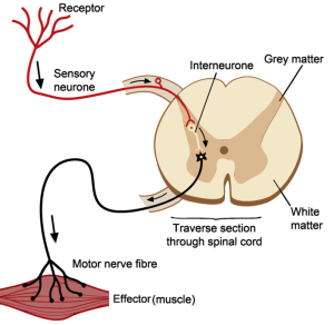
Reactive resilience is one that living systems have evolved to use extensively, and is illustrated by the simple reflex loop shown in the diagram.

A reactive system has three components linked together – a sensor (i.e. temperature sensitive nerves endings in the skin), a processor (i.e. the grey matter of the spinal chord) and an effector (i.e. the muscle, ligaments and bones). So, when a pre-defined limit of variation is reached (e.g. the flame) then the protective reaction withdraws the finger before it becomes damaged. The advantage this type of reactive resilience is that it is relatively simple and relatively fast. The disadvantage is that it is not addressing the cause of the problem.

This is called reactive, automatic and agnostic.

The automatic self-regulating systems that we see in biology, and that we have emulated in our machines, are evidence of the effectiveness of a combination of passive and reactive resilience. It is good enough for most scenarios – so long as the context remains stable. The problem comes when the context is evolving, and in that case the automatic/reflex/blind/agnostic approach will fail – at some point.


Survival in an evolving context requires more – it requires proactive resilience.

What that means is that the processor component of the feedback loop gains an extra feature – a memory. The advantage this brings is that past experience can be recalled, reflected upon and used to guide future expectation and future behaviour. We can listen and learn and become proactive. We can look ahead and we can keep up with our evolving context. One might call, this reactive adaptation or co-evolution and it is a widely observed phenomenon in nature.

The usual manifestation is this called competition.

Those who can reactively adapt faster and more effectively than others have a better chance of not failing – i.e. a better chance of survival. The traditional term for this is survival of the fittest but the trendier term for proactive resilience is agile.

And that is what successful organisations are learning to do. They are adding a layer of proactive resilience on top of their reactive resilience and their passive resilience.

All three layers of resilience are required to survive in an evolving context.

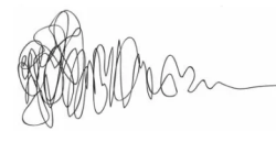
One manifestation of this is the concept of design which is where we create things with the required resilience before they are needed. This is illustrated by the design squiggle which has time running left to right and shows the design evolving adaptively until there is sufficient clarity to implement and possibly automate.

And one interesting thing about design is that it can be done without an understanding of how something works – just knowing what works is enough. The elegant and durable medieval cathedrals were designed and built by Master builders who had no formal education. They learned the heuristics as apprentices and through experience.


And if we project the word game forwards we might anticipate a form of resilience called proactive adaptation. However, we sense that is a novel thing because there is no proadaptive word in the dictionary.

PS. We might also use the term Anti-Fragile, which is the name of a thought-provoking book that explores this very topic.

Emergence

The last year has been dominated by one theme – the SARS-2-CoV global pandemic. It has been a roller coaster ride of ups and downs and twists and turns, often in darkness and accompanied by the baleful drone of doom-mongers and naysayers. But there have also been bright flashes of insight that have illuminated the way and surges of innovation that have carved new designs out of old paradigms.

What we are experiencing is the evolution of a complex adaptive system and what we are seeing is the emergence of a new normal.

Almost nothing will be the same again.

The diagram above tells many inter-weaved story threads that cannot be untangled. Two Chapters are complete – CRC and UTC. We are just starting Chapter 3.

The first Thread of Tragedy is shown by the red dotted line. It is the number of daily COVID-19 associated deaths reported in the UK. The total stands at just over 127,000 which is a more than enough to fill the whole of Wembley Stadium. And a lot more.

The solid red line on the diagram is the result of removing the 7-day oscillation caused the the reporting process which opts to take weekends off.

COVID-19 is busy 24 x 7.

The first reported COVID-19 death in the UK was in the first week of March 2020. The WHO declared a global pandemic the following week, and the UK implemented the first part of a national lock down the week after. It closed some pubs in London. The need for speed was because hospital admissions and deaths were growing exponentially. As the chart shows – deaths were doubling every few days.

The Chancellor’s Magic Blank Chequebook appeared and several Nightingales were rapidly assembled to absorb the predicted storm surge. However, critically ill patients require specialised equipment and highly trained staff – and those necessities were already in short supply. As was the personal protective equipment (PPE) the front-line staff needed to keep them safe.

The Nightingales were never going to be able to sing. It was a doomed design from Day #1.

The bigger problem was the millions of potentially infectious people who would get poorly but not unwell enough to go to hospital. What was the national plan for them? It seemed that there wasn’t one. So, we created our own. The COVID Referral Centre. CRC.

This was Chapter One and the story of that has already been shared here.

The CRC was an innovative drive-thru design and a temporary solution that was conceived, commissioned, constructed and opened in 3 weeks (the red box at the top of the first diagram). It worked as designed and it was disassembled, as planned, at the predicted end of the First Wave (the orange box at the top of the first diagram).

What happened next is even more interesting. We had demonstrated, by doing it, that a drive-thru design was feasible and now we had a new challenge. Most of the elective and urgent services had been mothballed to free up space and staff to fight the First Wave. And we had no clear picture what would happen if lock down restrictions were released. The Nightingales were held in readiness. An expensive and ineffective insurance policy.

Could the drive-thru design be used for a handful of small, temporary urgent treatment centres (UTCs)?

A key lesson from the CRC was the critical importance of managing the inflow to avoid a traffic jam of anxious and potentially very poorly people. We solved this using an electronic triage and referral app that was rapidly designed, developed and delivered for the opening of the CRC. Doing that took a whole week using the JEDI method (Just ‘Effing Do It) also known as Agile.

By August 2020 things were getting back to sort-of-normal. People were having summer holidays. Schools and universities were concocting elaborate plans to re-open in the autumn. And we were thinking ahead to Winter 2020 and the prospect of seasonal flu on top of a possible resurgence of COVID. The much-feared Second Wave.

So, just before the CRC was decommissioned we took the opportunity to measure how many people could be vaccinated in an innovative drive-thru compared with a conventional walk-in. An important constraint was we did not want queues of vulnerable elderly people inside or outside. This time we had the luxury of being able to map and measure the process properly and it revealed that the drive-thru option was feasible.

We now had the information we needed to design a high efficiency flow scheduler which would set the rate at which patients could arrive without causing queues and chaos, and at the same time make good use of the available and valuable resources.

The next design question we had to answer was “How will the booking be done?” and the immediate answers offered were “on-line” and “by the patient”.

But, this was not how the CRC worked. In that service the patient had to speak to a GP who assessed their symptoms and, if deemed necessary, referred them electronically to the CRC for a face-2-face assessment. The e-referral app was designed to limit the number of referrals to prevent a traffic jam and it also automatically assigned the next available free slot to make best use of the resources. There was no patient choice.

The other question that spun out of this exercise was “If patients could book their own appointments for a routine flu jab then could they refer themselves to a drive-thru urgent treatment centre?”

Now we were shaking the trees a bit too hard. The general consensus was “No“. But why not? Surely the patient is best placed to decide how urgent they feel their problem is? And anyway, an online self-referral can be quickly screened and any inappropriate ones addressed proactively. It is probably a better design than a walk-in service.

So, we decided to design a prototype online self-referral system and we looked on the Web for ideas that solved a similar “niggle” of being able provide convenient 24 x 7 online access to a traditional face-to-face 9-5 Mon-Fri service. Rather like the niggle of trying to get an urgent appointment at your GP practice. Or the niggle of finding an increasingly rare Post Office to go to and to get the right postage stamps for an urgent big letter / small parcel.

We discovered that the postage stamp niggle had been solved with an online app for a pay-and-print-postage-label. So, that gave us a validated design to start from.

All this digital innovation was going on during the Blue Period on the first diagram, along with the planning of a cluster of small, temporary, drive-thru UTCs placed in more convenient locations for patients. And by the time the whole caboodle was ready-to-roll it was apparent that the feared Second Wave was building momentum.

The drive-thru UTC service opened its gates in early October 2020 and only four weeks later the nation was commanded to lock down for a second time. The return of pupils to schools and students to university had created the perfect COVID incubator and the emergence of a hyper-contagious Mutant. The first diagram shows when the ‘fire-break’ lock down was eased, and when the Mutant exploded out of its cage, wiped out Christmas and doubled the UK death toll.

But, the drive-thru UTCs weathered the winter storms – figuratively and literally. They valiantly delivered a much needed service while the hospitals were swamped with a third tsunami of critically ill. The NHS was better prepared this time, which is just as well because the Third Wave was much bigger than the First.

And the data the UTCs collected themselves showed that the prototype self-referral app worked as designed. We have seen gradual adoption over the seven months since it was first piloted (see below). The day-to-day variation is not random. The weekly spikes on the chart coincide with weekends when GP practices are shut and A&Es are busy dealing with accidents and emergencies (not anyone and everything).

So what does the future hold?

When COVID is just a bad/sad memory and the NHS is grappling with the elephantine challenge of post-COVID recovery amidst yet another re-disorganisation, would a more permanent drive-thru urgent care service be a viable service delivery option?

Based on the hard evidence shown I would say “Yes“.

Necessity is the Mother of Invention.

Engineers Design Things to be Fit-for-Purpose.

One Year On

This is a picture that tells a story. In fact, it is a picture of millions of stories. Some tragic. Some heroic. Most neither. This is a story of a system adapting to an unexpected and deadly challenge. Over 125,000 souls have been lost. Much has been learned. We cannot return to what was before. The world has changed.

There are three lines on this chart.

The dotted red line is the daily reported deaths, and the obvious pattern is the weekly oscillation. This is caused by the fact that for two days of the week many people do not sit at their computers processing data. These are called weekends. So, they have to catch up with the data backlog when they return to work on Monday.

The solid red line illustrates what actually happened … the actual number of souls lost per day … peaking at over 1000 in January 2021. The ups and downs show the effect of three drastic interventions to limit the spread of a merciless virus that was mutating, evolving and competing with itself to spread faster.

This is a picture of a system learning how the Universe works – the hard, painful way.

The blue line is a prediction of how many souls would be lost, and it is surprisingly accurate. The blue line was generated by a computer. Not a multi-million pound supercomputer like the ones used to predict the weather – but a laptop like those millions of people use every day. And the reason the prediction is so accurate is because epidemics follow simple mathematical rules – and these rules were worked out about 100 years ago.

The tricky bit is turning these simple mathematical formulae into an accurate prediction … in our heads … intuitively. And the reason it is so tricky is because our brains have not evolved to do that. It is not a matter of lack of intelligence … it is just that a human brain is the wrong tool for that job.

But, what our brains are superbly evolved to do is conceptualise, innovate and collaborate to create tools like computers and Excel spreadsheets.

And many have said that in one year we have achieved ten years worth of innovation. We had to. Our lives depended on it.

So, now we have seen what is possible with a burning platform pushing us. How about we keep going with burning ambition pulling us to innovate and improve further?

Our lives and livelihoods will depend on it.

The Final Push

It is New Year 2021 and the spectre of COVID-4-Christmas came true.  We are now in the depths of winter and in the jaws of the Third Wave.  What happened?  Let us look back at the UK data for positive tests and deaths to see how this tragic story unfolded.

There was a Second Wave that started to build when Lock-down I was relaxed in July 2020.  And it looks like Lock-down II in November 2020 did indeed have a beneficial effect – but not as much as was needed.  So, when it too was relaxed at the start of December 2020 then … infections took off again … even faster than before!

That is the nature of epidemics and of exponential growth.  It seems we have not learned those painful lessons well enough.

And we all so desperately wanted a more normal Xmas that we conspired to let the COVID cat out of the bag again.  The steep rise in positive tests is real and we know that because a rise in deaths is following about three weeks behind.  And that means hospitals have filled up again.

Are we back to square one?

The emerging news of an even more contagious variant has only compounded our misery, but it is hard to separate the effect of that from all the other factors that are fuelling the Third Wave.

Is there no end to this recurring nightmare?

The short answer is – “It will end“.  It cannot continue forever.  All epidemics eventually burn themselves out when there are too few susceptible people left to infect and we enter the “endemic” phase.  When that happens the R number will gravitate to 1.0 again which some might find confusing.  The confusion is caused by mixing up Ro and Rt.

How close are we to that end game?

Well, we are certainly a lot closer than we were in July 2020 because millions more people have been exposed, infected and recovered and many of those were completely asymptomatic.  It is estimated that about a third of those who catch it do not have any symptoms – so they will not step forward to be tested and will not appear in the statistics.  But they can unwittingly and silently spread the virus while they are infectious.  And many who are symptomatic do not come get tested so they won’t appear in the statistics either.

And there are now two new players in the COVID-19 Game … the Pfizer vaccine and the Oxford vaccine.  They are the White Knights and they are on our side.

Hurrah!

Now we must manufacture, distribute and administer these sickness-and-death-preventing vaccines to 65 million people as soon as possible.  That alone is a massive logistical challenge when we are already fighting battles on many fronts.  It seems impossible.

Or do we?

It feels obvious but is it the most effective strategy?  Should we divert our limited, hard-pressed, exhausted health care staff to jabbing the worried-well?  Should we eke out our limited supplies of precious vaccine to give more people a first dose by delaying the second dose for others?

Will the White Knights save us?

The short answer is – “Not on their own“.

The maths is simple enough.

Over the last three weeks we have, through Herculean effort, managed to administer 1 million first doses of the Pfizer vaccine.  That sounds like a big number but when put into the context of a UK population of 65 million it represents less than 2% and offers only delayed and partial protection.  The trial evidence confirmed that two doses of the Pfizer vaccine given at a three week interval would confer about 90% protection.  That is the basis of the licence and the patient consent.

So, even if we delay second doses and double the rate of first dose delivery we can only hope to partially protect about 2-3% of the population by the end of January 2021.  That is orders of magnitude too slow.

And the vaccines are not a treatment.  The vaccine cannot mitigate the fact that a large number of people are already infected and will have to run the course of their illness.  Most will recover, but many will not.

So, how do we get our heads around all these interacting influences?  How do we predict how the Coronavirus Game is likely to play out over the next few weeks? How do we decide what to do for the best?

I believe it is already clear that trying to answer these questions using the 1.3 kg of wetware between our ears is fraught with problems.

We need to seek the assistance of some hardware, software and some knowledge of how to configure them to illuminate the terrain ahead.


Here is what the updated SEIR-V model suggests will happen if we continue with the current restrictions and the current vaccination rate.  I’ve updated it with the latest data and added a Vaccination component.

The lines to focus on are the dotted ones: grey = number of infected cases, yellow = number ill enough to justify hospital treatment, red = critically ill and black = not survived.

The vertical black line is Now and the lines to the right of that is the most plausible prediction.

It says that a Third Wave is upon us and that it could be worse than the First Wave.  That is the bad news. The good news is that the reason that the infection rate drops is because the epidemic will finally burn itself out – irrespective of the vaccinations.

So, it would appear that the White Knights cannot rescue us on their own … but we can all help to accelerate the final phase and limit the damage – if we all step up and pull together, at the same time and in the same direction.

We need a three-pronged retaliation:

  1. Lock-down:  “Stay at home. Protect the NHS. Save Lives”.  It worked in the First Wave and it will work in the Third Wave.
  2. Care in the Community:  For those who will become unwell and who will need the support of family, friends, neighbours and the NHS.
  3. Volunteer to Vaccinate:  To protect everyone as soon as is practically feasible.

Here is what it could look like.  All over by Easter.

There is light at the end of the tunnel.  The end is in sight.  We just have to pull together in the final phase of the Game.


PS. For those interested in how an Excel-based SEIR-V model is designed, built and used here’s a short (7 minute) video of the highlights:

This is health care systems engineering (HCSE) in action.

And I believe that the UK will need a new generation of HCSEs to assist in the re-designing and re-building of our shattered care services.  So, if you are interested then click here to explore further.

Coronavirus


The start of a new year, decade, century or millennium is always associated with a sense of renewal and hope.  Little did we know that in January 2020 a global threat had hatched and was growing in the city of Wuhan, Hubei Province, China.  A virus of the family coronaviridae had mutated and jumped from animal to man where it found a new host and a vehicle to spread itself.   Several weeks later the World became aware of the new threat and in the West … we ignored it.  Maybe we still remember the SARS epidemic which was heralded as a potential global catastrophe but was contained in the Far East and fizzled out.  So, maybe we assumed this SARS-like virus would do the same.

It didn’t.  This mutant was different.  It caused a milder illness and unwitting victims were infectious before they were symptomatic.  And most got better on their own, so they spread the mutant to many other people.  Combine that mutant behaviour with the winter (when infectious diseases spread more easily because we spend more time together indoors), Chinese New Year and global air travel … and we have the perfect recipe for cooking up a global pandemic of a new infectious disease.  But we didn’t know that at the time and we carried on as normal, blissfully unaware of the catastrophe that was unfolding.

By February 2020 it became apparent that the mutant had escaped containment in China and was wreaking havoc in other countries – with Italy high on the casualty list.  We watched in horror at the scenes on television of Italian hospitals overwhelmed with severely ill people fighting for breath as the virus attacked their lungs.  The death toll rose sharply but we still went on our ski holidays and assumed that the English Channel and our Quarantine Policy would protect us.

They didn’t.  This mutant was different.  We now know that it had already silently gained access into the UK and was growing and spreading.  The first COVID-19 death reported in the UK was in early March 2020 and only then did we sit up and start to take notice.  This was getting too close to home.

But it was too late.  The mathematics of how epidemics spread was worked out 100 years ago, not long after the 1918 pandemic of Spanish Flu that killed tens of millions of people before it burned itself out.  An epidemic is like cancer.  By the time it is obvious it is already far advanced because the growth is not linear – it is exponential.

As a systems engineer I am used to building simulation models to reveal the complex and counter-intuitive behaviour of nonlinear systems using the methods first developed by Jay W. Forrester in the 1950’s.  And when I looked up the equations that describe epidemics (on Wikipedia) I saw that I could build a system dynamics model of a COVID-19 epidemic using no more than an Excel spreadsheet.

So I did.  And I got a nasty surprise.  Using the data emerging from China on the nature of the spread of the mutant virus, the incidence of severe illness and the mortality rate … my simple Excel model predicted that, if COVID-19 was left to run its natural course in the UK, then it would burn itself out over several months but the human cost would be 500,000 deaths and the NHS would be completely overwhelmed with a “tsunami of sick”.  And I could be one of them!  The fact that there is no treatment and no vaccine for this novel threat excluded those options.  My basic Excel model confirmed that the only effective option to mitigate this imminent catastrophe was to limit the spread of the virus through social engineering i.e. an immediate and drastic lock-down.  Everyone who was not essential to maintaining core services should “Stay at home, Protect the NHS and Save lives“.  That would become the mantra.  And others were already saying this – epidemiologists whose careers are spent planning for this sort of eventuality.  But despite all this there still seemed to be little sense of urgency, perhaps because their super-sophisticated models predicted that the peak of the UK epidemic would be in mid-June so there was time to prepare.  My basic model predicted that the peak would be in mid-April, in about 4 weeks, and that it was already too late to prevent about 50,000 deaths.

It turns out I was right.  That is exactly what happened.  By mid-March 2020 London was already seeing an exponential rise in hospital admissions, intensive care admissions and deaths and suddenly the UK woke up and panicked.  By that time I had enlisted the help of a trusted colleague who is a public health doctor and who had studied epidemiology, and together we wrote up and published the emerging story as we saw it:

An Acute Hospital Demand Surge Planning Model for the COVID-19 Epidemic using Stock-and-Flow Simulation in Excel: Part 1. Journal of Improvement Science 2020: 68; 1-20.  The link to download the full paper is here.

I also shared the draft paper with another trusted friend and colleague who works for my local clinical commissioning group (CCG) and I asked “Has the CCG a sense of the speed and magnitude of what is about to happen and has it prepared for the tsunami of sick that primary care will need to see?

What then ensued was an almost miraculous emergence of a coordinated and committed team of health care professionals and NHS managers with a single, crystal clear goal:  To design, build and deliver a high-flow, drive-through community-based facility to safely see-and-assess hundreds of patients per day with suspected COVID-19 who were too sick/worried to be managed on the phone, but not sick enough to go to A&E.  This was not a Nightingale Ward – that was a parallel, more public and much more expensive endeavour designed as a spillover for overwhelmed acute hospitals.  Our purpose was to help to prevent that and the time scale was short.  We had three weeks to do it because Easter weekend was the predicted peak of the COVID-19 surge if the national lock-down policy worked as hoped.  No one really had an accurate estimate how effective the lock-down would be and how big the peak of the tsunami of sick would rise as it crashed into the NHS.  So, we planned for the worst and hoped for the best.  The Covid Referral Centre (CRC) was an insurance policy and we deliberately over-engineered it use to every scrap of space we had been offered in a small car park on the south side of the NEC site.

The CRC needed to open by Sunday 12th April 2020 and we were ready, but the actual opening was delayed by NHS bureaucracy and politics.  It did eventually open on 22nd April 2020, just four weeks after we started, and it worked exactly as designed.  The demand was, fortunately, less than our worst case scenario; partly because we had missed the peak by 10 days and we opened the gates to a falling tide; and partly because the social distancing policy had been more effective than hoped; and partly because it takes time for risk-averse doctors to develop trust and to change their ingrained patterns of working.  A drive-thru COVID-19 see-and-treat facility? That was innovative and untested!!

The CRC expected to see a falling demand as the first wave of COVID-19 washed over, and that exactly is what happened.  So, as soon as that prediction was confirmed, the CRC was progressively repurposed to provide other much needed services such as drive-thru blood tests, drive-thru urgent care, and even outpatient clinics in the indoor part of the facility.

The CRC closed its gates to suspected COVID-19 patients on 31st July 2020, as planned and as guided by the simple Excel computer model.

This is health care systems engineering in action.

And the simple Excel model has been continuously re-calibrated as fresh evidence has emerged.  The latest version predicts that a second peak of COVID-19 (that is potentially worse than the first) will happen in late summer or autumn if social distancing is relaxed too far (see below).

But we don’t know what “too far” looks like in practical terms.  Oh, and a second wave could kick off just just when we expect the annual wave of seasonal influenza to arrive.  Or will it?  Maybe the effect of social distancing for COVID-19 in other countries will suppress the spread of seasonal flu as well?  We don’t know that either but the data of the incidence of flu from Australia certainly supports that hypothesis.

We may need a bit more health care systems engineering in the coming months. We shall see.

Oh, and if we are complacent enough to think a second wave could never happen in the UK … here is what is happening in Australia.

A New Decade of Hope

At the end of the decade it is the time to reflect on what has happened in the past before planning for the future.  As always, the hottest topic in health care is the status of the emergency care services, and we have the data – it is public.

This shows the last 9 years of aggregate, monthly data for Scotland (red), England (blue), Wales (teal) and N.Ireland (orange).  It does not take a data scientist and a supercomputer to interpret – there is a progressive system-wide progressive deterioration year-on-year.  The winter dips are obvious and the worst of these affect all four countries indicating a systemic cause … the severity of the winter weather/illness cycle -i.e. the Flu Season.

What this chart also says is that all the effort and money being expended in winter planning is not working well enough – and the nagging question is “Why not?”

Many claim that it is the predicted demographic “time bomb” … but if it is predicted then how come it has not been mitigated?

Many claim that it is a growing funding gap … but most NHS funding is spent on staff and  and training nurses, doctors and allied health professionals (AHPs) takes time.  Again, a predicted eventuality that has not been mitigated.

This looming crisis in a lack of heath care workers is a global health challenge … and is described by Mark Britnell in “Human – Solving the global workforce crisis in healthcare“.

Mark was the CEO of University Hospitals Birmingham from 2000 and has worked for KPMG since 2009 in a global health role so is well placed to present a strategic overview.


But, health care workers deliver care to patients – one at a time.  They are not responsible for designing the system of health care delivery; or ensuring all the pieces of that vast jigsaw link up and work in a synchronised way; or for the long term planning needed to mitigate the predictable effects of demographic drift and technology advances.

Who is responsible for that challenge and are they adequately trained to do it?

The evidence would appear to suggest that there is a gap that either no one has noticed or that no one is prepared to discuss.  An Undiscussable?


The global gap in the healthcare workforce is predicted to be about 20% by 2030.  That is a big gap to fill because with the NHS workforce of 1.3 million people – that implies training 260,000 new staff of all types in the next 10 years, in addition to replacing those that leave.

Assuming the processes and productivity stay as they are now.

So, perhaps there is a parallel approach, one that works more quickly and a lower cost.


When current health care processes are examined through a flow engineering lens they are found to be poorly designed. They are both ineffective (do not reliably deliver the intended outcome) and inefficient (waste a lot of resources in delivering any outcome).  Further examination reveals that the processes have never been designed … they have evolved.

And just because something is described as current practice does not prove that it is good design.

An expected symptom of a poorly designed process is a combination of chronic queues, delays, chaos, reactive fire-fighting and burnout.  And the assumed cause is often lack of resources because when extra resource is added the queues and chaos subsides, for a while.

But, if the unintentional poor design of the process is addressed then a sequence of surprising things can happen. The chaos evaporates immediately without any extra resources. A feeling of calm is restored and the disruptive fire-fighting stops. The health care workers are able to focus on what they do best and pride-in-work is restored. Patient experience improves and staff feel that feedback and become more motivated. The complaining abates, sickness and absence falls, funded-but-hard-to-recruit-to posts are refilled and there are more hands on the handle of a more efficient/effective/productive pump.  The chronic queues and delays start to melt away – as if by magic.

And if that all sounds totally impossible then here are a couple of recent, real-world case studies written by different teams in different cities in different parts of the UK.  One from cancer care and one from complex diabetic care.

They confirm that this chaos-to-calm transformation is possible.

So, is there a common thread that links these two examples?

Yes, there is, and once again the spotlight is shone on the Undiscussable Gap … the fact that the NHS does not appear to have the embedded capability to redesign itself.

There is a hidden workforce gap that none of the existing programmes will address – because it is not a lack of health care workers – it is a lack of appropriately trained health care manager-designers.


The Undiscussable Elephant Is In The Room … the Undiscussable Emperor Has No Clothes.

And if history teaches us anything, Necessity is the Mother of Innovation and the chart at the top of the page shows starkly that there is an Growing Urgent Necessity.

And if two embedded teams can learn this magic trick of flipping chaos into calm at no cost, then perhaps others can too?

Welcome to the New Decade of Hope and Health Care Systems Engineering.

Co-Diagnosis, Co-Design and Co-Delivery

The thing that gives me the biggest buzz when it comes to improvement is to see a team share their story of what they have learned-by-doing; and what they have delivered that improves their quality of life and the quality of their patients’ experience.

And while the principles that underpin these transformations are generic, each story is unique because no two improvement challenges are exactly the same and no two teams are exactly the same.

The improvement process is not a standardised production line.  It is much more organic and adaptive experience and that requires calm, competent, consistent, compassionate and courageous facilitation.

So when I see a team share their story of what they have done and learned then I know that behind the scenes there will have been someone providing that essential ingredient.

This week a perfect example of a story like this was shared.

It is about the whole team who run the Diabetic Complex Cases Clinic at Guy’s and St. Thomas’ NHS Trust in London.  Everyone involved in the patient care was involved.  It tells the story of how they saw what might be possible and how they stepped up to the challenge of learning to apply the same principles in their world.  And it tells their story of what they diagnosed, what they designed and what they delivered.

The facilitation and support was provided Ellen Pirie who works for the Health Innovation Network (HIN) in South London and who is a Level 2 Health Care Systems Engineer.

And the link to the GSTT Diabetic Complex Clinic Team story is here.

Restoring Pride-in-Work

In 1986, Dr Don Berwick from Boston attended a 4-day seminar run by Dr W. Edwards Deming in Washington.  Dr Berwick was a 40 year old paediatrician who was also interested in health care management and improving quality and productivity.  Dr Deming was an 86 year old engineer and statistician who, when he was in his 40’s, helped the US to improve the quality and productivity of the industrial processes supporting the US and Allies in WWII.

Don Berwick describes attending the seminar as an emotionally challenging life-changing experience when he realised that his well-intended attempts to improve quality by inspection-and-correction was a counterproductive, abusive approach that led to fear, demotivation and erosion of pride-in-work.  His blinding new clarity of insight led directly to the Institute of Healthcare Improvement in the USA in the early 1990’s.

One of the tenets of Dr Deming’s theories is that the ingrained beliefs and behaviours that erode pride-in-work also lead to the very outcomes that management do not want – namely conflict between managers and workers and economic failure.

So, an explicit focus on improving pride-in-work as an early objective in any improvement exercise makes very good economic sense, and is a sign of wise leadership and competent management.


Last week a case study was published that illustrates exactly that principle in action.  The important message in the title is “restore the calm”.

One of the most demotivating aspects of health care that many complain about is the stress caused a chaotic environment, chronic crisis and perpetual firefighting.  So, anything that can restore calm will, in principle, improve motivation – and that is good for staff, patients and organisations.

The case study describes, in detail, how calm was restored in a chronically chaotic chemotherapy day unit … on Weds, June 19th 2019 … in one day and at no cost!

To say that the chemotherapy nurses were surprised and delighted is an understatement.  They were amazed to see that they could treat the same number of patients, with the same number of staff, in the same space and without the stress and chaos.  And they had time to keep up with the paperwork; and they had time for lunch; and they finished work 2 hours earlier than previously!

Such a thing was not possible surely? But here they were experiencing it.  And their patients noticed the flip from chaos-to-strangely-calm too.

The impact of the one-day-test was so profound that the nurses voted to adopt the design change the following week.  And they did.  And the restored calm has been sustained.


What happened next?

The chemotherapy nurses were able to catch up with their time-owing that had accumulated from the historical late finishes.  And the problem of high staff turnover and difficultly in recruitment evaporated.  Highly-trained chemotherapy nurses who had left because of the stressful chaos now want to come back.  Pride-in-work has been re-established.  There are no losers.  It is a win-win-win result for staff, patients and organisations.


So, how was this “miracle” achieved?

Well, first of all it was not a miracle.  The flip from chaos-to-calm was predicted to happen.  In fact, that was the primary objective of the design change.

So, how what this design change achieved?

By establishing the diagnosis first – the primary cause of the chaos – and it was not what the team believed it was.  And that is the reason they did not believe the design change would work; and that is the reason they were so surprised when it did.

So, how was the diagnosis achieved?

By using an advanced systems engineering technique called Complex Physical System (CPS) modelling.  That was the game changer!  All the basic quality improvement techniques had been tried and had not worked – process mapping, direct observation, control charts, respectful conversations, brainstorming, and so on.  The system structure was too complicated. The system behaviour was too complex (i.e. chaotic).

What CPS revealed was that the primary cause of the chaotic behaviour was the work scheduling policy.  And with that clarity of focus, the team were able to re-design the policy themselves using a simple paper-and-pen technique.  That is why it cost nothing to change.

So, why hadn’t they been able to do this before?

Because systems engineering is not a taught component of the traditional quality improvement offerings.  Healthcare is rather different to manufacturing! As the complexity of the health care system increases we need to learn the more advanced tools that are designed for this purpose.

What is the same is the principle of restoring pride-in-work and that is what Dr Berwick learned from Dr Deming in 1986, and what we saw happen on June 19th, 2019.

To read the story of how it was done click here.

One Small Step … One Giant Leap

It is 50 years today that Apollo 11 landed men on the moon – and the final small step for one man, astronaut Neil Armstrong, was indeed a giant leap for mankind.

Achieving that goal was the result of a massive programme of inspiration, innovation, investment, exploration and emergent learning that has led directly to many of the everyday things that we take for granted.  Portable computers and the Internet are just two spin-offs that our 21st Century society could not function without.


I have also just finished reading “Into the Black” which is the gripping story of the first flight of the Space Shuttle in April 1981.

This was another giant technical and cultural leap that paved the way for the International Space Station.


And it has not been plain sailing.  There have been very visible disasters that have shocked the world and challenged our complacency.

This is how complex system design is – few notice when it works – and everyone notices when it fails.

The emerging body of knowledge that NASA used is called systems engineering and it can be applied to any system, of any size and any complexity.

And that includes health care.

So, today is a time to pause, reflect and celebrate these awe inspiring achievements.  And to draw hope from them because the challenges that health care faces today require no less a commitment to investment in learning how to improve-by-design.

That is health care systems engineering.

Measuring Chaos

One of the big hurdles in health care improvement is that most of the low hanging fruit have been harvested.

These are the small improvement projects that can be done quickly because as soon as the issue is made visible to the stakeholders the cause is obvious and the solution is too.

This is where kaizen works well.

The problem is that many health care issues are rather more difficult because the process that needs improving is complicated (i.e. it has lots of interacting parts) and usually exhibits rather complex behaviour (e.g. chaotic).

One good example of this is a one stop multidisciplinary clinic.

These are widely used in healthcare and for good reason.  It is better for a patient with a complex illness, such as diabetes, to be able to access whatever specialist assessment and advice they need when they need it … i.e. in an outpatient clinic.

The multi-disciplinary team (MDT) is more effective and efficient when it can problem-solve collaboratively.

The problem is that the scheduling design of a one stop clinic is rather trickier than a traditional simple-but-slow-and-sequential new-review-refer design.

A one stop clinic that has not been well-designed feels chaotic and stressful for both staff and patients and usually exhibits the paradoxical behaviour of waiting patients and waiting staff.


So what do we need to do?

We need to map and measure the process and diagnose the root cause of the chaos, and then treat it.  A quick kaizen exercise should do the trick. Yes?

But how do we map and measure the chaotic behaviour of lots of specialists buzzing around like blue-***** flies trying to fix the emergent clinical and operational problems on the hoof?  This is not the linear, deterministic, predictable, standardised machine-dominated production line environment where kaizen evolved.

One approach might be to get the staff to audit what they are doing as they do it. But that adds extra work, usually makes the chaos worse, fuels frustration and results in a very patchy set of data.

Another approach is to employ a small army of observers who record what happens, as it happens.  This is possible and it works, but to be able to do this well requires a lot of experience of the process being observed.  And even if that is achieved the next barrier is the onerous task of transcribing and analysing the ocean of harvested data.  And then the challenge of feeding back the results much later … i.e. when the sands have shifted.


So we need a different approach … one that is able to capture the fine detail of a complex process in real-time, with minimal impact on the process itself, and that can process and present the wealth of data in a visual easy-to-assess format, and in real-time too.

This is a really tough design challenge …
… and it has just been solved.

Here are two recent case studies that describe how it was done using a robust systems engineering method.

Abstract

Abstract

System Dynamics

On Thursday we had a very enjoyable and educational day.  I say “we” because there were eleven of us learning together.

There was Declan, Chris, Lesley, Imran, Phil, Pete, Mike, Kate, Samar and Ellen and me (behind the camera).  Some are holding their long-overdue HCSE Level-1 Certificates and Badges that were awarded just before the photo was taken.

The theme for the day was System Dynamics which is a tried-and-tested approach for developing a deep understanding of how a complex adaptive system (CAS) actually works.  A health care system is a complex adaptive system.

The originator of system dynamics is Jay Wright Forrester who developed it around the end of WW2 (i.e. about 80 years ago) and who later moved to MIT.  Peter Senge, author of The Fifth Discipline was part of the same group as was Donella Meadows who wrote Limits to Growth.  Their dream was much bigger – global health – i.e. the whole planet not just the human passengers!  It is still a hot topic [pun intended].


The purpose of the day was to introduce the team of apprentice health care system engineers (HCSEs) to the principles of system dynamics and to some of its amazing visualisation and prediction techniques and tools.

The tangible output we wanted was an Excel-based simulation model that we could use to solve a notoriously persistent health care service management problem …

How to plan the number of new and review appointment slots needed to deliver a safe, efficient, effective and affordable chronic disease service?

So, with our purpose in mind, the problem clearly stated, and a blank design canvas we got stuck in; and we used the HCSE improvement-by-design framework that everyone was already familiar with.

We made lots of progress, learned lots of cool stuff, and had lots of fun.

We didn’t quite get to the final product but that was OK because it was a very tough design assignment.  We got 80% of the way there though which is pretty good in one day from a standing start.  The last 20% can now be done by the HCSEs themselves.

We were all exhausted at the end.  We had worked hard.  It was a good day.


And I am already looking forward to the next HCSE Masterclass that will be in about six weeks time.  This one will address another chronic, endemic, systemic health care system “disease” called carveoutosis multiforme fulminans.

From Push to Pull

One of the most frequent niggles that I hear from patients is the difficultly they have getting an appointment with their general practitioner.  I too have personal experience of the distress caused by the ubiquitous “Phone at 8AM for an Appointment” policy, so in June 2018 when I was approached to help a group of local practices redesign their appointment booking system I said “Yes, please!


What has emerged is a fascinating, enjoyable and rewarding journey of co-evolution of learning and co-production of an improved design.  The multi-skilled design team (MDT) we pulled together included general practitioners, receptionists and practice managers and my job was to show them how to use the health care systems engineering (HCSE) framework to diagnose, design, decide and deliver what they wanted: A safe, calm, efficient, high quality, value-4-money appointment booking service for their combined list of 50,000 patients.


This week they reached the start of the ‘decide and deliver‘ phase.  We have established the diagnosis of why the current booking system is not delivering what we all want (i.e. patients and practices), and we have assembled and verified the essential elements of an improved design.

And the most important outcome for me is that the Primary Care MDT now feel confident and capable to decide what and how to deliver it themselves.   That is what I call embedded capability and achieving it is always an emotional roller coaster ride that we call The Nerve Curve.

What we are dealing with here is called a complex adaptive system (CAS) which has two main components: Processes and People.  Both are complicated and behave in complex ways.  Both will adapt and co-evolve over time.  The processes are the result of the policies that the people produce.  The policies are the result of the experiences that the people have and the explanations that they create to make intuitive sense of them.

But, complex systems often behave in counter-intuitive ways, so our intuition can actually lead us to make unwise decisions that unintentionally perpetuate the problem we are trying to solve.  The name given to this is a wicked problem.

A health care systems engineer needs to be able to demonstrate where these hidden intuitive traps lurk, and to explain what causes them and how to avoid them.  That is the reason the diagnosis and design phase is always a bit of a bumpy ride – emotionally – our Inner Chimp does not like to be challenged!  We all resist change.  Fear of the unknown is hard-wired into us by millions of years of evolution.

But we know when we are making progress because the “ah ha” moments signal a slight shift of perception and a sudden new clarity of insight.  The cognitive fog clears a bit and a some more of the unfamiliar terrain ahead comes into view.  We are learning.

The Primary Care MDT have experienced many of these penny-drop moments over the last six months and unfortunately there is not space here to describe them all, but I can share one pivotal example.


A common symptom of a poorly designed process is a chronically chaotic queue.

[NB. In medicine the term chronic means “long standing”.  The opposite term is acute which means “recent onset”].

Many assume, intuitively, that the cause of a chronically chaotic queue is lack of capacity; hence the incessant calls for ‘more capacity’.  And it appears that we have learned this reflex response by observing the effect of adding capacity – which is that the queue and chaos abate (for a while).  So that proves that lack of capacity was the cause. Yes?

Well actually it doesn’t.  Proving causality requires a bit more work.  And to illustrate this “temporal association does not prove causality trap” I invite you to consider this scenario.

I have a headache => I take a paracetamol => my headache goes away => so the cause of my headache was lack of paracetamol. Yes?

Errr .. No!

There are many contributory causes of chronically chaotic queues and lack of capacity is not one of them because the queue is chronic.  What actually happens is that something else triggers the onset of chaos which then consumes the very resource we require to avoid the chaos.  And once we slip into this trap we cannot escape!  The chaos-perpretuating behaviour we observe is called fire-fighting and the necessary resource it consumes is called resilience.


Six months ago, the Primary Care MDT believed that the cause of their chronic appointment booking chaos was a mismatch between demand and capacity – i.e. too much patient demand for the appointment capacity available.  So, there was a very reasonable resistance to the idea of making the appointment booking process easier for patients – they justifiably feared being overwhelmed by a tsunami of unmet need!

Six months on, the Primary Care MDT understand what actually causes chronic queues and that awareness has been achieved by a step-by-step process of explanation and experimentation in the relative safety of the weekly design sessions.

We played simulation games – lots of them.

One particularly memorable “Ah Ha!” moment happened when we played the Carveout Game which is done using dice, tiddly-winks, paper and coloured-pens.  No computers.  No statistics.  No queue theory gobbledygook.  No smoke-and-mirrors.  No magic.

What the Carveout Game demonstrates, practically and visually, is that an easy way to trigger the transition from calm-efficiency to chaotic-ineffectiveness is … to impose a carveout policy on a system that has been designed to achieve optimum efficiency by using averages.  Boom!  We slip on the twin banana skins of the Flaw-of-Averages and Sub-Optimisation, slide off the performance cliff, and career down the rocky slope of Chronic Chaos into the Depths of Despair – from which we cannot then escape.

This visual demonstration was a cognitive turning point for the MDT.  They now believed that there is a rational science to improvement and from there we were on the step-by-step climb to building the necessary embedded capability.


It now felt like the team were pulling what they needed to know.  I was no longer pushing.  We had flipped from push-to-pull.  That is called the tipping point.

And that is how health care systems engineering (HCSE) works.


Health care is a complex adaptive system, and what a health care systems engineer actually “designs” is a context-sensitive  incubator that nurtures the seeds of innovation that already exist in the system and encourages them to germinate, grow and become strong enough to establish themselves.

That is called “embedded improvement-by-design capability“.

And each incubator need to be different – because each system is different.  One-solution-fits-all-problems does not work here just as it does not in medicine.  Each patient is both similar and unique.


Just as in medicine, first we need to diagnose the actual cause;  second we need to design some effective solutions; third we need to decide which design to implement and fourth we need to deliver it.

But the how-to-do-it feels a bit counter-intuitive, and if it were not we would already be doing it. But the good news is that anyone can learn how to do HCSE.

Seeing The Voice of the System

It is always a huge compliment to see an idea improved and implemented by inspired innovators.

Health care systems engineering (HCSE) brings together concepts from the separate domains of systems engineering and health care.  And one idea that emerged from this union is to regard the health care system as a living, evolving, adapting entity.

In medicine we have the concept of ‘vital signs’ … a small number of objective metrics that we can measure easily and quickly.  With these we can quickly assess the physical health of a patient and decide if we need to act, and when.

With a series of such measurements over time we can see the state of a patient changing … for better or worse … and we can use this to monitor the effect of our actions and to maintain the improvements we achieve.

For a patient, the five vital signs are conscious level, respiratory rate, pulse, blood pressure and temperature. To sustain life we must maintain many flows within healthy ranges and the most critically important is the flow of oxygen to every cell in the body.  Oxygen is carried by blood, so blood flow is critical.

So, what are the vital signs for a health care system where the flows are not oxygen and blood?  They are patients, staff, consumables, equipment, estate, data and cash.

The photograph shows a demonstration of a Vitals Dashboard for a part of the cancer care system in the ABMU health board in South Wales.  The inspirational innovators who created it are Imran Rao (left), Andy Jones (right) and Chris Jones (top left), and they are being supported by ABMU to do this as part of their HCSE training programme.

So well done guys … we cannot wait to hear how being better able to seeing the voice of your cancer system translates into improved care for patients, and improved working life for the dedicated NHS staff, and improved use of finite public resources.  Win-win-win.

The A.B.C.D.E. of Improvement

In medicine we use checklists as aide memoirs because they help us to avoid errors of omission, especially in an emergency when we are stressed and less able to think logically.

One that everyone learns if they do a First Aid course is A.B.C. and it stands for Airway, Breathing, Circulation.  It is designed to remind us what to do first because everything that follows depends on it, and then what to do next, and so on.  Avoiding the errors of omission improves outcomes.


In the world of improvement we are interested in change-for-the-better and there are many models of change that we can use to remind us not to omit necessary steps.

One of these is called the Six Steps model (or trans-theoretical model to use the academic title) and it is usually presented as a cycle starting with a state called pre-contemplation.

This change model arose from an empirical study of people who displayed addictive behaviours (e.g. smoking, drinking, drugs etc) and specifically, those who had overcome them without any professional assistance.

The researchers compared the stories from the successful self-healers with the accepted dogma for the management of addictions, and they found something very interesting.  The dogma advocated action, but the stories showed that there were some essential steps before action; steps that should not be omitted.  Specifically, the contemplation and determination steps.

If corrective actions were started too early then the success rate was low.  When the pre-action steps were added the success rate went up … a lot!


The first step is to raise awareness which facilitates a shift from pre-contemplation to contemplation.  The second step is to provide information that gradually increases the pros for change and at the same time gradually decreases the cons for change.

If those phases are managed skillfully then a tipping point is reached where the individual decides to make the change and moves themselves to the third step, the determination or planning phase.

Patience and persistence is required.  The contemplation phase can last a long time.  It is the phase of exploration, evidence and explanation. It is preparing the ground for change and can be summed up in one word: Study.

Often the trigger for determination (i.e. Plan) and then action (i.e. Do) is relatively small because when we are close to the tipping point it does not take much to nudge us to step across the line.


And there is an aide memoir we can use for this change cycle … one that is a bit easier to remember:

A = Awareness
B = Belief
C = Capability
D = Delivery
E = Excellence (+enjoyment, +evidence, +excitement, +engagement)

First we raise awareness of the issue.
Then we learn a solution is possible and that we can learn the know-how.
Then we plan the work.
Then we work the plan.
Then we celebrate what worked and learn from what did and what did not.

Experience shows that the process is not discrete and sequential and it cannot be project managed into defined time boxes.  Instead, it is a continuum and the phases overlap and blend from one to the next in a more fluid and adaptive way.


Raising awareness requires both empathy and courage because this issue is often treated as undiscussable, and even the idea of discussing it is undiscussable too. Taboo.

But for effective change we need to grasp the nettle, explore the current reality, and start the conversation.

The Strangeness of LoS

It had been some time since Bob and Leslie had chatted so an email from the blue was a welcome distraction from a complex data analysis task.

<Bob> Hi Leslie, great to hear from you. I was beginning to think you had lost interest in health care improvement-by-design.

<Leslie> Hi Bob, not at all.  Rather the opposite.  I’ve been very busy using everything that I’ve learned so far.  It’s applications are endless, but I have hit a problem that I have been unable to solve, and it is driving me nuts!

<Bob> OK. That sounds encouraging and interesting.  Would you be able to outline this thorny problem and I will help if I can.

<Leslie> Thanks Bob.  It relates to a big issue that my organisation is stuck with – managing urgent admissions.  The problem is that very often there is no bed available, but there is no predictability to that.  It feels like a lottery; a quality and safety lottery.  The clinicians are clamoring for “more beds” but the commissioners are saying “there is no more money“.  So the focus has turned to reducing length of stay.

<Bob> OK.  A focus on length of stay sounds reasonable.  Reducing that can free up enough beds to provide the necessary space-capacity resilience to dramatically improve the service quality.  So long as you don’t then close all the “empty” beds to save money, or fall into the trap of believing that 85% average bed occupancy is the “optimum”.

<Leslie> Yes, I know.  We have explored all of these topics before.  That is not the problem.

<Bob> OK. What is the problem?

<Leslie> The problem is demonstrating objectively that the length-of-stay reduction experiments are having a beneficial impact.  The data seems to say they they are, and the senior managers are trumpeting the success, but the people on the ground say they are not. We have hit a stalemate.


<Bob> Ah ha!  That old chestnut.  So, can I first ask what happens to the patients who cannot get a bed urgently?

<Leslie> Good question.  We have mapped and measured that.  What happens is the most urgent admission failures spill over to commercial service providers, who charge a fee-per-case and we have no choice but to pay it.  The Director of Finance is going mental!  The less urgent admission failures just wait on queue-in-the-community until a bed becomes available.  They are the ones who are complaining the most, so the Director of Governance is also going mental.  The Director of Operations is caught in the cross-fire and the Chief Executive and Chair are doing their best to calm frayed tempers and to referee the increasingly toxic arguments.

<Bob> OK.  I can see why a “Reduce Length of Stay Initiative” would tick everyone’s Nice If box.  So, the data analysts are saying “the length of stay has come down since the Initiative was launched” but the teams on the ground are saying “it feels the same to us … the beds are still full and we still cannot admit patients“.

<Leslie> Yes, that is exactly it.  And everyone has come to the conclusion that demand must have increased so it is pointless to attempt to reduce length of stay because when we do that it just sucks in more work.  They are feeling increasingly helpless and hopeless.

<Bob> OK.  Well, the “chronic backlog of unmet need” issue is certainly possible, but your data will show if admissions have gone up.

<Leslie> I know, and as far as I can see they have not.

<Bob> OK.  So I’m guessing that the next explanation is that “the data is wonky“.

<Leslie> Yup.  Spot on.  So, to counter that the Information Department has embarked on a massive push on data collection and quality control and they are adamant that the data is complete and clean.

<Bob> OK.  So what is your diagnosis?

<Leslie> I don’t have one, that’s why I emailed you.  I’m stuck.


<Bob> OK.  We need a diagnosis, and that means we need to take a “history” and “examine” the process.  Can you tell me the outline of the RLoS Initiative.

<Leslie> We knew that we would need a baseline to measure from so we got the historical admission and discharge data and plotted a Diagnostic Vitals Chart®.  I have learned something from my HCSE training!  Then we planned the implementation of a visual feedback tool that would show ward staff which patients were delayed so that they could focus on “unblocking” the bottlenecks.  We then planned to measure the impact of the intervention for three months, and then we planned to compare the average length of stay before and after the RLoS Intervention with a big enough data set to give us an accurate estimate of the averages.  The data showed a very obvious improvement, a highly statistically significant one.

<Bob> OK.  It sounds like you have avoided the usual trap of just relying on subjective feedback, and now have a different problem because your objective and subjective feedback are in disagreement.

<Leslie> Yes.  And I have to say, getting stuck like this has rather dented my confidence.

<Bob> Fear not Leslie.  I said this is an “old chestnut” and I can say with 100% confidence that you already have what you need in your T4 kit bag?

<Leslie>Tee-Four?

<Bob> Sorry, a new abbreviation. It stands for “theory, techniques, tools and training“.

<Leslie> Phew!  That is very reassuring to hear, but it does not tell me what to do next.

<Bob> You are an engineer now Leslie, so you need to don the hard-hat of Improvement-by-Design.  Start with your Needs Analysis.


<Leslie> OK.  I need a trustworthy tool that will tell me if the planned intervention has has a significant impact on length of stay, for better or worse or not at all.  And I need it to tell me that quickly so I can decide what to do next.

<Bob> Good.  Now list all the things that you currently have that you feel you can trust.

<Leslie> I do actually trust that the Information team collect, store, verify and clean the raw data – they are really passionate about it.  And I do trust that the front line teams are giving accurate subjective feedback – I work with them and they are just as passionate.  And I do trust the systems engineering “T4” kit bag – it has proven itself again-and-again.

<Bob> Good, and I say that because you have everything you need to solve this, and it sounds like the data analysis part of the process is a good place to focus.

<Leslie> That was my conclusion too.  And I have looked at the process, and I can’t see a flaw. It is driving me nuts!

<Bob> OK.  Let us take a different tack.  Have you thought about designing the tool you need from scratch?

<Leslie> No. I’ve been using the ones I already have, and assume that I must be using them incorrectly, but I can’t see where I’m going wrong.

<Bob> Ah!  Then, I think it would be a good idea to run each of your tools through a verification test and check that they are fit-4-purpose in this specific context.

<Leslie> OK. That sounds like something I haven’t covered before.

<Bob> I know.  Designing verification test-rigs is part of the Level 2 training.  I think you have demonstrated that you are ready to take the next step up the HCSE learning curve.

<Leslie> Do you mean I can learn how to design and build my own tools?  Special tools for specific tasks?

<Bob> Yup.  All the techniques and tools that you are using now had to be specified, designed, built, verified, and validated. That is why you can trust them to be fit-4-purpose.

<Leslie> Wooohooo! I knew it was a good idea to give you a call.  Let’s get started.


[Postscript] And Leslie, together with the other stakeholders, went on to design the tool that they needed and to use the available data to dissolve the stalemate.  And once everyone was on the same page again they were able to work collaboratively to resolve the flow problems, and to improve the safety, flow, quality and affordability of their service.  Oh, and to know for sure that they had improved it.

Ability minus Awareness equals Engagement

It is always rewarding when separate but related ideas come together and go “click”.

And this week I had one of those “ah ha” moments while attempting to explain how the process of engagement works.

Many years ago I was introduced to the conscious-competence model of learning which I found really insightful.  Sometime later I renamed it as the awareness-ability model because the term competence felt too judgemental.

The idea is that when we learn we all start from a position of being unaware of our inability.

A state called blissful ignorance.

And it is only when we try to do something that we become aware of what we cannot do; which can lead to temper tantrums!

As we concentrate and practice our ability improves and we enter the zone of know how.  We become able to demonstrate what we can do, and explain how we are doing it.

The final phase comes when it becomes so habitual that we forget how we learned our skill – it has become second nature.


Some years later I was introduced to the Nerve Curve which is the emotional roller-coaster ride that accompanies change.  Any form of change.

A five-step model was described in the context of bereavement by psychiatrist Elisabeth Kübler-Ross in her 1969 book “On Death & Dying: What the Dying Have to Teach Doctors, Nurses, Clergy and their Families.

More recently this has been extended and applied by authors such as William Bridges and John Fisher in the less emotionally traumatic contexts called transitions.

The characteristic sequence of emotions are triggered by external events are:

  • shock
  • denial
  • frustration
  • blame
  • guilt
  • depression
  • acceptance
  • engagement
  • excitement.

The important messages in both of these models is that we can get stuck along the path of transition, and we can disengage at several points, signalling to others that we have come off the track.  When we do that we exhibit behaviours such as denial, disillusionment and hostility.


More recently I was introduced to the work of the late Chris Argyris and specifically the concept of “defensive reasoning“.

The essence of the concept:  As we start to become aware of a gap between our intentions and our impact, then we feel threatened and our natural reaction is defensive.  This is the essence of the behaviour called “resistance to change”, and it is interesting to note that “smart” people are particularly adept at it.


These three concepts are clearly related in some way … but how?


As a systems engineer I am used to cyclical processes and the concepts of wavelength, amplitude, phase and offset, and I found myself looking at the Awareness-Ability cycle and asking:

“How could that cycle generate the characteristic shape of the transition curve?”

Then the Argyris idea of the gap between intent and impact popped up and triggered another question:

“What if we look at the gap between our ability and our awareness?”

So, I conducted a thought experiment and imagined myself going around the cycle – and charting my ability, awareness and emotional state along the way … and this sketch emerged. Ah ha!

When my awareness exceeded my ability I felt disheartened. That is the defensive reasoning that Chris Argyris talks about, the emotional barrier to self-improvement.


Ability – Awareness = Engagement


This suggested to me that the process of building self-engagement requires opening the ability-versus-awareness gap a little-bit-at-a-time, sensing the emotional discomfort, and then actively releasing the tension by learning a new concept, principle, technique or tool (and usually all four).

Eureka!

I wonder if the same strategy would work elsewhere?

O.O.D.A.

OODA is something we all do thousands of times a day without noticing.

Observe – Orient – Decide – Act.

The term is attributed to Colonel John Boyd, a real world “Top Gun” who studied economics and engineering, then flew and designed fighter planes, then became a well-respected military strategist.

OODA is a continuous process of updating our mental model based on sensed evidence.

And it is a fast process because happens largely out of awareness.

This was Boyd’s point: In military terms, the protagonist that can make wiser and faster decisions are more likely to survive in combat.


And notice that it is not a simple linear sequence … it is a system … there are parallel paths and both feed-forward and feed-backward loops … there are multiple information flow paths.

And notice that the Implicit Guidance & Control links do not go through Decision – this means they operate out of awareness and are much faster.

And notice the Feed Forward links link the OODA steps – this is the conscious, sequential, future looking process that we know by another name:

Study-Adjust-Plan-Do.


We use the same process in medicine: first we study the patient and the problem they are presenting (history, examination, investigation), then we adjust our generic mental model of how the body works to the specific patient (diagnosis), then we plan and decide a course of action to achieve the intended outcome, and then we act, we do it (treatment).

But at any point we can jump back to an earlier step and we can jump forwards to a later one.  The observe, orient, decide, act modes are running in parallel.

And the more experience we have of similar problems the faster we can complete the OODA (or SAPD) work because we learn what is the most useful information to attend to, and we learn how to interpret it.

We learn the patterns and what to look for – and that speeds up the process – a lot!


This emergent learning is then re-inforced if the impact of our action matches our intent and prediction and our conscious learning is then internalised as unconscious “rules of thumb” called heuristics.


We start by thinking our way consciously and slowly … and … we finish by feeling our way unconsciously and quickly.


Until … we  encounter a novel problem that does not fit any of our learned pattern matching neural templates. When that happens, our unconscious, parallel processing, pattern-matching system alerts us with a feeling of confusion and bewilderment – and we freeze (often with fright!)

Now we have a choice: We can retreat to using familiar, learned, reactive, knee-jerk patterns of behaviour (presumably in the hope that they will work) or we can switch into a conscious learning loop and start experimenting with novel ideas.

If we start at Hypothesis then we have the Plan-Do-Study-Act cycle; where we generate novel hypotheses to explain the unexpected, and we then plan experiments to test our hypotheses; and we then study the outcome of the experiments and we then we act on our conclusions.

This mindful mode of thinking is well described in the book “Managing the Unexpected” by Weick and Sutcliffe and is the behaviour that underpins the success of HROs – High Reliability Organisations.

The image is of the latest (3rd edition) but the previous (2nd edition) is also worth reading.

So we have two interdependent problem solving modes – the parallel OODA system and the sequential SAPD process.

And we can switch between them depending on the context.


Which is an effective long-term survival strategy because the more we embrace the unexpected, the more opportunities we will have to switch into exploration mode and learn new patterns; and the more patterns we recognise the more efficient and effective our unconscious decision-making process will become.

This complex adaptive system behaviour has another name … Resilience.

One Step Back; Two Steps Forward.

This week a ground-breaking case study was published.

It describes how a team in South Wales discovered how to make the flows visible in a critical part of their cancer pathway.

Radiology.

And they did that by unintentionally falling into a trap!  A trap that many who set out to improve health care services fall into.  But they did not give up.  They sought guidance and learned some profound lessons.

Part 1 of their story is shared here.


One lesson they learned is that, as they take on more complex improvement challenges, they need to be equipped with the right tools, and they need to be trained to use them, and they need to have practiced using them.

Another lesson they learned is that making the flows in a system visible is necessary before the current behaviour of the system can be understood.

And they learned that they needed a clear diagnosis of how the current system is not performing; before they can attempt to design an intervention to deliver the intended improvement.

They learned how the Study-Plan-Do cycle works, and they learned the reason it starts with “Study”, and not with “Plan”.


They tried, failed, took one step back, asked, listened and learned.


Then with their new knowledge, more advanced tools, and deeper understanding they took two steps forward; diagnosed problem, designed an intervention, and delivered a significant improvement.

And visualised just how significant.

Then they shared Part 2 of their story … here.


The OMG Effect … Revisited

Beliefs drive behaviour. Behaviour drives change. Improvement requires change.

So, improvement requires challenging beliefs; confirming some and disproving others.

And beliefs can only be confirmed or disproved rationally – with evidence and explanation. Rhetoric is too slippery. We can convince ourselves of anything with that!

So it comes as an emotional shock when one of our beliefs is disproved by experiencing reality from a new perspective.

Our natural reaction is surprise, perhaps delight, and then defense. We say “Yes, but ...”.

And that is healthy skepticism and it is a valuable and necessary part of the change and improvement process.

If there are not enough healthy skeptics on a design team it is unbalanced.

If there are too many healthy skeptics on a design team it is unbalanced.


This week I experienced this phenomenon first hand.

The context was a one day practical skills workshop and the topic was:

How to improve the safety, timeliness, quality and affordability of unscheduled care“.

The workshop is designed to approach this challenge from a different perspective.

Instead of asking “What is the problem and how do we solve it?” we took the system engineering approach of asking “What is the purpose and how can we achieve it?”

We used a range of practical exercises to illustrate some core concepts and principles – reality was our teacher. Then we applied those newly acquired insights to the design challenge using a proven methodology that ensured we do not skip steps.


And the outcome was: the participants discovered that …

it is indeed possible to improve the safety, timeliness, quality and affordability of unscheduled health care …

using health care systems engineering concepts, principles, techniques and tools that, until the workshop, they had been unaware even existed.


Their reaction was “OMG” and was shortly followed by “Yes, but …” which is to be expected and is healthy.

The rest of the “Yes, but … ” sentence was “… how will I convince my colleagues?

One way is for them to seek out the same experience …

… because reality is a much better teacher than rhetoric.

HCSE Practical Skills One Day Workshops


The Q-Community

At some point in the life-cycle of an innovation, there is the possibility of crossing an invisible line called the tipping point.

This happens when enough people have experienced the benefits of the innovation and believe that the innovation is the future.  These lone innovators start to connect and build a new community.

It is an emergent behaviour of a complex adaptive system.


This week I experienced what could be a tipping point.

I attended the Q-Community launch event for the West Midlands that was held at the ICC in Birmingham … and it was excellent.

The invited speakers were both engaging and inspiring – boosting the emotional charge in the old engagement batteries; which have become rather depleted of late by the incessant wailing from the all-too-numerous peddlers of doom-and-gloom.

There was an opportunity to re-connect with fellow radicals who, over nearly two decades, have had the persistent temerity to suggest that improvement is necessary, is possible, have invested in learning how to do it, and have disproved the impossibility hypothesis.

There were new connections with like-minded people who want to both share what they know about the science of improvement and to learn what they do not.

And there were hand-outs, side-shows and break-outs.  Something for everyone.


The voice of the Q-Community will grow louder – and for it to be listened to it will need to be patiently and persistently broadcasting the news stories of what has been achieved, and how it was achieved, and who has demonstrated they can walk-the-talk.  News stories like this one:

Improving safety, flow, quality and affordability of unscheduled care of the elderly.


I sincerely hope that in the future, with the benefit of hindsight, we in the West Midlands will say – the 19th July 2017 was our Q-Community tipping point.

And I pledge to do whatever I can to help make that happen.

Catch-22

There is a Catch-22 in health care improvement and it goes a bit like this:

Most people are too busy fire-fighting the chronic chaos to have time to learn how to prevent the chaos, so they are stuck.

There is a deeper Catch-22 as well though:

The first step in preventing chaos is to diagnose the root cause and doing that requires experience, and we don’t have that experience available, and we are too busy fire-fighting to develop it.


Health care is improvement science in action – improving the physical and psychological health of those who seek our help. Patients.

And we have a tried-and-tested process for doing it.

First we study the problem to arrive at a diagnosis; then we design alternative plans to achieve our intended outcome and we decide which plan to go with; and then we deliver the plan.

Study ==> Plan ==> Do.

Diagnose  ==> Design & Decide ==> Deliver.

But here is the catch. The most difficult step is the first one, diagnosis, because there are many different illnesses and they often present with very similar patterns of symptoms and signs. It is not easy.

And if we make a poor diagnosis then all the action plans that follow will be flawed and may lead to disappointment and even harm.

Complaints and litigation follow in the wake of poor diagnostic ability.

So what do we do?

We defer reassuring our patients, we play safe, we request more tests and we refer for second opinions from specialists. Just to be on the safe side.

These understandable tactics take time, cost money and are not 100% reliable.  Diagnostic tests are usually precisely focused to answer specific questions but can have false positive and false negative results.

To request a broad batch of tests in the hope that the answer will appear like a rabbit out of a magician’s hat is … mediocre medicine.


This diagnostic dilemma arises everywhere: in primary care and in secondary care, and in non-urgent and urgent pathways.

And it generates extra demand, more work, bigger queues, longer delays, growing chaos, and mounting frustration, disappointment, anxiety and cost.

The solution is obvious but seemingly impossible: to ensure the most experienced diagnostician is available to be consulted at the start of the process.

But that must be impossible because if the consultants were seeing the patients first, what would everyone else do?  How would they learn to become more expert diagnosticians? And would we have enough consultants?


When I was a junior surgeon I had the great privilege to have the opportunity to learn from wise and experienced senior surgeons, who had seen it, and done it and could teach it.

Mike Thompson is one of these.  He is a general surgeon with a special interest in the diagnosis and treatment of bowel cancer.  And he has a particular passion for improving the speed and accuracy of the diagnosis step; because it can be a life-saver.

Mike is also a disruptive innovator and an early pioneer of the use of endoscopy in the outpatient clinic.  It is called point-of-care testing nowadays, but in the 1980’s it was a radically innovative thing to do.

He also pioneered collecting the symptoms and signs from every patient he saw, in a standard way using a multi-part printed proforma. And he invested many hours entering the raw data into a computer database.

He also did something that even now most clinicians do not do; when he knew the outcome for each patient he entered that into his database too – so that he could link first presentation with final diagnosis.


Mike knew that I had an interest in computer-aided diagnosis, which was a hot topic in the early 1980’s, and also that I did not warm to the Bayesian statistical models that underpinned it.  To me they made too many simplifying assumptions.

The human body is a complex adaptive system. It defies simplification.

Mike and I took a different approach.  We  just counted how many of each diagnostic group were associated with each pattern of presenting symptoms and signs.

The problem was that even his database of 8000+ patients was not big enough! This is why others had resorted to using statistical simplifications.

So we used the approach that an experienced diagnostician uses.  We used the information we had already gleaned from a patient to decide which question to ask next, and then the next one and so on.


And we always have three pieces of information at the start – the patient’s age, gender and presenting symptom.

What surprised and delighted us was how easy it was to use the database to help us do this for the new patients presenting to his clinic; the ones who were worried that they might have bowel cancer.

And what surprised us even more was how few questions we needed to ask arrive at a statistically robust decision to reassure-or-refer for further tests.

So one weekend, I wrote a little computer program that used the data from Mike’s database and our simple bean-counting algorithm to automate this process.  And the results were amazing.  Suddenly we had a simple and reliable way of using past experience to support our present decisions – without any statistical smoke-and-mirror simplifications getting in the way.

The computer program did not make the diagnosis, we were still responsible for that; all it did was provide us with reliable access to a clear and comprehensive digital memory of past experience.


What it then enabled us to do was to learn more quickly by exploring the complex patterns of symptoms, signs and outcomes and to develop our own diagnostic “rules of thumb”.

We learned in hours what it would take decades of experience to uncover. This was hot stuff, and when I presented our findings at the Royal Society of Medicine the audience was also surprised and delighted (and it was awarded the John of Arderne Medal).

So, we called it the Hot Learning System, and years later I updated it with Mike’s much bigger database (29,000+ records) and created a basic web-based version of the first step – age, gender and presenting symptom.  You can have a play if you like … just click HERE.


So what are the lessons here?

  1. We need to have the most experienced diagnosticians at the start of the improvement process.
  2. The first diagnostic assessment can be very quick so long as we have developed evidence-based heuristics.
  3. We can accelerate the training in diagnostic skills using simple information technology and basic analysis techniques.

And exactly the same is true in the health care system improvement.

We need to have an experienced health care improvement practitioner involved at the start, because if we skip this critical study step and move to plan without a correct diagnosis, then we will make errors, poor decisions, and counter-productive actions.  And then generate more work, more queues, more delays, more chaos, more distress and increased costs.

Exactly the opposite of what we want.

Q1: So, how do we develop experienced improvement practitioners more quickly?

Q2: Is there a hot learning system for improvement science?

A: Yes, there is. It can be found here.

The Marmite Effect

Have you heard the phrase “you either love it or you hate it“?  It is called the Marmite Effect.

Improvement science has Marmite-like effect on some people, or more specifically, the theory part does.

Both evidence and experience show that most people prefer to learn-by-doing first; and then consolidate their learning with the minimum, necessary amount of supporting theory.

But that is not how we usually share what we know with others.  We usually attempt to teach the theory first, perhaps in the belief that it will speed up the process of learning.

Sadly, it usually has the opposite effect. Too much theory too soon often creates a barrier to engagement. It actually slows learning down! Which was not the impact we were intending.


The implications of this is that teachers of the science of improvement need to provide a range of different ways to engage with the subject.  Complementary ways.  And leave the choice of which suits whom … to the learner.

And the way to tell if it is working is … the sound of laughter.

Why is that?


Laughing is a complex behaviour that leaves us feeling happier. Which is good.

Comedians make a living from being able to trigger this behaviour in their audiences, and we will gladly part with hard cash when we know something will make us feel better.

And laughing is one of the healthiest ways to feel better!

So why do we laugh when we are learning?

It is believed that one trigger for the laughter reaction is the sudden shift from one perspective to another.  More specifically, a mental shift that relieves a growing emotional tension.  The punch line of a really good joke for example.

And later-in-life learning is often more a process of unlearning.

When we challenge a learned assumption with evidence and if we disprove it … we are unlearning.  And doing that generates emotional tension. We are often very attached to our unconscious assumptions and will usually resist them being challenged.

The way to unlearn effectively is to use the evidence of our own eyes to raise doubts about our unconscious assumptions.  We need to actively generate a bit of confusion.

Then, we resolve the apparent paradox by creatively shifting perspective, often with a real example, a practical explanation or a hands-on demonstration.

And when we experience the “Ah ha! Now I see!” reaction, and we emerge from the fog of confusion, we will relieve the emotional tension and our involuntary reaction is to laugh.

But if our teacher unintentionally triggers a Marmite effect; a “Yeuk, I am NOT enjoying this!” feeling, then we need to respect that, and step back, and adopt a different tack.


Over the last few months I have been experimenting with different approaches to introducing the principles of improvement-by-design.

And the results are clear.

A minority prefer to start with the abstract theory, and then apply it in practice.

The majority have various degrees of Marmite reaction to the theory, and some are so put off that they actively disengage.  But when they have an opportunity to see the same principles demonstrated in a concrete, practical way; they learn and laugh.

Unlearning-by-doing seems to work better for the majority.

So, if you want to have fun and learn how to deliver significant and sustained improvements … then the evidence points to this as the starting point …

… the Flow Design Practical Skills One Day Workshop.

And if you also want to dip into a bit of the tried-and-tested theory that underpins improvement-by-design then you can do that as well, either before or later (when it becomes necessary), or both.


So, to have lots of fun and learn some valuable improvement-by-design practical skills at the same time …  click here.

The Storyboard

This week about thirty managers and clinicians in South Wales conducted two experiments to test the design of the Flow Design Practical Skills One Day Workshop.

Their collective challenge was to diagnose and treat a “chronically sick” clinic and the majority had no prior exposure to health care systems engineering (HCSE) theory, techniques, tools or training.

Two of the group, Chris and Jat, had been delegates at a previous ODWS, and had then completed their Level-1 HCSE training and real-world projects.

They had seen it and done it, so this experiment was to test if they could now teach it.

Could they replicate the “OMG effect” that they had experienced and that fired up their passion for learning and using the science of improvement?

Continue reading “The Storyboard”

Diagnose-Design-Deliver

A story was shared this week.

A story of hope for the hard-pressed NHS, its patients, its staff and its managers and its leaders.

A story that says “We can learn how to fix the NHS ourselves“.

And the story comes with evidence; hard, objective, scientific, statistically significant evidence.


The story starts almost exactly three years ago when a Clinical Commissioning Group (CCG) in England made a bold strategic decision to invest in improvement, or as they termed it “Achieving Clinical Excellence” (ACE).

They invited proposals from their local practices with the “carrot” of enough funding to allow GPs to carve-out protected time to do the work.  And a handful of proposals were selected and financially supported.

This is the story of one of those proposals which came from three practices in Sutton who chose to work together on a common problem – the unplanned hospital admissions in their over 70’s.

Their objective was clear and measurable: “To reduce the cost of unplanned admissions in the 70+ age group by working with hospital to reduce length of stay.

Did they achieve their objective?

Yes, they did.  But there is more to this story than that.  Much more.


One innovative step they took was to invest in learning how to diagnose why the current ‘system’ was costing what it was; then learning how to design an improvement; and then learning how to deliver that improvement.

They invested in developing their own improvement science skills first.

They did not assume they already knew how to do this and they engaged an experienced health care systems engineer (HCSE) to show them how to do it (i.e. not to do it for them).

Another innovative step was to create a blog to make it easier to share what they were learning with their colleagues; and to invite feedback and suggestions; and to provide a journal that captured the story as it unfolded.

And they measured stuff before they made any changes and afterwards so they could measure the impact, and so that they could assess the evidence scientifically.

And that was actually quite easy because the CCG was already measuring what they needed to know: admissions, length of stay, cost, and outcomes.

All they needed to learn was how to present and interpret that data in a meaningful way.  And as part of their IS training,  they learned how to use system behaviour charts, or SBCs.


By Jan 2015 they had learned enough of the HCSE techniques and tools to establish the diagnosis and start to making changes to the parts of the system that they could influence.


Two years later they subjected their before-and-after data to robust statistical analysis and they had a surprise. A big one!

Reducing hospital mortality was not a stated objective of their ACE project, and they only checked the mortality data to be sure that it had not changed.

But it had, and the “p=0.014” part of the statement above means that the probability that this 20.0% reduction in hospital mortality was due to random chance … is less than 1.4%.  [This is well below the 5% threshold that we usually accept as “statistically significant” in a clinical trial.]

But …

This was not a randomised controlled trial.  This was an intervention in a complicated, ever-changing system; so they needed to check that the hospital mortality for comparable patients who were not their patients had not changed as well.

And the statistical analysis of the hospital mortality for the ‘other’ practices for the same patient group, and the same period of time confirmed that there had been no statistically significant change in their hospital mortality.

So, it appears that what the Sutton ACE Team did to reduce length of stay (and cost) had also, unintentionally, reduced hospital mortality. A lot!


And this unexpected outcome raises a whole raft of questions …


If you would like to read their full story then you can do so … here.

It is a story of hunger for improvement, of humility to learn, of hard work and of hope for the future.

Hugh, Louise and Bob

Bob Jekyll was already sitting at a table, sipping a pint of Black Sheep and nibbling on a bowl of peanuts when Hugh and Louise arrived.

<Hugh> Hello, are you Bob?

<Bob> Yes, indeed! You must be Hugh and Louise. Can I get you a thirst quencher?

<Louise> Lime and soda for me please.

<Hugh> I’ll have the same as you, a Black Sheep.

<Bob> On the way.

<Hugh> Hello Louise, I’m Hugh Lewis.  I am the ops manager for acute medicine at St. Elsewhere’s Hospital. It is good to meet you at last. I have seen your name on emails and performance reports.

<Louise> Good to meet you too Hugh. I am senior data analyst for St. Elsewhere’s and I think we may have met before, but I’m not sure when.  Do you know what this is about? Your invitation was a bit mysterious.

<Hugh> Yes. Sorry about that. I was chatting to a friend of mine at the golf club last week, Dr Bill Hyde who is one of our local GPs.  As you might expect, we got to talking about the chronic pressure we are all under in both primary and secondary care.  He said he has recently crossed paths with an old chum of his from university days who he’d had a very interesting conversation with in this very pub, and he recommended I email him. So I did. And that led to a phone conversation with Bob Jekyll. I have to say he asked some very interesting questions that left me feeling a mixture of curiosity and discomfort. After we talked Bob suggested that we meet for a longer chat and that I invite my senior data analyst along. So here we are.

<Louise> I have to say my curiosity was pricked by your invitation, specifically the phrase ‘system behaviour charts’. That is a new one on me and I have been working in the NHS for some time now. It is too many years to mention since I started as junior data analyst, fresh from university!

<Hugh> That is the term Bob used, and I confess it was new to me too.

<Bob> Here we are, Black Sheep, lime soda and more peanuts.  Thank you both for coming, so shall we talk about the niggle that Hugh raised when we spoke on the phone?

<Hugh> Ah! Louise, please accept my apologies in advance. I think Bob might be referring to when I said that “90% of the performance reports don’t make any sense to me“.

<Louise> There is no need to apologise Hugh. I am actually reassured that you said that. They don’t make any sense to me either! We only produce them that way because that is what we are asked for.  My original degree was geography and I discovered that I loved data analysis! My grandfather was a doctor so I guess that’s how I ended up in doing health care data analysis. But I must confess, some days I do not feel like I am adding much value.

<Hugh> Really? I believe we are in heated agreement! Some days I feel the same way.  Is that why you invited us both Bob?

<Bob> Yes.  It was some of the things that Hugh said when we talked on the phone.  They rang some warning bells for me because, in my line of work, I have seen many people fall into a whole minefield of data analysis traps that leave them feeling confused and frustrated.

<Louise> What exactly is your line of work, Bob?

<Bob> I am a systems engineer.  I design, build, verify, integrate, implement and validate systems. Fit-for-purpose systems.

<Louise> In health care?

<Bob> Not until last week when I bumped into Bill Hyde, my old chum from university.  But so far the health care system looks just like all the other ones I have worked in, so I suspect some of the lessons from other systems are transferable.

<Hugh> That sounds interesting. Can you give us an example?

<Bob> OK.  Hugh, in our first conversation, you often used the words “demand”  and “capacity”. What do you mean by those terms?

<Hugh> Well, demand is what comes through the door, the flow of requests, the workload we are expected to manage.  And capacity is the resources that we have to deliver the work and to meet our performance targets.  Capacity is the staff, the skills, the equipment, the chairs, and the beds. The stuff that costs money to provide.  As a manager, I am required to stay in-budget and that consumes a big part of my day!

<Bob> OK. Speaking as an engineer I would like to know the units of measurement of “demand” and “capacity”?

<Hugh> Oh! Um. Let me think. Er. I have never been asked that question before. Help me out here Louise.  I told you Bob asks tricky questions!

<Louise> I think I see what Bob is getting at.  We use these terms frequently but rather loosely. On reflection they are not precisely defined, especially “capacity”. There are different sorts of capacity all of which will be measured in different ways so have different units. No wonder we spend so much time discussing and debating the question of if we have enough capacity to meet the demand.  We are probably all assuming different things.  Beds cannot be equated to staff, but too often we just seem to lump everything together when we talk about “capacity”.  So by doing that what we are really asking is “do we have enough cash in the budget to pay for the stuff we thing we need?”. And if we are failing one target or another we just assume that the answer is “No” and we shout for “more cash”.

<Bob> Exactly my point. And this was one of the warning bells.  Lack of clarity on these fundamental definitions opens up a minefield of other traps like the “Flaw of Averages” and “Time equals Money“.  And if we are making those errors then they will, unwittingly, become incorporated into our data analysis.

<Louise> But we use averages all the time! What is wrong with an average?

<Bob> I can sense you are feeling a bit defensive Louise.  There is no need to.  An average is perfectly OK and is very useful tool.  The “flaw” is when it is used inappropriately.  Have you heard of Little’s Law?

<Louise> No. What’s that?

<Bob> It is the mathematically proven relationship between flow, work-in-progress and lead time.  It is a fundamental law of flow physics and it uses averages. So averages are OK.

<Hugh> So what is the “Flaw of Averages”?

<Bob> It is easier to demonstrate it than to describe it.  Let us play a game.  I have some dice and we have a big bowl of peanuts.  Let us simulate a simple two step process.  Hugh you are Step One and Louise you are Step Two.  I will be the the source of demand.

I will throw a dice and count that many peanuts out of the bowl and pass them to Hugh.  Hugh, you then throw the dice and move that many peanuts from your heap to Louise, then Louise throws the dice and moves that many from her pile to the final heap which we will call activity.

<Hugh> Sounds easy enough.  If we all use the same dice then the average flow through each step will be the same so after say ten rounds we should have, um …

<Louise> … thirty five peanuts in the activity heap.  On average.

<Bob> OK.  That’s the theory, let’s see what happens in reality.  And no eating the nuts-in-progress please.


They play the game and after a few minutes they have completed the ten rounds.


<Hugh> That’s odd.  There are only 30 nuts in the activity heap and we expected 35.  Nobody nibbled any nuts so its just chance I suppose.  Lets play again. It should average out.

…..  …..

<Louise> Thirty four this time which is better, but is still below the predicted average.  That could still be a chance effect though.  Let us run the ‘nutty’ game this a few more times.

….. …..

<Hugh> We have run the same game six times with the same nuts and the same dice and we delivered activities of 30, 34, 30, 24, 23 and 31 and there are usually nuts stuck in the process at the end of each game, so it is not due to a lack of demand.  We are consistently under-performing compared with our theoretical prediction.  That is weird.  My head says we were just unlucky but I have a niggling doubt that there is more to it.

<Louise> Is this the Flaw of Averages?

<Bob> Yes, it is one of them. If we set our average future flow-capacity to the average historical demand and there is any variation anywhere in the process then we will see this effect.

<Hugh> H’mmm.  But we do this all the time because we assume that the variation will average out over time. Intuitively it must average out over time.  What would happen if we kept going for more cycles?

<Bob> That is a very good question.  And your intuition is correct.  It does average out eventually but there is a catch.

<Hugh> What is the catch?

<Bob>  The number of peanuts in the process and the time it takes for one peanut to get through is very variable.

<Louise> Is there any pattern to the variation? Is it predictable?

<Bob> Another excellent question.  Yes, there is a pattern.  It is called “chaos”.  Predictable chaos if you like.

<Hugh> So is that the reason you said on the phone that we should present our metrics as time-series charts?

<Bob> Yes, one of them.  The appearance of chaotic system behaviour is very characteristic on a time-series chart.

<Louise> And if we see the chaos pattern on our charts then we could conclude that we have made the Flaw of Averages error?

<Bob> That would be a reasonable hypothesis.

<Hugh> I think I understand the reason you invited us to a face-to-face demonstration.  It would not have worked if you had just described it.  You have to experience it because it feels so counter-intuitive.  And this is starting to feel horribly familiar; perpetual chaos about sums up my working week!

<Louise> You also mentioned something you referred to as the “time equals money” trap.  Is that somehow linked to this?

<Bob> Yes.  We often equate time and money but they do not behave the same way.  If have five pounds today and I only spend four pounds then I can save the remaining one pound for tomorrow and spend it then – so the Law of Averages works.  But if I have five minutes today and I only use four minutes then the other minute cannot be saved and used tomorrow, it is lost forever.  That is why the Law of Averages does not work for time.

<Hugh> But that means if we set our budgets based on the average demand and the cost of people’s time then not only will we have queues, delays and chaos, we will also consistently overspend the budget too.  This is sounding more and more familiar by the minute!  This is nuts, if you will excuse the pun.

<Louise> So what is the solution?  I hope you would not have invited us here if there was no solution.

<Bob> Part of the solution is to develop our knowledge of system behaviour and how we need to present it in a visual format. With that we develop a deeper understanding of what the system behaviour charts are saying to us.  With that we can develop our ability to make wiser decisions that will lead to effective actions which will eliminate the queues, delays, chaos and cost-pressures.

<Hugh> This is possible?

<Bob> Yes. It is called systems engineering. That’s what I do.

<Louise> When do we start?

<Bob> We have started.

Dr Hyde and Mr Jekyll

Dr Bill Hyde was already at the bar when Bob Jekyll arrived.

Bill and  Bob had first met at university and had become firm friends, but their careers had diverged and it was only by pure chance that their paths had crossed again recently.

They had arranged to meet up for a beer and to catch up on what had happened in the 25 years since they had enjoyed the “good old times” in the university bar.

<Dr Bill> Hi Bob, what can I get you? If I remember correctly it was anything resembling real ale. Will this “Black Sheep” do?

<Bob> Hi Bill, Perfect! I’ll get the nibbles. Plain nuts OK for you?

<Dr Bill> My favourite! So what are you up to now? What doors did your engineering degree open?

<Bob> Lots!  I’ve done all sorts – mechanical, electrical, software, hardware, process, all except civil engineering. And I love it. What I do now is a sort of synthesis of all of them.  And you? Where did your medical degree lead?

<Dr Bill> To my hearts desire, the wonderful Mrs Hyde, and of course to primary care. I am a GP. I always wanted to be a GP since I was knee-high to a grasshopper.

<Bob> Yes, you always had that “I’m going to save the world one patient at a time!” passion. That must be so rewarding! Helping people who are scared witless by the health horror stories that the media pump out.  I had a fright last year when I found a lump.  My GP was great, she confidently diagnosed a “hernia” and I was all sorted in a matter of weeks with a bit of nifty day case surgery. I was convinced my time had come. It just shows how damaging the fear of the unknown can be!

<Dr Bill> Being a GP is amazingly rewarding. I love my job. But …

<Bob> But what? Are you alright Bill? You suddenly look really depressed.

<Dr Bill> Sorry Bob. I don’t want to be a damp squib. It is good to see you again, and chat about the old days when we were teased about our names.  And it is great to hear that you are enjoying your work so much. I admit I am feeling low, and frankly I welcome the opportunity to talk to someone I know and trust who is not part of the health care system. If you know what I mean?

<Bob> I know exactly what you mean.  Well, I can certainly offer an ear, “a problem shared is a problem halved” as they say. I can’t promise to do any more than that, but feel free to tell me the story, from the beginning. No blood-and-guts gory details though please!

<Dr Bill> Ha! “Tell me the story from the beginning” is what I say to my patients. OK, here goes. I feel increasingly overwhelmed and I feel like I am drowning under a deluge of patients who are banging on the practice door for appointments to see me. My intuition tells me that the problem is not the people, it is the process, but I can’t seem to see through the fog of frustration and chaos to a clear way forward.

<Bob> OK. I confess I know nothing about how your system works, so can you give me a bit more context.

<Dr Bill> Sorry. Yes, of course. I am what is called a single-handed GP and I have a list of about 1500 registered patients and I am contracted to provide primary care for them. I don’t have to do that 24 x 7, the urgent stuff that happens in the evenings and weekends is diverted to services that are designed for that. I work Monday to Friday from 9 AM to 5 PM, and I am contracted to provide what is needed for my patients, and that means face-to-face appointments.

<Bob> OK. When you say “contracted” what does that mean exactly?

<Dr Bill> Basically, the St. Elsewhere’s® Practice is like a small business. It’s annual income is a fixed amount per year for each patient on the registration list, and I have to provide the primary care service for them from that pot of cash. And that includes all the costs, including my income, our practice nurse, and the amazing Mrs H. She is the practice receptionist, manager, administrator and all-round fixer-of-anything.

<Bob> Wow! What a great design. No need to spend money on marketing, research, new product development, or advertising! Just 100% pure service delivery of tried-and-tested medical know-how to a captive audience for a guaranteed income. I have commercial customers who would cut off their right arms for an offer like that!

<Dr Bill> Really? It doesn’t feel like that to me. It feels like the more I offer, the more the patients expect. The demand is a bottomless well of wants, but the income is capped and my time is finite!

<Bob> H’mm. Tell me more about the details of how the process works.

<Dr Bill> Basically, I am a problem-solving engine. Patients phone for an appointment, Mrs H books one, the patient comes at the appointed time, I see them, and I diagnose and treat the problem, or I refer on to a specialist if it’s more complicated. That’s basically it.

<Bob> OK. Sounds a lot simpler than 99% of the processes that I’m usually involved with. So what’s the problem?

<Dr Bill> I don’t have enough capacity! After all the appointments for the day are booked Mrs H has to say “Sorry, please try again tomorrow” to every patient who phones in after that.  The patients who can’t get an appointment are not very happy and some can get quite angry. They are anxious and frustrated and I fully understand how they feel. I feel the same.

<Bob> We will come back to what you mean by “capacity”. Can you outline for me exactly how a patient is expected to get an appointment?

<Dr Bill> We tell them to phone at 8 AM for an appointment, there is a fixed number of bookable appointments, and it is first-come-first-served.  That is the only way I can protect myself from being swamped and is the fairest solution for patients.  It wasn’t my idea; it is called Advanced Access. Each morning at 8 AM we switch on the phones and brace ourselves for the daily deluge.

<Bob> You must be pulling my leg! This design is a batch-and-queue phone-in appointment booking lottery!  I guess that is one definition of “fair”.  How many patients get an appointment on the first attempt?

<Dr Bill> Not many.  The appointments are usually all gone by 9 AM and a lot are to people who have been trying to get one for several days. When they do eventually get to see me they are usually grumpy and then spring the trump card “And while I’m here doctor I have a few other things that I’ve been saving up to ask you about“. I help if I can but more often than not I have to say, “I’m sorry, you’ll have to book another appointment!“.

<Bob> I’m not surprised you patients are grumpy. I would be too. And my recollection of seeing my GP with my scary lump wasn’t like that at all. I phoned at lunch time and got an appointment the same day. Maybe I was just lucky, or maybe my GP was as worried as me. But it all felt very calm. When I arrived there was only one other patient waiting, and I was in and out in less than ten minutes – and mightily reassured I can tell you! It felt like a high quality service that I could trust if-and-when I needed it, which fortunately is very infrequently.

<Dr Bill> I dream of being able to offer a service like that! I am prepared to bet you are registered with a group practice and you see whoever is available rather than your own GP. Single-handed GPs like me who offer the old fashioned personal service are a rarity, and I can see why. We must be suckers!

<Bob> OK, so I’m starting to get a sense of this now. Has it been like this for a long time?

<Dr Bill> Yes, it has. When I was younger I was more resilient and I did not mind going the extra mile.  But the pressure is relentless and maybe I’m just getting older and grumpier.  My real fear is I end up sounding like the burned-out cynics that I’ve heard at the local GP meetings; the ones who crow about how they are counting down the days to when they can retire and gloat.

<Bob> You’re the same age as me Bill so I don’t think either of us can use retirement as an exit route, and anyway, that’s not your style. You were never a quitter at university. Your motto was always “when the going gets tough the tough get going“.

<Dr Bill> Yeah I know. That’s why it feels so frustrating. I think I lost my mojo a long time back. Maybe I should just cave in and join up with the big group practice down the road, and accept the inevitable loss of the personal service. They said they would welcome me, and my list of 1500 patients, with open arms.

<Bob> OK. That would appear to be an option, or maybe a compromise, but I’m not sure we’ve exhausted all the other options yet.  Tell me, how do you decide how long a patient needs for you to solve their problem?

<Dr Bill> That’s easy. It is ten minutes. That is the time recommended in the Royal College Guidelines.

<Bob> Eh? All patients require exactly ten minutes?

<Dr Bill> No, of course not!  That is the average time that patients need.  The Royal College did a big survey and that was what most GPs said they needed.

<Bob> Please tell me if I have got this right.  You work 9-to-5, and you carve up your day into 10-minute time-slots called “appointments” and, assuming you are allowed time to have lunch and a pee, that would be six per hour for seven hours which is 42 appointments per day that can be booked?

<Dr Bill> No. That wouldn’t work because I have other stuff to do as well as see patients. There are only 25 bookable 10-minute appointments per day.

<Bob> OK, that makes more sense. So where does 25 come from?

<Dr Bill> Ah! That comes from a big national audit. For an average GP with and average  list of 1,500 patients, the average number of patients seeking an appointment per day was found to be 25, and our practice population is typical of the national average in terms of age and deprivation.  So I set the upper limit at 25. The workload is manageable but it seems to generate a lot of unhappy patients and I dare not increase the slots because I’d be overwhelmed with the extra workload and I’m barely coping now.  I feel stuck between a rock and a hard place!

<Bob> So you have set the maximum slot-capacity to the average demand?

<Dr Bill> Yes. That’s OK isn’t it? It will average out over time. That is what average means! But it doesn’t feel like that. The chaos and pressure never seems to go away.


There was a long pause while Bob mulls over what he had heard, sips his pint of Black Sheep and nibbles on the dwindling bowl of peanuts.  Eventually he speaks.


<Bob> Bill, I have some good news and some not-so-good news and then some more good news.

<Dr Bill> Oh dear, you sound just like me when I have to share the results of tests with one of my patients at their follow up appointment. You had better give me the “bad news sandwich”!

<Bob> OK. The first bit of good news is that this is a very common, and easily treatable flow problem.  The not-so-good news is that you will need to change some things.  The second bit of good news is that the changes will not cost anything and will work very quickly.

<Dr Bill> What! You cannot be serious!! Until ten minutes ago you said that you knew nothing about how my practice works and now you are telling me that there is a quick, easy, zero cost solution.  Forgive me for doubting your engineering know-how but I’ll need a bit more convincing than that!

<Bob> And I would too if I were in your position.  The clues to the diagnosis are in the story. You said the process problem was long-standing; you said that you set the maximum slot-capacity to the average demand; and you said that you have a fixed appointment time that was decided by a subjective consensus.  From an engineering perspective, this is a perfect recipe for generating chronic chaos, which is exactly the symptoms you are describing.

<Dr Bill> Is it? OMG. You said this is well understood and resolvable? So what do I do?

<Bob> Give me a minute.  You said the average demand is 25 per day. What sort of service would you like your patients to experience? Would “90% can expect a same day appointment on the first call” be good enough as a starter?

<Dr Bill> That would be game changing!  Mrs H would be over the moon to be able to say “Yes” that often. I would feel much less anxious too, because I know the current system is a potentially dangerous lottery. And my patients would be delighted and relieved to be able to see me that easily and quickly.

<Bob> OK. Let me work this out. Based on what you’ve said, some assumptions, and a bit of flow engineering know-how; you would need to offer up to 31 appointments per day.

<Dr Bill> What! That’s impossible!!! I told you it would be impossible! That would be another hour a day of face-to-face appointments. When would I do the other stuff? And how did you work that out anyway?

<Bob> I did not say they would have to all be 10-minute appointments, and I did not say you would expect to fill them all every day. I did however say you would have to change some things.  And I did say this is a well understood flow engineering problem.  It is called “resilience design“. That’s how I was able to work it out on the back of this Black Sheep beer mat.

<Dr Bill> H’mm. That is starting to sound a bit more reasonable. What things would I have to change? Specifically?

<Bob> I’m not sure what specifically yet.  I think in your language we would say “I have taken a history, and I have a differential diagnosis, so next I’ll need to examine the patient, and then maybe do some tests to establish the actual diagnosis and to design and decide the treatment plan“.

<Dr Bill> You are learning the medical lingo fast! What do I need to do first? Brace myself for the forensic rubber-gloved digital examination?

<Bob> Alas, not yet and certainly not here. Shall we start with the vital signs? Height, weight, pulse, blood pressure, and temperature? That’s what my GP did when I went with my scary lump.  The patient here is not you, it is your St. Elsewhere’s® Practice, and we will need to translate the medical-speak into engineering-speak.  So one thing you’ll need to learn is a bit of the lingua-franca of systems engineering.  By the way, that’s what I do now. I am a systems engineer, or maybe now a health care systems engineer?

<Dr Bill> Point me in the direction of the HCSE dictionary! The next round is on me. And the nuts!

<Bob> Excellent. I’ll have another Black Sheep and some of those chilli-coated ones. We have work to do.  Let me start by explaining what “capacity” actually means to an engineer. Buckle up. This ride might get a bit bumpy.


This story is fictional, but the subject matter is factual.

Bob’s diagnosis and recommendations are realistic and reasonable.

Chapter 1 of the HCSE dictionary can be found here.

And if you are a GP who recognises these “symptoms” then this may be of interest.

Miracle on Tavanagh Avenue

Sometimes change is dramatic. A big improvement appears very quickly. And when that happens we are caught by surprise (and delight).

Our emotional reaction is much faster than our logical response. “Wow! That’s a miracle!


Our logical Tortoise eventually catches up with our emotional Hare and says “Hare, we both know that there is no such thing as miracles and magic. There must be a rational explanation. What is it?

And Hare replies “I have no idea, Tortoise.  If I did then it would not have been such a delightful surprise. You are such a kill-joy! Can’t you just relish the relief without analyzing the life out of it?

Tortoise feels hurt. “But I just want to understand so that I can explain to others. So that they can do it and get the same improvement.  Not everyone has a ‘nothing-ventured-nothing-gained’ attitude like you! Most of us are too fearful of failing to risk trusting the wild claims of improvement evangelists. We have had our fingers burned too often.


The apparent miracle is real and recent … here is a snippet of the feedback:

Notice carefully the last sentence. It took a year of discussion to get an “OK” and a month of planning to prepare the “GO”.

That is not a miracle and some magic … that took a lot of hard work!

The evangelist is the customer. The supplier is an engineer.


The context is the chronic niggle of patients trying to get an appointment with their GP, and the chronic niggle of GPs feeling overwhelmed with work.

Here is the back story …

In the opening weeks of the 21st Century, the National Primary Care Development Team (NPDT) was formed.  Primary care was a high priority and the government had allocated £168m of investment in the NHS Plan, £48m of which was earmarked to improve GP access.

The approach the NPDT chose was:

harvest best practice +
use a panel of experts +
disseminate best practice.

Dr (later Sir) John Oldham was the innovator and figure-head.  The best practice was copied from Dr Mark Murray from Kaiser Permanente in the USA – the Advanced Access model.  The dissemination method was copied from from Dr Don Berwick’s Institute of Healthcare Improvement (IHI) in Boston – the Collaborative Model.

The principle of Advanced Access is “today’s-work-today” which means that all the requests for a GP appointment are handled the same day.  And the proponents of the model outlined the key elements to achieving this:

1. Measure daily demand.
2. Set capacity so that is sufficient to meet the daily demand.
3. Simple booking rule: “phone today for a decision today”.

But that is not what was rolled out. The design was modified somewhere between aspiration and implementation and in two important ways.

First, by adding a policy of “Phone at 08:00 for an appointment”, and second by adding a policy of “carving out” appointment slots into labelled pots such as ‘Dr X’ or ‘see in 2 weeks’ or ‘annual reviews’.

Subsequent studies suggest that the tweaking happened at the GP practice level and was driven by the fear that, by reducing the waiting time, they would attract more work.

In other words: an assumption that demand for health care is supply-led, and without some form of access barrier, the system would be overwhelmed and never be able to cope.


The result of this well-intended tampering with the Advanced Access design was to invalidate it. Oops!

To a systems engineer this is meddling was counter-productive.

The “today’s work today” specification is called a demand-led design and, if implemented competently, will lead to shorter waits for everyone, no need for urgent/routine prioritization and slot carve-out, and a simpler, safer, calmer, more efficient, higher quality, more productive system.

In this context it does not mean “see every patient today” it means “assess and decide a plan for every patient today”.

In reality, the actual demand for GP appointments is not known at the start; which is why the first step is to implement continuous measurement of the daily number and category of requests for appointments.

The second step is to feed back this daily demand information in a visual format called a time-series chart.

The third step is to use this visual tool for planning future flow-capacity, and for monitoring for ‘signals’, such as spikes, shifts, cycles and slopes.

That was not part of the modified design, so the reasonable fear expressed by GPs was (and still is) that by attempting to do today’s-work-today they would unleash a deluge of unmet need … and be swamped/drowned.

So a flood defense barrier was bolted on; the policy of “phone at 08:00 for an appointment today“, and then the policy of  channeling the over spill into pots of “embargoed slots“.

The combined effect of this error of omission (omitting the measured demand visual feedback loop) and these errors of commission (the 08:00 policy and appointment slot carve-out policy) effectively prevented the benefits of the Advanced Access design being achieved.  It was a predictable failure.

But no one seemed to realize that at the time.  Perhaps because of the political haste that was driving the process, and perhaps because there were no systems engineers on the panel-of-experts to point out the risks of diluting the design.

It is also interesting to note that the strategic aim of the NPCT was to develop a self-sustaining culture of quality improvement (QI) in primary care. That didn’t seem to have happened either.


The roll out of Advanced Access was not the success it was hoped. This is the conclusion from the 300+ page research report published in 2007.


The “Miracle on Tavanagh Avenue” that was experienced this week by both patients and staff was the expected effect of this tampering finally being corrected; and the true potential of the original demand-led design being released – for all to experience.

Remember the essential ingredients?

1. Measure daily demand and feed it back as a visual time-series chart.
2. Set capacity so that is sufficient to meet the daily demand.
3. Use a simple booking rule: “phone anytime for a decision today”.

But there is also an extra design ingredient that has been added in this case, one that was not part of the original Advanced Access specification, one that frees up GP time to provide the required “resilience” to sustain a same-day service.

And that “secret” ingredient is how the new design worked so quickly and feels like a miracle – safe, calm, enjoyable and productive.

This is health care systems engineering (HCSE) in action.


So congratulations to Harry Longman, the whole team at GP Access, and to Dr Philip Lusty and the team at Riverside Practice, Tavangh Avenue, Portadown, NI.

You have demonstrated what was always possible.

The fear of failure prevented it before, just as it prevented you doing this until you were so desperate you had no other choices.

To read the fuller story click here.

PS. Keep a close eye on the demand time-series chart and if it starts to rise then investigate the root cause … immediately.


How Do We Know We Have Improved?

Phil and Pete are having a coffee and a chat.  They both work in the NHS and have been friends for years.

They have different jobs. Phil is a commissioner and an accountant by training, Pete is a consultant and a doctor by training.

They are discussing a challenge that affects them both on a daily basis: unscheduled care.

Both Phil and Pete want to see significant and sustained improvements and how to achieve them is often the focus of their coffee chats.


<Phil> We are agreed that we both want improvement, both from my perspective as a commissioner and from your perspective as a clinician. And we agree that what we want to see improvements in patient safety, waiting, outcomes, experience for both patients and staff, and use of our limited NHS resources.

<Pete> Yes. Our common purpose, the “what” and “why”, has never been an issue.  Where we seem to get stuck is the “how”.  We have both tried many things but, despite our good intentions, it feels like things are getting worse!

<Phil> I agree. It may be that what we have implemented has had a positive impact and we would have been even worse off if we had done nothing. But I do not know. We clearly have much to learn and, while I believe we are making progress, we do not appear to be learning fast enough.  And I think this knowledge gap exposes another “how” issue: After we have intervened, how do we know that we have (a) improved, (b) not changed or (c) worsened?

<Pete> That is a very good question.  And all that I have to offer as an answer is to share what we do in medicine when we ask a similar question: “How do I know that treatment A is better than treatment B?”  It is the essence of medical research; the quest to find better treatments that deliver better outcomes and at lower cost.  The similarities are strong.

<Phil> OK. How do you do that? How do you know that “Treatment A is better than Treatment B” in a way that anyone will trust the answer?

 <Pete> We use a science that is actually very recent on the scientific timeline; it was only firmly established in the first half of the 20th century. One reason for that is that it is rather a counter-intuitive science and for that reason it requires using tools that have been designed and demonstrated to work but which most of us do not really understand how they work. They are a bit like magic black boxes.

<Phil> H’mm. Please forgive me for sounding skeptical but that sounds like a big opportunity for making mistakes! If there are lots of these “magic black box” tools then how do you decide which one to use and how do you know you have used it correctly?

<Pete> Those are good questions! Very often we don’t know and in our collective confusion we generate a lot of unproductive discussion.  This is why we are often forced to accept the advice of experts but, I confess, very often we don’t understand what they are saying either! They seem like the medieval Magi.

<Phil> H’mm. So these experts are like ‘magicians’ – they claim to understand the inner workings of the black magic boxes but are unable, or unwilling, to explain in a language that a ‘muggle’ would understand?

<Pete> Very well put. That is just how it feels.

<Phil> So can you explain what you do understand about this magical process? That would be a start.


<Pete> OK, I will do my best.  The first thing we learn in medical research is that we need to be clear about what it is we are looking to improve, and we need to be able to measure it objectively and accurately.

<Phil> That  makes sense. Let us say we want to improve the patient’s subjective quality of the A&E experience and objectively we want to reduce the time they spend in A&E. We measure how long they wait. 

<Pete> The next thing is that we need to decide how much improvement we need. What would be worthwhile? So in the example you have offered we know that reducing the average time patients spend in A&E by just 30 minutes would have a significant effect on the quality of the patient and staff experience, and as a by-product it would also dramatically improve the 4-hour target performance.

<Phil> OK.  From the commissioning perspective there are lots of things we can do, such as commissioning alternative paths for specific groups of patients; in effect diverting some of the unscheduled demand away from A&E to a more appropriate service provider.  But these are the sorts of thing we have been experimenting with for years, and it brings us back to the question: How do we know that any change we implement has had the impact we intended? The system seems, well, complicated.

<Pete> In medical research we are very aware that the system we are changing is very complicated and that we do not have the power of omniscience.  We cannot know everything.  Realistically, all we can do is to focus on objective outcomes and collect small samples of the data ocean and use those in an attempt to draw conclusions can trust. We have to design our experiment with care!

<Phil> That makes sense. Surely we just need to measure the stuff that will tell us if our impact matches our intent. That sounds easy enough. What’s the problem?

<Pete> The problem we encounter is that when we measure “stuff” we observe patient-to-patient variation, and that is before we have made any changes.  Any impact that we may have is obscured by this “noise”.

<Phil> Ah, I see.  So if the our intervention generates a small impact then it will be more difficult to see amidst this background noise. Like trying to see fine detail in a fuzzy picture.

<Pete> Yes, exactly like that.  And it raises the issue of “errors”.  In medical research we talk about two different types of error; we make the first type of error when our actual impact is zero but we conclude from our data that we have made a difference; and we make the second type of error when we have made an impact but we conclude from our data that we have not.

<Phil> OK. So does that imply that the more “noise” we observe in our measure for-improvement before we make the change, the more likely we are to make one or other error?

<Pete> Precisely! So before we do the experiment we need to design it so that we reduce the probability of making both of these errors to an acceptably low level.  So that we can be assured that any conclusion we draw can be trusted.

<Phil> OK. So how exactly do you do that?

<Pete> We know that whenever there is “noise” and whenever we use samples then there will always be some risk of making one or other of the two types of error.  So we need to set a threshold for both. We have to state clearly how much confidence we need in our conclusion. For example, we often use the convention that we are willing to accept a 1 in 20 chance of making the Type I error.

<Phil> Let me check if I have heard you correctly. Suppose that, in reality, our change has no impact and we have set the risk threshold for a Type 1 error at 1 in 20, and suppose we repeat the same experiment 100 times – are you saying that we should expect about five of our experiments to show data that says our change has had the intended impact when in reality it has not?

<Pete> Yes. That is exactly it.

<Phil> OK.  But in practice we cannot repeat the experiment 100 times, so we just have to accept the 1 in 20 chance that we will make a Type 1 error, and we won’t know we have made it if we do. That feels a bit chancy. So why don’t we just set the threshold to 1 in 100 or 1 in 1000?

<Pete> We could, but doing that has a consequence.  If we reduce the risk of making a Type I error by setting our threshold lower, then we will increase the risk of making a Type II error.

<Phil> Ah! I see. The old swings-and-roundabouts problem. By the way, do these two errors have different names that would make it  easier to remember and to explain?

<Pete> Yes. The Type I error is called a False Positive. It is like concluding that a patient has a specific diagnosis when in reality they do not.

<Phil> And the Type II error is called a False Negative?

<Pete> Yes.  And we want to avoid both of them, and to do that we have to specify a separate risk threshold for each error.  The convention is to call the threshold for the false positive the alpha level, and the threshold for the false negative the beta level.

<Phil> OK. So now we have three things we need to be clear on before we can do our experiment: the size of the change that we need, the risk of the false positive that we are willing to accept, and the risk of a false negative that we are willing to accept.  Is that all we need?

<Pete> In medical research we learn that we need six pieces of the experimental design jigsaw before we can proceed. We only have three pieces so far.

<Phil> What are the other three pieces then?

<Pete> We need to know the average value of the metric we are intending to improve, because that is our baseline from which improvement is measured.  Improvements are often framed as a percentage improvement over the baseline.  And we need to know the spread of the data around that average, the “noise” that we referred to earlier.

<Phil> Ah, yes!  I forgot about the noise.  But that is only five pieces of the jigsaw. What is the last piece?

<Pete> The size of the sample.

<Phil> Eh?  Can’t we just go with whatever data we can realistically get?

<Pete> Sadly, no.  The size of the sample is how we control the risk of a false negative error.  The more data we have the lower the risk. This is referred to as the power of the experimental design.

<Phil> OK. That feels familiar. I know that the more experience I have of something the better my judgement gets. Is this the same thing?

<Pete> Yes. Exactly the same thing.

<Phil> OK. So let me see if I have got this. To know if the impact of the intervention matches our intention we need to design our experiment carefully. We need all six pieces of the experimental design jigsaw and they must all fall inside our circle of control. We can measure the baseline average and spread; we can specify the impact we will accept as useful; we can specify the risks we are prepared to accept of making the false positive and false negative errors; and we can collect the required amount of data after we have made the intervention so that we can trust our conclusion.

<Pete> Perfect! That is how we are taught to design research studies so that we can trust our results, and so that others can trust them too.

<Phil> So how do we decide how big the post-implementation data sample needs to be? I can see we need to collect enough data to avoid a false negative but we have to be pragmatic too. There would appear to be little value in collecting more data than we need. It would cost more and could delay knowing the answer to our question.

<Pete> That is precisely the trap than many inexperienced medical researchers fall into. They set their sample size according to what is achievable and affordable, and then they hope for the best!

<Phil> Well, we do the same. We analyse the data we have and we hope for the best.  In the magical metaphor we are asking our data analysts to pull a white rabbit out of the hat.  It sounds rather irrational and unpredictable when described like that! Have medical researchers learned a way to avoid this trap?

<Pete> Yes, it is a tool called a power calculator.

<Phil> Ooooo … a power tool … I like the sound of that … that would be a cool tool to have in our commissioning bag of tricks. It would be like a magic wand. Do you have such a thing?

<Pete> Yes.

<Phil> And do you understand how the power tool magic works well enough to explain to a “muggle”?

<Pete> Not really. To do that means learning some rather unfamiliar language and some rather counter-intuitive concepts.

<Phil> Is that the magical stuff I hear lurks between the covers of a medical statistics textbook?

<Pete> Yes. Scary looking mathematical symbols and unfathomable spells!

<Phil> Oh dear!  Is there another way for to gain a working understanding of this magic? Something a bit more pragmatic? A path that a ‘statistical muggle’ might be able to follow?

<Pete> Yes. It is called a simulator.

<Phil> You mean like a flight simulator that pilots use to learn how to control a jumbo jet before ever taking a real one out for a trip?

<Pete> Exactly like that.

<Phil> Do you have one?

<Pete> Yes. It was how I learned about this “stuff” … pragmatically.

<Phil> Can you show me?

<Pete> Of course.  But to do that we will need a bit more time, another coffee, and maybe a couple of those tasty looking Danish pastries.

<Phil> A wise investment I’d say.  I’ll get the the coffee and pastries, if you fire up the engines of the simulator.

“Houston, we have a problem!”

The immortal words from Apollo 13 that alerted us to an evolving catastrophe …

… and that is what we are seeing in the UK health and social care system … using the thermometer of A&E 4-hour performance. England is the red line.

uk_ae_runchart

The chart shows that this is not a sudden change, it has been developing over quite a long period of time … so why does it feel like an unpleasant surprise?


One reason may be that NHS England is using performance management techniques that were out of date in the 1980’s and are obsolete in the 2010’s!

Let me show you what I mean. This is a snapshot from the NHS England Board Minutes for November 2016.

nhse_rag_nov_2016
RAG stands for Red-Amber-Green and what we want to see on a Risk Assessment is Green for the most important stuff like safety, flow, quality and affordability.

We are not seeing that.  We are seeing Red/Amber for all of them. It is an evolving catastrophe.

A risk RAG chart is an obsolete performance management tool.

Here is another snippet …

nhse_ae_nov_2016

This demonstrates the usual mix of single point aggregates for the most recent month (October 2016); an arbitrary target (4 hours) used as a threshold to decide failure/not failure; two-point comparisons (October 2016 versus October 2015); and a sprinkling of ratios. Not a single time-series chart in sight. No pictures that tell a story.

Click here for the full document (which does also include some very sensible plans to maintain hospital flow through the bank holiday period).

The risk of this way of presenting system performance data is that it is a minefield of intuitive traps for the unwary.  Invisible pitfalls that can lead to invalid conclusions, unwise decisions, potentially ineffective and/or counter-productive actions, and failure to improve. These methods are risky and that is why they should be obsolete.

And if NHSE is using obsolete tools than what hope do CCGs and Trusts have?


Much better tools have been designed.  Tools that are used by organisations that are innovative, resilient, commercially successful and that deliver safety, on-time delivery, quality and value for money. At the same time.

And they are obsolete outside the NHS because in the competitive context of the dog-eat-dog real world, organisations do not survive if they do not innovate, improve and learn as fast as their competitors.  They do not have the luxury of being shielded from reality by having a central tax-funded monopoly!

And please do not misinterpret my message here; I am a 100% raving fan of the NHS ethos of “available to all and free at the point of delivery” and an NHS that is funded centrally and fairly. That is not my issue.

My issue is the continued use of obsolete performance management tools in the NHS.


Q: So what are the alternatives? What do the successful commercial organisations use instead?

A: System behaviour charts.

SBCs are pictures of how the system is behaving over time – pictures that tell a story – pictures that have meaning – pictures that we can use to diagnose, design and deliver a better outcome than the one we are heading towards.

Pictures like the A&E performance-over-time chart above.

Click here for more on how and why.


Therefore, if the DoH, NHSE, NHSI, STPs, CCGs and Trust Boards want to achieve their stated visions and missions then the writing-on-the-wall says that they will need to muster some humility and learn how successful organisations do this.

This is not a comfortable message to hear and it is easier to be defensive than receptive.

The NHS has to change if it wants to survive and continue serve the people who pay the salaries. And time is running out. Continuing as we are is not an option. Complaining and blaming are not options. Doing nothing is not an option.

Learning is the only option.

Anyone can learn to use system behaviour charts.  No one needs to rely on averages, two-point comparisons, ratios, targets, and the combination of failure-metrics and us-versus-them-benchmarking that leads to the chronic mediocrity trap.

And there is hope for those with enough hunger, humility and who are prepared to do the hard-work of developing their personal, team, department and organisational capability to use better management methods.


Apollo 13 is a true story.  The catastrophe was averted.  The astronauts were brought home safely.  The film retells the story of how that miracle was achieved. Perhaps watching the whole film would be somewhere to start, because it holds many valuable lessons for us all – lessons on how effective teams behave.

Patient Traffic Engineering

motorway[Beep] Bob’s computer alerted him to Leslie signing on to the Webex session.

<Bob> Good afternoon Leslie, how are you? It seems a long time since we last chatted.

<Leslie> Hi Bob. I am well and it has been a long time. If you remember, I had to loop out of the Health Care Systems Engineering training because I changed job, and it has taken me a while to bring a lot of fresh skeptics around to the idea of improvement-by-design.

<Bob> Good to hear, and I assume you did that by demonstrating what was possible by doing it, delivering results, and describing the approach.

<Leslie> Yup. And as you know, even with objective evidence of improvement it can take a while because that exposes another gap, the one between intent and impact.  Many people get rather defensive at that point, so I have had to take it slowly. Some people get really fired up though.

 <Bob> Yes. Respect, challenge, patience and persistence are all needed. So, where shall we pick up?

<Leslie> The old chestnut of winter pressures and A&E targets.  Except that it is an all-year problem now and according to what I read in the news, everyone is predicting a ‘melt-down’.

<Bob> Did you see last week’s IS blog on that very topic?

<Leslie> Yes, I did!  And that is what prompted me to contact you and to re-start my CHIPs coaching.  It was a real eye opener.  I liked the black swan code-named “RC9” story, it makes it sound like a James Bond film!

<Bob> I wonder how many people dug deeper into how “RC9” achieved that rock-steady A&E performance despite a rising tide of arrivals and admissions?

<Leslie> I did, and I saw several examples of anti-carve-out design.  I have read though my notes and we have talked about carve out many times.

<Bob> Excellent. Being able to see the signs of competent design is just as important as the symptoms of inept design. So, what shall we talk about?

<Leslie> Well, by co-incidence I was sent a copy of of a report entitled “Understanding patient flow in hospitals” published by one of the leading Think Tanks and I confess it made no sense to me.  Can we talk about that?

<Bob> OK. Can you describe the essence of the report for me?

<Leslie> Well, in a nutshell it said that flow needs space so if we want hospitals to flow better we need more space, in other words more beds.

<Bob> And what evidence was presented to support that hypothesis?

<Leslie> The authors equated the flow of patients through a hospital to the flow of traffic on a motorway. They presented a table of numbers that made no sense to me, I think partly because there are no units stated for some of the numbers … I’ll email you a picture.

traffic_flow_dynamics

<Bob> I agree this is not a very informative table.  I am not sure what the definition of “capacity” is here and it may be that the authors may be equating “hospital bed” to “area of tarmac”.  Anyway, the assertion that hospital flow is equivalent to motorway flow is inaccurate.  There are some similarities and traffic engineering is an interesting subject, but they are not equivalent.  A hospital is more like a busy city with junctions, cross-roads, traffic lights, roundabouts, zebra crossings, pelican crossings and all manner of unpredictable factors such as cyclists and pedestrians. Motorways are intentionally designed without these “impediments”, for obvious reasons! A complex adaptive flow system like a hospital cannot be equated to a motorway. It is a dangerous over-simplification.

<Leslie> So, if the hospital-motorway analogy is invalid then the conclusions are also invalid?

<Bob> Sometimes, by accident, we get a valid conclusion from an invalid method. What were the conclusions?

<Leslie> That the solution to improving A&E performance is more space (i.e. hospital beds) but there is no more money to build them or people to staff them.  So the recommendations are to reduce volume, redesign rehabilitation and discharge processes, and improve IT systems.

<Bob> So just re-iterating the habitual exhortations and nothing about using well-understood systems engineering methods to accurately diagnose the actual root cause of the ‘symptoms’, which is likely to be the endemic carveoutosis multiforme, and then treat accordingly?

<Leslie> No. I could not find the term “carve out” anywhere in the document.

<Bob> Oh dear.  Based on that observation, I do not believe this latest Think Tank report is going to be any more effective than the previous ones.  Perhaps asking “RC9” to write an account of what they did and how they learned to do it would be more informative?  They did not reduce volume, and I doubt they opened more beds, and their annual report suggests they identified some space and flow carveoutosis and treated it. That is what a competent systems engineer would do.

<Leslie> Thanks Bob. Very helpful as always. What is my next step?

<Bob> Some ISP-2 brain-teasers, a juicy ISP-2 project, and some one day training workshops for your all-fired-up CHIPs.

<Leslie> Bring it on!


For more posts like this please vote here.
For more information please subscribe here.

Outliers

reading_a_book_pa_150_wht_3136An effective way to improve is to learn from others who have demonstrated the capability to achieve what we seek.  To learn from success.

Another effective way to improve is to learn from those who are not succeeding … to learn from failures … and that means … to learn from our own failings.

But from an early age we are socially programmed with a fear of failure.

The training starts at school where failure is not tolerated, nor is challenging the given dogma.  Paradoxically, the effect of our fear of failure is that our ability to inquire, experiment, learn, adapt, and to be resilient to change is severely impaired!

So further failure in the future becomes more likely, not less likely. Oops!


Fortunately, we can develop a healthier attitude to failure and we can learn how to harness the gap between intent and impact as a source of energy, creativity, innovation, experimentation, learning, improvement and growing success.

And health care provides us with ample opportunities to explore this unfamiliar terrain. The creative domain of the designer and engineer.


The scatter plot below is a snapshot of the A&E 4 hr target yield for all NHS Trusts in England for the month of July 2016.  The required “constitutional” performance requirement is better than 95%.  The delivered whole system average is 85%.  The majority of Trusts are failing, and the Trust-to-Trust variation is rather wide. Oops!

This stark picture of the gap between intent (95%) and impact (85%) prompts some uncomfortable questions:

Q1: How can one Trust achieve 98% and yet another can do no better than 64%?

Q2: What can all Trusts learn from these high and low flying outliers?

[NB. I have not asked the question “Who should we blame for the failures?” because the name-shame-blame-game is also a predictable consequence of our fear-of-failure mindset.]


Let us dig a bit deeper into the information mine, and as we do that we need to be aware of a trap:

A snapshot-in-time tells us very little about how the system and the set of interconnected parts is behaving-over-time.

We need to examine the time-series charts of the outliers, just as we would ask for the temperature, blood pressure and heart rate charts of our patients.

Here are the last six years by month A&E 4 hr charts for a sample of the high-fliers. They are all slightly different and we get the impression that the lower two are struggling more to stay aloft more than the upper two … especially in winter.


And here are the last six years by month A&E 4 hr charts for a sample of the low-fliers.  The Mark I Eyeball Test results are clear … these swans are falling out of the sky!


So we need to generate some testable hypotheses to explain these visible differences, and then we need to examine the available evidence to test them.

One hypothesis is “rising demand”.  It says that “the reason our A&E is failing is because demand on A&E is rising“.

Another hypothesis is “slow flow”.  It says that “the reason our A&E is failing is because of the slow flow through the hospital because of delayed transfers of care (DTOCs)“.

So, if these hypotheses account for the behaviour we are observing then we would predict that the “high fliers” are (a) diverting A&E arrivals elsewhere, and (b) reducing admissions to free up beds to hold the DTOCs.

Let us look at the freely available data for the highest flyer … the green dot on the scatter gram … code-named “RC9”.

The top chart is the A&E arrivals per month.

The middle chart is the A&E 4 hr target yield per month.

The bottom chart is the emergency admissions per month.

Both arrivals and admissions are increasing, while the A&E 4 hr target yield is rock steady!

And arranging the charts this way allows us to see the temporal patterns more easily (and the images are deliberately arranged to show the overall pattern-over-time).

Patterns like the change-for-the-better that appears in the middle of the winter of 2013 (i.e. when many other trusts were complaining that their sagging A&E performance was caused by “winter pressures”).

The objective evidence seems to disprove the “rising demand”, “slow flow” and “winter pressure” hypotheses!

So what can we learn from our failure to adequately explain the reality we are seeing?


The trust code-named “RC9” is Luton and Dunstable, and it is an average district general hospital, on the surface.  So to reveal some clues about what actually happened there, we need to read their Annual Report for 2013-14.  It is a public document and it can be downloaded here.

This is just a snippet …

… and there are lots more knowledge nuggets like this in there …

… it is a treasure trove of well-known examples of good system flow design.

The results speak for themselves!


Q: How many black swans does it take to disprove the hypothesis that “all swans are white”.

A: Just one.

“RC9” is a black swan. An outlier. A positive deviant. “RC9” has disproved the “impossibility” hypothesis.

And there is another flock of black swans living in the North East … in the Newcastle area … so the “Big cities are different” hypothesis does not hold water either.


The challenge here is a human one.  A human factor.  Our learned fear of failure.

Learning-how-to-fail is the way to avoid failing-how-to-learn.

And to read more about that radical idea I strongly recommend reading the recently published book called Black Box Thinking by Matthew Syed.

It starts with a powerful story about the impact of human factors in health care … and here is a short video of Martin Bromiley describing what happened.

The “black box” that both Martin and Matthew refer to is the one that is used in air accident investigations to learn from what happened, and to use that learning to design safer aviation systems.

Martin Bromiley has founded a charity to support the promotion of human factors in clinical training, the Clinical Human Factors Group.

So if we can muster the courage and humility to learn how to do this in health care for patient safety, then we can also learn to how do it for flow, quality and productivity.

Our black swan called “RC9” has demonstrated that this goal is attainable.

And the body of knowledge needed to do this already exists … it is called Health and Social Care Systems Engineering (HSCSE).


For more posts like this please vote here.
For more information please subscribe here.
To email the author please click here.


Postscript: And I am pleased to share that Luton & Dunstable features in the House of Commons Health Committee report entitled Winter Pressures in A&E Departments that was published on 3rd Nov 2016.

Here is part of what L&D shared to explain their deviant performance:

luton_nuggets

These points describe rather well the essential elements of a pull design, which is the antidote to the rather more prevalent pressure cooker design.

The Cream of the Crap Trap

database_transferring_data_150_wht_10400It has been a busy week.

And a common theme has cropped up which I have attempted to capture in the diagram below.

It relates to how the NHS measures itself and how it “drives” improvement.

The measures are called “failure metrics” – mortality, infections, pressure sores, waiting time breaches, falls, complaints, budget overspends.  The list is long.

The data for a specific trust are compared with an arbitrary minimum acceptable standard to decide where the organisation is on the Red-Amber-Green scale.

If we are in the red zone on the RAG chart … we get a kick.  If not we don’t.

The fear of being bullied and beaten raises the emotional temperature and the internal pressure … which drives movement to get away from the pain.  A nematode worm will behave this way. They are not stupid either.

As as we approach the target line our RAG indicator turns “amber” … this is the “not statistically significant zone” … and now the stick is being waggled, ready in case the light goes red again.

So we muster our reserves of emotional energy and we PUSH until our RAG chart light goes green … but then we have to hold it there … which is exhausting.  One pain is replaced by another.

The next step is for the population of NHS nematodes to be compared with each other … they must be “bench-marked”, and some are doing better than others … as we might expect. We have done our “sadistics” training courses.

The bottom 5% or 10% line is used to set the “arbitrary minimum standard target” … and the top 10% are feted at national award ceremonies … and feast on the envy of the other 90 or 95% of “losers”.

The Cream of the Crop now have a big tick in their mission statement objectives box “To be in the Top 10% of Trusts in the UK“.  Hip hip huzzah.

And what has this system design actually achieved? The Cream of the Crap.

Oops!


It is said that every system is perfectly designed to deliver what it delivers.

And a system that has been designed to only use failure and fear to push improvement can only ever achieve chronic mediocrity – either chaotic mediocrity or complacent mediocrity.

So, if we want to tap into the vast zone of unfulfilled potential, and if we want to escape the perpetual pain of the Cream of the Crap Trap … we need a better system design.

And maybe we might need a splash of humility and some system engineers to help us do that.

This week I met some at the Royal Academy of Engineering in London, and it felt like finding a candle of hope amidst the darkness of despair.

I said it had been a busy week!

DIKUW

This 100 second video of the late Russell Ackoff is solid gold!

In it he describes the DIKUW hierarchy – data, information, knowledge, understanding and wisdom – and how it is critical to put effectiveness before efficiency.

A wise objective is a purpose … the intended outcome … and a well designed system will be both effective and efficient.  That is the engineers definition of productivity.  Doing the right thing first, and doing it right second.

So how do we transform data into wisdom? What are needs to be added or taken away? What is the process?

Data is what we get from our senses.

To convert data into information we add context.

To convert information into knowledge we use memory.

To convert knowledge into understanding we need to learn-by-doing.

And the test of understanding is to be able to teach someone else what we know and to be able to support them developing an understanding through practice.

To convert understanding into wisdom requires years of experience of seeing, doing and teaching.

There are no short cuts.

So the sooner we start learning-by-doing the quicker we will develop the wisdom of purpose, and the understanding of process.


For more posts like this please vote here.
For more information please subscribe here.

Socrates the Improvement Coach

One of the challenges involved in learning the science of improvement, is to be able to examine our own beliefs.

We need to do that to identify the invalid assumptions that lead us to make poor decisions, and to act in ways that push us off the path to our intended outcome.

Over two thousand years ago, a Greek philosopher developed a way of exposing invalid assumptions.  He was called Socrates.

The Socratic method involves a series of questions that are posed to help a person or group to determine their underlying beliefs and the extent of their knowledge.  It is a way to develop better hypotheses by steadily identifying and eliminating those that lead to contradictions.

Socrates designed his method to force one to examine one’s own beliefs and the validity of such beliefs.


That skill is as valuable today as it was then, and is especially valuable when we explore complex subjects,  such as improving the performance of our health and social care system.

Our current approach is called reactive improvement – and we are reacting to failure.

Reactive improvement zealots seem obsessed with getting away from failure, disappointment, frustration, fear, waste, variation, errors, cost etc. in the belief that what remains after the dross has been removed is the good stuff. The golden nuggets.

And there is nothing wrong with that.

It has a couple of downsides though:

  1. Removing dross leaves holes, that all too easily fill up with different dross!
  2. Reactive improvement needs a big enough problem to drive it.  A crisis!

The implication is that reactive improvement grinds to a halt as the pressure is relieved and as it becomes mired in a different form of bureaucratic dross … the Quality Control Inspectorate!

No wonder we feel as if we are trapped in a perpetual state of chronic and chaotic mediocrity.


Creative improvement is, as the name suggests, focused on creating something that we want in the future.  Something like a health and social care system that is safe, calm, fit-4-purpose, and affordable.

Creative improvement does not need a problem to get started. A compelling vision and a choice to make-it-so is enough.

Creative improvement does not fizzle out as soon as we improve… because our future vision is always there to pull us forward.  And the more we practice creative improvement, the better we get, the more progress we make, and the stronger the pull becomes.


The main thing that blocks us from using creative improvement are our invalid, unconscious beliefs and assumptions about what is preventing us achieving our vision now.

So we need a way to examine our beliefs and assumptions in a disciplined and robust way, and that is the legacy that Socrates left us.


For more posts like this please vote here.
For more information please subscribe here.

Surgeon Designers

This is a snapshot of an experiment in progress.  The question being asked is “Can consultant surgeons be trained to be system flow designers in one day?”

On the left are Kate Silvester and Phil Debenham … their doctor/trainers.


On the right are some brave volunteer consultant surgeons.

It is a tense moment. The focused concentration is palpable. It is a tough design assignment … a chronically chaotic one-stop outpatient clinic. They know it well.


They have the raw, unprocessed, data and they are deep into diagnosis mode.  On the other side of the room is another team of consultant surgeon volunteers who are struggling with the same challenge. Competition is in the air. Reputations are on the line. The game is on.

They are racing to generate this … a process template chart … that illustrates the conversion of raw event data into something visible and meaningful. A Gantt chart.

Their tools are basic – coloured pens and squared paper – just as Henry L. Gantt used in 1916 – a hundred years ago.

Hidden in this Gantt chart is the diagnosis, the open door to the path to improving this clinic design.  It is as plain as the nose on your face … if you know what to look for. They don’t. Well, … not yet.


Skip forwards to later in the experiment. Both teams have solved the ‘impossible’ problem. They have diagnosed the system design flaw that was causing the queues, chaos and waiting … and they have designed and verified a solution. With no more than squared paper and coloured pens.  Henry G would be delighted.

And they are justifiably proud of their achievement because, when they tested their design in the real world, it showed that the queues and chaos had “evaporated”.  And it cost … nothing.


At the start of the experiment they were unaware of what was possible. At the end of the experiment they knew how to do it. In one day.

The question: ‘”Can consultant surgeons be trained to be system flow designers in one day?”

The answer: “Yes”


Righteous Indignation

On 5th July 2018, the NHS will be 70 years old, and like many of those it was created to serve, it has become elderly and frail.

We live much longer, on average, than we used to and the growing population of frail elderly are presenting an unprecedented health and social care challenge that the NHS was never designed to manage.

The creases and cracks are showing, and each year feels more pressured than the last.


This week a story that illustrates this challenge was shared with me along with permission to broadcast …

“My mother-in-law is 91, in general she is amazingly self-sufficient, able to arrange most of her life with reasonable care at home via a council tendered care provider.

She has had Parkinson’s for years, needing regular medication to enable her to walk and eat (it affects her jaw and swallowing capability). So the care provision is time critical, to get up, have lunch, have tea and get to bed.

She’s also going deaf, profoundly in one ear, pretty bad in the other. She wears a single ‘in-ear’ aid, which has a micro-switch on/off toggle, far too small for her to see or operate. Most of the carers can’t put it in, and fail to switch it off.

Her care package is well drafted, but rarely adhered to. It should be 45 minutes in the morning, 30, 15, 30 through the day. Each time administering the medications from the dossette box. Despite the register in/out process from the carers, many visits are far less time than designed (and paid for by the council), with some lasting 8 minutes instead of 30!

Most carers don’t ensure she takes her meds, which sometimes leads to dropped pills on the floor, with no hope of picking them up!

While the care is supposedly ‘time critical’ the provider don’t manage it via allocated time slots, they simply provide lists, that imply the order of work, but don’t make it clear. My mother-in-law (Mum) cannot be certain when the visit will occur, which makes going out very difficult.

The carers won’t cook food, but will micro-wave it, thus if a cooked meal is to happen, my Mum will start it, with the view of the carers serving it. If they arrive early, the food is under-cooked (“Just put vinegar on it, it will taste better”) and if they arrive late, either she’ll try to get it out herself, or it will be dried out / cremated.

Her medication pattern should be every 4 to 5 hours in the day, with a 11:40 lunch visit, and a 17:45 tea visit, followed by a 19:30 bed prep visit, she finishes up with too long between meds, followed by far too close together. Her GP has stated that this is making her health and Parkinson’s worse.

Mum also rarely drinks enough through the day, in the hot whether she tends to dehydrate, which we try to persuade her must be avoided. Part of the problem is Parkinson’s related, part the hassle of getting to the toilet more often. Parkinson’s affects swallowing, so she tends to sip, rather than gulp. By sipping often, she deludes herself that she is drinking enough.

She also is stubbornly not adjusting methods to align to issues. She drinks tea and water from her lovely bone china cups. Because her grip is not good and her hand shakes, we can’t fill those cups very high, so her ‘cup of tea’ is only a fraction of what it could be.

As she can walk around most days, there’s no way of telling whether she drinks enough, and she frequently has several different carers in a day.

When Mum gets dehydrated, it affects her memory and her reasoning, similar to the onset of dementia. It also seems to increase her probability of falling, perhaps due to forgetting to be defensive.

When she falls, she cannot get up, thus usually presses her alarm dongle, resulting in me going round to get her up, check for concussion, and check for other injuries, prior to settling her down again. These can be ten weeks apart, through to a few in a week.

When she starts to hallucinate, we do our very best to increase drinking, seeking to re-hydrate.

On Sunday, something exceptional happened, Mum fell out of bed and didn’t press her alarm. The carer found her and immediately called the paramedics and her GP, who later called us in. For the first time ever she was not sufficiently mentally alert to press her alarm switch.

After initial assessment, she was taken to A&E, luckily being early on Sunday morning it was initially quite quiet.

Hospital

The Hospital is on the boundary between two counties, within a large town, a mixture of new build elements, between aging structures. There has been considerable investment within A&E, X-ray etc. due partly to that growth industry and partly due to the closures of cottage hospitals and reducing GP services out of hours.

It took some persuasion to have Mum put on a drip, as she hadn’t had breakfast or any fluids, and dehydration was a probable primary cause of her visit. They took bloods, an X-ray of her chest (to check for fall related damage) and a CT scan of her head, to see if there were issues.

I called the carers to tell them to suspend visits, but the phone simply rang without be answered (not for the first time.)

After about six hours, during which time she was awake, but not very lucid, she was transferred to the day ward, where after assessment she was given some meds, a sandwich and another drip.

Later that evening we were informed she was to be kept on a drip for 24 hours.

The next day (Bank Holiday Monday) she was transferred to another ward. When we arrived she was not on a drip, so their decisions had been reversed.

I spoke at length with her assigned staff nurse, and was told the following: Mum could come out soon if she had a 24/7 care package, and that as well as the known issues mum now has COPD. When I asked her what COPD was, she clearly didn’t know, but flustered a ‘it is a form of heart failure that affects breathing’. (I looked it up on my phone a few minutes later.)

So, to get mum out, I had to arrange a 24/7 care package, and nowhere was open until the next day.

Trying to escalate care isn’t going to be easy, even in the short term. My emails to ‘usually very good’ social care people achieved nothing to start with on Tuesday, and their phone was on the ‘out of hours’ setting for evenings and weekends, despite being during the day of a normal working week.

Eventually I was told that there would be nothing to achieve until the hospital processed the correct exit papers to Social Care.

When we went in to the hospital (on Tuesday) a more senior nurse was on duty. She explained that mum was now medically fit to leave hospital if care can be re-established. I told her that I was trying to set up 24/7 care as advised. She looked through the notes and said 24/7 care was not needed, the normal 4 x a day was enough. (She was clearly angry).

I then explained that the newly diagnosed COPD may be part of the problem, she said that she’s worked with COPD patients for 16 years, and mum definitely doesn’t have COPD. While she was amending the notes, I noticed that mum’s allergy to aspirin wasn’t there, despite us advising that on entry. The nurse also explained that as the hospital is in one county, but almost half their patients are from another, they are always stymied on ‘joined up working’

While we were talking with mum, her meds came round and she was only given paracetamol for her pain, but NOT her meds for Parkinson’s. I asked that nurse why that was the case, and she said that was not on her meds sheet. So I went back to the more senior nurse, she checked the meds as ordered and Parkinson’s was required 4 x a day, but it was NOT transferred onto the administration sheet. The doctor next to us said she would do it straight away, and I was told, “Thank God you are here to get this right!”

Mum was given her food, it consisted of some soup, which she couldn’t spoon due to lack of meds and a dry tough lump of gammon and some mashed sweet potato, which she couldn’t chew.

When I asked why meds were given at five, after the delivery of food, they said ‘That’s our system!’, when I suggested that administering Parkinson’s meds an hour before food would increase the ability to eat the food they said “that’s a really good idea, we should do that!”

On Wednesday I spoke with Social Care to try to re-start care to enable mum to get out. At that time the social worker could neither get through to the hospital nor the carers. We spoke again after I had arrived in hospital, but before I could do anything.

On arrival at the hospital I was amazed to see the white-board declaring that mum would be discharged for noon on Monday (in five days-time!). I spoke with the assigned staff nurse who said, “That’s the earliest that her carers can re-start, and anyway its nearly the weekend”.

I said that “mum was medically OK for discharge on Tuesday, after only two days in the hospital, and you are complacent to block the bed for another six days, have you spoken with the discharge team?”

She replied, “No they’ll have gone home by now, and I’ve not seen them all day” I told her that they work shifts, and that they will be here, and made it quite clear if she didn’t contact SHEDs that I’d go walkabout to find them. A few minutes later she told me a SHED member would be with me in 20 minutes.

While the hospital had resolved her medical issues, she was stuck in a ward, with no help to walk, the only TV via a complex pay-for system she had no hope of understanding, with no day room, so no entertainment, no exercise, just boredom encouraged to lay in bed, wear a pad because she won’t be taken to the loo in time.

When the SHED worker arrived I explained the staff nurse attitude, she said she would try to improve those thinking processes. She took lots of details, then said that so long as mum can walk with assistance, she could be released after noon, to have NHS carer support, 4 times a day, from the afternoon. She walked around the ward for the first time since being admitted, and while shaky was fine.

Hopefully all will be better now?”


This story is not exceptional … I have heard it many times from many people in many different parts of the UK.  It is the norm rather than the exception.

It is the story of a fragmented and fractured system of health and social care.

It is the story of frustration for everyone – patients, family, carers, NHS staff, commissioners, and tax-payers.  A fractured care system is unsafe, chaotic, frustrating and expensive.

There are no winners here.  It is not a trade off, compromise or best possible.

It is just poor system design.


What we want has a name … it is called a Frail Safe design … and this is not a new idea.  It is achievable. It has been achieved.

http://www.frailsafe.org.uk

So why is this still happening?

The reason is simple – the NHS does not know any other way.  It does not know how to design itself to be safe, calm, efficient, high quality and affordable.

It does not know how to do this because it has never learned that this is possible.

But it is possible to do, and it is possible to learn, and that learning does not take very long or cost very much.

And the return vastly outnumbers the investment.


The title of this blog is Righteous Indignation

… if your frail elderly parents, relatives or friends were forced to endure a system that is far from frail safe; and you learned that this situation was avoidable and that a safer design would be less expensive; and all you hear is “can’t do” and “too busy” and “not enough money” and “not my job” …  wouldn’t you feel a sense of righteous indignation?

I do.


For more posts like this please vote here.
For more information please subscribe here.

Fragmentation Cost

figure_falling_with_arrow_17621The late Russell Ackoff used to tell a great story. It goes like this:

“A team set themselves the stretch goal of building the World’s Best Car.  So the put their heads together and came up with a plan.

First they talked to drivers and drew up a list of all the things that the World’s Best Car would need to have. Safety, speed, low fuel consumption, comfort, good looks, low emissions and so on.

Then they drew up a list of all the components that go into building a car. The engine, the wheels, the bodywork, the seats, and so on.

Then they set out on a quest … to search the world for the best components … and to bring the best one of each back.

Then they could build the World’s Best Car.

Or could they?

No.  All they built was a pile of incompatible parts. The WBC did not work. It was a futile exercise.


Then the penny dropped. The features in their wish-list were not associated with any of the separate parts. Their desired performance emerged from the way the parts worked together. The working relationships between the parts were as necessary as the parts themselves.

And a pile of average parts that work together will deliver a better performance than a pile of best parts that do not.

So the relationships were more important than the parts!


From this they learned that the quickest, easiest and cheapest way to degrade performance is to make working-well-together a bit more difficult.  Irrespective of the quality of the parts.


Q: So how do we reverse this degradation of performance?

A: Add more failure-avoidance targets of course!

But we just discovered that the performance is the effect of how the parts work well together?  Will another failure-metric-fueled performance target help? How will each part know what it needs to do differently – if anything?  How will each part know if the changes they have made are having the intended impact?

Fragmentation has a cost.  Fear, frustration, futility and ultimately financial failure.

So if performance is fading … the quality of the working relationships is a good place to look for opportunities for improvement.

Precious Life Time

stick_figure_help_button_150_wht_9911Imagine this scenario:

You develop some non-specific symptoms.

You see your GP who refers you urgently to a 2 week clinic.

You are seen, assessed, investigated and informed that … you have cancer!


The shock, denial, anger, blame, bargaining, depression, acceptance sequence kicks off … it is sometimes called the Kübler-Ross grief reaction … and it is a normal part of the human psyche.

But there is better news. You also learn that your condition is probably treatable, but that it will require chemotherapy, and that there are no guarantees of success.

You know that time is of the essence … the cancer is growing.

And time has a new relevance for you … it is called life time … and you know that you may not have as much left as you had hoped.  Every hour is precious.


So now imagine your reaction when you attend your local chemotherapy day unit (CDU) for your first dose of chemotherapy and have to wait four hours for the toxic but potentially life-saving drugs.

They are very expensive and they have a short shelf-life so the NHS cannot afford to waste any.   The Aseptic Unit team wait until all the safety checks are OK before they proceed to prepare your chemotherapy.  That all takes time, about four hours.

Once the team get to know you it will go quicker. Hopefully.

It doesn’t.

The delays are not the result of unfamiliarity … they are the result of the design of the process.

All your fellow patients seem to suffer repeated waiting too, and you learn that they have been doing so for a long time.  That seems to be the way it is.  The waiting room is well used.

Everyone seems resigned to the belief that this is the best it can be.

They are not happy about it but they feel powerless to do anything.


Then one day someone demonstrates that it is not the best it can be.

It can be better.  A lot better!

And they demonstrate that this better way can be designed.

And they demonstrate that they can learn how to design this better way.

And they demonstrate what happens when they apply their new learning …

… by doing it and by sharing their story of “what-we-did-and-how-we-did-it“.

CDU_Waiting_Room

If life time is so precious, why waste it?

And perhaps the most surprising outcome was that their safer, quicker, calmer design was also 20% more productive.

A Recipe for Chaos

growing_workload_anim_6858There is an easy and quick-to-cook recipe for chaos.

All we have to do is to ensure that the maximum number of jobs that we can do in a given time is set equal to the average number of jobs that we are required to do in the same period of time.

Eh?

That does not make sense.  Our intuition says that looks like the perfect recipe for a hyper-efficient, zero-waste, zero idle-time design which is what we want.


I know it does, but it isn’t.  Our intuition is tricking us.

It is the recipe for chaos – and to prove it all we will have to do a real world experiment – because to prove it using maths is really difficult. So difficult in fact that the formula was not revealed until 1962 – by a mathematician called John Kingman while a postgraduate student at Pembroke College, Cambridge.

The empirical experiment is very easy to do – all we need is a single step process – and a stream of jobs to do.

And we could do it for real, or we can simulate it using an Excel spreadsheet – which is much quicker.


So we set up our spreadsheet to simulate a new job arriving every X minutes and each job taking X minutes to complete.

Our operator can only do one job at a time so if a job arrives and the operator is busy the job joins the back of a queue of jobs and waits.

When the operator finishes a job it takes the next one from the front of the queue, the one that has been waiting longest.

And if there is no queue the operator will wait until the next job arrives.

Simple.

And when we run simulation the we see that there is indeed no queue, no jobs waiting and the operator is always busy (i.e. 100% utilised). Perfection!

BUT ….

This is not a realistic scenario.  In reality there is always some random variation.  Not all jobs require the same length of time, and jobs do not arrive at precisely the right intervals.

No matter, our confident intuition tells us. It will average out.  Swings-and-roundabouts. Give-and-take.

It doesn’t.

And if you do not believe me just build the simple Excel model outlined above, verify that it works, then add some random variation to the time it takes to do each job … and observe what happens to the average waiting time.

What you will discover is that as soon as we add even a small amount of random variation we get a queue, and waiting and idle resources as well!

But not a steady, stable, predictable queue … Oh No! … We get an unsteady, unstable and unpredictable queue … we get chaos.

Try it.


So what? How does this abstract ‘queue theory’ apply to the real world?


Well, suppose we have a single black box system called ‘a hospital’ – patients arrive and we work hard to diagnose and treat them.  And so long as we have enough resource-time to do all the jobs we are OK. No unstable queues. No unpredictable waiting.

But time-costs-money and we have an annual cost improvement target (CIP) that we are required to meet so we need to ‘trim’ resource-time capacity to push up resource utilisation.  And we will call that an ‘efficiency improvement’ which is good … yes?

It isn’t actually.  I can just as easily push up my ‘utilisation’ by working slower, or doing stuff I do not need to, or by making mistakes that I have to check for and then correct.  I can easily make myself busier and delude myself I am working harder.

And we are also a victim of our own success … the better we do our job … the longer people live and the more workload they put on the health and social care system.

So we have the perfect storm … the perfect recipe for chaos … slowly rising demand … slowly shrinking budgets … and an inefficient ‘business’ design.

And that in a nutshell is the reason the NHS is descending into chaos.


So what is the solution?

Reduce demand? Stop people getting sick? Or make them sicker so they die quicker?

Increase budgets? Where will the money come from? Beg? Borrow? Steal? Economic growth?

Improve the design?  Now there’s a thought. But how? By using the same beliefs and behaviours that have created the current chaos?

Maybe we need to challenge some invalid beliefs and behaviours … and replace those that fail the Reality Test with some more effective ones.

System of Profound Knowledge


Don_Berwick_2016

This week I had the great pleasure of watching Dr Don Berwick sharing the story of his own ‘near religious experience‘ and his conversion to a belief that a Science of Improvement exists.  In 1986, Don attended one of W.Edwards Deming’s famous 4-day workshops.  It was an emotional roller coaster ride for Don! See here for a link to the whole video … it is worth watching all of it … the best bit is at the end.


Don outlines Deming’s System of Profound Knowledge (SoPK) and explores each part in turn. Here is a summary of SoPK from the Deming website.

Deming_SOPK

W.Edwards Deming was a physicist and statistician by training and his deep understanding of variation and appreciation for a system flows from that.  He was not trained as a biologist, psychologist or educationalist and those parts of the SoPK appear to have emerged later.

Here are the summaries of these parts – psychology first …

Deming_SOPK_Psychology

Neurobiologists and psychologists now know that we are the product of our experiences and our learning. What we think consciously is just the emergent tip of a much bigger cognitive iceberg. Most of what is happening is operating out of awareness. It is unconscious.  Our outward behaviour is just a visible manifestation of deeply ingrained values and beliefs that we have learned – and reinforced over and over again.  Our conscious thoughts are emergent effects.


So how do we learn?  How do we accumulate these values and beliefs?

This is the summary of Deming’s Theory of Knowledge …

Deming_SOPK_PDSA

But to a biologist, neuroanatomist, neurophysiologist, doctor, system designer and improvement coach … this does not feel correct.

At the most fundamental biological level we do not learn by starting with a theory; we start with a sensory.  The simplest element of the animal learning system – the nervous system – is called a reflex arc.

Sensor_Processor_EffectorFirst, we have some form of sensor to gather data from the outside world. Eyes, ears, smell, taste, touch, temperature, pain and so on.  Let us consider pain.

That signal is transmitted via a sensory nerve to the processor, the grey matter in this diagram, where it is filtered, modified, combined with other data, filtered again and a binary output generated. Act or Not.

If the decision is ‘Act’ then this signal is transmitted by a motor nerve to an effector, in this case a muscle, which results in an action.  The muscle twitches or contracts and that modifies the outside world – we pull away from the source of pain.  It is a harm avoidance design. Damage-limitation. Self-preservation.

Another example of this sensor-processor-effector design template is a knee-jerk reflex, so-named because if we tap the tendon just below the knee we can elicit a reflex contraction of the thigh muscle.  It is actually part of a very complicated, dynamic, musculoskeletal stability cybernetic control system that allows us to stand, walk and run … with almost no conscious effort … and no conscious awareness of how we are doing it.

But we are not born able to walk. As youngsters we do not start with a theory of how to walk from which we formulate a plan. We see others do it and we attempt to emulate them. And we fail repeatedly. Waaaaaaah! But we learn.


Human learning starts with study. We then process the sensory data using our internal mental model – our rhetoric; we then decide on an action based on our ‘current theory’; and then we act – on the external world; and then we observe the effect.  And if we sense a difference between our expectation and our experience then that triggers an ‘adjustment’ of our internal model – so next time we may do better because our rhetoric and the reality are more in sync.

The biological sequence is Study-Adjust-Plan-Do-Study-Adjust-Plan-Do and so on, until we have achieved our goal; or until we give up trying to learn.


So where does psychology come in?

Well, sometimes there is a bigger mismatch between our rhetoric and our reality. The world does not behave as we expect and predict. And if the mismatch is too great then we are left with feelings of confusion, disappointment, frustration and fear.  (PS. That is our unconscious mind telling us that there is a big rhetoric-reality mismatch).

We can see the projection of this inner conflict on the face of a child trying to learn to walk.  They screw up their faces in conscious effort, and they fall over, and they hurt themselves and they cry.  But they do not want us to do it for them … they want to learn to do it for themselves. Clumsily at first but better with practice. They get up and try again … and again … learning on each iteration.

Study-Adjust-Plan-Do over and over again.


There is another way to avoid the continual disappointment, frustration and anxiety of learning.  We can distort our sensation of external reality to better fit with our internal rhetoric.  When we do that the inner conflict goes away.

We learn how to tamper with our sensory filters until what we perceive is what we believe. Inner calm is restored (while outer chaos remains or increases). We learn the psychological defense tactics of denial and blame.  And we practice them until they are second-nature. Unconscious habitual reflexes. We build a reality-distortion-system (RDS) and it has a name – the Ladder of Inference.


And then one day, just by chance, somebody or something bypasses our RDS … and that is the experience that Don Berwick describes.

Don went to a 4-day workshop to hear the wisdom of W.Edwards Deming first hand … and he was forced by the reality he saw to adjust his inner model of the how the world works. His rhetoric.  It was a stormy transition!

The last part of his story is the most revealing.  It exposes that his unconscious mind got there first … and it was his conscious mind that needed to catch up.

Study-(Adjust)-Plan-Do … over-and-over again.


In Don’s presentation he suggests that Frederick W. Taylor is the architect of the failure of modern management. This is a commonly held belief, and everyone is equally entitled to an opinion, that is a definition of mutual respect.

But before forming an individual opinion on such a fundamental belief we should study the raw evidence. The words written by the person who wrote them not just the words written by those who filtered the reality through their own perceptual lenses.  Which we all do.

Culture – cause or effect?

The Harvard Business Review is worth reading because many of its articles challenge deeply held assumptions, and then back up the challenge with the pragmatic experience of those who have succeeded to overcome the limiting beliefs.

So the heading on the April 2016 copy that awaited me on my return from an Easter break caught my eye: YOU CAN’T FIX CULTURE.


HBR_April_2016

The successful leaders of major corporate transformations are agreed … the cultural change follows the technical change … and then the emergent culture sustains the improvement.

The examples presented include the Ford Motor Company, Delta Airlines, Novartis – so these are not corporate small fry!

The evidence suggests that the belief of “we cannot improve until the culture changes” is the mantra of failure of both leadership and management.


A health care system is characterised by a culture of risk avoidance. And for good reason. It is all too easy to harm while trying to heal!  Primum non nocere is a core tenet – first do no harm.

But, change and improvement implies taking risks – and those leaders of successful transformation know that the bigger risk by far is to become paralysed by fear and to do nothing.  Continual learning from many small successes and many small failures is preferable to crisis learning after a catastrophic failure!

The UK healthcare system is in a state of chronic chaos.  The evidence is there for anyone willing to look.  And waiting for the NHS culture to change, or pushing for culture change first appears to be a guaranteed recipe for further failure.

The HBR article suggests that it is better to stay focussed; to work within our circles of control and influence; to learn from others where knowledge is known, and where it is not – to use small, controlled experiments to explore new ground.


And I know this works because I have done it and I have seen it work.  Just by focussing on what is important to every member on the team; focussing on fixing what we could fix; not expecting or waiting for outside help; gathering and sharing the feedback from patients on a continuous basis; and maintaining patient and team safety while learning and experimenting … we have created a micro-culture of high safety, high efficiency, high trust and high productivity.  And we have shared the evidence via JOIS.

The micro-culture required to maintain the safety, flow, quality and productivity improvements emerged and evolved along with the improvements.

It was part of the effect, not the cause.


So the concept of ‘fix the system design flaws and the continual improvement culture will emerge’ seems to work at macro-system and at micro-system levels.

We just need to learn how to diagnose and treat healthcare system design flaws. And that is known knowledge.

So what is the next excuse?  Too busy?

Grit in the Oyster

Pearl_and_OysterThe word pearl is a metaphor for something rare, beautiful, and valuable.

Pearls are formed inside the shell of certain mollusks as a defense mechanism against a potentially threatening irritant.

The mollusk creates a pearl sac to seal off the irritation.


And so it is with change and improvement.  The growth of precious pearls of improvement wisdom – the ones that develop slowly over time – are triggered by an irritant.

Someone asking an uncomfortable question perhaps, or presenting some information that implies that an uncomfortable question needs to be asked.


About seven years ago a question was asked “Would improving healthcare flow and quality result in lower costs?”

It is a good question because some believe that it would and some believe that it would not.  So an experiment to test the hypothesis was needed.

The Health Foundation stepped up to the challenge and funded a three year project to find the answer. The design of the experiment was simple. Take two oysters and introduce an irritant into them and see if pearls of wisdom appeared.

The two ‘oysters’ were Sheffield Hospital and Warwick Hospital and the irritant was Dr Kate Silvester who is a doctor and manufacturing system engineer and who has a bit-of-a-reputation for asking uncomfortable questions and backing them up with irrefutable information.


Two rare and precious pearls did indeed grow.

In Sheffield, it was proved that by improving the design of their elderly care process they improved the outcome for their frail, elderly patients.  More went back to their own homes and fewer left via the mortuary.  That was the quality and safety improvement. They also showed a shorter length of stay and a reduction in the number of beds needed to store the work in progress.  That was the flow and productivity improvement.

What was interesting to observe was how difficult it was to get these profoundly important findings published.  It appeared that a further irritant had been created for the academic peer review oyster!

The case study was eventually published in Age and Aging 2014; 43: 472-77.

The pearl that grew around this seed is the Sheffield Microsystems Academy.


In Warwick, it was proved that the A&E 4 hour performance could be improved by focussing on improving the design of the processes within the hospital, downstream of A&E.  For example, a redesign of the phlebotomy and laboratory process to ensure that clinical decisions on a ward round are based on todays blood results.

This specific case study was eventually published as well, but by a different path – one specifically designed for sharing improvement case studies – JOIS 2015; 22:1-30

And the pearls of wisdom that developed as a result of irritating many oysters in the Warwick bed are clearly described by Glen Burley, CEO of Warwick Hospital NHS Trust in this recent video.


Getting the results of all these oyster bed experiments published required irritating the Health Foundation oyster … but a pearl grew there too and emerged as the full Health Foundation report which can be downloaded here.


So if you want to grow a fistful of improvement and a bagful of pearls of wisdom … then you will need to introduce a bit of irritation … and Dr Kate Silvester is a proven source of grit for your oyster!

Raising Awareness

SaveTheNHSGameThe first step in the process of improvement is raising awareness, and this has to be done carefully.

Most of us spend most of our time in a mental state called blissful ignorance.  We are happily unaware of the problems, and of their solutions.

Some of us spend some of our time in a different mental state called denial.

And we enter that from yet another mental state called painful awareness.

By raising awareness we are deliberately nudging ourselves, and others, out of our comfort zones.

But suddenly moving from blissful ignorance to painful awareness is not a comfortable transition. It feels like a shock. We feel confused. We feel vulnerable. We feel frightened. And we have a choice: freeze, flee or fight.

Freeze is shock. We feel paralysed by the mismatch between rhetoric and reality.

Flee is denial.  We run away from a new and uncomfortable reality.

Fight is anger. Directed first at others (blame) and then at ourselves (guilt).

It is this anger-passion that we must learn to channel and focus as determination to listen, learn and then lead.


The picture is of a recent awareness-raising event; it happened this week.

The audience is a group of NHS staff from across the depth and breadth of a health and social care system.

On the screen is the ‘Save the NHS Game’.  It is an interactive, dynamic flow simulation of a whole health care system; and its purpose is educational.  It is designed to illustrate the complex and counter-intuitive flow behaviour of a system of interdependent parts: primary care, an acute hospital, intermediate care, residential care, and so on.

We all became aware of a lot of unfamiliar concepts in a short space of time!

We all learned that a flow system can flip from calm to chaotic very quickly.

We all learned that a small change in one part of a system of interdependent parts can have a big effect in another part – either harmful or beneficial and often both.

We all learned that there is often a long time-lag between the change and the effect.

We all learned that we cannot reverse the effect just by reversing the change.

And we all learned that this high sensitivity to small changes is the result of the design of our system; i.e. our design.


Learning all that in one go was a bit of a shock!  Especially the part where we realised that we had, unintentionally, created near perfect conditions for chaos to emerge. Oh dear!

Denial felt like a very reasonable option; as did blame and guilt.

What emerged was a collective sense of determination.  “Let’s Do It!” captured the mood.


puzzle_lightbulb_build_PA_150_wht_4587The second step in the process of improvement is to show the door to the next phase of learning; the phase called ‘know how’.

This requires demonstrating that there is an another way out of the zone of painful awareness.  An alternative to denial.

This is where how-to-diagnose-and-correct-the-design-flaws needs to be illustrated. A step-at-a-time.

And when that happens it feels like a light bulb has been switched on.  What before was obscure and confusing suddenly becomes clear and understandable; and we say ‘Ah ha!’


So, if we deliberately raise awareness about a problem then, as leaders of change and improvement, we also have the responsibility to raise awareness about feasible solutions.


Because only then are we able to ask “Would we like to learn how to do this ourselves!”

And ‘Yes, please’ is what 68% of the people said after attending the awareness raising event.  Only 15% said ‘No, thank you’ and only 17% abstained.

Raising awareness is the first step to improvement.
Choosing the path out of the pain towards knowledge is the second.
And taking the first step on that path is the third.

The Cost of Chaos

british_pound_money_three_bundled_stack_400_wht_2425This week I conducted an experiment – on myself.

I set myself the challenge of measuring the cost of chaos, and it was tougher than I anticipated it would be.

It is easy enough to grasp the concept that fire-fighting to maintain patient safety amidst the chaos of healthcare would cost more in terms of tears and time …

… but it is tricky to translate that concept into hard numbers; i.e. cash.


Chaos is an emergent property of a system.  Safety, delivery, quality and cost are also emergent properties of a system. We can measure cost, our finance departments are very good at that. We can measure quality – we just ask “How did your experience match your expectation”.  We can measure delivery – we have created a whole industry of access target monitoring.  And we can measure safety by checking for things we do not want – near misses and never events.

But while we can feel the chaos we do not have an easy way to measure it. And it is hard to improve something that we cannot measure.


So the experiment was to see if I could create some chaos, then if I could calm it, and then if I could measure the cost of the two designs – the chaotic one and the calm one.  The difference, I reasoned, would be the cost of the chaos.

And to do that I needed a typical chunk of a healthcare system: like an A&E department where the relationship between safety, flow, quality and productivity is rather important (and has been a hot topic for a long time).

But I could not experiment on a real A&E department … so I experimented on a simplified but realistic model of one. A simulation.

What I discovered came as a BIG surprise, or more accurately a sequence of big surprises!

  1. First I discovered that it is rather easy to create a design that generates chaos and danger.  All I needed to do was to assume I understood how the system worked and then use some averaged historical data to configure my model.  I could do this on paper or I could use a spreadsheet to do the sums for me.
  2. Then I discovered that I could calm the chaos by reactively adding lots of extra capacity in terms of time (i.e. more staff) and space (i.e. more cubicles).  The downside of this approach was that my costs sky-rocketed; but at least I had restored safety and calm and I had eliminated the fire-fighting.  Everyone was happy … except the people expected to foot the bill. The finance director, the commissioners, the government and the tax-payer.
  3. Then I got a really big surprise!  My safe-but-expensive design was horribly inefficient.  All my expensive resources were now running at rather low utilisation.  Was that the cost of the chaos I was seeing? But when I trimmed the capacity and costs the chaos and danger reappeared.  So was I stuck between a rock and a hard place?
  4. Then I got a really, really big surprise!!  I hypothesised that the root cause might be the fact that the parts of my system were designed to work independently, and I was curious to see what happened when they worked interdependently. In synergy. And when I changed my design to work that way the chaos and danger did not reappear and the efficiency improved. A lot.
  5. And the biggest surprise of all was how difficult this was to do in my head; and how easy it was to do when I used the theory, techniques and tools of Improvement-by-Design.

So if you are curious to learn more … I have written up the full account of the experiment with rationale, methods, results, conclusions and references and I have published it here.

New Meat for Old Bones

FreshMeatOldBonesEvolution is an amazing process.

Using the same building blocks that have been around for a lot time, it cooks up innovative permutations and combinations that reveal new and ever more useful properties.

Very often a breakthrough in understanding comes from a simplification, not from making it more complicated.

Knowledge evolves in just the same way.

Sometimes a well understood simplification in one branch of science is used to solve an ‘impossible’ problem in another.

Cross-fertilisation of learning is a healthy part of the evolution process.


Improvement implies evolution of knowledge and understanding, and then application of that insight in the process of designing innovative ways of doing things better.


And so it is in healthcare.  For many years the emphasis on healthcare improvement has been the Safety-and-Quality dimension, and for very good reasons.  We need to avoid harm and we want to achieve happiness; for everyone.

But many of the issues that plague healthcare systems are not primarily SQ issues … they are flow and productivity issues. FP. The safety and quality problems are secondary – so only focussing on them is treating the symptoms and not the cause.  We need to balance the wheel … we need flow science.


Fortunately the science of flow is well understood … outside healthcare … but apparently not so well understood inside healthcare … given the queues, delays and chaos that seem to have become the expected norm.  So there is a big opportunity for cross fertilisation here.  If we choose to make it happen.


For example, from computer science we can borrow the knowledge of how to schedule tasks to make best use of our finite resources and at the same time avoid excessive waiting.

It is a very well understood science. There is comprehensive theory, a host of techniques, and fit-for-purpose tools that we can pick of the shelf and use. Today if we choose to.

So what are the reasons we do not?

Is it because healthcare is quite introspective?

Is it because we believe that there is something ‘special’ about healthcare?

Is it because there is no evidence … no hard proof … no controlled trials?

Is it because we assume that queues are always caused by lack of resources?

Is it because we do not like change?

Is it because we do not like to admit that we do not know stuff?

Is it because we fear loss of face?


Whatever the reasons the evidence and experience shows that most (if not all) the queues, delays and chaos in healthcare systems are iatrogenic.

This means that they are self-generated. And that implies we can un-self-generate them … at little or no cost … if only we knew how.

The only cost is to our egos of having to accept that there is knowledge out there that we could use to move us in the direction of excellence.

New meat for our old bones?

A Case of Chronic A&E Pain: Part 3

Dr_Bob_ThumbnailDr Bob runs a Clinic for Sick Systems and is sharing the story of a recent case – a hospital that has presented with chronic pain in their A&E department.

It is a complicated story so Dr Bob is presenting it in bite-sized bits that only require a few minutes to read. Part 1 is here. Part 2 is here.

To summarise the case history so far:

The patient is St.Elsewhere’s® Hospital, a medium sized district general hospital situated in mid-England. StE has a type-1 A&E Department that receives about 200 A&E arrivals per day which is rather average. StE is suffering with chronic pain – specifically the emotional, operational, cultural and financial pain caused by failing their 4-hour A&E target. Their Paymasters and Inspectors have the thumbscrews on, and each quarter … when StE publish their performance report that shows they have failed their A&E target (again) … the thumbscrews are tightened a few more clicks. Arrrrrrrrrrrrgh.

Dr Bob has discovered that StE routinely collect data on when individual patients arrive in A&E and when they depart, and that they use this information for three purposes:
1) To calculate their daily and quarterly 4-hour target failure rate.
2) To create action plans that they believe will eliminate their pain-of-failure.
3) To expedite patients who are approaching the 4-hour target – because that eases the pain.

But the action plans do not appear to have worked and, despite their heroic expeditionary effort, the chronic pain is getting worse. StE is desperate and has finally accepted that it needs help. The Board are worried that they might not survive the coming winter storm and when they hear whispers of P45s being armed and aimed by the P&I then they are finally scared enough to seek professional advice. So they Choose&Book an urgent appointment at Dr Bob’s clinic … and they want a solution yesterday … but they fear the worst. They fear discovering that there is no solution!

The Board, the operational managers and the senior clinicians feel like they are between a rock and a hard place.  If Dr Bob’s diagnosis is ‘terminal’ then they cannot avert the launch of the P45’s and it is Game Over for the Board and probably for StE as well.  And if Dr Bob’s diagnosis is ‘treatable’ then they cannot avert accepting the painful exposure of their past and present ineptitude – particularly if the prescribed humble pie is swallowed and has the desired effect of curing the A&E pain.

So whatever the diagnosis they appear to have an uncomfortable choice: leave or learn?

Dr Bob has been looking at the A&E data for one typical week that StE have shared.

And Dr Bob knows what to look for … the footprint of a dangerous yet elusive disease. A characteristic sign that doctors have a name for … a pathognomic sign.

Dr Bob is looking for the Horned Gaussian … and has found it!

So now Dr Bob has to deliver the bittersweet news to the patient.


<Dr Bob> Hello again. Please sit down and make yourselves comfortable. As you know I have been doing some tests on the A&E data that you shared.  I have the results of those tests and I need to be completely candid with you. There is good news and there is not-so-good news.

[pause]

Would you like to hear this news and if so … in what order?

<StE> Oh dear. We were hoping there was only good news so perhaps we should start there.

<Dr Bob> OK.  The good news is that you appear to be suffering from a treatable disease. The data shows the unmistakable footprint of a Horned Gaussian.

<StE> Phew! Thank the Stars! That is what we had hoped and prayed for! Thank you so much. You cannot imagine how much better we feel already.  But what is the not-so-good news?

<Dr Bob> The not-so-good news is that the disease is iatrogenic which is medical jargon for self-inflicted.  And I appreciate that you did not do this knowingly so you should not feel guilt or blame for doing things that you did not know are self-defeating.

[pause]

And in order to treat this disease we have to treat the root cause and that implies you have a simple choice to make.

<StE> Actually, what you are saying does not come as a surprise. We have sensed for some time that there was something that we did not really understand but we have been so consumed by fighting-the-fire that we have prevaricated in grasping that nettle.  And we think we know what the choice is: to leave or to learn. Continuing as we are is no longer an option.

<Dr Bob> You are correct.  That is the choice.


StE confers and unanimously choose to take the more courageous path … they choose to learn.


<StE> We choose to learn. Can we start immediately? Can you teach us about the Horned Gaussian?

<Dr Bob> Of course, but before that we need to understand what a Gaussian is.

Suppose we have some very special sixty-sided dice with faces numbered 1 to 59, and suppose we toss six of them and wait until they come to rest. Then suppose we count up the total score on the topmost facet of each die … and then suppose we write that total down. And suppose we do this 1500 times and then calculate the average total score. What do you suppose the average would be … approximately?

<StE> Well … the score on each die can be between 1 and 59 and each number is equally likely to happen … so the average score for 1500 throws of one die will be about 30 … so the average score for six of these mega-dice will be about 180.

<Dr Bob> Excellent. And how will the total score vary from throw to throw?

<StE> H’mm … tricky.  We know that it will vary but our intuition does not tell us by how much.

<Dr Bob> I agree. It is not intuitively obvious at all. We sense that the further away from 180 we look the less likely we are to find that score in our set of 1500 totals but that is about as close as our intuition can take us.  So we need to do an empirical experiment and we can do that easily with a spreadsheet. I have run this experiment and this is what I found …

Sixty_Sided_Dice_GameNotice that there is rather a wide spread around our expected average of 180 and remember that this is just tossing a handful of sixty-sided dice … so this variation is random … it is inherent and expected and we have no influence over it. Notice too that on the left the distribution of the scores is plotted as a histogram … the blue line. Notice the symmetrical hump-like shape … this is the footprint of a Gaussian.

<StE> So what? This is a bit abstract and theoretical for us. How does it help us?

<Dr Bob> Please bear with me a little longer. I have also plotted the time that each of your patients were in A&E last week on the same sort of chart. What do you notice?

StE_A&E_Actual

<StE> H’mm. This is very odd. It looks like someone has taken a blunt razor to the data … they fluffed the first bit but sharpened up their act for the rest of it. And the histogram looks a bit like the one on your chart, well the lower half does, then there is a big spike. Is that the Horned thingamy?

<Dr Bob> Yes. This is the footprint of a Horned Gaussian. What this picture of your data says is that something is distorting the natural behaviour of your A&E system and that something is cutting in at 240 minutes. Four hours.

<StE> Wait a minute! That is exactly what we do. We admit patients who are getting close to the 4-hour target to stop the A&E clock and reduce the pain of 4-hour failure.  But we can only admit as many as we have space for … and sometimes we run out of space.  That happened last Monday evening. The whole of StE hospital was gridlocked and we had no option but to store the A&E patients in the corridors – some for more than 12 hours! Just as the chart shows.

<Dr Bob> And by distorting your natural system behaviour in this way you are also distorting the data.  Your 4-hour breach rate is actually a lot lower that it would otherwise be … until the system gridlocks then it goes through the roof.  This design is unstable and unsafe.

[pause]

Are Mondays always like this?

<StE> Usually, yes. Tuesday feels less painful and the agony eases up to Friday then it builds up again.  It is worse than Groundhog Day … it is more like Groundhog Week!  The chaos and firefighting is continuous though, particularly in the late afternoon and evenings.      

<Dr Bob> So now we are gaining some understanding.  The uncomfortable discovery when we look in the mirror is that: part of the cause is our own policies that create the symptoms and obscure the disease. We have looked in the mirror and “we have seen the enemy and the enemy is us“. This is an iatrogenic disease and in my experience a common root cause is something called carveoutosis.  Understanding the pathogenesis of carveoutosis is the path to understanding what is needed to treat it.  Are you up for that?

<StE> You bet we are!

<Dr Bob> OK. First we need to establish a new habit. You need to start plotting your A&E data just like this. Every day. Every week. Forever. This is your primary feedback loop. This chart will tell you when real improvement is happening. Your quarterly average 4-hour breach percentage will not. The Paymasters, Inspectors and Government will still ask for that quarterly aggregated target failure data but you will use these diagnostic and prognostic system behaviour charts for all your internal diagnosis, decisions and actions.  And next week we will explore carveoutosis … 


St.Elsewhere’s® is a registered trademark of Kate Silvester Ltd.
And to read more real cases of 4-hour pain download Kate’s:
 The Christmas Crisis


A Case of Chronic A&E Pain: Part 2

Dr_Bob_ThumbnailHello, Dr Bob here.

This week we will continue to explore the Case of Chronic Pain in the A&E Department of St.Elsewhere’s Hospital.

Last week we started by ‘taking a history’.  We asked about symptoms and we asked about the time patterns and associations of those symptoms. The subjective stuff.

And as we studied the pattern of symptoms a list of plausible diagnoses started to form … with chronic carveoutosis as a hot contender.

Carveoutosis is a group of related system diseases that have a common theme. So if we find objective evidence of carveoutosis then we will talk about it … but for now we need to keep an open mind.


The next step is to ‘examine the patient’ – which means that we use the pattern of symptoms to focus our attention on seeking objective signs that will help us to prune our differential diagnosis.

But first we need to be clear what the pain actually is. We need a more detailed description.

<Dr Bob> Can you explain to me what the ‘4-hour target’ is?

<StE> Of course. When a new patient arrives at our A&E Department we start a clock for that patient, and when the patient leaves we stop their clock.  Then we work out how long they were in the A&E Department and we count the number that were longer than 4-hours for each day.  Then we divide this number by the number of patients who arrived that day to give us a percentage: a 4-hour target failure rate. Then we average those daily rates over three months to give us our Quarterly 4-hour A&E Target Performance; one of the Key Performance Indicators (KPIs) that are written into our contract and which we are required to send to our Paymasters and Inspectors.  If that is more than 5% we are in breach of our contract and we get into big trouble, if it is less than 5% we get left alone. Or to be more precise the Board get into big trouble and they share the pain with us.

<Dr Bob> That is much clearer now.  Do you know how many new patients arrive in A&E each day, on average.

<StE> About two hundred, but it varies quite a lot from day-to-day.


Dr Bob does a quick calculation … about 200 patients for 3 months is about 18,000 pieces of data on how long the patients were in the A&E Department …  a treasure trove of information that could help to diagnose the root cause of the chronic 4-hour target pain.  And all this data is boiled down into a binary answer to the one question in their quarterly KPI report:

Q: Did you fail the 4-hour A&E target this quarter? [Yes] [No]       

That implies that more than 99.99% of the available information is not used.

Which is like driving on a mountain road at night with your lights on but your eyes closed! Dangerous and scary!

Dr Bob now has a further addition to his list of diagnoses: amaurosis agnosias which roughly translated means ‘turning a blind eye’.


<Dr Bob> Can I ask how you use this clock information in your minute-to-minute management of patients?

<StE> Well for the first three hours we do not use it … we just get on with managing the patients.  Some are higher priority and more complicated than others, we call them Majors and we put them in the Majors Area. Some are lower priority and easier so we call them Minors and we put them in the Minors Area. Our doctors and nurses then run around looking after the highest clinical priority patients first … for obvious reasons. However, as a patient’s clock starts to get closer to 4-hours then that takes priority and those patients start to leapfrog up the queue of who to see next.  We have found that this is an easy and effective way to improve our 4-hour performance. It can make the difference between passing or failing a quarter and reducing our referred pain! To assist us implement the Leapfrog Policy our Board have invested in some impressive digital technology … a huge computer monitor on the wall that shows exactly who is closest to the 4-hour target.  This makes it much easier for us to see which patients needs to be leapfrogged for decision and action.

<Dr Bob>  Do you, by any chance, keep any of the individual patient clock data?

<StE> Yes, we have to do that because we are required to complete a report each week for the causes of 4-hour failures and we also have to submit an Action Plan for how we will eliminate them.  So we keep the data and then spend hours going back through the thousands of A&E cards to identify what we think are the causes of the delays. There are lots of causes and many patients are affected by more than one; and there does not appear to be any clear pattern … other than ‘too busy’. So our action plan is the same each week … write yet another business case asking for more staff and for more space. 

<Dr Bob> Could you send me some of that raw clock data?  Anonymous of course. I just need the arrival date and time and the departure date and time for an average week.

<StE> Yes of course – we will send the data from last week – there were about 1500 patients.


Dr Bob now has all the information needed to explore the hunch that the A&E Department is being regularly mauled by a data mower … one that makes the A&E performance look better … on paper … and that obscures the actual problem.

Just like treating a patient’s symptoms and making their underlying disease harder to diagnose and therefore harder to cure.

To be continued … here

A Case of Chronic A&E Pain: Part 1


Dr_Bob_Thumbnail

The blog last week seems to have caused a bit of a stir … so this week we will continue on the same theme.

I’m Dr Bob and I am a hospital doctor: I help to improve the health of poorly hospitals.

And I do that using the Science of Improvement – which is the same as all sciences, there is a method to it.

Over the next few weeks I will outline, in broad terms, how this is done in practice.

And I will use the example of a hospital presenting with pain in their A&E department.  We will call it St.Elsewhere’s ® Hospital … a fictional name for a real patient.


It is a while since I learned science at school … so I thought a bit of a self-refresher would be in order … just to check that nothing fundamental has changed.

Science_Sequence

This is what I found on page 2 of a current GCSE chemistry textbook.

Note carefully that the process starts with observations; hypotheses come after that; then predictions and finally designing experiments to test them.

The scientific process starts with study.

Which is reassuring because when helping a poorly patient or a poorly hospital that is exactly where we start.

So, first we need to know the symptoms; only then can we start to suggest some hypotheses for what might be causing those symptoms – a differential diagnosis; and then we look for more specific and objective symptoms and signs of those hypothetical causes.


<Dr Bob> What is the presenting symptom?

<StE> “Pain in the A&E Department … or more specifically the pain is being felt by the Executive Department who attribute the source to the A&E Department.  Their pain is that of 4-hour target failure.

<Dr Bob> Are there any other associated symptoms?

<StE> “Yes, a whole constellation.  Complaints from patients and relatives; low staff morale, high staff turnover, high staff sickness, difficulty recruiting new staff, and escalating locum and agency costs. The list is endless.”

<Dr Bob> How long have these symptoms been present?

<StE> “As long as we can remember.”

<Dr Bob> Are the symptoms staying the same, getting worse or getting better?

<StE> “Getting worse. It is worse in the winter and each winter is worse than the last.”

<Dr Bob> And what have you tried to relieve the pain?

<StE> “We have tried everything and anything – business process re-engineering, balanced scorecards, Lean, Six Sigma, True North, Blue Oceans, Golden Hours, Perfect Weeks, Quality Champions, performance management, pleading, podcasts, huddles, cuddles, sticks, carrots, blogs  and even begging. You name it we’ve tried it! The current recommended treatment is to create a swarm of specialist short-stay assessment units – medical, surgical, trauma, elderly, frail elderly just to name a few.” 

<Dr Bob> And how effective have these been?

<StE> “Well some seemed to have limited and temporary success but nothing very spectacular or sustained … and the complexity and cost of our processes just seem to go up and up with each new initiative. It is no surprise that everyone is change weary and cynical.”


The pattern of symptoms is that of a chronic (longstanding) illness that has seasonal variation, which is getting worse over time and the usual remedies are not working.

And it is obvious that we do not have a clear diagnosis; or know if our unclear diagnosis is incorrect; or know if we are actually dealing with an incurable disease.

So first we need to focus on establishing the diagnosis.

And Dr Bob is already drawing up a list of likely candidates … with carveoutosis at the top.


<Dr Bob> Do you have any data on the 4-hour target pain?  Do you measure it?

<StE> “We are awash with data! I can send the quarterly breach performance data for the last ten years!”

<Dr Bob> Excellent, that will be useful as it should confirm that this is a chronic and worsening problem but it does not help establish a diagnosis.  What we need is more recent, daily data. Just the last six months should be enough. Do you have that?

<StE> “Yes, that is how we calculate the quarterly average that we are performance managed on. Here is the spreadsheet. We are ‘required’ to have fewer than 5% 4-hour breaches on average. Or else.”


This is where Dr Bob needs some diagnostic tools.  He needs to see the pain scores presented as  picture … so he can see the pattern over time … because it is a very effective way to generate plausible causal hypotheses.

Dr Bob can do this on paper, or with an Excel spreadsheet, or use a tool specifically designed for the job. He selects his trusted visualisation tool : BaseLine©.


StE_4hr_Pain_Chart

<Dr Bob> This is your A&E pain data plotted as a time-series chart.  At first glance it looks very chaotic … that is shown by the wide and flat histogram. Is that how it feels?

<StE> “That is exactly how it feels … earlier in the year it was unremitting pain and now we have a constant background ache with sharp, severe, unpredictable stabbing pains on top. I’m not sure what is worse!

<Dr Bob> We will need to dig a bit deeper to find the root cause of this chronic pain … we need to identify the diagnosis or diagnoses … and your daily pain data should offer us some clues.

StE_4hr_Pain_Chart_RG_DoWSo I have plotted your data in a different way … grouping by day of the week … and this shows there is a weekly pattern to your pain. It looks worse on Mondays and least bad on Fridays.  Is that your experience?

<StE> “Yes, the beginning of the week is definitely worse … because it is like a perfect storm … more people referred by their GPs on Mondays and the hospital is already full with the weekend backlog of delayed discharges so there are rarely beds to admit new patients into until late in the day. So they wait in A&E.  


Dr Bob’s differential diagnosis is firming up … he still suspects acute-on-chronic carveoutosis as the primary cause but he now has identified an additional complication … Forrester’s Syndrome.

And Dr Bob suspects an unmentioned problem … that the patient has been traumatised by a blunt datamower!

So that is the evidence we will look for next … here

The Catastrophe is Coming

Monitor_Summary


This week an interesting report was published by Monitor – about some possible reasons for the A&E debacle that England experienced in the winter of 2014.

Summary At A Glance

“91% of trusts did not  meet the A&E 4-hour maximum waiting time standard last winter – this was the worst performance in 10 years”.


So it seems a bit odd that the very detailed econometric analysis and the testing of “Ten Hypotheses” did not look at the pattern of change over the previous 10 years … it just compared Oct-Dec 2014 with the same period for 2013! And the conclusion: “Hospitals were fuller in 2014“.  H’mm.


The data needed to look back 10 years is readily available on the various NHS England websites … so here it is plotted as simple time-series charts.  These are called system behaviour charts or SBCs. Our trusted analysis tools will be a Mark I Eyeball connected to the 1.3 kg of wetware between our ears that runs ChimpOS 1.0 …  and we will look back 11 years to 2004.

A&E_Arrivals_2004-15First we have the A&E Arrivals chart … about 3.4 million arrivals per quarter. The annual cycle is obvious … higher in the summer and falling in the winter. And when we compare the first five years with the last six years there has been a small increase of about 5% and that seems to associate with a change of political direction in 2010.

So over 11 years the average A&E demand has gone up … a bit … but only by about 5%.


A&E_Admissions_2004-15In stark contrast the A&E arrivals that are admitted to hospital has risen relentlessly over the same 11 year period by about 50% … that is about 5% per annum … ten times the increase in arrivals … and with no obvious step in 2010. We can see the annual cycle too.  It is a like a ratchet. Click click click.


But that does not make sense. Where are these extra admissions going to? We can only conclude that over 11 years we have progressively added more places to admit A&E patients into.  More space-capacity to store admitted patients … so we can stop the 4-hour clock perhaps? More emergency assessment units perhaps? Places to wait with the clock turned off perhaps? The charts imply that our threshold for emergency admission has been falling: Admission has become increasingly the ‘easier option’ for whatever reason.  So why is this happening? Do more patients need to be admitted?


In a recent empirical study we asked elderly patients about their experience of the emergency process … and we asked them just after they had been discharged … when it was still fresh in their memories. A worrying pattern emerged. Many said that they had been admitted despite them saying they did not want to be.  In other words they did not willingly consent to admission … they were coerced.

This is anecdotal data so, by implication, it is wholly worthless … yes?  Perhaps from a statistical perspective but not from an emotional one.  It is a red petticoat being waved that should not be ignored.  Blissful ignorance comes from ignoring anecdotal stuff like this. Emotionally uncomfortable anecdotal stories. Ignore the early warning signs and suffer the potentially catastrophic consequences.


A&E_Breaches_2004-15And here is the corresponding A&E 4-hour Target Failure chart.  Up to 2010 the imposed target was 98% success (i.e. 2% acceptable failure) and, after bit of “encouragement” in 2004-5, this was actually achieved in some of the summer months (when the A&E demand was highest remember).

But with a change of political direction in 2010 the “hated” 4-hour target was diluted down to 95% … so a 5% failure rate was now ‘acceptable’ politically, operationally … and clinically.

So it is no huge surprise that this is what was achieved … for a while at least.

In the period 2010-13 the primary care trusts (PCTs) were dissolved and replaced by clinical commissioning groups (CCGs) … the doctors were handed the ignition keys to the juggernaut that was already heading towards the cliff.

The charts suggest that the seeds were already well sown by 2010 for an evolving catastrophe that peaked last year; and the changes in 2010 and 2013 may have just pressed the accelerator pedal a bit harder. And if the trend continues it will be even worse this coming winter. Worse for patients and worse for staff and worse for commissioners and  worse for politicians. Lose lose lose lose.


So to summarise the data from the NHS England’s own website:

1. A&E arrivals have gone up 5% over 11 years.
2. Admissions from A&E have gone up 50% over 11 years.
3. Since lowering the threshold for acceptable A&E performance from 98% to 95% the system has become unstable and “fallen off the cliff” … but remember, a temporal association does not prove causation.

So what has triggered the developing catastrophe?

Well, it is important to appreciate that when a patient is admitted to hospital it represents an increase in workload for every part of the system that supports the flow through the hospital … not just the beds.  Beds represent space-capacity. They are just where patients are stored.  We are talking about flow-capacity; and that means people, consumables, equipment, data and cash.

So if we increase emergency admissions by 50% then, if nothing else changes, we will need to increase the flow-capacity by 50% and the space-capacity to store the work-in-progress by 50% too. This is called Little’s Law. It is a mathematically proven Law of Flow Physics. It is not negotiable.

So have we increased our flow-capacity and our space-capacity (and our costs) by 50%? I don’t know. That data is not so easy to trawl from the websites. It will be there though … somewhere.

What we have seen is an increase in bed occupancy (the red box on Monitor’s graphic above) … but not a 50% increase … that is impossible if the occupancy is already over 85%.  A hospital is like a rigid metal box … it cannot easily expand to accommodate a growing queue … so the inevitable result in an increase in the ‘pressure’ inside.  We have created an emergency care pressure cooker. Well lots of them actually.

And that is exactly what the staff who work inside hospitals says it feels like.

And eventually the relentless pressure and daily hammering causes the system to start to weaken and fail, gradually at first then catastrophically … which is exactly what the NHS England data charts are showing.


So what is the solution?  More beds?

Nope.  More beds will create more space and that will relieve the pressure … for a while … but it will not address the root cause of why we are admitting 50% more patients than we used to; and why we seem to need to increase the pressure inside our hospitals to squeeze the patients through the process and extrude them out of the various exit nozzles.

Those are the questions we need to have understandable and actionable answers to.

Q1: Why are we admitting 5% more of the same A&E arrivals each year rather than delivering what they need in 4 hours or less and returning them home? That is what the patients are asking for.

Q2: Why do we have to push patients through the in-hospital process rather than pulling them through? The staff are willing to work but not inside a pressure cooker.


A more sensible improvement strategy is to look at the flow processes within the hospital and ensure that all the steps and stages are pulling together to the agreed goals and plan for each patient. The clinical management plan that was decided when the patient was first seen in A&E. The intended outcome for each patient and the shortest and quickest path to achieving it.


Our target is not just a departure within 4 hours of arriving in A&E … it is a competent diagnosis (study) and an actionable clinical management plan (plan) within 4 hours of arriving; and then a process that is designed to deliver (do) it … for every patient. Right, first time, on time, in full and at a cost we can afford.

Q: Do we have that?
A: Nope.

Q: Is that within our gift to deliver?
A: Yup.

Q: So what is the reason we are not already doing it?
A: Good question.  Who in the NHS is trained how to do system-wide flow design like this?

Storytelling

figure_turning_a_custom_page_15415

Telling a compelling story of improvement is an essential skill for a facilitator and leader of change.

A compelling story has two essential components: cultural and technical. Otherwise known as emotional and factual.

Many of the stories that we hear are one or the other; and consequently are much less effective.


Some prefer emotive language and use stories of dismay and distress to generate an angry reaction: “That is awful we must DO something about that!”

And while emotion is the necessary fuel for action,  an angry mob usually attacks the assumed cause rather than the actual cause and can become ‘mindless’ and destructive.

Those who have observed the dangers of the angry mob opt for a more reflective, evidence-based, scientific, rational, analytical, careful, risk-avoidance approach.

And while facts are the necessary informers of decision, the analytical mind often gets stuck in the ‘paralysis of analysis’ swamp as layer upon layer of increasing complexity is exposed … more questions than answers.


So in a compelling story we need a bit of both.

We need a story that fires our emotions … and … we need a story that engages our intellect.

A bit of something for everyone.

And the key to developing this compelling-story-telling skill this is to start with something small enough to be doable in a reasonable period of time.  A short story rather than a lengthy legend.

A story, tale or fable.

Aesop’s Fables and Chaucer’s Canterbury Tales are still remembered for their timeless stories.


And here is a taste of such a story … one that has been published recently for all to read and to enjoy.

A Story of Learning Improvement Science

It is an effective blend of cultural and technical, emotional and factual … and to read the full story just follow the ‘Continue’ link.