 Last week the Ray Of Hope briefly illuminated a very common system design disease called carveoutosis. This week the RoH will tarry a little longer to illuminate an example that reveals the value of diagnosing and treating this endemic process ailment.
Do you remember the days when we used to have to visit the Central Post Office in our lunch hour to access a quality-of-life-critical service that only a Central Post Office could provide – like getting a new road tax disc for our car? On walking through the impressive Victorian entrances of these stalwart high street institutions our primary challenge was to decide which queue to join.
In front of each gleaming mahogony, brass and glass counter was a queue of waiting customers. Behind was the Post Office operative. We knew from experience that to be in-and-out before our lunch hour expired required deep understanding of the ways of people and processes – and a savvy selection. Some queues were longer than others. Was that because there was a particularly slow operative behind that counter? Or was it because there was a particularly complex postal problem being processed? Or was it because the customers who had been waiting longer had identified that queue was fast flowing and had defected to it from their more torpid streams? We know that size is not a reliable indicator of speed or quality.
The social pressure is now mounting … we must choose … dithering is a sign of weakness … and swapping queues later is another abhorrent behaviour. So we employ our most trusted heuristic – we join the end of the shortest queue. Sometimes it is a good choice, sometimes not so good! But intuitively it feels like the best option.
Of course if we choose wisely and we succeed in leap-frogging our fellow customers then we can swagger (just a bit) on the way out. And if not we can scowl and mutter oaths at others who (by sheer luck) leap frog us. The Post Office Game is fertile soil for the Aint’ It Awful game which we play when we arrive back at work.
 But those days are past and now we are more likely to encounter a single-queue when we are forced by necessity to embark on a midday shopping sortie. As we enter we see the path of the snake thoughtfully marked out with rope barriers or with shelves hopefully stacked with just-what-we-need bargains to stock up on as we drift past. We are processed FIFO (first-in-first-out) which is fairer-for-all and avoids the challenge of the dreaded choice-of-queue. But the single-queue snake brings a new challenge: when we reach the head of the snake we must identify which operative has become available first – and quickly!
Because if we falter then we will incur the shame of the finger-wagging or the flashing red neon arrow that is easily visible to the whole snake; and a painful jab in the ribs from the impatient snaker behind us; and a chorus of tuts from the tail of the snake. So as we frantically scan left and right along the line of bullet-proof glass cells looking for clues of imminent availability we run the risk of developing acute vertigo or a painful repetitive-strain neck injury!
 So is the single-queue design better? Do we actually wait less time, the same time or more time? Do we pay a fair price for fair-for-all queue design? The answer is not intuitively obvious because when we are forced to join a lone and long queue it goes against our gut instinct. We feel the urge to push.
The short answer is “Yes”. A single-queue feeding tasks to parallel-servers is actually a better design. And if we ask the Queue Theorists then they will dazzle us with complex equations that prove it is a better design – in theory. But the scary-maths does not help us to understand how it is a better design. Most of us are not able to convert equations into experience; academic rhetoric into pragmatic reality. We need to see it with our own eyes to know it and understand it. Because we know that reality is messier than theory.
And if it is a better design then just how much better is it?
To illustrate the potential advantage of a single-queue design we need to push the competing candiates to their performance limits and then measure the difference. We need a real example and some real data. We are Improvementologists!
First we need to map our Post Office process – and that reveals that we have a single step process – just the counter. That is about as simple as a process gets. Our map also shows that we have a row of counters of which five are manned by fully trained Post Office service operatives.
 Now we can measure our process and when we do that we find that we get an average of 30 customers per hour walking in the entrance and and average of 30 cusomers an hour walking out. Flow-out equals flow-in. Activity equals demand. And the average flow is one every 2 minutes. So far so good. We then observe our five operatives and we find that the average time from starting to serve one customer to starting to serve the next is 10 minutes. We know from our IS training that this is the cycle time. Good.
So we do a quick napkin calculation to check and that the numbers make sense: our system of five operatives working in parallel, each with an average cycle time of 10 minutes can collectively process a customer on average every 2 minutes – that is 30 per hour on average. So it appears we have just enough capacity to keep up with the flow of work – we are at the limit of efficiency. Good.
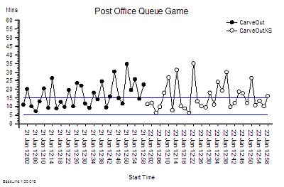
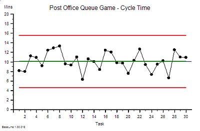 We also notice that there is variation in the cycle time from customer to customer – so we plot our individual measurements asa time-series chart. There does not seem to be an obvious pattern – it looks random – and BaseLine says that it is statistically stable. Our chart tells us that a range of 5 to 15 minutes is a reasonable expectation to set.
We also observe that there is always a queue of waiting customers somewhere – and although the queues fluctuate in size and location they are always there.
So there is always a wait for some customers. A variable wait; an unpredictable wait. And that is a concern for us because when the queues are too numerous and too long then we see customers get agitated, look at their watches, shrug their shoulders and leave – taking their custom and our income with them and no doubt telling all their friends of their poor experience. Long queues and long waits are bad for business.
And we do not want zero queues either because if there is no queue and our operatives run out of work then they become under-utilised and our system efficiency and productivity falls. That means we are incurring a cost but not generating an income. No queues and idle resources are bad for business too.
And we do not want a mixture of quick queues and slow queues because that causes complaints and conflict. A high-conflict customer complaint experience is bad for business too!
What we want is a design that creates small and stable queues; ones that are just big enough to keep our operatives busy and our customers not waiting too long.
So which is the better design and how much better is it? Five-queues or a single-queue? Carve-out or no-carve-out?
To find the answer we decide to conduct a week-long series of experiments on our system and use real data to reveal the answer. We choose the time from a customer arriving to the same customer leaving as our measure of quality and performance – and we know that the best we can expect is somewhere between 5 and 15 minutes. We know from our IS training that is called the Lead Time.
 On day #1 we arrange our Post Office with five queues – clearly roped out – one for each manned counter. We know from our mapping and measuring that customers do not arrive in a steady stream and we fear that may confound our experiment so we arrange to admit only one of our loyal and willing customers every 2 minutes. We also advise our loyal and willing customers which queue they must join before they enter to avoid the customer choice challenges. We decide which queue using a random number generator – we toss a dice until we get a number between 1 and 5. We record the time the customer enters on a slip of paper and we ask the customer to give it to the operative and we instruct our service operatives to record the time they completed their work on the same slip and keep it for us to analyse later. We run the experiment for only 1 hour so that we have a sample of 30 slips and then we collect the slips, calculate the difference between the arrival and departure times and plot them on a time-series chart in the order of arrival.
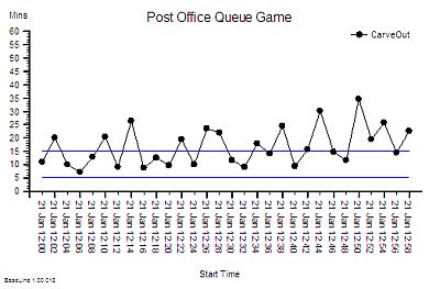 This is what we found. Given that the time at the counter is an average of 10 minutes then some of these lead times seem quite long. Some customers spend more time waiting than being served. And we sense that the performance is getting worse over time.
So for the next experiment we decide to open a sixth counter and to rope off a sixth queue. We expect that increasing capacity will reduce waiting time and we confidently expect the performance to improve.
On day #2 we run our experiment again, letting customers in one every 2 minutes as before and this time we use all the numbers on the dice to decide which queue to direct each customer to. At the end of the hour we collect the slips, calculate the lead times and plot the data – on the same chart.
It does not look much better and that is big surprise!
The wide variation from customer to customer looks about the same but with the Eye of Optimism we get a sense that the overall performance looks a bit more stable.
So we conclude that adding capacity (and cost) may make a small difference.
But then we remember that we still only served 30 customers – which means that our income stayed the same while our cost increased by 20%. That is definitely NOT good for business: it is not goiug to look good in a business case “possible marginally better quality and 20% increase in cost and therefore price!”
So on day #3 we change the layout. This time we go back to five counters but we re-arrange the ropes to create a single-queue so the customer at the front can be ‘pulled’ to the first available counter. Everything else stays the same – one customer arriving every 2 minutes, the dice, the slips of paper, everything. At the end of the hour we collect the slips, do our sums and plot our chart.
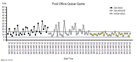 And this is what we get! The improvement is dramatic. Both the average and the variation has fallen – especially the variation. But surely this cannot be right. The improvement is too good to be true. We check our data again. Yes, our customers arrived and departed on average one every 2 minutes as before; and all our operatives did the work in an average of 10 minutes just as before. And we had the exactly the same capacity as we had on day #1. And we finished on time. It is correct. We are gobsmaked. It is like a magic wand has been waved over our process. We never would have predicted that just moving the ropes around to could have such a big impact. The Queue Theorists were correct after all!
But wait a minute! We are delivering a much better customer experience in terms of waiting time and at the same cost. So could we do even better with six counters open? What will happen if we keep the single-queue design and open the sixth desk? Before it made little difference but now we doubt our ability to guess what will happen. Our intuition seems to keep tricking us. We are losing our confidence in predicting what the impact will be. We are in counter-intuitive land! We need to run the experiment for real.
So on day #4 we keep the single-queue and we open six desks. We await the data eagerly.
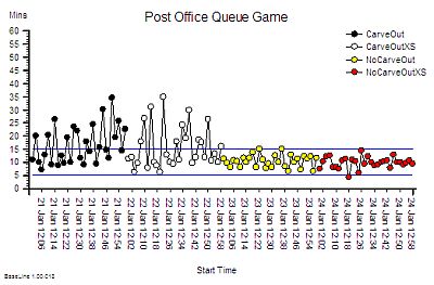 And this is what happened. Increasing the capacity by 20% has made virtually no difference – again. So we now have two pieces of evidence that say – adding extra capacity did not make a difference to waiting times. The variation looks a bit less though but it is marginal.
It was changing the Queue Design that made the difference! And that change cost nothing. Rien. Nada. Zippo!
That will look much better in our report but now we have to face the emotional discomfort of having to re-evaluate one of our deepest held assumptions.
Reality is telling us that we are delivering a better quality experience using exactly the same resources and it cost nothing to achieve. Higher quality did NOT cost more. In fact we can see that with a carve-out design when we added capacity we just increased the cost we did NOT improve quality. Wow! That is a shock. Everything we have been led to believe seems to be flawed.
Our senior managers are not going to like this message at all! We will be challening their dogma directly. And they do not like that. Oh dear!
Now we can see how much better a no-carveout single-queue pull-design can work; and now we can explain why single-queue designs are used; and now we can show others our experiment and our data and if they do not believe us they can repeat the experiment themselves. And we can see that it does not need a real Post Office – a pad of Post It® Notes, a few stopwatches and some willing helpers is all we need.
And even though we have seen it with our own eyes we still struggle to explain how the single-queue design works better. What actually happens? And we still have that niggling feeling that the performance on day #1 was unstable. We need to do some more exploring.
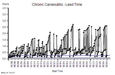
So we run the day#1 experiment again – the five queues – but this time we run it for a whole day, not just an hour.
Ah ha! Our hunch was right. It is an unstable design. Over time the variation gets bigger and bigger.
But how can that happen?
Then we remember. We told the customers that they could not choose the shortest queue or change queue after they had joined it. In effect we said “do not look at the other queues“.
And that happens all the time on our systems when we jealously hide performance data from each other! If we are seen to have a smaller queue we get given extra work by the management or told to slow down by the union rep!
So what do we do now? All we are doing is trying to improve the service and all we seem to be achieving is annoying more and more people.
What if we apply a maximum waiting time target, say of 1 hour, and allow customers to jump to the front of their queue if they are at risk if breaching the target? That will smooth out spikes and give everyone a fair chance. Customers will understand. It is intuitively obvious and common sense. But our intuition has tricked us before …
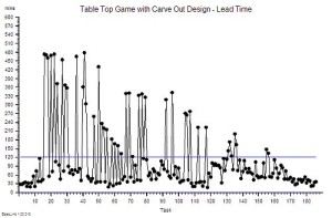
So we run the experiment again and this time we tell our customers that if they wait 50 minutes then they can jump to the front of their queue. They appreciate this because they now have a upper limit on the time they will wait.
 And this is what we observe. It looks better than before, at least initially, and then it goes pear-shaped.
All we have done with our ‘carve-out and-expedite-the-long-waiters’ design is to defer the inevitable – the crunch. We cannot keep our promise. By the end everyone is pushing to the frontof the queue. It is a riot!
And there is more. Look at the lead time for the last few customers – two hours. Not only have they waited a long time, but we have had to stay open for two hours longer. That is a BIG cost pessure in overtime payments.
So, whatever way we look at it: a single-queue design is better. And no one loses out! The customers have a short and predictable waiting time; the operatives are kept occupied and go home on time; and the executives bask in the reflected glory of the excellent customer feedback. It is a Three Wins® design.
Seeing is believing – and we now know that it is worth diagnosing and treating carveoutosis.
And the only thing left to do is to explain is how a single-queue design works better. It is not obvious is it?
 And the best way to do that is to play the Post Office Game and see what actually happens.
A big light-bulb moment awaits!
Update: My little Sylvanian friends have tried the Post Office Game and kindly sent me this video of the before Sylvanian Post Office Before and the after Sylvanian Post Office After. They say they now know how the single-queue design works better.

