
A few years ago I had a rant about the dangers of the widely promoted mantra that 85% is the optimum average measured bed-occupancy target to aim for.
But ranting is annoying, ineffective and often counter-productive.
So, let us revisit this with some calm objectivity and disprove this Myth a step at a time.
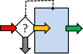 The diagram shows the system of interest (SoI) where the blue box represents the beds, the coloured arrows are the patient flows, the white diamond is a decision and the dotted arrow is information about how full the hospital is (i.e. full/not full).
A new emergency arrives (red arrow) and needs to be admitted. If the hospital is not full the patient is moved to an empty bed (orange arrow), the medical magic happens, and some time later the patient is discharged (green arrow). If there is no bed for the emergency request then we get “spillover” which is the grey arrow, i.e. the patient is diverted elsewhere (n.b. these are critically ill patients …. they cannot sit and wait).
This same diagram could represent patients trying to phone their GP practice for an appointment. The blue box is the telephone exchange and if all the lines are busy then the call is dropped (grey arrow). If there is a line free then the call is connected (orange arrow) and joins a queue (blue box) to be answered some time later (green arrow).
In 1917, a Danish mathematician/engineer called Agner Krarup Erlang was working for the Copenhagen Telephone Company and was grappling with this very problem: “How many telephone lines do we need to ensure that dropped calls are infrequent AND the switchboard operators are well utilised?“
This is the perennial quality-versus-cost conundrum. The Value-4-Money challenge. Too few lines and the quality of the service falls; too many lines and the cost of the service rises.
Q: Is there a V4M ‘sweet spot” and if so, how do we find it? Trial and error?
The good news is that Erlang solved the problem … mathematically … and the not-so good news is that his equations are very scary to a non mathematician/engineer! So this solution is not much help to anyone else.
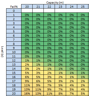
Fortunately, we have a tool for turning scary-equations into easy-2-see-pictures; our trusty Excel spreadsheet. So, here is a picture called a heat-map, and it was generated from one of Erlang’s equations using Excel.
 The Erlang equation is lurking in the background, safely out of sight. It takes two inputs and gives one output.
The first input is the Capacity, which is shown across the top, and it represents the number of beds available each day (known as the space-capacity).
The second input is the Load (or offered load to use the precise term) which is down the left side, and is the number of bed-days required per day (e.g. if we have an average of 10 referrals per day each of whom would require an average 2-day stay then we have an average of 10 x 2 = 20 bed-days of offered load per day).
The output of the Erlang model is the probability that a new arrival finds all the beds are full and the request for a bed fails (i.e. like a dropped telephone call). This average probability is displayed in the cell. The colour varies between red (100% failure) and green (0% failure), with an infinite number of shades of red-yellow-green in between.
We can now use our visual heat-map in a number of ways.
a) We can use it to predict the average likelihood of rejection given any combination of bed-capacity and average offered load.
Suppose the average offered load is 20 bed-days per day and we have 20 beds then the heat-map says that we will reject 16% of requests … on average (bottom left cell). But how can that be? Why do we reject any? We have enough beds on average! It is because of variation. Requests do not arrive in a constant stream equal to the average; there is random variation around that average. Critically ill patients do not arrive at hospital in a constant stream; so our system needs some resilience and if it does not have it then failures are inevitable and mathematically predictable.
b) We can use it to predict how many beds we need to keep the average rejection rate below an arbitrary but acceptable threshold (i.e. the quality specification).
Suppose the average offered load is 20 bed-days per day, and we want to have a bed available more than 95% of the time (less than 5% failures) then we will need at least 25 beds (bottom right cell).
c) We can use it to estimate the maximum average offered load for a given bed-capacity and required minimum service quality.
Suppose we have 22 beds and we want a quality of >=95% (failure <5%) then we would need to keep the average offered load below 17 bed-days per day (i.e. by modifying the demand and the length of stay because average load = average demand * average length of stay).
There is a further complication we need to be mindful of though … the measured utilisation of the beds is related to the successful admissions (orange arrow in the first diagram) not to the demand (red arrow). We can illustrate this with a complementary heat map generated in Excel.
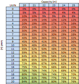 For scenario (a) above we have an offered load of 20 bed-days per day, and we have 20 beds but we will reject 16% of requests so the accepted bed load is only 16.8 bed days per day (i.e. (100%-16%) * 20) which is the reason that the average utilisation is only 16.8/20 = 84% (bottom left cell).
For scenario (b) we have an offered load of 20 bed-days per day, and 25 beds and will only reject 5% of requests but the average measured utilisation is not 95%, it is only 76% because we have more beds (the accepted bed load is 95% * 20 = 19 bed-days per day and 19/25 = 76%).
For scenario (c) the average measured utilisation would be about 74%.
So, now we see the problem more clearly … if we blindly aim for an average, measured, bed-utilisation of 85% with the untested belief that it is always the optimum … this heat-map says it is impossible to achieve and at the same time offer an acceptable quality (>95%).
We are trading safety for money and that is not an acceptable solution in a health care system.
So where did this “magic” value of 85% come from?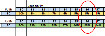
From the same heat-map perhaps?
If we search for the combination of >95% success (<5% fail) and 85% average bed-utilisation then we find it at the point where the offered load reaches 50 bed-days per day and we have a bed-capacity of 56 beds.
And if we search for the combination of >99% success (<1% fail) and 85% average utilisation then we find it with an average offered load of just over 100 bed-days per day and a bed-capacity around 130 beds.
H’mm. “Houston, we have a problem“.
So, even in this simplified scenario the hypothesis that an 85% average bed-occupancy is a global optimum is disproved.
The reality is that the average bed-occupancy associated with delivering the required quality for a given offered load with a specific number of beds is almost never 85%. It can range anywhere between 50% and 100%. Erlang knew that in 1917.
So, if a one-size-fits-all optimum measured average bed-occupancy assumption is not valid then how might we work out how many beds we need and predict what the expected average occupancy will be?
We would design the fit-4-purpose solution for each specific context …
… and to do that we need to learn the skills of complex adaptive system design …
… and that is part of the health care systems engineering (HCSE) skill-set.