Making it a habit – Steve Peak

It’s another sunny day and the laptop continues to perform well in the garden!

Yippee! I have completed my Foundations in Improvement Science for Healthcare (FISH©) course. The final stages of the course have taken me through visual presentation of system data, some worked examples (very useful) and of course the final assessment.  The key elements of the course came back to me easily for the assessment test which I always think is an indication of both enjoyment and how well the material has been presented.

My mentor says I have done more than enough to progress to the next stage of my improvement science journey.  Practitioner level now awaits. It is when it really gets serious and you take the learning so far and start applying it in very practical ways.  My goal is to become ‘safe’ in the use of the tools and techniques, which will give me the confidence to help others learn these fantastic skills.  All very satisfying indeed.

The other day I was at Keele University doing a session on change management to a group of specialist registrars.  We were exploring the key steps to follow if you are going to improve your approach to change management.  It struck me at the time that we need to make our approaches to potentially complex scenarios habit forming.  In other words lots and lots of research on change management has been conducted, so lets use it rather than stumbling through.  Similarly improvement science gives you a set of disciplines and tools to support and deliver changes in the design of our healthcare systems.  What we have to do is get to the point where it is a widespread habit to approach our healthcare systems and processes using this knowledge.  I am absolutely convinced patients will feel the difference and the ‘ground hog day’ operational struggles can be approached with renewed vigour and produce differing outcomes. i.e. improved quality, motivation and productivity.

So bring on the next stage of my journey as a mentor to other FISH participants, learning to be a practitioner and being able to apply this knowledge habitually.

The sun is still out!

The Learning Labyrinth

labyrinth

The mind is a labyrinth of knowledge – a maze with many twists, turns, joins, splits, tunnels, bridges, crevasses and caverns.

Some paths lead to dead ends; others take a long way around but get to the destination in the end.

The shortest path is not obvious – even in hindsight.

And there is another challenge … no two individuals share the same knowledge labyrinth.  An obvious path between problem and solution for one person may be  invisible or incomprehensible to another.

But the greatest challenge, and the greatest opportunity, is that our labyrinth of knowledge can change and does change continuously … through learning.

So if one person can see a path of improvement between current problem and future solution, then how can they guide another who cannot?

This is a challenge that an Improvement Scientist faces every day.

It is not effective to just give a list of instructions – “To get from problem to solution follow this path“.  The path may not exist in the recipients knowledge labyrinth. If they just follow the instructions they will come up against a wall or fall into a hole.

It is not realistic to expect the learner to replace their labyrinth of knowledge with that of the teacher – to clone the teachers way of thinking. Just reciting the Words of the Guru is not improvement – is Zealotry.

One way is for a guide to describe their own labyrinth of knowledge.  To lay it out in a way that any other can explore.  A way that is fully signposted, with explanations and maps that that the explorer can refer to as  they go.  A template against which they can compare their own knowledge labyrinth to reveal the similarities and the differences.

No two people will explore a knowledge labyrinth in the same way … but that does not matter. So long as they are able to uncover and assumptions that misguide them and any gaps in their knowledge block their progress.  With that feedback they can update their own mental signposts and create safe, effective and efficient paths that they can follow in future at will.

And that  is how the online FISH training is designed.  It is the knowledge labyrinth of an experienced Improvement Scientist that can be explored online.

And it keeps changing  …

The Grape Vine

growing_blue_vine_scrolling_down_150_wht_247Improvement Science is a collaborative community activity.

And word about what is possible spreads through The Grape Vine.

And it spreads in a particular way – through stories – personal accounts of “ah ha” moments.

Those “ah ha” moments are generated by a process – a process designed to generate them.

And that process is called the Nerve Curve.  It is rather like an emotional roller-coaster ride.

The Nerve Curve starts comfortably enough with a few gentle ups, downs, twists and turns – just to settle everyone in their seats.

Then it picks up pace and you have to hold on a bit tighter.

Then comes the Challenge – an interactive group-led improvement activity.  Something like the “Save the NHS Game“.

Then comes the Shock!  When the “intuitively obvious” and “collectively agreed” decisions and actions make the problem worse rather than better. The shock is magnified by learning that there is a solution – and that it was hidden from us. We did not know what we did not know. We were blissfully ignorant.

Now we are not. We are painfully aware of what we did not know.

Impossibility_HypothesisThen we head for Denial like a scared rabbit – but the cars are moving fast now and the is no stopping or going back.  We cannot get off – we cannot go back – so we cover our eyes and ears to block out the New Reality.

It does not work very well.  We quickly realize that it is safer to be able to see where we are heading so we can prepare for what is coming.  An emotional brick wall looms up in front of us – and written on it are the words “Impossibility Hypothesis”.  And we are heading right at it. A new emotion bubbles to the surface.

Anger.

Who’s ****** idea was it to get on this infernal contraption?  Why weren’t we warned?  Who is in charge? Who is to blame?

That does not work very well either. So we try a different strategy.

Bargaining.

We desperately want to limit the damage to comfort zone and confidence so we try negotiating a compromise, finding an exit option, and looking for the emergency stop cord.  There isn’t one. Reality is relentless and ruthless. Uncompromising.

Now we are really scared and with no viable options for staying where we were and no credible options for avoiding a catastrophe we are emotionally stuck – and we start to sink into Depression which is the path to Hopelessness, Apathy and Despair (HAD). We have run out of options. And we cannot stay in the past.

But the seed of innovation has been sown.  A hidden problem has been uncovered and an unknown option has been demonstrated. The “Way Over The Impossible-for-Me barrier” is clearly signposted. The light at the end of the tunnel has been switched on. We have a choice.

And at the last second we sweep over the Can’t Do Barrier and when we look back it has disappeared – it was a mirage – a perceptual trick our Intuition was playing on us. It only existed in our minds.

That is the “Ah ha”.

And now we can see a way forward – and how with support, guidance, encouragement and effort we can climb up Acceptance Mountain to Resolution Peak. It is will not be quick.  It will not be comfortable.  We have some unlearning to do. A few old assumptions and habits that need to be challenged, dismantled and re-designed.

It is hard work but it is surprisingly invigorating as a previously unrecognized inner well of hope, enthusiasm and confidence is tapped. We surprise ourselves with what we can do already.  We realize that the only thing that was actually blocking us before was our belief it was too difficult. And the lack of a guide.

And then we share our “ah ha” with others through The Grape Vine.

Here is a shared “ah ha” from this week:

The Post It® Note exercise was my biggest “Aha” moment on a combination of levels. The aspect that particularly resonated was the range of behaviours and responses from the different pairings, an aspect that would have been hidden had I done the exercise on my own. I’m still smiling at the simple elegance of this particular exercise and the depth of learning I am getting from it. [PD, Consultant Paediatrician. 15th July 2013].

The Post It® Note exercise is part of the FISH course … you can try it yourself here

This blog is part of The Grape Vine.

The Nerve Curve is ready and waiting to take you on an exciting ride through Improvement Science!

The Art of Juggling

figure_juggling_balls_150_wht_4301Improvement Science is like three-ball juggling.

And there are different sets of three things that an Improvementologist needs to juggle:

the Quality-Flow-Cost set and
the Governance-Operations-Finance set and
the Customer-Staff-Organization set.

But the problem with juggling is that it looks very difficult to do – so almost impossible to learn – so we do not try.  We give up before we start. And if we are foolhardy enough to try (by teaching ourselves using the suck-it-and-see or trial-and-error method) then we drop all the balls very quickly. We succeed in reinforcing our impossible-for-me belief with evidence.  It is a self-fulfilling prophesy. Only the most tenacious, self-motivated and confident people succeed – which further reinforces the I-Can’t-Do belief of everyone else.

The problem here is that we are making an Error of Omission.

We are omitting to ask ourselves two basic questions “How does a juggler learn their art?” and “How long does it take?

The answer is surprising.

It is possible for just about anyone to learn to juggle in about 10 minutes. Yes – TEN MINUTES.


Skeptical?  Sure you are – if it was that easy we would all be jugglers.  That is the “I Can’t Do” belief talking. Let us silence that confidence-sapping voice once and for all.

Here is how …

You do need to have at least one working arm and one working eyeball and something connecting them … and it is a bit easier with two working arms and two working eyeballs and something connecting them.

And you need something to juggle – fruit is quite good – oranges and apples are about the right size, shape, weight and consistency (and you can eat the evidence later too).

And you need something else.

You need someone to teach you.

And that someone must be able to juggle and more importantly they must be able to teach someone else how to juggle which is a completely different skill.

juggling_at_Keele_June_2013Those are the necessary-and-sufficient requirements to learn to juggle in 10 minutes.

The recent picture shows an apprentice Improvement Scientist at the “two orange” stage – just about ready to move to the “three orange” stage.

Exactly the same is true of learning the Improvement Science juggling trick.

The ability to improve Quality, Flow and Cost at the same time.

The ability to align Governance, Operations and Finance into a win-win-win synergistic system.

The ability to delight customers, motivate staff and support leaders at the same time.


And the trick to learning to juggle is called step-by-step unlearning. It is counter-intuitive.

To learn to juggle you just “unlearn” what is stopping you from juggling. You unlearn the unconscious assumptions and habits that are getting in the way.

And that is why you need a teacher who knows what needs to be unlearned and how to help you do it.

fish
And for an apprentice Improvement Scientist the first step on the Unlearning Journey is FISH.

The Chimp in me – Steve Peak

It’s a sunny day and I realize that my laptop screen is viewable whilst sitting in the garden!

I am now three quarters the way through my Foundations in Improvement Science for Healthcare (FISH©) course.  It has been a revelation to say the least.  The last time I blogged on my progress I remarked that memories of operational struggles whilst working within my various senior leadership roles have become clearer as to why we had some success and plenty of failure in terms of sustainable difference around the three key wins.  These are improved quality, productivity and motivation.  This feeling has most definitely continued!

The course so far has taken me through the general concepts using the Three Wins Design®, plenty of the people stuff that is fundamental to success and on the last few ‘study’ occasions the more technical stuff of what it takes to understand how a system is functioning. In other words how to build up a picture of the root causes for the outcomes from the system, how to analyse the data and present the data so that it is information and finally how potential design changes can be tested to reveal how the root causes can be reduced to achieve a balancing act around the three wins.  So I am becoming more confident in the use of value stream maps that set out how work is done and how resources are used and presentation on a process template.  What this does is to remove rhetoric; intuition and frankly some guess work that is all too common when tackling operational challenges.  The notion of cycle times that can help to explain why outpatient clinics, day case units etc can be a less than positive experience for patients by simply setting out the process on a Gantt chart is wonderful to see as it changes perceived complexity into a simple picture.

I am feeling more motivated than ever to complete the course as the power to resolve challenges becomes more and more obvious.  This is despite the fact I am being tested to grasp the concepts of schedules, standard work, hand offs, Pareto analysis, the 80:20 heuristic and how to present demand, workloads and resources in a consistent manner.  This is not easy for somebody who does not naturally occupy this type of space!

So why the Chimp in me?  Whilst completing the course I am reading an interesting book called the Chimp Paradox by Dr Steve Peters.  He sets out his thoughts on how the brain functions and how to manage your chimp.  Your chimp is the emotional part of the brain that will tell your human or logical part you can’t do something or ask why would you want to learn something new that could make you look daft.   Well my chimp is feeling settled and untroubled at the moment because of the combination of the achievement and the huge potential I see in using improvement science.  All this adds up to, I want to learn some more of this stuff.  Oh and the sun is still shining!

Steve Peak

Step 5 – Monitor

Improvement-by-Design is not the same as Improvement-by-Desire.

Improvement-by-Design has a clear destination and a design that we know can get us there because we have tested it before we implement it.

Improvement-by-Desire has a vague direction and no design – we do not know if the path we choose will take us in the direction we desire to go. We cannot see the twists and turns, the unknown decisions, the forks, the loops, and the dead-ends. We expect to discover those along the way. It is an exercise in hope.

So where pessimists and skeptics dominate the debate then Improvement-by-Design is a safer strategy.

Just over seven weeks ago I started an Improvement-by-Design project – a personal one. The destination was clear: to get my BMI (body mass index) into a “healthy” range by reducing weight by about 5 kg.  The design was clear too – to reduce energy input rather than increase energy output. It is a tried-and-tested method – “avoid burning the toast”.  The physical and physiological model predicted that the goal was achievable in 6 to 8 weeks.

So what has happened?

To answer that question requires two time-series charts. The input chart of calories ingested and the output chart of weight. This is Step 5 of the 6M Design® sequence.

Energy_Weight_Model
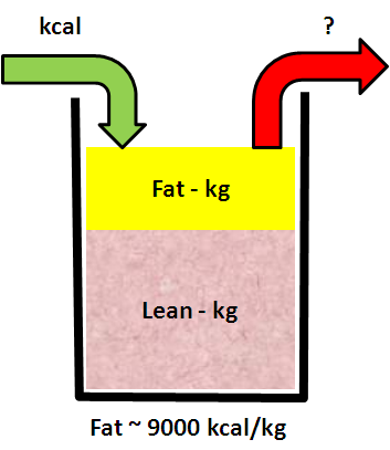
Remember that there was another parameter  in this personal Energy-Weight system: the daily energy expended.

But that is very difficult to measure accurately – so I could not do that.

What I could do was to estimate the actual energy expended from the model of the system using the measured effect of the change. But that is straying into the Department of Improvement Science Nerds. Let us stay in the real world a  bit longer.

Here is the energy input chart …

SRD_EnergyIn_XmR

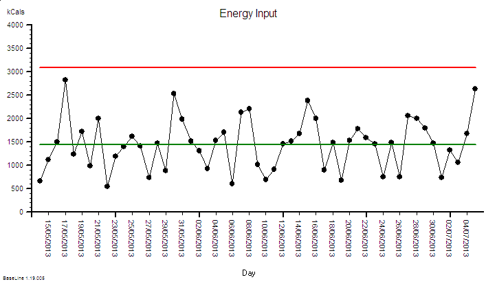
It shows an average calorie intake of 1500 kcal – the estimated required value to achieve the weight loss given the assumptions of the physiological model. It also shows a wide day-to-day variation.  It does not show any signal flags (red dots) so an inexperienced Improvementologist might conclude that this just random noise.

It is not.  The data is not homogeneous. There is a signal in the system – a deliberate design change – and without that context it is impossible to correctly interpret the chart.

Remember Rule #1: Data without context is meaningless.

The deliberate process design change was to reduce calorie intake for just two days per week by omitting unnecessary Hi-Cal treats – like those nice-but-naughty Chocolate Hobnobs. But which two days varied – so there is no obvious repeating pattern in the chart. And the intake on all days varied – there were a few meals out and some BBQ action.

To separate out these two parts of the voice-of-the-process we need to rationally group the data into the Lo-cal days (F) and the OK-cal days (N).

SRD_EnergyIn_Grouped_XmR

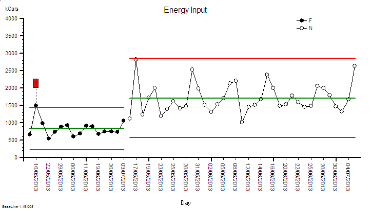
The grouped BaseLine© chart tells a different story.  The two groups clearly have a different average and both have a lower variation-over-time than the meaningless mixed-up chart.

And we can now see a flag – on the second F day. That is a prompt for an “investigation” which revealed: will-power failure.  Thursday evening beer and peanuts! The counter measure was to avoid Lo-cal on a Thursday!

What we are seeing here is the fifth step of 6M Design® exercise  – the Monitor step.

And as well as monitoring the factor we are changing – the cause;  we also monitor the factor we want to influence – the effect.

The effect here is weight. And our design includes a way of monitoring that – the daily weighing.

SRD_WeightOut_XmR
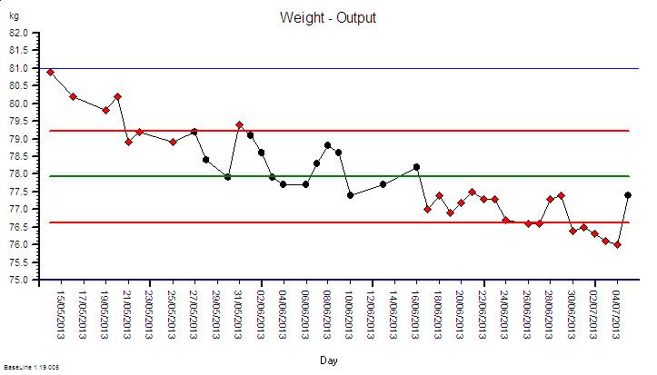
The output metric BaseLine© chart – weight – shows a very different pattern. It is described as “unstable” because there are clusters of flags (red dots) – some at the start and some at the end. The direction of the instability is “falling” – which is the intended outcome.

So we have robust, statistically valid evidence that our modified design is working.

The weight is falling so the energy going in must be less than the energy being put out. I am burning off the excess lard and without doing any extra exercise.  The physics of the system mandate that this is the only explanation. And that was my design specification.

So that is good. Our design is working – but is it working as we designed?  Does observation match prediction? This is Improvement-by-Design.

Remember that we had to estimate the other parameter to our model – the average daily energy output – and we guessed a value of 2400 kcal per day using generic published data.  Now I can refine the model using my specific measured change in weight – and I can work backwards to calculate the third parameter.  And when I did that the number came out at 2300 kcal per day.  Not a huge difference – the equivalent of one yummy Chocolate Hobnob a day – but the effect is cumulative.  Over the 53 days of the 6M Design® project so far that would be a 5300 kcal difference – about 0.6kg of useless blubber.

So now I have refined my personal energy-weight model using the new data and I can update my prediction and create a new chart – a Deviation from Aim chart.

SRD_WeightOut_DFA
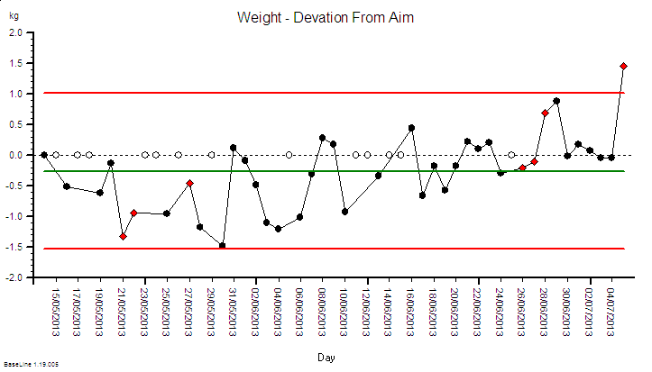
This is the  chart I need to watch to see  if I am on the predicted track – and it too is unstable -and not a good direction.  It shows that the deviation-from-aim is increasing over time and this is because my original guesstimate of an unmeasurable model parameter was too high.

This means that my current design will not get me to where I want to be, when I what to be there. This tells me  I need to tweak my design.  And I have a list of options.

1) I could adjust the target average calories per day down from 1500 to 1400 and cut out a few more calories; or

2) I could just keep doing what I am doing and accept that it will take me longer to get to the destination; or

3) I could do a bit of extra exercise to burn the extra 100 kcals a day off, or

4) I could do a bit of any or all three.

And because I am comparing experience with expectation using a DFA chart I will know very quickly if the design tweak is delivering.

And because some nice weather has finally arrived so the BBQ will be busy I have chosen to take longer to get there. I will enjoy the weather, have a few beers and some burgers. And that is OK. It is a perfectly reasonable design option – it is a rational and justifiable choice.

And I need to set my next destination – a weight if about 72 kg according to the BMI chart – and with my calibrated Energy-Weight model I will know exactly how to achieve that weight and how long it will take me. And I also know how to maintain it – by  increasing my calorie intake. More beer and peanuts – maybe – or the occasional Chocolate Hobnob even. Hurrah! Win-win-win!


6MDesign This real-life example illustrates 6M Design® in action and demonstrates that it is a generic framework.

The energy-weight model in this case is a very simple one that can be worked out on the back of a beer mat (which is what I did).

It is called a linear model because the relationship between calories-in and weight-out is approximately a straight line.

Most real-world systems are not like this. Inputs are not linearly related to outputs.  They are called non-linear systems: and that makes a BIG difference.

A very common error is to impose a “linear model” on a “non-linear system” and it is a recipe for disappointment and disaster.  We do that when we commit the Flaw of Averages error. We do it when we plot linear regression lines through time-series data. We do it when we extrapolate beyond the limits of our evidence.  We do it when we equate time with money.

The danger of this error is that our linear model leads us to make unwise decisions and we actually make the problem worse – not better.  We then give up in frustration and label the problem as “impossible” or “wicked” or get sucked into to various forms of Snake Oil Sorcery.

The safer approach is to assume the system is non-linear and just let the voice of the system talk to us through our BaseLine© charts. The challenge for us is to learn to understand what the system is saying.

That is why the time-series charts are called System Behaviour Charts and that is why they are an essential component of Improvement-by-Design.

However – there is a step that must happen before this – and that is to get the Foundations in place. The foundation of knowledge on which we can build our new learning. That gap must be filled first.

And anyone who wants to invest in learning the foundations of improvement science can now do so at their own convenience and at their own pace because it is on-line …. and it is here.

fish