
A few weeks ago I raised the undiscussable issue that the NHS feels like it is on a downward trajectory … and that what might be needed are some better engines … and to design, test, build and install them we will need some health care system engineers (HCSEs) … and that we do not have appear to have enough of those. None in fact.
The feedback shows that many people resonated with this sentiment.
This week I had the opportunity to peek inside the NHS Cockpit and look at the Dashboard … and this is what I saw on the A&E Performance panel.
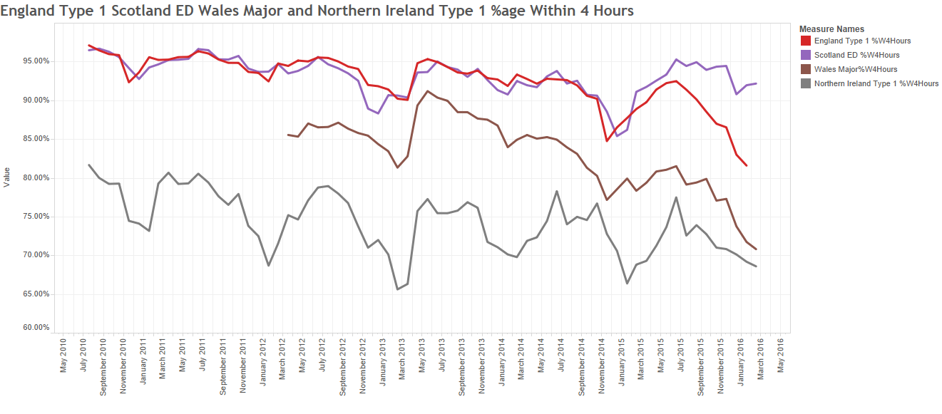
This is the monthly aggregate A&E 4-hour performance for England (red), Scotland (purple), Wales (brown) and Northern Ireland (grey) for the last six years.
The trajectory looked alarmingly obvious to me – the NHS is on a predictable path to destruction – a controlled flight into terrain (CFIT).
The repeating up-and-down pattern is the annual cycle of seasons; better in the summer and worse in the winter. This signal is driven by the celestial clock … the movement of the planets … which is beyond our power to influence.
The downward trajectory is the cumulative effect of our current design … which is the emergent effect of our collective beliefs, behaviours, policies and politics … which are completely within our gift to change.
If we chose to and if we knew how to – which we do not appear to.
Our collective ineptitude is not a topic for discussion. It is a taboo subject.
And I know that because if it were for discussion then this dashboard would be on public view on a website hosted by the NHS.
It isn’t.
 It was created by George Donald, a member of the public, a disappointed patient, and a retired IT consultant. And it was shared, free for all to see and use via Twitter (@GMDonald).
The information source is open, public, shared NHS data, but it takes a lot of work to winkle it out and present it like this. So well done George … keep up the great work!
Now have a closer look at the Dashboard Display … look at the most recent data for England and Scotland. What do you see?
Does it look like Scotland is pulling out of the dive and England is heading down even faster?
Hard to say for sure; there are lots of signals and noise all mixed up.
So we need to use some Systems Engineering tools to help us separate the signals from the noise; and for this a statistical process control (SPC) chart is useless. We need a system behaviour chart (SBC) and its handy helper the deviation from aim (DFA) chart.
I will not bore you with the technical details but, suffice it to say, it is a tried-and-tested technique called the Method of Residuals.
 Exhibit #1 is the DFA chart for Scotland. The middle 4 years (2011-2014) are used to create a ‘predictive model’; the model projection is then compared with measured performance; and the difference is plotted as the DFA chart.
What this “says” is that the 2015/16 performance in Scotland is significantly better than projected, and the change of direction seemed to start in the first half of 2015.
This evidence seems to support the results of our Mark I Eyeball test.
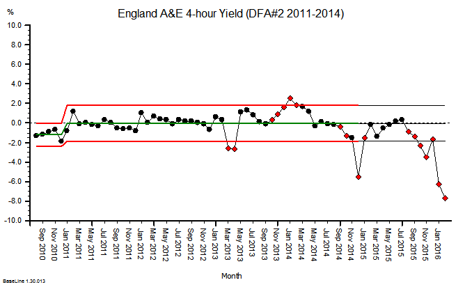
Exhibit #2 – the DFA for England suggests the 2015/16 performance is significantly worse than projected, and this deterioration appears to have started later in 2015.
Oh dear! I do not believe that was the intention, but it appears to be the impact.
So what are England and Scotland doing differently?
What can we all learn from this?
What can we all do differently in the future?
Isn’t that a question that more people like you, me and George could reasonably ask of those whom we entrust to design, build and fly our NHS?
Isn’t that a reasonable question that could be asked by the 65 million people in the UK who might, at any time, be unlucky enough to require a trip to their local A&E department.
So, let us all grasp the nettle and get the Elephant in the Room into plain view and say in unison “The Emperor Has No Clothes!”
We are suffering from mass ineptitude and hubris, to use Dr Atul Gawande’s language, and we need a better collective strategy.
And there is hope.
Some innovative hospitals have had the courage to grasp the nettle. They have seen what is coming; they have fully accepted the responsibility for their own fate; they have stepped up to the challenge; they have looked-listened-and-learned from others, and they are proving what is possible.
They have a name. They are called positive deviants.
Have a look at this short video … it is jaw-dropping … it is humbling … it is inspiring … and it is challenging … because it shows what has been achieved already.
It shows what is possible. Now, and here in the UK.