Bloodsucking Bugs

BloodSuckerThis is a magnified picture of a blood sucking bug called a Red Poultry Mite.

They go red after having gorged themselves on chicken blood.

Their life-cycle is only 7 days so, when conditions are just right, they can quickly cause an infestation – and one that is remarkably difficult to eradicate!  But if it is not dealt with then chicken coop productivity will plummet.


We use the term “bug” for something else … a design error … in a computer program for example.  If the conditions are just right, then software bugs can spread too and can infest a computer system.  They feed on the hardware resources – slurping up processor time and memory space until the whole system slows to a crawl.


And one especially pernicious type of system design error is called an Error of Omission.  These are the things we do not do that would prevent the bloodsucking bugs from breeding and spreading.

Prevention is better than cure.


In the world of health care improvement there are some blood suckers out there, ones who home in on a susceptible host looking for a safe place to establish a colony.  They are masters of the art of mimicry.  They look like and sound like something they are not … they claim to be symbiotic whereas in reality they are parasitic.

The clue to their true nature is that their impact does not match their intent … but by the time that gap is apparent they are entrenched and their spores have already spread.

Unlike the Red Poultry Mites, we do not want to eradicate them … we need to educate them. They only behave like parasites because they are missing a few essential bits of software.  And once those upgrades are installed they can achieve their potential and become symbiotic.

So, let me introduce them, they are called Len, Siggy and Tock and here is their story:

Six Ways Not To Improve Flow

Crash Test Dummy

CrashTestDummyThere are two complementary approaches to safety and quality improvement: desire and design.

In the improvement-by-desire world we use a suck-it-and-see approach to fix a problem.  It is called PDSA.

Sometimes this works and we pat ourselves on the back, and remember the learning for future use.

Sometimes it works for us but has a side effect: it creates a problem for someone else.  And we may not be aware of the unintended consequence unless someone shouts “Oi!” It may be too late by then of course.


The more parts in a system, and the more interconnected they are, the more likely it is that a well-intended suck-it-and-see change will create an unintended negative impact.

And in that situation our temptation is to … do nothing … and put up with the problems. It seems the safest option.


In the improvement-by-design world we choose to study first, and to find the causal roots of the system behaviour we are seeing.  Our first objective is a diagnosis.

With that we can propose rational design changes that we anticipate will deliver the improvement we seek without creating adverse effects.

But we have learned the hard way that our intuition can trick us … so we need a way to test our designs … a safe and controlled way.  We need a crash test dummy!


What they do is to deliberately experience our design in a controlled experiment, and what they generate for us is constructive feedback. What did work, and what did not.

A crash test dummy is tough and sensitive at the same time.  They do not break easily and yet they feel the pain and gain too.  They are resilient.


And with their feedback we can re-visit our design and improve it further, or we can use it to offer evidence-based assurance that our design is fit-for-purpose.

Safety and Quality Assurance is improvement-by-design. Diagnosis-and-treatment.

Safety and Quality Control is improvement-by-desire. Suck-and-see.

If you were a passenger or a patient … which option would you prefer?

Fragmentation Cost

figure_falling_with_arrow_17621The late Russell Ackoff used to tell a great story. It goes like this:

“A team set themselves the stretch goal of building the World’s Best Car.  So the put their heads together and came up with a plan.

First they talked to drivers and drew up a list of all the things that the World’s Best Car would need to have. Safety, speed, low fuel consumption, comfort, good looks, low emissions and so on.

Then they drew up a list of all the components that go into building a car. The engine, the wheels, the bodywork, the seats, and so on.

Then they set out on a quest … to search the world for the best components … and to bring the best one of each back.

Then they could build the World’s Best Car.

Or could they?

No.  All they built was a pile of incompatible parts. The WBC did not work. It was a futile exercise.


Then the penny dropped. The features in their wish-list were not associated with any of the separate parts. Their desired performance emerged from the way the parts worked together. The working relationships between the parts were as necessary as the parts themselves.

And a pile of average parts that work together will deliver a better performance than a pile of best parts that do not.

So the relationships were more important than the parts!


From this they learned that the quickest, easiest and cheapest way to degrade performance is to make working-well-together a bit more difficult.  Irrespective of the quality of the parts.


Q: So how do we reverse this degradation of performance?

A: Add more failure-avoidance targets of course!

But we just discovered that the performance is the effect of how the parts work well together?  Will another failure-metric-fueled performance target help? How will each part know what it needs to do differently – if anything?  How will each part know if the changes they have made are having the intended impact?

Fragmentation has a cost.  Fear, frustration, futility and ultimately financial failure.

So if performance is fading … the quality of the working relationships is a good place to look for opportunities for improvement.

The Fog

businessman_cloud_periscope_18347The path from chaos to calm is not clearly marked.  If it were we would not have chaotic health care processes, anxious patients, frustrated staff and escalating costs.

Many believe that there is no way out of the chaos. They have given up trying.

Some still nurture the hope that there is a way and are looking for a path through the fog of confusion.

A few know that there is a way out because they have been shown a path from chaos to calm and can show others how to find it.

Someone, a long time ago, explored the fog and discovered clarity of understanding on the far side, and returned with a Map of the Mind-field.


Q: What is causing The Fog?

When hot rhetoric meets cold reality the fog of disillusionment forms.

Q: Where does the hot rhetoric come from?

Passionate, well-intended and ill-informed people in positions of influence, authority and power. The orators, debaters and commentators.

They do not appear to have an ability to diagnose and to design, so cannot generate effective decisions and coordinate efficient delivery of solutions.

They have not learned how and seem to be unaware of it.

If they had, then they would be able to show that there is a path from chaos to calm.

A safe, quick, surprisingly enjoyable and productive path.

If they had the know-how then they could pull from the front in the ‘right’ direction, rather than push from the back in the ‘wrong’ one.


And the people who are spreading this good news are those who have just emerged from the path.  Their own fog of confusion evaporating as they discovered the clarity of hindsight for themselves.

Ah ha!  Now I see! Wow!  The view from the far side of The Fog is amazing and exciting. The opportunity and potential is … unlimited.  I must share the news. I must tell everyone! I must show them how-to.

Here is a story from Chris Jones who has recently emerged from The Fog.

And here is a description of part of the Mind-field Map, narrated in 2008 by Kate Silvester, a doctor and manufacturing systems engineer.

Early Warning System

radar_screen_anim_300_clr_11649The most useful tool that a busy operational manager can have is a reliable and responsive early warning system (EWS).

One that alerts when something is changing and that, if missed or ignored, will cause a big headache in the future.

Rather like the radar system on an aircraft that beeps if something else is approaching … like another aircraft or the ground!


Operational managers are responsible for delivering stuff on time.  So they need a radar that tells them if they are going to deliver-on-time … or not.

And their on-time-delivery EWS needs to alert them soon enough that they have time to diagnose the ‘threat’, design effective plans to avoid it, decide which plan to use, and deliver it.

So what might an effective EWS for a busy operational manager look like?

  1. It needs to be reliable. No missed threats or false alarms.
  2. It needs to be visible. No tomes of text and tables of numbers.
  3. It needs to be simple. Easy to learn and quick to use.

And what is on offer at the moment?

The RAG Chart
This is a table that is coloured red, amber and green. Red means ‘failing’, green means ‘not failing’ and amber means ‘not sure’.  So this meets the specification of visible and simple, but it is reliable?

It appears not.  RAG charts do not appear to have helped to solve the problem.

A RAG chart is generated using historic data … so it tells us where we are now, not how we got here, where we are going or what else is heading our way.  It is a snapshot. One frame from the movie.  Better than complete blindness perhaps, but not much.

The SPC Chart
This is a statistical process control chart and is a more complicated beast.  It is a chart of how some measure of performance has changed over time in the past.  So like the RAG chart it is generated using historic data.  The advantage is that it is not just a snapshot of where were are now, it is a picture of story of how we got to where we are, so it offers the promise of pointing to where we may be heading.  It meets the specification of visible, and while more complicated than a RAG chart, it is relatively easy to learn and quick to use.

Luton_A&E_4Hr_Yield
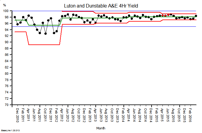
Here is an example. It is the SPC  chart of the monthly A&E 4-hour target yield performance of an acute NHS Trust.  The blue lines are the ‘required’ range (95% to 100%), the green line is the average and the red lines are a measure of variation over time.  What this charts says is: “This hospital’s A&E 4-hour target yield performance is currently acceptable, has been so since April 2012, and is improving over time.”

So that is much more helpful than a RAG chart (which in this case would have been green every month because the average was above the minimum acceptable level).


So why haven’t SPC charts replaced RAG charts in every NHS Trust Board Report?

Could there be a fly-in-the-ointment?

The answer is “Yes” … there is.

SPC charts are a quality audit tool.  They were designed nearly 100 years ago for monitoring the output quality of a process that is already delivering to specification (like the one above).  They are designed to alert the operator to early signals of deterioration, called ‘assignable cause signals’, and they prompt the operator to pay closer attention and to investigate plausible causes.

SPC charts are not designed for predicting if there is a flow problem looming over the horizon.  They are not designed for flow metrics that exhibit expected cyclical patterns.  They are not designed for monitoring metrics that have very skewed distributions (such as length of stay).  They are not designed for metrics where small shifts generate big cumulative effects.  They are not designed for metrics that change more slowly than the frequency of measurement.

And these are exactly the sorts of metrics that a busy operational manager needs to monitor, in reality, and in real-time.

Demand and activity both show strong cyclical patterns.

Lead-times (e.g. length of stay) are often very skewed by variation in case-mix and task-priority.

Waiting lists are like bank accounts … they show the cumulative sum of the difference between inflow and outflow.  That simple fact invalidates the use of the SPC chart.

Small shifts in demand, activity, income and expenditure can lead to big cumulative effects.

So if we abandon our RAG charts and we replace them with SPC charts … then we climb out of the RAG frying pan and fall into the SPC fire.

Oops!  No wonder the operational managers and financial controllers have not embraced SPC.


So is there an alternative that works better?  A more reliable EWS that busy operational managers and financial controllers can use?

Yes, there is, and here is a clue …

… but tread carefully …

… building one of these Flow-Productivity Early Warning Systems is not as obvious as it might first appear.  There are counter-intuitive traps for the unwary and the untrained.

You may need the assistance of a health care systems engineer (HCSE).