 <Ring Ring><Ring Ring>
Hello, you are through to the Improvement Science Helpline. How can we help?
This is Leslie, one of your apprentices. Could I speak to Bob – my Improvement Science coach?
Yes, Bob is free. I will connect you now.
<Ring Ring><Ring Ring>
B: Hello Leslie, Bob here. What is on your mind?
L: Hi Bob, I have a problem that I do not feel my Foundation training has equipped me to solve. Can I talk it through with you?
B: Of course. Can you outline the context for me?
L: OK. The context is a department that is delivering an acceptable quality-of-service and is delivering on-time but is failing financially. As you know we are all being forced to adopt austerity measures and I am concerned that if their budget is cut then they will fail on delivery and may start cutting corners and then fail on quality too. We need a win-win-win outcome and I do not know where to start with this one.
B: OK – are you using the 6M Design method?
L: Yes – of course!
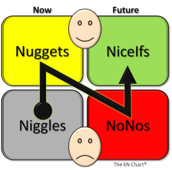
B: OK – have you done The 4N Chart for the customer of their service?
L: Yes – it was their customers who asked me if I could help and that is what I used to get the context.
B: OK – have you done The 4N Chart for the department?
L: Yes. And that is where my major concerns come from. They feel under extreme pressure; they feel they are working flat out just to maintain the current level of quality and on-time delivery; they feel undervalued and frustrated that their requests for more resources are refused; they feel demoralized; demotivated and scared that their service may be ‘outsourced’. On the positive side they feel that they work well as a team and are willing to learn. I do not know what to do next.
B: OK. Dispair not. This sounds like a very common and treatable system illness. It is a stream design problem which may be the reason your Foundations training feels insufficient. Would you like to see how a Practitioner would approach this?
L: Yes please!
B: OK. Have you mapped their internal process?
L: Yes. It is a six-step process for each job. Each step has different requirements and are done by different people with different skills. In the past they had a problem with poor service quality so extra safety and quality checks were imposed by the Governance department. Now the quality of each step is measured on a 1-6 scale and the quality of the whole process is the sum of the individual steps so is measured on a scale of 6 to 36. They now have been given a minimum quality target of 21 to achieve for every job. How they achieve that is not specified – it was left up to them.
B: OK – do they record their quality measurement data?
L: Yes – I have their report.
B: OK – how is the information presented?
L: As an average for the previous month which is reported up to the Quality Performance Committee.
B: OK – what was the average for last month?
L: Their results were 24 – so they do not have an issue delivering the required quality. The problem is the costs they are incurring and they are being labelled by others as ‘inefficient’. Especially the departments who are in budget and they are annoyed that this failing department keeps getting ‘bailed out’.
B: OK. One issue here is the quality reporting process is not alerting you to the real issue. It sounds from what you say that you have fallen into the Flaw of Averages trap.
L: I don’t understand. What is the Flaw of Averages trap?
B: The answer to your question will become clear. The finance issue is a symptom – an effect – it is unlikely to be the cause. When did this finance issue appear?
L: Just after the Safety and Quality Review. They needed to employ more agency staff to do the extra work created by having to meet the new Minimum Quality target.
B: OK. I need to ask you a personal question. Do you believe that improving quality always costs more?
L: I have to say that I am coming to that conclusion. Our Governance and Finance departments are always arguing about it. Governance state ‘a minimum standard of safety and quality is not optional’ and finance say ‘but we are going out of business’. They are at loggerheads. The service departments get caught in the cross-fire.
B: OK. We will need to use reality to demonstrate that this belief is incorrect. Rhetoric alone does not work. If it did then we would not be having this conversation. Do you have the raw data from which the averages are calculated?
L: Yes. We have the data. The quality inspectors are very thorough!
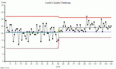
B: OK – can you plot the quality scores for the last fifty jobs as a BaseLine chart?
L: Yes – give me a second. The average is 24 as I said.
B: OK – is the process stable?
L: Yes – there is only one flag for the fifty. I know from my Foundations training that is not a cause for alarm.
B: OK – what is the process capability?
L: I am sorry – I don’t know what you mean by that?
B: My apologies. I forgot that you have not completed the Practitioner training yet. The capability is the range between the red lines on the chart.
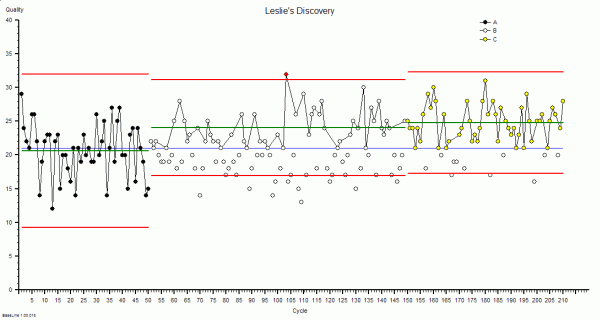
L: Um – the lower line is at 17 and the upper line is at 31.
L: OK – how many points lie below the target of 21.
B: None of course. They are meeting their Minimum Quality target. The issue is not quality – it is money.
There was a pause. Leslie knew from experience that when Bob paused there was a surprise coming.
B: Can you email me your chart?
A cold-shiver went down Leslie’s back. What was the problem here? Bob had never asked to see the data before.
Sure. I will send it now. The recent fifty is on the right, the data on the left is from after the quality inspectors went in and before the the Minimum Quality target was imposed. This is the chart that Governance has been using as evidence to justify their existence because they are claiming the credit for improving the quality.
B: OK – thanks. I have got it – let me see. Oh dear.
Leslie was shocked. She had never heard Bob use language like ‘Oh dear’.
There was another pause.
B: Leslie, what is the context for this data? What does the X-axis represent?
Leslie looked at the chart again – more closely this time. Then she saw what Bob was getting at. There were fifty points in the first group, and about the same number in the second group. That was not the interesting part. In the first group the X-axis went up to 50 in regular steps of five; in the second group it went from 50 to just over 149 and was no longer regularly spaced. Eventually she replied.
Bob, that is a really good question. My guess it is that this is the quality of the completed work.
B: It is unwise to guess. It is better to go and see reality.
You are right. I knew that. It is drummed into us during the Foundations training! I will go and ask. Can I call you back?
B: Of course. I will email you my direct number.
<Ring Ring><Ring Ring>
 B: Hello, Bob here.
L: Bob – it is Leslie. I am so excited! I have discovered something amazing.
B: Hello Leslie. That is good to hear. Can you tell me what you have discovered?
L: I have discovered that better quality does not always cost more.
B: That is a good discovery. Can you prove it with data?
L: Yes I can! I am emailing you the chart now.
B: OK – I am looking at your chart. Can you explain to me what you have discovered?
L: Yes. When I went to see for myself I saw that when a job failed the Minimum Quality check at the end then the whole job had to be re-done because there was no time to investigate and correct the causes of the failure. The people doing the work said that they were helpless victims of errors that were made upstream of them – and they could not predict from one job to the next what the error would be. They said it felt like quality was a lottery and that they were just firefighting all the time. They knew that just repeating the work was not solving the problem but they had no other choice because they were under enormous pressure to deliver on-time as well. The only solution they could see is was to get more resources but their requests were being refused by Finance on the grounds that there is no more money. They felt completely trapped.
B: OK. Can you describe what you did?
L: Yes. I saw immediately that there were so many sources of errors that it would be impossible for me to tackle them all. So I used the tool that I had learned in the Foundations training: the Niggle-o-Gram. That focussed us and led to a surprisingly simple, quick, zero-cost process design change. We deliberately did not remove the Inspection-and-Correction policy because we needed to know what the impact of the change would be. Oh, and we did one other thing that challenged the current methods. We plotted every attempt, both the successes and the failures, on the BaseLine chart so we could see both the the quality and the work done on one chart. And we updated the chart every day and posted it chart on the notice board so everyone in the department could see the effect of the change that they had designed. It worked like magic! They have already slashed their agency staff costs, the whole department feels calmer and they are still delivering on-time. And best of all they now feel that they have the energy and time to start looking at the next niggle. Thank you so much! Now I see how the tools and techniques I learned in Foundations are so powerful and now I understand better the reason we learned them first.
B: Well done Leslie. You have taken an important step to becoming a fully fledged Practitioner. You have learned some critical lessons in this challenge.
 This scenario is fictional but realistic.
And it has been designed so that it can be replicated easily using a simple game that requires only pencil, paper and some dice.
If you do not have some dice handy then you can use this little program that simulates rolling six dice.
The Six Digital Dice program (for PC only).
Instructions
1. Prepare a piece of A4 squared paper with the Y-axis marked from zero to 40 and the X-axis from 1 to 80.
2. Roll six dice and record the score on each (or roll one die six times) – then calculate the total.
3. Plot the total on your graph. Left-to-right in time order. Link the dots with lines.
4. After 25 dots look at the chart. It should resemble the leftmost data in the charts above.
5. Now draw a horizontal line at 21. This is the Minimum Quality Target.
6. Keep rolling the dice – six per cycle, adding the totals to the right of your previous data.
But this time if the total is less than 21 then repeat the cycle of six dice rolls until the score is 21 or more. Record on your chart the output of all the cycles – not just the acceptable ones.
7. Keep going until you have 25 acceptable outcomes. As long as it takes.
Now count how many cycles you needed to complete in order to get 25 acceptable outcomes. You should find that it is about twice as many as before you “imposed” the Inspect-and-Correct QI policy.
This illustrates the problem of an Inspection-and-Correction design for quality improvement. It does improve the quality of the final output – but at a higher cost.
We are treating the symptoms (effects) and ignoring the disease (causes).
The internal design of the process is unchanged so it is still generating mistakes.
How much quality improvement you get and how much it costs you is determined by the design of the underlying process – which has not changed. There is a Law of Diminishing returns here – and a big risk.
The risk is that if quality improves as the result of applying a quality target then it encourages the Governance thumbscrews to be tightened further and forces those delivering the service further into cross-fire between Governance and Finance.
The other negative consequence of the Inspect-and-Correct approach is that it increases both the average and the variation in lead time which also fuels the calls for more targets, more sticks, calls for more resources and pushes costs up even further.
The lesson from this simple exercise seems clear.
The better strategy for improving quality is to design the root causes of errors out of the processes because then we will get improved quality and improved delivery and improved productivity and we will discover that we have improved safety as well. Win-win-win-win.
The Six Dice Game is a simpler version of the famous Red Bead Game that W Edwards Deming used to explain why, in the modern world, the arbitrary-target-driven-command-and-control-stick-and-carrot style of performance management creates more problems than it solves.
The illusion is of short-term gain but the reality is of long-term pain.
And if you would like to see and hear Deming talking about the science of improvement there is a video of him speaking in 1984. He is at the bottom of the page. Click here.