End In Sight

We are a month into Lock-down III.

Is there any light at the end of the tunnel?

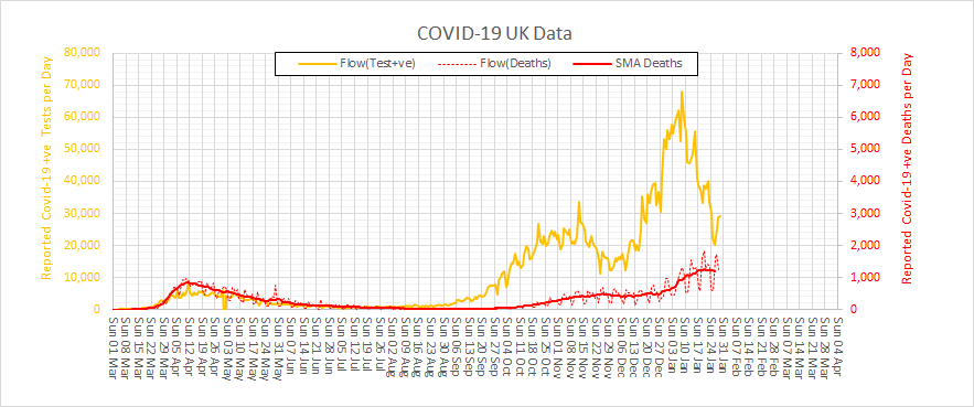
Here is the reported UK data.  As feared the Third Wave was worse than the First and the Second, and the cumulative mortality has exceeded 100,000 souls.  But the precipitous fall in reported positive tests is encouraging and it looks like the mortality curve is also turning the corner.

The worst is over.

So, was this turnaround caused by Lock-down III?

It is not possible to say for sure from this data.  We would need a No Lock-down randomised control group to keep the statistical purists happy and we could not do that.

Is there another way?

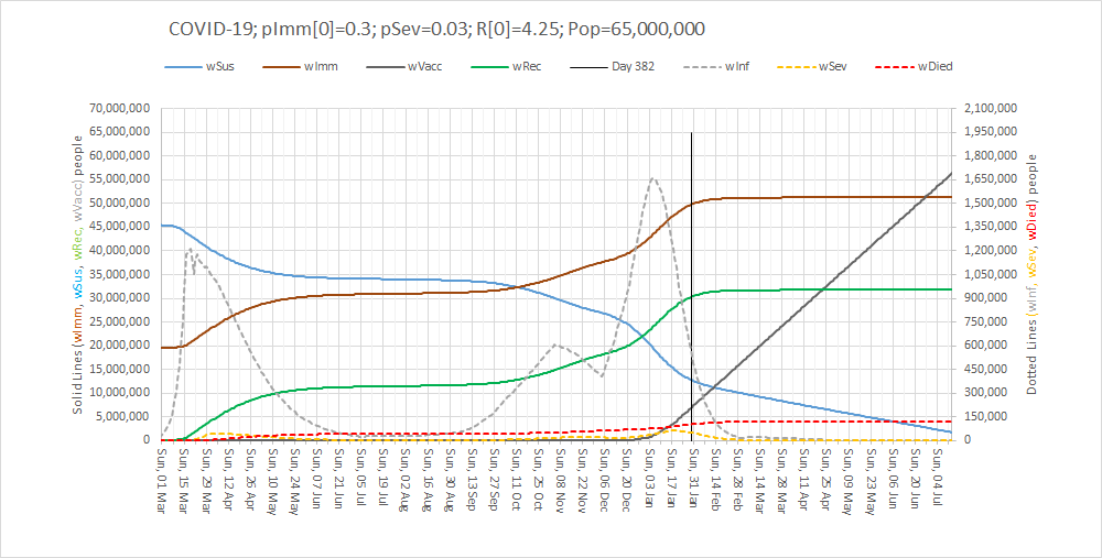
Yes, there is.  It is called a digital twin.  The basic idea is we design, build, verify and calibrate a digital simulation model of the system that we are interested and use that to explore cause-and-effect hypotheses.  Here is an example: The solid orange line in the chart above (daily reported positive tests) is closely related to the dotted grey line in the chart below (predicted daily prevalence of infectious people).   Note the almost identical temporal pattern and be aware that in the first wave we only reported positive tests of patients admitted to hospital.

What does our digital twin say was the cause?

It says that the primary cause of the fall in daily prevalence of infectious people is because the number of susceptible people (the solid blue line) has fallen to a low enough level for the epidemic to fizzle out on its own.  Without any more help from us.

And it says that Lock-down III has contributed a bit by flattening and lowering the peak of infections, admissions and deaths.

And it says that the vaccination programme has not contributed to the measured fall in prevalence.

What are the implications if our digital twin is speaking the truth?

Firstly, that the epidemic is already self-terminating.
Secondly, that the restrictions will not be needed after the end of February.
Thirdly, that a mass vaccination programme is a belt-and-braces insurance policy.

I would say that is all good news.  The light the end would appear to be in sight.

Second Wave

The summer holidays are over and schools are open again – sort of.

Restaurants, pubs and nightclubs are open again – sort of.

Gyms and leisure facilities are open again – sort of.

And after two months of gradual easing of social restrictions and massive expansion of test-and-trace we now have the spectre of a Second Wave looming.  It has happened in Australia, Italy, Spain and France so it can happen here.

As usual, the UK media are hyping up the general hysteria and we now also have rioting disbelievers claiming it is all a conspiracy and that re-applying local restrictions is an infringement of their liberty.

So, what is all the fuss about?

We need to side-step the gossip and get some hard data from a reliable source (i.e. not a newspaper). Here is what worldometer is sharing …
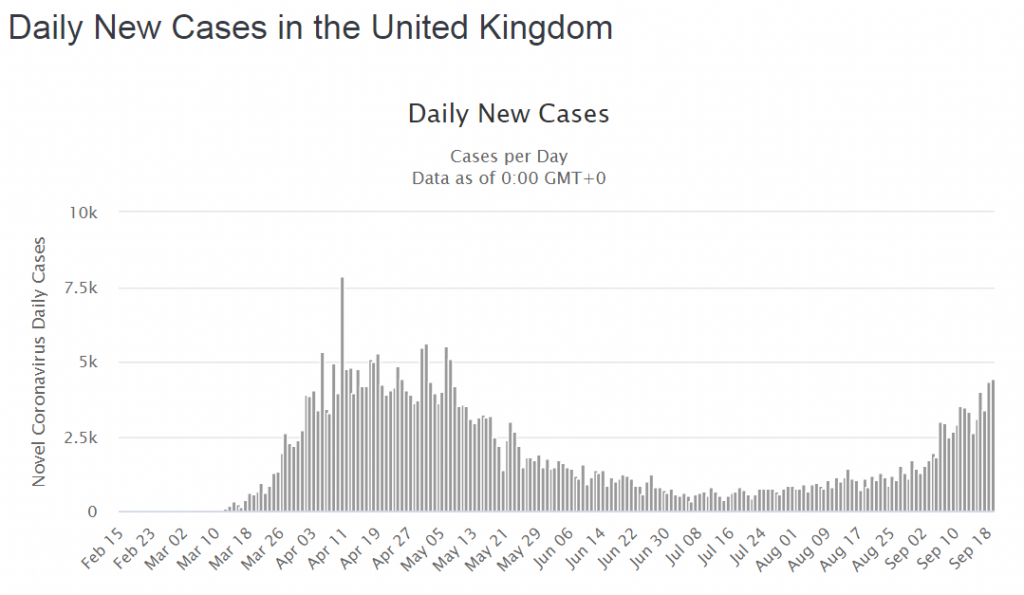
OMG!  It looks like The Second Wave is here already!  There are already as many cases now as in March and we still have the mantra “Stay At Home – Protect the NHS – Save Lives” ringing in our ears.  But something is not quite right.  No one is shouting that hospitals are bursting at the seams.  No one is reporting that the mortuaries are filling up.  Something is different.  What is going on?  We need more data.That is odd!  We can clearly see that cases and deaths went hand-in-hand in the First Wave with about 1:5 cases not making it.  But this time the deaths are not rising with the cases.
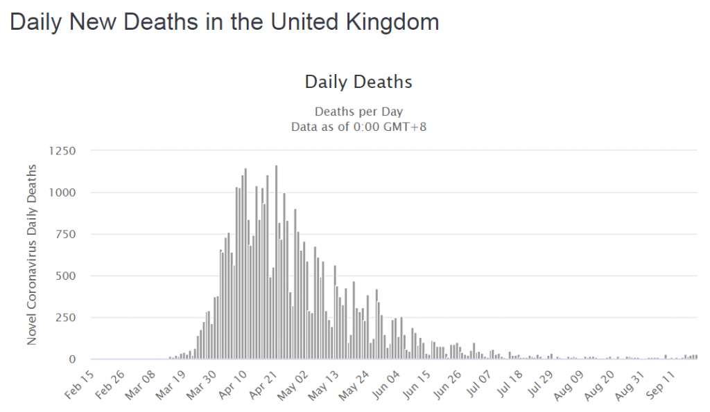
Ah ha!  Maybe that is because the virus has mutated into something much more benign and because we have got much better at diagnosing and treating this illness – the ventilators and steroids saved the day.  Hurrah!  It’s all a big fuss about nothing … we should still be able to have friends round for parties and go on pub crawls again!

But … what if there was a different explanation for the patterns on the charts above?

It is said that “data without context is meaningless” … and I’d go further than that … data without context is dangerous because if it leads to invalid conclusions and inappropriate decisions we can get well-intended actions that cause unintended harm.  Death.

So, we need to check the context of the data.

In the First Wave the availability of the antigen (swab) test was limited so it was only available to hospitals and the “daily new cases” were in patients admitted to hospital – the ones with severe enough symptoms to get through the NHS 111 telephone triage.  Most people with symptoms, even really bad ones, stayed at home to protect the NHS.  They didn’t appear in the statistics.

But did the collective sacrifice of our social lives save actual lives?

The original estimates of the plausible death toll in the UK ranged up to 500,000 from coronavirus alone (and no one knows how many more from the collateral effects of an overwhelmed NHS).  The COVID-19 body count to date is just under 50000, so putting a positive spin on that tragic statistic, 90% of the potential deaths were prevented.  The lock-down worked.  The NHS did not collapse.  The Nightingales stood ready and idle – an expensive insurance policy.  Lives were actually saved.

Why isn’t that being talked about?

And the context changed in another important way.  The antigen testing capacity was scaled up despite being mired in confusing jargon.  Who thought up the idea of calling them “pillars”?

But, if we dig about on the GOV.UK website long enough there is a definition:

So, Pillar 1 = NHS testing capacity Pillar 2 = commercial testing capacity and we don’t actually know how much was in-hospital testing and how much was in-community testing because the definitions seem to reflect budgets rather than patients.  Ever has it been thus in the NHS!

However, we can see from the chart below that testing activity (blue bars) has increased many-fold but the two testing streams (in hospital and outside hospital) are combined in one chart.  Well, it is one big pot of tax-payers cash after all and it is the same test.
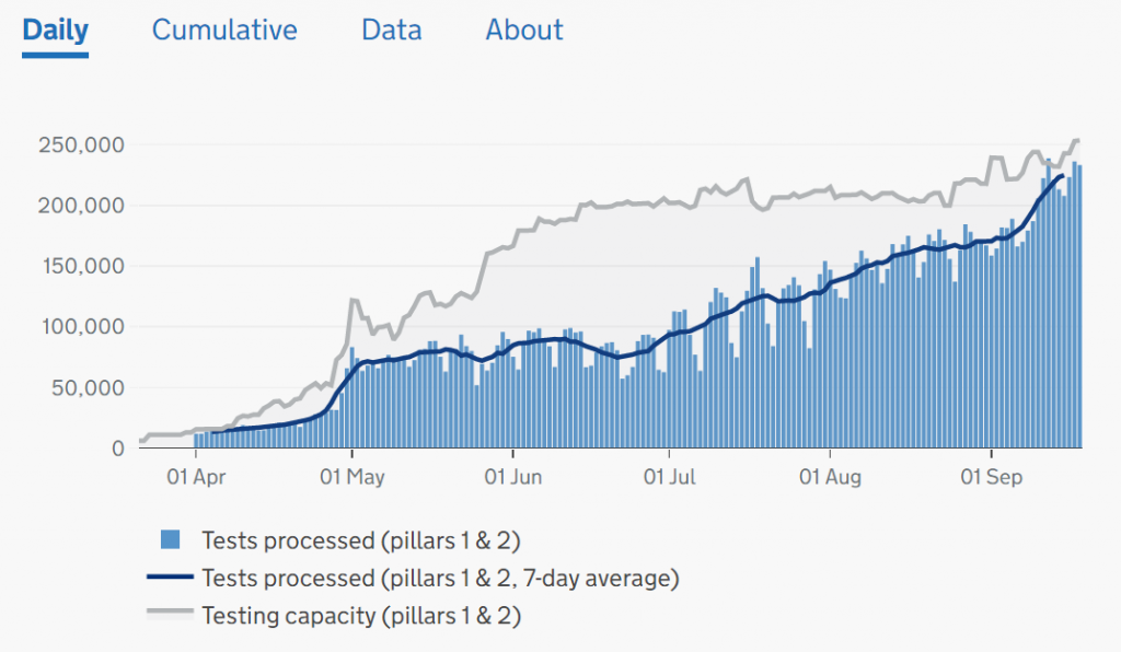
To unravel this a bit we have to dig into the website, download the raw data, and plot it ourselves.  Looking at Pillar 2 (commercial) we can see they had a late start, caught the tail of the First Wave, and then ramped up activity as the population testing caught up with the available capacity (because hospital activity has been falling since late April).
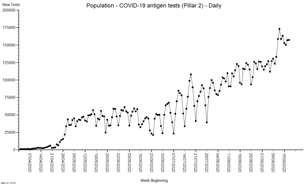
Now we can see that the increased number of positive tests could be explained by the fact that we are now testing anyone with possible COVID-19 symptoms who steps up – mainly in the community.  And we were unable to do this before because the testing capacity did not exist.

The important message is that in the First Wave we were not measuring what was happening in the community – it was happening though – it must have been.  We measured the knock on effects: hospital admissions with positive tests and deaths after positive tests.

So, to present the daily positive tests as one time-series chart that conflates both ‘pillars’ is both meaningless and dangerous and it is no surprise that people are confused.


This raises a question: Can we estimate how many people there would have been in the community in the First Wave so that we can get a sense of what the rising positive test rate means now?

The way that epidemiologists do this is to build a generic simulation of the system dynamics of an epidemic (a SEIR multi-compartment model) and then use the measured data to calibrate the this model so that it can then be used for specific prediction and planning.

Here is an example of the output of a calibrated multi-compartment system dynamics model of the UK COVID-19 epidemic for a nominal 1.3 million population.  The compartments that are included are Susceptible, Exposed, Infectious, and Recovered (i.e. not infectious) and this model also simulates the severity of the illness i.e. Severe (in hospital), Critical (in ITU) and Died.

The difference in size of the various compartments is so great that the graph below requires two scales – the solid line (Infectious) is plotted on the left hand scale and the others are plotted on the right hand scale which is 10 times smaller.  The green line is today and the reported data up to that point has been used to calibrate the model and to estimate the historical metrics that we did not measure – such as how many people in the community were infectious (and would have tested positive).
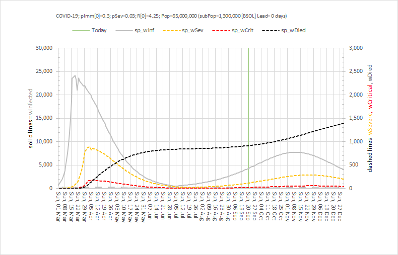
At the peak of the First Wave, for this population of 1.3 million, the model estimates there were about 800 patients in hospital (which there were) and 24,000 patients in the community who would have tested positive if we had been able to test them.  24,000/800 = 30 which means the peak of the grey line is 30 x higher than the peak of the orange line – hence the need for the two Y-axes with a 10-fold difference in scale.

Note the very rapid rise in the number of infectious people from the beginning of March when the first UK death was announced, before the global pandemic was declared and before the UK lock-down was enacted in law and implemented.  Coronavirus was already spreading very rapidly.

Note how this rapid rise in the number of infectious people came to an abrupt halt when the UK lock-down was put into place in the third week of March 2020.  Social distancing breaks the chain of transmission from one infectious person to many other susceptible ones.

Note how the peaks of hospital admissions, critical care admissions and deaths lag after the rise in infectious people (because it takes time for the coronavirus to do its damage) and how each peak is smaller (because only about 1:30 get sick enough to need admission, and only 1:5 of hospital admissions do not survive.

Note how the fall in the infectious group was more gradual than the rise (because the lock-down was partial,  because not everyone could stay at home (essential services like the NHS had to continue), and because there was already a big pool of infectious people in the community.


So, by early July 2020 it was possible to start a gradual relaxation of the lock down and from then we can see a gradual rise in infectious people again.  But now we were measuring them because of the growing capacity to perform antigen tests in the community.  The relatively low level and the relatively slow rise are much less dramatic than what was happening in March (because of the higher awareness and the continued social distancing and use of face coverings).  But it is all too easy to become impatient and complacent.

But by early September 2020 it was clear that the number on infectious people was growing faster in the community – and then we saw hospital admissions reach a minimum and start to rise again.  And then the number if deaths reach a minimum and start to rise again.  And this evidence proves that the current level of social distancing is not enough to keep a lid on this disease.  We are in the foothills of a Second Wave.


So what do we do next?

First, we must estimate the effect that the current social distancing policies are having and one way to do that would be to stop doing them and see what happens.  Clearly that is not an ethical experiment to perform given what we already know.  But, we can simulate that experiment using our calibrated SEIR model.  Here is what is predicted to happen if we went back to the pre-lockdown behaviours: There would be a very rapid spread of the virus followed by a Second Wave that would be many times bigger than the first!!  Then it would burn itself out and those who had survived could go back to some semblance of normality.  The human sacrifice would be considerable though.
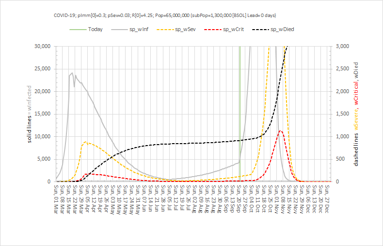
So, despite the problems that the current social distancing is causing, they pale into insignificance compared to what could happen if they were dropped.

The previous model shows what is predicted would happen if we continue as we are with no further easing of restrictions and assuming people stick to them.  In short, we will have COVID-for-Christmas and it could be a very nasty business indeed as it would come at the same time as other winter-associated infectious diseases such as influenza and norovirus.

The next chart shows what could happen if we squeeze the social distancing brake a bit harder by focusing only on the behaviours that the track-and-trace-and-test system is highlighting as the key drivers of the growth infections, admissions and deaths.
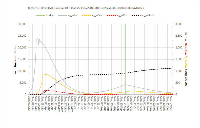
What we see is an arrest of the rise of the number of infectious people (as we saw before), a small and not sustained increase in hospital admissions, then a slow decline back to the levels that were achieved in early July – and at which point it would be reasonable to have a more normal Christmas.

And another potential benefit of a bit more social distancing might be a much less problematic annual flu epidemic because that virus would also find it harder to spread – plus we have a flu vaccination which we can use to reduce that risk further.


It is not going to be easy.  We will have to sacrifice a bit of face-to-face social life for a bit longer.  We will have to measure, monitor, model and tweak the plan as we go.

And one thing we can do immediately is to share the available information in a more informative and less histrionic way than we are seeing at the moment.


Update: Sunday 1st November 2020

Yesterday the Government had to concede that the policy of regional restrictions had failed and bluffing it out and ignoring the scientific advice was, with the clarity of hindsight, an unwise strategy.

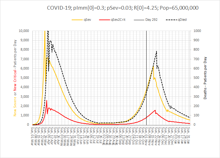
In the face of the hard evidence of rapidly rising COVID+ve hospital admissions and deaths, the decision to re-impose a national 4-week lock-down was announced.  This is the only realistic option to prevent overwhelming the NHS at a time of year that it struggles with seasonal influenza causing a peak of admissions and deaths.

Paradoxically, this year the effect of influenza may be less because social distancing will reduce the spread of that as well and also because there is a vaccination for influenza.  Many will have had their flu jab early … I certainly did.

So, what is the predicted effect of a 4 week lock down?  Well, the calibrated model (also used to generate the charts above) estimates that it could indeed suppress the Second Wave and mitigate a nasty COVID-4-Christmas scenario.  But even with it the hospital admissions and associated mortality will continue to increase until the effect kicks in.

Brace yourselves.
Co-Diagnosis, Co-Design and Co-Delivery

The thing that gives me the biggest buzz when it comes to improvement is to see a team share their story of what they have learned-by-doing; and what they have delivered that improves their quality of life and the quality of their patients’ experience.

And while the principles that underpin these transformations are generic, each story is unique because no two improvement challenges are exactly the same and no two teams are exactly the same.

The improvement process is not a standardised production line.  It is much more organic and adaptive experience and that requires calm, competent, consistent, compassionate and courageous facilitation.

So when I see a team share their story of what they have done and learned then I know that behind the scenes there will have been someone providing that essential ingredient.

This week a perfect example of a story like this was shared.

It is about the whole team who run the Diabetic Complex Cases Clinic at Guy’s and St. Thomas’ NHS Trust in London.  Everyone involved in the patient care was involved.  It tells the story of how they saw what might be possible and how they stepped up to the challenge of learning to apply the same principles in their world.  And it tells their story of what they diagnosed, what they designed and what they delivered.

The facilitation and support was provided Ellen Pirie who works for the Health Innovation Network (HIN) in South London and who is a Level 2 Health Care Systems Engineer.

And the link to the GSTT Diabetic Complex Clinic Team story is here.

Carveoutosis Multiforme Fulminans

This is the name given to an endemic, chronic, systemic, design disease that afflicts the whole NHS that very few have heard of, and even fewer understand.

This week marked two milestones in the public exposure of this elusive but eminently treatable health care system design illness that causes queues, delays, overwork, chaos, stress and risk for staff and patients alike.

The first was breaking news from the team in Swansea led by Chris Jones.

They had been grappling with the wicked problem of chronic queues, delays, chaos, stress, high staff turnover, and escalating costs in their Chemotherapy Day Unit (CDU) at the Singleton Hospital.

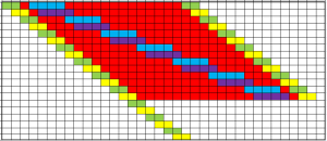
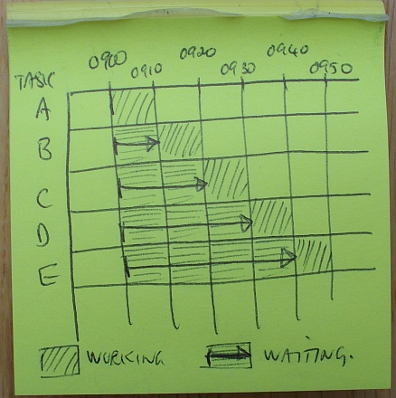
The breakthrough came earlier in the year when we used the innovative eleGANTT® system to measure and visualise the CDU chaos in real-time.

This rich set of data enabled us, for the first time, to apply a powerful systems engineering  technique called counterfactual analysis which revealed the primary cause of the chaos – the elusive and counter-intuitive design disease carvoutosis multiforme fulminans.

And this diagnosis implied that the chaos could be calmed quickly and at no cost.

But that news fell on slightly deaf ears because, not surprisingly, the CDU team were highly sceptical that such a thing was possible.

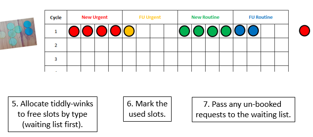
So, to convince them we needed to demonstrate the adverse effect of carveoutosis in a way that was easy to see.  And to do that we used some advanced technology: dice and tiddly winks.

The reaction of the CDU nurses was amazing.  As soon as they ‘saw’ it they clicked and immediately grasped how to apply it in their world.  They designed the change they needed to make in a matter of minutes.


But the proof-of-the-pudding-is-in-the eating and we arranged a one-day-test-of-change of their anti-carveout design.

The appointed day arrived, Wednesday 19th June.  The CDU nurses implemented their new design (which cost nothing to do).  Within an hour of the day starting they reported that the CDU was strangely calm.   And at the end of the day they reported that it had remained strangely calm all day; and that they had time for lunch; and that they had time to do all their admin as they went; and that they finished on time; and that the patients did not wait for their chemotherapy; and that the patients noticed the chaos-to-calm transformation too.

They treated just the same number of patients as usual with the same staff, in the same space and with the same equipment.  It cost nothing to make the change.

To say they they were surprised is an understatement!  They were so surprised and so delighted that they did not want to go back to the old design – but they had to because it was only a one-day-test-of-change.

So, on Thursday and Friday they reverted back to the carveoutosis design.  And the chaos returned.  That nailed it!  There was a riot!!  The CDU nurses refused to wait until later in the year to implement their new design and they voted unanimously to implement it from the following Monday.  And they did.  And calm was restored.


The second milestone happened on Thursday 11th July when we ran a Health Care Systems Engineering (HCSE) Masterclass on the very same topic … chronic systemic carveoutosis multiforme fulminans.

This time we used the dice and tiddly winks to demonstrate the symptoms, signs and the impact of treatment.  Then we explored the known pathophysiology of this elusive and endemic design disease in much more depth.

This is health care systems engineering in action.

It seems to work.

Leverage Points

One of the most surprising aspects of systems is how some big changes have no observable effect and how some small changes are game-changers. Why is that?

The technical name for this phenomenon is leverage points.

When a nudge is made at a leverage point in a real system the impact is amplified – so a small cause can have a big effect.

And when a big kick is made where there is no leverage point the effort is dissipated. Like flogging a dead horse.

Other names for leverage points are triggers, buttons, catalysts, fuses etc.


The fact that there is a big effect does not imply it is a good effect.

Poking a leverage point can trigger a catastrophe just as it can trigger a celebration. It depends on how it is poked.

Perhaps that is one reason people stay away from them.

But when our heath care system performance is in decline, if we do nothing or if we act but stay away from leverage points (i.e. flog the dead horse) then we will deny ourselves the opportunity of improvement.

So, we need a way to (a) identify the leverage points and (b) know how to poke them positively and know how to not poke them into delivering a catastrophe.


Here is a couple of real examples.


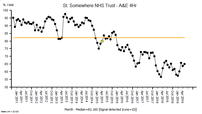
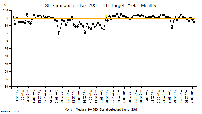
The time-series chart above shows the A&E performance of a real acute trust.  Notice the pattern as we read left-to-right; baseline performance is OKish and dips in the winters, and the winter dips get deeper but the baseline performance recovers.  In April 2015 (yellow flag) the system behaviour changes, and it goes into a steady decline with added winter dips.  This is the characteristic pattern of poking a leverage point in the wrong way … and the fact it happened at the start of the financial year suggests that Finance was involved.  Possibly triggered by a cost-improvement programme (CIP) action somewhere else in the system.  Save a bit of money here and create a bigger problem over there. That is how systems work. Not my budget so not my problem.

Here is a different example, again from a real hospital and around the same time.  It starts with a similar pattern of deteriorating performance and there is a clear change in system behaviour in Jan 2015.  But in this case the performance improves and stays improved.  Again, the visible sign of a leverage point being poked but this time in a good way.

In this case I do know what happened.  A contributory cause of the deteriorating performance was correctly diagnosed, the leverage point was identified, a change was designed and piloted, and then implemented and validated.  And it worked as predicted.  It was not a fluke.  It was engineered.


So what is the reason that the first example much more commonly seen than the second?

That is a very good question … and to answer it we need to explore the decision making process that leads up to these actions because I refuse to believe that anyone intentionally makes decisions that lead to actions that lead to deterioration in health care performance.

And perhaps we can all learn how to poke leverage points in a positive way?

Measuring Chaos

One of the big hurdles in health care improvement is that most of the low hanging fruit have been harvested.

These are the small improvement projects that can be done quickly because as soon as the issue is made visible to the stakeholders the cause is obvious and the solution is too.

This is where kaizen works well.

The problem is that many health care issues are rather more difficult because the process that needs improving is complicated (i.e. it has lots of interacting parts) and usually exhibits rather complex behaviour (e.g. chaotic).

One good example of this is a one stop multidisciplinary clinic.

These are widely used in healthcare and for good reason.  It is better for a patient with a complex illness, such as diabetes, to be able to access whatever specialist assessment and advice they need when they need it … i.e. in an outpatient clinic.

The multi-disciplinary team (MDT) is more effective and efficient when it can problem-solve collaboratively.

The problem is that the scheduling design of a one stop clinic is rather trickier than a traditional simple-but-slow-and-sequential new-review-refer design.

A one stop clinic that has not been well-designed feels chaotic and stressful for both staff and patients and usually exhibits the paradoxical behaviour of waiting patients and waiting staff.


So what do we need to do?

We need to map and measure the process and diagnose the root cause of the chaos, and then treat it.  A quick kaizen exercise should do the trick. Yes?

But how do we map and measure the chaotic behaviour of lots of specialists buzzing around like blue-***** flies trying to fix the emergent clinical and operational problems on the hoof?  This is not the linear, deterministic, predictable, standardised machine-dominated production line environment where kaizen evolved.

One approach might be to get the staff to audit what they are doing as they do it. But that adds extra work, usually makes the chaos worse, fuels frustration and results in a very patchy set of data.

Another approach is to employ a small army of observers who record what happens, as it happens.  This is possible and it works, but to be able to do this well requires a lot of experience of the process being observed.  And even if that is achieved the next barrier is the onerous task of transcribing and analysing the ocean of harvested data.  And then the challenge of feeding back the results much later … i.e. when the sands have shifted.


So we need a different approach … one that is able to capture the fine detail of a complex process in real-time, with minimal impact on the process itself, and that can process and present the wealth of data in a visual easy-to-assess format, and in real-time too.

This is a really tough design challenge …
… and it has just been solved.

Here are two recent case studies that describe how it was done using a robust systems engineering method.

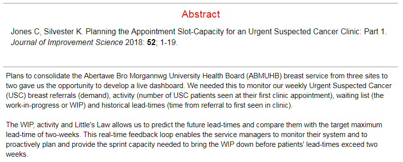
Abstract

Abstract
Warts-and-All

This week saw the publication of a landmark paper – one that will bring hope to many.  A paper that describes the first step of a path forward out of the mess that healthcare seems to be in.  A rational, sensible, practical, learnable and enjoyable path.


This week I also came across an idea that triggered an “ah ha” for me.  The idea is that the most rapid learning happens when we are making mistakes about half of the time.

And when I say ‘making a mistake’ I mean not achieving what we predicted we would achieve because that implies that our understanding of the world is incomplete.  In other words, when the world does not behave as we expect, we have an opportunity to learn and to improve our ability to make more reliable predictions.

And that ability is called wisdom.


When we get what we expect about half the time, and do not get what we expect about the other half of the time, then we have the maximum amount of information that we can use to compare and find the differences.

Was it what we did? Was it what we did not do? What are the acts and errors of commission and omission? What can we learn from those? What might we do differently next time? What would we expect to happen if we do?


And to explore this terrain we need to see the world as it is … warts and all … and that is the subject of the landmark paper that was published this week.


The context of the paper is improvement of cancer service delivery, and specifically of reducing waiting time from referral to first appointment.  This waiting is a time of extreme anxiety for patients who have suspected cancer.

It is important to remember that most people with suspected cancer do not have it, so most of the work of an urgent suspected cancer (USC) clinic is to reassure and to relieve the fear that the spectre of cancer creates.

So, the sooner that reassurance can happen the better, and for the unlucky minority who are diagnosed with cancer, the sooner they can move on to treatment the better.

The more important paragraph in the abstract is the second one … which states that seeing the system behaviour as it is, warts-and-all,  in near-real-time, allows us to learn to make better decisions of what to do to achieve our intended outcomes. Wiser decisions.

And the reason this is the more important paragraph is because if we can do that for an urgent suspected cancer pathway then we can do that for any pathway.


The paper re-tells the first chapter of an emerging story of hope.  A story of how an innovative and forward-thinking organisation is investing in building embedded capability in health care systems engineering (HCSE), and is now delivering a growing dividend.  Much bigger than the investment on every dimension … better safety, faster delivery, higher quality and more affordability. Win-win-win-win.

The only losers are the “warts” – the naysayers and the cynics who claim it is impossible, or too “wicked”, or too difficult, or too expensive.

Innovative reality trumps cynical rhetoric … and the full abstract and paper can be accessed here.

So, well done to Chris Jones and the whole team in ABMU.

And thank you for keeping the candle of hope alight in these dark, stormy and uncertain times for the NHS.

From Push to Pull

One of the most frequent niggles that I hear from patients is the difficultly they have getting an appointment with their general practitioner.  I too have personal experience of the distress caused by the ubiquitous “Phone at 8AM for an Appointment” policy, so in June 2018 when I was approached to help a group of local practices redesign their appointment booking system I said “Yes, please!


What has emerged is a fascinating, enjoyable and rewarding journey of co-evolution of learning and co-production of an improved design.  The multi-skilled design team (MDT) we pulled together included general practitioners, receptionists and practice managers and my job was to show them how to use the health care systems engineering (HCSE) framework to diagnose, design, decide and deliver what they wanted: A safe, calm, efficient, high quality, value-4-money appointment booking service for their combined list of 50,000 patients.


This week they reached the start of the ‘decide and deliver‘ phase.  We have established the diagnosis of why the current booking system is not delivering what we all want (i.e. patients and practices), and we have assembled and verified the essential elements of an improved design.

And the most important outcome for me is that the Primary Care MDT now feel confident and capable to decide what and how to deliver it themselves.   That is what I call embedded capability and achieving it is always an emotional roller coaster ride that we call The Nerve Curve.

What we are dealing with here is called a complex adaptive system (CAS) which has two main components: Processes and People.  Both are complicated and behave in complex ways.  Both will adapt and co-evolve over time.  The processes are the result of the policies that the people produce.  The policies are the result of the experiences that the people have and the explanations that they create to make intuitive sense of them.

But, complex systems often behave in counter-intuitive ways, so our intuition can actually lead us to make unwise decisions that unintentionally perpetuate the problem we are trying to solve.  The name given to this is a wicked problem.

A health care systems engineer needs to be able to demonstrate where these hidden intuitive traps lurk, and to explain what causes them and how to avoid them.  That is the reason the diagnosis and design phase is always a bit of a bumpy ride – emotionally – our Inner Chimp does not like to be challenged!  We all resist change.  Fear of the unknown is hard-wired into us by millions of years of evolution.

But we know when we are making progress because the “ah ha” moments signal a slight shift of perception and a sudden new clarity of insight.  The cognitive fog clears a bit and a some more of the unfamiliar terrain ahead comes into view.  We are learning.

The Primary Care MDT have experienced many of these penny-drop moments over the last six months and unfortunately there is not space here to describe them all, but I can share one pivotal example.


A common symptom of a poorly designed process is a chronically chaotic queue.

[NB. In medicine the term chronic means “long standing”.  The opposite term is acute which means “recent onset”].

Many assume, intuitively, that the cause of a chronically chaotic queue is lack of capacity; hence the incessant calls for ‘more capacity’.  And it appears that we have learned this reflex response by observing the effect of adding capacity – which is that the queue and chaos abate (for a while).  So that proves that lack of capacity was the cause. Yes?

Well actually it doesn’t.  Proving causality requires a bit more work.  And to illustrate this “temporal association does not prove causality trap” I invite you to consider this scenario.

I have a headache => I take a paracetamol => my headache goes away => so the cause of my headache was lack of paracetamol. Yes?

Errr .. No!

There are many contributory causes of chronically chaotic queues and lack of capacity is not one of them because the queue is chronic.  What actually happens is that something else triggers the onset of chaos which then consumes the very resource we require to avoid the chaos.  And once we slip into this trap we cannot escape!  The chaos-perpretuating behaviour we observe is called fire-fighting and the necessary resource it consumes is called resilience.


Six months ago, the Primary Care MDT believed that the cause of their chronic appointment booking chaos was a mismatch between demand and capacity – i.e. too much patient demand for the appointment capacity available.  So, there was a very reasonable resistance to the idea of making the appointment booking process easier for patients – they justifiably feared being overwhelmed by a tsunami of unmet need!

Six months on, the Primary Care MDT understand what actually causes chronic queues and that awareness has been achieved by a step-by-step process of explanation and experimentation in the relative safety of the weekly design sessions.

We played simulation games – lots of them.

One particularly memorable “Ah Ha!” moment happened when we played the Carveout Game which is done using dice, tiddly-winks, paper and coloured-pens.  No computers.  No statistics.  No queue theory gobbledygook.  No smoke-and-mirrors.  No magic.

What the Carveout Game demonstrates, practically and visually, is that an easy way to trigger the transition from calm-efficiency to chaotic-ineffectiveness is … to impose a carveout policy on a system that has been designed to achieve optimum efficiency by using averages.  Boom!  We slip on the twin banana skins of the Flaw-of-Averages and Sub-Optimisation, slide off the performance cliff, and career down the rocky slope of Chronic Chaos into the Depths of Despair – from which we cannot then escape.

This visual demonstration was a cognitive turning point for the MDT.  They now believed that there is a rational science to improvement and from there we were on the step-by-step climb to building the necessary embedded capability.


It now felt like the team were pulling what they needed to know.  I was no longer pushing.  We had flipped from push-to-pull.  That is called the tipping point.

And that is how health care systems engineering (HCSE) works.


Health care is a complex adaptive system, and what a health care systems engineer actually “designs” is a context-sensitive  incubator that nurtures the seeds of innovation that already exist in the system and encourages them to germinate, grow and become strong enough to establish themselves.

That is called “embedded improvement-by-design capability“.

And each incubator needs to be different – because each system is different.  One-solution-fits-all-problems does not work here just as it does not in medicine.  Each patient is both similar and unique.


Just as in medicine, first we need to diagnose the actual, specific cause;  second we need to design some effective solutions; third we need to decide which design to implement and fourth we need to deliver it.

This how-to-do-it framework feels counter-intuitive.  If it was obvious we would already be doing it.  But the good news is that the evidence proves that it works and that anyone can learn how to do HCSE.