Competent and Conscious

Conscious_and_CompetentThis week I was made mindful again of a simple yet powerful model that goes a long way to explaining why we find change so difficult.

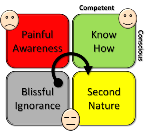
It is the conscious-competent model.

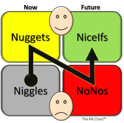
There are two dimensions which gives four combinations that are illustrated in the diagram.

We all start in the bottom left corner. We do not know what we do not know.  We are ignorant and incompetent and unconscious of the  fact.

Let us call that Blissful Ignorance.

Then suddenly we get a reality check. A shock. A big enough one to start us on the emotional roller coaster ride we call the Nerve Curve.

We become painfully aware of our ignorance (and incompetence). Conscious of it.

That is not a happy place to be and we have a well-developed psychological first line of defence to protect us. It is called Denial.

“That’s a load of rubbish!” we say.

But denial does not change reality and eventually we are reminded. Reality does not go away.

Our next line of defence is to shoot the messenger. We get angry and aggressive.

Who the **** are you to tell me that I do not know what I am doing!” we say.

Sometimes we are openly aggressive.  More often we use passive aggressive tactics. We resort to below-the-belt behind-the-back corridor-gossip behaviour.

But that does not change reality either.  And we are slowly forced to accept that we need to change. But not yet …

Our next line of defence is to bargain for more time (in the hope that reality will swing back in our favour).

There may be something in this but I am too busy at the moment … I will look at this  tomorrow/next week/next month/after my holiday/next quarter/next financial year/in my next job/when I retire!” we wheedle.

Our strategy usually does not work – it just wastes time – and while we prevaricate the crisis deepens. Reality is relentless.

Our last line of defence has now been breached and now we sink into depression and despair.

It is too late. Too difficult for me. I need rescuing. Someone help me!” we wail.

That does not work either. There is no one there. It is up to us. It is sink-or-swim time.

What we actually need now is a crumb of humility.

And with that we can start on the road to Know How. We start by unlearning the old stuff and then we can  replace it with the new stuff.  Step-by-step we climb out of the dark depths of Painful Awareness.

And then we get a BIG SURPRISE.

It is not as difficult as we assumed. And we discover that learning-by-doing is fun. And we find that demonstrating to others what we are learning is by far the most effective way to consolidate our new conscious competence.

And by playing to our strengths, with persistence, with practice and with reality-feedback our new know how capability gradually becomes second nature. Business as usual. The way we do things around here. The culture.

Then, and only then, will the improvement sustain … and spread … and grow.


N-N-N-N Feedback

4NChartOne of the essential components of an adaptive system is effective feedback.

Without feedback we cannot learn – we can only guess and hope.

So the design of our feedback loops is critical-to-success.

Many people do not like getting feedback because they live in a state of fear: fear of criticism. This is a learned behaviour.

Many people do not like giving feedback because they too live in a state of fear: fear of conflict. This is a learned behaviour.

And what is learned can be unlearned; with training, practice and time.

But before we will engage in unlearning our current habit we need to see the new habit that will replace it. The one that will work better for us. The one that is more effective.  The one that will require less effort. The one that is more efficient use of our most precious resource: life-time.

There is an effective and efficient feedback technique called The 4N Chart®.  And I know it works because I have used it and demonstrated to myself and others that  it works. And I have seen others use it and demonstrate to themselves and others that it works too.

The 4N Chart® has two dimensions – Time (Now and Future) and Emotion (Happy and Unhappy).

This gives four combinations each of which is given a label that begins with the letter ‘N’ – Niggles, Nuggets, NoNos and NiceIfs.

The N has a further significance … it reminds us which order to move through the  chart.

We start bottom left with the Niggles.  What is happening now that causes us to feel unhappy. What are these root causes of our niggles? And more importantly, which of these do we have control over?  Knowing that gives us a list of actions that we can do that will have the effect of reducing our niggles. And we can start that immediately because we do not need permission.

Next we move top-left to the Nuggets. What is happening now that causes us to feel happy? What are the root causes of our nuggets? Which of these do we control? We need to recognise these too and to celebrate them.  We need to give ourselves a pat on the back for them because that helps reinforce the habit to keep doing them.

Now we look to the future – and we need to consider two things: what we do not want to feel in the future and what we do want to feel in the future. These are our NoNos and our NiceIfs. It does not matter which order we do this … but  we must consider both.

Many prefer to consider dangers and threats first … that is SAFETY FIRST  thinking and is OK. First Do No Harm. Primum non nocere.

So with the four corners of our 4N Chart® filled in we have a balanced perspective and we can set off on the journey of improvement with confidence. Our 4N Chart® will help us stay on track. And we will update it as we go, as we study, as we plan and as we do things. As we convert NiceIfs into Nuggets and  Niggles into NoNos.

It sounds simple.  It is in theory. It is not quite as easy to do.

It takes practice … particularly the working backwards from the effect (the feeling) to the cause (the facts). This is done step-by-step using Reality as a guide – not our rhetoric. And we must be careful not to make assumptions in lieu of evidence. We must be careful not to jump to unsupported conclusions. That is called pre-judging.  Prejudice.

But when you get the hang of using The 4N Chart® you will be amazed at how much more easily and more quickly you make progress.

A Bit Of A Shock

egg_face_spooked_400_wht_13421It comes as a bit of a shock to learn that some of our habitual assumptions and actions are worthless.

Improvement implies change. Change requires doing things differently. That requires making different decisions. And that requires innovative thinking. And that requires new knowledge.

We are comfortable with the idea of adding  new knowledge to the vast store we have already accumulated.

We are less comfortable with the idea of removing old knowledge when it has grown out-of-date.

We are shocked when we discover that some of our knowledge is just wrong and it always has been. Since the start of time.

So we need to prepare ourselves for those sorts of shocks. We need to be resilient so that we are not knocked off our feet by them.  We need to practice a different emotional reaction to our habitual fright-flight-or-fight reaction.

We need to cultivate our curiosity.

For example:

It comes as a big shock to many when they learn that it is impossible to determine the cause from an analysis of the observed effect.  Not just difficult. Impossible.

“No Way!”  We shout angrily.  “We do that all the time!”

But do we?

What we do is we observe temporal associations.  We notice that Y happened after X and we conclude that X caused Y.

This is an incorrect conclusion.  We can only conclude from this observation that ‘X may have played a part in causing Y’ but we cannot prove it.

Not by observation alone.

What we can definitely say is that Y did not cause X – because time does not go backwards. At least it does not appear to.

Another thing that does not go backwards is information.

Q: What is 2 + 2?  Four. Easy. There is only one answer. Two numbers become one.

Let us try this in reverse …

Q: What two numbers when added together give 4? Tricky. There are countless answers.  One number cannot become two without adding uncertainty. Guessing.

So when we look at the information coming out of a system – the effects and we attempt to analyse it to reveal the causes we hit a problem. It is impossible.

And learning that is a big shock to people who describe themselves as ‘information analysts’ …. the whole foundation of what they do appears to evaporate.

So we need to outline what we can reasonably do with the retrospective analysis of effect data.

We can look for patterns.

Patterns that point to plausible causes.

Just like patterns of symptoms that point to possible diseases.

But how do we learn what patterns to look for?

Simple. We experiment. We do things and observe what happens immediately afterwards – the immediate effects. We conduct lots and lots of small experiments. And we learn the repeating patterns. “If the context is this and I do that then I always see this effect”.

If we observe a young child learning that is what we see … they are experimenting all the time.  They are curious. They delight in discovery. Novelty is fun. Learning to walk is a game.  Learning to talk is a game.  Learning to be a synergistic partner in a social group is a game.

And that same child-like curiosity is required for effective improvement.

And we know when we are doing improvement right: it feels good. It is fun. Learning is fun.

A Stab At The Vitals

pirate_flag_anim_150_wht_12881[Drrring Drrring] The phone heralded the start of the weekly ISP mentoring session.

<Bob> Hi Leslie, how are you today?

<Leslie> Hi Bob. To be honest I am not good. I am drowning. Drowning in data!

<Bob> Oh dear! I am sorry to hear that. Can I help? What led up to this?

<Leslie> Well, it was sort of triggered by our last chat and after you opened my eyes to the fact that we habitually throw most of our valuable information away by thresholding, aggregating and normalising.  Then we wonder why we make poor decisions … and then we get frustrated because nothing seems to improve.

<Bob> OK. What happened next?

<Leslie> I phoned our Performance Team and asked for some raw data. Three months worth.

<Bob> And what was their reaction?

<Leslie> They said “OK, here you go!” and sent me a twenty megabyte Excel spreadsheet that clogged my email inbox!  I did manage to unclog it eventually by deleting loads of old junk.  But I could swear that I heard the whole office laughing as they hung up the phone! Maybe I am paranoid?

<Bob> OK. And what happened next?

<Leslie> I started drowning!  The mega-file had a row of data for every patient that has attended A&E for the last three months as I had requested, but there were dozens of columns!  Trying to slice-and-dice it was a nightmare! My computer was smoking and each step took ages for it to complete.  In the end I gave up in frustration.  I now have a lot more respect for the Performance Team I can tell you! They do this for a living?

<Bob> OK.  It sounds like you are ready for a Stab At the Vitals.

<Leslie> What?  That sounds rather piratical!  Are you making fun of my slicing-and-dicing metaphor?

<Bob> No indeed.  I am deadly serious!  Before we leap into the data ocean we need to be able to swim; and we also need a raft that will keep us afloat;  and we need a sail to power our raft; and we need a way to navigate our raft to our desired destination.

<Leslie> OK. I like the nautical metaphor but how does it help?

<Bob> Let me translate. Learning to use system behaviour charts is equivalent to learning the skill of swimming. We have to do that first and practice until we are competent and confident.  Let us call our raft “ISP” – you are already aboard.  The sail you also have already – your Excel software.  The navigation aid is what I refer to as Vitals. So we need to have a “stab at the vitals”.

<Leslie> Do you mean we use a combination of time-series charts, ISP and Excel to create a navigation aid that helps avoid the Depths of Data and the Rocks of DRAT?

<Bob> Exactly.

<Leslie> Can you demonstrate with an example?

<Bob> Sure. Send me some of your data … just the arrival and departure events for one day – a typical one.

<Leslie> OK … give me a minute!  …  It is on its way.  How long will it take for you to analyse it?

<Bob> About 2 seconds. OK, here is your email … um … copy … paste … copy … reply

Vitals_Charts<Leslie> What the ****? That was quick! Let me see what this is … the top left chart is the demand, activity and work-in-progress for each hour; the top right chart is the lead time by patient plotted in discharge order; the table bottom left includes the 4 hour breach rate.  Those I do recognise. What is the chart on the bottom right?

<Bob> It is a histogram of the lead times … and it shows a problem.  Can you see the spike at 225 to 240 minutes?

<Leslie> Is that the fabled Horned Gaussian?

<Bob> Yes.  That is the sign that the 4-hour performance target is distorting the behaviour of the system.  And this is yet another reason why the  Breach Rate is a dangerous management metric. The adaptive reaction it triggers amplifies the variation and fuels the chaos.

<Leslie> Wow! And you did all that in Excel using my data in two seconds?  That must need a whole host of clever macros and code!

<Bob> “Yes” it was done in Excel and “No” it does not need any macros or code.  It is all done using simple formulae.

<Leslie> That is fantastic! Can you send me a copy of your Excel file?

<Bob> Nope.

<Leslie>Whaaaat? Why not? Is this some sort of evil piratical game?

<Bob> Nope. You are going to learn how to do this yourself – you are going to build your own Vitals Chart Generator – because that is the only way to really understand how it works.

<Leslie> Phew! You had me going for a second there! Bring it on! What do I do next?

<Bob> I will send you the step-by-step instructions of how to build, test and use a Vitals Chart Generator.

<Leslie> Thanks Bob. I cannot wait to get started! Weigh anchor and set the sails! Ha’ harrrr me hearties.