by Julian Simcox & Terry Weight
Ben Goldacre has spent several years popularizing the idea that we all ought all to be more interested in science.
Every day he writes and tweets examples of “bad science”, and about getting politicians and civil servants to be more evidence-based; about how governmental interventions should be more thoroughly tested before being rolled-out to the hapless citizen; about how the development and testing of new drugs should be more transparent to ensure the public get drugs that actually make a difference rather than risk harm; and about bad statistics – the kind that “make clever people do stupid things”(8).
Like Ben we would like to point the public sector, in particular the healthcare sector and its professionals, toward practical ways of doing more of the good kind of science, but just what is GOOD science?
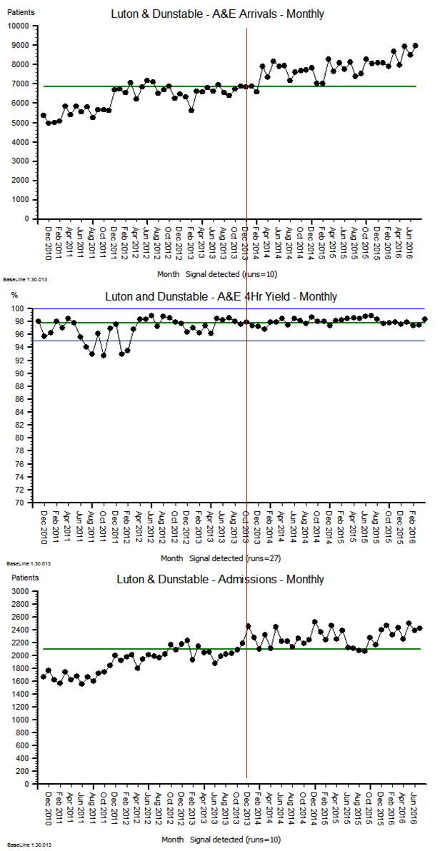
In collaboration with the Cabinet Office’s behaviour insights team, Ben has recently published a polemic (9) advocating evidence-based government policy. For us this too is commendable, yet there is a potentially grave error of omission in their paper which seems to fixate upon just a single method of research, and risks setting-up the unsuspecting healthcare professional for failure and disappointment – as Abraham Maslow once famously said
“.. it is tempting, if the only tool you have is a hammer, to treat everything as if it were a nail”(17)
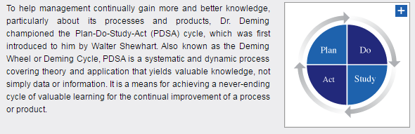
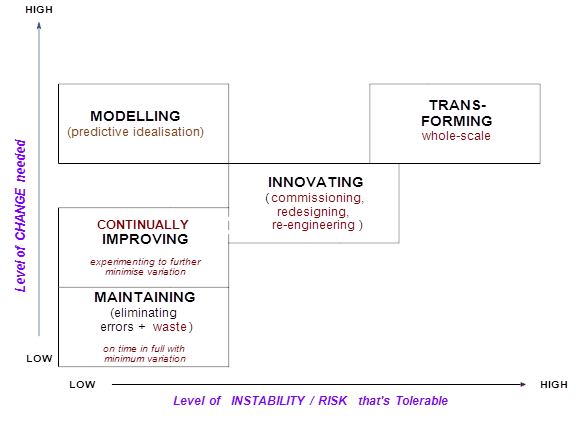
We question the need for the new Test, Learn and Adapt (TLA) model he offers because the NHS already possesses such a model – one which in our experience is more complete and often simpler to follow – it is called the “Improvement Model”(15) – and via its P-D-S-A mnemonic (Plan-Do-Study-Act) embodies the scientific method.
Moreover there is a preexisting wealth of experience on how best to embed this thinking within organisations – from top-to-bottom and importantly from bottom-to-top; experience that has been accumulating for fully nine decades – and though originally established in industrial settings has long since spread to services.
We are this week publishing two papers, one longer and one shorter, in which we start by defining science, ruing the dismal way in which it is perennially conveyed to children and students, the majority of whom leave formal education without understanding the power of discovery or gaining any first hand experience of the scientific method.
View Shorter Version Abstract
We argue that if science were to be defined around discovery, and learning cycles, and built upon observation, measurement and the accumulation of evidence – then good science could vitally be viewed as a process rather than merely as an externalized entity. These things comprise the very essence of what Don Berwick refers to as Improvement Science (2) as embodied by the Institute of Healthcare Improvement (IHI) and in the NHS’s Model for Improvement.
We also aim to bring an evolutionary perspective to the whole idea of science, arguing that its time has been coming for five centuries, yet is only now more fully arriving. We suggest that in a world where many at school have been turned-off science, the propensity to be scientific in our daily lives – and at work – makes a vast difference to the way people think about outcomes and their achievement. This is especially so if those who take a perverse pride in saying they avoided science at school, or who freely admit they do not do numbers, can get switched on to it.
The NHS Model for Improvement has a pedigree originating with Walter Shewhart in the 1920’s, then being famously applied by Deming and Juran after WWII. Deming in particular encapsulates the scientific method in his P-D-C-A model (three decades later he revised it to P-D-S-A in order to emphasize that the Check stage must not be short-changed) – his pragmatic way of enabling a learning/improvement to evolve bottom-up in organisations.
After the 1980’s Dr Don Berwick , standing on these shoulders, then applied the same thinking to the world of healthcare – initially in his native America. Berwick’s approach is to encourage people to ask questions such as: What works? .. and How would we know? His method, is founded upon a culture of evidence-based learning, providing a local context for systemic improvement efforts. A new organisational culture, one rooted in the science of improvement, if properly nurtured, may then emerge.
Yet, such a culture may initially jar with the everyday life of a conventional organisation, and the individuals within it. One of several reasons, according to Yuval Harari (21), is that for hundreds of generations our species has evolved such that imagined reality has been lorded over objective reality. Only relatively recently in our evolution has the advance of science been leveling up this imbalance, and in our papers we argue that a method is now needed that enables these two realities to more easily coexist.
We suggest that a method that enables data-rich evidence-based storytelling – by those who most know about the context and intend growing their collective knowledge – will provide the basis for an approach whereby the two realities may do just that.
In people’s working lives, a vital enabler is the 3-paradigm “Accountability/Improvement/Research” measurement model (AIRmm), reflecting the three archetypal ways in which people observe and measure things. It was created by healthcare professionals (23) to help their colleagues and policy-makers to unravel a commonly prevailing confusion, and to help people make better sense of the different approaches they may adopt when needing to evidence what they’re doing – depending on the specific purpose. An amended version of this model is already widely quoted inside the NHS, though this is not to imply that it is yet as widely understood or applied as it needs to be.
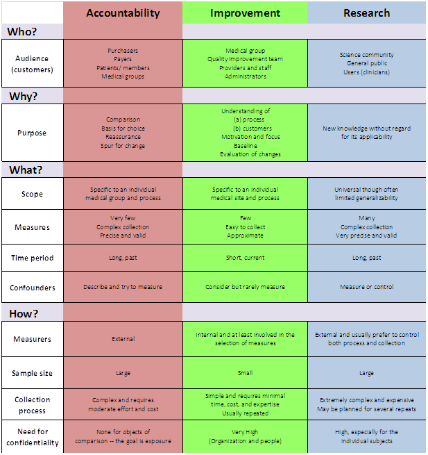
This 3-paradigm A-I-R measurement model underpins the way that science can be applied by, and has practical appeal for, the stretched healthcare professional, managerial leader, civil servant.
Indeed for anyone who intuitively suspects there has to be a better way to combine goals that currently feel disconnected or even in conflict: empowerment and accountability; safety and productivity; assurance and improvement; compliance and change; extrinsic and intrinsic motivation; evidence and action; facts and ideas; logic and values; etc.
Indeed for anyone who is searching for ways to unify their actions with the system-based implementation of those actions as systemic interventions. Though widely quoted in other guises, we are returning to the original model (23) because we feel it better connects to the primary aim of supporting healthcare professionals make best sense of their measurement options.
In particular the model makes it immediately plain that a way out of the apparent Research/Accountability dichotomy is readily available to anyone willing to “Learn, master and apply the modern methods of quality control, quality improvement and quality planning” – the recommendation made for all staff in the Berwick Report (3).
In many organisations, and not just in healthcare, the column 1 paradigm is the only game in town. Column 3 may feel attractive as a way-out, but it also feels inaccessible unless there is a graduate in statistician on hand. Moreover, the mainstay of the Column 3 worldview: the Randomized Controlled Trial (RCT) can feel altogether overblown and lacking in immediacy. It can feel like reaching for a spanner and finding a lump hammer in your hand – as Berwick says “Fans of traditional research methods view RCTs as the gold standard, but RCTs do not work well in many healthcare contexts” (2).
Like us, Ben is frustrated by the ways that healthcare organisations conduct themselves – not just the drug companies that commercialize science and publish only the studies likely to enhance sales, but governments too who commonly implement politically expedient policies only to then have to subsequently invent evidence to support them.
Policy-based evidence rather than evidence-based policy.
Ben’s recommended Column 3-style T-L-A approach is often more likely to make day-to-day sense to people and teams on the ground if complemented by Column 2-style improvement science.
One reason why Improvement Science can sometimes fail to dent established cultures is that it gets corralled by organisational “experts” – some of whom then use what little knowledge they have gathered merely to make themselves indispensable, not realising the extent to which everyone else as a consequence gets dis-empowered.
In our papers we take the opportunity to outline the philosophical underpinnings, and to do this we have borrowed the 7-point framework from a recent paper by Perla et al (35) who suggest that Improvement Science:
1. Is grounded in testing and learning cycles – the aim is collective knowledge and understanding about cause & effect over time. Some scientific method is needed, together with a way to make the necessary inquiry a collaborative one. Shewhart realised this and so invented the concept “continual improvement”.
2. Embraces a combination of psychology and logic – systemic learning requires that we balance myth and received wisdom with logic and the conclusions we derive from rational inquiry. This balance is approximated by the Sensing-Intuiting continuum in the Jungian-based MBTI model (12) reminding us that constructing a valid story requires bandwidth.
3. Has a philosophical foundation of conceptualistic pragmatism (16) – it cannot be expected that two scientists when observing, experiencing, or experimenting will make the same theory-neutral observations about the same event – even if there is prior agreement about methods of inference and interpretation. The normative nature of reality therefore has to be accommodated. Whereas positivism ultimately reduces the relation between meaning and experience to a matter of logical form, pragmatism allows us to ground meaning in conceived experience.
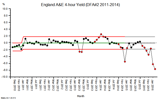
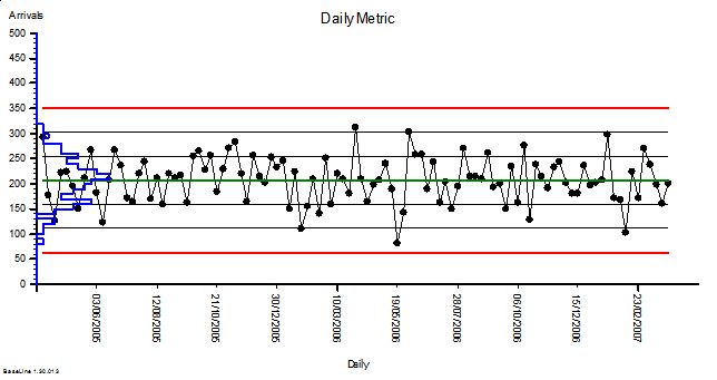
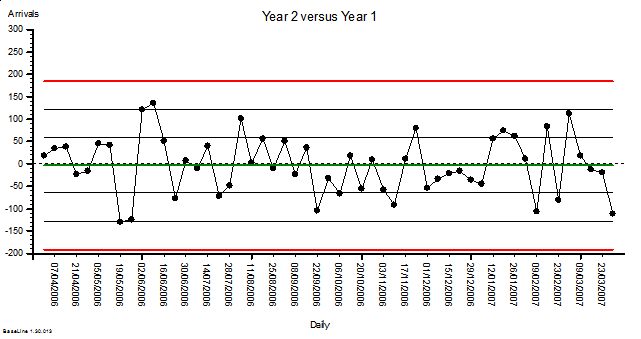
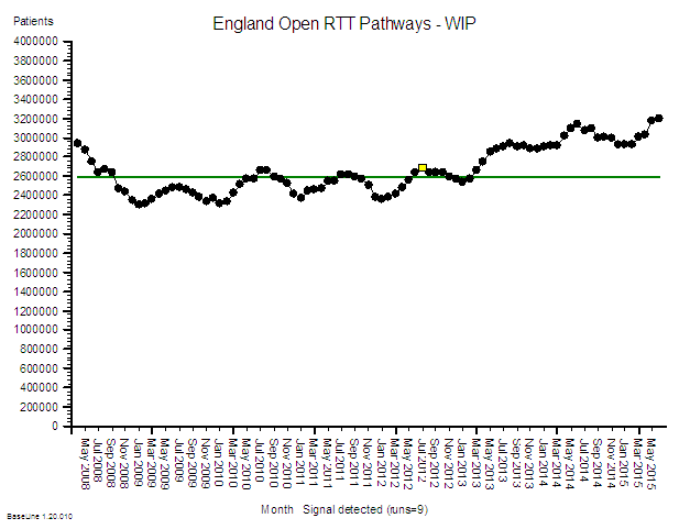
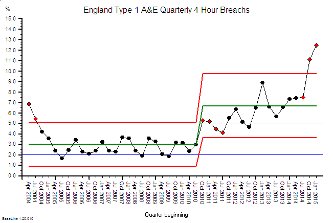
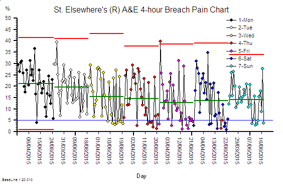
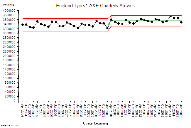
4. Employs Shewhart’s “theory of cause systems” – Walter Shewhart created the Control Chart for tuning-in to systemic behaviour that would otherwise remain unnoticed. It is a diagnostic tool, but by flagging potential trouble also aids real time prognosis. It might have been called a “self-control chart” for he was especially interested in supporting people working in and on their system being more considered (less reactive) when taking action to enhance it without over-reacting – avoiding what Deming later referred to as “Tampering” (4).
5. Requires the use of Operational Definitions – Deming warned that some of the most important aspects of a system cannot be expressed numerically, and those that can require care because “there is no true value of anything measured or observed” (5). When it comes to metric selection therefore it is essential to understand the measurement process itself, as well as the “operational definition” that each metric depends upon – the aim being to reduce ambiguity to zero.
6. Considers the contexts of both justification and discovery – Science can be defined as a process of discovery – testing and learning cycles built upon observation, measurement and accumulating evidence or experience – shared for example via a Flow Chart or a Gantt chart in order to justify a belief in the truth of an assertion. To be worthy of the term “science” therefore, a method or procedure is needed that is characterised by collaborative inquiry.
7. Is informed by Systems Theory – Systems Theory is the study of systems, any system: as small as a quark or as large as the universe. It aims to uncover archetypal behaviours and the principles by which systems hang together – behaviours that can be applied across all disciplines and all fields of research. There are several types of systems thinking, but Jay Forrester’s “System Dynamics” has most pertinence to Improvement Science because of its focus on flows and relationships – recognising that the behaviour of the whole may not be explained by the behaviour of the parts.
In the papers, we say more about this philosophical framing, and we also refer to the four elements in Deming’s “System of Profound Knowledge”(5). We especially want to underscore that the overall aim of any scientific method we employ is contextualised knowledge – which is all the more powerful if continually generated in context-specific experimental cycles. Deming showed that good science requires a theory of knowledge based upon ever-better questions and hypotheses. We two aim now to develop methods for building knowledge-full narratives that can work well in healthcare settings.
We wholeheartedly agree with Ben that for the public sector – not just in healthcare – policy-making needs to become more evidence-based.
In a poignant blog from the Health Foundation’s (HF) Richard Taunt (24), he recently describes attending two recent conferences on the same day. At the first one, policymakers from 25 countries had assembled to discuss how national policy can best enhance the quality of health care. When collectively asked which policies they would retain and repeat, their list included: use of data, building quality improvement capability, ensuring senior management are aware of improvement approaches, and supporting and spreading innovations.
In a different part of London, UK health politicians happened also to be debating Health and Care in order to establish the policy areas they would focus on if forming the next government. This second discussion brought out a completely different set of areas: the role of competition, workforce numbers, funding, and devolution of commissioning. These two discussions were supposedly about the same topic, but a Venn diagram would have contained next to no overlap.
Clare Allcock, also from the HF, then blogged to comment that “in England, we may think we are fairly advanced in terms of policy levers, but (unlike, for example in Scotland or the USA) we don’t even have a strategy for implementing health system quality.” She points in particular to Denmark who recently have announced they are phasing out their hospital accreditation scheme in favour of an approach strongly focused around quality improvement methodology and person-centred care. The Danes are in effect taking the 3-paradigm model and creating space for Column 2: improvement thinking.
The UK needs to take a leaf out of their book, for without changing fundamentally the way the NHS (and the public sector as a whole) thinks about accountability, any attempt to make column 2 the dominant paradigm is destined to be still born.
It is worth noting that in large part the AIRmm Column 2 paradigm was actually central to the 2012 White Paper’s values, and with it the subsequent Outcomes Framework consultation – both of which repeatedly used the phrase “bottom-up” to refer to how the new system of accountability would need to work, but somehow this seems to have become lost in legislative procedures that history will come to regard as having been overly ambitious. The need for a new paradigm of accountability however remains – and without it health workers and clinicians – and the managers who support them – will continue to view metrics more as something intrusive than as something that can support them in delivering enhancements in sustained outcomes. In our view the Stevens’ Five Year Forward View makes this new kind of accountability an imperative.
“Society, in general, and leaders and opinion formers, in particular, (including national and local media, national and local politicians of all parties, and commentators) have a crucial role to play in shaping a positive culture that, building on these strengths, can realise the full potential of the NHS.
When people find themselves working in a culture that avoids a predisposition to blame, eschews naïeve or mechanistic targets, and appreciates the pressures that can accumulate under resource constraints, they can avoid the fear, opacity, and denial that will almost inevitably lead to harm.”
Berwick Report (3)
Changing cultures means changing our habits – it starts with us. It won’t be easy because people default to the familiar, to more of the same. Hospitals are easier to build than relationships; operations are easier to measure than knowledge, skills and confidence; and prescribing is easier than enabling. The two of us do not of course possess a monopoly on all possible solutions, but our experience tells us that now is the time for: evidence-rich storytelling by front line teams; by pharmaceutical development teams; by patients and carers conversing jointly with their physicians.
We know that measurement is not a magic bullet, but what frightens us is that the majority of people seem content to avoid it altogether. As Oliver Moody recently noted in The Times ..
Call it innumeracy, magical thinking or intrinsic mental laziness, but even intelligent members of the public struggle, through no fault of their own, to deal with statistics and probability. This is a problem. People put inordinate amounts of trust in politicians, chief executives, football managers and pundits whose judgment is often little better than that of a psychic octopus. Short of making all schoolchildren study applied mathematics to A level, the only thing scientists can do about this is stick to their results and tell more persuasive stories about them.
Too often, Disraeli’s infamous words: “Lies, damned lies, and statistics” are used as the refuge of busy professionals looking for an excuse to avoid numbers.
If Improvement Science is to become a shared language, Berwick’s recommendation that all NHS staff “Learn, master and apply the modern methods of quality control, quality improvement and quality planning” has to be taken seriously.
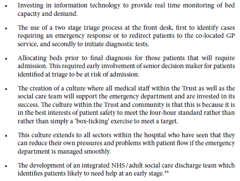
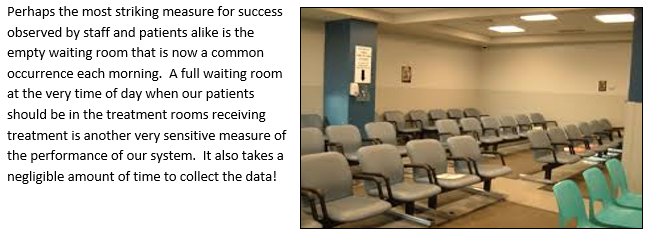
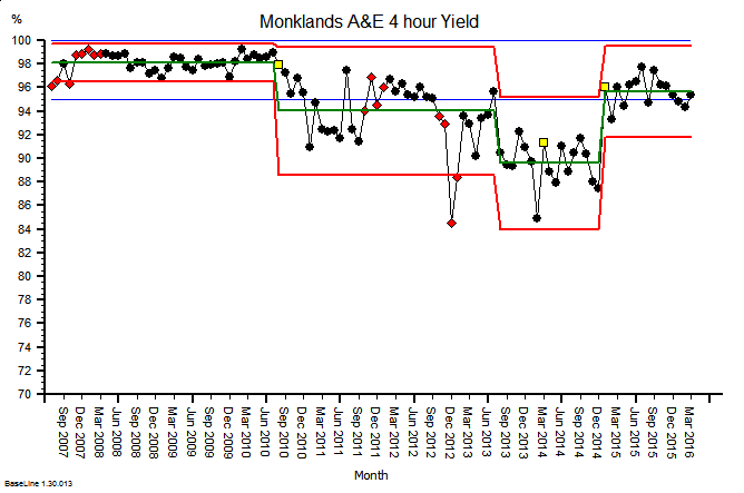
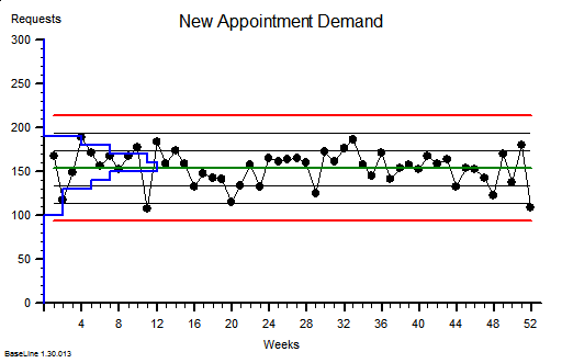
As a first step we recommend enabling teams to access good data in as near to real time as possible, data that indicates the impact that one’s intervention is having – this alone can prompt a dramatic shift in the type of conversation that people working in and on their system may have. Often this can be initiated simply by converting existing KPI data into System Behaviour Chart form which, using a tool like BaseLine® takes only a few mouse clicks.
In our longer paper we offer three examples of Improvement Science in action – combining to illustrate how data may be used to evidence both sustained systemic enhancement, and to generate engagement by the people most directly connected to what in real time is systemically occurring.
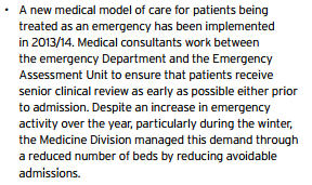
1. A surgical team using existing knowledge established by column 3-type research as a platform for column 2-type analytic study – to radically reduce post-operative surgical site infection (SSI).
2. 25 GP practices are required to collect data via the Friends & Family Test (FFT) and decide to experiment with being more than merely compliant. In two practices they collectively pilot a system run by their PPG (patient participation group) to study the FFT score – patient by patient – as they arrive each day. They use IS principles to separate signal from noise in a way that prompts the most useful response to the feedback in near to real time. Separately they summarise all the comments as a whole and feed their analysis into the bi-monthly PPG meeting. The aim is to address both “special cause” feedback and “common cause” feedback in a way that, in what most feel is an over-loaded system, can prompt sensibly prioritised improvement activity.
3. A patient is diagnosed with NAFLD and receives advice from their doctor to get more exercise e.g. by walking more. The patient uses the principles of IS to monitor what happens – using the data not just to show how they are complying with their doctor’s advice, but to understand what drives their personal mind/body system. The patient hopes that this knowledge can lead them to better decision-making and sustained motivation.
The landscape of NHS improvement and innovation support is fragmented, cluttered, and currently pretty confusing. Since May 2013 Academic Health Science Networks (AHSNs) funded by NHS England (NHSE) have been created with the aim of bringing together health services, and academic and industry members. Their stated purpose is to improve patient outcomes and generate economic benefits for the UK by promoting and encouraging the adoption of innovation in healthcare. They have a 5 year remit and have spent the first 2 years establishing their structures and recruiting, it is not yet clear if they will be able to deliver what’s really needed.
Patient Safety Collaboratives linked with AHSN areas have also been established to improve the safety of patients and ensure continual patient safety learning. The programme, coordinated by NHSE and NHSIQ will provide safety improvements across a range of healthcare settings by tackling the leading causes of avoidable harm to patients. The intention is to empower local patients and healthcare staff to work together to identify safety priorities and develop solutions – implemented and tested within local healthcare organisations, then later shared nationally.
We hope our papers will significantly influence the discussions about how improvement and innovation can assist with these initiatives. In the shorter paper to echo Deming, we even include our own 14 points for how healthcare organisations need to evolve. We will know that we have succeeded if the papers are widely read; if we enlist activists like Ben to the definition of science embodied by Improvement Science; and if we see a tidal wave of improvement science methods being applied across the NHS?
As patient volunteers, we each intend to find ways of contributing in any way that appears genuinely helpful. It is our hope that Improvement Science enables the cultural transformation we have envisioned in our papers and with our case studies. This is what we feel most equipped to help with. When in your sixties it easy to feel that time is short, but maybe people of every age should feel this way? In the words of Francis Bacon, the father of the scientific method.
Download Long Version
References

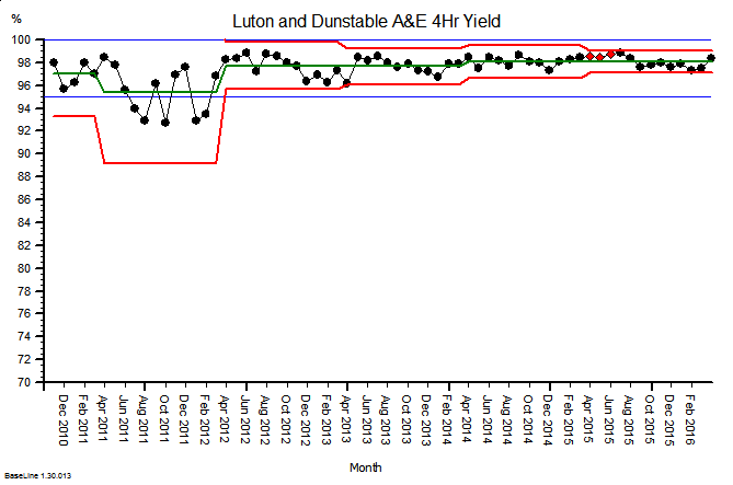
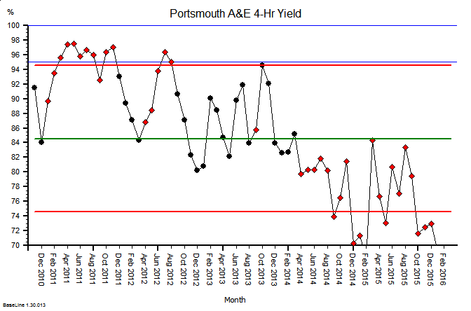
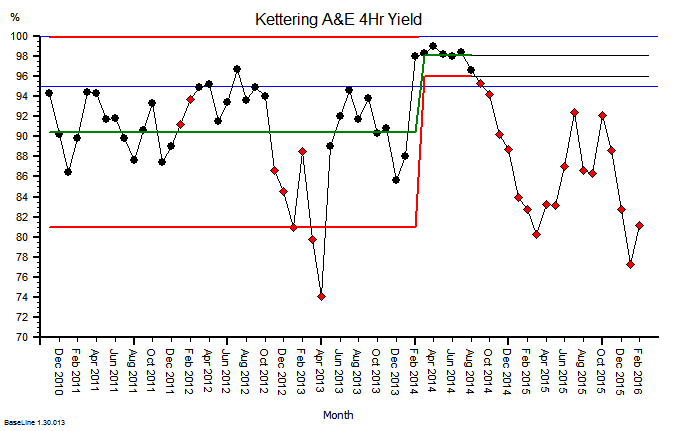
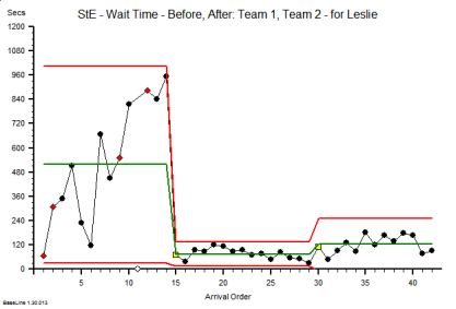
 Sometimes change is dramatic. A big improvement appears very quickly. And when that happens we are caught by surprise (and delight).


