
This week an interesting report was published by Monitor – about some possible reasons for the A&E debacle that England experienced in the winter of 2014.
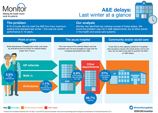
“91% of trusts did not meet the A&E 4-hour maximum waiting time standard last winter – this was the worst performance in 10 years”.
So it seems a bit odd that the very detailed econometric analysis and the testing of “Ten Hypotheses” did not look at the pattern of change over the previous 10 years … it just compared Oct-Dec 2014 with the same period for 2013! And the conclusion: “Hospitals were fuller in 2014“. H’mm.
The data needed to look back 10 years is readily available on the various NHS England websites … so here it is plotted as simple time-series charts. These are called system behaviour charts or SBCs. Our trusted analysis tools will be a Mark I Eyeball connected to the 1.3 kg of wetware between our ears that runs ChimpOS 1.0 … and we will look back 11 years to 2004.
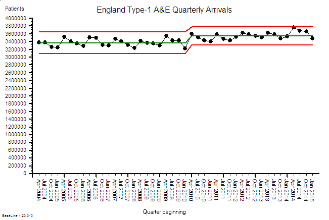 First we have the A&E Arrivals chart … about 3.4 million arrivals per quarter. The annual cycle is obvious … higher in the summer and falling in the winter. And when we compare the first five years with the last six years there has been a small increase of about 5% and that seems to associate with a change of political direction in 2010.
So over 11 years the average A&E demand has gone up … a bit … but only by about 5%.
 In stark contrast the A&E arrivals that are admitted to hospital has risen relentlessly over the same 11 year period by about 50% … that is about 5% per annum … ten times the increase in arrivals … and with no obvious step in 2010. We can see the annual cycle too. It is a like a ratchet. Click click click.
But that does not make sense. Where are these extra admissions going to? We can only conclude that over 11 years we have progressively added more places to admit A&E patients into. More space-capacity to store admitted patients … so we can stop the 4-hour clock perhaps? More emergency assessment units perhaps? Places to wait with the clock turned off perhaps? The charts imply that our threshold for emergency admission has been falling: Admission has become increasingly the ‘easier option’ for whatever reason. So why is this happening? Do more patients need to be admitted?
In a recent empirical study we asked elderly patients about their experience of the emergency process … and we asked them just after they had been discharged … when it was still fresh in their memories. A worrying pattern emerged. Many said that they had been admitted despite them saying they did not want to be. In other words they did not willingly consent to admission … they were coerced.
This is anecdotal data so, by implication, it is wholly worthless … yes? Perhaps from a statistical perspective but not from an emotional one. It is a red petticoat being waved that should not be ignored. Blissful ignorance comes from ignoring anecdotal stuff like this. Emotionally uncomfortable anecdotal stories. Ignore the early warning signs and suffer the potentially catastrophic consequences.
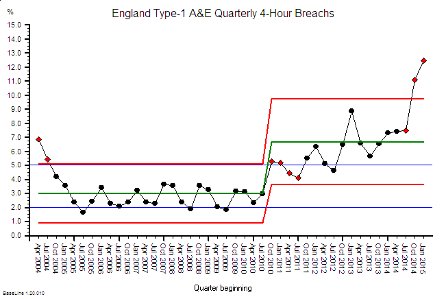 And here is the corresponding A&E 4-hour Target Failure chart. Up to 2010 the imposed target was 98% success (i.e. 2% acceptable failure) and, after bit of “encouragement” in 2004-5, this was actually achieved in some of the summer months (when the A&E demand was highest remember).
But with a change of political direction in 2010 the “hated” 4-hour target was diluted down to 95% … so a 5% failure rate was now ‘acceptable’ politically, operationally … and clinically.
So it is no huge surprise that this is what was achieved … for a while at least.
In the period 2010-13 the primary care trusts (PCTs) were dissolved and replaced by clinical commissioning groups (CCGs) … the doctors were handed the ignition keys to the juggernaut that was already heading towards the cliff.
The charts suggest that the seeds were already well sown by 2010 for an evolving catastrophe that peaked last year; and the changes in 2010 and 2013 may have just pressed the accelerator pedal a bit harder. And if the trend continues it will be even worse this coming winter. Worse for patients and worse for staff and worse for commissioners and worse for politicians. Lose lose lose lose.
So to summarise the data from the NHS England’s own website:
1. A&E arrivals have gone up 5% over 11 years.
2. Admissions from A&E have gone up 50% over 11 years.
3. Since lowering the threshold for acceptable A&E performance from 98% to 95% the system has become unstable and “fallen off the cliff” … but remember, a temporal association does not prove causation.
So what has triggered the developing catastrophe?
Well, it is important to appreciate that when a patient is admitted to hospital it represents an increase in workload for every part of the system that supports the flow through the hospital … not just the beds. Beds represent space-capacity. They are just where patients are stored. We are talking about flow-capacity; and that means people, consumables, equipment, data and cash.
So if we increase emergency admissions by 50% then, if nothing else changes, we will need to increase the flow-capacity by 50% and the space-capacity to store the work-in-progress by 50% too. This is called Little’s Law. It is a mathematically proven Law of Flow Physics. It is not negotiable.
So have we increased our flow-capacity and our space-capacity (and our costs) by 50%? I don’t know. That data is not so easy to trawl from the websites. It will be there though … somewhere.
What we have seen is an increase in bed occupancy (the red box on Monitor’s graphic above) … but not a 50% increase … that is impossible if the occupancy is already over 85%. A hospital is like a rigid metal box … it cannot easily expand to accommodate a growing queue … so the inevitable result in an increase in the ‘pressure’ inside. We have created an emergency care pressure cooker. Well lots of them actually.
And that is exactly what the staff who work inside hospitals says it feels like.
And eventually the relentless pressure and daily hammering causes the system to start to weaken and fail, gradually at first then catastrophically … which is exactly what the NHS England data charts are showing.
So what is the solution? More beds?
Nope. More beds will create more space and that will relieve the pressure … for a while … but it will not address the root cause of why we are admitting 50% more patients than we used to; and why we seem to need to increase the pressure inside our hospitals to squeeze the patients through the process and extrude them out of the various exit nozzles.
Those are the questions we need to have understandable and actionable answers to.
Q1: Why are we admitting 5% more of the same A&E arrivals each year rather than delivering what they need in 4 hours or less and returning them home? That is what the patients are asking for.
Q2: Why do we have to push patients through the in-hospital process rather than pulling them through? The staff are willing to work but not inside a pressure cooker.
A more sensible improvement strategy is to look at the flow processes within the hospital and ensure that all the steps and stages are pulling together to the agreed goals and plan for each patient. The clinical management plan that was decided when the patient was first seen in A&E. The intended outcome for each patient and the shortest and quickest path to achieving it.
Our target is not just a departure within 4 hours of arriving in A&E … it is a competent diagnosis (study) and an actionable clinical management plan (plan) within 4 hours of arriving; and then a process that is designed to deliver (do) it … for every patient. Right, first time, on time, in full and at a cost we can afford.
Q: Do we have that?
A: Nope.
Q: Is that within our gift to deliver?
A: Yup.
Q: So what is the reason we are not already doing it?
A: Good question. Who in the NHS is trained how to do system-wide flow design like this?