
 The NHS appears to be suffering from some form of obsessive-compulsive disorder.
OCD sufferers feel extreme anxiety in certain situations. Their feelings drive their behaviour which is to reduce the perceived cause of their feelings. It is a self-sustaining system because their perception is distorted and their actions are largely ineffective. So their anxiety is chronic.
Perfectionists demonstrate a degree of obsessive-compulsive behaviour too.
In the NHS the triggers are called ‘targets’ and usually take the form of failure metrics linked to arbitrary performance specifications.
The anxiety is the fear of failure and its unpleasant consequences: the name-shame-blame-game.
So a veritable industry has grown around ways to mitigate the fear. A very expensive and only partially effective industry.
Data is collected, cleaned, manipulated and uploaded to the Mothership (aka NHS England). There it is further manipulated, massaged and aggregated. Then the accumulated numbers are posted on-line, every month for anyone with a web-browser to scrutinise and anyone with an Excel spreadsheet to analyse.
An ocean of measurements is boiled and distilled into a few drops of highly concentrated and sanitized data and, in the process, most of the useful information is filtered out, deleted or distorted.
For example …
One of the failure metrics that sends a shiver of angst through a Chief Operating Officer (COO) is the failure to deliver the first definitive treatment for any patient within 18 weeks of referral from a generalist to a specialist.
The infamous and feared 18-week target.
Service providers, such as hospitals, are actually fined by their Clinical Commissioning Groups (CCGs) for failing to deliver-on-time. Yes, you heard that right … one NHS organisation financially penalises another NHS organisation for failing to deliver a result over which they have only partial control.
Service providers do not control how many patients are referred, or a myriad of other reasons that delay referred patients from attending appointments, tests and treatments. But the service providers are still accountable for the outcome of the whole process.
This ‘Perform-or-Pay-The-Price Policy‘ creates the perfect recipe for a lot of unhappiness for everyone … which is exactly what we hear and what we see.
So what distilled wisdom does the Mothership share? Here is a snapshot …
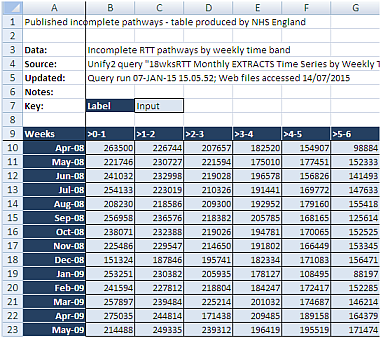
Q1: How useful is this table of numbers in helping us to diagnose the root causes of long waits, and how does it help us to decide what to change in our design to deliver a shorter waiting time and more productive system?
A1: It is almost completely useless (in this format).
So what actually happens is that the focus of management attention is drawn to the part just before the speed camera takes the snapshot … the bit between 14 and 18 weeks.
Inside that narrow time-window we see a veritable frenzy of target-failure-avoiding behaviour.
Clinical priority is side-lined and management priority takes over. This is a management emergency! After all, fines-for-failure are only going to make the already bad financial situation even worse!
The outcome of this fire-fighting is that the bigger picture is ignored. The focus is on the ‘whip’ … and avoiding it … because it hurts!
Message from the Mothership: “Until morale improves the beatings will continue”.
The good news is that the undigestible data liquor does harbour some very useful insights. All we need to do is to present it in a more palatable format … as pictures of system behaviour over time.
We need to use the data to calculate the work-in-progress (=WIP).
And then we need to plot the WIP in time-order so we can see how the whole system is behaving over time … how it is changing and evolving. It is a dynamic living thing, it has vitality.
So here is the WIP chart using the distilled wisdom from the Mothership.
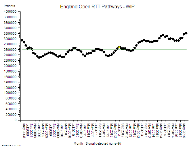
And this picture does not require a highly trained data analyst or statistician to interpret it for us … a Mark I eyeball linked to 1.3 kg of wetware running ChimpOS 1.0 is enough … and if you are reading this then you must already have that hardware and software.
Two patterns are obvious:
1) A cyclical pattern that appears to have an annual frequency, a seasonal pattern. The WIP is higher in the summer than in the winter. Eh? What is causing that?
2) After an initial rapid fall in 2008 the average level was steady for 4 years … and then after March 2012 it started to rise. Eh? What is causing is that?
The purpose of a WIP chart is to stimulate questions such as:
Q1: What happened in March 2012 that might have triggered this change in system behaviour?
Q2: What other effects could this trigger have caused and is there evidence for them?
A1: In March 2012 the Health and Social Care Act 2012 became Law. In the summer of 2012 the shiny new and untested Clinical Commissioning Groups (CCGs) were authorised to take over the reins from the exiting Primary care Trusts (PCTs) and Strategic Health Authorities (SHAs). The vast £80bn annual pot of tax-payer cash was now in the hands of well-intended GPs who believed that they could do a better commissioning job than non-clinicians. The accountability for outcomes had been deftly delegated to the doctors. And many of the new CCG managers were the same ones who had collected their redundancy checks when the old system was shut down. Now that sounds like a plausible system-wide change! A massive political experiment was underway and the NHS was the guinea-pig.
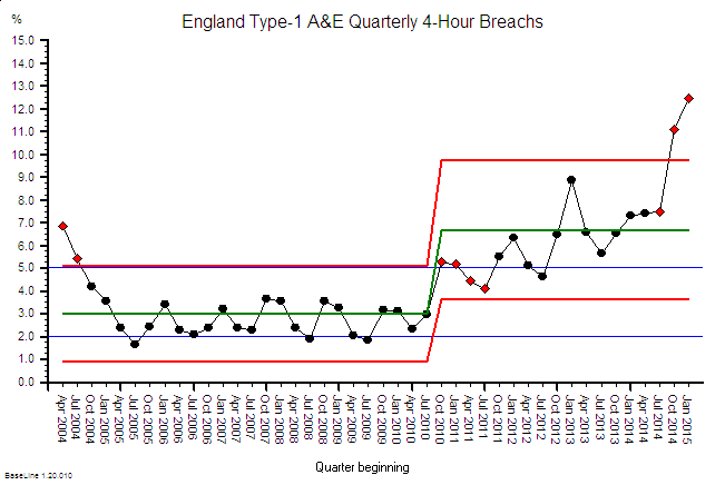
A2: Another NHS failure metric is the A&E 4-hour wait target which, worringly, also shows a deterioration that appears to have started just after July 2010, i.e. just after the new Government was elected into power. Maybe that had something to do with it? Maybe it would have happened whichever party won at the polls.
A plausible temporal association does not constitute proof – and we cannot conclude a political move to a CCG-led NHS has caused the observed behaviour. Retrospective analysis alone is not able to establish the cause.
It could just as easily be that something else caused these behaviours. And it is important to remember that there are usually many causal factors combining together to create the observed effect.
And unraveling that Gordian Knot is the work of analysts, statisticians, economists, historians, academics, politicians and anyone else with an opinion.
We have a more pressing problem. We have a deteriorating NHS that needs urgent resuscitation!
So what can we do?
One thing we can do immediately is to make better use of our data by presenting it in ways that are easier to interpret … such as a work in progress chart.
Doing that will trigger different conversions; ones spiced with more curiosity and laced with less cynicism.
We can add more context to our data to give it life and meaning. We can season it with patient and staff stories to give it emotional impact.
And we can deepen our understanding of what causes lead to what effects.
And with that deeper understanding we can begin to make wiser decisions that will lead to more effective actions and better outcomes.
This is all possible. It is called Improvement Science.
And as we speak there is an experiment running … a free offer to doctors-in-training to learn the foundations of improvement science in healthcare (FISH).
In just two weeks 186 have taken up that offer and 13 have completed the course!
And this vanguard of curious and courageous innovators have discovered a whole new world of opportunity that they were completely unaware of before. But not anymore!
So let us ease off applying the whip and ease in the application of WIP.
PostScript
Here is a short video describing how to create, animate and interpret a form of diagnostic Vitals Chart® using the raw data published by NHS England. This is a training exercise from the Improvement Science Practitioner (level 2) course.
How to create an 18 weeks animated Bucket Brigade Chart (BBC)