 The most useful tool that a busy operational manager can have is a reliable and responsive early warning system (EWS).
One that alerts when something is changing and that, if missed or ignored, will cause a big headache in the future.
Rather like the radar system on an aircraft that beeps if something else is approaching … like another aircraft or the ground!
Operational managers are responsible for delivering stuff on time. So they need a radar that tells them if they are going to deliver-on-time … or not.
And their on-time-delivery EWS needs to alert them soon enough that they have time to diagnose the ‘threat’, design effective plans to avoid it, decide which plan to use, and deliver it.
So what might an effective EWS for a busy operational manager look like?
- It needs to be reliable. No missed threats or false alarms.
- It needs to be visible. No tomes of text and tables of numbers.
- It needs to be simple. Easy to learn and quick to use.
And what is on offer at the moment?
The RAG Chart
This is a table that is coloured red, amber and green. Red means ‘failing’, green means ‘not failing’ and amber means ‘not sure’. So this meets the specification of visible and simple, but it is reliable?
It appears not. RAG charts do not appear to have helped to solve the problem.
A RAG chart is generated using historic data … so it tells us where we are now, not how we got here, where we are going or what else is heading our way. It is a snapshot. One frame from the movie. Better than complete blindness perhaps, but not much.
The SPC Chart
This is a statistical process control chart and is a more complicated beast. It is a chart of how some measure of performance has changed over time in the past. So like the RAG chart it is generated using historic data. The advantage is that it is not just a snapshot of where were are now, it is a picture of story of how we got to where we are, so it offers the promise of pointing to where we may be heading. It meets the specification of visible, and while more complicated than a RAG chart, it is relatively easy to learn and quick to use.
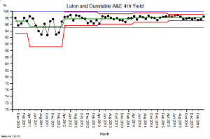
 Here is an example. It is the SPC chart of the monthly A&E 4-hour target yield performance of an acute NHS Trust. The blue lines are the ‘required’ range (95% to 100%), the green line is the average and the red lines are a measure of variation over time. What this charts says is: “This hospital’s A&E 4-hour target yield performance is currently acceptable, has been so since April 2012, and is improving over time.”
So that is much more helpful than a RAG chart (which in this case would have been green every month because the average was above the minimum acceptable level).
So why haven’t SPC charts replaced RAG charts in every NHS Trust Board Report?
Could there be a fly-in-the-ointment?
The answer is “Yes” … there is.
SPC charts are a quality audit tool. They were designed nearly 100 years ago for monitoring the output quality of a process that is already delivering to specification (like the one above). They are designed to alert the operator to early signals of deterioration, called ‘assignable cause signals’, and they prompt the operator to pay closer attention and to investigate plausible causes.
SPC charts are not designed for predicting if there is a flow problem looming over the horizon. They are not designed for flow metrics that exhibit expected cyclical patterns. They are not designed for monitoring metrics that have very skewed distributions (such as length of stay). They are not designed for metrics where small shifts generate big cumulative effects. They are not designed for metrics that change more slowly than the frequency of measurement.
And these are exactly the sorts of metrics that a busy operational manager needs to monitor, in reality, and in real-time.
Demand and activity both show strong cyclical patterns.
Lead-times (e.g. length of stay) are often very skewed by variation in case-mix and task-priority.
Waiting lists are like bank accounts … they show the cumulative sum of the difference between inflow and outflow. That simple fact invalidates the use of the SPC chart.
Small shifts in demand, activity, income and expenditure can lead to big cumulative effects.
So if we abandon our RAG charts and we replace them with SPC charts … then we climb out of the RAG frying pan and fall into the SPC fire.
Oops! No wonder the operational managers and financial controllers have not embraced SPC.
So is there an alternative that works better? A more reliable EWS that busy operational managers and financial controllers can use?
Yes, there is, and here is a clue …
… but tread carefully …
… building one of these Flow-Productivity Early Warning Systems is not as obvious as it might first appear. There are counter-intuitive traps for the unwary and the untrained.
You may need the assistance of a health care systems engineer (HCSE).
