A Recipe for Chaos

growing_workload_anim_6858There is an easy and quick-to-cook recipe for chaos.

All we have to do is to ensure that the maximum number of jobs that we can do in a given time is set equal to the average number of jobs that we are required to do in the same period of time.

Eh?

That does not make sense.  Our intuition says that looks like the perfect recipe for a hyper-efficient, zero-waste, zero idle-time design which is what we want.


I know it does, but it isn’t.  Our intuition is tricking us.

It is the recipe for chaos – and to prove it all we will have to do a real world experiment – because to prove it using maths is really difficult. So difficult in fact that the formula was not revealed until 1962 – by a mathematician called John Kingman while a postgraduate student at Pembroke College, Cambridge.

The empirical experiment is very easy to do – all we need is a single step process – and a stream of jobs to do.

And we could do it for real, or we can simulate it using an Excel spreadsheet – which is much quicker.


So we set up our spreadsheet to simulate a new job arriving every X minutes and each job taking X minutes to complete.

Our operator can only do one job at a time so if a job arrives and the operator is busy the job joins the back of a queue of jobs and waits.

When the operator finishes a job it takes the next one from the front of the queue, the one that has been waiting longest.

And if there is no queue the operator will wait until the next job arrives.

Simple.

And when we run simulation the we see that there is indeed no queue, no jobs waiting and the operator is always busy (i.e. 100% utilised). Perfection!

BUT ….

This is not a realistic scenario.  In reality there is always some random variation.  Not all jobs require the same length of time, and jobs do not arrive at precisely the right intervals.

No matter, our confident intuition tells us. It will average out.  Swings-and-roundabouts. Give-and-take.

It doesn’t.

And if you do not believe me just build the simple Excel model outlined above, verify that it works, then add some random variation to the time it takes to do each job … and observe what happens to the average waiting time.

What you will discover is that as soon as we add even a small amount of random variation we get a queue, and waiting and idle resources as well!

But not a steady, stable, predictable queue … Oh No! … We get an unsteady, unstable and unpredictable queue … we get chaos.

Try it.


So what? How does this abstract ‘queue theory’ apply to the real world?


Well, suppose we have a single black box system called ‘a hospital’ – patients arrive and we work hard to diagnose and treat them.  And so long as we have enough resource-time to do all the jobs we are OK. No unstable queues. No unpredictable waiting.

But time-costs-money and we have an annual cost improvement target (CIP) that we are required to meet so we need to ‘trim’ resource-time capacity to push up resource utilisation.  And we will call that an ‘efficiency improvement’ which is good … yes?

It isn’t actually.  I can just as easily push up my ‘utilisation’ by working slower, or doing stuff I do not need to, or by making mistakes that I have to check for and then correct.  I can easily make myself busier and delude myself I am working harder.

And we are also a victim of our own success … the better we do our job … the longer people live and the more workload they put on the health and social care system.

So we have the perfect storm … the perfect recipe for chaos … slowly rising demand … slowly shrinking budgets … and an inefficient ‘business’ design.

And that in a nutshell is the reason the NHS is descending into chaos.


So what is the solution?

Reduce demand? Stop people getting sick? Or make them sicker so they die quicker?

Increase budgets? Where will the money come from? Beg? Borrow? Steal? Economic growth?

Improve the design?  Now there’s a thought. But how? By using the same beliefs and behaviours that have created the current chaos?

Maybe we need to challenge some invalid beliefs and behaviours … and replace those that fail the Reality Test with some more effective ones.

High Performing Design Teams

figures_colored_teamwork_pass_puzzle_piece_300_wht_9681It is possible but unusual for significant improvement-by-design to be delivered by an individual.

It is much more likely to require a group of people – a design team.


And that is where efforts to improve often come to a grinding halt because, despite our good intentions, we are not always very good at collaborative improvement.


This is not a new problem so the solution must be elusive, yes?

Well, actually that is not the case.  We all already know what to do, we all know the pieces of the productive team jigsaw … we just do not use all of them all of the time.

Fortunately, there is an easy way to get around this problem. A checklist.

Just like the ones that astronauts, pilots, and surgeons use.

And this week I discovered an excellent source of checklists for developing and sustaining high performance teams:

A Systematic Guide to High Performing Teams by Ken Thompson (ISBN 9-781522-871910) and here is a TEDx talk of Ken describing the ‘secrets’.

The ones that we all know.

System of Profound Knowledge


Don_Berwick_2016

This week I had the great pleasure of watching Dr Don Berwick sharing the story of his own ‘near religious experience‘ and his conversion to a belief that a Science of Improvement exists.  In 1986, Don attended one of W.Edwards Deming’s famous 4-day workshops.  It was an emotional roller coaster ride for Don! See here for a link to the whole video … it is worth watching all of it … the best bit is at the end.


Don outlines Deming’s System of Profound Knowledge (SoPK) and explores each part in turn. Here is a summary of SoPK from the Deming website.

Deming_SOPK

W.Edwards Deming was a physicist and statistician by training and his deep understanding of variation and appreciation for a system flows from that.  He was not trained as a biologist, psychologist or educationalist and those parts of the SoPK appear to have emerged later.

Here are the summaries of these parts – psychology first …

Deming_SOPK_Psychology

Neurobiologists and psychologists now know that we are the product of our experiences and our learning. What we think consciously is just the emergent tip of a much bigger cognitive iceberg. Most of what is happening is operating out of awareness. It is unconscious.  Our outward behaviour is just a visible manifestation of deeply ingrained values and beliefs that we have learned – and reinforced over and over again.  Our conscious thoughts are emergent effects.


So how do we learn?  How do we accumulate these values and beliefs?

This is the summary of Deming’s Theory of Knowledge …

Deming_SOPK_PDSA

But to a biologist, neuroanatomist, neurophysiologist, doctor, system designer and improvement coach … this does not feel correct.

At the most fundamental biological level we do not learn by starting with a theory; we start with a sensory.  The simplest element of the animal learning system – the nervous system – is called a reflex arc.

Sensor_Processor_EffectorFirst, we have some form of sensor to gather data from the outside world. Eyes, ears, smell, taste, touch, temperature, pain and so on.  Let us consider pain.

That signal is transmitted via a sensory nerve to the processor, the grey matter in this diagram, where it is filtered, modified, combined with other data, filtered again and a binary output generated. Act or Not.

If the decision is ‘Act’ then this signal is transmitted by a motor nerve to an effector, in this case a muscle, which results in an action.  The muscle twitches or contracts and that modifies the outside world – we pull away from the source of pain.  It is a harm avoidance design. Damage-limitation. Self-preservation.

Another example of this sensor-processor-effector design template is a knee-jerk reflex, so-named because if we tap the tendon just below the knee we can elicit a reflex contraction of the thigh muscle.  It is actually part of a very complicated, dynamic, musculoskeletal stability cybernetic control system that allows us to stand, walk and run … with almost no conscious effort … and no conscious awareness of how we are doing it.

But we are not born able to walk. As youngsters we do not start with a theory of how to walk from which we formulate a plan. We see others do it and we attempt to emulate them. And we fail repeatedly. Waaaaaaah! But we learn.


Human learning starts with study. We then process the sensory data using our internal mental model – our rhetoric; we then decide on an action based on our ‘current theory’; and then we act – on the external world; and then we observe the effect.  And if we sense a difference between our expectation and our experience then that triggers an ‘adjustment’ of our internal model – so next time we may do better because our rhetoric and the reality are more in sync.

The biological sequence is Study-Adjust-Plan-Do-Study-Adjust-Plan-Do and so on, until we have achieved our goal; or until we give up trying to learn.


So where does psychology come in?

Well, sometimes there is a bigger mismatch between our rhetoric and our reality. The world does not behave as we expect and predict. And if the mismatch is too great then we are left with feelings of confusion, disappointment, frustration and fear.  (PS. That is our unconscious mind telling us that there is a big rhetoric-reality mismatch).

We can see the projection of this inner conflict on the face of a child trying to learn to walk.  They screw up their faces in conscious effort, and they fall over, and they hurt themselves and they cry.  But they do not want us to do it for them … they want to learn to do it for themselves. Clumsily at first but better with practice. They get up and try again … and again … learning on each iteration.

Study-Adjust-Plan-Do over and over again.


There is another way to avoid the continual disappointment, frustration and anxiety of learning.  We can distort our sensation of external reality to better fit with our internal rhetoric.  When we do that the inner conflict goes away.

We learn how to tamper with our sensory filters until what we perceive is what we believe. Inner calm is restored (while outer chaos remains or increases). We learn the psychological defense tactics of denial and blame.  And we practice them until they are second-nature. Unconscious habitual reflexes. We build a reality-distortion-system (RDS) and it has a name – the Ladder of Inference.


And then one day, just by chance, somebody or something bypasses our RDS … and that is the experience that Don Berwick describes.

Don went to a 4-day workshop to hear the wisdom of W.Edwards Deming first hand … and he was forced by the reality he saw to adjust his inner model of the how the world works. His rhetoric.  It was a stormy transition!

The last part of his story is the most revealing.  It exposes that his unconscious mind got there first … and it was his conscious mind that needed to catch up.

Study-(Adjust)-Plan-Do … over-and-over again.


In Don’s presentation he suggests that Frederick W. Taylor is the architect of the failure of modern management. This is a commonly held belief, and everyone is equally entitled to an opinion, that is a definition of mutual respect.

But before forming an individual opinion on such a fundamental belief we should study the raw evidence. The words written by the person who wrote them not just the words written by those who filtered the reality through their own perceptual lenses.  Which we all do.

Health Care System Engineers

engineers_turbine_engine_16758The NHS is falling.

All the performance indicators on the NHSE cockpit dashboard show that it is on a downward trajectory.

The NHS engines are no longer effective enough or efficient enough to keep the NHS airship safely aloft.

And many sense the impending crash.

Scuffles are breaking out in the cockpit as scared pilots and anxious politicians wrestle with each other for the controls. The passengers and patients appear to be blissfully ignorant of the cockpit conflict.

But the cockpit chaos only serves to accelerate their collective rate of descent towards the hard reality of the Mountain of Doom.


So what is needed to avoid the crash?

Well, some calm and credible leadership in the cockpit would help; some coordinated crash avoidance would help too; and some much more effective and efficient engines to halt the descent and to lift us back to a safe altitude would help too. In fact the new NHS engines are essential.

But who is able to design, build, test and install these new health care system engines?


We need competent and experienced health care system engineers.


And clearly we do not have enough because if we had, we would not be in a CFIT scenario (cee fit = controlled flight into terrain).

So why do we not have enough health care system engineers?

Surely there are appropriate candidates and surely there are enough accredited courses with proven track records?

I looked.  There are no accredited courses in the UK and there are no proven track records. But there appears to be no shortage of suitable candidates from all corners of the NHS.

How can this be?

The answer seems to be that the complex flow system engineering science needed to do this is actually quite new … it is called Complex Adaptive Systems Engineering (CASE) … and it has not diffused into healthcare.

More worryingly, even basic flow engineering science has not either, and that seems to be because health care is so insular.

So what can we do?

The answer would seem to be clear.  First, we need to find some people who, by chance, are dual-trained in health care and systems engineering.  And there are a few of them, but not many.


People like Dr Kate Silvester who trained as an ophthalmic surgeon then retrained as a manufacturing systems engineer with Lucas and Airbus. Kate brought these novel flow engineering skills back in to the NHS in the days of the Modernisation Agency and since then has proved that they work in practice – as described in the Health Foundation Flow-Cost-Quality Programme Report.


Second, we need to ask this small band of seasoned practitioners to design and to deliver a pragmatic, hands-on, learning-by-doing Health Care Systems Engineer Development Programme.


The good news is that, not surprisingly, they have already diagnosed this skill gap and have been quietly designing, building and testing.

And they have come up with a name: The Phoenix Programme.

And because TPP is a highly disruptive innovation they know that it is too early to give it a price-tag, so they have generously offered a limited number of free tickets to the first part of TPP to clinicians and clinical scientists.

The first step is called the Foundations of Improvement Science in Healthcare online course, and better known to those who have completed it as “FISH”.

This vanguard of innovators have shared their feedback.

And, for those who are frustrated and curious enough to explore outside their comfort zones, there are still some #freeFISH tickets available.


So, if you are attracted by the opportunity of dual-training as a clinician and as a Health Care Systems Engineer (HCSE) then we invite you to step this way.


And not surprisingly, this is not a new idea … see here and here.

Culture – cause or effect?

The Harvard Business Review is worth reading because many of its articles challenge deeply held assumptions, and then back up the challenge with the pragmatic experience of those who have succeeded to overcome the limiting beliefs.

So the heading on the April 2016 copy that awaited me on my return from an Easter break caught my eye: YOU CAN’T FIX CULTURE.


HBR_April_2016

The successful leaders of major corporate transformations are agreed … the cultural change follows the technical change … and then the emergent culture sustains the improvement.

The examples presented include the Ford Motor Company, Delta Airlines, Novartis – so these are not corporate small fry!

The evidence suggests that the belief of “we cannot improve until the culture changes” is the mantra of failure of both leadership and management.


A health care system is characterised by a culture of risk avoidance. And for good reason. It is all too easy to harm while trying to heal!  Primum non nocere is a core tenet – first do no harm.

But, change and improvement implies taking risks – and those leaders of successful transformation know that the bigger risk by far is to become paralysed by fear and to do nothing.  Continual learning from many small successes and many small failures is preferable to crisis learning after a catastrophic failure!

The UK healthcare system is in a state of chronic chaos.  The evidence is there for anyone willing to look.  And waiting for the NHS culture to change, or pushing for culture change first appears to be a guaranteed recipe for further failure.

The HBR article suggests that it is better to stay focussed; to work within our circles of control and influence; to learn from others where knowledge is known, and where it is not – to use small, controlled experiments to explore new ground.


And I know this works because I have done it and I have seen it work.  Just by focussing on what is important to every member on the team; focussing on fixing what we could fix; not expecting or waiting for outside help; gathering and sharing the feedback from patients on a continuous basis; and maintaining patient and team safety while learning and experimenting … we have created a micro-culture of high safety, high efficiency, high trust and high productivity.  And we have shared the evidence via JOIS.

The micro-culture required to maintain the safety, flow, quality and productivity improvements emerged and evolved along with the improvements.

It was part of the effect, not the cause.


So the concept of ‘fix the system design flaws and the continual improvement culture will emerge’ seems to work at macro-system and at micro-system levels.

We just need to learn how to diagnose and treat healthcare system design flaws. And that is known knowledge.

So what is the next excuse?  Too busy?

FrailSafe Design

frailsafeSafe means avoiding harm, and safety is an emergent property of a well-designed system.

Frail means infirm, poorly, wobbly and at higher risk of harm.

So we want our health care system to be a FrailSafe Design.

But is it? How would we know? And what could we do to improve it?


About ten years ago I was involved in a project to improve the safety design of a specific clinical stream flowing through the hospital that I work in.

The ‘at risk’ group of patients were frail elderly patients admitted as an emergency after a fall and who had suffered a fractured thigh bone. The neck of the femur.

Historically, the outcome for these patients was poor.  Many do not survive, and many of the survivors never returned to independent living. They become even more frail.


The project was undertaken during an organisational transition, the hospital was being ‘taken over’ by a bigger one.  This created a window of opportunity for some disruptive innovation, and the project was labelled as a ‘Lean’ one because we had been inspired by similar work done at Bolton some years before and Lean was the flavour of the month.

The actual change was small: it was a flow design tweak that cost nothing to implement.

First we asked two flow questions:
Q1: How many of these high-risk frail patients do we admit a year?
A1: About one per day on average.
Q2: What is the safety critical time for these patients?
A2: The first four days.  The sooner they have hip surgery and are able to be actively mobilise the better their outcome.

Second we applied Little’s Law which showed the average number of patients in this critical phase is four. This was the ‘work in progress’ or WIP.

And we knew that variation is always present, and we knew that having all these patients in one place would make it much easier for the multi-disciplinary teams to provide timely care and to avoid potentially harmful delays.

So we suggested that one six-bedded bay on one of the trauma wards be designated the Fractured Neck Of Femur bay.

That was the flow diagnosis and design done.

The safety design was created by the multi-disciplinary teams who looked after these patients: the geriatricians, the anaesthetists, the perioperative emergency care team (PECT), the trauma and orthopaedic team, the physiotherapists, and so on.

They designed checklists to ensure that all #NOF patients got what they needed when they needed it and so that nothing important was left to chance.

And that was basically it.

And the impact was remarkable. The stream flowed. And one measured outcome was a dramatic and highly statistically significant reduction in mortality.

Injury_2011_Results
The full paper was published in Injury 2011; 42: 1234-1237.

We had created a FrailSafe Design … which implied that what was happening before was clearly not safe for these frail patients!


And there was an improved outcome for the patients who survived: A far larger proportion rehabilitated and returned to independent living, and a far smaller proportion required long-term institutional care.

By learning how to create and implement a FrailSafe Design we had added both years-to-life and life-to-years.

It cost nothing to achieve and the message was clear, as this quote is from the 2011 paper illustrates …

Injury_2011_Message

What was a bit disappointing was the gap of four years between delivering this dramatic and highly significant patient safety and quality improvement and the sharing of the story.


What is more exciting is that the concept of FrailSafe is growing, evolving and spreading.

Type II Error

figure_pointing_out_chart_data_150_clr_8005It was the time for Bob and Leslie’s regular Improvement Science coaching session.

<Leslie> Hi Bob, how are you today?

<Bob> I am getting over a winter cold but otherwise I am good.  And you?

<Leslie> I am OK and I need to talk something through with you because I suspect you will be able to help.

<Bob> OK. What is the context?

<Leslie> Well, one of the projects that I am involved with is looking at the elderly unplanned admission stream which accounts for less than half of our unplanned admissions but more than half of our bed days.

<Bob> OK. So what were you looking to improve?

<Leslie> We want to reduce the average length of stay so that we free up beds to provide resilient space-capacity to ease the 4-hour A&E admission delay niggle.

<Bob> That sounds like a very reasonable strategy.  So have you made any changes and measured any improvements?

<Leslie> We worked through the 6M Design® sequence. We studied the current system, diagnosed some time traps and bottlenecks, redesigned the ones we could influence, modified the system, and continued to measure to monitor the effect.

<Bob> And?

<Leslie> It feels better but the system behaviour charts do not show an improvement.

<Bob> Which charts, specifically?

<Leslie> The BaseLine XmR charts of average length of stay for each week of activity.

<Bob> And you locked the limits when you made the changes?

<Leslie> Yes. And there still were no red flags. So that means our changes have not had a significant effect. But it definitely feels better. Am I deluding myself?

<Bob> I do not believe so. Your subjective assessment is very likely to be accurate. Our Chimp OS 1.0 is very good at some things! I think the issue is with the tool you are using to measure the change.

<Leslie> The XmR chart?  But I thought that was THE tool to use?

<Bob> Like all tools it is designed for a specific purpose.  Are you familiar with the term Type II Error.

<Leslie> Doesn’t that come from research? I seem to remember that is the error we make when we have an under-powered study.  When our sample size is too small to confidently detect the change in the mean that we are looking for.

<Bob> A perfect definition!  The same error can happen when we are doing before and after studies too.  And when it does, we see the pattern you have just described: the process feels better but we do not see any red flags on our BaseLine© chart.

<Leslie> But if our changes only have a small effect how can it feel better?

<Bob> Because some changes have cumulative effects and we omit to measure them.

<Leslie> OMG!  That makes complete sense!  For example, if my bank balance is stable my average income and average expenses are balanced over time. So if I make a small-but-sustained improvement to my expenses, like using lower cost generic label products, then I will see a cumulative benefit over time to the balance, but not the monthly expenses; because the noise swamps the signal on that chart!

<Bob> An excellent analogy!

<Leslie> So the XmR chart is not the tool for this job. And if this is the only tool we have then we risk making a Type II error. Is that correct?

<Bob> Yes. We do still use an XmR chart first though, because if there is a big enough and fast enough shift then the XmR chart will reveal it.  If there is not then we do not give up just yet; we reach for our more sensitive shift detector tool.

<Leslie> Which is?

<Bob> I will leave you to ponder on that question.  You are a trained designer now so it is time to put your designer hat on and first consider the purpose of this new tool, and then create the outline a fit-for-purpose design.

<Leslie> OK, I am on the case!

Raising Awareness

SaveTheNHSGameThe first step in the process of improvement is raising awareness, and this has to be done carefully.

Most of us spend most of our time in a mental state called blissful ignorance.  We are happily unaware of the problems, and of their solutions.

Some of us spend some of our time in a different mental state called denial.

And we enter that from yet another mental state called painful awareness.

By raising awareness we are deliberately nudging ourselves, and others, out of our comfort zones.

But suddenly moving from blissful ignorance to painful awareness is not a comfortable transition. It feels like a shock. We feel confused. We feel vulnerable. We feel frightened. And we have a choice: freeze, flee or fight.

Freeze is shock. We feel paralysed by the mismatch between rhetoric and reality.

Flee is denial.  We run away from a new and uncomfortable reality.

Fight is anger. Directed first at others (blame) and then at ourselves (guilt).

It is this anger-passion that we must learn to channel and focus as determination to listen, learn and then lead.


The picture is of a recent awareness-raising event; it happened this week.

The audience is a group of NHS staff from across the depth and breadth of a health and social care system.

On the screen is the ‘Save the NHS Game’.  It is an interactive, dynamic flow simulation of a whole health care system; and its purpose is educational.  It is designed to illustrate the complex and counter-intuitive flow behaviour of a system of interdependent parts: primary care, an acute hospital, intermediate care, residential care, and so on.

We all became aware of a lot of unfamiliar concepts in a short space of time!

We all learned that a flow system can flip from calm to chaotic very quickly.

We all learned that a small change in one part of a system of interdependent parts can have a big effect in another part – either harmful or beneficial and often both.

We all learned that there is often a long time-lag between the change and the effect.

We all learned that we cannot reverse the effect just by reversing the change.

And we all learned that this high sensitivity to small changes is the result of the design of our system; i.e. our design.


Learning all that in one go was a bit of a shock!  Especially the part where we realised that we had, unintentionally, created near perfect conditions for chaos to emerge. Oh dear!

Denial felt like a very reasonable option; as did blame and guilt.

What emerged was a collective sense of determination.  “Let’s Do It!” captured the mood.


puzzle_lightbulb_build_PA_150_wht_4587The second step in the process of improvement is to show the door to the next phase of learning; the phase called ‘know how’.

This requires demonstrating that there is an another way out of the zone of painful awareness.  An alternative to denial.

This is where how-to-diagnose-and-correct-the-design-flaws needs to be illustrated. A step-at-a-time.

And when that happens it feels like a light bulb has been switched on.  What before was obscure and confusing suddenly becomes clear and understandable; and we say ‘Ah ha!’


So, if we deliberately raise awareness about a problem then, as leaders of change and improvement, we also have the responsibility to raise awareness about feasible solutions.


Because only then are we able to ask “Would we like to learn how to do this ourselves!”

And ‘Yes, please’ is what 68% of the people said after attending the awareness raising event.  Only 15% said ‘No, thank you’ and only 17% abstained.

Raising awareness is the first step to improvement.
Choosing the path out of the pain towards knowledge is the second.
And taking the first step on that path is the third.

The Cost of Chaos

british_pound_money_three_bundled_stack_400_wht_2425This week I conducted an experiment – on myself.

I set myself the challenge of measuring the cost of chaos, and it was tougher than I anticipated it would be.

It is easy enough to grasp the concept that fire-fighting to maintain patient safety amidst the chaos of healthcare would cost more in terms of tears and time …

… but it is tricky to translate that concept into hard numbers; i.e. cash.


Chaos is an emergent property of a system.  Safety, delivery, quality and cost are also emergent properties of a system. We can measure cost, our finance departments are very good at that. We can measure quality – we just ask “How did your experience match your expectation”.  We can measure delivery – we have created a whole industry of access target monitoring.  And we can measure safety by checking for things we do not want – near misses and never events.

But while we can feel the chaos we do not have an easy way to measure it. And it is hard to improve something that we cannot measure.


So the experiment was to see if I could create some chaos, then if I could calm it, and then if I could measure the cost of the two designs – the chaotic one and the calm one.  The difference, I reasoned, would be the cost of the chaos.

And to do that I needed a typical chunk of a healthcare system: like an A&E department where the relationship between safety, flow, quality and productivity is rather important (and has been a hot topic for a long time).

But I could not experiment on a real A&E department … so I experimented on a simplified but realistic model of one. A simulation.

What I discovered came as a BIG surprise, or more accurately a sequence of big surprises!

  1. First I discovered that it is rather easy to create a design that generates chaos and danger.  All I needed to do was to assume I understood how the system worked and then use some averaged historical data to configure my model.  I could do this on paper or I could use a spreadsheet to do the sums for me.
  2. Then I discovered that I could calm the chaos by reactively adding lots of extra capacity in terms of time (i.e. more staff) and space (i.e. more cubicles).  The downside of this approach was that my costs sky-rocketed; but at least I had restored safety and calm and I had eliminated the fire-fighting.  Everyone was happy … except the people expected to foot the bill. The finance director, the commissioners, the government and the tax-payer.
  3. Then I got a really big surprise!  My safe-but-expensive design was horribly inefficient.  All my expensive resources were now running at rather low utilisation.  Was that the cost of the chaos I was seeing? But when I trimmed the capacity and costs the chaos and danger reappeared.  So was I stuck between a rock and a hard place?
  4. Then I got a really, really big surprise!!  I hypothesised that the root cause might be the fact that the parts of my system were designed to work independently, and I was curious to see what happened when they worked interdependently. In synergy. And when I changed my design to work that way the chaos and danger did not reappear and the efficiency improved. A lot.
  5. And the biggest surprise of all was how difficult this was to do in my head; and how easy it was to do when I used the theory, techniques and tools of Improvement-by-Design.

So if you are curious to learn more … I have written up the full account of the experiment with rationale, methods, results, conclusions and references and I have published it here.

Anti-Chaos

Hypothesis: Chaotic behaviour of healthcare systems is inevitable without more resources.

This appears to be a rather widely held belief, but what is the evidence?

Can we disprove this hypothesis?

Chaos is a predictable, emergent behaviour of many systems, both natural and man made, a discovery that was made rather recently, in the 1970’s.  Chaotic behaviour is not the same as random behaviour.  The fundamental difference is that random implies independence, while chaos requires the opposite: chaotic systems have interdependent parts.

Chaotic behaviour is complex and counter-intuitive, which may explain why it took so long for the penny to drop.


Chaos is a complex behaviour and it is tempting to assume that complicated structures always lead to complex behaviour.  But they do not.  A mechanical clock is a complicated structure but its behaviour is intentionally very stable and highly predictable – that is the purpose of a clock.  It is a fit-for-purpose design.

The healthcare system has many parts; it too is a complicated system; it has a complicated structure.  It is often seen to demonstrate chaotic behaviour.

So we might propose that a complicated system like healthcare could also be stable and predictable. If it were designed to be.


But there is another critical factor to take into account.

A mechanical clock only has inanimate cogs and springs that only obey the Laws of Physics – and they are neither adaptable nor negotiable.

A healthcare system is different. It is a living structure. It has patients, providers and purchasers as essential components. And the rules of how people work together are both negotiable and adaptable.

So when we are thinking about a healthcare system we are thinking about a complex adaptive system or CAS.

And that changes everything!


The good news is that adaptive behaviour can be a very effective anti-chaos strategy, if it is applied wisely.  The not-so-good news is that if it is not applied wisely then it can actually generate even more chaos.


Which brings us back to our hypothesis.

What if the chaos we are observing on out healthcare system is actually iatrogenic?

What if we are unintentionally and unconsciously generating it?

These questions require an answer because if we are unwittingly contributing to the chaos, with insight, understanding and wisdom we can intentionally calm it too.

These questions also challenge us to study our current way of thinking and working.  And in that challenge we will need to demonstrate a behaviour called humility. An ability to acknowledge that there are gaps in our knowledge and our understanding. A willingness to learn.


This all sounds rather too plausible in theory. What about an example?

Let us consider the highest flow process in healthcare: the outpatient clinic stream.

The typical design is a three-step process called the New-Test-Review design. This sequential design is simpler because the steps are largely independent of each other. And this simplicity is attractive because it is easier to schedule so is less likely to be chaotic. The downsides are the queues and delays between the steps and the risk of getting lost in the system. So if we are worried that a patient may have a serious illness that requires prompt diagnosis and treatment (e.g. cancer), then this simpler design is actually a potentially unsafe design.

A one-stop clinic is a better design because the New-Test-Review steps are completed in one visit, and that is better for everyone. But, a one-stop clinic is a more challenging scheduling problem because all the steps are now interdependent, and that is fertile soil for chaos to emerge.  And chaos is exactly what we often see.

Attending a chaotic one-stop clinic is frustrating experience for both patients and staff, and it is also less productive use of resources. So the chaos and cost appears to be price we are asked to pay for a quicker and safer design.

So is the one stop clinic chaos inevitable, or is it avoidable?

Simple observation of a one stop clinic shows that the chaos is associated with queues – which are visible as a waiting room full of patients and front-of-house staff working very hard to manage the queue and to signpost and soothe the disgruntled patients.

What if the one stop clinic queue and chaos is iatrogenic? What if it was avoidable without investing in more resources? Would the chaos evaporate? Would the quality improve?  Could we have a safer, calmer, higher quality and more productive design?

Last week I shared evidence that proved the one-stop clinic chaos was iatrogenic – by showing it was avoidable.

A team of healthcare staff were shown how to diagnose the cause of the queue and were then able to remove that cause, and to deliver the same outcome without the queue and the associated chaos.

And the most surprising lesson that the team learned was that they achieved this improvement using the same resources as before; and that those resources also felt the benefit of the chaos evaporating. Their work was easier, calmer and more predictable.

The impossible-without-more-resources hypothesis had been disproved.

So, where else in our complicated and complex healthcare system might we apply anti-chaos?

Everywhere?


And for more about complexity science see Santa Fe Institute

Melting the Queue

custom_meter_15256[Drrrrrrring]

<Leslie> Hi Bob, I hope I am not interrupting you.  Do you have five minutes?

<Bob> Hi Leslie. I have just finished what I was working on and a chat would be a very welcome break.  Fire away.

<Leslie> I really just wanted to say how much I enjoyed the workshop this week, and so did all the delegates.  They have been emailing me to say how much they learned and thanking me for organising it.

<Bob> Thank you Leslie. I really enjoyed it too … and I learned lots … I always do.

<Leslie> As you know I have been doing the ISP programme for some time, and I have come to believe that you could not surprise me any more … but you did!  I never thought that we could make such a dramatic improvement in waiting times.  The queue just melted away and I still cannot really believe it.  Was it a trick?

<Bob> Ahhhh, the siren-call of the battle-hardened sceptic! It was no trick. What you all saw was real enough. There were no computers, statistics or smoke-and-mirrors used … just squared paper and a few coloured pens. You saw it with your own eyes; you drew the charts; you made the diagnosis; and you re-designed the policy.  All I did was provide the context and a few nudges.

<Leslie> I know, and that is why I think seeing the before and after data would help me. The process felt so much better, but I know I will need to show the hard evidence to convince others, and to convince myself as well, to be brutally honest.  I have the before data … do you have the after data?

<Bob> I do. And I was just plotting it as BaseLine charts to send to you.  So you have pre-empted me.  Here you are.

StE_OSC_Before_and_After
This is the waiting time run chart for the one stop clinic improvement exercise that you all did.  The leftmost segment is the before, and the rightmost are the after … your two ‘new’ designs.

As you say, the queue and the waiting has melted away despite doing exactly the same work with exactly the same resources.  Surprising and counter-intuitive but there is the evidence.

<Leslie> Wow! That fits exactly with how it felt.  Quick and calm! But I seem to remember that the waiting room was empty, particularly in the case of the design that Team 1 created. How come the waiting is not closer to zero on the chart?

<Bob> You are correct.  This is not just the time in the waiting room, it also includes the time needed to move between the rooms and the changeover time within the rooms.  It is what I call the ‘tween-time.

<Leslie> OK, that makes sense now.  And what also jumps out of the picture for me is the proof that we converted an unstable process into a stable one.  The chaos was calmed.  So what is the root cause of the difference between the two ‘after’ designs?

<Bob> The middle one, the slightly better of the two, is the one where all patients followed the newly designed process.  The rightmost one was where we deliberately threw a spanner in the works by assuming an unpredictable case mix.

<Leslie> Which made very little difference!  The new design was still much, much better than before.

<Bob> Yes. What you are seeing here is the footprint of resilient design. Do you believe it is possible now?

<Leslie> You bet I do!

The Magic Black Box

stick_figure_magic_carpet_150_wht_5040It was the appointed time for Bob and Leslie’s regular coaching session as part of the improvement science practitioner programme.

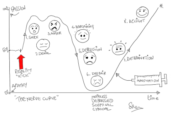
<Leslie> Hi Bob, I am feeling rather despondent today so please excuse me in advance if you hear a lot of “Yes, but …” language.

<Bob> I am sorry to hear that Leslie. Do you want to talk about it?

<Leslie> Yes, please.  The trigger for my gloom was being sent on a mandatory training workshop.

<Bob> OK. Training to do what?

<Leslie> Outpatient demand and capacity planning!

<Bob> But you know how to do that already, so what is the reason you were “sent”?

<Leslie> Well, I am no longer sure I know how to it.  That is why I am feeling so blue.  I went more out of curiosity and I came away utterly confused and with my confidence shattered.

<Bob> Oh dear! We had better start at the beginning.  What was the purpose of the workshop?

<Leslie> To train everyone in how to use an Outpatient Demand and Capacity planning model, an Excel one that we were told to download along with the User Guide.  I think it is part of a national push to improve waiting times for outpatients.

<Bob> OK. On the surface that sounds reasonable. You have designed and built your own Excel flow-models already; so where did the trouble start?

<Leslie> I will attempt to explain.  This was a paragraph in the instructions. I felt OK with this because my Improvement Science training has given me a very good understanding of basic demand and capacity theory.

IST_DandC_Model_01<Bob> OK.  I am guessing that other delegates may have felt less comfortable with this. Was that the case?

<Leslie> The training workshops are targeted at Operational Managers and the ones I spoke to actually felt that they had a good grasp of the basics.

<Bob> OK. That is encouraging, but a warning bell is ringing for me. So where did the trouble start?

<Leslie> Well, before going to the workshop I decided to read the User Guide so that I had some idea of how this magic tool worked.  This is where I started to wobble – this paragraph specifically …

IST_DandC_Model_02

<Bob> H’mm. What did you make of that?

<Leslie> It was complete gibberish to me and I felt like an idiot for not understanding it.  I went to the workshop in a bit of a panic and hoped that all would become clear. It didn’t.

<Bob> Did the User Guide explain what ‘percentile’ means in this context, ideally with some visual charts to assist?

<Leslie> No and the use of ‘th’ and ‘%’ was really confusing too.  After that I sort of went into a mental fog and none of the workshop made much sense.  It was all about practising using the tool without any understanding of how it worked. Like a black magic box.


<Bob> OK.  I can see why you were confused, and do not worry, you are not an idiot.  It looks like the author of the User Guide has unwittingly used some very confusing and ambiguous terminology here.  So can you talk me through what you have to do to use this magic box?

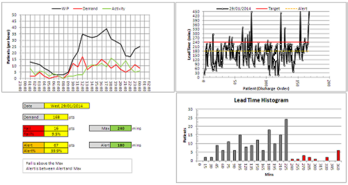
<Leslie> First we have to enter some of our historical data; the number of new referrals per week for a year; and the referral and appointment dates for all patients for the most recent three months.

<Bob> OK. That sounds very reasonable.  A run chart of historical demand and the raw event data for a Vitals Chart® is where I would start the measurement phase too – so long as the data creates a valid 3 month reporting window.

<Leslie> Yes, I though so too … but that is not how the black box model seems to work. The weekly demand is used to draw an SPC chart, but the event data seems to disappear into the innards of the black box, and recommendations pop out of it.

<Bob> Ah ha!  And let me guess the relationship between the term ‘percentile’ and the SPC chart of weekly new demand was not explained?

<Leslie> Spot on.  What does percentile mean?


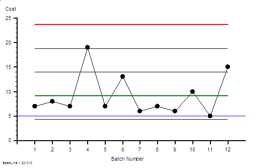
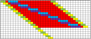
<Bob> It is statistics jargon. Remember that we have talked about the distribution of the data around the average on a BaseLine chart; and how we use the histogram feature of BaseLine to show it visually.  Like this example.

IST_DandC_Model_03
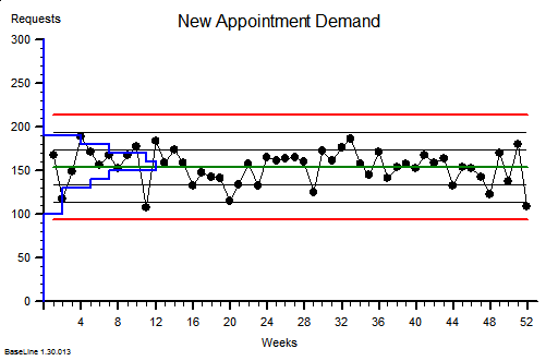
<Leslie> Yes. I recognise that. This chart shows a stable system of demand with an average of around 150 new referrals per week and the variation distributed above and below the average in a symmetrical pattern, falling off to zero around the upper and lower process limits.  I believe that you said that over 99% will fall within the limits.

<Bob> Good.  The blue histogram on this chart is called a probability distribution function, to use the terminology of a statistician.

<Leslie> OK.

<Bob> So, what would happen if we created a Pareto chart of demand using the number of patients per week as the categories and ignoring the time aspect? We are allowed to do that if the behaviour is stable, as this chart suggests.

<Leslie> Give me a minute, I will need to do a rough sketch. Does this look right?

IST_DandC_Model_04

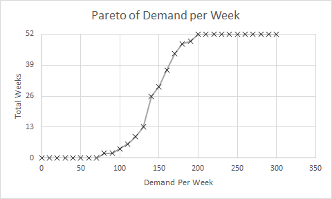
<Bob> Perfect!  So if you now convert the Y-axis to a percentage scale so that 52 weeks is 100% then where does the average weekly demand of about 150 fall? Read up from the X-axis to the line then across to the Y-axis.

<Leslie> At about 26 weeks or 50% of 52 weeks.  Ah ha!  So that is what a percentile means!  The 50th percentile is the average, the zeroth percentile is around the lower process limit and the 100th percentile is around the upper process limit!

<Bob> In this case the 50th percentile is the average, it is not always the case though.  So where is the 85th percentile line?

<Leslie> Um, 52 times 0.85 is 44.2 which, reading across from the Y-axis then down to the X-axis gives a weekly demand of about 170 per week.  That is about the same as the average plus one sigma according to the run chart.

<Bob> Excellent. The Pareto chart that you have drawn is called a cumulative probability distribution function … and that is usually what percentiles refer to. Comparative Statisticians love these but often omit to explain their rationale to non-statisticians!


<Leslie> Phew!  So, now I can see that the 65th percentile is just above average demand, and 85th percentile is above that.  But in the confusing paragraph how does that relate to the phrase “65% and 85% of the time”?

<Bob> It doesn’t. That is the really, really confusing part of  that paragraph. I am not surprised that you looped out at that point!

<Leslie> OK. Let us leave that for another conversation.  If I ignore that bit then does the rest of it make sense?

<Bob> Not yet alas. We need to dig a bit deeper. What would you say are the implications of this message?


<Leslie> Well.  I know that if our flow-capacity is less than our average demand then we will guarantee to create an unstable queue and chaos. That is the Flaw of Averages trap.

<Bob> OK.  The creator of this tool seems to know that.

<Leslie> And my outpatient manager colleagues are always complaining that they do not have enough slots to book into, so I conclude that our current flow-capacity is just above the 50th percentile.

<Bob> A reasonable hypothesis.

<Leslie> So to calm the chaos the message is saying I will need to increase my flow capacity up to the 85th percentile of demand which is from about 150 slots per week to 170 slots per week. An increase of 7% which implies a 7% increase in costs.

<Bob> Good.  I am pleased that you did not fall into the intuitive trap that a increase from the 50th to the 85th percentile implies a 35/50 or 70% increase! Your estimate of 7% is a reasonable one.

<Leslie> Well it may be theoretically reasonable but it is not practically possible. We are exhorted to reduce costs by at least that amount.

<Bob> So we have a finance versus governance bun-fight with the operational managers caught in the middle: FOG. That is not the end of the litany of woes … is there anything about Did Not Attends in the model?


<Leslie> Yes indeed! We are required to enter the percentage of DNAs and what we do with them. Do we discharge them or re-book them.

<Bob> OK. Pragmatic reality is always much more interesting than academic rhetoric and this aspect of the real system rather complicates things, at least for a comparative statistician. This is where the smoke and mirrors will appear and they will be hidden inside the black magic box.  To solve this conundrum we need to understand the relationship between demand, capacity, variation and yield … and it is rather counter-intuitive.  So, how would you approach this problem?

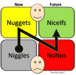
<Leslie> I would use the 6M Design® framework and I would start with a map and not with a model; least of all a magic black box one that I did not design, build and verify myself.

<Bob> And how do you know that will work any better?

<Leslie> Because at the One Day ISP Workshop I saw it work with my own eyes. The queues, waits and chaos just evaporated.  And it cost nothing.  We already had more than enough “capacity”.

<Bob> Indeed you did.  So shall we do this one as an ISP-2 project?

<Leslie> An excellent suggestion.  I already feel my confidence flowing back and I am looking forward to this new challenge. Thank you again Bob.

Emergent Learning

CAS_DiagramThe theme this week has been emergent learning.

By that I mean the ‘ah ha’ moment that happens when lots of bits of a conceptual jigsaw go ‘click’ and fall into place.

When, what initially appears to be smoky confusion suddenly snaps into sharp clarity.  Eureka!  And now new learning can emerge.


This did not happen by accident.  It was engineered.


The picture above is part of a bigger schematic map of a system – in this case a system related to the global health challenge of escalating obesity.

It is a complicated arrangement of boxes and arrows. There are  dotted lines that outline parts of the system that have leaky boundaries like the borders on a political map.

But it is a static picture of the structure … it tells us almost nothing about the function, the system behaviour.

And our intuition tells us that, because it is a complicated structure, it will exhibit complex and difficult to understand behaviour.  So, guided by our inner voice, we toss it into the pile labelled Wicked Problems and look for something easier to work on.


Our natural assumption that a complicated structure always leads to complex behavior is an invalid simplification, and one that we can disprove in a matter of moments.


Exhibit 1. A system can be complicated and yet still exhibit simple, stable and predictable behavior.

Harrison_H1The picture is of a clock designed and built by John Harrison (1693-1776).  It is called H1 and it is a sea clock.

Masters of sailing ships required very accurate clocks to calculate their longitude, the East-West coordinate on the Earth’s surface. And in the 18th Century this was a BIG problem. Too many ships were getting lost at sea.

Harrison’s sea clock is complicated.  It has many moving parts, but it was the most stable and accurate clock of its time.  And his later ones were smaller, more accurate and even more complicated.


Exhibit 2.  A system can be simple yet still exhibit complex, unstable and unpredictable behavior.

Double-compound-pendulumThe image is of a pendulum made of only two rods joined by a hinge.  The structure is simple yet the behavior is complex, and this can only be appreciated with a dynamic visualisation.

The behaviour is clearly not random. It has an emergent structure. It is called chaotic.

So, with these two real examples we have disproved our assumption that a complicated structure always leads to complex behaviour; and we have also disproved its inverse … that complex behavior always comes from a complicated structure.

The cognitive trap we have exposed here is over-generalisation, the unconscious habit of slipping in the implied [always].


This deeper understanding gives us hope.

John Harrison was a rare, naturally-gifted, mechanical genius.  And to make it easier, he was working on a purely mechanical system comprised of non-living parts that only obeyed the Laws of Newtonian physics.  And even with those advantages it took him decades to learn how to design and to build his sea clocks.  He was the first to do so and he was self-educated so his learning was emergent.

If there were a way to design complicated systems to exhibit stable and predictable behaviour, how could more of us learn how to do that?


Our healthcare system is not made of passive, mechanical cogs and springs.  The parts are active, living people whose actions are limited by physical Laws but whose decisions are steered by other policies … learned ones … and ones that can change.  These learned rules of thumb are called heuristics and they vary from person-to-person and from minute-to-minute.  Heuristics can be learned, unlearned, updated, and evolved.

This is called emergent learning.

And to generate it we only need to create the context for it … the rest happens … as if by magic … but only if we design a fit-for-purpose context.


This week I personally observed over a dozen healthcare staff simultaneously re-invent a complicated process scheduling technique, at the same time as using it to eliminate the  queues, waiting and chaos in the system they wanted to improve.

Their queues just evaporated … without requiring any extra capacity or money. Eureka!


We did not show them how to do it so they could not have just copied what we did.

We designed and built the context for their learning to emerge … and it did.  On its own.

The One Day Practical Skills Workshop delivered emergent learning … just as it was designed to do.

A health care system is a complex adaptive system (CAS), and system improvement-by-design is what systems engineers (SE) are trained to do.

And this emerging style of complex adaptive systems engineering (CASE) is at the cutting edge of human knowledge, and when applied in the health care domain it is called health care systems engineering (HCSE).

Our experience of the emergent learning that flows from the practical skills workshops verifies that CASE is both possible, learnable, teachable, applicable and effective.

Hot and Cold

stick_figure_on_cloud_150_wht_9604Last week Bob and Leslie were exploring the data analysis trap called a two-points-in-time comparison: as illustrated by the headline “This winter has not been as bad as last … which proves that our winter action plan has worked.

Actually it doesn’t.

But just saying that is not very helpful. We need to explain the reason why this conclusion is invalid and therefore potentially dangerous.


So here is the continuation of Bob and Leslie’s conversation.

<Bob> Hi Leslie, have you been reflecting on the two-points-in-time challenge?

<Leslie> Yes indeed, and you were correct, I did know the answer … I just didn’t know I knew if you get my drift.

<Bob> Yes, I do. So, are you willing to share your story?

<Leslie> OK, but before I do that I would like to share what happened when I described what we talked about to some colleagues.  They sort of got the idea but got lost in the unfamiliar language of ‘variance’ and I realized that I needed an example to illustrate.

<Bob> Excellent … what example did you choose?

<Leslie> The UK weather – or more specifically the temperature.  My reasons for choosing this were many: first it is something that everyone can relate to; secondly it has strong seasonal cycle; and thirdly because the data is readily available on the Internet.

<Bob> OK, so what specific question were you trying to answer and what data did you use?

<Leslie> The question was “Are our winters getting warmer?” and my interest in that is because many people assume that the colder the winter the more people suffer from respiratory illness and the more that go to hospital … contributing to the winter A&E and hospital pressures.  The data that I used was the maximum monthly temperature from 1960 to the present recorded at our closest weather station.

<Bob> OK, and what did you do with that data?

<Leslie> Well, what I did not do was to compare this winter with last winter and draw my conclusion from that!  What I did first was just to plot-the-dots … I created a time-series chart … using the BaseLine© software.

MaxMonthTemp1960-2015

And it shows what I expected to see, a strong, regular, 12-month cycle, with peaks in the summer and troughs in the winter.

<Bob> Can you explain what the green and red lines are and why some dots are red?

<Leslie> Sure. The green line is the average for all the data. The red lines are called the upper and lower process limits.  They are calculated from the data and what they say is “if the variation in this data is random then we will expect more than 99% of the points to fall between these two red lines“.

<Bob> So, we have 55 years of monthly data which is nearly 700 points which means we would expect fewer than seven to fall outside these lines … and we clearly have many more than that.  For example, the winter of 1962-63 and the summer of 1976 look exceptional – a run of three consecutive dots outside the red lines. So can we conclude the variation we are seeing is not random?

<Leslie> Yes, and there is more evidence to support that conclusion. First is the reality check … I do not remember either of those exceptionally cold or hot years personally, so I asked Dr Google.

BigFreeze_1963This picture from January 1963 shows copper telephone lines that are so weighed down with ice, and for so long, that they have stretched down to the ground.  In this era of mobile phones we forget this was what telecommunication was like!


HeatWave_1976

And just look at the young Michal Fish in the Summer of ’76! Did people really wear clothes like that?

And there is more evidence on the chart. The red dots that you mentioned are indicators that BaseLine© has detected other non-random patterns.

So the large number of red dots confirms our Mark I Eyeball conclusion … that there are signals mixed up with the noise.

<Bob> Actually, I do remember the Summer of ’76 – it was the year I did my O Levels!  And your signals-in-the-noise phrase reminds me of SETI – the search for extra-terrestrial intelligence!  I really enjoyed the 1997 film of Carl Sagan’s book Contact with Jodi Foster playing the role of the determined scientist who ends up taking a faster-than-light trip through space in a machine designed by ET and built by humans. And especially the line about 10 minutes from the end when those-in-high-places who had discounted her story as “unbelievable” realized they may have made an error … the line ‘Yes, that is interesting isn’t it’.

<Leslie> Ha ha! Yes. I enjoyed that film too. It had lots of great characters – her glory seeking boss; the hyper-suspicious head of national security who militarized the project; the charismatic anti-hero; the ranting radical who blew up the first alien machine; and John Hurt as her guardian angel. I must watch it again.

Anyway, back to the story. The problem we have here is that this type of time-series chart is not designed to extract the overwhelming cyclical, annual pattern so that we can search for any weaker signals … such as a smaller change in winter temperature over a longer period of time.

<Bob>Yes, that is indeed the problem with these statistical process control charts.  SPC charts were designed over 60 years ago for process quality assurance in manufacturing not as a diagnostic tool in a complex adaptive system such a healthcare. So how did you solve the problem?

<Leslie> I realized that it was the regularity of  the cyclical pattern that was the key.  I realized that I could use that to separate out the annual cycle and to expose the weaker signals.  I did that using the rational grouping feature of BaseLine© with the month-of-the-year as the group.

MaxMonthTemp1960-2015_ByMonth

Now I realize why the designers of the software put this feature in! With just one mouse click the story jumped out of the screen!

<Bob> OK. So can you explain what we are looking at here?

<Leslie> Sure. This chart shows the same data as before except that I asked BaseLine© first to group the data by month and then to create a mini-chart for each month-group independently.  Each group has its own average and process limits.  So if we look at the pattern of the averages, the green lines, we can clearly see the annual cycle.  What is very obvious now is that the process limits for each sub-group are much narrower, and that there are now very few red points  … other than in the groups that are coloured red anyway … a niggle that the designers need to nail in my opinion!

<Bob> I will pass on your improvement suggestion! So are you saying that the regular annual cycle has accounted for the majority of the signal in the previous chart and that now we have extracted that signal we can look for weaker signals by looking for red flags in each monthly group?

<Leslie> Exactly so.  And the groups I am most interested in are the November to March ones.  So, next I filtered out the November data and plotted it as a separate chart; and I then used another cool feature of BaseLine© called limit locking.

MaxTempNov1960-2015_LockedLimits

What that means is that I have used the November maximum temperature data for the first 30 years to get the baseline average and natural process limits … and we can see that there are no red flags in that section, no obvious signals.  Then I locked these limits at 1990 and this tells BaseLine© to compare the subsequent 25 years of data against these projected limits.  That exposed a lot of signal flags, and we can clearly see that most of the points in the later section are above the projected average from the earlier one.  This confirms that there has been a significant increase in November maximum temperature over this 55 year period.

<Bob> Excellent! You have answered part of your question. So what about December onwards?

<Leslie> I was on a roll now! I also noticed from my second chart that the December, January and February groups looked rather similar so I filtered that data out and plotted them as a separate chart.

MaxTempDecJanFeb1960-2015_Grouped
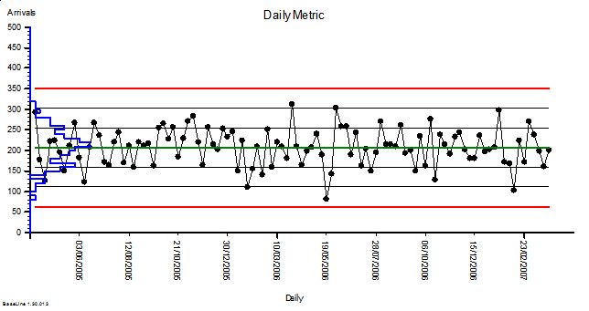
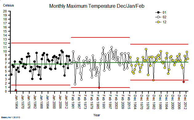
These were indeed almost identical so I lumped them together as a ‘winter’ group and compared the earlier half with the later half using another BaseLine© feature called segmentation.
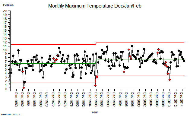
MaxTempDecJanFeb1960-2015-SplitThis showed that the more recent winter months have a higher maximum temperature … on average. The difference is just over one degree Celsius. But it also shows that that the month-to-month and year-to-year variation still dominates the picture.

<Bob> Which implies?

<Leslie> That, with data like this, a two-points-in-time comparison is meaningless.  If we do that we are just sampling random noise and there is no useful information in noise. Nothing that we can  learn from. Nothing that we can justify a decision with.  This is the reason the ‘this year was better than last year’ statement is meaningless at best; and dangerous at worst.  Dangerous because if we draw an invalid conclusion, then it can lead us to make an unwise decision, then decide a counter-productive action, and then deliver an unintended outcome.

By doing invalid two-point comparisons we can too easily make the problem worse … not better.

<Bob> Yes. This is what W. Edwards Deming, an early guru of improvement science, referred to as ‘tampering‘.  He was a student of Walter A. Shewhart who recognized this problem in manufacturing and, in 1924, invented the first control chart to highlight it, and so prevent it.  My grandmother used the term meddling to describe this same behavior … and I now use that term as one of the eight sources of variation. Well done Leslie!

The Two-Points-In-Time Comparison Trap

comparing_information_anim_5545[Bzzzzzz] Bob’s phone vibrated to remind him it was time for the regular ISP remote coaching session with Leslie. He flipped the lid of his laptop just as Leslie joined the virtual meeting.

<Leslie> Hi Bob, and Happy New Year!

<Bob> Hello Leslie and I wish you well in 2016 too.  So, what shall we talk about today?

<Leslie> Well, given the time of year I suppose it should be the Winter Crisis.  The regularly repeating annual winter crisis. The one that feels more like the perpetual winter crisis.

<Bob> OK. What specifically would you like to explore?

<Leslie> Specifically? The habit of comparing of this year with last year to answer the burning question “Are we doing better, the same or worse?”  Especially given the enormous effort and political attention that has been focused on the hot potato of A&E 4-hour performance.

<Bob> Aaaaah! That old chestnut! Two-Points-In-Time comparison.

<Leslie> Yes. I seem to recall you usually add the word ‘meaningless’ to that phrase.

<Bob> H’mm.  Yes.  It can certainly become that, but there is a perfectly good reason why we do this.

<Leslie> Indeed, it is because we see seasonal cycles in the data so we only want to compare the same parts of the seasonal cycle with each other. The apples and oranges thing.

<Bob> Yes, that is part of it. So what do you feel is the problem?

<Leslie> It feels like a lottery!  It feels like whether we appear to be better or worse is just the outcome of a random toss.

<Bob> Ah!  So we are back to the question “Is the variation I am looking at signal or noise?” 

<Leslie> Yes, exactly.

<Bob> And we need a scientifically robust way to answer it. One that we can all trust.

<Leslie> Yes.

<Bob> So how do you decide that now in your improvement work?  How do you do it when you have data that does not show a seasonal cycle?

<Leslie> I plot-the-dots and use an XmR chart to alert me to the presence of the signals I am interested in – especially a change of the mean.

<Bob> Good.  So why can we not use that approach here?

<Leslie> Because the seasonal cycle is usually a big signal and it can swamp the smaller change I am looking for.

<Bob> Exactly so. Which is why we have to abandon the XmR chart and fall back the two points in time comparison?

<Leslie> That is what I see. That is the argument I am presented with and I have no answer.

<Bob> OK. It is important to appreciate that the XmR chart was not designed for doing this.  It was designed for monitoring the output quality of a stable and capable process. It was designed to look for early warning signs; small but significant signals that suggest future problems. The purpose is to alert us so that we can identify the root causes, correct them and the avoid a future problem.

<Leslie> So we are using the wrong tool for the job. I sort of knew that. But surely there must be a better way than a two-points-in-time comparison!

<Bob> There is, but first we need to understand why a TPIT is a poor design.

<Leslie> Excellent. I’m all ears.

<Bob> A two point comparison is looking at the difference between two values, and that difference can be positive, zero or negative.  In fact, it is very unlikely to be zero because noise is always present.

<Leslie> OK.

<Bob> Now, both of the values we are comparing are single samples from two bigger pools of data.  It is the difference between the pools that we are interested in but we only have single samples of each one … so they are not measurements … they are estimates.

<Leslie> So, when we do a TPIT comparison we are looking at the difference between two samples that come from two pools that have inherent variation and may or may not actually be different.

<Bob> Well put.  We give that inherent variation a name … we call it variance … and we can quantify it.

<Leslie> So if we do many TPIT comparisons then they will show variation as well … for two reasons; first because the pools we are sampling have inherent variation; and second just from the process of sampling itself.  It was the first lesson in the ISP-1 course.

<Bob> Well done!  So the question is: “How does the variance of the TPIT sample compare with the variance of the pools that the samples are taken from?”

<Leslie> My intuition tells me that it will be less because we are subtracting.

<Bob> Your intuition is half-right.  The effect of the variation caused by the signal will be less … that is the rationale for the TPIT after all … but the same does not hold for the noise.

<Leslie> So the noise variation in the TPIT is the same?

<Bob> No. It is increased.

<Leslie> What! But that would imply that when we do this we are less likely to be able to detect a change because a small shift in signal will be swamped by the increase in the noise!

<Bob> Precisely.  And the degree that the variance increases by is mathematically predictable … it is increased by a factor of two.

<Leslie> So as we usually present variation as the square root of the variance, to get it into the same units as the metric, then that will be increased by the square root of two … 1.414

<Bob> Yes.

<Leslie> I need to put this counter-intuitive theory to the test!

<Bob> Excellent. Accept nothing on faith. Always test assumptions. And how will you do that?

<Leslie> I will use Excel to generate a big series of normally distributed random numbers; then I will calculate a series of TPIT differences using a fixed time interval; then I will calculate the means and variations of the two sets of data; and then I will compare them.

<Bob> Excellent.  Let us reconvene in ten minutes when you have done that.


10 minutes later …


<Leslie> Hi Bob, OK I am ready and I would like to present the results as charts. Is that OK?

<Bob> Perfect!

<Leslie> Here is the first one.  I used our A&E performance data to give me some context. We know that on Mondays we have an average of 210 arrivals with an approximately normal distribution and a standard deviation of 44; so I used these values to generate the random numbers. Here is the simulated Monday Arrivals chart for two years.

TPIT_SourceData

<Bob> OK. It looks stable as we would expect and I see that you have plotted the sigma levels which look to be just under 50 wide.

<Leslie> Yes, it shows that my simulation is working. So next is the chart of the comparison of arrivals for each Monday in Year 2 compared with the corresponding week in Year 1.

TPIT_DifferenceData <Bob> Oooookaaaaay. What have we here?  Another stable chart with a mean of about zero. That is what we would expect given that there has not been a change in the average from Year 1 to Year 2. And the variation has increased … sigma looks to be just over 60.

<Leslie> Yes!  Just as the theory predicted.  And this is not a spurious answer. I ran the simulation dozens of times and the effect is consistent!  So, I am forced by reality to accept the conclusion that when we do two-point-in-time comparisons to eliminate a cyclical signal we will reduce the sensitivity of our test and make it harder to detect other signals.

<Bob> Good work Leslie!  Now that you have demonstrated this to yourself using a carefully designed and conducted simulation experiment, you will be better able to explain it to others.

<Leslie> So how do we avoid this problem?

<Bob> An excellent question and one that I will ask you to ponder on until our next chat.  You know the answer to this … you just need to bring it to conscious awareness.


See One … Do Some … Teach Many

figure_pointing_out_chart_data_150_wht_8005Most of the time we are not aware of what is possible.

We live in a world dominated by blissful ignorance.

And we tolerate poor quality services by lowering our expectation.

And then one day we get a shock …

… we have an experience that disproves our hypothesis of impossibility. Just one. One is enough.


And our usual reaction is then some form of denial.

Usually we say “That is not true, it’s a fluke!” or we say “That is OK for you but I could never do it.”

But not always.  Sometimes we say “Can you show me another example and show me how to do it?”

And then we try ourselves … and then we get another shock.  It actually works! We can do it.


So now we are engaged … and when we try again, we make a right fist of it.  Another shock!  We need to “do some”. Practice makes perfect … if we do enough of it.

So we do … easier examples at  first then progressively more challenging ones.

We improve progressively … we progress … we develop know how … we develop competence … we develop confidence … and we start to grow a reputation.

And soon we are rewarded by being invited to teach others what we know.


And then we get another shock … the biggest of all … we no longer know how we are doing it … we have practiced so much and for so long that it has become second nature.

This is the toughest stage of all and this is where we learn the most.

When we teach others what is second nature to us … we learn more than they do.


10% of learning is in seeing others do it .

20% of learning is in doing it ourselves.

70% of learning is in teaching and coaching others to learn how to do it.

See One – Do Some – Teach Many.

That is how capability diffuses.

The Catastrophe is Coming

Monitor_Summary


This week an interesting report was published by Monitor – about some possible reasons for the A&E debacle that England experienced in the winter of 2014.

Summary At A Glance

“91% of trusts did not  meet the A&E 4-hour maximum waiting time standard last winter – this was the worst performance in 10 years”.


So it seems a bit odd that the very detailed econometric analysis and the testing of “Ten Hypotheses” did not look at the pattern of change over the previous 10 years … it just compared Oct-Dec 2014 with the same period for 2013! And the conclusion: “Hospitals were fuller in 2014“.  H’mm.


The data needed to look back 10 years is readily available on the various NHS England websites … so here it is plotted as simple time-series charts.  These are called system behaviour charts or SBCs. Our trusted analysis tools will be a Mark I Eyeball connected to the 1.3 kg of wetware between our ears that runs ChimpOS 1.0 …  and we will look back 11 years to 2004.

A&E_Arrivals_2004-15First we have the A&E Arrivals chart … about 3.4 million arrivals per quarter. The annual cycle is obvious … higher in the summer and falling in the winter. And when we compare the first five years with the last six years there has been a small increase of about 5% and that seems to associate with a change of political direction in 2010.

So over 11 years the average A&E demand has gone up … a bit … but only by about 5%.


A&E_Admissions_2004-15In stark contrast the A&E arrivals that are admitted to hospital has risen relentlessly over the same 11 year period by about 50% … that is about 5% per annum … ten times the increase in arrivals … and with no obvious step in 2010. We can see the annual cycle too.  It is a like a ratchet. Click click click.


But that does not make sense. Where are these extra admissions going to? We can only conclude that over 11 years we have progressively added more places to admit A&E patients into.  More space-capacity to store admitted patients … so we can stop the 4-hour clock perhaps? More emergency assessment units perhaps? Places to wait with the clock turned off perhaps? The charts imply that our threshold for emergency admission has been falling: Admission has become increasingly the ‘easier option’ for whatever reason.  So why is this happening? Do more patients need to be admitted?


In a recent empirical study we asked elderly patients about their experience of the emergency process … and we asked them just after they had been discharged … when it was still fresh in their memories. A worrying pattern emerged. Many said that they had been admitted despite them saying they did not want to be.  In other words they did not willingly consent to admission … they were coerced.

This is anecdotal data so, by implication, it is wholly worthless … yes?  Perhaps from a statistical perspective but not from an emotional one.  It is a red petticoat being waved that should not be ignored.  Blissful ignorance comes from ignoring anecdotal stuff like this. Emotionally uncomfortable anecdotal stories. Ignore the early warning signs and suffer the potentially catastrophic consequences.


A&E_Breaches_2004-15And here is the corresponding A&E 4-hour Target Failure chart.  Up to 2010 the imposed target was 98% success (i.e. 2% acceptable failure) and, after bit of “encouragement” in 2004-5, this was actually achieved in some of the summer months (when the A&E demand was highest remember).

But with a change of political direction in 2010 the “hated” 4-hour target was diluted down to 95% … so a 5% failure rate was now ‘acceptable’ politically, operationally … and clinically.

So it is no huge surprise that this is what was achieved … for a while at least.

In the period 2010-13 the primary care trusts (PCTs) were dissolved and replaced by clinical commissioning groups (CCGs) … the doctors were handed the ignition keys to the juggernaut that was already heading towards the cliff.

The charts suggest that the seeds were already well sown by 2010 for an evolving catastrophe that peaked last year; and the changes in 2010 and 2013 may have just pressed the accelerator pedal a bit harder. And if the trend continues it will be even worse this coming winter. Worse for patients and worse for staff and worse for commissioners and  worse for politicians. Lose lose lose lose.


So to summarise the data from the NHS England’s own website:

1. A&E arrivals have gone up 5% over 11 years.
2. Admissions from A&E have gone up 50% over 11 years.
3. Since lowering the threshold for acceptable A&E performance from 98% to 95% the system has become unstable and “fallen off the cliff” … but remember, a temporal association does not prove causation.

So what has triggered the developing catastrophe?

Well, it is important to appreciate that when a patient is admitted to hospital it represents an increase in workload for every part of the system that supports the flow through the hospital … not just the beds.  Beds represent space-capacity. They are just where patients are stored.  We are talking about flow-capacity; and that means people, consumables, equipment, data and cash.

So if we increase emergency admissions by 50% then, if nothing else changes, we will need to increase the flow-capacity by 50% and the space-capacity to store the work-in-progress by 50% too. This is called Little’s Law. It is a mathematically proven Law of Flow Physics. It is not negotiable.

So have we increased our flow-capacity and our space-capacity (and our costs) by 50%? I don’t know. That data is not so easy to trawl from the websites. It will be there though … somewhere.

What we have seen is an increase in bed occupancy (the red box on Monitor’s graphic above) … but not a 50% increase … that is impossible if the occupancy is already over 85%.  A hospital is like a rigid metal box … it cannot easily expand to accommodate a growing queue … so the inevitable result in an increase in the ‘pressure’ inside.  We have created an emergency care pressure cooker. Well lots of them actually.

And that is exactly what the staff who work inside hospitals says it feels like.

And eventually the relentless pressure and daily hammering causes the system to start to weaken and fail, gradually at first then catastrophically … which is exactly what the NHS England data charts are showing.


So what is the solution?  More beds?

Nope.  More beds will create more space and that will relieve the pressure … for a while … but it will not address the root cause of why we are admitting 50% more patients than we used to; and why we seem to need to increase the pressure inside our hospitals to squeeze the patients through the process and extrude them out of the various exit nozzles.

Those are the questions we need to have understandable and actionable answers to.

Q1: Why are we admitting 5% more of the same A&E arrivals each year rather than delivering what they need in 4 hours or less and returning them home? That is what the patients are asking for.

Q2: Why do we have to push patients through the in-hospital process rather than pulling them through? The staff are willing to work but not inside a pressure cooker.


A more sensible improvement strategy is to look at the flow processes within the hospital and ensure that all the steps and stages are pulling together to the agreed goals and plan for each patient. The clinical management plan that was decided when the patient was first seen in A&E. The intended outcome for each patient and the shortest and quickest path to achieving it.


Our target is not just a departure within 4 hours of arriving in A&E … it is a competent diagnosis (study) and an actionable clinical management plan (plan) within 4 hours of arriving; and then a process that is designed to deliver (do) it … for every patient. Right, first time, on time, in full and at a cost we can afford.

Q: Do we have that?
A: Nope.

Q: Is that within our gift to deliver?
A: Yup.

Q: So what is the reason we are not already doing it?
A: Good question.  Who in the NHS is trained how to do system-wide flow design like this?

Storytelling

figure_turning_a_custom_page_15415

Telling a compelling story of improvement is an essential skill for a facilitator and leader of change.

A compelling story has two essential components: cultural and technical. Otherwise known as emotional and factual.

Many of the stories that we hear are one or the other; and consequently are much less effective.


Some prefer emotive language and use stories of dismay and distress to generate an angry reaction: “That is awful we must DO something about that!”

And while emotion is the necessary fuel for action,  an angry mob usually attacks the assumed cause rather than the actual cause and can become ‘mindless’ and destructive.

Those who have observed the dangers of the angry mob opt for a more reflective, evidence-based, scientific, rational, analytical, careful, risk-avoidance approach.

And while facts are the necessary informers of decision, the analytical mind often gets stuck in the ‘paralysis of analysis’ swamp as layer upon layer of increasing complexity is exposed … more questions than answers.


So in a compelling story we need a bit of both.

We need a story that fires our emotions … and … we need a story that engages our intellect.

A bit of something for everyone.

And the key to developing this compelling-story-telling skill this is to start with something small enough to be doable in a reasonable period of time.  A short story rather than a lengthy legend.

A story, tale or fable.

Aesop’s Fables and Chaucer’s Canterbury Tales are still remembered for their timeless stories.


And here is a taste of such a story … one that has been published recently for all to read and to enjoy.

A Story of Learning Improvement Science

It is an effective blend of cultural and technical, emotional and factual … and to read the full story just follow the ‘Continue’ link.

Early Adoption

Rogers_CurveThe early phases of a transformation are where most fall by the wayside.

And the failure rate is horrifying – an estimated 80% of improvement initiatives fail to achieve their goals.

The recent history of the NHS is littered with the rusting wreckage of a series of improvement bandwagons.  Many who survived the crashes are too scarred and too scared to try again.


Transformation and improvement imply change which implies innovation … new ways of thinking, new ways of behaving, new techniques, new tools, and new ways of working.

And it has been known for over 50 years that innovation spreads in a very characteristic way. This process was described by Everett Rogers in a book called ‘Diffusion of Innovations‘ and is described visually in the diagram above.

The horizontal axis is a measure of individual receptiveness to the specific innovation … and the labels are behaviours: ‘I exhibit early adopter behaviour‘ (i.e. not ‘I am an early adopter’).

What Roger’s discovered through empirical observation was that in all cases the innovation diffuses from left-to-right; from innovation through early adoption to the ‘silent’ majority.


Complete diffusion is not guaranteed though … there are barriers between the phases.

One barrier is between innovation and early adoption.

There are many innovations that we never hear about and very often the same innovation appears in many places and often around the same time.

This innovation-adoption barrier is caused by two things:
1) most are not even aware of the problem … they are blissfully ignorant;
2) news of the innovation is not shared widely enough.

Innovators are sensitive people.  They sense there is a problem long before others do. They feel the fear and the excitement of need for innovation. They challenge their own assumptions and they actively seek solutions. They swim against the tide of ignorance, disinterest, skepticism and often toxic cynicism.  So when they do discover a way forward they often feel nervous about sharing it. They have learned (the hard way) that the usual reaction is to be dismissed and discounted.  Most people do not like to learn about unknown problems and hazards; and they like it even less to learn that there are solutions that they neither recognise nor understand.


But not everyone.

There is a group called the early adopters who, like the innovators, are aware of the problem. They just do not share the innovator’s passion to find a solution … irrespective of the risks … so they wait … their antennae tuned for news that a solution has been found.

Then they act.

And they act in one of two ways:

1) Talkers … re-transmit the news of the problem and the discovery of a generic solution … which is essential in building awareness.

2) Walkers … try the innovative approach themselves and in so doing learn a lot about their specific problem and the new ways to solving it.

And it is the early adopters that do both of these actions that are the most effective and the most valuable to everyone else.  Those that talk-the-new-walk and walk-the-new-talk.

And we can identify who they are because they will be able to tell stories of how they have applied the innovation in their world; and the results that they have achieved; and how they achieved them; and what worked well; and what did not; and what they learned; and how they evolved and applied the innovation to meet their specific needs.

They are the leaders, the coaches and the teachers of improvement and transformation.

They See One, Do Some, and Teach Many.

The early adopters are the bridge across the Innovation and Transformation Chasm.

Not as Easy as it Looks

smack_head_in_disappointment_150_wht_16653One of the traps for the inexperienced Improvement Science Practitioner is to believe that applying the science in the real world is as easy as it is in the safety of the training environment.

It isn’t.

The real world is messier and more complicated and it is easy to get lost in the fog of confusion and chaos.


So how do we avoid losing our footing, slipping into the toxic emotional swamp of organisational culture and giving ourselves an unpleasant dunking!

We use safety equipment … to protect ourselves and others from unintended harm.

The Improvement-by-Design framework is like a scaffold.  It is there to provide structure and safety.  The techniques and tools are like the harnesses, shackles, ropes, crampons, and pitons.  They give us flexibility and security.

But we need to know how to use them. We need to be competent as well as confident.

We do not want to tie ourselves up in knots … and we do not want to discover that we have not tied ourselves to something strong enough to support us if we slip. Which we will.


So we need to learn an practice the basics skills to the point that they are second nature.

We need to learn how to tie secure knots, quickly and reliably.

We need to learn how to plan an ascent … identifying the potential hazards and designing around them.

We need to learn how to assemble and check what we will need before we start … not too much and not too little.

We need to learn how to monitor out progress against our planned milestones and be ready to change the plan as we go …and even to abandon the attempt if necessary.


We would not try to climb a real mountain without the necessary training, planning, equipment and support … even though it might look easy.

And we do not try to climb an improvement mountain without the necessary training, planning, tools and support … even though it might look easy.

It is not as easy as it looks.

Yield

Dr_Bob_ThumbnailA recurring theme this week has been the concept of ‘quality’.

And it became quickly apparent that a clear definition of quality is often elusive.

Which seems to have led to a belief that quality is difficult to measure because it is subjective and has no precise definition.

The science of quality improvement is nearly 100 years old … and it was shown a long time ago, in 1924 in fact, that it is rather easy to measure quality – objectively and scientifically.

The objective measure of quality is called “yield”.

To measure yield we simply ask all our customers this question:

Did your experience meet your expectation?” 

If the answer is ‘Yes’ then we count this as OK; if it is ‘No’ then we count it as Not OK.

Yield is the ratio of the OKs divided by the number of customers who answered.


But this tried-and-tested way of measuring quality has a design flaw:

Where does a customer get their expectation from?

Because if a customer has an unrealistically high expectation then whatever we do will be perceived by them as Not OK.

So to consistently deliver a high quality service (i.e. high yield) we need to be able to influence both the customer experience and the customer expectation.


If we set our sights on a worthwhile and realistic expectation and we broadcast that to our customers, then we also need a way of avoiding their disappointment … that our objective quality outcome audit may reveal.

One way to defuse disappointment is to set a low enough expectation … which is, sadly, the approach adopted by naysayers,  complainers, cynics and doom-mongers. The inept.

That is not the path to either improvement or to excellence. It is the path to apathy.

A better approach is to set ourselves some internal standards of expectation and to check at each step if our work meets our own standard … and if it fails then we know we need have some more work to do.

This commonly used approach to maintaining quality is called a check-and-correct design.

So let us explore the ramifications of this check-and-correct approach to quality.


Suppose the quality of the product or service that we deliver is influenced by many apparently random factors. And when we actually measure our yield we discover that the chance of getting a right-first-time outcome is about 50%.  This amounts to little more than a quality lottery and we could simulate that ‘random’ process by tossing a coin.

So to set a realistic expectation for future customers there are two further questions we need to answer:
1. How long can an typical customer expect to wait for our product or service?
2. How much can an typical customer expect to pay for our product or service?

It is not immediately and intuitively obvious what the answers to these questions are … so we need to perform an experiment to find out.

Suppose we have five customers who require our product or service … we could represent them as Post It Notes; and suppose we have a clock … we could measure how long the process is taking; and suppose we have our coin … we can simulate the yield of the step; … and suppose we do not start the lead time clock until we start the work for each customer.

We now have the necessary and sufficient components to assemble a simple simulation model of our system … a model that will give us realistic answers to our questions.

So let us see what happens … just click the ‘Start Game’ button.

Http iframes are not shown in https pages in many major browsers. Please read this post for details.


It is worth running this exercise about a dozen times and recording the data for each run … then plotting the results on a time-series chart.

The data to plot is the make-time (which is the time displayed on the top left) and the cost (which is display top middle).

The make-time is the time from starting the first game to completing the last task.

The cost is the number of coin tosses we needed to do to deliver all work to the required standard.

And here are the charts from my dozen runs (yours will be different).

PostItNote_MakeTimeChart

PostItNote_CostChart

The variation from run to run is obvious; as is the correlation between a make-time and a high cost.

The charts also answer our two questions … a make time up to 90 would not be exceptional and an average cost of 10 implies that is the minimum price we need to charge in order to stay in business.

Our customers are waiting while we check-and-correct our own errors and we are expecting them to pay for the extra work!

In the NHS we have a name for this low-quality high-cost design: Payment By Results.


The charts also show us what is possible … a make time of 20 and a cost of 5.

That happened when, purely by chance, we tossed five heads in a row in the Quality Lottery.

So with this insight we could consider how we might increase the probability of ‘throwing a head’ i.e. doing the work right-first-time … because we can see from our charts what would happen.

The improved quality and cost of changing ourselves and our system to remove the root causes of our errors.

Quality Improvement-by-Design.

That something worth learning how to do.

And can we honestly justify not doing it?

Celebrate and Share

There comes a point in every improvement journey when it is time to celebrate and share. This is the most rewarding part of the Improvement Science Practitioner (ISP) coaching role so I am going to share a real celebration that happened this week.

The picture shows Chris Jones holding his well-earned ISP-1 Certificate of Competence.  The “Maintaining the Momentum of Medicines”  redesign project is shown on the poster on the left and it is the tangible Proof of Competence. The hard evidence that the science of improvement delivers.

Chris_Jones_Poster_and_Certificate

Behind us are the A3s for one of the Welsh Health Boards;  ABMU in fact.


An A3 is a way of summarising an improvement project very succinctly – the name comes from the size of paper used.  A3 is the biggest size that will go through an A4 fax machine (i.e. folded over) and the A3 discipline is to be concise and clear at the same time.

The three core questions that the A3 answers are:
Q1: What is the issue?
Q2: What would improvement need to look like?
Q3: How would we know that a change is an improvement?

This display board is one of many in the room, each sharing a succinct story of a different improvement journey and collectively a veritable treasure trove of creativity and discovery.

The A3s were of variable quality … and that is OK and is expected … because like all skills it takes practice. Lots of practice. Perfection is not the goal because it is unachievable. Best is not the goal because only one can be best. Progress is the goal because everyone can progress … and so progress is what we share and what we celebrate.


The event was the Fifth Sharing Event in the Welsh Flow Programme that has been running for just over a year and Chris is the first to earn an ISP-1 Certificate … so we all celebrated with him and shared the story.  It is a team achievement – everyone in the room played a part in some way – as did many more who were not in the room on the day.


stick_figure_look_point_on_cliff_anim_8156Improvement is like mountain walking.

After a tough uphill section we reach a level spot where we can rest; catch our breath; take in the view; reflect on our progress and the slips, trips and breakthroughs along the way; perhaps celebrate with drink and nibble of our chocolate ration; and then get up, look up, and square up for the next uphill bit.

New territory for us.  New challenges and new opportunities to learn and to progress and to celebrate and share our improvement stories.

The Improvement Pyramid

IS_PyramidDeveloping productive improvement capability in an organisation is like building a pyramid in the desert.

It is not easy and it takes time before there is any visible evidence of success.

The height of the pyramid is a measure of the level of improvement complexity that we can take on.

An improvement of a single step in a system would only require a small pyramid.

Improving the whole system will require a much taller one.


But if we rush and attempt to build a sky-scraper on top of the sand then we will not be surprised when it topples over before we have made very much progress.  The Egyptians knew this!

First, we need to dig down and to lay some foundations.  Stable enough and strong enough to support the whole structure.  We will never see the foundations so it is easy to forget them in our rush but they need to be there and they need to be there first.

It is the same when developing improvement science capability  … the foundations are laid first and when enough of that foundation knowledge is in place we can start to build the next layer of the pyramid: the practitioner layer.


It is the the Improvement Science Practitioners (ISPs) who start to generate tangible evidence of progress.  The first success stories help to spur us all on to continue to invest effort, time and money in widening our foundations to be able to build even higher – more layers of capability -until we can realistically take on a system wide improvement challenge.

So sharing the first hard evidence of improvement is an important milestone … it is proof of fitness for purpose … and that news should be shared with those toiling in the hot desert sun and with those watching from the safety of the shade.

So here is a real story of a real improvement pyramid achieving this magical and motivating milestone.


Over-Egged Expectation

FISH_ISP_eggs_jumpingResistance-to-change is an oft quoted excuse for improvement torpor. The implied sub-message is more like “We would love to change but They are resisting“.

Notice the Us-and-Them language.  This is the observable evidence of an “We‘re OK and They’re Not OK” belief.  And in reality it is this unstated belief and the resulting self-justifying behaviour that is an effective barrier to systemic improvement.

This Us-and-Them language generates cultural friction, erodes trust and erects silos that are effective barriers to the flow of information, of innovation and of learning.  And the inevitable reactive solutions to this Us-versus-Them friction create self-amplifying positive feedback loops that ensure the counter-productive behaviour is sustained.

One tangible manifestation are DRATs: Delusional Ratios and Arbitrary Targets.


So when a plausible, rational and well-evidenced candidate for an alternative approach is discovered then it is a reasonable reaction to grab it and to desperately spray the ‘magic pixie dust’ at everything.

This a recipe for disappointment: because there is no such thing as ‘improvement magic pixie dust’.

The more uncomfortable reality is that the ‘magic’ is the result of a long period of investment in learning and the associated hard work in practising and polishing the techniques and tools.

It may look like magic but is isn’t. That is an illusion.

And some self-styled ‘magicians’ choose to keep their hard-won skills secret … because by sharing them know that they will lose their ‘magic powers’ in a flash of ‘blindingly obvious in hindsight’.

And so the chronic cycle of despair-hope-anger-and-disappointment continues.


System-wide improvement in safety, flow, quality and productivity requires that the benefits of synergism overcome the benefits of antagonism.  This requires two changes to the current hope-and-despair paradigm.  Both are necessary and neither are sufficient alone.

1) The ‘wizards’ (i.e. magic folk) share their secrets.
2) The ‘muggles’ (i.e. non-magic folk) invest the time and effort in learning ‘how-to-do-it’.


The transition to this awareness is uncomfortable so it needs to be managed pro-actively … by being open about the risk … and how to mitigate it.

That is what experienced Practitioners of Improvement Science (and ISP) will do. Be open about the challenged ahead.

And those who desperately want the significant and sustained SFQP improvements; and an end to the chronic chaos; and an end to the gaming; and an end to the hope-and-despair cycle …. just need to choose. Choose to invest and learn the ‘how to’ and be part of the future … or choose to be part of the past.


Improvement science is simple … but it is not intuitively obvious … and so it is not easy to learn.

If it were we would be all doing it.

And it is the behaviour of a wise leader of change to set realistic and mature expectations of the challenges that come with a transition to system-wide improvement.

That is demonstrating the OK-OK behaviour needed for synergy to grow.

Walk Confidently before Running

running_walking_150_wht_8351Improvement is not a continuous process. It has starts and stops, and ups and downs.  Improvement implies change, and that is intentionally disruptive. So the context will determine the progress as much as the change.

A commonly observed behaviour is probably at the root of why the majority of improvements initiatives fail to achieve a significant and sustained improvement.  Trying to run before mastering the skill of walking.


An experienced improvement coach will not throw learners into the deep end and watch them sink or swim.  That is not coaching; it is cruelty.

So the first improvement projects must be doable and done with lots of hands-off support, encouragement and praise for progress.

This has the benefit of developing confidence and capability.

It has a danger of leading to over-confidence though.  Confidence that exceeds capability.

There is a risk that the growing learner will take on a future improvement project that is outside their capability zone.


The danger of doing this is that they fall at the second hurdle and their new confidence can be damaged and even smashed. This can leave the learner feeling less motivated and more fearful than before.


There are a number of ways that an improvement coach can  mitigate this risk:

1. Make the learners aware up front that this is a risk.
2. Scope each project to stretch but not scare.
3. Be prepared to stop and reduce scope if necessary.
4. Set the expectation to consolidate the basics by teaching others.

These are not mutually exclusive options.  Seeing, doing and teaching can happen in parallel and that is actually the most productive way to learn.


As children we learned to walk with confidence before we learned to run … because falling flat on our face hurts both physically and emotionally!

This is just the same.

Cumulative Sum

Dr_Bob_Thumbnail[Bing] Bob logged in for the weekly Webex coaching session. Leslie was not yet on line, but joined a few minutes later.

<Leslie> Hi Bob, sorry I am a bit late, I have been grappling with a data analysis problem and did not notice the time.

<Bob> Hi Leslie. Sounds interesting. Would you like to talk about that?

<Leslie> Yes please! It has been driving me nuts!

<Bob> OK. Some context first please.

<Leslie> Right, yes. The context is an improvement-by-design assignment with a primary care team who are looking at ways to reduce the unplanned admissions for elderly patients by 10%.

<Bob> OK. Why 10%?

<Leslie> Because they said that would be an operationally very significant reduction.  Most of their unplanned admissions, and therefore costs for admissions, are in that age group.  They feel that some admissions are avoidable with better primary care support and a 10% reduction would make their investment of time and effort worthwhile.

<Bob> OK. That makes complete sense. Setting a new design specification is OK.  I assume they have some baseline flow data.

<Leslie> Yes. We have historical weekly unplanned admissions data for two years. It looks stable, though rather variable on a week-by-week basis.

<Bob> So has the design change been made?

<Leslie> Yes, over three months ago – so I expected to be able to see something by now but there are no red flags on the XmR chart of weekly admissions. No change.  They are adamant that they are making a difference, particularly in reducing re-admissions.  I do not want to disappoint them by saying that all their hard work has made no difference!

<Bob> OK Leslie. Let us approach this rationally.  What are the possible causes that the weekly admissions chart is not signalling a change?

<Leslie> If there has not been a change in admissions. This could be because they have indeed reduced readmissions but new admissions have gone up and is masking the effect.

<Bob> Yes. That is possible. Any other ideas?

<Leslie> That their intervention has made no difference to re-admissions and their data is erroneous … or worse still … fabricated!

<Bob> Yes. That is possible too. Any other ideas?

<Leslie> Um. No. I cannot think of any.

<Bob> What about the idea that the XmR chart is not showing a change that is actually there?

<Leslie> You mean a false negative? That the sensitivity of the XmR chart is limited? How can that be? I thought these charts will always signal a significant shift.

<Bob> It depends on the degree of shift and the amount of variation. The more variation there is the harder it is to detect a small shift.  In a conventional statistical test we would just use bigger samples, but that does not work with an XmR chart because the run tests are all fixed length. Pre-defined sample sizes.

<Leslie> So that means we can miss small but significant changes and come to the wrong conclusion that our change has had no effect! Isn’t that called a Type 2 error?

<Bob> Yes, it is. And we need to be aware of the limitations of the analysis tool we are using. So, now you know that how might you get around the problem?

<Leslie> One way would be to aggregate the data over a longer time period before plotting on the chart … we know that will reduce the sample variation.

<Bob> Yes. That would work … but what is the downside?

<Leslie> That we have to wait a lot longer to show a change, or not. We do not want that.

<Bob> I agree. So what we do is we use a chart that is much more sensitive to small shifts of the mean.  And that is called a cusum chart. These were not invented until 30 years after Shewhart first described his time-series chart.  To give you an example, do you recall that the work-in-progress chart is much more sensitive to changes in flow than either demand or activity charts?

<Leslie> Yes, and the WIP chart also reacts immediately if either demand or activity change. It is the one I always look at first.

<Bob> That is because a WIP chart is actually a cusum chart. It is the cumulative sum of the difference between demand and activity.

<Leslie> OK! That makes sense. So how do I create and use a cusum chart?

<Bob> I have just emailed you some instructions and a few examples. You can try with your unplanned admissions data. It should only take a few minutes. I will get a cup of tea and a chocolate Hobnob while I wait.

[Five minutes later]

<Leslie> Wow! That is just brilliant!  I can see clearly on the cusum chart when the shifts happened and when I split the XmR chart at those points the underlying changes become clear and measurable. The team did indeed achieve a 10% reduction in admissions just as they claimed they had.  And I checked with a statistical test which confirmed that it is statistically significant.

<Bob> Good work.  Cusum charts take a bit of getting used to and we have be careful about the metric we are plotting and a few other things but it is a useful trick to have up our sleeves for situations like this.

<Leslie> Thanks Bob. I will bear that in mind.  Now I just need to work out how to explain cusum charts to others! I do not want to be accused of using statistical smoke-and-mirrors! I think a golf metaphor may work with the GPs.

A School for Rebels

Troublemaker_vs_RebelSystem-wide, significant, and sustained improvement implies system-wide change.

And system-wide change implies more than 20% of the people commit to action. This is the cultural tipping point.

These critical 20% have a badge … they call themselves rebels … and they are perceived as troublemakers by those who profit most from the status quo.

But troublemakers and rebels are radically different … as shown in the summary by Lois Kelly.


Rebels share a common, future-focussed purpose.  A mission.  They are passionate, optimistic and creative.  They understand synergy and how to release and align the stored emotional energy of both themselves and others.  And most importantly they are value-led and that makes them attractive.  Values such as honesty, integrity and industry are what make leaders together-effective.

SHCR_logoAnd as we speak there is school for rebels in healthcare gaining momentum …  and their programme is current, open to all and free to access. And the change agent development materials are excellent!

Click here to download their study guide.


Converting possibilities into realities is the essence of design … so our merry band of rebels will also need to learn how to convert their positive rhetoric into practical reality. And that is more physics than psychology.

Streams flow because of physics not because of passion.SFQP_Compass

And this is why the science of improvement is important because it is the synthesis of the people dimension and the process dimension – into a system that delivers significant and sustained improvement.

On all dimensions. Safety, Flow, Quality and Productivity.

The lighthouse is our purpose; the whale represents the magnitude of our challenge; the blue sky is the creative thinking we need … to avoid trying to boil the ocean.

And the noisy, greedy, s****y seagulls are the troublemakers who always will plague us.

[Image by Malaika Art].


Politicial Purpose

count_this_vote_400_wht_9473The question that is foremost in the mind of a designer is “What is the purpose?”   It is a future-focussed question.  It is a question of intent and outcome. It raises the issues of worth and value.

Without a purpose it impossible to answer the question “Is what we have fit-for-purpose?

And without a clear purpose it is impossible for a fit-for-purpose design to be created and tested.

In the absence of a future-purpose all that remains are the present-problems.

Without a future-purpose we cannot be proactive; we can only be reactive.

And when we react to problems we generate divergence.  We observe heated discussions. We hear differences of opinion as to the causes and the solutions.  We smell the sadness, anger and fear. We taste the bitterness of cynicism. And we are touched to our core … but we are paralysed.  We cannot act because we cannot decide which is the safest direction to run to get away from the pain of the problems we have.


And when the inevitable catastrophe happens we look for somewhere and someone to place and attribute blame … and high on our target-list are politicians.


So the prickly question of politics comes up and we need to grasp that nettle and examine it with the forensic lens of the system designer and we ask “What is the purpose of a politician?”  What is the output of the political process? What is their intent? What is their worth? How productive are they? Do we get value for money?

They will often answer “Our purpose is to serve the public“.  But serve is a verb so it is a process and not a purpose … “To serve the public for what purpose?” we ask. “What outcome can we expect to get?” we ask. “And when can we expect to get it?

We want a service (a noun) and as voters and tax-payers we have customer rights to one!

On deeper reflection we see a political spectrum come into focus … with Public at one end and Private at the other.  A country generates wealth through commerce … transforming natural and human resources into goods and services. That is the Private part and it has a clear and countable measure of success: profit.  The Public part is the redistribution of some of that wealth for the benefit of all – the tax-paying public. Us.

Unfortunately the Public part does not have quite the same objective test of success: so we substitute a different countable metric: votes. So the objectively measurable outcome of a successful political process is the most votes.

But we are still talking about process … not purpose.  All we have learned so far is that the politicians who attract the most votes will earn for themselves a temporary mandate to strive to achieve their political purpose. Whatever that is.

So what do the public, the voters, the tax-payers (and remember whenever we buy something we pay tax) … the customers of this political process … actually get for their votes and cash?  Are they delighted, satisfied or disappointed? Are they getting value-for-money? Is the political process fit-for-purpose? And what is the purpose? Are we all clear about that?

And if we look at the current “crisis” in health and social care in England then I doubt that “delight” will feature high on the score-sheet for those who work in healthcare or for those that they serve. The patients. The long-suffering tax-paying public.


Are politicians effective? Are they delivering on their pledge to serve the public? What does the evidence show?  What does their portfolio of public service improvement projects reveal?  Welfare, healthcare, education, police, and so on.The_Whitehall_Effect

Well the actual evidence is rather disappointing … a long trail of very expensive taxpayer-funded public service improvement failures.

And for an up-to-date list of some of the “eye-wateringly”expensive public sector improvement train-wrecks just read The Whitehall Effect.

But lurid stories of public service improvement failures do not attract precious votes … so they are not aired and shared … and when they are exposed our tax-funded politicians show their true skills and real potential.

Rather than answering the questions they filter, distort and amplify the questions and fire them at each other.  And then fall over each other avoiding the finger-of-blame and at the same time create the next deceptively-plausible election manifesto.  Their food source is votes so they have to tickle the voters to cough them up. And they are consummate masters of that art.

Politicians sell dreams and serve disappointment.


So when the-most-plausible with the most votes earn the right to wield the ignition keys for the engine of our national economy they deflect future blame by seeking the guidance of experts. And the only place they can realistically look is into the private sector who, in manufacturing anyway, have done a much better job of understanding what their customers need and designing their processes to deliver it. On-time, first-time and every-time.

Politicians have learned to be wary of the advice of academics – they need something more pragmatic and proven.  And just look at the remarkable rise of the manufacturing phoenix of Jaguar-Land-Rover (JLR) from the politically embarrassing ashes of the British car industry. And just look at Amazon to see what information technology can deliver!

So the way forward is blindingly obvious … combine manufacturing methods with information technology and build a dumb-robot manned production-line for delivering low-cost public services via a cloud-based website and an outsourced mega-call-centre manned by standard-script-following low-paid operatives.


But here we hit a bit of a snag.

Designing a process to deliver a manufactured product for a profit is not the same as designing a system to deliver a service to the public.  Not by a long chalk.  Public services are an example of what is now known as a complex adaptive system (CAS).

And if we attempt to apply the mechanistic profit-focussed management mantras of “economy of scale” and “division of labour” and “standardisation of work” to the messy real-world of public service then we actually achieve precisely the opposite of what we intended. And the growing evidence is embarrassingly clear.

We all want safer, smoother, better, and more affordable public services … but that is not what we are experiencing.

Our voted-in politicians have unwittingly commissioned complicated non-adaptive systems that ensure we collectively fail.

And we collectively voted the politicians into power and we are collectively failing to hold them to account.

So the ball is squarely in our court.


Below is a short video that illustrates what happens when politicians and civil servants attempt complex system design. It is called the “Save the NHS Game” and it was created by a surgeon who also happens to be a system designer.  The design purpose of the game is to raise awareness. The fundamental design flaw in this example is “financial fragmentation” which is the the use of specific budgets for each part of the system together with a generic, enforced, incremental cost-reduction policy (the shrinking budget).  See for yourself what happens …


In health care we are in the improvement business and to do that we start with a diagnosis … not a dream or a decision.

We study before we plan, and we plan before we do.

And we have one eye on the problem and one eye on the intended outcome … a healthier patient.  And we often frame improvement in the negative as a ‘we do not want a not sicker patient’ … physically or psychologically. Primum non nocere.  First do no harm.

And 99.9% of the time we do our best given the constraints of the system context that the voted-in politicians have created for us; and that their loyal civil servants have imposed on us.


Politicians are not designers … that is not their role.  Their part is to create and sell realistic dreams in return for votes.

Civil servants are not designers … that is not their role.  Their part is to enact the policy that the vote-seeking politicians cook up.

Doctors are not designers … that is not their role.  Their part is to make the best possible clinical decisions that will direct actions that lead, as quickly as possible, to healthier and happier patients.

So who is doing the complex adaptive system design?  Whose role is that?

And here we expose a gap.  No one.  For the simple reason that no one is trained to … so no one is tasked to.

But there is a group of people who are perfectly placed to create the context for developing this system design capability … the commissioners, the executive boards and the senior managers of our public services.

So that is where we might reasonably start … by inviting our leaders to learn about the science of complex adaptive system improvement-by-design.

And there are now quite a few people who can now teach this science … they are the ones who have done it and can demonstrate and describe their portfolios of successful and sustained public service improvement projects.

Would you vote for that?

People first or Process first?

stick_figure_balance_mind_heart_150_wht_9344A recurring theme this week has been the interplay between the cultural and the technical dimensions of system improvement.

The hearts and the minds.  The people and the process.  The psychology and the physics.

Reflecting on the many conversations what became clear was that both are required but not always in the same amount and in the same sequence.

The context is critical.

In some cases we can start with some technical stuff. Some flow physics and a Gantt and Run chart or two.

In other cases we have to start with some cultural stuff. Some conversations about values, beliefs and behaviours.

And they are both tricky but in different ways.


The technical stuff is counter-intuitive.  We have to engage our logical, rational thinking brains and work it through step-by-step, making every assumption explicit and every definition clear.

If we go with our gut we get it wrong (although we feel it is right) and then we fail, and then we blame others or ourselves. Either way we lose confidence.  The logical thinking is hard work. It makes our heads ache. So we cut corners.

But once we have understood then it gets much easier because we can then translate our hard won understanding into a trusted heuristic.  We do not need to work it out every time. We can just look up the correct recipe.

And there lurks a trap … the problem that was at first unrecognised, then impossible, then difficult, and then doable … becomes easy and even obvious … but only after we have worked out a solution. And that obvious-in-hindsight effect is a source of many dangers …

… we can become complacent, over-confident, and even dismissive of others who have not been through the ‘pain’ of learning. We may be tempted to elevate our status and to inflate our importance by hoarding our hard-won understanding. We risk losing our humility … and when we do that we stop being curious and we stop learning. And then we are part of the problem again.

So to avoid those traps we need to hold ourselves in the role of the teacher and coach. We need to actively share what we have learned and explain how we came to know it.  One step at a time … the blood, the sweat and the tears … the confusion and eureka moments. Not one giant leap from where we started to where we got to.  And when we have the generosity to share our knowledge … it is surprising how much we learn!  We learn more from teaching than by being taught.


The cultural stuff is counter-intuitive too.  We have to engage our emotional, irrational, feeling brains and step back from the objective fine-print to look at the subjective full-picture. We have to become curious. We have to look at the problem from as many perspectives as we can. We have to practice humble inquiry by asking others what they see.

If we go with our gut  and rely only on our learned and habitual beliefs, our untested assumptions and our prejudices … we get it wrong. When we filter reality to match our rhetoric, we leap to invalid conclusions, and we make unwise decisions, and they lead to counter-productive actions.

Our language and behaviour gives the game away … we cannot help it … because all this is happening unconsciously and out of our awareness.

So we need to solicit unfiltered feedback from trusted others who will describe what they see.  And that is tough to do.


So how do we know where to act first? Cultural or technical?

The conclusion I have come to is to use a check-list … the Safe System Improvement check-list so to speak.

Check cultural first – Is there a need to do some people stuff? If so then do it.

Check technical second – Is there a need to do some process stuff? If so then do it.

If neither are needed then we need to get out of the way and let the people redesign the processes. Only they can.

Catalyst

everyone_has_an_idea_300_wht_12709[Bing Bong] Bob was already logged into the weekly coaching Webex when Leslie arrived: a little late.

<Bob> Hi Leslie, how has your week been?

<Leslie> Hi Bob, sorry I am a bit late. It has been a very interesting week.

<Bob> My curiosity is pricked … are you willing to share?

<Leslie> Yes indeed! First an update on the improvement project was talked about a few weeks ago.

<Bob> The call centre one?

<Leslie> Yes.  The good news is that the improvement has been sustained. It was not a flash in the pan. The chaos is gone and the calm has continued.

<Bob> That is very good to hear. And how did the team react?

<Leslie> That is one of the interesting things. They went really quiet.  There was no celebration, no cheering, no sounds of champagne corks popping.  It was almost as if they did not believe what they were seeing and they feared that if they celebrated too early they would somehow trigger a failure … or wake up from a dream.

<Bob> That is a very common reaction.  It takes a while for reality to sink in – the reality that they have changed something, that the world did not end, and that their chronic chaos has evaporated.  It is like a grief reaction … they have to mourn the loss of their disbelief. That takes time. About six weeks usually.

<Leslie> Yes, that is exactly what has happened – and I know they have now got over the surprise because the message I got this week was simply “OK, that appears to have worked exactly as you predicted it would. Will you help us solve the next impossible problem?

<Bob> Well done Leslie!  You have helped them break through the “Impossibility Barrier”.  So what was your answer?

<Leslie> Well I was really tempted to say “Of course, let me at it!” but I did not. Instead I asked a question “What specifically do you need my help to do?

<Bob> OK.  And how was that reply received?

<Leslie> They were surprised, and they said “But we could not have done this on our own. You know what to do right at the start and even with your help it took us months to get to the point where we were ready to make the change. So you can do this stuff much more quickly than we can.

<Bob> Well they are factually correct.

<Leslie> Yes I know, so I pointed out that although the technical part of the design does not take very long … that was not the problem … what slowed us down was the cultural part of the change.  And that is done now so does not need to be repeated. The next study-plan-do cycle will be much quicker and they only need me for the technical bits they have not seen before.

<Bob> Excellent. So how would you now describe your role?

<Leslie> More of a facilitator and coach with a bit of only-when-needed training thrown in.

<Bob> Exactly … and I have a label for this role … I call it a Catalyst.

<Leslie> That is interesting, why so?

<Bob> Because the definition of a catalyst fits rather well. Using the usual scientific definition, a catalyst increases the yield and rate of a chemical reaction. With a catalyst, reactions occur faster and with less energy and catalysts are not consumed, they are recycled, so only tiny amounts are required.

<Leslie> Ah yes, that feels about right.  But I am not just catalysing the reaction that produced the desired result am I?

<Bob> No. What else are you doing?

<Leslie> I am also converting some of the substrate into potential future catalysts too.

<Bob> Yes, you are. And that is what is needed for the current paradigm to shift.

<Leslie> Wow! I see that. This is powerful stuff!

<Bob> It is indeed. And the reaction you are catalysing is the combination of wisdom with ineptitude.

<Leslie> Eh? Can you repeat that again. Wisdom and ineptitude? Those are not words that I hear very often. I hear words like dumb, stupid, ignorant, incompetent and incapable. What is the reason you use those words?

<Bob> Simply because the dictionary definitions fit. Ineptitude means not knowing what to do to get the result we want, which is not the same as just not knowing stuff or not having the necessary skills.  What we need are decisions which lead to effective actions and to intended outcomes. Wise decisions. If we demonstrate ineptitude we reveal that we lack the wisdom to make those effective decisions.  So we need to combine ineptitude with wisdom to get the capability to achieve our purpose.

<Leslie> But why use the word “wisdom”? Why not just “knowledge”?

<Bob> Because knowledge is not enough.  Knowledge just implies that I recognise what I am seeing. “I know this. I have seen it before“.  Appreciating the implication of what I recognise is something more … it is called “understanding”.

<Leslie> Ah! I know this. I have seen this before. I know what a time-series chart is and I know how to create one but it takes guidance, time and practice to understand the implications of what the chart is saying about the system.  But where does wisdom fit?

<Bob>Understanding is past-focussed. We understand how we got to where we are in the present. We cannot change the past so understanding has nothing to do with wise decisions or effective actions or intended outcomes. It is retrospection.

<Leslie> So wisdom is future-focussed. It is prospective. It is the ability to predict the outcome of an action and that ability is necessary to make wise decisions. That is why wisdom is the antidote to ineptitude!

<Bob> Well put! And that is what you did long before you made the change in the call centre … you learned how to make reliable predictions … and the results have confirmed yours was a wise decision.  They got their intended outcome. You are not inept.

<Leslie> Ah! Now I understand the difference. I am a catalyst for improvement because I am able to diagnose and treat ineptitude. That is what you did for me. You are a catalyst.

<Bob> Welcome to the world of the Improvement Science Practitioner.  You have earned your place.


Atul_GawandeThe word “ineptitude” is coined by Dr Atul Gawande in the first of the 2014 Reith Lectures entitled “Why Do Doctors Fail?“.

Click HERE to listen to his first lecture (30 minutes).

In his second lecture he describes how it is the design of the system that delivers apparently miraculous outcomes.  It is the way that the parts work together and the attention to context and to detail that counts.

Click HERE to hear his second lecture  “The Century of the System” (30 minutes).

And Atul has a proven track record in system improvement … he is the doctor-surgeon-instigator of the WHO Safer Surgery Check List – a simple idea borrowed from aviation that is now used worldwide and is preventing 1000’s of easily avoidable deaths during and after surgery.

Click HERE to hear his third lecture  “The Problem of Hubris” (30 minutes).

Click HERE to hear his fourth lecture  “The Idea of Wellbeing” (30 minutes).


Seeing and Believing

Flow_Science_Works[Beep] It was time again for the weekly Webex coaching session. Bob dialled into the teleconference to find Leslie already there … and very excited.

<Leslie> Hi Bob, I am so excited. I cannot wait to tell you about what has happened this week.

<Bob> Hi Leslie. You really do sound excited. I cannot wait to hear.

<Leslie> Well, let us go back a bit in the story.  You remember that I was really struggling to convince the teams I am working with to actually make changes.  I kept getting the ‘Yes … but‘ reaction from the sceptics.  It was as if they were more comfortable with complaining.

<Bob> That is the normal situation. We are all very able to delude ourselves that what we have is all we can expect.

<Leslie> Well, I listened to what you said and I asked them to work through what they predicted could happen if they did nothing.  Their healthy scepticism then worked to build their conviction that doing nothing was a very dangerous choice.

<Bob> OK. And I am guessing that insight was not enough.

<Leslie> Correct.  So then I shared some examples of what others had achieved and how they had done it, and I started to see some curiosity building, but no engagement still.  So I kept going, sharing stories of ‘what’, and ‘how’.  And eventually I got an email saying “We have thought about what you said about a one day experiment and we are prepared to give that a try“.

<Bob> Excellent. How long ago was that?

<Leslie> Three months. And I confess that I was part of the delay.  I was so surprised that they said ‘OK‘ that I was not ready to follow on.

<Bob> OK. It sounds like you did not really believe it was possible either. So what did you do next?

<Leslie> Well I knew for sure that we would only get one chance.  If the experiment failed then it would be Game Over. So I needed to know before the change what the effect would be.  I needed to be able to predict it accurately. I also needed to feel reassured enough to take the leap of faith.

<Bob> Very good, so did you use some of your ISP-2 skills?

<Leslie> Yes! And it was a bit of a struggle because doing it in theory is one thing; doing it in reality is a lot messier.

<Bob> So what did you focus on?

<Leslie> The top niggle of course!  At St Elsewhere® we have a call-centre that provides out-of-office-hours telephone advice and guidance – and it is especially busy at weekends.  We are required to answer all calls quickly, which we do, and then we categorise them into ‘urgent’  and ‘non-urgent’ and pass them on to the specialists.  They call the clients back and provide expert advice and guidance for their specific problem.

<Bob>So you do not use standard scripts?

<Leslie> No, that does not work. The variety of the problems we have to solve is too wide. And the specialist has to come to a decision quite quickly … solve the problem over the phone, arrange a visit to an out of hours clinic, or to dispatch a mobile specialist to the client immediately.

<Bob> OK. So what was the top niggle?

<Leslie> We have contractual performance specifications we have to meet for the maximum waiting time for our specialists to call clients back; and we were not meeting them.  That implied that we were at risk of losing the contract and that meant loss of revenue and jobs.

<Bob> So doing nothing was not an option.

<Leslie> Correct. And asking for more resources was not either … the contract was a fixed price one. We got it because we offered the lowest price. If we employed more staff we would go out of business.  It was a rock-and-a-hard-place problem.

<Bob> OK.  So if this was ranked as your top niggle then you must have had a solution in mind.

<Leslie> I had a diagnosis.  The Vitals Chart© showed that we already had enough resources to do the work. The performance failure was caused by a scheduling policy – one that we created – our intuitively-obvious policy.

<Bob> Ah ha! So you suggested doing something that felt counter-intuitive.

<Leslie> Yes. And that generated all the ‘Yes .. but‘  discussion.

<Bob> OK. Do you have the Vitals Chart© to hand? Can you send me the Wait-Time run chart?

<Leslie> Yes, I expected you would ask for that … here it is.

StE_CallCentre_Before<Bob> OK. So I am looking at the run chart of waiting time for the call backs for one Saturday, and it is in call arrival order, and the blue line is the maximum allowed waiting time is that correct?

<Leslie>Yup. Can you see the diagnosis?

<Bob> Yes. This chart shows the classic pattern of ‘prioritycarveoutosis’.  The upper border is the ‘non-urgents’ and the lower group are the ‘urgents’ … the queue jumpers.

<Leslie> Spot on.  It is the rising tide of non-urgent calls that spill over the specification limit.  And when I shared this chart the immediate reaction was ‘Well that proves we need more capacity!

<Bob> And the WIP chart did not support that assertion.

<Leslie> Correct. It showed we had enough total flow-capacity already.

<Bob> So you suggested a change in the scheduling policy would solve the problem without costing any money.

<Leslie> Yes. And the reaction to that was ‘That is impossible. We are already working flat out. We need more capacity because to work quicker will mean cutting corners and it is unsafe to cut-corners‘.

<Bob> So how did you get around that invalid but widely held belief?

<Leslie> I used one of the FISH techniques. I got a few of them to play a table top game where we simulated a much simpler process and demonstrated the same waiting time pattern on a hand-drawn run chart.

<Bob> Excellent.  Did that get you to the ‘OK, we will give it a go for one day‘ decision.

<Leslie>Yes. But then I had to come up with a new design and I had test it so I know it would work.

<Bob> Because that was a step too far for them. And It sounds like you achieved that.

<Leslie> Yes.  It was tough though because I knew I had to prove to myself I could do it. If I had asked you I know what you would have said – ‘I know you can do this‘.  And last Saturday we ran the ‘experiment’. I was pacing up and down like an expectant parent!

<Bob> I expect rather like the ESA team who have just landed Rosetta’s little probe-child on an asteroid travelling at 38,000 miles per hour, billions of miles from Earth after a 10 year journey through deep space!  Totally inspiring stuff!

<Leslie> Yes. And that is why I am so excited because OUR DESIGN WORKED!  Exactly as predicted.

<Bob> Three cheers for you!  You have experienced that wonderful feeling when you see the effect of improvement-by-design with your own eyes. When that happens then you really believe what opportunities become possible.

<Leslie> So I want to show you the ‘after’ chart …

StE_CallCentre_After

<Bob> Wow!  That is a spectacular result! The activity looks very similar, and other than a ‘blip’ between 15:00 and 19:00 the prioritycarveoutosis has gone. The spikes have assignable causes I assume?

<Leslie> Spot on again!  The activity was actually well above average for a Saturday.  The subjective feedback was that the new design felt calm and under-control. The chaos had evaporated.  The performance was easily achieved and everyone was very positive about the whole experience.  The sceptics were generous enough to say it had gone better than they expected.  And yes, I am now working through the ‘spikes’ and excluding them … but only once I have a root cause that explains them.

<Bob> Well done Leslie! I sense that you now believe what is possible whereas before you just hoped it would be.

<Leslie> Yes! And the most important thing to me is that we did it ourselves. Which means improvement-by-design can be learned. It is not obvious, it feels counter-intuitive, so it is not easy … but it works.

<Bob> Yes. That is the most important message. And you have now earned your ISP Certificate of Competency.

World Class Improvement

figure_weight_lift_success_150_wht_12334Improvement Science is exactly like a sport: it requires training and practice to do well.

Elite athletes do not just turn up and try hard … they have invested thousands of hours of blood, sweat and tears to even be eligible to turn up.

And their preparation is not random or haphazard … it is structured and scientific.  Sport is a science.

So it is well worth using this sporting metaphor to outline some critical-to-success factors … because the statistics on improvement projects is not good.

It is said that over 70% of improvement projects fail to achieve their goals.

figure_weight_lift_fail_anim_150_wht_12338That is a shocking statistic. It is like saying 70% of runners who start a race do not finish!

And in sport if you try something that you are not ready for then you can seriously damage your health. So just turning up and trying hard is not enough. In can actually be counter-productive!

Common sense tells us that those fail to complete the course were not well enough prepared to undertake the challenge.  We know that only one person can win a race … but everyone else could finish it.  And to start and finish a tough race is a major achievement for each participant.

It is actually their primary goal.

Being good enough to when we need to is the actual objective;  being the best-on-the-day is a bonus. Not winning is not a failure. Not finishing is.


So how does an Improvement Scientist prepare for the improvement challenge?

First, we need enough intrinsic motivation to get out of bed and to invest the required time and effort.  We must have enough passion to get started and to keep going.  We must be disappointed enough with past failures to commit to preventing future ones.  We must be angry enough with the present problems to take action … not on the people … but on the problem. We must be fearful enough of the future consequences of inaction to force us to act. And we need to be excited enough by the prospect of success to reach out for it.

Second, we need some technical training.  How to improve the behaviour and performance of  a complex adaptive system is not obvious. If it were we would all know how to do it. Many of the most effective designs appear counter-intuitive at first sight.  Many of our present assumptions and beliefs are actually a barrier to change.  So we need help and guidance in identifying what assumptions we need to unlearn.

stick_woman_toe_touch_150_wht_12023Third, We need to practice what we have learned until it becomes second-nature, and almost effortless. Deceptively easy to the untrained eye.  And we develop our capability incrementally by taking on challenges of graded difficulty. Each new challenge is a bit of a stretch, and we build on what we have achieved already.  There are no short cuts or quick fixes if we want to be capable and confident at taking on BIG improvement challenges.


And we need a coach as well as a trainer.

The role of a trainer is to teach us technical skills and to develop our physical strength, stamina and resilience.

The role of the coach is to help us develop our emotional stamina and resilience.  We need to learn to manage our minds as much as our muscles. We all harbour self-defeating attitudes, beliefs and behaviours. Bad habits that trip us up and cause us to slip, fall and bruise our egos and confidence.

The psychological development is actually more important than the physical … because if is our self-defeating “can’t do” and “yes but” inner voices that sap our intrinsic motivation and prevent us crawling out of bed and getting started.

bicycle_racer_150_wht_5606The UK Cycling Team that won multiple goal medals in the 2012 Olympics did not just train hard and have the latest and best equipment. They also had the support of a very special type of coach. Dr Steve Peters … who showed them how to manage their inner Chimp … and how to develop their mental strength in synergy with their technical ability. The result was a multi-gold medal winning engine.

And we can all benefit from this wisdom just by reading The Chimp Paradox by Dr Steve Peters.


So when we take on a difficult improvement challenge, one that many have tried and failed to overcome, and if we want world class performance as the outcome … then we need to learn the hard-won lessons of the extreme athletes … and we need to model their behaviour.

Because that is what it takes to become an Improvement Science Practitioner.

Our goal is to finish each improvement race that we start … to deliver a significant and sustained improvement.  We do not need to be perfect or the best … we just need to start and finish the race.

Spring the Trap

trapped_in_question_PA_300_wht_3174[Beeeeeep] It was time for the weekly coaching chat.  Bob, a seasoned practitioner of flow science, dialled into the teleconference with Lesley.

<Bob> Good afternoon Lesley, can I suggest a topic today?

<Lesley> Hi Bob. That would be great, and I am sure you have a good reason for suggesting it.

<Bob> I would like to explore the concept of time-traps again because it something that many find confusing. Which is a shame because it is often the key to delivering surprisingly dramatic and rapid improvements; at no cost.

<Lesley> Well doing exactly that is what everyone seems to be clamouring for so it sounds like a good topic to me.  I confess that I am still not confident to teach others about time-traps.

<Bob> OK. Let us start there. Can you describe what happens when you try to teach it?

<Lesley> Well, it seems to be when I say that the essence of a time-trap is that the lead time and the flow are independent.  For example, the lead time stays the same even though the flow is changing.  That really seems to confuse people; and me too if I am brutally honest.

<Bob> OK.  Can you share the example that you use?

<Lesley> Well it depends on who I am talking to.  I prefer to use an example that they are familiar with.  If it is a doctor I might use the example of the ward round.  If it is a manager I might use the example of emails or meetings.

<Bob> Assume I am a doctor then – an urgent care physician.

<Lesley> OK.  Let us take it that I have done the 4N Chart and the  top niggle is ‘Frustration because the post-take ward round takes so long that it delays the discharge of patients who then often have to stay an extra night which then fills up the unit with waiting patients and we get blamed for blocking flow from A&E and causing A&E breaches‘.

<Bob> That sounds like a good example. What is the time-trap in that design?

<Lesley> The  post-take ward round.

<Bob> And what justification is usually offered for using that design?

<Lesley> That it is a more efficient use of the expensive doctor’s time if the whole team congregate once a day and work through all the patients admitted over the previous 24 hours.  They review the presentation, results of tests, diagnosis, management plans, response to treatment, decide the next steps and do the paperwork.

<Bob> And why is that a time-trap design?

<Lesley> Because  it does not matter if one patient is admitted or ten, the average lead time from the perspective of the patient is the same – about one day.

<Bob> Correct. So why is the doctor complaining that there are always lots of patients to see?

<Lesley> Because there are. The emergency short stay ward is usually full by the time the post take ward round happens.

<Bob> And how do you present the data that shows the lead time is independent of the flow?

<Lesley> I use a Gantt chart, but the problem I find is that there is so much variation and queue jumping it is not blindingly obvious from the Gantt chart that there is a time-trap. There is so much else clouding the picture.

<Bob>Is that where the ‘but I do not understand‘ conversation starts?

<Lesley> Yes. And that is where I get stuck too.

<Bob> OK.  The issue here is that a Gantt chart is not the ideal visualisation tool when there are lots of crossed-streams, frequently changing priorities, and many other sources of variation.  The Gantt chart gets ‘messy’.   The trick here is to use a Vitals Chart – and you can derive that from the same data you used for the Gantt chart.

<Lesley> You are right about the Gantt chart getting messy. I have seen massive wall-sized Gantt charts that are veritable works-of-art and that have taken hours to create; and everyone standing looking at it and saying ‘Wow! That is an impressive piece of work.  So what does it tell us? How does it help?

<Bob> Yes, I have experienced that too. I think what happens is that those who do the foundation training and discover the Gantt chart then try to use it to solve every flow problem – and in their enthusiasm they discount any warning advice.  Desperation drives over-inflated expectation which is often the pre-cursor to disappointment, and then disillusionment.  The Nerve Curve again.

<Lesley> But a Vitals Chart is an HCSE level technique and you said that we do not need to put everyone through HCSE training.

<Bob>That is correct. I am advocating an HCSE-in-training using a Vitals Chart to explain the concept of a time-trap so that everyone understands it well enough to see the flaw in the design.

<Lesley> Ah ha!  Yes, I see.  So what is my next step?

<Bob> I will let you answer that.

<Lesley> Um, let me think.

The outcome I want is everyone understands the concept of a time-trap well enough to feel comfortable with trying a time-trap-free design because they can see the benefits for them.

And to get that depth of understanding I need to design a table top exercise that starts with a time-trap design and generates raw data that we can use to build both a Gantt chart and the Vitals Chart; so I can point out and explain the characteristic finger-print of a time trap.

And then we can ‘test’ an alternative time-trap-free design and generate the prognostic Gantt and Vitals Chart and compare with the baseline diagnostic charts to reveal the improvement.

<Bob> That sounds like a good plan to me.  And if you do that, and your team apply it to a real improvement exercise, and you see the improvement and you share the story, then that will earn you a coveted HCSE Certificate of Competency.

<Lesley>Ah ha! Now I understand the reason you suggested this topic!  I am on the case!

Feel the Fear

monster_in_closet_150_wht_14500We spend a lot of time in a state of anxiety and fear. It is part and parcel of life because there are many real threats that we need to detect and avoid.

For our own safety and survival.

Unfortunately there are also many imagined threats that feel just as real and just as terrifying.

In these cases it is our fear that does the damage because it paralyses our decision making and triggers our ‘fright’ then ‘fight’ or ‘flight’ reaction.

Fear is not bad … the emotional energy it releases can be channelled into change and improvement. Just as anger can.


So we need to be able to distinguish the real fears from the imaginary ones. And we need effective strategies to defuse the imaginary ones.  Because until we do that we will find it very difficult to listen, learn, experiment, change and improve.

So let us grasp the nettle and talk about a dozen universal fears …

Fear of dying before one’s time.
Fear of having one’s basic identity questioned.
Fear of poverty or loss of one’s livelihood.
Fear of being denied one’s fundamental rights and liberties.

Fear of being unjustly accused of wrongdoing.
Fear of public humiliation.
Fear of being unjustly seen as lacking character.
Fear of being discovered as inauthentic – a fraud.

Fear of radical change.
Fear of feedback.
Fear of failure.
Fear of the unknown.

Notice that some of these fears are much ‘deeper’ than others … this list is approximately in depth order. Some relate to ‘self’; some relate to ‘others’ and all are inter-related to some degree. Fear of failure links to fear of humiliation and to fear of loss-of-livelihood.


Of these the four that are closest to the surface are the easiest to tackle … fear of radical change, fear of feedback, fear of failure, and fear of the unknown.  These are the Four Fears that block personal improvement.


Fear of the unknown is the easiest to defuse. We just open the door and look … from an emotionally safe distance so that we can run away if our worst fears are realised … which does not happen when the fear is imagined.

This is an effective strategy for defusing the emotionally and socially damaging effects of self-generated phobias.

And we find overcoming fear-of-the-unknown exhilarating … that is how theme parks and roller-coaster rides work.

First we open our eyes, we look, we see, we observe, we reflect, we learn and we convert the unknown to the unfamiliar and then to the familiar. We may not conquer our fear completely … there may be some reasonable residual anxiety … but we have learned to contain it and to control it. We have made friends with our inner Chimp. We climb aboard the roller coaster that is called ‘life’.


Fear of failure is next.  We defuse this by learning how to fail safely so that we can learn-by-doing and by that means we reduce the risk of future failures. We make frequent small safe failures in order to learn how to avoid the rare big unsafe ones!

Many people approach improvement from an academic angle. They sit on the fence. They are the reflector-theorists. And this may because they are too fearful-of-failing to learn the how-by-doing. So they are unable to demonstrate the how and their fear becomes the fear-of-fraud and the fear-of-humiliation. They are blocked from developing their pragmatist/activist capability by their self-generated fear-of-failure.

So we start small, we stay focussed, we stay inside our circle of control, and we create a safe zone where we can learn how to fail safely – first in private and later in public.

One of the most inspiring behaviours of an effective leader is the courage to learn in public and to make small failures that demonstrate their humility and humanity.

Those who insist on ‘perfect’ leaders are guaranteed to be disappointed.


And one thing that we all fail repeatedly is to ask for, to give and to receive effective feedback. This links to the deeper fear-of-humiliation.

And it is relatively easy to defuse this fear-of-feedback too … we just need a framework to support us until we find our feet and our confidence.

The key to effective feedback is to make it non-judgemental.

And that can only be done by developing our ability to step back and out of the Drama Triangle and to cultivate an I’m OK- You’re OK  mindset.

The mindset of mutual respect. Self-respect and Other-respect.

And remember that Other-respect does not imply trust, alignment, agreement, or even liking.

Sworn enemies can respect each other while at the same time not trusting, liking or agreeing with each other.

Judgement-free feedback (JFF) is a very effective technique … both for defusing fear and for developing mutual respect.

And from that foundation radical change becomes possible, even inevitable.

Wacky Language

wacky_languageAll innovative ideas are inevitably associated with new language.

Familiar words used in an unfamiliar context so that the language sounds ‘wacky’ to those in the current paradigm.

Improvement science is no different.

A problem arises when familiar words are used in a new context and therefore with a different meaning. Confusion.

So we try to avoid this cognitive confusion by inventing new words, or by using foreign words that are ‘correct’ but unfamiliar.

This use of novel and foreign language exposes us to another danger: the evolution of a clique of self-appointed experts who speak the new and ‘wacky’ language.

This self-appointed expert clique can actually hinder change because it can result yet another us-and-them division.  Another tribe. More discussion. More confusion. Less improvement.


So it is important for an effective facilitator-of-improvement to define any new language using the language of the current paradigm.  This can be achieved by sharing examples of new concepts and their language in familiar contexts and with familiar words, because we learn what words mean from their use-in-context.

For example:

The word ‘capacity’ is familiar and we all know what we think it means.  So when we link it to another familiar word, ‘demand’, then we feel comfortable that we understand what the phrase ‘demand-and-capacity’ means.

But do we?

The act of recognising a word is a use of memory or knowledge. Understanding what a word means requires more … it requires knowing the context in which the word is used.  It means understanding the concept that the word is a label for.

To a practitioner of flow science the word ‘capacity’ is confusing – because it is too fuzzy.  There are many different forms of capacity: flow-capacity, space-capacity, time-capacity, and so on.  Each has a different unit and they are not interchangeable. So the unqualified term ‘capacity’ will trigger the question:

What sort of capacity are you referring to?

[And if that is not the reaction then you may be talking to someone who has little understanding of flow science].


Then there are the foreign words that are used as new labels for old concepts.

Lean zealots seem particularly fond of peppering their monologues with Japanese words that are meaningless to anyone else but other Lean zealots.  Words like muda and muri and mura which are labels for important and useful flow science concepts … but the foreign name gives no clue as to what that essential concept is!

[And for a bit of harmless sport ask a Lean zealot to explain what these three words actually mean but only using  language that you understand. If they cannot to your satisfaction then you have exposed the niggle. And if they can then it is worth asking ‘What is the added value of the foreign language?’]

And for those who are curious to know the essential concepts that these four-letter M words refer to:

muda means ‘waste’ and refers to the effects of poor process design in terms of the extra time (and cost) required for the process to achieve its intended purpose.  A linked concept is a ‘niggle’ which is the negative emotional effect of a poor process design.

muri means ‘overburdening’ and can be illustrated  with an example.  Suppose you work in a system where there is always a big backlog of work waiting to be done … a large queue of patients in the waiting room … a big heap of notes on the trolley. That ‘burden’ generates stress and leads to other risky behaviours such as rushing, corner-cutting, deflection and overspill. It is also an outcome of poor process design, so  is avoidable.

mura means variation or uncertainty. Again an example helps. Suppose we are running an emergency service then, by definition, a we have no idea what medical problem the next patient that comes through the door will present us with. It could be trivial or life-threatening. That is unplanned and expected variation and is part of the what we need our service to be designed to handle.  Suppose when we arrive for our shift that we have no idea how many staff will be available to do the work because people phone in sick at the last minute and there is no resilience on the staffing capacity.  Our day could be calm-and-capable (and rewarding) or chaotic-and-incapable (and unrewarding).  It is the stress of not knowing that creates the emotional and cultural damage, and is the expected outcome of incompetent process design. And is avoidable.


And finally we come to words that are not foreign but are not very familiar either.

Words like praxis.

This sounds like ‘practice’ but is not spelt the same. So is the the same?

And it sounds like a medical condition called dyspraxia which means:  poor coordination of movement.

And when we look up praxis in an English dictionary we discover that one definition is:

the practice and practical side of a profession or field of study, as opposed to theory.

Ah ah! So praxis is a label for the the concept of ‘how to’ … and someone who has this ‘know how’ is called a practitioner.  That makes sense.

On deeper reflection we might then describe our poor collective process design capability as dyspraxic or uncoordinated. That feels about right too.


An improvement science practitioner (ISP) is someone who knows the science of improvement; and can demonstrate their know-how in practice; and can explain the principles that underpin their praxis using the language of the learner. Without any wacky language.

So if we want to diagnose and treat our organisational dyspraxia;

… and if we want smooth and efficient services (i.e. elimination of chaos and reduction of cost);

… and if we want to learn this know-how,  practice or praxis;

… then we could study the Foundations of Improvement Science in Healthcare (FISH);

… and we could seek the wisdom of  the growing Community of Healthcare Improvement Practitioners (CHIPs).


FISH & CHIPs … a new use for a familiar phrase?

A Sisyphean Nightmare

cardiogram_heart_signal_150_wht_5748[Beep] It was time for the weekly e-mentoring session so Bob switched on his laptop, logged in to the virtual meeting site and found that Lesley was already there.

<Bob> Hi Lesley. What shall we talk about today?

<Lesley> Hello Bob. Another old chestnut I am afraid. Queues.  I keep hitting the same barrier where people who are fed up with the perpetual queue chaos have only one mantra “If you want to avoid long waiting times then we need more capacity.

<Bob> So what is the problem? You know that is not the cause of chronic queues.

<Lesley> Yes, I know that mantra is incorrect – but I do not yet understand how to respectfully challenge it and how to demonstrate why it is incorrect and what the alternative is.

<Bob> OK. I understand. So could you outline a real example that we can work with.

<Lesley> Yes. Another old chestnut: the Emergency Department 4-hour breaches.

<Bob> Do you remember the Myth of Sisyphus?

<Leslie> No, I do not remember that being mentioned in the FISH course.

<Bob> Ho ho! No indeed,  it is much older. In Greek mythology Sisyphus was a king of Ephyra who was punished by the Gods for chronic deceitfulness by being compelled to roll an immense boulder up a hill, only to watch it roll back down, and then to repeat this action forever.

Sisyphus_Cartoon

<Lesley> Ah! I see the link. Yes, that is exactly how people in the ED feel.  Everyday it feels like they are pushing a heavy boulder uphill – only to have to repeat the same labour the next day. And they do not believe it can ever be any better with the resources they have.

<Bob> A rather depressing conclusion! Perhaps a better metaphor is the story in the film  “Ground Hog Day” where Bill Murray plays the part of a rather arrogant newsreader who enters a recurring nightmare where the same day is repeated, over and over. He seems powerless to prevent it.  He does eventually escape when he learns the power of humility and learns how to behave differently.

<Lesley> So the message is that there is a way out of this daily torture – if we are humble enough to learn the ‘how’.

<Bob> Well put. So shall we start?

<Lesley> Yes please!

<Bob> OK. As you know very well it is important not to use the unqualified term ‘capacity’.  We must always state if we are referring to flow-capacity or space-capacity.

<Lesley> Because they have different units and because they are intimately related to lead time by Little’s Law.

<Bob> Yes.  Little’s Law is mathematically proven Law of flow physics – it is not negotiable.

<Lesley> OK. I know that but how does it solve problem we started with?

<Bob> Little’s Law is necessary but it is not sufficient. Little’s Law relates to averages – and is therefore just the foundation. We now need to build the next level of understanding.

<Lesley> So you mean we need to introduce variation?

<Bob> Yes. And the tool we need for this is a particular form of time-series chart called a Vitals Chart.

<Lesley> And I am assuming that will show the relationship between flow, lead time and work in progress … over time ?

<Bob> Exactly. It is the temporal patterns on the Vitals Chart that point to the root causes of the Sisyphean Chaos. The flow design flaws.

<Lesley> Which are not lack of flow-capacity or space-capacity.

<Bob> Correct. If the chaos is chronic then there must already be enough space-capacity and flow-capacity. Little’s Law shows that, because if there were not the system would have failed completely a long time ago. The usual design flaw in a chronically chaotic system is one or more misaligned policies.  It is as if the system hardware is OK but the operating software is not.

<Lesley> So to escape from the Sisyphean Recurring ED 4-Hour Breach Nightmare we just need enough humility and enough time to learn how to diagnose and redesign some of our ED system operating software? Some of our own policies? Some of our own mantras?

<Bob> Yup.  And not very much actually. Most of the software is OK. We need to focus on the flaws.

<Lesley> So where do I start?

<Bob> You need to do the ISP-1 challenge that is called Brainteaser 104.  That is where you learn how to create a Vitals Chart.

<Lesley> OK. Now I see what I need to do and the reason:  understanding how to do that will help me explain it to others. And you are not going to just give me the answer.

<Bob> Correct. I am not going to just give you the answer. You will not fully understand unless you are able to build your own Vitals Chart generator. You will not be able to explain the how to others unless you demonstrate it to yourself first.

<Lesley> And what else do I need to do that?

<Bob> A spreadsheet and your raw start and finish event data.

<Lesley> But we have tried that before and neither I nor the database experts in our Performance Department could work out how to get the real time work in progress from the events – so we assumed we would have to do a head count or a bed count every hour which is impractical.

<Bob> It is indeed possible as you are about to discover for yourself. The fact that we do not know how to do something does not prove that it is impossible … humility means accepting our inevitable ignorance and being open to learning. Those who lack humility will continue to live the Sisyphean Nightmare of ED Ground Hog Day. The choice to escape is ours.

<Lesley> I choose to learn. Please send me BT104.

<Bob> It is on its way …

The 85% Optimum Occupancy Myth

egg_face_spooked_400_wht_13421There seems to be a belief among some people that the “optimum” average bed occupancy for a hospital is around 85%.

More than that risks running out of beds and admissions being blocked, 4 hour breaches appearing and patients being put at risk. Less than that is inefficient use of expensive resources. They claim there is a ‘magic sweet spot’ that we should aim for.

Unfortunately, this 85% optimum occupancy belief is a myth.

So, first we need to dispel it, then we need to understand where it came from, and then we are ready to learn how to actually prevent queues, delays, disappointment, avoidable harm and financial non-viability.


Disproving this myth is surprisingly easy.   A simple thought experiment is enough.

Suppose we have a policy where  we keep patients in hospital until someone needs their bed, then we discharge the patient with the longest length of stay and admit the new one into the still warm bed – like a baton pass.  There would be no patients turned away – 0% breaches.  And all our the beds would always be full – 100% occupancy. Perfection!

And it does not matter if the number of admissions arriving per day is varying – as it will.

And it does not matter if the length of stay is varying from patient to patient – as it will.

We have disproved the hypothesis that a maximum 85% average occupancy is required to achieve 0% breaches.


The source of this specific myth appears to be a paper published in the British Medical Journal in 1999 called “Dynamics of bed use in accommodating emergency admissions: stochastic simulation model

So it appears that this myth was cooked up by academic health economists using a computer model.

And then amateur queue theory zealots jump on the band-wagon to defend this meaningless mantra and create a smoke-screen by bamboozling the mathematical muggles with tales of Poisson processes and Erlang equations.

And they are sort-of correct … the theoretical behaviour of the “ideal” stochastic demand process was described by Poisson and the equations that describe the theoretical behaviour were described by Agner Krarup Erlang.  Over 100 years ago before we had computers.

BUT …

The academics and amateurs conveniently omit one minor, but annoying,  fact … that real world systems have people in them … and people are irrational … and people cook up policies that ride roughshod over the mathematics, the statistics and the simplistic, stochastic mathematical and computer models.

And when creative people start meddling then just about anything can happen!


So what went wrong here?

One problem is that the academic hefalumps unwittingly stumbled into a whole minefield of pragmatic process design traps.

Here are just some of them …

1. Occupancy is a ratio – it is a meaningless number without its context – the flow parameters.

2. Using linear, stochastic models is dangerous – they ignore the non-linear complex system behaviours (chaos to you and me).

3. Occupancy relates to space-capacity and says nothing about the flow-capacity or the space-capacity and flow-capacity scheduling.

4. Space-capacity utilisation (i.e. occupancy) and systemic operational efficiency are not equivalent.

5. Queue theory is a simplification of reality that is needed to make the mathematics manageable.

6. Ignoring the fact that our real systems are both complex and adaptive implies that blind application of basic queue theory rhetoric is dangerous.

And if we recognise and avoid these traps and we re-examine the problem a little more pragmatically then we discover something very  useful:

That the maximum space capacity requirement (the number of beds needed to avoid breaches) is actually easily predictable.

It does not need a black-magic-box full of scary queue theory equations or rather complicated stochastic simulation models to do this … all we need is our tried-and-trusted tool … a spreadsheet.

And we need something else … some flow science training and some simulation model design discipline.

When we do that we discover something else …. that the expected average occupancy is not 85%  … or 65%, or 99%, or 95%.

There is no one-size-fits-all optimum occupancy number.

And as we explore further we discover that:

The expected average occupancy is context dependent.

And when we remember that our real system is adaptive, and it is staffed with well-intended, well-educated, creative people (who may have become rather addicted to reactive fire-fighting),  then we begin to see why the behaviour of real systems seems to defy the predictions of the 85% optimum occupancy myth:

Our hospitals seem to work better-than-predicted at much higher occupancy rates.

And then we realise that we might actually be able to design proactive policies that are better able to manage unpredictable variation; better than the simplistic maximum 85% average occupancy mantra.

And finally another penny drops … average occupancy is an output of the system …. not an input. It is an effect.

And so is average length of stay.

Which implies that setting these output effects as causal inputs to our bed model creates a meaningless, self-fulfilling, self-justifying delusion.

Ooops!


Now our challenge is clear … we need to learn proactive and adaptive flow policy design … and using that understanding we have the potential to deliver zero delays and high productivity at the same time.

And doing that requires a bit more than a spreadsheet … but it is possible.

The Productive Meeting

networking_people_PA_300_wht_1844The engine of improvement is a productive meeting.

Complex adaptive systems (CAS) are those that  learn and change themselves.

The books of ‘rules’ are constantly revised and refreshed as the CAS co-evolves with its environment.

System improvement is the outcome of effective actions.

Effective actions are the outcomes of wise decisions.

Wise decisions are the output of productive meetings.

So the meeting process must be designed to be productive: which means both effective and efficient.


One of the commonest niggles that individuals report is ‘Death by Meeting’.

That alone is enough evidence that our current design for meetings is flawed.


One common error of omission is lack of clarity about the purpose of the meeting.

This cause has two effects:

1. The wrong sort of meeting design is used for the problem(s) under consideration.

A meeting designed for tactical  (how to) planning will not work well for strategic (why to) problems.

2. A mixed bag of problems is dumped into the all-purpose-less meeting.

Mixing up short term tactical and long term strategic problems on a single overburdened agenda is doomed to fail.


Even when the purpose of  a meeting  is clear and agreed it is common to observe an unproductive meeting process.

The process may be unproductive because it is ineffective … there are no wise decisions made and so no effective actions implemented.

Worse even than that … decisions are made that are unwise and the actions that follow lead to unintended negative consequences.

The process may also be unproductive because it is inefficient … it requires too much input to get any output.

Of course we want both an effective and an efficient meeting process … and we need to be aware that effectiveness  comes first.  Designing the meeting process to be a more efficient generator of unwise decisions is not a good idea! The result is an even bigger problem!


So our meeting design focus is ‘How could we make wise decisions as a group?’

But if we knew the answer to that we would probably already be doing it!

So we can ask the same question another way: ‘How do we make unwise decisions as a group?

The second question is easier to answer. We just reflect on our current experience.

Some ways we appear to unintentionally generate unwise decisions are:

a) Ensure we have no clarity of purpose – confusion is a good way to defuse effective feedback.
b) Be selective in who we invite to the meeting – group-think facilitates consensus.
c) Ignore the pragmatic, actual, reality and only use academic, theoretical, rhetoric.
d) Encourage the noisy – quiet people are non-contributors.
e) Engage in manipulative styles of behaviour – people cannot be trusted.
f) Encourage the  sceptics and cynics to critique and cull innovative suggestions.
g) Have a trump card – keep the critical ‘any other business’ to the end – just in case.

If we adopt all these tactics we can create meetings that are ‘lively’, frustrating, inefficient and completely unproductive. That of course protects us from making unwise decisions.


So one approach to designing meetings to be more productive is simply to recognise and challenge the unproductive behaviours – first as individuals and then as groups.

The place to start is within our own circle of influence – with those we trust – and to pledge to each other to consciously monitor for unproductive behaviours and to respectfully challenge them.

These behaviours are so habitual that we are often unaware that we are doing them.

And it feels strange at first but it get easier with practice and when you see the benefits.

Perfect Storm

lightning_strike_150_wht_5809[Drrrrring Drrrrring]

<Bob> Hi Lesley! How are you today?

<Leslie> Hi Bob.  Really good.  I have just got back from a well earned holiday so I am feeling refreshed and re-energised.

<Bob> That is good to hear.  It has been a bit stormy here over the past few weeks.  Apparently lots of  hot air hitting cold reality and forming a fog of disillusionment and storms of protest.

<Leslie> Is that a metaphor?

<Bob> Yes!  A good one do you think? And it leads us into our topic for this week. Perfect storms.

<Leslie> I am looking forward to it.  Can you be a bit more specific?

<Bob> Sure.  Remember the ISP exercise where I asked you to build a ‘chaos generator’?

<Leslie> I sure do. That was an eye-opener!  I had no idea how easy it is to create chaotic performance in a system – just by making the Flaw of Averages error and adding a pinch of variation. Booom!

<Bob> Good. We are going to use that model to demonstrate another facet of system design.  How to steer out of chaos.

<Leslie> OK – what do I need to do.

<Bob> Start up that model and set the cycle time to 10 minutes with a sigma of 1.5 minutes.

<Leslie> OK.

<Bob> Now set the demand interval to 10 minutes and the sigma of that to 2.0 minutes.

<Leslie> OK. That is what I had before.

<Bob> Set the lead time upper specification limit to 30 minutes. Run that 12 times and record the failure rate.

<Leslie> OK.  That gives a chaotic picture!  All over the place.

<Bob> OK now change just the average of the demand interval.  Start with a value of 8 minutes, run 12 times, and then increase to 8.5 minutes and repeat that up to 12 minutes.

<Leslie> OK. That will repeat the run for 10 minutes. Is that OK.

<Bob> Yes.

<Leslie> OK … it will take me a few minutes to run all these.  Do you want to get a cup of tea while I do that?

<Bob> Good idea.

[5 minutes later]

<Leslie> OK I have done all that – 108 data points. Do I plot that as a run chart?

<Bob> You could.  I suggest plotting as a scattergram.

<Leslie> With the average demand interval on the X axis and the Failure % on the  Y axis?

<Bob> Yes. Exactly so. And just the dots, no lines.

<Leslie> OK. Wow! That is amazing!  Now I see why you get so worked up about the Flaw of Averages!

<Bob> What you are looking at is called a performance curve.  Notice how steep and fuzzy it is. That is called a chaotic transition. The perfect storm.  And when fall into the Flaw of Averages trap we design our systems to be smack in the middle of it.

<Leslie> Yes I see what you are getting at.  And that implies that to calm the chaos we do not need very much resilient flow capacity … and we could probably release that just from a few minor design tweaks.

<Bob> Yup.

<Leslie> That is so cool. I cannot wait to share this with the team. Thanks again Bob.

Seeing-by-Doing

OneStopBeforeGanttFlow improvement-by-design requires being able to see the flows; and that is trickier than it first appears.

We can see movement very easily.

Seeing flows is not so easy – particularly when they are mixed-up and unsteady.

One of the most useful tools for visualising flow was invented over 100 years ago by Henry Laurence Gantt (1861-1919).

Henry Gantt was a mechanical engineer from Johns Hopkins University and an early associate of Frederick Taylor. Gantt parted ways with Taylor because he disagreed with the philosophy of Taylorism which was that workers should be instructed what to do by managers (=parent-child).  Gantt saw that workers and managers could work together for mutual benefit of themselves and their companies (=adult-adult).  At one point Gantt was invited to streamline the production of munitions for the war effort and his methods were so successful that the Ordinance Department was the most productive department of the armed forces.  Gantt favoured democracy over autocracy and is quoted to have said “Our most serious trouble is incompetence in high places. The manager who has not earned his position and who is immune from responsibility will fail time and again, at the cost of the business and the workman“.

Henry Gantt invented a number of different charts – not just the one used in project management which was actually invented 20 years earlier by Karol Adamieki and re-invented by Gantt. It become popularised when it was used in the Hoover Dam project management; but that was after Gantt’s death in 1919.

The form of Gantt chart above is called a process template chart and it is designed to show the flow of tasks through  a process. Each horizontal line is a task; each vertical column is an interval of time. The colour code in each cell indicates what the task is doing and which resource the task is using during that time interval. Red indicates that the task is waiting. White means that the task is outside the scope of the chart (e.g. not yet arrived or already departed).

The Gantt chart shows two “red wedges”.  A red wedge that is getting wider from top to bottom is the pattern created by a flow constraint.  A red wedge that is getting narrower from top to bottom is the pattern of a policy constraint.  Both are signs of poor scheduling design.

A Gantt chart like this has three primary uses:
1) Diagnosis – understanding how the current flow design is creating the queues and delays.
2) Design – inventing new design options.
3) Prognosis – testing the innovative designs so the ‘fittest’ can be chosen for implementation.

These three steps are encapsulated in the third “M” of 6M Design® – the Model step.

In this example the design flaw was the scheduling policy.  When that was redesigned the outcome was zero-wait performance. No red on the chart at all.  The same number of tasks were completed in the same with the same resources used. Just less waiting. Which means less space is needed to store the queue of waiting work (i.e. none in this case).

That this is even possible comes as a big surprise to most people. It feels counter-intuitive. It is however an easy to demonstrate fact. Our intuition tricks us.

And that reduction in the size of the queue implies a big cost reduction when the work-in-progress is perishable and needs constant attention [such as patients lying on A&E trolleys and in hospital beds].

So what was the cost of re-designing this schedule?

A pinch of humility. A few bits of squared paper and some coloured pens. A couple hours of time. And a one-off investment in learning how to do it.  Peanuts in comparison with the recurring benefit gained.


Competent and Conscious

Conscious_and_CompetentThis week I was made mindful again of a simple yet powerful model that goes a long way to explaining why we find change so difficult.

It is the conscious-competent model.

There are two dimensions which gives four combinations that are illustrated in the diagram.

We all start in the bottom left corner. We do not know what we do not know.  We are ignorant and incompetent and unconscious of the  fact.

Let us call that Blissful Ignorance.

Then suddenly we get a reality check. A shock. A big enough one to start us on the emotional roller coaster ride we call the Nerve Curve.

We become painfully aware of our ignorance (and incompetence). Conscious of it.

That is not a happy place to be and we have a well-developed psychological first line of defence to protect us. It is called Denial.

“That’s a load of rubbish!” we say.

But denial does not change reality and eventually we are reminded. Reality does not go away.

Our next line of defence is to shoot the messenger. We get angry and aggressive.

Who the **** are you to tell me that I do not know what I am doing!” we say.

Sometimes we are openly aggressive.  More often we use passive aggressive tactics. We resort to below-the-belt behind-the-back corridor-gossip behaviour.

But that does not change reality either.  And we are slowly forced to accept that we need to change. But not yet …

Our next line of defence is to bargain for more time (in the hope that reality will swing back in our favour).

There may be something in this but I am too busy at the moment … I will look at this  tomorrow/next week/next month/after my holiday/next quarter/next financial year/in my next job/when I retire!” we wheedle.

Our strategy usually does not work – it just wastes time – and while we prevaricate the crisis deepens. Reality is relentless.

Our last line of defence has now been breached and now we sink into depression and despair.

It is too late. Too difficult for me. I need rescuing. Someone help me!” we wail.

That does not work either. There is no one there. It is up to us. It is sink-or-swim time.

What we actually need now is a crumb of humility.

And with that we can start on the road to Know How. We start by unlearning the old stuff and then we can  replace it with the new stuff.  Step-by-step we climb out of the dark depths of Painful Awareness.

And then we get a BIG SURPRISE.

It is not as difficult as we assumed. And we discover that learning-by-doing is fun. And we find that demonstrating to others what we are learning is by far the most effective way to consolidate our new conscious competence.

And by playing to our strengths, with persistence, with practice and with reality-feedback our new know how capability gradually becomes second nature. Business as usual. The way we do things around here. The culture.

Then, and only then, will the improvement sustain … and spread … and grow.


N-N-N-N Feedback

4NChartOne of the essential components of an adaptive system is effective feedback.

Without feedback we cannot learn – we can only guess and hope.

So the design of our feedback loops is critical-to-success.

Many people do not like getting feedback because they live in a state of fear: fear of criticism. This is a learned behaviour.

Many people do not like giving feedback because they too live in a state of fear: fear of conflict. This is a learned behaviour.

And what is learned can be unlearned; with training, practice and time.

But before we will engage in unlearning our current habit we need to see the new habit that will replace it. The one that will work better for us. The one that is more effective.  The one that will require less effort. The one that is more efficient use of our most precious resource: life-time.

There is an effective and efficient feedback technique called The 4N Chart®.  And I know it works because I have used it and demonstrated to myself and others that  it works. And I have seen others use it and demonstrate to themselves and others that it works too.

The 4N Chart® has two dimensions – Time (Now and Future) and Emotion (Happy and Unhappy).

This gives four combinations each of which is given a label that begins with the letter ‘N’ – Niggles, Nuggets, NoNos and NiceIfs.

The N has a further significance … it reminds us which order to move through the  chart.

We start bottom left with the Niggles.  What is happening now that causes us to feel unhappy. What are these root causes of our niggles? And more importantly, which of these do we have control over?  Knowing that gives us a list of actions that we can do that will have the effect of reducing our niggles. And we can start that immediately because we do not need permission.

Next we move top-left to the Nuggets. What is happening now that causes us to feel happy? What are the root causes of our nuggets? Which of these do we control? We need to recognise these too and to celebrate them.  We need to give ourselves a pat on the back for them because that helps reinforce the habit to keep doing them.

Now we look to the future – and we need to consider two things: what we do not want to feel in the future and what we do want to feel in the future. These are our NoNos and our NiceIfs. It does not matter which order we do this … but  we must consider both.

Many prefer to consider dangers and threats first … that is SAFETY FIRST  thinking and is OK. First Do No Harm. Primum non nocere.

So with the four corners of our 4N Chart® filled in we have a balanced perspective and we can set off on the journey of improvement with confidence. Our 4N Chart® will help us stay on track. And we will update it as we go, as we study, as we plan and as we do things. As we convert NiceIfs into Nuggets and  Niggles into NoNos.

It sounds simple.  It is in theory. It is not quite as easy to do.

It takes practice … particularly the working backwards from the effect (the feeling) to the cause (the facts). This is done step-by-step using Reality as a guide – not our rhetoric. And we must be careful not to make assumptions in lieu of evidence. We must be careful not to jump to unsupported conclusions. That is called pre-judging.  Prejudice.

But when you get the hang of using The 4N Chart® you will be amazed at how much more easily and more quickly you make progress.

A Stab At The Vitals

pirate_flag_anim_150_wht_12881[Drrring Drrring] The phone heralded the start of the weekly ISP mentoring session.

<Bob> Hi Leslie, how are you today?

<Leslie> Hi Bob. To be honest I am not good. I am drowning. Drowning in data!

<Bob> Oh dear! I am sorry to hear that. Can I help? What led up to this?

<Leslie> Well, it was sort of triggered by our last chat and after you opened my eyes to the fact that we habitually throw most of our valuable information away by thresholding, aggregating and normalising.  Then we wonder why we make poor decisions … and then we get frustrated because nothing seems to improve.

<Bob> OK. What happened next?

<Leslie> I phoned our Performance Team and asked for some raw data. Three months worth.

<Bob> And what was their reaction?

<Leslie> They said “OK, here you go!” and sent me a twenty megabyte Excel spreadsheet that clogged my email inbox!  I did manage to unclog it eventually by deleting loads of old junk.  But I could swear that I heard the whole office laughing as they hung up the phone! Maybe I am paranoid?

<Bob> OK. And what happened next?

<Leslie> I started drowning!  The mega-file had a row of data for every patient that has attended A&E for the last three months as I had requested, but there were dozens of columns!  Trying to slice-and-dice it was a nightmare! My computer was smoking and each step took ages for it to complete.  In the end I gave up in frustration.  I now have a lot more respect for the Performance Team I can tell you! They do this for a living?

<Bob> OK.  It sounds like you are ready for a Stab At the Vitals.

<Leslie> What?  That sounds rather piratical!  Are you making fun of my slicing-and-dicing metaphor?

<Bob> No indeed.  I am deadly serious!  Before we leap into the data ocean we need to be able to swim; and we also need a raft that will keep us afloat;  and we need a sail to power our raft; and we need a way to navigate our raft to our desired destination.

<Leslie> OK. I like the nautical metaphor but how does it help?

<Bob> Let me translate. Learning to use system behaviour charts is equivalent to learning the skill of swimming. We have to do that first and practice until we are competent and confident.  Let us call our raft “ISP” – you are already aboard.  The sail you also have already – your Excel software.  The navigation aid is what I refer to as Vitals. So we need to have a “stab at the vitals”.

<Leslie> Do you mean we use a combination of time-series charts, ISP and Excel to create a navigation aid that helps avoid the Depths of Data and the Rocks of DRAT?

<Bob> Exactly.

<Leslie> Can you demonstrate with an example?

<Bob> Sure. Send me some of your data … just the arrival and departure events for one day – a typical one.

<Leslie> OK … give me a minute!  …  It is on its way.  How long will it take for you to analyse it?

<Bob> About 2 seconds. OK, here is your email … um … copy … paste … copy … reply

Vitals_Charts<Leslie> What the ****? That was quick! Let me see what this is … the top left chart is the demand, activity and work-in-progress for each hour; the top right chart is the lead time by patient plotted in discharge order; the table bottom left includes the 4 hour breach rate.  Those I do recognise. What is the chart on the bottom right?

<Bob> It is a histogram of the lead times … and it shows a problem.  Can you see the spike at 225 to 240 minutes?

<Leslie> Is that the fabled Horned Gaussian?

<Bob> Yes.  That is the sign that the 4-hour performance target is distorting the behaviour of the system.  And this is yet another reason why the  Breach Rate is a dangerous management metric. The adaptive reaction it triggers amplifies the variation and fuels the chaos.

<Leslie> Wow! And you did all that in Excel using my data in two seconds?  That must need a whole host of clever macros and code!

<Bob> “Yes” it was done in Excel and “No” it does not need any macros or code.  It is all done using simple formulae.

<Leslie> That is fantastic! Can you send me a copy of your Excel file?

<Bob> Nope.

<Leslie>Whaaaat? Why not? Is this some sort of evil piratical game?

<Bob> Nope. You are going to learn how to do this yourself – you are going to build your own Vitals Chart Generator – because that is the only way to really understand how it works.

<Leslie> Phew! You had me going for a second there! Bring it on! What do I do next?

<Bob> I will send you the step-by-step instructions of how to build, test and use a Vitals Chart Generator.

<Leslie> Thanks Bob. I cannot wait to get started! Weigh anchor and set the sails! Ha’ harrrr me hearties.

Economy-of-Scale vs Economy-of-Flow

We_Need_Small_HospitalsThis was an interesting headline to see on the front page of a newspaper yesterday!

The Top Man of the NHS is openly challenging the current Centralisation-is-The-Only-Way-Forward Mantra;  and for good reason.

Mass centralisation is poor system design – very poor.

Q: So what is driving the centralisation agenda?

A: Money.

Or to be more precise – rather simplistic thinking about money.

The misguided money logic goes like this:

1. Resources (such as highly trained doctors, nurses and AHPs) cost a lot of money to provide.
[Yes].

2. So we want all these resources to be fully-utilised to get value-for-money.
[No, not all – just the most expensive].

3. So we will gather all the most expensive resources into one place to get the Economy-of-Scale.
[No, not all the most expensive – just the most specialised]

4. And we will suck /push all the work through these super-hubs to keep our expensive specialist resources busy all the time.
[No, what about the growing population of older folks who just need a bit of expert healthcare support, quickly, and close to home?]

This flawed logic confuses two complementary ways to achieve higher system productivity/economy/value-for-money without  sacrificing safety:

Economies of Scale (EoS) and Economies of Flow (EoF).

Of the two the EoF is the more important because by using EoF principles we can increase productivity in huge leaps at almost no cost; and without causing harm and disappointment. EoS are always destructive.

But that is impossible. You are talking rubbish … because if it were possible we would be doing it!

It is not impossible and we are doing it … but not at scale and pace in healthcare … and the reason for that is we are not trained in Economy-of-Flow methods.

And those who are trained and who have have experienced the effects of EoF would not do it any other way.

Example:

In a recent EoF exercise an ISP (Improvement Science Practitioner) helped a surgical team to increase their operating theatre productivity by 30% overnight at no cost.  The productivity improvement was measured and sustained for most of the last year. [it did dip a bit when the waiting list evaporated because of the higher throughput, and again after some meddlesome middle management madness was triggered by end-of-financial-year target chasing].  The team achieved the improvement using Economy of Flow principles and by re-designing some historical scheduling policies. The new policies  were less antagonistic. They were designed to line the ducks up and as a result the flow improved.


So the specific issue of  Super Hospitals vs Small Hospitals is actually an Economy of Flow design challenge.

But there is another critical factor to take into account.

Specialisation.

Medicine has become super-specialised for a simple reason: it is believed that to get ‘good enough’ at something you have to have a lot of practice. And to get the practice you have to have high volumes of the same stuff – so you need to specialise and then to sort undifferentiated work into separate ‘speciologist’ streams or sequence the work through separate speciologist stages.

Generalists are relegated to second-class-citizen status; mere tripe-skimmers and sign-posters.

Specialisation is certainly one way to get ‘good enough’ at doing something … but it is not the only way.

Another way to learn the key-essentials from someone who already knows (and can teach) and then to continuously improve using feedback on what works and what does not – feedback from everywhere.

This second approach is actually a much more effective and efficient way to develop expertise – but we have not been taught this way.  We have only learned the scrape-the-burned-toast-by-suck-and-see method.

We need to experience another way.

We need to experience rapid acquisition of expertise!

And being able to gain expertise quickly means that we can become expert generalists.

There is good evidence that the broader our skill-set the more resilient we are to change, and the more innovative we are when faced with novel challenges.

In the Navy of the 1800’s sailors were “Jacks of All Trades and Master of One” because if only one person knew how to navigate and they got shot or died of scurvy the whole ship was doomed.  Survival required resilience and that meant multi-skilled teams who were good enough at everything to keep the ship afloat – literally.


Specialisation has another big drawback – it is very expensive and on many dimensions. Not just Finance.

Example:

Suppose we have six-step process and we have specialised to the point where an individual can only do one step to the required level of performance (safety/flow/quality/productivity).  The minimum number of people we need is six and the process only flows when we have all six people. Our minimum costs are high and they do not scale with flow.

If any one of the six are not there then the whole process stops. There is no flow.  So queues build up and smooth flow is sacrificed.

Out system behaves in an unstable and chaotic feast-or-famine manner and rapidly shifting priorities create what is technically called ‘thrashing’.

And the special-six do not like the constant battering.

And the special-six have the power to individually hold the whole system to ransom – they do not even need to agree.

And then we aggravate the problem by paying them the high salary that it is independent of how much they collectively achieve.

We now have the perfect recipe for a bigger problem!  A bunch of grumpy, highly-paid specialists who blame each other for the chaos and who incessantly clamour for ‘more resources’ at every step.

This is not financially viable and so creates the drive for economy-of-scale thinking in which to get us ‘flow resilience’ we need more than one specialist at each of the six steps so that if one is on holiday or off sick then the process can still flow.  Let us call these tribes of ‘speciologists’ there own names and budgets, and now we need to put all these departments somewhere – so we will need a big hospital to fit them in – along with the queues of waiting work that they need.

Now we make an even bigger design blunder.  We assume the ‘efficiency’ of our system is the same as the average utilisation of all the departments – so we trim budgets until everyone’s utilisation is high; and we suck any-old work in to ensure there is always something to do to keep everyone busy.

And in so doing we sacrifice all our Economy of Flow opportunities and we then scratch our heads and wonder why our total costs and queues are escalating,  safety and quality are falling, the chaos continues, and our tribes of highly-paid specialists are as grumpy as ever they were!   It must be an impossible-to-solve problem!


Now contrast that with having a pool of generalists – all of whom are multi-skilled and can do any of the six steps to the required level of expertise.  A pool of generalists is a much more resilient-flow design.

And the key phrase here is ‘to the required level of expertise‘.

That is how to achieve Economy-of-Flow on a small scale without compromising either safety or quality.

Yes, there is still a need for a super-level of expertise to tackle the small number of complex problems – but that expertise is better delivered as a collective-expertise to an individual problem-focused process.  That is a completely different design.

Designing and delivering a system that that can achieve the synergy of the pool-of-generalists and team-of-specialists model requires addressing a key error of omission first: we are not trained how to do this.

We are not trained in Complex-Adaptive-System Improvement-by-Design.

So that is where we must start.


Ratio Hazards

waste_paper_shot_miss_150_wht_11853[Bzzzzz Bzzzzz] Bob’s phone was on silent but the desktop amplified the vibration and heralded the arrival of Leslie’s weekly ISP coaching call.

<Bob> Hi Leslie.  How are you today and what would you like to talk about?

<Leslie> Hi Bob.  I am well and I have an old chestnut to roast today … target-driven-behaviour!

<Bob> Excellent. That is one of my favorite topics. Is there a specific context?

<Leslie> Yes.  The usual desperate directive from on-high exhorting everyone to “work harder to hit the target” and usually accompanied by a RAG table of percentages that show just who is failing and how badly they are doing.

<Bob> OK. Red RAGs irritating the Bulls eh? Percentages eh? Have we talked about Ratio Hazards?

<Leslie> We have talked about DRATs … Delusional Ratios and Arbitrary Targets as you call them. Is that the same thing?

<Bob> Sort of. What happened when you tried to explain DRATs to those who are reacting to these ‘desperate directives’?

<Leslie> The usual reply is ‘Yes, but that is how we are required to report our performance to our Commissioners and Regulatory Bodies.’

<Bob> And are the key performance indicators that are reported upwards and outwards also being used to manage downwards and inwards?  If so, then that is poor design and is very likely to be contributing to the chaos.

<Leslie> Can you explain that a bit more? It feels like a very fundamental point you have just made.

 <Bob> OK. To do that let us work through the process by which the raw data from your system is converted into the externally reported KPI.  Choose any one of your KPIs

<Leslie> Easy! The 4-hour A&E target performance.

<Bob> What is the raw data that goes in to that?

<Leslie> The percentage of patients who breach 4-hours per day.

<Bob> And where does that ratio come from?

<Leslie> Oh! I see what you mean. That comes from a count of the number of patients who are in A&E for more than 4 hours divided by a count of the number of patients who attended.

<Bob> And where do those counts come come from?

<Leslie> We calculate the time the patient is in A&E and use the 4-hour target to label them as breaches or not.

<Bob> And what data goes into the calculation of that time?

<Leslie>The arrival and departure times for each patient. The arrive and depart events.

<Bob>OK. Is that the raw data?

<Leslie>Yes. Everything follows from that.

<Bob> Good.  Each of these two events is a time – which is a continuous metric.  In principle,  we could in record it to any degree of precision we like – milliseconds if we had a good enough enough clock.

<Leslie> Yes. We record it to an accuracy of of seconds – it is when the patient is ‘clicked through’ on the computer.

<Bob> Careful Leslie, do not confuse precision with accuracy. We need both.

<Leslie> Oops! Yes I remember we had that conversation before.

<Bob> And how often is the A&E 4-hour target KPI reported externally?

<Leslie> Quarterly. We either succeed or fail each quarter of the financial year.

<Bob> That is a binary metric. An “OK or not OK”. No gray zone.

<Leslie> Yes. It is rather blunt but that is how we are contractually obliged to report our performance.

<Bob> OK. And how many patients per day on average come to A&E?

<Leslie> About 200 per day.

<Bob> So the data analysis process is boiling down about 36,000 pieces of continuous data into one Yes-or-No bit of binary data.

<Leslie> Yes.

<Bob> And then that one bit is used to drive the action of the Board: if it is ‘OK last quarter’ then there is no ‘desperate directive’ and if it is a ‘Not OK last quarter’ then there is.

<Leslie> Yes.

<Bob> So you are throwing away 99.9999% of your data and wondering why what is left is not offering much insight in what to do.

<Leslie>Um, I guess so … when you say it like that.  But how does that relate to your phrase ‘Ratio Hazards’?

<Bob> A ratio is just one of the many ways that we throw away information. A ratio requires two numbers to calculate it; and it gives one number as an output so we are throwing half our information away.  And this is an irreversible act.  Two specific numbers will give one ratio; but that ratio can be created by an infinite number possible pairs of numbers and we have no way of knowing from the ratio what specific pair was used to create it.

<Leslie> So a ratio is an exercise in obfuscation!

<Bob> Well put! And there is an even more data-wasteful behaviour that we indulge in. We aggregate.

<Leslie> By that do you mean we summarise a whole set of numbers with an average?

<Bob> Yes. When we average we throw most of the data away and when we average over time then we abandon our ability to react in a timely way.

<Leslie>The Flaw of Averages!

<Bob> Yes. One of them. There are many.

<Leslie>No wonder it feels like we are flying blind and out of control!

<Bob> There is more. There is an even worse data-wasteful behaviour. We threshold.

<Leslie>Is that when we use a target to decide if the lead time is OK or Not OK.

<Bob> Yes. And using an arbitrary target makes it even worse.

<Leslie> Ah ha! I see what you are getting at.  The raw event data that we painstakingly collect is a treasure trove of information and potential insight that we could use to help us diagnose, design and deliver a better service. But we throw all but one single solitary binary digit when we put it through the DRAT Processor.

<Bob> Yup.

<Leslie> So why could we not do both? Why could we not use use the raw data for ourselves and the DRAT processed data for external reporting.

<Bob> We could.  So what is stopping us doing just that?

<Leslie> We do not know how to effectively and efficiently interpret the vast ocean of raw data.

<Bob> That is what a time-series chart is for. It turns the thousands of pieces of valuable information onto a picture that tells a story – without throwing the information away in the process. We just need to learn how to interpret the pictures.

<Leslie> Wow! Now I understand much better why you insist we ‘plot the dots’ first.

<Bob> And now you understand the Ratio Hazards a bit better too.

<Leslie> Indeed so.  And once again I have much to ponder on. Thank you again Bob.

The Learning Labyrinth

Minecraft There is an amazing phenomenon happening right now – a whole generation of people are learning to become system designers and they are doing it by having fun.

There is a game called Minecraft which millions of people of all ages are rapidly discovering.  It is creative, fun and surprisingly addictive.

This is what it says on the website.

“Minecraft is a game about breaking and placing blocks. At first, people built structures to protect against nocturnal monsters, but as the game grew players worked together to create wonderful, imaginative things.”

The principle is that before you can build you have to dig … you have to gather the raw materials you need … and then you have to use what you have gathered in novel and imaginative ways.  You need tools too, and you need to learn what they are used for, and what they are useless for. And the quickest way to learn the necessary survival and creative  skills is by exploring, experimenting, seeking help, and sharing your hard-won knowledge and experience with others.

The same principles hold in the real world of Improvement Science.

The treasure we are looking for is less tangible though … but no less difficult to find … unless you know where to look.

The treasure we seek is learning; how to achieve significant and sustained improvement on all dimensions.

And there is a mountain of opportunity that we can mine into. It is called Reality.

And when we do that we uncover nuggets of knowledge, jewels of understanding, and pearls of wisdom.

There are already many tunnels that have been carved out by others who have gone before us. They branch and join to form a vast cave network. A veritable labyrinth. Complicated and not always well illuminated or signposted.

And stored in the caverns is a vast treasure trove of experience we can dip into – and an even greater horde of new treasure waiting to be discovered.

But even now there there is no comprehensive map of the labyrinth. So it is easy to get confused and to get lost. Not all junctions have signposts and not all the signposts are correct. There are caves with many entrances and exits, there are blind-ending tunnels, and there are many hazards and traps for the unwary.

So to enter the Learning Labyrinth and to return safety with Improvement treasure we need guides. Those who know the safe paths and the unsafe ones. And as we explore we all need to improve the signage and add warning signs where hazards lurk.

And we need to work at the edge of knowledge  to extend the tunnels further. We need to seal off the dead-ends, and to draw and share up-to-date maps of the paths.

We need to grow a Community of Improvement Science Minecrafters.

And the first things we need are some basic improvement tools and techniques … and they can be found here.

SuDoKu

sudokuAn Improvement-by-Design challenge is very like a Sudoku puzzle. The rules are deceptively simple but the solving the puzzle is not so simple.

For those who have never tried a Sudoku puzzle the objective is to fill in all the empty boxes with a number between 1 and 9. The constraint is that each row, column and 3×3 box (outlined in bold) must include all the numbers between 1 and 9 i.e. no duplicates.

What you will find when you try is that, at each point in the puzzle solving process there are more than one choice for  most empty cells.

The trick is to find the empty cells that have only one option and fill those in. That changes the puzzle and makes it ‘easier’.

And when you keep following this strategy, and so long as you do not make any mistakes, then you will solve the puzzle.  It just takes concentration, attention to detail, and discipline.

In the example above, the top-right cell in the left-box on the middle-row can only hold a 6; and the top-middle cell in the middle-box on the bottom-row must be a 3.

So we can see already there are three ways ‘into’ the solution – put the 6 in and see where that takes us; put the 3 in and see where that takes us; or put both in and see where that takes us.

The final solution will be the same – so there are multiple paths from where we are to our objective.  Some may involve more mental work than others but all will involve completing the same number of empty cells.

What is also clear is that the sequence order that we complete the empty cells is not arbitrary. Usually the boxes and rows with the fewest empty cells get competed earlier and those with the most empty cells at the start get completed later.

And even if the final configuration is the same, if we start with a different set of missing cells the solution path will be different. It may be very easy, very hard or even impossible without some ‘guessing’ and hoping for the best.


Exactly the same is true of improvement-by-design challenges.

The rules of flow science  are rather simple; but when we have a system of parallel streams (the rows) interacting with parallel stages (the columns); and when we have safety, delivery, and economy constraints to comply with at every part of the system … then finding and ‘improvement plan’ that will deliver our objective is a tough challenge.

But it is possible with concentration, attention-to-detail and discipline; and that requires some flow science training and some improvement science practice.

OK – I am off for lunch and then maybe indulge in a Sudoku puzzle or two – just for fun – and then maybe design an improvement plan to two – just for fun!


The Battle of the Chimps

Chimp_BattleImprovement implies change.
Change implies action.
Action implies decision.

So how is the decision made?
With Urgency?
With Understanding?

Bitter experience teaches us that often there is an argument about what to do and when to do it.  An argument between two factions. Both are motivated by a combination of anger and fear. One side is motivated more by anger than fear. They vote for action because of the urgency of the present problem. The other side is motivated more by fear than anger. They vote for inaction because of their fear of future failure.

The outcome is unhappiness for everyone.

If the ‘action’ party wins the vote and a failure results then there is blame and recrimination. If the ‘inaction’ party wins the vote and a failure results then there is blame and recrimination. If either party achieves a success then there is both gloating and resentment. Lose Lose.

The issue is not the decision and how it is achieved.The problem is the battle.

Dr Steve Peters is a psychiatrist with 30 years of clinical experience.  He knows how to help people succeed in life through understanding how the caveman wetware between their ears actually works.

In the run up to the 2012 Olympic games he was the sports psychologist for the multiple-gold-medal winning UK Cycling Team.  The World Champions. And what he taught them is described in his book – “The Chimp Paradox“.

Chimp_Paradox_SmallSteve brilliantly boils the current scientific understanding of the complexity of the human mind down into a simple metaphor.

One that is accessible to everyone.

The metaphor goes like this:

There are actually two ‘beings’ inside our heads. The Chimp and the Human. The Chimp is the older, stronger, more emotional and more irrational part of our psyche. The Human is the newer, weaker, logical and rational part.  Also inside there is the Computer. It is just a memory where both the Chimp and the Human store information for reference later. Beliefs, values, experience. Stuff like that. Stuff they use to help them make decisions.

And when some new information arrives through our senses – sight and sound for example – the Chimp gets first dibs and uses the Computer to look up what to do.  Long before the Human has had time to analyse the new information logically and rationally. By the time the Human has even started on solving the problem the Chimp has come to a decision and signaled it to the Human and associated it with a strong emotion. Anger, Fear, Excitement and so on. The Chimp operates on basic drives like survival-of-the-self and survival-of-the-species. So if the Chimp gets spooked or seduced then it takes control – and it is the stronger so it always wins the internal argument.

But the human is responsible for the actions of the Chimp. As Steve Peters says ‘If your dog bites someone you cannot blame the dog – you are responsible for the dog‘.  So it is with our inner Chimps. Very often we end up apologising for the bad behaviour of our inner Chimp.

Because our inner Chimp is the stronger we cannot ‘control’ it by force. We have to learn how to manage the animal. We need to learn how to soothe it and to nurture it. And we need to learn how to remove the Gremlins that it has programmed into the Computer. Our inner Chimp is not ‘bad’ or ‘mad’ it is just a Chimp and it is an essential part of us.

Real chimpanzees are social, tribal and territorial.  They live in family groups and the strongest male is the boss. And it is now well known that a troop of chimpanzees in the wild can plan and wage battles to acquire territory from neighbouring troops. With casualties on both sides.  And so it is with people when their inner Chimps are in control.

Which is most of the time.

Scenario:
A hospital is failing one of its performance targets – the 18 week referral-to-treatment one – and is being threatened with fines and potential loss of its autonomy. The fear at the top drives the threat downwards. Operational managers are forced into action and do so using strategies that have not worked in the past. But they do not have time to learn how to design and test new ones. They are bullied into Plan-Do mode. The hospital is also required to provide safe care and the Plan-Do knee-jerk triggers fear-of-failure in the minds of the clinicians who then angrily oppose the diktat or quietly sabotage it.

This lose-lose scenario is being played out  in  100’s if not 1000’s of hospitals across the globe as we speak.  The evidence is there for everyone to see.

The inner Chimps are in charge and the outcome is a turf war with casualties on all sides.

So how does The Chimp Paradox help dissolve this seemingly impossible challenge?

First it is necessary to appreciate that both sides are being controlled by their inner Chimps who are reacting from a position of irrational fear and anger. This means that everyone’s behaviour is irrational and their actions likely to be counter-productive.

What is needed is for everyone to be managing their inner Chimps so that the Humans are back in control of the decision making. That way we get wise decisions that lead to effective actions and win-win outcomes. Without chaos and casualties.

To do this we all need to learn how to manage our own inner Chimps … and that is what “The Chimp Paradox” is all about. That is what helped the UK cyclists to become gold medalists.

In the scenario painted above we might observe that the managers are more comfortable in the Pragmatist-Activist (PA) half of the learning cycle. The Plan-Do part of PDSA  – to translate into the language of improvement. The clinicians appear more comfortable in the Reflector-Theorist (RT) half. The Study-Act part of PDSA.  And that difference of preference is fueling the firestorm.

Improvement Science tells us that to achieve and sustain improvement we need all four parts of the learning cycle working  smoothly and in sequence.

So what at first sight looks like it must be pitched battle which will result in two losers; in reality is could be a three-legged race that will result in everyone winning. But only if synergy between the PA and the RT halves can be achieved.

And that synergy is achieved by learning to respect, understand and manage our inner Chimps.

Rocket Science

ViewFromSpaceThis is a picture of Chris Hadfield. He is an astronaut and to prove it here he is in the ‘cupola’ of the International Space Station (ISS). Through the windows is a spectacular view of the Earth from space.

Our home seen from space.

What is remarkable about this image is that it even exists.

This image is tangible evidence of a successful outcome of a very long path of collaborative effort by 100’s of 1000’s of people who share a common dream.

That if we can learn to overcome the challenge of establishing a permanent manned presence in space then just imagine what else we might achieve?

Chis is unusual for many reasons.  One is that he is Canadian and there are not many Canadian astronauts. He is also the first Canadian astronaut to command the ISS.  Another claim to fame is that when he recently lived in space for 5 months on the ISS, he recorded a version of David Bowie’s classic song – for real – in space. To date this has clocked up 21 million YouTube hits and had helped to bring the inspiring story of space exploration back to the public consciousness.

Especially the next generation of explorers – our children.

Chris has also written a book ‘An Astronaut’s View of Life on Earth‘ that tells his story. It describes how he was inspired at a young age by seeing the first man to step onto the Moon in 1969.  He overcame seemingly impossible obstacles to become an astronaut, to go into space, and to command the ISS.  The image is tangible evidence.

We all know that space is a VERY dangerous place.  I clearly remember the two space shuttle disasters. There have been many other much less public accidents.  Those tragic events have shocked us all out of complacency and have created a deep sense of humility in those who face up to the task of learning to overcome the enormous technical and cultural barriers.

Getting six people into space safely, staying there long enough to conduct experiments on the long-term effects of weightlessness, and getting them back again safely is a VERY difficult challenge.  And it has been overcome. We have the proof.

Many of the seemingly impossible day-to-day problems that we face seem puny in comparison.

For example: getting every patient into hospital, staying there just long enough to benefit from cutting edge high-technology healthcare, and getting them back home again safely.

And doing it repeatedly and consistently so that the system can be trusted and we are not greeted with tragic stories every time we open a newspaper. Stories that erode our trust in the ability of groups of well-intended people to do anything more constructive than bully, bicker and complain.

So when the exasperated healthcare executive exclaims ‘Getting 95% of emergency admissions into hospital in less than 4 hours is not rocket science!‘ – then perhaps a bit more humility is in order. It is rocket science.

Rocket science is Improvement science.

And reading the story of a real-life rocket-scientist might be just the medicine our exasperated executives need.

Because Chris explains exactly how it is done.

And he is credible because he has walked-the-talk so he has earned the right to talk-the-walk.

The least we can do is listen and learn.

Here is is Chris answering the question ‘How to achieve an impossible dream?

Navigating the Nerve Curve

Nerve_CurveThe emotional roller-coaster ride that is associated with change, learning and improvement is called the Nerve Curve.

We are all very familiar with the first stages – of Shock, Denial, Anger, Bargaining, Depression and Despair.  We are less familiar with the stages associated with the long climb out to Resolution: because most improvement initiatives fail for one reason of another.

The critical first step is to “Disprove Impossibility” and this is the first injection of innovation. Someone (the ‘innovator’) discovers that what was believed to be impossible is not. They only have to have one example too. One Black Swan.

The tougher task is to influence those languishing in the ‘Depths of Despair’ that there is hope and that there is a ‘how’. This is not easy because cynicism is toxic to innovation.  So an experienced Improvement Science Practitioner (ISP) bypasses the cynics and engages with the depressed-but-still-healthy-sceptics.

The challenge now is how to get a shed load of them up the hill.

When we first learn to drive we start on the flat, not on hills,  for a very good reason. Safety.

We need to learn to become confident with the controls first. The brake, the accelerator, the clutch and the steering wheel.  This takes practice until it is comfortable, unconscious and almost second nature. We want to achieve a smooth transition from depression to delight, not chaotic kangaroo jumps!

Only when we can do that on the flat do we attempt a hill-start. And the key to a successful hill start is the sequence.  Hand brake on  for safety, out of gear, engine running, pointing at the goal. Then we depress the clutch and select a low gear – we do not want to stall. Speed is not the goal. Safety comes first. Then we rev the engine to give us the power we need to draw on. Then we ease the clutch until the force of the engine has overcome the force of gravity and we feel the car wanting to move forward. And only then do we ease the handbrake off, let the clutch out more and hit the gas to keep the engine revs in the green.

So when we are planning to navigate a group of healthy sceptics up the final climb of the Nerve Curve we need to plan and prepare carefully.

What is least likely to be successful?

Well, if all we have is our own set of wheels,  a cheap and cheerful mini-motor, then it is not going to be a good idea to shackle a trailer to it; fill the trailer with sceptics and attempt a hill start. We will either stall completely or burn out our clutch. We may even be dragged backwards into the Cynic Infested Toxic Swamp.

So what if we hire a bus, load up our sceptical passengers, and have a go.  We may be lucky –  but if we have no practice doing hill starts with a full bus then we could be heading for disappointment; or disaster.

So what is a safer plan:
1) First we need to go up the mountain ourselves to demonstrate it is possible.
2) Then we take one or two of the least sceptical up in our car to show it is safe.
3) We then invite those sceptics with cars to learn how to do safe hill starts.
4) Finally we ask the ex-sceptics to teach the fresh-sceptics how to do it.

Brmmmm Brmmmm. Off we go.