
 A recurring theme this week has been the concept of ‘quality’.
And it became quickly apparent that a clear definition of quality is often elusive.
Which seems to have led to a belief that quality is difficult to measure because it is subjective and has no precise definition.
The science of quality improvement is nearly 100 years old … and it was shown a long time ago, in 1924 in fact, that it is rather easy to measure quality – objectively and scientifically.
The objective measure of quality is called “yield”.
To measure yield we simply ask all our customers this question:
“Did your experience meet your expectation?”
If the answer is ‘Yes’ then we count this as OK; if it is ‘No’ then we count it as Not OK.
Yield is the ratio of the OKs divided by the number of customers who answered.
But this tried-and-tested way of measuring quality has a design flaw:
Where does a customer get their expectation from?
Because if a customer has an unrealistically high expectation then whatever we do will be perceived by them as Not OK.
So to consistently deliver a high quality service (i.e. high yield) we need to be able to influence both the customer experience and the customer expectation.
If we set our sights on a worthwhile and realistic expectation and we broadcast that to our customers, then we also need a way of avoiding their disappointment … that our objective quality outcome audit may reveal.
One way to defuse disappointment is to set a low enough expectation … which is, sadly, the approach adopted by naysayers, complainers, cynics and doom-mongers. The inept.
That is not the path to either improvement or to excellence. It is the path to apathy.
A better approach is to set ourselves some internal standards of expectation and to check at each step if our work meets our own standard … and if it fails then we know we need have some more work to do.
This commonly used approach to maintaining quality is called a check-and-correct design.
So let us explore the ramifications of this check-and-correct approach to quality.
Suppose the quality of the product or service that we deliver is influenced by many apparently random factors. And when we actually measure our yield we discover that the chance of getting a right-first-time outcome is about 50%. This amounts to little more than a quality lottery and we could simulate that ‘random’ process by tossing a coin.
So to set a realistic expectation for future customers there are two further questions we need to answer:
1. How long can an typical customer expect to wait for our product or service?
2. How much can an typical customer expect to pay for our product or service?
It is not immediately and intuitively obvious what the answers to these questions are … so we need to perform an experiment to find out.
Suppose we have five customers who require our product or service … we could represent them as Post It Notes; and suppose we have a clock … we could measure how long the process is taking; and suppose we have our coin … we can simulate the yield of the step; … and suppose we do not start the lead time clock until we start the work for each customer.
We now have the necessary and sufficient components to assemble a simple simulation model of our system … a model that will give us realistic answers to our questions.
So let us see what happens … just click the ‘Start Game’ button.
Http iframes are not shown in https pages in many major browsers. Please read this post for details.
It is worth running this exercise about a dozen times and recording the data for each run … then plotting the results on a time-series chart.
The data to plot is the make-time (which is the time displayed on the top left) and the cost (which is display top middle).
The make-time is the time from starting the first game to completing the last task.
The cost is the number of coin tosses we needed to do to deliver all work to the required standard.
And here are the charts from my dozen runs (yours will be different).

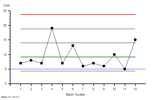
The variation from run to run is obvious; as is the correlation between a make-time and a high cost.
The charts also answer our two questions … a make time up to 90 would not be exceptional and an average cost of 10 implies that is the minimum price we need to charge in order to stay in business.
Our customers are waiting while we check-and-correct our own errors and we are expecting them to pay for the extra work!
In the NHS we have a name for this low-quality high-cost design: Payment By Results.
The charts also show us what is possible … a make time of 20 and a cost of 5.
That happened when, purely by chance, we tossed five heads in a row in the Quality Lottery.
So with this insight we could consider how we might increase the probability of ‘throwing a head’ i.e. doing the work right-first-time … because we can see from our charts what would happen.
The improved quality and cost of changing ourselves and our system to remove the root causes of our errors.
Quality Improvement-by-Design.
That something worth learning how to do.
And can we honestly justify not doing it?