 Processes are like people – they get poorly – sometimes very poorly.
Poorly processes present with symptoms. Symptoms such as criticism, complaints, and even catastrophes.
Poorly processes show signs. Signs such as fear, queues and deficits.
So when a process gets very poorly what do we do?
We follow the Three R’s
1-Resuscitate
2-Review
3-Repair
Resuscitate means to stabilize the process so that it is not getting sicker.
Review means to quickly and accurately diagnose the root cause of the process sickness.
Repair means to make changes that will return the process to a healthy and stable state.
So the concept of ‘stability’ is fundamental and we need to understand what that means in practice.
Stability means ‘predictable within limits’. It is not the same as ‘constant’. Constant is stable but stable is not necessarily constant.
Predictable implies time – so any measure of process health must be presented as time-series data.
We are now getting close to a working definition of stability: “a useful metric of system performance that is predictable within limits over time”.
So what is a ‘useful metric’?
There will be at least three useful metrics for every system: a quality metric, a time metric and a money metric.
Quality is subjective. Money is objective. Time is both.
Time is the one to start with – because it is the easiest to measure.
And if we treat our system as a ‘black box’ then from the outside there are three inter-dependent time-related metrics. These are external process metrics (EPMs) – sometimes called Key Performance Indicators (KPIs).
Flow in – also called demand
Flow out – also called activity
Delivery time – which is the time a task spends inside our system – also called the lead time.
But this is all starting to sound like rather dry, conceptual, academic mumbo-jumbo … so let us add a bit of realism and drama – let us tell this as a story …
[reveal heading=”Click here to reveal the story …“]
Picture  yourself as the manager of a service that is poorly. Very poorly. You are getting a constant barrage of criticism and complaints and the occasional catastrophe. Your service is struggling to meet the required delivery time performance. Your service is struggling to stay in budget – let alone meet future cost improvement targets. Your life is a constant fire-fight and you are getting very tired and depressed. Nothing you try seems to make any difference. You are starting to think that anything is better than this – even unemployment! But you have a family to support and jobs are hard to come by in austere times so jumping is not an option. There is no way out. You feel you are going under. You feel are drowning. You feel terrified and helpless!
In desperation you type “Management fire-fighting” into your web search box and among the list of hits you see “Process Improvement Emergency Service”. That looks hopeful. The link takes you to a website and a phone number. What have you got to lose? You dial the number.
It rings twice and a calm voice answers.
?“You are through to the Process Improvement Emergency Service – what is the nature of the process emergency?”
“Um – my service feels like it is on fire and I am drowning!”
The calm voice continues in a reassuring tone.
?“OK. Have you got a minute to answer three questions?”
“Yes – just about”.
?“OK. First question: Is your service safe?”
“Yes – for now. We have had some catastrophes but have put in lots of extra safety policies and checks which seems to be working. But they are creating a lot of extra work and pushing up our costs and even then we still have lots of criticism and complaints.”
?“OK. Second question: Is your service financially viable?”
“Yes, but not for long. Last year we just broke even, this year we are projecting a big deficit. The cost of maintaining safety is ‘killing’ us.”
?“OK. Third question: Is your service delivering on time?”
“Mostly but not all of the time, and that is what is causing us the most pain. We keep getting beaten up for missing our targets. We constantly ask, argue and plead for more capacity and all we get back is ‘that is your problem and your job to fix – there is no more money’. The system feels chaotic. There seems to be no rhyme nor reason to when we have a good day or a bad day. All we can hope to do is to spot the jobs that are about to slip through the net in time; to expedite them; and to just avoid failing the target. We are fire-fighting all of the time and it is not getting better. In fact it feels like it is getting worse. And no one seems to be able to do anything other than blame each other.”
There is a short pause then the calm voice continues.
?“OK. Do not panic. We can help – and you need to do exactly what we say to put the fire out. Are you willing to do that?”
“I do not have any other options! That is why I am calling.”
The calm voice replied without hesitation.
?“We all always have the option of walking away from the fire. We all need to be prepared to exercise that option at any time. To be able to help then you will need to understand that and you will need to commit to tackling the fire. Are you willing to commit to that?”
You are surprised and strangely reassured by the clarity and confidence of this response and you take a moment to compose yourself.
“I see. Yes, I agree that I do not need to get toasted personally and I understand that you cannot parachute in to rescue me. I do not want to run away from my responsibility – I will tackle the fire.”
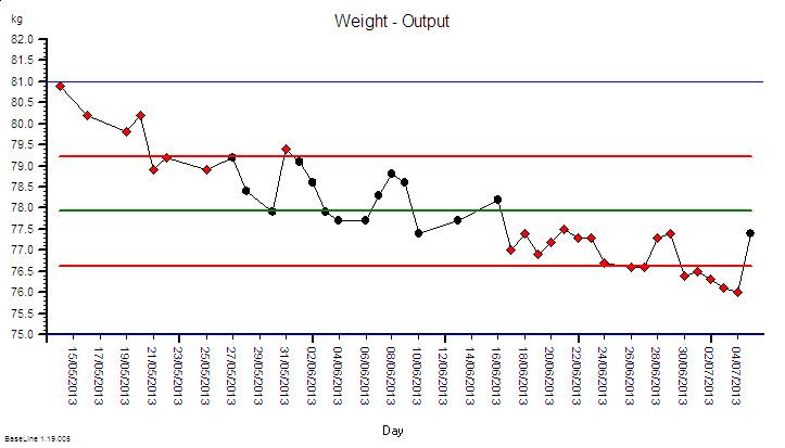
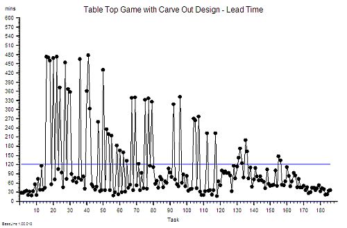
?“OK. First we need to know how stable your process is on the delivery time dimension. Do you have historical data on demand, activity and delivery time?”
“Hey! Data is one thing I do have – I am drowning in the stuff! RAG charts that blink at me like evil demons! None of it seems to help though – the more data I get sent the more confused I become!”
?“OK. Do not panic. The data you need is very specific. We need the start and finish events for the most recent one hundred completed jobs. Do you have that?”
“Yes – I have it right here on a spreadsheet – do I send the data to you to analyse?”
?“There is no need to do that. I will talk you through how to do it.”
“You mean I can do it now?”
?“Yes – it will only take a few minutes.”
“OK, I am ready – I have the spreadsheet open – what do I do?”
?“Step 1. Arrange the start and finish events into two columns with a start and finish event for each task on each row.
You copy and paste the data you need into a new worksheet.
“OK – done that”.
?“Step 2. Sort the two columns into ascending order using the start event.”
“OK – that is easy”.
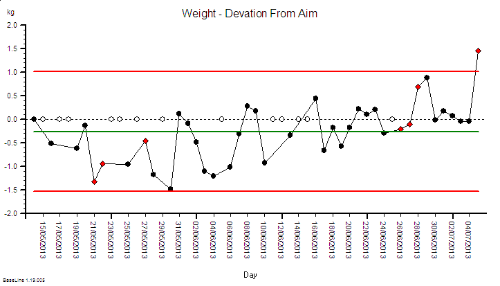
?“Step 3. Create a third column and for each row calculate the difference between the start and the finish event for that task. Please label it ‘Lead Time’”.
“OK – do you want me to calculate the average Lead Time next?”
There was a pause. Then the calm voice continued but with a slight tinge of irritation.
?“That will not help. First we need to see if your system is unstable. We need to avoid the Flaw of Averages trap. Please follow the instructions exactly. Are you OK with that?”
This response was a surprise and you are starting to feel a bit confused.
“Yes – sorry. What is the next step?”
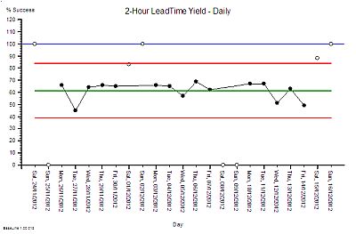
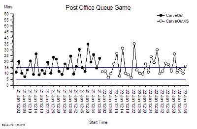
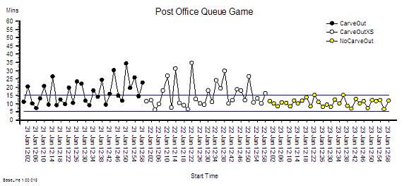
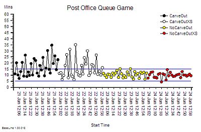
?“Step 4: Plot a graph. Put the Lead Time on the vertical axis and the start time on the horizontal axis”.
“OK – done that.”
?“Step 5: Please describe what you see?”
“Um – it looks to me like a cave full of stalagtites. The top is almost flat, there are some spikes, but the bottom is all jagged.”
?“OK. Step 6: Does the pattern on the left-side and on the right-side look similar?”
“Yes – it does not seem to be rising or falling over time. Do you want me to plot the smoothed average over time or a trend line? They are options on the spreadsheet software. I do that use all the time!”
The calm voice paused then continued with the irritated overtone again.
?“No. There is no value is doing that. Please stay with me here. A linear regression line is meaningless on a time series chart. You may be feeling a bit confused. It is common to feel confused at this point but the fog will clear soon. Are you OK to continue?”
An odd feeling starts to grow in you: a mixture of anger, sadness and excitement. You find yourself muttering “But I spent my own hard-earned cash on that expensive MBA where I learned how to do linear regression and data smoothing because I was told it would be good for my career progression!”
?“I am sorry I did not catch that? Could you repeat it for me?”
“Um – sorry. I was talking to myself. Can we proceed to the next step?”
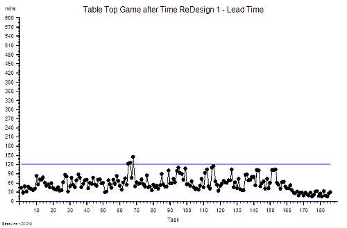
?”OK. From what you say it sounds as if your process is stable – for now. That is good. It means that you do not need to Resuscitate your process and we can move to the Review phase and start to look for the cause of the pain. Are you OK to continue?”
An uncomfortable feeling is starting to form – one that you cannot quite put your finger on.
“Yes – please”.
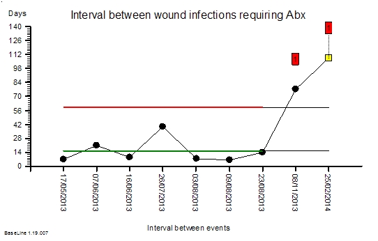
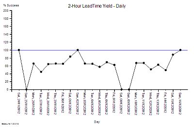
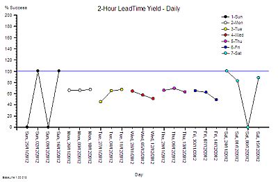
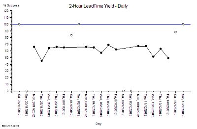
?Step 7: What is the value of the Lead Time at the ‘cave roof’?”
“Um – about 42”
?“OK – Step 8: What is your delivery time target?”
“42”
?“OK – Step 9: How is your delivery time performance measured?”
“By the percentage of tasks that are delivered late each month. Our target is better than 95%. If we fail any month then we are named-and-shamed at the monthly performance review meeting and we have to explain why and what we are going to do about it. If we succeed then we are spared the ritual humiliation and we are rewarded by watching others else being mauled instead. There is always someone in the firing line and attendance at the meeting is not optional!”
You also wanted to say that the data you submit is not always completely accurate and that you often expedite tasks just to avoid missing the target – in full knowkedge that the work had not been competed to the required standard. But you hold that back. Someone might be listening.
There was a pause. Then the calm voice continued with no hint of surprise.
?“OK. Step 10. The most likely diagnosis here is a DRAT. You have probably developed a Gaussian Horn that is creating the emotional pain and that is fuelling the fire-fighting. Do not panic. This is a common and curable process illness.”
You look at the clock. The conversation has taken only a few minutes. Your feeling of panic is starting to fade and a sense of relief and curiosity is growing. Who are these people?
“Can you tell me more about a DRAT? I am not familiar with that term.”
?“Yes. Do you have two minutes to continue the conversation?”
“Yes indeed! You have my complete attention for as long as you need. The emails can wait.”
The calm voice continues.
?“OK. I may need to put you on hold or call you back if another emergency call comes in. Are you OK with that?”
“You mean I am not the only person feeling like this?”
?“You are not the only person feeling like this. The process improvement emergency service, or PIES as we call it, receives dozens of calls like this every day – from organisations of every size and type.”
“Wow! And what is the outcome?”
There was a pause. Then the calm voice continued with an unmistakeable hint of pride.
?“We have a 100% success rate to date – for those who commit. You can look at our performance charts and the client feedback on the website.”
“I certainly will! So can you explain what a DRAT is?”
And as you ask this you are thinking to yourself ‘I wonder what happened to those who did not commit?’
The calm voice interrupts your train of thought with a well-practiced explanation.
?“DRAT stands for Delusional Ratio and Arbitrary Target. It is a very common management reaction to unintended negative outcomes such as customer complaints. The concept of metric-ratios-and-performance-specifications is not wrong; it is just applied indiscriminately. Using DRATs can drive short-term improvements but over a longer time-scale they always make the problem worse.”
One thought is now reverberating in your mind. “I knew that! I just could not explain why I felt so uneasy about how my service was being measured.” And now you have a new feeling growing – anger. You control the urge to swear and instead you ask:
“And what is a Horned Gaussian?”
The calm voice was expecting this question.
?“It is easier to demonstrate than to explain. Do you still have your spreadsheet open and do you know how to draw a histogram?”
“Yes – what do I need to plot?”
?“Use the Lead Time data and set up ten bins in the range 0 to 50 with equal intervals. Please describe what you see”.
It takes you only a few seconds to do this. You draw lots of histograms – most of them very colourful but meaningless. No one seems to mind though.
“OK. The histogram shows a sort of heap with a big spike on the right hand side – at 42.”
The calm voice continued – this time with a sense of satisfaction.
?“OK. You are looking at the Horned Gaussian. The hump is the Gaussian and the spike is the Horn. It is a sign that your complex adaptive system behaviour is being distorted by the DRAT. It is the Horn that causes the pain and the perpetual fire-fighting. It is the DRAT that causes the Horn.”
“Is it possible to remove the Horn and put out the fire?”
?“Yes.”
This is what you wanted to hear and you cannot help cutting to the closure question.
“Good. How long does that take and what does it involve?”
The calm voice was clearly expecting this question too.
?“The Gaussian Horn is a non-specific reaction – it is an effect – it is not the cause. To remove it and to ensure it does not come back requires treating the root cause. The DRAT is not the root cause – it is also a knee-jerk reaction to the symptoms – the complaints. Treating the symptoms requires learning how to diagnose the specific root cause of the lead time performance failure. There are many possible contributors to lead time and you need to know which are present because if you get the diagnosis wrong you will make an unwise decision, take the wrong action and exacerbate the problem.”
Something goes ‘click’ in your head and suddently your fog of confusion evaporates. It is like someone just switched a light on.
“Ah Ha! You have just explained why nothing we try seems to work for long – if at all. How long does it take to learn how to diagnose and treat the specific root causes?”
The calm voice was expecting this question and seemed to switch to the next part of the script.
?“It depends on how committed the learner is and how much unlearning they have to do in the process. Our experience is that it takes a few hours of focussed effort over a few weeks. It is rather like learning any new skill. Guidance, practice and feedback are needed. Just about anyone can learn how to do it – but paradoxically it takes longer for the more experienced and, can I say, cynical managers. We believe they have more unlearning to do.”
You are now feeling a growing sense of urgency and excitement.
“So it is not something we can do now on the phone?”
?“No. This conversation is just the first step.”
You are eager now – sitting forward on the edge of your chair and completely focussed.
“OK. What is the next step?”
There is a pause. You sense that the calm voice is reviewing the conversation and coming to a decision.
?“Before I can answer your question I need to ask you something. I need to ask you how you are feeling.”
That was not the question you expected! You are not used to talking about your feelings – especially to a complete stranger on the phone – yet strangely you do not sense that you are being judged. You have is a growing feeling of trust in the calm voice.
You pause, collect your thoughts and attempt to put your feelings into words.
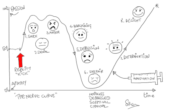
“Er – well – a mixture of feelings actually – and they changed over time. First I had a feeling of surprise that this seems so familiar and straightforward to you; then a sense of resistance to the idea that my problem is fixable; and then a sense of confusion because what you have shown me challenges everything I have been taught; and then a feeling distrust that there must be a catch and then a feeling of fear of embarassement if I do not spot the trick. Then when I put my natural skepticism to one side and considered the possibility as real then there was a feeling of anger that I was not taught any of this before; and then a feeling of sadness for the years of wasted time and frustration from battling something I could not explain. Eventually I started to started to feel that my cherished impossibility belief was being shaken to its roots. And then I felt a growing sense of curiosity, optimism and even excitement that is also tinged with a feeling of fear of disappointment and of having my hopes dashed – again.”
There was a pause – as if the calm voice was digesting this hearty meal of feelings. Then the calm voice stated:
?“You are experiencing the Nerve Curve. It is normal and expected. It is a healthy sign. It means that the healing process has already started. You are part of your system. You feel what it feels – it feels what you do. The sequence of negative feelings: the shock, denial, anger, sadness, depression and fear will subside with time and the positive feelings of confidence, curiosity and excitement will replace them. Do not worry. This is normal and it takes time. I can now suggest the next step.”
You now feel like you have just stepped off an emotional rollercoaster – scary yet exhilarating at the same time. A sense of relief sweeps over you. You have shared your private emotional pain with a stranger on the phone and the world did not end! There is hope.
“What is the next step?”
This time there was no pause.
?“To commit to learning how to diagnose and treat your process illnesses yourself.”
“You mean you do not sell me an expensive training course or send me a sharp-suited expert who will come tell me what to do and charge me a small fortune?”
There is an almost sarcastic tone to your reply that you regret as soon as you have spoken.
Another pause. An uncomfortably long one this time. You sense the calm voice knows that you know the answer to your own question and is waiting for you to answer it yourself.
You answer your own question.
“OK. I guess not. Sorry for that. Yes – I am definitely up for learning how! What do I need to do.”
?“Just email us. The address is on the website. We will outline the learning process. It is neither difficult nor expensive.”
The way this reply was delivered – calmly and matter-of-factly – was reassuring but it also promoted a new niggle – a flash of fear.
“How long have I got to learn this?”
This time the calm voice had an unmistakable sense of urgency that sent a cold prickles down your spine.
?”Delay will add no value. You are being stalked by the Horned Gaussian. This means your system is on the edge of a catastrophe cliff. It could tip over any time. You cannot afford to relax. You must maintain all your current defenses. It is a learning-by-doing process. The sooner you start to learn-by-doing the sooner the fire starts to fade and the sooner you move away from the edge of the cliff.”
“OK – I understand – and I do not know why I did not seek help a long time ago.”
The calm voice replied simply.
?”Many people find seeking help difficult. Especially senior people”.
Sensing that the conversation is coming to an end you feel compelled to ask:
“I am curious. Where do the DRATs come from?”
?“Curiosity is a healthy attitude to nurture. We believe that DRATs originated in finance departments – where they were originally called Fiscal Averages, Ratios and Targets. At some time in the past they were sucked into operations and governance departments by a knowledge vacuum created by an unintended error of omission.”
You are not quite sure what this unfamiliar language means and you sense that you have strayed outside the scope of the “emergency script” but the phrase ‘error of omission sounds interesting’ and pricks your curiosity. You ask:
“What was the error of omission?”
?“We believe it was not investing in learning how to design complex adaptive value systems to deliver capable win-win-win performance. Not investing in learning the Science of Improvement.”
“I am not sure I understand everything you have said.”
?“That is OK. Do not worry. You will. We look forward to your email. My name is Bob by the way.”
“Thank you so much Bob. I feel better just having talked to someone who understands what I am going through and I am grateful to learn that there is a way out of this dark pit of despair. I will look at the website and send the email immediately.”
?”I am happy to have been of assistance.”
[/reveal]

 [Dring Dring] The telephone soundbite announced the start of the coaching session.
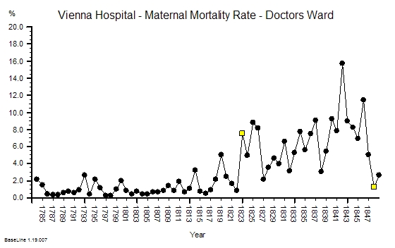


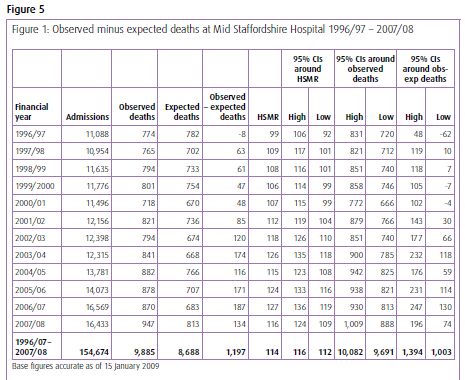
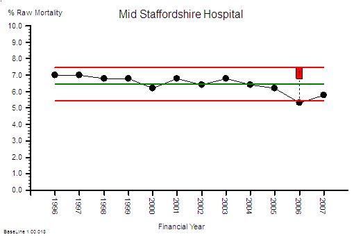
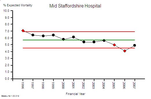
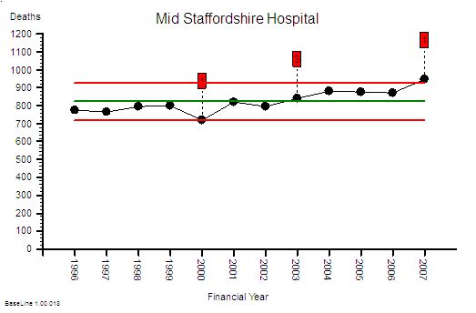 This is the raw mortality data from the table above, plotted as a time-series chart. The green line is the average and the red-lines are a measure of variation-over-time. We can all see that the raw mortality is increasing and the red flags say that this is a statistically significant increase. Oh dear!


 L: U
L: U