
Each of us is a small part of a big system. Each of us is a big system made of smaller parts. The concept of a system is the same at all scales – it is called scale invariant.
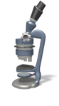 When we put a system under a microscope we see parts that are also systems. And when we zoom in on those we see their parts are also systems. And if we look outwards with a telescope we see that we are part of a bigger system which in turn is part of an even bigger system.
This concept of systems-within-systems has a down-side and an up-side.
 The down-side is that it quickly becomes impossible to create a mental picture of the whole system-of-systems. Our caveman brains are just not up to the job. So we just focus our impressive-but-limited cognitive capacity on the bit that affects us most. The immediate day-to-day people-and-process here-and-now stuff. And we ignore the ‘rest’. We deliberately become ignorant – and for good reason. We do not ask about the ‘rest’ because we do not want to know because we cannot comprehend the complexity. We create cognitive comfort zones and personal silos.
And we stay inside our comfort zones and we hide inside our silos.
Unfortunately – ignoring the ‘rest’ does not make it go away.
We are part of a system – we are affected by it and it is affected by us. That is how systems work.
 The up-side is that all systems behave in much the same way – irrespective of the level. This is very handy because if we can master a method for understanding and improving a system at one level – then we can use the same method at any level. The only change is the degree of detail. We can chunk up and down and still use the same method.
The improvement scientist needs to be a master of one method and to be aware of three levels: the system level, the stream level and the step level.
The system provides the context for the streams. The steps provide the content of the streams.
- Direction operates at the system level.
- Delivery operates at the stream level.
- Doing operates at the step level.
So an effective and efficient improvement science method must work at all three levels – and one method that has been demonstrated to do that is called 6M Design®.
6M Design® is not the only improvement science method, and it is not intended to be the best. Being the best is not the purpose because it is not necessary. Having better than what we had before is the purpose because it is sufficient. That is improvement.
6M Design® works at all three levels. It is sufficient for system-wide and system-deep improvement. So that is what I use.
The first M stands for Map.
Maps are designed to be visual and two-dimensional because that is how our Mark-I eyeballs abd visual sensory systems work. Our caveman brains are good at using pictures and in extraction meaning from the detail. It is a survival skill.
All real systems have a lot more than two dimensions. Safety, Quality, Flow and Cost are four dimensions to start with, and there are many more. So we need lots of maps. Each one looking at just two of the dimensions. It is our set of maps that provide us with a multi-dimensional picture of the system we want to improve.
One dimension features more often in the maps than any other – and that dimension is time.
The Western cultural convention is to put time on the horizonal axis with past in the left and future on the right. Left-to-right means looking forward in time. Right-to-left means looking backwards in time.
We have already seen one of the time-dependent maps – The 4N Chart®.
It is a Emotion-Time map. How do we feel now and why? What do we want to feel in the futrure and why? It is a status-at-a-glance map. A static map. A snapshot.
 The emotional roller coaster of change – the Nerve Curve – is an Emotion-Time map too. It is a dynamic map – an expected trajectory map. The emotional ups and downs that we expect to encounter when we engage in significant change.
Change usually involves several threads at the same time – each with its own Nerve Curve.
The 4N Charts® are snapshots of all the parallel threads of change – they evolve over time – they are our day-to-day status-at-a-glance maps – and they guide us to which Nerve Curve to pay attention to next and what to do.
The map that links the three – the purposes, the pathways and the parts – is the map that underpins 6M Design®. A map that most people are not familiar with because it represents a counter-intuitive way of thinking.
And it is that critical-to-success map which differentiates innovative design from incremental improvement.
And using that map can be learned quite quickly – if you have a guide – an Improvement Scientist.