
[Bing Bong] The sound bite heralded Leslie joining the regular Improvement Science mentoring session with Bob. They were now using web-technology to run virtual meetings because it allows a richer conversation and saves a lot of time. It is a big improvement.
<Bob> Hi Lesley, how are you today?
<Leslie> OK thank you Bob. I have a thorny issue to ask you about today. It has been niggling me even since we started to share the experience we are gaining from our current improvement-by-design project.
<Bob> OK. That sounds interesting. Can you paint the picture for me?
<Leslie> Better than that – I can show you the picture, I will share my screen with you.
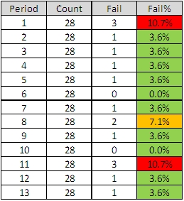 <Bob> OK. I can see that RAG table. Can you give me a bit more context?
<Leslie> Yes. This is how our performance management team have been asked to produce their 4-weekly reports for the monthly performance committee meetings.
<Bob> OK. I assume the “Period” means sequential four week periods … so what is Count, Fail and Fail%?
<Leslie> Count is the number of discharges in that 4 week period, Fail is the number whose length of stay is longer than the target, and Fail% is the ratio of Fail/Count for each 4 week period.
<Bob> It looks odd that the counts are all 28. Is there some form of admission slot carve-out policy?
<Leslie> Yes. There is one admission slot per day for this particular stream – that has been worked out from the average historical activity.
<Bob> Ah! And the Red, Amber, Green indicates what?
<Leslie> That is depends where the Fail% falls in a set of predefined target ranges; less than 5% is green, 5-10% is Amber and more than 10% is red.
<Bob> OK. So what is the niggle?
<Leslie>Each month when we are in the green we get no feedback – a deafening silence. Each month we are in amber we get a warning email. Each month we are in the red we have to “go and explain ourselves” and provide a “back-on-track” plan.
<Bob> Let me guess – this feedback design is not helping much.
<Leslie> It is worse than that – it creates a perpetual sense of fear. The risk of breaching the target is distorting people’s priorities and their behaviour.
<Bob> Do you have any evidence of that?
<Leslie> Yes – but it is anecdotal. There is a daily operational meeting and the highest priority topic is “Which patients are closest to the target length of stay and therefore need to have their discharge expedited?“.
<Bob> Ah yes. The “target tail wagging the quality dog” problem. So what is your question?
<Leslie> How do we focus on the cause of the problem rather than the symptoms? We want to be rid of the “fear of the stick”.
<Bob> OK. What you have hear is a very common system design flaw. It is called a DRAT.
<Leslie> DRAT?
<Bob> “Delusional Ratio and Arbitrary Target”.
<Leslie> Ha! That sounds spot on! “DRAT” is what we say every time we miss the target!
<Bob> Indeed. So first plot this yield data as a time series chart.
<Leslie> Here we go.
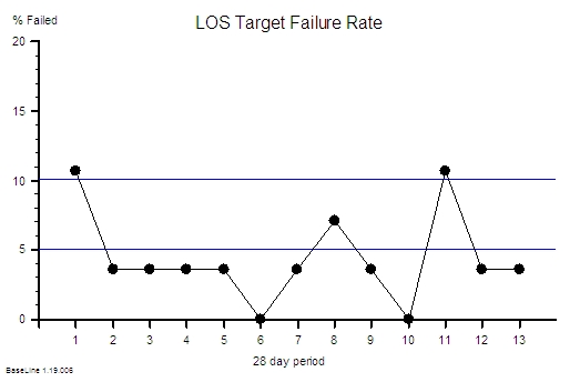 <Bob>Good. I see you have added the cut-off thresholds for the RAG chart. These 5% and 10% thresholds are arbitrary and the data shows your current system is unable to meet them. Your design looks incapable.
<Leslie>Yes – and it also shows that the % expressed to one decimal place is meaningless because there are limited possibilities for the value.
<Bob> Yes. These are two reasons that this is a Delusional Ratio; there are quite a few more.
 <Leslie> OK and if I plot this as an Individuals charts I can see that this variation is not exceptional.
<Bob> Careful Leslie. It can be dangerous to do this: an Individuals chart of aggregate yield becomes quite insensitive with aggregated counts of relatively rare events, a small number of levels that go down to zero, and a limited number of points. The SPC zealots are compounding the problem and plotting this data as a C-chart or a P-chart makes no difference.
This is all the effect of the common practice of applying an arbitrary performance target then counting the failures and using that as means of control.
It is poor feedback loop design – but a depressingly common one.
<Leslie> So what do we do? What is a better design?
<Bob> First ask what the purpose of the feedback is?
<Leslie> To reduce the number of beds and save money by forcing down the length of stay so that the bed-day load is reduced and so we can do the same activity with fewer beds and at the same time avoid cancellations.
<Bob> OK. That sounds reasonable from the perspective of a tax-payer and a patient. It would also be a more productive design.
<Leslie> I agree but it seems to be having the opposite effect. We are focusing on avoiding breaches so much that other patients get delayed who could have gone home sooner and we end up with more patients to expedite. It is like a vicious circle. And every time we fail we get whacked with the RAG stick again. It is very demoralizing and it generates a lot of resentment and conflict. That is not good for anyone – least of all the patients.
<Bob>Yes. That is the usual effect of a DRAT design. Remember that senior managers have not been trained in process improvement-by-design either so blaming them is also counter-productive. We need to go back to the raw data. Can you plot actual LOS by patient in order of discharge as a run chart.

<Bob> OK – is the maximum LOS target 8 days?
<Leslie> Yes – and this shows we are meeting it most of the time. But it is only with a huge amount of effort.
<Bob> Do you know where 8 days came from?
<Leslie> I think it was the historical average divided by 85% – someone read in a book somewhere that 85% average occupancy was optimum and put 2 and 2 together.
<Bob> Oh dear! The “85% Occupancy is Best” myth combined with the “Flaw of Averages” trap. Never mind – let me explain the reasons why it is invalid to do this.
<Leslie> Yes please!
<Bob> First plot the data as a run chart and as a histogram – do not plot the natural process limits yet as you have done. We need to do some validity checks first.
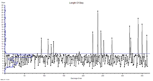
<Leslie> Here you go.
<Bob> What do you see?
<Leslie> The histogram has more than one peak – and there is a big one sitting just under the target.
<Bob>Yes. This is called the “Horned Gaussian” and is the characteristic pattern of an arbitrary lead-time target that is distorting the behaviour of the system. Just as you have described subjectively. There is a smaller peak with a mode of 4 days and are a few very long length of stay outliers. This multi-modal pattern means that the mean and standard deviation of this data are meaningless numbers as are any numbers derived from them. It is like having a bag of mixed fruit and then setting a maximum allowable size for an unspecified piece of fruit. Meaningless.
<Leslie> And the cases causing the breaches are completely different and could never realistically achieve that target! So we are effectively being randomly beaten with a stick. That is certainly how it feels.
<Bob> They are certainly different but you cannot yet assume that their longer LOS is inevitable. This chart just says – “go and have a look at these specific cases for a possible cause for the difference“.
<Leslie> OK … so if they are from a different system and I exclude them from the analysis what happens?
<Bob> It will not change reality. The current design of this process may not be capable of delivering an 8 day upper limit for the LOS. Imposing a DRAT does not help – it actually makes the design worse! As you can see. Only removing the DRAT will remove the distortion and reveal the underlying process behaviour.
<Leslie> So what do we do? There is no way that will happen in the current chaos!
<Bob> Apply the 6M Design® method. Map, Measure and Model it. Understand how it is behaving as it is then design out all the causes of longer LOS and that way deliver with a shorter and less variable LOS. Your chart shows that your process is stable. That means you have enough flow capacity – so look at the policies. Draw on all your FISH training. That way you achieve your common purpose, and the big nasty stick goes away, and everyone feels better. And in the process you will demonstrate that there is a better feedback design than DRATs and RAGs. A win-win-win design.
<Leslie> OK. That makes complete sense. Thanks Bob! But what you have described is not part of the FISH course.
<Bob> You are right. It is part of the ISP training that comes after FISH. Improvement Science Practitioner.
<Leslie> I think we will need to get a few more people trained in the theory, techniques and tools of Improvement Science.
<Bob> That would appear to be the case. They will need a real example to see what is possible.
<Leslie> OK. I am on the case!