 The retrospectoscope is the favourite instrument of the forensic cynic – the expert in the after-the-event-and-I-told-you-so rhetoric. The rabble-rouser for the lynch-mob.
It feels better to retrospectively nail-to-a-cross the person who committed the Cardinal Error of Omission, and leave them there in emotional and financial pain as a visible lesson to everyone else.
This form of public feedback has been used for centuries.
It is called barbarism, and it has no place in a modern civilised society.
A more constructive question to ask is:
“Could the evolving Mid-Staffordshire crisis have been detected earlier … and avoided?”
And this question exposes a tricky problem: it is much more difficult to predict the future than to explain the past. And if it could have been detected and avoided earlier, then how is that done? And if the how-is-known then is everyone else in the NHS using this know-how to detect and avoid their own evolving Mid-Staffs crisis?
To illustrate how it is currently done let us use the actual Mid-Staffs data. It is conveniently available in Figure 1 embedded in Figure 5 on Page 360 in Appendix G of Volume 1 of the first Francis Report. If you do not have it at your fingertips I have put a copy of it below.
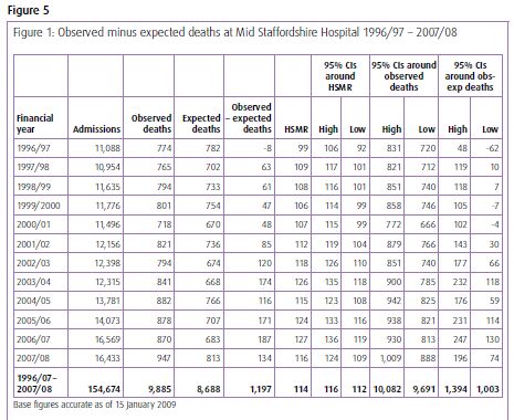
The message does not exactly leap off the page and smack us between the eyes does it? Even with the benefit of hindsight. So what is the problem here?
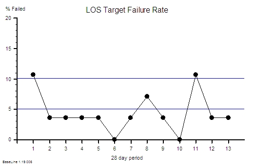
The problem is one of ergonomics. Tables of numbers like this are very difficult for most people to interpret, so they create a risk that we ignore the data or that we just jump to the bottom line and miss the real message. And It is very easy to miss the message when we compare the results for the current period with the previous one – a very bad habit that is spread by accountants.
This was a slowly emerging crisis so we need a way of seeing it evolving and the better way to present this data is as a time-series chart.
As we are most interested in safety and outcomes, then we would reasonably look at the outcome we do not want – i.e. mortality. I think we will all agree that it is an easy enough one to measure.
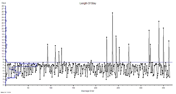
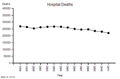
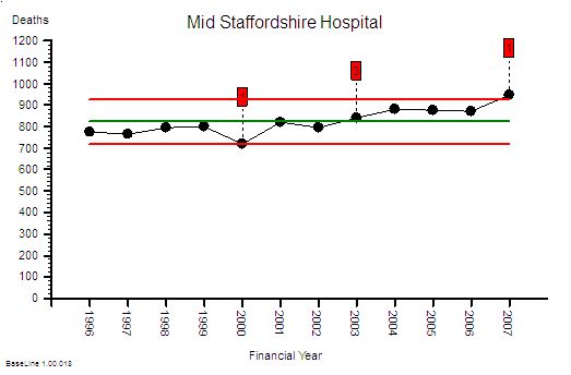 This is the raw mortality data from the table above, plotted as a time-series chart. The green line is the average and the red-lines are a measure of variation-over-time. We can all see that the raw mortality is increasing and the red flags say that this is a statistically significant increase. Oh dear!
But hang on just a minute – using raw mortality data like this is invalid because we all know that the people are getting older, demand on our hospitals is rising, A&Es are busier, older people have more illnesses, and more of them will not survive their visit to our hospital. This rise in mortality may actually just be because we are doing more work.
Good point! Let us plot the activity data and see if there has been an increase.
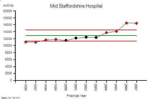
Yes – indeed the activity has increased significantly too.
Told you so! And it looks like the activity has gone up more than the mortality. Does that mean we are actually doing a better job at keeping people alive? That sounds like a more positive message for the Board and the Annual Report. But how do we present that message? What about as a ratio of mortality to activity? That will make it easier to compare ourselves with other hospitals.
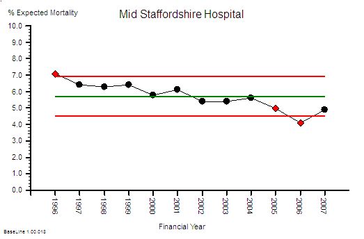
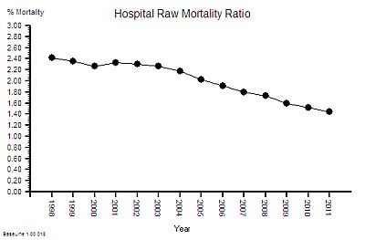
Good idea! Here is the Raw Mortality Ratio chart.
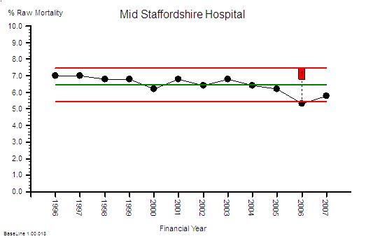 Ah ha. See! The % mortality is falling significantly over time. Told you so.
Careful. There is an unstated assumption here. The assumption that the case mix is staying the same over time. This pattern could also be the impact of us doing a greater proportion of lower complexity and lower risk work. So we need to correct this raw mortality data for case mix complexity – and we can do that by using data from all NHS hospitals to give us a frame of reference. Dr Foster can help us with that because it is quite a complicated statistical modelling process. What comes out of Dr Fosters black magic box is the Global Hospital Raw Mortality (GHRM) which is the expected number of deaths for our case mix if we were an ‘average’ NHS hospital.
What this says is that the NHS-wide raw mortality risk appears to be falling over time (which may be for a wide variety of reasons but that is outside the scope of this conversation). So what we now need to do is compare this global raw mortality risk with our local raw mortality risk … to give the Hospital Standardised Mortality Ratio.
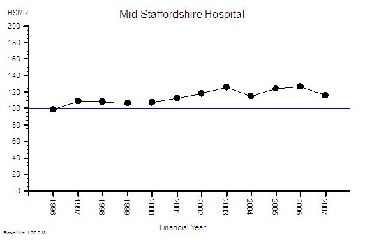 This gives us the Mid Staffordshire Hospital HSMR chart. The blue line at 100 is the reference average – and what this chart says is that Mid Staffordshire hospital had a consistently higher risk than the average case-mix adjusted mortality risk for the whole NHS. And it says that it got even worse after 2001 and that it stayed consistently 20% higher after 2003.
Ah! Oh dear! That is not such a positive message for the Board and the Annual Report. But how did we miss this evolving safety catastrophe? We had the Dr Foster data from 2001
This is not a new problem – a similar thing happened in Vienna between 1820 and 1850 with maternal deaths caused by Childbed Fever. The problem was detected by Dr Ignaz Semmelweis who also discovered a simple, pragmatic solution to the problem: hand washing. He blew the whistle but unfortunately those in power did not like the implication that they had been the cause of thousands of avoidable mother and baby deaths. Semmelweis was vilified and ignored, and he did not publish his data until 1861. And even then the story was buried in tables of numbers. Semmelweis went mad trying to convince the World that there was a problem. Here is the full story.
Also, time-series charts were not invented until 1924 – and it was not in healthcare – it was in manufacturing. These tried-and-tested safety and quality improvement tools are only slowly diffusing into healthcare because the barriers to innovation appear somewhat impervious.
And the pores have been clogged even more by the social poison called “cynicide” – the emotional and political toxin exuded by cynics.
So how could we detect a developing crisis earlier – in time to avoid a catastrophe?
The first step is to estimate the excess-death-equivalent. Dr Foster does this for you.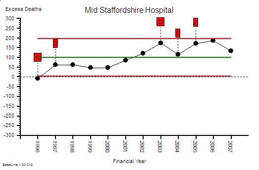 Here is the data from the table plotted as a time-series chart that shows that the estimated-excess-death-equivalent per year. It has an average of 100 (that is two per week) and the average should be close to zero. More worryingly the number was increasing steadily over time up to 200 per year in 2006 – that is about four excess deaths per week – on average. It is important to remember that HSMR is a risk ratio and mortality is a multi-factorial outcome. So the excess-death-equivalent estimate does not imply that a clear causal chain will be evident in specific deaths. That is a complete misunderstanding of the method.
I am sorry – you are losing me with the statistical jargon here. Can you explain in plain English what you mean?
OK. Let us use an example.
Suppose we set up a tombola at the village fete and we sell 50 tickets with the expectation that the winner bags all the money. Each ticket holder has the same 1 in 50 risk of winning the wad-of-wonga and a 49 in 50 risk of losing their small stake. At the appointed time we spin the barrel to mix up the ticket stubs then we blindly draw one ticket out. At that instant the 50 people with an equal risk changes to one winner and 49 losers. It is as if the grey fog of risk instantly condenses into a precise, black-and-white, yes-or-no, winner-or-loser, reality.
Translating this concept back into HSMR and Mid Staffs – the estimated 1200 deaths are the just the “condensed risk of harm equivalent”. So, to then conduct a retrospective case note analysis of specific deaths looking for the specific cause would be equivalent to trying to retrospectively work out the reason the particular winning ticket in the tombola was picked out. It is a search that is doomed to fail. To then conclude from this fruitless search that HSMR is invalid, is only to compound the delusion further. The actual problem here is ignorance and misunderstanding of the basic Laws of Physics and Probability, because our brains are not good at solving these sort of problems.
But Mid Staffs is a particularly severe example and it only shows up after years of data has accumulated. How would a hospital that was not as bad as this know they had a risk problem and know sooner? Waiting for years to accumulate enough data to prove there was a avoidable problem in the past is not much help.
That is an excellent question. This type of time-series chart is not very sensitive to small changes when the data is noisy and sparse – such as when you plot the data on a month-by-month timescale and avoidable deaths are actually an uncommon outcome. Plotting the annual sum smooths out this variation and makes the trend easier to see, but it delays the diagnosis further. One way to increase the sensitivity is to plot the data as a cusum (cumulative sum) chart – which is conspicuous by its absence from the data table. It is the running total of the estimated excess deaths. Rather like the running total of swings in a game of golf.
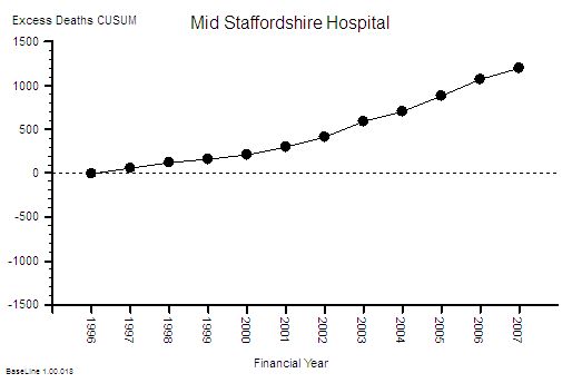 This is the cusum chart of excess deaths and you will notice that it is not plotted with control limits. That is because it is invalid to use standard control limits for cumulative data. The important feature of the cusum chart is the slope and the deviation from zero. What is usually done is an alert threshold is plotted on the cusum chart and if the measured cusum crosses this alert-line then the alarm bell should go off – and the search then focuses on the precursor events: the Near Misses, the Not Agains and the Niggles.
I see. You make it look easy when the data is presented as pictures. But aren’t we still missing the point? Isn’t this still after-the-avoidable-event analysis?
Yes! An avoidable death should be a Never-Event in a designed-to-be-safe healthcare system. It should never happen. There should be no coffins to count. To get to that stage we need to apply exactly the same approach to the Near-Misses, and then the Not-Agains, and eventually the Niggles.
You mean we have to use the SUI data and the IR1 data and the complaint data to do this – and also ask our staff and patients about their Niggles?
Yes. And it is not the number of complaints that is the most useful metric – it is the appearance of the cumulative sum of the complaint severity score. And we need a method for diagnosing and treating the cause of the Niggles too. We need to convert the feedback information into effective action.
Ah ha! Now I understand what the role of the Governance Department is: to apply the tools and techniques of Improvement Science proactively. But our Governance Department have not been trained to do this!
Then that is one place to start – and their role needs to evolve from Inspectors and Supervisors to Demonstrators and Educators – ultimately everyone in the organisation needs to be a competent Healthcare Improvementologist.
OK – I now now what to do next. But wait a minute. This is going to cost a fortune!
This is just one small first step. The next step is to redesign the processes so the errors do not happen in the first place. The cumulative cost saving from eliminating the repeated checking, correcting, box-ticking, documenting, investigating, compensating and insuring is much much more than the one-off investment in learning safe system design.
So the Finance Director should be a champion for safety and quality too.
Yup!
Brill. Thanks. And can I ask one more question? I do not want to appear to skeptical but how do we know we can trust that this risk-estimation system has been designed and implemented correctly? How do we know we are not being bamboozled by statisticians? It has happened before!
That is the best question yet. It is important to remember that HSMR is counting deaths in hospital which means that it is not actually the risk of harm to the patient that is measured – it is the risk to the reputation of hospital! So the answer to your question is that you demonstrate your deep understanding of the rationle and method of risk-of-harm estimation by listing all the ways that such a system could be deliberately “gamed” to make the figures look better for the hospital. And then go out and look for hard evidence of all the “games” that you can invent. It is a sort of creative poacher-becomes-gamekeeper detective exercise.
OK – I sort of get what you mean. Can you give me some examples?
Yes. The HSMR method is based on deaths-in-hospital so discharging a patient from hospital before they die will make the figures look better. Suppose one hospital has more access to end-of-life care in the community than another: their HSMR figures would look better even though exactly the same number of people died. Another is that the HSMR method is weighted towards admissions classified as “emergencies” – so if a hospital admits more patients as “emergencies” who are not actually very sick and discharges them quickly then this will inflated their estimated deaths and make their actual mortality ratio look better – even though the risk-of-harm to patients has not changed.
OMG – so if we have pressure to meet 4 hour A&E targets and we get paid more for an emergency admission than an A&E attendance then admitting to an Assessmen Area and discharging within one day will actually reward the hospital financially, operationally and by apparently reducing their HSMR even though there has been no difference at all to the care that patients actually recieve?
Yes. It is an inevitable outcome of the current system design.
But that means that if I am gaming the system and my HSMR is not getting better then the risk-of-harm to patients is actually increasing and my HSMR system is giving me false reassurance that everything is OK. Wow! I can see why some people might not want that realisation to be public knowledge. So what do we do?
Design the system so that the rewards are aligned with lower risk of harm to patients and improved outcomes.
Is that possible?
Yes. It is called a Win-Win-Win design.
How do we learn how to do that?
Improvement Science.
Footnote I:
The graphs tell a story but they may not create a useful sense of perspective. It has been said that there is a 1 in 300 chance that if you go to hospital you will not leave alive for avoidable causes. What! It cannot be as high as 1 in 300 surely?
OK – let us use the published Mid-Staffs data to test this hypothesis. Over 12 years there were about 150,000 admissions and an estimated 1,200 excess deaths (if all the risk were concentrated into the excess deaths which is not what actually happens). That means a 1 in 130 odds of an avoidable death for every admission! That is twice as bad as the estimated average.
The Mid Staffordshire statistics are bad enough; but the NHS-as-a-whole statistics are cumulatively worse because there are 100’s of other hospitals that are each generating not-as-obvious avoidable mortality. The data is very ‘noisy’ so it is difficult even for a statistical expert to separate the message from the morass.
And remember – that the “expected” mortality is estimated from the average for the whole NHS – which means that if this average is higher than it could be then there is a statistical bias and we are being falsely reassured by being ‘not statistically significantly different’ from the pack.
And remember too – for every patient and family that suffers and avoidable death there are many more that have to live with the consequences of avoidable but non-fatal harm. That is called avoidable morbidity. This is what the risk really means – everyone has a higher risk of some degree of avoidable harm. Psychological and physical harm.
This challenge is not just about preventing another Mid Staffs – it is about preventing 1000’s of avoidable deaths and 100,000s of patients avoidably harmed every year in ‘average’ NHS trusts.
It is not a mass conspiracy of bad nurses, bad doctors, bad managers or bad policians that is the root cause.
It is poorly designed processes – and they are poorly designed because the nurses, doctors and managers have not learned how to design better ones. And we do not know how because we were not trained to. And that education gap was an accident – an unintended error of omission.
Our urgently-improve-NHS-safety-challenge requires a system-wide safety-by-design educational and cultural transformation.
And that is possible because the knowledge of how to design, test and implement inherently safe processes exists. But it exists outside healthcare.
And that safety-by-design training is a worthwhile investment because safer-by-design processes cost less to run because they require less checking, less documenting, less correcting – and all the valuable nurse, doctor and manager time freed up by that can be reinvested in more care, better care and designing even better processes and systems.
Everyone Wins – except the cynics who have a choice: to eat humble pie or leave.
Footnote II:
In the debate that has followed the publication of the Francis Report a lot of scrutiny has been applied to the method by which an estimated excess mortality number is created and it is necessary to explore this in a bit more detail.
The HSMR is an estimate of relative risk – it does not say that a set of specific patients were the ones who came to harm and the rest were OK. So looking at individual deaths and looking for the specific causes is to completely misunderstand the method. So looking at the actual deaths individually and looking for identifiable cause-and-effect paths is an misuse of the message. When very few if any are found to conclude that HSMR is flawed is an error of logic and exposes the ignorance of the analyst further.
HSMR is not perfect though – it has weaknesses. It is a benchmarking process the”standard” of 100 is always moving because the collective goal posts are moving – the reference is always changing . HSMR is estimated using data submitted by hospitals themselves – the clinical coding data. So the main weakness is that it is dependent on the quality of the clinicial coding – the errors of comission (wrong codes) and the errors of omission (missing codes). Garbage In Garbage Out.
Hospitals use clinically coded data for other reasons – payment. The way hospitals are now paid is based on the volume and complexity of that activity – Payment By Results (PbR) – using what are called Health Resource Groups (HRGs). This is a better and fairer design because hospitals with more complex (i.e. costly to manage) case loads get paid more per patient on average. The HRG for each patient is determined by their clinical codes – including what are called the comorbidities – the other things that the patient has wrong with them. More comorbidites means more complex and more risky so more money and more risk of death – roughly speaking. So when PbR came in it becamevery important to code fully in order to get paid “properly”. The problem was that before PbR the coding errors went largely unnoticed – especially the comorbidity coding. And the errors were biassed – it is more likely to omit a code than to have an incorrect code. Errors of omission are harder to detect. This meant that by more complete coding (to attract more money) the estimated casemix complexity would have gone up compared with the historical reference. So as actual (not estimated) NHS mortality has gone down slightly then the HSMR yardstick becomes even more distorted. Hospitals that did not keep up with the Coding Game would look worse even though their actual risk and mortality may be unchanged. This is the fundamental design flaw in all types of benchmarking based on self-reported data.
The actual problem here is even more serious. PbR is actually a payment for activity – not a payment for outcomes. It is calculated from what it cost to run the average NHS hospital using a technique called Reference Costing which is the same method that manufacturing companies used to decide what price to charge for their products. It has another name – Absorption Costing. The highest performers in the manufacturing world no longer use this out-of-date method. The implication of using Reference Costing and PbR in the NHS are profound and dangerous:
If NHS hospitals in general have poorly designed processes that create internal queues and require more bed days than actually necessary then the cost of that “waste” becomes built into the future PbR tariff. This means average length of stay (LOS) is financially rewarded. Above average LOS is financially penalised and below average LOS makes a profit. There is no financial pressure to improve beyound average. This is called the Regression to the Mean effect. Also LOS is not a measure of quality – so there is a to shorten length of stay for purely financial reasons – to generate a surplus to use to fund growth and capital investment. That pressure is non-specific and indiscrimiate. PbR is necessary but it is not sufficient – it requires an quality of outcome metric to complete it.
So the PbR system is based on an out-of-date cost-allocation model and therefore leads to the very problems that are contributing to the MidStaffs crisis – financial pressure causing quality failures and increased risk of mortality. MidStaffs may be a chance victim of a combination of factors coming together like a perfect storm – but those same factors are present throughout the NHS because they are built into the current design.
One solution is to move towards a more up-to-date financial model called stream costing. This uses the similar data to reference costing but it estimates the “ideal” cost of the “necessary” work to achieve the intended outcome. This stream cost becomes the focus for improvement – the streams where there is the biggest gap between the stream cost and the reference cost are the focus of the redesign activity. Very often the root cause is just poor operational policy design; sometimes it is quality and safety design problems. Both are solvable without investment in extra capacity. The result is a higher quality, quicker, lower-cost stream. Win-win-win. And in the short term that is rewarded by a tariff income that exceeds cost and a lower HSMR.
Radically redesigning the financial model for healthcare is not a quick fix – and it requires a lot of other changes to happen first. So the sooner we start the sooner we will arrive.

 One of the best things about improvement is the delight that we feel when someone else acknowledges it.
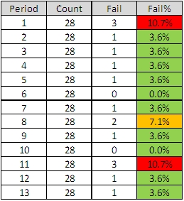


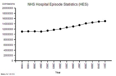
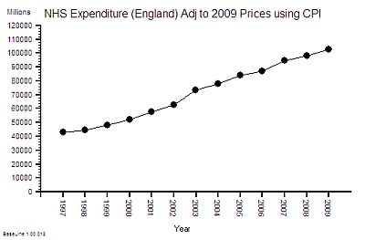
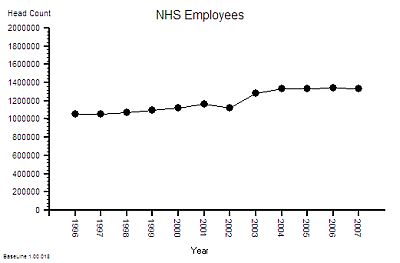 The published data says that staff headcount went up by 25% – which correlates with the increase in activity. That makes sense.
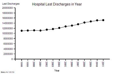


 The One Big Whack can come at the start and is a shock tactic designed to generate an emotional flip – a Road to Damascus moment – one that people remember very clearly. This is the stuff that newspapers fall over themselves to find – the Big Front Page Story – because it is emotive so it sells newspapers. The One Big Whack can also come later – as an act of desperation by those in power who originally broadcast The Big Idea and who are disappointed and frustrated by lack of measurable improvement as the time ticks by and the money is consumed.