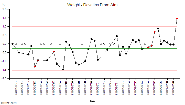
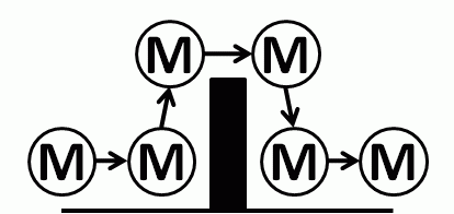
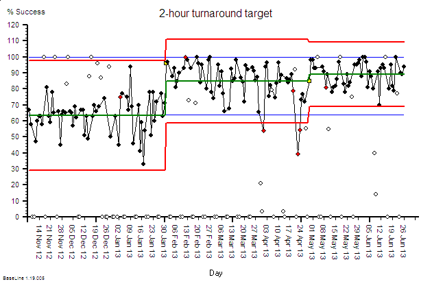
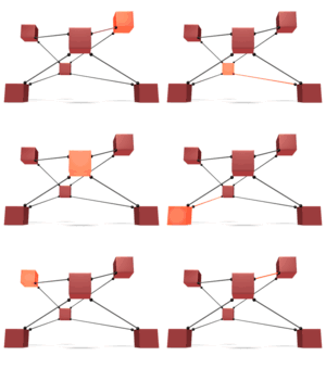
The Improvement Pyramid

IS_PyramidDeveloping productive improvement capability in an organisation is like building a pyramid in the desert.

It is not easy and it takes time before there is any visible evidence of success.

The height of the pyramid is a measure of the level of improvement complexity that we can take on.

An improvement of a single step in a system would only require a small pyramid.

Improving the whole system will require a much taller one.


But if we rush and attempt to build a sky-scraper on top of the sand then we will not be surprised when it topples over before we have made very much progress.  The Egyptians knew this!

First, we need to dig down and to lay some foundations.  Stable enough and strong enough to support the whole structure.  We will never see the foundations so it is easy to forget them in our rush but they need to be there and they need to be there first.

It is the same when developing improvement science capability  … the foundations are laid first and when enough of that foundation knowledge is in place we can start to build the next layer of the pyramid: the practitioner layer.


It is the the Improvement Science Practitioners (ISPs) who start to generate tangible evidence of progress.  The first success stories help to spur us all on to continue to invest effort, time and money in widening our foundations to be able to build even higher – more layers of capability -until we can realistically take on a system wide improvement challenge.

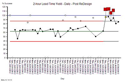
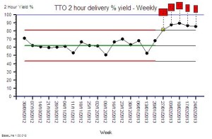
So sharing the first hard evidence of improvement is an important milestone … it is proof of fitness for purpose … and that news should be shared with those toiling in the hot desert sun and with those watching from the safety of the shade.

So here is a real story of a real improvement pyramid achieving this magical and motivating milestone.


Over-Egged Expectation

FISH_ISP_eggs_jumpingResistance-to-change is an oft quoted excuse for improvement torpor. The implied sub-message is more like “We would love to change but They are resisting“.

Notice the Us-and-Them language.  This is the observable evidence of an “We‘re OK and They’re Not OK” belief.  And in reality it is this unstated belief and the resulting self-justifying behaviour that is an effective barrier to systemic improvement.

This Us-and-Them language generates cultural friction, erodes trust and erects silos that are effective barriers to the flow of information, of innovation and of learning.  And the inevitable reactive solutions to this Us-versus-Them friction create self-amplifying positive feedback loops that ensure the counter-productive behaviour is sustained.

One tangible manifestation are DRATs: Delusional Ratios and Arbitrary Targets.


So when a plausible, rational and well-evidenced candidate for an alternative approach is discovered then it is a reasonable reaction to grab it and to desperately spray the ‘magic pixie dust’ at everything.

This a recipe for disappointment: because there is no such thing as ‘improvement magic pixie dust’.

The more uncomfortable reality is that the ‘magic’ is the result of a long period of investment in learning and the associated hard work in practising and polishing the techniques and tools.

It may look like magic but is isn’t. That is an illusion.

And some self-styled ‘magicians’ choose to keep their hard-won skills secret … because by sharing them know that they will lose their ‘magic powers’ in a flash of ‘blindingly obvious in hindsight’.

And so the chronic cycle of despair-hope-anger-and-disappointment continues.


System-wide improvement in safety, flow, quality and productivity requires that the benefits of synergism overcome the benefits of antagonism.  This requires two changes to the current hope-and-despair paradigm.  Both are necessary and neither are sufficient alone.

1) The ‘wizards’ (i.e. magic folk) share their secrets.
2) The ‘muggles’ (i.e. non-magic folk) invest the time and effort in learning ‘how-to-do-it’.


The transition to this awareness is uncomfortable so it needs to be managed pro-actively … by being open about the risk … and how to mitigate it.

That is what experienced Practitioners of Improvement Science (and ISP) will do. Be open about the challenged ahead.

And those who desperately want the significant and sustained SFQP improvements; and an end to the chronic chaos; and an end to the gaming; and an end to the hope-and-despair cycle …. just need to choose. Choose to invest and learn the ‘how to’ and be part of the future … or choose to be part of the past.


Improvement science is simple … but it is not intuitively obvious … and so it is not easy to learn.

If it were we would be all doing it.

And it is the behaviour of a wise leader of change to set realistic and mature expectations of the challenges that come with a transition to system-wide improvement.

That is demonstrating the OK-OK behaviour needed for synergy to grow.

The Improvement Gearbox

GearboxOne of the most rewarding experiences for an improvement science coach is to sense when an individual or team shift up a gear and start to accelerate up their learning curve.

It is like there is a mental gearbox hidden inside them somewhere.  Before they were thrashing themselves by trying to go too fast in a low gear. Noisy, ineffective, inefficient and at high risk of blowing a gasket!

Then, they discover that there is a higher gear … and that to get to it they have to take a risk … depress the emotional clutch, ease back on the gas, slip into neutral, and trust themselves to find the new groove and … click … into the higher gear, and then ease up the power while letting out the clutch.  And then accelerate up the learning  curve.  More effective, more efficient. More productive. More fun.


Organisations appear to behave in much the same way.

Some scream along in the slow-lane … thrashing their employee engine. The majority chug complacently in the middle-lane of mediocrity. A few accelerate past in the fast-lane to excellence.

And they are all driving exactly the same model of car.

So it is not the car that is making the difference … it is the driving.


Those who have studied organisations have observed five cultural “gears”; and which gear an organisation is in most of the time can be diagnosed by listening to the sound of the engine – the conversations of the employees.

If they are muttering “work sucks” then they are in first gear.  The sense of hopelessness, futility, despair and anger consumes all their emotional fuel. Fortunately this is uncommon.

If we mainly hear “my work sucks” then they are in second gear.  The feeling is of helplessness and apathy and the behaviour is Victim-like.  They believe that they cannot solve their own problems … someone else must do it for them or tell them what to do. They grumble a lot.

If the dominant voice is “I’m great but you lot suck” then we are hearing third gear attitudes. The selfishly competitive behaviour of the individualist achiever. The “keep your cards close to your chest” style of dyadic leadership.  The advocate of “it is OK to screw others to get ahead”. They grumble a lot too – about the apathetic bunch.

And those who have studied organisations suggest that about 80% of healthcare organisations are stuck in first, second or third cultural gear.  And we can tell who they are … the lower 80% of the league tables. The ones clamouring for more … of everything.


So how come so many organisations are so stuck? Unable to find fourth gear?

One cause is the design of their feedback loops. Their learning loops.

If an organisation only uses failure as a feedback loop then it is destined to get no more than mediocrity.  Third gear at best, and usually only second.

Example.
We all feel disappointment when our experience does not live up to our expectation.  But only the most angry of us will actually do something and complain.  Especially when we have no other choice of provider!

Suppose we are commissioners of healthcare services and we are seeing a rising tide of patient and staff complaints. We want to improve the safety and quality of the services that we are paying for; so we draw up a league table using complaints as feedback fodder and we focus on the worst performing providers … threatening them with dire consequences for being in the bottom 20%.  What happens? Fear of failure motivates them to ‘pull up their socks’ and the number of complaints falls.

Job done?

Unfortunately not.

All we have done is to bully those stuck in first or second gear into thrashing their over-burdened employee engine even harder.  We have not helped anyone find their higher gear. We have hit the target, missed the point, and increased the risk of system failure!

So what about those organisations stuck in third gear?

Well they are ticking their performance boxes, meeting our targets, keeping their noses clean.  Some are just below, and some just above the collective mean of barely acceptable mediocrity.

But expectation is changing.

The 20% who have discovered fourth gear are accelerating ahead and are demonstrating what is possible. And they are raising expectation, increasing the variation of service quality … for the better.

And the other 80% are falling further and further behind; thrashing their tired and demoralised staff harder and harder to keep up.  Complaining increasingly that life is unfair and that they need more, time, money and staff engagement. Eventually their executive head gaskets go “pop” and they fall by the wayside.


Finding cultural fourth gear is possible but it is not easy. There are no short cuts.  We have to work our way up the gears and we have to learn when and how to make smooth transitions from first to second, second to third and then third to fourth.

And when we do that the loudest voice we hear is “We are OK“.

We need to learn how to do a smooth cultural hill start on the steep slope from apathy to excellence.

And we need to constantly listen to the sound of our improvement engine; to learn to understand what it is saying; and learn how and when to change to the next cultural gear.

A School for Rebels

Troublemaker_vs_RebelSystem-wide, significant, and sustained improvement implies system-wide change.

And system-wide change implies more than 20% of the people commit to action. This is the cultural tipping point.

These critical 20% have a badge … they call themselves rebels … and they are perceived as troublemakers by those who profit most from the status quo.

But troublemakers and rebels are radically different … as shown in the summary by Lois Kelly.


Rebels share a common, future-focussed purpose.  A mission.  They are passionate, optimistic and creative.  They understand synergy and how to release and align the stored emotional energy of both themselves and others.  And most importantly they are value-led and that makes them attractive.  Values such as honesty, integrity and industry are what make leaders together-effective.

SHCR_logoAnd as we speak there is school for rebels in healthcare gaining momentum …  and their programme is current, open to all and free to access. And the change agent development materials are excellent!

Click here to download their study guide.


Converting possibilities into realities is the essence of design … so our merry band of rebels will also need to learn how to convert their positive rhetoric into practical reality. And that is more physics than psychology.

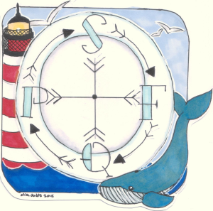
Streams flow because of physics not because of passion.SFQP_Compass

And this is why the science of improvement is important because it is the synthesis of the people dimension and the process dimension – into a system that delivers significant and sustained improvement.

On all dimensions. Safety, Flow, Quality and Productivity.

The lighthouse is our purpose; the whale represents the magnitude of our challenge; the blue sky is the creative thinking we need … to avoid trying to boil the ocean.

And the noisy, greedy, s****y seagulls are the troublemakers who always will plague us.

[Image by Malaika Art].


Politicial Purpose

count_this_vote_400_wht_9473The question that is foremost in the mind of a designer is “What is the purpose?”   It is a future-focussed question.  It is a question of intent and outcome. It raises the issues of worth and value.

Without a purpose it impossible to answer the question “Is what we have fit-for-purpose?

And without a clear purpose it is impossible for a fit-for-purpose design to be created and tested.

In the absence of a future-purpose all that remains are the present-problems.

Without a future-purpose we cannot be proactive; we can only be reactive.

And when we react to problems we generate divergence.  We observe heated discussions. We hear differences of opinion as to the causes and the solutions.  We smell the sadness, anger and fear. We taste the bitterness of cynicism. And we are touched to our core … but we are paralysed.  We cannot act because we cannot decide which is the safest direction to run to get away from the pain of the problems we have.


And when the inevitable catastrophe happens we look for somewhere and someone to place and attribute blame … and high on our target-list are politicians.


So the prickly question of politics comes up and we need to grasp that nettle and examine it with the forensic lens of the system designer and we ask “What is the purpose of a politician?”  What is the output of the political process? What is their intent? What is their worth? How productive are they? Do we get value for money?

They will often answer “Our purpose is to serve the public“.  But serve is a verb so it is a process and not a purpose … “To serve the public for what purpose?” we ask. “What outcome can we expect to get?” we ask. “And when can we expect to get it?

We want a service (a noun) and as voters and tax-payers we have customer rights to one!

On deeper reflection we see a political spectrum come into focus … with Public at one end and Private at the other.  A country generates wealth through commerce … transforming natural and human resources into goods and services. That is the Private part and it has a clear and countable measure of success: profit.  The Public part is the redistribution of some of that wealth for the benefit of all – the tax-paying public. Us.

Unfortunately the Public part does not have quite the same objective test of success: so we substitute a different countable metric: votes. So the objectively measurable outcome of a successful political process is the most votes.

But we are still talking about process … not purpose.  All we have learned so far is that the politicians who attract the most votes will earn for themselves a temporary mandate to strive to achieve their political purpose. Whatever that is.

So what do the public, the voters, the tax-payers (and remember whenever we buy something we pay tax) … the customers of this political process … actually get for their votes and cash?  Are they delighted, satisfied or disappointed? Are they getting value-for-money? Is the political process fit-for-purpose? And what is the purpose? Are we all clear about that?

And if we look at the current “crisis” in health and social care in England then I doubt that “delight” will feature high on the score-sheet for those who work in healthcare or for those that they serve. The patients. The long-suffering tax-paying public.


Are politicians effective? Are they delivering on their pledge to serve the public? What does the evidence show?  What does their portfolio of public service improvement projects reveal?  Welfare, healthcare, education, police, and so on.The_Whitehall_Effect

Well the actual evidence is rather disappointing … a long trail of very expensive taxpayer-funded public service improvement failures.

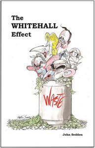
And for an up-to-date list of some of the “eye-wateringly”expensive public sector improvement train-wrecks just read The Whitehall Effect.

But lurid stories of public service improvement failures do not attract precious votes … so they are not aired and shared … and when they are exposed our tax-funded politicians show their true skills and real potential.

Rather than answering the questions they filter, distort and amplify the questions and fire them at each other.  And then fall over each other avoiding the finger-of-blame and at the same time create the next deceptively-plausible election manifesto.  Their food source is votes so they have to tickle the voters to cough them up. And they are consummate masters of that art.

Politicians sell dreams and serve disappointment.


So when the-most-plausible with the most votes earn the right to wield the ignition keys for the engine of our national economy they deflect future blame by seeking the guidance of experts. And the only place they can realistically look is into the private sector who, in manufacturing anyway, have done a much better job of understanding what their customers need and designing their processes to deliver it. On-time, first-time and every-time.

Politicians have learned to be wary of the advice of academics – they need something more pragmatic and proven.  And just look at the remarkable rise of the manufacturing phoenix of Jaguar-Land-Rover (JLR) from the politically embarrassing ashes of the British car industry. And just look at Amazon to see what information technology can deliver!

So the way forward is blindingly obvious … combine manufacturing methods with information technology and build a dumb-robot manned production-line for delivering low-cost public services via a cloud-based website and an outsourced mega-call-centre manned by standard-script-following low-paid operatives.


But here we hit a bit of a snag.

Designing a process to deliver a manufactured product for a profit is not the same as designing a system to deliver a service to the public.  Not by a long chalk.  Public services are an example of what is now known as a complex adaptive system (CAS).

And if we attempt to apply the mechanistic profit-focussed management mantras of “economy of scale” and “division of labour” and “standardisation of work” to the messy real-world of public service then we actually achieve precisely the opposite of what we intended. And the growing evidence is embarrassingly clear.

We all want safer, smoother, better, and more affordable public services … but that is not what we are experiencing.

Our voted-in politicians have unwittingly commissioned complicated non-adaptive systems that ensure we collectively fail.

And we collectively voted the politicians into power and we are collectively failing to hold them to account.

So the ball is squarely in our court.


Below is a short video that illustrates what happens when politicians and civil servants attempt complex system design. It is called the “Save the NHS Game” and it was created by a surgeon who also happens to be a system designer.  The design purpose of the game is to raise awareness. The fundamental design flaw in this example is “financial fragmentation” which is the the use of specific budgets for each part of the system together with a generic, enforced, incremental cost-reduction policy (the shrinking budget).  See for yourself what happens …


In health care we are in the improvement business and to do that we start with a diagnosis … not a dream or a decision.

We study before we plan, and we plan before we do.

And we have one eye on the problem and one eye on the intended outcome … a healthier patient.  And we often frame improvement in the negative as a ‘we do not want a not sicker patient’ … physically or psychologically. Primum non nocere.  First do no harm.

And 99.9% of the time we do our best given the constraints of the system context that the voted-in politicians have created for us; and that their loyal civil servants have imposed on us.


Politicians are not designers … that is not their role.  Their part is to create and sell realistic dreams in return for votes.

Civil servants are not designers … that is not their role.  Their part is to enact the policy that the vote-seeking politicians cook up.

Doctors are not designers … that is not their role.  Their part is to make the best possible clinical decisions that will direct actions that lead, as quickly as possible, to healthier and happier patients.

So who is doing the complex adaptive system design?  Whose role is that?

And here we expose a gap.  No one.  For the simple reason that no one is trained to … so no one is tasked to.

But there is a group of people who are perfectly placed to create the context for developing this system design capability … the commissioners, the executive boards and the senior managers of our public services.

So that is where we might reasonably start … by inviting our leaders to learn about the science of complex adaptive system improvement-by-design.

And there are now quite a few people who can now teach this science … they are the ones who have done it and can demonstrate and describe their portfolios of successful and sustained public service improvement projects.

Would you vote for that?

Learning Loops

campfire_burning_150_wht_174[Beep Beep] Bob’s phone reminded him that it was time for the remote coaching session with Leslie, one of the CHIPs (community of healthcare improvement science practitioners). He flipped open his laptop and logged in. Leslie was already there.

<Leslie> Hi Bob.  I hope you had a good Xmas.

<Bob> Thank you Leslie. Yes, I did. I was about to ask the same question.

<Leslie> Not so good here I am afraid to say. The whole urgent care system is in meltdown. The hospital is gridlocked, the 4-hour target performance has crashed like the Stock Market on Black Wednesday, emergency admissions have spilled over into the Day Surgery Unit, hundreds of operations have been cancelled, waiting lists are spiralling upwards and the fragile 18-week performance ceiling has been smashed. It is chaos. Dangerous chaos.

<Bob> Oh dear. It sounds as if the butterfly has flapped its wings. Do you remember seeing this pattern of behaviour before?

<Leslie> Sadly yes. When I saw you demonstrate the Save the NHS Game.  This is exactly the chaos I created when I attempted to solve the 4-hour target problem, and the chaos I have seen every doctor, manager and executive create when they do too. We seem to be the root cause!

<Bob> Please do not be too hard on yourself Leslie. I am no different. I had to realise that I was contributing to the chaos I was complaining about, by complaining about it. Paradoxically not complaining about it made no difference. My error was one of omission. I was not learning. I was stuck in a self-justifying delusional blame-bubble of my own making. My humility and curiosity disabled by my disappointment, frustration and anxiety. My inner chimp was running the show!

<Leslie> Wow! That is just how everyone is feeling and behaving. Including me. So how did you escape from the blame-bubble?

<Bob> Well first of all I haven’t completely escaped. I just spend less time there. It is always possible to get sucked back in. The way out started to appear when I installed a “learning loop”.

<Leslie> A what? Is that  like a hearing loop for the partially deaf?

<Bob> Ha! Yes! A very apt metaphor.  Yes, just like that. Very good. I will borrow that if I may.

<Leslie> So what did your learning loop consist of?

<Bob> A journal.  I started a journal. I invested a few minutes each day reflecting and writing it down. The first entries were short and rather “ranty”. I cannot possibly share them in public. It is too embarrassing. But it was therapeutic and over time the anger subsided and a quieter, calmer inner voice could be heard. The voice of curiosity. It was asking one question over and over again. “How?” … not “Why?”.

<Leslie> Like “How did I get myself into this state?

<Bob> Exactly so.  And also “How come I cannot get myself out of this mess?

<Leslie> And what happened next?

<Bob> I started to take more notice of things that I had discounted before. Apparently insignificant things that I discovered had profound implications. Like the “butterflies wing” effect … I discovered that small changes can have big effects.  I also learned to tune in to specific feelings because they were my warning signals.

<Leslie> Niggles you mean?

<Bob> Yes. Niggles are flashes of negative emotion that signal a design flaw. They are usually followed by an untested assumption, an invalid conclusion, an unwise decision and a counter-productive action. It all happens unconsciously and very fast so we are only aware of the final action – the MR ANGRY reply to the email that we stupidly broadcast via the Reply All button!

<Leslie> So you learned to tune into the niggle to avoid the chain reaction that led to hitting the Red Button.

<Bob> Sort of. What actually happened is that the passion unleashed by the niggle got redirected into a more constructive channel – via my Curiosity Centre to power up the Improvement Engine. It was a bit rusty! It had not been used for a long while.

<Leslie> And once the “engine” was running it sucked in niggles that were now a source of fuel! You started harvesting them using the 4N Chart! So what was the output?

<Bob> Purposeful, focused, constructive, rational actions. Not random, destructive, emotional explosions.

<Leslie> Constructive actions such as?

<Bob> Well designing and building the FISH course is one, and this ISP programme is another.

<Leslie> More learning loops!

<Bob> Yup.

<Leslie> OK. So I can see that a private journal can help an individual to build their own learning loop. How does that work with groups? We do not all need to design and build a FISH-equivalent surely!

<Bob> No indeed. What we do is we share stories. We gather together in small groups around camp fires and we share what we are learning … as we are learning it. We contribute our perspective to the collective awareness … and we all gain from everyone’s learning. We learn and teach together.

<Leslie> So the stories are about what we are learning, not what we achieved with that learning.

<Bob> Well put! The “how” we achieved it is more valuable knowledge than “what” we achieved. The “how” is the process, the “what” is just the product. And the “how” we failed to achieve is even more valuable.

<Leslie> Wow! So are you saying that the chaos we are experiencing is the expected effect of not installing enough learning loops! A system-wide error of omission.

<Bob> I would say that is a reasonable diagnosis.

<Leslie> So a rational and reasonable course of treatment becomes clear.  I am on the case!

Righteous Indignation

NHS_Legal_CostsThis heading in the the newspaper today caught my eye.

Reading the rest of the story triggered a strong emotional response: anger.

My inner chimp was not happy. Not happy at all.

So I took my chimp for a walk and we had a long chat and this is the story that emerged.

The first trigger was the eye-watering fact that the NHS is facing something like a £26 billion litigation cost.  That is about a quarter of the total NHS annual budget!

The second was the fact that the litigation bill has increased by over £3 billion in the last year alone.

The third was that the extra money will just fall into a bottomless pit – the pockets of legal experts – not to where it is intended, to support overworked and demoralised front-line NHS staff. GPs, nurses, AHPs, consultants … the ones that deliver care.

That is why my chimp was so upset.  And it sounded like righteous indignation rather than irrational fear.


So what is the root cause of this massive bill? A more litigious society? Ambulance chasing lawyers trying to make a living? Dishonest people trying to make a quick buck out of a tax-funded system that cannot defend itself?

And what is the plan to reduce this cost?

Well in the article there are three parts to this:
“apologise and learn when you’re wrong,  explain and vigorously defend when we’re right, view court as a last resort.”

This sounds very plausible but to achieve it requires knowing when we are wrong or right.

How do we know?


Generally we all think we are right until we are proved wrong.

It is the way our brains are wired. We are more sure about our ‘rightness’ than the evidence suggests is justified. We are naturally optimistic about our view of ourselves.

So to be proved wrong is emotionally painful and to do it we need:
1) To make a mistake.
2) For that mistake to lead to psychological or physical harm.
3) For the harm to be identified.
4) For the cause of the harm to be traced back to the mistake we made.
5) For the evidence to be used to hold us to account, (to apologise and learn).

And that is all hunky-dory when we are individually inept and we make avoidable mistakes.

But what happens when the harm is the outcome of a combination of actions that individually are harmless but which together are not?  What if the contributory actions are sensible and are enforced as policies that we dutifully follow to the letter?

Who is held to account?  Who needs to apologise? Who needs to learn?  Someone? Anyone? Everyone? No one?

The person who wrote the policy?  The person who commissioned the policy to be written? The person who administers the policy? The person who follows the policy?

How can that happen if the policies are individually harmless but collectively lethal?


The error here is one of a different sort.

It is called an ‘error of omission’.  The harm is caused by what we did not do.  And notice the ‘we’.

What we did not do is to check the impact on others of the policies that we write for ourselves.

Example:

The governance department of a large hospital designs safety policies that if not followed lead to disciplinary action and possible dismissal.  That sounds like a reasonable way to weed out the ‘bad apples’ and the policies are adhered to.

At the same time the operations department designs flow policies (such as maximum waiting time targets and minimum resource utilisation) that if not followed lead to disciplinary action and possible dismissal.  That also sounds like a reasonable way to weed out the layabouts whose idleness cause queues and delays and the policies are adhered to.

And at the same time the finance department designs fiscal policies (such as fixed budgets and cost improvement targets) that if not followed lead to disciplinary action and possible dismissal. Again, that sounds like a reasonable way to weed out money wasters and the policies are adhered to.

What is the combined effect? The multiple safety checks take more time to complete, which puts extra workload on resources and forces up utilisation. As the budget ceiling is lowered the financial and operational pressures build, the system heats up, stress increases, corners are cut, errors slip through the safety checks. More safety checks are added and the already over-worked staff are forced into an impossible position.  Chaos ensues … more mistakes are made … patients are harmed and justifiably seek compensation by litigation.  Everyone loses (except perhaps the lawyers).


So why was my inner chimp really so unhappy?

Because none of this is necessary. This scenario is avoidable.

Reducing the pain of complaints and the cost of litigation requires setting realistic expectations to avoid disappointment and it requires not creating harm in the first place.

That implies creating healthcare systems that are inherently safe, not made not-unsafe by inspection-and-correction.

And it implies measuring and sharing intended and actual outcomes not  just compliance with policies and rates of failure to meet arbitrary and conflicting targets.

So if that is all possible and all that is required then why are we not doing it?

Simple. We never learned how. We never knew it is possible.

Metamorphosis

butterfly_flying_around_465Some animals undergo a remarkable transformation on their journey to becoming an adult.

This metamorphosis is most obvious with a butterfly: the caterpillar enters the stage and a butterfly emerges.

The capabilities and behaviours of these development stages are very different.  A baby caterpillar crawls and feeds on leaves;  an adult butterfly flies and feeds on nectar.


There are many similarities to the transformation of an organisation from chaotic to calm; from depressed to enthused; and from struggling to flying.

It is the metamorphosis of individuals within organisations that drives the system change – the transformation from inept sceptics to capable advocates.


metamorphosis_1The journey starts with the tiny, hungry, baby caterpillar emerging from the egg.

This like a curious new sceptic emerging from denial and tentatively engaging the the process of learning. Usually triggered by seeing or hearing of a significant and sustained success that disproves their ‘impossibility hypothesis’.


metamorphosis_2A caterpillar is an eating machine. As it grows it sheds its skin and becomes larger. It also changes its appearance and eventually its behaviour.

Our curious improvement sceptic is devouring new information and is visibly growing in knowledge, understanding and confidence. 


metamorphosis_3When the caterpillar sheds the last skin a new form emerges. A pupa. It has a different appearance and behaviour. It is now stationary and it does not move or eat.

This is the contemplative sceptic who appears to have become dormant but is not … they are planning to change. This stage is very variable: it may be minutes or years.


metamorphosis_5Inside the pupa the solid body of the caterpillar is converted to ‘cellular soup’ and the cells are reassembled into a completely new structure called an adult butterfly.

Our healthy sceptic is dissolving their self-limiting beliefs and restructuring their mental model. It is stage of apparent confusion and success is not guaranteed.


metamorphosis_7And suddenly the adult butterfly emerges: fully formed but not yet able to fly. Its wings are not yet ready – they need to be inflated, to dry and be flexed.

So it is with our newly hatched improvement practitioner. They need to pause, prepare, and practice before they feel safe to fly solo.  They start small but are thinking big.


metamorphosis_8After a short rest the new wings are fully expanded and able to lift the butterfly aloft to explore the new opportunities that await. A whole new and exciting world full of flowers and nectar.

Our improvement practitioner can also feel when they are ready to explore. And then they fly – right first time.


An active improvement practitioner will inspire others to emerge, and many of those will hatch into improvement caterpillars who will busily munch on the new knowledge and grow in understanding and confidence. Then it goes quiet and, as if by magic, a new generation of improvement butterflies appear. And they continue to spread the word and the knowledge.

That is how Improvement Science grows and spreads – by metamorphosis.

Spring the Trap

trapped_in_question_PA_300_wht_3174[Beeeeeep] It was time for the weekly coaching chat.  Bob, a seasoned practitioner of flow science, dialled into the teleconference with Lesley.

<Bob> Good afternoon Lesley, can I suggest a topic today?

<Lesley> Hi Bob. That would be great, and I am sure you have a good reason for suggesting it.

<Bob> I would like to explore the concept of time-traps again because it something that many find confusing. Which is a shame because it is often the key to delivering surprisingly dramatic and rapid improvements; at no cost.

<Lesley> Well doing exactly that is what everyone seems to be clamouring for so it sounds like a good topic to me.  I confess that I am still not confident to teach others about time-traps.

<Bob> OK. Let us start there. Can you describe what happens when you try to teach it?

<Lesley> Well, it seems to be when I say that the essence of a time-trap is that the lead time and the flow are independent.  For example, the lead time stays the same even though the flow is changing.  That really seems to confuse people; and me too if I am brutally honest.

<Bob> OK.  Can you share the example that you use?

<Lesley> Well it depends on who I am talking to.  I prefer to use an example that they are familiar with.  If it is a doctor I might use the example of the ward round.  If it is a manager I might use the example of emails or meetings.

<Bob> Assume I am a doctor then – an urgent care physician.

<Lesley> OK.  Let us take it that I have done the 4N Chart and the  top niggle is ‘Frustration because the post-take ward round takes so long that it delays the discharge of patients who then often have to stay an extra night which then fills up the unit with waiting patients and we get blamed for blocking flow from A&E and causing A&E breaches‘.

<Bob> That sounds like a good example. What is the time-trap in that design?

<Lesley> The  post-take ward round.

<Bob> And what justification is usually offered for using that design?

<Lesley> That it is a more efficient use of the expensive doctor’s time if the whole team congregate once a day and work through all the patients admitted over the previous 24 hours.  They review the presentation, results of tests, diagnosis, management plans, response to treatment, decide the next steps and do the paperwork.

<Bob> And why is that a time-trap design?

<Lesley> Because  it does not matter if one patient is admitted or ten, the average lead time from the perspective of the patient is the same – about one day.

<Bob> Correct. So why is the doctor complaining that there are always lots of patients to see?

<Lesley> Because there are. The emergency short stay ward is usually full by the time the post take ward round happens.

<Bob> And how do you present the data that shows the lead time is independent of the flow?

<Lesley> I use a Gantt chart, but the problem I find is that there is so much variation and queue jumping it is not blindingly obvious from the Gantt chart that there is a time-trap. There is so much else clouding the picture.

<Bob>Is that where the ‘but I do not understand‘ conversation starts?

<Lesley> Yes. And that is where I get stuck too.

<Bob> OK.  The issue here is that a Gantt chart is not the ideal visualisation tool when there are lots of crossed-streams, frequently changing priorities, and many other sources of variation.  The Gantt chart gets ‘messy’.   The trick here is to use a Vitals Chart – and you can derive that from the same data you used for the Gantt chart.

<Lesley> You are right about the Gantt chart getting messy. I have seen massive wall-sized Gantt charts that are veritable works-of-art and that have taken hours to create; and everyone standing looking at it and saying ‘Wow! That is an impressive piece of work.  So what does it tell us? How does it help?

<Bob> Yes, I have experienced that too. I think what happens is that those who do the foundation training and discover the Gantt chart then try to use it to solve every flow problem – and in their enthusiasm they discount any warning advice.  Desperation drives over-inflated expectation which is often the pre-cursor to disappointment, and then disillusionment.  The Nerve Curve again.

<Lesley> But a Vitals Chart is an HCSE level technique and you said that we do not need to put everyone through HCSE training.

<Bob>That is correct. I am advocating an HCSE-in-training using a Vitals Chart to explain the concept of a time-trap so that everyone understands it well enough to see the flaw in the design.

<Lesley> Ah ha!  Yes, I see.  So what is my next step?

<Bob> I will let you answer that.

<Lesley> Um, let me think.

The outcome I want is everyone understands the concept of a time-trap well enough to feel comfortable with trying a time-trap-free design because they can see the benefits for them.

And to get that depth of understanding I need to design a table top exercise that starts with a time-trap design and generates raw data that we can use to build both a Gantt chart and the Vitals Chart; so I can point out and explain the characteristic finger-print of a time trap.

And then we can ‘test’ an alternative time-trap-free design and generate the prognostic Gantt and Vitals Chart and compare with the baseline diagnostic charts to reveal the improvement.

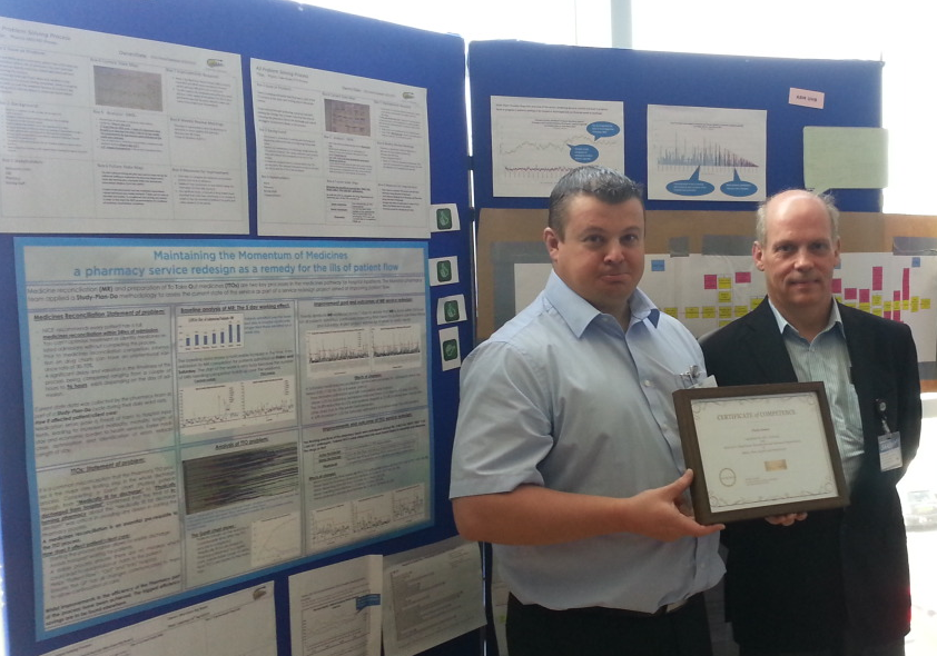
<Bob> That sounds like a good plan to me.  And if you do that, and your team apply it to a real improvement exercise, and you see the improvement and you share the story, then that will earn you a coveted HCSE Certificate of Competency.

<Lesley>Ah ha! Now I understand the reason you suggested this topic!  I am on the case!

Fit-4-Purpose

F4P_PillsWe all want a healthcare system that is fit for purpose.

One which can deliver diagnosis, treatment and prognosis where it is needed, when it is needed, with empathy and at an affordable cost.

One that achieves intended outcomes without unintended harm – either physical or psychological.

We want safety, delivery, quality and affordability … all at the same time.

And we know that there are always constraints we need to work within.

There are constraints set by the Laws of the Universe – physical constraints.

These are absolute,  eternal and are not negotiable.

Dr Who’s fantastical tardis is fictional. We cannot distort space, or travel in time, or go faster than light – well not with our current knowledge.

There are also constraints set by the Laws of the Land – legal constraints.

Legal constraints are rigid but they are also adjustable.  Laws evolve over time, and they are arbitrary. We design them. We choose them. And we change them when they are no longer fit for purpose.

The third limit is often seen as the financial constraint. We are required to live within our means. There is no eternal font of  limitless funds to draw from.  We all share a planet that has finite natural resources  – and ‘grow’ in one part implies ‘shrink’ in another.  The Laws of the Universe are not negotiable. Mass, momentum and energy are conserved.

The fourth constraint is perceived to be the most difficult yet, paradoxically, is the one that we have most influence over.

It is the cultural constraint.

The collective, continuously evolving, unwritten rules of socially acceptable behaviour.


Improvement requires challenging our unconscious assumptions, our beliefs and our habits – and selectively updating those that are no longer fit-4-purpose.

To learn we first need to expose the gaps in our knowledge and then to fill them.

We need to test our hot rhetoric against cold reality – and when the fog of disillusionment forms we must rip up and rewrite what we have exposed to be old rubbish.

We need to examine our habits with forensic detachment and we need to ‘unlearn’ the ones that are limiting our effectiveness, and replace them with new habits that better leverage our capabilities.

And all of that is tough to do. Life is tough. Living is tough. Learning is tough. Leading is tough. But it energising too.

Having a model-of-effective-leadership to aspire to and a peer-group for mutual respect and support is a critical piece of the jigsaw.

It is not possible to improve a system alone. No matter how smart we are, how committed we are, or how hard we work.  A system can only be improved by the system itself. It is a collective and a collaborative challenge.


So with all that in mind let us sketch a blueprint for a leader of systemic cultural improvement.

What values, beliefs, attitudes, knowledge, skills and behaviours would be on our ‘must have’ list?

What hard evidence of effectiveness would we ask for? What facts, figures and feedback?

And with our check-list in hand would we feel confident to spot an ‘effective leader of systemic cultural improvement’ if we came across one?


This is a tough design assignment because it requires the benefit of  hindsight to identify the critical-to-success factors: our ‘must have and must do’ and ‘must not have and must not do’ lists.

H’mmmm ….

So let us take a more pragmatic and empirical approach. Let us ask …

“Are there any real examples of significant and sustained healthcare system improvement that are relevant to our specific context?”

And if we can find even just one Black Swan then we can ask …

Q1. What specifically was the significant and sustained improvement?
Q2. How specifically was the improvement achieved?
Q3. When exactly did the process start?
Q4. Who specifically led the system improvement?

And if we do this exercise for the NHS we discover some interesting things.

First let us look for exemplars … and let us start using some official material – the Monitor website (http://www.monitor.gov.uk) for example … and let us pick out ‘Foundation Trusts’ because they are the ones who are entrusted to run their systems with a greater degree of capability and autonomy.

And what we discover is a league table where those FTs that are OK are called ‘green’ and those that are Not OK are coloured ‘red’.  And there are some that are ‘under review’ so we will call them ‘amber’.

The criteria for deciding this RAG rating are embedded in a large balanced scorecard of objective performance metrics linked to a robust legal contract that provides the framework for enforcement.  Safety metrics like standardised mortality ratios, flow metrics like 18-week and 4-hour target yields, quality metrics like the friends-and-family test, and productivity metrics like financial viability.

A quick tally revealed 106 FTs in the green, 10 in the amber and 27 in the red.

But this is not much help with our quest for exemplars because it is not designed to point us to who has improved the most, it only points to who is failing the most!  The league table is a name-and-shame motivation-destroying cultural-missile fuelled by DRATs (delusional ratios and arbitrary targets) and armed with legal teeth.  A projection of the current top-down, Theory-X, burn-the-toast-then-scrape-it management-of-mediocrity paradigm. Oh dear!

However,  despite these drawbacks we could make better use of this data.  We could look at the ‘reds’ and specifically at their styles of cultural leadership and compare with a random sample of all the ‘greens’ and their models for success. We could draw out the differences and correlate with outcomes: red, amber or green.

That could offer us some insight and could give us the head start with our blueprint and check-list.


It would be a time-consuming and expensive piece of work and we do not want to wait that long. So what other avenues are there we can explore now and at no cost?

Well there are unofficial sources of information … the ‘grapevine’ … the stuff that people actually talk about.

What examples of effective improvement leadership in the NHS are people talking about?

Well a little blue bird tweeted one in my ear this week …

And specifically they are talking about a leader who has learned to walk-the-improvement-walk and is now talking-the-improvement-walk: and that is Sir David Dalton, the CEO of Salford Royal.

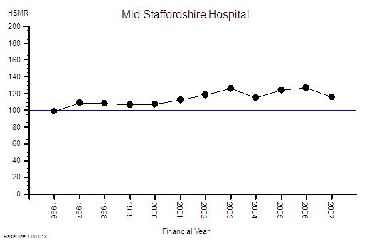
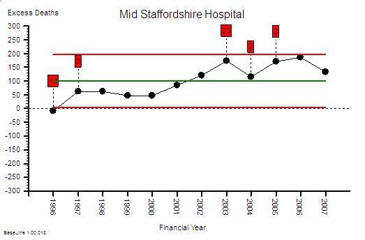
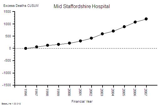
Here is a copy of the slides from Sir David’s recent lecture at the Kings Fund … and it is interesting to compare and contrast it with the style of NHS Leadership that led up to the Mid Staffordshire Failure, and to the Francis Report, and to the Keogh Report and to the Berwick Report.

Chalk and cheese!


So if you are an NHS employee would you rather work as part of an NHS Trust where the leaders walk-DD’s-walk and talk-DD’s-talk?

And if you are an NHS customer would you prefer that the leaders of your local NHS Trust walked Sir David’s walk too?


We are the system … we get the leaders that we deserve … we make the  choice … so we need to choose wisely … and we need to make our collective voice heard.

Actions speak louder than words.  Walk works better than talk.  We must be the change we want to see.

A Little Law and Order

teamwork_puzzle_build_PA_150_wht_2341[Bing bong]. The sound heralded Lesley logging on to the weekly Webex coaching session with Bob, an experienced Improvement Science Practitioner.

<Bob> Good afternoon Lesley.  How has your week been and what topic shall we explore today?

<Lesley> Hi Bob. Well in a nutshell, the bit of the system that I have control over feels like a fragile oasis of calm in a perpetual desert of chaos.  It is hard work keeping the oasis clear of the toxic sand that blows in!

<Bob> A compelling metaphor. I can just picture it.  Maintaining order amidst chaos requires energy. So what would you like to talk about?

<Lesley> Well, I have a small shoal of FISHees who I am guiding  through the foundation shallows and they are getting stuck on Little’s Law.  I confess I am not very good at explaining it and that suggests to me that I do not really understand it well enough either.

<Bob> OK. So shall we link those two theme – chaos and Little’s Law?

<Lesley> That sounds like an excellent plan!

<Bob> OK. So let us refresh the foundation knowledge. What is Little’s Law?

<Lesley>It is a fundamental Law of process physics that relates flow, with lead time and work in progress.

<Bob> Good. And specifically?

<Lesley> Average lead time is equal to the average flow multiplied by the average work in progress.

<Bob>Yes. And what are the units of flow in your equation?

<Lesley> Ah yes! That is  a trap for the unwary. We need to be clear how we express flow. The usual way is to state it as number of tasks in a defined period of time, such as patients admitted per day.  In Little’s Law the convention is to use the inverse of that which is the average interval between consecutive flow events. This is an unfamiliar way to present flow to most people.

<Bob> Good. And what is the reason that we use the ‘interval between events’ form?

<Leslie> Because it is easier to compare it with two critically important  flow metrics … the takt time and the cycle time.

<Bob> And what is the takt time?

<Leslie> It is the average interval between new tasks arriving … the average demand interval.

<Bob> And the cycle time?

<Leslie> It is the shortest average interval between tasks departing …. and is determined by the design of the flow constraint step.

<Bob> Excellent. And what is the essence of a stable flow design?

<Lesley> That the cycle time is less than the takt time.

<Bob>Why less than? Why not equal to?

<Leslie> Because all realistic systems need some flow resilience to exhibit stable and predictable-within-limits behaviour.

<Bob> Excellent. Now describe the design requirements for creating chronically chaotic system behaviour?

<Leslie> This is a bit trickier to explain. The essence is that for chronically chaotic behaviour to happen then there must be two feedback loops – a destabilising loop and a stabilising loop.  The destabilising loop creates the chaos, the stabilising loop ensures it is chronic.

<Bob> Good … so can you give me an example of a destabilising feedback loop?

<Leslie> A common one that I see is when there is a long delay between detecting a safety risk and the diagnosis, decision and corrective action.  The risks are often transitory so if the corrective action arrives long after the root cause has gone away then it can actually destabilise the process and paradoxically increase the risk of harm.

<Bob> Can you give me an example?

<Leslie>Yes. Suppose a safety risk is exposed by a near miss.  A delay in communicating the niggle and a root cause analysis means that the specific combination of factors that led to the near miss has gone. The holes in the Swiss cheese are not static … they move about in the chaos.  So the action that follows the accumulation of many undiagnosed near misses is usually the non-specific mantra of adding yet another safety-check to the already burgeoning check-list. The longer check-list takes more time to do, and is often repeated many times, so the whole flow slows down, queues grow bigger, waiting times get longer and as pressure comes from the delivery targets corners start being cut, and new near misses start to occur; on top of the other ones. So more checks are added and so on.

<Bob> An excellent example! And what is the outcome?

<Leslie> Chronic chaos which is more dangerous, more disordered and more expensive. Lose lose lose.

<Bob> And how do the people feel who work in the system?

<Leslie> Chronically naffed off! Angry. Demotivated. Cynical.

<Bob>And those feelings are the key symptoms.  Niggles are not only symptoms of poor process design, they are also symptoms of a much deeper problem: a violation of values.

<Leslie> I get the first bit about poor design; but what is that second bit about values?

<Bob>  We all have a set of values that we learned when we were very young and that have bee shaped by life experience.  They are our source of emotional energy, and our guiding lights in an uncertain world. Our internal unconscious check-list.  So when one of our values is violated we know because we feel angry. How that anger is directed varies from person to person … some internalise it and some externalise it.

<Leslie> OK. That explains the commonest emotion that people report when they feel a niggle … frustration which is the same as anger.

<Bob>Yes.  And we reveal our values by uncovering the specific root causes of our niggles.  For example if I value ‘Hard Work’ then I will be niggled by laziness. If you value ‘Experimentation’ then you may be niggled by ‘Rigid Rules’.  If someone else values ‘Safety’ then they may value ‘Rigid Rules’ and be niggled by ‘Innovation’ which they interpret as risky.

<Leslie> Ahhhh! Yes, I see.  This explains why there is so much impassioned discussion when we do a 4N Chart! But if this behaviour is so innate then it must be impossible to resolve!

<Bob> Understanding  how our values motivate us actually helps a lot because we are naturally attracted to others who share the same values – because we have learned that it reduces conflict and stress and improves our chance of survival. We are tribal and tribes share the same values.

<Leslie> Is that why different  departments appear to have different cultures and behaviours and why they fight each other?

<Bob> It is one factor in the Silo Wars that are a characteristic of some large organisations.  But Silo Wars are not inevitable.

<Leslie> So how are they avoided?

<Bob> By everyone knowing what common purpose of the organisation is and by being clear about what values are aligned with that purpose.

<Leslie> So in the healthcare context one purpose is avoidance of harm … primum non nocere … so ‘safety’ is a core value.  Which implies anything that is felt to be unsafe generates niggles and well-intended but potentially self-destructive negative behaviour.

<Bob> Indeed so, as you described very well.

<Leslie> So how does all this link to Little’s Law?

<Bob>Let us go back to the foundation knowledge. What are the four interdependent dimensions of system improvement?

<Leslie> Safety, Flow, Quality and Productivity.

<Bob> And one measure of  productivity is profit.  So organisations that have only short term profit as their primary goal are at risk of making poor long term safety, flow and quality decisions.

<Leslie> And flow is the key dimension – because profit is just  the difference between two cash flows: income and expenses.

<Bob> Exactly. One way or another it all comes down to flow … and Little’s Law is a fundamental Law of flow physics. So if you want all the other outcomes … without the emotionally painful disorder and chaos … then you cannot avoid learning to use Little’s Law.

<Leslie> Wow!  That is a profound insight.  I will need to lie down in a darkened room and meditate on that!

<Bob> An oasis of calm is the perfect place to pause, rest and reflect.

Wacky Language

wacky_languageAll innovative ideas are inevitably associated with new language.

Familiar words used in an unfamiliar context so that the language sounds ‘wacky’ to those in the current paradigm.

Improvement science is no different.

A problem arises when familiar words are used in a new context and therefore with a different meaning. Confusion.

So we try to avoid this cognitive confusion by inventing new words, or by using foreign words that are ‘correct’ but unfamiliar.

This use of novel and foreign language exposes us to another danger: the evolution of a clique of self-appointed experts who speak the new and ‘wacky’ language.

This self-appointed expert clique can actually hinder change because it can result yet another us-and-them division.  Another tribe. More discussion. More confusion. Less improvement.


So it is important for an effective facilitator-of-improvement to define any new language using the language of the current paradigm.  This can be achieved by sharing examples of new concepts and their language in familiar contexts and with familiar words, because we learn what words mean from their use-in-context.

For example:

The word ‘capacity’ is familiar and we all know what we think it means.  So when we link it to another familiar word, ‘demand’, then we feel comfortable that we understand what the phrase ‘demand-and-capacity’ means.

But do we?

The act of recognising a word is a use of memory or knowledge. Understanding what a word means requires more … it requires knowing the context in which the word is used.  It means understanding the concept that the word is a label for.

To a practitioner of flow science the word ‘capacity’ is confusing – because it is too fuzzy.  There are many different forms of capacity: flow-capacity, space-capacity, time-capacity, and so on.  Each has a different unit and they are not interchangeable. So the unqualified term ‘capacity’ will trigger the question:

What sort of capacity are you referring to?

[And if that is not the reaction then you may be talking to someone who has little understanding of flow science].


Then there are the foreign words that are used as new labels for old concepts.

Lean zealots seem particularly fond of peppering their monologues with Japanese words that are meaningless to anyone else but other Lean zealots.  Words like muda and muri and mura which are labels for important and useful flow science concepts … but the foreign name gives no clue as to what that essential concept is!

[And for a bit of harmless sport ask a Lean zealot to explain what these three words actually mean but only using  language that you understand. If they cannot to your satisfaction then you have exposed the niggle. And if they can then it is worth asking ‘What is the added value of the foreign language?’]

And for those who are curious to know the essential concepts that these four-letter M words refer to:

muda means ‘waste’ and refers to the effects of poor process design in terms of the extra time (and cost) required for the process to achieve its intended purpose.  A linked concept is a ‘niggle’ which is the negative emotional effect of a poor process design.

muri means ‘overburdening’ and can be illustrated  with an example.  Suppose you work in a system where there is always a big backlog of work waiting to be done … a large queue of patients in the waiting room … a big heap of notes on the trolley. That ‘burden’ generates stress and leads to other risky behaviours such as rushing, corner-cutting, deflection and overspill. It is also an outcome of poor process design, so  is avoidable.

mura means variation or uncertainty. Again an example helps. Suppose we are running an emergency service then, by definition, a we have no idea what medical problem the next patient that comes through the door will present us with. It could be trivial or life-threatening. That is unplanned and expected variation and is part of the what we need our service to be designed to handle.  Suppose when we arrive for our shift that we have no idea how many staff will be available to do the work because people phone in sick at the last minute and there is no resilience on the staffing capacity.  Our day could be calm-and-capable (and rewarding) or chaotic-and-incapable (and unrewarding).  It is the stress of not knowing that creates the emotional and cultural damage, and is the expected outcome of incompetent process design. And is avoidable.


And finally we come to words that are not foreign but are not very familiar either.

Words like praxis.

This sounds like ‘practice’ but is not spelt the same. So is the the same?

And it sounds like a medical condition called dyspraxia which means:  poor coordination of movement.

And when we look up praxis in an English dictionary we discover that one definition is:

the practice and practical side of a profession or field of study, as opposed to theory.

Ah ah! So praxis is a label for the the concept of ‘how to’ … and someone who has this ‘know how’ is called a practitioner.  That makes sense.

On deeper reflection we might then describe our poor collective process design capability as dyspraxic or uncoordinated. That feels about right too.


An improvement science practitioner (ISP) is someone who knows the science of improvement; and can demonstrate their know-how in practice; and can explain the principles that underpin their praxis using the language of the learner. Without any wacky language.

So if we want to diagnose and treat our organisational dyspraxia;

… and if we want smooth and efficient services (i.e. elimination of chaos and reduction of cost);

… and if we want to learn this know-how,  practice or praxis;

… then we could study the Foundations of Improvement Science in Healthcare (FISH);

… and we could seek the wisdom of  the growing Community of Healthcare Improvement Practitioners (CHIPs).


FISH & CHIPs … a new use for a familiar phrase?

A Sisyphean Nightmare

cardiogram_heart_signal_150_wht_5748[Beep] It was time for the weekly e-mentoring session so Bob switched on his laptop, logged in to the virtual meeting site and found that Lesley was already there.

<Bob> Hi Lesley. What shall we talk about today?

<Lesley> Hello Bob. Another old chestnut I am afraid. Queues.  I keep hitting the same barrier where people who are fed up with the perpetual queue chaos have only one mantra “If you want to avoid long waiting times then we need more capacity.

<Bob> So what is the problem? You know that is not the cause of chronic queues.

<Lesley> Yes, I know that mantra is incorrect – but I do not yet understand how to respectfully challenge it and how to demonstrate why it is incorrect and what the alternative is.

<Bob> OK. I understand. So could you outline a real example that we can work with.

<Lesley> Yes. Another old chestnut: the Emergency Department 4-hour breaches.

<Bob> Do you remember the Myth of Sisyphus?

<Leslie> No, I do not remember that being mentioned in the FISH course.

<Bob> Ho ho! No indeed,  it is much older. In Greek mythology Sisyphus was a king of Ephyra who was punished by the Gods for chronic deceitfulness by being compelled to roll an immense boulder up a hill, only to watch it roll back down, and then to repeat this action forever.

Sisyphus_Cartoon

<Lesley> Ah! I see the link. Yes, that is exactly how people in the ED feel.  Everyday it feels like they are pushing a heavy boulder uphill – only to have to repeat the same labour the next day. And they do not believe it can ever be any better with the resources they have.

<Bob> A rather depressing conclusion! Perhaps a better metaphor is the story in the film  “Ground Hog Day” where Bill Murray plays the part of a rather arrogant newsreader who enters a recurring nightmare where the same day is repeated, over and over. He seems powerless to prevent it.  He does eventually escape when he learns the power of humility and learns how to behave differently.

<Lesley> So the message is that there is a way out of this daily torture – if we are humble enough to learn the ‘how’.

<Bob> Well put. So shall we start?

<Lesley> Yes please!

<Bob> OK. As you know very well it is important not to use the unqualified term ‘capacity’.  We must always state if we are referring to flow-capacity or space-capacity.

<Lesley> Because they have different units and because they are intimately related to lead time by Little’s Law.

<Bob> Yes.  Little’s Law is mathematically proven Law of flow physics – it is not negotiable.

<Lesley> OK. I know that but how does it solve problem we started with?

<Bob> Little’s Law is necessary but it is not sufficient. Little’s Law relates to averages – and is therefore just the foundation. We now need to build the next level of understanding.

<Lesley> So you mean we need to introduce variation?

<Bob> Yes. And the tool we need for this is a particular form of time-series chart called a Vitals Chart.

<Lesley> And I am assuming that will show the relationship between flow, lead time and work in progress … over time ?

<Bob> Exactly. It is the temporal patterns on the Vitals Chart that point to the root causes of the Sisyphean Chaos. The flow design flaws.

<Lesley> Which are not lack of flow-capacity or space-capacity.

<Bob> Correct. If the chaos is chronic then there must already be enough space-capacity and flow-capacity. Little’s Law shows that, because if there were not the system would have failed completely a long time ago. The usual design flaw in a chronically chaotic system is one or more misaligned policies.  It is as if the system hardware is OK but the operating software is not.

<Lesley> So to escape from the Sisyphean Recurring ED 4-Hour Breach Nightmare we just need enough humility and enough time to learn how to diagnose and redesign some of our ED system operating software? Some of our own policies? Some of our own mantras?

<Bob> Yup.  And not very much actually. Most of the software is OK. We need to focus on the flaws.

<Lesley> So where do I start?

<Bob> You need to do the ISP-1 challenge that is called Brainteaser 104.  That is where you learn how to create a Vitals Chart.

<Lesley> OK. Now I see what I need to do and the reason:  understanding how to do that will help me explain it to others. And you are not going to just give me the answer.

<Bob> Correct. I am not going to just give you the answer. You will not fully understand unless you are able to build your own Vitals Chart generator. You will not be able to explain the how to others unless you demonstrate it to yourself first.

<Lesley> And what else do I need to do that?

<Bob> A spreadsheet and your raw start and finish event data.

<Lesley> But we have tried that before and neither I nor the database experts in our Performance Department could work out how to get the real time work in progress from the events – so we assumed we would have to do a head count or a bed count every hour which is impractical.

<Bob> It is indeed possible as you are about to discover for yourself. The fact that we do not know how to do something does not prove that it is impossible … humility means accepting our inevitable ignorance and being open to learning. Those who lack humility will continue to live the Sisyphean Nightmare of ED Ground Hog Day. The choice to escape is ours.

<Lesley> I choose to learn. Please send me BT104.

<Bob> It is on its way …

The 85% Optimum Occupancy Myth

egg_face_spooked_400_wht_13421There seems to be a belief among some people that the “optimum” average bed occupancy for a hospital is around 85%.

More than that risks running out of beds and admissions being blocked, 4 hour breaches appearing and patients being put at risk. Less than that is inefficient use of expensive resources. They claim there is a ‘magic sweet spot’ that we should aim for.

Unfortunately, this 85% optimum occupancy belief is a myth.

So, first we need to dispel it, then we need to understand where it came from, and then we are ready to learn how to actually prevent queues, delays, disappointment, avoidable harm and financial non-viability.


Disproving this myth is surprisingly easy.   A simple thought experiment is enough.

Suppose we have a policy where  we keep patients in hospital until someone needs their bed, then we discharge the patient with the longest length of stay and admit the new one into the still warm bed – like a baton pass.  There would be no patients turned away – 0% breaches.  And all our the beds would always be full – 100% occupancy. Perfection!

And it does not matter if the number of admissions arriving per day is varying – as it will.

And it does not matter if the length of stay is varying from patient to patient – as it will.

We have disproved the hypothesis that a maximum 85% average occupancy is required to achieve 0% breaches.


The source of this specific myth appears to be a paper published in the British Medical Journal in 1999 called “Dynamics of bed use in accommodating emergency admissions: stochastic simulation model

So it appears that this myth was cooked up by academic health economists using a computer model.

And then amateur queue theory zealots jump on the band-wagon to defend this meaningless mantra and create a smoke-screen by bamboozling the mathematical muggles with tales of Poisson processes and Erlang equations.

And they are sort-of correct … the theoretical behaviour of the “ideal” stochastic demand process was described by Poisson and the equations that describe the theoretical behaviour were described by Agner Krarup Erlang.  Over 100 years ago before we had computers.

BUT …

The academics and amateurs conveniently omit one minor, but annoying,  fact … that real world systems have people in them … and people are irrational … and people cook up policies that ride roughshod over the mathematics, the statistics and the simplistic, stochastic mathematical and computer models.

And when creative people start meddling then just about anything can happen!


So what went wrong here?

One problem is that the academic hefalumps unwittingly stumbled into a whole minefield of pragmatic process design traps.

Here are just some of them …

1. Occupancy is a ratio – it is a meaningless number without its context – the flow parameters.

2. Using linear, stochastic models is dangerous – they ignore the non-linear complex system behaviours (chaos to you and me).

3. Occupancy relates to space-capacity and says nothing about the flow-capacity or the space-capacity and flow-capacity scheduling.

4. Space-capacity utilisation (i.e. occupancy) and systemic operational efficiency are not equivalent.

5. Queue theory is a simplification of reality that is needed to make the mathematics manageable.

6. Ignoring the fact that our real systems are both complex and adaptive implies that blind application of basic queue theory rhetoric is dangerous.

And if we recognise and avoid these traps and we re-examine the problem a little more pragmatically then we discover something very  useful:

That the maximum space capacity requirement (the number of beds needed to avoid breaches) is actually easily predictable.

It does not need a black-magic-box full of scary queue theory equations or rather complicated stochastic simulation models to do this … all we need is our tried-and-trusted tool … a spreadsheet.

And we need something else … some flow science training and some simulation model design discipline.

When we do that we discover something else …. that the expected average occupancy is not 85%  … or 65%, or 99%, or 95%.

There is no one-size-fits-all optimum occupancy number.

And as we explore further we discover that:

The expected average occupancy is context dependent.

And when we remember that our real system is adaptive, and it is staffed with well-intended, well-educated, creative people (who may have become rather addicted to reactive fire-fighting),  then we begin to see why the behaviour of real systems seems to defy the predictions of the 85% optimum occupancy myth:

Our hospitals seem to work better-than-predicted at much higher occupancy rates.

And then we realise that we might actually be able to design proactive policies that are better able to manage unpredictable variation; better than the simplistic maximum 85% average occupancy mantra.

And finally another penny drops … average occupancy is an output of the system …. not an input. It is an effect.

And so is average length of stay.

Which implies that setting these output effects as causal inputs to our bed model creates a meaningless, self-fulfilling, self-justifying delusion.

Ooops!


Now our challenge is clear … we need to learn proactive and adaptive flow policy design … and using that understanding we have the potential to deliver zero delays and high productivity at the same time.

And doing that requires a bit more than a spreadsheet … but it is possible.

Seeing-by-Doing

OneStopBeforeGanttFlow improvement-by-design requires being able to see the flows; and that is trickier than it first appears.

We can see movement very easily.

Seeing flows is not so easy – particularly when they are mixed-up and unsteady.

One of the most useful tools for visualising flow was invented over 100 years ago by Henry Laurence Gantt (1861-1919).

Henry Gantt was a mechanical engineer from Johns Hopkins University and an early associate of Frederick Taylor. Gantt parted ways with Taylor because he disagreed with the philosophy of Taylorism which was that workers should be instructed what to do by managers (=parent-child).  Gantt saw that workers and managers could work together for mutual benefit of themselves and their companies (=adult-adult).  At one point Gantt was invited to streamline the production of munitions for the war effort and his methods were so successful that the Ordinance Department was the most productive department of the armed forces.  Gantt favoured democracy over autocracy and is quoted to have said “Our most serious trouble is incompetence in high places. The manager who has not earned his position and who is immune from responsibility will fail time and again, at the cost of the business and the workman“.

Henry Gantt invented a number of different charts – not just the one used in project management which was actually invented 20 years earlier by Karol Adamieki and re-invented by Gantt. It become popularised when it was used in the Hoover Dam project management; but that was after Gantt’s death in 1919.

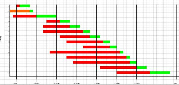
The form of Gantt chart above is called a process template chart and it is designed to show the flow of tasks through  a process. Each horizontal line is a task; each vertical column is an interval of time. The colour code in each cell indicates what the task is doing and which resource the task is using during that time interval. Red indicates that the task is waiting. White means that the task is outside the scope of the chart (e.g. not yet arrived or already departed).

The Gantt chart shows two “red wedges”.  A red wedge that is getting wider from top to bottom is the pattern created by a flow constraint.  A red wedge that is getting narrower from top to bottom is the pattern of a policy constraint.  Both are signs of poor scheduling design.

A Gantt chart like this has three primary uses:
1) Diagnosis – understanding how the current flow design is creating the queues and delays.
2) Design – inventing new design options.
3) Prognosis – testing the innovative designs so the ‘fittest’ can be chosen for implementation.

These three steps are encapsulated in the third “M” of 6M Design® – the Model step.

In this example the design flaw was the scheduling policy.  When that was redesigned the outcome was zero-wait performance. No red on the chart at all.  The same number of tasks were completed in the same with the same resources used. Just less waiting. Which means less space is needed to store the queue of waiting work (i.e. none in this case).

That this is even possible comes as a big surprise to most people. It feels counter-intuitive. It is however an easy to demonstrate fact. Our intuition tricks us.

And that reduction in the size of the queue implies a big cost reduction when the work-in-progress is perishable and needs constant attention [such as patients lying on A&E trolleys and in hospital beds].

So what was the cost of re-designing this schedule?

A pinch of humility. A few bits of squared paper and some coloured pens. A couple hours of time. And a one-off investment in learning how to do it.  Peanuts in comparison with the recurring benefit gained.


Economy-of-Scale vs Economy-of-Flow

We_Need_Small_HospitalsThis was an interesting headline to see on the front page of a newspaper yesterday!

The Top Man of the NHS is openly challenging the current Centralisation-is-The-Only-Way-Forward Mantra;  and for good reason.

Mass centralisation is poor system design – very poor.

Q: So what is driving the centralisation agenda?

A: Money.

Or to be more precise – rather simplistic thinking about money.

The misguided money logic goes like this:

1. Resources (such as highly trained doctors, nurses and AHPs) cost a lot of money to provide.
[Yes].

2. So we want all these resources to be fully-utilised to get value-for-money.
[No, not all – just the most expensive].

3. So we will gather all the most expensive resources into one place to get the Economy-of-Scale.
[No, not all the most expensive – just the most specialised]

4. And we will suck /push all the work through these super-hubs to keep our expensive specialist resources busy all the time.
[No, what about the growing population of older folks who just need a bit of expert healthcare support, quickly, and close to home?]

This flawed logic confuses two complementary ways to achieve higher system productivity/economy/value-for-money without  sacrificing safety:

Economies of Scale (EoS) and Economies of Flow (EoF).

Of the two the EoF is the more important because by using EoF principles we can increase productivity in huge leaps at almost no cost; and without causing harm and disappointment. EoS are always destructive.

But that is impossible. You are talking rubbish … because if it were possible we would be doing it!

It is not impossible and we are doing it … but not at scale and pace in healthcare … and the reason for that is we are not trained in Economy-of-Flow methods.

And those who are trained and who have have experienced the effects of EoF would not do it any other way.

Example:

In a recent EoF exercise an ISP (Improvement Science Practitioner) helped a surgical team to increase their operating theatre productivity by 30% overnight at no cost.  The productivity improvement was measured and sustained for most of the last year. [it did dip a bit when the waiting list evaporated because of the higher throughput, and again after some meddlesome middle management madness was triggered by end-of-financial-year target chasing].  The team achieved the improvement using Economy of Flow principles and by re-designing some historical scheduling policies. The new policies  were less antagonistic. They were designed to line the ducks up and as a result the flow improved.


So the specific issue of  Super Hospitals vs Small Hospitals is actually an Economy of Flow design challenge.

But there is another critical factor to take into account.

Specialisation.

Medicine has become super-specialised for a simple reason: it is believed that to get ‘good enough’ at something you have to have a lot of practice. And to get the practice you have to have high volumes of the same stuff – so you need to specialise and then to sort undifferentiated work into separate ‘speciologist’ streams or sequence the work through separate speciologist stages.

Generalists are relegated to second-class-citizen status; mere tripe-skimmers and sign-posters.

Specialisation is certainly one way to get ‘good enough’ at doing something … but it is not the only way.

Another way to learn the key-essentials from someone who already knows (and can teach) and then to continuously improve using feedback on what works and what does not – feedback from everywhere.

This second approach is actually a much more effective and efficient way to develop expertise – but we have not been taught this way.  We have only learned the scrape-the-burned-toast-by-suck-and-see method.

We need to experience another way.

We need to experience rapid acquisition of expertise!

And being able to gain expertise quickly means that we can become expert generalists.

There is good evidence that the broader our skill-set the more resilient we are to change, and the more innovative we are when faced with novel challenges.

In the Navy of the 1800’s sailors were “Jacks of All Trades and Master of One” because if only one person knew how to navigate and they got shot or died of scurvy the whole ship was doomed.  Survival required resilience and that meant multi-skilled teams who were good enough at everything to keep the ship afloat – literally.


Specialisation has another big drawback – it is very expensive and on many dimensions. Not just Finance.

Example:

Suppose we have six-step process and we have specialised to the point where an individual can only do one step to the required level of performance (safety/flow/quality/productivity).  The minimum number of people we need is six and the process only flows when we have all six people. Our minimum costs are high and they do not scale with flow.

If any one of the six are not there then the whole process stops. There is no flow.  So queues build up and smooth flow is sacrificed.

Out system behaves in an unstable and chaotic feast-or-famine manner and rapidly shifting priorities create what is technically called ‘thrashing’.

And the special-six do not like the constant battering.

And the special-six have the power to individually hold the whole system to ransom – they do not even need to agree.

And then we aggravate the problem by paying them the high salary that it is independent of how much they collectively achieve.

We now have the perfect recipe for a bigger problem!  A bunch of grumpy, highly-paid specialists who blame each other for the chaos and who incessantly clamour for ‘more resources’ at every step.

This is not financially viable and so creates the drive for economy-of-scale thinking in which to get us ‘flow resilience’ we need more than one specialist at each of the six steps so that if one is on holiday or off sick then the process can still flow.  Let us call these tribes of ‘speciologists’ there own names and budgets, and now we need to put all these departments somewhere – so we will need a big hospital to fit them in – along with the queues of waiting work that they need.

Now we make an even bigger design blunder.  We assume the ‘efficiency’ of our system is the same as the average utilisation of all the departments – so we trim budgets until everyone’s utilisation is high; and we suck any-old work in to ensure there is always something to do to keep everyone busy.

And in so doing we sacrifice all our Economy of Flow opportunities and we then scratch our heads and wonder why our total costs and queues are escalating,  safety and quality are falling, the chaos continues, and our tribes of highly-paid specialists are as grumpy as ever they were!   It must be an impossible-to-solve problem!


Now contrast that with having a pool of generalists – all of whom are multi-skilled and can do any of the six steps to the required level of expertise.  A pool of generalists is a much more resilient-flow design.

And the key phrase here is ‘to the required level of expertise‘.

That is how to achieve Economy-of-Flow on a small scale without compromising either safety or quality.

Yes, there is still a need for a super-level of expertise to tackle the small number of complex problems – but that expertise is better delivered as a collective-expertise to an individual problem-focused process.  That is a completely different design.

Designing and delivering a system that that can achieve the synergy of the pool-of-generalists and team-of-specialists model requires addressing a key error of omission first: we are not trained how to do this.

We are not trained in Complex-Adaptive-System Improvement-by-Design.

So that is where we must start.


Ratio Hazards

waste_paper_shot_miss_150_wht_11853[Bzzzzz Bzzzzz] Bob’s phone was on silent but the desktop amplified the vibration and heralded the arrival of Leslie’s weekly ISP coaching call.

<Bob> Hi Leslie.  How are you today and what would you like to talk about?

<Leslie> Hi Bob.  I am well and I have an old chestnut to roast today … target-driven-behaviour!

<Bob> Excellent. That is one of my favorite topics. Is there a specific context?

<Leslie> Yes.  The usual desperate directive from on-high exhorting everyone to “work harder to hit the target” and usually accompanied by a RAG table of percentages that show just who is failing and how badly they are doing.

<Bob> OK. Red RAGs irritating the Bulls eh? Percentages eh? Have we talked about Ratio Hazards?

<Leslie> We have talked about DRATs … Delusional Ratios and Arbitrary Targets as you call them. Is that the same thing?

<Bob> Sort of. What happened when you tried to explain DRATs to those who are reacting to these ‘desperate directives’?

<Leslie> The usual reply is ‘Yes, but that is how we are required to report our performance to our Commissioners and Regulatory Bodies.’

<Bob> And are the key performance indicators that are reported upwards and outwards also being used to manage downwards and inwards?  If so, then that is poor design and is very likely to be contributing to the chaos.

<Leslie> Can you explain that a bit more? It feels like a very fundamental point you have just made.

 <Bob> OK. To do that let us work through the process by which the raw data from your system is converted into the externally reported KPI.  Choose any one of your KPIs

<Leslie> Easy! The 4-hour A&E target performance.

<Bob> What is the raw data that goes in to that?

<Leslie> The percentage of patients who breach 4-hours per day.

<Bob> And where does that ratio come from?

<Leslie> Oh! I see what you mean. That comes from a count of the number of patients who are in A&E for more than 4 hours divided by a count of the number of patients who attended.

<Bob> And where do those counts come come from?

<Leslie> We calculate the time the patient is in A&E and use the 4-hour target to label them as breaches or not.

<Bob> And what data goes into the calculation of that time?

<Leslie>The arrival and departure times for each patient. The arrive and depart events.

<Bob>OK. Is that the raw data?

<Leslie>Yes. Everything follows from that.

<Bob> Good.  Each of these two events is a time – which is a continuous metric.  In principle,  we could in record it to any degree of precision we like – milliseconds if we had a good enough enough clock.

<Leslie> Yes. We record it to an accuracy of of seconds – it is when the patient is ‘clicked through’ on the computer.

<Bob> Careful Leslie, do not confuse precision with accuracy. We need both.

<Leslie> Oops! Yes I remember we had that conversation before.

<Bob> And how often is the A&E 4-hour target KPI reported externally?

<Leslie> Quarterly. We either succeed or fail each quarter of the financial year.

<Bob> That is a binary metric. An “OK or not OK”. No gray zone.

<Leslie> Yes. It is rather blunt but that is how we are contractually obliged to report our performance.

<Bob> OK. And how many patients per day on average come to A&E?

<Leslie> About 200 per day.

<Bob> So the data analysis process is boiling down about 36,000 pieces of continuous data into one Yes-or-No bit of binary data.

<Leslie> Yes.

<Bob> And then that one bit is used to drive the action of the Board: if it is ‘OK last quarter’ then there is no ‘desperate directive’ and if it is a ‘Not OK last quarter’ then there is.

<Leslie> Yes.

<Bob> So you are throwing away 99.9999% of your data and wondering why what is left is not offering much insight in what to do.

<Leslie>Um, I guess so … when you say it like that.  But how does that relate to your phrase ‘Ratio Hazards’?

<Bob> A ratio is just one of the many ways that we throw away information. A ratio requires two numbers to calculate it; and it gives one number as an output so we are throwing half our information away.  And this is an irreversible act.  Two specific numbers will give one ratio; but that ratio can be created by an infinite number possible pairs of numbers and we have no way of knowing from the ratio what specific pair was used to create it.

<Leslie> So a ratio is an exercise in obfuscation!

<Bob> Well put! And there is an even more data-wasteful behaviour that we indulge in. We aggregate.

<Leslie> By that do you mean we summarise a whole set of numbers with an average?

<Bob> Yes. When we average we throw most of the data away and when we average over time then we abandon our ability to react in a timely way.

<Leslie>The Flaw of Averages!

<Bob> Yes. One of them. There are many.

<Leslie>No wonder it feels like we are flying blind and out of control!

<Bob> There is more. There is an even worse data-wasteful behaviour. We threshold.

<Leslie>Is that when we use a target to decide if the lead time is OK or Not OK.

<Bob> Yes. And using an arbitrary target makes it even worse.

<Leslie> Ah ha! I see what you are getting at.  The raw event data that we painstakingly collect is a treasure trove of information and potential insight that we could use to help us diagnose, design and deliver a better service. But we throw all but one single solitary binary digit when we put it through the DRAT Processor.

<Bob> Yup.

<Leslie> So why could we not do both? Why could we not use use the raw data for ourselves and the DRAT processed data for external reporting.

<Bob> We could.  So what is stopping us doing just that?

<Leslie> We do not know how to effectively and efficiently interpret the vast ocean of raw data.

<Bob> That is what a time-series chart is for. It turns the thousands of pieces of valuable information onto a picture that tells a story – without throwing the information away in the process. We just need to learn how to interpret the pictures.

<Leslie> Wow! Now I understand much better why you insist we ‘plot the dots’ first.

<Bob> And now you understand the Ratio Hazards a bit better too.

<Leslie> Indeed so.  And once again I have much to ponder on. Thank you again Bob.

Reducing Avoidable Harm

patient_stumbling_with_bandages_150_wht_6861Primum non nocere” is Latin for “First do no harm”.

It is a warning mantra that had been repeated by doctors for thousands of years and for good reason.

Doctors  can be bad for your health.

I am not referring to the rare case where the doctor deliberately causes harm.  Such people are criminals and deserve to be in prison.

I am referring to the much more frequent situation where the doctor has no intention to cause harm – but harm is the outcome anyway.

Very often the risk of harm is unavoidable. Healthcare is a high risk business. Seriously unwell patients can be very unstable and very unpredictable.  Heroic efforts to do whatever can be done can result in unintended harm and we have to accept those risks. It is the nature of the work.  Much of the judgement in healthcare is balancing benefit with risk on a patient by patient basis. It is not an exact science. It requires wisdom, judgement, training and experience. It feels more like an art than a science.

The focus of this essay is not the above. It is on unintentionally causing avoidable harm.

Or rather unintentionally not preventing avoidable harm which is not quite the same thing.

Safety means prevention of avoidable harm. A safe system is one that does that. There is no evidence of harm to collect. A safe system does not cause harm. Never events never happen.

Safe systems are designed to be safe.  The root causes of harm are deliberately designed out one way or another.  But it is not always easy because to do that we need to understand the cause-and-effect relationships that lead to unintended harm.  Very often we do not.


In 1847 a doctor called Ignaz Semmelweis made a very important discovery. He discovered that if the doctors and medical students washed their hands in disinfectant when they entered the labour ward, then the number of mothers and babies who died from infection was reduced.

And the number dropped a lot.

It fell from an annual average of 10% to less than 2%!  In really bad months the rate was 30%.

The chart below shows the actual data plotted as a time-series chart. The yellow flag in 1848 is just after Semmelweis enforced a standard practice of hand-washing.

Vienna_Maternal_Mortality_1785-1848

Semmelweis did not know the mechanism though. This was not a carefully designed randomised controlled trial (RCT). He was desperate. And he was desperate because this horrendous waste of young lives was only happening on the doctors ward.  On the nurses ward, which was just across the corridor, the maternal mortality was less than 2%.

The hospital authorities explained it away as ‘bad air’ from outside. That was the prevailing belief at the time. Unavoidable. A risk that had to be just accepted.

Semmeleis could not do a randomized controlled trial because they were not invented until a century later.

And Semmelweis suspected that the difference between the mortality on the nurses and the doctors wards was something to do with the Mortuary. Only the doctors performed the post-mortems and the practice of teaching anatomy to medical students using post-mortem dissection was an innovation pioneered in Vienna in 1823 (the first yellow flag on the chart above). But Semmelweis did not have this data in 1847.  He collated it later and did not publish it until 1861.

What Semmelweis demonstrated was the unintended and avoidable deaths were caused by ignorance of the mechanism of how microorganisms cause disease. We know that now. He did not.

It would be another 20 years before Louis Pasteur demonstrated the mechanism using the famous experiment with the swan neck flask. Pasteur did not discover microorganisms;  he proved that they did not appear spontaneously in decaying matter as was believed. He proved that by killing the bugs by boiling, the broth in the flask  stayed fresh even though it was exposed to the air. That was a big shock but it was a simple and repeatable experiment. He had a mechanism. He was believed. Germ theory was born. A Scottish surgeon called Joseph Lister read of this discovery and surgical antisepsis was born.

Semmelweis suspected that some ‘agent’ may have been unwittingly transported from the dead bodies to the live mothers and babies on the hands of the doctors.  It was a deeply shocking suggestion that the doctors were unwittingly killing their patients.

The other doctors did not take this suggestion well. Not well at all. They went into denial. They discounted the message and they discharged the messenger. Semmelweis never worked in Vienna again. He went back to Hungary and repeated the experiment. It worked.


Even today the message that healthcare practitioners can unwittingly bring avoidable harm to their patients is disturbing. We still seek solace in denial.

Hospital acquired infections (HAI) are a common cause of harm and many are avoidable using simple, cheap and effective measures such as hand-washing.

The harm does not come from what we do. It comes from what we do not do. It happens when we omit to follow the simple safety measures that have be proven to work. Scientifically. Statistically Significantly. Understood and avoidable errors of omission.


So how is this “statistically significant scientific proof” acquired?

By doing experiments. Just like the one Ignaz Semmelweis conducted. But the improvement he showed was so large that it did not need statistical analysis to validate it.  And anyway such analysis tools were not available in 1847. If they had been he might have had more success influencing his peers. And if he had achieved that goal then thousands, if not millions, of deaths from hospital acquired infections may have been prevented.  With the clarity of hindsight we now know this harm was avoidable.

No. The problem we have now is because the improvement that follows a single intervention is not very large. And when the causal mechanisms are multi-factorial we need more than one intervention to achieve the improvement we want. The big reduction in avoidable harm. How do we do that scientifically and safely?


About 20% of hospital acquired infections occur after surgical operations.

We have learned much since 1847 and we have designed much safer surgical systems and processes. Joseph Lister ushered in the era of safe surgery, much has happened since.

We routinely use carefully designed, ultra-clean operating theatres, sterilized surgical instruments, gloves and gowns, and aseptic techniques – all to reduce bacterial contamination from outside.

But surgical site infections (SSIs) are still common place. Studies show that 5% of patients on average will suffer this complication. Some procedures are much higher risk than others, despite the precautions we take.  And many surgeons assume that this risk must just be accepted.

Others have tried to understand the mechanism of SSI and their research shows that the source of the infections is the patients themselves. We all carry a ‘bacterial flora’ and normally that is no problem. Our natural defense – our skin – is enough.  But when that biological barrier is deliberately breached during a surgical operation then we have a problem. The bugs get in and cause mischief. They cause surgical site infections.

So we have done more research to test interventions to prevent this harm. Each intervention has been subject to well-designed, carefully-conducted, statistically-valid and very expensive randomized controlled trials.  And the results are often equivocal. So we repeat the trials – bigger, better controlled trials. But the effects of the individual interventions are small and they easily get lost in the noise. So we pool the results of many RCTs in what is called a ‘meta-analysis’ and the answer from that is very often ‘not proven’ – either way.  So individual surgeons are left to make the judgement call and not surprisingly there is wide variation in practice.  So is this the best that medical science can do?

No. There is another way. What we can do is pool all the learning from all the trials and design a multi-facetted intervention. A bundle of care. And the idea of a bundle is that the  separate small effects will add or even synergise to create one big effect.  We are not so much interested in the mechanism as the outcome. Just like Ignaz Semmelweiss.

And we can now do something else. We can test our bundle of care using statistically robust tools that do not require a RCT.  They are just as statistically valid as a RCT but a different design.

And the appropriate tool for this to measure the time interval between adverse the events  – and then to plot this continuous metric as a time-series chart.

But we must be disciplined. First we must establish the baseline average interval and then we introduce our bundle and then we just keep measuring the intervals.

If our bundle works then the interval between the adverse events gets longer – and we can easily prove that using our time-series chart. The longer the interval the more ‘proof’ we have.  In fact we can even predict how long we need to observe to prove that ‘no events’ is a statistically significant improvement. That is an elegant an efficient design.


Here is a real and recent example.

The time-series chart below shows the interval in days between surgical site infections following routine hernia surgery. These are not life threatening complications. They rarely require re-admission or re-operation. But they are disruptive for patients. They cause pain, require treatment with antibiotics, and the delay recovery and return to normal activities. So we would like to avoid them if possible.

Hernia_SSI_CareBundle

The green and red lines show the baseline period. The  green line says that the average interval between SSIs is 14 days.  The red line says that an interval more than about 60 days would be surprisingly long: valid statistical evidence of an improvement.  The end of the green and red lines indicates when the intervention was made: when the evidence-based designer care bundle was adopted together with the discipline of applying it to every patient. No judgement. No variation.

The chart tells the story. No complicated statistical analysis is required. It shows a statistically significant improvement.  And the SSI rate fell by over 80%. That is a big improvement.

We still do not know how the care bundle works. We do not know which of the seven simultaneous simple and low-cost interventions we chose are the most important or even if they work independently or in synergy.  Knowledge of the mechanism was not our goal.

Our goal was to improve outcomes for our patients – to reduce avoidable harm – and that has been achieved. The evidence is clear.

That is Improvement Science in action.

And to read the full account of this example of the Science of Improvement please go to:

http://www.journalofimprovementscience.org

It is essay number 18.

And avoid another error of omission. If you have read this far please share this message – it is important.

The Battle of the Chimps

Chimp_BattleImprovement implies change.
Change implies action.
Action implies decision.

So how is the decision made?
With Urgency?
With Understanding?

Bitter experience teaches us that often there is an argument about what to do and when to do it.  An argument between two factions. Both are motivated by a combination of anger and fear. One side is motivated more by anger than fear. They vote for action because of the urgency of the present problem. The other side is motivated more by fear than anger. They vote for inaction because of their fear of future failure.

The outcome is unhappiness for everyone.

If the ‘action’ party wins the vote and a failure results then there is blame and recrimination. If the ‘inaction’ party wins the vote and a failure results then there is blame and recrimination. If either party achieves a success then there is both gloating and resentment. Lose Lose.

The issue is not the decision and how it is achieved.The problem is the battle.

Dr Steve Peters is a psychiatrist with 30 years of clinical experience.  He knows how to help people succeed in life through understanding how the caveman wetware between their ears actually works.

In the run up to the 2012 Olympic games he was the sports psychologist for the multiple-gold-medal winning UK Cycling Team.  The World Champions. And what he taught them is described in his book – “The Chimp Paradox“.

Chimp_Paradox_SmallSteve brilliantly boils the current scientific understanding of the complexity of the human mind down into a simple metaphor.

One that is accessible to everyone.

The metaphor goes like this:

There are actually two ‘beings’ inside our heads. The Chimp and the Human. The Chimp is the older, stronger, more emotional and more irrational part of our psyche. The Human is the newer, weaker, logical and rational part.  Also inside there is the Computer. It is just a memory where both the Chimp and the Human store information for reference later. Beliefs, values, experience. Stuff like that. Stuff they use to help them make decisions.

And when some new information arrives through our senses – sight and sound for example – the Chimp gets first dibs and uses the Computer to look up what to do.  Long before the Human has had time to analyse the new information logically and rationally. By the time the Human has even started on solving the problem the Chimp has come to a decision and signaled it to the Human and associated it with a strong emotion. Anger, Fear, Excitement and so on. The Chimp operates on basic drives like survival-of-the-self and survival-of-the-species. So if the Chimp gets spooked or seduced then it takes control – and it is the stronger so it always wins the internal argument.

But the human is responsible for the actions of the Chimp. As Steve Peters says ‘If your dog bites someone you cannot blame the dog – you are responsible for the dog‘.  So it is with our inner Chimps. Very often we end up apologising for the bad behaviour of our inner Chimp.

Because our inner Chimp is the stronger we cannot ‘control’ it by force. We have to learn how to manage the animal. We need to learn how to soothe it and to nurture it. And we need to learn how to remove the Gremlins that it has programmed into the Computer. Our inner Chimp is not ‘bad’ or ‘mad’ it is just a Chimp and it is an essential part of us.

Real chimpanzees are social, tribal and territorial.  They live in family groups and the strongest male is the boss. And it is now well known that a troop of chimpanzees in the wild can plan and wage battles to acquire territory from neighbouring troops. With casualties on both sides.  And so it is with people when their inner Chimps are in control.

Which is most of the time.

Scenario:
A hospital is failing one of its performance targets – the 18 week referral-to-treatment one – and is being threatened with fines and potential loss of its autonomy. The fear at the top drives the threat downwards. Operational managers are forced into action and do so using strategies that have not worked in the past. But they do not have time to learn how to design and test new ones. They are bullied into Plan-Do mode. The hospital is also required to provide safe care and the Plan-Do knee-jerk triggers fear-of-failure in the minds of the clinicians who then angrily oppose the diktat or quietly sabotage it.

This lose-lose scenario is being played out  in  100’s if not 1000’s of hospitals across the globe as we speak.  The evidence is there for everyone to see.

The inner Chimps are in charge and the outcome is a turf war with casualties on all sides.

So how does The Chimp Paradox help dissolve this seemingly impossible challenge?

First it is necessary to appreciate that both sides are being controlled by their inner Chimps who are reacting from a position of irrational fear and anger. This means that everyone’s behaviour is irrational and their actions likely to be counter-productive.

What is needed is for everyone to be managing their inner Chimps so that the Humans are back in control of the decision making. That way we get wise decisions that lead to effective actions and win-win outcomes. Without chaos and casualties.

To do this we all need to learn how to manage our own inner Chimps … and that is what “The Chimp Paradox” is all about. That is what helped the UK cyclists to become gold medalists.

In the scenario painted above we might observe that the managers are more comfortable in the Pragmatist-Activist (PA) half of the learning cycle. The Plan-Do part of PDSA  – to translate into the language of improvement. The clinicians appear more comfortable in the Reflector-Theorist (RT) half. The Study-Act part of PDSA.  And that difference of preference is fueling the firestorm.

Improvement Science tells us that to achieve and sustain improvement we need all four parts of the learning cycle working  smoothly and in sequence.

So what at first sight looks like it must be pitched battle which will result in two losers; in reality is could be a three-legged race that will result in everyone winning. But only if synergy between the PA and the RT halves can be achieved.

And that synergy is achieved by learning to respect, understand and manage our inner Chimps.

Rocket Science

ViewFromSpaceThis is a picture of Chris Hadfield. He is an astronaut and to prove it here he is in the ‘cupola’ of the International Space Station (ISS). Through the windows is a spectacular view of the Earth from space.

Our home seen from space.

What is remarkable about this image is that it even exists.

This image is tangible evidence of a successful outcome of a very long path of collaborative effort by 100’s of 1000’s of people who share a common dream.

That if we can learn to overcome the challenge of establishing a permanent manned presence in space then just imagine what else we might achieve?

Chis is unusual for many reasons.  One is that he is Canadian and there are not many Canadian astronauts. He is also the first Canadian astronaut to command the ISS.  Another claim to fame is that when he recently lived in space for 5 months on the ISS, he recorded a version of David Bowie’s classic song – for real – in space. To date this has clocked up 21 million YouTube hits and had helped to bring the inspiring story of space exploration back to the public consciousness.

Especially the next generation of explorers – our children.

Chris has also written a book ‘An Astronaut’s View of Life on Earth‘ that tells his story. It describes how he was inspired at a young age by seeing the first man to step onto the Moon in 1969.  He overcame seemingly impossible obstacles to become an astronaut, to go into space, and to command the ISS.  The image is tangible evidence.

We all know that space is a VERY dangerous place.  I clearly remember the two space shuttle disasters. There have been many other much less public accidents.  Those tragic events have shocked us all out of complacency and have created a deep sense of humility in those who face up to the task of learning to overcome the enormous technical and cultural barriers.

Getting six people into space safely, staying there long enough to conduct experiments on the long-term effects of weightlessness, and getting them back again safely is a VERY difficult challenge.  And it has been overcome. We have the proof.

Many of the seemingly impossible day-to-day problems that we face seem puny in comparison.

For example: getting every patient into hospital, staying there just long enough to benefit from cutting edge high-technology healthcare, and getting them back home again safely.

And doing it repeatedly and consistently so that the system can be trusted and we are not greeted with tragic stories every time we open a newspaper. Stories that erode our trust in the ability of groups of well-intended people to do anything more constructive than bully, bicker and complain.

So when the exasperated healthcare executive exclaims ‘Getting 95% of emergency admissions into hospital in less than 4 hours is not rocket science!‘ – then perhaps a bit more humility is in order. It is rocket science.

Rocket science is Improvement science.

And reading the story of a real-life rocket-scientist might be just the medicine our exasperated executives need.

Because Chris explains exactly how it is done.

And he is credible because he has walked-the-talk so he has earned the right to talk-the-walk.

The least we can do is listen and learn.

Here is is Chris answering the question ‘How to achieve an impossible dream?

Jiggling

hurry_with_the_SFQP_kit[Dring] Bob’s laptop signaled the arrival of Leslie for their regular ISP remote coaching session.

<Bob> Hi Leslie. Thanks for emailing me with a long list of things to choose from. It looks like you have been having some challenging conversations.

<Leslie> Hi Bob. Yes indeed! The deepening gloom and the last few blog topics seem to be polarising opinion. Some are claiming it is all hopeless and others, perhaps out of desperation, are trying the FISH stuff for themselves and discovering that it works.  The ‘What Ifs’ are engaged in war of words with the ‘Yes Buts’.

<Bob> I like your metaphor! Where would you like to start on the long list of topics?

<Leslie> That is my problem. I do not know where to start. They all look equally important.

<Bob> So, first we need a way to prioritise the topics to get the horse-before-the-cart.

<Leslie> Sounds like a good plan to me!

<Bob> One of the problems with the traditional improvement approaches is that they seem to start at the most difficult point. They focus on ‘quality’ first – and to be fair that has been the mantra from the gurus like W.E.Deming. ‘Quality Improvement’ is the Holy Grail.

<Leslie>But quality IS important … are you saying they are wrong?

<Bob> Not at all. I am saying that it is not the place to start … it is actually the third step.

<Leslie>So what is the first step?

<Bob> Safety. Eliminating avoidable harm. Primum Non Nocere. The NoNos. The Never Events. The stuff that generates the most fear for everyone. The fear of failure.

<Leslie> You mean having a service that we can trust not to harm us unnecessarily?

<Bob> Yes. It is not a good idea to make an unsafe design more efficient – it will deliver even more cumulative harm!

<Leslie> OK. That makes perfect sense to me. So how do we do that?

<Bob> It does not actually matter.  Well-designed and thoroughly field-tested checklists have been proven to be very effective in the ‘ultra-safe’ industries like aerospace and nuclear.

<Leslie> OK. Something like the WHO Safe Surgery Checklist?

<Bob> Yes, that is a good example – and it is well worth reading Atul Gawande’s book about how that happened – “The Checklist Manifesto“.  Gawande is a surgeon who had published a lot on improvement and even so was quite skeptical that something as simple as a checklist could possibly work in the complex world of surgery. In his book he describes a number of personal ‘Ah Ha!’ moments that illustrate a phenomenon that I call Jiggling.

<Leslie> OK. I have made a note to read Checklist Manifesto and I am curious to learn more about Jiggling – but can we stick to the point? Does quality come after safety?

<Bob> Yes, but not immediately after. As I said, Quality is the third step.

<Leslie> So what is the second one?

<Bob> Flow.

There was a long pause – and just as Bob was about to check that the connection had not been lost – Leslie spoke.

<Leslie> But none of the Improvement Schools teach basic flow science.  They all focus on quality, waste and variation!

<Bob> I know. And attempting to improve quality before improving flow is like papering the walls before doing the plastering.  Quality cannot grow in a chaotic context. The flow must be smooth before that. And the fear of harm must be removed first.

<Leslie> So the ‘Improving Quality through Leadership‘ bandwagon that everyone is jumping on will not work?

<Bob> Well that depends on what the ‘Leaders’ are doing. If they are leading the way to learning how to design-for-safety and then design-for-flow then the bandwagon might be a wise choice. If they are only facilitating collaborative agreement and group-think then they may be making an unsafe and ineffective system more efficient which will steer it over the edge into faster decline.

<Leslie>So, if we can stabilize safety using checklists do we focus on flow next?

<Bob>Yup.

<Leslie> OK. That makes a lot of sense to me. So what is Jiggling?

<Bob> This is Jiggling. This conversation.

<Leslie> Ah, I see. I am jiggling my understanding through a series of ‘nudges’ from you.

<Bob>Yes. And when the learning cogs are a bit rusty, some Improvement Science Oil and a bit of Jiggling is more effective and much safer than whacking the caveman wetware with a big emotional hammer.

<Leslie>Well the conversation has certainly jiggled Safety-Flow-Quality-and-Productivity into a sensible order for me. That has helped a lot. I will sort my to-do list into that order and start at the beginning. Let me see. I have a plan for safety, now I can focus on flow. Here is my top flow niggle. How do I design the resource capacity I need to ensure the flow is smooth and the waiting times are short enough to avoid ‘persecution’ by the Target Time Police?

<Bob> An excellent question! I will send you the first ISP Brainteaser that will nudge us towards an answer to that question.

<Leslie> I am ready and waiting to have my brain-teased and my niggles-nudged!

The Time Trap

clock_hands_spinning_import_150_wht_3149[Hmmmmmm]

The desk amplified the vibration of Bob’s smartphone as it signaled the time for his planned e-mentoring session with Leslie.

<Bob> Hi Leslie, right-on-time, how are you today?

<Leslie> Good thanks Bob. I have a specific topic to explore if that is OK. Can we talk about time traps.

<Bob> OK – do you have a specific reason for choosing that topic?

<Leslie> Yes. The blog last week about ‘Recipe for Chaos‘ set me thinking and I remembered that time-traps were mentioned in the FISH course but I confess, at the time, I did not understand them. I still do not.

<Bob> Can you describe how the ‘Recipe for Chaos‘ blog triggered this renewed interest in time-traps?

<Leslie> Yes – the question that occurred to me was: ‘Is a time-trap a recipe for chaos?’

<Bob> A very good question! What do you feel the answer is?

<Leslie> I feel that time-traps can and do trigger chaos but I cannot explain how. I feel confused.

<Bob> Your intuition is spot on – so can you localize the source of your confusion?

<Leslie> OK. I will try. I confess I got the answer to the MCQ correct by guessing – and I wrote down the answer when I eventually guessed correctly – but I did not understand it.

<Bob> What did you write down?

<Leslie> “The lead time is independent of the flow”.

<Bob> OK. That is accurate – though I agree it is perhaps a bit abstract. One source of confusion may be that there are different causes of time-traps and there is a lot of overlap with other chaos-creating policies. Do you have a specific example we can use to connect theory with reality?

<Leslie> OK – that might explain my confusion.  The example that jumped to mind is the RTT target.

<Bob> RTT?

<Leslie> Oops – sorry – I know I should not use undefined abbreviations. Referral to Treatment Time.

<Bob> OK – can you describe what you have mapped and measured already?

<Leslie> Yes.  When I plot the lead-time for patients in date-of-treatment order the process looks stable but the histogram is multi-modal with a big spike just underneath the RTT target of 18 weeks. What you describe as the ‘Horned Gaussian’ – the sign that the performance target is distorting the behaviour of the system and the design of the system is not capable on its own.

<Bob> OK, and have you investigated why there is not just one spike?

<Leslie> Yes – the factor that best explains that is the ‘priority’ of the referral.  The  ‘urgents’ jump in front of the ‘soons’ and both jump in front of the ‘routines’. The chart has three overlapping spikes.

<Bob> That sounds like a reasonable policy for mixed-priority demand. So what is the problem?

<Leslie> The ‘Routine’ group is the one that clusters just underneath the target. The lead time for routines is almost constant but most of the time those patients sit in one queue or another being leap-frogged by other higher-priority patients. Until they become high-priority – then they do the leap frogging.

<Bob> OK – and what is the condition for a time trap again?

<Leslie> That the lead time is independent of flow.

<Bob> Which implies?

<Leslie> Um. Let me think. That the flow can be varying but the lead time stays the same?

<Bob> Yup. So is the flow of routine referrals varying?

<Leslie> Not over the long term. The chart is stable.

<Bob> What about over the short term? Is demand constant?

<Leslie> No of course not – it varies – but that is expected for all systems. Constant means ‘over-smoothed data’ – the Flaw of Averages trap!

<Bob> OK. And how close is the average lead time for routines to the RTT maximum allowable target?

<Leslie> Ah! I see what you mean. The average is about 17 weeks and the target is 18 weeks.

<Bob> So, what is the flow variation on a week-to-week time scale?

<Leslie> Demand or Activity?

<Bob> Both.

<Leslie> H’mm – give me a minute to re-plot flow as a weekly-aggregated chart. Oh! I see what you mean – both the weekly activity and demand are both varying widely and they are not in sync with each other. Work in progress must be wobbling up and down a lot! So how can the lead time variation be so low?

<Bob> What do the flow histograms look like?

<Leslie> Um. Just a second. That is weird! They are both bi-modal with peaks at the extremes and not much in the middle – the exact opposite of what I expected to see! I expected a centered peak.

<Bob> What you are looking at is the characteristic flow fingerprint of a chaotic system – it is called ‘thrashing’.

<Leslie> So, I was right!

<Bob> Yes. And now you know the characteristic pattern to look for. So, what is the policy design flaw here?

<Leslie> The DRAT – the delusional ratio and arbitrary target?

<Bob> That is part of it – that is the external driver policy. The one you cannot change easily. What is the internally driven policy? The reaction to the DRAT?

<Leslie> The policy of leaving routine patients until they are about to breach then re-classifying them as ‘urgent’.

<Bob> Yes! It is called a ‘Prevarication Policy’ and it is surprisingly and uncomfortably common. Ask yourself – do you ever prevaricate? Do you ever put off ‘lower priority’ tasks until later and then not fill the time freed up with ‘higher priority tasks’?

<Leslie> OMG! I do that all the time! I put low priority and unexciting jobs on a ‘to do later’ heap but I do not sit idle – I do then focus on the high priority ones.

<Bob> High priority for whom?

<Leslie> Ah! I see what you mean. High priority for me. The ones that give me the biggest reward! The fun stuff or the stuff that I get a pat on the back for doing or that I feel good about.

<Bob> And what happens?

<Leslie> The heap of ‘no-fun-for-me-to-do’ jobs gets bigger and I await the ‘reminders’ and then have to rush round in a mad panic to avoid disappointment, criticism and blame. It feels chaotic. I get grumpy. I make more mistakes and I deliver lower-quality work. If I do not get a reminder I assume that the job was not that urgent after all and if I am challenged I claim I am too busy doing the other stuff.

<Bob> And have you avoided disappointment?

<Leslie> Ah! No – that I needed to be reminded meant that I had already disappointed. And when I do not get a reminded does not prove I have not disappointed either. Most people blame rather than complain. I have just managed to erode other people’s trust in my reliability. I have disappointed myself. I have achieved exactly the opposite of what I intended. Drat!

<Bob> So, what is the reason that you work this way? There will be a reason.  A good reason.

<Leslie> That is a very good question! I will reflect on that because I believe it will help me understand why others behave this way too.

<Bob> OK – I will be interested to hear your conclusion.  Let us return to the question. What is the  downside of a ‘Prevarication Policy’?

<Leslie> It creates stress, chaos, fire-fighting, last minute changes, increased risk of errors,  more work and it erodes both quality, confidence and trust.

<Bob> Indeed so – and the impact on productivity?

<Leslie> The activity falls, the system productivity falls, revenue falls, queues increase, waiting times increase and the chaos increases!

<Bob> And?

<Leslie> We treat the symptoms by throwing resources at the problem – waiting list initiatives – and that pushes our costs up. Either way we are heading into a spiral of decline and disappointment. We do not address the root cause.

<Bob> So what is the way out of chaos?

<Leslie> Reduce the volume on the destabilizing feedback loop? Stop the managers meddling!

<Bob> Or?

<Leslie> Eh? I do not understand what you mean. The blog last week said management meddling was the problem.

<Bob> It is a problem. How many feedback loops are there?

<Leslie> Two – that need to be balanced.

<Bob> So, what is another option?

<Leslie> OMG! I see. Turn UP the volume of the stabilizing feedback loop!

<Bob> Yup. And that is a lot easier to do in reality. So, that is your other challenge to reflect on this week. And I am delighted to hear you using the terms ‘stabilizing feedback loop’ and ‘destabilizing feedback loop’.

<Leslie> Thank you. That was a lesson for me after last week – when I used the terms ‘positive and negative feedback’ it was interpreted in the emotional context – positive feedback as encouragement and negative feedback as criticism.  So ‘reducing positive feedback’ in that sense is the exact opposite of what I was intending. So I switched my language to using ‘stabilizing and destabilizing’ feedback loops that are much less ambiguous and the confusion and conflict disappeared.

<Bob> That is very useful learning Leslie … I think I need to emphasize that distinction more in the blog. That is one advantage of online media – it can be updated!

 <Leslie> Thanks again Bob!  And I have the perfect opportunity to test a new no-prevarication-policy design – in part of the system that I have complete control over – me!

The Recipe for Chaos

boxes_group_PA4_150_wht_4916There are only four ingredients required to create Chaos.

The first is Time.

All processes and systems are time-dependent.

The second ingredient is a Metric of Interest (MoI).

That means a system performance metric that is important to all – such as a Safety or Quality or Cost; and usually all three.

The third ingredient is a feedback loop of a specific type – it is called a Negative Feedback Loop.  The NFL  is one that tends to adjust, correct and stabilise the behaviour of the system.

Negative feedback loops are very useful – but they have a drawback. They resist change and they reduce agility. The name is also a disadvantage – the word ‘negative feedback’ is often associated with criticism.

The fourth and final ingredient in our Recipe for Chaos is also a feedback loop but one of a different design – a Positive Feedback Loop (PFL)- one that amplifies variation and change.

Positive feedback loops are also very useful – they are required for agility – quick reactions to unexpected events. Fast reflexes.

The downside of a positive feedback loop is that increases instability.

The name is also confusing – ‘positive feedback’ is associated with encouragement and praise.

So, in this context it is better to use the terms ‘stabilizing feedback’ and ‘destabilizing feedback’  loops.

When we mix these four ingredients in just the right amounts we get a system that may behave chaotically. That is surprising and counter-intuitive. But it is how the Universe works.

For example:

Suppose our Metric of Interest is the amount of time that patients spend in a Accident and Emergency Department. We know that the longer this time is the less happy they are and the higher the risk of avoidable harm – so it is a reasonable goal to reduce it.

Longer-than-possible waiting times have many root causes – it is a non-specific metric.  That means there are many things that could be done to reduce waiting time and the most effective actions will vary from case-to-case, day-to-day and even minute-to-minute.  There is no one-size-fits-all solution.

This implies that those best placed to correct the causes of these delays are the people who know the specific system well – because they work in it. Those who actually deliver urgent care. They are the stabilizing ingredient in our Recipe for Chaos.

The destabilizing ingredient is the hit-the-arbitrary-target policy which drives a performance management feedback loop.

This policy typically involves:
(1) Setting a performance target that is desirable but impossible for the current design to achieve reliably;
(2) inspecting how close to the target we are; then
(3) using the real-time data to justify threats of dire consequences for failure.

Now we have a perfect Recipe for Chaos.

The higher the failure rate the more inspections, reports, meetings, exhortations, threats, interruptions, and interventions that are generated.  Fear-fuelled management meddling. This behaviour consumes valuable time – so leaves less time to do the worthwhile work. Less time to devote to safety, flow, and quality. The queues build and the pressure increases and the system becomes hyper-sensitive to small fluctuations. Delays multiply and errors are more likely and spawn more workload, more delays and more errors.  Tempers become frayed and molehills are magnified into mountains. Irritations become arguments.  And all of this makes the problem worse rather than better. Less stable. More variable. More chaotic. More dangerous. More expensive.

It is actually possible to write a simple equation that captures this complex dynamic behaviour characteristic of real systems.  And that was a very surprising finding when it was discovered in 1976 by a mathematician called Robert May.

This equation is called the logistic equation.

Here is the abstract of his seminal paper.

Nature 261, 459-467 (10 June 1976)

Simple mathematical models with very complicated dynamics

First-order difference equations arise in many contexts in the biological, economic and social sciences. Such equations, even though simple and deterministic, can exhibit a surprising array of dynamical behaviour, from stable points, to a bifurcating hierarchy of stable cycles, to apparently random fluctuations. There are consequently many fascinating problems, some concerned with delicate mathematical aspects of the fine structure of the trajectories, and some concerned with the practical implications and applications. This is an interpretive review of them.

The fact that this chaotic behaviour is completely predictable and does not need any ‘random’ element was a big surprise. Chaotic is not the same as random. The observed chaos in the urgent healthcare care system is the result of the design of the system – or more specifically the current healthcare system management policies.

This has a number of profound implications – the most important of which is this:

If the chaos we observe in our health care systems is the predictable and inevitable result of the management policies we ourselves have created and adopted – then eliminating the chaos will only require us to re-design these policies.

In fact we only need to tweak one of the ingredients of the Recipe for Chaos – such as to reduce the strength of the destabilizing feedback loop. The gain. The volume control on the variation amplifier!

This is called the MM factor – otherwise known as ‘Management Meddling‘.

We need to keep all four ingredients though – because we need our system to have both agility and stability.  It is the balance of ingredients that that is critical.

The flaw is not the Managers themselves – it is their learned behaviour – the Meddling.  This is learned so it can be unlearned. We need to keep the Managers but “tweak” their role slightly. As they unlearn their old habits they move from being ‘Policy-Enforcers and Fire-Fighters’ to becoming ‘Policy-Engineers and Chaos-Calmers’. They focus on learning to understand the root causes of variation that come from outside the circle of influence of the non-Managers.   They learn how to rationally and radically redesign system policies to achieve both agility and stability.

And doing that requires developing systemic-thinking and learning Improvement Science skills – because the causes of chaos are counter-intuitive. If it were intuitively-obvious we would have discovered the nature of chaos thousands of years ago. The fact that it was not discovered until 1976 demonstrates this fact.

It is our homo sapiens intuition that got us into this mess!  The inherent flaws of the chimp-ware between our ears.  Our current management policies are intuitively-obvious, collectively-agreed, rubber-stamped and wrong! They are part of the Recipe for Chaos.

And when we learn to re-design our system policies and upload the new system software then the chaos evaporates as if a magic wand had been waved.

And that comes as a really BIG surprise!

What also comes as a big surprise is just how small the counter-intuitive policy design tweaks often are.

Safe, smooth, efficient, effective, and productive flow is restored. Calm confidence reigns. Safety, Flow, Quality and Productivity all increase – at the same time.  The emotional storm clouds dissipate and the prosperity sun shines again.

Everyone feels better. Everyone. Patients, managers, and non-managers.

This is Win-Win-Win improvement by design. Improvement Science.

Software First

computer_power_display_glowing_150_wht_9646A healthcare system has two inter-dependent parts. Let us call them the ‘hardware’ and the ‘software’ – terms we are more familiar with when referring to computer systems.

In a computer the critical-to-success software is called the ‘operating system’ – and we know that by the brand labels such as Windows, Linux, MacOS, or Android. There are many.

It is the O/S that makes the hardware fit-for-purpose. Without the O/S the computer is just a box of hot chips. A rather expensive room heater.

All the programs and apps that we use to to deliver our particular information service require the O/S to manage the actual hardware. Without a coordinator there would be chaos.

In a healthcare system the ‘hardware’ is the buildings, the equipment, and the people.  They are all necessary – but they are not sufficient on their own.

The ‘operating system’ in a healthcare system are the management policies: the ‘instructions’ that guide the ‘hardware’ to do what is required, when it is required and sometimes how it is required.  These policies are created by managers – they are the healthcare operating system design engineers so-to-speak.

Change the O/S and you change the behaviour of the whole system – it may look exactly the same – but it will deliver a different performance. For better or for worse.


In 1953 the invention of the transistor led to the first commercially viable computers. They were faster, smaller, more reliable, cheaper to buy and cheaper to maintain than their predecessors. They were also programmable.  And with many separate customer programs demanding hardware resources – an effective and efficient operating system was needed. So the understanding of “good” O/S design developed quickly.

In the 1960’s the first integrated circuits appeared and the computer world became dominated by mainframe computers. They filled air-conditioned rooms with gleaming cabinets tended lovingly by white-coated technicians carrying clipboards. Mainframes were, and still are, very expensive to build and to run! The valuable resource that was purchased by the customers was ‘CPU time’.  So the operating systems of these machines were designed to squeeze every microsecond of value out of the expensive-to-maintain CPU: for very good commercial reasons. Delivering the “data processing jobs” right, on-time and every-time was paramount.

The design of the operating system software was critical to the performance and to the profit.  So a lot of brain power was invested in learning how to schedule jobs; how to orchestrate the parts of the hardware system so that they worked in harmony; how to manage data buffers to smooth out flow and priority variation; how to design efficient algorithms for number crunching, sorting and searching; and how to switch from one task to the next quickly and without wasting time or making errors.

Every modern digital computer has inherited this legacy of learning.

In the 1970’s the first commercial microprocessors appeared – which reduced the size and cost of computers by orders of magnitude again – and increased their speed and reliability even further. Silicon Valley blossomed and although the first micro-chips were rather feeble in comparison with their mainframe equivalents they ushered in the modern era of the desktop-sized personal computer.

In the 1980’s players such as Microsoft and Apple appeared to exploit this vast new market. The only difference was that Microsoft only offered just the operating system for the new IBM-PC hardware (called MS-DOS); while Apple created both the hardware and software as a tightly integrated system – the Apple I.

The ergonomic-seamless-design philosophy at Apple led to the Apple Mac which revolutionised personal computing. It made them usable by people who had no interest in the innards or in programming. The Apple Macs were the “designer”computers and were reassuringly more expensive. The innovations that Apple designed into the Mac are now expected in all personal computers as well as the latest generations of smartphones and tablets.

Today we carry more computing power in our top pocket than a mainframe of the 1970’s could deliver! The design of the operating system has hardly changed though.

It was the O/S  design that leveraged the maximum potential of the very expensive hardware.  And that is still the case – but we take it for completely for granted.


Exactly the same principle applies to our healthcare systems.

The only difference is that the flow is not 1’s and 0’s – it is patients and all the things needed to deliver patient care. The ‘hardware’ is the expensive part to assemble and run – and the largest cost is the people.  Healthcare is a service delivered by people to people. Highly-trained nurses, doctors and allied healthcare professionals are expensive.

So the key to healthcare system performance is high quality management policy design – the healthcare operating system (HOS).

And here we hit a snag.

Our healthcare management policies have not been designed using the same rigor as the operating systems for our computers. They have not been designed using the well-understood principles of flow physics. The various parts of our healthcare system do not work well together. The flows are fractured. The silos work independently. And the ubiquitous symptom of this dysfunction is confusion, chaos and conflict.  The managers and the doctors are at each others throats. And this is because the management policies have evolved through a largely ineffective and very inefficient strategy called “burn-and-scrape”. Firefighting.

The root cause of the poor design is that neither healthcare managers nor the healthcare workers are trained in operational policy design. Design for Safety. Design for Quality. Design for Delivery. Design for Productivity.

And we are all left with a lose-lose-lose legacy: a system that is no longer fit-for-purpose and a generation of managers and clinicians who have never learned how to design the operational and clinical policies that ensure the system actually delivers what the ‘hardware’ is capable of delivering.


For example:

Suppose we have a simple healthcare system with three stages called A, B and C.  All the patients flow through A, then to B and then to C.  Let us assume these three parts are managed separately as departments with separate budgets and that they are free to use whatever policies they choose so long as they achieve their performance targets -which are (a) to do all the work and (b) to stay in budget and (c) to deliver on time.  So far so good.

Now suppose that the work that arrives at Department B from Department  A is not all the same and different tasks require different pathways and different resources. A Radiology, Pathology or Pharmacy Department for example.

Sorting the work into separate streams and having expensive special-purpose resources sitting idle waiting for work to arrive is inefficient and expensive. It will push up the unit cost – the total cost divided by the total activity. This is called ‘carve-out’.

Switching resources from one pathway to another takes time and that change-over time implies some resources are not able to do the work for a while.  These inefficiencies will contribute to the total cost and therefore push up the “unit-cost”. The total cost for the department divided by the total activity for the department.

So Department B decides to improve its “unit cost” by deploying a policy called ‘batching’.  It starts to sort the incoming work into different types of task and when a big enough batch has accumulated it then initiates the change-over. The cost of the change-over is shared by the whole batch. The “unit cost” falls because Department B is now able to deliver the same activity with fewer resources because they spend less time doing the change-overs. That is good. Isn’t it?

But what is the impact on Departments A and C and what effect does it have on delivery times and work in progress and the cost of storing the queues?

Department A notices that it can no longer pass work to B when it wants because B will only start the work when it has a full batch of requests. The queue of waiting work sits inside Department A.  That queue takes up space and that space costs money but the queue cost is incurred by Department A – not Department B.

What Department C sees is the order of the work changed by Department B to create a bigger variation in lead times for consecutive tasks. So if the whole system is required to achieve a delivery time specification – then Department C has to expedite the longest waiters and delay the shortest waiters – and that takes work,  time, space and money. That cost is incurred by Department C not by Department B.

The unit costs for Department B go down – and those for A and C both go up. The system is less productive as a whole.  The queues and delays caused by the policy change means that work can not be completed reliably on time. The blame for the failure falls on Department C.  Conflict between the parts of the system is inevitable. Lose-Lose-Lose.

And conflict is always expensive – on all dimensions – emotional, temporal and financial.


The policy design flaw here looks like it is ‘batching’ – but that policy is just a reaction to a deeper design flaw. It is a symptom.  The deeper flaw is not even the use of ‘unit costing’. That is a useful enough tool. The deeper flaw is the incorrect assumption that by improving the unit costs of the stages independently will always get an improvement in whole system productivity.

This is incorrect. This error is the result of ‘linear thinking’.

The Laws of Flow Physics do not work like this. Real systems are non-linear.

To design the management policies for a non-linear system using linear-thinking is guaranteed to fail. Disappointment and conflict is inevitable. And that is what we have. As system designers we need to use ‘systems-thinking’.

This discovery comes as a bit of a shock to management accountants. They feel rather challenged by the assertion that some of their cherished “cost improvement policies” are actually making the system less productive. Precisely the opposite of what they are trying to achieve.

And it is the senior management that decide the system-wide financial policies so that is where the linear-thinking needs to be challenged and the ‘software patch’ applied first.

It is not a major management software re-write. Just a minor tweak is all that is required.

And the numbers speak for themselves. It is not a difficult experiment to do.


So that is where we need to start.

We need to learn Healthcare Operating System design and we need to learn it at all levels in healthcare organisations.

And that system-thinking skill has another name – it is called Improvement Science.

The good news is that it is a lot easier to learn than most people believe.

And that is a big shock too – because how to do this has been known for 50 years.

So if you would like to see a real and current example of how poor policy design leads to falling productivity and then how to re-design the policies to reverse this effect have a look at Journal Of Improvement Science 2013:8;1-20.

And if you would like to learn how to design healthcare operating policies that deliver higher productivity with the same resources then the first step is FISH.

Space-and-Time

line_figure_phone_400_wht_9858<Lesley>Hi Bob! How are you today?

<Bob>OK thanks Lesley. And you?

<Lesley>I am looking forward to our conversation. I have two questions this week.

<Bob>OK. What is the first one?

<Lesley>You have taught me that improvement-by-design starts with the “purpose” question and that makes sense to me. But when I ask that question in a session I get an “eh?” reaction and I get nowhere.

<Bob>Quod facere bonum opus et quomodo te cognovi unum?

<Lesley>Eh?

<Bob>I asked you a purpose question.

<Lesley>Did you? What language is that? Latin? I do not understand Latin.

<Bob>So although you recognize the language you do not understand what I asked, the words have no meaning. So you are unable to answer my question and your reaction is “eh?”. I suspect the same is happening with your audience. Who are they?

<Lesley>Front-line clinicians and managers who have come to me to ask how to solve their problems. There Niggles. They want a how-to-recipe and they want it yesterday!

<Bob>OK. Remember the Temperament Treacle conversation last week. What is the commonest Myers-Briggs Type preference in your audience?

<Lesley>It is xSTJ – tough minded Guardians.  We did that exercise. It was good fun! Lots of OMG moments!

<Bob>OK – is your “purpose” question framed in a language that the xSTJ preference will understand naturally?

<Lesley>Ah! Probably not! The “purpose” question is future-focused, conceptual , strategic, value-loaded and subjective.

<Bob>Indeed – it is an iNtuitor question. xNTx or xNFx. Pose that question to a roomful of academics or executives and they will debate it ad infinitum.

<Lesley>More Latin – but that phrase I understand. You are right.  And my own preference is xNTP so I need to translate my xNTP “purpose” question into their xSTJ language?

<Bob>Yes. And what language do they use?

<Lesley>The language of facts, figures, jobs-to-do, work-schedules, targets, budgets, rational, logical, problem-solving, tough-decisions, and action-plans. Objective, pragmatic, necessary stuff that keep the operational-wheels-turning.

<Bob>OK – so what would “purpose” look like in xSTJ language?

<Lesley>Um. Good question. Let me start at the beginning. They came to me in desperation because they are now scared enough to ask for help.

<Bob>Scared of what?

<Lesley>Unintentionally failing. They do not want to fail and they do not need beating with sticks. They are tough enough on themselves and each other.

<Bob>OK that is part of their purpose. The “Avoid” part. The bit they do not want. What do they want? What is the “Achieve” part? What is their “Nice If”?

<Lesley>To do a good job.

<Bob>Yes. And that is what I asked you – but in an unfamiliar language. Translated into English I asked “What is a good job and how do you know you are doing one?”

<Lesley>Ah ha! That is it! That is the question I need to ask. And that links in the first map – The 4N Chart®. And it links in measurement, time-series charts and BaseLine© too. Wow!

<Bob>OK. So what is your second question?

<Lesley>Oh yes! I keep getting asked “How do we work out how much extra capacity we need?” and I answer “I doubt that you need any more capacity.”

<Bob>And their response is?

<Lesley>Anger and frustration! They say “That is obvious rubbish! We have a constant stream of complaints from patients about waiting too long and we are all maxed out so of course we need more capacity! We just need to know the minimum we can get away with – the what, where and when so we can work out how much it will cost for the business case.

<Bob>OK. So what do they mean by the word “capacity”. And what do you mean?

<Lesley>Capacity to do a good job?

<Bob>Very quick! Ho ho! That is a bit imprecise and subjective for a process designer though. The Laws of Physics need the terms “capacity”, “good” and “job” clearly defined – with units of measurement that are meaningful.

<Lesley>OK. Let us define “good” as “delivered on time” and “job” as “a patient with a health problem”.

<Bob>OK. So how do we define and measure capacity? What are the units of measurement?

<Lesley>Ah yes – I see what you mean. We touched on that in FISH but did not go into much depth.

<Bob>Now we dig deeper.

<Lesley>OK. FISH talks about three interdependent forms of capacity: flow-capacity, resource-capacity, and space-capacity.

<Bob>Yes. They are the space-and-time capacities. If we are too loose with our use of these and treat them as interchangeable then we will create the confusion and conflict that you have experienced. What are the units of measurement of each?

<Lesley>Um. Flow-capacity will be in the same units as flow, the same units as demand and activity – tasks per unit time.

<Bob>Yes. Good. And space-capacity?

<Lesley>That will be in the same units as work in progress or inventory – tasks.

<Bob>Good! And what about resource-capacity?

<Lesley>Um – Will that be resource-time – so time?

<Bob>Actually it is resource-time per unit time. So they have different units of measurement. It is invalid to mix them up any-old-way. It would be meaningless to add them for example.

<Lesley>OK. So I cannot see how to create a valid combination from these three! I cannot get the units of measurement to work.

<Bob>This is a critical insight. So what does that mean?

<Lesley>There is something missing?

<Bob>Yes. Excellent! Your homework this week is to work out what the missing pieces of the capacity-jigsaw are.

<Lesley>You are not going to tell me the answer?

<Bob>Nope. You are doing ISP training now. You already know enough to work it out.

<Lesley>OK. Now you have got me thinking. I like it. Until next week then.

<Bob>Have a good week.

Temperament Treacle

stick_figure_help_button_150_wht_9911If the headlines in the newspapers are a measure of social anxiety then healthcare in the UK is in a state of panic: “Hospitals Fear The Winter Crisis Is Here Early“.

The Panic Button is being pressed and the Patient Safety Alarms are sounding.

Closer examination of the statement suggests that the winter crisis is not unexpected – it is just here early.  So we are assuming it will be worse than last year – which was bad enough.

The evidence shows this fear is well founded.  Last year was the worst on the last 5 years and this year is shaping up to be worse still.

So if it is a predictable annual crisis and we have a lot of very intelligent, very committed, very passionate people working on the problem – then why is it getting worse rather than better?

One possible factor is Temperament Treacle.

This is the glacially slow pace of effective change in healthcare – often labelled as “resistance to change” and implying deliberate scuppering of the change boat by powerful forces within the healthcare system.

Resistance to the flow of change is probably a better term. We could call that cultural viscosity.  Treacle has a very high viscosity – it resists flow.  Wading through treacle is very hard work. So pushing change though cultural treacle is hard work. Many give up in exhaustion after a while.

So why the term “Temperament Treacle“?

Improvement Science has three parts – Processes, Politics and Systems.

Process Science is applied physics. It is an objective, logical, rational science. The Laws of Physics are not negotiable. They are absolute.

Political Science is applied psychology. It is a subjective, illogical, irrational science. The Laws of People are totally negotiable.  They are arbitrary.

Systems Science is a combination of Physics and Psychology. A synthesis. A synergy. A greater-than-the-sum-of-the-parts combination.

The Swiss physician Carl Gustav Jung studied psychology – and in 1920 published “Psychological Types“.  When this ground-breaking work was translated into English in 1923 it was picked up by Katherine Cook Briggs and made popular by her daughter Isabel.  Isabel Briggs married Clarence Myers and in 1942 Isabel Myers learned about the Humm-Wadsworth Scale,  a tool for matching people with jobs. So using her knowledge of psychological type differences she set out to develop her own “personality sorting tool”. The first prototype appeared in 1943; in the 1950’s she tested the third iteration and measured the personality types of 5,355 medical students and over 10,000 nurses.   The Myers-Briggs Type Indicator was published 1962 and since then the MBTI® has been widely tested and validated and is the most extensively used personality type instrument. In 1980 Isabel Myers finished writing Gifts Differing just before she died at the age of 82 after a twenty year long battle with cancer.

The essence of Jung’s model is that an individual’s temperament is largely innate and the result of a combination of three dimensions:

1. The input or perceiving  process (P). The poles are Intuitor (N) or Sensor (S).
2. The decision or judging process (J). The poles are Thinker (T) or Feeler (F).
3. The output or doing process. The poles are Extraversion (E) or Intraversion (I).

Each of Jung’s dimensions had two “opposite” poles so when combined they gave eight types.  Isabel Myers, as a result of her extensive empirical testing, added a fourth dimension – which gives the four we see in the modern MBTI®.  The fourth dimension linked the other three together – it describes if the J or the P process is the one shown to the outside world. So the MBTI® has sixteen broad personality types.  In 1998 a book called “Please Understand Me II” written by David Keirsey, the MBTI® is put into an historical context and Keirsey concluded that there are four broad Temperaments – and these have been described since Ancient times.

When Isabel Myers measured different populations using her new tool she discovered a consistent pattern: that the proportions of the sixteen MBTI® types were consistent across a wide range of societies. Personality type is, as Jung had suggested, an innate part of the “human condition”. She also saw that different types clustered in different occupations. Finding the “right job” appeared to be a process of natural selection: certain types fitted certain roles better than others and people self-selected at an early age.  If their choice was poor then the person would be unhappy and would not achieve their potential.

Isabel’s work also showed that each type had both strengths and weaknesses – and that people performed better and felt happier when their role played to their temperament strengths.  It also revealed that considerable conflict could be attributed to type-mismatch.  Polar opposite types have the least psychological “common ground” – so when they attempt to solve a common problem they do so by different routes and using different methods and language. This generates confusion and conflict.  This is why Isabel Myers gave her book the title of “Gifts Differing” and her message was that just having awareness of and respect for the innate type differences was a big step towards reducing the confusion and conflict.

So what relevance does this have to change and improvement?

Well it turns out that certain types are much more open to change than others and certain types are much more resistant.  If an organisation, by the very nature of its work, attracts the more change resistant types then that organisation will be culturally more viscous to the flow of change. It will exhibit the cultural characteristics of temperament treacle.

The key to understanding Temperament and the MBTI® is to ask a series of questions:

Q1. Does the person have the N or S preference on their perceiving function?

A1=N then Q2: Does the person have a T or F preference on their judging function?
A2=T gives the xNTx combination which is called the Rational or phlegmatic temperament.
A2=F gives the xNFx combination which is called the Idealist or choleric temperament.

A1=S then Q3: Does the person show a J or P preference to the outside world?
A3=J gives the xSxJ combination which is called the Guardian or melancholic temperament.
A3=P gives the xSxP combination which is called the Artisan or sanguine temperament.

So which is the most change resistant temperament?  The answer may not be a big surprise. It is the Guardians. The melancholics. The SJ’s.

Bureaucracies characteristically attract SJ types. The upside is that they ensure stability – the downside is that they prevent agility.  Bureaucracies block change.

The NF Idealists are the advocates and the mentors: they love initiating and facilitating transformations with the dream of making the world a better place for everyone. They light the emotional bonfire and upset the apple cart. The NT Rationals are the engineers and the architects. They love designing and building new concepts and things – so once the Idealists have cracked the bureaucratic carapace they can swing into action. The SP Sanguines are the improvisors and expeditors – they love getting the new “concept” designs to actually work in the messy real world.

Unfortunately the grand designs dreamed up by the ‘N’s often do not work in practice – and the scene is set for the we-told-you-so game, and the name-shame-blame game.

So if initiating and facilitating change is the Achilles Heel of the SJ’s then what is their strength?

Let us approach this from a different perspective:

Let us put ourselves in the shoes of patients and ask ourselves: “What do we want from a System of Healthcare and from those who deliver that care – the doctors?”

1. Safe?
2. Reliable?
3. Predictable?
4. Decisive?
5. Dependable?
6. All the above?

These are the strengths of the SJ temperament. So how do doctors measure up?

In a recent observational study, 168 doctors who attended a leadership training course completed their MBTI® self-assessments as part of developing insight into temperament from the perspective of a clinical leader.  From the collective data we can answer our question: “Are there more SJ types in the medical profession than we would expect from the general population?”

Doctor_Temperament The table shows the results – 60% of doctors were SJ compared with 35% expected for the general population.

Statistically this is highly significant difference (p<0.0001). Doctors are different.

It is of enormous practical importance well.

We are reassured that the majority of doctors have a preference for the very traits that patients want from them. That may explain why the Medical Profession always ranks highest in the league table of “trusted professionals”. We need to be able to trust them – it could literally be a matter of life or death.

The table also shows where the doctors were thin on the ground: in the mediating, improvising, developing, constructing temperaments. The very set of skills needed to initiate and facilitate effective and sustained change.

So when the healthcare system is lurching from one predictable crisis to another – the innate temperament of the very people we trust to deliver our health care are the least comfortable with changing the system of care itself.

That is a problem. A big problem.

Studies have show that when we get over-stressed, fearful and start to panic then in a desperate act of survival we tend to resort to the aspects of our temperament that are least well developed.  An SJ who is in panic-mode may resort to NP tactics: opinion-led purposeless conceptual discussion and collective decision paralysis. This is called the “headless chicken and rabbit in the headlights” mode. We have all experienced it.

A system that is no longer delivering fit-for-purpose performance because its purpose has shifted requires redesign.  The temperament treacle inhibits the flow of change so the crisis is not averted. The crisis happens, invokes panic and triggers ineffective and counter-productive behaviour. The crisis deepens and performance can drop catastrophically when the red tape is cut. It was the only thing holding the system together!

But while the bureaucracy is in disarray then innovation can start to flourish. And the next cycle starts.

It is a painful, slow, wasteful process called “reactionary evolution by natural selection“.

Improvement Science is different. It operates from a “proactive revolution through collective design” that is enjoyable, quick and efficient but it requires mastery of synergistic political science and process science. We do not have that capability – yet.

The table offers some hope.  It shows the majority of doctors are xSTJ.  They are Logical Guardians. That means that they solve problems using tried-tested-and-trustworthy logic. So they have no problem with the physics. Show them how to diagnose and design processes and they are inside their comfort zone.

Their collective weak spot is managing the politics – the critical cultural dimension of change. Often the result is manipulation rather than motivation. It does not work. The improvement stalls. Cynicism increases. The treacle gets thicker.

System-redesign requires synergistic support, development, improvisation and mediation. These strengths do exist in the medical profession – but they appear to be in short supply – so they need to be identified, and nurtured.  And change teams need to assemble and respect the different gifts.

One further point about temperament.  It is not immutable. We can all develop a broader set of MBTI® capabilities with guidance and practice – especially the ones that fill the gaps between xSTJ and xNFP.  Those whose comfort zone naturally falls nearer the middle of the four dimensions find this easier. And that is one of the goals of Improvement Science training.

Sorting_HatAnd if you are in a hurry then you might start today by identifying the xSFJ “supporters” and the xNFJ “mentors” in your organisation and linking them together to build a temporary bridge over the change culture chasm.

So to find your Temperament just click here to download the Temperament Sorter.

The Mirror

mirror_mirror[Dring Dring]

The phone announced the arrival of Leslie for the weekly ISP mentoring conversation with Bob.

<Leslie> Hi Bob.

<Bob> Hi Leslie. What would you like to talk about today?

<Leslie> A new challenge – one that I have not encountered before.

<Bob>Excellent. As ever you have pricked my curiosity. Tell me more.

<Leslie> OK. Up until very recently whenever I have demonstrated the results of our improvement work to individuals or groups the usual response has been “Yes, but“. The habitual discount as you call it. “Yes, but your service is simpler; Yes, but your budget is bigger; Yes, but your staff are less militant.” I have learned to expect it so I do not get angry any more.

<Bob> OK. The mantra of the skeptics is to be expected and you have learned to stay calm and maintain respect. So what is the new challenge?

<Leslie>There are two parts to it.  Firstly, because the habitual discounting is such an effective barrier to diffusion of learning;  our system has not changed; the performance is steadily deteriorating; the chaos is worsening and everything that is ‘obvious’ has been tried and has not worked. More red lights are flashing on the patient-harm dashboard and the Inspectors are on their way. There is an increasing  turnover of staff at all levels – including Executive.  There is an anguished call for “A return to compassion first” and “A search for new leaders” and “A cultural transformation“.

<Bob> OK. It sounds like the tipping point of awareness has been reached, enough people now appreciate that their platform is burning and radical change of strategy is required to avoid the ship sinking and them all drowning. What is the second part?

<Leslie> I am getting more emails along the line of “What would you do?

<Bob> And your reply?

<Leslie> I say that I do not know because I do not have a diagnosis of the cause of the problem. I do know a lot of possible causes but I do not know which plausible ones are the actual ones.

<Bob> That is a good answer.  What was the response?

<Leslie>The commonest one is “Yes, but you have shown us that Plan-Do-Study-Act is the way to improve – and we have tried that and it does not work for us. So we think that improvement science is just more snake oil!”

<Bob>Ah ha. And how do you feel about that?

<Leslie>I have learned the hard way to respect the opinion of skeptics. PDSA does work for me but not for them. And I do not understand why that is. I would like to conclude that they are not doing it right but that is just discounting them and I am wary of doing that.

<Bob>OK. You are wise to be wary. We have reached what I call the Mirror-on-the-Wall moment.  Let me ask what your understanding of the history of PDSA is?

<Leslie>It was called Plan-Do-Check-Act by Walter Shewhart in the 1930’s and was presented as a form of the scientific method that could be applied on the factory floor to improving the quality of manufactured products.  W Edwards Deming modified it to PDSA where the “Check” was changed to “Study”.  Since then it has been the key tool in the improvement toolbox.

<Bob>Good. That is an excellent summary.  What the Zealots do not talk about are the limitations of their wonder-tool.  Perhaps that is because they believe it has no limitations.  Your experience would seem to suggest otherwise though.

<Leslie>Spot on Bob. I have a nagging doubt that I am missing something here. And not just me.

<Bob>The reason PDSA works for you is because you are using it for the purpose it was designed for: incremental improvement of small bits of the big system; the steps; the points where the streams cross the stages.  You are using your FISH training to come up with change plans that will work because you understand the Physics of Flow better. You make wise improvement decisions.  In fact you are using PDSA in two separate modes: discovery mode and delivery mode.  In discovery mode we use the Study phase to build your competence – and we learn most when what happens is not what we expected.  In delivery mode we use the Study phase to build our confidence – and that grows most when what happens is what we predicted.

<Leslie>Yes, that makes sense. I see the two modes clearly now you have framed it that way – and I see that I am doing both at the same time, almost by second nature.

<Bob>Yes – so when you demonstrate it you describe PDSA generically – not as two complimentary but contrasting modes. And by demonstrating success you omit to show that there are some design challenges that cannot be solved with either mode.  That hidden gap attracts some of the “Yes, but” reactions.

<Leslie>Do you mean the challenges that others are trying to solve and failing?

<Bob>Yes. The commonest error is to discount the value of improvement science in general; so nothing is done and the inevitable crisis happens because the system design is increasingly unfit for the evolving needs.  The toast is not just burned it is on fire and is now too late to  use the discovery mode of PDSA because prompt and effective action is needed.  So the delivery mode of PDSA is applied to a emergent, ill-understood crisis. The Plan is created using invalid assumptions and guesswork so it is fundamentally flawed and the Do then just makes the chaos worse.  In the ensuing panic the Study and Act steps are skipped so all hope of learning is lost and and a vicious and damaging spiral of knee-jerk Plan-Do-Plan-Do follows. The chaos worsens, quality falls, safety falls, confidence falls, trust falls, expectation falls and depression and despair increase.

<Leslie>That is exactly what is happening and why I feel powerless to help. What do I do?

<Bob>The toughest bit is past. You have looked squarely in the mirror and can now see harsh reality rather than hasty rhetoric. Now you can look out of the window with different eyes.  And you are now looking for a real-world example of where complex problems are solved effectively and efficiently. Can you think of one?

<Leslie>Well medicine is one that jumps to mind.  Solving a complex, emergent clinical problems requires a clear diagnosis and prompt and effective action to stabilise the patient and then to cure the underlying cause: the disease.

<Bob>An excellent example. Can you describe what happens as a PDSA sequence?

<Leslie>That is a really interesting question.  I can say for starters that it does not start with P – we have learned are not to have a preconceived idea of what to do at the start because it badly distorts our clinical judgement.  The first thing we do is assess the patient to see how sick and unstable they are – we use the Vital Signs. So that means that we decide to Act first and our first action is to Study the patient.

<Bob>OK – what happens next?

<Leslie>Then we will do whatever is needed to stabilise the patient based on what we have observed – it is called resuscitation – and only then we can plan how we will establish the diagnosis; the root cause of the crisis.

<Bob> So what does that spell?

<Leslie> A-S-D-P.  It is the exact opposite of P-D-S-A … the mirror image!

<Bob>Yes. Now consider the treatment that addresses the root cause and that cures the patient. What happens then?

<Leslie>We use the diagnosis is used to create a treatment Plan for the specific patient; we then Do that, and we Study the effect of the treatment in that specific patient, using our various charts to compare what actually happens with what we predicted would happen. Then we decide what to do next: the final action.  We may stop because we have achieved our goal, or repeat the whole cycle to achieve further improvement. So that is our old friend P-D-S-A.

<Bob>Yes. And what links the two bits together … what is the bit in the middle?

<Leslie>Once we have a diagnosis we look up the appropriate treatment options that have been proven to work through research trials and experience; and we tailor the treatment to the specific patient. Oh I see! The missing link is design. We design a specific treatment plan using generic principles.

<Bob>Yup.  The design step is the jam in the improvement sandwich and it acts like a mirror: A-S-D-P is reflected back as P-D-S-A

<Leslie>So I need to teach this backwards: P-D-S-A and then Design and then A-S-P-D!

<Bob>Yup – and you know that by another name.

<Leslie> 6M Design®! That is what my Improvement Science Practitioner course is all about.

<Bob> Yup.

<Leslie> If you had told me that at the start it would not have made much sense – it would just have confused me.

<Bob>I know. That is the reason I did not. The Mirror needs to be discovered in order for the true value to appreciated. At the start we look in the mirror and perceive what we want to see. We have to learn to see what is actually there. Us. Now you can see clearly where P-D-S-A and Design fit together and the missing A-S-D-P component that is needed to assemble a 6M Design® engine. That is Improvement-by-Design in a nine-letter nutshell.

<Leslie> Wow! I can’t wait to share this.

<Bob> And what do you expect the response to be?

<Leslie>”Yes, but”?

<Bob> From the die hard skeptics – yes. It is the ones who do not say “Yes, but” that you want to engage with. The ones who are quiet. It is always the quiet ones that hold the key.

The Black Curtain

Black_Curtain_and_DoorA couple of weeks ago an important event happened.  A Masterclass in Demand and Capacity for NHS service managers was run by an internationally renown and very experienced practitioner of Improvement Science.

The purpose was to assist the service managers to develop their capability for designing quality, flow and cost improvement using tried and tested operations management (OM) theory, techniques and tools.

It was assumed that as experienced NHS service managers that they already knew the basic principles of  OM and the foundation concepts, terminology, techniques and tools.

It was advertised as a Masterclass and designed accordingly.

On the day it was discovered that none of the twenty delegates had heard of two fundamental OM concepts: Little’s Law and Takt Time.

These relate to how processes are designed-to-flow. It was a Demand and Capacity Master Class; not a safety, quality or cost one.  The focus was flow.

And it became clear that none of the twenty delegates were aware before the day that there is a well-known and robust science to designing systems to flow.

So learning this fact came as a bit of a shock.

The implications of this observation are profound and worrying:

if a significant % of senior NHS operational managers are unaware of the foundations of operations management then the NHS may have problem it was not aware of …

because …

“if transformational change of the NHS into a stable system that is fit-for-purpose (now and into the future) requires the ability to design processes and systems that deliver both high effectiveness and high efficiency ...”

then …

it raises the question of whether the current generation of NHS managers are fit-for-this-future-purpose“.

No wonder that discovering a Science of  Improvement actually exists came as a bit of a shock!

And saying “Yes, but clinicians do not know this science either!” is a defensive reaction and not a constructive response. They may not but they do not call themselves “operational managers”.

[PS. If you are reading this and are employed by the NHS and do not know what Little’s Law and Takt Time are then it would be worth doing that first. Wikipedia is a good place to start].

And now we have another question:

“Given there are thousands of operational managers in the NHS; what does one sample of 20 managers tell us about the whole population?”

Now that is a good question.

It is also a question of statistics. More specifically quite advanced statistics.

And most people who work in the NHS have not studied statistics to that level. So now we have another do-not-know-how problem.

But it is still an important question that we need to understand the answer to – so we need to learn how and that means taking this learning path one step at a time using what we do know, rather than what we do not.

Step 1:

What do we know? We have one sample of 20 NHS service managers. We know something about our sample because our unintended experiment has measured it: that none of them had heard of Little’s Law or Takt Time. That is 0/20 or 0%.

This is called a “sample statistic“.

What we want to know is “What does this information tell us about the proportion of the whole population of all NHS managers who do have this foundation OM knowledge?”

This proportion of interest is called  the unknown “population parameter“.

And we need to estimate this population parameter from our sample statistic because it is impractical to measure a population parameter directly: That would require every NHS manager completing an independent and accurate assessment of their basic OM knowledge. Which seems unlikely to happen.

The good news is that we can get an estimate of a population parameter from measurements made from small samples of that population. That is one purpose of statistics.

Step 2:

But we need to check some assumptions before we attempt this statistical estimation trick.

Q1: How representative is our small sample of the whole population?

If we chose the delegates for the masterclass by putting the names of all NHS managers in a hat and drawing twenty names out at random, as in a  tombola or lottery, than we have what is called a “random sample” and we can trust our estimate of the wanted population parameter.  This is called “random sampling”.

That was not the case here. Our sample was self-selecting. We were not conducting a research study. This was the real world … so there is a chance of “bias”. Our sample may not be representative and we cannot say what the most likely bias is.

It is possible that the managers who selected themselves were the ones struggling most and therefore more likely than average to have a gap in their foundation OM knowledge. It is also possible that the managers who selected themselves are the most capable in their generation and are very well aware that there is something else that they need to know.

We may have a biased sample and we need to proceed with some caution.

Step 3:

So given the fact that none of our possibly biased sample of mangers were aware of the Foundation OM Knowledge then it is possible that no NHS service managers know this core knowledge.  In other words the actual population parameter is 0%. It is also possible that the managers in our sample were the only ones in the NHS who do not know this.  So, in theory, the sought-for population parameter could be anywhere between 0% and very nearly 100%.  Does that mean it is impossible to estimate the true value?

It is not impossible. In fact we can get an estimate that we can be very confident is accurate. Here is how it is done.

Statistical estimates of population parameters are always presented as ranges with a lower and an upper limit called a “confidence interval” because the sample is not the population. And even if we have an unbiased random sample we can never be 100% confident of our estimate.  The only way to be 100% confident is to measure the whole population. And that is not practical.

So, we know the theoretical limits from consideration of the extreme cases … but what happens when we are more real-world-reasonable and say – “let us assume our sample is actually a representative sample, albeit not a randomly selected one“.  How does that affect the range of our estimate of the elusive number – the proportion of NHS service managers who know basic operation management theory?

Step 4:

To answer that we need to consider two further questions:

Q2. What is the effect of the size of the sample?  What if only 5 managers had come and none of them knew; what if had been 50 or 500 and none of them knew?

Q3. What if we repeated the experiment more times? With the same or different sample sizes? What could we learn from that?

Our intuition tells us that the larger the sample size and the more often we do the experiment then the more confident we will be of the result. In other words  narrower the range of the confidence interval around our sample statistic.

Our intuition is correct because if our sample was 100% of the population we could be 100% confident.

So given we have not yet found an NHS service manager who has the OM Knowledge then we cannot exclude 0%. Our challenge narrows to finding a reasonable estimate of the upper limit of our confidence interval.

Step 5

Before we move on let us review where we have got to already and our purpose for starting this conversation: We want enough NHS service managers who are knowledgeable enough of design-for-flow methods to catalyse a transition to a fit-for-purpose and self-sustaining NHS.

One path to this purpose is to have a large enough pool of service managers who do understand this Science well enough to act as advocates and to spread both the know-of and the know-how.  This is called the “tipping point“.

There is strong evidence that when about 20% of a population knows about something that is useful for the whole population – then that knowledge  will start to spread through the grapevine. Deeper understanding will follow. Wiser decisions will emerge. More effective actions will be taken. The system will start to self-transform.

And in the Brave New World of social media this message may spread further and faster than in the past. This is good.

So if the NHS needs 20% of its operational managers aware of the Foundations of Operations Management then what value is our morsel of data from one sample of 20 managers who, by chance, were all unaware of the Knowledge.  How can we use that data to say how close to the magic 20% tipping point we are?

Step 6:

To do that we need to ask the question in a slightly different way.

Q4. What is the chance of an NHS manager NOT knowing?

We assume that they either know or do not know; so if 20% know then 80% do not.

This is just like saying: if the chance of rolling a “six” is 1-in-6 then the chance of rolling a “not-a-six” is 5-in-6.

Next we ask:

Q5. What is the likelihood that we, just by chance, selected a group of managers where none of them know – and there are 20 in the group?

This is rather like asking: what is the likelihood of rolling twenty “not-a-sixes” in a row?

Our intuition says “an unlikely thing to happen!”

And again our intuition is sort of correct. How unlikely though? Our intuition is a bit vague on that.

If the actual proportion of NHS managers who have the OM Knowledge is about the same chance of rolling a six (about 16%) then we sense that the likelihood of getting a random sample of 20 where not one knows is small. But how small? Exactly?

We sense that 20% is too a high an estimate of a reasonable upper limit.  But how much too high?

The answer to these questions is not intuitively obvious.

We need to work it out logically and rationally. And to work this out we need to ask:

Q6. As the % of Managers-who-Know is reduced from 20% towards 0% – what is the effect on the chance of randomly selecting 20 all of whom are not in the Know?  We need to be able to see a picture of that relationship in our minds.

The good news is that we can work that out with a bit of O-level maths. And all NHS service managers, nurses and doctors have done O-level maths. It is a mandatory requirement.

The chance of rolling a “not-a-six” is 5/6 on one throw – about 83%;
and the chance of rolling only “not-a-sixes” in two throws is 5/6 x 5/6 = 25/36 – about 69%
and the chance of rolling only “not-a-sixes” in three throws is 5/6 x 5/6 x 5/6 – about 58%… and so on.

[This is called the “chain rule” and it requires that the throws are independent of each other – i.e. a random, unbiased sample]

If we do this 20 times we find that the chance of rolling no sixes at all in 20 throws is about 2.6% – unlikely but far from impossible.

We need to introduce a bit of O-level algebra now.

Let us call the proportion of NHS service managers who understand basic OM, our unknown population parameter something like “p”.

So if p is the chance of a “six” then (1-p) is a chance of a “not-a-six”.

Then the chance of no sixes in one throw is (1-p)

and no sixes after 2 throws is (1-p)(1-p) = (1-p)^2 (where ^ means raise to the power)

and no sixes after three throws is (1-p)(1-p)(1-p) = (1-p)^3 and so on.

So the likelihood of  “no sixes in n throws” is (1-p)^n

Let us call this “t”

So the equation we need to solve to estimate the upper limit of our estimate of “p” is

t=(1-p)^20

Where “t” is a measure of how likely we are to choose 20 managers all of whom do not know – just by chance.  And we want that to be a small number. We want to feel confident that our estimate is reasonable and not just a quirk of chance.

So what threshold do we set for “t” that we feel is “reasonable”? 1 in a million? 1 in 1000? 1 in 100? 1 in10?

By convention we use 1 in 20 (t=0.05) – but that is arbitrary. If we are more risk-averse we might choose 1:100 or 1:1000. It depends on the context.

Let us be reasonable – let is say we want to be 95% confident our our estimated upper limit for “p” – which means we are calculating the 95% confidence interval. This means that will accept a 1:20 risk of our calculated confidence interval for “p” being wrong:  a 19:1 odds that the true value of “p” falls outside our calculated range. Pretty good odds! We will be reasonable and we will set the likelihood threshold for being “wrong” at 5%.

So now we need to solve:

0.05= (1-p)^20

And we want a picture of this relationship in our minds so let us draw a graph of t for a range of values of p.

We know the value of p must be between 0 and 1.0 so we have all we need and we can generate this graph easily using Excel.  And every senior NHS operational manager knows how to use Excel. It is a requirement. Isn’t it?

Black_Curtain

The Excel-generated chart shows the relationship between p (horizontal axis) and t (vertical axis) using our equation:

t=(1-p)^20.

Step 7

Let us first do a “sanity check” on what we have drawn. Let us “check the extreme values”.

If 0% of managers know then a sample of 20 will always reveal none – i.e. the leftmost point of the chart. Check!

If 100% of managers know then a sample of 20 will never reveal none – i.e. way off to the right. Check!

What is clear from the chart is that the relationship between p and t  is not a straight line; it is non-linear. That explains why we find it difficult to estimate intuitively. Our brains are not very good at doing non-linear analysis. Not very good at all.

So we need a tool to help us. Our Excel graph.  We read down the vertical “t” axis from 100% to the 5% point, then trace across to the right until we hit the line we have drawn, then read down to the corresponding value for “p”. It says about 14%.

So that is the upper limit of our 95% confidence interval of the estimate of the true proportion of NHS service managers who know the Foundations of Operations Management.  The lower limit is 0%.

And we cannot say better than somewhere between  0%-14% with the data we have and the assumptions we have made.

To get a more precise estimate,  a narrower 95% confidence interval, we need to gather some more data.

[Another way we can use our chart is to ask “If the actual % of Managers who know is x% the what is the chance that no one of our sample of 20 will know?” Solving this manually means marking the x% point on the horizontal axis then tracing a line vertically up until it crosses the drawn line then tracing a horizontal line to the left until it crosses the vertical axis and reading off the likelihood.]

So if in reality 5% of all managers do Know then the chance of no one knowing in an unbiased sample of 20 is about 35% – really quite likely.

Now we are getting a feel for the likely reality. Much more useful than just dry numbers!

But we are 95% sure that 86% of NHS managers do NOT know the basic language  of flow-improvement-science.

And what this chart also tells us is that we can be VERY confident that the true value of p is less than 2o% – the proportion we believe we need to get to transformation tipping point.

Now we need to repeat the experiment experiment and draw a new graph to get a more accurate estimate of just how much less – but stepping back from the statistical nuances – the message is already clear that we do have a Black Curtain problem.

A Black Curtain of Ignorance problem.

Many will now proclaim angrily “This cannot be true! It is just statistical smoke and mirrors. Surely our managers do know this by a different name – how could they not! It is unthinkable to suggest the majority of NHS manages are ignorant of the basic science of what they are employed to do!

If that were the case though then we would already have an NHS that is fit-for-purpose. That is not what reality is telling us.

And it quickly become apparent at the master class that our sample of 20 did not know-this-by-a-different-name.

The good news is that this knowledge gap could hiding the opportunity we are all looking for – a door to a path that leads to a radical yet achievable transformation of the NHS into a system that is fit-for-purpose. Now and into the future.

A system that delivers safe, high quality care for those who need it, in full, when they need it and at a cost the country can afford. Now and for the foreseeable future.

And the really good news is that this IS knowledge gap may be  and extensive deep but it is not wide … the Foundations are is easy to learn, and to start applying immediately.  The basics can be learned in less than a week – the more advanced skills take a bit longer.  And this is not untested academic theory – it is proven pragmatic real-world problem solving know-how. It has been known for over 50 years outside healthcare.

Our goal is not acquisition of theoretical knowledge – is is a deep enough understanding to make wise enough  decisions to achieve good enough outcomes. For everyone. Starting tomorrow.

And that is the design purpose of FISH. To provide those who want to learn a quick and easy way to do so.

Stop Press: Further feedback from the masterclass is that some of the managers are grasping the nettle, drawing back their own black curtains, opening the door that was always there behind it, and taking a peek through into a magical garden of opportunity. One that was always there but was hidden from view.

Improvement-by-Twitter

Sat 5th October

It started with a tweet.

08:17 [JG] The NHS is its people. If you lose them, you lose the NHS.

09:15 [DO] We are in a PEOPLE business – educating people and creating value.

Sun 6th October

08:32 [SD] Who isn’t in people business? It is only people who buy stuff. Plants, animals, rocks and machines don’t.

09:42 [DO] Very true – it is people who use a service and people who deliver a service and we ALL know what good service is.

09:47 [SD] So onus is on us to walk our own talk. If we don’t all improve our small bits of the NHS then who can do it for us?

Then we were off … the debate was on …

10:04 [DO] True – I can prove I am saving over £160 000.00 a year – roll on PBR !?

10:15 [SD] Bravo David. I recently changed my surgery process: productivity up by 35%. Cost? Zero. How? Process design methods.

11:54 [DO] Exactly – cost neutral because we were thinking differently – so how to persuade the rest?

12:10 [SD] First demonstrate it is possible then show those who want to learn how to do it themselves. http://www.saasoft.com/fish/course

We had hard evidence it was possible … and now MC joined the debate …

12:48 [MC] Simon why are there different FISH courses for safety, quality and efficiency? Shouldn’t good design do all of that?

12:52 [SD] Yes – goal of good design is all three. It just depends where you are starting from: Governance, Operations or Finance.

A number of parallel threads then took off and we all had lots of fun exploring  each others knowledge and understanding.

17:28 MC registers on the FISH course.

And that gave me an idea. I emailed an offer – that he could have a complimentary pass for the whole FISH course in return for sharing what he learns as he learns it.  He thought it over for a couple of days then said “OK”.

Weds 9th October

06:38 [MC] Over the last 4 years of so, I’ve been involved in incrementally improving systems in hospitals. Today I’m going to start an experiment.

06:40 [MC] I’m going to see if we can do less of the incremental change and more system redesign. To do this I’ve enrolled in FISH

Fri 11th October

06:47 [MC] So as part of my exploration into system design, I’ve done some studies in my clinic this week. Will share data shortly.

21:21 [MC] Here’s a chart showing cycle time of patients in my clinic. Median cycle time 14 mins, but much longer in 2 pic.twitter.com/wu5MsAKk80

20131019_TTchart

21:22 [MC] Here’s the same clinic from patients’ point if view, wait time. Much longer than I thought or would like

20131019_WTchart

21:24 [MC] Two patients needed to discuss surgery or significant news, that takes time and can’t be rushed.

21:25 [MC] So, although I started on time, worked hard and finished on time. People were waited ages to see me. Template is wrong!

21:27 [MC] By the time I had seen the the 3rd patient, people were waiting 45 mins to see me. That’s poor.

21:28 [MC] The wait got progressively worse until the end of the clinic.

Sunday 13th October

16:02 [MC] As part of my homework on systems, I’ve put my clinic study data into a Gantt chart. Red = waiting, green = seeing me pic.twitter.com/iep2PDoruN

20131019_Ganttchart

16:34 [SD] Hurrah! The visual power of the Gantt Chart. Worth adding the booked time too – there are Seven Sins of Scheduling to find.

16:36 [SD] Excellent – good idea to sort into booked time order – it makes the planned rate of demand easier to see.

16:42 [SD] Best chart is Work In Progress – count the number of patients at each time step and plot as a run chart.

17:23 [SD] Yes – just count how many lines you cross vertically at each time interval. It can be automated in Excel

17:38 [MC] Like this? pic.twitter.com/fTnTK7MdOp


20131019_WIPchart

This is the work-in-progress chart. The most useful process monitoring chart of all. It shows the changing size of the queue over time.  Good flow design is associated with small, steady queues.

18:22 [SD] Perfect! You’re right not to plot as XmR – this is a cusum metric. Not a healthy WIP chart this!

There was more to follow but the “ah ha” moment had been seen and shared.

Weds 16th October

MC completes the Online FISH course and receives his well-earned Certificate of Achievement.

This was his with-the-benefit-of-hindsight conclusion:

I wish I had known some of this before. I will have totally different approach to improvement projects now. Key is to measure and model well before doing anything radical.

Improvement Science works.
Improvement-by-Design is a skill that can be learned quickly.
FISH is just a first step.

The Power of the Converted Skeptic

puzzle_lightbulb_build_PA_150_wht_4587One of the biggest challenges in Improvement Science is diffusion of an improvement outside the circle of control of the innovator.

It is difficult enough to make a significant improvement in one small area – it is an order of magnitude more difficult to spread the word and to influence others to adopt the new idea!

One strategy is to shame others into change by demonstrating that their attitude and behaviour are blocking the diffusion of innovation.

This strategy does not work.  It generates more resistance and amplifies the differences of opinion.

Another approach is to bully others into change by discounting their opinion and just rolling out the “obvious solution” by top-down diktat.

This strategy does not work either.  It generates resentment – even if the solution is fit-for-purpose – which it usually is not!

So what does work?

The key to it is to convert some skeptics because a converted skeptic is a powerful force for change.

But doesn’t that fly in the face of established change management theory?

Innovation diffuses from innovators to early-adopters, then to the silent majority, then to the laggards and maybe even dinosaurs … doesn’t it?

Yes – but that style of diffusion is incremental, slow and has a very high failure rate.  What is very often required is something more radical, much faster and more reliable.  For that it needs both push from the Confident Optimists and pull from some Converted Pessimists.  The tipping point does not happen until the silent majority start to come off the fence in droves: and they do that when the noisy optimists and equally noisy pessimists start to agree.

The fence-sitters jump when the tug-o-war stalemate stops and the force for change becomes aligned in the direction of progress.

So how is a skeptic converted?

Simple. By another Converted Skeptic.


Here is a real example.

We are all skeptical about many things that we would actually like to improve.

Personal health for instance. Something like weight. Yawn! Not that Old Chestnut!

We are bombarded with shroud-waver stories that we are facing an epidemic of obesity, rapidly rising  rates of diabetes, and all the nasty and life-shortening consequences of that. We are exhorted to eat “five portions of fruit and veg a day” …  or else! We are told that we must all exercise our flab away. We are warned of the Evils of Cholesterol and told that overweight children are caused by bad parenting.

The more gullible and fearful are herded en-masse in the direction of the Get-Thin-Quick sharks who then have a veritable feeding frenzy. Their goal is their short-term financial health not the long-term health of their customers.

The more insightful, skeptical and frustrated seek solace in the chocolate Hob Nob jar.

For their part, the healthcare professionals are rewarded for providing ineffective healthcare by being paid-for-activity not for outcome. They dutifully measure the decline and hand out ineffective advice. Their goal is survival too.

The outcome is predictable and seemingly unavoidable.


So when a disruptive innovation comes along that challenges the current dogma and status quo, the healthy skeptics inevitably line up and proclaim that it will not work.

Not that it does not work. They do not know that because they never try it. They are skeptics. Someone else has to prove it to them.

And I am a healthy skeptic about many things.

I am skeptical about diets – the evidence suggests that their proclaimed benefit is difficult to achieve and even more difficult to sustain: and that is the hall-mark of either a poor design or a deliberate, profit-driven, yet legal scam.

So I decided to put an innovative approach to weight loss to the test.  It is not a diet – it is a design to achieve and sustain a healthier weight to height ratio.  And for it to work it must work for me because I am a diet skeptic.

The start of the story is  HERE

I am now a Converted Healthier Skeptic.

I call the innovative design a “2 out of 7 Lo-CHO” policy and what that means is for two days a week I just cut out as much carbohydrate (CHO) as feasible.  Stuff like bread, potatoes, rice, pasta and sugar. The rest of the time I do what I normally do.  There is no need for me to exercise and no need for me to fill up on Five Fruit and Veg.

LoCHO_Design

The chart above is the evidence of what happened. It shows a 7 kg reduction in weight over 140 days – and that is impressive given that it has required no extra exercise and no need to give up tasty treats completely and definitely no need to boost the bottom-line of a Get-Thin-Quick shark!

It also shows what to expect.  The weight loss starts steeper then tails off as it approaches a new equilibrium weight. This is the classic picture of what happens to a “system” when one of its “operational policies” is wisely re-designed.

Patience, persistence and a time-series chart are all that is needed. It takes less than a minute per day to monitor the improvement.

Even I can afford to invest a minute per day.

The BaseLine© chart clearly shows that the day-to-day variation is quite high: and that is expected – it is inherent in the 2-out-of-7 Lo-CHO design. It is the not the short-term change that is the measure of success – it is the long-term improvement that is important.

It is important to measure daily – because it is the daily habit that keeps me mindful, aligned, and  on-goal.  It is not the measurement itself that is the most important thing – it is the conscious act of measuring and then plotting the dot in the context of the previous dots. The picture tells the story. No further “statistical” analysis is required.

The power of this chart is that it provides hard evidence that is very effective for nudging other skeptics like me into giving the innovative idea a try.  I know because I have done that many times now.  I have converted other skeptics.  It is an innovation infection.

And the same principle appears to apply to other areas.  What is critical to success is tangible and visible proof of progress. That is what skeptics need. Then a rational and logical method and explanation that respects their individual opinion and requirements. The design has to work for them. And it must make sense.

They will come out with a string of “Yes … buts” and that is OK because that is how skeptics work.  Just answer their questions with evidence and explanations. It can get a bit wearing I admit but it is worth the effort.

An effective Improvement Scientist needs to be a healthy skeptic too – i.e. an open minded one.

Taming the Wicked Bull and the OH Effect

bull_by_the_horns_anim_150_wht_9609Take the bull by the horns” is a phrase that is often heard in Improvement circles.

The metaphor implies that the system – the bull – is an unpredictable, aggressive, wicked, wild animal with dangerous sharp horns.

“Unpredictable” and “Dangerous” is certainly what the newspapers tell us the NHS system is – and this generates fear.  Fear-for-our-safety and fear drives us to avoid the bad tempered beast.

It creates fear in the hearts of the very people the NHS is there to serve – the public.  It is not the intended outcome.

Bullish” is a phrase we use for “aggressive behaviour” and it is disappointing to see those accountable behave in a bullish manner – aggressive, unpredictable and dangerous.

We are taught that bulls are to be  avoided and we are told to not to wave red flags at them! For our own safety.

But that is exactly what must happen for Improvement to flourish.  We all need regular glimpses of the Red Flag of Reality.  It is called constructive feedback – but it still feels uncomfortable.  Our natural tendency to being shocked out of our complacency is to get angry and to swat the red flag waver.  And the more powerful we are,  the sharper our horns are, the more swatting we can do and the more fear we can generate.  Often intentionally.

So inexperienced improvement zealots are prodded into “taking the executive bull by the horns” – but it is poor advice.

Improvement Scientists are not bull-fighters. They are not fearless champions who put themselves at personal risk for personal glory and the entertainment of others.  That is what Rescuers do. The fire-fighters; the quick-fixers; the burned-toast-scrapers; the progress-chasers; and the self-appointed-experts. And they all get gored by an angry bull sooner or later.  Which is what the crowd came to see – Bull Fighter Blood and Guts!

So attempting to slay the wicked bullish system is not a realistic option.

What about taming it?

This is the game of Bucking Bronco.  You attach yourself to the bronco like glue and wear it down as it tries to throw you off and trample you under hoof. You need strength, agility, resilience and persistence. All admirable qualities. Eventually the exhausted beast gives in and does what it is told. It is now tamed. You have broken its spirit.  The stallion is no longer a passionate leader; it is just a passive follower. It has become a Victim.

Improvement requires spirit – lots of it.

Improvement requires the spirit-of-courage to challenge dogma and complacency.
Improvement requires the spirit-of-curiosity to seek out the unknown unknowns.
Improvement requires the spirit-of-bravery to take calculated risks.
Improvement requires the spirit-of-action to make  the changes needed to deliver the improvements.
Improvement requires the spirit-of-generosity to share new knowledge, understanding and wisdom.

So taming the wicked bull is not going to deliver sustained improvement.  It will only achieve stable mediocrity.

So what next?

What about asking someone who has actually done it – actually improved something?

Good idea! Who?

What about someone like Don Berwick – founder of the Institute of Healthcare Improvement in the USA?

Excellent idea! We will ask him to come and diagnose the disease in our system – the one that lead to the Mid-Staffordshire septic safety carbuncle, and the nasty quality rash in 14 Trusts that Professor Sir Bruce Keogh KBE uncovered when he lifted the bed sheet.

[Click HERE to see Dr Bruce’s investigation].

We need a second opinion because the disease goes much deeper – and we need it from a credible, affable, independent, experienced expert. Like Dr Don B.

So Dr Don has popped over the pond,  examined the patient, formulated his diagnosis and delivered his prescription.

[Click HERE to read Dr Don’s prescription].

Of course if you ask two experts the same question you get two slightly different answers.  If you ask ten you get ten.  This is because if there was only one answer that everyone agreed on then there would be no problem, no confusion, and need for experts. The experts know this of course. It is not in their interest to agree completely.

One bit of good news is that the reports are getting shorter.  Mr Robert’s report on the failing of one hospital is huge and has 209 recommendations.  A bit of a bucketful.  Dr Bruce’s report is specific to the Naughty Fourteen who have strayed outside the statistical white lines of acceptable mediocrity.

Dr Don’s is even shorter and it has just 10 recommendations. One for each finger – so easy to remember.

1. The NHS should continually and forever reduce patient harm by embracing wholeheartedly an ethic of learning.

2. All leaders concerned with NHS healthcare – political, regulatory, governance, executive, clinical and advocacy – should place quality of care in general, and patient safety in particular, at the top of their priorities for investment, inquiry, improvement, regular reporting, encouragement and support.

3. Patients and their carers should be present, powerful and involved at all levels of healthcare organisations from wards to the boards of Trusts.

4. Government, Health Education England and NHS England should assure that sufficient staff are available to meet the NHS’s needs now and in the future. Healthcare organisations should ensure that staff are present in appropriate numbers to provide safe care at all times and are well-supported.

5. Mastery of quality and patient safety sciences and practices should be part of initial preparation and lifelong education of all health care professionals, including managers and executives.

6. The NHS should become a learning organisation. Its leaders should create and support the capability for learning, and therefore change, at scale, within the NHS.

7. Transparency should be complete, timely and unequivocal. All data on quality and safety, whether assembled by government, organisations, or professional societies, should be shared in a timely fashion with all parties who want it, including, in accessible form, with the public.

8. All organisations should seek out the patient and carer voice as an essential asset in monitoring the safety and quality of care.

9. Supervisory and regulatory systems should be simple and clear. They should avoid diffusion of responsibility. They should be respectful of the goodwill and sound intention of the vast majority of staff. All incentives should point in the same direction.

10. We support responsive regulation of organisations, with a hierarchy of responses. Recourse to criminal sanctions should be extremely rare, and should function primarily as a deterrent to wilful or reckless neglect or mistreatment.

The meat in the sandwich are recommendations 5 and 6 that together say “Learn Improvement Science“.

And what happens when we commit and engage in that learning journey?

Steve Peak has described what happens in this this very blog. It is called the OH effect.

OH stands for “Obvious-in-Hindsight”.

Obvious means “understandable” which implies visible, sensible, rational, doable and teachable.

Hindsight means “reflection” which implies having done something and learning from reality.

So if you would like to have a sip of Dr Don’s medicine and want to get started on the path to helping to create a healthier healthcare system you can do so right now by learning how to FISH – the first step to becoming an Improvement Science Practitioner.

The good news is that this medicine is neither dangerous nor nasty tasting – it is actually fun!

And that means it is OK for everyone – clinicians, managers, patients, carers and politicians.  All of us.


Step 5 – Monitor

Improvement-by-Design is not the same as Improvement-by-Desire.

Improvement-by-Design has a clear destination and a design that we know can get us there because we have tested it before we implement it.

Improvement-by-Desire has a vague direction and no design – we do not know if the path we choose will take us in the direction we desire to go. We cannot see the twists and turns, the unknown decisions, the forks, the loops, and the dead-ends. We expect to discover those along the way. It is an exercise in hope.

So where pessimists and skeptics dominate the debate then Improvement-by-Design is a safer strategy.

Just over seven weeks ago I started an Improvement-by-Design project – a personal one. The destination was clear: to get my BMI (body mass index) into a “healthy” range by reducing weight by about 5 kg.  The design was clear too – to reduce energy input rather than increase energy output. It is a tried-and-tested method – “avoid burning the toast”.  The physical and physiological model predicted that the goal was achievable in 6 to 8 weeks.

So what has happened?

To answer that question requires two time-series charts. The input chart of calories ingested and the output chart of weight. This is Step 5 of the 6M Design® sequence.

Energy_Weight_ModelRemember that there was another parameter  in this personal Energy-Weight system: the daily energy expended.

But that is very difficult to measure accurately – so I could not do that.

What I could do was to estimate the actual energy expended from the model of the system using the measured effect of the change. But that is straying into the Department of Improvement Science Nerds. Let us stay in the real world a  bit longer.

Here is the energy input chart …

SRD_EnergyIn_XmR

It shows an average calorie intake of 1500 kcal – the estimated required value to achieve the weight loss given the assumptions of the physiological model. It also shows a wide day-to-day variation.  It does not show any signal flags (red dots) so an inexperienced Improvementologist might conclude that this just random noise.

It is not.  The data is not homogeneous. There is a signal in the system – a deliberate design change – and without that context it is impossible to correctly interpret the chart.

Remember Rule #1: Data without context is meaningless.

The deliberate process design change was to reduce calorie intake for just two days per week by omitting unnecessary Hi-Cal treats – like those nice-but-naughty Chocolate Hobnobs. But which two days varied – so there is no obvious repeating pattern in the chart. And the intake on all days varied – there were a few meals out and some BBQ action.

To separate out these two parts of the voice-of-the-process we need to rationally group the data into the Lo-cal days (F) and the OK-cal days (N).

SRD_EnergyIn_Grouped_XmR

The grouped BaseLine© chart tells a different story.  The two groups clearly have a different average and both have a lower variation-over-time than the meaningless mixed-up chart.

And we can now see a flag – on the second F day. That is a prompt for an “investigation” which revealed: will-power failure.  Thursday evening beer and peanuts! The counter measure was to avoid Lo-cal on a Thursday!

What we are seeing here is the fifth step of 6M Design® exercise  – the Monitor step.

And as well as monitoring the factor we are changing – the cause;  we also monitor the factor we want to influence – the effect.

The effect here is weight. And our design includes a way of monitoring that – the daily weighing.

SRD_WeightOut_XmRThe output metric BaseLine© chart – weight – shows a very different pattern. It is described as “unstable” because there are clusters of flags (red dots) – some at the start and some at the end. The direction of the instability is “falling” – which is the intended outcome.

So we have robust, statistically valid evidence that our modified design is working.

The weight is falling so the energy going in must be less than the energy being put out. I am burning off the excess lard and without doing any extra exercise.  The physics of the system mandate that this is the only explanation. And that was my design specification.

So that is good. Our design is working – but is it working as we designed?  Does observation match prediction? This is Improvement-by-Design.

Remember that we had to estimate the other parameter to our model – the average daily energy output – and we guessed a value of 2400 kcal per day using generic published data.  Now I can refine the model using my specific measured change in weight – and I can work backwards to calculate the third parameter.  And when I did that the number came out at 2300 kcal per day.  Not a huge difference – the equivalent of one yummy Chocolate Hobnob a day – but the effect is cumulative.  Over the 53 days of the 6M Design® project so far that would be a 5300 kcal difference – about 0.6kg of useless blubber.

So now I have refined my personal energy-weight model using the new data and I can update my prediction and create a new chart – a Deviation from Aim chart.

SRD_WeightOut_DFA
This is the  chart I need to watch to see  if I am on the predicted track – and it too is unstable -and not a good direction.  It shows that the deviation-from-aim is increasing over time and this is because my original guesstimate of an unmeasurable model parameter was too high.

This means that my current design will not get me to where I want to be, when I what to be there. This tells me  I need to tweak my design.  And I have a list of options.

1) I could adjust the target average calories per day down from 1500 to 1400 and cut out a few more calories; or

2) I could just keep doing what I am doing and accept that it will take me longer to get to the destination; or

3) I could do a bit of extra exercise to burn the extra 100 kcals a day off, or

4) I could do a bit of any or all three.

And because I am comparing experience with expectation using a DFA chart I will know very quickly if the design tweak is delivering.

And because some nice weather has finally arrived so the BBQ will be busy I have chosen to take longer to get there. I will enjoy the weather, have a few beers and some burgers. And that is OK. It is a perfectly reasonable design option – it is a rational and justifiable choice.

And I need to set my next destination – a weight if about 72 kg according to the BMI chart – and with my calibrated Energy-Weight model I will know exactly how to achieve that weight and how long it will take me. And I also know how to maintain it – by  increasing my calorie intake. More beer and peanuts – maybe – or the occasional Chocolate Hobnob even. Hurrah! Win-win-win!


6MDesign This real-life example illustrates 6M Design® in action and demonstrates that it is a generic framework.

The energy-weight model in this case is a very simple one that can be worked out on the back of a beer mat (which is what I did).

It is called a linear model because the relationship between calories-in and weight-out is approximately a straight line.

Most real-world systems are not like this. Inputs are not linearly related to outputs.  They are called non-linear systems: and that makes a BIG difference.

A very common error is to impose a “linear model” on a “non-linear system” and it is a recipe for disappointment and disaster.  We do that when we commit the Flaw of Averages error. We do it when we plot linear regression lines through time-series data. We do it when we extrapolate beyond the limits of our evidence.  We do it when we equate time with money.

The danger of this error is that our linear model leads us to make unwise decisions and we actually make the problem worse – not better.  We then give up in frustration and label the problem as “impossible” or “wicked” or get sucked into to various forms of Snake Oil Sorcery.

The safer approach is to assume the system is non-linear and just let the voice of the system talk to us through our BaseLine© charts. The challenge for us is to learn to understand what the system is saying.

That is why the time-series charts are called System Behaviour Charts and that is why they are an essential component of Improvement-by-Design.

However – there is a step that must happen before this – and that is to get the Foundations in place. The foundation of knowledge on which we can build our new learning. That gap must be filled first.

And anyone who wants to invest in learning the foundations of improvement science can now do so at their own convenience and at their own pace because it is on-line …. and it is here.

fish

Step 6 – Maintain

Anyone with much experience of  change will testify that one of the hardest parts is sustaining the hard won improvement.

The typical story is all too familiar – a big push for improvement, a dramatic improvement, congratulations and presentations then six months later it is back where it was before but worse. The cynics are feeding on the corpse of the dead change effort.

The cause of this recurrent nightmare is a simple error of omission.

Failure to complete the change sequence. Missing out the last and most important step. Step 6 – Maintain.

Regular readers may remember the story of the pharmacy project – where a sceptical department were surprised and delighted to discover that zero-cost improvement was achievable and that a win-win-win outcome was not an impossible dream.

Enough time has now passed to ask the question: “Was the improvement sustained?”

TTO_Yield_Nov12_Jun13The BaseLine© chart above shows their daily performance data on their 2-hour turnaround target for to-take-out prescriptions (TTOs) . The weekends are excluded because the weekend system is different from the weekday system. The first split in the data in Jan 2013 is when the improvement-by-design change was made. Step 4 on the 6M Design® sequence – Modify.

There was an immediate and dramatic improvement in performance that was sustained for about six weeks – then it started to drift back. Bit by Bit.  The time-series chart flags it clearly.


So what happened next?

The 12-week review happened next – and it was done by the change leader – in this case the Inspector/Designer/Educator.  The review data plotted as a time-series chart revealed instability and that justified an investigation of the root cause – which was that the final and critical step had not been completed as recommended. The inner feedback loop was missing. Step 6 – Maintain was not in place.

The outer feedback loop had not been omitted. That was the responsibility of the experienced change leader.

And the effect of closing the outer-loop is clearly shown by the third segment – a restoration of stability and improved capability. The system is again delivering the improvement it was designed to deliver.


What does this lesson teach us?

The message here is that the sponsors of improvement have essential parts to play in the initiation and the maintenance of change and improvement. If they fail in their responsibility then the outcome is inevitable and predictable. Mediocrity and cynicism.

Part 1: Setting the clarity and constancy of common purpose.

Without a clear purpose then alignment, focus and effectiveness are thwarted.  Purpose that changes frequently is not a purpose – it is reactive knee-jerk politics.  Constancy of purpose is required because improvement takes time to achieve and to embed.  There is always a lag so moving the target while the arrow is in flight is both dangerous and leads to disengagement.  Establishing common ground is essential to avoiding the time-wasting discussion and negotiation that is inevitable when opinions differ – which they always do.

Part 2: Respectful challenge.

Effective change leadership requires an ability to challenge from a position of mutual respect.  Telling people what to do is not leadership – it is dictatorship.  Dodging the difficult conversations and passing the buck to others is not leadership – it is ineffective delegation. Asking people what they want to do is not leadership – it is abdication of responsibility.  People need their leaders to challenge them and to respect them at the same time.  It is not a contradiction.  It is possible to do both.

And one way that a leader of change can challenge with respect is to expose the need for change; to create the context for change; and then to commit to holding those charged with change to account – including themselves.  And to make it clear at the start what their expectation is as a leader – and what the consequences of disappointment are.

It is a delight to see individuals,  teams, departments and organisations blossom and grow when the context of change is conducive.  And it is disappointing to see them wither and shrink when the context of change is laced with cynicide – the toxic product of cynicism.


So what is the next step?

What could an aspirant change leader do to get this for themselves and their organisations?

One option is to become a Student of Improvementology® – and they can do that here.

Closing the Two Loops

Over the past few weeks I have been conducting an Improvement Science Experiment (ISE).  I do that a lot.  This one is a health improvement experiment. I do that a lot too.  Specifically – improving my own health. Ah! Not so diligent with that one.

The domain of health that I am focusing on is weight – for several reasons:
(1) because a stable weight that is within “healthy” limits is a good idea for many reasons and
(2) because weight is very easy to measure objectively and accurately.

But like most people I have constraints: motivation constraints, time constraints and money constraints.  What I need is a weight reduction design that requires no motivation, no time, and no money.  That sounds like a tough design challenge – so some consideration is needed.

Design starts with a specific purpose and a way of monitoring progress.  And I have a purpose – weight within acceptable limits; a method for monitoring progress – a dusty set of digital scales. What I need is a design for delivering the improvement and a method for maintaining it. That is the challenge.

So I need a tested design that will deliver the purpose.  I could invent something here but it is usually quicker to learn from others who have done it, or something very similar.  And there is lots of knowledge and experience out there.  And they fall into two broad schools – Eat Healthier or Exercise More and usually Both.

Eat Healthier is sold as  Eat Less of the Yummy Bad Stuff and more of the Yukky Good Stuff. It sounds like a Puritanical Policy and is not very motivating. So with zero motivation as  a constraint this is a problem.  And Yukky Good Stuff seems to come with a high price tag. So with zero budget as a constraint this is a problem too.

Exercise More is sold as Get off Your Bottom and Go for a Walk. It sounds like a Macho Man Mantra. Not very motivating either. It takes time to build up a “healthy” sweat and I have no desire to expose myself as a health-desperado by jogging around my locality in my moth-eaten track suit.  So with zero time as a constraint this is a problem. Gym subscriptions and the necessary hi-tech designer garb do not come cheap.  So with a zero budget constraint this is another problem.

So far all the conventional wisdom is failing to meet any of my design constraints. On all dimensions.

Oh dear!

The rhetoric is not working.  That packet of Chocolate Hob Nobs is calling to me from the cupboard. And I know I will feel better if I put them out of their misery. Just one will not do any harm. Yum Yum.  Arrrgh!!!  The Guilt. The Guilt.

OK – get a grip – time for Improvement Scientist to step in – we need some Science.

[Improvement Science hat on]

The physics and physiology are easy on this one:

(a) What we eat provides us with energy to do necessary stuff (keep warm, move about, think, etc). Food energy  is measured in “Cals”; work energy is measured in “Ergs”.
(b) If we eat more Cals than we burn as Ergs then the difference is stored for later – ultimately as blubber (=fat).
(c) There are four contributors to or weight: dry (bones and stuff), lean (muscles and glands of various sorts), fluid (blood, wee etc), and blubber (fat).
(d) The sum of the dry, lean, and fluids should be constant – we need them – we do not store energy there.
(e) The fat component varies. It is stored energy. Work-in-progress so to speak.
(f) One kilogram of blubber is equivalent to about 9000 Cals.
(g) An adult of average weight, composition, and activity uses between 2000 and 2500 Cals per day – just to stay at a stable weight.

These facts are all we need to build an energy flow model.

Food Cals = Energy In.
Work Ergs = Energy Out.
Difference between Energy In and Energy Out is converted to-and-from blubber at a rate of 1 gram per 9 Cal.
Some of our weight is the accumulated blubber – the accumulated difference between Cals-In and Ergs-Out

The Laws Of Physics are 100% Absolute and 0% Negotiable. The Behaviours of People are 100% Relative and 100% Negotiable.  Weight loss is more about behaviour. Habits. Lifestyle.

Bit more Science needed now:

Which foods have the Cals?

(1) Fat (9 Cal per gram)
(2) Carbs (4 Cal per gram)
(3) Protein (4 Cal per gram)
(4) Water, Vitamins, Minerals, Fibre, Air, Sunshine, Fags, Motivation (0 Cal per gram).

So how much of each do we get from the stuff we nosh?

It is easy enough to work out – but it is very tedious to do so.  This is how calorie counting weight loss diets work. You weigh everything that goes in, look up the Cal conversions per gram in a big book, do some maths and come up with a number.  That takes lots of time. Then you convert to points and engage in a pseudo-accounting game where you save points up and cash them in as an occasional cream cake.  Time is a constraint and Saving-the-Yummies-for-Later is not changing a habit – it is feeding it!

So it is just easier for me to know what a big bowel of tortilla chips translates to as Cals. Then I can make an informed choice. But I do not know that.

Why not?

Because I never invested time in learning.  Like everyone else I gossip, I guess, and I generalise.  I say “Yummy stuff is bad because it is Hi-Cal; Yukky stuff is good because it is Lo-Cal“.  And from this generalisation I conclude “Cutting Cals feels bad“. Which is a problem because my motivation is already rock bottom.  So I do nothing,  and my weight stays the same, and I still feel bad.

The Get-Thin-Quick industry knows this … so they use Shock Tactics to motivate us.  They scare us with stories of fat young people having heart attacks and dying wracked with regret. Those they leave behind are the real victims. The industry bludgeons us into fearful submission and into coughing up cash for their Get Thin Quick Panaceas.  Their real goal is the repeat work – the loyal customers. And using scare mongering and a few whale-to-waif conversions as rabble-rousing  zealots they cook up the ideal design to achieve that.  They know that, for most of us, as soon as the fear subsides, the will weakens, the chips are down (the neck), the blubber builds, and we are back with our heads hung low and our wallets open.

I have no motivation – that is a constraint.  So flogging an over-weight and under-motivated middle-aged curmudgeon will only get a more over-weight, ego-bruised-and-depressed, middle-aged cynic. I may even seek solace in the Chocolate Hob Nob jar.

Nah! I need a better design.

[Improvement Scientist hat back on]

First Rule of Improvement – Check the Assumptions.

Assumption 1:
Yummy => Hi-Cal => Bad for Health
Yukky => Lo-Cal => Good for Health

It turns out this is a gross over-simplification.  Lots of Yummy things are Lo-Cal; lots of Yukky things are Hi-Cal. Yummy and Yukky are subjective. Cals are not.

OK – that knowledge is really useful because if I know which-is-which then I can made wiser decisions. I can do swaps so that the Yummy Score goes higher and the Cals Score goes lower.  That sounds more like it! My Motiv-o-Meter twitches.

Assumption 2:
Hi-Cal => Cheap => Good for Wealth
Lo-Cal => Expensive => Bad for Wealth

This is a gross over-simplification too. Lots of Expensive things are Hi-Cal; lots of Cheap things are Lo-Cal.

OK so what about the combination?

Bingo!  There are lots of Yummy+Cheap+Lo-Cal things out there !  So my process is to swap the Lose-Lose-Lose for the Win-Win-Win. I feel a motivation surge. The needle on my Motiv-o-Meter definitely moved this time.

But how much? And for how long? And how will I know if it is working?

[Improvement Science hat back on]

Second Rule of Improvement Science – Work from the Purpose

We need an output  specification.  What weight reduction in what time-scale?

OK – I work out my target weight – using something called the BMI (body mass index) which uses my height and a recommended healthy BMI range to give a target weight range. I plumb for 75 kg – not just “10% reduction” – I need an absolute goal. (PS. The BMI chart I used is at the end of the blog).

OK – I now I need a time-scale – and I know that motivation theory shows that if significant improvement is not seen within 15 repetitions of a behaviour change then it does not stick. It will not become a new habit. I need immediate feedback. I need to see a significant weight reduction within two weeks. I need a quick win to avoid eroding my fragile motivation.  And so long as a get that I will keep going. And how long to get to target weight?  One or two lunar cycles feels about right. Let us compromise on six weeks.

And what is a “significant improvement”?

Ah ha! Now I am on familiar ground – I have a tool for answering that question – a system behaviour chart (SBC).  I need to measure my weight and plot it on a time-series chart using BaseLine.  And I know that I need 9 points to show a significant shift, and I know I must not introduce variation into my measurements. So I do four things – I ensure my scales have high enough precision (+/- 0.1 kg); I do the weighing under standard conditions (same time of day and same state of dress);  I weigh myself every day or every other day; and I plot-the-dots.

OK – how am I doing on my design checklist?
1. Purpose – check
2. Process – check
3. Progress – check

Anything missing?

Yes – I need to measure the energy input – the Cals per day going in – but I need a easy, quick and low-cost way of doing it.

Time for some brainstorming. What about an App? That fancy new smartphone can earn its living for a change. Yup – lots of free ones for tracking Cals.  Choose one. Works OK. Another flick on the Motiv-o-Meter needle.

OK – next bit of the jigsaw. What is my internal process metric (IPM)?  How many fewer Cals per day on average do I need to achieve … quick bit of beer-mat maths … that many kg reduction times Cal per kg of blubber divided by 6 weeks gives  … 1300 Cals per day less than now (on average).  So what is my daily Cals input now?  I dunno. I do not have a baseline.  And I do not fancy measuring it for a couple of weeks to get one. My feeble motivation will not last that long. I need action. I need a quick win.

OK – I need to approach this a different way.  What if I just change the input to more Yummy+Cheap+Lo-Cal stuff and less Yummy+Cheap+Hi-Cal stuff and just measure what happens.  What if I just do what I feel able to? I can measure the input Cals accurately enough and also the output weight. My curiosity is now pricked too and my Inner Nerd starts to take notice and chips in “You can work out the rest from that. It is a simple S&F model” . Thanks Inner Nerd – you do come in handy occasionally. My Motiv-o-Meter is now in the green – enough emotional fuel for a decision and some action.

I have all the bits of the design jigsaw – Purpose, Process, Progress and Pieces.  Studying, and Planning over – time for Doing.

So what happened?

It is an ongoing experiment – but so far it has gone exactly as the design dictated (and the nerdy S&F model predicted).

And the experience has helped me move some Get-Thin-Quick mantras to the rubbish bin.

I have counted nine so far:

Mantra 1. Do not weight yourself every day –  rubbish – weigh yourself every day using a consistent method and plot the dots.
Mantra 2. Focus on the fatrubbish – it is Cals that count whatever the source – fat, carbs, protein (and alcohol).
Mantra 3. Five fresh fruit and veg a dayrubbish – they are just Hi-Cost+Low-Cal stocking fillers.
Mantra 4. Only eat balanced mealsrubbish –  it is OK to increase protein and reduce both carbs and fat.
Mantra 5. It costs money to get healthyrubbish – it is possible to reduce cost by switching to Yummy+Cheap+Lo-Cal stuff.
Mantra 6. Cholesterol is badrubbish – we make more cholesterol than we eat – just stay inside a recommended range.
Mantra 7. Give up all alcohol – rubbish – just be sensible – just stay inside a recommended range.
Mantra 8. Burn the fat with exercise rubbish – this is scraping-the-burnt-toast thinking – less Cals in first.
Mantra 9. Eat less every dayrubbish – it is OK to have Lo-Cal days and OK-Cal days – it is the average Cals that count.

And the thing that has made the biggest difference is the App.  Just being able to quickly look up the Cals in a “Waitrose Potato Croquette” when-ever and where-ever I want to is what I really needed. I have quickly learned what-is-in-what and that helps me make “Do I need that Chocolate Hob-Nob or not?” decisions on the fly. One tiny, insignificant Chocolate Hob-Nob = 95 Cals. Ouch! Maybe not.

I have been surprised by what I have learned. I now know that before I was making lots of unwise decisions based on completely wrong assumptions. Doh!

The other thing that has helped me build motivation is seeing the effect of those wiser design decisions translated into a tangible improvement – and quickly!  With a low-variation and high-precision weight measurement protocol I can actually see the effect of the Cals ingested yesterday on the Weight recorded today.  Our bodies obey the Laws of Physics. We are what we eat.

So what is the lesson to take away?

That there are two feedback loops that need to be included in all Improvement Science challenges – and both loops need to be closed so information flows if the Improvement exercise is to succeed and to sustain.

First the Rhetoric Feedback loop – where new, specific, knowledge replaces old, generic gossip. We want to expose the myths and mantras and reveal novel options.  Challenge assumptions with scientifically valid evidence. If you do not know then look it up.

Second the Reality Feedback loop – where measured outcomes verifies the wisdom of the decision – the intended purpose was achieved.  Measure the input, internal and output metrics and plot all as time-series charts. Seeing is believing.

So the design challenge has been achieved and with no motivation, no time and no budget.

Now where is that packet of Chocolate Hob Nobs. I think I have earned one. Yum yum.

[PS. This is not a new idea – it is called “double loop learning“.  Do not know of it? Worth looking it up?]


bmi_chart

Burn-and-Scrape


telephone_ringing_300_wht_14975[Ring Ring]

<Bob> Hi Leslie how are you to today?

<Leslie> I am good thanks Bob and looking forward to today’s session. What is the topic?

<Bob> We will use your Niggle-o-Gram® to choose something. What is top of the list?

<Leslie> Let me see.  We have done “Engagement” and “Productivity” so it looks like “Near-Misses” is next.

<Bob> OK. That is an excellent topic. What is the specific Niggle?

<Leslie> “We feel scared when we have a safety near-miss because we know that there is a catastrophe waiting to happen.”

<Bob> OK so the Purpose is to have a system that we can trust not to generate avoidable harm. Is that OK?

<Leslie> Yes – well put. When I ask myself the purpose question I got a “do” answer rather than a “have” one. The word trust is key too.

<Bob> OK – what is the current safety design used in your organisation?

<Leslie> We have a computer system for reporting near misses – but it does not deliver the purpose above. If the issue is ranked as low harm it is just counted, if medium harm then it may be mentioned in a report, and if serious harm then all hell breaks loose and there is a root cause investigation conducted by a committee that usually results in a new “you must do this extra check” policy.

<Bob> Ah! The Burn-and-Scrape model.

<Leslie>Pardon? What was that? Our Governance Department call it the Swiss Cheese model.

<Bob> Burn-and-Scrape is where we wait for something to go wrong – we burn the toast – and then we attempt to fix it – we scrape the burnt toast to make it look better. It still tastes burnt though and badly burnt toast is not salvageable.

<Leslie>Yes! That is exactly what happens all the time – most issues never get reported – we just “scrape the burnt toast” at all levels.

fire_blaze_s_150_clr_618 fire_blaze_h_150_clr_671 fire_blaze_n_150_clr_674<Bob> One flaw with the Burn-and-Scrape design is that harm has to happen for the design to work.

It is all reactive.

Another design flaw is that it focuses attention on the serious harm first – avoidable mortality for example.  Counting the extra body bags completely misses the purpose.  Avoidable death means avoidably shortened lifetime.  Avoidable non-fatal will also shorten lifetime – and it is even harder to measure.  Just consider the cumulative effect of all that non-fatal life-shortening avoidable-but-ignored harm?

Most of the reasons that we live longer today is because we have removed a lot of lifetime shortening hazards – like infectious disease and severe malnutrition.

Take health care as an example – accurately measuring avoidable mortality in an inherently high-risk system is rather difficult.  And to conclude “no action needed” from “no statistically significant difference in mortality between us and the global average” is invalid and it leads to a complacent delusion that what we have is good enough.  When it comes to harm it is never “good enough”.

<Leslie> But we do not have the resources to investigate the thousands of cases of minor harm – we have to concentrate on the biggies.

<Bob> And do the near misses keep happening?

<Leslie> Yes – that is why they are top rank  on the Niggle-o-Gram®.

<Bob> So the Burn-and-Scrape design is not fit-for-purpose.

<Leslie> So it seems. But what is the alternative? If there was one we would be using it – surely?

<Bob> Look back Leslie. How many of the Improvement Science methods that you have already learned are business-as-usual?

<Leslie> Good point. Almost none.

<Bob> And do they work?

<Leslie> You betcha!

<Bob> This is another example.  It is possible to design systems to be safe – so the frequent near misses become rare events.

<Leslie> Is it?  Wow! That know-how would be really useful to have. Can you teach me?

<Bob> Yes. First we need to explore what the benefits would be.

<Leslie> OK – well first there would be no avoidable serious harm and we could trust in the safety of our system – which is the purpose.

<Bob> Yes …. and?

<Leslie> And … all the effort, time and cost spent “scraping the burnt toast” would be released.

<Bob> Yes …. and?

<Leslie> The safer-by-design processes would be quicker and smoother, a more enjoyable experience for both customers and suppliers, and probably less expensive as well!

<Bob> Yes. So what does that all add up to?

<Leslie> A win-win-win-win outcome!

<Bob> Indeed. So a one-off investment of effort, time and money in learning Safety-by-Design methods would appear to be a wise business decision.

<Leslie> Yes indeed!  When do we start?

<Bob> We have already started.


For a real-world example of this approach delivering a significant and sustained improvement in safety click here.

Do Not Give Up Too Soon

clock_hands_spinning_import_150_wht_3149Tangible improvement takes time. Sometimes it takes a long time.

The more fundamental the improvement the more people are affected. The more people involved the greater the psychological inertia. The greater the resistance the longer it takes to show tangible effects.

The advantage of deep-level improvement is that the cumulative benefit is greater – the risk is that the impatient Improvementologist may give up too early – sometimes just before the benefit becomes obvious to all.

The seeds of change need time to germinate and to grow – and not all good ideas will germinate. The green shoots of innovation do not emerge immediately – there is often a long lag and little tangible evidence for a long time.

This inevitable  delay is a source of frustration, and the impatient innovator can unwittingly undo their good work.  By pushing too hard they can drag a failure from the jaws of success.

Q: So how do we avoid this trap?

The trick is to understand the effect of the change on the system.  This means knowing where it falls on our Influence Map that is marked with the Circles of Control, Influence and Concern.

Our Circle of Concern includes all those things that we are aware of that present a threat to our future survival – such as a chunk of high-velocity space rock smashing into the Earth and wiping us all out in a matter of milliseconds. Gulp! Very unlikely but not impossible.

Some concerns are less dramatic – such as global warming – and collectively we may have more influence over changing that. But not individually.

Our Circle of Influence lies between the limit of our individual control and the limit of our collective control. This a broad scope because “collective” can mean two, twenty, two hundred, two thousand, two million, two billion and so on.

Making significant improvements is usually a Circle of Influence challenge and only collectively can we make a difference.  But to deliver improvement at this level we have to influence others to change their knowledge, understanding, attitudes, beliefs and behaviour. That is not easy and that is not quick. It is possible though – with passion, plausibility, persistence, patience – and an effective process.

It is here that we can become impatient and frustrated and are at risk of giving up too soon – and our temperaments influence the risk. Idealists are impatient for fundamental change. Rationals, Guardians and Artisans do not feel the same pain – and it is a rich source of conflict.

So if we need to see tangible results quickly then we have to focus closer to home. We have to work inside our Circle of Individual Influence and inside our Circle of Control.  The scope of individual influence varies from person-to-person but our Circle of Control is the same for all of us: the outer limit is our skin.  We all choose our behaviour and it is that which influences others: for better or for worse.  It is not what we think it is what we do. We cannot read or control each others minds. We can all choose our attitudes and our actions.

So if we want to see tangible improvement quickly then we must limit the scope of our action to our Circle of Individual Influence and get started.  We do what we can and as soon as we can.

Choosing what to do and what not do requires wisdom. That takes time to develop too.


Making an impact outside the limit of our Circle of Individual Influence is more difficult because it requires influencing many other people.

So it is especially rewarding for to see examples of how individual passion, persistence and patience have led to profound collective improvement.  It proves that it is still possible. It provides inspiration and encouragement for others.

One example is the recently published Health Foundation Quality, Cost and Flow Report.

This was a three-year experiment to test if the theory, techniques and tools of Improvement Science work in healthcare: specifically in two large UK acute hospitals – Sheffield and Warwick.

The results showed that Improvement Science does indeed work in healthcare and it worked for tough problems that were believed to be very difficult if not impossible to solve. That is very good news for everyone – patients and practitioners.

But the results have taken some time to appear in published form – so it is really good news to report that the green shoots of improvement are now there for all to see.

The case studies provide hard evidence that win-win-win outcomes are possible and achievable in the NHS.

The Impossibility Hypothesis has been disproved. The cynics can step off the bus. The skeptics have their evidence and can now become adopters.

And the report offers a lot of detail on how to do it including two references that are available here:

  1. A Recipe for Improvement PIE
  2. A Study of Productivity Improvement Tactics using a Two-Stream Production System Model

These references both describe the fundamentals of how to align financial improvement with quality and delivery improvement to achieve the elusive win-win-win outcome.

A previously invisible door has opened to reveal a new Land of Opportunity. A land inhabited by Improvementologists who mark the path to learning and applying this new knowledge and understanding.

There are many who do not know what to do to solve the current crisis in healthcare – they now have a new vista to explore.

Do not give up too soon –  there is a light at the end of the dark tunnel.

And to get there safely and quickly we just need to learn and apply the Foundations of Improvement Science in Healthcare – and we first learn to FISH in our own ponds first.

fish

What is the Temperamenture?

tweet_birdie_flying_between_phones_150_wht_9168Tweet
The sound heralded the arrival of a tweet so Bob looked up from his book and scanned the message. It was from Leslie, one of the Improvement Science apprentices.

It said “If your organisation is feeling poorly then do not forget to measure the Temperamenture. You may have Cultural Change Fever.

Bob was intrigued. This was a novel word and he suspected it was not a spelling error. He know he was being teased. He tapped a reply on his iPad “Interesting word ‘Temperamenture’ – can you expand?” 

Ring Ring
<Bob> Hello, Bob here.

There was laughing on the other end of the line – it was Leslie.

<Leslie> Ho Ho. Hi Bob – I thought that might prick your curiosity if you were on line. I know you like novel words.

<Bob> Ah! You know my weakness – I am at your mercy now!  So, I am consumed with curiosity – as you knew I would be.

<Leslie> OK. No more games. You know that you are always saying that there are three parts to Improvement Science – Processes, People and Systems – and that the three are synergistic so they need to be kept in balance …

<Bob> Yes.

<Leslie> Well, I have discovered a source of antagonism that creates a lot of cultural imbalance and emotional heat in my organisation.

<Bob> OK. So I take from that you mean an imbalance in the People part that then upsets the Process and System parts.

<Leslie> Yes, exactly. In your Improvement Science course you mentioned the theory behind this but did not share any real examples.

<Bob> That is very possible.  Hard evidence and explainable examples are easier for the Process component – the People stuff is more difficult to do that way.  Can you be more specific?  I think I know where you may be going with this.

<Leslie> OK. Where do you feel I am going with it?

<Bob> Ha! The student becomes the teacher. Excellent response! I was thinking something to do with the Four Temperaments.

<Leslie>Yes.  And specifically the conflict that can happen between them.  I am thinking of the tension between the Idealists and the Guardians.

<Bob> Ah!  Yes. The Bile Wars – Yellow and Black. The Cholerics versus the Melancholics. So do you have hard evidence of this happening in reality rather than just my theoretical rhetoric?

<Leslie> Yes!  But the facts do not seem to fit the theory. You know that I work in a hospital. Well one of the most important “engines” of a hospital is the surgical operating suite. Conveniently called the SOS.

<Bob> Yes. It seems to be a frequent source of both Nuggets and Niggles.

<Leslie> Well, I am working with the SOS team at my hospital and I have to say that they are a pretty sceptical bunch.  Everyone seems to have strong opinions.  Strong but different opinions of what should happen and who should do it.  The words someone and should get mentioned a lot.  I have not managed to find this elusive “someone” yet.  The some-one, no-one, every-one, any-one problem.

<Bob> OK. I have heard this before. I hear that surgeons in particular have strong opinions – and they disagree with each other!  I remember watching episodes of “Doctor in the House” many years ago.  What was the name of the irascible chief surgeon played by James Robertson Justice? Sir Lancelot Spratt the archetype consultant surgeon. Are they actually like that?

<Leslie> I have not met any as extreme as Sir Lancelot though some do seem to emulate that role model.  In reality the surgeons, anaesthetists, nurses, ODPs, and managers all seem to believe there is one way that a theatre should be run, their way, and their separate “one ways” do not line up.  Hence the conflict and high emotional temperature.

<Bob> OK, so how does the Temperament dimension relate to this?  Is there a temperament mismatch between the different tribes in the operating suite as the MBTI theory would suggest?

<Leslie> That was my hypothesis and I decided that the only way I could test it was by mapping the temperaments using the Temperament Sorter from the FISH toolbox.

<Bob> Excellent, but you would need quite a big sample to draw any statistically valid conclusions.  How did you achieve that with a group of disparate sceptics?

<Leslie>I know.  So I posed this challenge as a research question – and they were curious enough to give it a try.  Well, the Surgeons and Anaesthetists were anyway.  The Nurses, OPDs and Managers chose to sit on the fence and watch the game.

<Bob>Wow! Now I am really interested. What did you find?

<Leslie>Woah there!  I need to explain how we did it first.  They have a monthly audit meeting where they all get together as separate groups and after I posed the question they decided to do use the Temperament Sorter at one of those meetings.  It was done in a light-hearted way and it was really good fun too.  I brought some cartoons and descriptions of the sixteen MBTI types and they tried to guess who was which type.

<Bob>Excellent.  So what did you find?

<Leslie>We disproved the hypothesis that there was a Temperament mismatch.

<Bob>Really!  What did the data show?

<Leslie> It showed that the Temperament profile for both surgeons and anaesthetists was different from the population average …

<Bob>OK, and …?

<Leslie>… and that there was no statistical difference between surgeons and anaesthetists.

<Bob> Really! So what are they both?

<Leslie> Guardians. The majority of both tribes are SJs.

There was a long pause.  Bob was digesting this juicy new fact.  Leslie knew that if there was one thing that Bob really liked it was having a theory disproved by reality.  Eventually he replied.

<Bob> Clarity of hindsight is a wonderful thing.  It makes complete sense that they are Guardians.  Speaking as a patient, what I want most is Safety and Predictability which is the ideal context for Guardians to deliver their best.  I am sure that neither surgeons nor anaesthetists like “surprises” and I suspect that they both prefer doing things “by the book”.  They are sceptical of new ideas by temperament.

<Leslie> And there is more.

<Bob> Excellent! What?

<Leslie> They are tough-minded Guardians. They are STJs.

<Bob> Of course!  Having the responsibility of “your life in my hands” requires a degree of tough-mindedness and an ability to not get too emotionally hooked.  Sir Lancelot is a classic extrovert tough-minded Guardian!  The Rolls-Royce and the ritual humiliation of ignorant underlings all fits.  Wow!  Well done Leslie.  So what have you done with this new knowledge and deeper understanding?

<Leslie> Ouch! You got me! That is why I sent the Tweet. Now what do I do?

<Bob> Ah! I am not sure.  We are both sailing in uncharted water now so I suggest we explore and learn together.  Let me ponder and do some exploring of the implications of your findings and I will get back to you.  Can you do the same?

<Leslie> Good plan. Shall we share notes in a couple of days?

<Bob> Excellent. I look forward to it.


This is not a completely fictional narrative.

In a recent experiment the Temperament of a group of 66 surgeons and 65 anaesthetists was mapped using a standard Myers-Briggs Type Indicator® tool.  The data showed that the proportion reporting a Guardian (xSxJ) preference was 62% for the surgeons and 59% for the anaesthetists.  The difference was not statistically significant [For the statistically knowledgable the Chi-squared test gave a p-value of 0.84].  The reported proportion of the normal population who have a Guardian temperament is 34% so this is very different from the combined group of operating theatre doctors [Chi-squared test, p<0.0001].  Digging deeper into the data the proportion showing the tough-minded Guardian preference, the xSTJ, was 55% for the Surgeons and 46% for the Anaesthetists which was also not significantly different [p=0.34] but compared with a normal population proportion of 24% there are significantly more tough-minded Guardians in the operating theatre [p<0.0001].

So what then is the difference between Surgeons and Anaesthetists in their preferred modes of thinking?

The data shows that Surgeons are more likely to prefer Extraversion – the ESTJ profile – compared with Anaesthetists – who lean more towards Introversion – the ISTJ profile (p=0.12). This p-value means that with the data available there is a one in eight chance that this difference is due to chance. We would needs a bigger set of data to get greater certainty.

The temperament gradient is enough to create a certain degree of tension because although the Guardian temperament is the same, and the tough-mindedness is the same, the dominant function differs between the ESTJ and the ISTJ types.  As the Surgeons tend to the ESTJ mode, their dominant function is Thinking Judgement. The Anaesthetists tend to perfer ISTJ so their dominant fuction is Sensed Perceiving. This makes a big difference.

And it fits with their chosen roles in the operating theatre. The archetype ESTJ Surgeon is the Supervisor and decides what to do and who does it. The archetype ISTJ Anaesthetist is the Inspector and monitors and maintains safety and stability. This is a sweepig generalisation of course – but a useful one.

The roles are complementary, the minor conflict is inevitable, and the tension is not a “bad” thing – it is healthy – for the patient.  But when external forces threaten the safety, predictability and stability the conflict is amplified.

lightning_strike_150_wht_5809Rather like the weather.

Hot wet air looks clear. Cold dry air looks clear too.  When hot-humid air from the tropics meets cold-crisp air from the poles then a band of of fog will be created.  We call it a weather front and it generates variation.  And if the temperature and humidity difference is excessive then storm clouds will form. The lightning will flash and the thunder will growl as the energy is released.

Clouds obscure clarity of forward vision but clouds also create shade from the sun above; clouds trap warmth beneath; and clouds create rain which is necessary to sustain growth. Clouds are not all bad.  Some cloudiness is necessary.

An Improvement Scientist knows that 100% harmony is not the healthiest ratio. Unchallenged group-think is potentially dangerous.  Zero harmony is also unhealthy.  Open warfare is destructive.  Everyone loses.  A mixture of temperaments, a diversity of perspectives, a bit of fog, and a bit of respectful challenge is healthier than All-or-None.

It is at the complex and dynamic interface between different temperaments that learning and innovation happens so a slight temperamenture gradient is ideal.  The emotometer should not read too cold or too hot.

Understanding this dynamic is a big step towards being able to manage the creative tension.

To explore the Temperamenture Map of your team, department and organisation try the Temperament Sorter tool – one of the Improvement Science cultural diagnostic tests.

Creep-Crack-Crunch

The current crisis of confidence in the NHS has all the hallmarks of a classic system behaviour called creep-crack-crunch.

The first obvious crunch may feel like a sudden shock but it is usually not a complete surprise and it is actually one of a series of cracks that are leading up to a BIG CRUNCH. These cracks are an early warning sign of pressure building up in parts of the system and causing localised failures. These cracks weaken the whole system. The underlying cause is called creep.

SanFrancisco_PostEarthquake

Earthquakes are a perfect example of this phenomemon. Geological time scales are measured in thousands of years and we now know that the surface of the earth is a dynamic structure with vast contient-sized plates of solid rock floating on a liquid core of molten magma. Over millions of years the continents have moved huge distances and the world we see today on our satellite images is just a single frame in a multi-billion year geological video.  That is the geological creep bit. The cracks first appear at the edges of these tectonic plates where they smash into each other, grind past each other or are pulled apart from each other.  The geological hot-spots are marked out on our global map by lofty mountain ranges, fissured earthquake zones, and deep mid-ocean trenches. And we know that when a geological crunch arrives it happens in a blink of the geological eye.

The panorama above shows the devastation of San Francisco caused by the 1906 earthquake. San Francisco is built on the San Andreas Fault – the junction between the Pacific plate and the North American plate. The dramatic volcanic eruption in Iceland in 2010 came and went in a matter of weeks but the irreversible disruption it caused for global air traffic will be felt for years. The undersea earthquakes that caused the devastating tsunamis in 2006 and 2011 lasted only a few minutes; the deadly shock waves crossed an ocean in a matter of hours; and when they arrived the silent killer wiped out whole shoreside communities in seconds. Tens of thousands of lives were lost and the social after-shocks of that geological-crunch will be felt for decades.

These are natural disasters. We have little or no influence over them. Human-engineered disasters are a different matter – and they are just as deadly.

The NHS is an example. We are all painfully aware of the recent crisis of confidence triggered by the Francis Report. Many could see the cracks appearing and tried to blow their warning whistles but with little effect – they were silenced with legal gagging clauses and the opening cracks were papered over. It was only after the crunch that we finally acknowledged what we already knew and we started to search for the creep. Remorse and revenge does not bring back those who have been lost.  We need to focus on the future and not just point at the past.

UK_PopulationPyramid_2013Socio-economic systems evolve at a pace that is measured in years. So when a social crunch happens it is necessary to look back several decades for the tell-tale symptoms of creep and the early signs of cracks appearing.

Two objective measures of a socio-economic system are population and expenditure.

Population is people-in-progress; and national expenditure is the flow of the cash required to keep the people-in-progress watered, fed, clothed, housed, healthy and occupied.

The diagram above is called a population pyramid and it shows the distribution by gender and age of the UK population in 2013. The wobbles tell a story. It does rather look like the profile of a bushy-eyebrowed, big-nosed, pointy-chinned old couple standing back-to-back and maybe there is a hidden message for us there?

The “eyebrow” between ages 67 and 62 is the increase in births that happened 62 to 67 years ago: betwee 1946 and 1951. The post WWII baby boom.  The “nose” of 42-52 year olds are the “children of the 60’s” which was a period of rapid economic growth and new optimism. The “upper lip” at 32-42 correlates with the 1970’s that was a period of stagnant growth,  high inflation, strikes, civil unrest and the dark threat of global thermonuclear war. This “stagflation” is now believed to have been triggered by political meddling in the Middle-East that led to the 1974 OPEC oil crisis and culminated in the “winter of discontent” in 1979.  The “chin” signals there was another population expansion in the 1980s when optimism returned (SALT-II was signed in 1979) and the economy was growing again. Then the “neck” contraction in the 1990’s after the 1987 Black Monday global stock market crash.  Perhaps the new optimism of the Third Millenium led to the “chest” expansion but the financial crisis that followed the sub-prime bubble to burst in 2008 has yet to show its impact on the population chart. This static chart only tells part of the story – the animated chart reveals a significant secondary expansion of the 20-30 year old age group over the last decade. This cannot have been caused by births and is evidence of immigration of a large number of young couples – probably from the expanding Europe Union.

If this “yo-yo” population pattern is repeated then the current economic downturn will be followed by a contraction at the birth end of the spectrum and possibly also net emigration. And that is a big worry because each population wave takes a 100 years to propagate through the system. The most economically productive population – the  20-60 year olds  – are the ones who pay the care bills for the rest. So having a population curve with lots of wobbles in it causes long term socio-economic instability.

Using this big-picture long-timescale perspective; evidence of an NHS safety and quality crunch; silenced voices of cracks being papered-over; let us look for the historical evidence of the creep.

Nowadays the data we need is literally at our fingertips – and there is a vast ocean of it to swim around in – and to drown in if we are not careful.  The Office of National Statistics (ONS) is a rich mine of UK socioeconomic data – it is the source of the histogram above.  The trick is to find the nuggets of knowledge in the haystack of facts and then to convert the tables of numbers into something that is a bit more digestible and meaningful. This is what Russ Ackoff descibes as the difference between Data and Information. The data-to-information conversion needs context.

Rule #1: Data without context is meaningless – and is at best worthless and at worse is dangerous.

boxes_connected_PA_150_wht_2762With respect to the NHS there is a Minotaur’s Labyrinth of data warehouses – it is fragmented but it is out there – in cyberspace. The Department of Health publishes some on public sites but it is a bit thin on context so it can be difficult to extract the meaning.

Relying on our memories to provide the necessary context is fraught with problems. Memories are subject to a whole range of distortions, deletions, denials and delusions.  The NHS has been in existence since 1948 and there are not many people who can personally remember the whole story with objective clarity.  Fortunately cyberspace again provides some of what we need and with a few minutes of surfing we can discover something like a website that chronicles the history of the NHS in decades from its creation in 1948 – http://www.nhshistory.net/ – created and maintained by one person and a goldmine of valuable context. The decade that is of particular interest is 1998-2007 – Chapter 6

With just some data and some context it is possible to pull together the outline of the bigger picture of the decade that led up to the Mid Staffordshire healthcare quality crunch.

We will look at this as a NHS system evolving over time within its broader UK context. Here is the time-series chart of the population of England – the source of the demand on the NHS.

Population_of_England_1984-2010This shows a significant and steady increase in population – 12% overall between 1984 an 2012.

This aggregate hides a 9% increase in the under 65 population and 29% growth in the over 65 age group.

This is hard evidence of demographic creep – a ticking health and social care time bomb. And the curve is getting steeper. The pressure is building.

The next bit of the map we need is a measure of the flow through hospitals – the activity – and this data is available as the annual HES (Hospital Episodes Statistics) reports.  The full reports are hundreds of pages of fine detail but the headline summaries contain enough for our present purpose.

NHS_HES_Admissions_1997-2011

The time- series chart shows a steady increase in hospital admissions. Drilling into the summaries revealed that just over a third are emergency admissions and the rest are planned or maternity.

In the decade from 1998 to 2008 there was a 25% increase in hospital activity. This means more work for someone – but how much more and who for?

But does it imply more NHS beds?

Beds require wards, buildings and infrastructure – but it is the staff that deliver the health care. The bed is just a means of storage.  One measure of capacity and cost is the number of staffed beds available to be filled.  But this like measuring the number of spaces in a car park – it does not say much about flow – it is a just measure of maximum possible work in progress – the available space to hold the queue of patients who are somewhere between admission and discharge.

Here is the time series chart of the number of NHS beds from 1984 to 2006. The was a big fall in the number of beds in the decade after 1984 [Why was that?]

NHS_Beds_1984-2006

Between 1997 and 2007 there was about a 10% fall in the number of beds. The NHS patient warehouse was getting smaller.

But the activity – the flow – grew by 25% over the same time period: so the Laws Of Physics say that the flow must have been faster.

The average length of stay must have been falling.

This insight has another implication – fewer beds must mean smaller hospitals and lower costs – yes?  After all everyone seems to equate beds-to-cost; more-beds-cost-more less-beds-cost-less. It sounds reasonable. But higher flow means more demand and more workload so that would require more staff – and that means higher costs. So which is it? Less, the same or more cost?

NHS_Employees_1996_2007The published data says that staff headcount  went up by 25% – which correlates with the increase in activity. That makes sense.

And it looks like it “jumped” up in 2003 so something must have triggered that. More cash pumped into the system perhaps? Was that the effect of the Wanless Report?

But what type of staff? Doctors? Nurses? Admin and Clerical? Managers?  The European Working Time Directive (EWTD) forced junior doctors hours down and prompted an expansion of consultants to take on the displaced service work. There was also a gradual move towards specialisation and multi-disciplinary teams. What impact would that have on cost? Higher most likely. The system is getting more complex.

Of course not all costs have the same impact on the system. About 4% of staff are classified as “management” and it is this group that are responsible for strategic and tactical planning. Managers plan the work – workers work the plan.  The cost and efficiency of the management component of the system is not as useful a metric as the effectiveness of its collective decision making. Unfortuately there does not appear to be any published data on management decision making qualty and effectiveness. So we cannot estimate cost-effectiveness. Perhaps that is because it is not as easy to measure effectiveness as it is to count admissions, discharges, head counts, costs and deaths. Some things that count cannot easily be counted. The 4% number is also meaningless. The human head represents about 4% of the bodyweight of an adult person – and we all know that it is not the size of our heads that is important it is the effectiveness of the decisions that it makes which really counts!  Effectiveness, efficiency and costs are not the same thing.

Back to the story. The number of beds went down by 10% and number of staff went up by 25% which means that the staff-per-bed ratio went up by nearly 40%.  Does this mean that each bed has become 25% more productive or 40% more productive or less productive? [What exactly do we mean by “productivity”?]

To answer that we need to know what the beds produced – the discharges from hospital and not just the total number, we need the “last discharges” that signal the end of an episode of hospital care.

NHS_LastDischarges_1998-2011The time-series chart of last-discharges shows the same pattern as the admissions: as we would expect.

This output has two components – patients who leave alive and those who do not.

So what happened to the number of deaths per year over this period of time?

That data is also published annually in the Hospital Episode Statistics (HES) summaries.

This is what it shows ….

NHS_Absolute_Deaths_1998-2011The absolute hospital mortality is reducing over time – but not steadily. It went up and down between 2000 and 2005 – and has continued on a downward trend since then.

And to put this into context – the UK annual mortality is about 600,000 per year. That means that only about 40% of deaths happen in hospitals. UK annual mortality is falling and births are rising so the population is growing bigger and older.  [My head is now starting to ache trying to juggle all these numbers and pictures in it].

This is not the whole story though – if the absolute hospital activity is going up and the absolute hospital mortality is going down then this raw mortality number may not be telling the whole picture. To correct for those effects we need the ratio – the Hospital Mortality Ratio (HMR).

NHS_HospitalMortalityRatio_1998-2011This is the result of combining these two metrics – a 40% reduction in the hospital mortality ratio.

Does this mean that NHS hospitals are getting safer over time?

This observed behaviour can be caused by hospitals getting safer – it can also be caused by hospitals doing more low-risk work that creates a dilution effect. We would need to dig deeper to find out which. But that will distract us from telling the story.

Back to productivity.

The other part of the productivity equation is cost.

So what about NHS costs?  A bigger, older population, more activity, more staff, and better outcomes will all cost more taxpayer cash, surely! But how much more?  The activity and head count has gone up by 25% so has cost gone up by the same amount?

NHS_Annual_SpendThis is the time-series chart of the cost per year of the NHS and because buying power changes over time it has been adjusted using the Consumer Price Index using 2009 as the reference year – so the historical cost is roughly comparable with current prices.

The cost has gone up by 100% in one decade!  That is a lot more than 25%.

The published financial data for 2006-2010 shows that the proportion of NHS spending that goes to hospitals is about 50% and this has been relatively stable over that period – so it is reasonable to say that the increase in cash flowing to hospitals has been about 100% too.

So if the cost of hospitals is going up faster than the output then productivity is falling – and in this case it works out as a 37% drop in productivity (25% increase in activity for 100% increase in cost = 37% fall in productivity).

So the available data which anyone with a computer, an internet connection, and some curiosity can get; and with bit of spreadsheet noggin can turn into pictures shows that over the decade of growth that led up to the the Mid Staffs crunch we had:

1. A slightly bigger population; and a
2. significantly older population; and a
3. 25% increase in NHS hospital activity; and a
4. 10% fall in NHS beds; and a
5. 25% increase in NHS staff; which gives a
6. 40% increase in staff-per-bed ratio; an an
7. 8% reduction in absolute hospital mortality; which gives a
8. 40% reduction in relative hospital mortality; and a
9. 100% increase in NHS  hospital cost; which gives a
10. 37% fall drop in “hospital productivity”.

An experienced Improvement Scientist knows that a system that has been left to evolve by creep-crack-and-crunch can be re-designed to deliver higher quality and higher flow at lower total cost.

The safety creep at Mid-Staffs is now there for all to see. A crack has appeared in our confidence in the NHS – and raises a couple of crunch questions:

Where Has All The Extra Money Gone?

 How Will We Avoid The BIG CRUNCH?

The huge increase in NHS funding over the last decade was the recommendation of the Wanless Report but the impact of implementing the recommendations has never been fully explored. Healthcare is a service system that is designed to deliver two intangible products – health and care. So the major cost is staff-time – particularly the clinical staff.  A 25% increase in head count and a 100% increase in cost implies that the heads are getting more expensive.  Either a higher proportion of more expensive clinically trained and registered staff, or more pay for the existing staff or both.  The evidence shows that about 50% of NHS Staff are doctors and nurses and over the last decade there has been a bigger increase in the number of doctors than nurses. Added to that the Agenda for Change programme effectively increased the total wage bill and the new contracts for GPs and Consultants added more upward wage pressure.  This is cost creep and it adds up over time. The Kings Fund looked at the impact in 2006 and suggested that, in that year alone, 72% of the additional money was sucked up by bigger wage bills and other cost-pressures! The previous year they estimated 87% of the “new money” had disappeared hte same way. The extra cash is gushing though the cracks in the bottom of the fiscal bucket that had been clumsily papered-over. And these are recurring revenue costs so they add up over time into a future financial crunch.  The biggest one may be yet to come – the generous final-salary pensions that public-sector employees enjoy!

So it is even more important that the increasingly expensive clinical staff are not being forced to spend their time doing work that has no direct or indirect benefit to patients.

Trying to do a good job in a poorly designed system is both frustrating and demotivating – and the outcome can be a cynical attitude of “I only work here to pay the bills“. But as public sector wages go up and private sector pensions evaporate the cynics are stuck in a miserable job that they cannot afford to give up. And their negative behaviour poisons the whole pool. That is the long term cumulative cultural and financial cost of poor NHS process design. That is the outcome of not investing earlier in developing an Improvement Science capability.

The good news is that the time-series charts illustrate that the NHS is behaving like any other complex, adaptive, human-engineered value system. This means that the theory, techniques and tools of Improvement Science and value system design can be applied to answer these questions. It means that the root causes of the excessive costs can be diagnosed and selectively removed without compromising safety and quality. It means that the savings can be wisely re-invested to improve the resilience of some parts and to provide capacity in other parts to absorb the expected increases in demand that are coming down the population pipe.

This is Improvement Science. It is a learnable skill.

18/03/2013: Update

The question “Where Has The Money Gone?” has now been asked at the Public Accounts Committee


What Can I Do To Help?

stick_figures_moving_net_150_wht_8609The growing debate about the safety of our health care systems is gaining momentum.

This is not just a UK phenomenon.

The same question was being asked 10 years ago across the pond by many people – perhaps the most familiar name is Don Berwick.

The term Improvement Science has been buzzing around for a long time. This is a global – not just a local challenge.

Seeing the shameful reality in black-and-white [the Francis Report] is a nasty shock to everyone. There are no winners here. Our blissful ignorance is gone. Painful awareness has arrived.

The usual emotional reaction to being shoved from blissful ignorance into painful awareness is characteristic;  and it does not matter if it is discovering horse in your beef pie or hearing of 1200 avoidable deaths in a UK hospital.

Our emotional reaction is a predictable sequence that goes something like:

Shock => Denial => Anger =>Bargaining =>Depression =>Acceptance

=> Resolution.

It is the psychological healing process that is called the grief reaction and it is a normal part of the human psyche. We all do it. And we do it both individually and collectively. I remember well the global grief reactions that followed the sudden explosion of Challenger; the sudden death of Princess Diana; and the sudden collapse of the Twin Towers.

Fortunately such avoidable tragedies are uncommon.

The same chain-reaction happens to a lesser degree in any sudden change. We grieve the loss of our old way of thinking – we mourn the passing away our comfortable rhetoric that has been rudely and suddenly disproved by harsh reality. This is the Nerve Curve.  And learning to ride it safely is a critical-to-survival life skill.  Especially in turbulent times.

The UK population has suffered two psychological shocks in recent weeks – the discovery of horse in the beef pie and the fuller public disclosure of the story behind the 1000’s of avoidable deaths in one of our Trust hospitals. Both are now escalating and the finger of blame is pointing squarely at a common cause: the money-tail-wagging-the-safety-dog.

So what will happen next?  The Wall of Denial has been dynamited with hard evidence. We are now into the Collective Anger phase.

First there will be widespread righteous indignation and a strong desire to blame, to hunt down the evil ones, and to crucify the responsible and accountable. Partly as punishment, partly as a lesson to others, and partly to prevent them doing harm again.  Uncontrolled anger is dangerous especially when there is a lethal weapon to hand. The more controlled, action-oriented and future-focused will want to do something about it. Now! There will be rallies, and soap-boxes, and megaphones. The We-Told-You-So brigade will get shoved aside and trampled in the rush to do something – ANYTHING. Conferences will be hastily arranged and those most fearful for their reputations and jobs will cough up the cash and clear their diaries. They will be expected to be there. They will be. Desperately looking for answers. Anxiously seeking credible leaders. And the snake-oil salesmen will have a bonanza! The calmer, more reflective, phlegmatic, academic types will call for more money for more research so that we can fully analyse and fully understand the problem before we do anything.

And while the noisy bargaining for more cash keeps everyone busy the harm will continue to happen.

Eventually the message will sink in as the majority accept that there is no way to change the past; that we cannot cling to what is out-of-date thinking; and that all of our new-reality-avoiding tactics are fruitless. And we are forced to accept that there is no more cash. Now we are in danger of becoming helpless and hopeless, slipping into depression, and then into despair. We are at risk of giving up and letting ourselves wallow and drown in self-pity. This is a dangerous phase. Depression is understandable but it is avoidable because there is always something than can be done. We can always ask the elephant-in-the-room questions. Inside we usually know the answers.

We accept the new reality; we accept that we cannot change the past, we accept that we have some learning to do; we accept that we have to adjust; and we accept that all of us can do something.

Now we have reached the most important stage – resolution. This is the test of our resolve. Are we all-talk or can we convert talk-to-walk?

stick_figure_help_button_150_wht_9911We can all ask ourselves one question: “What can I do to help?”

I have asked myself that question and my first answer was “As a system designer I can help by looking at this challenge as a design assignment and describe what I see “.

Design starts with the intended outcome, the vision, the goal, the objective, the specification, the target.

The design goal is: Significant reduction in avoidable harm in the NHS, quickly, and at no extra cost.

[Please note that a design goal is a “what we get” not a “what we do”. It is a purpose and not just a process.]

Now we can invite, gather, dream-up, brain-storm any number of design options and then we can consider logically and rationally how well they might meet our design goal.

What are some of the design options on the table?

Design Option 1. Create a cadre of hospital inspectors.

Nope – that will take time and money and inspection alone does not guarantee better outcomes. We have enough evidence of that.

Design Option 2. Get lots more PhDs funded, do high quality academic research, write papers, publish them and hope the evidence is put into practice.

Nope – that will take time and money too and publication alone does not guarantee adoption of the lessons and delivery of better outcomes. We have enough evidence of that too. What is proven to be efficacious in a research trial is not necessarily effective, practical or affordable  in reality.  

Design Option 3. Put together conferences and courses to teach/train a new generation of competent healthcare improvement practitioners.

Maybe – it has the potential to deliver the outcome but it too will take time and money. We have been doing conferences and courses for decades – they are not very cost-effective. The Internet may have changed things though. 

Design Option 4. All of the above plus broadcast via the Internet the current pragmatic know-how of the basics of safe system design to everyone in the NHS so that they know what is possible and they know how to get started.

Promising – it has the greatest potential to deliver the required outcome, a broadcast will cost nothing and it can start working immediately.

OK – Option 4 it is – here we go …

The Basics of How To Design a Safe System

Definition 1: Safe means free of risk of harm.

Definition 2Harm is the result of hazards combining with risks.

There are two components to safe system design – the people stuff and the process stuff.

For example a busy main road is designed to facilitate the transport of stuff from A to B. It also represents a hazard – the potential for harm. If the vehicles bump into each other or other things then harm will result. So a lot of the design of the vehicles and the roads is about reducing the risk of bumps or mitigating the effects (e.g. seat-belts).

The risk is multi-factorial. If you drive at high speed, under the influence of recreational drugs, at night, on an icy road then the probability of having a bump is high.  If you step into a busy road without looking then the risk of getting bumped into is high too.

So the path to better safety is to eliminate as many hazards as possible and to reduce the risks as much as possible. And we have to do that without unintentionally creating more hazards, higher risks, excessive delays and higher costs.

So how is this done outside healthcare?

One tried-and-tested method for designing safer processes is called FMEA – Failure Modes and Effects Analysis.

Now that sounds really nerdy and it is.  It is an attention-to-detail exercise that will make your brain ache and your eyes bleed. But it works – so it is worthwhile learning the basic principles.

For the people part there is the whole body of Human Factors Research to access. This is also a bit nerdy for us hands-on oily-rag pragmatists so if you want something more practical immediately then have a go with The 4N Chart and the Niggle-o-Gram (which is a form of emotional FMEA). This short summary is also free to download, read, print, copy, share, discuss and use.

OK – I am off to design and build something else – an online course for teaching safety-by-design.

What are you going to do to help improve safety in the NHS?

The Writing on the Wall – Part II

Who_Is_To_BlameThe retrospectoscope is the favourite instrument of the forensic cynic – the expert in the after-the-event-and-I-told-you-so rhetoric. The rabble-rouser for the lynch-mob.

It feels better to retrospectively nail-to-a-cross the person who committed the Cardinal Error of Omission, and leave them there in emotional and financial pain as a visible lesson to everyone else.

This form of public feedback has been used for centuries.

It is called barbarism, and it has no place in a modern civilised society.


A more constructive question to ask is:

Could the evolving Mid-Staffordshire crisis have been detected earlier … and avoided?”

And this question exposes a tricky problem: it is much more difficult to predict the future than to explain the past.  And if it could have been detected and avoided earlier, then how is that done?  And if the how-is-known then is everyone else in the NHS using this know-how to detect and avoid their own evolving Mid-Staffs crisis?

To illustrate how it is currently done let us use the actual Mid-Staffs data. It is conveniently available in Figure 1 embedded in Figure 5 on Page 360 in Appendix G of Volume 1 of the first Francis Report.  If you do not have it at your fingertips I have put a copy of it below.

MS_RawData

The message does not exactly leap off the page and smack us between the eyes does it? Even with the benefit of hindsight.  So what is the problem here?

The problem is one of ergonomics. Tables of numbers like this are very difficult for most people to interpret, so they create a risk that we ignore the data or that we just jump to the bottom line and miss the real message. And It is very easy to miss the message when we compare the results for the current period with the previous one – a very bad habit that is spread by accountants.

This was a slowly emerging crisis so we need a way of seeing it evolving and the better way to present this data is as a time-series chart.

As we are most interested in safety and outcomes, then we would reasonably look at the outcome we do not want – i.e. mortality.  I think we will all agree that it is an easy enough one to measure.

MS_RawDeathsThis is the raw mortality data from the table above, plotted as a time-series chart.  The green line is the average and the red-lines are a measure of variation-over-time. We can all see that the raw mortality is increasing and the red flags say that this is a statistically significant increase. Oh dear!

But hang on just a minute – using raw mortality data like this is invalid because we all know that the people are getting older, demand on our hospitals is rising, A&Es are busier, older people have more illnesses, and more of them will not survive their visit to our hospital. This rise in mortality may actually just be because we are doing more work.

Good point! Let us plot the activity data and see if there has been an increase.

MS_Activity

Yes – indeed the activity has increased significantly too.

Told you so! And it looks like the activity has gone up more than the mortality. Does that mean we are actually doing a better job at keeping people alive? That sounds like a more positive message for the Board and the Annual Report. But how do we present that message? What about as a ratio of mortality to activity? That will make it easier to compare ourselves with other hospitals.

Good idea! Here is the Raw Mortality Ratio chart.

MS_RawMortality_RatioAh ha. See! The % mortality is falling significantly over time. Told you so.

Careful. There is an unstated assumption here. The assumption that the case mix is staying the same over time. This pattern could also be the impact of us doing a greater proportion of lower complexity and lower risk work.  So we need to correct this raw mortality data for case mix complexity – and we can do that by using data from all NHS hospitals to give us a frame of reference. Dr Foster can help us with that because it is quite a complicated statistical modelling process. What comes out of Dr Fosters black magic box is the Global Hospital Raw Mortality (GHRM) which is the expected number of deaths for our case mix if we were an ‘average’ NHS hospital.

MS_ExpectedMortality_Ratio

What this says is that the NHS-wide raw mortality risk appears to be falling over time (which may be for a wide variety of reasons but that is outside the scope of this conversation). So what we now need to do is compare this global raw mortality risk with our local raw mortality risk  … to give the Hospital Standardised Mortality Ratio.

MS_HSMRThis gives us the Mid Staffordshire Hospital HSMR chart.  The blue line at 100 is the reference average – and what this chart says is that Mid Staffordshire hospital had a consistently higher risk than the average case-mix adjusted mortality risk for the whole NHS. And it says that it got even worse after 2001 and that it stayed consistently 20% higher after 2003.

Ah! Oh dear! That is not such a positive message for the Board and the Annual Report. But how did we miss this evolving safety catastrophe?  We had the Dr Foster data from 2001

This is not a new problem – a similar thing happened in Vienna between 1820 and 1850 with maternal deaths caused by Childbed Fever. The problem was detected by Dr Ignaz Semmelweis who also discovered a simple, pragmatic solution to the problem: hand washing.  He blew the whistle but unfortunately those in power did not like the implication that they had been the cause of thousands of avoidable mother and baby deaths.  Semmelweis was vilified and ignored, and he did not publish his data until 1861. And even then the story was buried in tables of numbers.  Semmelweis went mad trying to convince the World that there was a problem.  Here is the full story.

Also, time-series charts were not invented until 1924 – and it was not in healthcare – it was in manufacturing. These tried-and-tested safety and quality improvement tools are only slowly diffusing into healthcare because the barriers to innovation appear somewhat impervious.

And the pores have been clogged even more by the social poison called “cynicide” – the emotional and political toxin exuded by cynics.

So how could we detect a developing crisis earlier – in time to avoid a catastrophe?

The first step is to estimate the excess-death-equivalent. Dr Foster does this for you.MS_ExcessDeathsHere is the data from the table plotted as a time-series chart that shows that the estimated-excess-death-equivalent per year. It has an average of 100 (that is two per week) and the average should be close to zero. More worryingly the number was increasing steadily over time up to 200 per year in 2006 – that is about four excess deaths per week – on average.  It is important to remember that HSMR is a risk ratio and mortality is a multi-factorial outcome. So the excess-death-equivalent estimate does not imply that a clear causal chain will be evident in specific deaths. That is a complete misunderstanding of the method.

I am sorry – you are losing me with the statistical jargon here. Can you explain in plain English what you mean?

OK. Let us use an example.

Suppose we set up a tombola at the village fete and we sell 50 tickets with the expectation that the winner bags all the money. Each ticket holder has the same 1 in 50 risk of winning the wad-of-wonga and a 49 in 50 risk of losing their small stake. At the appointed time we spin the barrel to mix up the ticket stubs then we blindly draw one ticket out. At that instant the 50 people with an equal risk changes to one winner and 49 losers. It is as if the grey fog of risk instantly condenses into a precise, black-and-white, yes-or-no, winner-or-loser, reality.

Translating this concept back into HSMR and Mid Staffs – the estimated 1200 deaths are the just the “condensed risk of harm equivalent”.  So, to then conduct a retrospective case note analysis of specific deaths looking for the specific cause would be equivalent to trying to retrospectively work out the reason the particular winning ticket in the tombola was picked out. It is a search that is doomed to fail. To then conclude from this fruitless search that HSMR is invalid, is only to compound the delusion further.  The actual problem here is ignorance and misunderstanding of the basic Laws of Physics and Probability, because our brains are not good at solving these sort of problems.

But Mid Staffs is a particularly severe example and  it only shows up after years of data has accumulated. How would a hospital that was not as bad as this know they had a risk problem and know sooner? Waiting for years to accumulate enough data to prove there was a avoidable problem in the past is not much help. 

That is an excellent question. This type of time-series chart is not very sensitive to small changes when the data is noisy and sparse – such as when you plot the data on a month-by-month timescale and avoidable deaths are actually an uncommon outcome. Plotting the annual sum smooths out this variation and makes the trend easier to see, but it delays the diagnosis further. One way to increase the sensitivity is to plot the data as a cusum (cumulative sum) chart – which is conspicuous by its absence from the data table. It is the running total of the estimated excess deaths. Rather like the running total of swings in a game of golf.

MS_ExcessDeaths_CUSUMThis is the cusum chart of excess deaths and you will notice that it is not plotted with control limits. That is because it is invalid to use standard control limits for cumulative data.  The important feature of the cusum chart is the slope and the deviation from zero. What is usually done is an alert threshold is plotted on the cusum chart and if the measured cusum crosses this alert-line then the alarm bell should go off – and the search then focuses on the precursor events: the Near Misses, the Not Agains and the Niggles.

I see. You make it look easy when the data is presented as pictures. But aren’t we still missing the point? Isn’t this still after-the-avoidable-event analysis?

Yes! An avoidable death should be a Never-Event in a designed-to-be-safe healthcare system. It should never happen. There should be no coffins to count. To get to that stage we need to apply exactly the same approach to the Near-Misses, and then the Not-Agains, and eventually the Niggles.

You mean we have to use the SUI data and the IR1 data and the complaint data to do this – and also ask our staff and patients about their Niggles?

Yes. And it is not the number of complaints that is the most useful metric – it is the appearance of the cumulative sum of the complaint severity score. And we need a method for diagnosing and treating the cause of the Niggles too. We need to convert the feedback information into effective action.

Ah ha! Now I understand what the role of the Governance Department is: to apply the tools and techniques of Improvement Science proactively.  But our Governance Department have not been trained to do this!

Then that is one place to start – and their role needs to evolve from Inspectors and Supervisors to Demonstrators and Educators – ultimately everyone in the organisation needs to be a competent Healthcare Improvementologist.

OK – I now now what to do next. But wait a minute. This is going to cost a fortune!

This is just one small first step.  The next step is to redesign the processes so the errors do not happen in the first place. The cumulative cost saving from eliminating the repeated checking, correcting, box-ticking, documenting, investigating, compensating and insuring is much much more than the one-off investment in learning safe system design.

So the Finance Director should be a champion for safety and quality too.

Yup!

Brill. Thanks. And can I ask one more question? I do not want to appear to skeptical but how do we know we can trust that this risk-estimation system has been designed and implemented correctly? How do we know we are not being bamboozled by statisticians? It has happened before!

That is the best question yet.  It is important to remember that HSMR is counting deaths in hospital which means that it is not actually the risk of harm to the patient that is measured – it is the risk to the reputation of hospital! So the answer to your question is that you demonstrate your deep understanding of the rationle and method of risk-of-harm estimation by listing all the ways that such a system could be deliberately “gamed” to make the figures look better for the hospital. And then go out and look for hard evidence of all the “games” that you can invent. It is a sort of creative poacher-becomes-gamekeeper detective exercise.

OK – I sort of get what you mean. Can you give me some examples?

Yes. The HSMR method is based on deaths-in-hospital so discharging a patient from hospital before they die will make the figures look better. Suppose one hospital has more access to end-of-life care in the community than another: their HSMR figures would look better even though exactly the same number of people died. Another is that the HSMR method is weighted towards admissions classified as “emergencies” – so if a hospital admits more patients as “emergencies” who are not actually very sick and discharges them quickly then this will inflated their estimated deaths and make their actual mortality ratio look better – even though the risk-of-harm to patients has not changed.

OMG – so if we have pressure to meet 4 hour A&E targets and we get paid more for an emergency admission than an A&E attendance then admitting to an Assessmen Area and discharging within one day will actually reward the hospital financially, operationally and by apparently reducing their HSMR even though there has been no difference at all to the care that patients actually recieve?

Yes. It is an inevitable outcome of the current system design.

But that means that if I am gaming the system and my HSMR is not getting better then the risk-of-harm to patients is actually increasing and my HSMR system is giving me false reassurance that everything is OK.   Wow! I can see why some people might not want that realisation to be public knowledge. So what do we do?

Design the system so that the rewards are aligned with lower risk of harm to patients and improved outcomes.

Is that possible?

Yes. It is called a Win-Win-Win design.

How do we learn how to do that?

Improvement Science.

Footnote I:

The graphs tell a story but they may not create a useful sense of perspective. It has been said that there is a 1 in 300 chance that if you go to hospital you will not leave alive for avoidable causes. What! It cannot be as high as 1 in 300 surely?

OK – let us use the published Mid-Staffs data to test this hypothesis. Over 12 years there were about 150,000 admissions and an estimated 1,200 excess deaths (if all the risk were concentrated into the excess deaths which is not what actually happens). That means a 1 in 130 odds of an avoidable death for every admission! That is twice as bad as the estimated average.

The Mid Staffordshire statistics are bad enough; but the NHS-as-a-whole statistics are cumulatively worse because there are 100’s of other hospitals that are each generating not-as-obvious avoidable mortality. The data is very ‘noisy’ so it is difficult even for a statistical expert to separate the message from the morass.

And remember – that  the “expected” mortality is estimated from the average for the whole NHS – which means that if this average is higher than it could be then there is a statistical bias and we are being falsely reassured by being ‘not statistically significantly different’ from the pack.

And remember too – for every patient and family that suffers and avoidable death there are many more that have to live with the consequences of avoidable but non-fatal harm.  That is called avoidable morbidity.  This is what the risk really means – everyone has a higher risk of some degree of avoidable harm. Psychological and physical harm.
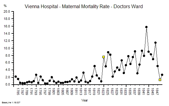
This challenge is not just about preventing another Mid Staffs – it is about preventing 1000’s of avoidable deaths and 100,000s of patients avoidably harmed every year in ‘average’ NHS trusts.

It is not a mass conspiracy of bad nurses, bad doctors, bad managers or bad policians that is the root cause.

It is poorly designed processes – and they are poorly designed because the nurses, doctors and managers have not learned how to design better ones.  And we do not know how because we were not trained to.  And that education gap was an accident – an unintended error of omission.  

Our urgently-improve-NHS-safety-challenge requires a system-wide safety-by-design educational and cultural transformation.

And that is possible because the knowledge of how to design, test and implement inherently safe processes exists. But it exists outside healthcare.

And that safety-by-design training is a worthwhile investment because safer-by-design processes cost less to run because they require less checking, less documenting, less correcting – and all the valuable nurse, doctor and manager time freed up by that can be reinvested in more care, better care and designing even better processes and systems.

Everyone Wins – except the cynics who have a choice: to eat humble pie or leave.

Footnote II:

In the debate that has followed the publication of the Francis Report a lot of scrutiny has been applied to the method by which an estimated excess mortality number is created and it is necessary to explore this in a bit more detail.

The HSMR is an estimate of relative risk – it does not say that a set of specific patients were the ones who came to harm and the rest were OK. So looking at individual deaths and looking for the specific causes is to completely misunderstand the method. So looking at the actual deaths individually and looking for identifiable cause-and-effect paths is an misuse of the message.  When very few if any are found to conclude that HSMR is flawed is an error of logic and exposes the ignorance of the analyst further.

HSMR is not perfect though – it has weaknesses.  It is a benchmarking process the”standard” of 100 is always moving because the collective goal posts are moving – the reference is always changing . HSMR is estimated using data submitted by hospitals themselves – the clinical coding data.  So the main weakness is that it is dependent on the quality of the clinicial coding – the errors of comission (wrong codes) and the errors of omission (missing codes). Garbage In Garbage Out.

Hospitals use clinically coded data for other reasons – payment. The way hospitals are now paid is based on the volume and complexity of that activity – Payment By Results (PbR) – using what are called Health Resource Groups (HRGs). This is a better and fairer design because hospitals with more complex (i.e. costly to manage) case loads get paid more per patient on average.  The HRG for each patient is determined by their clinical codes – including what are called the comorbidities – the other things that the patient has wrong with them. More comorbidites means more complex and more risky so more money and more risk of death – roughly speaking.  So when PbR came in it becamevery important to code fully in order to get paid “properly”.  The problem was that before PbR the coding errors went largely unnoticed – especially the comorbidity coding. And the errors were biassed – it is more likely to omit a code than to have an incorrect code. Errors of omission are harder to detect. This meant that by more complete coding (to attract more money) the estimated casemix complexity would have gone up compared with the historical reference. So as actual (not estimated) NHS mortality has gone down slightly then the HSMR yardstick becomes even more distorted.  Hospitals that did not keep up with the Coding Game would look worse even though  their actual risk and mortality may be unchanged.  This is the fundamental design flaw in all types of  benchmarking based on self-reported data.

The actual problem here is even more serious. PbR is actually a payment for activity – not a payment for outcomes. It is calculated from what it cost to run the average NHS hospital using a technique called Reference Costing which is the same method that manufacturing companies used to decide what price to charge for their products. It has another name – Absorption Costing.  The highest performers in the manufacturing world no longer use this out-of-date method. The implication of using Reference Costing and PbR in the NHS are profound and dangerous:

If NHS hospitals in general have poorly designed processes that create internal queues and require more bed days than actually necessary then the cost of that “waste” becomes built into the future PbR tariff. This means average length of stay (LOS) is financially rewarded. Above average LOS is financially penalised and below average LOS makes a profit.  There is no financial pressure to improve beyound average. This is called the Regression to the Mean effect.  Also LOS is not a measure of quality – so there is a to shorten length of stay for purely financial reasons – to generate a surplus to use to fund growth and capital investment.  That pressure is non-specific and indiscrimiate.  PbR is necessary but it is not sufficient – it requires an quality of outcome metric to complete it.    

So the PbR system is based on an out-of-date cost-allocation model and therefore leads to the very problems that are contributing to the MidStaffs crisis – financial pressure causing quality failures and increased risk of mortality.  MidStaffs may be a chance victim of a combination of factors coming together like a perfect storm – but those same factors are present throughout the NHS because they are built into the current design.

One solution is to move towards a more up-to-date financial model called stream costing. This uses the similar data to reference costing but it estimates the “ideal” cost of the “necessary” work to achieve the intended outcome. This stream cost becomes the focus for improvement – the streams where there is the biggest gap between the stream cost and the reference cost are the focus of the redesign activity. Very often the root cause is just poor operational policy design; sometimes it is quality and safety design problems. Both are solvable without investment in extra capacity. The result is a higher quality, quicker, lower-cost stream. Win-win-win. And in the short term that  is rewarded by a tariff income that exceeds cost and a lower HSMR.

Radically redesigning the financial model for healthcare is not a quick fix – and it requires a lot of other changes to happen first. So the sooner we start the sooner we will arrive. 

The Writing On The Wall – Part I

writing_on_the_wallThe writing is on the wall for the NHS.

It is called the Francis Report and there is a lot of it. Just the 290 recommendations runs to 30 pages. It would need a very big wall and very small writing to put it all up there for all to see.

So predictably the speed-readers have latched onto specific words – such as “Inspectors“.

Recommendation 137Inspection should remain the central method for monitoring compliance with fundamental standards.”

And it goes further by recommending “A specialist cadre of hospital inspectors should be established …”

A predictable wail of anguish rose from the ranks “Not more inspectors! The last lot did not do much good!”

The word “cadre” is not one that is used in common parlance so I looked it up:

Cadre: 1. a core group of people at the center of an organization, especially military; 2. a small group of highly trained people, often part of a political movement.

So it has a military, centralist, specialist, political flavour. No wonder there was a wail of anguish! Perhaps this “cadre of inspectors” has been unconsciously labelled with another name? Persecutors.

Of more interest is the “highly trained” phrase. Trained to do what? Trained by whom? Clearly none of the existing schools of NHS management who have allowed the fiasco to happen in the first place. So who – exactly? Are these inspectors intended to be protectors, persecutors, or educators?

And what would they inspect?

And how would they use the output of such an inspection?

Would the fear of the inspection and its possible unpleasant consequences be the stick to motivate compliance?
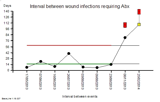
Is the language of the Francis Report going to create another brick wall of resistance from the rubble of the ruins of the reputation of the NHS?  Many self-appointed experts are already saying that implementing 290 recommendations is impossible.

They are incorrect.

The number of recommendations is a measure of the breadth and depth of the rot. So the critical-to-success factor is to implement them in a well-designed order. Get the first few in place and working and the rest will follow naturally.  Get the order wrong and the radical cure will kill the patient.

So where do we start?

Let us look at the inspection question again.  Why would we fear an external inspection? What are we resisting? There are three facets to this: first we do not know what is expected of us;  second we do not know if we can satisfy the expectation; and third we fear being persecuted for failing to achieve the impossible.

W Edwards Deming used a very effective demonstration of the dangers of well-intended but badly-implemented quality improvement by inspection: it was called the Red Bead Game.  The purpose of the game was to illustrate how to design an inspection system that actually helps to achieve the intended goal. Sustained improvement.

This is applied Improvement Science and I will illustrate how it is done with a real and current example.


I am assisting a department in a large NHS hospital to improve the quality of their service. I have been sent in as an external inspector.  The specific quality metric they have been tasked to improve is the turnaround time of the specialist work that they do. This is a flow metric because a patient cannot leave hospital until this work is complete – and more importantly it is a flow and quality metric because when the hospital is full then another patient, one who urgently needs to be admitted, will be waiting for the bed to be vacated. One in one out.

The department have been set a standard to meet, a target, a specification, a goal. It is very clear and it is easily measurable. They have to turnaround each job of work in less than 2 hours.  This is called a lead time specification and it is arbitrary.  But it is not unreasonable from the perspective of the patient waiting to leave and for the patient waiting to be admitted. Neither want to wait.

The department has a sophisticated IT system that measures their performance. They use it to record when each job starts and when each job is finished and from those two events the software calculates the lead time for each job in real-time. At the end of each day the IT system counts how many jobs were completed in less than 2 hours and compares this with how many were done in total and calculates a ratio which it presents as a percentage in the range of 0 and 100. This is called the process yield.  The department are dedicated and they work hard and they do all the work that arrives each day the same day – no matter how long it takes. And at the end of each day they have their score for that day. And it is almost never 100%.  Not never. Almost never. But it is not good enough and they are being blamed for it. In turn they blame others for making their job more difficult. It is a blame-game and it has been going on for years.

So how does an experienced Improvement Science-trained Inspector approach this sort of “wicked” problem?

First we need to get the writing on the wall – we need to see the reality – we need to “plot the dots” – we need to see what the performance is doing over time – we need to see the voice of the process. And that requires only their data, a pencil, some paper and for the chart to be put on the on the wall where everyone can see it.

Chart_1This is what their daily % yield data for three consecutive weeks looked like as a time-series chart. The thin blue line is the 100% yield target.

The 100% target was only achieved on three days – and they were all Sundays. On the other Sunday it was zero (which may mean that there was no data to calculate a ratio from).

There is wide variation from one day to the next and it is the variation as well as the average that is of interest to an improvement scientist. What is the source of the variation it? If 100% yield can be achieved some days then what is different about those days?

Chart_2

So our Improvement science-trained Inspector will now re-plot the data in a different way – as rational groups. This exposes the issue clearly. The variation on Weekends is very wide and the performance during the Weekdays is much less variable.  What this says is that the weekend system and the weekday system are different. This means that it is invalid to combine the data for both.

It also raises the question of why there is such high variation in yield only at weekends?  The chart cannot answer the question, so our IS-trained Inspector digs a bit deeper and discovers that the volume of work done at the weekend is low, the staffing of the department is different, and that the recording of the events is less reliable. In short – we cannot even trust the weekend data – so we have two reasons to justify excluding it from our chart and just focusing on what happens during the week.

Chart_3We re-plot our chart, marking the excluded weekend data as not for analysis.

We can now see that the weekday performance of our system is visible, less variable, and the average is a long way from 100%.

The team are working hard and still only achieving mediocre performance. That must mean that they need something that is missing. Motivating maybe. More people maybe. More technology maybe.  But there is no more money for more people or technology and traditional JFDI motivation does not seem to have helped.

This looks like an impossible task!

Chart_4

So what does our Inspector do now? Mark their paper with a FAIL and put them on the To Be Sacked for Failing to Meet an Externally Imposed Standard heap?

Nope.

Our IS-trained Inspector calculates the limits of expected performance from the data  and plots these limits on the chart – the red lines.  The computation is not difficult – it can be done with a calculator and the appropriate formula. It does not need a sophisticated IT system.

What this chart now says is “The current design of this process is capable of delivering between 40% and 85% yield. To expect it do do better is unrealistic”.  The implication for action is “If we want 100% yield then the process needs to be re-designed.” Persecution will not work. Blame will not work. Hoping-for-the-best will not work. The process must be redesigned.

Our improvement scientist then takes off the Inspector’s hat and dons the Designer’s overalls and gets to work. There is a method to this and it is called 6M Design®.

Chart_5

First we need to have a way of knowing if any future design changes have a statistically significant impact – for better or for worse. To do this the chart is extended into the future and the red lines are projected forwards in time as the black lines called locked-limits.  The new data is compared with this projected baseline as it comes in.  The weekends and bank holidays are excluded because we know that they are a different system. On one day (20/12/2012) the yield was surprisingly high. Not 100% but more than the expected upper limit of 85%.

Chart_6The alerts us to investigate and we found that it was a ‘hospital bed crisis’ and an ‘all hands to the pumps’ distress call went out.

Extra capacity was pulled to the process and less urgent work was delayed until later.  It is the habitual reaction-to-a-crisis behaviour called “expediting” or “firefighting”.  So after the crisis had waned and the excitement diminished the performance returned to the expected range. A week later the chart signals us again and we investigate but this time the cause was different. It was an unusually quiet day and there was more than enough hands on the pumps.

Both of these days are atypically good and we have an explanation for each of them. This is called an assignable cause. So we are justified in excluding these points from our measure of the typical baseline capability of our process – the performance the current design can be expected to deliver.

An inexperienced manager might conclude from these lessons that what is needed is more capacity. That sounds and feels intuitively obvious and it is correct that adding more capacity may improve the yield – but that does not prove that lack of capacity is the primary cause.  There are many other causes of long lead times  just as there are many causes of headaches other than brain tumours! So before we can decide the best treatment for our under-performing design we need to establish the design diagnosis. And that is done by inspecting the process in detail. And we need to know what we are looking for; the errors of design commission and the errors of design omission. The design flaws.

Only a trained and experienced process designer can spot the flaws in a process design. Intuition will trick the untrained and inexperienced.


Once the design diagnosis is established then the redesign stage can commence. Design always works to a specification and in this case it was clear – to significantly improve the yield to over 90% at no cost.  In other words without needing more people, more skills, more equipment, more space, more anything. The design assignment was made trickier by the fact that the department claimed that it was impossible to achieve significant improvement without adding extra capacity. That is why the Inspector had been sent in. To evaluate that claim.

The design inspection revealed a complex adaptive system – not a linear, deterministic, production-line that manufactures widgets.  The department had to cope with wide variation in demand, wide variation in quality of request, wide variation in job complexity, and wide variation in urgency – all at the same time.  But that is the nature of healthcare and acute hospital work. That is the expected context.

The analysis of the current design revealed that it was not well suited for this requirement – and the low yield was entirely predictable. The analysis also revealed that the root cause of the low yield was not lack of either flow-capacity or space-capacity.

This insight led to the suggestion that it would be possible to improve yield without increasing cost. The department were polite but they did not believe it was possible. They had never seen it, so why should they be expected to just accept this on faith?

Chart_7So, the next step was to develop, test and demonstrate a new design and that was done in three stages. The final stage was the Reality Test – the actual process design was changed for just one day – and the yield measured and compared with the predicted improvement.

This was the validity test – the proof of the design pudding. And to visualise the impact we used the same technique as before – extending the baseline of our time-series chart, locking the limits, and comparing the “after” with the “before”.

The yellow point marks the day of the design test. The measured yield was well above the upper limit which suggested that the design change had made a significant improvement. A statistically significant improvement.  There was no more capacity than usual and the day was not unusually quiet. At the end of the day we held a team huddle.

Our first question was “How did the new design feel?” The consensus was “Calmer, smoother, fewer interruptions” and best of all “We finished on time – there was no frantic catch up at the end of the day and no one had to stay late to complete the days work!”

The next question was “Do we want to continue tomorrow with this new design or revert back to the old one?” The answer was clear “Keep going with the new design. It feels better.”

The same chart was used to show what happened over the next few days – excluding the weekends as before. The improvement was sustained – it did not revert to the original because the process design had been changed. Same work, same capacity, different process – higher yield. The red flags on the charts mark the statistically significant evidence of change and the cluster of red flags is very strong statistical evidence that the improvement is not due to chance.

The next phase of the 6M Design® method is to continue to monitor the new process to establish the new baseline of expectation. That will require at least twelve data points and it is in progress. But we have enough evidence of a significant improvement. This means that we have no credible justification to return to the old design, and it also implies that it is no longer valid to compare the new data against the old projected limits. Our chart tells us that we need to split the data into before-and-after and to calculate new averages and limits for each segment separately. We have changed the voice of the process by changing the design.

Chart_8And when we split the data at the point-of-change then the red flags disappear – which means that our new design is stable. And it has a new capability – a better one. We have moved closer to our goal of 100% yield. It is still early days and we do not really have enough data to calculate the new capability.

What we can say is that we have improved average quality yield from 63% to about 90% at no cost using a sequence of process diagnose, design, deliver.  Study-Plan-Do.

And we have hard evidence that disproves the impossibility hypothesis.


And that was the goal of the first design change – it was not to achieve 100% yield in one jump. Our design simulation had predicted an improvement to about 90%.  And there are other design changes to follow that need this stable foundation to build on.  The order of implementation is critical – and each change needs time to bed in before the next change is made. That is the nature of the challenge of improving a complex adaptive system.

The cost to the department was zero but the benefit was huge.  The bigger benefit to the organisation was felt elsewhere – the ‘customers’ saw a higher quality, quicker process – and there will be a financial benefit for the whole system. It will be difficult to measure with our current financial monitoring systems but it will be real and it will be there – lurking in the data.

The improvement required a trained and experienced Inspector/Designer/Educator to start the wheel of change turning. There are not many of these in the NHS – but the good news is that the first level of this training is now available.

What this means for the post-Francis Report II NHS is that those who want to can choose to leap over the wall of resistance that is being erected by the massing legions of noisy cynics. It means we can all become our own inspectors. It means we can all become our own improvers. It means we can all learn to redesign our systems so that they deliver higher safety, better quality, more quickly and at no extra one-off or recurring cost.  We all can have nothing to fear from the Specialist Cadre of Hospital Inspectors.

The writing is on the wall.


15/02/2013 – Two weeks in and still going strong. The yield has improved from 63% to 92% and is stable. Improvement-by-design works.

10/03/2013 – Six weeks in and a good time to test if the improvement has been sustained.

TTO_Yield_WeeklyThe chart is the weekly performance plotted for 17 weeks before the change and for 5 weeks after. The advantage of weekly aggregated data is that it removes the weekend/weekday 7-day cycle and reduces the effect of day-to-day variation.

The improvement is obvious, significant and has been sustained. This is the objective improvement. More important is the subjective improvement.

Here is what Chris M (departmental operational manager) wrote in an email this week (quoted with permission):

Hi Simon

It is I who need to thank you for explaining to me how to turn our pharmacy performance around and ultimately improve the day to day work for the pharmacy team (and the trust staff). This will increase job satisfaction and make pharmacy a worthwhile career again instead of working in constant pressure with a lack of achievement that had made the team feel rather disheartened and depressed. I feel we can now move onwards and upwards so thanks for the confidence boost.

Best wishes and many thanks

Chris

This is what Improvement Science is all about!

Robert Francis QC

press_on_screen_anim_150_wht_7028Today is an important day.

The Robert Francis QC Report and recommendations from the Mid-Staffordshire Hospital Crisis has been published – and it is a sobering read.  The emotions that just the executive summary evoked in me were sadness, shame and anger.  Sadness for the patients, relatives, and staff who have been irreversibly damaged; shame that the clinical professionals turned a blind-eye; and anger that the root cause has still not been exposed to public scrutiny.

Click here to get a copy of the RFQC Report Executive Summary.

Click here to see the video of RFQC describing his findings. 

The root cause is ignorance at all levels of the NHS.  Not stupidity. Not malevolence. Just ignorance.

Ignorance of what is possible and ignorance of how to achieve it.

RFQC rightly focusses his recommendations on putting patients at the centre of healthcare and on making those paid to deliver care accountable for the outcomes.  Disappointingly, the report is notably thin on the financial dimension other than saying that financial targets took priority over safety and quality.  He is correct. They did. But the report does not say that this is unnecessary – it just says “in future put safety before finance” and in so doing he does not challenge the belief that we are playing a zero-sum-game. The  assumotion that higher-quality-always-costs-more.

This assumption is wrong and can easily be disproved.

A system that has been designed to deliver safety-and-quality-on-time-first-time-and-every-time costs less. And it costs less because the cost of errors, checking, rework, queues, investigation, compensation, inspectors, correctors, fixers, chasers, and all the other expensive-high-level-hot-air-generation-machinery that overburdens the NHS and that RFQC has pointed squarely at is unnecessary.  He says “simplify” which is a step in the right direction. The goal is to render it irrelevent.

The ignorance is ignorance of how to design a healthcare system that works right-first-time. The fact that the Francis Report even exists and is pointing its uncomfortable fingers-of-evidence at every level of the NHS from ward to government is tangible proof of this collective ignorance of system design.

And the good news is that this collective ignorance is also unnecessary … because the knowledge of how to design safe-and-affordable systems already exists. We just have to learn how. I call it 6M Design® – but  the label is irrelevent – the knowledge exists and the evidence that it works exists.

So here are some of the RFQC recommendations viewed though a 6M Design® lens:       

1.131 Compliance with the fundamental standards should be policed by reference to developing the CQC’s outcomes into a specification of indicators and metrics by which it intends to monitor compliance. These indicators should, where possible, be produced by the National Institute for Health and Clinical Excellence (NICE) in the form of evidence-based procedures and practice which provide a practical means of compliance and of measuring compliance with fundamental standards.

This is the safety-and-quality outcome specification for a healthcare system design – the required outcome presented as a relevent metric in time-series format and qualified by context.  Only a stable outcome can be compared with a reference standard to assess the system capability. An unstable outcome metric requires inquiry to understand the root cause and an appropriate action to restore stability. A stable but incapable outcome performance requires redesign to achieve both stability and capability. And if  the terms used above are unfamiliar then that is further evidence of system-design-ignorance.   
 
1.132 The procedures and metrics produced by NICE should include evidence-based tools for establishing the staffing needs of each service. These measures need to be readily understood and accepted by the public and healthcare professionals.

This is the capacity-and-cost specification of any healthcare system design – the financial envelope within which the system must operate. The system capacity design works backwards from this constraint in the manner of “We have this much resource – what design of our system is capable of delivering the required safety and quality outcome with this capacity?”  The essence of this challenge is to identify the components of poor (i.e. wasteful) design in the existing systems and remove or replace them with less wasteful designs that achieve the same or better quality outcomes. This is not impossible but it does require system diagnostic and design capability. If the NHS had enough of those skills then the Francis Report would not exist.

1.133 Adoption of these practices, or at least their equivalent, is likely to help ensure patients’ safety. Where NICE is unable to produce relevant procedures, metrics or guidance, assistance could be sought and commissioned from the Royal Colleges or other third-party organisations, as felt appropriate by the CQC, in establishing these procedures and practices to assist compliance with the fundamental standards.

How to implement evidence-based research in the messy real world is the Elephant in the Room. It is possible but it requires techniques and tools that fall outside the traditional research and audit framework – or rather that sit between research and audit. This is where Improvement Science sits. The fact that the Report only mentions evidence-based practice and audit implies that the NHS is still ignorant of this gap and what fills it – and so it appears is RFQC.   

1.136 Information needs to be used effectively by regulators and other stakeholders in the system wherever possible by use of shared databases. Regulators should ensure that they use the valuable information contained in complaints and many other sources. The CQC’s quality risk profile is a valuable tool, but it is not a substitute for active regulatory oversight by inspectors, and is not intended to be.

Databases store data. Sharing databases will share data. Data is not information. Information requires data and the context for that data.  Furthermore having been informed does not imply either knowledge or understanding. So in addition to sharing information, the capability to convert information-into-decision is also required. And the decisions we want are called “wise decisions” which are those that result in actions and inactions that lead inevitably to the intended outcome.  The knowledge of how to do this exists but the NHS seems ignorant of it. So the challenge is one of education not of yet more investigation.

1.137 Inspection should remain the central method for monitoring compliance with fundamental standards. A specialist cadre of hospital inspectors should be established, and consideration needs to be given to collaborative inspections with other agencies and a greater exploitation of peer review techniques.

This is audit. This is the sixth stage of a 6M Design® – the Maintain step.  Inspectors need to know what they are looking for, the errors of commission and the errors of omission;  and to know what those errors imply and what to do to identify and correct the root cause of these errors when discovered. The first cadre of inspectors will need to be fully trained in healthcare systems design and healthcare systems improvement – in short – they need to be Healthcare Improvementologists. And they too will need to be subject to the same framework of accreditation, and accountability as those who work in the system they are inspecting.  This will be one of the greatest of the challenges. The fact that the Francis report exists implies that we do not have such a cadre. Who will train, accredit and inspect the inspectors? Who has proven themselves competent in reality (not rhetorically)?

1.163 Responsibility for driving improvement in the quality of service should therefore rest with the commissioners through their commissioning arrangements. Commissioners should promote improvement by requiring compliance with enhanced standards that demand more of the provider than the fundamental standards.

This means that commissioners will need to understand what improvement requires and to include that expectation in their commissioning contracts. This challenge is even geater that the creation of a “cadre of inspectors”. What is required is a “generation of competent commissioners” who are also experienced and who have demonstrated competence in healthcare system design. The Commissioners-of-the-Future will need to be experienced healthcare improvementologists.

The NHS is sick – very sick. The medicine it needs to restore its health and vitality does exist – and it will not taste very nice – but to withold an effective treatment for an serious illness on that basis is clinical negligence.

It is time for the NHS to look in the mirror and take the strong medicine. The effect is quick – it will start to feel better almost immediately. 

To deliver safety and quality and quickly and affordably is possible – and if you do not believe that then you will need to muster the humility to ask to have the how demonstrated.

6MDesign


Kicking the Habit

no_smoking_400_wht_6805It is not easy to kick a habit. We all know that. And for some reason the ‘bad’ habits are harder to kick than the ‘good’ ones. So what is bad about a ‘bad habit’ and why is it harder to give up? Surely if it was really bad it would be easier to give up?

Improvement is all about giving up old ‘bad’ habits and replacing them with new ‘good’ habits – ones that will sustain the improvement. But there is an invisible barrier that resists us changing any habit – good or bad. And it is that barrier to habit-breaking that we need to understand to succeed. Luck is not a reliable ally.

What does that habit-breaking barrier look like?

The problem is that it is invisible – or rather it is emotional – or to be precise it is chemical.

Our emotions are the output of a fantastically complex chemical system – our brains. And influencing the chemical balance of our brains can have a profound effect on our emotions.  That is how anti-depressants work – they very slightly adjust the chemical balance of every part of our brains. The cumulative effect is that we feel happier.  Nicotine has a similar effect.

And we can achieve the same effect without resorting to drugs or fags – and we can do that by consciously practising some new mental habits until they become ingrained and unconscious. We literally overwrite the old mental habit.

So how do we do this?

First we need to make the mental barrier visible – and then we can focus our attention on eroding it. To do that we need to remove the psychological filter that we all use to exclude our emotions. It is rather like taking off our psychological sunglasses.

When we do that the invisible barrier jumps into view: illuminated by the glare of three negative emotions.  Sadness, fear, and anxiety.  So whenever we feel any of these we know there is a barrier to improvement hiding  the emotional smoke. This is the first stage: tune in to our emotions.

The next step is counter-intuitive. Instead of running away from the negative feeling we consciously flip into a different way of thinking.  We actively engage with our negative feelings – and in a very specific way. We engage in a detached, unemotional, logical, rational, analytical  ‘What caused that negative feeling?’ way.

We then focus on the causes of the negative emotions. And when we have the root causes of our Niggles we design around them, under them, and over them.  We literally design them out of our heads.

The effect is like magic.

And this week I witnessed a real example of this principle in action.

figure_pressing_power_button_150_wht_10080One team I am working with experienced the Power of Improvementology. They saw the effect with their own eyes.  There were no computers in the way, no delays, no distortion and no deletion of data to cloud the issue. They saw the performance of their process jump dramatically – from a success rate of 60% to 96%!  And not just the first day, the second day too.  “Surprised and delighted” sums up their reaction.

So how did we achieve this miracle?

We just looked at the process through a different lens – one not clouded and misshapen by old assumptions and blackened by ignorance of what is possible.  We used the 6M Design® lens – and with the clarity of insight it brings the barriers to improvement became obvious. And they were dissolved. In seconds.

Success then flowed as the Dam of Disbelief crumbled and was washed away.

figure_check_mark_celebrate_anim_150_wht_3617The chaos has gone. The interruptions have gone. The expediting has gone. The firefighting has gone. The complaining has gone.  These chronic Niggles have have been replaced by the Nuggets of calm efficiency, new hope and visible excitement.

And we know that others have noticed the knock-on effect because we got an email from our senior executive that said simply “No one has moaned about TTOs for two days … something has changed.”    

That is Improvementology-in-Action.


The Management of Victimosis

erasable_sad_face_150_wht_6089One of the commonest psycho-socio-economic diseases is Victimosis.

This disease has a characteristic set of symptoms and signs. The symptoms are easy to detect – and the easiest way is to close your eyes and listen to the language being used. There is a characteristic vocabulary.  ‘Yes but’ is common as is ‘If only’ and ‘They should’ and ‘Not my’ and ‘Too busy’.  Hearing these phrases used frequently is good evidence that the subject is suffering from Victimosis.

Everyone suffers from Acute Victimosis occasionally, especially if they are tired and suffer a series of emotional set backs.  With the support of relatives and friends our psychoimmune system is able to combat the cause and return us to healthy normality. We are normally able to heal our emotional wounds.

Unfortunately Victimosis is an infectious and highly contagious condition and with a large enough innoculum it can spread until almost everyone in the organisation is affected to some degree.  When this happens the Victimosis behaviour can become the norm and awareness of the symptoms slips from consciousness. Victimosis then becomes the unspoken dominant culture and the transition to the Chronic Victimosis phase is complete.

dna_magnifying_glass_150_wht_8959Research has shown that Victimosis is an acquired disease linked to a transmissable meme that is picked up early in life. The meme can be transmitted person-to-person and also through mass communication systems which then leads to rapid dissemination. Typical channels are newspapers, television, the internet and now social media.  Just sample the daily news and observe how much Victimosis language is in circulation.

Those more susceptible to infection can develop into chronic carriers who constantly infect and reinfect others.  The outward mainfestations of the chronic form are incessant complaining, criticising, irrational decisions, ineffective actions, blaming and eventually depression, hopelessness and terminal despair.  The chronically infected may aggregate into like-minded groups as a safety-in-numbers reflex response.  These groups are characterised  by having a high proportion of people with the same temperament; particularly the Guardian preference (the Supervisors, Inspectors, Providers and Protectors who make up two thirds of the population).

Those able to resist infection find the context and culture toxic and they take action. They leave.

The outward manifestations of Chronic Victimosis are GroupThink and Silosis.  GroupThink is where collectives start to behave as one and their group-rhetoric becomes progressively less varied and more dogmatic. Silosis is a form of organisational tribalism where Departments become separated from each other, conceptually, emotionally, physically and financially. Both natural reactions only aggravate the condition and accelerate the decline.

patient_stumbling_with_bandages_150_wht_6861One of the effects of the Victimosis-meme is Agnostic Hyper-Reactivity. This is where both the Individuals and their Silos develop a thick emotional protective membrane that distorts their perception.  It is not that they do not sense what is happening – it is that they do not perceive it or that they perceive it in a distorted way.  This is the Agnosia part – literally ‘not knowing’.

Unfortunately being ignorant of Reality does not help and eventually the pressure of Reality builds up and punches a hole through the emotional barrier.  Something exceptionally bad happens that cannot be discounted or ignored. This is the ‘crisis‘ stage and it elicits a characteristic reflex reaction. An emotional knee-jerk. Unfortunately the reflex is an over-reaction and is poorly focussed and badly coordinated – so it does more harm than good.

This is the hyper-reactivity part.

The blind reflex reaction further destabilises an already unstable situation and accelerates the decline.  It creates a positive feedback loop that can quickly escalate to verbal, written and then psychological and physical conflict. The Lose-Lose-Lose of Self-Destructive behaviour that is characteristic of the late phase.  And that is not all.  Over time the reflex reaction gets less effective as the Victimosis Membrane thickens. The reflex fades out.  This is a dangerous development because on the surface it looks like things are improving, there is less conflict, but in reality the patient is slipping into pre-terminal Victimosis.

Fortunately there is a treatment for Victimosis.

It is called Positivicillin.

herbal_supplement_400_wht_8492This is not a new wonder drug, it is a natural product. We all produce Positivicillin and some of us produce more than others: they are called Optimists.  Positivicillin works by channelling the flow of emotional energy into the reflection-and-action pathways. Naturally occurring Positivicillin has a long-half life: the warm glow of success lasts a long time.  Unfortunately Positivicillin is irreversibly deactivated by the emotional toxin generated by the Victimosis meme: a toxin called Discountin. So in the presence of Discountin the affected person needs to generate more Positivicillin and to do so continuously and this leads to emotional exhaustion. The diffusion of Positivicillin is impeded by the Victimosis Membrane so if subject has a severe case of Chronic Victimosis then they may need extrinsic Positivicillin treatment at high dose and for a long time to prevent terminal decline. The primary goal of emergency treatment is to neutralise the excess Discountin for long enough that the natural production of Positivicillin can start to work.

So where can we get supplies of extrinsic Positivicillin from?

In its pure form Positivicillin is rare and expensive.  The number of naturally occurring Eternal Optimist Exporters is small and their collective Positivicillin production capability is limited. Healthy organisations value and attract them; unhealthy ones discount and reject them.

wine_toast_pc_400_wht_4449no_smoking_400_wht_6805So we are forced to resort to using more abundant, cheaper but inferior drugs.  One is called Alcoholimycin and another is Tobaccomycin.  They are both widely available and affordable but they have long term irreversible toxic side effects.

Chronic Victimosis is endemic so chronic abuse of Tobaccomycin and Alcoholimycin is common and, in an attempt to restrict their negative long term effects, both drugs are heavily taxed by the Authorities.

Unfortunately this only aggravates the spread of Chronic Victimosis which some report is a sign of the same condition affecting the Authorties! These radicals are calling for de-regulation of the more potent variants such a Cannabisimycin but the Authorities have opted for a tightly regulated supply of symptom-suppressants such as Anxiolytin and Antidepressin. These are now freely available and do help those who want to learn to cure themselves.

The long term goal of the Victimosis Research Council is to develop ways to produce pure Positivicillin and to treat the most severe cases of Chronic Victimosis; and to find ways to boost the natural production of Positivicillin within less seriously affected individuals and organisations.


Chronic Victimosis is not a new disease – it has been described in various forms throughout recorded history – so the search for a cure starts with the historical treatments – one of which is Confessmycin. This has been used for centuries and appears to work well for some but not others and this idiosyncratic response is believed to be due to the presence (or not) of the Rel-1-Gion meme. Active dissemination of a range of Rel-1-Gion meme variants (and the closely linked Pol-1-Tic meme variants) has been tried with considerable success but does not appear to be a viable long term option.

A recent high-tech approach is called a Twimplant.  This is an example of the Social-Media class of biopsychosocial feedback loops that uses the now ubiquitous mobiphonic symbiont to connect the individual to a regular supply of positive support, ideas and evidence called P-Tweets.  It is important to tune the Twimplant correctly because the same device can also pick up distress signals broadcast by sufferers of Chronic Victimosis who are attempting to dilute their Discountin by digitising it and exporting it to everyone else. These are called N-Tweets and are easily identifiable by their Victimosis vocabulary. N-tweets can be avoided by adopting an Unfollow policy.

heart_puzzle_piece_missing_pa_150_wht_4829One promising line of new research is called R2LM probe therapy.  This is an unconventional and innovative way of curing Chronic Victimosis. The R2LM probe is designed to identify the gaps in the organisational memetic code and to guide delivery of specific meme transplants that fill the gaps it reveals. One common gap is called the OM-meme deletion and one effective treatment for this is called FISH. Taking a course of FISH injections or using a FISH immersion technique leads to a rapid and sustained improvement in emotional balance.  That in-turn leads to an increase in the natural production of Positivicillin. From that point on the individual and can dissolve the Victimosis Membrance and correct their perceptual distortion. The treatment is sometimes uncomfortable but those who completed the course will vouch for its effectiveness.

For the milder forms of Victimosis it is possible to self-diagnose and to self-treat.

The strategy here is to actively reduce the production of Discountin and to boost the natural production of Positivicillin. These have a synergistic effect. The first step is to practice listening for the Victimosis vocabulary using a list of common phrases.  The patient is taught to listen for these in spoken communication and to look for them in written communication. Spoken communication includes their Internal Voice. The commonest phrases are:

1. “Yes but …”
2. “If only  …”
3. “I/You/We/They should …”
4. “I/We can’t …”
5. “I/We hope …”
6. “Not My/Our fault …”
7. “Constant struggle …”
8. “I/We do not know …”
9. “I am too busy to …”

The negative emotional impact of these phrases is caused by the presence of the Discountin toxin.

The second step is to substitute the contaminated phrase with an equivalent one where the Discountin is deactivated using Positivicillin. This deliberate and conscious substitution is easiest in written communication, then externally spoken and finally the Internal Voice. The replacements for the above are …

1. “Yes, and …”
2. “Next time …”
3. “I/We could …”
4. “I/We can …”
5. “I/We know …”
6. “My/Our responsibility …”
7. “Endless opportunity …”
8. “I/We will learn …”
9. “It is too important not to …”

figure_check_mark_celebrate_anim_150_wht_3617The system-wide benefits of the prompt and effective management of Chronic Victimosis are enormous. There is more reflective consideration and more effective action. There is success and celebration where before there was failure and frustration. The success stimulates natural release of more Positivicillin which builds a positive reinforcement feedback loop.  In addition the other GA-memes become progressively switched off and the signs of Passive Persecutitis and Reactive Rescuopathy resolve.

The combined effect leads to the release of Curiositonin, the natural inquisitiveness hormone, and Excitaline – the hormone that causes the addictive feeling of eager anticipation. The racing heart and the dry mouth.

From then on the ex-patient is able to maintain their emotional balance, to further develop their emotional resilience, and to assist other sufferers.  And that is a win for everyone.

The Heart of Change

In 1628 a courageous and paradigm shifting act happened. A small 72-page book was published in Frankfurt that openly challenged 1500 years of medical dogma. The book challenged the authority of Galen (129-200) the most revered medical researcher of antiquity and Hippocrates (460 BC – 370 BC) the Father of Medicine.

The writer of the book was a respected and influential English doctor called William Harvey (1578-1657) who was physician to King James I and who became personal physician to King Charles I.

William_HarveyWilliam Harvey was from yeoman stock. The salt-of-the-earth. Loyal, honest and hard-working free men often owned their land – but who were way down the social pecking order. They were the servant class.

William was the eldest son of Thomas Harvey from Folkstone who had a burning ambition to raise the station of his family from yeoman to gentry. This implied that the family was allowed to have their own coat of arms. To the modern mind this is almost meaningless – in the 17th Century it was not!

And Thomas was wealthy enough to have William formally educated and the dutiful William worked hard at his studies and was rewarded by gaining a place at Caius College in Cambridge University.  John Caius (1510-1573) was a physician who had studied in Padua, Italy – the birthplace of modern medicine. William did well and after graduating from Cambridge in 1597 he too travelled through Europe to study in Padua. There he saw Galenic dogma challenged and defused using empirical evidence. This was at the same time that Galileo Galilei (1564-1642) was challenging the geocentric dogma of the Catholic Church using empirical evidence gained by simple celestial observation with his new telescope. This was the Renaissance. The Rebirth of Learning. This was the end of the Dark Ages of Dogma.

Harvey brought this “new thinking” back to Elizabethan England and decided to focus his attention on the heart. And what Harvey discovered was that the accepted truth from the ancients about how the heart worked was wrong. Galen was wrong. Hippocrates was wrong.

But this was not the most interesting part of the story.  It was the how he proved it that was radically different. He used evidence from reality to disprove the rhetoric. He used the empirical method espoused by Francis Bacon (1561-1626): what we now call the Scientific Method. In effect what Harvey said was “If you do not believe or agree with me then all you need to do is repeat the observation yourself.  Do an autopsy“.  [aut=self and opsy=see]. William Harvey saw and conducted human dissection in Padua, and practiced both it and animal vivisection back in England – and by that means he discovered how the heart actually worked.

Harvey opened a crack in the cultural ice that had frozen medical innovation for 1500 years. The crack in the paradigm was a seed of doubt planted by a combination of curiosity and empirical experimentation:

Q1: If Galen was wrong about the heart then what else was he wrong about? The Four Humours too?
Q2: If the heart is just a simple pump then where does the Spirit reside?

Looking back with our 21st century perspective these are meaningless questions.  To a person in the 17th Century these were fundamental paradigm-challenging questions.  They rocked the whole foundation of their belief system.  The believed that illness was a natural phenomenon and was not caused by magic, curses and evil spirits; but they believed that celestial objects, the stars and planets, were influential. In 1628 astronomy and astrology were the same thing.   

And Harvey was savvy. He was both religious and a devout Royalist and he knew that he would need the support of the most powerful person in England – the monarch. And he knew that he needed to be a respectable member of a powerful institution – the Royal College of Physicians (RCP) which he gained in 1604. A remarkable achievement in itself for someone of yeoman stock. With this ticket he was able to secure a position at St Bartholomew’s Hospital in Smithfield, London and in 1615 he became the RCP Lumleian Lecturer which involved lecturing on anatomy – which he did from 1616.  By virtue of his position Harvey was able to develop a lucrative private practice in London and by that route was introduced to the Court. In 1618 he was appointed as Physician Extraordinary to King James I. [The Physician Ordinary was the top job].

And even with this level of influence, credibility and royal support his paradigm-challenging message met massive cultural and political resistance because he was challenging a 1500 year old belief.

Over the 12 years between 1616 and 1628 Harvey invested a lot of time sharing his ideas and the evidence with influential friends and he used their feedback to deepen his understanding, to guide his experiments, and to sharpen his arguments. He had learned how to debate at school and had developed his skill at Cambridge so he know how to turn argments-against into arguments-for.

Harvey was intensely curious, he knew how to challenge himself, to learn, to influence others, and to change their worldview.  He knew that easily observable phenomemon could help spread the message – such as the demonstration of venous valves in the arm illustrated in his book.  

DeMotuCordisAfter the publication of De Motu Cordis in 1628 his personal credibility and private practice suffered massively because as a self-declared challenger of the current paradigm he was treated with skepticism and distrust by his peers. Gossip is effective.

And even with all his passion, education, evidence, influence and effort it still took 20 years for his message to become widely enough accepted to survive him.  And it did so because others resonated with the message; others like a Rene Descartes (1596-1650). 

William Harvey is now remembered as one of the founders of modern medical science.  When he published De Motu Cordis he triggered a paradim shift – one that we take for granted today.  Harvey showed that the path to improvement is through respectfully challenging accepted dogma with a combination of curiosity, humility, hard-work, and empirical evidence. Reality reinforced rhetoric.

Today we are used to having the freedom of speech and we are familiar with using experimental data to test our hypotheses.  In 1628 this was new thinking and was very risky. People were burned at the stake for challenging the authority of the Catholic Church and the Holy Roman Inquisition was still active well into the 18th Century!

Harvey was also innovative in the use of arithmetic. He showed that the volume of blood pumped by the heart in a day was far more than the liver could reasonably generate.  But at that time arithmetic was the domain of merchants, accountants and money-lenders and was not seen as a tool that a self-respecting natural philosopher would use!  The use of mathematics as a scientific tool did not really take off until after Sir Isaac Newton (1642-1727) published the Principia in 1687 – 30 years after Harvey’s death. [To read more about William Harvey click here].

William Harvey was an Improvementologist.

 So what lessons can modern Improvement Scientists draw from his story?

  • The first is that all significant challanges to current thinking will meet emotional and political resistance. They will be discounted and ridiculed because they challenge the authority of experts.
  • The second is that challenges must be made respectfully. The current thinking has both purpose and value. Improvements build on the foundation of knowledge and only challenge what is not fit for purpose.
  • The third is that the challenge must be more than rhetorical – it must be backed with replicatable evidence. A difference of opinion is just that. Reality is the ultimate arbiter.
  • The fourth is that having an idea is not enough – testig, proving, explaining and demonstrating are needed too. It is hard work to change a mental paradigm and it requires an emotionally secure context to do it. People who are under pressure will find it more difficult and more traumatic. 
  • The fifth is that patience and persistence are needed. Worldview change takes time and happen in small steps. The new paradigm needs to find its place.

And Harvey did not say that Galen and Hippocrates were completely wrong – just partly wrong. And he explained that the reason that Hippocrates and Galen could not test their ideas about human anatomy was because dissection of human bodies was illegal in Greek and Roman societies. Padua in Renaissance Italy was one of the first places where dissection was permitted by Law.   

So which part of the Galenic dogma did Harvey challenge?

He challenged the dogma that blood was created continuously by the liver. He challenged the dogma that there were invisible pores between the right and left sides of the heart. He challenged the dogma that the arteries ‘sucked’ the blood from the heart. He challenged the dogma that the ‘vitalised’ arterial blood was absorbed by the tissues. And he challenged these beliefs with empirical evidence. He showed evidence that the blood circulated fom the right heart to the lungs to the left heart to the body and back to the right heart. He showed evidence that the heart was a muscular pump. And he showed evidence that it worked the same way in man and in animals.  

FourHumoursIn so doing he undermined the foundation of the whole paradigm of ancient belief that illness was the result of an imbalance between the Four Humours. Yellow Bile (associated with the liver), Black Bile (associated with the Spleen), Blood (as ociated with the heart) and Phlegm (associated with the lungs).   

We still have the remnants of this ancient belief in our language.  The Four Humours were also associated with Four Temperaments – four observable personality types. The phlegmatic type (excess phlegm), the sanguine type (excess blood), the choleric type (excess yellow bile), and the melancholic type (excess black bile).

We still talk about “the heart of the matter” and being “heartless”, “heartfelt”  and “change of heart” because the heart was believed to be where emotion and passion resided. Sanguine is the term given to people who show warmth, passion, a live-now-pay-later, optimistic and energetic disposition. And this is not an unreasonable hypothesis given that we are all very aware of changes in how our heart beats when we are emotionally aroused; and how the color of our skin changes.

So when Harvey suggested that blood flowed in a circle from the heart to the arteries and back to the heart via the veins; and that the heart was just a pump then this idea shook the current paradigm on many levels – right down to its roots.

And the ancient justification for a whole raft of medical diagnoses, prognoses and treatments was challenged. The House of Cards was challenged. And many people owed their livelihoods to these ancient beliefs – so it is no surprise that his peers were not jumping  for joy to hear what Harvey said.

But Harvey had reality on his side – and reality trumps rhetoric.

And the same is true today, 500 years later.

The current paradigm is being shaken. The belief that we can all live today and pay tomorrow. The belief that our individual actions have no global impact and no long lasting consequences. The belief that competition is the best route to contentment.

The evidence is accumulating that these beliefs are wrong.

The difference is that today the paradigm is being challenged by a collective voice – not by a lone voice.

Subscribe: [smlsubform]

Defusing Trust Eroders – Part II

line_figure_phone_400_wht_9858<Ring Ring><Ring Ring>

B: Hello Leslie. How are you today?

L: Hi Bob – I am OK.  Thank you for your time today.  Is 15 minutes going to be enough?

B: Yes. There is evidence that the ideal chunk of time for effective learning is around 15 minutes.

L: OK.  I said I would read the material you sent me and reflect on it.

B: Yes.  Can you retell your Nerve Curve experience as a storyboard and highlight your ‘ah ha’ moments?

L: OK.  And that was the first ‘ah ha’.  I found the storyboard format a really effective way to capture my sequence of emotional states.

campfire_burning_150_wht_174B: Yes.  There are close links between stories, communication, learning and improvement.  Before we learned to write we used campfire stories to pass collective knowledge from generation to generation.   It is an ancient, in-built skill we all have and we all enjoy a good story.

L: Yes.  My first reaction was to the way you described the Victim role.  It really resonated with how I was feeling and how I was part of the dynamic.  You were spot on with the feelings that dominated my thinking – anxiety and fear. The big ‘ah ha’ for me was to understand the discount that I was making.  Not of others – of myself.

B: OK.  What was the image that you sketched on your storyboard?

L: I am embarrased to say – you will think I am silly.

B: I will not think you are silly.

employee_diciplined_400_wht_5635I know.  And I knew that as soon as I said it.  I think I was actually saying it to myself – or part of myself.  Like I was trying to appease part of myself.  Anyway, the picture I sketched was me as a small child at school standing with my head down, hands by my sides, and being told off in front of the whole class for getting a sum wrong.  I was crying.  I was not very good at maths and even now my mind sort of freezes and I get tears in my eyes and feel scared whenever someone tries to explain something using equations!  I can feel the terror starting to well up just talking about it.

B: OK. No need to panic. Take a long breath and exhale slowly.  The story you have told is very common.  Many of our fears of failure originate from early memories of experiencing ‘education by humiliation’.  It is a blunt and ineffective motivational tool that causes untold and long lasting damage.  It is a symptom of a low quality education system design. Education is an exercise in improvement of knowledge, understanding, capability and confidence.  The unintended outcome of this clumsy teaching tactic is a belief that we cannot solve problems ourselves and it is that invalid belief that creates the self-fulfilling prophecy of repeated failure.

L: Yes! And I know I can solve maths problems – I do it all the time – and I help my children with their maths homework.  So, it is not the maths that is triggering my fear.  What is it?

B: The answer to your question will become clear.  What is the next picture on your storyboard?

emotion_head_mad_400_wht_7632The next picture was of the teacher who was telling me off.  Or rather the face of the teacher.  It was a face of frustration and anger.  I drew a thought bubble and wrote in it “This small, irritating child cannot solve even a simple maths problem and is slowing down the whole lesson by bursting into tears everytime they get stuck.  I blame the parents who are clearly too soft.  They all need to learn some discipline – the hard way.

L: Does this shed any light on your question?

B: Wow!  Yes!  It is not the maths that I am reacting to – it is the behaviour of the teacher.  I am scared of the behaviour.  I feel powerless.  They are the teacher, I am just a small, incompetent, stupid, blubbing child.  They do not care that I do not understand the question, and that I am in distress, and that I am scared that I will be embarassed in front of the whole class, and that I am scared that my parents will see a bad mark on my school report.  And I feel trapped.  I need to rationalise this.  To make sense of it.  Maybe I am stupid?  That would explain why I cannot solve the mths problem.  Maybe I should just give in and accept that I am a failure and too stupid to do maths?

There was a pause.  Then Leslie continued in a different tone.  A more determined tone.

L: But I am not a failure.  This is just my knee jerk habitual reaction to an authority figure displaying anger towards me.  I can decide how I react.  I have complete control over that.  I can disconnect the behaviour I experience and my reaction to it.  I can choose.  Wow!

B: OK. How are you feeling right now?  Can you describe it using a visual metaphor?

ready_to_launch_PA_150_wht_5052L: Um – weird.  Mixed feelings.  I am picturing myself sitting on a giant catapault.  The ends of the huge elastic bands are anchored in the present and I am sitting in the loop but it is stretched way back into the past.  There is something formless in the past that has been holding me back and the tension has been slowly building over time.  And it feels that I have just cut that tie to the past, and I am free, and I am now being accelerated into the future.  I did that.  I am in control of my own destiny and it suddenly feels fun and exciting.

B: OK. How do you feel right now about the memory of the authority figure from the past?

L: OK actually.  That is really weird.  I thought that I would feel angry but I do not.  I just feel free.  It was not them that was the problem.  Their behaviour was not my fault – and it was my reaction to their behaviour that was the issue.  My habitual behaviour.  No, wait a second. Our habitual behaviour.  It is a dynamic.  It takes both people to play the game.

There was a pause.  Leslie sensed that Bob knew that some time was needed to let the emotions settle a bit.

B: Are you OK to continue with your storyboard?

emotion_head_sad_frown_400_wht_7644L: Yes.  The next picture is of the faces of my parents.  They are looking at my school report.  They look sad and are saying “We always dreamed that Leslie would be a doctor or something like that.  I suppose we will have to settle for something less ambitious.  Do not worry Leslie, it is not your fault, it will be OK, we will help you.”  I felt like I had let them down and I had shattered their dream.  I felt so ashamed.  They had given me everything I had ever asked for.  I also felt angry with myself and with them.  And that is when I started beating myself up.  I no longer needed anyone else to do that!  I could persecute myself.  I could play both parts of the game in my own head.  That is what I did just now when it felt like I was talking to myself.

B: OK.  You have now outlined the three roles that together create the dynamic for a stable system of learned behaviour.  A system that is very resistant to change.  It is like a triangular role-playing-game.  We pass the role-hats as we swap places in the triangle and we do it in collusion with others and ourselves and we do it unconsciously.  The purpose of the game is to create opportunities for social interaction – which we need and crave – the process has a clear purpose.  The unintended outcome of this design is that it generates bad feelings, it erodes trust and it blocks personal and organisational development and improvement.  We get stuck in it – rather like a small boat in a whirlpool.  And we cannot see that we are stuck in it.  We just feel bad as we spin around in an emotional maelstrom.  And we feel cheated out of something better but we do not know what it is and how to get it.

There was a long pause.  Leslie’s mind was racing.  The world had just changed.  The pieces had been blown apart and were now re-assembling in a different configuration.  A simpler, clearer and more elegant design.

L: So, tell me if I have this right.  Each of the three roles involves a different discount?

B: Yes.

And each discount requires a different – um – tactic to defuse?

B: Yes.

So, the way to break out of this trust eroding behavioural hamster-wheel is to learn to recognise which role we are in and to consciously deploy the discount defusing tactic.

B: Yes.

And by doing that enough times we learn how to spot the traps that other people are creating and avoid getting sucked into them.

B: Yes. And we also avoid starting them ourselves.

L: Of course! And by doing that we develop growing respect for ourselves and for each other and a growing level of trust in ourselves and in others?  We have started to defuse the trust eroding behaviour and that lowers the barrier to personal and organisational development and improvement.

B: Yes.

L: So what are the three discount defusing tactics?

There was a pause.  Leslie knew what was coming next.  It would be a question.

B: What role are you in now?

L: Oh!  Yes.  I see.  I am still feeling like that small school child at school but now I am asking for the answer and I am discounting myself by assuming that I cannot solve this problem myself.  I am assuming that I need you to rescue me by telling me the answer.  I am still in the trust eroding game, I do not trust myself and I am inviting you to play too, and to reinforce my belief that I cannot solve the problem.

B: And do you need me to tell you the answer?

L: No.  I can probably work this out myself.  And if I do get stuck then I can ask for hints or nudges – not for the answer.  I need to do the learning work and I want to do it.

B: OK.  I will commit to hinting and nudging if asked, and if I do not know the answer I will say so.

L: Phew!  That was definitely an emotional rollercoaster ride on the Nerve Curve.  Looking back it all makes complete sense and I now know what to do – but at the start it felt like I was heading into the Dark Unknown.  You are right.  It is liberating and exhilarating!

B: That feeling of clarity-of-hindsight and exhilaration from learning is what we always strive for.  Both as teachers and students.

L: You mean it is the same for you?  You are still riding the Nerve Curve?  Still feeling surprised, confused, scared, resolved, enlightened then delighted?

B: Ha ha!  Yes.  Every day.  It is fun.  I believe that there is No Limit to Learning so there is an inexhaustible Font of Fun.

L: Wow! I am off to have more Fun from Learning. Thank you so much yet again.

two_stickmen_shaking_hands_puzzle_150_wht_5229B: Thank you Leslie.


The Three R’s

Processes are like people – they get poorly – sometimes very poorly.

Poorly processes present with symptoms. Symptoms such as criticism, complaints, and even catastrophes.

Poorly processes show signs. Signs such as fear, queues and deficits.

So when a process gets very poorly what do we do?

We follow the Three R’s

1-Resuscitate
2-Review
3-Repair

Resuscitate means to stabilize the process so that it is not getting sicker.

Review means to quickly and accurately diagnose the root cause of the process sickness.

Repair means to make changes that will return the process to a healthy and stable state.

So the concept of ‘stability’ is fundamental and we need to understand what that means in practice.

Stability means ‘predictable within limits’. It is not the same as ‘constant’. Constant is stable but stable is not necessarily constant.

Predictable implies time – so any measure of process health must be presented as time-series data.

We are now getting close to a working definition of stability: “a useful metric of system performance that is predictable within limits over time”.

So what is a ‘useful metric’?

There will be at least three useful metrics for every system: a quality metric, a time metric and a money metric.

Quality is subjective. Money is objective. Time is both.

Time is the one to start with – because it is the easiest to measure.

And if we treat our system as a ‘black box’ then from the outside there are three inter-dependent time-related metrics. These are external process metrics (EPMs) – sometimes called Key Performance Indicators (KPIs).

Flow in – also called demand
Flow out – also called activity
Delivery time – which is the time a task spends inside our system – also called the lead time.

But this is all starting to sound like rather dry, conceptual, academic mumbo-jumbo … so let us add a bit of realism and drama – let us tell this as a story …

[reveal heading=”Click here to reveal the story …“] 


Picture yourself as the manager of a service that is poorly. Very poorly. You are getting a constant barrage of criticism and complaints and the occasional catastrophe. Your service is struggling to meet the required delivery time performance. Your service is struggling to stay in budget – let alone meet future cost improvement targets. Your life is a constant fire-fight and you are getting very tired and depressed. Nothing you try seems to make any difference. You are starting to think that anything is better than this – even unemployment! But you have a family to support and jobs are hard to come by in austere times so jumping is not an option. There is no way out. You feel you are going under. You feel are drowning. You feel terrified and helpless!

In desperation you type “Management fire-fighting” into your web search box and among the list of hits you see “Process Improvement Emergency Service”.  That looks hopeful. The link takes you to a website and a phone number. What have you got to lose? You dial the number.

It rings twice and a calm voice answers.

?“You are through to the Process Improvement Emergency Service – what is the nature of the process emergency?”

“Um – my service feels like it is on fire and I am drowning!”

The calm voice continues in a reassuring tone.

?“OK. Have you got a minute to answer three questions?”

“Yes – just about”.

?“OK. First question: Is your service safe?”

“Yes – for now. We have had some catastrophes but have put in lots of extra safety policies and checks which seems to be working. But they are creating a lot of extra work and pushing up our costs and even then we still have lots of criticism and complaints.”

?“OK. Second question: Is your service financially viable?”

“Yes, but not for long. Last year we just broke even, this year we are projecting a big deficit. The cost of maintaining safety is ‘killing’ us.”

?“OK. Third question: Is your service delivering on time?”

“Mostly but not all of the time, and that is what is causing us the most pain. We keep getting beaten up for missing our targets.  We constantly ask, argue and plead for more capacity and all we get back is ‘that is your problem and your job to fix – there is no more money’. The system feels chaotic. There seems to be no rhyme nor reason to when we have a good day or a bad day. All we can hope to do is to spot the jobs that are about to slip through the net in time; to expedite them; and to just avoid failing the target. We are fire-fighting all of the time and it is not getting better. In fact it feels like it is getting worse. And no one seems to be able to do anything other than blame each other.”

There is a short pause then the calm voice continues.

?“OK. Do not panic. We can help – and you need to do exactly what we say to put the fire out. Are you willing to do that?”

“I do not have any other options! That is why I am calling.”

The calm voice replied without hesitation. 

?“We all always have the option of walking away from the fire. We all need to be prepared to exercise that option at any time. To be able to help then you will need to understand that and you will need to commit to tackling the fire. Are you willing to commit to that?”

You are surprised and strangely reassured by the clarity and confidence of this response and you take a moment to compose yourself.

“I see. Yes, I agree that I do not need to get toasted personally and I understand that you cannot parachute in to rescue me. I do not want to run away from my responsibility – I will tackle the fire.”

?“OK. First we need to know how stable your process is on the delivery time dimension. Do you have historical data on demand, activity and delivery time?”

“Hey! Data is one thing I do have – I am drowning in the stuff! RAG charts that blink at me like evil demons! None of it seems to help though – the more data I get sent the more confused I become!”

?“OK. Do not panic.  The data you need is very specific. We need the start and finish events for the most recent one hundred completed jobs. Do you have that?”

“Yes – I have it right here on a spreadsheet – do I send the data to you to analyse?”

?“There is no need to do that. I will talk you through how to do it.”

“You mean I can do it now?”

?“Yes – it will only take a few minutes.”

“OK, I am ready – I have the spreadsheet open – what do I do?”

?“Step 1. Arrange the start and finish events into two columns with a start and finish event for each task on each row.

You copy and paste the data you need into a new worksheet. 

“OK – done that”.

?“Step 2. Sort the two columns into ascending order using the start event.”

“OK – that is easy”.

?“Step 3. Create a third column and for each row calculate the difference between the start and the finish event for that task. Please label it ‘Lead Time’”.

“OK – do you want me to calculate the average Lead Time next?”

There was a pause. Then the calm voice continued but with a slight tinge of irritation.

?“That will not help. First we need to see if your system is unstable. We need to avoid the Flaw of Averages trap. Please follow the instructions exactly. Are you OK with that?”

This response was a surprise and you are starting to feel a bit confused.    

“Yes – sorry. What is the next step?”

?“Step 4: Plot a graph. Put the Lead Time on the vertical axis and the start time on the horizontal axis”.

“OK – done that.”

?“Step 5: Please describe what you see?”

“Um – it looks to me like a cave full of stalagtites. The top is almost flat, there are some spikes, but the bottom is all jagged.”

?“OK. Step 6: Does the pattern on the left-side and on the right-side look similar?”

“Yes – it does not seem to be rising or falling over time. Do you want me to plot the smoothed average over time or a trend line? They are options on the spreadsheet software. I do that use all the time!”

The calm voice paused then continued with the irritated overtone again.

?“No. There is no value is doing that. Please stay with me here. A linear regression line is meaningless on a time series chart. You may be feeling a bit confused. It is common to feel confused at this point but the fog will clear soon. Are you OK to continue?”

An odd feeling starts to grow in you: a mixture of anger, sadness and excitement. You find yourself muttering “But I spent my own hard-earned cash on that expensive MBA where I learned how to do linear regression and data smoothing because I was told it would be good for my career progression!”

?“I am sorry I did not catch that? Could you repeat it for me?”

“Um – sorry. I was talking to myself. Can we proceed to the next step?”

?”OK. From what you say it sounds as if your process is stable – for now. That is good.  It means that you do not need to Resuscitate your process and we can move to the Review phase and start to look for the cause of the pain. Are you OK to continue?”

An uncomfortable feeling is starting to form – one that you cannot quite put your finger on.

“Yes – please”. 

?Step 7: What is the value of the Lead Time at the ‘cave roof’?”

“Um – about 42”

?“OK – Step 8: What is your delivery time target?”

“42”

?“OK – Step 9: How is your delivery time performance measured?”

“By the percentage of tasks that are delivered late each month. Our target is better than 95%. If we fail any month then we are named-and-shamed at the monthly performance review meeting and we have to explain why and what we are going to do about it. If we succeed then we are spared the ritual humiliation and we are rewarded by watching others else being mauled instead. There is always someone in the firing line and attendance at the meeting is not optional!”

You also wanted to say that the data you submit is not always completely accurate and that you often expedite tasks just to avoid missing the target – in full knowkedge that the work had not been competed to the required standard. But you hold that back. Someone might be listening.

There was a pause. Then the calm voice continued with no hint of surprise. 

?“OK. Step 10. The most likely diagnosis here is a DRAT. You have probably developed a Gaussian Horn that is creating the emotional pain and that is fuelling the fire-fighting. Do not panic. This is a common and curable process illness.”

You look at the clock. The conversation has taken only a few minutes. Your feeling of panic is starting to fade and a sense of relief and curiosity is growing. Who are these people?

“Can you tell me more about a DRAT? I am not familiar with that term.”

?“Yes.  Do you have two minutes to continue the conversation?”

“Yes indeed! You have my complete attention for as long as you need. The emails can wait.”

The calm voice continues.

?“OK. I may need to put you on hold or call you back if another emergency call comes in. Are you OK with that?”

“You mean I am not the only person feeling like this?”

?“You are not the only person feeling like this. The process improvement emergency service, or PIES as we call it, receives dozens of calls like this every day – from organisations of every size and type.”

“Wow! And what is the outcome?”

There was a pause. Then the calm voice continued with an unmistakeable hint of pride.

?“We have a 100% success rate to date – for those who commit. You can look at our performance charts and the client feedback on the website.”

“I certainly will! So can you explain what a DRAT is?” 

And as you ask this you are thinking to yourself ‘I wonder what happened to those who did not commit?’ 

The calm voice interrupts your train of thought with a well-practiced explanation.

?“DRAT stands for Delusional Ratio and Arbitrary Target. It is a very common management reaction to unintended negative outcomes such as customer complaints. The concept of metric-ratios-and-performance-specifications is not wrong; it is just applied indiscriminately. Using DRATs can drive short-term improvements but over a longer time-scale they always make the problem worse.”

One thought is now reverberating in your mind. “I knew that! I just could not explain why I felt so uneasy about how my service was being measured.” And now you have a new feeling growing – anger.  You control the urge to swear and instead you ask:

“And what is a Horned Gaussian?”

The calm voice was expecting this question.

?“It is easier to demonstrate than to explain. Do you still have your spreadsheet open and do you know how to draw a histogram?”

“Yes – what do I need to plot?”

?“Use the Lead Time data and set up ten bins in the range 0 to 50 with equal intervals. Please describe what you see”.

It takes you only a few seconds to do this.  You draw lots of histograms – most of them very colourful but meaningless. No one seems to mind though.

“OK. The histogram shows a sort of heap with a big spike on the right hand side – at 42.”

The calm voice continued – this time with a sense of satisfaction.

?“OK. You are looking at the Horned Gaussian. The hump is the Gaussian and the spike is the Horn. It is a sign that your complex adaptive system behaviour is being distorted by the DRAT. It is the Horn that causes the pain and the perpetual fire-fighting. It is the DRAT that causes the Horn.”

“Is it possible to remove the Horn and put out the fire?”

?“Yes.”

This is what you wanted to hear and you cannot help cutting to the closure question.

“Good. How long does that take and what does it involve?”

The calm voice was clearly expecting this question too.

?“The Gaussian Horn is a non-specific reaction – it is an effect – it is not the cause. To remove it and to ensure it does not come back requires treating the root cause. The DRAT is not the root cause – it is also a knee-jerk reaction to the symptoms – the complaints. Treating the symptoms requires learning how to diagnose the specific root cause of the lead time performance failure. There are many possible contributors to lead time and you need to know which are present because if you get the diagnosis wrong you will make an unwise decision, take the wrong action and exacerbate the problem.”

Something goes ‘click’ in your head and suddently your fog of confusion evaporates. It is like someone just switched a light on.

“Ah Ha! You have just explained why nothing we try seems to work for long – if at all.  How long does it take to learn how to diagnose and treat the specific root causes?”

The calm voice was expecting this question and seemed to switch to the next part of the script.

?“It depends on how committed the learner is and how much unlearning they have to do in the process. Our experience is that it takes a few hours of focussed effort over a few weeks. It is rather like learning any new skill. Guidance, practice and feedback are needed. Just about anyone can learn how to do it – but paradoxically it takes longer for the more experienced and, can I say, cynical managers. We believe they have more unlearning to do.”

You are now feeling a growing sense of urgency and excitement.

“So it is not something we can do now on the phone?”

?“No. This conversation is just the first step.”

You are eager now – sitting forward on the edge of your chair and completely focussed.

“OK. What is the next step?”

There is a pause. You sense that the calm voice is reviewing the conversation and coming to a decision.

?“Before I can answer your question I need to ask you something. I need to ask you how you are feeling.”

That was not the question you expected! You are not used to talking about your feelings – especially to a complete stranger on the phone – yet strangely you do not sense that you are being judged. You have is a growing feeling of trust in the calm voice.

You pause, collect your thoughts and attempt to put your feelings into words. 

“Er – well – a mixture of feelings actually – and they changed over time. First I had a feeling of surprise that this seems so familiar and straightforward to you; then a sense of resistance to the idea that my problem is fixable; and then a sense of confusion because what you have shown me challenges everything I have been taught; and then a feeling distrust that there must be a catch and then a feeling of fear of embarassement if I do not spot the trick. Then when I put my natural skepticism to one side and considered the possibility as real then there was a feeling of anger that I was not taught any of this before; and then a feeling of sadness for the years of wasted time and frustration from battling something I could not explain.  Eventually I started to started to feel that my cherished impossibility belief was being shaken to its roots. And then I felt a growing sense of curiosity, optimism and even excitement that is also tinged with a feeling of fear of disappointment and of having my hopes dashed – again.”

There was a pause – as if the calm voice was digesting this hearty meal of feelings. Then the calm voice stated:

?“You are experiencing the Nerve Curve. It is normal and expected. It is a healthy sign. It means that the healing process has already started. You are part of your system. You feel what it feels – it feels what you do. The sequence of negative feelings: the shock, denial, anger, sadness, depression and fear will subside with time and the positive feelings of confidence, curiosity and excitement will replace them. Do not worry. This is normal and it takes time. I can now suggest the next step.”

You now feel like you have just stepped off an emotional rollercoaster – scary yet exhilarating at the same time. A sense of relief sweeps over you. You have shared your private emotional pain with a stranger on the phone and the world did not end! There is hope.

“What is the next step?”

This time there was no pause.

?“To commit to learning how to diagnose and treat your process illnesses yourself.”

“You mean you do not sell me an expensive training course or send me a sharp-suited expert who will come tell me what to do and charge me a small fortune?”

There is an almost sarcastic tone to your reply that you regret as soon as you have spoken.

Another pause.  An uncomfortably long one this time. You sense the calm voice knows that you know the answer to your own question and is waiting for you to answer it yourself.

You answer your own question.  

“OK. I guess not. Sorry for that. Yes – I am definitely up for learning how! What do I need to do.”

?“Just email us. The address is on the website. We will outline the learning process. It is neither difficult nor expensive.”

The way this reply was delivered – calmly and matter-of-factly – was reassuring but it also promoted a new niggle – a flash of fear.

“How long have I got to learn this?”

This time the calm voice had an unmistakable sense of urgency that sent a cold prickles down your spine.

?”Delay will add no value. You are being stalked by the Horned Gaussian. This means your system is on the edge of a catastrophe cliff. It could tip over any time. You cannot afford to relax. You must maintain all your current defenses. It is a learning-by-doing process. The sooner you start to learn-by-doing the sooner the fire starts to fade and the sooner you move away from the edge of the cliff.”       

“OK – I understand – and I do not know why I did not seek help a long time ago.”

The calm voice replied simply.

?”Many people find seeking help difficult. Especially senior people”.

Sensing that the conversation is coming to an end you feel compelled to ask:

“I am curious. Where do the DRATs come from?”

?“Curiosity is a healthy attitude to nurture. We believe that DRATs originated in finance departments – where they were originally called Fiscal Averages, Ratios and Targets.  At some time in the past they were sucked into operations and governance departments by a knowledge vacuum created by an unintended error of omission.”

You are not quite sure what this unfamiliar language means and you sense that you have strayed outside the scope of the “emergency script” but the phrase ‘error of omission sounds interesting’ and pricks your curiosity. You ask: 

“What was the error of omission?”

?“We believe it was not investing in learning how to design complex adaptive value systems to deliver capable win-win-win performance. Not investing in learning the Science of Improvement.”

“I am not sure I understand everything you have said.”

?“That is OK. Do not worry. You will. We look forward to your email.  My name is Bob by the way.”

“Thank you so much Bob. I feel better just having talked to someone who understands what I am going through and I am grateful to learn that there is a way out of this dark pit of despair. I will look at the website and send the email immediately.”

?”I am happy to have been of assistance.”

[/reveal]

Look Out For The Time Trap!

There is a common system ailment which every Improvement Scientist needs to know how to manage.

In fact, it is probably the commonest.

The Symptoms: Disappointingly long waiting times and all resources running flat out.

The Diagnosis?  90%+ of managers say “It is obvious – lack of capacity!”.

The Treatment? 90%+ of managers say “It is obvious – more capacity!!”

Intuitively obvious maybe – but unfortunately these are incorrect answers. Which implies that 90%+ of managers do not understand how their systems work. That is a bit of a worry.  Lament not though – misunderstanding is a treatable symptom of an endemic system disease called agnosia (=not knowing).

The correct answer is “I do not yet have enough information to make a diagnosis“.

This answer is more helpful than it looks because it prompts four other questions:

Q1. “What other possible system diagnoses are there that could cause this pattern of symptoms?”
Q2. “What do I need to know to distinguish these system diagnoses?”
Q3. “How would I treat the different ones?”
Q4. “What is the risk of making the wrong system diagnosis and applying the wrong treatment?”


Before we start on this list we need to set out a few ground rules that will protect us from more intuitive errors (see last week).

The first Rule is this:

Rule #1: Data without context is meaningless.

For example 130  is a number – it is data. 130 what? 130 mmHg. Ah ha! The “mmHg” is the units – it means millimetres of mercury and it tells us this data is a pressure. But what, where, when,who, how and why? We need more context.

“The systolic blood pressure measured in the left arm of Joe Bloggs, a 52 year old male, using an Omron M2 oscillometric manometer on Saturday 20th October 2012 at 09:00 is 130 mmHg”.

The extra context makes the data much more informative. The data has become information.

To understand what the information actually means requires some prior knowledge. We need to know what “systolic” means and what an “oscillometric manometer” is and the relevance of the “52 year old male”.  This ability to extract meaning from information has two parts – the ability to recognise the language – the syntax; and the ability to understand the concepts that the words are just labels for; the semantics.

To use this deeper understanding to make a wise decision to do something (or not) requires something else. Exploring that would  distract us from our current purpose. The point is made.

Rule #1: Data without context is meaningless.

In fact it is worse than meaningless – it is dangerous. And it is dangerous because when the context is missing we rarely stop and ask for it – we rush ahead and fill the context gaps with assumptions. We fill the context gaps with beliefs, prejudices, gossip, intuitive leaps, and sometimes even plain guesses.

This is dangerous – because the same data in a different context may have a completely different meaning.

To illustrate.  If we change one word in the context – if we change “systolic” to “diastolic” then the whole meaning changes from one of likely normality that probably needs no action; to one of serious abnormality that definitely does.  If we missed that critical word out then we are in danger of assuming that the data is systolic blood pressure – because that is the most likely given the number.  And we run the risk of missing a common, potentially fatal and completely treatable disease called Stage 2 hypertension.

There is a second rule that we must always apply when using data from systems. It is this:

Rule #2: Plot time-series data as a chart – a system behaviour chart (SBC).

The reason for the second rule is because the first question we always ask about any system must be “Is our system stable?”

Q: What do we mean by the word “stable”? What is the concept that this word is a label for?

A: Stable means predictable-within-limits.

Q: What limits?

A: The limits of natural variation over time.

Q: What does that mean?

A: Let me show you.

Joe Bloggs is disciplined. He measures his blood pressure almost every day and he plots the data on a chart together with some context .  The chart shows that his systolic blood pressure is stable. That does not mean that it is constant – it does vary from day to day. But over time a pattern emerges from which Joe Bloggs can see that, based on past behaviour, there is a range within which future behaviour is predicted to fall.  And Joe Bloggs has drawn these limits on his chart as two red lines and he has called them expectation lines. These are the limits of natural variation over time of his systolic blood pressure.

If one day he measured his blood pressure and it fell outside that expectation range  then he would say “I didn’t expect that!” and he could investigate further. Perhaps he made an error in the measurement? Perhaps something else has changed that could explain the unexpected result. Perhaps it is higher than expected because he is under a lot of emotional stress a work? Perhaps it is lower than expected because he is relaxing on holiday?

His chart does not tell him the cause – it just flags when to ask more “What might have caused that?” questions.

If you arrive at a hospital in an ambulance as an emergency then the first two questions the emergency care team will need to know the answer to are “How sick are you?” and “How stable are you?”. If you are sick and getting sicker then the first task is to stabilise you, and that process is called resuscitation.  There is no time to waste.


So how is all this relevant to the common pattern of symptoms from our sick system: disappointingly long waiting times and resources running flat out?

Using Rule#1 and Rule#2:  To start to establish the diagnosis we need to add the context to the data and then plot our waiting time information as a time series chart and ask the “Is our system stable?” question.

Suppose we do that and this is what we see. The context is that we are measuring the Referral-to-Treatment Time (RTT) for consecutive patients referred to a single service called X. We only know the actual RTT when the treatment happens and we want to be able to set the expectation for new patients when they are referred  – because we know that if patients know what to expect then they are less likely to be disappointed – so we plot our retrospective RTT information in the order of referral.  With the Mark I Eyeball Test (i.e. look at the chart) we form the subjective impression that our system is stable. It is delivering a predictable-within-limits RTT with an average of about 15 weeks and an expected range of about 10 to 20 weeks.

So far so good.

Unfortunately, the purchaser of our service has set a maximum limit for RTT of 18 weeks – a key performance indicator (KPI) target – and they have decided to “motivate” us by withholding payment for every patient that we do not deliver on time. We can now see from our chart that failures to meet the RTT target are expected, so to avoid the inevitable loss of income we have to come up with an improvement plan. Our jobs will depend on it!

Now we have a problem – because when we look at the resources that are delivering the service they are running flat out – 100% utilisation. They have no spare flow-capacity to do the extra work needed to reduce the waiting list. Efficiency drives and exhortation have got us this far but cannot take us any further. We conclude that our only option is “more capacity”. But we cannot afford it because we are operating very close to the edge. We are a not-for-profit organisation. The budgets are tight as a tick. Every penny is being spent. So spending more here will mean spending less somewhere else. And that will cause a big argument.

So the only obvious option left to us is to change the system – and the easiest thing to do is to monitor the waiting time closely on a patient-by-patient basis and if any patient starts to get close to the RTT Target then we bump them up the list so that they get priority. Obvious!

WARNING: We are now treating the symptoms before we have diagnosed the underlying disease!

In medicine that is a dangerous strategy.  Symptoms are often not-specific.  Different diseases can cause the same symptoms.  An early morning headache can be caused by a hangover after a long night on the town – it can also (much less commonly) be caused by a brain tumour. The risks are different and the treatment is different. Get that diagnosis wrong and disappointment will follow.  Do I need a hole in the head or will a paracetamol be enough?


Back to our list of questions.

What else can cause the same pattern of symptoms of a stable and disappointingly long waiting time and resources running at 100% utilisation?

There are several other process diseases that cause this symptom pattern and none of them are caused by lack of capacity.

Which is annoying because it challenges our assumption that this pattern is always caused by lack of capacity. Yes – that can sometimes be the cause – but not always.

But before we explore what these other system diseases are we need to understand why our current belief is so entrenched.

One reason is because we have learned, from experience, that if we throw flow-capacity at the problem then the waiting time will come down. When we do “waiting list initiatives” for example.  So if adding flow-capacity reduces the waiting time then the cause must be lack of capacity? Intuitively obvious.

Intuitively obvious it may be – but incorrect too.  We have been tricked again. This is flawed causal logic. It is called the illusion of causality.

To illustrate. If a patient complains of a headache and we give them paracetamol then the headache will usually get better.  That does not mean that the cause of headaches is a paracetamol deficiency.  The headache could be caused by lots of things and the response to treatment does not reliably tell us which possible cause is the actual cause. And by suppressing the symptoms we run the risk of missing the actual diagnosis while at the same time deluding ourselves that we are doing a good job.

If a system complains of  long waiting times and we add flow-capacity then the long waiting time will usually get better. That does not mean that the cause of long waiting time is lack of flow-capacity.  The long waiting time could be caused by lots of things. The response to treatment does not reliably tell us which possible cause is the actual cause – so by suppressing the symptoms we run the risk of missing the diagnosis while at the same time deluding ourselves that we are doing a good job.

The similarity is not a co-incidence. All systems behave in similar ways. Similar counter-intuitive ways.


So what other system diseases can cause a stable and disappointingly long waiting time and high resource utilisation?

The commonest system disease that is associated with these symptoms is a time trap – and they have nothing to do with capacity or flow.

They are part of the operational policy design of the system. And we actually design time traps into our systems deliberately! Oops!

We create a time trap when we deliberately delay doing something that we could do immediately – perhaps to give the impression that we are very busy or even overworked!  We create a time trap whenever we deferring until later something we could do today.

If the task does not seem important or urgent for us then it is a candidate for delaying with a time trap.

Unfortunately it may be very important and urgent for someone else – and a delay could be expensive for them.

Creating time traps gives us a sense of power – and it is for that reason they are much loved by bureaucrats.

To illustrate how time traps cause these symptoms consider the following scenario:

Suppose I have just enough resource-capacity to keep up with demand and flow is smooth and fault-free.  My resources are 100% utilised;  the flow-in equals the flow-out; and my waiting time is stable.  If I then add a time trap to my design then the waiting time will increase but over the long term nothing else will change: the flow-in,  the flow-out,  the resource-capacity, the cost and the utilisation of the resources will all remain stable.  I have increased waiting time without adding or removing capacity. So lack of resource-capacity is not always the cause of a longer waiting time.

This new insight creates a new problem; a BIG problem.

Suppose we are measuring flow-in (demand) and flow-out (activity) and time from-start-to-finish (lead time) and the resource usage (utilisation) and we are obeying Rule#1 and Rule#2 and plotting our data with its context as system behaviour charts.  If we have a time trap in our system then none of these charts will tell us that a time-trap is the cause of a longer-than-necessary lead time.

Aw Shucks!

And that is the primary reason why most systems are infested with time traps. The commonly reported performance metrics we use do not tell us that they are there.  We cannot improve what we cannot see.

Well actually the system behaviour charts do hold the clues we need – but we need to understand how systems work in order to know how to use the charts to make the time trap diagnosis.

Q: Why bother though?

A: Simple. It costs nothing to remove a time trap.  We just design it out of the process. Our flow-in will stay the same; our flow-out will stay the same; the capacity we need will stay the same; the cost will stay the same; the revenue will stay the same but the lead-time will fall.

Q: So how does that help me reduce my costs? That is what I’m being nailed to the floor with as well!

A: If a second process requires the output of the process that has a hidden time trap then the cost of the queue in the second process is the indirect cost of the time trap.  This is why time traps are such a fertile cause of excess cost – because they are hidden and because their impact is felt in a different part of the system – and usually in a different budget.

To illustrate. Suppose that 60 patients per day are discharged from our hospital and each one requires a prescription of to-take-out (TTO) medications to be completed before they can leave.  Suppose that there is a time trap in this drug dispensing and delivery process. The time trap is a policy where a porter is scheduled to collect and distribute all the prescriptions at 5 pm. The porter is busy for the whole day and this policy ensures that all the prescriptions for the day are ready before the porter arrives at 5 pm.  Suppose we get the event data from our electronic prescribing system (EPS) and we plot it as a system behaviour chart and it shows most of the sixty prescriptions are generated over a four hour period between 11 am and 3 pm. These prescriptions are delivered on paper (by our busy porter) and the pharmacy guarantees to complete each one within two hours of receipt although most take less than 30 minutes to complete. What is the cost of this one-delivery-per-day-porter-policy time trap? Suppose our hospital has 500 beds and the total annual expense is £182 million – that is £0.5 million per day.  So sixty patients are waiting for between 2 and 5 hours longer than necessary, because of the porter-policy-time-trap, and this adds up to about 5 bed-days per day – that is the cost of 5 beds – 1% of the total cost – about £1.8 million.  So the time trap is, indirectly, costing us the equivalent of £1.8 million per annum.  It would be much more cost-effective for the system to have a dedicated porter working from 12 am to 5 pm doing nothing else but delivering dispensed TTOs as soon as they are ready!  And assuming that there are no other time traps in the decision-to-discharge process;  such as the time trap created by batching all the TTO prescriptions to the end of the morning ward round; and the time trap created by the batch of delivered TTOs waiting for the nurses to distribute them to the queue of waiting patients!


Q: So how do we nail the diagnosis of a time trap and how do we differentiate it from a Batch or a Bottleneck or Carveout?

A: To learn how to do that will require a bit more explanation of the physics of processes.

And anyway if I just told you the answer you would know how but might not understand why it is the answer. Knowledge and understanding are not the same thing. Wise decisions do not follow from just knowledge – they require understanding. Especially when trying to make wise decisions in unfamiliar scenarios.

It is said that if we are shown we will understand 10%; if we can do we will understand 50%; and if we are able to teach then we will understand 90%.

So instead of showing how instead I will offer a hint. The first step of the path to knowing how and understanding why is in the following essay:

A Study of the Relative Value of Different Time-series Charts for Proactive Process Monitoring. JOIS 2012;3:1-18

Click here to visit JOIS

Safety by Despair, Desire or Design?

Imagine the health and safety implications of landing a helicopter carrying a critically ill patient on the roof of a hospital.

Consider the possible number of ways that this scenario could go horribly wrong. But in reality it does not because this is a very visible hazard and the associated risks are actively mitigated.

It is much more dangerous for a slightly ill patient to enter the doors of the hospital on their own two legs.  Surely not!  How can that be?

First the reality – the evidence.

Repeated studies have shown that about 1 in 300  emergency admissions to hospitals do not leave alive and their death is avoidable. And it is not just weekends that are risky. That means about 1 person per week for each large acute hospital in England. That is about a jumbo-jet full of people every week in England. If you want to see the evidence click here to get a copy of a recent study.

How long would an airline stay in business if it crashed one plane full of passengers every week?

And how do we know that these are the risks? Well by looking at hospitals who have recognised the hazards and the risks and have actively done something about it. The ones that have used Improvement Science – and improved.


In one hospital the death rate from a common, high-risk emergency was significantly reduced overnight simply by designing and implementing a protocol that ensured these high-risk patients were admitted to the same ward. It cost nothing to do. No extra staff or extra beds. The effect was a consistently better level of care through proactive medical management. Preventing risk rather than correcting harm. The outcome was not just fewer deaths – the survivers did better too. More of them returned to independent living – which had a huge financial implication for the cost of long term care. It was cheaper for the healthcare system. But that benefit was felt in a different budget so there was no direct financial reward to the hospital for improving the outcome.  So the improvement was not celebrated and sustained. Finance trumped Governance. Desire to improve safety is not enough.


Eventually and inevitably the safety issue will resurface and bite back.  The Mid Staffordshire Hospital debacle is a timely reminder. Eventually despair will drive change – but it will come at a high price.  The emotional knee jerk reaction driven by public outrage will be to add yet more layers of bureaucracy and cost: more inspectors, inspections and delays.  The knee jerk is not designed to understand the root cause and correct it – that toxic combination of ignorance and confidence that goes by the name arrogance.


The reason that the helicopter-on-the-hospital is safer is because it is designed to be – and one of the tools used in safe process design is called Failure Modes and Effects Analysis or FMEA.

So if there is anyone reading this who is in a senior clinical or senior mangerial role in a hospital that has any safety issues – and who has not heard of FMEA then they have a golden opportunity to learn a skill that will lead to safer-by-design hospital.

Safer-by-design hospitals are less frightening to walk into, less demotivating to work in and cheaper to run.  Everyone wins.

If you want to learn more now then click here for a short summary of FMEA from the Institute of Healthcare Improvement.

It was written in 2004. That is eight years ago.

The Frightening Cost Of Fear

The recurring theme this week has been safety and risk.

Specifically in a healthcare context. Most people are not aware just how risky our current healthcare systems are. Those who work in healthcare are much more aware of the dangers but they seem powerless to do much to make their systems safer for patients.


The shroud-waving  zealots who rant on about safety often use a very unhelpful quotation. They say “Every system is perfectly designed to deliver the performance it does“. The implication is that when the evidence shows that our healthcare systems are dangerous …. then …. we designed them to be dangerous.  The reaction from the audience is emotional and predictable “We did not intend this so do not try to pin the blame on us!”  The well-intentioned shroud-waving safety zealot loses whatever credibility they had and the collective swamp of cynicism and despair gets a bit deeper.


The warning-word here is design – because it has many meanings.  The design of a system can mean “what the system is” in the sense of a blueprint. The design of a system can also mean “how the blueprint was created”.  This process sense is the trap – because it implies intention.  Design needs a purpose – the intended outcome – so to say an unsafe system has been designed is to imply that it was intended to be unsafe. This is incorrect.

The message in the emotional backlash that our well-intended zealot provoked is “You said we intended bad things to happen which is not correct so if you are wrong on that fundamental belief then how can I trust anything else you say?“. This is the reason zealots lose credibility and actually make improvement less likely to happen.


The reality is not that the system was designed to be unsafe – it is that it was not designed not to be. The double negatives are intentional. The two statements are not the same.


The default way of the Universe is evolutionary (which is unintentional and reactive) and chaotic (which is unstable and unsafe). To design a system to be not-unsafe we need to understand Two Sciences – Design Science and Safety Science. Only then can we proactively and intentionally design safe, stable, and trustable systems.    If we do nothing and do not invest in mastering the Two Sciences then we will get the default outcome: unintended unsafety.  This is what the uncomfortable  evidence says we have.


So where does the Frightening Cost of Fear come in?

If our system is unintentionally and unpredictably unsafe then of course we will try to protect ourselves from the blame which inevitably will follow from disappointed customers.  We fear the blame partly because we know it is justified and partly because we feel powerless to avoid it. So we cover our backs. We invent and implement complex check-and-correct systems and we document everything we do so that we have the evidence in the inevitable event of a bad outcome and the backlash it unleashes. The evidence that proves we did our best; it shows we did what the safety zealots told us to do; it shows that we cannot be held responsible for the bad outcome.

Unfortunately this strategy does little to prevent bad outcomes. In fact it can have has exactly the opposite effect of what is intended. The added complexity and cost of our cover-my-back bureaucracy actually increases the stress and chaos and makes bad outcomes more likely to happen. It makes the system even less safe. It does not deflect the blame. It just demonstrates that we do not understand how to design a not-unsafe system.


And the financial cost of our fear is frighteningly high.

Studies have shown that over 60% of nursing time is spent on documentation – and about 70% of healthcare cost is on hospital nurse salaries. The maths is easy – at least 42% of total healthcare cost is spent on back-covering-blame-deflection-bureaucracy.

It gets worse though.

Those legal documents called clinical records need to be moved around and stored for a minimum of seven years. That is expensive. Converting them into an electronic format misses the point entirely. Finding the few shreds of valuable clinical information amidst the morass of back-covering-bureaucracy uses up valuable specialist time and has a high risk of failure. Inevitably the risk of decision errors increases – but this risk is unmeasured and is possibly unmeasurable. The frustration and fear it creates is very obvious though: to anyone willing to look.

The cost of correcting the Niggles that have been detected before they escalate to Not Agains, Near Misses and Never Events can itself account for half the workload. And the cost of clearing up the mess after the uncommon but inevitable disaster becomes built into the system too – as insurance premiums to pay for future litigation and compensation. It is no great surprise that we have unintentionally created a compensation culture! Patient expectation is rising.

Add all those costs up and it becomes plausible to suggest that the Cost of Fear could be a terrifying 80% of the total cost!


Of course we cannot just flick a switch and say “Right – let us train everyone in safe system design science“.  What would all the people who make a living from feeding on the present dung-heap do? What would the checkers and auditors and litigators and insurers do to earn a crust? Join the already swollen ranks of the unemployed?


If we step back and ask “Does the Cost of Fear principle apply to everything?” then we are faced with the uncomfortable conclusion that it most likely is.  So the cost of everything we buy will have a Cost of Fear component in it. We will not see it written down like that but it will be in there – it must be.

This leads us to a profound idea.  If we collectively invested in learning how to design not-unsafe systems then the cost of everything could fall. This means we would not need to work as many hours to earn enough to pay for what we need to live. We could all have less fear and stress. We could all have more time to do what we enjoy. We could all have both of these and be no worse off in terms of financial security.

This Win-Win-Win outcome feels counter-intuitive enough to deserve serious consideration.


So here are some other blog topics on the theme of Safety and Design:

Never Events, Near Misses, Not Agains and Nailing Niggles

The Safety Line in the Quality Sand

Safety By Design