The current crisis of confidence in the NHS has all the hallmarks of a classic system behaviour called creep-crack-crunch.
The first obvious crunch may feel like a sudden shock but it is usually not a complete surprise and it is actually one of a series of cracks that are leading up to a BIG CRUNCH. These cracks are an early warning sign of pressure building up in parts of the system and causing localised failures. These cracks weaken the whole system. The underlying cause is called creep.

Earthquakes are a perfect example of this phenomemon. Geological time scales are measured in thousands of years and we now know that the surface of the earth is a dynamic structure with vast contient-sized plates of solid rock floating on a liquid core of molten magma. Over millions of years the continents have moved huge distances and the world we see today on our satellite images is just a single frame in a multi-billion year geological video. That is the geological creep bit. The cracks first appear at the edges of these tectonic plates where they smash into each other, grind past each other or are pulled apart from each other. The geological hot-spots are marked out on our global map by lofty mountain ranges, fissured earthquake zones, and deep mid-ocean trenches. And we know that when a geological crunch arrives it happens in a blink of the geological eye.
The panorama above shows the devastation of San Francisco caused by the 1906 earthquake. San Francisco is built on the San Andreas Fault – the junction between the Pacific plate and the North American plate. The dramatic volcanic eruption in Iceland in 2010 came and went in a matter of weeks but the irreversible disruption it caused for global air traffic will be felt for years. The undersea earthquakes that caused the devastating tsunamis in 2006 and 2011 lasted only a few minutes; the deadly shock waves crossed an ocean in a matter of hours; and when they arrived the silent killer wiped out whole shoreside communities in seconds. Tens of thousands of lives were lost and the social after-shocks of that geological-crunch will be felt for decades.
These are natural disasters. We have little or no influence over them. Human-engineered disasters are a different matter – and they are just as deadly.
The NHS is an example. We are all painfully aware of the recent crisis of confidence triggered by the Francis Report. Many could see the cracks appearing and tried to blow their warning whistles but with little effect – they were silenced with legal gagging clauses and the opening cracks were papered over. It was only after the crunch that we finally acknowledged what we already knew and we started to search for the creep. Remorse and revenge does not bring back those who have been lost. We need to focus on the future and not just point at the past.
 Socio-economic systems evolve at a pace that is measured in years. So when a social crunch happens it is necessary to look back several decades for the tell-tale symptoms of creep and the early signs of cracks appearing.
Two objective measures of a socio-economic system are population and expenditure.
Population is people-in-progress; and national expenditure is the flow of the cash required to keep the people-in-progress watered, fed, clothed, housed, healthy and occupied.
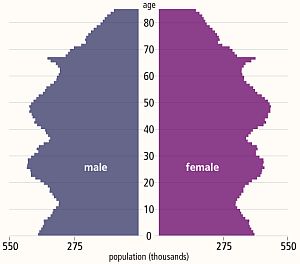
The diagram above is called a population pyramid and it shows the distribution by gender and age of the UK population in 2013. The wobbles tell a story. It does rather look like the profile of a bushy-eyebrowed, big-nosed, pointy-chinned old couple standing back-to-back and maybe there is a hidden message for us there?
The “eyebrow” between ages 67 and 62 is the increase in births that happened 62 to 67 years ago: betwee 1946 and 1951. The post WWII baby boom. The “nose” of 42-52 year olds are the “children of the 60’s” which was a period of rapid economic growth and new optimism. The “upper lip” at 32-42 correlates with the 1970’s that was a period of stagnant growth, high inflation, strikes, civil unrest and the dark threat of global thermonuclear war. This “stagflation” is now believed to have been triggered by political meddling in the Middle-East that led to the 1974 OPEC oil crisis and culminated in the “winter of discontent” in 1979. The “chin” signals there was another population expansion in the 1980s when optimism returned (SALT-II was signed in 1979) and the economy was growing again. Then the “neck” contraction in the 1990’s after the 1987 Black Monday global stock market crash. Perhaps the new optimism of the Third Millenium led to the “chest” expansion but the financial crisis that followed the sub-prime bubble to burst in 2008 has yet to show its impact on the population chart. This static chart only tells part of the story – the animated chart reveals a significant secondary expansion of the 20-30 year old age group over the last decade. This cannot have been caused by births and is evidence of immigration of a large number of young couples – probably from the expanding Europe Union.
If this “yo-yo” population pattern is repeated then the current economic downturn will be followed by a contraction at the birth end of the spectrum and possibly also net emigration. And that is a big worry because each population wave takes a 100 years to propagate through the system. The most economically productive population – the 20-60 year olds – are the ones who pay the care bills for the rest. So having a population curve with lots of wobbles in it causes long term socio-economic instability.
Using this big-picture long-timescale perspective; evidence of an NHS safety and quality crunch; silenced voices of cracks being papered-over; let us look for the historical evidence of the creep.
Nowadays the data we need is literally at our fingertips – and there is a vast ocean of it to swim around in – and to drown in if we are not careful. The Office of National Statistics (ONS) is a rich mine of UK socioeconomic data – it is the source of the histogram above. The trick is to find the nuggets of knowledge in the haystack of facts and then to convert the tables of numbers into something that is a bit more digestible and meaningful. This is what Russ Ackoff descibes as the difference between Data and Information. The data-to-information conversion needs context.
Rule #1: Data without context is meaningless – and is at best worthless and at worse is dangerous.
 With respect to the NHS there is a Minotaur’s Labyrinth of data warehouses – it is fragmented but it is out there – in cyberspace. The Department of Health publishes some on public sites but it is a bit thin on context so it can be difficult to extract the meaning.
Relying on our memories to provide the necessary context is fraught with problems. Memories are subject to a whole range of distortions, deletions, denials and delusions. The NHS has been in existence since 1948 and there are not many people who can personally remember the whole story with objective clarity. Fortunately cyberspace again provides some of what we need and with a few minutes of surfing we can discover something like a website that chronicles the history of the NHS in decades from its creation in 1948 – http://www.nhshistory.net/ – created and maintained by one person and a goldmine of valuable context. The decade that is of particular interest is 1998-2007 – Chapter 6
With just some data and some context it is possible to pull together the outline of the bigger picture of the decade that led up to the Mid Staffordshire healthcare quality crunch.
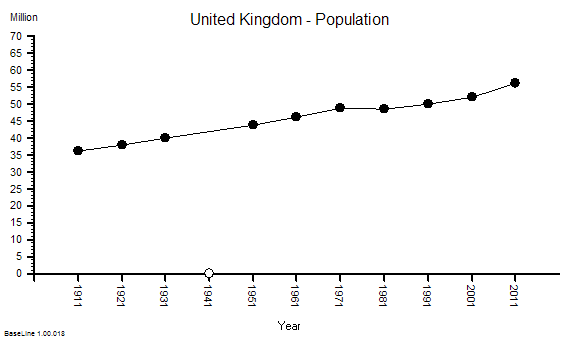
We will look at this as a NHS system evolving over time within its broader UK context. Here is the time-series chart of the population of England – the source of the demand on the NHS.
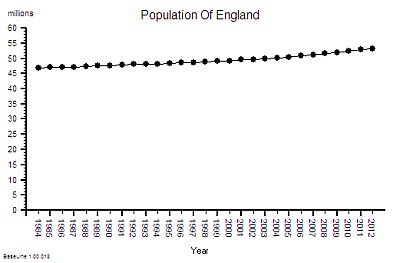 This shows a significant and steady increase in population – 12% overall between 1984 an 2012.
This aggregate hides a 9% increase in the under 65 population and 29% growth in the over 65 age group.
This is hard evidence of demographic creep – a ticking health and social care time bomb. And the curve is getting steeper. The pressure is building.
The next bit of the map we need is a measure of the flow through hospitals – the activity – and this data is available as the annual HES (Hospital Episodes Statistics) reports. The full reports are hundreds of pages of fine detail but the headline summaries contain enough for our present purpose.
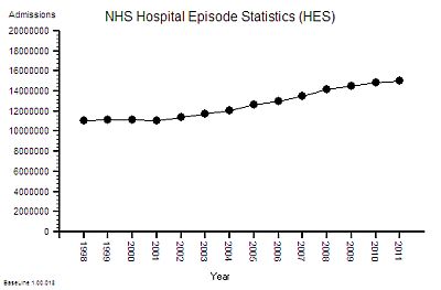
The time- series chart shows a steady increase in hospital admissions. Drilling into the summaries revealed that just over a third are emergency admissions and the rest are planned or maternity.
In the decade from 1998 to 2008 there was a 25% increase in hospital activity. This means more work for someone – but how much more and who for?
But does it imply more NHS beds?
Beds require wards, buildings and infrastructure – but it is the staff that deliver the health care. The bed is just a means of storage. One measure of capacity and cost is the number of staffed beds available to be filled. But this like measuring the number of spaces in a car park – it does not say much about flow – it is a just measure of maximum possible work in progress – the available space to hold the queue of patients who are somewhere between admission and discharge.
Here is the time series chart of the number of NHS beds from 1984 to 2006. The was a big fall in the number of beds in the decade after 1984 [Why was that?]
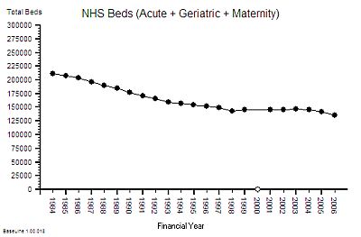
Between 1997 and 2007 there was about a 10% fall in the number of beds. The NHS patient warehouse was getting smaller.
But the activity – the flow – grew by 25% over the same time period: so the Laws Of Physics say that the flow must have been faster.
The average length of stay must have been falling.
This insight has another implication – fewer beds must mean smaller hospitals and lower costs – yes? After all everyone seems to equate beds-to-cost; more-beds-cost-more less-beds-cost-less. It sounds reasonable. But higher flow means more demand and more workload so that would require more staff – and that means higher costs. So which is it? Less, the same or more cost?
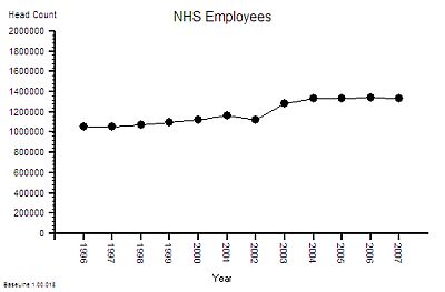 The published data says that staff headcount went up by 25% – which correlates with the increase in activity. That makes sense.
And it looks like it “jumped” up in 2003 so something must have triggered that. More cash pumped into the system perhaps? Was that the effect of the Wanless Report?
But what type of staff? Doctors? Nurses? Admin and Clerical? Managers? The European Working Time Directive (EWTD) forced junior doctors hours down and prompted an expansion of consultants to take on the displaced service work. There was also a gradual move towards specialisation and multi-disciplinary teams. What impact would that have on cost? Higher most likely. The system is getting more complex.
Of course not all costs have the same impact on the system. About 4% of staff are classified as “management” and it is this group that are responsible for strategic and tactical planning. Managers plan the work – workers work the plan. The cost and efficiency of the management component of the system is not as useful a metric as the effectiveness of its collective decision making. Unfortuately there does not appear to be any published data on management decision making qualty and effectiveness. So we cannot estimate cost-effectiveness. Perhaps that is because it is not as easy to measure effectiveness as it is to count admissions, discharges, head counts, costs and deaths. Some things that count cannot easily be counted. The 4% number is also meaningless. The human head represents about 4% of the bodyweight of an adult person – and we all know that it is not the size of our heads that is important it is the effectiveness of the decisions that it makes which really counts! Effectiveness, efficiency and costs are not the same thing.
Back to the story. The number of beds went down by 10% and number of staff went up by 25% which means that the staff-per-bed ratio went up by nearly 40%. Does this mean that each bed has become 25% more productive or 40% more productive or less productive? [What exactly do we mean by “productivity”?]
To answer that we need to know what the beds produced – the discharges from hospital and not just the total number, we need the “last discharges” that signal the end of an episode of hospital care.
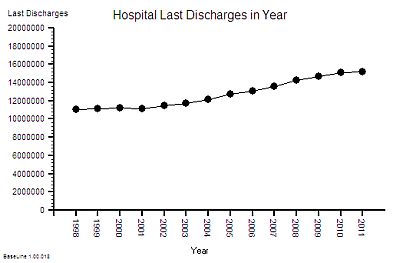 The time-series chart of last-discharges shows the same pattern as the admissions: as we would expect.
This output has two components – patients who leave alive and those who do not.
So what happened to the number of deaths per year over this period of time?
That data is also published annually in the Hospital Episode Statistics (HES) summaries.
This is what it shows ….
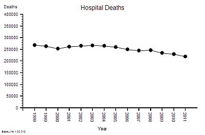 The absolute hospital mortality is reducing over time – but not steadily. It went up and down between 2000 and 2005 – and has continued on a downward trend since then.
And to put this into context – the UK annual mortality is about 600,000 per year. That means that only about 40% of deaths happen in hospitals. UK annual mortality is falling and births are rising so the population is growing bigger and older. [My head is now starting to ache trying to juggle all these numbers and pictures in it].
This is not the whole story though – if the absolute hospital activity is going up and the absolute hospital mortality is going down then this raw mortality number may not be telling the whole picture. To correct for those effects we need the ratio – the Hospital Mortality Ratio (HMR).
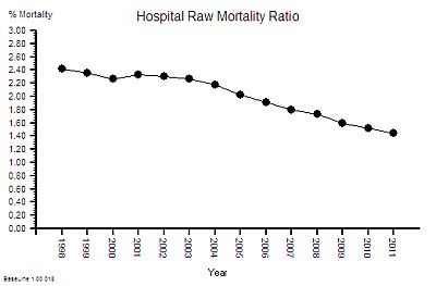 This is the result of combining these two metrics – a 40% reduction in the hospital mortality ratio.
Does this mean that NHS hospitals are getting safer over time?
This observed behaviour can be caused by hospitals getting safer – it can also be caused by hospitals doing more low-risk work that creates a dilution effect. We would need to dig deeper to find out which. But that will distract us from telling the story.
Back to productivity.
The other part of the productivity equation is cost.
So what about NHS costs? A bigger, older population, more activity, more staff, and better outcomes will all cost more taxpayer cash, surely! But how much more? The activity and head count has gone up by 25% so has cost gone up by the same amount?
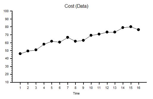
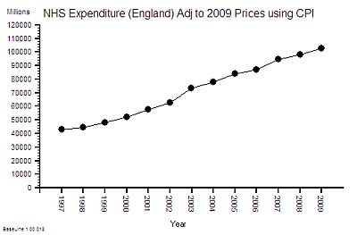 This is the time-series chart of the cost per year of the NHS and because buying power changes over time it has been adjusted using the Consumer Price Index using 2009 as the reference year – so the historical cost is roughly comparable with current prices.
The cost has gone up by 100% in one decade! That is a lot more than 25%.
The published financial data for 2006-2010 shows that the proportion of NHS spending that goes to hospitals is about 50% and this has been relatively stable over that period – so it is reasonable to say that the increase in cash flowing to hospitals has been about 100% too.
So if the cost of hospitals is going up faster than the output then productivity is falling – and in this case it works out as a 37% drop in productivity (25% increase in activity for 100% increase in cost = 37% fall in productivity).
So the available data which anyone with a computer, an internet connection, and some curiosity can get; and with bit of spreadsheet noggin can turn into pictures shows that over the decade of growth that led up to the the Mid Staffs crunch we had:
1. A slightly bigger population; and a
2. significantly older population; and a
3. 25% increase in NHS hospital activity; and a
4. 10% fall in NHS beds; and a
5. 25% increase in NHS staff; which gives a
6. 40% increase in staff-per-bed ratio; an an
7. 8% reduction in absolute hospital mortality; which gives a
8. 40% reduction in relative hospital mortality; and a
9. 100% increase in NHS hospital cost; which gives a
10. 37% fall drop in “hospital productivity”.
An experienced Improvement Scientist knows that a system that has been left to evolve by creep-crack-and-crunch can be re-designed to deliver higher quality and higher flow at lower total cost.
The safety creep at Mid-Staffs is now there for all to see. A crack has appeared in our confidence in the NHS – and raises a couple of crunch questions:
Where Has All The Extra Money Gone?
How Will We Avoid The BIG CRUNCH?
The huge increase in NHS funding over the last decade was the recommendation of the Wanless Report but the impact of implementing the recommendations has never been fully explored. Healthcare is a service system that is designed to deliver two intangible products – health and care. So the major cost is staff-time – particularly the clinical staff. A 25% increase in head count and a 100% increase in cost implies that the heads are getting more expensive. Either a higher proportion of more expensive clinically trained and registered staff, or more pay for the existing staff or both. The evidence shows that about 50% of NHS Staff are doctors and nurses and over the last decade there has been a bigger increase in the number of doctors than nurses. Added to that the Agenda for Change programme effectively increased the total wage bill and the new contracts for GPs and Consultants added more upward wage pressure. This is cost creep and it adds up over time. The Kings Fund looked at the impact in 2006 and suggested that, in that year alone, 72% of the additional money was sucked up by bigger wage bills and other cost-pressures! The previous year they estimated 87% of the “new money” had disappeared hte same way. The extra cash is gushing though the cracks in the bottom of the fiscal bucket that had been clumsily papered-over. And these are recurring revenue costs so they add up over time into a future financial crunch. The biggest one may be yet to come – the generous final-salary pensions that public-sector employees enjoy!
So it is even more important that the increasingly expensive clinical staff are not being forced to spend their time doing work that has no direct or indirect benefit to patients.
Trying to do a good job in a poorly designed system is both frustrating and demotivating – and the outcome can be a cynical attitude of “I only work here to pay the bills“. But as public sector wages go up and private sector pensions evaporate the cynics are stuck in a miserable job that they cannot afford to give up. And their negative behaviour poisons the whole pool. That is the long term cumulative cultural and financial cost of poor NHS process design. That is the outcome of not investing earlier in developing an Improvement Science capability.
The good news is that the time-series charts illustrate that the NHS is behaving like any other complex, adaptive, human-engineered value system. This means that the theory, techniques and tools of Improvement Science and value system design can be applied to answer these questions. It means that the root causes of the excessive costs can be diagnosed and selectively removed without compromising safety and quality. It means that the savings can be wisely re-invested to improve the resilience of some parts and to provide capacity in other parts to absorb the expected increases in demand that are coming down the population pipe.
This is Improvement Science. It is a learnable skill.
18/03/2013: Update
The question “Where Has The Money Gone?” has now been asked at the Public Accounts Committee

 [Ring Ring]

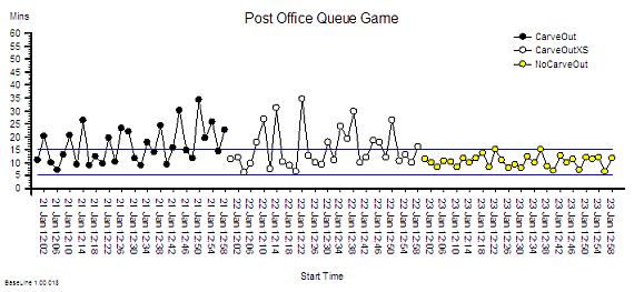
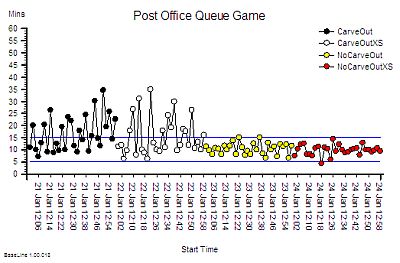
 <Bob> One flaw with the Burn-and-Scrape design is that harm has to happen for the design to work.


