FrailSafe Design

frailsafeSafe means avoiding harm, and safety is an emergent property of a well-designed system.

Frail means infirm, poorly, wobbly and at higher risk of harm.

So we want our health care system to be a FrailSafe Design.

But is it? How would we know? And what could we do to improve it?


About ten years ago I was involved in a project to improve the safety design of a specific clinical stream flowing through the hospital that I work in.

The ‘at risk’ group of patients were frail elderly patients admitted as an emergency after a fall and who had suffered a fractured thigh bone. The neck of the femur.

Historically, the outcome for these patients was poor.  Many do not survive, and many of the survivors never returned to independent living. They become even more frail.


The project was undertaken during an organisational transition, the hospital was being ‘taken over’ by a bigger one.  This created a window of opportunity for some disruptive innovation, and the project was labelled as a ‘Lean’ one because we had been inspired by similar work done at Bolton some years before and Lean was the flavour of the month.

The actual change was small: it was a flow design tweak that cost nothing to implement.

First we asked two flow questions:
Q1: How many of these high-risk frail patients do we admit a year?
A1: About one per day on average.
Q2: What is the safety critical time for these patients?
A2: The first four days.  The sooner they have hip surgery and are able to be actively mobilise the better their outcome.

Second we applied Little’s Law which showed the average number of patients in this critical phase is four. This was the ‘work in progress’ or WIP.

And we knew that variation is always present, and we knew that having all these patients in one place would make it much easier for the multi-disciplinary teams to provide timely care and to avoid potentially harmful delays.

So we suggested that one six-bedded bay on one of the trauma wards be designated the Fractured Neck Of Femur bay.

That was the flow diagnosis and design done.

The safety design was created by the multi-disciplinary teams who looked after these patients: the geriatricians, the anaesthetists, the perioperative emergency care team (PECT), the trauma and orthopaedic team, the physiotherapists, and so on.

They designed checklists to ensure that all #NOF patients got what they needed when they needed it and so that nothing important was left to chance.

And that was basically it.

And the impact was remarkable. The stream flowed. And one measured outcome was a dramatic and highly statistically significant reduction in mortality.

Injury_2011_Results
The full paper was published in Injury 2011; 42: 1234-1237.

We had created a FrailSafe Design … which implied that what was happening before was clearly not safe for these frail patients!


And there was an improved outcome for the patients who survived: A far larger proportion rehabilitated and returned to independent living, and a far smaller proportion required long-term institutional care.

By learning how to create and implement a FrailSafe Design we had added both years-to-life and life-to-years.

It cost nothing to achieve and the message was clear, as this quote is from the 2011 paper illustrates …

Injury_2011_Message

What was a bit disappointing was the gap of four years between delivering this dramatic and highly significant patient safety and quality improvement and the sharing of the story.


What is more exciting is that the concept of FrailSafe is growing, evolving and spreading.

Type II Error

figure_pointing_out_chart_data_150_clr_8005It was the time for Bob and Leslie’s regular Improvement Science coaching session.

<Leslie> Hi Bob, how are you today?

<Bob> I am getting over a winter cold but otherwise I am good.  And you?

<Leslie> I am OK and I need to talk something through with you because I suspect you will be able to help.

<Bob> OK. What is the context?

<Leslie> Well, one of the projects that I am involved with is looking at the elderly unplanned admission stream which accounts for less than half of our unplanned admissions but more than half of our bed days.

<Bob> OK. So what were you looking to improve?

<Leslie> We want to reduce the average length of stay so that we free up beds to provide resilient space-capacity to ease the 4-hour A&E admission delay niggle.

<Bob> That sounds like a very reasonable strategy.  So have you made any changes and measured any improvements?

<Leslie> We worked through the 6M Design® sequence. We studied the current system, diagnosed some time traps and bottlenecks, redesigned the ones we could influence, modified the system, and continued to measure to monitor the effect.

<Bob> And?

<Leslie> It feels better but the system behaviour charts do not show an improvement.

<Bob> Which charts, specifically?

<Leslie> The BaseLine XmR charts of average length of stay for each week of activity.

<Bob> And you locked the limits when you made the changes?

<Leslie> Yes. And there still were no red flags. So that means our changes have not had a significant effect. But it definitely feels better. Am I deluding myself?

<Bob> I do not believe so. Your subjective assessment is very likely to be accurate. Our Chimp OS 1.0 is very good at some things! I think the issue is with the tool you are using to measure the change.

<Leslie> The XmR chart?  But I thought that was THE tool to use?

<Bob> Like all tools it is designed for a specific purpose.  Are you familiar with the term Type II Error.

<Leslie> Doesn’t that come from research? I seem to remember that is the error we make when we have an under-powered study.  When our sample size is too small to confidently detect the change in the mean that we are looking for.

<Bob> A perfect definition!  The same error can happen when we are doing before and after studies too.  And when it does, we see the pattern you have just described: the process feels better but we do not see any red flags on our BaseLine© chart.

<Leslie> But if our changes only have a small effect how can it feel better?

<Bob> Because some changes have cumulative effects and we omit to measure them.

<Leslie> OMG!  That makes complete sense!  For example, if my bank balance is stable my average income and average expenses are balanced over time. So if I make a small-but-sustained improvement to my expenses, like using lower cost generic label products, then I will see a cumulative benefit over time to the balance, but not the monthly expenses; because the noise swamps the signal on that chart!

<Bob> An excellent analogy!

<Leslie> So the XmR chart is not the tool for this job. And if this is the only tool we have then we risk making a Type II error. Is that correct?

<Bob> Yes. We do still use an XmR chart first though, because if there is a big enough and fast enough shift then the XmR chart will reveal it.  If there is not then we do not give up just yet; we reach for our more sensitive shift detector tool.

<Leslie> Which is?

<Bob> I will leave you to ponder on that question.  You are a trained designer now so it is time to put your designer hat on and first consider the purpose of this new tool, and then create the outline a fit-for-purpose design.

<Leslie> OK, I am on the case!

Grit in the Oyster

Pearl_and_OysterThe word pearl is a metaphor for something rare, beautiful, and valuable.

Pearls are formed inside the shell of certain mollusks as a defense mechanism against a potentially threatening irritant.

The mollusk creates a pearl sac to seal off the irritation.


And so it is with change and improvement.  The growth of precious pearls of improvement wisdom – the ones that develop slowly over time – are triggered by an irritant.

Someone asking an uncomfortable question perhaps, or presenting some information that implies that an uncomfortable question needs to be asked.


About seven years ago a question was asked “Would improving healthcare flow and quality result in lower costs?”

It is a good question because some believe that it would and some believe that it would not.  So an experiment to test the hypothesis was needed.

The Health Foundation stepped up to the challenge and funded a three year project to find the answer. The design of the experiment was simple. Take two oysters and introduce an irritant into them and see if pearls of wisdom appeared.

The two ‘oysters’ were Sheffield Hospital and Warwick Hospital and the irritant was Dr Kate Silvester who is a doctor and manufacturing system engineer and who has a bit-of-a-reputation for asking uncomfortable questions and backing them up with irrefutable information.


Two rare and precious pearls did indeed grow.

In Sheffield, it was proved that by improving the design of their elderly care process they improved the outcome for their frail, elderly patients.  More went back to their own homes and fewer left via the mortuary.  That was the quality and safety improvement. They also showed a shorter length of stay and a reduction in the number of beds needed to store the work in progress.  That was the flow and productivity improvement.

What was interesting to observe was how difficult it was to get these profoundly important findings published.  It appeared that a further irritant had been created for the academic peer review oyster!

The case study was eventually published in Age and Aging 2014; 43: 472-77.

The pearl that grew around this seed is the Sheffield Microsystems Academy.


In Warwick, it was proved that the A&E 4 hour performance could be improved by focussing on improving the design of the processes within the hospital, downstream of A&E.  For example, a redesign of the phlebotomy and laboratory process to ensure that clinical decisions on a ward round are based on todays blood results.

This specific case study was eventually published as well, but by a different path – one specifically designed for sharing improvement case studies – JOIS 2015; 22:1-30

And the pearls of wisdom that developed as a result of irritating many oysters in the Warwick bed are clearly described by Glen Burley, CEO of Warwick Hospital NHS Trust in this recent video.


Getting the results of all these oyster bed experiments published required irritating the Health Foundation oyster … but a pearl grew there too and emerged as the full Health Foundation report which can be downloaded here.


So if you want to grow a fistful of improvement and a bagful of pearls of wisdom … then you will need to introduce a bit of irritation … and Dr Kate Silvester is a proven source of grit for your oyster!

Raising Awareness

SaveTheNHSGameThe first step in the process of improvement is raising awareness, and this has to be done carefully.

Most of us spend most of our time in a mental state called blissful ignorance.  We are happily unaware of the problems, and of their solutions.

Some of us spend some of our time in a different mental state called denial.

And we enter that from yet another mental state called painful awareness.

By raising awareness we are deliberately nudging ourselves, and others, out of our comfort zones.

But suddenly moving from blissful ignorance to painful awareness is not a comfortable transition. It feels like a shock. We feel confused. We feel vulnerable. We feel frightened. And we have a choice: freeze, flee or fight.

Freeze is shock. We feel paralysed by the mismatch between rhetoric and reality.

Flee is denial.  We run away from a new and uncomfortable reality.

Fight is anger. Directed first at others (blame) and then at ourselves (guilt).

It is this anger-passion that we must learn to channel and focus as determination to listen, learn and then lead.


The picture is of a recent awareness-raising event; it happened this week.

The audience is a group of NHS staff from across the depth and breadth of a health and social care system.

On the screen is the ‘Save the NHS Game’.  It is an interactive, dynamic flow simulation of a whole health care system; and its purpose is educational.  It is designed to illustrate the complex and counter-intuitive flow behaviour of a system of interdependent parts: primary care, an acute hospital, intermediate care, residential care, and so on.

We all became aware of a lot of unfamiliar concepts in a short space of time!

We all learned that a flow system can flip from calm to chaotic very quickly.

We all learned that a small change in one part of a system of interdependent parts can have a big effect in another part – either harmful or beneficial and often both.

We all learned that there is often a long time-lag between the change and the effect.

We all learned that we cannot reverse the effect just by reversing the change.

And we all learned that this high sensitivity to small changes is the result of the design of our system; i.e. our design.


Learning all that in one go was a bit of a shock!  Especially the part where we realised that we had, unintentionally, created near perfect conditions for chaos to emerge. Oh dear!

Denial felt like a very reasonable option; as did blame and guilt.

What emerged was a collective sense of determination.  “Let’s Do It!” captured the mood.


puzzle_lightbulb_build_PA_150_wht_4587The second step in the process of improvement is to show the door to the next phase of learning; the phase called ‘know how’.

This requires demonstrating that there is an another way out of the zone of painful awareness.  An alternative to denial.

This is where how-to-diagnose-and-correct-the-design-flaws needs to be illustrated. A step-at-a-time.

And when that happens it feels like a light bulb has been switched on.  What before was obscure and confusing suddenly becomes clear and understandable; and we say ‘Ah ha!’


So, if we deliberately raise awareness about a problem then, as leaders of change and improvement, we also have the responsibility to raise awareness about feasible solutions.


Because only then are we able to ask “Would we like to learn how to do this ourselves!”

And ‘Yes, please’ is what 68% of the people said after attending the awareness raising event.  Only 15% said ‘No, thank you’ and only 17% abstained.

Raising awareness is the first step to improvement.
Choosing the path out of the pain towards knowledge is the second.
And taking the first step on that path is the third.

The Cost of Chaos

british_pound_money_three_bundled_stack_400_wht_2425This week I conducted an experiment – on myself.

I set myself the challenge of measuring the cost of chaos, and it was tougher than I anticipated it would be.

It is easy enough to grasp the concept that fire-fighting to maintain patient safety amidst the chaos of healthcare would cost more in terms of tears and time …

… but it is tricky to translate that concept into hard numbers; i.e. cash.


Chaos is an emergent property of a system.  Safety, delivery, quality and cost are also emergent properties of a system. We can measure cost, our finance departments are very good at that. We can measure quality – we just ask “How did your experience match your expectation”.  We can measure delivery – we have created a whole industry of access target monitoring.  And we can measure safety by checking for things we do not want – near misses and never events.

But while we can feel the chaos we do not have an easy way to measure it. And it is hard to improve something that we cannot measure.


So the experiment was to see if I could create some chaos, then if I could calm it, and then if I could measure the cost of the two designs – the chaotic one and the calm one.  The difference, I reasoned, would be the cost of the chaos.

And to do that I needed a typical chunk of a healthcare system: like an A&E department where the relationship between safety, flow, quality and productivity is rather important (and has been a hot topic for a long time).

But I could not experiment on a real A&E department … so I experimented on a simplified but realistic model of one. A simulation.

What I discovered came as a BIG surprise, or more accurately a sequence of big surprises!

  1. First I discovered that it is rather easy to create a design that generates chaos and danger.  All I needed to do was to assume I understood how the system worked and then use some averaged historical data to configure my model.  I could do this on paper or I could use a spreadsheet to do the sums for me.
  2. Then I discovered that I could calm the chaos by reactively adding lots of extra capacity in terms of time (i.e. more staff) and space (i.e. more cubicles).  The downside of this approach was that my costs sky-rocketed; but at least I had restored safety and calm and I had eliminated the fire-fighting.  Everyone was happy … except the people expected to foot the bill. The finance director, the commissioners, the government and the tax-payer.
  3. Then I got a really big surprise!  My safe-but-expensive design was horribly inefficient.  All my expensive resources were now running at rather low utilisation.  Was that the cost of the chaos I was seeing? But when I trimmed the capacity and costs the chaos and danger reappeared.  So was I stuck between a rock and a hard place?
  4. Then I got a really, really big surprise!!  I hypothesised that the root cause might be the fact that the parts of my system were designed to work independently, and I was curious to see what happened when they worked interdependently. In synergy. And when I changed my design to work that way the chaos and danger did not reappear and the efficiency improved. A lot.
  5. And the biggest surprise of all was how difficult this was to do in my head; and how easy it was to do when I used the theory, techniques and tools of Improvement-by-Design.

So if you are curious to learn more … I have written up the full account of the experiment with rationale, methods, results, conclusions and references and I have published it here.

Anti-Chaos

Hypothesis: Chaotic behaviour of healthcare systems is inevitable without more resources.

This appears to be a rather widely held belief, but what is the evidence?

Can we disprove this hypothesis?

Chaos is a predictable, emergent behaviour of many systems, both natural and man made, a discovery that was made rather recently, in the 1970’s.  Chaotic behaviour is not the same as random behaviour.  The fundamental difference is that random implies independence, while chaos requires the opposite: chaotic systems have interdependent parts.

Chaotic behaviour is complex and counter-intuitive, which may explain why it took so long for the penny to drop.


Chaos is a complex behaviour and it is tempting to assume that complicated structures always lead to complex behaviour.  But they do not.  A mechanical clock is a complicated structure but its behaviour is intentionally very stable and highly predictable – that is the purpose of a clock.  It is a fit-for-purpose design.

The healthcare system has many parts; it too is a complicated system; it has a complicated structure.  It is often seen to demonstrate chaotic behaviour.

So we might propose that a complicated system like healthcare could also be stable and predictable. If it were designed to be.


But there is another critical factor to take into account.

A mechanical clock only has inanimate cogs and springs that only obey the Laws of Physics – and they are neither adaptable nor negotiable.

A healthcare system is different. It is a living structure. It has patients, providers and purchasers as essential components. And the rules of how people work together are both negotiable and adaptable.

So when we are thinking about a healthcare system we are thinking about a complex adaptive system or CAS.

And that changes everything!


The good news is that adaptive behaviour can be a very effective anti-chaos strategy, if it is applied wisely.  The not-so-good news is that if it is not applied wisely then it can actually generate even more chaos.


Which brings us back to our hypothesis.

What if the chaos we are observing on out healthcare system is actually iatrogenic?

What if we are unintentionally and unconsciously generating it?

These questions require an answer because if we are unwittingly contributing to the chaos, with insight, understanding and wisdom we can intentionally calm it too.

These questions also challenge us to study our current way of thinking and working.  And in that challenge we will need to demonstrate a behaviour called humility. An ability to acknowledge that there are gaps in our knowledge and our understanding. A willingness to learn.


This all sounds rather too plausible in theory. What about an example?

Let us consider the highest flow process in healthcare: the outpatient clinic stream.

The typical design is a three-step process called the New-Test-Review design. This sequential design is simpler because the steps are largely independent of each other. And this simplicity is attractive because it is easier to schedule so is less likely to be chaotic. The downsides are the queues and delays between the steps and the risk of getting lost in the system. So if we are worried that a patient may have a serious illness that requires prompt diagnosis and treatment (e.g. cancer), then this simpler design is actually a potentially unsafe design.

A one-stop clinic is a better design because the New-Test-Review steps are completed in one visit, and that is better for everyone. But, a one-stop clinic is a more challenging scheduling problem because all the steps are now interdependent, and that is fertile soil for chaos to emerge.  And chaos is exactly what we often see.

Attending a chaotic one-stop clinic is frustrating experience for both patients and staff, and it is also less productive use of resources. So the chaos and cost appears to be price we are asked to pay for a quicker and safer design.

So is the one stop clinic chaos inevitable, or is it avoidable?

Simple observation of a one stop clinic shows that the chaos is associated with queues – which are visible as a waiting room full of patients and front-of-house staff working very hard to manage the queue and to signpost and soothe the disgruntled patients.

What if the one stop clinic queue and chaos is iatrogenic? What if it was avoidable without investing in more resources? Would the chaos evaporate? Would the quality improve?  Could we have a safer, calmer, higher quality and more productive design?

Last week I shared evidence that proved the one-stop clinic chaos was iatrogenic – by showing it was avoidable.

A team of healthcare staff were shown how to diagnose the cause of the queue and were then able to remove that cause, and to deliver the same outcome without the queue and the associated chaos.

And the most surprising lesson that the team learned was that they achieved this improvement using the same resources as before; and that those resources also felt the benefit of the chaos evaporating. Their work was easier, calmer and more predictable.

The impossible-without-more-resources hypothesis had been disproved.

So, where else in our complicated and complex healthcare system might we apply anti-chaos?

Everywhere?


And for more about complexity science see Santa Fe Institute

Melting the Queue

custom_meter_15256[Drrrrrrring]

<Leslie> Hi Bob, I hope I am not interrupting you.  Do you have five minutes?

<Bob> Hi Leslie. I have just finished what I was working on and a chat would be a very welcome break.  Fire away.

<Leslie> I really just wanted to say how much I enjoyed the workshop this week, and so did all the delegates.  They have been emailing me to say how much they learned and thanking me for organising it.

<Bob> Thank you Leslie. I really enjoyed it too … and I learned lots … I always do.

<Leslie> As you know I have been doing the ISP programme for some time, and I have come to believe that you could not surprise me any more … but you did!  I never thought that we could make such a dramatic improvement in waiting times.  The queue just melted away and I still cannot really believe it.  Was it a trick?

<Bob> Ahhhh, the siren-call of the battle-hardened sceptic! It was no trick. What you all saw was real enough. There were no computers, statistics or smoke-and-mirrors used … just squared paper and a few coloured pens. You saw it with your own eyes; you drew the charts; you made the diagnosis; and you re-designed the policy.  All I did was provide the context and a few nudges.

<Leslie> I know, and that is why I think seeing the before and after data would help me. The process felt so much better, but I know I will need to show the hard evidence to convince others, and to convince myself as well, to be brutally honest.  I have the before data … do you have the after data?

<Bob> I do. And I was just plotting it as BaseLine charts to send to you.  So you have pre-empted me.  Here you are.

StE_OSC_Before_and_After
This is the waiting time run chart for the one stop clinic improvement exercise that you all did.  The leftmost segment is the before, and the rightmost are the after … your two ‘new’ designs.

As you say, the queue and the waiting has melted away despite doing exactly the same work with exactly the same resources.  Surprising and counter-intuitive but there is the evidence.

<Leslie> Wow! That fits exactly with how it felt.  Quick and calm! But I seem to remember that the waiting room was empty, particularly in the case of the design that Team 1 created. How come the waiting is not closer to zero on the chart?

<Bob> You are correct.  This is not just the time in the waiting room, it also includes the time needed to move between the rooms and the changeover time within the rooms.  It is what I call the ‘tween-time.

<Leslie> OK, that makes sense now.  And what also jumps out of the picture for me is the proof that we converted an unstable process into a stable one.  The chaos was calmed.  So what is the root cause of the difference between the two ‘after’ designs?

<Bob> The middle one, the slightly better of the two, is the one where all patients followed the newly designed process.  The rightmost one was where we deliberately threw a spanner in the works by assuming an unpredictable case mix.

<Leslie> Which made very little difference!  The new design was still much, much better than before.

<Bob> Yes. What you are seeing here is the footprint of resilient design. Do you believe it is possible now?

<Leslie> You bet I do!

The Magic Black Box

stick_figure_magic_carpet_150_wht_5040It was the appointed time for Bob and Leslie’s regular coaching session as part of the improvement science practitioner programme.

<Leslie> Hi Bob, I am feeling rather despondent today so please excuse me in advance if you hear a lot of “Yes, but …” language.

<Bob> I am sorry to hear that Leslie. Do you want to talk about it?

<Leslie> Yes, please.  The trigger for my gloom was being sent on a mandatory training workshop.

<Bob> OK. Training to do what?

<Leslie> Outpatient demand and capacity planning!

<Bob> But you know how to do that already, so what is the reason you were “sent”?

<Leslie> Well, I am no longer sure I know how to it.  That is why I am feeling so blue.  I went more out of curiosity and I came away utterly confused and with my confidence shattered.

<Bob> Oh dear! We had better start at the beginning.  What was the purpose of the workshop?

<Leslie> To train everyone in how to use an Outpatient Demand and Capacity planning model, an Excel one that we were told to download along with the User Guide.  I think it is part of a national push to improve waiting times for outpatients.

<Bob> OK. On the surface that sounds reasonable. You have designed and built your own Excel flow-models already; so where did the trouble start?

<Leslie> I will attempt to explain.  This was a paragraph in the instructions. I felt OK with this because my Improvement Science training has given me a very good understanding of basic demand and capacity theory.

IST_DandC_Model_01<Bob> OK.  I am guessing that other delegates may have felt less comfortable with this. Was that the case?

<Leslie> The training workshops are targeted at Operational Managers and the ones I spoke to actually felt that they had a good grasp of the basics.

<Bob> OK. That is encouraging, but a warning bell is ringing for me. So where did the trouble start?

<Leslie> Well, before going to the workshop I decided to read the User Guide so that I had some idea of how this magic tool worked.  This is where I started to wobble – this paragraph specifically …

IST_DandC_Model_02

<Bob> H’mm. What did you make of that?

<Leslie> It was complete gibberish to me and I felt like an idiot for not understanding it.  I went to the workshop in a bit of a panic and hoped that all would become clear. It didn’t.

<Bob> Did the User Guide explain what ‘percentile’ means in this context, ideally with some visual charts to assist?

<Leslie> No and the use of ‘th’ and ‘%’ was really confusing too.  After that I sort of went into a mental fog and none of the workshop made much sense.  It was all about practising using the tool without any understanding of how it worked. Like a black magic box.


<Bob> OK.  I can see why you were confused, and do not worry, you are not an idiot.  It looks like the author of the User Guide has unwittingly used some very confusing and ambiguous terminology here.  So can you talk me through what you have to do to use this magic box?

<Leslie> First we have to enter some of our historical data; the number of new referrals per week for a year; and the referral and appointment dates for all patients for the most recent three months.

<Bob> OK. That sounds very reasonable.  A run chart of historical demand and the raw event data for a Vitals Chart® is where I would start the measurement phase too – so long as the data creates a valid 3 month reporting window.

<Leslie> Yes, I though so too … but that is not how the black box model seems to work. The weekly demand is used to draw an SPC chart, but the event data seems to disappear into the innards of the black box, and recommendations pop out of it.

<Bob> Ah ha!  And let me guess the relationship between the term ‘percentile’ and the SPC chart of weekly new demand was not explained?

<Leslie> Spot on.  What does percentile mean?


<Bob> It is statistics jargon. Remember that we have talked about the distribution of the data around the average on a BaseLine chart; and how we use the histogram feature of BaseLine to show it visually.  Like this example.

IST_DandC_Model_03<Leslie> Yes. I recognise that. This chart shows a stable system of demand with an average of around 150 new referrals per week and the variation distributed above and below the average in a symmetrical pattern, falling off to zero around the upper and lower process limits.  I believe that you said that over 99% will fall within the limits.

<Bob> Good.  The blue histogram on this chart is called a probability distribution function, to use the terminology of a statistician.

<Leslie> OK.

<Bob> So, what would happen if we created a Pareto chart of demand using the number of patients per week as the categories and ignoring the time aspect? We are allowed to do that if the behaviour is stable, as this chart suggests.

<Leslie> Give me a minute, I will need to do a rough sketch. Does this look right?

IST_DandC_Model_04

<Bob> Perfect!  So if you now convert the Y-axis to a percentage scale so that 52 weeks is 100% then where does the average weekly demand of about 150 fall? Read up from the X-axis to the line then across to the Y-axis.

<Leslie> At about 26 weeks or 50% of 52 weeks.  Ah ha!  So that is what a percentile means!  The 50th percentile is the average, the zeroth percentile is around the lower process limit and the 100th percentile is around the upper process limit!

<Bob> In this case the 50th percentile is the average, it is not always the case though.  So where is the 85th percentile line?

<Leslie> Um, 52 times 0.85 is 44.2 which, reading across from the Y-axis then down to the X-axis gives a weekly demand of about 170 per week.  That is about the same as the average plus one sigma according to the run chart.

<Bob> Excellent. The Pareto chart that you have drawn is called a cumulative probability distribution function … and that is usually what percentiles refer to. Comparative Statisticians love these but often omit to explain their rationale to non-statisticians!


<Leslie> Phew!  So, now I can see that the 65th percentile is just above average demand, and 85th percentile is above that.  But in the confusing paragraph how does that relate to the phrase “65% and 85% of the time”?

<Bob> It doesn’t. That is the really, really confusing part of  that paragraph. I am not surprised that you looped out at that point!

<Leslie> OK. Let us leave that for another conversation.  If I ignore that bit then does the rest of it make sense?

<Bob> Not yet alas. We need to dig a bit deeper. What would you say are the implications of this message?


<Leslie> Well.  I know that if our flow-capacity is less than our average demand then we will guarantee to create an unstable queue and chaos. That is the Flaw of Averages trap.

<Bob> OK.  The creator of this tool seems to know that.

<Leslie> And my outpatient manager colleagues are always complaining that they do not have enough slots to book into, so I conclude that our current flow-capacity is just above the 50th percentile.

<Bob> A reasonable hypothesis.

<Leslie> So to calm the chaos the message is saying I will need to increase my flow capacity up to the 85th percentile of demand which is from about 150 slots per week to 170 slots per week. An increase of 7% which implies a 7% increase in costs.

<Bob> Good.  I am pleased that you did not fall into the intuitive trap that a increase from the 50th to the 85th percentile implies a 35/50 or 70% increase! Your estimate of 7% is a reasonable one.

<Leslie> Well it may be theoretically reasonable but it is not practically possible. We are exhorted to reduce costs by at least that amount.

<Bob> So we have a finance versus governance bun-fight with the operational managers caught in the middle: FOG. That is not the end of the litany of woes … is there anything about Did Not Attends in the model?


<Leslie> Yes indeed! We are required to enter the percentage of DNAs and what we do with them. Do we discharge them or re-book them.

<Bob> OK. Pragmatic reality is always much more interesting than academic rhetoric and this aspect of the real system rather complicates things, at least for a comparative statistician. This is where the smoke and mirrors will appear and they will be hidden inside the black magic box.  To solve this conundrum we need to understand the relationship between demand, capacity, variation and yield … and it is rather counter-intuitive.  So, how would you approach this problem?

<Leslie> I would use the 6M Design® framework and I would start with a map and not with a model; least of all a magic black box one that I did not design, build and verify myself.

<Bob> And how do you know that will work any better?

<Leslie> Because at the One Day ISP Workshop I saw it work with my own eyes. The queues, waits and chaos just evaporated.  And it cost nothing.  We already had more than enough “capacity”.

<Bob> Indeed you did.  So shall we do this one as an ISP-2 project?

<Leslie> An excellent suggestion.  I already feel my confidence flowing back and I am looking forward to this new challenge. Thank you again Bob.

Emergent Learning

CAS_DiagramThe theme this week has been emergent learning.

By that I mean the ‘ah ha’ moment that happens when lots of bits of a conceptual jigsaw go ‘click’ and fall into place.

When, what initially appears to be smoky confusion suddenly snaps into sharp clarity.  Eureka!  And now new learning can emerge.


This did not happen by accident.  It was engineered.


The picture above is part of a bigger schematic map of a system – in this case a system related to the global health challenge of escalating obesity.

It is a complicated arrangement of boxes and arrows. There are  dotted lines that outline parts of the system that have leaky boundaries like the borders on a political map.

But it is a static picture of the structure … it tells us almost nothing about the function, the system behaviour.

And our intuition tells us that, because it is a complicated structure, it will exhibit complex and difficult to understand behaviour.  So, guided by our inner voice, we toss it into the pile labelled Wicked Problems and look for something easier to work on.


Our natural assumption that a complicated structure always leads to complex behavior is an invalid simplification, and one that we can disprove in a matter of moments.


Exhibit 1. A system can be complicated and yet still exhibit simple, stable and predictable behavior.

Harrison_H1The picture is of a clock designed and built by John Harrison (1693-1776).  It is called H1 and it is a sea clock.

Masters of sailing ships required very accurate clocks to calculate their longitude, the East-West coordinate on the Earth’s surface. And in the 18th Century this was a BIG problem. Too many ships were getting lost at sea.

Harrison’s sea clock is complicated.  It has many moving parts, but it was the most stable and accurate clock of its time.  And his later ones were smaller, more accurate and even more complicated.


Exhibit 2.  A system can be simple yet still exhibit complex, unstable and unpredictable behavior.

Double-compound-pendulumThe image is of a pendulum made of only two rods joined by a hinge.  The structure is simple yet the behavior is complex, and this can only be appreciated with a dynamic visualisation.

The behaviour is clearly not random. It has an emergent structure. It is called chaotic.

So, with these two real examples we have disproved our assumption that a complicated structure always leads to complex behaviour; and we have also disproved its inverse … that complex behavior always comes from a complicated structure.

The cognitive trap we have exposed here is over-generalisation, the unconscious habit of slipping in the implied [always].


This deeper understanding gives us hope.

John Harrison was a rare, naturally-gifted, mechanical genius.  And to make it easier, he was working on a purely mechanical system comprised of non-living parts that only obeyed the Laws of Newtonian physics.  And even with those advantages it took him decades to learn how to design and to build his sea clocks.  He was the first to do so and he was self-educated so his learning was emergent.

If there were a way to design complicated systems to exhibit stable and predictable behaviour, how could more of us learn how to do that?


Our healthcare system is not made of passive, mechanical cogs and springs.  The parts are active, living people whose actions are limited by physical Laws but whose decisions are steered by other policies … learned ones … and ones that can change.  These learned rules of thumb are called heuristics and they vary from person-to-person and from minute-to-minute.  Heuristics can be learned, unlearned, updated, and evolved.

This is called emergent learning.

And to generate it we only need to create the context for it … the rest happens … as if by magic … but only if we design a fit-for-purpose context.


This week I personally observed over a dozen healthcare staff simultaneously re-invent a complicated process scheduling technique, at the same time as using it to eliminate the  queues, waiting and chaos in the system they wanted to improve.

Their queues just evaporated … without requiring any extra capacity or money. Eureka!


We did not show them how to do it so they could not have just copied what we did.

We designed and built the context for their learning to emerge … and it did.  On its own.

The One Day Practical Skills Workshop delivered emergent learning … just as it was designed to do.

A health care system is a complex adaptive system (CAS), and system improvement-by-design is what systems engineers (SE) are trained to do.

And this emerging style of complex adaptive systems engineering (CASE) is at the cutting edge of human knowledge, and when applied in the health care domain it is called health care systems engineering (HCSE).

Our experience of the emergent learning that flows from the practical skills workshops verifies that CASE is both possible, learnable, teachable, applicable and effective.

And?

take_a_walk_text_10710One of the barriers to improvement is jumping to judgment too quickly.

Improvement implies innovation and action …

doing something different …

and getting a better outcome.

Before an action is a decision.  Before a decision is a judgment.

And we make most judgments quickly, intuitively and unconsciously.  Our judgments are a reflection of our individual, inner view of the world. Our mental model.

So when we judge intuitively and quickly then we will actually just reinforce our current worldview … and in so doing we create a very effective barrier to learning and improvement.

We guarantee the status quo.


So how do we get around this barrier?

In essence we must train ourselves to become more consciously aware of the judgment step in our thinking process.  And one way to flush it up to the surface is to ask the deceptively powerful question … And?

When someone is thinking through a problem then an effective contribution that we can offer is to listen, reflect, summarize, clarify and to encourage by asking “And?”

This process has a name.  It is called a coaching conversation.

And anyone can learn to how do it. Anyone.

Not as Easy as it Looks

smack_head_in_disappointment_150_wht_16653One of the traps for the inexperienced Improvement Science Practitioner is to believe that applying the science in the real world is as easy as it is in the safety of the training environment.

It isn’t.

The real world is messier and more complicated and it is easy to get lost in the fog of confusion and chaos.


So how do we avoid losing our footing, slipping into the toxic emotional swamp of organisational culture and giving ourselves an unpleasant dunking!

We use safety equipment … to protect ourselves and others from unintended harm.

The Improvement-by-Design framework is like a scaffold.  It is there to provide structure and safety.  The techniques and tools are like the harnesses, shackles, ropes, crampons, and pitons.  They give us flexibility and security.

But we need to know how to use them. We need to be competent as well as confident.

We do not want to tie ourselves up in knots … and we do not want to discover that we have not tied ourselves to something strong enough to support us if we slip. Which we will.


So we need to learn an practice the basics skills to the point that they are second nature.

We need to learn how to tie secure knots, quickly and reliably.

We need to learn how to plan an ascent … identifying the potential hazards and designing around them.

We need to learn how to assemble and check what we will need before we start … not too much and not too little.

We need to learn how to monitor out progress against our planned milestones and be ready to change the plan as we go …and even to abandon the attempt if necessary.


We would not try to climb a real mountain without the necessary training, planning, equipment and support … even though it might look easy.

And we do not try to climb an improvement mountain without the necessary training, planning, tools and support … even though it might look easy.

It is not as easy as it looks.

Yield

Dr_Bob_ThumbnailA recurring theme this week has been the concept of ‘quality’.

And it became quickly apparent that a clear definition of quality is often elusive.

Which seems to have led to a belief that quality is difficult to measure because it is subjective and has no precise definition.

The science of quality improvement is nearly 100 years old … and it was shown a long time ago, in 1924 in fact, that it is rather easy to measure quality – objectively and scientifically.

The objective measure of quality is called “yield”.

To measure yield we simply ask all our customers this question:

Did your experience meet your expectation?” 

If the answer is ‘Yes’ then we count this as OK; if it is ‘No’ then we count it as Not OK.

Yield is the ratio of the OKs divided by the number of customers who answered.


But this tried-and-tested way of measuring quality has a design flaw:

Where does a customer get their expectation from?

Because if a customer has an unrealistically high expectation then whatever we do will be perceived by them as Not OK.

So to consistently deliver a high quality service (i.e. high yield) we need to be able to influence both the customer experience and the customer expectation.


If we set our sights on a worthwhile and realistic expectation and we broadcast that to our customers, then we also need a way of avoiding their disappointment … that our objective quality outcome audit may reveal.

One way to defuse disappointment is to set a low enough expectation … which is, sadly, the approach adopted by naysayers,  complainers, cynics and doom-mongers. The inept.

That is not the path to either improvement or to excellence. It is the path to apathy.

A better approach is to set ourselves some internal standards of expectation and to check at each step if our work meets our own standard … and if it fails then we know we need have some more work to do.

This commonly used approach to maintaining quality is called a check-and-correct design.

So let us explore the ramifications of this check-and-correct approach to quality.


Suppose the quality of the product or service that we deliver is influenced by many apparently random factors. And when we actually measure our yield we discover that the chance of getting a right-first-time outcome is about 50%.  This amounts to little more than a quality lottery and we could simulate that ‘random’ process by tossing a coin.

So to set a realistic expectation for future customers there are two further questions we need to answer:
1. How long can an typical customer expect to wait for our product or service?
2. How much can an typical customer expect to pay for our product or service?

It is not immediately and intuitively obvious what the answers to these questions are … so we need to perform an experiment to find out.

Suppose we have five customers who require our product or service … we could represent them as Post It Notes; and suppose we have a clock … we could measure how long the process is taking; and suppose we have our coin … we can simulate the yield of the step; … and suppose we do not start the lead time clock until we start the work for each customer.

We now have the necessary and sufficient components to assemble a simple simulation model of our system … a model that will give us realistic answers to our questions.

So let us see what happens … just click the ‘Start Game’ button.

Http iframes are not shown in https pages in many major browsers. Please read this post for details.


It is worth running this exercise about a dozen times and recording the data for each run … then plotting the results on a time-series chart.

The data to plot is the make-time (which is the time displayed on the top left) and the cost (which is display top middle).

The make-time is the time from starting the first game to completing the last task.

The cost is the number of coin tosses we needed to do to deliver all work to the required standard.

And here are the charts from my dozen runs (yours will be different).

PostItNote_MakeTimeChart

PostItNote_CostChart

The variation from run to run is obvious; as is the correlation between a make-time and a high cost.

The charts also answer our two questions … a make time up to 90 would not be exceptional and an average cost of 10 implies that is the minimum price we need to charge in order to stay in business.

Our customers are waiting while we check-and-correct our own errors and we are expecting them to pay for the extra work!

In the NHS we have a name for this low-quality high-cost design: Payment By Results.


The charts also show us what is possible … a make time of 20 and a cost of 5.

That happened when, purely by chance, we tossed five heads in a row in the Quality Lottery.

So with this insight we could consider how we might increase the probability of ‘throwing a head’ i.e. doing the work right-first-time … because we can see from our charts what would happen.

The improved quality and cost of changing ourselves and our system to remove the root causes of our errors.

Quality Improvement-by-Design.

That something worth learning how to do.

And can we honestly justify not doing it?

What is Productivity?

It was the time for Bob and Leslie’s regular coaching session. Dr_Bob_ThumbnailBob was already on line when Leslie dialed in to the teleconference.

<Leslie> Hi Bob, sorry I am a bit late.

<Bob> No problem Leslie. What aspect of improvement science shall we explore today?

<Leslie> Well, I’ve been working through the Safety-Flow-Quality-Productivity cycle in my project and everything is going really well.  The team are really starting to put the bits of the jigsaw together and can see how the synergy works.

<Bob> Excellent. And I assume they can see the sources of antagonism too.

<Leslie> Yes, indeed! I am now up to the point of considering productivity and I know it was introduced at the end of the Foundation course but only very briefly.

<Bob> Yes,  productivity was described as a system metric. A ratio of a steam metric and a stage metric … what we get out of the streams divided by what we put into the stages.  That is a very generic definition.

<Leslie> Yes, and that I think is my problem. It is too generic and I get it confused with concepts like efficiency.  Are they the same thing?

<Bob> A very good question and the short answer is “No”, but we need to explore that in more depth.  Many people confuse efficiency and productivity and I believe that is because we learn the meaning of words from the context that we see them used in. If  others use the words imprecisely then it generates discussion, antagonism and confusion and we are left with the impression of that it is a ‘difficult’ subject.  The reality is that it is not difficult when we use the words in a valid way.

<Leslie> OK. That reassures me a bit … so what is the definition of efficiency?

<Bob> Efficiency is a stream metric – it is the ratio of the minimum cost of the resources required to complete one task divided by the actual cost of the resources used to complete one task.

<Leslie> Um.  OK … so how does time come into that?

<Bob> Cost is a generic concept … it can refer to time, money and lots of other things.  If we stick to time and money then we know that if we have to employ ‘people’ then time will cost money because people need money to buy essential stuff that the need for survival. Water, food, clothes, shelter and so on.

<Leslie> So we could use efficiency in terms of resource-time required to complete a task?

<Bob> Yes. That is a very useful way of looking at it.

<Leslie> So how is productivity different? Completed tasks out divided by cash in to pay for resource time would be a productivity metric. It looks the same.

<Bob> Does it?  The definition of efficiency is possible cost divided by actual cost. It is not the as our definition of system productivity.

<Leslie> Ah yes, I see. So do others define productivity the same way?

<Bob> Try looking it up on Wikipedia …

<Leslie> OK … here we go …

Productivity is an average measure of the efficiency of production. It can be expressed as the ratio of output to inputs used in the production process, i.e. output per unit of input”.

Now that is really confusing!  It looks like efficiency and productivity are the same. Let me see what the Wikipedia definition of efficiency is …

“Efficiency is the (often measurable) ability to avoid wasting materials, energy, efforts, money, and time in doing something or in producing a desired result”.

But that is closer to your definition of efficiency – the actual cost is the minimum cost plus the cost of waste.

<Bob> Yes.  I think you are starting to see where the confusion arises.  And this is because there is a critical piece of the jigsaw missing.

<Leslie> Oh …. and what is that?

<Bob> Worth.

<Leslie> Eh?

<Bob> Efficiency has nothing to do with whether the output of the stream has any worth.  I can produce a worthless product with low waste … in other words very efficiently.  And what if we have the situation where the output of my process is actually harmful.  The more efficiently I use my resources the more harm I will cause from a fixed amount of resource … and in that situation it is actually safer to have an inefficient process!

<Leslie> Wow!  That really hits the nail on the head … and the implications are … profound.  Efficiency is objective and relates only to flow … and between flow and productivity we have to cross the Safety-Quality line. Productivity also includes the subjective concept of worth or value. That all makes complete sense now. A productive system is a subjectively and objectively win-win-win design.

<Bob> Yup.  Get the safety, flow and quality perspectives of the design in synergy and productivity will sky-rocket. It is called a Fit-4-Purpose design.

Excellence By Design

top_surgeon_400_wht_7589All healthcare organisations strive for excellence, which is good, and most achieve mediocrity, which is not so good.

Why is that?

One cause is the design of their model for improvement … the one that is driven by targets, complaints, near misses, serious untoward incidents (SUIs) and never events (which are not never).

A model for improvement that is driven by failure feedback loops can only ever achieve mediocrity, not excellence.

Whaaaaaat?!* That’s rubbish”  I hear you cry … so let us see.


Try this simple test …. just ask any employee in your organisation this question (and start with yourself):

How do you know you are doing a good job?

If the first answer heard is “When no one is complaining” then you have a Mediocrity Design.


When customers have a disappointing experience most do not pen a letter or write an email to complain.  Most just sigh and lower their expectations to avoid future disappointment; many will grumble to family and friends; and only a few (about 5%) will actually complain. They are the really angry extreme.  So they can easily be fobbed off with platitudes … just being earnestly listened to and unreservedly apologised to is usually enough to take the wind out of their sails.  It will escort them back to the silent but disappointed majority whose expectation is being gradually eroded by relentless disappointment. Nothing fundamental needs to change because eventually the complaints dry up, apathy is re-established and chronic mediocrity is assured.


To achieve excellence we need a better answer to the “How do you know you are doing a good job?” question.

We need to be able to say “I know I am doing a good job because this is what a good outcome looks like; this is my essential contribution to achieving that outcome; and here are the measures of the intended outcomes that we are achieving.

In short we need a clear purpose, a defined part in the process that delivers that purpose, and we need an objective feedback loop that tells us that the purpose has been achieved and that our work is worthwhile.

And if  any of those components are missing then we know we have some improvement work to do.

The first step is usually answering the question “What is our purpose?

The second step is using the purpose to design and install the how-are-we-doing feedback loop.

And the  third step is to learn to use the success feedback loop to ensure that we are always working to have a necessary-and-sufficient process that delivers the intended outcome and that we are playing a part in that.

And when we are reliably achieving our purpose, we set ourselves an even better outcome – an even safer, calmer, higher quality and more productive one … and doing that will generate more improvement work to do.  We will not be idle.


That is the essence of Excellence-by-Design.

V.U.T.

figure_pointing_out_chart_data_150_wht_8005It was the appointed time for the ISP coaching session and both Bob and Leslie were logged on and chatting about their Easter breaks.

<Bob> OK Leslie, I suppose we had better do some actual work, which seems a shame on such a wonderful spring day.

<Leslie> Yes, I suppose so. There is actually something I would like to ask you about because I came across it by accident and it looked very pertinent to flow design … but you have never mentioned it.

<Bob> That sounds interesting. What is it?

<Leslie> V.U.T.

<Bob> Ah ha!  You have stumbled across the Queue Theorists and the Factory Physicists.  So, what was your take on it?

<Leslie> Well it all sounded very impressive. The context is I was having a chat with a colleague who is also getting into the improvement stuff and who had been to a course called “Factory Physics for Managers” – and he came away buzzing about the VUT equation … and claimed that it explained everything!

<Bob> OK. So what did you do next?

<Leslie> I looked it up of course and I have to say the more I read the more confused I got. Maybe I am just a bid dim and not up to understanding this stuff.

<Bob> Well you are certainly not dim so your confusion must be caused by something else. Did your colleague describe how the VUT equation is applied in practice?

<Leslie> Um. No, I do not remember him describing an example – just that it explained why we cannot expect to run resources at 100% utilisation.

<Bob> Well he is correct on that point … though there is a bit more to it than that.  A more accurate statement is “We cannot expect our system to be stable if there is variation and we run flow-resources at 100% utilisation”.

<Leslie> Well that sounds just like the sort of thing we have been talking about, what you call “resilient design”, so what is the problem with the VUT equation?

<Bob> The problem is that it gives an estimate of the average waiting time in a very simple system called a G/G/1 system.

<Leslie> Eh? What is a G/G/1 system?

<Bob> Arrgh … this is the can of queue theory worms that I was hoping to avoid … but as you brought it up let us grasp the nettle.  This is called Kendall’s Notation and it is a short cut notation for describing the system design. The first letter refers to the arrivals or demand and G means a general distribution of arrival times; the second G refers to the size of the jobs or the cycle time and again the distribution is general; and the last number refers to the number of parallel resources pulling from the queue.

<Leslie> OK, so that is a single queue feeding into a single resource … the simplest possible flow system.

<Bob> Yes. But that isn’t the problem.  The problem is that the VUT equation gives an approximation to the average waiting time. It tells us nothing about the variation in the waiting time.

<Leslie> Ah I see. So it tells us nothing about the variation in the size of the queue either … so does not help us plan the required space-capacity to hold the varying queue.

<Bob> Precisely.  There is another problem too.  The ‘U’ term in the VUT equation refers to utilisation of the resource … denoted by the symbol ? or rho.  The actual term is ? / (1-?) … so what happens when rho approaches one … or in practical terms the average utilisation of the resource approaches 100%?

<Leslie> Um … 1 divided by (1-1) is 1 divided by zero which is … infinity!  The average waiting time becomes infinitely long!

<Bob> Yes, but only if we wait forever – in reality we cannot and anyway – reality is always changing … we live in a dynamic, ever-changing, unstable system called Reality. The VUT equation may be academically appealing but in practice it is almost useless.

<Leslie> Ah ha! Now I see why you never mentioned it. So how do we design for resilience in practice? How do we get a handle on the behaviour of even the G/G/1 system over time?

<Bob> We use an Excel spreadsheet to simulate our G/G/1 system and we find a fit-for-purpose design using an empirical, experimental approach. It is actually quite straightforward and does not require any Queue Theory or VUT equations … just a bit of basic Excel know-how.

<Leslie> Phew!  That sounds more up my street. I would like to see an example.

<Bob> Welcome to the first exercise in ISP-2 (Flow).

Politicial Purpose

count_this_vote_400_wht_9473The question that is foremost in the mind of a designer is “What is the purpose?”   It is a future-focussed question.  It is a question of intent and outcome. It raises the issues of worth and value.

Without a purpose it impossible to answer the question “Is what we have fit-for-purpose?

And without a clear purpose it is impossible for a fit-for-purpose design to be created and tested.

In the absence of a future-purpose all that remains are the present-problems.

Without a future-purpose we cannot be proactive; we can only be reactive.

And when we react to problems we generate divergence.  We observe heated discussions. We hear differences of opinion as to the causes and the solutions.  We smell the sadness, anger and fear. We taste the bitterness of cynicism. And we are touched to our core … but we are paralysed.  We cannot act because we cannot decide which is the safest direction to run to get away from the pain of the problems we have.


And when the inevitable catastrophe happens we look for somewhere and someone to place and attribute blame … and high on our target-list are politicians.


So the prickly question of politics comes up and we need to grasp that nettle and examine it with the forensic lens of the system designer and we ask “What is the purpose of a politician?”  What is the output of the political process? What is their intent? What is their worth? How productive are they? Do we get value for money?

They will often answer “Our purpose is to serve the public“.  But serve is a verb so it is a process and not a purpose … “To serve the public for what purpose?” we ask. “What outcome can we expect to get?” we ask. “And when can we expect to get it?

We want a service (a noun) and as voters and tax-payers we have customer rights to one!

On deeper reflection we see a political spectrum come into focus … with Public at one end and Private at the other.  A country generates wealth through commerce … transforming natural and human resources into goods and services. That is the Private part and it has a clear and countable measure of success: profit.  The Public part is the redistribution of some of that wealth for the benefit of all – the tax-paying public. Us.

Unfortunately the Public part does not have quite the same objective test of success: so we substitute a different countable metric: votes. So the objectively measurable outcome of a successful political process is the most votes.

But we are still talking about process … not purpose.  All we have learned so far is that the politicians who attract the most votes will earn for themselves a temporary mandate to strive to achieve their political purpose. Whatever that is.

So what do the public, the voters, the tax-payers (and remember whenever we buy something we pay tax) … the customers of this political process … actually get for their votes and cash?  Are they delighted, satisfied or disappointed? Are they getting value-for-money? Is the political process fit-for-purpose? And what is the purpose? Are we all clear about that?

And if we look at the current “crisis” in health and social care in England then I doubt that “delight” will feature high on the score-sheet for those who work in healthcare or for those that they serve. The patients. The long-suffering tax-paying public.


Are politicians effective? Are they delivering on their pledge to serve the public? What does the evidence show?  What does their portfolio of public service improvement projects reveal?  Welfare, healthcare, education, police, and so on.The_Whitehall_Effect

Well the actual evidence is rather disappointing … a long trail of very expensive taxpayer-funded public service improvement failures.

And for an up-to-date list of some of the “eye-wateringly”expensive public sector improvement train-wrecks just read The Whitehall Effect.

But lurid stories of public service improvement failures do not attract precious votes … so they are not aired and shared … and when they are exposed our tax-funded politicians show their true skills and real potential.

Rather than answering the questions they filter, distort and amplify the questions and fire them at each other.  And then fall over each other avoiding the finger-of-blame and at the same time create the next deceptively-plausible election manifesto.  Their food source is votes so they have to tickle the voters to cough them up. And they are consummate masters of that art.

Politicians sell dreams and serve disappointment.


So when the-most-plausible with the most votes earn the right to wield the ignition keys for the engine of our national economy they deflect future blame by seeking the guidance of experts. And the only place they can realistically look is into the private sector who, in manufacturing anyway, have done a much better job of understanding what their customers need and designing their processes to deliver it. On-time, first-time and every-time.

Politicians have learned to be wary of the advice of academics – they need something more pragmatic and proven.  And just look at the remarkable rise of the manufacturing phoenix of Jaguar-Land-Rover (JLR) from the politically embarrassing ashes of the British car industry. And just look at Amazon to see what information technology can deliver!

So the way forward is blindingly obvious … combine manufacturing methods with information technology and build a dumb-robot manned production-line for delivering low-cost public services via a cloud-based website and an outsourced mega-call-centre manned by standard-script-following low-paid operatives.


But here we hit a bit of a snag.

Designing a process to deliver a manufactured product for a profit is not the same as designing a system to deliver a service to the public.  Not by a long chalk.  Public services are an example of what is now known as a complex adaptive system (CAS).

And if we attempt to apply the mechanistic profit-focussed management mantras of “economy of scale” and “division of labour” and “standardisation of work” to the messy real-world of public service then we actually achieve precisely the opposite of what we intended. And the growing evidence is embarrassingly clear.

We all want safer, smoother, better, and more affordable public services … but that is not what we are experiencing.

Our voted-in politicians have unwittingly commissioned complicated non-adaptive systems that ensure we collectively fail.

And we collectively voted the politicians into power and we are collectively failing to hold them to account.

So the ball is squarely in our court.


Below is a short video that illustrates what happens when politicians and civil servants attempt complex system design. It is called the “Save the NHS Game” and it was created by a surgeon who also happens to be a system designer.  The design purpose of the game is to raise awareness. The fundamental design flaw in this example is “financial fragmentation” which is the the use of specific budgets for each part of the system together with a generic, enforced, incremental cost-reduction policy (the shrinking budget).  See for yourself what happens …


In health care we are in the improvement business and to do that we start with a diagnosis … not a dream or a decision.

We study before we plan, and we plan before we do.

And we have one eye on the problem and one eye on the intended outcome … a healthier patient.  And we often frame improvement in the negative as a ‘we do not want a not sicker patient’ … physically or psychologically. Primum non nocere.  First do no harm.

And 99.9% of the time we do our best given the constraints of the system context that the voted-in politicians have created for us; and that their loyal civil servants have imposed on us.


Politicians are not designers … that is not their role.  Their part is to create and sell realistic dreams in return for votes.

Civil servants are not designers … that is not their role.  Their part is to enact the policy that the vote-seeking politicians cook up.

Doctors are not designers … that is not their role.  Their part is to make the best possible clinical decisions that will direct actions that lead, as quickly as possible, to healthier and happier patients.

So who is doing the complex adaptive system design?  Whose role is that?

And here we expose a gap.  No one.  For the simple reason that no one is trained to … so no one is tasked to.

But there is a group of people who are perfectly placed to create the context for developing this system design capability … the commissioners, the executive boards and the senior managers of our public services.

So that is where we might reasonably start … by inviting our leaders to learn about the science of complex adaptive system improvement-by-design.

And there are now quite a few people who can now teach this science … they are the ones who have done it and can demonstrate and describe their portfolios of successful and sustained public service improvement projects.

Would you vote for that?

Catalyst

everyone_has_an_idea_300_wht_12709[Bing Bong] Bob was already logged into the weekly coaching Webex when Leslie arrived: a little late.

<Bob> Hi Leslie, how has your week been?

<Leslie> Hi Bob, sorry I am a bit late. It has been a very interesting week.

<Bob> My curiosity is pricked … are you willing to share?

<Leslie> Yes indeed! First an update on the improvement project was talked about a few weeks ago.

<Bob> The call centre one?

<Leslie> Yes.  The good news is that the improvement has been sustained. It was not a flash in the pan. The chaos is gone and the calm has continued.

<Bob> That is very good to hear. And how did the team react?

<Leslie> That is one of the interesting things. They went really quiet.  There was no celebration, no cheering, no sounds of champagne corks popping.  It was almost as if they did not believe what they were seeing and they feared that if they celebrated too early they would somehow trigger a failure … or wake up from a dream.

<Bob> That is a very common reaction.  It takes a while for reality to sink in – the reality that they have changed something, that the world did not end, and that their chronic chaos has evaporated.  It is like a grief reaction … they have to mourn the loss of their disbelief. That takes time. About six weeks usually.

<Leslie> Yes, that is exactly what has happened – and I know they have now got over the surprise because the message I got this week was simply “OK, that appears to have worked exactly as you predicted it would. Will you help us solve the next impossible problem?

<Bob> Well done Leslie!  You have helped them break through the “Impossibility Barrier”.  So what was your answer?

<Leslie> Well I was really tempted to say “Of course, let me at it!” but I did not. Instead I asked a question “What specifically do you need my help to do?

<Bob> OK.  And how was that reply received?

<Leslie> They were surprised, and they said “But we could not have done this on our own. You know what to do right at the start and even with your help it took us months to get to the point where we were ready to make the change. So you can do this stuff much more quickly than we can.

<Bob> Well they are factually correct.

<Leslie> Yes I know, so I pointed out that although the technical part of the design does not take very long … that was not the problem … what slowed us down was the cultural part of the change.  And that is done now so does not need to be repeated. The next study-plan-do cycle will be much quicker and they only need me for the technical bits they have not seen before.

<Bob> Excellent. So how would you now describe your role?

<Leslie> More of a facilitator and coach with a bit of only-when-needed training thrown in.

<Bob> Exactly … and I have a label for this role … I call it a Catalyst.

<Leslie> That is interesting, why so?

<Bob> Because the definition of a catalyst fits rather well. Using the usual scientific definition, a catalyst increases the yield and rate of a chemical reaction. With a catalyst, reactions occur faster and with less energy and catalysts are not consumed, they are recycled, so only tiny amounts are required.

<Leslie> Ah yes, that feels about right.  But I am not just catalysing the reaction that produced the desired result am I?

<Bob> No. What else are you doing?

<Leslie> I am also converting some of the substrate into potential future catalysts too.

<Bob> Yes, you are. And that is what is needed for the current paradigm to shift.

<Leslie> Wow! I see that. This is powerful stuff!

<Bob> It is indeed. And the reaction you are catalysing is the combination of wisdom with ineptitude.

<Leslie> Eh? Can you repeat that again. Wisdom and ineptitude? Those are not words that I hear very often. I hear words like dumb, stupid, ignorant, incompetent and incapable. What is the reason you use those words?

<Bob> Simply because the dictionary definitions fit. Ineptitude means not knowing what to do to get the result we want, which is not the same as just not knowing stuff or not having the necessary skills.  What we need are decisions which lead to effective actions and to intended outcomes. Wise decisions. If we demonstrate ineptitude we reveal that we lack the wisdom to make those effective decisions.  So we need to combine ineptitude with wisdom to get the capability to achieve our purpose.

<Leslie> But why use the word “wisdom”? Why not just “knowledge”?

<Bob> Because knowledge is not enough.  Knowledge just implies that I recognise what I am seeing. “I know this. I have seen it before“.  Appreciating the implication of what I recognise is something more … it is called “understanding”.

<Leslie> Ah! I know this. I have seen this before. I know what a time-series chart is and I know how to create one but it takes guidance, time and practice to understand the implications of what the chart is saying about the system.  But where does wisdom fit?

<Bob>Understanding is past-focussed. We understand how we got to where we are in the present. We cannot change the past so understanding has nothing to do with wise decisions or effective actions or intended outcomes. It is retrospection.

<Leslie> So wisdom is future-focussed. It is prospective. It is the ability to predict the outcome of an action and that ability is necessary to make wise decisions. That is why wisdom is the antidote to ineptitude!

<Bob> Well put! And that is what you did long before you made the change in the call centre … you learned how to make reliable predictions … and the results have confirmed yours was a wise decision.  They got their intended outcome. You are not inept.

<Leslie> Ah! Now I understand the difference. I am a catalyst for improvement because I am able to diagnose and treat ineptitude. That is what you did for me. You are a catalyst.

<Bob> Welcome to the world of the Improvement Science Practitioner.  You have earned your place.


Atul_GawandeThe word “ineptitude” is coined by Dr Atul Gawande in the first of the 2014 Reith Lectures entitled “Why Do Doctors Fail?“.

Click HERE to listen to his first lecture (30 minutes).

In his second lecture he describes how it is the design of the system that delivers apparently miraculous outcomes.  It is the way that the parts work together and the attention to context and to detail that counts.

Click HERE to hear his second lecture  “The Century of the System” (30 minutes).

And Atul has a proven track record in system improvement … he is the doctor-surgeon-instigator of the WHO Safer Surgery Check List – a simple idea borrowed from aviation that is now used worldwide and is preventing 1000’s of easily avoidable deaths during and after surgery.

Click HERE to hear his third lecture  “The Problem of Hubris” (30 minutes).

Click HERE to hear his fourth lecture  “The Idea of Wellbeing” (30 minutes).


Counter-Productivity

coffee_table_talk_PA_150_wht_6082The Webex icon bounced up and down on Bob’s task bar signalling that Leslie had just joined the weekly ISP coaching session.

<Leslie> Hi Bob. I have been so busy this week that I have not had time to consider a topic to explore.

<Bob> No problem Leslie, I have shelf full of topics we have not touched yet.  So shall we talk about counter-productivity?

<Leslie> Don’t you mean productivity … the fourth dimension of system improvement.

<Bob>They are related of course but we will approach the issue of productivity from a different angle. Rather like we did with safety. To improve safety we considered at the causes of un-safety and focussed our efforts there.

<Leslie> Ah yes, I see.  So to improve productivity we look at the causes of un-productivity … in other words counter-productive beliefs and behaviours that are manifest as system design flaws.

<Bob> Exactly. So remind me what the definition of a productivity metric is from your FISH course.

<Leslie> Productivity is the ratio of a stream metric and a stage metric.  Value-for-Money for example.

<Bob> Good.  So counter-productivity is also a ratio of a stream and a stage metric.

<Leslie> Um, I’m not sure I quite get that. Can you explain a bit more.

<Bob> OK. To explore deeper we need to be clear about how each metric relates to our intended outcome.  Remember in safety-by-design we count the number and severity of risks and harm because  as harm is going up then safety is going down.  So harm is an un-safety stream metric.

<Leslie> Ah! Yes I see.  So if we look at cycle-time, which is a stage metric; as cycle-time increases, the activity falls and productivity falls. So cycle-time is actually a counter-productivity metric.

<Bob>Excellent. You are getting the hang of the concept of counter-productivity.

<Leslie> And we need to be careful because productivity is a ratio so the numerator and denominator metrics work in opposite ways: increasing the magnitude of the numerator is equivalent to decreasing the magnitude of the denominator – the ratio increases.

<Bob> Indeed, there are many hazards with ratios as we have explored before. So let is consider a real and rather useful example.  Let us look at Little’s Law from the perspective of counter-productivity. Remind me of the definition of Little’s Law for a single step system.

<Leslie> Little’s Law is a mathematically proven law of flow physics which states that the average lead-time is the product of the average work-in-progress and the average cycle-time.

LT = WIP * CT

<Bob> Good and I am pleased to see that you have used cycle-time. We are considering a single stream, single stage, single step system.

<Leslie> Yes, I avoided using the unqualified term ‘activity’. I have learned that lesson the hard way too!

<Bob> So how do the terms in Little’s Law relate to streams, stages and systems?

<Leslie> Lead-time is a stream metric, cycle-time is a stage metric and work-in-progress is a …. h’mm. What it is? A stream metric or a stage metric?

<Bob>Or?

<Leslie>A system metric?  WIP is a system metric!

<Bob> Good. So now re-arrange Little’s Law as a productivity formula.

<Leslie> Work-in-Progress equals lead-time divided by cycle-time

WIP = LT / CT

<Bob> So is WIP a productivity or a counter-productivity metric?

<Leslie> H’mmm …. I will need to work this through logically and step-by-step. I do not trust my intuition on this flow stuff.

Increasing cycle-time is counter-productive because it implies activity is falling while costs are not.

But cycle-time is on the bottom of the ratio so it’s effect reverses.

So if lead-time stays the same and cycle-time increases then because it is on the bottom of the ratio that implies a more productive design. And at the same time work in progress must be falling. Urrgh! This is hurting my head.

<Bob> Good, keep going … you are nearly there.

<Leslie> So a falling WIP is a sign of increasing productivity.

<Bob> Good … and that implies?

<Leslie> WIP is a counter-productivity system metric!

<Bob> Well done. Your logic is flawless.

<Leslie> So that  is why we focus on WIP so much!  Whatever causes WIP to increase is counter-productive!

Ahhhh …. that makes complete sense.

Lo-WIP  designs are more productive than Hi-WIP designs.

<Bob> Bravo!  And translating this into financial metrics … it is because a big queue of waiting work incurs costs. Storage cost, maintenance cost, processing cost and so on. So WIP is a liability. It is not an asset!

<Leslie> But doesn’t that imply treating work-in-progress as an asset on the financial balance sheet is counter-productive?

<Bob> It does indeed.

<Leslie> Oh dear! That revelation is going to upset a lot of people in the accounting department!

<Bob> The painful reality is that  the Laws of Flow Physics are completely indifferent to what any of us believe or do not believe.

<Leslie> Wow!  I like this concept of counter-productivity … it really helps to expose some of our invalid assumptions that invisibly block improvement!

<Bob> So here is a question to ponder.  Is zero WIP desirable or even possible?

<Leslie> H’mmm.  I will have to think about that.  I know you would not have asked the question for no reason.

Spring the Trap

trapped_in_question_PA_300_wht_3174[Beeeeeep] It was time for the weekly coaching chat.  Bob, a seasoned practitioner of flow science, dialled into the teleconference with Lesley.

<Bob> Good afternoon Lesley, can I suggest a topic today?

<Lesley> Hi Bob. That would be great, and I am sure you have a good reason for suggesting it.

<Bob> I would like to explore the concept of time-traps again because it something that many find confusing. Which is a shame because it is often the key to delivering surprisingly dramatic and rapid improvements; at no cost.

<Lesley> Well doing exactly that is what everyone seems to be clamouring for so it sounds like a good topic to me.  I confess that I am still not confident to teach others about time-traps.

<Bob> OK. Let us start there. Can you describe what happens when you try to teach it?

<Lesley> Well, it seems to be when I say that the essence of a time-trap is that the lead time and the flow are independent.  For example, the lead time stays the same even though the flow is changing.  That really seems to confuse people; and me too if I am brutally honest.

<Bob> OK.  Can you share the example that you use?

<Lesley> Well it depends on who I am talking to.  I prefer to use an example that they are familiar with.  If it is a doctor I might use the example of the ward round.  If it is a manager I might use the example of emails or meetings.

<Bob> Assume I am a doctor then – an urgent care physician.

<Lesley> OK.  Let us take it that I have done the 4N Chart and the  top niggle is ‘Frustration because the post-take ward round takes so long that it delays the discharge of patients who then often have to stay an extra night which then fills up the unit with waiting patients and we get blamed for blocking flow from A&E and causing A&E breaches‘.

<Bob> That sounds like a good example. What is the time-trap in that design?

<Lesley> The  post-take ward round.

<Bob> And what justification is usually offered for using that design?

<Lesley> That it is a more efficient use of the expensive doctor’s time if the whole team congregate once a day and work through all the patients admitted over the previous 24 hours.  They review the presentation, results of tests, diagnosis, management plans, response to treatment, decide the next steps and do the paperwork.

<Bob> And why is that a time-trap design?

<Lesley> Because  it does not matter if one patient is admitted or ten, the average lead time from the perspective of the patient is the same – about one day.

<Bob> Correct. So why is the doctor complaining that there are always lots of patients to see?

<Lesley> Because there are. The emergency short stay ward is usually full by the time the post take ward round happens.

<Bob> And how do you present the data that shows the lead time is independent of the flow?

<Lesley> I use a Gantt chart, but the problem I find is that there is so much variation and queue jumping it is not blindingly obvious from the Gantt chart that there is a time-trap. There is so much else clouding the picture.

<Bob>Is that where the ‘but I do not understand‘ conversation starts?

<Lesley> Yes. And that is where I get stuck too.

<Bob> OK.  The issue here is that a Gantt chart is not the ideal visualisation tool when there are lots of crossed-streams, frequently changing priorities, and many other sources of variation.  The Gantt chart gets ‘messy’.   The trick here is to use a Vitals Chart – and you can derive that from the same data you used for the Gantt chart.

<Lesley> You are right about the Gantt chart getting messy. I have seen massive wall-sized Gantt charts that are veritable works-of-art and that have taken hours to create; and everyone standing looking at it and saying ‘Wow! That is an impressive piece of work.  So what does it tell us? How does it help?

<Bob> Yes, I have experienced that too. I think what happens is that those who do the foundation training and discover the Gantt chart then try to use it to solve every flow problem – and in their enthusiasm they discount any warning advice.  Desperation drives over-inflated expectation which is often the pre-cursor to disappointment, and then disillusionment.  The Nerve Curve again.

<Lesley> But a Vitals Chart is an HCSE level technique and you said that we do not need to put everyone through HCSE training.

<Bob>That is correct. I am advocating an HCSE-in-training using a Vitals Chart to explain the concept of a time-trap so that everyone understands it well enough to see the flaw in the design.

<Lesley> Ah ha!  Yes, I see.  So what is my next step?

<Bob> I will let you answer that.

<Lesley> Um, let me think.

The outcome I want is everyone understands the concept of a time-trap well enough to feel comfortable with trying a time-trap-free design because they can see the benefits for them.

And to get that depth of understanding I need to design a table top exercise that starts with a time-trap design and generates raw data that we can use to build both a Gantt chart and the Vitals Chart; so I can point out and explain the characteristic finger-print of a time trap.

And then we can ‘test’ an alternative time-trap-free design and generate the prognostic Gantt and Vitals Chart and compare with the baseline diagnostic charts to reveal the improvement.

<Bob> That sounds like a good plan to me.  And if you do that, and your team apply it to a real improvement exercise, and you see the improvement and you share the story, then that will earn you a coveted HCSE Certificate of Competency.

<Lesley>Ah ha! Now I understand the reason you suggested this topic!  I am on the case!

A Little Law and Order

teamwork_puzzle_build_PA_150_wht_2341[Bing bong]. The sound heralded Lesley logging on to the weekly Webex coaching session with Bob, an experienced Improvement Science Practitioner.

<Bob> Good afternoon Lesley.  How has your week been and what topic shall we explore today?

<Lesley> Hi Bob. Well in a nutshell, the bit of the system that I have control over feels like a fragile oasis of calm in a perpetual desert of chaos.  It is hard work keeping the oasis clear of the toxic sand that blows in!

<Bob> A compelling metaphor. I can just picture it.  Maintaining order amidst chaos requires energy. So what would you like to talk about?

<Lesley> Well, I have a small shoal of FISHees who I am guiding  through the foundation shallows and they are getting stuck on Little’s Law.  I confess I am not very good at explaining it and that suggests to me that I do not really understand it well enough either.

<Bob> OK. So shall we link those two theme – chaos and Little’s Law?

<Lesley> That sounds like an excellent plan!

<Bob> OK. So let us refresh the foundation knowledge. What is Little’s Law?

<Lesley>It is a fundamental Law of process physics that relates flow, with lead time and work in progress.

<Bob> Good. And specifically?

<Lesley> Average lead time is equal to the average flow multiplied by the average work in progress.

<Bob>Yes. And what are the units of flow in your equation?

<Lesley> Ah yes! That is  a trap for the unwary. We need to be clear how we express flow. The usual way is to state it as number of tasks in a defined period of time, such as patients admitted per day.  In Little’s Law the convention is to use the inverse of that which is the average interval between consecutive flow events. This is an unfamiliar way to present flow to most people.

<Bob> Good. And what is the reason that we use the ‘interval between events’ form?

<Leslie> Because it is easier to compare it with two critically important  flow metrics … the takt time and the cycle time.

<Bob> And what is the takt time?

<Leslie> It is the average interval between new tasks arriving … the average demand interval.

<Bob> And the cycle time?

<Leslie> It is the shortest average interval between tasks departing …. and is determined by the design of the flow constraint step.

<Bob> Excellent. And what is the essence of a stable flow design?

<Lesley> That the cycle time is less than the takt time.

<Bob>Why less than? Why not equal to?

<Leslie> Because all realistic systems need some flow resilience to exhibit stable and predictable-within-limits behaviour.

<Bob> Excellent. Now describe the design requirements for creating chronically chaotic system behaviour?

<Leslie> This is a bit trickier to explain. The essence is that for chronically chaotic behaviour to happen then there must be two feedback loops – a destabilising loop and a stabilising loop.  The destabilising loop creates the chaos, the stabilising loop ensures it is chronic.

<Bob> Good … so can you give me an example of a destabilising feedback loop?

<Leslie> A common one that I see is when there is a long delay between detecting a safety risk and the diagnosis, decision and corrective action.  The risks are often transitory so if the corrective action arrives long after the root cause has gone away then it can actually destabilise the process and paradoxically increase the risk of harm.

<Bob> Can you give me an example?

<Leslie>Yes. Suppose a safety risk is exposed by a near miss.  A delay in communicating the niggle and a root cause analysis means that the specific combination of factors that led to the near miss has gone. The holes in the Swiss cheese are not static … they move about in the chaos.  So the action that follows the accumulation of many undiagnosed near misses is usually the non-specific mantra of adding yet another safety-check to the already burgeoning check-list. The longer check-list takes more time to do, and is often repeated many times, so the whole flow slows down, queues grow bigger, waiting times get longer and as pressure comes from the delivery targets corners start being cut, and new near misses start to occur; on top of the other ones. So more checks are added and so on.

<Bob> An excellent example! And what is the outcome?

<Leslie> Chronic chaos which is more dangerous, more disordered and more expensive. Lose lose lose.

<Bob> And how do the people feel who work in the system?

<Leslie> Chronically naffed off! Angry. Demotivated. Cynical.

<Bob>And those feelings are the key symptoms.  Niggles are not only symptoms of poor process design, they are also symptoms of a much deeper problem: a violation of values.

<Leslie> I get the first bit about poor design; but what is that second bit about values?

<Bob>  We all have a set of values that we learned when we were very young and that have bee shaped by life experience.  They are our source of emotional energy, and our guiding lights in an uncertain world. Our internal unconscious check-list.  So when one of our values is violated we know because we feel angry. How that anger is directed varies from person to person … some internalise it and some externalise it.

<Leslie> OK. That explains the commonest emotion that people report when they feel a niggle … frustration which is the same as anger.

<Bob>Yes.  And we reveal our values by uncovering the specific root causes of our niggles.  For example if I value ‘Hard Work’ then I will be niggled by laziness. If you value ‘Experimentation’ then you may be niggled by ‘Rigid Rules’.  If someone else values ‘Safety’ then they may value ‘Rigid Rules’ and be niggled by ‘Innovation’ which they interpret as risky.

<Leslie> Ahhhh! Yes, I see.  This explains why there is so much impassioned discussion when we do a 4N Chart! But if this behaviour is so innate then it must be impossible to resolve!

<Bob> Understanding  how our values motivate us actually helps a lot because we are naturally attracted to others who share the same values – because we have learned that it reduces conflict and stress and improves our chance of survival. We are tribal and tribes share the same values.

<Leslie> Is that why different  departments appear to have different cultures and behaviours and why they fight each other?

<Bob> It is one factor in the Silo Wars that are a characteristic of some large organisations.  But Silo Wars are not inevitable.

<Leslie> So how are they avoided?

<Bob> By everyone knowing what common purpose of the organisation is and by being clear about what values are aligned with that purpose.

<Leslie> So in the healthcare context one purpose is avoidance of harm … primum non nocere … so ‘safety’ is a core value.  Which implies anything that is felt to be unsafe generates niggles and well-intended but potentially self-destructive negative behaviour.

<Bob> Indeed so, as you described very well.

<Leslie> So how does all this link to Little’s Law?

<Bob>Let us go back to the foundation knowledge. What are the four interdependent dimensions of system improvement?

<Leslie> Safety, Flow, Quality and Productivity.

<Bob> And one measure of  productivity is profit.  So organisations that have only short term profit as their primary goal are at risk of making poor long term safety, flow and quality decisions.

<Leslie> And flow is the key dimension – because profit is just  the difference between two cash flows: income and expenses.

<Bob> Exactly. One way or another it all comes down to flow … and Little’s Law is a fundamental Law of flow physics. So if you want all the other outcomes … without the emotionally painful disorder and chaos … then you cannot avoid learning to use Little’s Law.

<Leslie> Wow!  That is a profound insight.  I will need to lie down in a darkened room and meditate on that!

<Bob> An oasis of calm is the perfect place to pause, rest and reflect.

A Sisyphean Nightmare

cardiogram_heart_signal_150_wht_5748[Beep] It was time for the weekly e-mentoring session so Bob switched on his laptop, logged in to the virtual meeting site and found that Lesley was already there.

<Bob> Hi Lesley. What shall we talk about today?

<Lesley> Hello Bob. Another old chestnut I am afraid. Queues.  I keep hitting the same barrier where people who are fed up with the perpetual queue chaos have only one mantra “If you want to avoid long waiting times then we need more capacity.

<Bob> So what is the problem? You know that is not the cause of chronic queues.

<Lesley> Yes, I know that mantra is incorrect – but I do not yet understand how to respectfully challenge it and how to demonstrate why it is incorrect and what the alternative is.

<Bob> OK. I understand. So could you outline a real example that we can work with.

<Lesley> Yes. Another old chestnut: the Emergency Department 4-hour breaches.

<Bob> Do you remember the Myth of Sisyphus?

<Leslie> No, I do not remember that being mentioned in the FISH course.

<Bob> Ho ho! No indeed,  it is much older. In Greek mythology Sisyphus was a king of Ephyra who was punished by the Gods for chronic deceitfulness by being compelled to roll an immense boulder up a hill, only to watch it roll back down, and then to repeat this action forever.

Sisyphus_Cartoon

<Lesley> Ah! I see the link. Yes, that is exactly how people in the ED feel.  Everyday it feels like they are pushing a heavy boulder uphill – only to have to repeat the same labour the next day. And they do not believe it can ever be any better with the resources they have.

<Bob> A rather depressing conclusion! Perhaps a better metaphor is the story in the film  “Ground Hog Day” where Bill Murray plays the part of a rather arrogant newsreader who enters a recurring nightmare where the same day is repeated, over and over. He seems powerless to prevent it.  He does eventually escape when he learns the power of humility and learns how to behave differently.

<Lesley> So the message is that there is a way out of this daily torture – if we are humble enough to learn the ‘how’.

<Bob> Well put. So shall we start?

<Lesley> Yes please!

<Bob> OK. As you know very well it is important not to use the unqualified term ‘capacity’.  We must always state if we are referring to flow-capacity or space-capacity.

<Lesley> Because they have different units and because they are intimately related to lead time by Little’s Law.

<Bob> Yes.  Little’s Law is mathematically proven Law of flow physics – it is not negotiable.

<Lesley> OK. I know that but how does it solve problem we started with?

<Bob> Little’s Law is necessary but it is not sufficient. Little’s Law relates to averages – and is therefore just the foundation. We now need to build the next level of understanding.

<Lesley> So you mean we need to introduce variation?

<Bob> Yes. And the tool we need for this is a particular form of time-series chart called a Vitals Chart.

<Lesley> And I am assuming that will show the relationship between flow, lead time and work in progress … over time ?

<Bob> Exactly. It is the temporal patterns on the Vitals Chart that point to the root causes of the Sisyphean Chaos. The flow design flaws.

<Lesley> Which are not lack of flow-capacity or space-capacity.

<Bob> Correct. If the chaos is chronic then there must already be enough space-capacity and flow-capacity. Little’s Law shows that, because if there were not the system would have failed completely a long time ago. The usual design flaw in a chronically chaotic system is one or more misaligned policies.  It is as if the system hardware is OK but the operating software is not.

<Lesley> So to escape from the Sisyphean Recurring ED 4-Hour Breach Nightmare we just need enough humility and enough time to learn how to diagnose and redesign some of our ED system operating software? Some of our own policies? Some of our own mantras?

<Bob> Yup.  And not very much actually. Most of the software is OK. We need to focus on the flaws.

<Lesley> So where do I start?

<Bob> You need to do the ISP-1 challenge that is called Brainteaser 104.  That is where you learn how to create a Vitals Chart.

<Lesley> OK. Now I see what I need to do and the reason:  understanding how to do that will help me explain it to others. And you are not going to just give me the answer.

<Bob> Correct. I am not going to just give you the answer. You will not fully understand unless you are able to build your own Vitals Chart generator. You will not be able to explain the how to others unless you demonstrate it to yourself first.

<Lesley> And what else do I need to do that?

<Bob> A spreadsheet and your raw start and finish event data.

<Lesley> But we have tried that before and neither I nor the database experts in our Performance Department could work out how to get the real time work in progress from the events – so we assumed we would have to do a head count or a bed count every hour which is impractical.

<Bob> It is indeed possible as you are about to discover for yourself. The fact that we do not know how to do something does not prove that it is impossible … humility means accepting our inevitable ignorance and being open to learning. Those who lack humility will continue to live the Sisyphean Nightmare of ED Ground Hog Day. The choice to escape is ours.

<Lesley> I choose to learn. Please send me BT104.

<Bob> It is on its way …

The 85% Optimum Occupancy Myth

egg_face_spooked_400_wht_13421There seems to be a belief among some people that the “optimum” average bed occupancy for a hospital is around 85%.

More than that risks running out of beds and admissions being blocked, 4 hour breaches appearing and patients being put at risk. Less than that is inefficient use of expensive resources. They claim there is a ‘magic sweet spot’ that we should aim for.

Unfortunately, this 85% optimum occupancy belief is a myth.

So, first we need to dispel it, then we need to understand where it came from, and then we are ready to learn how to actually prevent queues, delays, disappointment, avoidable harm and financial non-viability.


Disproving this myth is surprisingly easy.   A simple thought experiment is enough.

Suppose we have a policy where  we keep patients in hospital until someone needs their bed, then we discharge the patient with the longest length of stay and admit the new one into the still warm bed – like a baton pass.  There would be no patients turned away – 0% breaches.  And all our the beds would always be full – 100% occupancy. Perfection!

And it does not matter if the number of admissions arriving per day is varying – as it will.

And it does not matter if the length of stay is varying from patient to patient – as it will.

We have disproved the hypothesis that a maximum 85% average occupancy is required to achieve 0% breaches.


The source of this specific myth appears to be a paper published in the British Medical Journal in 1999 called “Dynamics of bed use in accommodating emergency admissions: stochastic simulation model

So it appears that this myth was cooked up by academic health economists using a computer model.

And then amateur queue theory zealots jump on the band-wagon to defend this meaningless mantra and create a smoke-screen by bamboozling the mathematical muggles with tales of Poisson processes and Erlang equations.

And they are sort-of correct … the theoretical behaviour of the “ideal” stochastic demand process was described by Poisson and the equations that describe the theoretical behaviour were described by Agner Krarup Erlang.  Over 100 years ago before we had computers.

BUT …

The academics and amateurs conveniently omit one minor, but annoying,  fact … that real world systems have people in them … and people are irrational … and people cook up policies that ride roughshod over the mathematics, the statistics and the simplistic, stochastic mathematical and computer models.

And when creative people start meddling then just about anything can happen!


So what went wrong here?

One problem is that the academic hefalumps unwittingly stumbled into a whole minefield of pragmatic process design traps.

Here are just some of them …

1. Occupancy is a ratio – it is a meaningless number without its context – the flow parameters.

2. Using linear, stochastic models is dangerous – they ignore the non-linear complex system behaviours (chaos to you and me).

3. Occupancy relates to space-capacity and says nothing about the flow-capacity or the space-capacity and flow-capacity scheduling.

4. Space-capacity utilisation (i.e. occupancy) and systemic operational efficiency are not equivalent.

5. Queue theory is a simplification of reality that is needed to make the mathematics manageable.

6. Ignoring the fact that our real systems are both complex and adaptive implies that blind application of basic queue theory rhetoric is dangerous.

And if we recognise and avoid these traps and we re-examine the problem a little more pragmatically then we discover something very  useful:

That the maximum space capacity requirement (the number of beds needed to avoid breaches) is actually easily predictable.

It does not need a black-magic-box full of scary queue theory equations or rather complicated stochastic simulation models to do this … all we need is our tried-and-trusted tool … a spreadsheet.

And we need something else … some flow science training and some simulation model design discipline.

When we do that we discover something else …. that the expected average occupancy is not 85%  … or 65%, or 99%, or 95%.

There is no one-size-fits-all optimum occupancy number.

And as we explore further we discover that:

The expected average occupancy is context dependent.

And when we remember that our real system is adaptive, and it is staffed with well-intended, well-educated, creative people (who may have become rather addicted to reactive fire-fighting),  then we begin to see why the behaviour of real systems seems to defy the predictions of the 85% optimum occupancy myth:

Our hospitals seem to work better-than-predicted at much higher occupancy rates.

And then we realise that we might actually be able to design proactive policies that are better able to manage unpredictable variation; better than the simplistic maximum 85% average occupancy mantra.

And finally another penny drops … average occupancy is an output of the system …. not an input. It is an effect.

And so is average length of stay.

Which implies that setting these output effects as causal inputs to our bed model creates a meaningless, self-fulfilling, self-justifying delusion.

Ooops!


Now our challenge is clear … we need to learn proactive and adaptive flow policy design … and using that understanding we have the potential to deliver zero delays and high productivity at the same time.

And doing that requires a bit more than a spreadsheet … but it is possible.

Seeing-by-Doing

OneStopBeforeGanttFlow improvement-by-design requires being able to see the flows; and that is trickier than it first appears.

We can see movement very easily.

Seeing flows is not so easy – particularly when they are mixed-up and unsteady.

One of the most useful tools for visualising flow was invented over 100 years ago by Henry Laurence Gantt (1861-1919).

Henry Gantt was a mechanical engineer from Johns Hopkins University and an early associate of Frederick Taylor. Gantt parted ways with Taylor because he disagreed with the philosophy of Taylorism which was that workers should be instructed what to do by managers (=parent-child).  Gantt saw that workers and managers could work together for mutual benefit of themselves and their companies (=adult-adult).  At one point Gantt was invited to streamline the production of munitions for the war effort and his methods were so successful that the Ordinance Department was the most productive department of the armed forces.  Gantt favoured democracy over autocracy and is quoted to have said “Our most serious trouble is incompetence in high places. The manager who has not earned his position and who is immune from responsibility will fail time and again, at the cost of the business and the workman“.

Henry Gantt invented a number of different charts – not just the one used in project management which was actually invented 20 years earlier by Karol Adamieki and re-invented by Gantt. It become popularised when it was used in the Hoover Dam project management; but that was after Gantt’s death in 1919.

The form of Gantt chart above is called a process template chart and it is designed to show the flow of tasks through  a process. Each horizontal line is a task; each vertical column is an interval of time. The colour code in each cell indicates what the task is doing and which resource the task is using during that time interval. Red indicates that the task is waiting. White means that the task is outside the scope of the chart (e.g. not yet arrived or already departed).

The Gantt chart shows two “red wedges”.  A red wedge that is getting wider from top to bottom is the pattern created by a flow constraint.  A red wedge that is getting narrower from top to bottom is the pattern of a policy constraint.  Both are signs of poor scheduling design.

A Gantt chart like this has three primary uses:
1) Diagnosis – understanding how the current flow design is creating the queues and delays.
2) Design – inventing new design options.
3) Prognosis – testing the innovative designs so the ‘fittest’ can be chosen for implementation.

These three steps are encapsulated in the third “M” of 6M Design® – the Model step.

In this example the design flaw was the scheduling policy.  When that was redesigned the outcome was zero-wait performance. No red on the chart at all.  The same number of tasks were completed in the same with the same resources used. Just less waiting. Which means less space is needed to store the queue of waiting work (i.e. none in this case).

That this is even possible comes as a big surprise to most people. It feels counter-intuitive. It is however an easy to demonstrate fact. Our intuition tricks us.

And that reduction in the size of the queue implies a big cost reduction when the work-in-progress is perishable and needs constant attention [such as patients lying on A&E trolleys and in hospital beds].

So what was the cost of re-designing this schedule?

A pinch of humility. A few bits of squared paper and some coloured pens. A couple hours of time. And a one-off investment in learning how to do it.  Peanuts in comparison with the recurring benefit gained.


A Stab At The Vitals

pirate_flag_anim_150_wht_12881[Drrring Drrring] The phone heralded the start of the weekly ISP mentoring session.

<Bob> Hi Leslie, how are you today?

<Leslie> Hi Bob. To be honest I am not good. I am drowning. Drowning in data!

<Bob> Oh dear! I am sorry to hear that. Can I help? What led up to this?

<Leslie> Well, it was sort of triggered by our last chat and after you opened my eyes to the fact that we habitually throw most of our valuable information away by thresholding, aggregating and normalising.  Then we wonder why we make poor decisions … and then we get frustrated because nothing seems to improve.

<Bob> OK. What happened next?

<Leslie> I phoned our Performance Team and asked for some raw data. Three months worth.

<Bob> And what was their reaction?

<Leslie> They said “OK, here you go!” and sent me a twenty megabyte Excel spreadsheet that clogged my email inbox!  I did manage to unclog it eventually by deleting loads of old junk.  But I could swear that I heard the whole office laughing as they hung up the phone! Maybe I am paranoid?

<Bob> OK. And what happened next?

<Leslie> I started drowning!  The mega-file had a row of data for every patient that has attended A&E for the last three months as I had requested, but there were dozens of columns!  Trying to slice-and-dice it was a nightmare! My computer was smoking and each step took ages for it to complete.  In the end I gave up in frustration.  I now have a lot more respect for the Performance Team I can tell you! They do this for a living?

<Bob> OK.  It sounds like you are ready for a Stab At the Vitals.

<Leslie> What?  That sounds rather piratical!  Are you making fun of my slicing-and-dicing metaphor?

<Bob> No indeed.  I am deadly serious!  Before we leap into the data ocean we need to be able to swim; and we also need a raft that will keep us afloat;  and we need a sail to power our raft; and we need a way to navigate our raft to our desired destination.

<Leslie> OK. I like the nautical metaphor but how does it help?

<Bob> Let me translate. Learning to use system behaviour charts is equivalent to learning the skill of swimming. We have to do that first and practice until we are competent and confident.  Let us call our raft “ISP” – you are already aboard.  The sail you also have already – your Excel software.  The navigation aid is what I refer to as Vitals. So we need to have a “stab at the vitals”.

<Leslie> Do you mean we use a combination of time-series charts, ISP and Excel to create a navigation aid that helps avoid the Depths of Data and the Rocks of DRAT?

<Bob> Exactly.

<Leslie> Can you demonstrate with an example?

<Bob> Sure. Send me some of your data … just the arrival and departure events for one day – a typical one.

<Leslie> OK … give me a minute!  …  It is on its way.  How long will it take for you to analyse it?

<Bob> About 2 seconds. OK, here is your email … um … copy … paste … copy … reply

Vitals_Charts<Leslie> What the ****? That was quick! Let me see what this is … the top left chart is the demand, activity and work-in-progress for each hour; the top right chart is the lead time by patient plotted in discharge order; the table bottom left includes the 4 hour breach rate.  Those I do recognise. What is the chart on the bottom right?

<Bob> It is a histogram of the lead times … and it shows a problem.  Can you see the spike at 225 to 240 minutes?

<Leslie> Is that the fabled Horned Gaussian?

<Bob> Yes.  That is the sign that the 4-hour performance target is distorting the behaviour of the system.  And this is yet another reason why the  Breach Rate is a dangerous management metric. The adaptive reaction it triggers amplifies the variation and fuels the chaos.

<Leslie> Wow! And you did all that in Excel using my data in two seconds?  That must need a whole host of clever macros and code!

<Bob> “Yes” it was done in Excel and “No” it does not need any macros or code.  It is all done using simple formulae.

<Leslie> That is fantastic! Can you send me a copy of your Excel file?

<Bob> Nope.

<Leslie>Whaaaat? Why not? Is this some sort of evil piratical game?

<Bob> Nope. You are going to learn how to do this yourself – you are going to build your own Vitals Chart Generator – because that is the only way to really understand how it works.

<Leslie> Phew! You had me going for a second there! Bring it on! What do I do next?

<Bob> I will send you the step-by-step instructions of how to build, test and use a Vitals Chart Generator.

<Leslie> Thanks Bob. I cannot wait to get started! Weigh anchor and set the sails! Ha’ harrrr me hearties.

Ratio Hazards

waste_paper_shot_miss_150_wht_11853[Bzzzzz Bzzzzz] Bob’s phone was on silent but the desktop amplified the vibration and heralded the arrival of Leslie’s weekly ISP coaching call.

<Bob> Hi Leslie.  How are you today and what would you like to talk about?

<Leslie> Hi Bob.  I am well and I have an old chestnut to roast today … target-driven-behaviour!

<Bob> Excellent. That is one of my favorite topics. Is there a specific context?

<Leslie> Yes.  The usual desperate directive from on-high exhorting everyone to “work harder to hit the target” and usually accompanied by a RAG table of percentages that show just who is failing and how badly they are doing.

<Bob> OK. Red RAGs irritating the Bulls eh? Percentages eh? Have we talked about Ratio Hazards?

<Leslie> We have talked about DRATs … Delusional Ratios and Arbitrary Targets as you call them. Is that the same thing?

<Bob> Sort of. What happened when you tried to explain DRATs to those who are reacting to these ‘desperate directives’?

<Leslie> The usual reply is ‘Yes, but that is how we are required to report our performance to our Commissioners and Regulatory Bodies.’

<Bob> And are the key performance indicators that are reported upwards and outwards also being used to manage downwards and inwards?  If so, then that is poor design and is very likely to be contributing to the chaos.

<Leslie> Can you explain that a bit more? It feels like a very fundamental point you have just made.

 <Bob> OK. To do that let us work through the process by which the raw data from your system is converted into the externally reported KPI.  Choose any one of your KPIs

<Leslie> Easy! The 4-hour A&E target performance.

<Bob> What is the raw data that goes in to that?

<Leslie> The percentage of patients who breach 4-hours per day.

<Bob> And where does that ratio come from?

<Leslie> Oh! I see what you mean. That comes from a count of the number of patients who are in A&E for more than 4 hours divided by a count of the number of patients who attended.

<Bob> And where do those counts come come from?

<Leslie> We calculate the time the patient is in A&E and use the 4-hour target to label them as breaches or not.

<Bob> And what data goes into the calculation of that time?

<Leslie>The arrival and departure times for each patient. The arrive and depart events.

<Bob>OK. Is that the raw data?

<Leslie>Yes. Everything follows from that.

<Bob> Good.  Each of these two events is a time – which is a continuous metric.  In principle,  we could in record it to any degree of precision we like – milliseconds if we had a good enough enough clock.

<Leslie> Yes. We record it to an accuracy of of seconds – it is when the patient is ‘clicked through’ on the computer.

<Bob> Careful Leslie, do not confuse precision with accuracy. We need both.

<Leslie> Oops! Yes I remember we had that conversation before.

<Bob> And how often is the A&E 4-hour target KPI reported externally?

<Leslie> Quarterly. We either succeed or fail each quarter of the financial year.

<Bob> That is a binary metric. An “OK or not OK”. No gray zone.

<Leslie> Yes. It is rather blunt but that is how we are contractually obliged to report our performance.

<Bob> OK. And how many patients per day on average come to A&E?

<Leslie> About 200 per day.

<Bob> So the data analysis process is boiling down about 36,000 pieces of continuous data into one Yes-or-No bit of binary data.

<Leslie> Yes.

<Bob> And then that one bit is used to drive the action of the Board: if it is ‘OK last quarter’ then there is no ‘desperate directive’ and if it is a ‘Not OK last quarter’ then there is.

<Leslie> Yes.

<Bob> So you are throwing away 99.9999% of your data and wondering why what is left is not offering much insight in what to do.

<Leslie>Um, I guess so … when you say it like that.  But how does that relate to your phrase ‘Ratio Hazards’?

<Bob> A ratio is just one of the many ways that we throw away information. A ratio requires two numbers to calculate it; and it gives one number as an output so we are throwing half our information away.  And this is an irreversible act.  Two specific numbers will give one ratio; but that ratio can be created by an infinite number possible pairs of numbers and we have no way of knowing from the ratio what specific pair was used to create it.

<Leslie> So a ratio is an exercise in obfuscation!

<Bob> Well put! And there is an even more data-wasteful behaviour that we indulge in. We aggregate.

<Leslie> By that do you mean we summarise a whole set of numbers with an average?

<Bob> Yes. When we average we throw most of the data away and when we average over time then we abandon our ability to react in a timely way.

<Leslie>The Flaw of Averages!

<Bob> Yes. One of them. There are many.

<Leslie>No wonder it feels like we are flying blind and out of control!

<Bob> There is more. There is an even worse data-wasteful behaviour. We threshold.

<Leslie>Is that when we use a target to decide if the lead time is OK or Not OK.

<Bob> Yes. And using an arbitrary target makes it even worse.

<Leslie> Ah ha! I see what you are getting at.  The raw event data that we painstakingly collect is a treasure trove of information and potential insight that we could use to help us diagnose, design and deliver a better service. But we throw all but one single solitary binary digit when we put it through the DRAT Processor.

<Bob> Yup.

<Leslie> So why could we not do both? Why could we not use use the raw data for ourselves and the DRAT processed data for external reporting.

<Bob> We could.  So what is stopping us doing just that?

<Leslie> We do not know how to effectively and efficiently interpret the vast ocean of raw data.

<Bob> That is what a time-series chart is for. It turns the thousands of pieces of valuable information onto a picture that tells a story – without throwing the information away in the process. We just need to learn how to interpret the pictures.

<Leslie> Wow! Now I understand much better why you insist we ‘plot the dots’ first.

<Bob> And now you understand the Ratio Hazards a bit better too.

<Leslie> Indeed so.  And once again I have much to ponder on. Thank you again Bob.

The Learning Labyrinth

Minecraft There is an amazing phenomenon happening right now – a whole generation of people are learning to become system designers and they are doing it by having fun.

There is a game called Minecraft which millions of people of all ages are rapidly discovering.  It is creative, fun and surprisingly addictive.

This is what it says on the website.

“Minecraft is a game about breaking and placing blocks. At first, people built structures to protect against nocturnal monsters, but as the game grew players worked together to create wonderful, imaginative things.”

The principle is that before you can build you have to dig … you have to gather the raw materials you need … and then you have to use what you have gathered in novel and imaginative ways.  You need tools too, and you need to learn what they are used for, and what they are useless for. And the quickest way to learn the necessary survival and creative  skills is by exploring, experimenting, seeking help, and sharing your hard-won knowledge and experience with others.

The same principles hold in the real world of Improvement Science.

The treasure we are looking for is less tangible though … but no less difficult to find … unless you know where to look.

The treasure we seek is learning; how to achieve significant and sustained improvement on all dimensions.

And there is a mountain of opportunity that we can mine into. It is called Reality.

And when we do that we uncover nuggets of knowledge, jewels of understanding, and pearls of wisdom.

There are already many tunnels that have been carved out by others who have gone before us. They branch and join to form a vast cave network. A veritable labyrinth. Complicated and not always well illuminated or signposted.

And stored in the caverns is a vast treasure trove of experience we can dip into – and an even greater horde of new treasure waiting to be discovered.

But even now there there is no comprehensive map of the labyrinth. So it is easy to get confused and to get lost. Not all junctions have signposts and not all the signposts are correct. There are caves with many entrances and exits, there are blind-ending tunnels, and there are many hazards and traps for the unwary.

So to enter the Learning Labyrinth and to return safety with Improvement treasure we need guides. Those who know the safe paths and the unsafe ones. And as we explore we all need to improve the signage and add warning signs where hazards lurk.

And we need to work at the edge of knowledge  to extend the tunnels further. We need to seal off the dead-ends, and to draw and share up-to-date maps of the paths.

We need to grow a Community of Improvement Science Minecrafters.

And the first things we need are some basic improvement tools and techniques … and they can be found here.

The Improvement Pyramid

tornada_150_wht_10155The image of a tornado is what many associate with improvement.  An unpredictable, powerful, force that sweeps away the wood in its path. It certainly transforms – but it leaves a trail of destruction and disappointment in its wake. It does not discriminate  between the green wood and the dead wood.

A whirlwind is created by a combination of powerful forces – but the trigger that unleashes the beast is innocuous. The classic ‘butterfly wing effect’. A spark that creates an inferno.

This is not the safest way to achieve significant and sustained improvement. A transformation tornado is a blunt and destructive tool.  All it can hope to achieve is to clear the way for something more elegant. Improvement Science.

We need to build the capability for improvement progressively and to build it effective, efficient, strong, reliable, and resilient. In a word  – trustworthy. We need a durable structure.

But what sort of structure?  A tower from whose lofty penthouse we can peer far into the distance?  A bridge between the past and the future? A house with foundations, walls and a roof? Do these man-made edifices meet our criteria?  Well partly.

Let us see what nature suggests. What are the naturally durable designs?

Suppose we have a bag of dry sand – an unstructured mix of individual grains – and that each grain represents an improvement idea.

Suppose we have a specific issue that we would like to improve – a Niggle.

Let us try dropping the Improvement Sand on the Niggle – not in a great big reactive dollop – but in a proactive, exploratory bit-at-a-time way.  What shape emerges?

hourglass_150_wht_8762What we see is illustrated by the hourglass.  We get a pyramid.

The shape of the pyramid is determined by two factors: how sticky the sand is and how fast we pour it.

What we want is a tall pyramid – one whose sturdy pinnacle gives us the capability to see far and to do much.

The stickier the sand the steeper the sides of our pyramid.  The faster we pour the quicker we get the height we need. But there is a limit. If we pour too quickly we create instability – we create avalanches.

So we need to give the sand time to settle into its stable configuration; time for it to trickle to where it feels most comfortable.

And, in translating this metaphor to building improvement capability in system we could suggest that the ‘stickiness’ factor is how well ideas hang together and how well individuals get on with each other and how well they share ideas and learning. How cohesive our people are.  Distrust and conflict represent repulsive forces.  Repulsion creates a large, wide, flat structure  – stable maybe but incapable of vision and improvement. That is not what we need

So when developing a strategy for building improvement capability we build small pyramids where the niggles point to. Over time they will merge and bigger pyramids will appear and merge – until we achieve the height. Then was have a stable and capable improvement structure. One that we can use and we can trust.

Just from sprinkling Improvement Science Sand on our Niggles.

The Speed of Trust

London_UndergroundSystems are built from intersecting streams of work called processes.

This iconic image of the London Underground shows a system map – a set of intersecting transport streams.

Each stream links a sequence of independent steps – in this case the individual stations.  Each step is a system in itself – it has a set of inner streams.

For a system to exhibit stable and acceptable behaviour the steps must be in synergy – literally ‘together work’. The steps also need to be in synchrony – literally ‘same time’. And to do that they need to be aligned to a common purpose.  In the case of a transport system the design purpose is to get from A to B safety, quickly, in comfort and at an affordable cost.

In large socioeconomic systems called ‘organisations’ the steps represent groups of people with special knowledge and skills that collectively create the desired product or service.  This creates an inevitable need for ‘handoffs’ as partially completed work flows through the system along streams from one step to another. Each step contributes to the output. It is like a series of baton passes in a relay race.

This creates the requirement for a critical design ingredient: trust.

Each step needs to be able to trust the others to do their part:  right-first-time and on-time.  All the steps are directly or indirectly interdependent.  If any one of them is ‘untrustworthy’ then the whole system will suffer to some degree. If too many generate dis-trust then the system may fail and can literally fall apart. Trust is like social glue.

So a critical part of people-system design is the development and the maintenance of trust-bonds.

And it does not happen by accident. It takes active effort. It requires design.

We are social animals. Our default behaviour is to trust. We learn distrust by experiencing repeated disappointments. We are not born cynical – we learn that behaviour.

The default behaviour for inanimate systems is disorder – and it has a fancy name – it is called ‘entropy’. There is a Law of Physics that says that ‘the average entropy of a system will increase over time‘. The critical word is ‘average’.

So, if we are not aware of this and we omit to pay attention to the hand-offs between the steps we will observe increasing disorder which leads to repeated disappointments and erosion of trust. Our natural reaction then is ‘self-protect’ which implies ‘check-and-reject’ and ‘check and correct’. This adds complexity and bureaucracy and may prevent further decline – which is good – but it comes at a cost – quite literally.

Eventually an equilibrium will be achieved where our system performance is limited by the amount of check-and-correct bureaucracy we can afford.  This is called a ‘mediocrity trap’ and it is very resilient – which means resistant to change in any direction.


To escape from the mediocrity trap we need to break into the self-reinforcing check-and-reject loop and we do that by developing a design that challenges ‘trust eroding behaviour’.  The strategy is to develop a skill called  ‘smart trust’.

To appreciate what smart trust is we need to view trust as a spectrum: not as a yes/no option.

At one end is ‘nonspecific distrust’ – otherwise known as ‘cynical behaviour’. At the other end is ‘blind trust’ – otherwise  known and ‘gullible behaviour’.  Neither of these are what we need.

In the middle is the zone of smart trust that spans healthy scepticism  through to healthy optimism.  What we need is to maintain a balance between the two – not to eliminate them. This is because some people are ‘glass-half-empty’ types and some are ‘glass-half-full’. And both views have a value.

The action required to develop smart trust is to respectfully challenge every part of the organisation to demonstrate ‘trustworthiness’ using evidence.  Rhetoric is not enough. Politicians always score very low on ‘most trusted people’ surveys.

The first phase of this smart trust development is for steps to demonstrate trustworthiness to themselves using their own evidence, and then to share this with the steps immediately upstream and downstream of them.

So what evidence is needed?

SFQP1Safety comes first. If a step cannot be trusted to be safe then that is the first priority. Safe systems need to be designed to be safe.

Flow comes second. If the streams do not flow smoothly then we experience turbulence and chaos which increases stress,  the risk of harm and creates disappointment for everyone. Smooth flow is the result of careful  flow design.

Third is Quality which means ‘setting and meeting realistic expectations‘.  This cannot happen in an unsafe, chaotic system.  Quality builds on Flow which builds on Safety. Quality is a design goal – an output – a purpose.

Fourth is Productivity (or profitability) and that does not automatically follow from the other three as some QI Zealots might have us believe. It is possible to have a safe, smooth, high quality design that is unaffordable.  Productivity needs to be designed too.  An unsafe, chaotic, low quality design is always more expensive.  Always. Safe, smooth and reliable can be highly productive and profitable – if designed to be.

So whatever the driver for improvement the sequence of questions is the same for every step in the system: “How can I demonstrate evidence of trustworthiness for Safety, then Flow, then Quality and then Productivity?”

And when that happens improvement will take off like a rocket. That is the Speed of Trust.  That is Improvement Science in Action.

Sticks or Carrots?

boss_dangling_carrot_for_employee_anim_150_wht_13061[Beep Beep] Bob’s laptop signaled the arrival of Leslie to their regular Webex mentoring session. Bob picked up the phone and connected to the conference call.

<Bob> Hi Leslie, how are you today?

<Leslie> Great thanks Bob. I am sorry but that I do not have a red-hot burning issue to talk about today.

<Bob> OK – so your world is completely calm and orderly now. Excellent.

<Leslie> I wish! The reason is that I have been busy preparing for the monthly 1-2-1 with my boss.

<Bob> OK. So do you have a few minutes to talk about that?

<Leslie> What can I tell you about it?

<Bob> Can you just describe the purpose and the process for me?

<Leslie> OK. The purpose is improvement – for both the department and the individual. The process is that all departmental managers have an annual appraisal based on their monthly 1-2-1 chats and the performance scores for their departments are used to reward the top 15% and to ‘performance manage’ the bottom 15%.

<Bob> H’mmm.  What is the commonest emotion that is associated with this process?

<Leslie> I would say somewhere between severe anxiety and abject terror. No one looks forward to it. The annual appraisal feels like a lottery where the odds are stacked against you.

<Bob> Can you explain that a bit more for me?

<Leslie> Well, the most fear comes from being in the bottom 15% – the fear of being ‘handed your hat’ so to speak. Fortunately that fear motivates us to try harder and that usually saves us from the chopper because our performance improves.  The cost is the extra stress, working late and taking ‘stuff’ home.

<Bob> OK. And the anxiety?

<Leslie> Paradoxically that mostly comes from the top 15%. They are anxious to sustain their performance. Most do not and the Boss’s Golden Manager can crash spectacularly! We have seen it so often. It is almost as if being the Best carries a curse! So most of us try to stay in the middle of the pack where we do not stick out – a sort of safety in the herd strategy.  It is illogical I know because there is always a ‘top’ 15% and a ‘bottom’ 15%.

<Bob> You mentioned before that it feels like a lottery. How come?

<Leslie> Yes – it feels like a lottery but I know it has a rational scientific basis. Someone once showed me the ‘statistically significant evidence’ that proves it works.

<Bob> That what works exactly?

<Leslie> That sticks are more effective than carrots!

<Bob> Really! And what does the performance run charts look like – over the long term – say monthly over 2-3 years?

<Leslie> That is a really good question. They are surprisingly stable – well completely stable in fact. The wobble up and down of course but there is no sign of improvement over the long term – no trend. If anything it is the other way.

<Bob> So what is the rationale for maintaining the stick-is-better-than-the-carrot policy?

<Leslie> Ah! The message we are getting  is ‘as performance is not improving and sticks have been scientifically proven to be more effective than carrots then we will be using a bigger stick in future‘.

<Bob> Hence the atmosphere of fear and anxiety?

<Leslie> Exactly. But that is the way it must be I suppose.

<Bob> Actually it is not. This is an invalid design based on rubbish intuitive assumptions and statistical smoke-and-mirrors that creates unmeasurable emotional pain and destroys both people and organisations!

<Leslie> Wow! Bob! I have never heard you use language like that. You are usually so calm and reasonable. This must be really important!

 <Bob> It is – and for that reason I need to shock you out of your apathy  – and I can do that best by you proving it to yourself – scientifically – with a simple experiment. Are you up for that?

<Leslie> You betcha! This sounds like it is going to be interesting. I had better fasten my safety belt! The Nerve Curve awaits.


 The Stick-or-Carrot Experiment

<Bob> Here we go. You will need five coins, some squared-paper and a pencil. Coloured ones are even better.

<Leslie> OK. Does it matter what sort of coins?

<Bob> No. Any will do. Imagine you have four managers called A,B,C and D respectively.  Each month the performance of their department is measured as the number of organisational targets that they are above average on. Above average is like throwing a ‘head’, below average is like throwing a ‘tail’. There are five targets – hence the coins

<Leslie>OK. That makes sense – and it feels better to use the measured average – we have demonstrated that arbitrary performance targets are dangers – especially when imposed blindly across all departments.

<Bob> Indeed. So can you design a score sheet to track the data for the experiment.

<Leslie>Give me a minute.  Will this suffice?

Stick_and_Carrot_Fig1<Bob> Perfect! Now simulate a month by tossing all five coins – once for each manager – and record the outcome of each as H to T , then tot up the number of heads for each manager.

<Leslie>  OK … here is what I got.

Stick_and_Carrot_Fig2<Bob>Good. Now repeat this 11 more times to give you the results for a whole year.  In the n(Heads) column colour the boxes that have scores of zero or one as red – these are the Losers. Then colour the boxes that have 4 or 5 as green – these are the Winners.

<Leslie>OK, that will take me a few minutes – do you want to get a coffee or something.

[Five minutes later]

Here you go. That gives 96 opportunities to win or lose and I counted 9 Losers and 9 Winners so just under 20% for each. The majority were in the unexceptional middle. The herd.

Stick_and_Carrot_Fig3<Bob> Excellent.  A useful way to visualise this is using a Tally chart. Just run down the column of n(Heads) and create the Tally chart as you go. This is one of the oldest forms of counting in existence. There are fossil records that show Tally charts being used thousands of years ago.

<Leslie> I think I understand what you mean. We do not wait until all the data is in then draw the chart, we update it as we go along – as the data comes in.

<Bob> Spot on!

<Leslie> Let me see. Wow! That is so cool!  I can see the pattern appearing almost magically – and the more data I have the clearer the pattern is.

 <Bob>Can you show me?

<Leslie> Here we go.

Stick_and_Carrot_Fig4<Bob> Good.  This is the expected picture. If you repeated this many times you would get the same general pattern with more 2 and 3 scores.

Now I want you to do an experiment.

Assume each manager that is classed as a Winner in one month is given a reward – a ‘pat on the back’ from their Boss. And each manager that is classed as a Loser is given a ‘written warning’. Now look for  the effect that this has.

<Leslie> But we are using coins – which means the outcome is just a matter of chance! It is a lottery.

<Bob> I know that and you know that but let us assume that the Boss believes that the monthly feedback has an effect. The experiment we are doing is to compare the effect of the carrot with the stick. The Boss wants to know which results in more improvement and to know that with scientific and statistical confidence!

<Leslie> OK. So what I will do is look at the score the following month for each manager that was either a Winner or a  Loser; work out the difference, and then calculate the average of those differences and compare them with each other. That feels suitably scientific!

<Bob> OK. What do you get.

<Leslie> Just a minute, I need to do this carefully. OK – here it is.

<Bob>Stick_and_Carrot_Fig5 Excellent.  Just eye-balling the ‘Measured improvement after feedback’ columns I would say the Losers have improved and the Winners have deteriorated!

<Leslie> Yes! And the Losers have improved by 1.29 on average and the Winners have deteriorated by 1.78 – and that is a big difference for such small sample. I am sure that with enough data this would be a statistically significant difference! So it is true, sticks work better than carrots!

<Bob>Not so fast. What you are seeing is a completely expected behaviour called “Regression to the Mean“. Remember we know that the score for each manager each month is the result of a game of chance, a coin toss, a lottery. So no amount of stick or carrot feedback is going to influence that.

<Leslie>But the data is saying there is a difference! And that feels like the experience we have – and why fear stalks the management corridors. This is really confusing!

<Bob>Remember that confusion arises from invalid or conflicting unconscious assumptions. There is a flaw in the statistical design of this experiment. The ‘obvious’ conclusion is invalid because of this flaw. And do not be too hard on yourself. The flaw eluded mathematicians for centuries. But now you know there is one can you find it?

<Leslie>OMG!  The use of the average to classify the managers into Winners or Losers is the flaw!  That is just a lottery. Who the managers are is irrelevant. This is just a demonstration of how chance works.

But that means … OMG!  If the conclusion is invalid then sticks are not better than carrots and we have been brain-washed for decades into accepting a performance management system that is invalid – and worse still is used to ‘scientifically’ justify systematic persecution! I can see now why you get so angry!

<Bob>Bravo Leslie.  We  need to check your understanding. Does that mean carrots are better than sticks?

<Leslie>No!  The conclusion is invalid because the assumptions are invalid and the design is fatally flawed. It does not matter what the conclusion actually is.

<Bob>Excellent. So what conclusion can you draw?

<Leslie>That this short-term carrot-or-stick feedback design for achieving improvement in a stable system  is both ineffective and emotionally damaging. In fact it could well be achieving precisely the opposite effect that it is intended to. It may be preventing improvement! But the story feels so plausible and the data appears to back it up. What is happening here is we are using statistical smoke-and-mirrors to justify what we have already decided – and only an true expert would spot the flaw! Once again our intuition has tricked us!

<Bob>Well done! And with this new insight – how would you do it differently?  What would be a better design?

<Leslie>That is a very good question. I am going to have to think about that – before my 1-2-1 tomorrow. I wonder what might happen if I show this demonstration to my Boss? Thanks Bob, as always … lots of food for thought.


Seeing Inside the Black Box

box_opening_up_closing_150_wht_8035 Improvement Science requires the effective, efficient and coordinated use of diagnosis, design and delivery tools.

Experience has also taught us that it is not just about the tools – each must be used as it was designed.

The craftsman knows his tools and knows what instrument to use, where and when the context dictates; and how to use it with skill.

Some tools are simple and effective – easy to understand and to use. The kitchen knife is a good example. It does not require an instruction manual to use it.

Other tools are more complex. Very often because they have a specific purpose. They are not generic. And they may not be intuitively obvious how to use them.  Many labour-saving household appliances have specific purposes: the microwave oven, the dish-washer and so on – but they have complex controls and settings that we need to manipulate to direct the “domestic robot” to deliver what we actually want.  Very often these controls are not intuitively obvious – we are dealing with a black box – and our understanding of what is happening inside is vague.

Very often we do not understand how the buttons and dials that we can see and touch – the inputs – actually influence the innards of the box to determine the outputs. We do not have a mental model of what is inside the Black Box. We do not know – we are ignorant.

In this situation we may resort to just blindly following the instructions;  or blindly copying what someone else does; or blindly trying random combinations of inputs until we get close enough to what we want. No wiser at the end than we were at the start.  The common thread here is “blind”. The box is black. We cannot see inside.

And the complex black box is deliberately made so – because the supplier of the super-tool does not want their “secret recipe” to be known to all – least of all their competitors.

This is a perfect recipe for confusion and for conflict. Lose-Lose-Lose.

Improvement Science is dedicated to eliminating confusion and conflict – so Black Box Tools are NOT on the menu.

Improvement Scientists need to understand how their tools work – and the best way to achieve that level of understanding is to design and build their own.

This may sound like re-inventing the wheel but it is not about building novel tools – it is about re-creating the tried and tested tools – for the purpose of understanding how they work. And understanding their strengths, their weaknesses, their opportunities and their risks or threats.

And doing that requires guidance from a mentor who has been through this same learning journey. Starting with simple, intuitive tools, and working step-by-step to design, build and understand the more complex ones.

So where do we start?

In the FISH course the first tool we learn to use is a Gantt Chart.

It was invented by Henry Laurence Gantt about 100 years ago and requires nothing more than pencil and paper. Coloured pencils and squared paper are even better.

Gantt_ChartThis is an example of a Gantt Chart for a Day Surgery Unit.

At the top are the “tasks” – patients 1 and 2; and at the bottom are the “resources”.

Time runs left to right.

Each coloured bar appears twice: once on each chart.

The power of a Gantt Chart is that it presents a lot of information in a very compact and easy-to-interpret format. That is what Henry Gantt intended.

A Gantt Chart is like the surgeon’s scalpel. It is a simple, generic easy-to-create tool that has a wide range of uses. The skill is knowing where, when and how to use it: and just as importantly where-not, when-not and how-not.

DRAT_04The second tool that an Improvement Scientist learns to use is the Shewhart or time-series chart.

It was invented about 90 years ago.

This is a more complex tool and as such there is a BIG danger that it is used as a Black Box with no understanding of the innards.  The SPC  and Six-Sigma Zealots sell it as a Magic Box. It is not.

We could paste any old time-series data into a bit of SPC software; twiddle with the controls until we get the output we want; and copy the chart into our report. We could do that and hope that no-one will ask us to explain what we have done and how we have done it. Most do not because they do not want to appear ‘ignorant’. The elephant is in the room though.  There is a conspiracy of silence.

The elephant-in-the-room is the risk we take when use Black Box tools – the risk of GIGO. Garbage In Garbage Out.

And unfortunately we have a tendency to blindly trust what comes out of the Black Box that a plausible Zealot tells us is “magic”. This is the Emporer’s New Clothes problem.  Another conspiracy of silence follows.

The problem here is not the tool – it is the desperate person blindly wielding it. The Zealots know this and they warn the Desperados of the risk and offer their expensive Magician services. They are not interested in showing how the magic trick is done though! They prefer the Box to stay Black.

So to avoid this cat-and-mouse scenario and to understand both the simpler and the more complex tools, and to be able to use them effectively and safely, we need to be able to build one for ourselves.

And the know-how to do that is not obvious – if it were we would have already done it – so we need guidance.

And once we have  built our first one – a rough-and-ready working prototype – then we can use the existing ones that have been polished with long use. And we can appreciate the wisdom that has gone into their design. The Black Box becomes Transparent.

So learning how the build the essential tools is the first part of the Improvement Science Practitioner (ISP) training – because without that knowledge it is difficult to progress very far. And without that understanding it is impossible to teach anyone anything other than to blindly follow a Black Box recipe.

Of course Magic Black Box Solutions Inc will not warm to this idea – they may not want to reveal what is inside their magic product. They are fearful that their customers may discover that it is much simpler than they are being told.  And we can test that hypothesis by asking them to explain how it works in language that we can understand. If they cannot (or will not) then we may want to keep looking for someone who can and will.

Space-and-Time

line_figure_phone_400_wht_9858<Lesley>Hi Bob! How are you today?

<Bob>OK thanks Lesley. And you?

<Lesley>I am looking forward to our conversation. I have two questions this week.

<Bob>OK. What is the first one?

<Lesley>You have taught me that improvement-by-design starts with the “purpose” question and that makes sense to me. But when I ask that question in a session I get an “eh?” reaction and I get nowhere.

<Bob>Quod facere bonum opus et quomodo te cognovi unum?

<Lesley>Eh?

<Bob>I asked you a purpose question.

<Lesley>Did you? What language is that? Latin? I do not understand Latin.

<Bob>So although you recognize the language you do not understand what I asked, the words have no meaning. So you are unable to answer my question and your reaction is “eh?”. I suspect the same is happening with your audience. Who are they?

<Lesley>Front-line clinicians and managers who have come to me to ask how to solve their problems. There Niggles. They want a how-to-recipe and they want it yesterday!

<Bob>OK. Remember the Temperament Treacle conversation last week. What is the commonest Myers-Briggs Type preference in your audience?

<Lesley>It is xSTJ – tough minded Guardians.  We did that exercise. It was good fun! Lots of OMG moments!

<Bob>OK – is your “purpose” question framed in a language that the xSTJ preference will understand naturally?

<Lesley>Ah! Probably not! The “purpose” question is future-focused, conceptual , strategic, value-loaded and subjective.

<Bob>Indeed – it is an iNtuitor question. xNTx or xNFx. Pose that question to a roomful of academics or executives and they will debate it ad infinitum.

<Lesley>More Latin – but that phrase I understand. You are right.  And my own preference is xNTP so I need to translate my xNTP “purpose” question into their xSTJ language?

<Bob>Yes. And what language do they use?

<Lesley>The language of facts, figures, jobs-to-do, work-schedules, targets, budgets, rational, logical, problem-solving, tough-decisions, and action-plans. Objective, pragmatic, necessary stuff that keep the operational-wheels-turning.

<Bob>OK – so what would “purpose” look like in xSTJ language?

<Lesley>Um. Good question. Let me start at the beginning. They came to me in desperation because they are now scared enough to ask for help.

<Bob>Scared of what?

<Lesley>Unintentionally failing. They do not want to fail and they do not need beating with sticks. They are tough enough on themselves and each other.

<Bob>OK that is part of their purpose. The “Avoid” part. The bit they do not want. What do they want? What is the “Achieve” part? What is their “Nice If”?

<Lesley>To do a good job.

<Bob>Yes. And that is what I asked you – but in an unfamiliar language. Translated into English I asked “What is a good job and how do you know you are doing one?”

<Lesley>Ah ha! That is it! That is the question I need to ask. And that links in the first map – The 4N Chart®. And it links in measurement, time-series charts and BaseLine© too. Wow!

<Bob>OK. So what is your second question?

<Lesley>Oh yes! I keep getting asked “How do we work out how much extra capacity we need?” and I answer “I doubt that you need any more capacity.”

<Bob>And their response is?

<Lesley>Anger and frustration! They say “That is obvious rubbish! We have a constant stream of complaints from patients about waiting too long and we are all maxed out so of course we need more capacity! We just need to know the minimum we can get away with – the what, where and when so we can work out how much it will cost for the business case.

<Bob>OK. So what do they mean by the word “capacity”. And what do you mean?

<Lesley>Capacity to do a good job?

<Bob>Very quick! Ho ho! That is a bit imprecise and subjective for a process designer though. The Laws of Physics need the terms “capacity”, “good” and “job” clearly defined – with units of measurement that are meaningful.

<Lesley>OK. Let us define “good” as “delivered on time” and “job” as “a patient with a health problem”.

<Bob>OK. So how do we define and measure capacity? What are the units of measurement?

<Lesley>Ah yes – I see what you mean. We touched on that in FISH but did not go into much depth.

<Bob>Now we dig deeper.

<Lesley>OK. FISH talks about three interdependent forms of capacity: flow-capacity, resource-capacity, and space-capacity.

<Bob>Yes. They are the space-and-time capacities. If we are too loose with our use of these and treat them as interchangeable then we will create the confusion and conflict that you have experienced. What are the units of measurement of each?

<Lesley>Um. Flow-capacity will be in the same units as flow, the same units as demand and activity – tasks per unit time.

<Bob>Yes. Good. And space-capacity?

<Lesley>That will be in the same units as work in progress or inventory – tasks.

<Bob>Good! And what about resource-capacity?

<Lesley>Um – Will that be resource-time – so time?

<Bob>Actually it is resource-time per unit time. So they have different units of measurement. It is invalid to mix them up any-old-way. It would be meaningless to add them for example.

<Lesley>OK. So I cannot see how to create a valid combination from these three! I cannot get the units of measurement to work.

<Bob>This is a critical insight. So what does that mean?

<Lesley>There is something missing?

<Bob>Yes. Excellent! Your homework this week is to work out what the missing pieces of the capacity-jigsaw are.

<Lesley>You are not going to tell me the answer?

<Bob>Nope. You are doing ISP training now. You already know enough to work it out.

<Lesley>OK. Now you have got me thinking. I like it. Until next week then.

<Bob>Have a good week.

Temperament Treacle

stick_figure_help_button_150_wht_9911If the headlines in the newspapers are a measure of social anxiety then healthcare in the UK is in a state of panic: “Hospitals Fear The Winter Crisis Is Here Early“.

The Panic Button is being pressed and the Patient Safety Alarms are sounding.

Closer examination of the statement suggests that the winter crisis is not unexpected – it is just here early.  So we are assuming it will be worse than last year – which was bad enough.

The evidence shows this fear is well founded.  Last year was the worst on the last 5 years and this year is shaping up to be worse still.

So if it is a predictable annual crisis and we have a lot of very intelligent, very committed, very passionate people working on the problem – then why is it getting worse rather than better?

One possible factor is Temperament Treacle.

This is the glacially slow pace of effective change in healthcare – often labelled as “resistance to change” and implying deliberate scuppering of the change boat by powerful forces within the healthcare system.

Resistance to the flow of change is probably a better term. We could call that cultural viscosity.  Treacle has a very high viscosity – it resists flow.  Wading through treacle is very hard work. So pushing change though cultural treacle is hard work. Many give up in exhaustion after a while.

So why the term “Temperament Treacle“?

Improvement Science has three parts – Processes, Politics and Systems.

Process Science is applied physics. It is an objective, logical, rational science. The Laws of Physics are not negotiable. They are absolute.

Political Science is applied psychology. It is a subjective, illogical, irrational science. The Laws of People are totally negotiable.  They are arbitrary.

Systems Science is a combination of Physics and Psychology. A synthesis. A synergy. A greater-than-the-sum-of-the-parts combination.

The Swiss physician Carl Gustav Jung studied psychology – and in 1920 published “Psychological Types“.  When this ground-breaking work was translated into English in 1923 it was picked up by Katherine Cook Briggs and made popular by her daughter Isabel.  Isabel Briggs married Clarence Myers and in 1942 Isabel Myers learned about the Humm-Wadsworth Scale,  a tool for matching people with jobs. So using her knowledge of psychological type differences she set out to develop her own “personality sorting tool”. The first prototype appeared in 1943; in the 1950’s she tested the third iteration and measured the personality types of 5,355 medical students and over 10,000 nurses.   The Myers-Briggs Type Indicator was published 1962 and since then the MBTI® has been widely tested and validated and is the most extensively used personality type instrument. In 1980 Isabel Myers finished writing Gifts Differing just before she died at the age of 82 after a twenty year long battle with cancer.

The essence of Jung’s model is that an individual’s temperament is largely innate and the result of a combination of three dimensions:

1. The input or perceiving  process (P). The poles are Intuitor (N) or Sensor (S).
2. The decision or judging process (J). The poles are Thinker (T) or Feeler (F).
3. The output or doing process. The poles are Extraversion (E) or Intraversion (I).

Each of Jung’s dimensions had two “opposite” poles so when combined they gave eight types.  Isabel Myers, as a result of her extensive empirical testing, added a fourth dimension – which gives the four we see in the modern MBTI®.  The fourth dimension linked the other three together – it describes if the J or the P process is the one shown to the outside world. So the MBTI® has sixteen broad personality types.  In 1998 a book called “Please Understand Me II” written by David Keirsey, the MBTI® is put into an historical context and Keirsey concluded that there are four broad Temperaments – and these have been described since Ancient times.

When Isabel Myers measured different populations using her new tool she discovered a consistent pattern: that the proportions of the sixteen MBTI® types were consistent across a wide range of societies. Personality type is, as Jung had suggested, an innate part of the “human condition”. She also saw that different types clustered in different occupations. Finding the “right job” appeared to be a process of natural selection: certain types fitted certain roles better than others and people self-selected at an early age.  If their choice was poor then the person would be unhappy and would not achieve their potential.

Isabel’s work also showed that each type had both strengths and weaknesses – and that people performed better and felt happier when their role played to their temperament strengths.  It also revealed that considerable conflict could be attributed to type-mismatch.  Polar opposite types have the least psychological “common ground” – so when they attempt to solve a common problem they do so by different routes and using different methods and language. This generates confusion and conflict.  This is why Isabel Myers gave her book the title of “Gifts Differing” and her message was that just having awareness of and respect for the innate type differences was a big step towards reducing the confusion and conflict.

So what relevance does this have to change and improvement?

Well it turns out that certain types are much more open to change than others and certain types are much more resistant.  If an organisation, by the very nature of its work, attracts the more change resistant types then that organisation will be culturally more viscous to the flow of change. It will exhibit the cultural characteristics of temperament treacle.

The key to understanding Temperament and the MBTI® is to ask a series of questions:

Q1. Does the person have the N or S preference on their perceiving function?

A1=N then Q2: Does the person have a T or F preference on their judging function?
A2=T gives the xNTx combination which is called the Rational or phlegmatic temperament.
A2=F gives the xNFx combination which is called the Idealist or choleric temperament.

A1=S then Q3: Does the person show a J or P preference to the outside world?
A3=J gives the xSxJ combination which is called the Guardian or melancholic temperament.
A3=P gives the xSxP combination which is called the Artisan or sanguine temperament.

So which is the most change resistant temperament?  The answer may not be a big surprise. It is the Guardians. The melancholics. The SJ’s.

Bureaucracies characteristically attract SJ types. The upside is that they ensure stability – the downside is that they prevent agility.  Bureaucracies block change.

The NF Idealists are the advocates and the mentors: they love initiating and facilitating transformations with the dream of making the world a better place for everyone. They light the emotional bonfire and upset the apple cart. The NT Rationals are the engineers and the architects. They love designing and building new concepts and things – so once the Idealists have cracked the bureaucratic carapace they can swing into action. The SP Sanguines are the improvisors and expeditors – they love getting the new “concept” designs to actually work in the messy real world.

Unfortunately the grand designs dreamed up by the ‘N’s often do not work in practice – and the scene is set for the we-told-you-so game, and the name-shame-blame game.

So if initiating and facilitating change is the Achilles Heel of the SJ’s then what is their strength?

Let us approach this from a different perspective:

Let us put ourselves in the shoes of patients and ask ourselves: “What do we want from a System of Healthcare and from those who deliver that care – the doctors?”

1. Safe?
2. Reliable?
3. Predictable?
4. Decisive?
5. Dependable?
6. All the above?

These are the strengths of the SJ temperament. So how do doctors measure up?

In a recent observational study, 168 doctors who attended a leadership training course completed their MBTI® self-assessments as part of developing insight into temperament from the perspective of a clinical leader.  From the collective data we can answer our question: “Are there more SJ types in the medical profession than we would expect from the general population?”

Doctor_Temperament The table shows the results – 60% of doctors were SJ compared with 35% expected for the general population.

Statistically this is highly significant difference (p<0.0001). Doctors are different.

It is of enormous practical importance well.

We are reassured that the majority of doctors have a preference for the very traits that patients want from them. That may explain why the Medical Profession always ranks highest in the league table of “trusted professionals”. We need to be able to trust them – it could literally be a matter of life or death.

The table also shows where the doctors were thin on the ground: in the mediating, improvising, developing, constructing temperaments. The very set of skills needed to initiate and facilitate effective and sustained change.

So when the healthcare system is lurching from one predictable crisis to another – the innate temperament of the very people we trust to deliver our health care are the least comfortable with changing the system of care itself.

That is a problem. A big problem.

Studies have show that when we get over-stressed, fearful and start to panic then in a desperate act of survival we tend to resort to the aspects of our temperament that are least well developed.  An SJ who is in panic-mode may resort to NP tactics: opinion-led purposeless conceptual discussion and collective decision paralysis. This is called the “headless chicken and rabbit in the headlights” mode. We have all experienced it.

A system that is no longer delivering fit-for-purpose performance because its purpose has shifted requires redesign.  The temperament treacle inhibits the flow of change so the crisis is not averted. The crisis happens, invokes panic and triggers ineffective and counter-productive behaviour. The crisis deepens and performance can drop catastrophically when the red tape is cut. It was the only thing holding the system together!

But while the bureaucracy is in disarray then innovation can start to flourish. And the next cycle starts.

It is a painful, slow, wasteful process called “reactionary evolution by natural selection“.

Improvement Science is different. It operates from a “proactive revolution through collective design” that is enjoyable, quick and efficient but it requires mastery of synergistic political science and process science. We do not have that capability – yet.

The table offers some hope.  It shows the majority of doctors are xSTJ.  They are Logical Guardians. That means that they solve problems using tried-tested-and-trustworthy logic. So they have no problem with the physics. Show them how to diagnose and design processes and they are inside their comfort zone.

Their collective weak spot is managing the politics – the critical cultural dimension of change. Often the result is manipulation rather than motivation. It does not work. The improvement stalls. Cynicism increases. The treacle gets thicker.

System-redesign requires synergistic support, development, improvisation and mediation. These strengths do exist in the medical profession – but they appear to be in short supply – so they need to be identified, and nurtured.  And change teams need to assemble and respect the different gifts.

One further point about temperament.  It is not immutable. We can all develop a broader set of MBTI® capabilities with guidance and practice – especially the ones that fill the gaps between xSTJ and xNFP.  Those whose comfort zone naturally falls nearer the middle of the four dimensions find this easier. And that is one of the goals of Improvement Science training.

Sorting_HatAnd if you are in a hurry then you might start today by identifying the xSFJ “supporters” and the xNFJ “mentors” in your organisation and linking them together to build a temporary bridge over the change culture chasm.

So to find your Temperament just click here to download the Temperament Sorter.

The Mirror

mirror_mirror[Dring Dring]

The phone announced the arrival of Leslie for the weekly ISP mentoring conversation with Bob.

<Leslie> Hi Bob.

<Bob> Hi Leslie. What would you like to talk about today?

<Leslie> A new challenge – one that I have not encountered before.

<Bob>Excellent. As ever you have pricked my curiosity. Tell me more.

<Leslie> OK. Up until very recently whenever I have demonstrated the results of our improvement work to individuals or groups the usual response has been “Yes, but“. The habitual discount as you call it. “Yes, but your service is simpler; Yes, but your budget is bigger; Yes, but your staff are less militant.” I have learned to expect it so I do not get angry any more.

<Bob> OK. The mantra of the skeptics is to be expected and you have learned to stay calm and maintain respect. So what is the new challenge?

<Leslie>There are two parts to it.  Firstly, because the habitual discounting is such an effective barrier to diffusion of learning;  our system has not changed; the performance is steadily deteriorating; the chaos is worsening and everything that is ‘obvious’ has been tried and has not worked. More red lights are flashing on the patient-harm dashboard and the Inspectors are on their way. There is an increasing  turnover of staff at all levels – including Executive.  There is an anguished call for “A return to compassion first” and “A search for new leaders” and “A cultural transformation“.

<Bob> OK. It sounds like the tipping point of awareness has been reached, enough people now appreciate that their platform is burning and radical change of strategy is required to avoid the ship sinking and them all drowning. What is the second part?

<Leslie> I am getting more emails along the line of “What would you do?

<Bob> And your reply?

<Leslie> I say that I do not know because I do not have a diagnosis of the cause of the problem. I do know a lot of possible causes but I do not know which plausible ones are the actual ones.

<Bob> That is a good answer.  What was the response?

<Leslie>The commonest one is “Yes, but you have shown us that Plan-Do-Study-Act is the way to improve – and we have tried that and it does not work for us. So we think that improvement science is just more snake oil!”

<Bob>Ah ha. And how do you feel about that?

<Leslie>I have learned the hard way to respect the opinion of skeptics. PDSA does work for me but not for them. And I do not understand why that is. I would like to conclude that they are not doing it right but that is just discounting them and I am wary of doing that.

<Bob>OK. You are wise to be wary. We have reached what I call the Mirror-on-the-Wall moment.  Let me ask what your understanding of the history of PDSA is?

<Leslie>It was called Plan-Do-Check-Act by Walter Shewhart in the 1930’s and was presented as a form of the scientific method that could be applied on the factory floor to improving the quality of manufactured products.  W Edwards Deming modified it to PDSA where the “Check” was changed to “Study”.  Since then it has been the key tool in the improvement toolbox.

<Bob>Good. That is an excellent summary.  What the Zealots do not talk about are the limitations of their wonder-tool.  Perhaps that is because they believe it has no limitations.  Your experience would seem to suggest otherwise though.

<Leslie>Spot on Bob. I have a nagging doubt that I am missing something here. And not just me.

<Bob>The reason PDSA works for you is because you are using it for the purpose it was designed for: incremental improvement of small bits of the big system; the steps; the points where the streams cross the stages.  You are using your FISH training to come up with change plans that will work because you understand the Physics of Flow better. You make wise improvement decisions.  In fact you are using PDSA in two separate modes: discovery mode and delivery mode.  In discovery mode we use the Study phase to build your competence – and we learn most when what happens is not what we expected.  In delivery mode we use the Study phase to build our confidence – and that grows most when what happens is what we predicted.

<Leslie>Yes, that makes sense. I see the two modes clearly now you have framed it that way – and I see that I am doing both at the same time, almost by second nature.

<Bob>Yes – so when you demonstrate it you describe PDSA generically – not as two complimentary but contrasting modes. And by demonstrating success you omit to show that there are some design challenges that cannot be solved with either mode.  That hidden gap attracts some of the “Yes, but” reactions.

<Leslie>Do you mean the challenges that others are trying to solve and failing?

<Bob>Yes. The commonest error is to discount the value of improvement science in general; so nothing is done and the inevitable crisis happens because the system design is increasingly unfit for the evolving needs.  The toast is not just burned it is on fire and is now too late to  use the discovery mode of PDSA because prompt and effective action is needed.  So the delivery mode of PDSA is applied to a emergent, ill-understood crisis. The Plan is created using invalid assumptions and guesswork so it is fundamentally flawed and the Do then just makes the chaos worse.  In the ensuing panic the Study and Act steps are skipped so all hope of learning is lost and and a vicious and damaging spiral of knee-jerk Plan-Do-Plan-Do follows. The chaos worsens, quality falls, safety falls, confidence falls, trust falls, expectation falls and depression and despair increase.

<Leslie>That is exactly what is happening and why I feel powerless to help. What do I do?

<Bob>The toughest bit is past. You have looked squarely in the mirror and can now see harsh reality rather than hasty rhetoric. Now you can look out of the window with different eyes.  And you are now looking for a real-world example of where complex problems are solved effectively and efficiently. Can you think of one?

<Leslie>Well medicine is one that jumps to mind.  Solving a complex, emergent clinical problems requires a clear diagnosis and prompt and effective action to stabilise the patient and then to cure the underlying cause: the disease.

<Bob>An excellent example. Can you describe what happens as a PDSA sequence?

<Leslie>That is a really interesting question.  I can say for starters that it does not start with P – we have learned are not to have a preconceived idea of what to do at the start because it badly distorts our clinical judgement.  The first thing we do is assess the patient to see how sick and unstable they are – we use the Vital Signs. So that means that we decide to Act first and our first action is to Study the patient.

<Bob>OK – what happens next?

<Leslie>Then we will do whatever is needed to stabilise the patient based on what we have observed – it is called resuscitation – and only then we can plan how we will establish the diagnosis; the root cause of the crisis.

<Bob> So what does that spell?

<Leslie> A-S-D-P.  It is the exact opposite of P-D-S-A … the mirror image!

<Bob>Yes. Now consider the treatment that addresses the root cause and that cures the patient. What happens then?

<Leslie>We use the diagnosis is used to create a treatment Plan for the specific patient; we then Do that, and we Study the effect of the treatment in that specific patient, using our various charts to compare what actually happens with what we predicted would happen. Then we decide what to do next: the final action.  We may stop because we have achieved our goal, or repeat the whole cycle to achieve further improvement. So that is our old friend P-D-S-A.

<Bob>Yes. And what links the two bits together … what is the bit in the middle?

<Leslie>Once we have a diagnosis we look up the appropriate treatment options that have been proven to work through research trials and experience; and we tailor the treatment to the specific patient. Oh I see! The missing link is design. We design a specific treatment plan using generic principles.

<Bob>Yup.  The design step is the jam in the improvement sandwich and it acts like a mirror: A-S-D-P is reflected back as P-D-S-A

<Leslie>So I need to teach this backwards: P-D-S-A and then Design and then A-S-P-D!

<Bob>Yup – and you know that by another name.

<Leslie> 6M Design®! That is what my Improvement Science Practitioner course is all about.

<Bob> Yup.

<Leslie> If you had told me that at the start it would not have made much sense – it would just have confused me.

<Bob>I know. That is the reason I did not. The Mirror needs to be discovered in order for the true value to appreciated. At the start we look in the mirror and perceive what we want to see. We have to learn to see what is actually there. Us. Now you can see clearly where P-D-S-A and Design fit together and the missing A-S-D-P component that is needed to assemble a 6M Design® engine. That is Improvement-by-Design in a nine-letter nutshell.

<Leslie> Wow! I can’t wait to share this.

<Bob> And what do you expect the response to be?

<Leslie>”Yes, but”?

<Bob> From the die hard skeptics – yes. It is the ones who do not say “Yes, but” that you want to engage with. The ones who are quiet. It is always the quiet ones that hold the key.

Three Essentials

There are three necessary parts before ANY improvement-by-design effort will gain traction. Omit any one of them and nothing happens.

stick_figure_drawing_three_check_marks_150_wht_5283

1. A clear purpose and an outline strategic plan.

2. Tactical measurement of performance-over-time.

3. A generic Improvement-by-Design framework.

These are necessary minimum requirements to be able to safely delegate the day-to-day and week-to-week tactical stuff the delivers the “what is needed”.

These are necessary minimum requirements to build a self-regulating, self-sustaining, self-healing, self-learning win-win-win system.

And this is not a new idea.  It was described by Joseph Juran in the 1960’s and that description was based on 20 years of hands-on experience of actually doing it in a wide range of manufacturing and service organisations.

That is 20 years before  the terms “Lean” or “Six Sigma” or “Theory of Constraints” were coined.  And the roots of Juran’s journey were 20 years before that – when he started work at the famous Hawthorne Works in Chicago – home of the Hawthorne Effect – and where he learned of the pioneering work of  Walter Shewhart.

And the roots of Shewhart’s innovations were 20 years before that – in the first decade of the 20th Century when innovators like Henry Ford and Henry Gantt were developing the methods of how to design and build highly productive processes.

Ford gave us the one-piece-flow high-quality at low-cost production paradigm. Toyota learned it from Ford.  Gantt gave us simple yet powerful visual charts that give us an understanding-at-a-glance of the progress of the work.  And Shewhart gave us the deceptively simple time-series chart that signals when we need to take more notice.

These nuggets of pragmatic golden knowledge have been buried for decades under a deluge of academic mud.  It is nigh time to clear away the detritus and get back to the bedrock of pragmatism. The “how-to-do-it” of improvement. Just reading Juran’s 1964 “Managerial Breakthrough” illustrates just how much we now take for granted. And how ignorant we have allowed ourselves to become.

Acquired Arrogance is a creeping, silent disease – we slip from second nature to blissful ignorance without noticing when we divorce painful reality and settle down with our own comfortable collective rhetoric.

The wake-up call is all the more painful as a consequence: because it is all the more shocking for each one of us; and because it affects more of us.

The pain is temporary – so long as we treat the cause and not just the symptom.

The first step is to acknowledge the gap – and to start filling it in. It is not technically difficult, time-consuming or expensive.  Whatever our starting point we need to put in place the three foundation stones above:

1. Common purpose.
2. Measurement-over-time.
3. Method for Improvement.

Then the rubber meets the road (rather than the sky) and things start to improve – for real. Lots of little things in lots of places at the same time – facilitated by the Junior Managers. The cumulative effect is dramatic. Chaos is tamed; calm is restored; capability builds; and confidence builds. The cynics have to look elsewhere for their sport and the skeptics are able to remain healthy.

Then the Middle Managers feel the new firmness under their feet – where before there were shifting sands. They are able to exert their influence again – to where it makes a difference. They stop chasing Scotch Mist and start reporting real and tangible improvement – with hard evidence. And they rightly claim a slice of the credit.

And the upwelling of win-win-win feedback frees the Senior Managers from getting sucked into reactive fire-fighting and the Victim Vortex; and that releases the emotional and temporal space to start learning and applying System-level Design.  That is what is needed to deliver a significant and sustained improvement.

And that creates the stable platform for the Executive Team to do Strategy from. Which is their job.

It all starts with the Three Essentials:

1. A Clear and Common Constancy of Purpose.
2. Measurement-over-time of the Vital Metrics.
3. A Generic Method for Improvement-by-Design.

The Black Curtain

Black_Curtain_and_Door
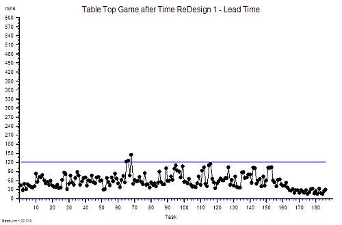
A couple of weeks ago an important event happened.  A Masterclass in Demand and Capacity for NHS service managers was run by an internationally renown and very experienced practitioner of Improvement Science.

The purpose was to assist the service managers to develop their capability for designing quality, flow and cost improvement using tried and tested operations management (OM) theory, techniques and tools.

It was assumed that as experienced NHS service managers that they already knew the basic principles of  OM and the foundation concepts, terminology, techniques and tools.

It was advertised as a Masterclass and designed accordingly.

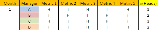
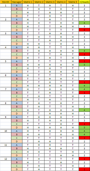
On the day it was discovered that none of the twenty delegates had heard of two fundamental OM concepts: Little’s Law and Takt Time.

These relate to how processes are designed-to-flow. It was a Demand and Capacity Master Class; not a safety, quality or cost one.  The focus was flow.

And it became clear that none of the twenty delegates were aware before the day that there is a well-known and robust science to designing systems to flow.

So learning this fact came as a bit of a shock.

The implications of this observation are profound and worrying:

if a significant % of senior NHS operational managers are unaware of the foundations of operations management then the NHS may have problem it was not aware of …

because …

“if transformational change of the NHS into a stable system that is fit-for-purpose (now and into the future) requires the ability to design processes and systems that deliver both high effectiveness and high efficiency ...”

then …

it raises the question of whether the current generation of NHS managers are fit-for-this-future-purpose“.

No wonder that discovering a Science of  Improvement actually exists came as a bit of a shock!

And saying “Yes, but clinicians do not know this science either!” is a defensive reaction and not a constructive response. They may not but they do not call themselves “operational managers”.

[PS. If you are reading this and are employed by the NHS and do not know what Little’s Law and Takt Time are then it would be worth doing that first. Wikipedia is a good place to start].

And now we have another question:

“Given there are thousands of operational managers in the NHS; what does one sample of 20 managers tell us about the whole population?”

Now that is a good question.

It is also a question of statistics. More specifically quite advanced statistics.

And most people who work in the NHS have not studied statistics to that level. So now we have another do-not-know-how problem.

But it is still an important question that we need to understand the answer to – so we need to learn how and that means taking this learning path one step at a time using what we do know, rather than what we do not.

Step 1:

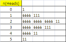
What do we know? We have one sample of 20 NHS service managers. We know something about our sample because our unintended experiment has measured it: that none of them had heard of Little’s Law or Takt Time. That is 0/20 or 0%.

This is called a “sample statistic“.

What we want to know is “What does this information tell us about the proportion of the whole population of all NHS managers who do have this foundation OM knowledge?”

This proportion of interest is called  the unknown “population parameter“.

And we need to estimate this population parameter from our sample statistic because it is impractical to measure a population parameter directly: That would require every NHS manager completing an independent and accurate assessment of their basic OM knowledge. Which seems unlikely to happen.

The good news is that we can get an estimate of a population parameter from measurements made from small samples of that population. That is one purpose of statistics.

Step 2:

But we need to check some assumptions before we attempt this statistical estimation trick.

Q1: How representative is our small sample of the whole population?

If we chose the delegates for the masterclass by putting the names of all NHS managers in a hat and drawing twenty names out at random, as in a  tombola or lottery, than we have what is called a “random sample” and we can trust our estimate of the wanted population parameter.  This is called “random sampling”.

That was not the case here. Our sample was self-selecting. We were not conducting a research study. This was the real world … so there is a chance of “bias”. Our sample may not be representative and we cannot say what the most likely bias is.

It is possible that the managers who selected themselves were the ones struggling most and therefore more likely than average to have a gap in their foundation OM knowledge. It is also possible that the managers who selected themselves are the most capable in their generation and are very well aware that there is something else that they need to know.

We may have a biased sample and we need to proceed with some caution.

Step 3:

So given the fact that none of our possibly biased sample of mangers were aware of the Foundation OM Knowledge then it is possible that no NHS service managers know this core knowledge.  In other words the actual population parameter is 0%. It is also possible that the managers in our sample were the only ones in the NHS who do not know this.  So, in theory, the sought-for population parameter could be anywhere between 0% and very nearly 100%.  Does that mean it is impossible to estimate the true value?

It is not impossible. In fact we can get an estimate that we can be very confident is accurate. Here is how it is done.

Statistical estimates of population parameters are always presented as ranges with a lower and an upper limit called a “confidence interval” because the sample is not the population. And even if we have an unbiased random sample we can never be 100% confident of our estimate.  The only way to be 100% confident is to measure the whole population. And that is not practical.

So, we know the theoretical limits from consideration of the extreme cases … but what happens when we are more real-world-reasonable and say – “let us assume our sample is actually a representative sample, albeit not a randomly selected one“.  How does that affect the range of our estimate of the elusive number – the proportion of NHS service managers who know basic operation management theory?

Step 4:

To answer that we need to consider two further questions:

Q2. What is the effect of the size of the sample?  What if only 5 managers had come and none of them knew; what if had been 50 or 500 and none of them knew?

Q3. What if we repeated the experiment more times? With the same or different sample sizes? What could we learn from that?

Our intuition tells us that the larger the sample size and the more often we do the experiment then the more confident we will be of the result. In other words  narrower the range of the confidence interval around our sample statistic.

Our intuition is correct because if our sample was 100% of the population we could be 100% confident.

So given we have not yet found an NHS service manager who has the OM Knowledge then we cannot exclude 0%. Our challenge narrows to finding a reasonable estimate of the upper limit of our confidence interval.

Step 5

Before we move on let us review where we have got to already and our purpose for starting this conversation: We want enough NHS service managers who are knowledgeable enough of design-for-flow methods to catalyse a transition to a fit-for-purpose and self-sustaining NHS.

One path to this purpose is to have a large enough pool of service managers who do understand this Science well enough to act as advocates and to spread both the know-of and the know-how.  This is called the “tipping point“.

There is strong evidence that when about 20% of a population knows about something that is useful for the whole population – then that knowledge  will start to spread through the grapevine. Deeper understanding will follow. Wiser decisions will emerge. More effective actions will be taken. The system will start to self-transform.

And in the Brave New World of social media this message may spread further and faster than in the past. This is good.

So if the NHS needs 20% of its operational managers aware of the Foundations of Operations Management then what value is our morsel of data from one sample of 20 managers who, by chance, were all unaware of the Knowledge.  How can we use that data to say how close to the magic 20% tipping point we are?

Step 6:

To do that we need to ask the question in a slightly different way.

Q4. What is the chance of an NHS manager NOT knowing?

We assume that they either know or do not know; so if 20% know then 80% do not.

This is just like saying: if the chance of rolling a “six” is 1-in-6 then the chance of rolling a “not-a-six” is 5-in-6.

Next we ask:

Q5. What is the likelihood that we, just by chance, selected a group of managers where none of them know – and there are 20 in the group?

This is rather like asking: what is the likelihood of rolling twenty “not-a-sixes” in a row?

Our intuition says “an unlikely thing to happen!”

And again our intuition is sort of correct. How unlikely though? Our intuition is a bit vague on that.

If the actual proportion of NHS managers who have the OM Knowledge is about the same chance of rolling a six (about 16%) then we sense that the likelihood of getting a random sample of 20 where not one knows is small. But how small? Exactly?

We sense that 20% is too a high an estimate of a reasonable upper limit.  But how much too high?

The answer to these questions is not intuitively obvious.

We need to work it out logically and rationally. And to work this out we need to ask:

Q6. As the % of Managers-who-Know is reduced from 20% towards 0% – what is the effect on the chance of randomly selecting 20 all of whom are not in the Know?  We need to be able to see a picture of that relationship in our minds.

The good news is that we can work that out with a bit of O-level maths. And all NHS service managers, nurses and doctors have done O-level maths. It is a mandatory requirement.

The chance of rolling a “not-a-six” is 5/6 on one throw – about 83%;
and the chance of rolling only “not-a-sixes” in two throws is 5/6 x 5/6 = 25/36 – about 69%
and the chance of rolling only “not-a-sixes” in three throws is 5/6 x 5/6 x 5/6 – about 58%… and so on.

[This is called the “chain rule” and it requires that the throws are independent of each other – i.e. a random, unbiased sample]

If we do this 20 times we find that the chance of rolling no sixes at all in 20 throws is about 2.6% – unlikely but far from impossible.

We need to introduce a bit of O-level algebra now.

Let us call the proportion of NHS service managers who understand basic OM, our unknown population parameter something like “p”.

So if p is the chance of a “six” then (1-p) is a chance of a “not-a-six”.

Then the chance of no sixes in one throw is (1-p)

and no sixes after 2 throws is (1-p)(1-p) = (1-p)^2 (where ^ means raise to the power)

and no sixes after three throws is (1-p)(1-p)(1-p) = (1-p)^3 and so on.

So the likelihood of  “no sixes in n throws” is (1-p)^n

Let us call this “t”

So the equation we need to solve to estimate the upper limit of our estimate of “p” is

t=(1-p)^20

Where “t” is a measure of how likely we are to choose 20 managers all of whom do not know – just by chance.  And we want that to be a small number. We want to feel confident that our estimate is reasonable and not just a quirk of chance.

So what threshold do we set for “t” that we feel is “reasonable”? 1 in a million? 1 in 1000? 1 in 100? 1 in10?

By convention we use 1 in 20 (t=0.05) – but that is arbitrary. If we are more risk-averse we might choose 1:100 or 1:1000. It depends on the context.

Let us be reasonable – let is say we want to be 95% confident our our estimated upper limit for “p” – which means we are calculating the 95% confidence interval. This means that will accept a 1:20 risk of our calculated confidence interval for “p” being wrong:  a 19:1 odds that the true value of “p” falls outside our calculated range. Pretty good odds! We will be reasonable and we will set the likelihood threshold for being “wrong” at 5%.

So now we need to solve:

0.05= (1-p)^20

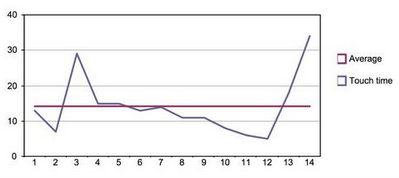
And we want a picture of this relationship in our minds so let us draw a graph of t for a range of values of p.

We know the value of p must be between 0 and 1.0 so we have all we need and we can generate this graph easily using Excel.  And every senior NHS operational manager knows how to use Excel. It is a requirement. Isn’t it?

Black_Curtain

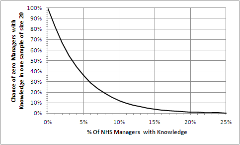
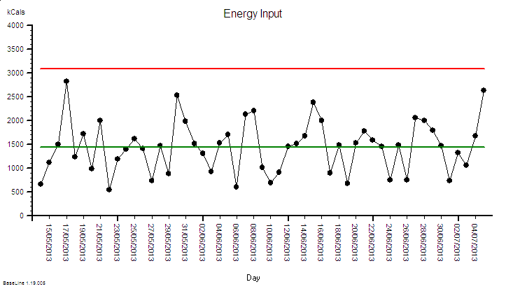
The Excel-generated chart shows the relationship between p (horizontal axis) and t (vertical axis) using our equation:

t=(1-p)^20.

Step 7

Let us first do a “sanity check” on what we have drawn. Let us “check the extreme values”.

If 0% of managers know then a sample of 20 will always reveal none – i.e. the leftmost point of the chart. Check!

If 100% of managers know then a sample of 20 will never reveal none – i.e. way off to the right. Check!

What is clear from the chart is that the relationship between p and t  is not a straight line; it is non-linear. That explains why we find it difficult to estimate intuitively. Our brains are not very good at doing non-linear analysis. Not very good at all.

So we need a tool to help us. Our Excel graph.  We read down the vertical “t” axis from 100% to the 5% point, then trace across to the right until we hit the line we have drawn, then read down to the corresponding value for “p”. It says about 14%.

So that is the upper limit of our 95% confidence interval of the estimate of the true proportion of NHS service managers who know the Foundations of Operations Management.  The lower limit is 0%.

And we cannot say better than somewhere between  0%-14% with the data we have and the assumptions we have made.

To get a more precise estimate,  a narrower 95% confidence interval, we need to gather some more data.

[Another way we can use our chart is to ask “If the actual % of Managers who know is x% the what is the chance that no one of our sample of 20 will know?” Solving this manually means marking the x% point on the horizontal axis then tracing a line vertically up until it crosses the drawn line then tracing a horizontal line to the left until it crosses the vertical axis and reading off the likelihood.]

So if in reality 5% of all managers do Know then the chance of no one knowing in an unbiased sample of 20 is about 35% – really quite likely.

Now we are getting a feel for the likely reality. Much more useful than just dry numbers!

But we are 95% sure that 86% of NHS managers do NOT know the basic language  of flow-improvement-science.

And what this chart also tells us is that we can be VERY confident that the true value of p is less than 2o% – the proportion we believe we need to get to transformation tipping point.

Now we need to repeat the experiment experiment and draw a new graph to get a more accurate estimate of just how much less – but stepping back from the statistical nuances – the message is already clear that we do have a Black Curtain problem.

A Black Curtain of Ignorance problem.

Many will now proclaim angrily “This cannot be true! It is just statistical smoke and mirrors. Surely our managers do know this by a different name – how could they not! It is unthinkable to suggest the majority of NHS manages are ignorant of the basic science of what they are employed to do!

If that were the case though then we would already have an NHS that is fit-for-purpose. That is not what reality is telling us.

And it quickly become apparent at the master class that our sample of 20 did not know-this-by-a-different-name.

The good news is that this knowledge gap could hiding the opportunity we are all looking for – a door to a path that leads to a radical yet achievable transformation of the NHS into a system that is fit-for-purpose. Now and into the future.

A system that delivers safe, high quality care for those who need it, in full, when they need it and at a cost the country can afford. Now and for the foreseeable future.

And the really good news is that this IS knowledge gap may be  and extensive deep but it is not wide … the Foundations are is easy to learn, and to start applying immediately.  The basics can be learned in less than a week – the more advanced skills take a bit longer.  And this is not untested academic theory – it is proven pragmatic real-world problem solving know-how. It has been known for over 50 years outside healthcare.

Our goal is not acquisition of theoretical knowledge – is is a deep enough understanding to make wise enough  decisions to achieve good enough outcomes. For everyone. Starting tomorrow.

And that is the design purpose of FISH. To provide those who want to learn a quick and easy way to do so.

Stop Press: Further feedback from the masterclass is that some of the managers are grasping the nettle, drawing back their own black curtains, opening the door that was always there behind it, and taking a peek through into a magical garden of opportunity. One that was always there but was hidden from view.

Improvement-by-Twitter

Sat 5th October

It started with a tweet.

08:17 [JG] The NHS is its people. If you lose them, you lose the NHS.

09:15 [DO] We are in a PEOPLE business – educating people and creating value.

Sun 6th October

08:32 [SD] Who isn’t in people business? It is only people who buy stuff. Plants, animals, rocks and machines don’t.

09:42 [DO] Very true – it is people who use a service and people who deliver a service and we ALL know what good service is.

09:47 [SD] So onus is on us to walk our own talk. If we don’t all improve our small bits of the NHS then who can do it for us?

Then we were off … the debate was on …

10:04 [DO] True – I can prove I am saving over £160 000.00 a year – roll on PBR !?

10:15 [SD] Bravo David. I recently changed my surgery process: productivity up by 35%. Cost? Zero. How? Process design methods.

11:54 [DO] Exactly – cost neutral because we were thinking differently – so how to persuade the rest?

12:10 [SD] First demonstrate it is possible then show those who want to learn how to do it themselves. http://www.saasoft.com/fish/course

We had hard evidence it was possible … and now MC joined the debate …

12:48 [MC] Simon why are there different FISH courses for safety, quality and efficiency? Shouldn’t good design do all of that?

12:52 [SD] Yes – goal of good design is all three. It just depends where you are starting from: Governance, Operations or Finance.

A number of parallel threads then took off and we all had lots of fun exploring  each others knowledge and understanding.

17:28 MC registers on the FISH course.

And that gave me an idea. I emailed an offer – that he could have a complimentary pass for the whole FISH course in return for sharing what he learns as he learns it.  He thought it over for a couple of days then said “OK”.

Weds 9th October

06:38 [MC] Over the last 4 years of so, I’ve been involved in incrementally improving systems in hospitals. Today I’m going to start an experiment.

06:40 [MC] I’m going to see if we can do less of the incremental change and more system redesign. To do this I’ve enrolled in FISH

Fri 11th October

06:47 [MC] So as part of my exploration into system design, I’ve done some studies in my clinic this week. Will share data shortly.

21:21 [MC] Here’s a chart showing cycle time of patients in my clinic. Median cycle time 14 mins, but much longer in 2 pic.twitter.com/wu5MsAKk80

20131019_TTchart

21:22 [MC] Here’s the same clinic from patients’ point if view, wait time. Much longer than I thought or would like

20131019_WTchart

21:24 [MC] Two patients needed to discuss surgery or significant news, that takes time and can’t be rushed.

21:25 [MC] So, although I started on time, worked hard and finished on time. People were waited ages to see me. Template is wrong!

21:27 [MC] By the time I had seen the the 3rd patient, people were waiting 45 mins to see me. That’s poor.

21:28 [MC] The wait got progressively worse until the end of the clinic.

Sunday 13th October

16:02 [MC] As part of my homework on systems, I’ve put my clinic study data into a Gantt chart. Red = waiting, green = seeing me pic.twitter.com/iep2PDoruN

20131019_Ganttchart

16:34 [SD] Hurrah! The visual power of the Gantt Chart. Worth adding the booked time too – there are Seven Sins of Scheduling to find.

16:36 [SD] Excellent – good idea to sort into booked time order – it makes the planned rate of demand easier to see.

16:42 [SD] Best chart is Work In Progress – count the number of patients at each time step and plot as a run chart.

17:23 [SD] Yes – just count how many lines you cross vertically at each time interval. It can be automated in Excel

17:38 [MC] Like this? pic.twitter.com/fTnTK7MdOp


20131019_WIPchart

This is the work-in-progress chart. The most useful process monitoring chart of all. It shows the changing size of the queue over time.  Good flow design is associated with small, steady queues.

18:22 [SD] Perfect! You’re right not to plot as XmR – this is a cusum metric. Not a healthy WIP chart this!

There was more to follow but the “ah ha” moment had been seen and shared.

Weds 16th October

MC completes the Online FISH course and receives his well-earned Certificate of Achievement.

This was his with-the-benefit-of-hindsight conclusion:

I wish I had known some of this before. I will have totally different approach to improvement projects now. Key is to measure and model well before doing anything radical.

Improvement Science works.
Improvement-by-Design is a skill that can be learned quickly.
FISH is just a first step.

The Victim Vortex

[Beep Beep] Bob tapped the “Answer” button on his smartphone – it was Lesley calling in for their regular ISP coaching session.

<Bob>Hi Lesley. How are you today? And which tunnel in the ISP Learning Labyrinth shall we explore today?

<Lesley>Hi Bob. I am OK thank you. Can we invest some time in the Engagement Maze?

<Bob>OK. Do you have a specific example?

<Lesley>Sort of. This week I had a conversation with our Chief Executive about the potential of Improvement Science and the reply I got was “I am convinced by what you say but it is your colleagues who need to engage. If you have not succeeded in convincing them then how can I?” I was surprised by that response and slightly niggled because it had an uncomfortable nugget of truth in it.

<Bob>That sounds like the wisdom of a leader who understands that the “power” to make things happen does not sit wholly in the lap of those charged with accountability.

<Lesley> I agree.  And at the same time everything that the “Top Team” suggest gets shot down in flames by a small and very vocal group of my more skeptical colleagues.

<Bob>Ah ha!  It sounds like the Victim Vortex is causing trouble here.

<Lesley>The Victim Vortex?

<Bob>Yes.  Let me give you an example.  One of the common initiators of the Victim Vortex is the data flow part of a complex system design.  The Sixth Flow.  So can I ask you: “How are new information systems developed in your organization?

<Lesley>Wow!  You hit the nail on the head first time!  Just this week there has been another firestorm of angry emails triggered by yet another silver-bullet IT system being foisted on us!

<Bob>Interesting use of language Lesley.  You sound quite “niggled”.

<Lesley>I am.  Not by the constant “drizzle of IT magic” – that is irritating enough – but more by the vehemently cynical reaction of my peers.

<Bob>OK.  This sounds like good enough example of the Victim Vortex.  What do you expect the outcome will be?

<Lesley>Well, if past experience is a predictor for future performance – an expensive failure, more frustration and a deeper well of cynicism.

<Bob>Frustrating for whom?

<Lesley>Everyone.  The IT department as well.  It feels like we are all being sucked into a lose-lose-lose black hole of depression and despair!

<Bob>A very good description of the Victim Vortex.

<Lesley>So the Victim Vortex is an example of the Drama Triangle acting on an organizational level?

tornada_150_wht_10155<Bob>Yes. Visualize a cultural tornado.  The energy that drives it is the emotional  currency spent in playing the OK – Not OK Games.  It is a self-fueling system, a stable design, very destructive and very resistant to change.

<Lesley>That metaphor works really well for me!

<Bob>A similar one is a whirlpool – a water vortex.  If you were out swimming and were caught up in a whirlpool what are your exit strategy options?

<Lesley>An interesting question.  I have never had that experience and would not want it – it sounds rather hazardous.  Let me think.  If I do nothing I will just get swept around in the chaos and I am at risk of  getting bashed, bruised and then sucked under.

<Bob>Yes – you would probably spend all your time and energy just treading water and dodging the flotsam and jetsam that has been sucked into the Vortex.  That is what most people do.  It is called the Hamster Wheel effect.

<Lesley>So another option is to actively swim towards the middle of the Vortex – the end would at least be quick! But that is giving up and adopting the Hopelessness attitude of burned out Victim.  That would be the equivalent of taking voluntary redundancy or early retirement.  It is not my style!

<Bob>Yes.  It does not solve the problem either.  The Vortex is always hoovering up new Victims.  It is insatiable.

<Lesley> And another option would be to swim with the flow to avoid being “got” from behind.  That would be seem sensible and is possible; and at least I would feel better for doing something. I might even escape if I swim fast enough!

<Bob>That is indeed what some try.  The movers and shakers.  The pace setters.  The optimists.  The extrovert leaders.  The problem is that it makes the Vortex spin even faster.  It actually makes the Vortex bigger,  more chaotic and more dangerous than before.

<Lesley>Yes – I can see that.  So my other option is to swim against the flow in an attempt to slow the Vortex down.  Would that work?

<Bob>If everyone did that at the same time it might but that is unlikely to happen spontaneously.  If you could achieve that degree of action alignment you would not have a Victim Vortex in the first place.  Trying to do it alone is ineffective, you tire very quickly, the other Victims bash into you, you slow them down, and then you all get sucked down the Plughole of Despair.

<Lesley>And I suppose a small group of like-minded champions who try to swim-against the flow might last longer if they stick together but even then eventually they would get bashed up and broken up too.  I have seen that happen.  And that is probably where our team are heading at the moment.  I am out of options.  Is it impossible to escape the Victim Vortex?

<Bob>There is one more direction you can swim.

<Lesley>Um?  You mean across the flow heading directly away from the center?

<Bob>Exactly.  Consider that option.

<Lesley>Well, it would still be hard work and I would still be going around with the Vortex and I would still need to watch out for flotsam but every stroke I make would take me further from the center.  The chaos would get gradually less and eventually I would be in clear water and out of danger.  I could escape the Victim Vortex!

<Bob>Yes. And what would happen if others saw you do that and did the same?

<Lesley>The Victim Vortex would dissipate!

<Bob>Yes.  So that is your best strategy.  It is a win-win-win strategy too. You can lead others out of the Victim Vortex.

<Lesley>Wow!  That is so cool!  So how would I apply that metaphor to the Information System niggle?

<Bob>I will leave you to ponder on that.  Think about it as a design assignment.  The design of the system that generates IT solutions that are fit-for-purpose.

<Lesley> Somehow I knew you were going to say that!  I have my squared-paper and sharpened pencil at the ready.  Yes – an improvement-by-design assignment.  Thank you once again Bob.  This ISP course is the business!

DRAT!

[Bing Bong]  The sound bite heralded Leslie joining the regular Improvement Science mentoring session with Bob.  They were now using web-technology to run virtual meetings because it allows a richer conversation and saves a lot of time. It is a big improvement.

<Bob> Hi Lesley, how are you today?

<Leslie> OK thank you Bob.  I have a thorny issue to ask you about today. It has been niggling me even since we started to share the experience we are gaining from our current improvement-by-design project.

<Bob> OK. That sounds interesting. Can you paint the picture for me?

<Leslie> Better than that – I can show you the picture, I will share my screen with you.

DRAT_01 <Bob> OK. I can see that RAG table. Can you give me a bit more context?

<Leslie> Yes. This is how our performance management team have been asked to produce their 4-weekly reports for the monthly performance committee meetings.

<Bob> OK. I assume the “Period” means sequential four week periods … so what is Count, Fail and Fail%?

<Leslie> Count is the number of discharges in that 4 week period, Fail is the number whose length of stay is longer than the target, and Fail% is the ratio of Fail/Count for each 4 week period.

<Bob> It looks odd that the counts are all 28.  Is there some form of admission slot carve-out policy?

<Leslie> Yes. There is one admission slot per day for this particular stream – that has been worked out from the average historical activity.

<Bob> Ah! And the Red, Amber, Green indicates what?

<Leslie> That is depends where the Fail% falls in a set of predefined target ranges; less than 5% is green, 5-10% is Amber and more than 10% is red.

<Bob> OK. So what is the niggle?

<Leslie>Each month when we are in the green we get no feedback – a deafening silence. Each month we are in amber we get a warning email.  Each month we are in the red we have to “go and explain ourselves” and provide a “back-on-track” plan.

<Bob> Let me guess – this feedback design is not helping much.

<Leslie> It is worse than that – it creates a perpetual sense of fear. The risk of breaching the target is distorting people’s priorities and their behaviour.

<Bob> Do you have any evidence of that?

<Leslie> Yes – but it is anecdotal.  There is a daily operational meeting and the highest priority topic is “Which patients are closest to the target length of stay and therefore need to have their  discharge expedited?“.

<Bob> Ah yes.  The “target tail wagging the quality dog” problem. So what is your question?

<Leslie> How do we focus on the cause of the problem rather than the symptoms?  We want to be rid of the “fear of the stick”.

<Bob> OK. What you have hear is a very common system design flaw. It is called a DRAT.

<Leslie> DRAT?

<Bob> “Delusional Ratio and Arbitrary Target”.

<Leslie> Ha! That sounds spot on!  “DRAT” is what we say every time we miss the target!

<Bob> Indeed.  So first plot this yield data as a time series chart.

<Leslie> Here we go.

DRAT_02<Bob>Good. I see you have added the cut-off thresholds for the RAG chart. These 5% and 10% thresholds are arbitrary and the data shows your current system is unable to meet them. Your design looks incapable.

<Leslie>Yes – and it also shows that the % expressed to one decimal place is meaningless because there are limited possibilities for the value.

<Bob> Yes. These are two reasons that this is a Delusional Ratio; there are quite a few more.

DRAT_03<Leslie> OK  and if I plot this as an Individuals charts I can see that this variation is not exceptional.

<Bob> Careful Leslie. It can be dangerous to do this: an Individuals chart of aggregate yield becomes quite insensitive with aggregated counts of relatively rare events, a small number of levels that go down to zero, and a limited number of points.  The SPC zealots are compounding the problem and plotting this data as a C-chart or a P-chart makes no difference.

This is all the effect of the common practice of applying  an arbitrary performance target then counting the failures and using that as means of control.

It is poor feedback loop design – but a depressingly common one.

<Leslie> So what do we do? What is a better design?

<Bob> First ask what the purpose of the feedback is?

<Leslie> To reduce the number of beds and save money by forcing down the length of stay so that the bed-day load is reduced and so we can do the same activity with fewer beds and at the same time avoid cancellations.

<Bob> OK. That sounds reasonable from the perspective of a tax-payer and a patient. It would also be a more productive design.

<Leslie> I agree but it seems to be having the opposite effect.  We are focusing on avoiding breaches so much that other patients get delayed who could have gone home sooner and we end up with more patients to expedite. It is like a vicious circle.  And every time we fail we get whacked with the RAG stick again. It is very demoralizing and it generates a lot of resentment and conflict. That is not good for anyone – least of all the patients.

<Bob>Yes.  That is the usual effect of a DRAT design. Remember that senior managers have not been trained in process improvement-by-design either so blaming them is also counter-productive.  We need to go back to the raw data. Can you plot actual LOS by patient in order of discharge as a run chart.

DRAT_04

<Bob> OK – is the maximum LOS target 8 days?

<Leslie> Yes – and this shows  we are meeting it most of the time.  But it is only with a huge amount of effort.

<Bob> Do you know where 8 days came from?

<Leslie> I think it was the historical average divided by 85% – someone read in a book somewhere that 85%  average occupancy was optimum and put 2 and 2 together.

<Bob> Oh dear! The “85% Occupancy is Best” myth combined with the “Flaw of Averages” trap. Never mind – let me explain the reasons why it is invalid to do this.

<Leslie> Yes please!

<Bob> First plot the data as a run chart and  as a histogram – do not plot the natural process limits yet as you have done. We need to do some validity checks first.

DRAT_05

<Leslie> Here you go.

<Bob> What do you see?

<Leslie> The histogram  has more than one peak – and there is a big one sitting just under the target.

<Bob>Yes. This is called the “Horned Gaussian” and is the characteristic pattern of an arbitrary lead-time target that is distorting the behaviour of the system.  Just as you have described subjectively. There is a smaller peak with a mode of 4 days and are a few very long length of stay outliers.  This multi-modal pattern means that the mean and standard deviation of this data are meaningless numbers as are any numbers derived from them. It is like having a bag of mixed fruit and then setting a maximum allowable size for an unspecified piece of fruit. Meaningless.

<Leslie> And the cases causing the breaches are completely different and could never realistically achieve that target! So we are effectively being randomly beaten with a stick. That is certainly how it feels.

<Bob> They are certainly different but you cannot yet assume that their longer LOS is inevitable. This chart just says – “go and have a look at these specific cases for a possible cause for the difference“.

<Leslie> OK … so if they are from a different system and I exclude them from the analysis what happens?

<Bob> It will not change reality.  The current design of  this process may not be capable of delivering an 8 day upper limit for the LOS.  Imposing  a DRAT does not help – it actually makes the design worse! As you can see. Only removing the DRAT will remove the distortion and reveal the underlying process behaviour.

<Leslie> So what do we do? There is no way that will happen in the current chaos!

<Bob> Apply the 6M Design® method. Map, Measure and Model it. Understand how it is behaving as it is then design out all the causes of longer LOS and that way deliver with a shorter and less variable LOS. Your chart shows that your process is stable.  That means you have enough flow capacity – so look at the policies. Draw on all your FISH training. That way you achieve your common purpose, and the big nasty stick goes away, and everyone feels better. And in the process you will demonstrate that there is a better feedback design than DRATs and RAGs. A win-win-win design.

<Leslie> OK. That makes complete sense. Thanks Bob!  But what you have described is not part of the FISH course.

<Bob> You are right. It is part of the ISP training that comes after FISH. Improvement Science Practitioner.

<Leslie> I think we will need to get a few more people trained in the theory, techniques and tools of Improvement Science.

<Bob> That would appear to be the case. They will need a real example to see what is possible.

<Leslie> OK. I am on the case!

Fudge? We Love Fudge!

stick_figures_moving_net_150_wht_8609
It is almost autumn again.  The new school year brings anticipation and excitement. The evenings are drawing in and there is a refreshing chill in the early morning air.

This is the time of year for fudge.

Alas not the yummy sweet sort that Grandma cooked up and gave out as treats.

In healthcare we are already preparing the Winter Fudge – the annual guessing game of attempting to survive the Winter Pressures. By fudging the issues.

This year with three landmark Safety and Quality reports under our belts we have more at stake than ever … yet we seem as ill prepared as usual. Mr Francis, Prof Keogh and Dr Berwick have collectively exhorted us to pull up our socks.

So let us explore how and why we resort to fudging the issues.

Watch the animation of a highly simplified emergency department and follow the thoughts of the manager. You can pause, rewind, and replay as much as you like.  Follow the apparently flawless logic – it is very compelling. The exercise is deliberately simplified to eliminate wriggle room. But it is valid because the behaviour is defined by the Laws of Physics – and they are not negotiable.

The problem was combination of several planning flaws – two in particular.

First is the “Flaw of Averages” which is where the past performance-over-time is boiled down to one number. An average. And that is then used to predict precise future behaviour. This is a very big mistake.

The second is the “Flaw of Fudge Factors” which is a attempt to mitigate the effects of first error by fudging the answer – by adding an arbitrary “safety margin”.

This pseudo-scientific sleight-of-hand may polish the planning rhetoric and render it more plausible to an unsuspecting Board – but it does not fool Reality.

In reality the flawed design failed – as the animation dramatically demonstrated.  The simulated patients came to harm. Unintended harm to be sure – but harm nevertheless.

So what is the alternative?

The alternative is to learn how to avoid Sir Flaw of Averages and his slippery friend Mr Fudge Factor.

And learning how to do that is possible … it is called Improvement Science.

And you can start right now … click HERE.

Step 5 – Monitor

Improvement-by-Design is not the same as Improvement-by-Desire.

Improvement-by-Design has a clear destination and a design that we know can get us there because we have tested it before we implement it.

Improvement-by-Desire has a vague direction and no design – we do not know if the path we choose will take us in the direction we desire to go. We cannot see the twists and turns, the unknown decisions, the forks, the loops, and the dead-ends. We expect to discover those along the way. It is an exercise in hope.

So where pessimists and skeptics dominate the debate then Improvement-by-Design is a safer strategy.

Just over seven weeks ago I started an Improvement-by-Design project – a personal one. The destination was clear: to get my BMI (body mass index) into a “healthy” range by reducing weight by about 5 kg.  The design was clear too – to reduce energy input rather than increase energy output. It is a tried-and-tested method – “avoid burning the toast”.  The physical and physiological model predicted that the goal was achievable in 6 to 8 weeks.

So what has happened?

To answer that question requires two time-series charts. The input chart of calories ingested and the output chart of weight. This is Step 5 of the 6M Design® sequence.

Energy_Weight_ModelRemember that there was another parameter  in this personal Energy-Weight system: the daily energy expended.

But that is very difficult to measure accurately – so I could not do that.

What I could do was to estimate the actual energy expended from the model of the system using the measured effect of the change. But that is straying into the Department of Improvement Science Nerds. Let us stay in the real world a  bit longer.

Here is the energy input chart …

SRD_EnergyIn_XmR

It shows an average calorie intake of 1500 kcal – the estimated required value to achieve the weight loss given the assumptions of the physiological model. It also shows a wide day-to-day variation.  It does not show any signal flags (red dots) so an inexperienced Improvementologist might conclude that this just random noise.

It is not.  The data is not homogeneous. There is a signal in the system – a deliberate design change – and without that context it is impossible to correctly interpret the chart.

Remember Rule #1: Data without context is meaningless.

The deliberate process design change was to reduce calorie intake for just two days per week by omitting unnecessary Hi-Cal treats – like those nice-but-naughty Chocolate Hobnobs. But which two days varied – so there is no obvious repeating pattern in the chart. And the intake on all days varied – there were a few meals out and some BBQ action.

To separate out these two parts of the voice-of-the-process we need to rationally group the data into the Lo-cal days (F) and the OK-cal days (N).

SRD_EnergyIn_Grouped_XmR

The grouped BaseLine© chart tells a different story.  The two groups clearly have a different average and both have a lower variation-over-time than the meaningless mixed-up chart.

And we can now see a flag – on the second F day. That is a prompt for an “investigation” which revealed: will-power failure.  Thursday evening beer and peanuts! The counter measure was to avoid Lo-cal on a Thursday!

What we are seeing here is the fifth step of 6M Design® exercise  – the Monitor step.

And as well as monitoring the factor we are changing – the cause;  we also monitor the factor we want to influence – the effect.

The effect here is weight. And our design includes a way of monitoring that – the daily weighing.

SRD_WeightOut_XmRThe output metric BaseLine© chart – weight – shows a very different pattern. It is described as “unstable” because there are clusters of flags (red dots) – some at the start and some at the end. The direction of the instability is “falling” – which is the intended outcome.

So we have robust, statistically valid evidence that our modified design is working.

The weight is falling so the energy going in must be less than the energy being put out. I am burning off the excess lard and without doing any extra exercise.  The physics of the system mandate that this is the only explanation. And that was my design specification.

So that is good. Our design is working – but is it working as we designed?  Does observation match prediction? This is Improvement-by-Design.

Remember that we had to estimate the other parameter to our model – the average daily energy output – and we guessed a value of 2400 kcal per day using generic published data.  Now I can refine the model using my specific measured change in weight – and I can work backwards to calculate the third parameter.  And when I did that the number came out at 2300 kcal per day.  Not a huge difference – the equivalent of one yummy Chocolate Hobnob a day – but the effect is cumulative.  Over the 53 days of the 6M Design® project so far that would be a 5300 kcal difference – about 0.6kg of useless blubber.

So now I have refined my personal energy-weight model using the new data and I can update my prediction and create a new chart – a Deviation from Aim chart.

SRD_WeightOut_DFA
This is the  chart I need to watch to see  if I am on the predicted track – and it too is unstable -and not a good direction.  It shows that the deviation-from-aim is increasing over time and this is because my original guesstimate of an unmeasurable model parameter was too high.

This means that my current design will not get me to where I want to be, when I what to be there. This tells me  I need to tweak my design.  And I have a list of options.

1) I could adjust the target average calories per day down from 1500 to 1400 and cut out a few more calories; or

2) I could just keep doing what I am doing and accept that it will take me longer to get to the destination; or

3) I could do a bit of extra exercise to burn the extra 100 kcals a day off, or

4) I could do a bit of any or all three.

And because I am comparing experience with expectation using a DFA chart I will know very quickly if the design tweak is delivering.

And because some nice weather has finally arrived so the BBQ will be busy I have chosen to take longer to get there. I will enjoy the weather, have a few beers and some burgers. And that is OK. It is a perfectly reasonable design option – it is a rational and justifiable choice.

And I need to set my next destination – a weight if about 72 kg according to the BMI chart – and with my calibrated Energy-Weight model I will know exactly how to achieve that weight and how long it will take me. And I also know how to maintain it – by  increasing my calorie intake. More beer and peanuts – maybe – or the occasional Chocolate Hobnob even. Hurrah! Win-win-win!


6MDesign This real-life example illustrates 6M Design® in action and demonstrates that it is a generic framework.

The energy-weight model in this case is a very simple one that can be worked out on the back of a beer mat (which is what I did).

It is called a linear model because the relationship between calories-in and weight-out is approximately a straight line.

Most real-world systems are not like this. Inputs are not linearly related to outputs.  They are called non-linear systems: and that makes a BIG difference.

A very common error is to impose a “linear model” on a “non-linear system” and it is a recipe for disappointment and disaster.  We do that when we commit the Flaw of Averages error. We do it when we plot linear regression lines through time-series data. We do it when we extrapolate beyond the limits of our evidence.  We do it when we equate time with money.

The danger of this error is that our linear model leads us to make unwise decisions and we actually make the problem worse – not better.  We then give up in frustration and label the problem as “impossible” or “wicked” or get sucked into to various forms of Snake Oil Sorcery.

The safer approach is to assume the system is non-linear and just let the voice of the system talk to us through our BaseLine© charts. The challenge for us is to learn to understand what the system is saying.

That is why the time-series charts are called System Behaviour Charts and that is why they are an essential component of Improvement-by-Design.

However – there is a step that must happen before this – and that is to get the Foundations in place. The foundation of knowledge on which we can build our new learning. That gap must be filled first.

And anyone who wants to invest in learning the foundations of improvement science can now do so at their own convenience and at their own pace because it is on-line …. and it is here.

fish

Middle-Aware

line_figure_phone_400_wht_9858[Dring Dring]

<Bob> Hi Leslie, how are you today?

<Leslie> Really good thanks. We are making progress and it is really exciting to see tangible and measurable improvement in safety, delivery, quality and financial stability.

<Bob> That is good to hear. So what topic shall we explore today?

<Leslie> I would like to return to the topic of engagement.

<Bob> OK. I am sensing that you have a specific Niggle that you would like to share.

<Leslie> Yes.  Specifically it is engaging the Board.

<Bob> Ah ha. I wondered when we would get to that. Can you describe your Niggle?

<Leslie> Well, the feeling is fear and that follows from the risk of being identified as a trouble-maker which follows from exposing gaps in knowledge and understanding of seniors.

<Bob> Well put.  This is an expected hurdle that all Improvement Scientists have to learn to leap reliably. What is the barrier that you see?

<Leslie> That I do not know how to do it and I have seen a  lot of people try and commit career-suicide – like moths on a flame.

<Bob> OK – so it is a real fear based on real evidence. What methods did the “toasted moths” try?

<Leslie> Some got angry and blasted off angry send-to-all emails.  They just succeeded in identifying themselves as “terrorists” and were dismissed – politically and actually. Others channeled  their passion more effectively by heroic acts that held the system together for a while – and they succeeded in burning themselves out. The end result was the same: toasted!

<Bob> So with your understanding of design principles what does that say?

<Leslie> That the design of their engagement process is wrong.

<Bob> Wrong?

<Leslie> I mean “not fit for purpose”.

<Bob> And the difference is?

<Leslie> “Wrong” is a subjective judgement, “not fit for purpose” is an objective assessment.

<Bob> Yes. We need to be careful with words. So what is the “purpose”?

<Leslie> An organisation that is capable of consistently delivering improvement on all dimensions, safety, delivery, quality and affordability.

<Bob> Which requires?

<Leslie> All the parts working in synergy to a common purpose.

<Bob> So what are the parts?

<Leslie> The departments.

<Bob> They are the stages that the streams cross – they are parts of system structure. I am thinking more broadly.

<Leslie> The workers, the managers and the executives?

<Bob> Yes.  And how is that usually perceived?

<Leslie> As a power hierarchy.

<Bob> And do physical systems have power hierarchies?

<Leslie> No … they have components with different and complementary roles.

<Bob> So does that help?

<Leslie> Yes! To achieve synergy each component has to know its complementary role and be competent to do it.

<Bob> And each must understand the roles of the others,  respect the difference, and develop trust in their competence.

<Leslie> And the concepts of understanding, respect and trust appears again.

<Bob> Indeed.  They are always there in one form or another.

<Leslie> So as learning and improvement is a challenge then engagement is respectful challenge …

<Bob> … uh huh …

<Leslie> … and each part is different so requires a different form of respectful challenge?

<Bob> Yes. And with three parts there are six relationships between them – so six different ways of one part respectfully challenging another. Six different designs that have the same purpose but a different context.

<Leslie> Ah ha!  And if we do not use the context-dependent-fit-for-purpose-respectful-challenge-design we do not achieve our purpose?

<Bob> Correct. The principles of design are generic.

<Leslie> So what are the six designs?

<Bob> Let us explore three of them. First the context of a manager respectfully challenging a worker to improve.

<Leslie> That would require some form of training. Either the manager trains the worker or employs someone else to.

<Bob> Yes – and when might a manager delegate training?

<Leslie> When they do not have time to or do not know how to.

<Bob> Yes. So how would the flaw in that design be avoided?

<Leslie> By the manager maintaining their own know-how by doing enough training themselves and delegating the rest.

<Bob> Yup. Well done. OK let us consider a manager respectfully challenging other managers to improve.

<Leslie> I see what you mean. That is a completely different dynamic. The closest I can think of is a coaching arrangement.

<Bob> Yes. Coaching is quite different from training. It is more of a two-way relationship and I prefer to refer to it as “informal co-coaching” because both respectfully challenge each other in different ways; both share knowledge; and both learn and develop.

<Leslie> And that is what you are doing now?

<Bob> Yes. The only difference is that we have agreed a formal coaching contract. So what about a worker respectfully challenging a manager or a manager respectfully challenging an executive?

<Leslie>That is a very different dynamic. It is not training and it is not coaching.

<Bob> What other options are there?

<Leslie>Not formal coaching!  An executive is not going to ask a middle manager to coach them!

<Bob> You are right on both counts – so what is the essence of informal coaching?

<Leslie> An informal coach provides a different perspective and will say what they see if asked and will ask questions that help to illustrate alternative perspectives and offer evidence of alternative options. This is just well-structured, judgement-free feedback.

<Bob> Yes. We do it all the time. And we are often “coached” by those much younger than ourselves who have a more modern perspective. Our children for instance.

<Leslie> So the judgement free feedback metaphor is the one that a manager can use to engage an executive.

<Bob> Yes. And look at it from the perspective of the executive – they want feedback that can help them made wiser strategic decisions. That is their role. Boards are always asking for customer feedback, staff feedback and performance feedback.  They want to know the Nuggets, the Niggles, the Nice Ifs and the NoNos.  They just do not ask for it like that.

<Leslie> So they are no different from the rest of us?

<Bob> Not in respect of an insatiable appetite for unfiltered and undistorted feedback. What is different is their role. They are responsible for the strategic decisions – the ones that affect us all – so we can help ourselves by helping them make those decisions. A well-designed feedback model is fit-for-that-purpose.

<Leslie> And an Improvement Scientist needs to be able to do all three – training, coaching and communicating in a collaborative informal style. Is that leadership?

<Bob> I call it “middle-aware”.

<Leslie> It makes complete sense to me. There is a lot of new stuff here and I will need to reflect on it. Thank you once again for showing me a different perspective on the problem.

<Bob> I enjoyed it too – talking it through helps me to learn to explain it better – and I look forward to hearing the conclusions from your reflections because I know I will learn from that too.

Closing the Two Loops

Over the past few weeks I have been conducting an Improvement Science Experiment (ISE).  I do that a lot.  This one is a health improvement experiment. I do that a lot too.  Specifically – improving my own health. Ah! Not so diligent with that one.

The domain of health that I am focusing on is weight – for several reasons:
(1) because a stable weight that is within “healthy” limits is a good idea for many reasons and
(2) because weight is very easy to measure objectively and accurately.

But like most people I have constraints: motivation constraints, time constraints and money constraints.  What I need is a weight reduction design that requires no motivation, no time, and no money.  That sounds like a tough design challenge – so some consideration is needed.

Design starts with a specific purpose and a way of monitoring progress.  And I have a purpose – weight within acceptable limits; a method for monitoring progress – a dusty set of digital scales. What I need is a design for delivering the improvement and a method for maintaining it. That is the challenge.

So I need a tested design that will deliver the purpose.  I could invent something here but it is usually quicker to learn from others who have done it, or something very similar.  And there is lots of knowledge and experience out there.  And they fall into two broad schools – Eat Healthier or Exercise More and usually Both.

Eat Healthier is sold as  Eat Less of the Yummy Bad Stuff and more of the Yukky Good Stuff. It sounds like a Puritanical Policy and is not very motivating. So with zero motivation as  a constraint this is a problem.  And Yukky Good Stuff seems to come with a high price tag. So with zero budget as a constraint this is a problem too.

Exercise More is sold as Get off Your Bottom and Go for a Walk. It sounds like a Macho Man Mantra. Not very motivating either. It takes time to build up a “healthy” sweat and I have no desire to expose myself as a health-desperado by jogging around my locality in my moth-eaten track suit.  So with zero time as a constraint this is a problem. Gym subscriptions and the necessary hi-tech designer garb do not come cheap.  So with a zero budget constraint this is another problem.

So far all the conventional wisdom is failing to meet any of my design constraints. On all dimensions.

Oh dear!

The rhetoric is not working.  That packet of Chocolate Hob Nobs is calling to me from the cupboard. And I know I will feel better if I put them out of their misery. Just one will not do any harm. Yum Yum.  Arrrgh!!!  The Guilt. The Guilt.

OK – get a grip – time for Improvement Scientist to step in – we need some Science.

[Improvement Science hat on]

The physics and physiology are easy on this one:

(a) What we eat provides us with energy to do necessary stuff (keep warm, move about, think, etc). Food energy  is measured in “Cals”; work energy is measured in “Ergs”.
(b) If we eat more Cals than we burn as Ergs then the difference is stored for later – ultimately as blubber (=fat).
(c) There are four contributors to or weight: dry (bones and stuff), lean (muscles and glands of various sorts), fluid (blood, wee etc), and blubber (fat).
(d) The sum of the dry, lean, and fluids should be constant – we need them – we do not store energy there.
(e) The fat component varies. It is stored energy. Work-in-progress so to speak.
(f) One kilogram of blubber is equivalent to about 9000 Cals.
(g) An adult of average weight, composition, and activity uses between 2000 and 2500 Cals per day – just to stay at a stable weight.

These facts are all we need to build an energy flow model.

Food Cals = Energy In.
Work Ergs = Energy Out.
Difference between Energy In and Energy Out is converted to-and-from blubber at a rate of 1 gram per 9 Cal.
Some of our weight is the accumulated blubber – the accumulated difference between Cals-In and Ergs-Out

The Laws Of Physics are 100% Absolute and 0% Negotiable. The Behaviours of People are 100% Relative and 100% Negotiable.  Weight loss is more about behaviour. Habits. Lifestyle.

Bit more Science needed now:

Which foods have the Cals?

(1) Fat (9 Cal per gram)
(2) Carbs (4 Cal per gram)
(3) Protein (4 Cal per gram)
(4) Water, Vitamins, Minerals, Fibre, Air, Sunshine, Fags, Motivation (0 Cal per gram).

So how much of each do we get from the stuff we nosh?

It is easy enough to work out – but it is very tedious to do so.  This is how calorie counting weight loss diets work. You weigh everything that goes in, look up the Cal conversions per gram in a big book, do some maths and come up with a number.  That takes lots of time. Then you convert to points and engage in a pseudo-accounting game where you save points up and cash them in as an occasional cream cake.  Time is a constraint and Saving-the-Yummies-for-Later is not changing a habit – it is feeding it!

So it is just easier for me to know what a big bowel of tortilla chips translates to as Cals. Then I can make an informed choice. But I do not know that.

Why not?

Because I never invested time in learning.  Like everyone else I gossip, I guess, and I generalise.  I say “Yummy stuff is bad because it is Hi-Cal; Yukky stuff is good because it is Lo-Cal“.  And from this generalisation I conclude “Cutting Cals feels bad“. Which is a problem because my motivation is already rock bottom.  So I do nothing,  and my weight stays the same, and I still feel bad.

The Get-Thin-Quick industry knows this … so they use Shock Tactics to motivate us.  They scare us with stories of fat young people having heart attacks and dying wracked with regret. Those they leave behind are the real victims. The industry bludgeons us into fearful submission and into coughing up cash for their Get Thin Quick Panaceas.  Their real goal is the repeat work – the loyal customers. And using scare mongering and a few whale-to-waif conversions as rabble-rousing  zealots they cook up the ideal design to achieve that.  They know that, for most of us, as soon as the fear subsides, the will weakens, the chips are down (the neck), the blubber builds, and we are back with our heads hung low and our wallets open.

I have no motivation – that is a constraint.  So flogging an over-weight and under-motivated middle-aged curmudgeon will only get a more over-weight, ego-bruised-and-depressed, middle-aged cynic. I may even seek solace in the Chocolate Hob Nob jar.

Nah! I need a better design.

[Improvement Scientist hat back on]

First Rule of Improvement – Check the Assumptions.

Assumption 1:
Yummy => Hi-Cal => Bad for Health
Yukky => Lo-Cal => Good for Health

It turns out this is a gross over-simplification.  Lots of Yummy things are Lo-Cal; lots of Yukky things are Hi-Cal. Yummy and Yukky are subjective. Cals are not.

OK – that knowledge is really useful because if I know which-is-which then I can made wiser decisions. I can do swaps so that the Yummy Score goes higher and the Cals Score goes lower.  That sounds more like it! My Motiv-o-Meter twitches.

Assumption 2:
Hi-Cal => Cheap => Good for Wealth
Lo-Cal => Expensive => Bad for Wealth

This is a gross over-simplification too. Lots of Expensive things are Hi-Cal; lots of Cheap things are Lo-Cal.

OK so what about the combination?

Bingo!  There are lots of Yummy+Cheap+Lo-Cal things out there !  So my process is to swap the Lose-Lose-Lose for the Win-Win-Win. I feel a motivation surge. The needle on my Motiv-o-Meter definitely moved this time.

But how much? And for how long? And how will I know if it is working?

[Improvement Science hat back on]

Second Rule of Improvement Science – Work from the Purpose

We need an output  specification.  What weight reduction in what time-scale?

OK – I work out my target weight – using something called the BMI (body mass index) which uses my height and a recommended healthy BMI range to give a target weight range. I plumb for 75 kg – not just “10% reduction” – I need an absolute goal. (PS. The BMI chart I used is at the end of the blog).

OK – I now I need a time-scale – and I know that motivation theory shows that if significant improvement is not seen within 15 repetitions of a behaviour change then it does not stick. It will not become a new habit. I need immediate feedback. I need to see a significant weight reduction within two weeks. I need a quick win to avoid eroding my fragile motivation.  And so long as a get that I will keep going. And how long to get to target weight?  One or two lunar cycles feels about right. Let us compromise on six weeks.

And what is a “significant improvement”?

Ah ha! Now I am on familiar ground – I have a tool for answering that question – a system behaviour chart (SBC).  I need to measure my weight and plot it on a time-series chart using BaseLine.  And I know that I need 9 points to show a significant shift, and I know I must not introduce variation into my measurements. So I do four things – I ensure my scales have high enough precision (+/- 0.1 kg); I do the weighing under standard conditions (same time of day and same state of dress);  I weigh myself every day or every other day; and I plot-the-dots.

OK – how am I doing on my design checklist?
1. Purpose – check
2. Process – check
3. Progress – check

Anything missing?

Yes – I need to measure the energy input – the Cals per day going in – but I need a easy, quick and low-cost way of doing it.

Time for some brainstorming. What about an App? That fancy new smartphone can earn its living for a change. Yup – lots of free ones for tracking Cals.  Choose one. Works OK. Another flick on the Motiv-o-Meter needle.

OK – next bit of the jigsaw. What is my internal process metric (IPM)?  How many fewer Cals per day on average do I need to achieve … quick bit of beer-mat maths … that many kg reduction times Cal per kg of blubber divided by 6 weeks gives  … 1300 Cals per day less than now (on average).  So what is my daily Cals input now?  I dunno. I do not have a baseline.  And I do not fancy measuring it for a couple of weeks to get one. My feeble motivation will not last that long. I need action. I need a quick win.

OK – I need to approach this a different way.  What if I just change the input to more Yummy+Cheap+Lo-Cal stuff and less Yummy+Cheap+Hi-Cal stuff and just measure what happens.  What if I just do what I feel able to? I can measure the input Cals accurately enough and also the output weight. My curiosity is now pricked too and my Inner Nerd starts to take notice and chips in “You can work out the rest from that. It is a simple S&F model” . Thanks Inner Nerd – you do come in handy occasionally. My Motiv-o-Meter is now in the green – enough emotional fuel for a decision and some action.

I have all the bits of the design jigsaw – Purpose, Process, Progress and Pieces.  Studying, and Planning over – time for Doing.

So what happened?

It is an ongoing experiment – but so far it has gone exactly as the design dictated (and the nerdy S&F model predicted).

And the experience has helped me move some Get-Thin-Quick mantras to the rubbish bin.

I have counted nine so far:

Mantra 1. Do not weight yourself every day –  rubbish – weigh yourself every day using a consistent method and plot the dots.
Mantra 2. Focus on the fatrubbish – it is Cals that count whatever the source – fat, carbs, protein (and alcohol).
Mantra 3. Five fresh fruit and veg a dayrubbish – they are just Hi-Cost+Low-Cal stocking fillers.
Mantra 4. Only eat balanced mealsrubbish –  it is OK to increase protein and reduce both carbs and fat.
Mantra 5. It costs money to get healthyrubbish – it is possible to reduce cost by switching to Yummy+Cheap+Lo-Cal stuff.
Mantra 6. Cholesterol is badrubbish – we make more cholesterol than we eat – just stay inside a recommended range.
Mantra 7. Give up all alcohol – rubbish – just be sensible – just stay inside a recommended range.
Mantra 8. Burn the fat with exercise rubbish – this is scraping-the-burnt-toast thinking – less Cals in first.
Mantra 9. Eat less every dayrubbish – it is OK to have Lo-Cal days and OK-Cal days – it is the average Cals that count.

And the thing that has made the biggest difference is the App.  Just being able to quickly look up the Cals in a “Waitrose Potato Croquette” when-ever and where-ever I want to is what I really needed. I have quickly learned what-is-in-what and that helps me make “Do I need that Chocolate Hob-Nob or not?” decisions on the fly. One tiny, insignificant Chocolate Hob-Nob = 95 Cals. Ouch! Maybe not.

I have been surprised by what I have learned. I now know that before I was making lots of unwise decisions based on completely wrong assumptions. Doh!

The other thing that has helped me build motivation is seeing the effect of those wiser design decisions translated into a tangible improvement – and quickly!  With a low-variation and high-precision weight measurement protocol I can actually see the effect of the Cals ingested yesterday on the Weight recorded today.  Our bodies obey the Laws of Physics. We are what we eat.

So what is the lesson to take away?

That there are two feedback loops that need to be included in all Improvement Science challenges – and both loops need to be closed so information flows if the Improvement exercise is to succeed and to sustain.

First the Rhetoric Feedback loop – where new, specific, knowledge replaces old, generic gossip. We want to expose the myths and mantras and reveal novel options.  Challenge assumptions with scientifically valid evidence. If you do not know then look it up.

Second the Reality Feedback loop – where measured outcomes verifies the wisdom of the decision – the intended purpose was achieved.  Measure the input, internal and output metrics and plot all as time-series charts. Seeing is believing.

So the design challenge has been achieved and with no motivation, no time and no budget.

Now where is that packet of Chocolate Hob Nobs. I think I have earned one. Yum yum.

[PS. This is not a new idea – it is called “double loop learning“.  Do not know of it? Worth looking it up?]


bmi_chart

Burn-and-Scrape


telephone_ringing_300_wht_14975[Ring Ring]

<Bob> Hi Leslie how are you to today?

<Leslie> I am good thanks Bob and looking forward to today’s session. What is the topic?

<Bob> We will use your Niggle-o-Gram® to choose something. What is top of the list?

<Leslie> Let me see.  We have done “Engagement” and “Productivity” so it looks like “Near-Misses” is next.

<Bob> OK. That is an excellent topic. What is the specific Niggle?

<Leslie> “We feel scared when we have a safety near-miss because we know that there is a catastrophe waiting to happen.”

<Bob> OK so the Purpose is to have a system that we can trust not to generate avoidable harm. Is that OK?

<Leslie> Yes – well put. When I ask myself the purpose question I got a “do” answer rather than a “have” one. The word trust is key too.

<Bob> OK – what is the current safety design used in your organisation?

<Leslie> We have a computer system for reporting near misses – but it does not deliver the purpose above. If the issue is ranked as low harm it is just counted, if medium harm then it may be mentioned in a report, and if serious harm then all hell breaks loose and there is a root cause investigation conducted by a committee that usually results in a new “you must do this extra check” policy.

<Bob> Ah! The Burn-and-Scrape model.

<Leslie>Pardon? What was that? Our Governance Department call it the Swiss Cheese model.

<Bob> Burn-and-Scrape is where we wait for something to go wrong – we burn the toast – and then we attempt to fix it – we scrape the burnt toast to make it look better. It still tastes burnt though and badly burnt toast is not salvageable.

<Leslie>Yes! That is exactly what happens all the time – most issues never get reported – we just “scrape the burnt toast” at all levels.

fire_blaze_s_150_clr_618 fire_blaze_h_150_clr_671 fire_blaze_n_150_clr_674<Bob> One flaw with the Burn-and-Scrape design is that harm has to happen for the design to work.

It is all reactive.

Another design flaw is that it focuses attention on the serious harm first – avoidable mortality for example.  Counting the extra body bags completely misses the purpose.  Avoidable death means avoidably shortened lifetime.  Avoidable non-fatal will also shorten lifetime – and it is even harder to measure.  Just consider the cumulative effect of all that non-fatal life-shortening avoidable-but-ignored harm?

Most of the reasons that we live longer today is because we have removed a lot of lifetime shortening hazards – like infectious disease and severe malnutrition.

Take health care as an example – accurately measuring avoidable mortality in an inherently high-risk system is rather difficult.  And to conclude “no action needed” from “no statistically significant difference in mortality between us and the global average” is invalid and it leads to a complacent delusion that what we have is good enough.  When it comes to harm it is never “good enough”.

<Leslie> But we do not have the resources to investigate the thousands of cases of minor harm – we have to concentrate on the biggies.

<Bob> And do the near misses keep happening?

<Leslie> Yes – that is why they are top rank  on the Niggle-o-Gram®.

<Bob> So the Burn-and-Scrape design is not fit-for-purpose.

<Leslie> So it seems. But what is the alternative? If there was one we would be using it – surely?

<Bob> Look back Leslie. How many of the Improvement Science methods that you have already learned are business-as-usual?

<Leslie> Good point. Almost none.

<Bob> And do they work?

<Leslie> You betcha!

<Bob> This is another example.  It is possible to design systems to be safe – so the frequent near misses become rare events.

<Leslie> Is it?  Wow! That know-how would be really useful to have. Can you teach me?

<Bob> Yes. First we need to explore what the benefits would be.

<Leslie> OK – well first there would be no avoidable serious harm and we could trust in the safety of our system – which is the purpose.

<Bob> Yes …. and?

<Leslie> And … all the effort, time and cost spent “scraping the burnt toast” would be released.

<Bob> Yes …. and?

<Leslie> The safer-by-design processes would be quicker and smoother, a more enjoyable experience for both customers and suppliers, and probably less expensive as well!

<Bob> Yes. So what does that all add up to?

<Leslie> A win-win-win-win outcome!

<Bob> Indeed. So a one-off investment of effort, time and money in learning Safety-by-Design methods would appear to be a wise business decision.

<Leslie> Yes indeed!  When do we start?

<Bob> We have already started.


For a real-world example of this approach delivering a significant and sustained improvement in safety click here.

Invisible Design

Improvement Science is all about making some-thing better in some-way by some-means.

There are lots of things that might be improved – almost everything in fact.

There are lots of ways that those things might be improved. If it was a process we might improve safety, quality, delivery, and productivity. If it was a product we might improve reliability, usability, durability and affordability.

There are lots of means by which those desirable improvements might be achieved – lots of different designs.

Multiply that lot together and you get a very big number of options – so it is no wonder we get stuck in the “what to do first?” decision process.

So how do we approach this problem currently?

We use our intuition.

Intuition steers us to the obvious – hence the phrase intuitively obvious. Which means what looks to our minds-eye to be a good option.And that is OK. It is usually a lot better than guessing (but not always).

However, the problem using “intuitively obvious” is that we end up with mediocrity. We get “about average”. We get “OKish”.  We get “satisfactory”. We get “what we expected”. We get “same as always”. We do not get “significantly better-than-average’. We do not get “reliably good”. We do not get improvement. And we do not because anyone and everyone can do the “intuitively obvious” stuff.

To improve we need a better-than-average functional design. We need a Reliably Good Design. And that is invisible.

By “invisible” I mean not immediately obvious to our conscious awareness.  We do not notice good functional design because it does not get in the way of achieving our intention.  It does not trip us up.

We notice poor functional design because it trips us up. It traps us into making mistakes. It wastes out time. It fails to meet our expectation. And we are left feeling disappointed, irritated, and anxious. We feel Niggled.

We also notice exceptional design – because it works far better than we expected. We are surprised and we are delighted.

We do not notice Good Design because it just works. But there is a trap here. And that is we habitually link expectation to price.  We get what we paid for.  Higher cost => Better design => Higher expectation.

So we take good enough design for granted. And when we take stuff for granted we are on the slippery slope to losing it. As soon as something becomes invisible it is at risk of being discounted and deleted.

If we combine these two aspects of “invisible design” we arrive at an interesting conclusion.

To get from Poor Design to OK Design and then Good Design we have to think “counter-intuitively”.  We have to think “outside the box”. We have to “think laterally”.

And that is not a natural way for us to think. Not for individuals and not for teams. To get improvement we need to learn a method of how to counter our habit of thinking intuitively and we need to practice the method so that we can do it when we need to. When we want to need to improve.

To illustrate what I mean let us consider an real example.

Suppose we have 26 cards laid out in a row on a table; each card has a number on it; and our task is to sort the cards into ascending order. The constraint is that we can only move cards by swapping them.  How do we go about doing it?

There are many sorting designs that could achieve the intended purpose – so how do we choose one?

One criteria might be the time it takes to achieve the result. The quicker the better.

One criteria might be the difficulty of the method we use to achieve the result. The easier the better.

When individuals are given this task they usually do something like “scan the cards for the smallest and swap it with the first from the left, then repeat for the second from the left, and so on until we have sorted all the cards“.

This card-sorting-design is fit for purpose.  It is intuitively obvious, it is easy to explain, it is easy to teach and it is easy to do. But is it the quickest?

The answer is NO. Not by a long chalk.  For 26 randomly mixed up cards it will take about 3 minutes if we scan at a rate of 2 per second. If we have 52 cards it will take us about 12 minutes. Four times as long. Using this intuitively obvious design the time taken grows with the square of the number of cards that need sorting.

In reality there are much quicker designs and for this type of task one of the quickest is called Quicksort. It is not intuitively obvious though, it is not easy to describe, but it is easy to do – we just follow the Quicksort Policy.  (For those who are curious you can read about the method here and make up your own mind about how “intuitively obvious” it is.  Quicksort was not invented until 1960 so given that sorting stuff is not a new requirement, it clearly was not obvious for a few thousand years).

Using Quicksort to sort our 52 cards would take less than 3 minutes! That is a 400% improvement in productivity when we flip from an intuitive to a counter-intuitive design.  And Quicksort was not chance discovery – it was deliberately designed to address a specific sorting problem – and it was designed using robust design principles.

So our natural intuition tends to lead us to solutions that are “effective, easy and inefficient” – and that means expensive in terms of use of resources.

This has an important conclusion – if we are all is given the same improvement assignment and we all used our intuition to solve it then we will get similar and mediocre results.  It will feel OK and it will appear obvious but there will be no improvement.

We then conclude that “OK, this is the best we can expect.” which is intuitively obvious, logically invalid, and wrong. It is that sort of intuitive thinking trap that blocked us from inventing Quicksort for thousands of years.

And remember, to decide what is “best” we have to explore all options exhaustively – both intuitively obvious and counter-intuitively obscure. That impossible in practice.  This is why “best” and “optimum” are generally unhelpful concepts in the context of improvement science.

So how do we improve when good design is so counter-intuitive?

The answer is that we learn a set of “good designs” from a teacher who knows and understands them, and then we prove them to ourselves in practice. We leverage the “obvious in retrospect” effect. And we practice until we understand. And then we then teach others.

So if we wanted to improve the productivity of our designed-by-intuition card sorting process we could:
(a) consult a known list of proven sorting algorithms,
(b) choose one that meets our purpose (our design specification),
(c) compare the measured performance of our current “intuitively obvious” design with the predicted performance of that “counter-intuitively obscure” design,
(d) set about planning how to implement the higher performance design – possibly as a pilot first to confirm the prediction, reassure the fence-sitters, satisfy the skeptics, and silence the cynics.

So if these proven good designs are counter-intuitive then how do we get them?

The simplest and quickest way is to learn from people who already know and understand them. If we adopt the “not invented by us” attitude and attempt to re-invent the wheel then we may get lucky and re-discover a well-known design, we might even discover a novel design; but we are much more likely to waste a lot of time and end up no better off, or worse. This is called “meddling” and is driven by a combination of ignorance and arrogance.

So who are these people who know and understand good design?

They are called Improvement Scientists – and they have learned one-way-or-another what a good design looks like. That lalso means they can see poor design where others see only-possible design.

That difference of perception creates a lot of tension.

The challenge that Improvement Scientists face is explaining how counter-intuitive good design works: especially to highly intelligent, skeptical people who habitually think intuitively. They are called Academics.  And it is a pointless exercise trying to convince them using rhetoric.

Instead our Improvement Scientists side-steps the “theoretical discussion” and the “cynical discounting” by pragmatically demonstrating the measured effect of good design in practice. They use reality to make the case for good design – not rhetoric.

Improvement Scientists are Pragmatists.

And because they have learned how counter-intuitive good design is to the novice – how invisible it is to their intuition – then they are also Voracious Learners. They have enough humility to see themselves as Eternal Novices and enough confidence to be selective students.  They will actively seek learning from those who can demonstrate the “what” and explain the “how”.  They know and understand it is a much quicker and easier way to improve their knowledge and understanding.  It is Good Design.


The Seventh Flow

texting_a_friend_back_n_forth_150_wht_5352Bing Bong

Bob looked up from the report he was reading and saw the SMS was from Leslie, one of his Improvement Science Practitioners.

It said “Hi Bob, would you be able to offer me your perspective on another barrier to improvement that I have come up against.”

Bob thumbed a reply immediately “Hi Leslie. Happy to help. Free now if you would like to call. Bob

Ring Ring

<Bob> Hello, Bob here.

<Leslie> Hi Bob. Thank you for responding so quickly. Can I describe the problem?

<Bob> Hi Leslie – Yes, please do.

<Leslie> OK. The essence of it is that I have discovered that our current method of cash-flow control is preventing improvements in safety, quality, delivery and paradoxically in productivity too. I have tried to talk to the Finance department and all I get back is “We have always done it this way. That is what we are taught. It works. The rules are not negotiable and the problem is not Finance“. I am at a loss what to do.

<Bob> OK. Do not worry. This is a common issue that every ISP discovers at some point. What led you to your conclusion that the current methods are creating a barrier to change?

<Leslie> Well, the penny dropped when I started using the modelling tools you have shown me.  In particular when predicting the impact of process improvement-by-design changes on the financial performance of the system.

<Bob> OK. Can you be more specific?

<Leslie> Yes. The project was to design a new ambulatory diagnostic facility that will allow much more of the complex diagnostic work to be done on an outpatient basis.  I followed the 6M Design approach and looked first at the physical space design. We needed that to brief the architect.

<Bob> OK. What did that show?

<Leslie> It showed that the physical layout had a very significant impact on the flow in the process and that by getting all the pieces arranged in the right order we could create a physical design that felt spacious without actually requiring a lot of space. We called it the “Tardis Effect“. The most marked impact was on the size of the waiting areas – they were really small compared with what we have now which are much bigger and yet still feel cramped and chaotic.

<Bob> OK. So how does that physical space design link to the finance question?

<Leslie> Well, the obvious links were that the new design would have a smaller physical foot-print and at the same time give a higher throughput. It will cost less to build and will generate more activity than if we just copied the old design into a shiny new building.

<Bob> OK. I am sure that the Capital Allocation Committee and the Revenue Generation Committee will have been pleased with that outcome. What was the barrier?

<Leslie> Yes, you are correct. They were delighted because it left more in the Capital Pot for other equally worthy projects. The problem was not capital it was revenue.

<Bob> You said that activity was predicted to increase. What was the problem?

<Leslie>Yes – sorry, I was not clear – it was not the increased activity that was the problem – it was how to price the activity and  how to distribute the revenue generated. The Reference Cost Committee and Budget Allocation Committee were the problem.

<Bob> OK. What was the problem?

<Leslie> Well the estimates for the new operational budgets were basically the current budgets multiplied by the ratio of the future planned and historical actual activity. The rationale was that the major costs are people and consumables so the running costs should scale linearly with activity. They said the price should stay as it is now because the quality of the output is the same.

<Bob> OK. That does sound like a reasonable perspective. The variable costs will track with the activity if nothing else changes. Was it apportioning the overhead costs as part of the Reference Costing that was the problem?

<Leslie> No actually. We have not had that conversation yet. The problem was more fundamental. The problem is that the current budgets are wrong.

<Bob> Ah! That statement might come across as a bit of a challenge to the Finance Department. What was their reaction?

<Leslie> To para-phrase it was “We are just breaking even in the current financial year so the current budget must be correct. Please do not dabble in things that you clearly do not understand.”

<Bob> OK. You can see their point. How did you reply?

<Leslie> I tried to explain the concepts of the Cost-Of-The-Queue and how that cost was incurred by one part of the system with one budget but that the queue was created by a different part of the system with a different budget. I tried to explain that just because the budgets were 100% utilised does not mean that the budgets were optimal.

<Bob> How was that explanation received?

<Leslie> They did not seem to understand what I was getting at and kept saying “Inventory is an asset on the balance sheet. If profit is zero we must have planned our budgets perfectly. We cannot shift money between budgets within year if the budgets are already perfect. Any variation will average out. We have to stick to the financial plan and projections for the year. It works. The problem is not Finance – the problem is you.

<Bob> OK. Have you described the Seventh Flow and put it in context?

<Leslie> Arrrgh! No! Of course! That is how I should have approached it. Budgets are Cash-Inventories and what we need is Cash-Flow to where and when it is needed and in just the right amount according to the Principle of Parsimonious Pull. Thank you. I knew you would ask the crunch question. That has given me a fresh perspective on it. I will have another go.

<Bob> Let know how you get on. I am curious to hear the next instalment of the story.

<Leslie> Will do. Bye for now.

Drrrrrrrr

construction_blueprint_meeting_150_wht_10887Creating a productive and stable system design requires considering Seven Flows at the same time. The Seventh Flow is cash flow.

Cash is like energy – it is only doing useful work when it is flowing.

Energy is often described as two forms – potential energy and and kinetic energy.  The ‘doing’ happens when one form is being converted from potential to kinetic. Cash in the budget is like potential energy – sitting there ready to do some business.  Cash flow is like kinetic energy – it is the business.

The most versatile form of energy that we use is electrical energy. It is versatile because it can easily be converted into other forms – e.g. heat, light and movement. Since the late 1800’s our whole society has become highly dependent on electrical energy.  But electrical energy is tricky to store and even now our battery technology is pretty feeble. So, if we want to store energy we use a different form – chemical energy.  Gas, oil and coal – the fossil fuels – are all ancient stores of chemical energy that were originally derived from sunlight captured by vast carboniferous forests over millions of years. These carbon-rich fossil fuels are convenient to store near where they are needed, and when they are needed. But fossil fuels have a number of drawbacks: One is that they release their stored carbon when they are “burned”.  Another is that they are not renewable.  So, in the future we will need to develop better ways to capture, transport, use and store the energy from the Sun that will flow in glorious abundance for millions of years to come.

Plants discovered millions of years ago how to do this sunlight-to-chemical energy conversion and that biological legacy is built into every cell in every plant on the planet. Animals just do the reverse trick – they convert chemical-to-electrical. Every cell in every animal on the planet is a microscopic electrical generator that “burns” chemical fuel – carbohydrate. The other products are carbon dioxide and water. Plants use sunlight to recycle and store the carbon dioxide. It is a resilient and sustainable design.

plant_growing_anim_150_wht_9902Plants seemingly have it easy – the sunlight comes to them – they just sunbathe all day!  The animals have to work a bit harder – they have to move about gathering their chemical fuel. Some animals just feed on plants, others feed on other animals, and we do a bit of both. This food-gathering is a more complicated affair – and it creates a problem. Animals need a constant supply of energy – so they have to carry a store of chemical fuel around with them. That store is heavy so it needs energy to move it about.  Herbivors can be bigger and less intelligent because their food does not run away.  Carnivors need to be more agile; both physically and mentally. A balance is required. A big enough fuel store but not too big.  So, some animals have evolved additional strategies. Animals have become very good at not wasting energy – because the more that is wasted the more food that is needed and the greater the risk of getting eaten or getting too weak to catch the next meal.

To illustrate how amazing animals are at energy conservation we just need to look at an animal structure like the heart. The heart is there to pump blood around. Blood carries chemical nutrients and waste from one “department” of the body to another – just like ships, rail, roads and planes carry stuff around the world.

cardiogram_heart_working_150_wht_5747Blood is a sticky, viscous fluid that requires considerable energy to pump around the body and, because it is pumped continuously by the heart, even a small improvement in the energy efficiency of the circulation design has a big long-term cumulative effect. The flow of blood to any part of the body must match the requirements of that part.  If the blood flow to your brain slows down for even few seconds the brain cannot work properly and you lose consciousness – it is called “fainting”.

If the flow of blood to the brain is stopped for just a few minutes then the brain cells actually die. That is called a “stroke”. Our brains use a lot of electrical energy to do their job and our brain cells do not have big stores of fuel – so they need constant re-supply. And our brains are electrically active all the time – even when we are sleeping.

Other parts of the body are similar. Muscles for instance. The difference is that the supply of blood that muscles need is very variable – it is low when resting and goes up with exercise. It has been estimated that the change in blood flow for a muscle can be 30 fold!  That variation creates a design problem for the body because we need to maintain the blood flow to brain at all times but we only want blood to be flowing to the muscles in just the amount that they need, where they need it and when they need it. And we want to minimise the energy required to pump the blood at all times. How then is the total and differential allocation of blood flow decided and controlled?  It is certainly not a conscious process.

stick_figure_turning_valve_150_wht_8583The answer is that the brain and the muscles control their own flow. It is called autoregulation.  They open the tap when needed and just as importantly they close the tap when not needed. It is called the Principle of Parsimonious Pull. The brain directs which muscles are active but it does not direct the blood supply that they need. They are left to do that themselves.

So, if we equate blood-flow and energy-flow to cash-flow then we arrive at a surprising conclusion. The optimal design, the most energy and cash efficient, is where the separate parts of the system continuously determine the energy/cash flow required for them to operate effectively. They control the supply. They autoregulate their cash-flow. They pull only what they need when they need it.

BUT

For this to work then every part of the system needs to have a collaborative and parsimonious pull-design philosophy – one that wastes as little energy and cash as possible.  Minimum waste of energy requires careful design – it is called ergonomic design. Minimum waste of cash requires careful design – it is called economic design.

business_figures_accusing_anim_150_wht_9821Many socioeconomic systems are fragmented and have parts that behave in a “greedy” manner and that compete with each other for resources. It is a dog-eat-dog design. They would use whatever resources they can get for fear of being starved. Greed is Good. Collaboration is Weak.  In such a competitive situation a rigid-budget design is a requirement because it helps prevent one part selfishly and blindly destabilising the whole system for all. The problem is that this rigid financial design blocks change so it blocks improvement.

This means that greedy, competitive, selfish systems are unable to self-improve.

So, when the world changes too much and their survival depends on change then they risk becoming extinct just as the dinosaurs did.

red_arrow_down_crash_400_wht_2751Many will challenge this assertion by saying “But competition drives up performance“.  Actually, it is not as simple as that. Competition will weed out the weakest who “die” and remove themselves from the equation – apparently increasing the average. What actually drives improvement is customer choice. Organisations that are able to self-improve will create higher-quality and lower-cost products and in a globally-connected-economy the customers will vote with their wallets. The greedy and selfish competition lags behind.

So, to ensure survival in a global economy the Seventh Flow cannot be rigidly restricted by annually allocated departmental budgets. It is a dinosaur design.

And there is no difference between public and private organisations. The laws of cash-flow physics are universal.

How then is the cash flow controlled?

The “trick” is to design a monitoring and feedback component into the system design. This is called the Sixth Flow – and it must be designed so that just the right amount of cash is pulled to the just the right places and at just the right time and for just as long as needed to maximise the revenue.  The rest of the design – First Flow to Fifth Flow ensure the total amount of cash needed is a minimum.  All Seven Flows are needed.

So the essential ingredient for financial stability and survival is Sixth and Seventh Flow Design capability. That skill has another name – it is called Value Stream Accounting which is a component of complex adaptive systems engineering (CASE).

What? Never heard of Value Stream Accounting?

Maybe that is just another Error of Omission?

The Writing On The Wall – Part I

writing_on_the_wallThe writing is on the wall for the NHS.

It is called the Francis Report and there is a lot of it. Just the 290 recommendations runs to 30 pages. It would need a very big wall and very small writing to put it all up there for all to see.

So predictably the speed-readers have latched onto specific words – such as “Inspectors“.

Recommendation 137Inspection should remain the central method for monitoring compliance with fundamental standards.”

And it goes further by recommending “A specialist cadre of hospital inspectors should be established …”

A predictable wail of anguish rose from the ranks “Not more inspectors! The last lot did not do much good!”

The word “cadre” is not one that is used in common parlance so I looked it up:

Cadre: 1. a core group of people at the center of an organization, especially military; 2. a small group of highly trained people, often part of a political movement.

So it has a military, centralist, specialist, political flavour. No wonder there was a wail of anguish! Perhaps this “cadre of inspectors” has been unconsciously labelled with another name? Persecutors.

Of more interest is the “highly trained” phrase. Trained to do what? Trained by whom? Clearly none of the existing schools of NHS management who have allowed the fiasco to happen in the first place. So who – exactly? Are these inspectors intended to be protectors, persecutors, or educators?

And what would they inspect?

And how would they use the output of such an inspection?

Would the fear of the inspection and its possible unpleasant consequences be the stick to motivate compliance?

Is the language of the Francis Report going to create another brick wall of resistance from the rubble of the ruins of the reputation of the NHS?  Many self-appointed experts are already saying that implementing 290 recommendations is impossible.

They are incorrect.

The number of recommendations is a measure of the breadth and depth of the rot. So the critical-to-success factor is to implement them in a well-designed order. Get the first few in place and working and the rest will follow naturally.  Get the order wrong and the radical cure will kill the patient.

So where do we start?

Let us look at the inspection question again.  Why would we fear an external inspection? What are we resisting? There are three facets to this: first we do not know what is expected of us;  second we do not know if we can satisfy the expectation; and third we fear being persecuted for failing to achieve the impossible.

W Edwards Deming used a very effective demonstration of the dangers of well-intended but badly-implemented quality improvement by inspection: it was called the Red Bead Game.  The purpose of the game was to illustrate how to design an inspection system that actually helps to achieve the intended goal. Sustained improvement.

This is applied Improvement Science and I will illustrate how it is done with a real and current example.


I am assisting a department in a large NHS hospital to improve the quality of their service. I have been sent in as an external inspector.  The specific quality metric they have been tasked to improve is the turnaround time of the specialist work that they do. This is a flow metric because a patient cannot leave hospital until this work is complete – and more importantly it is a flow and quality metric because when the hospital is full then another patient, one who urgently needs to be admitted, will be waiting for the bed to be vacated. One in one out.

The department have been set a standard to meet, a target, a specification, a goal. It is very clear and it is easily measurable. They have to turnaround each job of work in less than 2 hours.  This is called a lead time specification and it is arbitrary.  But it is not unreasonable from the perspective of the patient waiting to leave and for the patient waiting to be admitted. Neither want to wait.

The department has a sophisticated IT system that measures their performance. They use it to record when each job starts and when each job is finished and from those two events the software calculates the lead time for each job in real-time. At the end of each day the IT system counts how many jobs were completed in less than 2 hours and compares this with how many were done in total and calculates a ratio which it presents as a percentage in the range of 0 and 100. This is called the process yield.  The department are dedicated and they work hard and they do all the work that arrives each day the same day – no matter how long it takes. And at the end of each day they have their score for that day. And it is almost never 100%.  Not never. Almost never. But it is not good enough and they are being blamed for it. In turn they blame others for making their job more difficult. It is a blame-game and it has been going on for years.

So how does an experienced Improvement Science-trained Inspector approach this sort of “wicked” problem?

First we need to get the writing on the wall – we need to see the reality – we need to “plot the dots” – we need to see what the performance is doing over time – we need to see the voice of the process. And that requires only their data, a pencil, some paper and for the chart to be put on the on the wall where everyone can see it.

Chart_1This is what their daily % yield data for three consecutive weeks looked like as a time-series chart. The thin blue line is the 100% yield target.

The 100% target was only achieved on three days – and they were all Sundays. On the other Sunday it was zero (which may mean that there was no data to calculate a ratio from).

There is wide variation from one day to the next and it is the variation as well as the average that is of interest to an improvement scientist. What is the source of the variation it? If 100% yield can be achieved some days then what is different about those days?

Chart_2

So our Improvement science-trained Inspector will now re-plot the data in a different way – as rational groups. This exposes the issue clearly. The variation on Weekends is very wide and the performance during the Weekdays is much less variable.  What this says is that the weekend system and the weekday system are different. This means that it is invalid to combine the data for both.

It also raises the question of why there is such high variation in yield only at weekends?  The chart cannot answer the question, so our IS-trained Inspector digs a bit deeper and discovers that the volume of work done at the weekend is low, the staffing of the department is different, and that the recording of the events is less reliable. In short – we cannot even trust the weekend data – so we have two reasons to justify excluding it from our chart and just focusing on what happens during the week.

Chart_3We re-plot our chart, marking the excluded weekend data as not for analysis.

We can now see that the weekday performance of our system is visible, less variable, and the average is a long way from 100%.

The team are working hard and still only achieving mediocre performance. That must mean that they need something that is missing. Motivating maybe. More people maybe. More technology maybe.  But there is no more money for more people or technology and traditional JFDI motivation does not seem to have helped.

This looks like an impossible task!

Chart_4

So what does our Inspector do now? Mark their paper with a FAIL and put them on the To Be Sacked for Failing to Meet an Externally Imposed Standard heap?

Nope.

Our IS-trained Inspector calculates the limits of expected performance from the data  and plots these limits on the chart – the red lines.  The computation is not difficult – it can be done with a calculator and the appropriate formula. It does not need a sophisticated IT system.

What this chart now says is “The current design of this process is capable of delivering between 40% and 85% yield. To expect it do do better is unrealistic”.  The implication for action is “If we want 100% yield then the process needs to be re-designed.” Persecution will not work. Blame will not work. Hoping-for-the-best will not work. The process must be redesigned.

Our improvement scientist then takes off the Inspector’s hat and dons the Designer’s overalls and gets to work. There is a method to this and it is called 6M Design®.

Chart_5

First we need to have a way of knowing if any future design changes have a statistically significant impact – for better or for worse. To do this the chart is extended into the future and the red lines are projected forwards in time as the black lines called locked-limits.  The new data is compared with this projected baseline as it comes in.  The weekends and bank holidays are excluded because we know that they are a different system. On one day (20/12/2012) the yield was surprisingly high. Not 100% but more than the expected upper limit of 85%.

Chart_6The alerts us to investigate and we found that it was a ‘hospital bed crisis’ and an ‘all hands to the pumps’ distress call went out.

Extra capacity was pulled to the process and less urgent work was delayed until later.  It is the habitual reaction-to-a-crisis behaviour called “expediting” or “firefighting”.  So after the crisis had waned and the excitement diminished the performance returned to the expected range. A week later the chart signals us again and we investigate but this time the cause was different. It was an unusually quiet day and there was more than enough hands on the pumps.

Both of these days are atypically good and we have an explanation for each of them. This is called an assignable cause. So we are justified in excluding these points from our measure of the typical baseline capability of our process – the performance the current design can be expected to deliver.

An inexperienced manager might conclude from these lessons that what is needed is more capacity. That sounds and feels intuitively obvious and it is correct that adding more capacity may improve the yield – but that does not prove that lack of capacity is the primary cause.  There are many other causes of long lead times  just as there are many causes of headaches other than brain tumours! So before we can decide the best treatment for our under-performing design we need to establish the design diagnosis. And that is done by inspecting the process in detail. And we need to know what we are looking for; the errors of design commission and the errors of design omission. The design flaws.

Only a trained and experienced process designer can spot the flaws in a process design. Intuition will trick the untrained and inexperienced.


Once the design diagnosis is established then the redesign stage can commence. Design always works to a specification and in this case it was clear – to significantly improve the yield to over 90% at no cost.  In other words without needing more people, more skills, more equipment, more space, more anything. The design assignment was made trickier by the fact that the department claimed that it was impossible to achieve significant improvement without adding extra capacity. That is why the Inspector had been sent in. To evaluate that claim.

The design inspection revealed a complex adaptive system – not a linear, deterministic, production-line that manufactures widgets.  The department had to cope with wide variation in demand, wide variation in quality of request, wide variation in job complexity, and wide variation in urgency – all at the same time.  But that is the nature of healthcare and acute hospital work. That is the expected context.

The analysis of the current design revealed that it was not well suited for this requirement – and the low yield was entirely predictable. The analysis also revealed that the root cause of the low yield was not lack of either flow-capacity or space-capacity.

This insight led to the suggestion that it would be possible to improve yield without increasing cost. The department were polite but they did not believe it was possible. They had never seen it, so why should they be expected to just accept this on faith?

Chart_7So, the next step was to develop, test and demonstrate a new design and that was done in three stages. The final stage was the Reality Test – the actual process design was changed for just one day – and the yield measured and compared with the predicted improvement.

This was the validity test – the proof of the design pudding. And to visualise the impact we used the same technique as before – extending the baseline of our time-series chart, locking the limits, and comparing the “after” with the “before”.

The yellow point marks the day of the design test. The measured yield was well above the upper limit which suggested that the design change had made a significant improvement. A statistically significant improvement.  There was no more capacity than usual and the day was not unusually quiet. At the end of the day we held a team huddle.

Our first question was “How did the new design feel?” The consensus was “Calmer, smoother, fewer interruptions” and best of all “We finished on time – there was no frantic catch up at the end of the day and no one had to stay late to complete the days work!”

The next question was “Do we want to continue tomorrow with this new design or revert back to the old one?” The answer was clear “Keep going with the new design. It feels better.”

The same chart was used to show what happened over the next few days – excluding the weekends as before. The improvement was sustained – it did not revert to the original because the process design had been changed. Same work, same capacity, different process – higher yield. The red flags on the charts mark the statistically significant evidence of change and the cluster of red flags is very strong statistical evidence that the improvement is not due to chance.

The next phase of the 6M Design® method is to continue to monitor the new process to establish the new baseline of expectation. That will require at least twelve data points and it is in progress. But we have enough evidence of a significant improvement. This means that we have no credible justification to return to the old design, and it also implies that it is no longer valid to compare the new data against the old projected limits. Our chart tells us that we need to split the data into before-and-after and to calculate new averages and limits for each segment separately. We have changed the voice of the process by changing the design.

Chart_8And when we split the data at the point-of-change then the red flags disappear – which means that our new design is stable. And it has a new capability – a better one. We have moved closer to our goal of 100% yield. It is still early days and we do not really have enough data to calculate the new capability.

What we can say is that we have improved average quality yield from 63% to about 90% at no cost using a sequence of process diagnose, design, deliver.  Study-Plan-Do.

And we have hard evidence that disproves the impossibility hypothesis.


And that was the goal of the first design change – it was not to achieve 100% yield in one jump. Our design simulation had predicted an improvement to about 90%.  And there are other design changes to follow that need this stable foundation to build on.  The order of implementation is critical – and each change needs time to bed in before the next change is made. That is the nature of the challenge of improving a complex adaptive system.

The cost to the department was zero but the benefit was huge.  The bigger benefit to the organisation was felt elsewhere – the ‘customers’ saw a higher quality, quicker process – and there will be a financial benefit for the whole system. It will be difficult to measure with our current financial monitoring systems but it will be real and it will be there – lurking in the data.

The improvement required a trained and experienced Inspector/Designer/Educator to start the wheel of change turning. There are not many of these in the NHS – but the good news is that the first level of this training is now available.

What this means for the post-Francis Report II NHS is that those who want to can choose to leap over the wall of resistance that is being erected by the massing legions of noisy cynics. It means we can all become our own inspectors. It means we can all become our own improvers. It means we can all learn to redesign our systems so that they deliver higher safety, better quality, more quickly and at no extra one-off or recurring cost.  We all can have nothing to fear from the Specialist Cadre of Hospital Inspectors.

The writing is on the wall.


15/02/2013 – Two weeks in and still going strong. The yield has improved from 63% to 92% and is stable. Improvement-by-design works.

10/03/2013 – Six weeks in and a good time to test if the improvement has been sustained.

TTO_Yield_WeeklyThe chart is the weekly performance plotted for 17 weeks before the change and for 5 weeks after. The advantage of weekly aggregated data is that it removes the weekend/weekday 7-day cycle and reduces the effect of day-to-day variation.

The improvement is obvious, significant and has been sustained. This is the objective improvement. More important is the subjective improvement.

Here is what Chris M (departmental operational manager) wrote in an email this week (quoted with permission):

Hi Simon

It is I who need to thank you for explaining to me how to turn our pharmacy performance around and ultimately improve the day to day work for the pharmacy team (and the trust staff). This will increase job satisfaction and make pharmacy a worthwhile career again instead of working in constant pressure with a lack of achievement that had made the team feel rather disheartened and depressed. I feel we can now move onwards and upwards so thanks for the confidence boost.

Best wishes and many thanks

Chris

This is what Improvement Science is all about!

Kicking the Habit

no_smoking_400_wht_6805It is not easy to kick a habit. We all know that. And for some reason the ‘bad’ habits are harder to kick than the ‘good’ ones. So what is bad about a ‘bad habit’ and why is it harder to give up? Surely if it was really bad it would be easier to give up?

Improvement is all about giving up old ‘bad’ habits and replacing them with new ‘good’ habits – ones that will sustain the improvement. But there is an invisible barrier that resists us changing any habit – good or bad. And it is that barrier to habit-breaking that we need to understand to succeed. Luck is not a reliable ally.

What does that habit-breaking barrier look like?

The problem is that it is invisible – or rather it is emotional – or to be precise it is chemical.

Our emotions are the output of a fantastically complex chemical system – our brains. And influencing the chemical balance of our brains can have a profound effect on our emotions.  That is how anti-depressants work – they very slightly adjust the chemical balance of every part of our brains. The cumulative effect is that we feel happier.  Nicotine has a similar effect.

And we can achieve the same effect without resorting to drugs or fags – and we can do that by consciously practising some new mental habits until they become ingrained and unconscious. We literally overwrite the old mental habit.

So how do we do this?

First we need to make the mental barrier visible – and then we can focus our attention on eroding it. To do that we need to remove the psychological filter that we all use to exclude our emotions. It is rather like taking off our psychological sunglasses.

When we do that the invisible barrier jumps into view: illuminated by the glare of three negative emotions.  Sadness, fear, and anxiety.  So whenever we feel any of these we know there is a barrier to improvement hiding  the emotional smoke. This is the first stage: tune in to our emotions.

The next step is counter-intuitive. Instead of running away from the negative feeling we consciously flip into a different way of thinking.  We actively engage with our negative feelings – and in a very specific way. We engage in a detached, unemotional, logical, rational, analytical  ‘What caused that negative feeling?’ way.

We then focus on the causes of the negative emotions. And when we have the root causes of our Niggles we design around them, under them, and over them.  We literally design them out of our heads.

The effect is like magic.

And this week I witnessed a real example of this principle in action.

figure_pressing_power_button_150_wht_10080One team I am working with experienced the Power of Improvementology. They saw the effect with their own eyes.  There were no computers in the way, no delays, no distortion and no deletion of data to cloud the issue. They saw the performance of their process jump dramatically – from a success rate of 60% to 96%!  And not just the first day, the second day too.  “Surprised and delighted” sums up their reaction.

So how did we achieve this miracle?

We just looked at the process through a different lens – one not clouded and misshapen by old assumptions and blackened by ignorance of what is possible.  We used the 6M Design® lens – and with the clarity of insight it brings the barriers to improvement became obvious. And they were dissolved. In seconds.

Success then flowed as the Dam of Disbelief crumbled and was washed away.

figure_check_mark_celebrate_anim_150_wht_3617The chaos has gone. The interruptions have gone. The expediting has gone. The firefighting has gone. The complaining has gone.  These chronic Niggles have have been replaced by the Nuggets of calm efficiency, new hope and visible excitement.

And we know that others have noticed the knock-on effect because we got an email from our senior executive that said simply “No one has moaned about TTOs for two days … something has changed.”    

That is Improvementology-in-Action.


A Ray Of Hope

stick_figure_shovel_snow_anim_150_wht_9579It does not seem to take much to bring a real system to an almost standstill.  Six inches of snow falling between 10 AM and 2 PM in a Friday in January seems to be enough!

It was not so much the amount of snow – it was the timing.  The decision to close many schools was not made until after the pupils had arrived – and it created a logistical nightmare for parents. 

Many people suddenly needed to get home before they expected which created an early rush hour and gridlocked the road system.

The same number of people travelled the same distance in the same way as they would normally – it just took them a lot longer.  And the queues created more problems as people tried to find work-arounds to bypass the traffic jams.

How many thousands of hours of life-time was wasted sitting in near-stationary queues of cars? How many millions of poundsworth of productivity was lost? How much will the catchup cost? 

And yet while we grumble we shrug our shoulders and say “It is just one of those things. We cannot control the weather. We just have to grin and bear it.”  

Actually we do not have to. And we do not need a weather machine to control the weather. Mother Nature is what it is.

Exactly the same behaviour happens in many systems – and our conclusion is the same.  We assume the chaos and queues are inevitable.

They are not.

They are symptoms of the system design – and specifically they are the inevitable outcomes of the time-design.

But it is tricky to visualise the time-design of a system.  We can see the manifestations of the poor time-design, the queues and chaos, but we do not so easily perceive the causes. So the poor time-design persists. We are not completely useless though; there are lots of obvious things we can do. We can devise ingenious ways to manage the queues; we can build warehouses to hold the queues; we can track the jobs in the queues using sophisticated and expensive information technology; we can identify the hot spots; we can recruit and deploy expediters, problem-solvers and fire-fighters to facilitate the flow through the hottest of them; and we can pump capacity and money into defences, drains and dramatics. And our efforts seem to work so we congratulate ourselves and conclude that these actions are the only ones that work.  And we keep clamouring for more and more resources. More capacity, MORE capacity, MORE CAPACITY.

Until we run out of money!

And then we have to stop asking for more. And then we start rationing. And then we start cost-cutting. And then the chaos and queues get worse. 

And all the time we are not aware that our initial assumptions were wrong.

The chaos and queues are not inevitable. They are a sign of the time-design of our system. So we do have other options.  We can improve the time-design of our system. We do not need to change the safety-design; nor the quality-design; nor the money-design.  Just improving the time-design will be enough. For now.

So the $64,000,000 question is “How?”

Before we explore that we need to demonstrate What is possible. How big is the prize?

The class of system design problem that cause particular angst are called mixed-priority mixed-complexity crossed-stream designs.  We encounter dozens of them in our daily life and we are not aware of it.  One of particular interest to many is called a hospital. The mixed-priority dimension is the need to manage some patients as emergencies, some as urgent and some as routine. The mixed-complexity dimension is that some patients are easy and some are complex. The crossed-stream dimension is the aggregation of specialised resources into departments. Expensive equipment and specific expertise.  We then attempt to push patients with different priorites long different paths through these different departments . And it is a management nightmare! 

BlueprintOur usual and “obvious” response to this challenge is called a carve-out design. And that means we chop up our available resource capacity into chunks.  And we do that in two ways: chunks of time and chunks of space.  We try to simplify the problem by dissecting it into bits that we can understand. We separate the emergency departments from the  planned-care facilities. We separate outpatients from inpatients. We separate medicine from surgery – and we then intellectually dissect our patients into organ systems: brains, lungs, hearts, guts, bones, skin, and so on – and we create separate departments for each one. Neurology, Respiratory, Cardiology, Gastroenterology, Orthopaedics, Dermatology to list just a few. And then we become locked into the carve-out design silos like prisoners in cages of our own making.

And so it is within the departments that are sub-systems of the bigger system. Simplification, dissection and separation. Ad absurdam.

The major drawback with our carve-up design strategy is that it actually makes the system more complicated.  The number of necessary links between the separate parts grows exponentially.  And each link can hold a small queue of waiting tasks – just as each side road can hold a queue of waiting cars. The collective complexity is incomprehensible. The cumulative queue is enormous. The opportunity for confusion and error grows exponentially. Safety and quality fall and cost rises. Carve-out is an inferior time-design.

But our goal is correct: we do need to simplify the system so that means simplifying the time-design.

To illustrate the potential of this ‘simplify the time-design’ approach we need a real example.

One way to do this is to create a real system with lots of carve-out time-design built into it and then we can observe how it behaves – in reality. A carefully designed Table Top Game is one way to do this – one where the players have defined Roles and by following the Rules they collectively create a real system that we can map, measure and modify. With our Table Top Team trained and ready to go we then pump realistic tasks into our realistic system and measure how long they take in reality to appear out of the other side. And we then use the real data to plot some real time-series charts. Not theoretical general ones – real specific ones. And then we use the actual charts to diagnose the actual causes of the actual queues and actual chaos.

TimeDesign_BeforeThis is the time-series chart of a real Time-Design Game that has been designed using an actual hospital department and real observation data.  Which department it was is not of importance because it could have been one of many. Carve-out is everywhere.

During one run of the Game the Team processed 186 tasks and the chart shows how long each task took from arriving to leaving (the game was designed to do the work in seconds when in the real department it took minutes – and this was done so that one working day could be condensed from 8 hours into 8 minutes!)

There was a mix of priority: some tasks were more urgent than others. There was a mix of complexity: some tasks required more steps that others. The paths crossed at separate steps where different people did defined work using different skills and special equipment.  There were handoffs between all of the steps on all of the streams. There were  lots of links. There were many queues. There were ample opportunities for confusion and errors.

But the design of the real process was such that the work was delivered to a high quality – there were very few output errors. The yield was very high. The design was effective. The resources required to achieve this quality were represented by the hours of people-time availability – the capacity. The cost. And the work was stressful, chaotic, pressured, and important – so it got done. Everyone was busy. Everyone pulled together. They helped each other out. They were not idle. They were a good team. The design was efficient.

The thin blue line on the time-series chart is the “time target” set by the Organisation.  But the effective and efficient system design only achieved it 77% of the time.  So the “obvious” solution was to clamour for more people and for more space and for more equipment so that the work can be done more quickly to deliver more jobs on-time.  Unfortunately the Rules of the Time-Design Game do not allow this more-money option. There is no more money.

To succeed at the Time-Design Game the team must find a way to improve their delivery time performance with the capacity they have and also to deliver the same quality.  But this is impossible! If it were possible then the solution would be obvious and they would be doing it already. No one can succeed on the Time-Design Game. 

Wrong. It is possible.  And the assumption that the solution is obvious is incorrect. The solution is not obvious – at least to the untrained eye.

To the trained eye the time-series chart shows the characteristic signals of a carve-out time-design. The high task-to-task variation is highly suggestive as is the pattern of some of the earlier arrivals having a longer lead time. An experienced system designer can diagnose a carve-out time-design from a set of time-series charts of a process just as a doctor can diagnose the disease from the vital signs chart for a patient.  And when the diagnosis is confirmed with a verification test then the time-Redesign phase can start. 

TimeDesign_AfterPhase1This chart shows what happened after the time-design of the system was changed – after some of the carve-out design was modified. The Y-axis scale is the same as before – and the delivery time improvement is dramatic. The Time-ReDesigned system is now delivering 98% achievement of the “on time target”.

The important thing to be aware of is that exactly the same work was done, using exactly the same steps, and exactly the same resources. No one had to be retrained, released or recruited.  The quality was not impaired. And the cost was actually less because less overtime was needed to mop up the spillover of work at the end of the day.

And the Time-ReDesigned system feels better to work in. It is not chaotic; flow is much smoother; and it is busy yet relaxed and even fun.  The same activity is achieved by the same people doing the same work in the same sequence. Only the Time-Design has changed. A change that delivered a win for the workers!

What was the impact of this cost-saving improvement on the customers of this service? They can now be 98% confident that they will get their task completed correctly in less than 120 minutes.  Before the Time-Redesign the 98% confidence limit was 470 minutes! So this is a win for the customers too!

And the Time-ReDesigned system is less expensive so it is a win for whoever is paying.

Same safety and quality, quicker with less variation, and at lower cost. Win-Win-Win.

And the usual reaction to playing the Time-ReDesign Game is incredulous disbelief.  Some describe it as a “light bulb” moment when they see how the diagnosis of the carve-out time-design is made and and how the Time-ReDesign is done. They say “If I had not seen it with my own eyes I would not have believed it.” And they say “The solutions are simple but not obvious!” And they say “I wish I had learned this years ago!”  And thay apologise for being so skeptical before.

And there are those who are too complacent, too careful or too cynical to play the Time-ReDesign Game (which is about 80% of people actually) – and who deny themselves the opportunity of a win-win-win outcome. And that is their choice. They can continue to grin and bear it – for a while longer.     

And for the 20% who want to learn how to do Time ReDesign for real in their actual systems there is now a Ray Of Hope.

And the Ray of Hope is illuminating a signpost on which is written “This Way to Improvementology“. 

Quality First or Time First?

Before we explore this question we need to establish something. If the issue is Safety then that always goes First – and by safety we mean “a risk of harm that everyone agrees is unacceptable”.


figure_running_hamster_wheel_150_wht_4308Many Improvement Zealots state dogmatically that the only way reach the Nirvanah of “Right Thing – On Time – On Budget” is to focus on Quality First.

This is incorrect.  And what makes it incorrect is the word only.

Experience teaches us that it is impossible to divert people to focus on quality when everyone is too busy just keeping afloat. If they stop to do something else then they will drown. And they know it.

The critical word here is busy.

‘Busy’ means that everyone is spending all their time doing stuff – important stuff – the work, the checking, the correcting, the expediting, the problem solving, and the fire-fighting. They are all busy all of the time.

So when a Quality Zealot breezes in and proclaims ‘You should always focus on quality first … that will solve all the problems’ then the reaction they get is predictable. The weary workers listen with their arms-crossed, roll-their eyes, exchange knowing glances, sigh, shrug, shake their heads, grit their teeth, and trudge back to fire-fighting. Their scepticism and cynicism has been cut a notch deeper. And the weary workers get labelled as ‘Not Interested In Quality’ and ‘Resisting Change’  and ‘Laggards’ by the Quality Zealot who has spent more time studying and regurgitating rhetoric than investing time in observing and understanding reality.

The problem here is the seemingly innocuous word ‘always’. It is too absolute. Too black-and-white. Too dogmatic. Too simple.

Sometimes focussing on Quality First is a wise decision. And that situation is when there is low-quality and idle-time. There is some spare capacity to re-invest in understanding the root causes of the quality issues,  in designing them out of the process, and in implementing the design changes.

But when everyone is busy – when there is no idle-time – then focussing on quality first is not a wise decision because it can actually make the problem worse!

[The Quality Zealots will now be turning a strange red colour, steam will be erupting from their ears and sparks will be coming from their finger-tips as they reach for their keyboards to silence the heretical anti-quality lunatic. “Burn, burn, burn” they rant]. 

When everyone is busy then the first thing to focus on is Time.

And because everyone is busy then the person doing the Focus-on-Time stuff must be someone else. Someone like an Improvementologist.  The Quality Zealot is a liability at this stage – but they become an asset later when the chaos has calmed.

And what our Improvementologist is looking for are queues – also known as Work-in-Progress or WIP.

Why WIP?  Why not where the work is happening? Why not focus on resource utilisation? Isn’t that a time metric?

Yes, resource utilisation is a time-related metric but because everyone is busy then resource utilisation will be high. So looking at utilisation will only confirm what we already know.  And everyone is busy doing important stuff – they are not stupid – they are busy and they are doing their best given the constraints of their process design.        

The queue is where an Improvementologist will direct attention first.  And the specific focus of their attention is the cause of the queue.

This is because there is only one cause of a queue: a mismatch-over-time between demand and activity.

So, the critical first step to diagnosing the cause of a queue is to make the flow visible – to plot the time-series charts of demand, activity and WIP.  Until that is done then no progress will be made with understanding what is happening and it wil be impossible to decide what to do. We need a diagnosis before we can treat. And to get a diagnosis we need data from an examination of our process; and we need data on the history of how it has developed. And we need to know how to convert that data into information, and then into understanding, and then into design options, and then into a wise decision, and then into action, and then into improvement.

And we now know how to spot an experienced Improvementologist because the first thing they will look for are the Queues not the Quality.

But why bother with the flow and the queues at all? Customers are not interested in them! If time is the focus then surely it is turnaround times and waiting times that we need to measure! Then we can compare our performance with our ‘target’ and if it is out of range we can then apply the necessary ‘pressure’!

This is indeed what we observe. So let us explore the pros and cons of this approach with an example.

We are the manager of a support department that receives requests, processes them and delivers the output back to the sender. We could be one of many support departments in an organisation:  human resources, procurement, supplies, finance, IT, estates and so on. We are the Backroom Brigade. We are the unsung heros and heroines.

The requests for our service come in different flavours – some are easy to deal with, others are more complex.  They also come with different priorities – urgent, soon and routine. And they arrive as a mixture of dribbles and deluges.  Our job is to deliver high quality work (i.e. no errors) within the delivery time expected by the originator of the request (i.e. on time). If  we do that then we do not get complaints (but we do not get compliments either).

From the outside things look mostly OK.  We deliver mostly on quality and mostly on time. But on the inside our department is in chaos! Every day brings a new fire to fight. Everyone is busy and the pressure and chaos are relentless. We are keeping our head above water – but only just.  We do not enjoy our work-life. It is not fun. Our people are miserable too. Some leave – others complain – others just come to work, do stuff, take the money and go home – like Zombies. They comply.

three_wins_agreementOnce in the past we were were seduced by the sweet talk of a Quality Zealot. We were promised Nirvanah. We were advised to look at the quality of the requests that we get. And this suggestion resonated with us because we were very aware that the requests were of variable quality. Our people had to spend time checking-and-correcting them before we could process them.  The extra checking had improved the quality of what we deliver – but it had increased our costs too. So the Quality Zealot told us we should work more closely with our customers and to ‘swim upstream’ to prevent the quality problems getting to us in the first place. So we sent some of our most experienced and most expensive Inspectors to paddle upstream. But our customers were also very busy and, much as they would have liked, they did not have time to focus on quality either. So our Inspectors started doing the checking-and-correcting for our customers. Our people are now working for our customers but we still pay their wages. And we do not have enough Inspectors to check-and-correct all the requests at source so we still need to keep a skeleton crew of Inspectors in the department. And these stay-at-home Inspectors  are stretched too thin and their job is too pressured and too stressful. So no one wants to do it.And given the choice they would all rather paddle out to the customers first thing in the morning to give them as much time as possible to check-and-correct the requests so the days work can be completed on time.  It all sounds perfectly logical and rational – but it does not seem to have worked as promised. The stay-at-home Inspectors can only keep up with the more urgent work,  delivery of the less urgent work suffers and the chronic chaos and fire-fighting are now aggravated by a stream of interruptions from customers asking when their ‘non-urgent’ requests will be completed.

figure_talk_giant_phone_anim_150_wht_6767The Quality Zealot insisted we should always answer the phone to our customers – so we take the calls – we expedite the requests – we solve the problems – and we fight-the-fire.  Day, after day, after day.

We now know what Purgatory means. Retirement with a pension or voluntary redundancy with a package are looking more attractive – if only we can keep going long enough.

And the last thing we need is more external inspection, more targets, and more expensive Quality Zealots telling us what to do! 

And when we go and look we see a workplace that appears just as chaotic and stressful and angry as we feel. There are heaps of work in progress everywhere – the phone is always ringing – and our people are running around like headless chickens, expediting, fire-fighting and getting burned-out: physically and emotionally. And we feel powerless to stop it. So we hide.

Does this fictional fiasco feel familiar? It is called the Miserable Job Purgatory Vortex.

Now we know the characteristic pattern of symptoms and signs:  constant pressure of work, ever present threat of quality failure, everyone busy, just managing to cope, target-stick-and-carrot management, a miserable job, and demotivated people.

The issue here is that the queues are causing some of the low quality. It is not always low quality that causes all of the queues.

figure_juggling_time_150_wht_4437Queues create delays, which generate interruptions, which force investigation, which generates expediting, which takes time from doing the work, which consumes required capacity, which reduces activity, which increases the demand-activity mismatch, which increases the queue, which increases the delay – and so on. It is a vicious circle. And interruptions are a fertile source of internally generated errors which generates even more checking and correcting which uses up even more required capacity which makes the queues grow even faster and longer. Round and round.  The cries for ‘we need more capacity’ get louder. It is all hands to the pump – but even then eventually there is a crisis. A big mistake happens. Then Senior Management get named-blamed-and shamed,  money magically appears and is thrown at the problem, capacity increases,  the symptoms settle, the cries for more capacity go quiet – but productivity has dropped another notch. Eventually the financial crunch arrives.    

One symptom of this ‘reactive fire-fight design’ is that people get used to working late to catch up at the end of the day so that the next day they can start the whole rollercoaster ride again. And again. And again. At least that is a form of stability. We can expect tomorrow to be just a s miserable as today and yesterday and the day before that. But TOIL (Time Off In Lieu) costs money.

The way out of the Miserable Job Purgatory Vortex is to diagnose what is causing the queue – and to treat that first.

And that means focussing on Time first – and that means Focussing on Flow first.  And by doing that we will improve delivery, improve quality and improve cost because chaotic systems generate errors which need checking and correcting which costs more. Time first is a win-win-win strategy too.

And we already have everything we need to start. We can easily count what comes in and when and what goes out and when.

The first step is to plot the inflow over time (the demand), the outflow over time (the activity), and from that we work out and plot the Work-in-Progress over time. With these three charts we can start the diagnostic process and by that path we can calm the chaos.

And then we can set to work on the Quality Improvement.  


13/01/2013Newspapers report that 17 hospitals are “dangerously understaffed”  Sound familiar?

Next week we will explore how to diagnose the root cause of a queue using Time charts.

For an example to explore please play the SystemFlow Game by clicking here


Defusing Trust Eroders – Part II

line_figure_phone_400_wht_9858<Ring Ring><Ring Ring>

? Hello Leslie. How are you today?

Hi Bob – I am OK. Thank you for your time today. Is 15 minutes going to be enough?

? Yes. There is evidence that the ideal chunk of time for effective learning is around 15 minutes.

OK. I said I would read the material you sent me and reflect on it.

? Yes. Can you retell your Nerve Curve as a storyboard and highlight your ‘ah ha’ moments?

OK. And that was the first ‘ah ha’. I found the storyboard format a really effective way to capture my sequence of emotional states.

campfire_burning_150_wht_174?Yes.  There are very close links between stories, communication, learning and improvement. Before we learned to write we used campfire stories to pass collective knowledge from generation to generation.  It is an ancient, in-built skill we all have and we all enjoy a good story.

Yes. My first reaction was to the way you described the Victim role.  It really resonated with how I was feeling and how I was part of the dynamic. You were spot on with the feelings that dominated my thinking – anxiety and fear. The big ‘ah ha’ for me was to understand the discount that I was making. Not of others – of myself.

? OK. What was the image that you sketched on your storyboard?

I am embarrased to say – you will think I am silly.

? I will not think you are silly.

employee_diciplined_400_wht_5635Ouch! I know. And I knew that as soon as I said it. I think I was actually saying it to myself – or part of myself. Like I was trying to appease part of myself. Anyway, the picture I sketched was me as a small child at school standing with my head down, hands by my sides, and being told off in front of the whole class for getting a sum wrong. I was crying. I was not very good at maths and even now my mind sort of freezes and I get tears in my eyes and feel scared whenever someone tries to explain something using equations! I can feel the terror starting to well up just talking about it.

? OK. Do not panic. The story you have told is very common. Many of our fears of failure originate from early memories of experiencing ‘education by humiliation’. It is a blunt motivational tool that causes untold and long lasting damage. It is a symptom of a low quality education system design. Education is an exercise in improvement of knowledge and understanding. The unintended outcome of this clumsy educational tactic is a belief that we cannot solve problems ourselves and it is that invalid belief that creates the self-fulfilling prophecy of repeated failure.

Yes! And I know I can solve maths problems – I do it all the time – and I help my children with their maths homework. So it is not the maths that is triggering my fear. What is it?

? The answer to your question will become clear. What is the next picture on your storyboard?

emotion_head_mad_400_wht_7632The next picture was of the teacher who was telling me off. Or rather the face of the teacher. It was a face of frustration and anger. I drew a thought bubble and wrote in it “This small, irritating child cannot solve even a simple maths problem and is slowing down the whole lesson by bursting into tears everytime they get stuck. I blame the parents who are clearly too soft. They all need to learn some discipline – the hard way.

? Does this shed any light on your question?

Wow! Yes! It is not the maths that I am reacting to – it is the behaviour of the teacher. I am scared of the behaviour. I feel powerless. They are the teacher, I am just a small, incompetent, stupid, blubbing child. They do not care that I do not understand the question, and that I am in distress, and that I am scared that I will be embarassed in front of the whole class, and that I am scared that my parents will see a bad mark on my school report. And I feel trapped. I need to rationalise this. To make sense of it. Maybe I am stupid? That would explain why I cannot solve the mths problem. Maybe I should just give in and accept that I am a failure and to stupid to do maths?

There was a pause. Then Leslie continued in a different tone. A more determined tone.

But I am not a failure. This is just my knee jerk habitual reaction to an authority figure displaying anger towards me.  I can decide how I react. I have complete control over that.  I can disconnect the behaviour I experience and my reaction to it. I can choose.  Wow!         

? OK. How are you feeling right now? Can you describe it using a visual metaphor?

ready_to_launch_PA_150_wht_5052Um – weird. Mixed feelings. I am picturing myself sitting on a giant catapault. The ends of the huge elastic bands are anchored in the present and I am sitting in the loop but it is stretched way back into the past. There is something formless in the past that has been holding me back and the tension has been slowly building over time. And it feels that I have just cut that tie to the past, and I am free, and I am now being accelerated into the future. I did that. I am in control of my own destiny and it suddenly feels fun and exciting.

? OK. How do you feel right now about the memory of the authority figure from the past?

OK actually. That is really weird. I thought that I would feel angry but I do not. I just feel free. It was not them that was the problem. Their behaviour was not my fault – and it was my reaction to their behaviour that was the issue. My habitual behaviour. No, wait a second. Our habitual behaviour. It is a dynamic. It takes both people to play the game.

There was a pause.  Leslie sensed that Bob knew that some time was needed to let the emotions settle a bit.

? Are you OK to continue with your storyboard?

emotion_head_sad_frown_400_wht_7644Yes. The next picture is of the faces of my parents. They are looking at my school report. They look sad and are saying “We always dreamed that Leslie would be a doctor or something like that. I suppose we will have to settle for something less ambitious. Do not worry Leslie, it is not your fault, it will be OK, we will help you.” I felt like I had let them down and I had shattered their dream. I felt so ashamed. They had given me everything I had ever asked for. I also felt angry with myself and with them. And that is when I started beating myself up. I no longer needed anyone else to do that! I could persecute myself. I could play both parts of the game in my own head. That is what I did just now when it felt like I was talking to myself.  

? OK. You have now outlined the three roles that together create the dynamic for a stable system of learned behaviour. A system that is very resistant to change.  It is like a triangular role-playing-game. We pass the role-hats as we swap places in the triangle and we do it in collusion with others and ourselves and we do it unconsciously.  The purpose of the game is to create opportunities for social interaction – which we need and crave – the process has a clear purpose. The unintended outcome of this design is that it generates bad feelings, it erodes trust and it blocks personal and organisational development and improvement. We get stuck in it – rather like a small boat in a whirlpool. And we cannot see that we are stuck in it. We just feel bad as we spin around in an emotional maelstrom. And we feel cheated out of something better but we do not know what it is and how to get it.

There was a long pause. Leslie’s mind was racing. The world had just changed. The pieces had been blown apart and were now re-assembling in a different configuration. A simpler, clearer and more elegant design. 

So, tell me if I have this right. Each of the three roles involves a different discount?

?Yes.

And each discount requires a different – um – tactic to defuse?

?Yes.

So the way to break out of this trust eroding behavioural hamster-wheel is to learn to recognise which role we are in and to consciously deploy the discount defusing tactic.

? Yes.

And by doing that enough times we learn how to spot the traps that other people are creating and avoid getting sucked into them.

? Yes. And we also avoid starting them ourselves.

Of course! And by doing that we develop growing respect for ourselves and for each other and a growing level of trust in ourselves and in others? We have started to defuse the trust eroding behaviour and that lowers the barrier to personal and organisational development and improvement.

? Yes.

So what are the three discount defusing tactics?

There was a pause. Leslie knew what was coming next. It would be a question.

? What role are you in now?

Oh! Yes. I see. I am still feeling like that small school child at school but now I am asking for the answer and I am discounting myself by assuming that I cannot solve this problem myself. I am assuming that I need you to rescue me by telling me the answer. I am still in the trust eroding game, I do not trust myself and I am inviting you to play too, and to reinforce my belief that I cannot solve the problem.  

? And do you need me to tell you the answer?

No. I can probably work this out myself.  And if I do get stuck then I can ask for hints or nudges – not for the answer. I need to do the learning work.

? OK. I will commit to hinting and nudging if asked and if I do not know the answer I will say so.

Phew! That was definitely a rollercoaster ride on the Nerve Curve. Looking back it all makes complete sense and I now know what to do – but at the start it felt like I was heading into the Dark Unknown. You are right. It is liberating and exhilarating!

? That feeling of clarity of hindsight and exhilaration from learning is what we always strive for. Both as educators and educatees.

You mean it is the same for you? You are still riding the Nerve Curve? Still feeling surprised, confused, scared, resolved, enlightened then delighted?

? Yes. Every day. It is fun. I believe that there is No Limit to Learning so there is an inexhaustible Font of Fun.

Wow! I am off to have more Fun from Learning. Thank you so much yet again.

two_stickmen_shaking_hands_puzzle_150_wht_5229? Thank you Leslie.


Defusing Trust Eroders – Part I

Defusing Trust Eroders – Part III